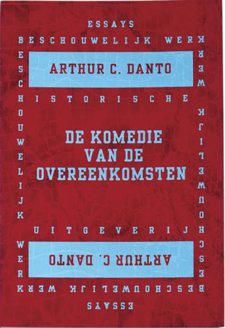
I chose this book because of it’s dark red crocodile/snake like cover, with its light blue text. The cover is soft and flexible, but still stable and firm. I spotted the book immediately by its contrasting colors, and small thick size. I like the fact that the first two, and last two pages associates to the cover by their light blue block color, clear of text. The design is strong, graphic and individual.
The book is mostly all text, except for one page with a picture of a painting.
But i really like how the text is setup in ‘boxes’ placed in the middle of the page, very simple.
The book is called ‘De Komedie Van De Overeenkomsten’, designed by Felix Janssens a dutch graphic designer that lives in Holland. He is now working as Creative director at the company Total Identity. I’ve been talking with the designer over email about this very special and eye-catching book of his, and he agreed to answer a few question for me.
Why did you chose this cover/design?
The cover is part of a series ‘beschouwelijk werk’ (reflections) of renowned historians. I always look at publishing houses like Gallimard or Penguin, how they made these series…. only type, but in a way it pops! by making it physical with the leathers it really became something tactile, a sensation for the senses. But its not only the cover that matters, the interior is like a comfortable living space.. comfortable, with some sparky details. Smooth papers, easy to hold in your hands for a longer time…
The type, the combination of the industrial Egyptiëne display font and a Garamond-like body typeface, the mirrored border on the cover…. an art-deco appraoch that fitted well to the titles in the series.
Did you decide on your own, how the design was going to turn out, or did the author have any inputs?
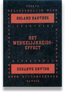
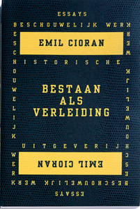
Since the concept was applied for more books like Cioran, Blumenthal, Barthes and others, it was finding the right combination of colours and textures.
Why those colors?
Red and blue, complementary… high contrast… and like you wrote, a blue that’s off normal, slightly lighter than you would expect… making it look younger. Juvenile.
Why the size?
The size is comfortable in you hands while reading. Slightly more wide than a pocket would be. It makes it more like a little catalog…
How long did it take you to figure out the design?
I can’t recall, but normally these processes start with an intuitive idea,
which becomes starting point and goal, without being a dogma or fixated idea…
Its the accumulation of what you’ve seen without being concrete yet. Typography and book design, it’s pure intuition for me. The moment one starts to rationalize or describe it, it becomes false. It’s the space of pure abstraction which you have to keep ‘open’, which you have to prevent from putting to literal meanings (design) on top of it.
What does your agenda look like when you get a job to design a book? Where do you begin, and how many samples do you go through, before you find the right one?
You’re right it’s a generational process. More recent i designed in collaboration with the artist Willem Oorebeek the book Monolith2, starting with a white book to be filled. It was like a painting process.
Normally book design is about planning, this time it was like growing, creating, shaping, molding… very interesting. And different!
For a good book, physical qualities play a big role. So different samples in weights, binding types and finishes are being made. Also for the series of the HU/Beschouwelijk Werk.
I’ve discovered that you have been using the same design, for other books writing by other authors, but in different colors, whats the idea behind that?
Like i said before, to create a series, with enough differentiation between the volumes, colour combinations are like a personal comment on each book.
What is your opinion of this book?
Danto as very specific ideas about art and art history. Radical, and unconventional. I like that.
To be honest, i don’t feel myself equipped to judge about this book- I am more influenced by philosophers, economists and sociologists.
Do you often buy books mainly because you get fascinated by its look?
Do I buy books? less and less. After collecting books for years, 4 years ago I stopped buying books. It just didn’t give meaning anymore. I think that most designers collect books for their looks, the design or the designer. Just a few actually get read.
So it was with me. I rather preferred experiencing things in reality… Now I buy/want a book because of it’s content, the overview it gives me. So books now fascinate me by the content, regardless of their looks. But if they look good, it’s not too bad 😉
Would an ugly/less attractive book cover/design (in your opinion) keep you from buying or looking into the book?
No, an ugly book may enter my domain. You wouldn’t discriminate a child or dog by it’s looks either? It’s their inside what matters.
Would you trust somebody who’s too good looking? But it proofs that design is just a dream, a phantasy when disconnected from it’s primary function. A book, a chair, a bread, a bicycle, all objects we use.
But now, Bread can be bought for more then 5 euros on the Noordermarkt! a bread! how about that? That Bread is more like a conversation piece for guests and friends…it’s a today’s authenticity fetish. 4 slices of industrial fabricated C1000 bread allow me to cycle for 200km. The c1000 bread is the ‘ugly book’ under the breads, yet it’s functional.
The Noordermarkt bread is the ‘design book’ under the breads- it is validated by it’s “sign-value”.
Do you always work in colors?
The Identity color codes project learned me a lot about colors. About the psychological dimensions apart from cultural differences. It tought me a lot about the limits of symbols. Colour is free, free to use, to adapt to. It’s inclusive. Symbols are exclusive.
What is your top 3 favorite book designs?
It can be any type of books, just 3 that caught your eye and you have to own them.
I lost a great part of my collection/archive a few years ago…. but these ones I carried with me
Walter Nikkels made a beautiful book with Lothar Baumgarten “Carbon”, The Custom Road bike or Viewing Matters from Hans Haacke
Rietveld library catalog no : 700.6-dan-2