Skip to Content Skip to Search Go to Top Navigation Go to Side Menu


"interieur design" Category


Grey Hypocrisy


Thursday, November 29, 2018

Continuing my Quest for the Dull. I did not find any books by the tagwords connected to my previous result: ’Boring’ or ‘Seductive’. Only the third and less subjective ‘Interior Architecture’ gave a match. Though, this match wasn’t the ‘right’ book for me, in the sense that it was maybe too mediocre, but its neighboring book did catch my eye. It looked kind of dull, but at the same time demanded an autonomous authority. Not so dull after all, and therefore forcing me to adapt the definition of my Quest. Perhaps it was the rather small size (15 x 15 cm.), or the textless spine. I realized how the blanco spine is actually quite a sensation in this library, considering that most books contain either a title, some text or other imagery on this part the book. At the same time did this book blend in well with the rest. Just like all other copies, it is plasticized, and then some: front, back, top, bottom – everything drenched in the monotonous clammy layer by the name of adhesive cellophane. A perfect recipe for blending in, at least in the world of books.

Even though this grey square of about 50 sheets of paper could be considered boring, there are a few elements that make this otherwise invisible copy stand out by its demand for adapted care-taking. For example, the thinness of the book made it impossible for the librarian to place the code sticker in its entirety on the spine, the rest of it had to be placed on the cover. I can imagine when doing this job, the irregularity of books like this is quite bothersome. A visual rupture in the repetitive rhythm of the surrounding stickers. Besides, because of this invisibility, it is harder for a person wanting to look up a book only by the code he/she was given by the library’s database. Maybe that’s why I was drawn to it, the code was missing, or at least not visible at first sight. Maybe that’s why this book has this size; it only wants to be noticed by people who don’t follow the code, but choose by its appearance only. A stubborn little fella, this “cDIM Valencia”. Hypocritical even. Its innocent appearance, yet sneaky way of asking for attention.

774.4 cat 17

Beige Seduction


Thursday, November 22, 2018

What book to pick in an art academy’s library? Each one so carefully designed, asking for individual attention and therefor disappear into an abundance of ‘designiness’. It makes me long for the boring book that could potentially surprise me with its content. Perhaps one of those plastic file folders on the top shelves hide some curiosity. Unfortunately, I find out that these are not for students to be looked into – the Quest for Boringness continues. My eyes are caught by a book with a textless beige spine, carrying only the library’s tag: “718.6 pov. 1”.

The color is more band-Aid like beige; it would blend in well with my skin, or my grandmother’s sweater. The surface is slightly textured, but the book’s front has been plasticized by the library for protection. To me, this adds to the sensation of monotony, since so many other books were treated the same way. All individual books have been esthetically democratized by this layer of plastic. This endangers even the most exotic looking book to drown in a pool of textureless mass. This book’s only unique touch might be its shape, which, unlike most surrounding books, is wider then it is tall. Nevertheless, it still hasn’t excited me. Bingo.

Flipping through its pages, I see prints of black and white photographs depicting shop windows, -interiors and -facades. Repeatedly placed on every other page, accompanied with a short description. These photos focus on the design (architecture) that is used to sell other design (product). These designs are made to lure the viewer in; not by their boringness, but their promise of exclusivity. Not much unlike these books in the library. In search for the dull, I ended up with a book about seduction and exclusivity.

I’m quite fascinated by these images. Maybe because I once worked as a sales assistant in a luxury fashion store. A frequent visitor was a well-known Dutch architect, whose experience in designing various (Prada) stores apparently made him a valid person to complain about our bad lighting system. It was too yellow and not bright enough. However, I think he kept visiting our store for its unpretentious appeal; no overly designed cabinets, shelves or fancy lighting systems. A store with a no-nonsense atmosphere; selling quality products through quality service. Like a boring book with neat photographs.

code: 718.6 pov. 1


Space in the Metro universe


Sunday, May 20, 2018

How do we recognize a map? That is the main question rising when we stand in front of the new decorations that appeared in differed Metro stations in Amsterdam. Together with design bureau Fabrique, Group A architects was responsible for the design [x] and renovation of stations along the Oostlijn Metro in Amsterdam.  Group A has created a design that is not only a return to the basis of the original design’ but also reflects ‘a vision of the future’. In an interview for Grafik.net website, Rene Knip, the main designer of the project, said: I’m taking the walls of stations and starting to tell things, I’m leaving it open — stories that are not understandable but everybody wants to read. I give type the opportunity to mean something, I give the people visual material to build meaning, a visual story that is free to dive in – the way they do it is their story.”

 
metro 1
Photoshop sketches for visual language tableaus for the renovation of the Oostlijn metro in Amsterdam, 2013

 
When looking at these decorations, they immediately receive the shape of mystery maps revealing unknown places. They become a visualization of a secret landscape or an imaginary place. The reason that we see those unknown images and connect them to maps might be the language that was used in the design of the decorations. The use of red broken lines and empty dots, above a white background, connect us to the visual language of the Metro maps, but also to childhood treasure maps that uncover precious secrets. Knip described that the Metro designs were inspired by childhood experiences.

The Metro stations can perform as a universe on their own. When we look at a Metro map, we find out it is very much composed by straight lines, even though the path in fact is not straight. The maps are not designed in a way that allows you to find your location in the world, but instead they give a relative information of where is your station in the order of the Metro station system. Your location is relative to the route you are on.

In this universe there is an order of actions that you have to perform in order to get to your destination starting with passing your ticket to enter. Once you arrive, you pass your ticket again and go back to the outside world. The Metro maps are the maps of a parallel world, that is connected to the locations outside, but also has existence of its own. You can travel under the city in a parallel universe that its whole reason of existence is to allow you to pass between places. In New York, abandoned Subway stations are becoming a strange space in which things are changing and transforming according to time.

 
metro 2
The tiling on a platform at Chambers Street has become significantly damaged

 
When we step out of the metro, and in our way out we see the decorations on the wall, it’s clear for us that they don’t try to illustrate the outside world. Why do we still relate ourselves to those maps? We know what it is but we don’t understand it, we recognize it as a metro map but we cannot read it. Maybe the motive of fantasy that they hold, the fact that they are almost something familiar, but not completely, is what gives it its power.


metro 3

Amsterdam’s Metro map

 
Is it possible that the way the decorations communicates might change with time? when we look back at something in time, we might not understand the meaning of it, but this appearance of something that it constructed by rules might give us the feeling that there is a meaning hiding behind the unknown language. An example for this can be the hieroglyphs found inside the pyramids in Egypt. No one had used the hieroglyphs for more than 1,500 years, but since discovered, people knew that the hieroglyphs are not only decorations on the Egyptian kings’ grave tombs. Even though people believed that the hieroglyphs has a meaning, they were decoded only after hundreds of years, with the discovery of the rosette stone that was found in 1799. The stone is inscribed with three versions of a decree issued at Memphis, Egypt in 196 BC during the Ptolemaic dynasty on behalf of King Ptolemy V. The top and middle texts are in Ancient Egyptian using hieroglyphic script and Demotic script, while the bottom is in Ancient Greek. As the decree has only minor differences between the three versions, the Rosetta Stone [x] proved to be the key to deciphering Egyptian hieroglyphs.

 
Maybe in hundreds of years, the cultures following ours will come across those Metro decorations that has the quality of a secret map or a secret language, and will try to find the meaning lying behind those vague maps. Maybe when that happens, they would be able to find their own Rosetta stone [x}, and give new life to our symbols, that will receive a new form and meaning.

tumblr_o6swairt5L1r54c4oo1_1280
Linear IKEA Store “Transit” Strip Map
 

It’s all about context


Thursday, February 15, 2018


Although being already more then few times now at the Stedeljk museum, it’s always pleasant be here,  environment, the architecture itself and the natural light that create a charming atmosphere all around.We moving towards the so called BASE 1 to see the new permanent installation of iconic works from the collection of the Stedelijk Museum. It occupies the entire new wing of the museum and features a selection of around 700 pieces grouped around historic movements, social themes, and influential artists.

After I’ve made aware about that what I am going to see is going to be like this for the next 10 years, I approached my visiting focusing my attention mostly on the division of the space and the solution founded to display the artworks.


rem-koolhaas-AMO-stedelijk-museum-amsterdam-base-exhibition-space-OMA-designboom-07 700-3

700-1 700-2


The space allow visitors to experience the collection through an open-ended route.The chronology can be followed on the perimeter, while freestanding walls in the middle create separate sectors highlighting groups of artworks that represent a specific theme or aspect of the collection.

I have this constantly feelings of jumping between a sort of labyrinth in which I can keep choosing different directions but as soon as I taken one, those vertical high walls create a dynamic and cozy environment, almost like little galleries inside a enormous place.


The layout display  the collection as a network of relations rather than a presentation of individual artworks. All the artworks do not loose their independence even tough, there are chairs and carpets hanging at the walls, and the displaying of some works are not as we are used to see.


I am  wondering about how they bring inside here this massive standing steel walls? And how they organized  works in different areas of the collection…


I’ll try figure all this out a little bit more

stay tuned…

700

Beauty is the harmony of purpose and form.


Thursday, February 15, 2018

Alvor Aalto : Screen 100

Skærmbillede 2018-01-18 kl. 16.17.03

Alvor Aalto was born in 1898. Most of his childhood and youth he lived in Jyväskylä, a town in the center of Finland, surrounded by the big finish nature. Thousand of lakes and woods with millions of birch trees, must have influenced the young Aalto.
In his work nature is always present, either in the organic shape of the products or the choice of materials. And Finland is present, one can say that Finland is with Aalto and that Aalto is with Finland.

Aalto was both an architect and a designer. It is very obvious in one of his early works, the Paimio Sanatorium. In addition to the new and functional building he also designed all interior for the building. Today the Paimio Chair is probably the most well-known Aalto chair from that time. It was designed for the patients, functionality and mass production was important issues, together with the organic shape it all makes the chair an icon of good design.

Skærmbillede 2018-01-18 kl. 16.17.48

“Beauty is the harmony of purpose and form.”  Alvor Aalto 1928.

Alvor Aalto has had an immense impact on our perception of Scandinavian design today.
In 1935 he founded the company Artek together with his wife Aino and Nils-Gustave Hahl and Maire Gullichsen. The company should handle the sale of Alto furniture, but they wanted to take it further. They saw themselves as promoters of “Rational living and interior Design” (as they write in ‘the Artek Manifesto’). In other words they wanted to educate people and teach about the ”good life”.

All over Europe design changed or evolved in to something more functional, modern and lighter. There was a new way of thinking, new production possibilities and materials. Just think of the Bauhaus movement in Germany. In Aalto’s design he combines that thinking with natural materials and organic shapes.

It is evident in the screen 100 from 1936. The construction is so simple. Wooden sticks assembled with a metal wire. When the screen is used as a room divider or a simple screen it forms different organic shapes.
The repetition of the vertical wooden sticks leads the minds to forests with beautiful slender birch trees. An effect Alvor Alto also used, when he worked with different expressions on the facade of his buildings. That can be seen on the picture of the finish pavilion which Aalto made for the world exhibition in New York in 1939.

Skærmbillede 2018-01-18 kl. 16.17.31

The screen has been sold since late 1930s. At the Stedelijk, I found it attractive and it caught my attention at first because of the simplicity and round shape.

On the attached picture it can be seen in the Artek Showroom in Helsinki in the late 1930s.  Today it is still for sale in the Artek Showroom together with the Paimio Chair and many other Aalto products.

Even though Alvor Aalto made fantastic design he still wanted the user to influence the design.

 “ A standardized object should not be a finished product, but on the contrary be made so that man and all the individual laws controlling him supplement its form.” Alvar Aalto 1935 

The Screen is a standardized object, but the user is the one who forms it.

Skærmbillede 2018-01-18 kl. 16.17.18

A small conclusion:

Why did I try to build the screen, how was it and what happened on the way?

At first when I saw this screen, my first thought was that I wanted it at home. It looked so simple and gentle in it’s look. How it stood there and divided the exhibition with its calmness and simpleness. But still what I was fascinated by, was that it was also simple to make, it is basically just sticks put together and then the shape makes it stand.

But such an iconic and great design object needs time to make. And often with design and especially Scandinavian design, simple stuff takes the longest.

Therefore I decided to build a model myself, I wanted to try and put myself in the making and designing of this. It was fun, I made a small 1:10 scale model

IMG_6040 IMG_6039 IMG_6038 IMG_6037

The small model didn’t give me any trouble that I didn’t expect. It was simple and easy and a very honest object. I think If I scaled it up I would have had more trouble and I would have been confronted with some other problems.

But all in all it was clear for me after trying to make a model and looking into the design and production of this, that this object is very honest.

It is exactly what you see.

IMG_6036 IMG_6035 IMG_6034

Colour Coding Space


Thursday, October 19, 2017

When we paint we create compositions, shapes and forms from colour. The colour choice is important in our spaces and on our walls sending messages to the brain, different colours evoking different emotional response. Colour is engrained in literature and film like ‘The Yellow Wallpaper’ where yellow connotes to madness and insanity or visually in ‘Blue is the Warmest Colour’ (where blue features in every scene) we can see it as freedom in deeper tones and a depression as it becomes more diluted, in each context colour can play a different role. Red, the third primary, is depicted as villainous characters and day-to-day we see red road signs as danger. Each colour resonates, we have an emotional response, and this is why the psychology of colour is intrinsic to human life.

Mondrian's Studio Mondrian-composition-in-red-blue-and-yellow-1937

In De Stijl we saw a reduction in form and simplicity of colour pulling back to these three primary colours. This movement strived to strip back the chaos of war and the ornate elaborate architecture of 1917 as painters Piet Mondrian and Theo van Doesburg took two dimensionality into the three dimensional architectural form. In Mondrian’s paintings the lines move out almost from the canvas to enter the viewers own space and pull you in to the squares of colour. In the recreation of Mondrian’s room I felt the same pull, there was a flow in the space that I enjoyed, the room was awash with white but had these fleck of colour that mirror his paintings. The freshness and purity was achieved through colour awakening my eyes to a new experience to colour. It opened up a window to my experience of colour and its effect on the soul, first looking at these three staple colours and then then into the wider sphere of the colour wheel.

Blue

My room also is predominantly white to promote a clean fresh feeling but is splashed with blue in curtains, cushions and rugs. Blue is said to promote a feeling of creativity in a study by the University of British Columbia as creative blue is represented as something that is not tangible, the sky, the horizon, the sea. Where sky meets sea it is a point of contact that can never be reached and this adds space to an environment and seems to give depth to a room. Rudolf Steiner’s schools used colour as a vital part of the formation of a child and blue was especially key. For the 6th, 7th and 8th grade the classrooms where painted blue because Steiner believed that we undergo a 9 year old change, finally seeing colours for what they are. Before the classrooms where painted in warmer reds and oranges because at this age the child sees the colours for their complimentary match on the opposite side of the colour wheel. So, in both cases the cooler blue tones calm the child down and add space for the child to focus, promoting Steiner’s non-suffocating environment to set free their thinking and ideas.

Steiner's Warm Classroom Steiner's Blue Classroom

Yellow makes babies cry and irritation in adults which is why this colour is used to paint restaurant walls, stopping people from staying too long taking up valuable space. Where I currently live the walls are drenched in a bright sickly yellow pressing a sense of forced optimism, this tone reflects more light, excessively stimulating the eye making it understandable that yellow can fatigue both eye and optimism. ‘Yellow Scream’ by artist Kim Beom beautifully reflects this angst creating a composition reliant on the psychological weight of each scream. This use of yellow links back to an idea of madness and as Beom adds black it reflects Steiner’s theory of this darkened yellow depicting the grotesque creating a compelling piece of performance art. It is an unnatural colour, like the other primaries drawing away from the natural mirroring De Stijl’s movement, however out of this context yellow can be antagonistic to the human eye.

Red

In Barnett Newman’s ‘Who’s Afraid of Red, Yellow and Blue III’ we can see the use of an overwhelming red applied layer upon layer, the artist presents us with an invasive red further juxtaposing nature in industrial mechanical colours. This piece demands the viewing to look at it and have a reaction in Newman’s didactic idea rather than that of De Stijl’s expression of freedom, the red evoked such strong emotional response is was attacked by critics and attempted to be destroyed. The red of the teacher’s pen acts as a warning through colour conditioning and it is interesting that within a different a context primary colours can have a different response and pose as a protest. If we add white, however something different happens and pink can be used to calm. ‘Cool down pink’ is widely used in prisons in Switzerland to calm down the inmates because it is believed to be physically soothing. This soft feminine colour has spread through prison to Texas where prisoners are dressed in pink jumpsuits or drunkards being locked in pink cells to calm down. It is interesting how diluting such a vivid colour of blood, passion and anger can alter its effect on the human spirit becoming something to pacify a patient.

Pink Prison Cellpink-jailpink-inmate

The psychology of colour influences how we decorate our homes, institutions and environment. Tonal variation, hue and complimentary colours all play a role in how each day is coloured. De Stijl reduced it down to a purity and simplicity of colour that opens up new ways of seeing, transforming our space into something painterly and making the two dimensional into the three. We connect to colour through conditioning and through tone playing a part in each moment. Colour responds to the spaces we move in and alters our perspective on how we see our homes and world.

Turbulant Times for Tubular Chairs


Monday, October 19, 2015

In the Boijmans Van Beuningen museum Design Derby exhibition there were two chairs that use a different main shape to catch your eyes and bring them to ‘ their side’ of the show. In both cases, the armrests follow this main shape; the rests of the Dutch chair are symmetrically shaped by an oval, while the rests of the Belgium chair are asymmetrical and sturdy angled.


Screen Shot 2015-11-23 at 20.28.27Screen Shot 2015-11-23 at 20.30.00

The Auping fauteuil, 1931 • The Chaise Lounge by Gaston Eysselinck, 1932


Despite this difference, the chairs are rather similar because of the chrome-coted construction parts, the use of wood in the armrests, the shared function, and the same exact period in witch these chairs were made (1930’s). Without any background information you could say that these chairs were made by the same enterprise or you can take it the other way around; these designs could have been competing with each other back in the day. This tension field spiked my interest to take a closer look in the history of both designs. Are they that different?

Examinating these chairs further I found that the same Dutch designer movements influenced the choices that were made in both of the designs. Designs meant for modern progressive consumers. These influences include Dudok [x], J.P.Oud [x], Gerrit Rietveld and De Stijl movement [x].

In the 1930’s Auping decided to broaden their horizon and manufacture a line of tubular living room furniture including the Auping fauteuil. At this time, this branch was not important. The designer of the fauteuil was not even linked to the chair itself. Later investigation concludes that the unknown interior designer Ben Reynsdorp is likely to be the designer of this magnificent chair. (jaarverslag 2014 Bojimans.nl [x])

At the same time, at the end of heroic period of the Avant Garde, the young architect Eysselink succeeded in assimilating these influences in a highly personal way. He went after Rietveld and designed his own home in Gent and manufactured fitting and unique furniture;

House_Eusselinck

“In 1932 he designed all the furniture for this house. It is tubular steel furniture [x], of which the stacking chairs and the large recliner are the most interesting. He hoped to manufacture the furniture at a later date, with the name FRATSTA (Fabriek voor RATioneelse STAalmeubelen – Factory for Rational Steel Furniture), an enterprise which in fact proved unsuccessful. Eysselinck is the only architect in Belgium from the period between the wars to produce a ‘collection’ of tubular furniture.”

The latter brings me by another less fortunate similarity found; both chairs were part of lines that initially were not well received in the market and this brought production to an end in both cases. As said, the enterprise of Eysenck went bankrupt after only two years. His unique “machine à habiter” was not mentioned by the media. Auping on the other hand, focused on the improvement of their bedding and the continuing of their existing production lines in the crisis. They did not continue the production of tubular living room furniture as it was not as popular as their beds.

Nowadays Eysselink is seen as one of the great in Modernism. The Chaise Lounge [x] even got a re-edition in the 70’s; a modern and luxurious implementation.


474199.jpg;jsessionid=9E51294DBFF433EB0AE8992185C93492

The re-edition of the Chaise Lounge by Gaston Eysselinck, 1970's


The Auping chair ultimately got the attention and the designer the credit he deserves. Both chairs flourish at the Holland – Belgium Design Derby Exhibit and defend the honor of their ‘native countries’.

But ‘What differs the Chaise Lounge from the Auping fauteuil?’ you might ask. These chairs can not possibly be from the same designer for one major reason: The Auping fauteuil is not designed by Eysselinck’s ‘Form Follows Function’ regime. The armrests of Auping are used in a more decorative way than Eysselinck would have wanted. This makes that, although these chairs may look very similar, my gut feeling was right and they can be categorized in a whole different way.


PEOPLE NEXT DOOR


Monday, October 5, 2015

The design derby took place in the Boijmans museum. It is about the confrontation of Belgian and Dutch design objects from 1815 till today. The collection covered all kinds of design; from glass and ceramics, prints, furniture, fashion, even up to cars. The exhibition was ordered chronologically and all the items from each country were presented next to each other into two big lines.

Does this make sense and do you really find out more about Dutch and Belgian design by looking at it like that? This is an attempt to find out as much as possible through two chosen objects from the exhibition.


table carion OLYMPUS DIGITAL CAMERA

Francois Carion table [x] and lamp [x]

Firstly, a small round table by the Belgian designer François Carion. He built this table between 1925 and 1930, the materials he used for it are iron and pink glass. The wrought iron is one of the key symbols of his work and he used it for a lot of other designs as well.


ravesteyn chair ravesteyn

Ravensteyn chair presented at the "Exposition des Arts Décoratifs et Industriels Modernes in Paris 1925 [x]

The second is this chair by the dutch designer Sybold van Ravesteyn, who was born in 1889 in Rotterdam. Van Ravesteyn is a nationally famous architect who designed some quite important projects in Holland, for example the central station in Rotterdam [x] (shutdown in 2007) and also various residences and furniture [x]. The presented chair was designed in 1925. It is made out of wood and painted in geometrical shapes in black and white, designed specially for mister Rademacher-Schoers bedroom with the matching nightstand for his house in Utrecht.

To find out more about the artists it is important to understand the circumstances of life and therefore their inspirations.
First of all, after the first World War progressive designers took advantage of the knowledge of material and techniques they had gained during war. That’s why for example it was also a big topic to design the first cantilever chair out of tubular steel which was used by famous designers like Mart Stam, Marcel Breuer and Mies van der Rohe.

Moreover some big art movements were going on in this time; from 1890 until around 1910 Art Nouveau was a big influence mainly inspired by natural forms and shapes and therefore you can find many dynamic flowing lines and mainly asymmetrical shapes. Art Nouveau was seen as a harmonization between nature and design, and also a way of life. In the same time the Arts and Crafts movement was going on, which was an big influence from Great Britain; the movement was mainly about the combination of work and art. From France came the important Art Deco movement. Art Deco was defined by stylized and two dimensional representation of floral and organic designs. The industrial production and lack of shadows and natural elements was the new sign for modernity and the overtake of Art Nouveau. The absolute climax of Art Deco was the Exposition Internationales des Arts Décoratifs et industriels modernes 1925 in Paris, which defined the movements name.

Another movement was De Stijl in Holland. Famous contributors included painter Piet Mondriaan and of course architect Gerrit Rietveld. Their work is mainly known as plastic art which is a pure abstraction in form and colour. It is about the reduction to the essentials by only using primary colors (among black and white) and the limitation to use almost only vertical and horizontal directions. The most famous example is the Red and Blue Chair by Rietveld in 1917 which can be also seen as a three dimensional painting of Mondrian.This chair was also invented for mass production which expresses the mood of time in Holland at that moment.

Also because in most middle class houses in Holland and with the higher class in Belgium it became common to use a gas stoves instead of a big oven in the kitchen,  people didn’t gathered only in their kitchens anymore as nice and cozy place to stay but in their whole houses. There were other heated rooms, even central heating, as well and furniture became much more important in general.

I choose these two items mainly because of their difference, despite being designed and produced at almost the same time. This shows how many different influences the countries and artist themselves had during the time, which makes the derby more interesting, it is nice that you can find several elements of the ongoing movements in these two pieces.

arts and crafts   william morris niebelungenlied

Art Deco Jug • Charles Robert Ashbee (1904) [x

Art Deco Interior • William Morris Niebelungenlied (1860) [x]  

In Carions table for example I can find lots of flowing formed shapes and the motive of nature a characteristic of Art Nouveau and the Arts and Crafts movement which is coming mainly from Britain. I wanted to give another example for this movement because there are so many similarities to Carions work  in C.R. Ashbees work  (1863-1942) who was a British major designer for the arts and crafts movement. You can find simply the same elements and materials as Carion used in his works. In Interior Design wood was also a big thing  you can see that in the Red House from William Morris, who is actually seen as the founder of this movement and his friend Philip Wood. They designed this house in England together and until now it is a well known example for the Arts and Crafts movement.

18_designparade_jt130711   Bar Aubette

Art Nouveau Interior • Sybold van Ravesteyn room of Villa Noailles [x]

De Stijl Interieur • Theo van Doesburg Aubette (1928) [x]

Ravesteyn’s work which in this period consists of only geometrical shapes and very limited colours shows influences from the Dutch de Stijl movement, which is very much connected to Rietvelds work, who was also designing for private houses . But also artists such as Theo van Doesburg in whose Maison-Atelier de Theo van Doesburg de Meudon in Paris where he lived himself with his wife. It is quite obvious that both artists have similar inspirations and approaches in their work. In the picture you can see “Aubette” a collaboration between Hans Arp and van Doesburg for a cinema in Strasbourg which is very loyal to the de Stijl rules.

All in all from this exhibition as an example we can see the impact and influences countries get from other countries. As here seen in Holland which is more orientated on the East with Germany and the Bauhaus movement as there were also many refugees coming from there and they choose Holland as neutral country. In contrast to Belgium which was more focused on France and even Britain so therefore the south and west.

Moreover it is an interesting fact that people lived next to each other, but also very different, because there was a border between them. This has changed so much today where there is internet and it is so much easier to to cross borders to find inspiration online and not having to depend on the values and movements being part of the countries itself.

Mart Stam and Gaston Eysselinck ‘s chairs


Monday, October 5, 2015


chairs mart stamjpg

What first stroke me about those two chairs is how similar they look.

I thought they were made by the same designer. It’s funny because at first I was attracted by the colour of Mart Stam’s chair. Yellow is for me the colour, of happiness and brightness. I also thought that it was very modern and appealing in it’s shape and colour. I then saw that they were made in the 1930’s which surprised me because I believe they haven’t done anything so modern ever since.

Obviously throughout the last century we have discovered a lot of what arts have to offer and gone deeper and deeper in to the meaning of it. Just as Gaston Eysselinck’s did with his chair, pushing simplicity and minimalism to it’s most extreme point and aspect. I believe this is why Gaston’s chair is much more depressing sad even then the one of Mart Stam, because he has pushed the concept just a little bit too far.

eysselinck_10

The other aspect is that, they did it one year a part from each other but seemed to have had no kind of link what so ever, it means that in a way they had the same intention and were inspired more or less by the same idea. Both countries were at the verge of something new because of economical, social and political changes.

Gaston Esseyelinck Typist chair is way more simplistic and sad in a way, and maybe more to me I guess this is because of its wooden colour which brought me back to my teen years when I was send to an all girl catholic boarding school, where we had wooden bench as chair’s in our classes. Gaston Eysselinck’s rigid design reminds me of that a lot. They are not a very cheerful memory, so I might not be objective about it but as a involved spectator I can’t really be objective because of all these emotions that are brought in me be the design piece and this what it is meant to do. In that point of view Gaston Eysselinck’s chair worked on me by bringing back emotions even if they weren’t cheerful ones.

I believe the difference, is also the approach to the product of design it self. Mart Stam’s chair was meant to be sold for the mass so the idea of quantity enclosed in the design was appealing to that mass. Gaston Eysselinck, only

mart stam ellow chair

managed to make this one and didn’t manage to commercialize it. I believe he pushed his idea a little bit to far in the simplistic way, in wanting it to be to much avant-garde maybe to functional in the construction and lost himself in the process, or maybe just by being raised in Belgium in a Protestant society which obvious influenced him.

The exhibition itself didn’t interest me so much probably because it was so organized and most of the objects were not well presented in my point of view but when I saw those two chairs, even if Gaston’s one didn’t cut my breath, they were standing out in the crowd. Until a few days ago I could not say why but it’s because they aren’t just chair they are like architectures which makes sense as both designers were architects. The forms and shapes are very simplistic but very researched well thought.

Beautifully, according to me they are simply beautiful; “less is more” is a concept I completely agree with. And which applies here in its entire complexity, it is because those chairs are so simple, that they are so modern, triggering in me those emotions.

Mart Stam manage to create a chair that is still today a reference to any designer or architect that wants to create a chair.

He didn’t just create a chair. He developed an idea that brought out a lot of the new ideas at that time, but in 1930 proving that it could be simple and beautiful, was an achievement and innovative.

If you go to Ikea or any department store today you will find many chairs that will be in a way coping those chairs. This is why it is such an invention because we are still using it as a reference without even realizing it.

ARE WE STILL FUTURISTS?


Friday, March 27, 2015


h2_1987.98.1a-d

                                        Joe Colombo, Tube Chair, 1969-1970


This is my chair. The Tube chair designed by Joe Colombo in 1969-1970. First I will introduce the intentions of this designer as a representative architect of that period and shed some light on the ideals behind designs from this time. Colombo was mainly focused on the creation of living systems (Combi- Centre of 1963) that were made to become micro-living-worlds with dynamic, multifunctional living spaces. He was very interested in furniture systems (Additional Living System), as an example the Tube Chair that could be set up in several different ways depending on the users wish!


first impression

One of the things that caught my attention when looking at this chair is the shape. To me it is quite unusual and therefore appealing to think that a construction could be shaped by only using round cylinders. I also found quite interesting the fact that these shapes could be organized according to the position you want at the moment, which to me is fascinating. Also the color of this particular model is very present and strong, adding to the shiny material it is made from. All of these elements create a quiet eye-catching construction.

Intrigued, I decided to research more about the aesthetics of the sixties and early seventies and learn the meaning behind this particular aesthetic and philosophy behind this kind of design.


for whoever want to know Joe Colombo

shiny tubes

shiny

shiny shiny shiny shiny shiny shiny shiny shiny shiny shiny

perfect colliding cells of bodies, body parts inside parts of parts of bodies inside shiny parts of bodies, is this a body, is my body this, parts of colliding shiny cells colliding bodies?

or cold neglected manufactures of machines? Machinery taped forcefully by robotic aggression or casually naturally beloved shapes holding, sustaining, lovingly enclosing tender body parts?

this is my question when sitting in the tube-chair.

both.none.both and none at the same time

because time is the reaction after this action.

orange tube chair.

I saw lots of similarities between the interior design that is visible in furniture design, decoration and the architectural use of space used by  Joe Colombo during the late sixties/early seventies. here are some pictures to show some representative interiors designed by him in this period!


Manu 6

Manu 5

MANU 3


Joe Colombo, Visiona-Livingroom of the future, 1969, Total Furnishing Unit, 1972, Spring Lamp’s prototype, table lamp version, 1968,‘Plywood Chair’, 1963, Carrello Boby, 1970, Spiral chair, 1932, B-Line Colombo Modern Multi Chair, 1969


some history lessons:

The 70s represented a reaction against the sleek minimalism and simplicity of modernism and instead sought a  “playful embellishment and radical experimentation with form.” So this meant that functionality had a high importance yet still creating an exciting and almost utopian space. These spaces had unusual colors, shapes and functions as to move towards a successful future of living.Self-expression and individuality were defining for the time. Technology started gaining importance and spaces were used as organisms that were part of their surroundings.

The architecture of the time was also very innovative when it comes to light and space. In many ways, the 70s started the concept of “open plan living”. Many designers reacted to changes of how families were starting to be structured (women started working outside of the house thanks to  technological advances and overall economical growth f.e.) with double-height spaces, open planned living and grand entrances. Many homes had giant windows, spiral or “floating” staircases, interior and second-floor balconies. The kitchens were made to accommodate more cabinets and high spaces. Many kitchens had islands or breakfast spaces, bringing the family into a room that was once reserved only for women or staff. This was a symbol for the slight change in position women were starting to have during this period, that was to be seen in the way the living space was designed by the architects of the time.

During the seventies there was an enormous use of bright colors. Houses became very inviting and there was a lot of eclecticism when it came to the furniture designs and nearly every object had a bright color such as toilets, walls, furniture and decorations which came in several colors .

The 70s was a time of many advances in the design of chairs and office furniture. Designers began experimenting with ergonomic designs for the workplace and home offices. Many Italian Designers were at the forefront of radical and experimental furniture design, using high tech materials, tubular steel, bright colors, and polyurethane plastics.

1970s stuff

• Sleek plastics and high-tech materials
• Avocado green and gold
• Bold patterns and prints
• Stacked stone fireplace and stone walls
• Timbered ceiling beams
• Exposed brick walls
• Metal (chrome, polished steel)
• Geometric shapes and lines
• Thick and chunky masculine furniture
• Fiber optic lights
• Wood paneling
• Skylights
• Atriums
• Indoor gardens
• Fireplaces with elevated hearths
• Big windows and lots of glass
• Wall-to-wall carpeting
• Sunken living rooms
• Wicker furniture
• Shag rugs
• Earth tones
• Brightly colored furniture
• Orange

MANU2MANU


Joe Colombo, Additional System chair,

1967-1968, demonstration of positions


parallels to today:

IKEA

Reading about the sixties/seventies really got me thinking about how much of the ideals and aesthetics I recognize in our contemporary culture today. Some of the things such as experimentation with form, eclectic interiors, technological advances (that are employed within living spaces) and individualistic approach to the design and embellishment of a living space are elements I strongly recognize in our culture today. The first place that came to my mind was Ikea because of the presence it has amongst nearly all of us, as well as its attracting quality it has to people today. Here are some pictures that I thought were representative for the similarities!


Ikea_catalog1 copy
Ikea_catalog2 copy

Here from ago


Friday, March 27, 2015

03/03/2015, 10:00 AM

Fresh morning, makes me want to fill it with coffee and smoke and a nice story. And so we begin this day in a spacious room which is separated from the rest of the studio by this black wall which looks as if it fell from somewhere above and its destination happened to be this studio. It is interesting but Ok, nevermind. Let us sip our coffee from tiny soup bowls and burn it with some smoky inhales of rolled tobacco, as we further dicuss about this centrally positioned chair which put us together in this time and space.

10153205_10152017634480998_129506274_n
Chris Junge in the monodrama ‘ons ons’.

I have first encountered this chair on 3rd of July 2014, during an exhibition and a theater play by Melle Hammer, who at the same time is the designer of this chair. Its cheap and grandiose look caught my attention and kept my eyes staring at it, although I never really bothered to further investigate or question its existence. It seemed cheap in terms of the material it was made of (corrugated cardboard), and grandiose for its physical characteristics and attitude.

10885450_10152527566920998_4811577043378295905_n

As I sit a few steps across from it now, this switch from past to present keeps bouncing back and forth, making me want to finalize my opinion about this chair.  But then again, I know almost nothing about it. Although it is now standing upside down, it seems as if it hasn’t changed much, if at all. Cardboard still has the same brown color, its weight still looks cheap. Only this time, there’s more to see from what its interior structure offers, which is interior support consisting of two more cardboards connecting to form a plus-shaped structure.

And it’s Melle showtime, baby, feed me with words. It’s time for some real storytelling. He starts by describing the very first click he had for this chair, which was a theater play written by him. A monologue, or a dialogue should I say, between the writer and himself and so on which doesn’t really matter, but you get the idea. Anyway, the main point is that the he was trying to design a chair for this stage set which would give enough richness to the play, as if holding the whole scene on its legs.

We have a click. Good. And we have a direction/some kind of a plan. Good. What is the the hint, an inspiration, research, anything to grasp and begin with? A CHESTERFIELD CHAIR [x]. Just some background information. Ok, now we are complete: a click, a direction and a sort of inspiration.

Let us continue with some starting points, you know, that time when you get your hands dirty and make some mess. Before Melle starts telling me how the chair came to existence, he wants to make sure I understand the term „problem-solving“ before anything else about this chair, which has its occurence before design and which was his method of designing this chair. As an example, he puts a fork and a lemon squeezer on the table explaining that both of them can be used towards the same goal, which is getting the juice, despite the fact that their functions differ. Lemon squeezer speaks for itself, while the function of a fork, in this situation, would be „problem-solving“. I couldn’t make a direct connection to the chair, but I could sense my subtle excitement for what the following information is about. And so he introduces me to the problem he encountered in the beginning of the process, that being the money. He could not afford buying one of them chesties only for a one night show, so how one dealt with the problem and tried to find a solution resulted in the making of this chair. Corrugated, brown board costs only 6 euros per sheet (inc.taxes). It’s nice, yes, sharp, but its lasting is not long. Let’s say one year long, which is still enough as it was meant to be used for a few hours. Inside, the board consists of fluted sheets which will eventually deform or collapse through longer usage. During this play, the point of the chair where most power is used is armrest. At the same time, that’s where a lot of the chair’s strength comes from and it is double-layered. This armrest gives the chair a possibility to be used as a chair. However, real power comes from the interior of the chair which consists of two centrally crossing cardboards in order to support the weight. At this point of the story, I felt the pieces of the puzzle falling into their place, but Melle concludes it by saying that it is not a design, but a matter of problem-solving.


So far the obstacles encountered in the process were solved. Theater stage had its chair, it survived the show, and it met the budget conditions. Everyone is happy. The story goes on, however. It continues with Melle’s decision to take his problem-solving design further, from which breaking and overcoming more barriers followed. The goal is different now, that being to keep the model design of the chair which is strong enough to hold its ground without the interior support. And to last longer. Pure design. What is the key? Stronger material, which is Falcon board. It consists of standing up hextagons and doesn’t need to be double-layered in order to be stronger. It costs 9-11 euros per sheet(inc.taxes). Of course, it comes with disadvantages. Falcon board cannot be cut with machine pressing and immeddiately cutting down because of its high strength, but it would be possible with a plutter which travels slowly and precisely through the board. That said, it needs time and the production costs. However, this production would allow the possibility to print on the board, which further allows customized prints. This makes it into a more industrial product; it gives a furniture-feel and you can have it made with print preferences.

Melle_kill-your-darlings Melle_kill-your-darlings-1

Scale model(corrugated board chair) • Scale model(falcon board chair)


Example of customized print

I go back to that summer evening when I first saw the chair. I try to recall my thoughts, but it seems like I hadn’t put any effort to study the chair. All I can remember is that it did trigger my amazement for it for the reasons of its cheapness and steadiness. And I wonder, if I were to gain this knowledge about the chair before seeing it on stage, would the amazement still be there, or at all? Would it change my focus on the play? At the end of the play, who would my applaud be forwarded to? I was never exposed to much information about the chairs and their existence but the information keeps being present all the time, either verbally or visually. It took two events to broaden my perspective and make me question what lies beneath their designs.

Through Melle’s story; the whole process of deciding about the material, way of production, and constant problem-solving, I have come to realize that designing chairs is one of the hardest tasks for its creator.

11103936_10152743092000998_1510648936_n

Who is Gherpe? About Superarchitecture and corruption by conventions


Saturday, January 10, 2015

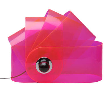
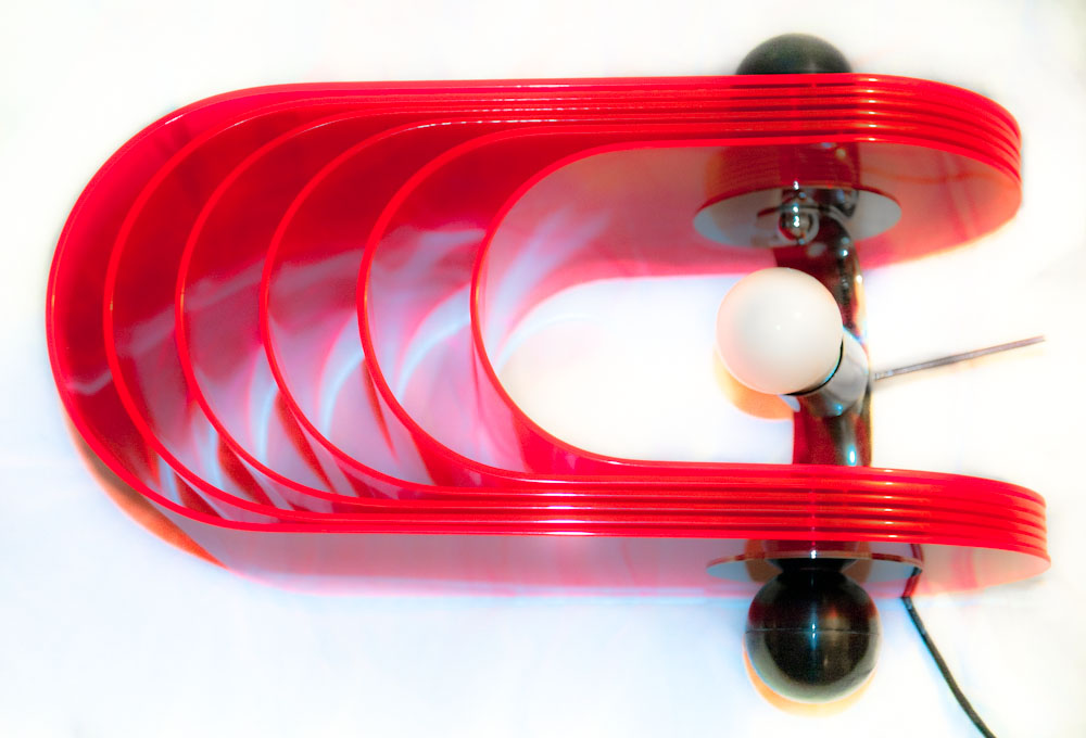
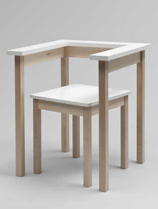
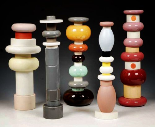
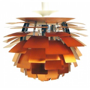
Gherpe – a lamp designed by Superstudio
Gherpe
 (via:http://www.nova68.com/gherpelamp.html)

I think the Gherpe lamp is a relevant design because of several reasons. First of all, the lamp itself is made of materials that are still considered modern, even though it was designed more then forty years ago. That alone already shows how we still hang on to, or maybe are condemned to these materials nowadays. Next to that is the design, which references to the mathematics that appear in Nautilus shells. Then again the way this shape is interpreted is more like a cartoon of it, leaving the classical Nautilus image behind. This way of designing, letting interests and research – the designer was into marine biology – influence the work is something I think many designers work like, or would like to work like. Last reason why I think this is a relevant piece is because I think the whole of Superstudio, their designs and mainly their architecture is, because of their new views and extensive researches, relevant. They were part of a critical wave, commenting on Florence and it’s ancient heritage, on the years of full trust in technology and on architects before them. They wanted designers to be responsible for their creations when they design to make a better world. Their criticality on how design and architecture influences the life of other people and self-reflectiveness is what made them different from many before them. This idealism in theories, but with playfulness towards the designing process itself is to my opinion something important to keep relevant in art and design.

gherpe_01


(via:http://photografieundmehr.com/pics/2012-11/gherpe_01.jpg)
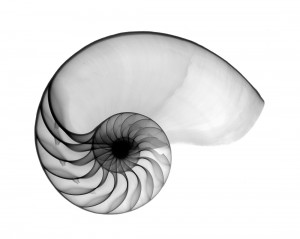
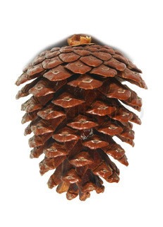
Nautilus-OS

Nautilus shell

(via: http://www.hungrywalrus.com/wp-content/uploads/2011/08/Nautilus-POS.jpg)

To test it’s relevance I’ m trying to get to know what Gherpe is, what it is not and what it could be, what it means to Superstudio and what it means to me.

At a time where popular culture is stealing all the science and logic that Modernism employed to make this world better, with youngsters starting to call themselves Mod.’s, Pop Art commenting on this Modernist reality and society by reproducing imagery from that popular culture, Gherpe is born. It’s designed by Cristiano Toraldo di Francia, and adopted by Superstudio, the Italian architecture group where Toraldo is the most important member of, together with Adolfo Natalini, who is a Pop Art painter when they found the group in 1966.


big_374062_2176_giulia_superstudio3

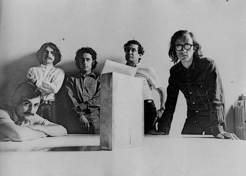
Alessandro Magris, Cristiano Toraldo di Francia, Piero Frassinelli, Roberto Magris, Adolfo Natalini
(via:http://www.domusweb.it/content/dam/domusweb/en/from-the-archive/2012/02/11/superstudio-projects-and-thoughts/big_374062_2176_giulia_superstudio3.jpg)


Where Modernism, in its affirmation of the human power to improve their environment the aid of practical experimentation and science, goes for logic, Gherpe pretty much mocks Modernism, by taking it’s science and it’s new materials to make something that is not in any way useful other than it’s aesthetical purpose. Gherpe is not practical, and it’s not helpful. But Gherpe’s cartoon like ambiguity looks fun, you want to have it, it looks smart even though it isn’t, and that’s exactly in line with popular culture of that day. Gherpes connection with nature is meaningless, but very important for it’s attractiveness. You could say it’s a beauty trick. The interest of Superstudio in nature combined with construction is to be traced back to one of their guides in the Academy of Architecture in Florence, which most members of Superstudio were attending. His name was Leonardo Savioli. As Adolfo Natalini says about Savioli: “Even when the drawings looked like traces of insects or explosions, galaxies, spiderwebs or wounds, they were always able to resemble parts of constructions or something constructable”.


Savioli_plateXVIII

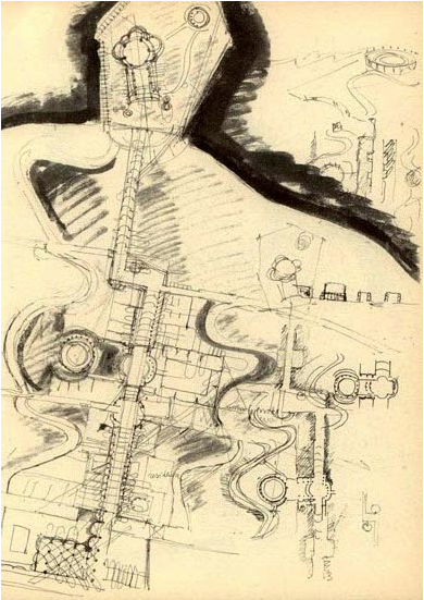
Plate XVIII, a drawing by Savioli

(via:www.etsavega.net/dibex/Savioli_citta-e.htm)


The fact that Gherpe’s reference to nature doesn’t have any symbolism or engagement in it, already shows what things it really has to do with, things like freedom. Gherpe is free from the morals that come with modernism: Superstudio didn’t think architecture could change the world for the better. Gherpe is the joyous realization that the burden of creating something that will add to create paradise on earth is not possible.

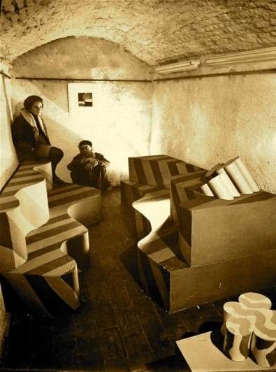
Gherpe was in the Superarchitettura show. This was a show combining two groups. The Superstudio and Archizoom, both from Florence and mainly from the same architecture school. The show took place right after a flood had swallowed a chunk of Florence’s renaissance beauty, at a time where others mourned renaissance architectures birthplace the Superstudio show was a psychedelic experience work that purposely lacked engagement and put consumerism on a pedestal. Their ideal: morals were irrelevant to architecture, and so you should not aim to change the world with it either. So there is a different approach: “Superarchittettura accepts the logic of production and consumption, it utilizes it in an attempt at demystification” and  “Superarchitecture is the architecture of superproduction, of superconsumption, of superinduction of superconsumption, of the supermarket, of the superman, of the super gasoline”.

gherpe-archivio2

Toraldo and Gherpe, and Passiflora
(via:http://www.centrostudipoltronova.it/wp/wp-content/uploads/2014/07/gherpe-archivio2.jpg)

Seeing Gherpe from the eye of the Superarchitecture that it is, means not that Gherpe was meant for a world better than ours, but for the world as it was in 1967, where consumption and production were exploding. You could say, Gherpe is super itself. A lamp fitting for all these phenomena that felt relevant for the younger generation at this time. Instead of denying these phenomena, or wanting to change them, Superstudio designed something that fit in. It might even accelerate superconsumption, be meant for that purpose. In this perspective Gherpe is in a way a neo-futuristic piece, a monument for the speed and mass of its time. You could also see Gherpe as an, perhaps slightly melancholic, attempt at creating something, something touchable and real out of all the superlatives that together form the ungraspable frightening dystopia that was (and is) everyday life. And maybe that this is the reason we enjoy it, because Gherpe is then our comfort, a sign that from superproduction and superconsumption something appreciable can materialize.

superarchitettura-3

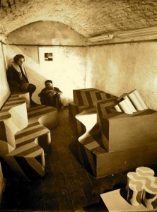
Image of Superarchittettura show
(via:http://www.stylepark.com/en/news/a-landscape-of-mountains-and-valleys-the-design-parade-03-in-hyeres/283330)

Gherpe shows Superstudio’s double nature: it’s serious, socially critical but can also be ironic.  When Superstudio presents an utopian, or dystopian design we can never accept it at face value. When they design a utopia, they explore every possibility into the extreme, and so exploration of the architecture itself is it’s aim. Instead of presenting the possible solutions it tells the stories of the decisions of mankind, the ones it made and might make. A very serious and melancholic subject, reflecting their serious opinions (Adolfo Natalini: “the race of consumerism is definitely wrong”) but enabling playful and smart experimentations.

As Gherpe is an early Superstudio piece, Gherpe is also an early exploration which, as we can see in the Stedelijk, ended in a lamp. As Superstudio kept exploring their ideas became more and more critical of architecture and design, which made their projects end up way less often in actual designs and realizable architecture. Instead they expressed their ideas in movies, models and collages.

According to Superstudio architecture was corrupted to such an extent that even the avant-garde architect was guilty of suppressing human development, since he made use of existing conventions in architecture. An interesting idea, which suggests human development can come from no other place than out of the blue. Where one can ask the question what human development actually is, but let’s get back to Superstudio. They saw reason as the only quality that’s uncorrupted by these conventions. This makes it’s easy to see why they step farther away from architecture and design, as they are easily seen as complete and valid evidence of manifestos or ideas, rather than generally questioning and alienating. That doesn’t mean Superstudio didn’t make anything at all anymore, as you might expect.

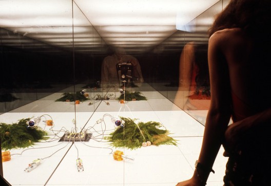
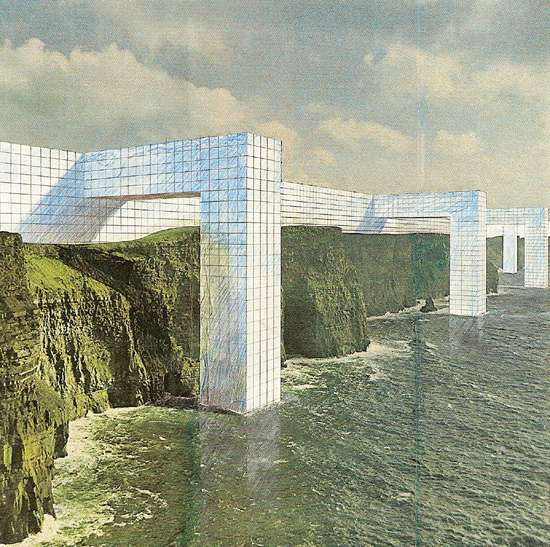
Instead they found ways to visualize what architecture could be, without designing from conventions. Something that wasn’t really architecture. For the exhibition “ Italy: The New Domestic Landscape”  in the MOMA Superstudio made an 8 x 8 black square on the floor, and made it repeat itself in an endless grid by placing mirrors at the walls. They put a box with wires on each corner, making the plugs recur regularly in this “landscape” [x]. It wasn’t the first time they worked with this black grid [x], but it was the first time architecture and design was so completely dismissed that it was actually left out at all. Even though this seems like the ultimate conclusion, there’s more to the ever expanding black grid. In the Continuous Monument, a glass grid-like structure that spans all over the world, visualized in absurd collages [x] where it embraces Manhattan or faces the Taj Mahal, the irony, social critic and dystopia remains: a homogenous unrealizable blank space, but also a space where we can project our own ideas on of what it really is. Our ideas, full of conventions and corruption.

521d003de8e44effd40000a8_environments-and-counter-environments-italy-the-new-domestic-landscape-moma-1972-exhibition_5-528x362

Grid in the Moma: View of Supersurface: An Alternate Model of Life on Earth, by Superstudio, in Italy: The New Domestic Landscape, MoMA, 1972. Photo: Copyright Cristiano Toraldo di Francia.

(via: http://www.archdaily.com/421040/environments-and-counter-environments-italy-the-new-domestic-landscape-moma-1972-exhibition/)

As you understand now, Gherpe too is a piece of corruption. A mash up of conventions and brainwashing, which will, as you look at it, only corrupt and brainwash you more. Which is very true in the sense that, the more you know, the more you are stuck in the things that already are. Whether that really suppresses the development of humanity is questionable. I personally am less negative about the influences of the past and the conventions we get taught. But the fact that Superstudio deals so productively with their frustrations over a system is something everyone, defenitely every art student, can be inspired by.

Over thinking and commenting on how design works is something I find fundamentally important, as I think this self reflection is what can bring us to new insights. Insights that can be reflected on again later, a continuous process I’d say would be human development rather than corruption. But, if you are reading this, and you do happen to find yourself having been corrupted by looking at Gherpe and reading about it, then at least we can be sure about it’s relevance for the (design) world today.


2701091233096716superstudio_monument_1_kl

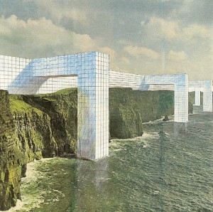
The Continuous Monument, one of the many collages.

(via: http://www.spaceinvading.com/bookmarklet/Images/2701091233096716superstudio_monument_1_kl.jpg)

THE THRILL OF CONFUSION/ POINTY BEAUTY


Monday, September 30, 2013

One piece of the permanent exhibition at the Stedelijk that stimulated some form of internal reaction was ‘Cow Chair’ designed by Niels van Eijk in 1997 for his graduation project at the academy in Eindhoven.

At first glance it appears to be a thick legged kiddie chair with a cow hide pinned onto it, which is nice enough – I remember thinking how well it would go with my new old cowboy boots – however, much to my astonishment, as I drag my feet past the seat to check off the next object to admire that it was obstructing I sneak a peek into the chairs insides, where to my amazement was in fact no such chair supporting the skin! I began to pace from one side to the other, pushing my face as close as I could to the void within without drawing the attention of the eagerly hovering security, reassuring myself that it was truly self-supporting.

Curious, the way that it looks so flexibly drawn around a form, with bunched creases contrasting with the tautness in the extremities yet still feels that if you were to sit on the cloth would fall beneath you like a loose rag. When considering the properties of a hide I had no reason to consider that it was it’s own shape, rather than taking the form of a structure beneath it; after all, isn’t that what skin does? My perception of the design changed completely; a hollow, anorexic skin made rigid by the last moistness of life being drained from it, locked together by savage stitches pulling at the skin as both leathers shrink in opposition.


Rather morbid, really.

As oppose to being a complex object that requires calculated thought to attempt to understand, such as an optical illusion or some form of puzzle, this intense feeling of pure confusion is induced when a seemingly mundane, daily object or situation is not how you automatically assume it to be; so automatically  that you don’t even think about it, that’s what really puts you out of whack. This sensation is one that has fascinated me (or haunted, in some cases) since I can remember. One chair related experience almost brought me to tears, it was such bedlam. On a morning no different to any other I took my usual seat at my dining room table with my tea and toast, but as I slid my chair under the table the top of my thighs brushed against the underside of the wooden table; this never happens! I was simply overwhelmed, I just didn’t know why it had happened. I called to my mother to seek an answer, ‘oh, well it must be because one of the chairs is slightly lower than the others, they must have been switched’; what a cruel trick to play so early in the morning. It was such a minute change that upon reflection such a reaction could easily seem somewhat overdramatic, but in the heat of the moment it truly felt like the world was crumbling around me and the chair.

The experience with the cow chair was less of a painful confusion and more of an intriguing, encapsulating.. confusion.  An object to eradicate all other drifts of thought.  To be noticed above all other things, even if the intention of the design is to be discreet . To create an object capable of such engrossment is surely the target of all designs? I find it so refreshingly satisfying to experience such a concentrated distraction, allowing you to grant all focus to the subject at hand, being lost in thought for something that is really real. After all, how can you think in an unclouded manner when you’re constantly mentally multitasking?

Niels and Miriam, hangin’ out.

Mr. Van Eijk and Miriam van der Lubbe have been partners in design (and in [x] their personal lives) since they graduated from the Sandburg institute, leading them to found their design studio in 1998, which lead to their own label: Usuals. Whilst managing not to come close to making the same thing twice, these two capture Dutch design by collaborating humour with vast imagination and experimental works, ranging from spacial projects to product and furniture design; this creative combination attracted numerous museums and other collaborative design companies such as Droog, and many others.

‘Poodle Chair’ 2002, another example of humorous chairs by VEVDL.

The design was of pure inspirational birth. According to ‘Subjects’, one evening whilst Niels was admiring his shoes he was captured by the way the leather formed so beautifully around the point of the toe he thought ‘if this is possible, it must be possible to make a whole chair this way’. This notion developed my opinion on the design even more so; I like a good lump of leather around my feet and can absolutely empathize with the new found pointy beauty that the chair possesses. Why, I just want to wrap myself up in a crispy point of leather.

Although I am a great enthusiast in the field of pointy-leather-beauty, I can’t help but feel a mild disappointment towards the  lack of confusion in the way the design was conceived; it all seems a little too cosy. Alas, perhaps only few are subjected to the level of intense confusion that taunts me so heavily.

A piece of (furniture)?


Sunday, September 29, 2013


CRI_157986


Table-chair is a furniture made by Richard Hutten. It’s a two-piece furniture consisting of a chair and a table with an almost shy and invisible character. The interesting thing with this piece is that it’s a illusion of a table and a chair. By closer observation I realize that it’s the relation between the two parts that create the visual expression of a table and a chair, and if you separate them, the expression changes and along with it the whole concept of the furniture. The parts are defined by each other as furniture. Presented separately, you might not even recognize it as a specific furniture. Richard Hutten’s works makes me question what actually constitutes a piece of furniture. It also makes me understand what a big role our associations play when we observe our surroundings. The Table-chair automatically lead our thoughts to a table and a chair, not only by name but also trough its execution. It’s interesting how this piece, with its simple and discreet design, can contain our ideas of what a piece of furniture is.


thedish


Perception, function and behavour
A table usually consists of a flat horizontal surface that is held up by a base of one or several supports. The fundamental purpose of the table is to support various objects in order to relate to them; for overview, work, show, storage.

The table is an ultimate tool when eating dinner. It creates conditions for you to perform the activity of eating. The flat surface of the table support the plate and consequently free your hands and makes it possible for you to use the cutlery. By placing the objects on the table, their relation becomes more clear and also their behavior related to the format of the table. A rectangular tabletop requires structure, the objects relates to the straight lines of the edges. When placing my computer on it it’s constantly relate to the lines of the surrounding. I place the laptop in front of me, push it a bit backwards to get enough space for my arms to be supported. The table support my activity with the object.

I place a sheet of paper onto the flat surface of the table, I then place a pen beside, in perfect line with the sheet, unconsciously I move the pen a bit more to the right, I continue moving it back and forth until it feels right. The right balance occurs when all element are taken into account, table, objects and body and even though my actions are based on sense it’s not a coincidence – It’s about being taught how to behave and relate to the table

At first sight the Table-chair of Richard Hutten behaves like any chair and table and therefore I know how to relate to it, but a  closer look makes me doubt. This piece of furniture requires a new approach and for that I must forget my conception of what determines a chair and a table.

OLYMPUS DIGITAL CAMERA

Within the context
I found myself at the Stedelijk, continuing to observe the Table-chair. One thing is clear; Hutten confuses me. And somehow the object makes me feel tricked. Part of Stedelijk’s design collection, the Table-chair stands on a podium among other famous design-items. Its chosen placement puts Hutten’s work within the context of modern design.

It’s clear that the work is dependent on its two phsyical parts, that together create the image of a furniture. Another important component is its ability to create confusion in the viewer. But also, I wonder if the greatness of Hutten’s furniture depends on the context in which it is shown. Perhaps it’s the context of Design that creates the confusion surrounding the object.

As a distinguished person with a recognized position and an important role within the design world, Richard Hutten can certainly play with the main principles of design. For me, it is obvious that he choose to use the design context, with its limitations as well as its possibilies, to raise issues and questions about how our perceptions and behavior are shaped by of our surroundings.

For me, the most interesting aspect of Richard Hutten’s work is the fact  that he makes them as a designer.

Bless you Hutten!

I like Hutten


Thursday, September 26, 2013

tabel chair orange


Both parts are built by straight lines and rectangle forms. So plain and elegant it is easy to walk by. The work contains out of two separate parts that together create an object we recognize as a chair. The Table Chair is manufactured by Droog Design and can be found in different variations. The Table Chair is the exam work of  Richard Hutten when he graduated from the Design academy in Eindhoven.
It takes some time to realize how the different parts work together. My brain process what I see. What is the object and what do I think the object is? Can I try it, Please? How would a dinner party or a meeting work out when using Table Chairs? There is a feeling of being tricked. The designer  have a sharp sense of humor.

Design has always struck me as a contest in elitism, tyring-to-be-smart and commercial profit. The Table Chair’s supposed function is completely unpractical and has no intention to flirt with the viewer. Richard Hutten’s complete lack of compromise with his customers, the material and his own creative process is something I admire. I’m attracted to the Table Chair because of it’s obviousness. Still I haven’t seen anything like it before. The Table Chair is such a conceptual piece that it first makes me laugh and then gets me interested in the designers other works. It makes me see a 40 min long interview with Richard Hutten on YouTube. It makes me consider the DesignLAB program at Rietveld. It makes me visit the store that distribute Richard Hutten‘s other work. It makes me question my own sense of  value. And it makes me like his Facebook page. I like Richard Hutten.

Parkrand Building, Entrence

Parkrand building, seen from east

The Parkrand Surveillance


The ultimate Hutten experience, a journey through Amsterdam
I. Contact
I send an email to Richard Hutten Studio and ask for information about where I can find Huttens works in Amsterdam. Favorably somewhere I can experience the works in any way. While thinking about what to do next I use Huttens own method and start playing around, in Photoshop. I realize how fantastic color combinations you can find and that everybody really do look better in black and white.

II. Action
I have never been west of the Rembrandt park before. On my way to the Parkrand building I notice how the neighborhoods I pass differs to the area I live in. There is much less shops and almost no restaurants. The houses people live in have smaller windows and are not as old as the houses in the Museumkwartier. I recall a sequence in an interview with Richard Hutten where he speaks about cultural and social design. He says that is the only design that interests him. The Parkland-project is a typical example of cultural and social design to improve the reputation and well-being of the suburbs west of Amsterdam. The Parkrand building is an apartment complex where Richard Hutten designed three outdoor rooms: one room for children, one living room and one dinning room. I get to Doctor H. Colijnstraat and start looking for a way in to the outdoor rooms. I can’t get in anywhere. I try to follow a couple of construction workers but then I reach a locked door and see the surveillance cameras.

III. Capital
There is one place in Amsterdam where I know I have a chance to see Richard Hutten design products close up. The droog store near Nieuwmarkt distribute Richard Huttens design and has Richard Hutten design works on display. I recognize three. The Loo Table, a extremly small table with a stick coming up from the center, it keeps toilette paper rolls in place, 59,00 €. The Leaves, small and strong magnets put together with plastic leaves, 29,95 €. The Domoor cup, an oversized childrens cup that make passing tourists to fascinatingly mimic the drinking movement. I realize that it is a rich mans world and pay 10 €.

IV. Use
A black Domoor cup, also known as Dombo, with tea. My father laughs when he sees me. “What is that?!” I explain to him that it is my new cup. He asks me if I like it. I tell him I do.

Playing is the reason The Loo table at Droog Design

How to drink from a Dombo mug


Opposites attracts and influences


Sunday, March 31, 2013

Ettore Sottsass designed this lamp in 1981 for the Memphis Milano Collection and it got its name after the great Indian emperor Ashoka. Fascinated in ancient cultures, he travelled in 1961 to India, which profoundly affected him. However, there is nothing that precisely reminds me of Ashoka in the lamp, neither in colors, form nor material.

Portrait of the emperor Ashoka and an Ashoka temple in India.


With deeper investigation I found out that ashoka translates from Sanskrit into English as “without sorrow”. The emperor Ashoka was revered by many as a leader supporting big changes. After years of rationalism, Sottsass along with Memphis Group were rebels. The style they brought up was seen to be perfectly in tune with the early 80’s post-punk culture, without a doubt a distinction of the often-obscure theories of postmodernists. This brings me to the feeling of Sottsass as a punk, reining the future without sorrow for the past and incorporating art into design.

What further strikes me is the significant playfulness that follows his designs and thinking. A good description of his works is “a shotgun wedding between Bauhaus and Fisher Price”. It shares a common interest with toys such as testing out, trying, building as in children’s mind and color palette.


Fisher-Price advertising and Ettore Sottsass Flavia vases


Duplo lego and Ettore Sottsass Casablanca Sideboard


The name Ettore Sottsass was unknown to me, until some months ago. I was star-struck by his philosophy and work. Coming from Sweden where popular design often is characterized as being very minimal and serious, I was experiencing the complete opposite. It was playful, bold and colorful. He totally distracts me with his colors, what he calls “gas station colors”. Maybe my attention is drawn to the object thanks to the distinct primary color used; there is something pure and genuine about them. To Sottsass these colors are the ones he used as a kid, learning to draw. Freedom and rejection of prejudices is supposed to be a reason why he uses them. There is always an extra effort to be able to combine or even use color. What he expressed in 2007 becomes especially interesting since my wardrobe exclusively consists of black and different shades of gray:

“It’s a shame, but yes, color is still something unpopular. The predominant shades are white, black, beige … I think the reason is that it is just easier. If you go all dressed in black its very easy.”

Sottsass was, besides working solely colorful, well known investigating in combining different materials, from cheap materials such as laminate to richer ones – brass and marble. This creates a conflict for possible new life or at least raises questions about it.


Furthermore, from my point of view, it is important to notice that the lamp (plus almost all of his other works) seems to widen the users’ idea of function in every day life. Instead of taking the obvious and primary functionality of an object for granted, in this case, a source of light, Sottsass deliberately add another dimension into the object. By taking away the familiar he surprises and asks for participation and sensation. He gives the object an aura and hence creates a presence to which I am confronted to and that makes me feel alive. One noteworthy quote from Sottsass is when he explains his view on function:

“All the objects I have designed are ‘functional’. They can always be of use. What matters is that the one who uses them must be able to use them. (…) Everyone has different ‘function’ or necessities. (…) Maybe a young man wants to put his rolls in a container, whereas a young woman wants to put all her books there. I don’t know. There is no generic function. Function is life. I cannot foresee function. The furniture I have designed has always been functional. However, one needs to know what it is for.”

I would define my sentiment regarding Ettore Sottsass’s work as an ‘opposite attraction’. Opposite, because originally, my personality and work do not reflect at first sight his point of view. Attraction, because he has and will inspire me to break up predefined rules, experiment techniques and challenge mentalities in my personal work.


Poul Henningsen The Artichoke 1958


Sunday, March 10, 2013

Poul Henningsens lamps were produced because he thought that the electric light bulbs cast a disturbing light. They where either too bright or the lampshades swallowed all the light because of their design in that time. He wanted a lampshade that sent light into the room with its full strength without blinding you. One of the examples is the The Artichoke which also hangs in the Stedelijk Permanent Design Show. As you can see on the picture he has composed layers of copper plates in the shape of a pine cone (I choose to say a pine cone and not artichoke but I will explain why later) so the light is reflected from the greatest ability and does not dazzle you as there is no direct light from the bulb.

One of the reasons that I chose PH’s lamp is because I know that design from Denmark. It reminds me of my parents living room where a PH5 lamp is hanging over their dining table which is typically seen in many places of Scandinavian homes and institutions.

But what also catched me was the English translation of “Koglen” which from danish should be translated to “The Pine Cone” and not an artichoke. I found it disturbing to break the original concept because I do not associate it with being something Danish or Nordic. I can understand that the artichoke as a vegetable visually have something in common with the lamp as the leaves of the artichoke could compare to its division into the different copper plates.

But as a fact he build his design out from a pine cone and that is what makes me wonder why it is suddenly being an artichoke. Also because the copper is an obvious association to the brown color of a pine cone.
It is not because I am a bitter nationalist that finally get the chance to publish a letter to the editor about how danish design is being misunderstood but I am really surprised about the translation and I’m thinking it is the same as if the chair “The Swan” by Arne Jacobsen was translated into “The flamingo” to get people from outside Scandinavia able to identify them self with the design.


Log in
subscribe