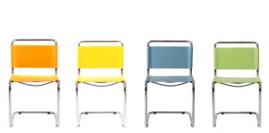
What first stroke me about those two chairs is how similar they look.
I thought they were made by the same designer. It’s funny because at first I was attracted by the colour of Mart Stam’s chair. Yellow is for me the colour, of happiness and brightness. I also thought that it was very modern and appealing in it’s shape and colour. I then saw that they were made in the 1930’s which surprised me because I believe they haven’t done anything so modern ever since.
Obviously throughout the last century we have discovered a lot of what arts have to offer and gone deeper and deeper in to the meaning of it. Just as Gaston Eysselinck’s did with his chair, pushing simplicity and minimalism to it’s most extreme point and aspect. I believe this is why Gaston’s chair is much more depressing sad even then the one of Mart Stam, because he has pushed the concept just a little bit too far.
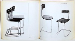
The other aspect is that, they did it one year a part from each other but seemed to have had no kind of link what so ever, it means that in a way they had the same intention and were inspired more or less by the same idea. Both countries were at the verge of something new because of economical, social and political changes.
Gaston Esseyelinck Typist chair is way more simplistic and sad in a way, and maybe more to me I guess this is because of its wooden colour which brought me back to my teen years when I was send to an all girl catholic boarding school, where we had wooden bench as chair’s in our classes. Gaston Eysselinck’s rigid design reminds me of that a lot. They are not a very cheerful memory, so I might not be objective about it but as a involved spectator I can’t really be objective because of all these emotions that are brought in me be the design piece and this what it is meant to do. In that point of view Gaston Eysselinck’s chair worked on me by bringing back emotions even if they weren’t cheerful ones.
I believe the difference, is also the approach to the product of design it self. Mart Stam’s chair was meant to be sold for the mass so the idea of quantity enclosed in the design was appealing to that mass. Gaston Eysselinck, only
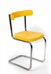
managed to make this one and didn’t manage to commercialize it. I believe he pushed his idea a little bit to far in the simplistic way, in wanting it to be to much avant-garde maybe to functional in the construction and lost himself in the process, or maybe just by being raised in Belgium in a Protestant society which obvious influenced him.
The exhibition itself didn’t interest me so much probably because it was so organized and most of the objects were not well presented in my point of view but when I saw those two chairs, even if Gaston’s one didn’t cut my breath, they were standing out in the crowd. Until a few days ago I could not say why but it’s because they aren’t just chair they are like architectures which makes sense as both designers were architects. The forms and shapes are very simplistic but very researched well thought.
Beautifully, according to me they are simply beautiful; “less is more” is a concept I completely agree with. And which applies here in its entire complexity, it is because those chairs are so simple, that they are so modern, triggering in me those emotions.
Mart Stam manage to create a chair that is still today a reference to any designer or architect that wants to create a chair.
He didn’t just create a chair. He developed an idea that brought out a lot of the new ideas at that time, but in 1930 proving that it could be simple and beautiful, was an achievement and innovative.
If you go to Ikea or any department store today you will find many chairs that will be in a way coping those chairs. This is why it is such an invention because we are still using it as a reference without even realizing it.
