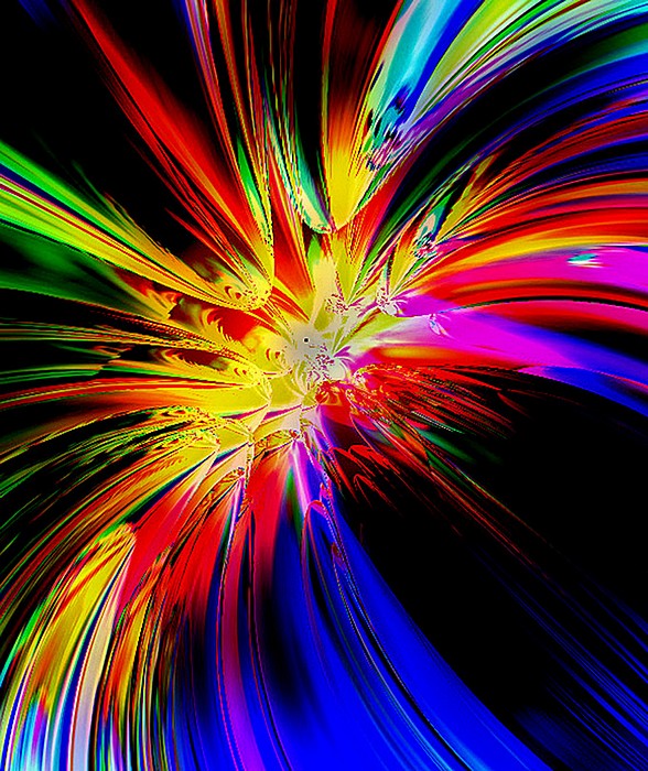
Skip to Content Skip to Search Go to Top Navigation Go to Side Menu


"colors" Tag


”Farbenkugel ”


Monday, February 3, 2014

Schermata 2014-02-06 a 22.57.12

Colors //

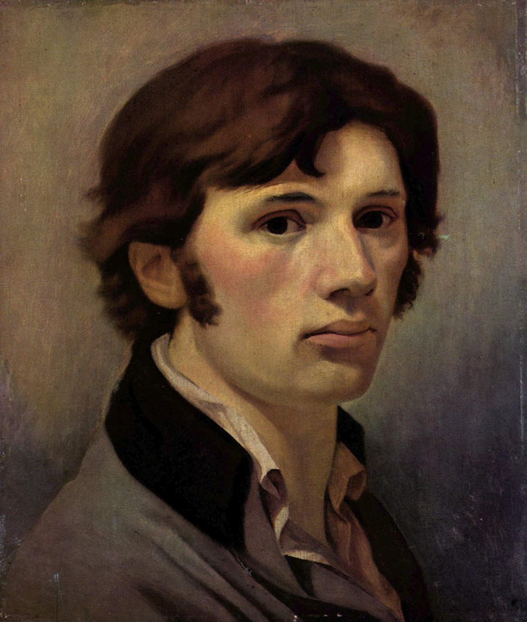
Philipp Otto Runge, born the 23 july 1777, died the 2 December 1810, he was a German Romantic Painter, friend of Goethe (that wrote a ”brick” book about colors; ”Theory of Colours”) in short, they shared the same interests. Runge dedicate his life on accurate, almost ”scientific”, drawings, painting and he dedicate him self on the studies of colours and creating a colours system.

For him there are three colors (blue, yellow and red) what he wanted to do is create the complete kind of colors resulting from the mixing of them, among them self and black and white. The result is a  sphere illustration similar to planet earth with two poles of black and white and colors are mixing each others in all direction and depth. The easy way to visualize his idea I think is to imagine it as a three-dimensional sphere that you can as well dissect (like an apple) and inside discover colors mixing among each other.

527px-Runge_Farbenkugel

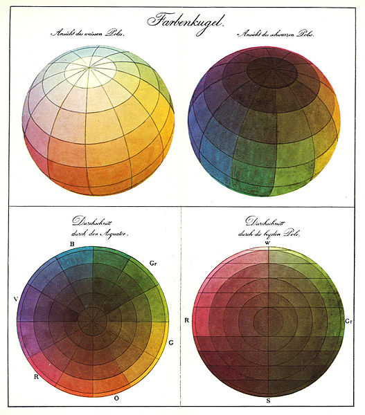
What I appreciate on the ”Farbenkugel” is his ambition on creating a complete illustration of the relation between colors, and the obvious benefit that you can have from it.

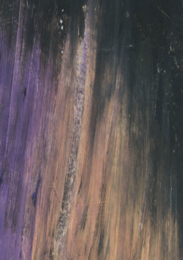
With the fact that he is a painter you can see that his colour studies influenced the way he is handling colours (x;x) in his paintings that make me interested on choosing some of his paintings, simplify them and select some colours with the use of pastels, than be playful and let the process lead me to create something.
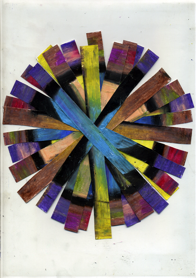
illustrazione-copy Philipp_Otto_Runge_005


The process//

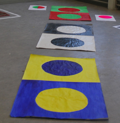
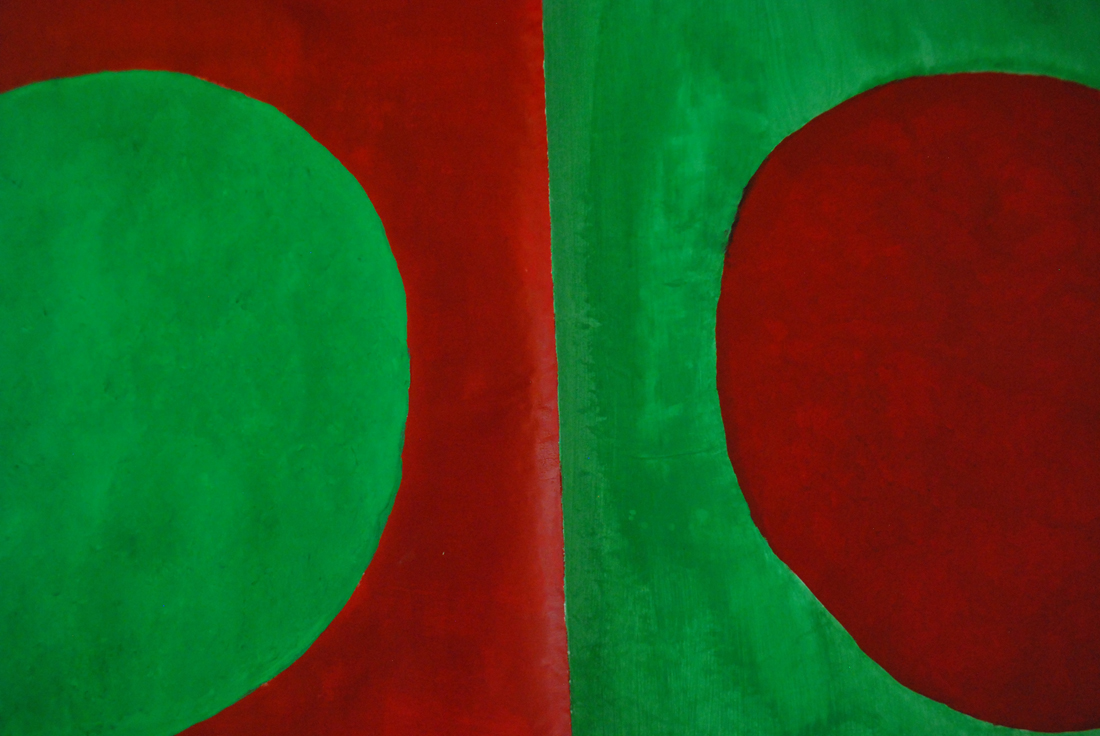
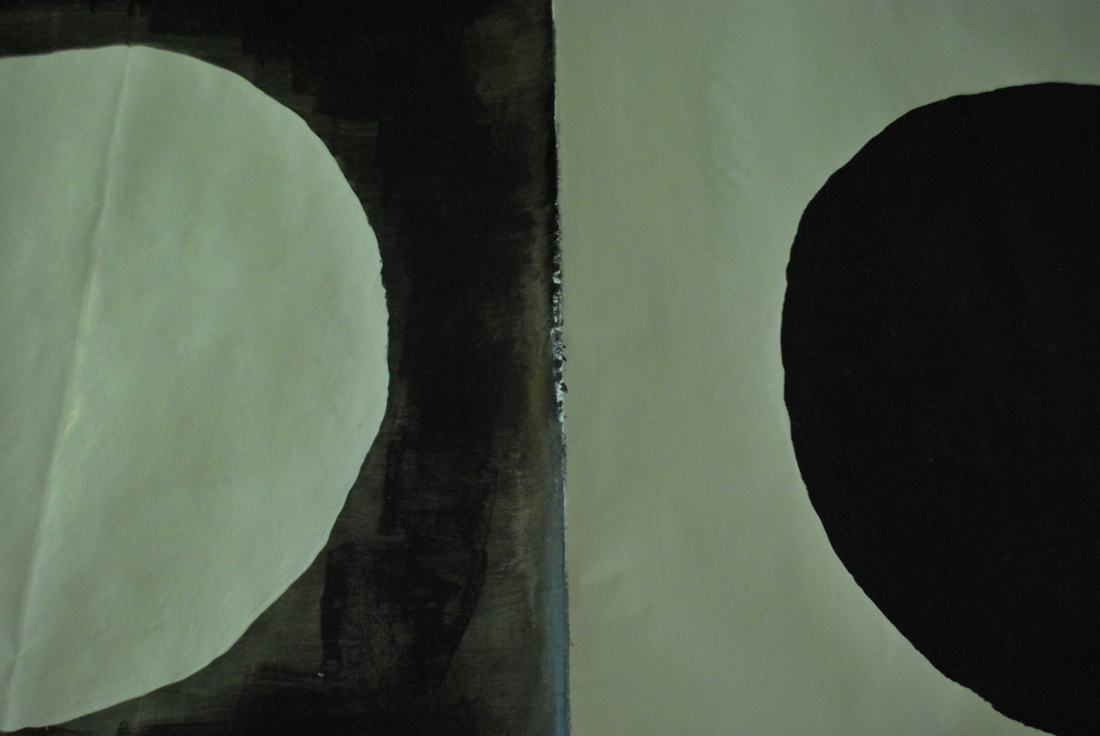
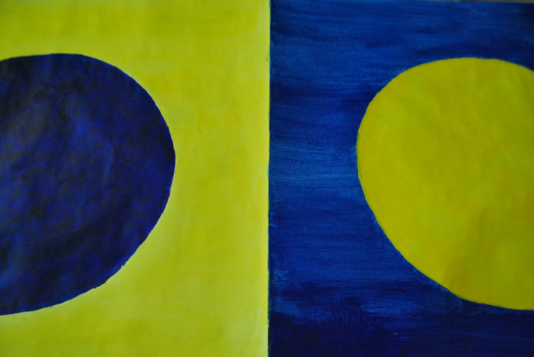
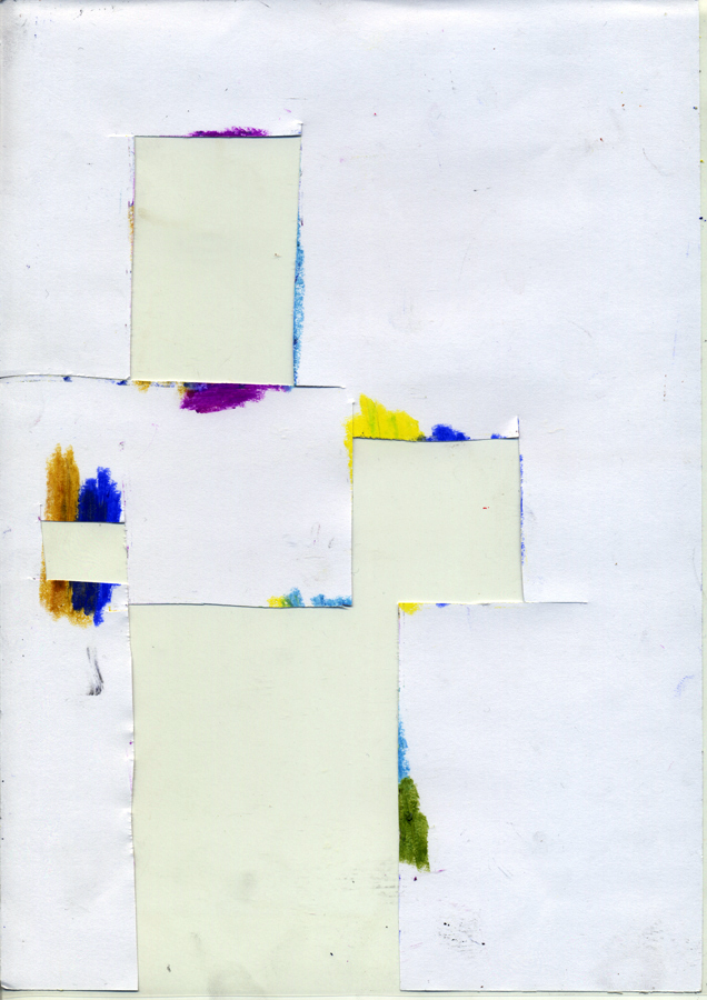
First of all I selected some of his paintings and then I made some abstractions based on the similar color that you can see in his works, then I cut out parts, square and lines of the abstractions. Build forms and experiment and play around with them.

An interesting point of the “Farbenkugel”, if I´m not wrong, is that in the center of the sphere, or rather the core, all the colors are mixed and give black, I decide to pick a gray because of adding some white from the upper pole of the color sphere:

1903285_10151905931406314_1697678139_n

Actually, the more I was experimenting and trying out, the more I was getting insecure and confused.
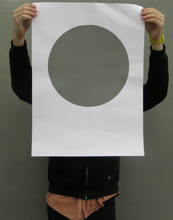
Finally I decided to focus on the square selection and zoom/ abstraction of his painting.

Prova2-15_redu A2pastel

Prova2-9_reduprovaA2_redu

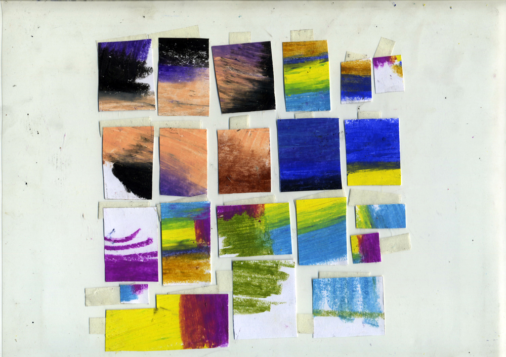
So I selected some of the more or less 5 x 6 cm cut outs, scanned them and printed them in A3. But then I still didn’t know what to do with them.

I questioned myself what should I do? So i pick up the camera and start filming but….

I was getting more lost and far from the original idea.

Whit this color system I must say that I learned to not underestimate or doubt the first idea, but go for it and finish it.
So this is a video clip showing the concept of extraction of colors on the first idea that I had, and if I followed correctly maybe I had some more image exemples…

Get the Flash Player to see this content.

The On-Colour-Project


Friday, January 25, 2013

No better way to welcome the students back on the academy after their X-mass holidays. With the end-years fireworks still in mind our color circles accentuated the snowy white carpet of this wintery month

Thanks to the excellent cooperation of the Silkscreen department, printing and routinely sticking the posters to the billboard, so we could enjoy the colorful results of one of the Foundation year’s student latest projects.

These circles were part of a project initiated bij Henk Groenendijk and Matthias Kreuzer as a cooperation between the Design and Design Research classes.
An amount of randomly selected color-sytems were distributed among the student after which they researched substantive backgrounds and the possibilities to base a work on that. The objectivity of science (subjective as the sometimes seemed) was used as an impartial starting point. Parallel to that process a color was determined representing the project or an element of the research. This monochrome color was printed in small print run using silkscreen printing technique. Interaction between research and the creative process is documented on Designblog under the “On-Colour-Project” project

For the Open-Day Hansje van Ooijen (chair) composed here own subjective variant, as a backdrop for the Foundation Year’s Open-Day meeting place.

Researchers / editors: Group B students
Initiators / guides: Matthias Kreutzer and Henk Groenendijk
printing / posting: Harmen Liemburg and Kees Maas

Color Opposition


Thursday, January 24, 2013


What I understand about Ewald Hering is not a vast amount, it’s pretty narrow. I’m no Physiologist as he was but I will try to elaborate on his theory of Color Opponency, which is the idea that the receptors in our eye that make seeing colors possible are capable of taking in two colors at a time and that to each color there is a reaction. When looking at the two colors at the same time, or next to each other, it has contradictory experiences. This creates a kind of optical illusion where the colors seem to glow. Just like when you look at a black dot on a white background then look away you keep seeing the glow of the dot you stared at. This is that same glow. There are many optical illusions that use this formula.

The opposing colors he was talking about were Blue to Yellow (and vice versa), Green to Red and Black to White.
Anytime these colors are put up next to each other, without any intervening colors, it becomes difficult to look precisely at the border between them.

I understood why this combination of two opposing colors creates this illusion.
So my plan was to combine the colors and create an illusion that had its effect within the colors.
First I started with little prototypes with examples of existing optical illusions, but with the opposing colors, since I had discovered that Hering himself had created an optical illusion, namely the Hering Illusion.

Goodness gracious, is there anything Mr. Hering didn't do?

I found two other optical illusions that were of almost the same design as that of Hering’s and combined the colors with the design of the illusions.

It was too distracting, the optical illusions, so I removed these and tried a simple design; a red square within a green background and the opposite of that; a red background with a green square in the middle.
It felt more honest to the colors, rather than taking something that was already meant as an optical illusion and decorating it, so to say.

I liked the prototypes but they were, after all, prototypes.
So I set off to make three big paintings with a color combination of two each just like the ones I had made before.
The optical illusion worked, halfway through the second one, blue and yellow, I had to wear my sunglasses because I started to get a massive headache.

It was funny how the color scheme, blue & yellow, green & blue and white & black are usually set up together. I finally understood why; it was this subliminal optic effect which makes you either love it or hate it.

Not only that, this might be the very reason some people hate Christmas. Eureka!

I had to pat myself on the back for that one.

What I’m interested in researching further after this project is to see which secondary colors have this same effect with each other.
However I don’t want to limit my research to painting, I want to check if the same rule applies with objects in backgrounds with opposing colors.
I’ll try this with myself wearing a red t-shirt and standing in front of a green wall. The opposite as well, green shirt to a red wall. This I’ll do with all the color combinations and if my calculations are correct I should be able to blind you when you see me.

I started noticing that this same optical illusion not only works with these colors, but that it happens with other ones as well. Colors like purple in combination to green, for example, has a similar effect. However I don’t have the specific formulas to the secondary colors, so I won’t elaborate.

As an ending to the Ewald Hering project we silk screened one color each in reflection to our color theory. I chose the brightest neon pink I could find

(Thank God for Magenta, am I right?)


Song Through 21st Century Eyes


Thursday, September 9, 2010

I have to admit, that this was the first time I’ve heard of Irma Boom, although I have already seen a few of the books she has designed before.

Her way of thinking and working has always seemed to me kinda normal/typical for a good graphic designer – passionate, curious, perfectionist and stubborn.

Chinese brush set of 3

I have chosen the Song book, because it seemed to me like an example of a well designed book. What I liked the most about the book is, that  (like Irma says in the description) the colors of the  pages are based on traditional Chinese color schemes. This detail made the book special/different than a normal book/ to me. It is something I don’t understand. I don’t know about those color schemes, but this made me want to know more.

At first, what caught my eye was the red silk foldable chinese box covered with red silk from the outside, bright pink inside.  The book is about two different chinese ceramics styles – that’s why it’s all white, with a blind-stamped vase on the matte porcelain looking cover. The pages paper is yellowish, about 90gr thick, makes a feel of silk again. I can clearly see, how the paper color works together with the print. It feels exactly like it should- expensive and exclusive. Most of the book’s contents are images, but the text is written in both english and chinese.

foldable_box_book

ScreAming bOOk


Wednesday, November 11, 2009

I noticed that all the books I took off the shelf, to look at, had strong expressive images on the spine of the covers. My eye caught a blue Pinocchio that was on a black and white background, also the white title was complementing the spine of this book. The black and white background had been drawn with a pencil and the Pinocchio was well painted with either paint or fabricated on the computer. It combined the “sketch” fase together with the “endproduct”. I though it gave me a good idea about the content of this book, just by looking at its spine. When I took the book off the shelve to look at it, the cover was fabulously bright with colors. I chose this book because it was screaming so loud that it practically jumped off the shelve into my hands, so I felt I HAD to take it.

Rietveld Academy Library No. 799.4


Log in
subscribe