Step 0 | Question: What is beauty?
What is beauty? How can it be defined?
It could be an obscure question which does not have a clear answer. A topic of my first art theory class of this semester was just about it. The first chapter in Cynthia Freeland’s book, Art Theory: A Very Short Introduction was used and it also referred to aesthetic judgement of Kant. It has never been a simple subject for me, since there would be an enormous space to argue.
But a couple of months later, I happened to think of what is called “style” might have its own clear answer.
This idea made me feel a little bit better.
Step 1 | Dutch style aquarium has appeared as unknown territory
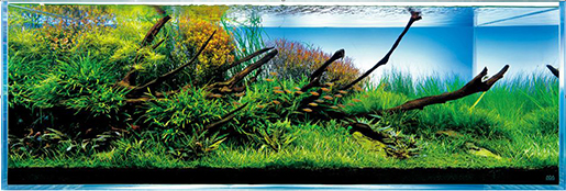
Work by Takashi Amano, the founder of the style “Nature aquarium”
When I got an assignment named “exploring unknown territory” in design class, I never thought about such a thing. As I need to meet a professional who inspired me to go in his/her context, I was simply looking for someone who I can contact in the Netherlands. In my mind, a specific genre of aquarium, Dutch style aquarium, came earlier than an idea of who to choose.
It is because an aquarium making was my hobby which I got interested in, few years ago in Japan. This aquarium is specifically called “Nature aquarium” in which you can create an “aquascape” resembling nature landscape by putting growing aquatic plants, stones, wood and little creatures like tropical fishes or shrimps in your tank.
Unfortunately I had to leave mine in Japan when I moved to Amsterdam, but I still had a little expectation that I would see a different type of aquarium. I had already heard the word of “Dutch style aquarium” even in Japan. Now is it time to explore it here, in the Netherlands?
Step 2 | The Answer from Dutch style aquarium
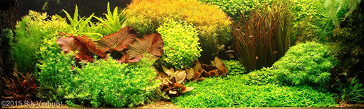
A work from category of Dutch aquascape in AGA contest 2015
There are two kinds of major styles of aquascaping. One is called Nature aquarium in which I had been interested since before, and the other is called Dutch style aquarium, the oldest style becoming popular during the 1930s in the Netherlands. The former has become the global mainstream since being established in Japan in early 1990s, but actually it came after the latter.
To know more about the Dutch style I tried to meet one of judges for a category of Dutch aquascape of the international aquascaping contest. Unfortunately it was not realized. Instead, I still could get a lot of information on the internet.
Though the most simple feature of the Dutch style is nonuse of hardscape material like stones or wood, the most interesting finding for me was the very detailed rules. It is very much specific.
It requires;
– well grown and defined grouping plants
– a small space between the groups
– clearly different height between the groups
– more than 3 plant species per foot (foreground / middle / background)
– terracing to convey depth
– rich contrasts (made by color variation, leaf height, texture)
– a focal point (emphasized by a red or large plant / by the effective use of the “Rule of Thirds” / only one focal point in tanks 36” or less)
– more than 70% of the floor planted
– imaginary streets / pathways of plant
etc…
You would also find that contest’s judgments are always given from an objective viewpoint, if a work fulfills the criteria mentioned above or not.
In my mind, these were immediately connected to the question, how aesthetics can be judged, which was discussed in the theory class before. If the guidelines of aesthetic, could be applied to even other things?
Then, I decided to try to make “beautiful” compositions by appropriating these criteria for totally different things.
Step 3 | Then, what can the criteria fit?
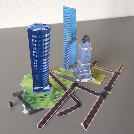
The first cutout with images from “SimCity” app
It was not easy to choose the objects for the composition.
I think I was caught too much by the idea of choosing a specific motif, which needs arrangements as well as aquascapes do. What came in my mind, for example, was still life painting, architecture or city planning. I actually have tried to make some 3D collages with these motives.
After some struggle, my idea eventually reached autonomous graphic compositions without any motives. It would be interesting to use things without any restriction, than to focus on a specific objects, since it has more expandability. What is more, I could not imagine the result and it simply made me curious.
How much universal could this criteria become? I wanted to make some studies to examine it.
Step 4 | Interpretation of aquascape language
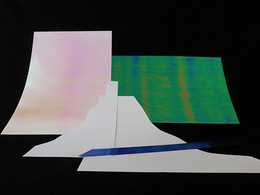
To go on with this experiment, I deliberately applied some points mentioned below to my practices, choosing from many.
– Contrast by colors
the use of color highlights
black and white, green and red, positive and negative…
– Contrast by textures
fluffy, flat, glossy, mat…
photo prints showing different textures
– Contrast by shapes
curvy and strait, circles and angles
same shapes but in different size and height
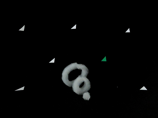
– Focal point
A focal point provided by the use of above techniques
Application of the rule of thirds
– Imaginary pathways
Emphasis of the perspective
In addition to these rules, I found that aquariums are something in-between of 3D and 2D. I mean, it is actually three dimensional but the layouts are always considered from a fixed viewpoint. Traditionally tanks show only the front side and the other sides are totally covered. Photography always had an important role in showing it also. I put a camera in a position where I started to make each layout.
Step 5 | A result
In this experiment, I had already found that the goal of this project would not be to make an finished image but to try a lot of compositions as studies. What kind of results can I get from this? Is it “beautiful”? These kinds of tryouts are not completed in short time but should be just a starting point of pursuits.
Will it still continue?