I saw this little guy in the library and decided to pick it up.
The first thing that caught my eye was the vibrant neon back cover of the book. It fascinated me to see something so small yell out for attention in such a violent way, almost as if it was a small Chihuahua, barking at the slightest suggestion of danger.
Having fallen for this Chihuahua’s barking, I picked it up and flipped it around, expecting it to yell as loudly as its backside did. However, I was pleasantly surprised. The front of the book showcased a multicolored illustration, displaying repetitive shapes reminiscent of a futuristic painting by Russolo. The stacked curved shapes and the black space beside them caused the illustration to look spacious, as if I was looking through a window into an unknown dimension.
The use of color was quite dimmed, though, which exaggerated the contrast between the front and the back cover. However, there wasn’t a disharmony between the two, due to similar colors being present in the illustration and the neon green corners cutting off the edges of the illustration.
Opening the book was kind of a let-down, I was expecting something as vibrant and thrilling as the cover, but the inside just looked like an ordinary book to me. I guess you really can’t judge a book by its cover! However, I’m sure the content of the book is equally as thrilling as it’s cover.
Regardless of the content, I’m still happy that I chose this book.
I decided to investigate the design a bit more in depth. On the bottom of the back cover, I found the name of the designer; Erik Carter.
With a quick Google search of the name, I found the following information on his website.
Carter is an art director and graphic designer based in California. He’s worked as a senior designer at MTV, an art director at Google and The New York Times. In a brief list of his big clients I found the name Verso Books, which is the publisher of the book I chose in the library. This gave me hope that I’d be able to find a lot of information about my little Chihuahua.
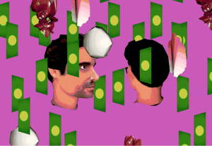
A still image from an animation Erik Carter did for BuzzFeed
Upon reading that Erik Carter worked as a designer of on-air animations for MTV, I was brought back to the afternoons in my teenage years I’d spent mindlessly watching television. A strong memory that stuck with me from those afternoons were the flashy intense animations MTV would present before and after a commercial break. I always found those animations incredibly confusing and interesting, and I’d wonder who came up with these wacky designs. This unexpected link to a memory from the past gives me the impression that I was somehow destined to find this book and research it.
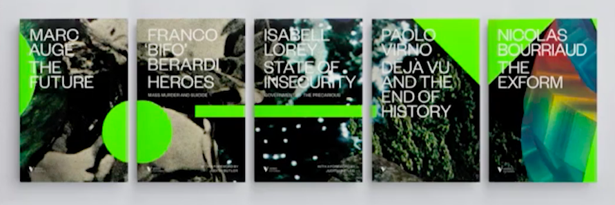
I started reading articles and listening to interviews with Erik Carter, hoping to find some information about my precious little book. And then, in an interview with the “Type Directors Club” I found what I was looking for. Turns out that my book was part of a five part book series that Verso books commissioned Carter to design covers for. The covers form one continuing image when put next to each other. My book is the last book in the series, the youngest of its siblings.
In the interview, Erik Carter talked about the process of creating the covers in collaboration with the publisher. Turns out it was quite a stressful process, with many rejected ideas in the short time frame of only three weeks. Many designs he presented were found to be too busy. This eventually led him to the final design, which, while still having an energetic design, still reads as calm and somewhat minimalist.
A nice detail to the design was the story behind the background. What seemed like a mysterious space-scape to me, was actually part of a collage Carter made of advertisements he found in Playboy magazine. He explained that part of the background was actually just a distorted image of ice cubes. Knowing this, the book and its design gained an element of playfulness to me.
So here I am, knowing what I know now about this (ex-)stranger in front of me, feeling like I’ve learned its entire life-story, no secrets left to uncover. Of course this is completely untrue, since I haven’t read a single word of the book’s content.
I know the book now as a designed object, not as a bearer of information. I can’t help but feel like the book has more of an autonomous identity to me now, than if I had only read its content, even though I only looked at its cover.
Nicolas Bourriaud: The Exform. design by Åbäke, Rietveld library number: 700.6 bour 4


