Skip to Content Skip to Search Go to Top Navigation Go to Side Menu


"typefaces" Tag


Syndicate of original and contemporary typography


Thursday, October 23, 2014

Typeface_as_Program_00

Typeface as Program: Applied Research and Development in Typography
Designed by David Keshavjee and Julien Tavelli


The book “Typeface as Program” is a book about the graduation project of David Keshavjee and Julien Tavelli. They graduated at the ECAL/University of Art and Design [x] in Lausanne, Switserland.
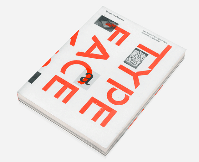
The first thing you will notice when you see this book is, of course, the cover. As seen in the picture, this cover contains the colours red, white and black. I think this, and the typeface on the cover appealed to me the most at first sight. It also seems like a book that makes you move closer, because you see the cover but you cannot read at first side what is written on the cover, because it’s vertical. You also do not yet really understand what it is about and what you will find inside. As the title is situated very small in the left corner, it draws you come closer. When you read it, Typeface as Program, more questions pop up. What is this book about? Why did they situated the words like this?


When you open the book you’ll see a very outstanding orange colour which I really like.

front page

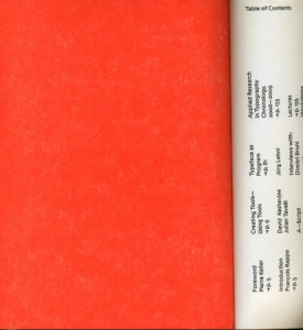
Next you will see the table of contents and introduction. What I don’t really like about that is that it’s vertical written, so you have to turn the book which is not very practical. It does look nice.

What I already mentioned in the beginning, is the typeface. If you actually start to read this book you’ll find out the whole book is about this typeface and how they developed and produced it.


spread_CreatingTools
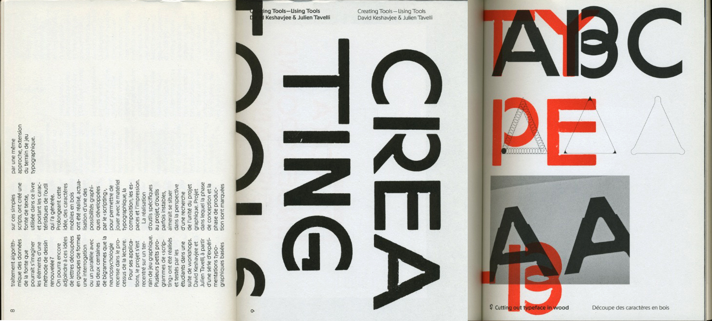
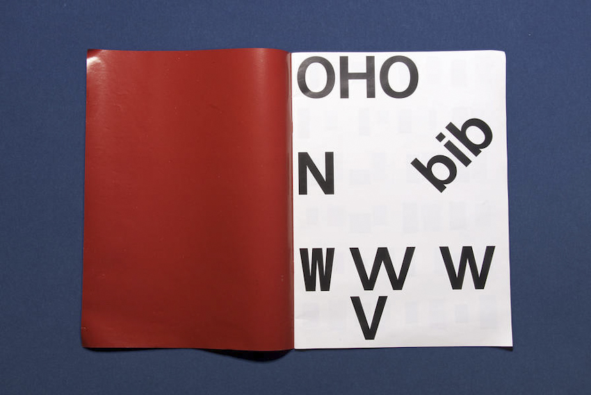
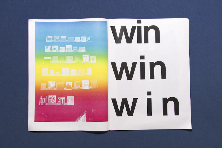
A view into the book about their graduation project


The size is a little bit smaller then A4-size, which I also like because it fits easily into my bag, and A4 mostly doesn’t. The cover is soft but not too soft. The size and the material makes the book approachable because it is not too big and heavy to open it.

The book is representing the graduation project of Keshavjee and Tavelli collaborated by other people. The project “Creating tools, Using tools” earned Keshavjee and Tavelli the Federal Design Grant in 2009 [x]. This project is realised by several steps. They decided to develop their own tools. First they programmed a script that could automatically generate character sets based on a group of specified variables. Then, with the digital font they created, they made wood types and an automatic layout tool.


maximage6Maximage-1
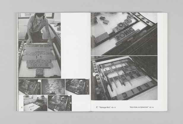
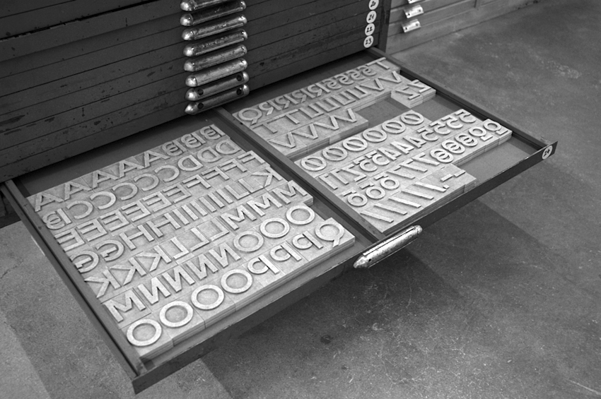
Pictures of the handmade woodcuts they made for their typeface


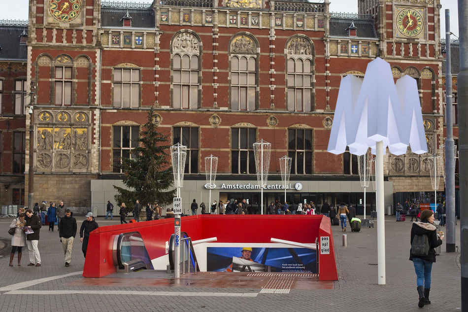
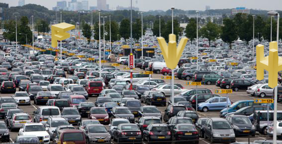
By combining these tools, they printed the posters seen in the beginning of the book. Using a digital font and manual wood types, they wanted to contrast different kinds of typographic languages.
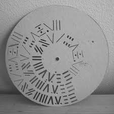
In the result you can see the programmed randomness. Their type design is impossible to regenerate with either only traditional- or digital methods. The typeface was based on the idea that the, let’s call it, “DNA” was only containing the letters “o” and “n”, and from those two letters on they built the complete Latin alphabet.


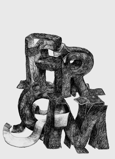
The typeface is called “Programme”. Primitiv is the first version, which was automatically generated. Its very light, almost like a sketch with a skeletal structure. Later they made more calligraphic cuts. In the typeface it’s possible to see marks made by pen, brushes or computer. The typeface looks, even though its automatically generated, almost like an old typeface.


programmae1 programmae
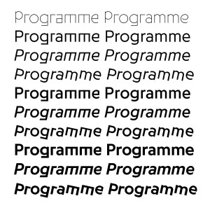
Programme, 2009, Keshavjee&Tavelli’s typeface they made as a graduation project


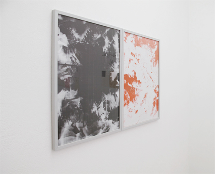
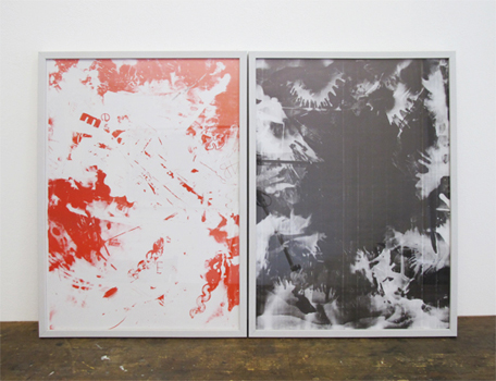
After their graduation project they, of course, didn’t sit still. They continued a lot to work in an experimental way combining different tools and using them in a twisted way, to try to reach an innovating and interesting effect. Seen in the catalog “Acid Test”, their first experiments with chemical products.


Maximage-AcidTest-cover Maximage-AcidTest-spread

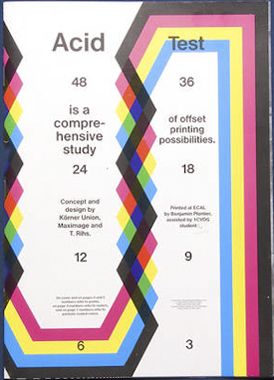
Acid Test, 2010, in collaboration with Tatiana Rihs and Körner Union


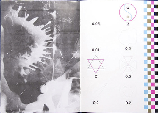
In this book, they tried to work completely manual, without computer but with for example tape, razor blades, acids or brushes. They were trying to understand better how colours on colours overlay and how chemicals would react on other material. “Les impressionists Magiques” is a final product of the best outcomes they got by using these new tools, shapes and gestures. They try to see the good also in “mistakes” and unexpected surprises. It marks their work. They push tools to their boundaries and use them in a wrong/different way to get new results.


maximage2 maximage3
Maximage Formula Guide, 2011


They made several more catalogs, booklets, posters for festivals and record covers. Also, they work a lot in collaboration with other artists. Their latest is “The Most Beautiful Swiss Books of the year 2013”. Again they combined new methods, for example all the parameters in the book are changing all the time. Furthermore are some pages glossy and some aren’t. I think this is an innovating view on typography to use subtle and original gestures. They also used different screening types. This all comes out in a book full of varieties [x].


Katalog-cover Katalog-2013_Content
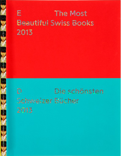
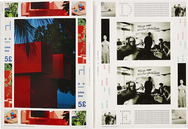
The most beautiful Swiss Books, 2013


plaat1plaat3plaat5 plaat2plaat 4

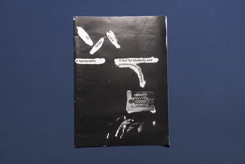
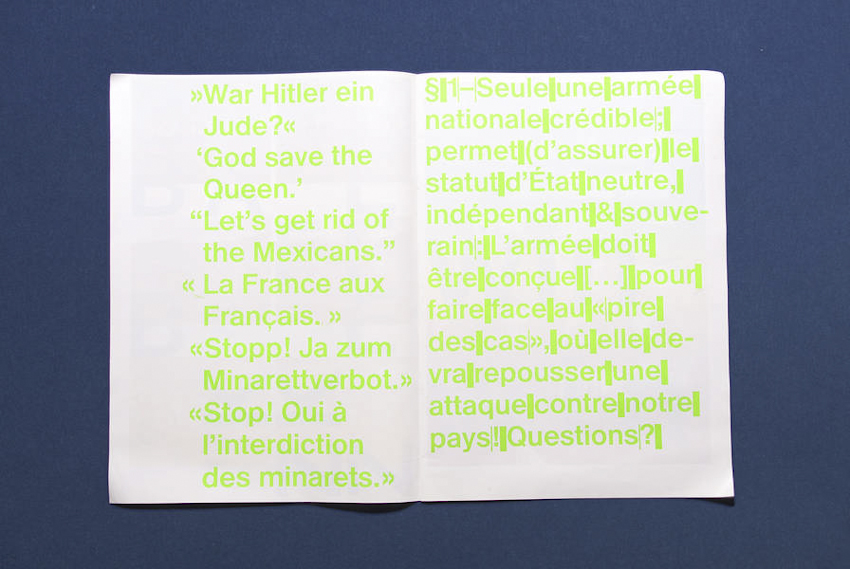
La Grida Loca (2010) is a short booklet for graphic design students. It is about common mistakes and solutions for graphic designers and it also contains designer tips — in collaboration with Körner Union.


ohne titel1
ohne titel2
Untitled, in collaboration with Körner Union and Tatiana Rihs

Rietveld library catalog no : 757.3 kel1


4D typography in public spaces


Sunday, October 28, 2012

My first contact with 4D typeface was in Casco at Utrecht. The 4D typeface was from Herman Damen and it intrigued me and left some questions behind. After i dived in the subject I found the typeface of Lo Siento. The beautiful designs are however not really used in the public space and not well known by the public’ because of that. Why? Are the 4D typeface not useful in public spaces or are they just not clear enough? In this research I will analyse which kind of way 4D typeface can be an extra supplement in public spaces.

Plan of the research
To find out why 4D typeface it not that much seen in the public spaces I will ask some different questions to help myself in this research.
-what kind of 4D typefaces are already present in public spaces?
-what do people think about 4D typeface? Is it well known?

Examples of 4D typeface in public spaces.
When we think about some known examples of typeface in public space we soon think about logo’s or indication of places (for example in public transport). It’s impossible to miss it on the highway: the Mc Donalds indication. Maybe that’s a part of the success of the logo next to the road; it is recognizable and readable from two directions. But is it also a 4D typeface? The definition of 4D typography: “4D Typography is the result of intersectioning, in an orthogonal way in space, two extrusions of the same character, which allows the spectator to read it from, minimum, two different positions in space.” (Lo Siento, 2012) that means that the Mc Donalds indication next to the road (what is readable from both sides) is a 4D typeface. But of course when the Mc Donalds logo is placed on a wall of a restaurant, this is not the case.
A second example of 4D typeface in public spaces is a place indication, for example a subway. In the Netherlands you see this a lot in the form of a cube with the letter ‘M’ printed on every side. The indication sign is readable from more perspectives (at least four). But… here starts the question: is it allowed to call this a 4D typeface when it is a cube with a printed letter on each side? When you ask me, it isn’t because the indication (the cube itself ) is not a character.


To define that 4D typeface will fit in public space, the opinion of the pubic on these places is important. To find out these opinions I went to Schiphol airport, the library in Middelburg and the railway station Rotterdam Central. Prominent is that a big part of the respondents (above 90%) never heard about 4D typeface. When I showed the 4D typeface of Lo Siento, there were not many people who recognized this way of typography. Of course they did when I showed them a picture of the indication of Mc Donalds. When I asked them about their opinion, a lot of people reacted really positive. Over all they thought that it is a really attractive supplement in public spaces. Eva: “For me it is really appealing. 4D typeface could give the usual (mostly boring) indications a new life.” Next to all these positive reactions there were also some negative points, mostly about the readability. Richard: “This way of designing is much better, nice! But I think it’s not always possible to use 4D typeface. The character ‘R’ is a difficult one, they should be careful with that.”

Ways to put 4D typeface in public spaces
In this research I couldn’t find many examples of 4D typeface, especially not in the public spaces. But the people I interviewed where really positive about it. I think (and the respondents also did) that 4D typeface could be a new supplement in the public spaces. I will give you some examples how we could do it. I hope that this way of typeface will pick up fast in the public spaces. For me this is a big discovery in the typeface.


Karl Nawrot, fascination for the In-Between


Monday, March 7, 2011

Typefaces always seem to be facing the wind, two feet on the sheet of paper, unmovable. Like a silent army, arranged according to there ranking, there are ready to take a new formation. This traditional and almost absolute arrangement tends to make us forget how those typefaces got there, what is there personal journey, what and even who shaped them like that.

Karl Nawrot seems to be privileging this particular journey i am talking about. So to say, his typefaces carriers are far from being all traced beforehand. Moreover, he seems to be having even more fun in creating devices and means to form those letters than in the final presentation.

By using tools he creates himself, he lets the door ajar to imagination, not exhibiting the letter as a final assertion but as a possibility. Stamps, enigmatic stencil disks, collages celebrate as much the process as the result.

Thereby the designer does not hesitate to present those tools, such as the stencils disks, also through a series of posters, respecting somehow the presentation of typefaces. By creating a parallel in the presentation, he builds up a clear bridge between the making and the result, putting them on the same level of importance.
Through this interstice he offers us, one can let his imagination grow about what could be the final arrangement.

But is it not the definition of children games ?Making use of the possibility of the material and playing around it more than gathering all the forces to the final result. Indeed he does not only create his own tool, he also documents the process by making use of stop-motion movies.
Once again the use of this device to present his work makes it really fun. The videos or clip-arts that can be found on his website, www.voidwreck.com , are, according to me, by no means instructions for the proper use of those tools but once again a celebration of its inner-possibilities.
Thereby, in a interview he gave to the blog Manystuff.com in January 2011, he gives his definition of what a good design is. He declares : ’’A good design gives you the feeling of a piece stuck between past & future.’’

Playfulness is definitely the word I would use to describe the work of Karl Nawrot. However focusing on this aspect would maybe undermine the importance of geometry in his creations. Indeed if there is space for game and ‘’abruptness’’ in the realization, there is a clear rigor in the fabrication of the tool. On the one hand the Stamps Box conceived in 2005 and 2006 has a clear connection to childhood but on the other hand the rubber stamps consist of drawn geometrical patterns of the same size. Even if Nawrot limits himself to four simple geometrical shapes (rectangle, line, triangle and circle), he succeeds in generating 150 different stamps : the result of an intense research in exhausting the possibilities and combinations of shapes.

Still Karl Nawrot is not only experiencing with typography, he is also an illustrator but those two interests tend to meet again through the approach he uses.

Indeed the letters he draws seem to peel themselves off, falling into pieces. But the movement could also be interpreted in a reverse manner : the letter getting slowly their final shape under our eyes. Once again Karl Nawrot creates the ambiguity, describing physically this in-between he invokes below, ‘’between past and future’’.

Background :

Karl Nawrot attended the graphic design school Emil Cohl in Lyon, France. He was accepted at the Werkplaats Typographie in 2006. He is now established as a graphic designer and typographer in Amsterdam where he lives.


Log in
subscribe