
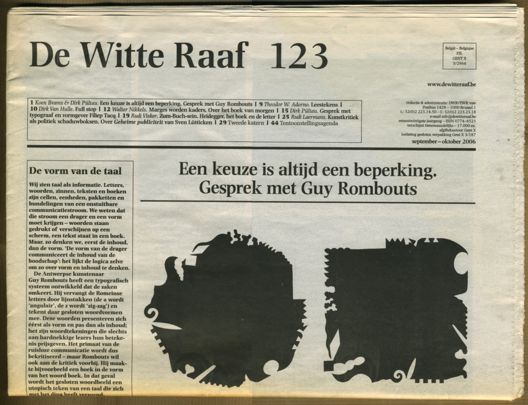
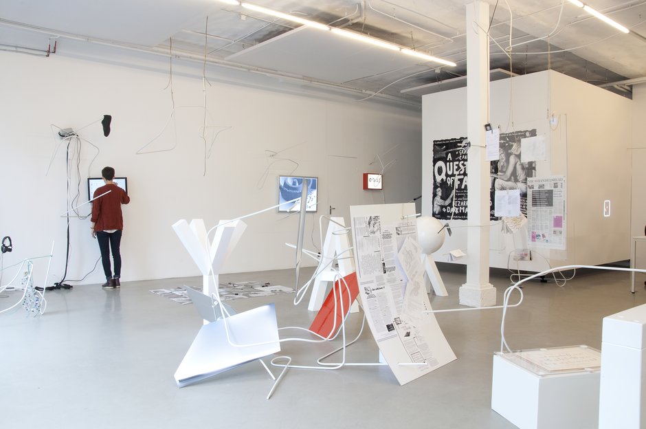
Guy Rombouts (Geel, 1949) is een Belgisch beeldend kunstenaar.

“Monica vond de naam Rombouts niet universeel genoeg. In een oude Franse tekst was ik het woord Azart tegengekomen. Dat woord kan verwijzen naar het alfabet en – via het Franse hasard – naar de arbitraire relatie van taal en werkelijkheid. Daar konden we beiden mee leven.”
— Guy Rombouts
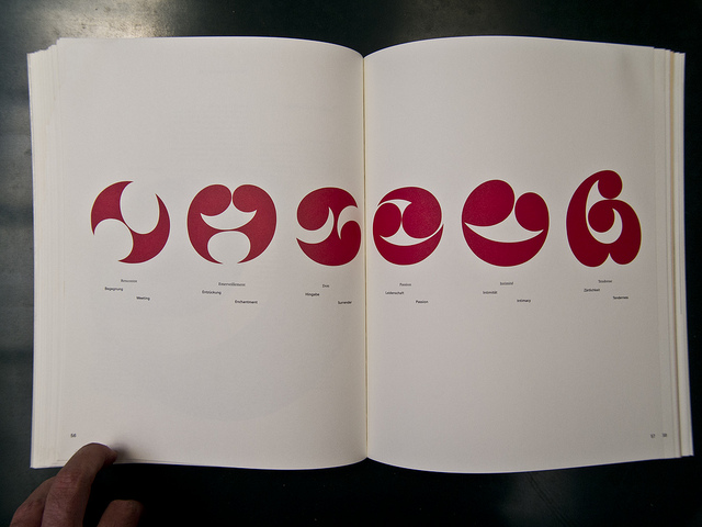
In Group A we have Arubiano, Danish, Dutch, French, German, Spanish and South Koreean Nationalitys.
Last name to first name in alphabet form from A to Z
Last name
First name to last name in alphabet form from A to Z
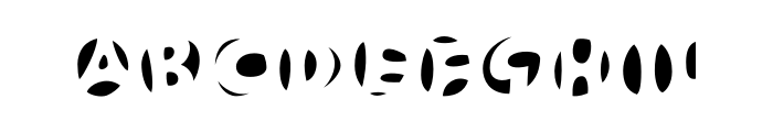
Karl Nawrot, also known as Walter Warton, is a French graphic designer and illustrator who lives and works in Seoul. He first studied illustration in Lyon, France and in 2008 finished a Master’s Degree in graphic design at The Werkplaats Typography in Arnhem, The Netherlands. Through his design studio Voidwreck Nawrot has been working on a variety of projects from designs of typefaces to illustrations and more experimental work. He has also been teaching drawing at the Rietveld Academy and has worked as a curator for graphic design exhibitions.
Nawrot’s designs explore basic shapes and patterns taking them very far into abstraction and playing with the different possibilities. Many works show a true fascination for infinity and repetition. In an interview for gallery 12mail he said that his inspiration was “the drawings that I trace in the morning when a part of myself is still asleep.” His work is often very drawing based yet he has also developed his very own style in working in more experimental way. He creates his own tools which can be anything from ink stamps to circular record templates and geometrical stencils. He uses these tools and devices to investigate and explore the possibilities of shapes and patterns and to make type experiments.


–Slavs and Tatars
Slavs and Tatars was born in 2006, devoted to the polemics and intimacies between the east side of the Berlin wall and the west side of the Great wall of China, in easy words ‘’Eurasia’’. The group explores time relations between Slavs, Caucasians and Central Asians, groups that belong those lands.
The beforehand mentioned collective has mainly language , architecture, politics, mystical stuff, etc… as the main focuses of their researches, practices and magazines, but is possibly through the multiplicity of languages around Eurasia by which Slavs and Tatars build connections between disparate subjects as new ideologies ,old histories and some places, is by this way that some cultural affinities and geographical identities arise from unexpected places and never minded sources . Its is by their great interest in language by which their work take place in the public space, trough institutions or media, to the public sphere.
Slavs and Tatars interest in Eurasia because its relevant role politically, culturally and spiritually , It position belonging two continents make languages there played a big role in a practical, historical and sometimes sacred way, (they point to some old an recent mystical protests which are reflected in the changes of affinities and differences until nowadays).
Khhhhhhhhhh
In this edition Slavs and Tatars seeks for the changes of language ,across Eurasia ,from a close and personal perspective, but at the same time understanding it from a discreet distance. Their phrase ’’ Times are changing , consequently the scales we use change ‘’ takes a real meaning with the idea of substitution which examines, rethink and self-discover the role of mysticism in social revolutions, metaphysics of protest. It is under the name of ‘’ Khhhhhhh’’ by which they try to show these changes.
x, ? , ? or ? , all these belong [Kh]” but with almost different graphemes, sounds, roots and roles. We can considerer [kh] as a linguistic totem who plays different iterations in different languages across Eurasia, To begin I think is important to understand the phonetics of [kh], it begins in the vocal tract , in a rasp over the throat ,is at this friction where [kh] ends and other letters begin.
It is remarkable the role that [Kh] has in different languages, I can describe like an example the Persian word for house— (khaneh)— begins with [kh], while other persian words also related to ‘’shelter/house ‘’ has the the [kh] like a beginning or beside it, okhraniat (to protect), kholia (care), khibarka (hovel) … khlev (cowshed [Kh] followed by [l], produces an entirely different meaning to a [kh] followed by [r]. Changing the [l] of the Russian (khlam, junk), into an p [r: junk is sublimated and becomes (khram, shrine).
In some historical points languages get richer. New words brought by foreigners, neologisms forged by common parlance, among many others, It is at this point that [Kh] suffer certain transformations and get the acquisition of new multiple meanings. Certainly some ideas and stories from foreign lands bring new symbols, whose with the time becomes in letters , those will have an inherent correspondence between the sound—or shape—of itself (the letter )and its meaning, One example could be the eight letter of the Hebrew ”?” (chet), which in other languages becomes in almost different symbols and letters, as examplesi can show: Syriac «, Arabic ? and Berber ?, Greek Eta H, Latin H, Cyrillic ?, the remarkable part of this is that these letters are always regarding at some point to their real background, Hebrew ? (chet), like in the Hebrew these are positioned in the 8th position of its respective alphabet.
serpentine (click over serpentine)
At this last point I would like me to show 2 names of interesting importance in the changes of languages across Eurasia, especially in the early 20th century, Velimir Khlebnikov whose work connects cultural roots and linguistic ramifications, he did experiments with consonants ,nouns, and definitions spelled out in a simplest form, there are some of its 1920s essays who mark a clear line between what we considerer old readers and new, his work was classified as hermetic, incomprehensible:
The sun’s rays in the dark eye
of an ox
and on the wing of a blue fly,
like a wedding’s line dance
that streaked past above him.
And Rudolph Steiner, who searched for a language of thought. He was looking for the process ‘’from the figure to the thought/ form ‘’, and how our bodies will be able to make a real union with one or another kind of being, something similar to this last statement could be turning the reading normal book into a manual and lately into an artist book, according to him it will lead to a ‘’high level of spiritual insight’’.
“Style, however, requires continuity of thought. Anyone setting out to write an essay and to write in style ought already to have his last sentence within the first. He should in fact pay even more attention to the last than to the first. And while he is writing his second sentence, he should have in mind the last but one. Only when he comes to the middle of his essay can he allow himself to concentrate on one sentence alone. If an author has a true feeling for style in prose, he will have the whole essay before him as he writes.”

Typography is the expression by which we communicate in our written language. My focus for this text is experimental type in our modern time. To understand the current state and the future of typography, I believe its important to look at the development of type through history.
Typography has a long history of development and in European history we can trace it back as far as 40 000 years, where cave paintings and other forms of expressions (such as decorated bones and crafted tools) has been found in Cromagnon, France. The Homo sapiens living in this period came to Europe from Africa and the Middle East, about 100 000 years ago. Other historical founds also include Petroglyphs, which is a group name for carvings on cave walls and surfaces alike. These carvings has been found around 12 000 B.C and is believed to be the ancestors of the modern typographical system, based on the Pictogram and Ideogram.
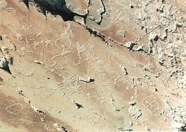
Petroglyphs found in Val de Fontanalbe, France.
Pictograms were used to illustrate and depict the chosen object, for example an ox. This kind of communication is still used to today in some countries, for example in the chinese language. After some time, the system developed, a circle which normally would represent the sun could also have the meaning of a day. The result of this development is called the Ideogram. This means that the context of the signs had relevance to the individual signs, as the circle changed meaning depending on the content of all signs combined. An extra sign could also be added to one of the individual signs to point out the exact meaning, this is then called a determinative. Another important development was the invention of the phonogram. Through the phonograms the humans could now also communicate by writing the sound of the spoken word. The shift from the Ideogram to Phonogram happened around 3000 B.C.
Around 3500 B.C, the Sumerians settled down by the rivers Eufrat and Tigris in Iraq. They also developed a unique written language which is called Cuneiform script. This written language was made by using a shaped object which was then pushed down in wet clay. When the clay dried, the document became intact. This kind of writing was widely used in Asia, Assyria and Persia. By the same period, around the area of the Nile, the egyptians developed an important way of communication. These scriptures were called the hieroglyphs, it was also built on the Ideogram but had different and more diverse signs for sounds and letters. The hieroglyphs were also divided into eight major categories.
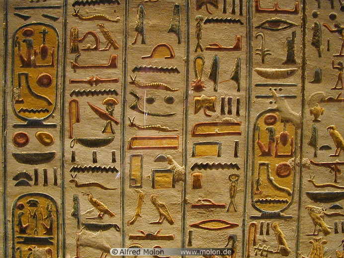
Egyptian Hieroglyphs.
Around 1000 B.C, a new written language was invented, called the Phoenician alphabet. This written language is the root for many languages, among them Hebrew and Syrian, as well as the Etruscan language which in return later on developed into Latin. The Latin alphabet was used by Greek settlers, who colonized the islands outside of Italy’s shores. The earliest find of the Greek alphabet was made in 730 B.C, on the island Ischia. The development of the Greek language continued as the Romans gained power in Italy. The Phoenician language was read from right to left, but as the Romans developed the Latin language, they shifted the way the text was read to left to right. The way the letters were standing was also shifted as this happened. It was also around this time that the Romans developed characters from the Phoenician language into the Latin characters we know as Alpha, Beta, Omega, Gamma, and so on. Serifs were for the first time invented during this time as well, first used in inscriptions on walls using a hammer and a spike, as they could be read more clearly this way.
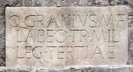
Example of roman inscriptions.
The Romans continued to develop their written language, as the Unical script and the Half Unical script was invented around 500 A.D. The Unical script was based on two lines, creating only capital letters, the Half Unical script was based on four lines, creating the opportunity for lower case letters as well. This development later led to the Gothic styled scripts found in Germany around 1100 A.D, developed versions of this script type was later made in France and Italy. This later developed type later came to England through Belgium. This period of development is usually called the humanistic handwriting, and was dominant from 1300 A.C to around 1460 B.C. In 1439 the first European movable printing press was made by Johannes Gutenberg, which allowed high quality printing for typefaces. This printing technique quickly spread through Europe and during this period and following on, specific typefaces started to be created in more diverse styles. Claude Garamond (1490 – 1561) was one of the first to produce typefaces independently.
There was a high development of typefaces during this period and by the 19th century, the highest peak was considered to have been reached. Some even considered that the highest point of typographical development had been reached already by the 17th century. Although typography continued to develop as Napoleon was interested in Egypt by this time, and he had several excavations and expeditions ordered. The interest for the Egyptian hieroglyphs were high during this time and people started to loose interest in their roman type heritage. Inspired by the findings in Egypt, type designers came up with a new invention in the modern written language, the sans-serif. All previous modern writing had been serif typefaces, but by 1816 the first sans-serif typeface was created by William Caslon IV, the typeface called Egyptian. The sans-serif typefaces also became more popular along with the industrial revolution, as companies could communicate their advertisements more clearly with help of the bold letters. Typography continued to develop during the 19th and 20th century, creating several influential and modern typefaces.

Example text of William Caslon IV’s typeface Egyptian from 1816.
However, since the development of typography had been so great by the 20th century, modern designers as well as fine artists started to seek for new ways to use type. Francis Picabia, a Dada artist in the beginning of the 20th century, is one of first to experiment with typography. As the Dada artists influenced the typographical approach, designers started to take serious notice to this approach as well. Herbert Bayer and Joost Schmidt were two Bauhaus designers who stopped using the roman letters as a basis for their typographical designs. Instead their language became more futuristic, with focus on the circle and the line. An example of this can be found in Herbert Bayer’s typeface Universal, from 1925.

Herbert Bayers Universal, from 1925.
Bayer also had controversial ideas regarding the sizes of the alphabet. His point of view was that only the lower case letters were needed, as the letters are pronounced the same way when we read them, regardless if it is capital or not. This influenced Bauhaus directly, as they started to only design lower case letters. This came to be called the functionalism movement with focus on freedom from tradition, geometric clarity, simplifying the typographical elements and the use of primal colours. At this point designers were well aware of the direct influence that typography could have, and with the functionalism they attempted to communicate in the clearest way possible, avoiding ornaments and other subjective expressions within the typography. This lead to a language which would communicate very strongly and direct with the viewer, the most famous example being Helvetica, designed in 1957 by Max Miedinger and Eduard Hoffmann.
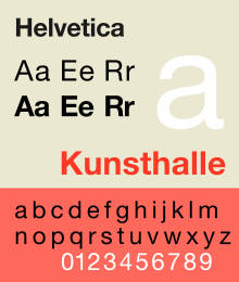
Helvetica, designed in 1957 by Max Miedinger and Eduard Hoffmann.
During this time the so called Grid system was invented, which created a new way to approach type. The Grid system is a line based system which allows for typography and other elements such as photography or illustration to be arranged in a symmetrical or asymmetrical order. This movement is close to the functionalist movement, but involved mainly swiss designers, the so called ‘International typographic style’.
Another important change happened as technology advanced and computers were invented. As computers with programs allowed anyone to fairly easily play with type in a much more free way, typography was no longer restricted to designers and professionals. As typography became digitalized, there was no longer a need to cut the type in a traditional way. This meant that the profession that earlier demanded a lot of handwork and precision, could be executed quickly by the means of modern technology. David Carson, among others, is famous for his experimental approach in the beginning of the 1990’s. He treated type in a new original way, and among other things invented the style that we today call ‘Grunge’.
Neville Brody and Jon Wozencroft is the name of two designers who also was involved in modern experimental type, and in 1991 they founded the Fuse magazine together. Fuse has since then been a platform for new and innovative ways to approach typography, and since its start it has been a controversial magazine which questions the modern language and its usage. A platform such a Fuse is important, as they encourage both discussion as well as practical input for the further development of type design. It is clear that expression within type is returning, since the most legible and clear typefaces already have been made during the 20th century. We are now in the beginning of the 21st century, and the way we are communicating and sharing information is developing quickly.
Looking back at history it is evident that innovations and experiments relevant to the times has always been present. As in other art forms, previous developments sparks new responses. The type of today is as earlier mentioned used more freely. One might consider if typography still is as important as it used to be, or if it is only the typefaces that has lost their relevance themselves. As we become more informed and aware of our past, we become more aware of the choices we make today. And if the importance of expression in type has increased today, can really type from the 15th or even the 19th century express the thoughts or feelings of today?
Typographers today can make their own decisions when it comes to using type, they can disregard from renaissance inventions, or functionalism from the 20th century. But we are always limited to our own inventions, wherefore I believe experimentation should always be encouraged. Though I can not predict the future, some even believe that the written language will die out, as technology will allow more sufficient ways to communicate. It is hard to say in what direction our language will develop in the future, and the role of the typographer. But having an open discussion and room for experimentation is an important step to keep up with the rapid changes of today.
Ed Ruscha is an artist who mainly works with text. His works have been assigned to pop art at the start of his career. As pop artists put common objects into images, such as, advertisements, magazine, cartoon, Ed Ruscha started his career by dealing with so called typical images and texts. Soon he began to focus on text.
For more information about a brief introduction about the artist (Click!)
When I faced his works for the first time, I thought that meaning of text must be influential on his works regardless the artist’s intention because text is tremendously powerful. At the same time, a question was raised about his approach to text. What is more, I also realized that some of Ed Ruscha’s works has a similarity with a Korean conceptual artist Yi-so Bahc’s one. So, this essay will explore some of Ed Ruscha’s methods to handle his subject by both investigating a couple of his paintings and comparing to Yi-so Bahc’s ones.
A change in dealing with subject
Ed Ruscha did not intend to convey messages but wanted for viewers to enjoy text itself as an image. To achieve his purpose, it was important for the artist to make viewers experience his point. In fact, his earlier works were relatively illustrative and expository. For instance, in ‘20th century fox’, relatively many imagery elements – such as the angle that the text was drawn or the horizontal thrust – were provided to explain what the artist would like to mention about the text directly.

Ed Ruscha, "Large Trademark with Eight Spotlights", 1962. Whitney Museum N.Y.
However, Ed Ruscha has kept trying to reveal a text itself in his paintings and minimize other unnecessary elements. He has eliminated illustrative elements from his paintings, and at some points, only a vague background and a text were remained.

Ed Ruscha, "Voice", oil on canvas 16 H x 20 W (inches) 1968
An artist who keeps silent
Ed Ruscha once said at an interview, “Words are pattern-like, and in their horizontality they answer my investigation into landscape. They’re almost not words – they are objects that become words.”As he commented, he sees words as objects. However, suggesting text as an object must be arduous. How can it be possible to force viewers not to read words but see them as an object though it is natural to read text? Although I doubted, the result is successful. Explaining with an example of my experience, when I looked at his paintings, I have completed viewing a painting by reading words on it and kept reading another words on the next painting.
By the way, even though I thought that I was reading text, there was a strange aspect that I could not remember the text I had ‘read’. I merely could remember an image which consisted of an uncertain background and text in the middle of the image as if I recall a painting. That is because the text in Ed Ruscha’s paintings keeps silent and did not convey any information like the text in newspapers. It can be clarified by comparing with Yi-so Bahc’s drawing as this reaction is the opposite of that of Yi-so Bahc’s case. Following is Yi-so Bahc’s drawing showing an installation for the phrase, ‘We are Happy’. Yi-so Bahc’s work encourages viewers have a question, “Are we really happy?” Furthermore, viewers remember they have seen a message rather than a drawing. In Yi-so Bahc’s case, the text conveys a message and does not exist as text itself. In other words, each drawing of each artist shows text in common, yet viewers’ reactions are clearly different.

Yi-so Bahc, "We are Happy", 21x30cm 2004
To achieve Ed Ruscha’s goal of enjoying text as an image, he took a position of being objective. That means, he strictly eliminated unnecessary or descriptive elements. Then the artist entrusted enjoyment of his works to viewers. There is another comparable example of works from the two artists which deals with stains in common. In Yi-so Bahc’s work, which titled as ‘A long story’, the artist dropped artificial tears on a spot of a paper one thousand times repeatedly, and an invisible stain remains on the paper. Tears usually implies something emotional reaction and encourages to imagine that an important event happened. Also, the title has a role that helps viewers to approach the artist’s thought. Yi-so Bahc utilised elements that he dealt with to emphasise his message, and consequently, the message in the work is strengthened by all of the elements.
On the contrary, in Ed Ruscha’s case, he collected various kinds of stains then made a book. He titled the book as ‘Stains’. The artist collected various images repeatedly and categorized them as stains. Every stain was treated as a mere stain itself, and no other explanation was given why the artist did that work. What is more, the title indicates repetitively the content of the book-stains. Ed Ruscha commented like following. “It’s nothing more than a training manual for people who want to know about things like that.” and “I think with Stains there was no latitude for any kind of manipulation of the image. In other words, the stains were exactly what they were stated to be. They were like little droplets in the middle of a piece of paper; there’s no gestural opportunity, no opportunity to do anything else besides simply dropping the liquid on the paper… I didn’t want it to look like art. I wanted it to look like a stain.”The artist merely introduced his work as ‘stains’, and viewers should explore what they are looking at themselves.

Ed Ruscha, "Stains", Portfolio of 75 mixed-media stains on paper, 1969
As the artist followed manners which is used in objective investigations, such as, a biologist gathers specimens, Ed Ruscha does not suggest his opinion directly, but exposes objects.
Ed Ruscha keeps this style through most of his works. The artist’s message is hidden or unclear, while his subjects reveal themselves as an object. This style sometimes can causes a trouble that viewers cannot acquire any clue to understand his work at all. However, it is obvious that his style is efficient and proper to implement his subject firmly. As mentioned in the beginning, I was curious about Ed Ruscha’s approach to text as I have dealt with text as a material and thought about how to develop it. So it was entertaining to know that his works are controlled not to be swept away by the meaning of the text as my work did not either. Furthermore, his works were supposed to be enjoyable for the artist as a sort of play experimenting with text and other elements. The Rietveld Library just aquired a beautifull book about Ruscha’s latest self curated exhibit in the KunstHaus-Bregenz. This book show his latest work and also all his famous books
*Works Cited from "Ed Ruscha" by Richard D. Marshall [Phaidon]. Recommended reading also: Cotton Puffs, Q-Tips, Smoke and Mirrors: The Drawings of Ed Ruscha
Jürg Lehni is an independent designer, developer and artist, who got well known for his diploma project, to graduate ÉCAL in 2002, called „Hektor“.
Typical for his work is the different approach to tools, computers and technology in relation to now-a-days common design. In the last few years, all of his Projects relied on those facts. Often he collaborates with other Artists of different fields. I want to concentrate on a few projects, which really impressed me and provide you a small insight into Jürg Lehnis Work.
Hektor 2002
Jürg Lehni & Uli Franke
(Rita and Viktor)
Hektor is a portable spray paint output device for Laptops, that could be compared to a common printer. The principle is quite simple. Hektor consists of two light and fragile motors, toothed belts and a normal spray can holder. The can is moved along drawing paths just like common hand drawings or old Plotters. The software to create the drawing paths is called Scriptographer, which was also developed by Jürg Lehni. It is a scripting plug-in for Adobe Illustrator.
Similar to Hektor are Rita and Viktor. Both of them are as well mechanical drawing devices, guided by Scriptographer drawing paths. But Viktor is working with chalk and Rita with markers.
Hektor consists of design, high-tech programming and low tech tools. In a time were nearly everything can be perfectly done with computer programs, often even too perfect, Hektor is going back to an analogue way with a digital starting point.
Its a call to all the designers and artists to innovate new styles and ways of working and thinking. It’s a call against the now-a-days aesthetics which are predicted by computer programs and are therefore often too predictable. It is a call to the designers to not just work with common methods but experiment and by doing so innovate, achieve a wider variation and implement new methods for the everyday work.
Because of the above mentioned reasons Scriptographer and Hektor are free to use for other Artists, so that they can experiment with it as well.
With this thought I see a relation to the principal of Sol Lewitts wall drawings. Sol Lewitt states that people can carry out his wall drawings following his instructions leaving it his work of art, as long as they don’t change it on purpose. While Sol Lewitt provides the concept Leni provides the medium.
Hektor is an interaction between the user and the technology with a creative input made by a technical medium.
Emptywords 2005
Jürg Lehni & Jonathan Hares
Emptywords consists of a plotter which punches holes into paper guided by an interface software. The holes are creating a font with which you can write short expressions. This tool is a medium to express short messages by the artists or the spectator.
Just like Hektor Emptywords also plays and experiments with the unpredicted and oppositional aesthetics to common design. It is playing with the nothing, in form of the holes, which are creating the font. The font is displaying ironic sentences, which adds to this work a playful, light and alternating meaning as well.
News 2009
Jürg Lehni & Alex Rich
News was developed while thinking of what to do with the speed i-jet printer developed by Reiner. This mobile pen printer is able to save 30 signs, and print them by sliding the pen over a sheet of paper. Newspaper headlines were programmed into the pen so that the spectators were able to print those ambivalent headlines per-programmed by the artists.
News shows some similaritys to the other two works too. You can see the same ironic playful thoughts behind the work. Its about doing something unexpected with simple things.
Jürg Lehni & Jonathan Puckey
This is the last project I want to tell you about. But i’m not going to write about it, as I want you to explore it for yourself by clicking on the title.
For me it was really hard to find a way into Lehnis work because I never really was obsessed with computer/programming art and I don’t have the knowledge to understand it that easily . When I was reading stuff about Lehni it really fascinated me, even though I had to read it a few times in a row to understand it.
It was my first “getting in touch” with that technical or programmed way of art. Now, after having had this research in the back of my head for a few weeks, I have another attitude to this theme. I think it is really interesting to cope with those digital themes in our time. Especially because I have the feeling that my generation is the last generation that can still remember how it was without cellphones, hyper fast internet and all the other inventions which have had huge impact on our society and our development.
Lehnis is playing with this theme with a charming lightness that attracts, but also animates to think. I enjoyed exploring his world and he invited me to this contemporary theme, so that I am now looking forward to see more of his work or other artists who are coping with similar themes. This Research inspired me aswell to cope more with the theme of Programming, I want to learn now how to edit things with the html code and java script, and if I am succesful with this you could perhaps see soon a headline banner for this research that I edited myself with those from Lehni provided Tools.
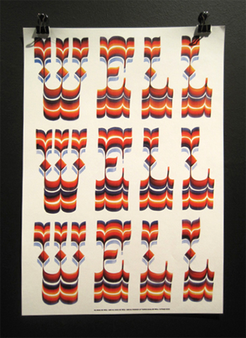
“This silky, mellow soup offers up traditional autumn color, with a crunchy little surprise in the fleurons, which are nothing more than decorative bits off a puffy pastry.” “Those fancy ornamental graphics that are used to start a new section within a chapter.” “Would their use in a complex list would be a faux pas?” “Fancy typography.” “Section breaks, dinkus (a dinkus is whatever you want a dinkus to be. It has no definite meaning. If you are at a loss for words the word dinkus can fill in for you) space break symbols, paragraph dividers, fleurons and glyphs.” “To make pages look better.” “Stuff like that, vector accents, motifs.” “Frilly bits.” “Informal something that is desirable but not a necessity, a luxury.”
In my language (which is lithuanian, the oldest living language) there is no such word as a fleuron. Fleuron is considered to be element of architecture . I understand fleuron as ugly something (usually stupid ornament in book) which always annoys me. And always brings up question “WHY ARE YOU THERE”. I raided the books I have looking for this ugliness, however, only few were infected. For understandable reasons, pictures won’t be posted.
This research made me aware of fact, that some people are urgently looking for fleurons. For wedding invitations, fiction books and etc..They are hard to find( what I kind of experienced myself), because people don’t even know how they are called..How to use them properly ( I also don’t know).. If you want to know more about fleurons and see some examples I provide you with a great link which I found on first page of Google.
And then you come across “collaborative project” like Font Aid. Organization which is based on great ideas like creating and selling fonts based on certain tragedies (and part of profit is given to the victims). Earthquake and tsunami in Japan?? Oh great, let’s all create beautiful fleurons and sell them. Let’s involve more than 300 designers and let’s make less than 13 000 USD, oh jeeeee. Already four of those beautiful collaborations happened! When is the fifth coming across??? Well that depends on disasters, wars, tsunamis..Something strong we need to get inspired, don’t we.. And of course, all the information you are longing for is totally available right here.
And watch this!
Did you like the video? Did you notice any fleurons? Did it help you to understand something better? If no, think about it, and watch video one more time. My suggestion to Font Aid would be just to contact those guys, I am sure they could help with more than 13 000 USD. So that is how I feel about this project. My feelings probably have nothing to do with the true reasons behind. And have a look at Building Letters Three magazine. You can still help 2004 tsunami refugees in Asia buy buying it for 35 euros (including free shipping).
On the other hand I came up with the idea that fleurons are very natural for humans to make. They are brain drawings. When you sit there waiting for a call and nervous with a pencil in your hand and a piece of paper..There is a very great opportunity for a fleuron to pop out. The only question is how advanced your brains are. What is it there? Two little crossed flowers or teddy bears? Fleurons can be very different and loads of them are just ridiculous (for me). I saw one in the Building Letters Three magazine. So there is this green leaf with white flower in it. The flower has eleven petals and Mother Earth in it. Eight human figures are standing on Earth holding each other hands and flowers in between. Below it is written People ARE Flowers. With People and Flowers in the same handwritten font. Word ARE is in bold and fat font. You don’t want to see it.
My conclusion would be that fleurons are not necessary, though they are. That we don’t notice them until they are ugly. We don’t need them until we do. We can’t find them because we don’t know what they are. New fleurons worldwide won’t be created till something big and awful happens. Fleurons representing the pain of many. Sold for not much for not many. How poetic and cruel. The fleuron. Will hurt your eyes.

My first contact with 4D typeface was in Casco at Utrecht. The 4D typeface was from Herman Damen and it intrigued me and left some questions behind. After i dived in the subject I found the typeface of Lo Siento. The beautiful designs are however not really used in the public space and not well known by the public’ because of that. Why? Are the 4D typeface not useful in public spaces or are they just not clear enough? In this research I will analyse which kind of way 4D typeface can be an extra supplement in public spaces.
Plan of the research
To find out why 4D typeface it not that much seen in the public spaces I will ask some different questions to help myself in this research.
-what kind of 4D typefaces are already present in public spaces?
-what do people think about 4D typeface? Is it well known?
Examples of 4D typeface in public spaces.
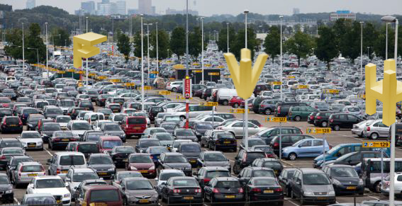
When we think about some known examples of typeface in public space we soon think about logo’s or indication of places (for example in public transport). It’s impossible to miss it on the highway: the Mc Donalds indication. Maybe that’s a part of the success of the logo next to the road; it is recognizable and readable from two directions. But is it also a 4D typeface? The definition of 4D typography: “4D Typography is the result of intersectioning, in an orthogonal way in space, two extrusions of the same character, which allows the spectator to read it from, minimum, two different positions in space.” (Lo Siento, 2012) that means that the Mc Donalds indication next to the road (what is readable from both sides) is a 4D typeface. But of course when the Mc Donalds logo is placed on a wall of a restaurant, this is not the case.
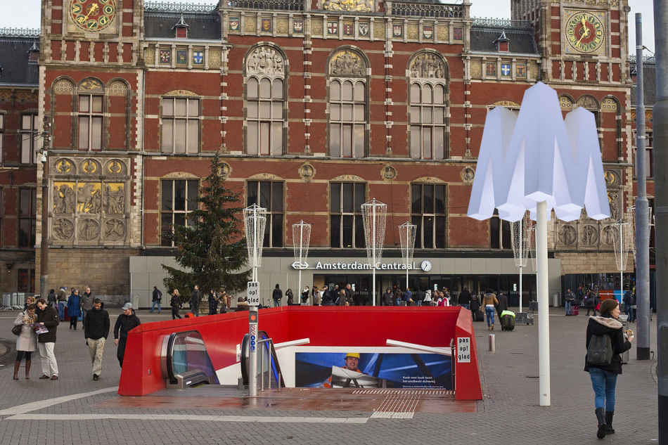
A second example of 4D typeface in public spaces is a place indication, for example a subway. In the Netherlands you see this a lot in the form of a cube with the letter ‘M’ printed on every side. The indication sign is readable from more perspectives (at least four). But… here starts the question: is it allowed to call this a 4D typeface when it is a cube with a printed letter on each side? When you ask me, it isn’t because the indication (the cube itself ) is not a character.


To define that 4D typeface will fit in public space, the opinion of the pubic on these places is important. To find out these opinions I went to Schiphol airport, the library in Middelburg and the railway station Rotterdam Central. Prominent is that a big part of the respondents (above 90%) never heard about 4D typeface. When I showed the 4D typeface of Lo Siento, there were not many people who recognized this way of typography. Of course they did when I showed them a picture of the indication of Mc Donalds. When I asked them about their opinion, a lot of people reacted really positive. Over all they thought that it is a really attractive supplement in public spaces. Eva: “For me it is really appealing. 4D typeface could give the usual (mostly boring) indications a new life.” Next to all these positive reactions there were also some negative points, mostly about the readability. Richard: “This way of designing is much better, nice! But I think it’s not always possible to use 4D typeface. The character ‘R’ is a difficult one, they should be careful with that.”
Ways to put 4D typeface in public spaces
In this research I couldn’t find many examples of 4D typeface, especially not in the public spaces. But the people I interviewed where really positive about it. I think (and the respondents also did) that 4D typeface could be a new supplement in the public spaces. I will give you some examples how we could do it. I hope that this way of typeface will pick up fast in the public spaces. For me this is a big discovery in the typeface.
Letman. Behind this nickname hides a former student of the Rietveld Academy, Job Wouters. He represents well a very illustrative part of graphic design and type design. This young artist is currently becoming quite famous, with some impressive institutions as clients like Monoprix, Heineken, Tommy Hilfiger, the New York Times Magazine, Playboy, or more recently a collaboration with dutch artist Dries Van Noten for a fashion show. In addition he has just published a book in collaboration with Gijs Frieling, and received the Dutch Design Award for his series of posters called Undercover.
Wouters first started to practice his drawing passion with friends and his brother, sharing their discoveries together. He still often collaborates with his brother Roel, or his childhood friend Yvo Sprey. He was quite intrigued by graffiti, practicing a lot and was particularly interested in street art lettering. This was his first step into the world of typography. In an interview, he said: when I was a youngster I was especially interested in graffiti-writers, who could write their names flawlessly in different styles. The communicative potential of type style was already of great interest to him. It is ironic to start looking at different styles that could communicate your personality through graffiti and finally do the same for corporate firms or advertisements. Later Job entered the KABK school of the Hague in the typography department and then carried his studies further at the Rietveld Academy in Amsterdam, where he graduated in 2004. His great passion for graffiti and handwriting was already very present during his studies. His graduation work was for example made out of 500 posters displaying each name of his classmates, they were handwritten thanks to a huge panel of graffiti styles. Job is definitely interested in underground handmade style of graphic design always keeping aesthetic problems, finalization and communication effects in mind. It is impressive to see a designer like Job who found his way so early, and then sticking to this fundamental base, staying true and evolving all the way.
ornament
noun |?ôrn?m?nt|
a thing used to adorn something but usually having no practical purpose, esp. a small object such as a figurine.
• a quality or person adding grace, beauty, or honor to something : the design would be a great ornament to the metropolis.
• decoration added to embellish something, esp. a building : it served more for ornament than for protection.
adorn; beautify : the men and women in the Stone Age ornamented their caves.
![]()
Apart from an ornament being a quality or having to do with religion and music or being the popular Christmas Ornaments, it’s all about adorning, and beautifying. And this is no different with Ornaments in the type world, from old to new, it’s the same bull. (pardon my english)
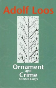
There are many great book to dive into like this famous publication “Ornament and Crime” (1908) by Adolf Loos, produced in the name of ornaments, at the birth of modernism.
The forms used in the type ornament or indeed in any kind of ornament, may be based upon, but should not be imitations of nature. All ornamental units are derived from one of two sources. they are obtained either from natural forms, such as plants, animals, fish, etc., or from forms not directly traceable to nature, such as the elemental geometric forms– straight and curved lines, triangle, square, circle, etc., and their combinations.
Well searching for these buggers is the thing, you type in on your computer [ornaments], you’ll find some ornaments because crafting is so in and do it yourself, and among these you find some of the type ornaments or sites that you can buy a certain font that is ornament based that’s great, but that is not the point. (kind of.)
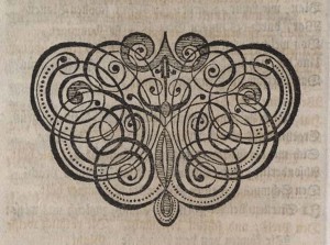
And for my search I typed these, typeface ornaments, printers ornaments, dingbats, Ornaments. I thank the search of “printers’ ornaments”, gave me this following site that is gold. (click image)
*Latent Stare* exhibition guide cover by Saul Steinberg
David Bennewith (who is born in 1977) is a graphic designer from New Zealand living in the Netherlands. He has a small design studio named Colophon (since 2007) which focuses on graphic and type design. He works on both commission-based and non-commission-based projects as well as research-orientated. He has been working as an advising researcher at the Jan van Eyck Academie design department (since 2010) and is currently teaching in the graphic design department in the Gerrit Rietveld Academie. David Bennewith doesn’t want to call himself the curator of the *Latent Stare* exhibition, but the organizer. The exhibition is a project that explores the practice, methods and messages of type design. The exhibition was open from 8 July – 30 September 2012 in Casco, Utrecht, but had also been set up in the design department at the Jan van Eyck Academie, Maastricht (in 2010).
To begin with I had to research the title because I didn’t know what Latent Stare meant.
*Latent Stare*, definition:
la·tent /?l?tnt/ :
1. Present or potential but not evident or active: latent talent.
2. Pathology In a dormant or hidden stage: a latent infection.
3. Biology Undeveloped but capable of normal growth under the proper conditions: a latent bud.
4. Psychology Present and accessible in the unconscious mind but not consciously expressed.
stare /ste(?)r/ :
So I guess a *Hidden Gaze* would be close to a synonym.
I visited Casco with my class and teacher to see the exhibition and listened to David Bennewith, the organizer-not-the-curator of the exhibition, explain some of the works. Unfortunately I couldn’t really follow what he said due to the strict programme that day which didn’t include any breaks to refill the students’ brain energy and empty stomachs. So all I could think about was food. Type design hasn’t got much in common with food. What did happen though was I paid a lot of attention to David Bennewith’s New Zealand accent. *Latent Steeeer*. I started thinking about how interesting it would have been if the exhibition were about his accent and not only the letters of the English alphabet. How boring is it that even if you speak with this amazing accent you still have to write the same way as all the other accents.
|
Adrian Frutiger, born in 1928 in Interlaken Switzerland, is the creator of the ‘Univers’ and ‘Frutiger’ typefaces. Besides typefaces he is also known for signets, logos, corporate typefaces and corporate identities for publishers and industrial enterprises. At a young age he experimented with invented scripts and stylized handwriting frustrated as he was with the formal, cursive penmanship being enforced at the Swiss school he was attending. At the age of sixteen, he was interested in sculpture and learned woodcutting, engraving and calligraphy. His father discouraged him to continu his studies in sculpture and encouraged him to go work in the printing business. Even though he was in the world of printing, he kept his love for sculpture which influenced a great part of his type forms.
But in this research I will only talk about his independent works, the symbols; the forms and counterforms.
Generally speaking, form and counterforms, is the way in which the type and its background have an effect on each other. We can also say; letters or in this case, symbols are created by positive and negative shapes. The positive shape is referred to as the form, the negative shape is referred to as the counterform.
It is easy to make a negative or positive image and reverse it afterwards, but the meaning of the symbols will change completely. This is what Frutiger wanted. Nothing has one meaning, the imagination of our thoughts is so wide that you cannot give it a name. Even though Frutiger gave his symbols names, titles, or better said feelings, I for example do not feel the same way as he does about those symbols. Which is a nice thing, because we do not share the same past, we lived in different periods, so this influences the way of how I look at it. The forms are recognizable in my eyes, you can easily define the subject of it. In the counterforms though, it is a bit difficult because the symbols are not free in space anymore. They are encircled, outlined, which confuses the imagination to think ‘out of the box’. Even though they are connected with each other, they obtain different atmospheres.
![]()
This is an example of forms – positive

This is an example of counterforms – negative
The symbols are ‘Frutiger Symbols’ and ‘Frutiger Stone’ was made to express Frutiger’s thinking, feelings and opinion in signs. It is a symbol font of plants, animals and stars as well as religious and mythological symbols. This typeface builds a completely new design system, which offers endless possibilities, the “world language system” as Frutiger said. Better formulated, the entire spiritual world of his mind or even our minds becomes readable trough symbols. There’s no need to use letters to express ourself, only symbols matter. The simplicity of letting go our feelings on paper, with a brush or in woodcutting.
 An example of Frutiger Stone
The idea of universal connections determines his thinking and marks all his creative work. No need for intellectual capacity for reading the signs, Frutiger wanted people to use their dreams to understand his work. Which is a beautiful idea, but almost impossible. Because our thinking does not always match the way Frutiger wanted. His symbols were in a way, a spontaneous interactions between his feeling at that time and what his hand was doing with those informations.
I truly like the fact that all the symbols are connected witch each other yet not completely. In his forms there is a representation of movement, there’s always a beginning but never an ending. He thought that he could always find a way to make it “better”, “uglier”, more “aggressive” or put more “emotions” in it. Nothing was in his eyes finished. Like the human existence and thoughts, which were the main themes of the forms, he asked himself often the same questions about life, beauty and our thoughts. Those impressions of the feelings he had at that moment fit well in his forms.
While I am talking about a way to communicate with each other without using the alphabet, I can show you an example that is still in use: Charles de Gaulle Airport at Roissy, France.
He was asked to make a new directional sign system. The yellow background with the white letters in French and the black letters in English is an invention of Frutiger. I think this task which was given to him, completed his way of thinking. Frutiger wanted to make an universal language connected with symbols to make it understandable for everyone, young and old. It is remarkable how those symbols hit us in the eyes, and what it means to us. I can imagine that when you are in a hurry to catch your flight you would not have the time or the ability to read, only to see symbols. It makes live easier, understandable and there is no speaking or wrong communication. There’s only one language that we all do speak Frutiger’s language, and that is the symbol-language.
Frutiger is found in the work of the Romanian sculptor C. Brancusi, who made sculptures that represented what Frutiger wanted in his works. Leave the unnecessary for what it is and focus on what you want to see, to feel. Trying to reach the perfection. Frutiger took note for his forms and counterforms. He also developed some sculpture himself.
Frutiger opened a door to express ourself, our feelings and thoughts in symbols, an international language without knowledge, but only the use of our dreams and our unconscious. We share the same feelings, but we do not show them equally. And this is in my opinion the essence of what Frutiger wanted to show us. Nothing is the same, yet it is.
If you want to know more about Adrian Frutiger and all his typefaces, there’s a documentary The man of Black and White – Adrian Frutiger by Christine Kopp and Christoph Frutiger. There’s also a good paper about Frutiger’s life and works; Travail de Maturité « A.Frutiger »; Frutiger .
If you talk about communication, you can not avoid Paul Elliman.
Paul Elliman is born in 1961 in the UK. He is a London based artist and designer, with works primarily focusing on communication and different ways of communication through language, sound and typefaces.![]()
He is dealing with new looks and ways to use the written language. He has made a human alphabet, with people acting letters in a photo booth machine.
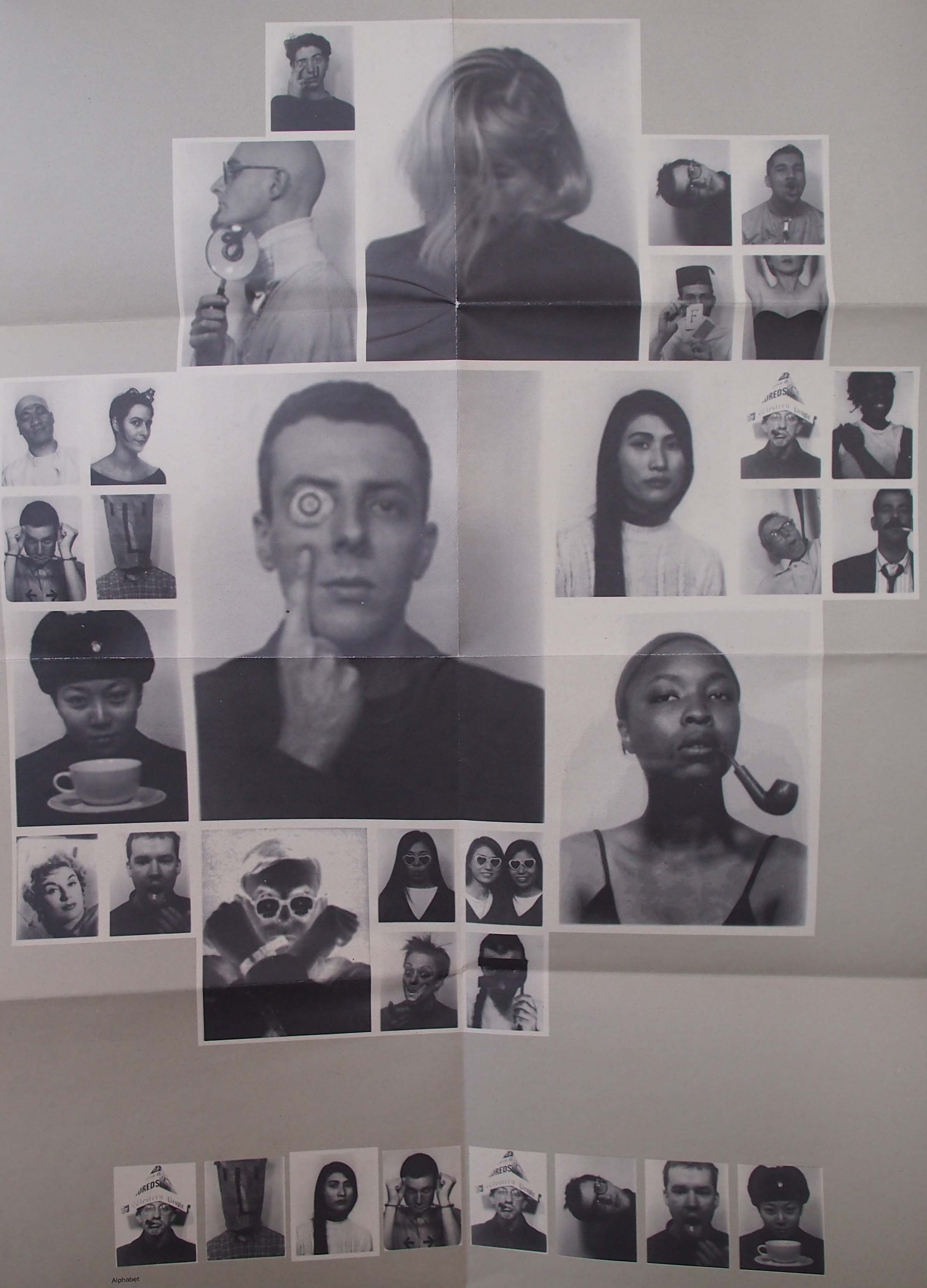
The original poster as Paul Elliman made it.
His work often involves collections of things. The largest project is his own font, “Found Font”, which is based on things from his everyday live. It is an ongoing project that already has been going for over 23 years.
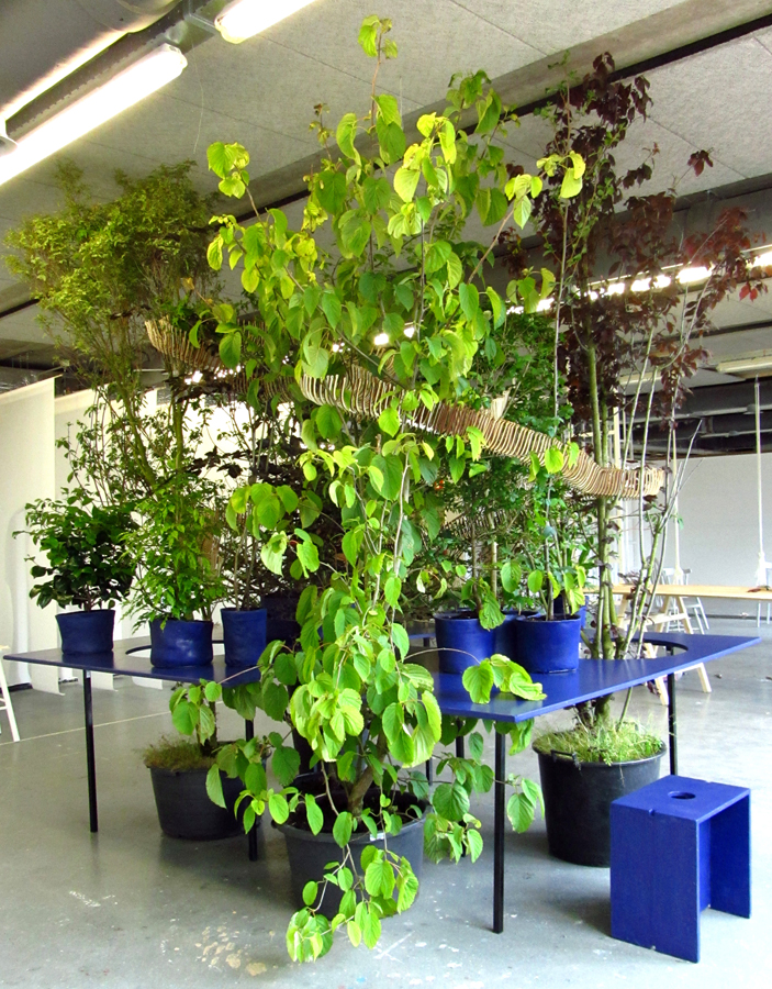
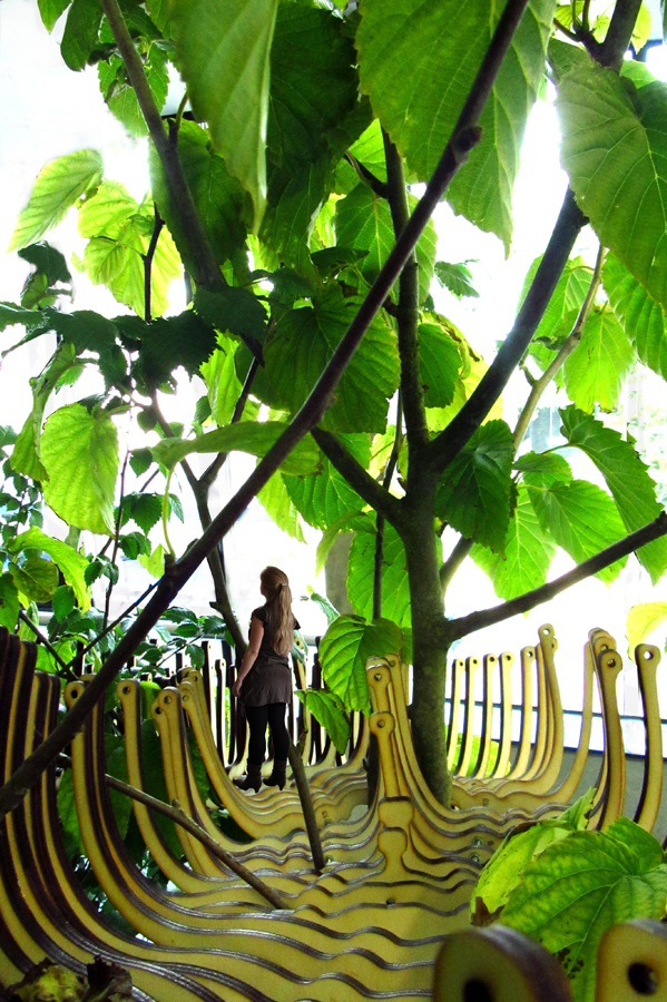
How would a park of the future look like, knowing that our cities will keep on growing and keep on getting denser? I tried to answer that question, with the need to experience greenery in busy cities. [Images from graduation show presentation]
In my thesis I try to find an answer to the underlying question: How can green improve an urban living environment? For which in this research I specifically take a look at New York, a metropolis with high density that will keep on growing rapidly over the coming years. NYC plays a leading role in the field of green development. My main question reads: which lessons can be drawn from the innovative green projects in New York City.
To be able to answer my main question, I first took a step back. I did research about what a city actually means, how the process of urbanization took place, which problems it produced and why these issues are considered problems. After this the young trend Landscape Urbanism is studied. These ideas focus on new ways of shaping an urban design, according ‘horizontal landscapes’ instead of ‘vertical building’.
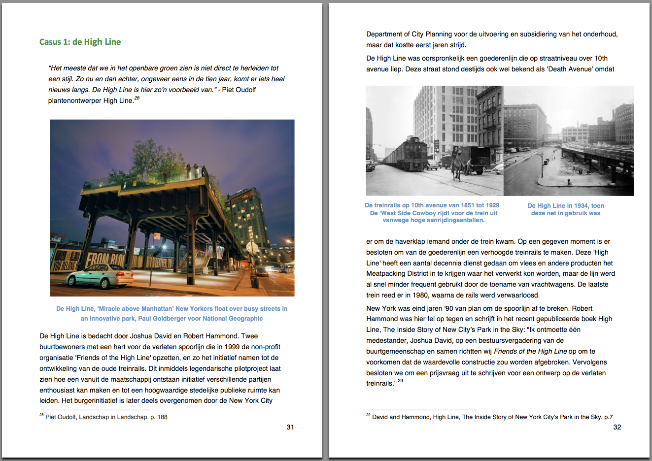
De High Line, "Miracle above Manhattan" New Yorkers float over busy streets in an innovative park, Paul Goldberger voor National Geographic.

De High Line is bedacht door Joshua David en Robert Hammond. Twee buurtbewoners met een hart voor de verlaten spoorlijn die in 1999 de non-profit organisatie ?Friends of the High Line' opzetten, en zo het initiatief namen tot de ontwikkeling van de oude treinrails..page 31/32 of thesis
My research consists out of three parts. First the problems of urbanization are analyzed, making use of the created historical context. The pioneers of greener cities will be discussed. Next to this the subject infrastructure, livability on street level and food supply are discussed.
The second chapter shows a series of solutions how green is used to regain peace and space in the city. Also is described how this added greenery could improve the urban ecology at the same time.
The last part focuses on case studies in New York. The research method is based on fieldwork and interviews with related people at the spot. I looked into what kind of influence the projects had on the city and its inhabitants and what examples other cities adopt.
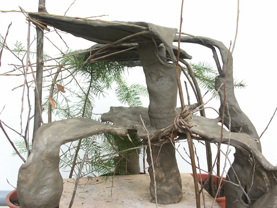
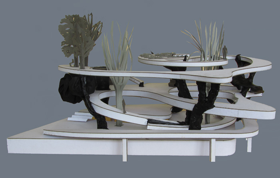
I made research models out of ceramics. Like in the final design concept, living plants form the structure in this earlier intuitive models. After keeping them inside over the wintertime the young trees started growing. This experiment shows in smaller scale how growth takes over, allowed to complete the design.
“not the excess of people but the lack of green is what threatens the mental health of townspeople“.
With this knowledge the people of New York commit themselves, supported by a strong governmental policy, to make their city greener and more livable. This is what makes the trend that helped the ‘Big Apple’ change into a ‘Green Apple’ so interesting and relevant: The approach both top-down and bottom-up at the same time. This is an innovatory model that fits well within the current economical recession, because the city is not only developed on governmental initiatives and financing but there is also searched for other possibilities and money sources.
![]()
Download this thesis: The Green Apple [dutch language]
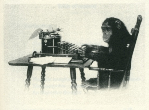 Lydia Sachse [x] graduated from the Rietveld Academy Department Graphic Design in 2012. Her graduation theses was titled “Half Constructed Infinity; On Algorithmic Literature and Text Generators”. It shows her fascination for complex machines and mathematical order as well as the visual beauty of chance. The essay’s introduction starts with two quotes and before you know you –artist as well as designer– get caught in this rich and intriguing subject;
Roald Dahl, The Great Automatic Grammatizator
“carpets … chairs … shoes … bricks … crockery … anything you like to mention – they’re all made by machinery now. The quality may be inferior, but that doesn’t matter. It’s the cost of production that counts. And stories – well – they’re just another product, like carpets and chairs, and no one cares how you produce them so long as you deliver the goods.”
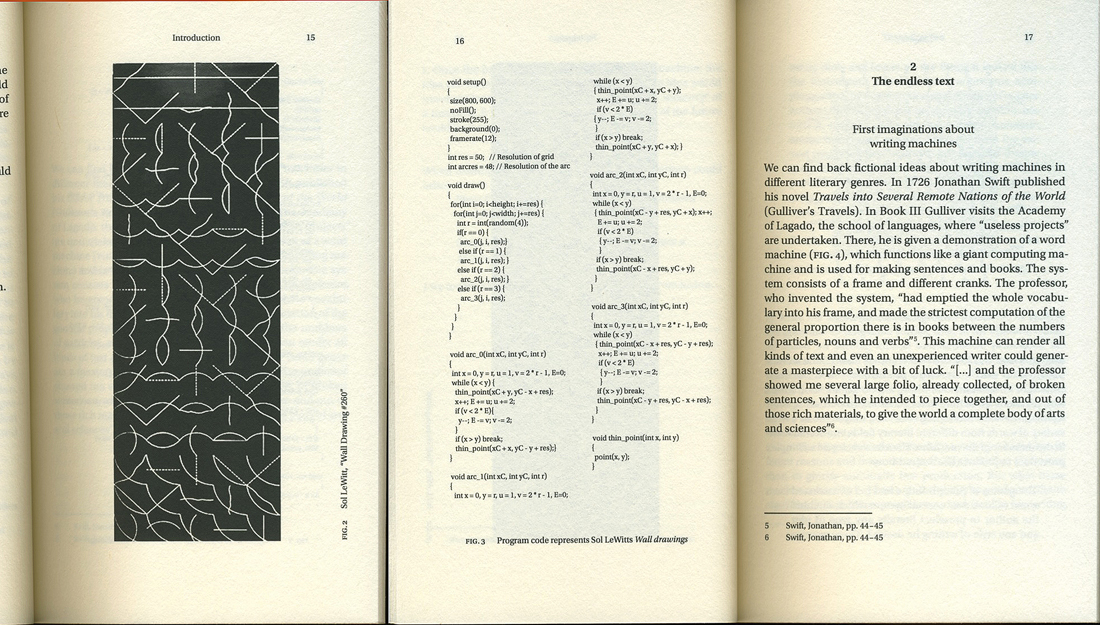
Sol LeWitt, Paragraphs on Conceptual Art
“When an artist uses an conceptual form of art, it means that all of the planning and decisions are made beforehand and the execution is a perfunctory affair. The idea becomes a machine that makes the art.”
“The subject of the text is automation with a special focus on text generators and algorithmic literature. Text generators are not limited to the computer, Already the invention of the movable type transformed religious and literary writing into algorithmic structures and even sytemic theory of rhetoric (Aristotle) was a step towards this direction. This research focuses on different examples of automatic processors from the 20th century and how these emanate from each other in consideration of the technological background.
Inspired by mathematical thoughts scientists and artists started to experiment with computer generated text in the early fifties. Many writers got exited by the new possibilities of computer technology with the hope of finding new ways of artistic expression…..”
![]()
Download this thesis: Half Constructed Infinity
[Algorithm: pattern of action which describes how to achieve an aim in several steps (functions as work routine)]