Why is it interesting to examine the differences between Dutch and Belgian design? The exhibition that was supposed to make me understand what was interesting about comparing the two countries design-wise, made me even more confused. As I strolled down the beautifully curated paths of the Design Derby, I saw Dutch and Belgian design objects cleverly placed next to each other to make the viewer see the clear differences between these two very closely related countries. The problem was that every time I had concluded something drastic about one of the two being more art nouveau, constructivistic or a clear example of de Stijl movement than the other, I would see two new objects and be surprised that my conclusions were far fetched.
What I should have done instead of just casually taking a glimpse at the beautiful objects, was reading what was written on the walls next to them. This I found out by googling the relationship between Belgium and Holland, and figuring out that they have a closely related history, but developing different socio-economic statuses during the 20th century.
Hereby I found the answer to why this exhibition is interesting and relevant, not only to people familiar with the history of the two countries, but in general for people who want to understand how a design object can express a whole time period or the mindset of a country just in the way it’s shaped.
Here, for example, the two logo’s of respectively the Dutch railway system, and The Belgian Metro. Similar in their form, you think by first eye sight, but if you look closer you see significant differences.
Dutch >•< Belgium
The Dutch logo was made in the 1960's, a golden age for corporate design in Europe, with Holland and Switzerland as two of the main providers. This logo was made by the still existing Graphic Design company, Studio Dumbar, who created a whole Identity for the Dutch railways; way finding signs, tickets, the look of the outside of the trains etc. The logo is a symbol, no letters are needed, because this symbol is supposed to be strong enough to remind every Dutch person that 'here you can take the train', and maybe it even contains more than just that simple fact. The railway system of Holland is a public institution, it's a representative of the Dutch culture, signaling to both the people of the country itself and the outside. Maybe this is why the same company was chosen to design the identity of various other public institutions: to give the whole country a graphic identity. This shows a very visually conscious country, knowing the importance of a graphic identity.
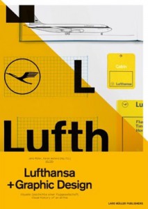
Here an example from neighboring country, Germany and Swiss, with their big company's representing the country, the airline Lufthansa and Swiss-Rail. Other examples showing the strong, straight lined, European corporate design of the 1960's.
Logo design by Otl Aicher 1963 and Joseph Müller-Brockmann 1982
The Belgian logo is a bit different in it's look. Less sharp, less serious with a lighter blue colour and a rounded and assymetrical shape. What is the most significant difference when you look up the history of this logo, is that it was made, not by a big company that knows about Graphic Design, but by a small and vagely well known Sculpturer, who never, before nor after, had anything to do with Graphic Design in a traditional sense.
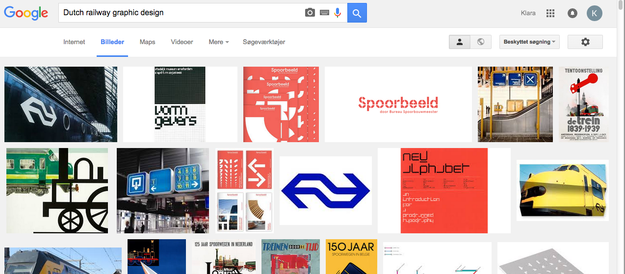
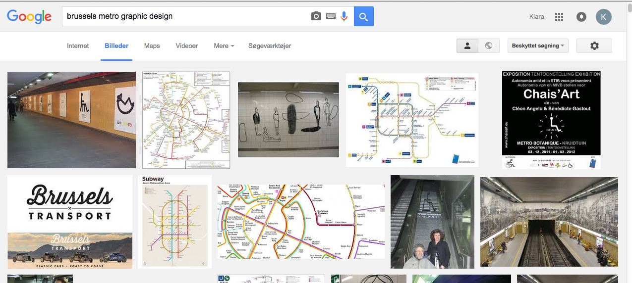
Also interesting is, that if you google Brussels Metro Graphic Design, the images that turn up are far less clear than what turns up when you do the same to the Dutch Railways. This being said, it is also important to have in mind that the Belgian logo was designed in the 1980's, a slightly different style period in the history op graphic design. Less clear, more post modern, pointing in different directions. This shows in the logo being both sharp and soft, geometrical and asymmetrical, as if it was shaped in the hands of a, yes, sculptor.


Google Search images for Dutch Railways and Brussels Metro


