In the library, I was first overwhelmed by the fact that I had to make a choice.
…
Because of my mood, I was drawn to all the books which seemed to hold a certain amount of history – in other words, old and mysterious.
I was lingering at a big blue book with no inscriptions, when I first saw it:
SCHRIFTKUNDE, SCHREIBÛBUNGEN UND SKIZZIEREN
Ein kleines Lehrbuch der Schrift für Setzer und Graphiker
– Von Jan Tschichold
Almost too thin to be of any importance. A5, 77 pages, and rather uneven around the edges. The color is a light slightly yellow brown, the main title in black capital letters and the further inscription in dark toned orange cursive.
Maybe I felt a bit of myself reflected in the design, or maybe I was drawn by the nostalgia and romance I often ascribe to objects which are a bit ‘old-fashioned’. A weakness of mine.
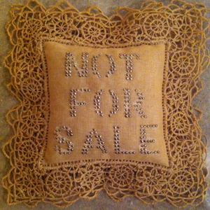
Immediately I felt the need to give this book a certain personification.
To claim that this book has a character, and with it a history hidden in its scruffy pages. It is almost stoic, with its simple design.
Moderate, German = serious, important.
The plastic cover for protection is exhausted, and has been repaired, giving the book an even dodgier look. The plastic reflects the light and makes me think of grease shining on the forehead of old sweaty men.
Although my German is a bit rusty, I try to decipher the title; SCHRIFTKUNDEN – ‘the art of writing’.
The text on the back is a bit more confusing, but overall I get some words: Typographic, graphic art, learning and maybe something about photography too.
The backside only confirms my notion of this book and its author.
Jan Tschichold makes his own introduction of the book, mentioning its precise size (148 x 210 mm), number of edition (112), publisher, something about the paper and the prize of the book (5 Franken), which I find amusing.
Typography – the artwork of creating letters and numbers.
The beauty of an alphabet has always fascinated me.
I remember making up my own alphabets as a child:
Aa, Bb, Cc, Dd, Ee, Ff, Gg, Hh, Ii, Jj, Kk, Ll, Mm, Nn, Oo, Pp, Qq, Rr, Ss, Tt, Uu, Vv, Xx, Ww, Yy, Zz, Ææ, Øø, Åå. I would write them over and over again.
Different sizes, lengths of the lines, curves, dips and turns,
Words as drawings, numbers as symbols. Somehow it was important for me to claim the letters. Taking over, making it into my personal alphabet, in a sense conquering the language.
After this notion I felt softness. A sense of safety mixed with the slight sadness of nostalgia. I remembered other things. Smells, touches., sounds.
And I felt grateful.
Book number, 757.4-tsch-5