This kettle has been designed by Richard Sapper, a well known german designer. Richar Sapper started as a designer at Daimler-Benz, then, as he wanted more freedom in creation, he moved to Milan and started working for Alberto Alessi in 1958. He had an obvious proximity with the Italian editor. Alberto Alessi is one of the most influent designers, he especially worked on “emotional kitchenware“. (see more of his works: Alessi index)
The first Bollitore 9090 was released in 1980 and was the first to be exposed at the Moma in 1983. The Same year, the Bollitore 9091 with melodic whistle came out [x].
Alberto Alessi's presentation of the Bollitore 9091.
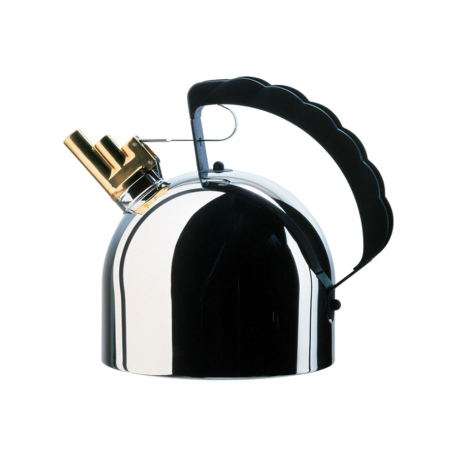
The Bollitore 9091 has the same design as the 9090, with a very reflective silver surface, a golden spout and a black handle.
By placing a golden chorister whistle (little tubes meant to tune wind instruments) on top of the spout, Richard Sapper is adding a poetic aspect of a melody to the very materialist function of boiling water.
In both editions, the design of the kettle is not the most influent element but the surface is the most important. The materials completely transform the kettle, the meet of silver gold and black makes it extravagantly popping out, and seducing.
Using the minimalistic aesthetic, he is making the viewers wonder about the object itself, its design, its function.
« For him, the form follows the function but his notion of function is going far beyond pure material aspect. In his projects, he is always aiming for a sort of « spirit function, he loves when his objects have a soul » Alberto Alessi.
Richard Sapper is here seeking for a poly-sensorial object, that appeals more senses than a regular kettle.
Sapper’s Bollitore is also making us reflect about the function of our everyday items.
The kettle has been completely transformed by the material covering the surface of the object, the match of shiny silver and gold has a very attractive effect which directly disturbs the perception of the object behind.
The luster of the Bollitore is perfectly inappropriate to a regular kettle situation. A surprising feeling I also felt with the Fordite, when I realized it was just paint layers component of a precious stone look.
Both of the Fordite lustre and the Bollitore lustre are disturbing because it’s making the perception of the object more ambiguous.