The book I choose to research is called ‘Biogea’ and was written by Michael Serres, and designed by Jason Wagner. Published in 2012 by Univocal Publishing, which Jason Wagner co-created with Drew Burk.
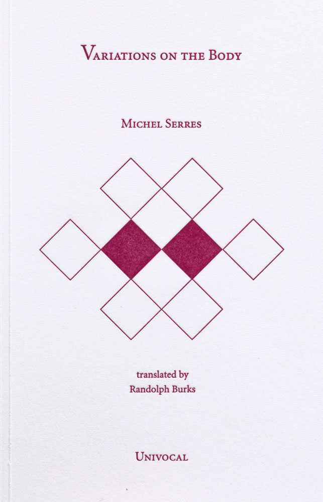
From the design of this book and from other books that Jason Wagner has designed I can see hints of his personality if not that then definitely his direction of interest. The way all the patterns are so precise and clean cut gives me the impression that he has a methodological nature and an obvious love of patterns both simple and complicated, while enjoying a subtle use of colour. As seen in another book designed by Jason Wagner ‘Variations on the Body’, which is also written by Michel Serres.
The fact that Jason Wagner is a part of the Univocal means that a critical look at the company can give an insight on the designer and ultimately the design itself.
Univocal Publishing was founded in 2011 as an independent publishing house specializing in small-scale editions and translations of texts spanning the areas of cultural theory, continental philosophy, aesthetics, anthropology and more. Univocal’s books including Biogea combine traditional printmaking techniques with the create evolutions of the digital age and feature letterpress covers designed by Jason Wagner, who demonstrates the technique in a video.
https://youtu.be/qwQSNhor1EQhttp://
Using techniques similar to this the publishing company oversaw the printing and binding of books from 2012 to May 2017, in which it ceased operations and merged with another company. This could seem to fall down to Jason Wagner who is stated to be moving on to pursue other projects.
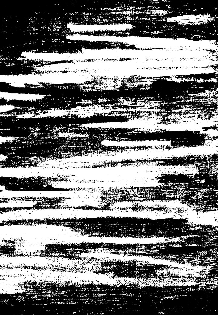
But why did I choose this book? I decided on this book for a variety of reasons. I enjoyed its’ simple yet complex design containing a neat revolving spiral-like pattern which is placed in the middle of the book and looks pleasing to the eye. The pattern it self drew my gaze as I found it really intriguing as it resonated with my own interest in complex and unique patterns which I like to create.
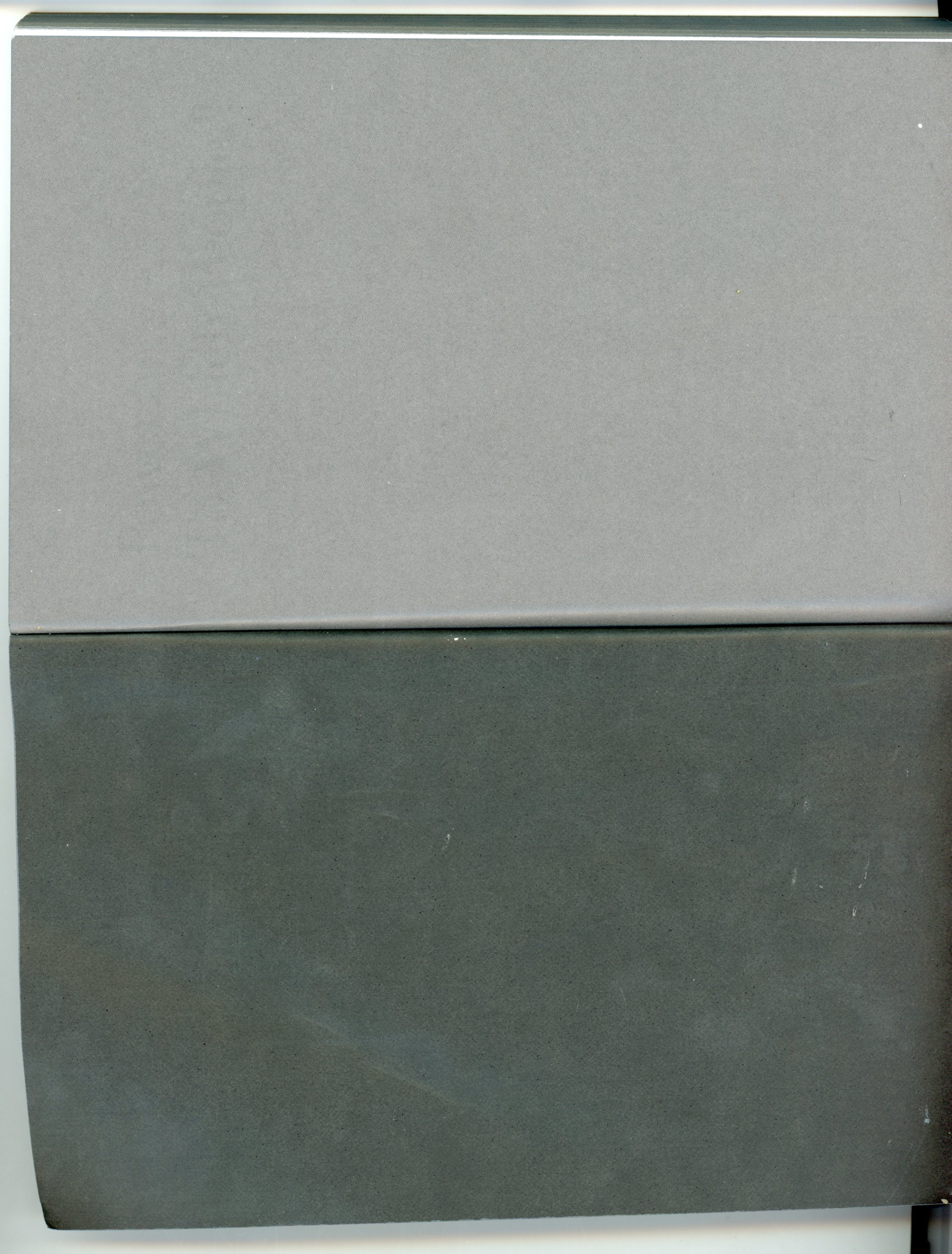
The plain colours and easygoing layout of the book for me made it feel more approachable. The design it self didn’t take anything away from the content, for sometimes I feel that the cover of a book can sometimes give you false expectations of what it contains. Being misled into buying something based on its looks. This book however balances this nicely I think by not taking anything away from the content but instead relating and highlighting the themes within.

The Typography is placed on top of the design and relates to and supports it nicely. Accentuating its colours and giving the book a clean and natural feel. The pattern initially drew my attention to the book, but as I took a closer look I found that the texture around the design on the cover felt good to the hand and gave it a thicker and more solid feel. This impacted on my decision as the pattern and texture subtly blend their delicate qualities together to create a book that i found aesthetically pleasing. While the design since imprinted on a thicker material felt noticeably different making it stand out from other designs and books.
The almost scientific complexity of the simple and delicate design also relates well to the content of the book for it’s a mixture of poetry and science. While also presenting a philosophy that merges the humanities with all creation. This has made Michel Serres “one of the most intriguing thinkers of his age”, and I believe is a reason why Univocal publishing has design and printed most of his books. Because of the authors philosophical and poetic inquiry sings praise of earth and life, and what Michel Serres names singularly as ‘Biogea’. The design relates well to the content as it mixes light fresh colours with an intricate pattern, which gives a natural clean aesthetic relating to some of the topics within the book. Some of the obvious examples being the use of blue in the typography which links with text within. “ Today we have other neighbours, constituents of the Biogea; the sea, my lover; our mother, the Earth, becomes our daughter; this beautiful breeze which inspires the spirit, a spiritual mistress; our light friends, the fresh and flowing waters.
Even though the design itself is quite precise it has a sense of movement to it and gives the book a poetic feel to it, this also relates to the content, as it’s a mixture of poetic statements revolving around natural themes. “In these times when species are disappearing, when catastrophic events such as earthquakes and tsunamis impale the earth” the author wonders if anyone “worries about the death pangs of the rivers”.
The author asks the same question of philosophy “as the humanities increasingly find themselves in need of defenders. Today, all living organisms discover themselves part of the Biogea”. Knowing the content of the book also ends up shaping my view on the design of the cover as the series of lines almost create a shield like swirl or sea creature, protected by the bold strong title Biogea.
Biogea, designer: Jason Wagner, Rietveld Library Cat. no: 157.3 ser 3