January 30th
Hi all,
Sunny morning, the colours are back! 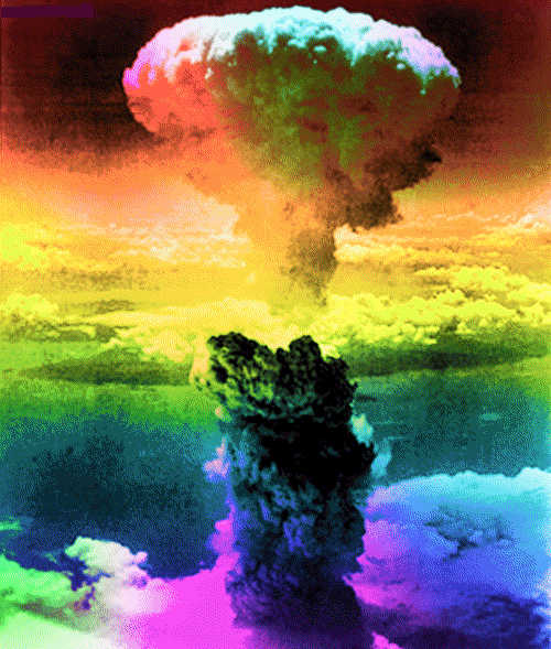
Colour systems are created from very different starting points and urgencies, often related to a specific application and context. Some are based on observations, others on textual theories or visions. They can be technical, poetical, philosophical, tactical or speculative, they can be developed “for home use” or for a large audience or group of users. They are both political and personal, and almost always related to ideology.
Here’s the story about a fake art movement SPECTRA. Also all the other bulletins in that section (from ‘Umberto Eco: THE COLORS WE SEE’ till ‘James Langdon: NOW IN COLOUR’) are on colour-related topics.
The question is to develop a new colour system. A colour system that comes from your own, subjective starting point. Medium, scale, application, etc. is up to you. It would be interesting too if you all develop a colour and a visual, graph-like representation as part of your colour system,
This was how the project started and ended with the publication of all process documentations which you can read if you scroll down.
April 4th
But before you do,
Look at all the colours we created, silkscreened with Kees Maas as part of this project and glued on the Rietveld Billboard. The next day it was a sunny day..
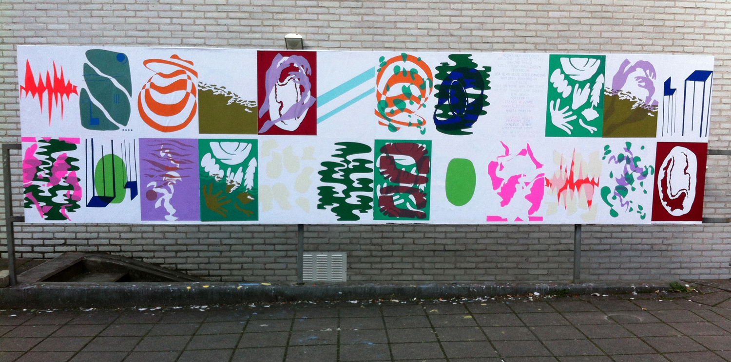
– All Color Names–
–Night Sky Violence, Walking on Light Tears, Sancho Panza, Lost-Diving-Mask-Green, Sickatoum, Sea Bird Blue Goes Dancing, Retired Rosy Brown, Flu Blue, Lost in Some Wax That Game Out Of Shrek’s Ear Green, Uta Grass, Hope Empty, Lizzard Wizzard, Capitalistic Pink, Maria Markan, I’ve Got Leaves In My Eyes, Tolerant White, Dragon’s Egg, Daniel’s Jeans, Adolescent Moss, Glass White / Glaswit, Don’t Be Blue Boo –
WORK IN PROGRESS
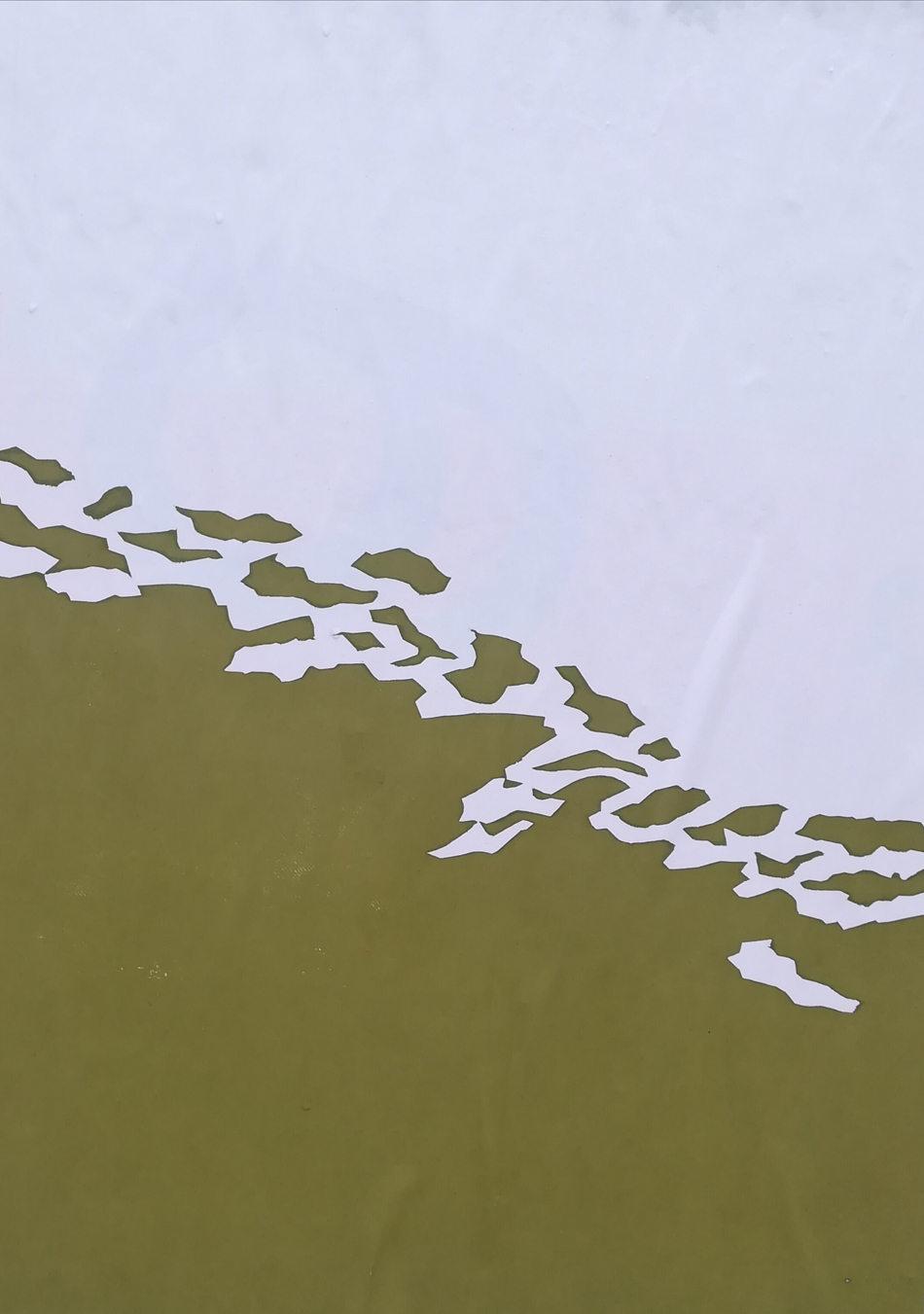
color name: – I’ve got leaves in my eyes –
 a colour made as an hommage to our eyes who can differentiate more shades of green than they can with any other colour. Because humans used to gather their food in the wild, our eyes are able to see more shades of green. Thanks to this we knew how to tell one plant from another, and knew which ones were edible and which ones weren’t. The shapes I cut out for the silkscreen print were also inspired by nature’s green leaves. I’ve got leaves in my eyes.
 [by Irene de Gelder]
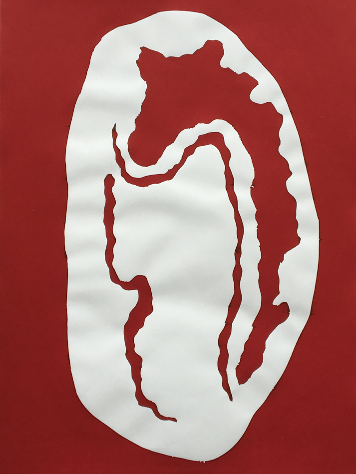
color name: – Dragon’s Egg –
by Sofie Baytocheva
color name: – Capitalistic Pink –
by Julia Petryshena
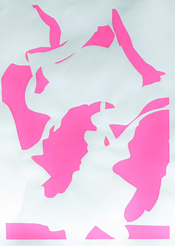
There is this trend color of the year. You can find it on the Pantone website, for e.g. It is a secret weapon of capitalism, so that people have the urge to stay up to date and buy new stuff.
color name: – Glass White –
by Arjan Post