Philipp Otto Runge (1777 -1810) was a romantic painter. He’s considered to be one of the best of his time. His interest in colour was the natural result of his profession as a painter. He invented a colour theory which he eventually published, encouraged by his friends, in 1808 in the form of a manuscript. He was pen pals with Goethe and they exchanged their ideas on colour. Goethe also featured him in one of his books. Sadly he died young and his efforts where soon overshadowed by others.
His goal was to establish the complete world of colours resulting from mixtures of the three, among themselves, and together with white and black. He presented this in the form of a colour sphere, shown below.
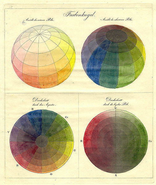
Featured are the primary colours red, yellow and blue. They have the same distance to each other. The secondary colours orange, purple and green also have the same distance. The upper part of the sphere is white; the colours become lighter. The lowest part of the sphere is black; The colours become darker. Red, blue yellow, black and white have the same distance from each other.
The colours shown on the outer layer of the sphere are the most pure. You could, for instance, also cut the sphere. In the middle of the sphere you could see a muddy colour (grey/brown). It’s every colour together so it doesn’t have any characteristics.
—————————————————————–
For my own project I took the idea of three-dimensional color. It’s already there in the original drawings from Runge, as shown above. This idea of three-dimensional color and the way Runge has dealt with showing this already offers some nice problems which I used as a starting point.
For instance:
-You can’t (to a certain extent) show three-dimensional colour in a two-dimensional way, in other words you can’t show the three-dimensionality of the color sphere by making a drawing of it.
– The only thing that works like the colour sphere is the colour sphere itself. For example; if you take the fruit ”mango” you will see random spots of red and green on the outside and yellow on the inside, there’s no order, like with the sphere. There are no logical transitions and grades. From red to yellow is logical. From red to green not.
-The colour sphere cannot be a colour triangle or colour square. It only works as a globe.
I started investigating these thoughts; The problem of three-dimensionality, the problem of the colour itself and the problem of shape.
With this in mind I started investigating different ways of showing color. On different surfaces; paper, textile. With different materials, paint etc. I started looking for objects, things and even animals which I thought could be interesting colour-wise. Taking them apart to see the colour inside. Decomposing and analyzing.
In the end I took an onion. The advantage is it’s simple shape, round, and the way it’s already layered. It has different layers of colour, ready to be peeled off.

Philip Otto Runge was of course a painter. To stay close to those roots I used actual paint to get the right colours of the onion. I painted on the onion itself to see if the colours where alike and for me it was a big part of the project; it’s quite hard to get the exact colors. As Runge used his colour sphere to discover and examine the colour of paint, and how to effectively use it, it was a nice experience to work with this material myself in such a way.
Now I had the colours ready; I could start thinking about the shape, or the application of these colours. I thought about applying the colour to various things, for instance; architecture. In the illustration I made below one can see how this could be done. There are seven rooms that fit into each other. I took them apart and spread them out in the illustration in different layers. The last ”room” is actually a pillar. You can’t go any further.
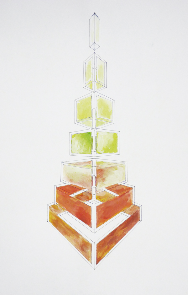

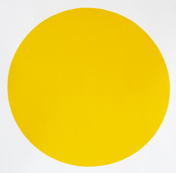
I silkscreened this colour. It reminded me of the light of the sun at the beginning & end of the day, when it only touches the top part of houses, trees, clouds. A gold, deep and warm yellow with a little bit of mustard. One of Runge’s works, ”morning”, inspired me to choose this colour.
/In progress/