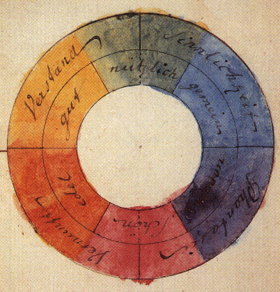
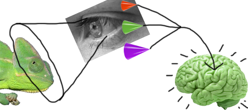
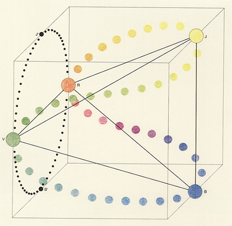
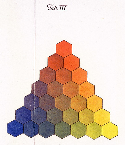
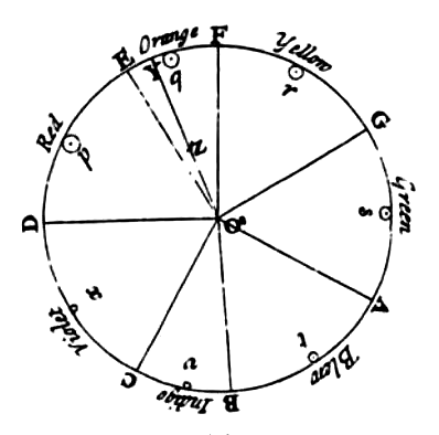
Athanasius Kircher, is the man behind de Coloribus (1646). The basis for all combinations is a linear construction which, apart from white and black, operates with three colors (yellow, red and blue). The special position of green is red also placed in the center. Green is located at the overlap of yellow and blue.
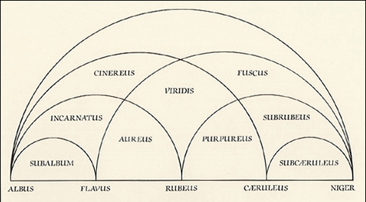
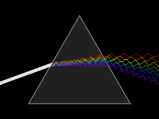
The diagram of the theory shows that all colors (yellow, red, purple, green, and blue) are derived from mixtures of black and white. This had a big influence on the color theories in that time and remained influential until Isaac Newtons’s experiments with light refraction. The prism, and its effect on light, was something already known to Kircher. He accounted for his colors by noting that the brightest occur after passing through the thinnest side of the glass, and the darkest after passing through the thickest side of the glass. But newton was the one who defined the right order of the rainbow colors. And Newton also discovered that colors are light of different wavelengths and that white light is a mix of all colors in the rainbow spectrum, something that Kircher didn’t find out.
In Kircher’s book that contains eight chapters which deal with the multitude of colors, investigate the colors of transparent stones, or colors of plants and animals. For example, he questions himself why four legged animals do not seem to be golden, and why insects and birds adopt all of the colors. And why the sky appears blue, but he never reached a satisfactory answer.
*
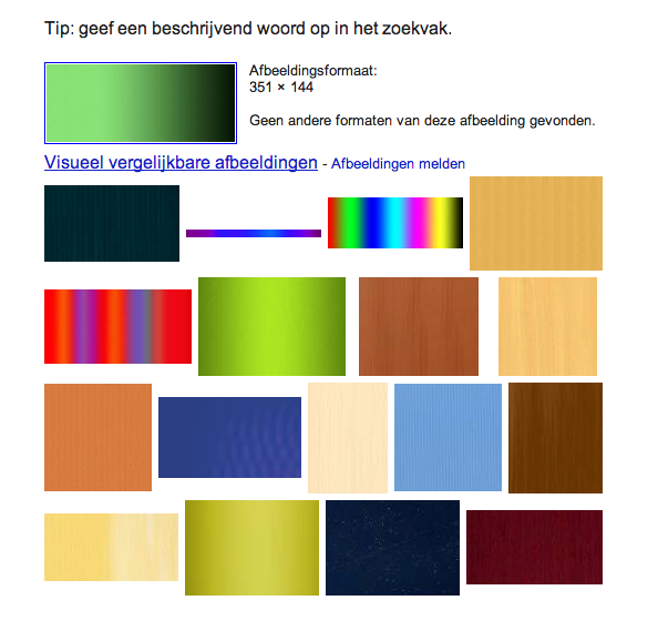
During the research on Kircher’s color-system I was looking for an answer that wasn’t there. The color system was just a view from one guy, a long time ago and there wasn’t that much to understand about. It was just what it was. So for that reason I chose to just leave the colors for what they were and chose to use the image search option in Google. The first time I used a white to green gradient, and the second time a black to green gradient.
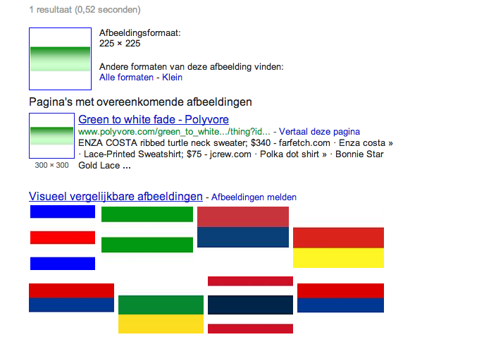
Green to white
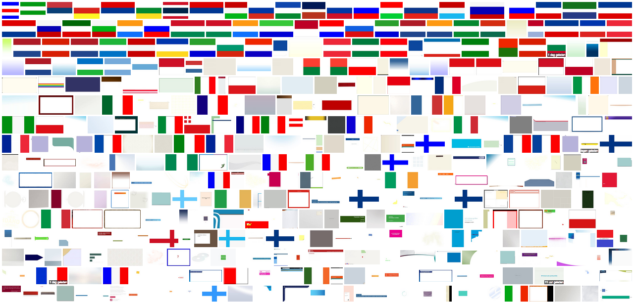
and the second time a black to green gradient.
Green to black
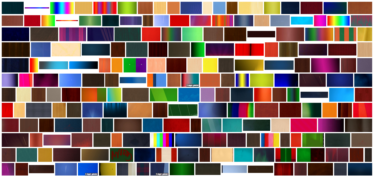
It was pretty interesting that the images weren’t any photo’s, but all gradient or flag like images. I found it very interesting how the different images or flags float into each other, and wanna to combine pairs of images which should create a new image.
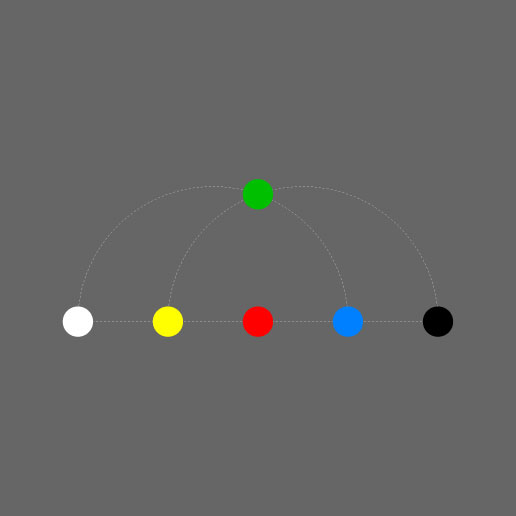
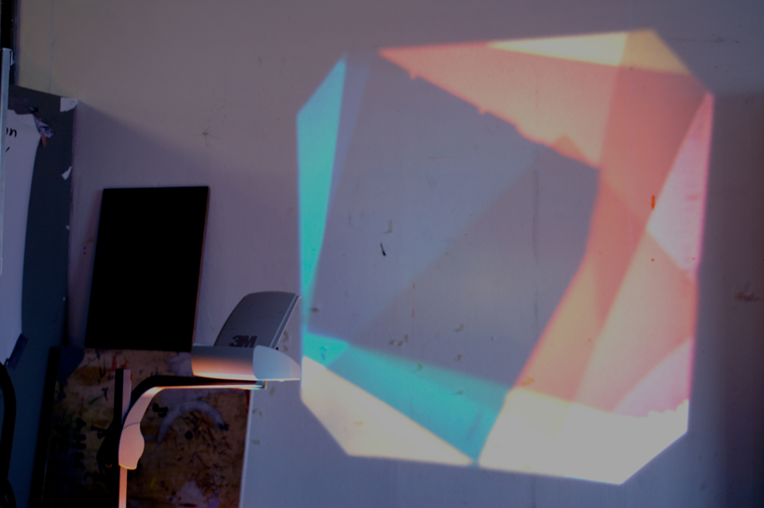
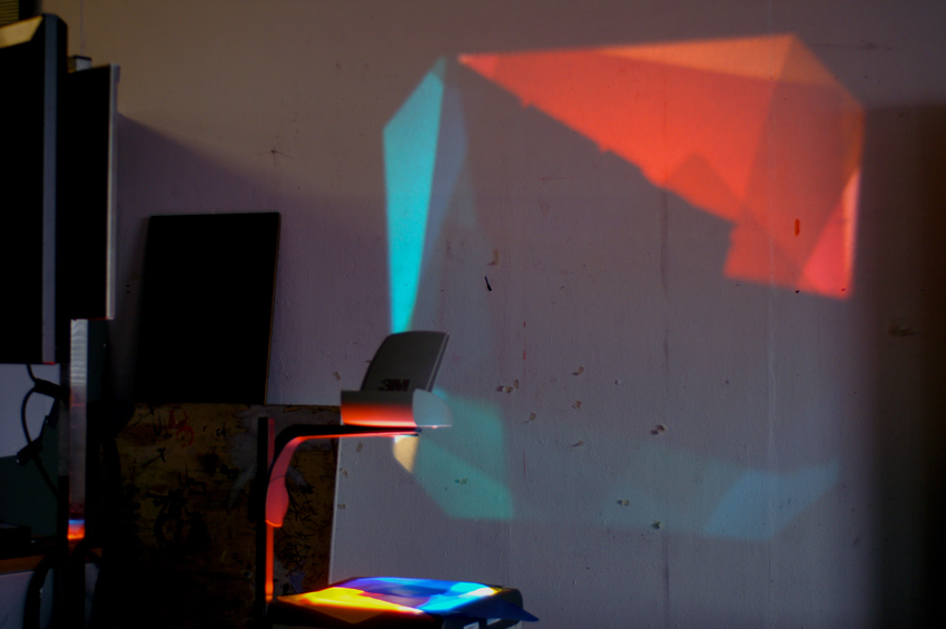
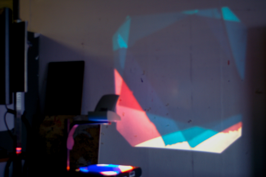
I made a JPEG from every color in the color-system in Photoshop, using the RGB colors to create the colors. I dragged the colors in chronologic order in the image search-bar and made some more screen captures of all the results.
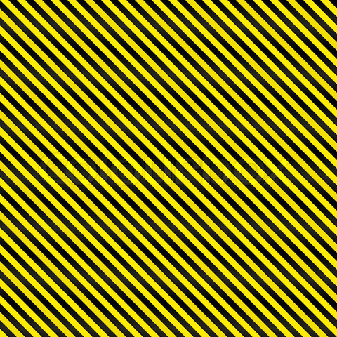
What was even more interesting were the titles of the images found in Google. Titles like: "2334452-90081-a-tightly-woven-yellow-and-black-stripes-texture-that-works-as-a-seamless-pattern-in-any-direction.jpg" or "The Colour Green.jpg"

Because of that I had the idea to make a book with all the found images, ordered in chronologic order with the title of image. But because of the big amount of money, what I needed for the book and the idea that the images where from internet. And so belonged on the computer, I decided to create a slideshow of the images and use the voiceover function in Mac for the titles. I did everything in chronologic order (except for the color green) I decided to put the red before the color green (as you can see in the color scheme it wasn’t really in the middle, so I had to choose if I putted it before or after the color red.
During editing the video I tried to make a kind of system using a different style for each type of file. And also the same slide in the Color that I used to find the images.
I’m very happy with the end result, although it went in a different way than I expected to be. But I’m fine with that. With this I learned to accept the results that you find during the research, and not to manipulate or change it. But deal with what you have, and only change the medium if necessary. Why not use video or why relate nothing to the computer if your material is found on the computer. But this depends on what the images try to say, or what the images say to you and what you want to do with it. I really have to take some more distance of the results in my research, most of the times I try to be too much in it, because of that I lose the reflection on, and the actual core of, the collection of images or results of what I’ve made. And because of that I sometimes do too much with the things that I’ve made. I kind of ruin the core of the images in that way.
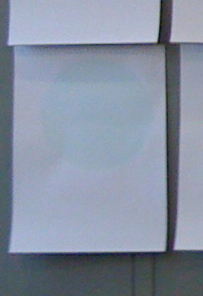
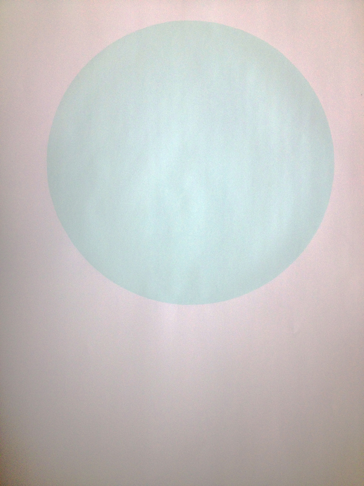
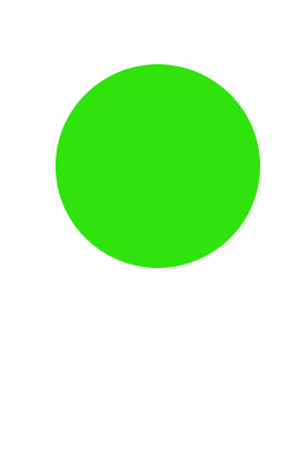
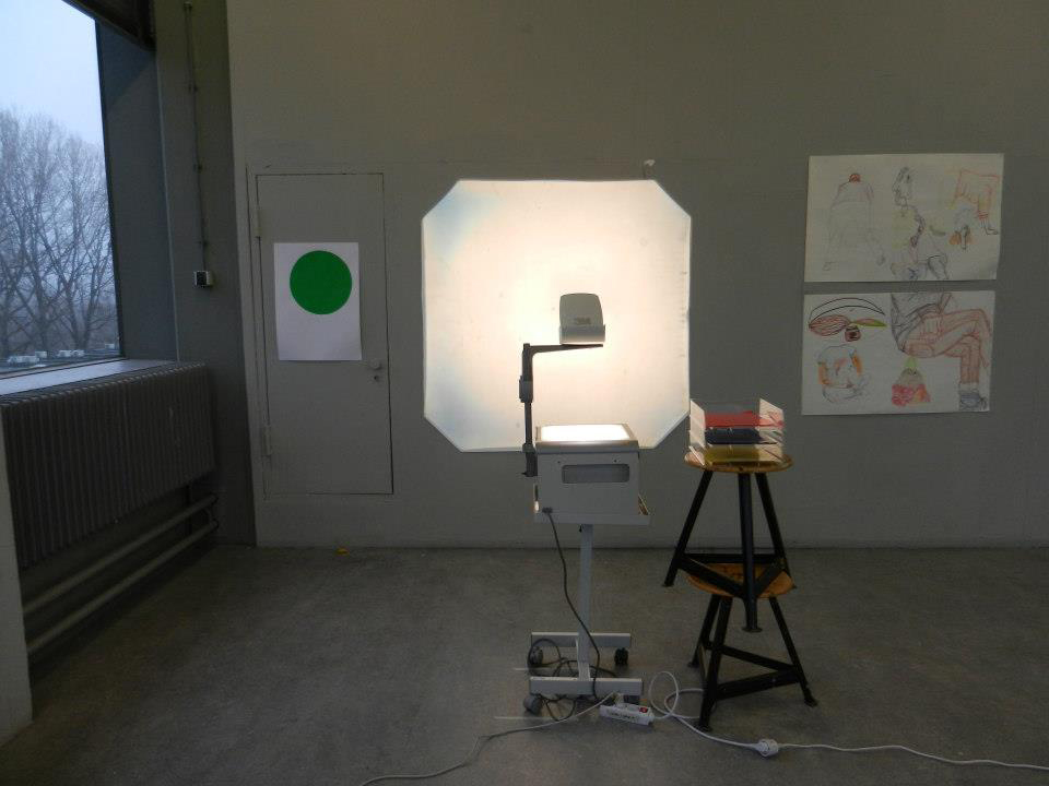
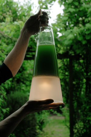
The color that I silk screened as part of the process has something to do with the fact that the colors between black and white are derived with mixtures from green according to Kircher’s color system. I decided to add a little bit of neon
green in thewhite, so it became almost white but also green. It almost look like a glow-in-the-dark circle as you can see.


