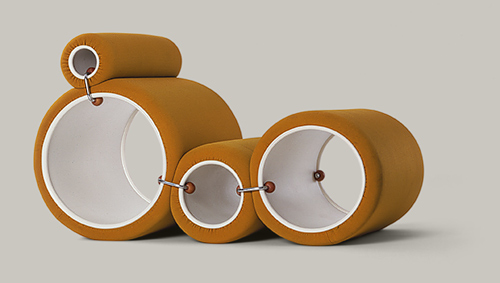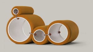
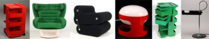
Joe Colombo, Tube Chair, 1969-1970
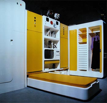
This is my chair. The Tube chair designed by Joe Colombo in 1969-1970. First I will introduce the intentions of this designer as a representative architect of that period and shed some light on the ideals behind designs from this time. Colombo was mainly focused on the creation of living systems (Combi- Centre of 1963) that were made to become micro-living-worlds with dynamic, multifunctional living spaces. He was very interested in furniture systems (Additional Living System), as an example the Tube Chair that could be set up in several different ways depending on the users wish!
first impression
One of the things that caught my attention when looking at this chair is the shape. To me it is quite unusual and therefore appealing to think that a construction could be shaped by only using round cylinders. I also found quite interesting the fact that these shapes could be organized according to the position you want at the moment, which to me is fascinating. Also the color of this particular model is very present and strong, adding to the shiny material it is made from. All of these elements create a quiet eye-catching construction.
Intrigued, I decided to research more about the aesthetics of the sixties and early seventies and learn the meaning behind this particular aesthetic and philosophy behind this kind of design.
for whoever want to know Joe Colombo
shiny tubes
shiny
shiny shiny shiny shiny shiny shiny shiny shiny shiny shiny
perfect colliding cells of bodies, body parts inside parts of parts of bodies inside shiny parts of bodies, is this a body, is my body this, parts of colliding shiny cells colliding bodies?
or cold neglected manufactures of machines? Machinery taped forcefully by robotic aggression or casually naturally beloved shapes holding, sustaining, lovingly enclosing tender body parts?
this is my question when sitting in the tube-chair.
both.none.both and none at the same time
because time is the reaction after this action.
orange tube chair.
I saw lots of similarities between the interior design that is visible in furniture design, decoration and the architectural use of space used by Joe Colombo during the late sixties/early seventies. here are some pictures to show some representative interiors designed by him in this period!
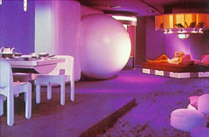

Joe Colombo, Visiona-Livingroom of the future, 1969, Total Furnishing Unit, 1972, Spring Lamp’s prototype, table lamp version, 1968,‘Plywood Chair’, 1963, Carrello Boby, 1970, Spiral chair, 1932, B-Line Colombo Modern Multi Chair, 1969
some history lessons:
The 70s represented a reaction against the sleek minimalism and simplicity of modernism and instead sought a “playful embellishment and radical experimentation with form.” So this meant that functionality had a high importance yet still creating an exciting and almost utopian space. These spaces had unusual colors, shapes and functions as to move towards a successful future of living.Self-expression and individuality were defining for the time. Technology started gaining importance and spaces were used as organisms that were part of their surroundings.
The architecture of the time was also very innovative when it comes to light and space. In many ways, the 70s started the concept of “open plan living”. Many designers reacted to changes of how families were starting to be structured (women started working outside of the house thanks to technological advances and overall economical growth f.e.) with double-height spaces, open planned living and grand entrances. Many homes had giant windows, spiral or “floating” staircases, interior and second-floor balconies. The kitchens were made to accommodate more cabinets and high spaces. Many kitchens had islands or breakfast spaces, bringing the family into a room that was once reserved only for women or staff. This was a symbol for the slight change in position women were starting to have during this period, that was to be seen in the way the living space was designed by the architects of the time.
During the seventies there was an enormous use of bright colors. Houses became very inviting and there was a lot of eclecticism when it came to the furniture designs and nearly every object had a bright color such as toilets, walls, furniture and decorations which came in several colors .
The 70s was a time of many advances in the design of chairs and office furniture. Designers began experimenting with ergonomic designs for the workplace and home offices. Many Italian Designers were at the forefront of radical and experimental furniture design, using high tech materials, tubular steel, bright colors, and polyurethane plastics.
1970s stuff
• Sleek plastics and high-tech materials
• Avocado green and gold
• Bold patterns and prints
• Stacked stone fireplace and stone walls
• Timbered ceiling beams
• Exposed brick walls
• Metal (chrome, polished steel)
• Geometric shapes and lines
• Thick and chunky masculine furniture
• Fiber optic lights
• Wood paneling
• Skylights
• Atriums
• Indoor gardens
• Fireplaces with elevated hearths
• Big windows and lots of glass
• Wall-to-wall carpeting
• Sunken living rooms
• Wicker furniture
• Shag rugs
• Earth tones
• Brightly colored furniture
• Orange

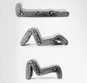
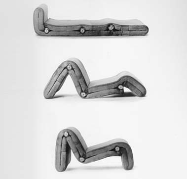
Joe Colombo, Additional System chair,
1967-1968, demonstration of positions
parallels to today:
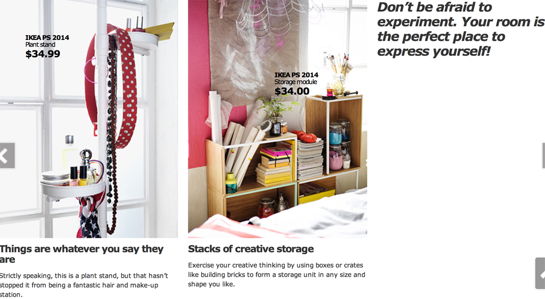
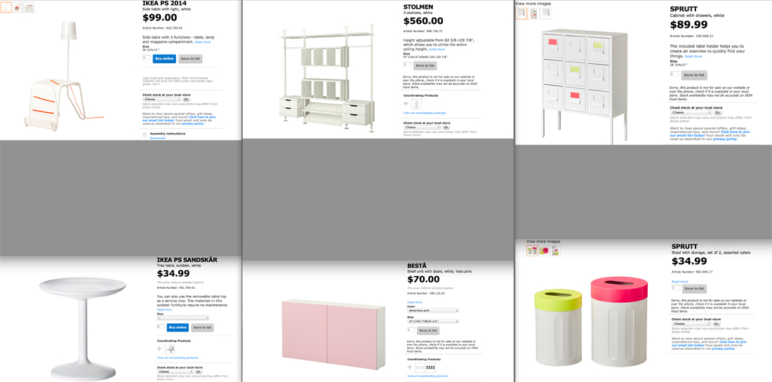
IKEA
Reading about the sixties/seventies really got me thinking about how much of the ideals and aesthetics I recognize in our contemporary culture today. Some of the things such as experimentation with form, eclectic interiors, technological advances (that are employed within living spaces) and individualistic approach to the design and embellishment of a living space are elements I strongly recognize in our culture today. The first place that came to my mind was Ikea because of the presence it has amongst nearly all of us, as well as its attracting quality it has to people today. Here are some pictures that I thought were representative for the similarities!


 Boosted Boris 🙂