Skip to Content Skip to Search Go to Top Navigation Go to Side Menu


"Scripties" Category


Abstract Language of Space and Light – the Metaphor of Perception in Space for Correspondence


Saturday, August 31, 2013


Melancholia_rietveld graduation show2013Ji Sun Nowh


Writing this I discovered a new aesthetic language through the “way of looking” and the combination of possibility and imagination latent in it. This tends toward the potential unknown reality. The artist has an insight to see through various worlds and this inner eye allows the artist to experience the

other world beyond reality. Melancholia03_ Jisun Nowh_redu The work created by this artist is the very gateway leading us to this place across time. Through the operation of thinking and recollecting, we are able to bring out the invisible time and space, experiences, reminiscence, and subconscious. What I have attempted to represent using a metaphoric form of visual language is the faint outlines of the invisible beings, the lingering ambiance of light, and the emotional respiration coming from the stream of subconscious, all experienced through the mutual perception of time and space.

Melancholia04_ Jisun Nowh_redu Melancholia02_ Jisun Nowh_redu
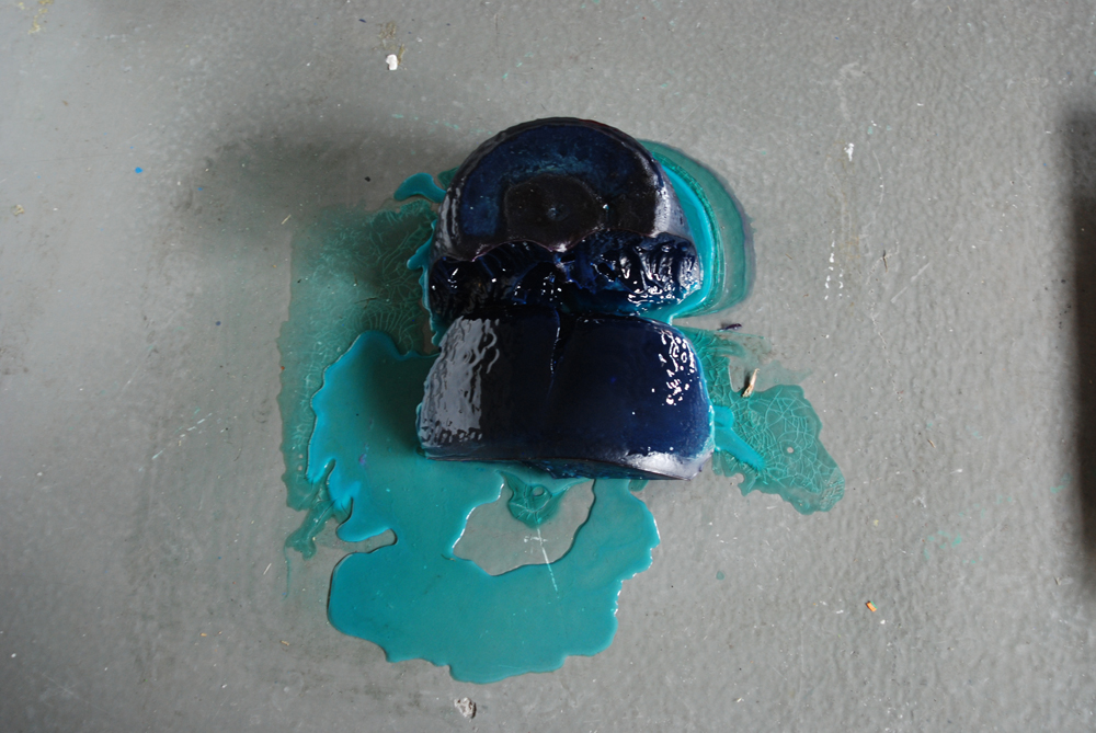
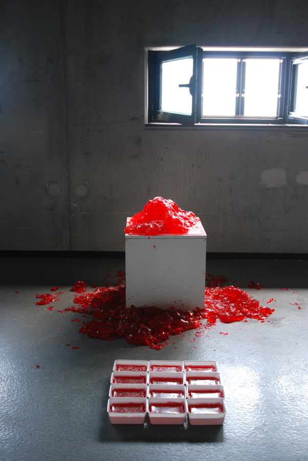
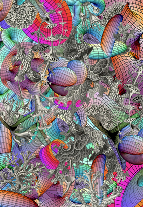
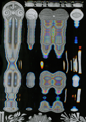
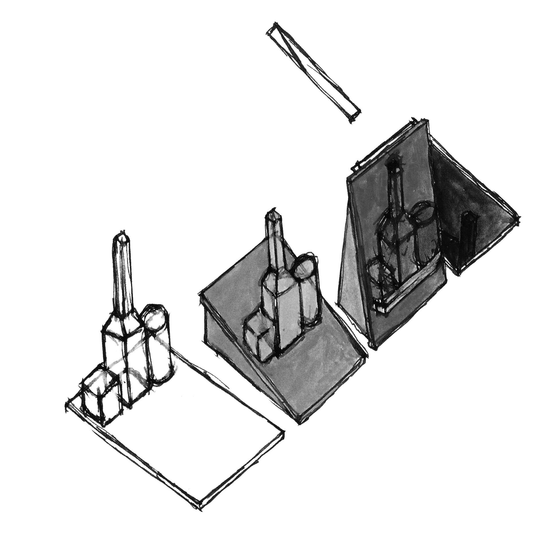
My work intends to be vacant and open rather than to express many things. This is to induce the viewers to read the work as a reflection of their own experience and sensibility. I found that architecture and art consist of the inner abstraction and the perception of light and I have experienced the process of the works in this thesis that starts from the convergence of form, line, color and sensibility and develops into sculpture, painting and building involving space and light. The combination of form and color awakens the sensibility inside this. I tried to enable a more direct visual experience and bring out the abstract forms to the real space in order to substantiate them.

The geometrical Melancholia01_ Jisun Nowh_redu 
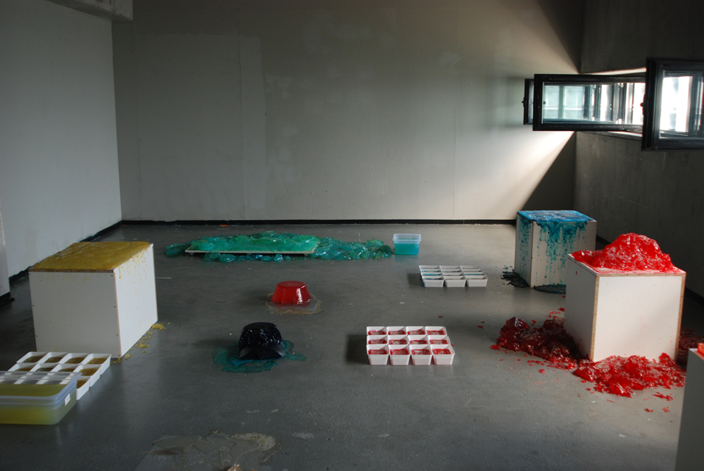
forms in these works are  imaginative spaces waiting to be filled with serene experiences.
I brought this abstract language form into my work and it will be originate from the restoration of imagination through the “way of looking”. I wish it did not remain in the state of merely reflecting the inner space but rather to be continuously reborn through various interpretations by being read as different stories and experiences.

text by Jisun Nowh [graduate student department of Inter Architecture]

 
Pdf-icon Download my thesis: ”Abstract Language of Space and Light;
The metaphor of perception in space and light for correspondence
 

Ecosophical Roadmap


Friday, August 30, 2013

intro

Haeckel_Orchidae

“The drawings in Kunstformen Der Natur express Haeckel’s fascination and devotion to the study of nature. Haeckel himself described his fascination for the world he was investigating, mostly referring to his main discovery, the Radiolarius [x], a single cell organism discovered in the depth of the ocean.
“It’s hard to believe that these creatures are single cells, some are like grids, broken nets or stems, others like tiny balls, helmets or bells when others appear to us like tender houses, windmills, fantastic towers.”

These words reflect on how much the artistic impulse of Haeckel seemed to have taken over his wish to be perfectly accurate and neutral as a scientist. His drawings are projections of real observations but they are as much projections of the inner interpretation of the artist’s vision of reality. Kunstformen der Natur was a way for him to unite these two projections in a single work. He by doing so “began to see not only the outer forms but also the inner content, the nature and the history of things”. He’s been trying to see nature as a “single unfolded work of art” by trying to understand the sequences allowing the Radiolarius to be present in such a multitude of forms. By doing so he achieved an astonishing body of work that can be seen as a suspended moment in time, a witness of this wish to leave space enough for observations and fantasy in a single picture. Following Goethe’s attempt to present nature in its diversity and trying to find unity in it at the same time, Ernst Haeckel created hybrid specimens that reflected on his subjective way to create the marvelous and the poetic in order to try to decode the genesis and the evolutionary systems of nature. That lead him to coin the word “ecology” itself.”

Excerpt from “The Curious, the Marvelous and the Particular”
(thesis by Rudy Guedj can be downloaded as pdf at the end of the article)


roadmap

By exploring the potentialities of ecological worldviews, old and new, through theory and art, WHERE ARE WE GOING, WALT WHITMAN? seeked, to accelerate, accumulate, animate and activate our poetical and political understanding of the world. (Introduction of the Studium Generale 2012-2013 “Where are we going, Walt Whitman? An ecosophical roadmap for artists and other futurists”)

The visual campaign for the Studium Generale — designed in collaboration with Sophie Rogg, Olya Troitskaya and Martin Huger –all graduates from the Graphic Design department in 2013— revealed itself progressively. It was trying to both map knowledge acquired during the past lectures, and project on a fictional level thanks to a visual pollution which was growing exponentially on all the mediums we used.

billboard1

The first layer of the campaign, the map, was created before the Conference-Festival as a simple topology arranging references into a single spacial representation. Day after day, the basic map, as all the different supports we used to communicate with, was taken over by a visual infection.

DSC_0030

The creation of each of the collages has been realized as a reaction to the existing publication Kunstformen der Natur (Ernst Haeckel, 1899-1904). These bold interventions on top of the existing drawings shaped a fictional journey throughout the campaign and provided endless interpretations of the very broad topic of ecology today.

Collage_Orchidae calabi-yau-2 poster_3 Haeckel_Kunstformen_Page_065_2
< illustrations Rudy Guedj, Sophie Rogg, Olya Troitskaya and Martin Huger >

“A welcome pendant to the overload of terms and theory is the online Ecosophical Roadmap: an ongoing encyclopedic exercise accumulating (visual) footage that inspired the speakers. (Ecosophical Roadmap) I dare say this experiment is the only contribution to the Studium Generale that practices what it preaches: it actually embodies our way of interacting with the material world, mediated through technology and immaterial digits.”
From : Metropolis M (online reviews)

DSC_0110 DSC_0127
< Studium Generale poster, physical translation Roadmap >

The online roadmap was a way for us to respond to the immediate and ephemeral format of the lecture by gathering notes and other references mentioned during the discussions. It functions today as a remaining archive, an attempt to visualize the many connections that were progressively built up and to emphasize on the important role that plays serendipity in our daily use of technological medias.

text by Rudy Guedj [graduate student department of Graphic Design]

thesis


Pdf-icon Download my thesis: ”The Curious, the Marvelous and the Particular“


Brooch : Absence, Function & Contemporary Jewellery Practice


Thursday, August 29, 2013


he-jing-brooch-2013-7


My graduation work called ‘Brooch’ stems from my study in structure of brooches and daily objects. I am interested in the relationship of forms and functions in mass productions; how the form appeared because of function but not only aesthetic. I was wondering how they work and how people use or misuse them. During the research I questioned what jewelry can be and its characters, and compared jewelry with other ready-mades [x].
My practice has combined these daily objects with jewelry, focussing on the tensions between “sense and nonsense, “usefulness and uselessness”. I was observing every details of the objects, and in the mean time, I was observing my reactions to them. I saw my works as results but not answers of this process, which included remaking, testing, running, repeating and failing.
I take jewelry as a way of asking questions instead of giving answers, I hope people wear my works and question them, maybe even misuse them, or be questioned by others.


brooch8
Brooch by Jing He /photography DAN/NAD


My practice on jewelry is focused on the relationship of the human body and daily objects. I questioned what jewelry can be and its characters, observing and experiencing the function of objects, and comparing them with jewelry. The central interests in this are tensions between ‘sense and nonsense’, ‘usefulness and uselessness’. What I did was to focus first on the structure of mass produced products; how the form appeared because of the function and not he aesthetic. Then I explored how jewelry, as part of people’s daily life, resides at the edge of usefulness and uselessness/function and aesthetic, analyzing the special character and dilemma of jewelry makers. Finally I related my findings to the practice of the contemporary jewelry field.


post_card_2clean


In Chapter 1, I mainly referred to the philosophy of Laozi and Martin Heidegger: the absence and function of objects, the different structures and usages between jewelry with other practical objects.
From Heidegger’s essay ‘The Thing'[x], I found the handle of his example of the jug interesting. In my opinion, the character of the jug’s handle has similarities with jewelry. In addition, I described and questioned my own jewelry practice, and how I discovered “absence”.
In Chapter 2, I studied similarities and differences of the jug handle and jewelry. In the contemporary jewelry field, I provided examples, referred to Jacques Derrida’s idea of supplement, and questioning the meaning of jewelry.
Jewelry is not only about the creation process but also the viewing experience, thus in Chapter 3, I compared paintings from ancient China and Italy, and discovered a new way of viewing image and jewelry. I proposed the idea that jewelry is seen out of the corner of once’s eyes.
In the end, I refocused on the absence of objects, and added how people misuses daily objects, and a few pieces of art. I believe that jewelry making can originate in the idea of combining different absence parts from objects.

text by Jing He [graduate student department of Jewelery] he-jing.com


Pdf-icon Download my thesis: ”Absence, Function and Contemporary Jewellery Practice“
 

Woman of the Shreds


Thursday, August 8, 2013

My thesis “Aufarbeitung” [reprocessing] is based on a historical research on the influence of economical and political crises on fashion and clothing production from a German perspective, says Verena Michels (fashion graduate 2013). My investigation aimed at finding answers on “how can I be a pro-active designer in the current crises and turn shortcomings into innovation? This theoretical research was the starting point for my garment collection.

© PETER STIGTER  FILENAME IS DESIGNERNAME RIETVELD 2013 GRADUATES © PETERS STIGTER RIETVELD ACADEMIE 2013 EINDEXAMEN © PETER STIGTER  FILENAME IS DESIGNERNAME RIETVELD 2013 GRADUATES

photo's Peter Stigter


trummerfrauen The icon of my collection is the so called “Truemmerfrau” (woman of the shreds): former housewives who were empowered and emancipated through physical labour in post-war Germany during the years of restoration. It was a period of hardship and material-, clothes-, and food shortcomings that encouraged black market and innovation through necessity.
When comparing that situation to our current crisis, I find a paradox: the European financial crisis is characterised not by a shortcoming but by an overload of materials, clothes and food, and what we lack are values, work ethics and a definition of what defines quality in times of mass production and over-consumption.
I decided to look for the answer by researching “material”. After experimenting with dust, lint and fabric leftovers, I chose wool as my main material. It is a highly relevant material for me because of its rawness, because it comes directly from nature (sheep, alpaca, goat), protects our body, keeps us warm, and doesn’t need to be washed. I decided to use wool in a non-conventional way, and put it in a context other than knitting.

COVER Rosemarie Trockel wool painting
Rosemarie Trockel wool on canvas, Dark Threat 2 2010, Syz Collection

Inspired by the wool paintings of German artist Rosemarie Trockel who transferred wool from the female household to established art galleries, I developed a new textile. This material is flat, structured, and requires only the exact amount of yarn without waste. It can be produced at home with a household sewing machine. The simplicity of the technique allows me to share it with friends and to collaborate. This can be a relevant starting point for making production communal and local again. I see it as a contemporary translation of the post-war DIY culture and hope my idea inspires others.

Screen shot 2013-08-08 at 12.13.23 PM

photo by Lutz Bauman

My collection book is an archive of visual research, notes and ideas, documentation of material and form research. It includes two chapters of my thesis and a photo series of the end results. The photo shoot took place at KOBOR, the wool store of Koos Koopman who buys yarns from bankrupt companies or factories that produced too much, and sells it at a fair price.

text by Verena Michels [graduate student department of Fashion] : more verenamichels.tumblr.com


Pdf-icon
Download her collection book ”Treummerfrau“, [woman of the shreds]

Pdf-icon Download the thesis: ”Aufarbeitung“, [recollection]
 

Orthogonal Allegory – the reality of architectural plan drawing


Friday, July 26, 2013

In this essay not only does the plan delineate (describes) the basic ‘syntax’ of a building, but it also creates a reality on its own; through allography the plan creates an allegory. This thesis won the 2013 Rietveld Thesis award


The floorplan takes a peculiar position in architectural creation. As a notational device, it translates the conception of a built space to a graphical code. The form of an orthogonal projection of a building abolishes the illusion of space, it excludes exactly the elements that are elementary to architectural expression, “light and shade, walls and space.” Le Corbusier, Towards a New Architecture.
Scan 2
John Hejduk Still Life Museum / Museum for still lifes, could it be possible for the architect to take the natura morta of a painting and by a single transformation build it into a still life?

First and foremost architectural plans are a tool for instruction and documentation of a building process, but the graphic compression of a spatial idea creates a reality on its own. The plan equally takes part in other disciplines, painting, literature (think of Alain Robbe Grillets Jealousy), as it does in architecture.

chamberworks III-H
Daniel Libeskind, Drawing from the series Chamberworks, 1983, Chamberworks, carries in its title the notational character of the drawings, the form of their conception of space.


The planar form of representation is able to develop architectural problems independent from the construction process. It writes a text, different from that of the building, though in an indexical relation they contain each other. The factual information given by the plan creates a metaphor of the building through decisions made in its form of graphical notation, the format of drawing enables architecture to incorporate and appropriate parts of other disciplines, literature, philosophy, painting. The foundations of casual literacy are different from those of architectural, spatial literacy. In John Hejduk’s Architecs wheel the history of literature stands of the same level of elemental necessity, as that of construction materials, forms of depiction and building elements. Still, a plan is bound to an indexical relation towards reality, but it narrates a different story about the building it depicts, just as the story of the building differs from that of the plan. In its abstraction, the plan creates a Sinnbild (symbol), ideograph, allegory of the building.

DP109642
Man Ray, Dust breeding, 1920, Duchamps 'Large Glass' metaphorically turns it into a huge landscape, a pictorial setting.


The text formed from a logic of graphical signifiers, line, plane colour, typography, delineates what a building is about it a two-fold way: Syntactical, as the composition of spaces, and theoretical, as the Weltanschauung (philosophy of life), a complex synthesis of philosophical, religious, social beliefs. In that sense, the architects wheel is an archetypical plan, containing Hejduks complete vocabulary, a model for his architecture, for the narrative of basic shape, rather than a concrete building. Every plan evokes the world in which that building exists, the possibility of a space, just like every lie creates the world in which it is true. The plan formulates principles of grammar, methods of thinking and working, it integrates tectonic space and form and human experiences and conditions that comprise our existence and thus it is essentially philosophic.

dubai_masterplan2
Dubai Masterplan, “It was the precision of my memory which enabled me to demystify the imaginary quality of the dream: surreal and real became interchangeable metaphors.” Raimund Abraham, the architects dream, 1983

text by Anton Stuckardt [graduate student department of Graphic Design]


from the jury rapport: In ‘Orthogonal Allegories, the reality of architectural plan drawing’ Anton Stuckardt has tackled the difficult subject of how the three-dimensional form is two-dimensionally represented. Still Anton manages to make the subject understandable in a very intelligent way and the thesis shows that he is a sharp thinker. The jury also found it to Anton’s advantage that he took his own interest in architecture, and connected this to the field of graphic design. Overall the thesis was compact, powerful and well written with good illustrations.


Pdf-icon Download this thesis:

Orthogonal Alegory – the reality of architectural plan drawing.


Over de kunstenaar die een detective wilde zijn


Friday, July 12, 2013

The Hotel, Room 47 1981 by Sophie Calle born 1953

In L’Hotel (1981) neemt de Franse kunstenares Sophie Calle tijdelijk een baan aan als kamermeisje in een Venetiaans hotel. Ze krijgt 12 kamers toegewezen, die ze gedurende enkele weken zorgvuldig moet schoonmaken. Tijdens haar werkzaamheden documenteert ze de voorwerpen die de gasten in hun verblijf achterlaten. Ze fotografeert de bedden, die soms niet eens beslapen zijn. Ze opent de koffers, bevoelt de zijden stropdassen. Ze leest brieven, die niet aan haar gericht zijn, en maakt aantekeningen van wat ze in de badkamers aantreft. Ze documenteert alles wat de gasten in hun kamers achterlaten. Als een ware detective onderzoekt ze hun levens.
De foto’s en teksten die Calle maakte tijdens haar werkzaamheden als kamermeisje, publiceert ze later in de serie L’Hotel. Met dit werk maakt ze het publiek deelgenoot van haar voyeurisme: ze biedt de toeschouwer een intiem kijkje in het leven van de hotelgasten.

The Hotel, Room 47 1981 by Sophie Calle born 1953

both images : Sophie Calle, The Hotel, Room 47 1981, © DACS, 2004

De kunstenaars die in deze scriptie behandeld worden gedragen zich net als Calle als een detective. In hun werk nemen zij het leven onder de loep: ze verzamelen informatie, onderzoeken deze zorgvuldig en komen vervolgens tot verrassende ontdekkingen. Aan de hand van het werk van onder andere Douglas Huebler, Hans-Peter Feldmann, Arjan de Nooy en Hans Aarsman, wordt in deze scriptie ingegaan op de overeenkomsten en verschillen tussen de werkwijze van de kunstenaar en die van de detective.

text by Rosan Dekker [graduate student deartement of Graphic Design]: www.rosandekker.com


From the jury rapport : The jury found the carefully designed thesis of Rosan Dekker, which looks like a poetry booklet from the early twentieth century, very charming. Scriptie - boeken - Rosan Dekker - Detective_small But the jury was also impressed by the content of the thesis. In her thesis Rosan investigates what we can learn from the artist in the role of detective. Rosan shows in a well-written narrative that the artist should be a detective that asks the wrong questions and takes up the false leads to get the best results. The jury has found that Rosan's is the only thesis that shows good art criticism in that she is not afraid to take in a position and defend it. [thesis nominated for 2013 Rietveld theses prize]


Pdf-icon Download this thesis: Over de kunstenaar die een detective wilde zijn [dutch language]
 

The Green Apple


Tuesday, October 23, 2012


IMG_0451mirte_redu IMG_0513mirte_redu
How would a park of the future look like, knowing that our cities will keep on growing and keep on getting denser? I tried to answer that question, with the need to experience greenery in busy cities. [Images from graduation show presentation]


In my thesis I try to find an answer to the underlying question: How can green improve an urban living environment? For which in this research I specifically take a look at New York, a metropolis with high density that will keep on growing rapidly over the coming years. NYC plays a leading role in the field of green development. My main question reads: which lessons can be drawn from the innovative green projects in New York City.
To be able to answer my main question, I first took a step back. I did research about what a city actually means, how the process of urbanization took place, which problems it produced and why these issues are considered problems. After this the young trend Landscape Urbanism is studied. These ideas focus on new ways of shaping an urban design, according ‘horizontal landscapes’ instead of ‘vertical building’.

spread_page31-32
De High Line, "Miracle above Manhattan" New Yorkers float over busy streets in an innovative park, Paul Goldberger voor National Geographic.
De High Line is bedacht door Joshua David en Robert Hammond. Twee buurtbewoners met een hart voor de verlaten spoorlijn die in 1999 de non-profit organisatie ?Friends of the High Line' opzetten, en zo het initiatief namen tot de ontwikkeling van de oude treinrails..page 31/32 of thesis


My research consists out of three parts. First the problems of urbanization are analyzed, making use of the created historical context. The pioneers of greener cities will be discussed. Next to this the subject infrastructure, livability on street level and food supply are discussed.
The second chapter shows a series of solutions how green is used to regain peace and space in the city. Also is described how this added greenery could improve the urban ecology at the same time.
The last part focuses on case studies in New York. The research method is based on fieldwork and interviews with related people at the spot. I looked into what kind of influence the projects had on the city and its inhabitants and what examples other cities adopt.

Minolta DSC big model2_redu
I made research models out of ceramics. Like in the final design concept, living plants form the structure in this earlier intuitive models. After keeping them inside over the wintertime the young trees started growing. This experiment shows in smaller scale how growth takes over, allowed to complete the design.


not the excess of people but the lack of green is what threatens the mental health of townspeople“.

With this knowledge the people of New York commit themselves, supported by a strong governmental policy, to make their city greener and more livable. This is what makes the trend that helped the ‘Big Apple’ change into a ‘Green Apple’ so interesting and relevant: The approach both top-down and bottom-up at the same time. This is an innovatory model that fits well within the current economical recession, because the city is not only developed on governmental initiatives and financing but there is also searched for other possibilities and money sources.


Pdf-icon Download this thesis: The Green Apple [dutch language]

Half Constructed Infinity


Tuesday, October 23, 2012

Ape  Lydia Sachse [x] graduated from the Rietveld Academy Department Graphic Design in 2012. Her graduation theses was titled “Half Constructed Infinity; On Algorithmic Literature and Text Generators”. It shows her fascination for complex machines and mathematical order as well as the visual beauty of chance. The essay’s introduction starts with two quotes and before you know you –artist as well as designer– get caught in this rich and intriguing subject;

Roald Dahl, The Great Automatic Grammatizator

“carpets … chairs … shoes … bricks … crockery … anything you like to mention – they’re all made by machinery now. The quality may be inferior, but that doesn’t matter. It’s the cost of production that counts. And stories – well – they’re just another product, like carpets and chairs, and no one cares how you produce them so long as you deliver the goods.”

Sol LeWitt, Paragraphs on Conceptual Art

“When an artist uses an conceptual form of art, it means that all of the planning and decisions are made beforehand and the execution is a perfunctory affair. The idea becomes a machine that makes the art.”


Spread_SolLeWitt_small

“The subject of the text is automation with a special focus on text generators and algorithmic literature. Text generators are not limited to the computer, Already the invention of the movable type transformed religious and literary writing into algorithmic structures and even sytemic theory of rhetoric (Aristotle) was a step towards this direction. This research focuses on different examples of automatic processors from the 20th century and how these emanate from each other in consideration of the technological background.
Inspired by mathematical thoughts scientists and artists started to experiment with computer generated text in the early fifties. Many writers got exited by the new possibilities of computer technology with the hope of finding new ways of artistic expression…..”


Pdf-icon Download this thesis: Half Constructed Infinity

[Algorithm: pattern of action which describes how to achieve an aim in several steps (functions as work routine)]

The Erratic Life of Texts Made Public


Tuesday, October 23, 2012

[publication of graduation essay by Laura Pappa 2012


In the spotlight is a collection of books and book-related projects that are introduced through the subject of this essay: the erratic life of texts made public. This text takes a look at what happens to books after they’ve been published, and in what forms can they continue their existence. For this a narrative of sorts has been put into practice where at each step texts are subject to more and more deformation and alienation from the original content. This order defined the selection of projects to be introduced as well as the context for their analysis. This curated collection of books is subject to a close study through examining the different ways material can be treated and made use of, weighing the ups and downs of it and defining the core of these projects.
The text is divided into several different chapters titled by the act material is exposed to and under each title a handful of projects are introduced. Aside from individual critique of the selected examples, the text touches upon subjects such as publishing, authorship, appropriation, reading and books in general.
…… Alongside the disappearance of the material, somewhere between sharing and creating, uncommon types of publications and projects emerge that infuse (parts of) existing texts with new layers of information that begin interacting with the chosen content. The additions can be textual, image- or form-based where the selection of the source material can also often have a key role to play. All the models, no matter how simple or perhaps seemingly worthless, provide numerous possibilities for the creation of new publications. Through questioning and implementing the “originals” newer and better formats may emerge.
 
Download this thesis: The Erratic Life of Texts Made Public

[image thesis flyer by Laura Pappa]


from the jury rapport: “The Erratic Life of Text Made Public” by Laura Pappa of the Graphic Design department is an outstanding thesis because it is well written, has a good outline and gives original examples. The thesis describes and researches everything that can happen with a text, which takes flight from Laura Pappa’s own discipline of graphic design. The jury only found one blind spot in the thesis in that it doesn’t question what the – sometimes devastating - effect of the graphic designer him/herself can be on the text. Still it is a remarkable thesis in that it is one of the few that really shows an independent manner of thinking and a train of thought that is taken to its utter consequences.


The problem of finding an interesting subject


Monday, October 22, 2012

[publication of graduation essay by Lilian Stolk 2012]


“Zoek het dichtbij jezelf”, was de tip die mijn scriptie begeleider mij gaf. Ik zag mij zitten, op het puntje van mijn bureau stoel en mijn neus in mijn computerscherm. Maar wat mij zo fascineerde, wist ik niet. Na lang nadenken over een goede onderzoeksvraag, besloot ik de zoektocht zelf als onderwerp te nemen. Ik herhaalde de vier stappen die ik tot nu toe had genomen, zoals een museumbezoek of het analyseren van mijn eigen werk. Ik werkte samen met grafisch ontwerper Aude Debout, die de vier stappen fantastisch heeft vormgegeven.


Download thesis: Mijn zoektocht naar een onderzoeksvraag [dutch language]

[image from essay by Lilian Stolk][www.lilianstolk.com / www.ikhouvanvieren.nl]


Pharmakon, cure as well as poison


Monday, October 22, 2012

[publication of graduation essay by Marieke Berghuis 2012]

“Pharmakon: De magie van het schrift” is a thesis about the connection between the material world and the world of writing. This thesis investigates the question in two parts: the effect symbolic signs have on us as well as the effect of the manual activity of writing/drawing itself on the writer.


In Plato’s book Phaedrus, Sokrates tells a story of the Egyptian Pharaoh Thamus who is visited by the god Hermes, or Toth. Hermes is the alleged inventor of writing, and offers his invention to Thamus as a cure (‘pharmakon’) for memory. The king refuses the gift, believing writing would rather be poison (‘pharmakon’) to the memory, since memory needs to be trained. Without training their memory people will remember only by mere virtue of an external device. This story is firstly about writing, but the word ‘pharmakon’ also provides the key in this research’ conclusion. ‘Pharmakon’ means at the same time cure and poison. This ambiguity and lack of unequivocality is what renders writing, drawing or mark making, in a sense magical. In focusing on the performative act of writing or drawing, I found that artists such as On Kawara and Hanne Darboven, and writers such as Franz Kafka, Robert Walser and Walter Benjamin, created a certain beneficial rhythm for themselves by the manual, repetitive movements of painting, drawing or writing.


My research is illustrated by the personal story of me taking notes in a courtroom. Security guards removed me from the public gallery and confiscated my drawings for inspection as they posed a security problem. That was the starting point of a lengthy exchange of letters to discover the rule or regulation I had violated. Eventually, I was told that as long as the authorities knew what I was doing, could understand or read what I scribbled on the paper, there would have been no problem. My notes however, being illegible to the authorities and made without a clear-cut, understandable purpose, rendered my presence disruptive.
 
Download thesis: De Magie van Het Schrift [dutch language]

[image from graduation show and essay of Marieke Berghuis][www.mariekeberghuis.nl]


Golden Encounter


Monday, October 22, 2012

[publication of graduation essay by Richard Elenbaas 2012

Richard Elenbaas is interested in how value is created. He adds ideas to objects to create something valuable, but what is value these days in a time where most of the values are virtual? In the field of jewellery the theme of value is always present. A lot of times jewellery is valuable or bears a valuable meaning.

His work is based on topics that trouble all of us: newspapers filled with articles about the “crisis” and the degrading of the “euro”. As a jewellery maker he takes these themes to create work about “value”. The aim is to create connective possibilities to this theme and make suggestions.

Interested in symbols of value like gold and money, it seems this is all that matters today. So he try to triggers people with the seduction of interaction; to make them become part of the work and create value and social relations.
 
  Download thesis: Jewellery is a State of Encounter

[images of Richard Elenbaas's graduation show


Playing God


Friday, October 19, 2012


Humans are playing God by physically and metaphorically perfecting themselves. Beauty is currently at an all time climax, allowing this project to explore what lies beyond perfection.

Just being human is not good enough anymore nor has it ever been. What is very clear is that people are not satisfied with what they were naturally born with. Neither the prehistoric cave dweller nor modern man has ever considered the human body aesthetically satisfactory. It is human nature to want to be more than what we are, and from the beginning of time we have gone to extreme measures to express on the outside how we desire to be perceived. On the surface, we are physically turning into ideal dream versions of ourselves. Being born a certain way is no longer a life sentence. We can choose exactly who we want to be. What are the possibilities of this new God-like control we have over our bodies?


Scary Beautiful challenges current beauty ideals by inflicting an unexpected new beauty standard.

Right now you can truly become more than just yourself, more than human. It’s almost as if we have shifted from reality into fantasy. The sky is the limit when it comes to controlling our own image. Being online is considered a trusted version of yourself. We are behaving as if we have robotic extensions and we can now generate body parts and also have access to the technology to obtain super powers. We now have complete power over our own image and abilities. What is currently being done and where might these God-like powers potentially lead?

 
Download this challanging thesis: Playing God

[top images of Leanie de Vyver's graduation show


from the jury rapport: The object created by Leanie expands the concept of a shoe into multiple new meanings. The beautifully made leather object is accompanied by a video registration of a girl wearing it. One observes the design forcing the wearer to develop a new way of walking, leaning forward while refinding a painfully fragile balance. The jury applauds the way
aesthetics, ergonomics and prothesis merge into an awkward choreography. The craftsmanship and strong conceptual way of designing also show in another work, a ceramic tea set in which reference is made to a building in South Africa. Leanie succeeds in translating political consciousness into form and is considered by the jury to be a meaningful future designer.


We sense volume before we can articulate it


Friday, October 19, 2012


Marie De Bruyn makes monumental objects out of hand blown glass alongside video work and wooden constructions resulting in hybrid installations. Apart from the making process she is interested in integrating objects in a specific setting, creating atmospheres where the viewer can engage in a physical relation towards the objects and their surrounding space. Similar to Brancusi’s sculptural permutations – arranging and re-arranging the space in between his sculptures – the placing of an object is as important as the object itself.

Her work is about the relation between the perception of inner and outer. ‘How do we deal with our (surrounding) space? How do we position ourselves towards ourselves, the people around us, and the objects taking place in a given situation?’ The theses then discusses the function of the surrounding in the work of Dan Graham and those of body and space in the work of Richard Serra


Download thesis : We sence volume before we can articulate it [in dutch]

[images of Marie de Bruyn's graduation show


Twice Four /Theses TXT


Friday, October 19, 2012


All Essays by the graduation year 2012 of the Textile Department,


students are: Ellie Duiker /Kimono Parameters – kijken, vertalen, dragen

Isabel van Gool /Het was er -Over Fotografie

Jasmin Koschutnig /Dagen van Acryl – Spinnen tegen verspilling

Elisabeth Leerssen / Use Your Ignorance

Caroline Lindo /Surface of Revolution

Sara Martin / Incrementum – Growing Surfaces

Sylvia Wozniak /De Tuin van het Vergeten Verbond


designed by Alexander Shoukas (designer GRA website)
available for €10,00 at the Textile Department or Bureau Rietveld


Creating destruction


Thursday, October 18, 2012

[publication of graduation essay by Caroline Lindo 2012

I wrote this thesis “Surface of Revolution” for anyone who – openly or secretly – wants radical change in our current financial and political system and I hope my words can inspire them to find out how they want to position themselves within this time of change.

A Surface of Revolution is a three dimensional surface, shaped by rotation around its axis. I chose this title because it relates to the current uproar across the world in which people are also trying to turn things upside down, and because I will use the protest tent cities and its actual surfaces as the
parameters for my concept. I recognized the fact that there is a class problem in the world and that that problem needs to be dealt with. In this thesis I will study Occupy and the tent and I’ll try to define my way of protesting. I’ll describe the many different kinds of protest I encountered during Occupy and how I am finding my own place within activism. In the end, I hope to find out what my own ethical truth is in respects to changing this class problem in society and find out if there is a way to do it that can apply to bringing down any given system. Violently, non violently, creative or destructive or a
combination of those together. In my work I am searching for this balance too, I am physically acting out the dilemmas and choices I have to make in order to find my own way of protesting.

The main question I am asking myself here is: What is the most effective and still ethically just way for me to attempt to collapse a system? My thesis is about the dilemma’s I faced in regards to protesting. There is the option to destroy, the option to create and all the shades in between. Do I have to choose, and if I feel that I do: how can I make a well weighed decision?
To make this choice I started visualizing creation and destruction, after that I made game rules to play out the different options. In this thesis I draw parallels between the inside and outside of the (“Occupy”) protest tent cities, the tent frame and the structure of the fabric. With thesis ingredients I created my own surface of revolution. A reflection of the protests around the world and my own journey through all the dilemmas I encountered there.

Download thesis by Caroline Lindo: Surface of Revolution

[images of Caroline Lindo's graduation show


link to website: http://carolindo.tk and http://carolindo.tumblr.com (same one)

Why Can’t I Use My Ignorance


Thursday, October 18, 2012

[publication of graduation essay by Elisabeth Leersen 2012


In the following text we will dive into the notion of ignorance, in order to see what this could mean for the marginal areas of design. Hence the question Why can’t I use my ignorance? This is a question I will try to resolve, by walking past different subjects. Exploring the unknown, by shifting context.

First we will conclude what ignorance means: what it means in society, and what it means for me, personally. Next we will develop questions; in order to see how ignorance relates to the primitive, and we will see how the notion of anthropology has a say in this matter.
All we learned, I will transform into an abstract notion, which may help us to link my questions directly to my own practice and my own desires. And so, in the end we will deal with storytelling, truth, flickering perspectives, and finally a way in which ignorance has found it’s place within my design process.

You must wonder, Why ignorance? This is a question I ask myself regularly.
Inside of me lies a desire to call a bluff from time to time, which I guess goes for everyone.
In order to see what would happen if I were to invent a certain knowledge, and thus would put my ignorance to a different use. How far could I take someone along in this dreamed-up universe? And, why am I attracted to this invented ignorance? These are all questions we will deal with. Some we will answer, some we will not. I invite you to take this journey with me, and see where ignorance might take us.

“There are different ways of looking out, of looking for new perspectives. Perhaps my fascination with the ancient explorers and their narrations lies not so much in narrative, but lies in their approach. It does not interest me to revisit their voyages, but to commence my own. To adopt their naive, primitive, and subjective way of seeing the world, in the new encounters they made. Making many assumptions on the way, and never finding the entire truth; or any truth for that matter.
This narrative of transition, it is a fictive journey. Finding yourself opposite an unknown phenomenon, as in the explorers’ journals: the multitude, yet incompleteness. Many truths, many ideas, and much more assumptions. Diving into different disciplines, using them all; perhaps taking pieces that were not meant for me. I’m not looking for the strength of singularities; but for humble pluralities.”

Download thesis by Elisabeth Leersen: Use Your Ignorance

[images by August Sander /Claude Levi Strauss /Galon & Gajek]

from the jury rapport: Elisabeth Leersen from the Textile Department provided the jury with a beautifully designed thesis that was also content wise very interesting. In her thesis Elisabeth researches how ignorance can be made productive. She takes herself as a starting point and arrives at original and lively references from different disciplines and gives her own creative examples. It is a search that ends up again at Elisabeth Leersen herself. At this point the thesis would require a little more self-reflection and more precise use of language, but the thesis remains one of the best.


Log in
subscribe