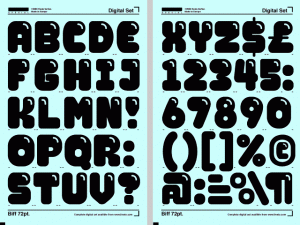
« Biff » is a typeface, created in 1999 by Swedish designer Jonas Williamsson for the Lineto type foundry. Jonas Williamsson is part of the art and design collective REALA.
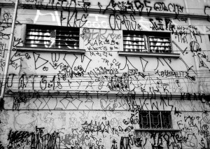
“Biff” is a font based on the aesthetic of the early (80’s-90’s) NYC graffiti, the description of the font on the Lineto website mentions in a direct way the throw-up graffiti style as main reference.
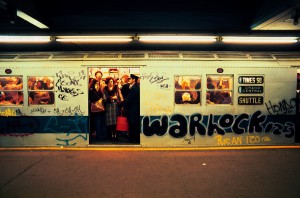
Big, simple and round letters were very common at that time, when the material available and the circumstances it took place in did not allow graffiti writers to do complex and precise pieces. Before it became the well documented worldwide culture it now is, graffiti started as a way for young uneducated urban populations to leave a trace of their existence or for gangs to mark their territory. Subways became the main vector of this « street signalization » because they travelled the city, passing from a neighborhood to another, going from the projects of the Bronx, to the wealthy streets of the Upper West Side.
This local phenomenon has been well documented at the time (1983) in the famous movie “Style Wars”
In this context, the visibility and the ability to be easily read and recognized while using basic high-pressure spray-cans and painting fast in order to avoid getting arrested was more important than a proper styling of the letters, giving birth to the « bubble » style, also called « throw-ups ».
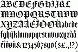
Hand writing and drawing symbols are very ancient and codified practices, present for thousands or more years in the Western countries as well as in Asia or in the Arabic world. In Europe calligraphic handwriting based on the ancient Greek and cursive Roman scripts developed in the Middle-Age (around 600 AD) by Monks, using tools such as brushes or calligraphic pens on parchment, which allowed the writer to give a lot of contrast to his letters (switching between more thin or thick lines within the same letter). These tools and the calligraphic use that was made of them gave birth to Gothic typefaces, that can be recognized by their large amount of angles and ligatures. The first bible Gutenberg printed was made using Textura characters (also called “Blackletter”). Although cut from wood the letters still resemble hand writing. Gutenberg even enhanced that feeling by cutting the letters with small variations.
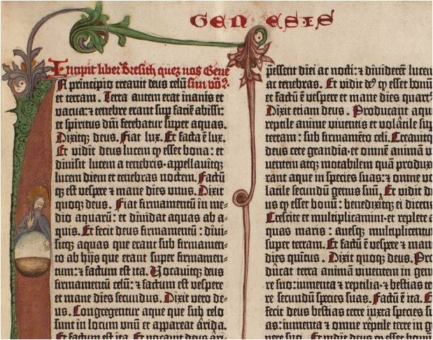
Detail of Gutenberg's bible
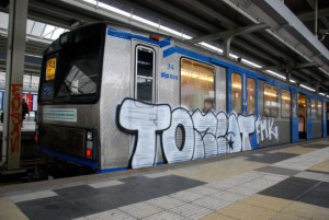
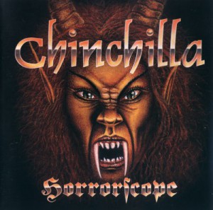
At the end of the Twentieth century, while New-York’s graffiti scene was getting a lot of attention from the medias and artistic world, influencing the arrival of similar movements (in style and in attitude) all around the world (especially in European capitals such as Paris, London or Copenhagen), writers in Sao-Paulo started developing a singular approach of this practice. Influenced by the artworks of heavy-metal bands coming from the West, they reinterpretate these Gothic typefaces (which are less and less used all around the world, exception made for these confidential subcultures) by using a mono-linear tool (spray paint) that does not allow any variation in the thickness of the line. Even their approach of graffiti writing and tagging is different than in New-York where it was all about the signature.
Sao-Paulo writers (also called « Pixadores ») are closer to a classical writing logic, rather than a signing logic, copying an ancient font and paying a lot of attention to the space between letters and lines. The surfaces they choose to write on are also quite peculiar. By climbing and risking their lives, the Picadores draw their letters in a systematic and performative way on the faces of the tall buildings and towers of the city, creating impressive compositions, each group or individuals passing one after the other on a same spot.
In the same way “Style Wars” documented New-York graffiti scene, a movie like “Pixadores” is a historically significant trace of Sao-Paulo’s writing phenomenon.
Nowadays, typography is still developed based on classical calligraphy and Latin capitals, using the shape and contrast of regular calligraphic pens, while the worldwide writing practice is mainly made using mono-linear tools like BIC pens or round-tip markers. This gap between a common contemporary behavior and the survival of this old way of dealing with typography is very real.
A typeface like Gerard Unger’s « Flora » however, is an attempt to approach typography in a more contemporary way (the letters are based on his own hand writing). The website myfonts.com also released an interview with Gerard Unger, a dutch designer who studied and taught for a long time at the Gerrit Rietveld Academy. More famous typefaces are designed based on this more contemporary technique of writing like Din Mittelschrift [x] or even Helvetica rounded [x]

The above handmade transformation of a classic fractur and a textura letter type with my Bic pen illustrates clearly what happens when old calligraphic letterforms are re-written with modern writing tool [x]
