Skip to Content Skip to Search Go to Top Navigation Go to Side Menu


"Projects" Category


My associations with the Bird chair


Saturday, March 28, 2015


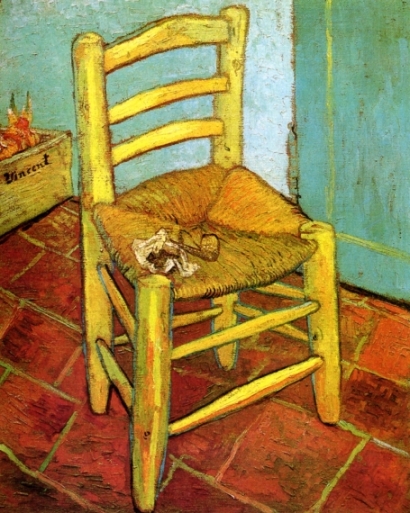
So many times I have seen chairs with an adjustable back; but I have never had any ideas where this design came from. To be honest, I was not so much interested in it, because I never liked it. However, when a previous tenant of my flat left a nice rush chair, which looks like a chair from the Van Gogh painting, I suddenly became more interested in it. I was wondering if I had this almost original Van Gogh chair, a chair of one of my favorite artists, or at least a copy of it.

a van gogh`s chair

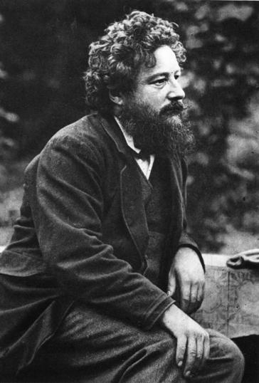
Than I saw this rush chair at an chair exhibition and I was wondering again. I tried to get more information in the books and found out that this style was brought into fashion again by William Morris. I have never heard of his name before and became interested. I found amazing the way he looked at the world, how what he was making is directly connected to his perception of life.

Being under the strong influence of medievalism while studying Classics at Oxford University, William Morris became significant figure of revival of traditional British methods of production of the textile. He was also designing wallpaper, fabrics, the stained glass windows and so on. In 1861 William Morris and his friends from the the Pre-Raphalites have found  furnishings and decorative arts company Morris, Marshall, Faulkner & Co, which became later Morris & Co. Moreover, Morris was also known as a poet and novelist. In other words, he was a very versatile person and became a role model for me in some way.

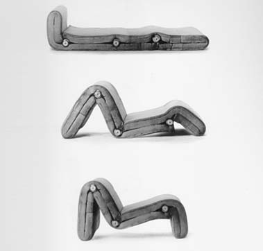
Suddenly, reading some book about him, I found information that he was that person, who has created the first chair with an adjustable back, exactly such type of chairs which I did not like. I also found a picture of this chair ,which is called Bird, and was so amazed by it. How it is different from all the similar latest chairs I have seen!

a chair with an adjustable back william morris`s chair `bird` with an adjustable back

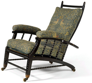
What I liked a lot is that feeling of coziness which this chair gives me. Of course it is very old fashioned and maybe too fancy and frilly, but to me it seems so comfortable and inviting. Usually, I prefer the use of minimalistic shapes and simple colours in art and design. But in case with this chair I feel like if I would have such chair somewhere in my old fashioned library, where I would have the same amount of books as Rijksmuseum does, for example, and where I could feel the specific smell of the books or somewhere on the attic, I would sit on it reading, thinking or just enjoying my sitting. It is making a special atmosphere for me because of the warm colors and a middle age pattern with a lot of small details. All its birds, fruit, flowers create a new world, when you look at it for a while. It reminds me myself at the age of 5-6, watching the illustrations by Russian artist Ivan Bilibin.

an illustration by Bilibin

They were also quite simple, but because of ornaments it was kind of imaginary traveling to the fantasy world for me. This chair gives me the feeling of infinite calmness. I think that only peaceful and calm person could create it.

While reading about William Morris, I realized that most of the times when I like some artist`s works a lot, I try not to read about this person and don’t see the pictures of his face, because sometimes his biography or facial expression ruins all my perception of his art and then I do not like it anymore. However, it did not happen in the case of Willam Morris and I still do not know why.

I found his art so organic and so suitable to his life, thoughts, home and even his face. I could not imagine another person doing such art. I also found him similar with one of my favorite Russian artist and writer of 19th century Konstantin Korovin, who was a good friend of Feodor Chaliapin.

a painting by Korovin

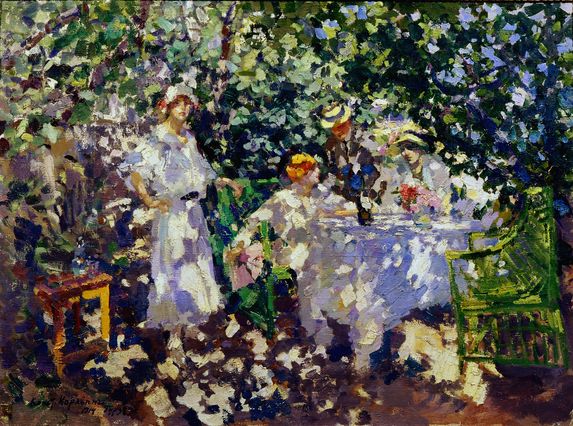
He is the second person of whom I was so happy to read, and who also, in my opinion, did not have any dissonance between his art and his point of view, which was quite similar to William Morris his ideas. Korovin liked the nature and he also was trying to make everything around him beautiful, thinking that natural beauty has a huge influence on people, their lives and behavior.

william morris konstantin-korovin

But continuing about Morris, I found his patterns for wall paper and  the book designs so elegant. Once he said: ‘I began printing books with the hope of producing some which would have a definite claim to beauty, while at the same time they should be easy to read and should not dazzle the eye……I found I had to consider chiefly the following things: the paper, the form of the type, the relative spacing of the letters, the words, and the lines; and lastly the position of the printed matter on the page‘.

a book design by William Morris

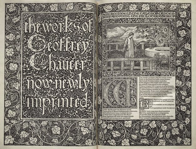
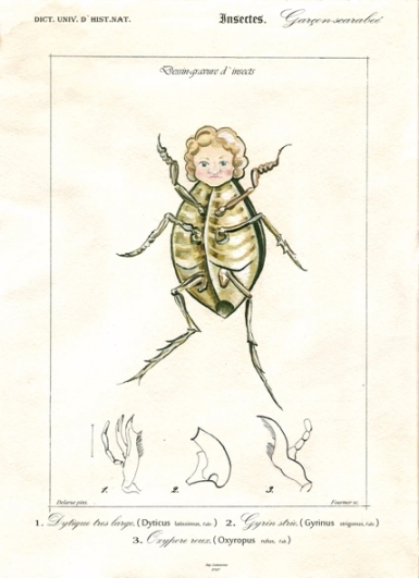
His book designs are so fairy and detailed, although not readable at all, at least to me. But it inspired me a lot and also reminded some of the old engravings depicting plants and animals. I felt like trying to do something similar, something really small and precise and I drew a silly painting depicting a beetle with a boy`s face. Of course it was not a serious work, but still after seeing William Morris`s works I had a lot of thoughts and ideas in my head, which I wanted to immediately realize.

a beetle with a boy`s face

I found out later (which was quite to be expected) that I am not the only person who was inspired by his book designs. So many people were trying to continue work in this style later. For example, such as the US artists Elbert Hubbard or W. A. Dwiggins, however some of them had not the best reputation. For instance, a daughter of William Morris called May believed that Hubbard was an obnoxious imitator of my dear father.

elbert hubbard`s book

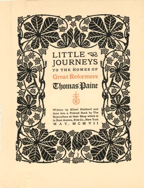
It can be true, but I see Hubbard’s books more readable, although less decorative and precise. Anyway, I think it is not that bad, when one artist creates something inspiring for other artists, who start using or copying this style in their works. It just shows again the ingenuity of the inventor. Especially, talking about William Morris, who has definitely done a lot for arts and crafts in so many fields.

In this research it was very interesting for me not only to get to know more about some subject that was my starting point, but also to see how this subject brings you to something completely different. As I wrote, even if you have no desire of getting more information about something particular, this something can bring you to completely different field which can do affect you. It gives you this possibility to see the same not interesting from the beginning thing, but from the different angle, and then you are more into it.

I still do not know anything about the rush chair, but just because I started searching for information about it, it brought me to William Morris and now I know a lot about him and also about the adjustable chair, which did not had my interest before, but now.Now I know it’s story, I like it as a design product.

The Egg – Perfectly Laid


Saturday, March 28, 2015

 5695915-retro-arne-jacobsen

It’s always hard describing a well known person, a song, movie image, object, etc. In my case it’s a chair. Not only any chair, but Arne Jacobsen’s famous, or should I say infamous Egg chair. So, to get the formalities over with, I will start with some less elaborate reading about Jacobsen’s history.

Arne Jacobsen (1902-1971), was a Danish architect and designer. Jacobsen graduated from the Danish Royal Academy of Architecture in 1927, where he later became professor in 1956. After graduating, Jacobsen quickly became a worldly name. He is internationally best known for his iconic chair design; Seven, the Ant, the Swan, and the Egg.

Jacobsen is one of the few who have enrolled in both design and architectural history. His breakthrough as an architect came in 1929, with the winning proposal for a competition, House of the Future. The proposal, which was realized temporarily in connection with a large housing exhibition represented the then 27- year-old Arne Jacobsen along with fellow student Flemming Lassen. As an architect, Arne Jacobsen was truly an interpreter of functionalism, with its rigid geometric lines, and white surfaces. Even though the rigidness and sharp lines remain in Jacobsen’s architecture, he breaks with it in his furniture design, especially with the Egg and the Swan. It is this integration of architecture and design, also known as Gesamtkunstwerk (total work of art, ideal work of art, universal artwork etc) that reveals Jacobsen’s best abilities.[x]


How can design say something about you?


fec458a966f1dbc9bf6f4772f4fa96e7
10 Crosby Fall 12 By Derek Lam

So what is it about that Egg, why has it won so many people over, what is so alluring, so irresistible that people are even willing to spend thousands of euros, or in other cases willing to buy fakes, just for the sake of owning a Jacobsen? Is there at all any difference between a fake and a real chair, does it even matter, and is it perhaps not about authenticity, but instead about the design, the look?

When someone says that the dog looks like its owner, is it because the owner chooses a dog that mirrors some of the owner’s properties. Here I guess we can transfer the example on our personal choices of design, because we often choose designed products from our own personality. Thus the objects we buy, become a kind of extension or doubling of ourselves. Often it happens unconsciously, but we can also choose to “brand” ourselves, that is, create a specific idea about ourselves to others, by choosing a particular clothing style, listen to a certain type of music and buy products that support the impression we want to give of ourselves.

If you invest in expensive design, and designer ”stuff”, it’s obvious you want to portray yourself in a certain way. But what about originality ? If someone chooses to invest in an original Egg chair, and bought it in good conscience, but it turns out it’s a fake, without the buyer knowing it. Would the value still remain the same because the conviction of belief still is intact ? Here I would argue that it is.

I recently read an article in the danish news paper Politiken, about a man, Henrik Buus Nielsen, who purchased two copy’s of Arne Jacobsen’s the Swan chair through the English dealer Voga.com.

I could well buy the classics in the ‘real’ issues, but ‘why pay 30,000 Kr, when you can make do with 7,000‘, he asks. And since the money still does not go to the designer, but the producers, he can not see a problem in buying replica furniture.

 I think Henrik Buus Nielsen makes a good point in the sense that the money doesn’t go to the designer, but to the producers. In this way he argues that the ”original” Egg or Swan chairs being produced today, in a way also are ”fake”!? So perhaps originality doesn’t play as big a role any more, and if so what is it about?


The Design


eggs

My first encounter with the Egg chair, was on an eighth grade school visit to the famous Royal SAS hotel [x] in Copenhagen. I remember starring at the chair, and feeling quite apprehensive about sitting in it, it was almost to ”valuable” in a way. It reminding me of the first time a saw a baby chicken hatch. The Idea of protection, and openness at the same time, was quite intriguing. The Egg is crafted as one piece, and in doing so, it gives the impressions of shelter, it kind of holds you, almost like a hug.The form of the chair is recognizable, you have seen it before. But there is something about the shape, the eye never becomes sated by, and you constantly see new lines and new forms. I Recently went to visit the SAS hotel again [x], and it’s quite remarkable that the Egg chairs in the lobby feel ever as contemporary as they did 10 years ago. Personally one could argue that the modernist building style and architecture, hugely inspired by the functionalists, in some cases doesn’t always work in the interior design, but in this case it really does. The round curves of the chairs, oppose the straight and linear constraints of the building, which together dance quite elegantly. While I was in the lobby I began to think about Henrik Buus Nielsen, and his fake chairs, and what if these chairs in the lobby indeed also were fakes. Firstly I don’t think anyone would noticed, or ever question their authenticity, after all they are in an original Arne Jacobsen building inside and out. And honestly I don’t think it would bother me that much if they were. In this case the design overshadows the fake, or real of it all. Stores have copied quality design for ages, but I think it’s first during the last couple of years, that it has become more accepted to own or buy fake designer goods. The tendency is all but increasing. People want good design, but for a cheaper price, and like Henrik Buus Nielsen said: ‘why pay 30,000 Kr, when you can make do with 7,000.’ Originality can always be discussed to a certain extent, and probably a question that is going to be asked more and more frequently, but good design can never be discarded. For me that is the main essence with the Egg, having a design that no matter how many years go by, and how many replicas there are produced, still prevails. And that is what Arne Jacobsen’s Egg represents. It embodies all aspects and criteria of good design, a universal design, and like the hatching of an egg, Arne Jacobsen’s chair will remain, it really is perfectly laid.

it looks great


Saturday, March 28, 2015


i say glasgow


Untitled-1

not the airport.

not the bin lorry crash.

not the coma scale.

not the distillery.

not the east midlands.

not the fishing mega-store.

not the grin (interesting, though).

not the herald.

not the irn-bru.

not the jigsaw puzzle.

not the kiss (again, interesting).

not the library.

not the mortality.

not the nino.

not the outcome scale.

not the prestwick.

not the qmu.

not the rangers FC.

not the smile.

not the tragedia 2014.

not the university.

not the vikings.

not the whisky.

not the zip.


it is a chair – a stool – a taburett.

glasgow


and it is not any famous one.


one of these pieces of furniture that catch your eye and (if you are a good listener of your inner instincts) you hear them scream get me, get me. you do not get it immediately, but time-to-time you stop by the store, to look at it, to walk around it, touch it and in this case – to sit on it – or not – rather be like – it looks great on this shelf. it looks great.

in the end you decide to get this perfect bargain for amazing 34,99 only, which could be easily the price for the materials you would use for making your own (and maybe even better).


open the box 

unwrap it

Untitled-2

to be honest, the very first sit was kind of problematic due to its construction – the three legs which you firstly have to screw in – oh what a mechanism i could really make it myself – do not really support the whole weight of a normal adult human being.


it looks great, though.


questioning


when getting such piece of design in a big and ordinary furniture store you should be less naive than when shopping at the other places. you should expect the lower price which goes hand-in-hand with the lower quality. but do you ever think of the company or the person who actually designed it? do you think of the people who manufactured it? do you think of the person who cut the wood for it? (not the case here, not the wood, lies) and do you ever think of the driver who delivered your piece to the store?


i tried to think about it. i tried. and I tried to search. and I got to the dead point at the very beginning – who actually created this chair?


no names

no dates

no places


it seems like this chair just appeared to be. and it looks great.


some blunt information about the material and the size, more color options and the list of the other places where to get it. but that is it.


another way around or a holy piece


the original is made by the American furniture design company called UM Project, founded in 2004 by Francois Chambard, who seems to be french living in the united states.

(the names of his wife and children in his bio)

UM stands for users and makers.

F.Ch. says –  interested in getting his hands dirty, but also by the recognition that the market was craving more personal, tangible products and experiences beyond the conceptual promise of brands.


their name for the chair is holy stoolwhy – and is not very different from my version – only the material is not the some pieces of wood&shit&stuff&glue but pure maple. dipped into the paint (or at least that is how i imagine it) from the bottom up – while my chair is the other way around.


the other potential users experience is same instability as i do with my cheaper version of this stool, while the studio claims that the legs are far apart, which makes the stool stable and perfect for everyday use in homes or offices.

they said – users and makers. 


i am not sure how to feel anymore.

it looks great

saturday morning, mess around me, me in bed.

it looks great

glasgow close to me.

it looks great


confession – i never sit on it. 


piles of clothes dirty clean tidy laptop pills projector bags and purses boyfriend book jacket not me but it looks great


consumer society? are we greedy? or do we just get stuff because it looks great?

it looks great, though.


another confession – i will probably never sit on it. 


however, this has been the first chair that i have ever bought. the first piece of furniture that i have bought for myself only not because i need it but because i wanted it. 


and another confession – yes, we are greedy. 


i need to think about it all over again. 


The chair as a subject of slow thought


Saturday, March 28, 2015

This is how I remember my grandfather’s chair. I remember how I used to watch him sit on it. Or, sit in it. The chair was big and my grandfather had then already begun to become tiny. It was as though this chair, with its plumpness, its doubtful green color and its leather cushions pushing into skin, offered him an escape.

Since then I’ve never seen anyone sit and disappear like him.
Maybe people don’t have the time.
Maybe people don’t have the space.
Maybe people don’t have the guts.

_________________________________________________________________________

Human beings are standing beings; our muscles are constantly at work to keep us up, while gravity is constantly pulling us down. Keeping this in mind, sitting seems to be merely a way to discharge these muscles, to compensate for the unnatural posture that is ours as a result of evolution.
It is compensation that shows that even though we’re trying (as we are developing new techniques and exploring new ways of enhancement every day) we have not reached the state of super human yet. We are still in some state where we possess human intelligence, but are trapped in our animal bodies.
To sit is to accept this animal body.

– or is it?

It is easy to speak of only physical aspects in regard to sitting. However, as both the brain and the rest of our body are part of the same nervous system, there is of course a connection between our mind and body; these two influence each other every second of every day.
Having the object ‘chair’ as a framework, I’m interested in how this chair can, being a  specific physical condition, extort or stimulate a specific mental condition. A desk-chair for instance has another mental state as a purpose than a dining chair; there is concentration on the one hand and relaxation on the other.


To explore this, I’ve been sketching chairs I come across lately. By doing so, I aimed to assemble a variety of chairs, carrying a variety of different appearances, to see what the similarities are.

mrs-fast-chairs

As it turns out, the designs of these chairs share quite some similarities (even though the chairs don’t all share the same purpose). You can see that none of them have armrests, for instance. Partly due to this, none of them seem to be ‘heavy’. All of them are quite small and all fitted in the place where I encountered them.

__________________________________________________________________________

I feel like these daily chairs, that I will refer to as fast-chairs, trigger two reactions in us;

Firstly, awareness of one’s surroundings: these chairs are in a way elongations of what is already there, instead of autonomous objects. This stimulates a way of living in which one is always cautiously aware of what is happening around him, and therefore less aware of what is happening within himself. Society tends to distract us from ourselves. As we are being placed in groups everywhere and also forced to function within these groups, we are reminded that it is these surroundings that matter; it is the society around you that you should play your part in.

Secondly, these fast-chairs stimulate fast-thinking: the lack of armrests, the light feel; all of these elements make that these chairs are only shortly used. As we rush through the day, we accept the world we live in and try to give the right answers to it. Who still dares to propose deliberate questions, though? Who still dares to sit alone, and be consumed by existential thoughts? Who still dares to disappear, like my grandfather would?

Considering the second thought, it is interesting to refer to Daniel Kahneman, a psychologist whose book ‘Thinking, fast and slow’, was published in 2011.
In his book, Kahneman distinguishes two systems of thought: “System 1” is fast, instinctive, stereotypical and emotional; “System 2” is slower, more deliberative, more calculating and more logical. System 1 is much more frequently used than System 2, explains Kahneman in the following interview:

https://www.youtube.com/watch?v=mWaIE6u3wvw
As Kahneman distinguishes these models of thinking, you could also distinguish two types of chairs. Type 1 is the fast-chair I mentioned earlier and Type 2 is the slow-chair ; the type of which there are less and less to be seen in our daily routine. This I consider as a scary thing, since the level of critical, individual thinking might follow the way down.

__________________________________________________________________________

It’s in my grandfather’s living room where you can find the slow-chair. Sitting in his chair caused for him the seemingly paradoxical situation where while surrendering his physical control, he gained mental control. Because of its physicallities (pointing towards the plumpness I talked about before), this chair was something autonomous:

It didn’t need my grandfather to sit in it to exist, my grandfather needed this chair to exist.


(more…)

In Sync, Act I


Saturday, March 28, 2015

hap_capisco

hap_capisco2


‘The Mosquito’


Friday, March 27, 2015

I am sitting behind a table, in my parents house, on a familiar, comfortable chair. I am used to this seat and it has been around for as long as I can remember. My grandmother got a set of four teak wooden chairs with a matching table as a wedding gift in the late fifties.  I have seen them in two different states throughout my life. My mother was given the set when she was about twenty years old. Feeling that the natural teak wood colour was outdated and ugly she decided to paint the chairs red. The table was not present until recently.

About a year ago my mom started to regret her decision to paint the chairs, and had them brought back to their original state. After my parents moved to a new house the chairs and table were placed in their newly furnished home, where they stand in full glory. Ever since then I keep admiring them more


family-around-Jacobsen_900

two generations sitting at the dinner table


The Danish designer/architect Arne Jacobsen (1902-1971) introduced the munkegaard chair – also known as the mosquito – in 1955, in the Munkegaard school located in Gentofte, north of Copenhagen. The school is considered one of his most important architectural works, within which he designed everything from the light fixtures to the sinks [x]. The chair that belonged to it became an absolute classic. Because of the setting that the chairs were made for, the design is highly functional. They are very easy to stack, which is perfect in places where you have to deal with limited space. They are extremely durable and comfortable at the same time. The part on which your back rests follows the natural shape of your spine. The seat of the chair is made out of pressure moulded sliced veneer. The bases are made of chrome steel tubes. The thin wood is strong but flexible. If you lean backwards, the wood moves slightly with you. The chairs are more than just convenient though. The elegant objects have an inviting look. They are unique in their simplicity with an understated aesthetic quality, which makes them so brilliant. They will complement any decor or surrounding, and bring an edge to any interior. Having only been produced from 1955 until the late sixties (and for a short amount of time in the nineties), they are now back in production again. When you pay attention they appear everywhere. When I was on a holiday in Denmark, I noticed that the chair was used in many different places, from office spaces, to cafeterias, and from the fancy to the less fancy places. Everyone seems to appreciate them. See here a website made especially for the chair.


Munkegaard schoolThe mosquito chair

Munkegaard School                             The Mosquito Chair, Teakwood


Jacobsen plays an enormous part in the image we have of danish design, and maybe even design in general. Traces of his work are found worldwide, even now still, thirty years after his death. Jacobsen was a man of extraordinary vision, strong ideals and in his time was considered true avant-garde. He is not considered intellectual or analytical in a traditional sense. Jacobsen was a producer; even when he was not working he worked nonetheless. Relaxation for him meant a shift in the creative realm. His output therefore was enormous. As a designer he strongly believed in the ‘form follows function’ motto. Jacobsen was inspired by the works of Le Corbusier, Mies van der Rohe, and Walter Gropius, which is explicitly visible in his own early works. He was also inspired by the furniture of Ray and Charles Eames who worked a lot with bent plywood. Even though Jacobsen is most famous as a designer he never called himself as such, and it is said he had a strong dislike towards the word. A lot of his designs were created in the context of the architectural buildings that they would be placed in.

I see Jacobsen as a visionary, as he played a huge part in designing the environment we live our daily lives in. From architectural masterpieces to simple things we use everyday, Jacobsen surrounds us. He makes things exactly the way I like them. His designs are the perfect formula of functionality, durability, and aesthetics. They are modern simplicity: all that it needs to be and nothing more. His mosquito chair will remain a timeless object that people will appreciate for ever. As for the chairs in my parents house, they are probably not originals, since the design is one of the most copied in the world. Nonetheless I am happy that I have grown up acquainted with such a beautiful piece of design.

ARE WE STILL FUTURISTS?


Friday, March 27, 2015


h2_1987.98.1a-d

                                        Joe Colombo, Tube Chair, 1969-1970


This is my chair. The Tube chair designed by Joe Colombo in 1969-1970. First I will introduce the intentions of this designer as a representative architect of that period and shed some light on the ideals behind designs from this time. Colombo was mainly focused on the creation of living systems (Combi- Centre of 1963) that were made to become micro-living-worlds with dynamic, multifunctional living spaces. He was very interested in furniture systems (Additional Living System), as an example the Tube Chair that could be set up in several different ways depending on the users wish!


first impression

One of the things that caught my attention when looking at this chair is the shape. To me it is quite unusual and therefore appealing to think that a construction could be shaped by only using round cylinders. I also found quite interesting the fact that these shapes could be organized according to the position you want at the moment, which to me is fascinating. Also the color of this particular model is very present and strong, adding to the shiny material it is made from. All of these elements create a quiet eye-catching construction.

Intrigued, I decided to research more about the aesthetics of the sixties and early seventies and learn the meaning behind this particular aesthetic and philosophy behind this kind of design.


for whoever want to know Joe Colombo

shiny tubes

shiny

shiny shiny shiny shiny shiny shiny shiny shiny shiny shiny

perfect colliding cells of bodies, body parts inside parts of parts of bodies inside shiny parts of bodies, is this a body, is my body this, parts of colliding shiny cells colliding bodies?

or cold neglected manufactures of machines? Machinery taped forcefully by robotic aggression or casually naturally beloved shapes holding, sustaining, lovingly enclosing tender body parts?

this is my question when sitting in the tube-chair.

both.none.both and none at the same time

because time is the reaction after this action.

orange tube chair.

I saw lots of similarities between the interior design that is visible in furniture design, decoration and the architectural use of space used by  Joe Colombo during the late sixties/early seventies. here are some pictures to show some representative interiors designed by him in this period!


Manu 6

Manu 5

MANU 3


Joe Colombo, Visiona-Livingroom of the future, 1969, Total Furnishing Unit, 1972, Spring Lamp’s prototype, table lamp version, 1968,‘Plywood Chair’, 1963, Carrello Boby, 1970, Spiral chair, 1932, B-Line Colombo Modern Multi Chair, 1969


some history lessons:

The 70s represented a reaction against the sleek minimalism and simplicity of modernism and instead sought a  “playful embellishment and radical experimentation with form.” So this meant that functionality had a high importance yet still creating an exciting and almost utopian space. These spaces had unusual colors, shapes and functions as to move towards a successful future of living.Self-expression and individuality were defining for the time. Technology started gaining importance and spaces were used as organisms that were part of their surroundings.

The architecture of the time was also very innovative when it comes to light and space. In many ways, the 70s started the concept of “open plan living”. Many designers reacted to changes of how families were starting to be structured (women started working outside of the house thanks to  technological advances and overall economical growth f.e.) with double-height spaces, open planned living and grand entrances. Many homes had giant windows, spiral or “floating” staircases, interior and second-floor balconies. The kitchens were made to accommodate more cabinets and high spaces. Many kitchens had islands or breakfast spaces, bringing the family into a room that was once reserved only for women or staff. This was a symbol for the slight change in position women were starting to have during this period, that was to be seen in the way the living space was designed by the architects of the time.

During the seventies there was an enormous use of bright colors. Houses became very inviting and there was a lot of eclecticism when it came to the furniture designs and nearly every object had a bright color such as toilets, walls, furniture and decorations which came in several colors .

The 70s was a time of many advances in the design of chairs and office furniture. Designers began experimenting with ergonomic designs for the workplace and home offices. Many Italian Designers were at the forefront of radical and experimental furniture design, using high tech materials, tubular steel, bright colors, and polyurethane plastics.

1970s stuff

• Sleek plastics and high-tech materials
• Avocado green and gold
• Bold patterns and prints
• Stacked stone fireplace and stone walls
• Timbered ceiling beams
• Exposed brick walls
• Metal (chrome, polished steel)
• Geometric shapes and lines
• Thick and chunky masculine furniture
• Fiber optic lights
• Wood paneling
• Skylights
• Atriums
• Indoor gardens
• Fireplaces with elevated hearths
• Big windows and lots of glass
• Wall-to-wall carpeting
• Sunken living rooms
• Wicker furniture
• Shag rugs
• Earth tones
• Brightly colored furniture
• Orange

MANU2MANU


Joe Colombo, Additional System chair,

1967-1968, demonstration of positions


parallels to today:

IKEA

Reading about the sixties/seventies really got me thinking about how much of the ideals and aesthetics I recognize in our contemporary culture today. Some of the things such as experimentation with form, eclectic interiors, technological advances (that are employed within living spaces) and individualistic approach to the design and embellishment of a living space are elements I strongly recognize in our culture today. The first place that came to my mind was Ikea because of the presence it has amongst nearly all of us, as well as its attracting quality it has to people today. Here are some pictures that I thought were representative for the similarities!


Ikea_catalog1 copy
Ikea_catalog2 copy

Here from ago


Friday, March 27, 2015

03/03/2015, 10:00 AM

Fresh morning, makes me want to fill it with coffee and smoke and a nice story. And so we begin this day in a spacious room which is separated from the rest of the studio by this black wall which looks as if it fell from somewhere above and its destination happened to be this studio. It is interesting but Ok, nevermind. Let us sip our coffee from tiny soup bowls and burn it with some smoky inhales of rolled tobacco, as we further dicuss about this centrally positioned chair which put us together in this time and space.

10153205_10152017634480998_129506274_n
Chris Junge in the monodrama ‘ons ons’.

I have first encountered this chair on 3rd of July 2014, during an exhibition and a theater play by Melle Hammer, who at the same time is the designer of this chair. Its cheap and grandiose look caught my attention and kept my eyes staring at it, although I never really bothered to further investigate or question its existence. It seemed cheap in terms of the material it was made of (corrugated cardboard), and grandiose for its physical characteristics and attitude.

10885450_10152527566920998_4811577043378295905_n

As I sit a few steps across from it now, this switch from past to present keeps bouncing back and forth, making me want to finalize my opinion about this chair.  But then again, I know almost nothing about it. Although it is now standing upside down, it seems as if it hasn’t changed much, if at all. Cardboard still has the same brown color, its weight still looks cheap. Only this time, there’s more to see from what its interior structure offers, which is interior support consisting of two more cardboards connecting to form a plus-shaped structure.

And it’s Melle showtime, baby, feed me with words. It’s time for some real storytelling. He starts by describing the very first click he had for this chair, which was a theater play written by him. A monologue, or a dialogue should I say, between the writer and himself and so on which doesn’t really matter, but you get the idea. Anyway, the main point is that the he was trying to design a chair for this stage set which would give enough richness to the play, as if holding the whole scene on its legs.

We have a click. Good. And we have a direction/some kind of a plan. Good. What is the the hint, an inspiration, research, anything to grasp and begin with? A CHESTERFIELD CHAIR [x]. Just some background information. Ok, now we are complete: a click, a direction and a sort of inspiration.

Let us continue with some starting points, you know, that time when you get your hands dirty and make some mess. Before Melle starts telling me how the chair came to existence, he wants to make sure I understand the term „problem-solving“ before anything else about this chair, which has its occurence before design and which was his method of designing this chair. As an example, he puts a fork and a lemon squeezer on the table explaining that both of them can be used towards the same goal, which is getting the juice, despite the fact that their functions differ. Lemon squeezer speaks for itself, while the function of a fork, in this situation, would be „problem-solving“. I couldn’t make a direct connection to the chair, but I could sense my subtle excitement for what the following information is about. And so he introduces me to the problem he encountered in the beginning of the process, that being the money. He could not afford buying one of them chesties only for a one night show, so how one dealt with the problem and tried to find a solution resulted in the making of this chair. Corrugated, brown board costs only 6 euros per sheet (inc.taxes). It’s nice, yes, sharp, but its lasting is not long. Let’s say one year long, which is still enough as it was meant to be used for a few hours. Inside, the board consists of fluted sheets which will eventually deform or collapse through longer usage. During this play, the point of the chair where most power is used is armrest. At the same time, that’s where a lot of the chair’s strength comes from and it is double-layered. This armrest gives the chair a possibility to be used as a chair. However, real power comes from the interior of the chair which consists of two centrally crossing cardboards in order to support the weight. At this point of the story, I felt the pieces of the puzzle falling into their place, but Melle concludes it by saying that it is not a design, but a matter of problem-solving.


So far the obstacles encountered in the process were solved. Theater stage had its chair, it survived the show, and it met the budget conditions. Everyone is happy. The story goes on, however. It continues with Melle’s decision to take his problem-solving design further, from which breaking and overcoming more barriers followed. The goal is different now, that being to keep the model design of the chair which is strong enough to hold its ground without the interior support. And to last longer. Pure design. What is the key? Stronger material, which is Falcon board. It consists of standing up hextagons and doesn’t need to be double-layered in order to be stronger. It costs 9-11 euros per sheet(inc.taxes). Of course, it comes with disadvantages. Falcon board cannot be cut with machine pressing and immeddiately cutting down because of its high strength, but it would be possible with a plutter which travels slowly and precisely through the board. That said, it needs time and the production costs. However, this production would allow the possibility to print on the board, which further allows customized prints. This makes it into a more industrial product; it gives a furniture-feel and you can have it made with print preferences.

Melle_kill-your-darlings Melle_kill-your-darlings-1

Scale model(corrugated board chair) • Scale model(falcon board chair)


Example of customized print

I go back to that summer evening when I first saw the chair. I try to recall my thoughts, but it seems like I hadn’t put any effort to study the chair. All I can remember is that it did trigger my amazement for it for the reasons of its cheapness and steadiness. And I wonder, if I were to gain this knowledge about the chair before seeing it on stage, would the amazement still be there, or at all? Would it change my focus on the play? At the end of the play, who would my applaud be forwarded to? I was never exposed to much information about the chairs and their existence but the information keeps being present all the time, either verbally or visually. It took two events to broaden my perspective and make me question what lies beneath their designs.

Through Melle’s story; the whole process of deciding about the material, way of production, and constant problem-solving, I have come to realize that designing chairs is one of the hardest tasks for its creator.

11103936_10152743092000998_1510648936_n

Proving Prouvé


Friday, March 27, 2015

Starting our research trip through the endless material of chairs and endless amount of possibilities to wright a research about, we traveled to remote cities to attend group chair exhibitions. During this whole complicated ritual of coming up with a specific chair, I was always thinking of the simplest one. One that I could really describe because it would be just basic. And what is about basic that fascinates me is that anyone can imagine themselves on it. It might not be the most comfortable chair but for sure it will be one to spend some study hour on.
During these basic thoughts on basic chairs, my mind would travel to the chairs that I had been sitting on for 12 continuous years in my life, from the moment that I started primary school and finished high school.

13.thrania_metalika_gl

It is probably be the chair I have been sitting on the most. I have spend endless amounts of time getting bored on this chair, getting back pain on this chair and always trying to switch between positions as to find the right place for my feet. This would be in school, when I would bend my knees, place my legs under my butt so that I have a pillow on the basis of the chair with my feet coming out of the empty space, right under the piece of plywood supporting my back. Teachers would not allow non upright positions.
I remember I was then complaining to them on why they were using a comfortable chair with foam pillows for their desks in class, while us, a mass production of  students in a mass production education were sitting on mass production chairs.
This would be just four steel legs and two molded pieces of wood. Thin plywood.
On the group chair exhibition I found myself identifying with Jean Prouvé’s Standard Chair produced during the 1930’s-1950’s since it looked very similar to the school chair I was recalling at the moment.

jean prouve

Going through the background of Jean Prouvé and his architectural achievements I got informed about his fascination with mass production of machine-made furniture and his constant adaptation to the problems of his times through working in a collective union with fellow architects such as Le Corbusier, Eileen Gray and Sonia Delaunay. In 1930, Jean Prouvé  joined the French Union of Modern Artists(UAM), a groundbreaking movement who’s artists proclaimed ‘We must rise up against everything that looks rich, against whatever is well made, and against anything inherited from grandmother…”.  Apparently, through this collective way of working, simple and basic furniture for collective use were produced. Educational furniture was some of them.
This is when I realized that my visual connection of his chair to my school chair was not random.  The name of it gives it away: “Standard Chair”.
Unfortunately I never got to sit on one of the Standard Chairs but I am convinced that it feels more or less the same.

Both chairs I am comparing take the stress on the back legs where they bear the weight of the user’s upper body. Prouvé incorporated this simple insight in his design for the Standard Chair: while steel tubing suffices for the front legs, since they are subject to less stress, the back legs are made of voluminous hollow sections that transfer the primary weight to the floor.

Feels like it is a chair to keep you aware and well-postured. I remember sitting on ugly yellow cubular (rectangular) steel legs when new, clean and polished chairs arrived having tubular(round) steel legs. A small detail I remember since somehow I prefer the first ones. I can also recall the high pitch sound of these steel legs when you would boringly move the chair in the classroom by scrubbing it on the floor. It sounded like it is going to collapse, like all the rust-proof elements would finally get un-proofed. But they didn’t.
They survived through many years, through many students sitting awkwardly on them, vandalizing them, chipping off the layers of the plywood one by one on your front classmates’ chair, writing nonsense with blanco pen in the back of it or making graffiti on it.
There was also this plastic black cap used to block the empty space of the tubular steel at the edge of it. This cap that you could patiently remove during the boredom of the class, revealing the empty space, where you could dispose your chewing gum if the teacher would see you, where you could loose your pen or hide a cheating note.

I am mostly fascinated with Prouvé’s chair because it somehow summarizes all these memories in an official and prototype way. All these years of experiencing the school chair were brought to the foreground at my first encounter with this chair, proving to me that I was sitting on it without even realizing it. That it was Him behind it.
It seems like his industrialized Standard Chair was indeed used in schools at that time and that it did inspire even Chinese companies to copy it and send them to schools all over Europe by stacking them on each other just like a good mass production product would do.

A-001


La chaise vide – A research about a chair and design and art


Friday, March 27, 2015

lachaisechair

   It seems to be safe for me to say that if you don’t know Charles and Ray Eames you are not really a cultivated person. The super design couple have been a major influence in the design and the art world in general, making timeless designs as well as conceptual art works. In this research I wanted to analyze one of my favorite chairs which was designed by the Eames and try to get to a conclusion on why I like it as much as I say I do or if I have just chosen an object that I call my favorite to make me sound more cultivated. This is it.

   To begin with I want to make a little historical introduction to this chair with a name of double entendre. La Chaise was originally designed in the year 1948 by the couple Charles and Ray Eames for a competition held by The Museum of Modern Art in New York. The competition was entitled “Low-Cost Furniture Design” and was really connected with the atmosphere of the United States at post World War II times where a lot of immigrants were imigrating to the States and furniture had become a high priced luxury. So in a way to bring new horizons to inhabitants and introduce a new way of living the MoMA made that competition and invited world wide reknown designers to participate. The Eameses got second place but for a different chair called the “DAX” chair. Although the La Chaise chair didn’t win any of the awards at the competition it got some attention for elegant design in the free form. The Eameses were really interested in innovative designs and the plastic substance in general. They did a lot of experimenting with the shape of the new content in different but clever forms. Their rounded lines were easily transformed from the sketchbooks in to development and production. Ironically the chair was too expensive in production at the time so the chair was not manufactured again until the Swiss furniture company Vitra took over the production in the year 1998 with increasing interest from the public. The ‘La Chaise’ chair is “Two bonded fiberglass shells, chromed rod base  with natural oak cruciform foot”.

The 'La Chaise' chair by Charles and Ray Eames

The ‘La Chaise’ chair by Charles and Ray Eames


   The name of the chair has like I said before a double entendre (double meaning). In the French language the word la chaise means simply the chair, given that the La Chaise is a chair the first meaning speaks for itself but the other meaning connects with the artist Gaston Lachaise. In the year 1927 Gaston Lachaise made a sculpture by the name of Floating Figure which shows a figure which appears to be floating on water. It is a female figure with arms wide in a somehow formal but welcoming posture looking upwards, perhaps to the future while her feet are laying horizontal but crossed as if she would be sitting in a sofa.

'Floating Figure' by Gaston Lachaise

‘Floating Figure’ by Gaston Lachaise


   When looking closely at the chair by the Eames and the sculpture by Lachaise. You can well see that the sculpture was an inspiration to the chair which right now in the year 2015 is still a great object both as a designed object and as an eye pleasing artwork in itself.

   Two years ago I was studying at a technical school in Reykjavik where I took a course called Design history and I remember seeing a picture of the ‘La Chaise’ next to the ‘Floating Figure’. At that moment which, when I think of it now, was perhaps kind of stupid of me, not to have thought of before, being 21 years old, I saw for the first time how thin the line is between art and design. It really crossed me as a weird experience because for me the chair itself is as much of an artwork as the original sculpture by LaChaise only with more functions as it is supposed to be comfortable to sit in although I haven’t tried it myself.

Waterman


Tuesday, March 3, 2015

Waterman

Sportsfigures_240_WatermanBrooch

I have chosen the Waterman Brooch from the series, combining a postcard of a Bruce Weber image with the diamond ring of the commissioner. Bakker bought the image as a postcard from a secondhand store in New Orleans, then embellished it with white gold and diamonds that resemble water droplets flowing from the bucket down the model’s muscular back. The movement and elegance in the original image was heightened by the placement of the gemstones. Bakker eventually created two additional brooches using the same image; one is in the collection of the Stedelijk Museum ’s-Hertogenbosch, the other in a private collection.

Gijs Bakker (1942) is a Dutch jewerly and industrial-designer, educated at the Gerrit Rietveld Academie and the Konstfack Skolan in Stockholm. Over the years, he has taught at various European art academies and worked on numerous commercial collaborations, creating everything from furniture through jewelry to public spaces. In 1985, Bakker began to use easily available and recognizable images of popular figures for his Sports figure series.

Passing by these items in the museum has made me doubtful about if it’s serious or some sort of joke ending up in the kitschy result. I’ve found this contradictional impression interesting enough to deal with it a bit further.

But what is jewellery’s role in our modern and future lives?

In the late 1960s, Gijs Bakker and Emmy Van Leersum, created a furor with their avant-garde jewelry and clothing that fused fashion, design, and art. They were the first to make minimal jewelry out of unorthodox materials, such as aluminum and plexiglas. The pair set of a real revolution in jewelry design. Bakker and Van Leersum’s breakthrough came in 1967 when they presented their vision of a total concept of fashion and jewelry with a spectacular show at the Stedelijk Museum Amsterdam. It was a provocation after which jewelery totally changed,especially on the subject of the concept of beauty and functionality.


MS04foto_matthijs schrofer_lowres


The most famous item of jewelry featured in the show is undoubtedly Bakker’s Stovepipe Necklace (with matching bracelet), now an icon of Dutch design. Bakker was the first designer to create a piece of jewelry of such audacity and on such a scale. It was a provocation.


The-Gijs-and-Emmy-Spectacle-exhibition-at-the-Stedelijk-Museum_dezeen_3


3.1999-K80249(A-C)A


https://vimeo.com/89612291

Afterwards his role in dutch jewelry design became really important in Holland, it changed the view on jewelry.


In 1993 he founded Droog Design, a Dutch collective of designers, products and information, together with design critic and historian Renny Ramakers. Together with Ramakers, Bakker was the selector and art director of all products within Droog. Droog works with independent designers to design and realize products, projects, exhibitions and events. During the Milan Furniture Fair in 1993, the duo presented a selection of sober designs made of industrial materials and found objects. The presentation was titled ‘Droog Design’, because of the simplicity and dry humor of the objects. The Droog collection is curated by Renny Ramakers and consists of around 200 products by more than a hundred designers. New designs are often developed and presented in relation with exhibitions “Saved by Droog” is an element of Droog design that buys up stock and transforms it into something completely new with a distinct voice and purpose. It’s more than sustainable design; it’s a “reflection of the designer’s creativity.

image.php

droog design [x]

In current design projects Bakker investigates the relation between craft and design. Since 2009, he is exploring this theme in his role as creative director for HAN Gallery, formerly known as Yii in Taiwan.His new series ‘Go for Gold’ emphasizes the importance of gold in the competitive world of sports, business and politics. By laser-welding gold on titanium or by laser-cutting gold under titanium, the brooches literally go for gold.


 „I am watching football in the same way as I am watching ballet”


The Sport figures series used copies of images from various newspapers of athletes in track along with contrasting, valuable materials like gold for example – to emphasize and highlight a particular moment. The practice of this clash of substances ends up in a playful tension that comes from having precious gems combined with an everyday object, bringing focus (or questioning) the borderline between „cheap” and „expensive” materials.

Does the use of valuable material makes something a jewelry (as the commissioner ask for it) or does it become a design piece driven by the vision of the maker himself?

Since he was fluently shifting through content, character, and medium it makes it hard to categorize the Sports figure series. Visual references from sports, automotive, and history are imbued with a trademark postmodern stance: sarcastic, ironic, and unsubtly nonconforming.

All of the works demonstrate his unconventional relationship with his discipline, as Bakker once admitted, „I dislike jewelry. I dislike the behavior of jewelry buying ladies. I dislike ladies jewelry. jewelry shops depress me. if jewelry is only decorative, I lose interest. I like jewelry because it is absolutely superfluous. I like jewelry because it is never a prior functional. I like jewelry because like clothes, it is closest to our body and says something about the wearer. a painting is hung on the wall and can be ignored. a piece of jewelry is worn and creates an impression.”


timthumb.php


For the first look the Waterman seemed for me like objects what you find in shops selling useless stuff for tourist, ranging the weirdest combinations of taste and culture.  Yet Bakker’s main approach was driven by the concept over the final product. So instead of the craftmanship’s usual categories, he tried to focus on the driving thought behind the piece, which in this case was the clash of materials, a surprising marriage between the every dayness of the paper cut picture and the stones. For me, this piece is still about the beauty itself (like all jewellery), just inviting a rather unusual form of it, at least within this field. But picking athletes somehow still tells about the beauty, so this piece becomes a celebration of the natural born beauty, combined and emphasized by the diamonds, which becomes a secondary tool for this purpose rather then the main „attraction” or message of the work. Like if it would pass it’s shine to the photo itself.

Yet I think that next to all the importance of conceptual approach, the visual and applied design principle shouldn’t be left behind too much, especially in an originally and historically applied discipline like jewellery. I feel that it’s just not the right tool or way to mediate such a message. Let’s be honest, a jewel is made for wearing, but who would walk around in a piece like Waterman?


Complexity is Free


Monday, January 12, 2015

«Innovation can’t be found in the drawing of an object but in the use that is made of technology, materials, techniques. Technology has no interest for its image, but it is interesting for the service it offers. Its image must disappear, melt into the object. Technology is at the service of the result : price, lightness, comfort…» Patrick Jouin


OneShot.MGX_01

OneShot.MGX by Patrick Jouin

OneShot.MGX is a 3D-printed stool designed by the french designer Partick Jouin in 2004.This stool was manufactured using the 3D printing technique. Born in the mid 1980s, 3D printing, more formally known as additive manufacturing, was used at this time for visual prototyping. But some companies soon realized that the technology had the potential to do more than just producing prototypes. In 2003, .MGX by Materialise was founded and they invited world-class designers to experiment with this new technique and come up with novel products that were only possible with this new technology. Patrick Jouin was one of them and created on this occasion two chairs, a table and this stool.

I consider this item as one of the the most relevant among the Stedelijk’s design collection. Innovative, surprising, light, handy, delicate, subtile… it satisfies all the expectations that we have from a stool. You can take it anywhere easily, store it in a cupboard, in a car, in a bag. This object is in harmony with Patrick Jouin’s philosophy if we believe his words : «The objects we draw today are more discrete. They are more «affectuous». Discrete friends. They don’t tell less, they simply do it more slowly. It’s like homeopathy. They diffuse rather than they speak.»  I discovered Patrick at the same time as his product during the exhibition and I think he has a clear mind about what is going on in design nowadays. He created his own agency in 1998 after some years at Philippe Strack’s agency. His style is often qualified as discrete.

Patrick Jouin is really interested in experimenting new technologies. In an interview about rapid prototyping, P.J. said «The distance in between the creation, the drawing, and the final object was very short. It was like a sketch which is coming alive and taking shape in 3D. I know that every time in the history of design, when there is a new technology, there is always a new aesthetic.»

Patrick Jouin talking about 3D Printing

«Industrial production requires a radical conversion : we must start from the function of the object and possibilities of the machine. The limited performance of the craft production allowed sometimes the realization of original or richly decorated forms. Production by the machine, in series, needs a simplification of manufacturing’s forms and processes.» Willem Sandberg wrote these words around 1970 in a catalogue about the german designer Wilhelm Wagenfeld. Should we consider this way of thinking as still relevant nowadays ? New technologies such as 3D printing make these ideas a bit old-fashioned. I am not saying that this aesthetic is over, but 3D printing doesn’t undergo the same rules as the more industrial technique. Patrick Jouin said : «There are so many aspects, undiscovered yet, it is a new way to think how an object can be made.»

In his book Fabricated : The New World of 3D Printing, Cornell University researcher Hod Lipson describes ten of the underlying principles fundamental to 3D printing. The first principle he notes is that «manufacturing complexity is free». Unlike traditional manufacturing processes, where extra complexity requires a more expensive mold with more parts, there is no penalty with 3D printing when an object is made more complex. On the contrary, in some cases there may even be a benefit. With 3D printing, designers and artists can explore new kinds of highly complex and intricate forms that would have been impossible to realize with traditional techniques, and these come at no extra cost. It is a proverbial candy store of new formal possibilities, resulting in a new design language that is baroque and often eclectic.

Kram/Weisshaar, Multithread

Multithread #06 Console Shelf[x]

«Just because you can, doesn’t mean you have to». It is true that there is a risk of overuse, a risk that it becomes too much. What should designers do now that complexity is not a problem anymore. Designers are still in the early stages of the search for aesthetic in 3D printing. Many of the experiment we see today may appear outdated in ten years, but they are playing an important role in paving the way. With an increasing number of designers, artists, and makers gaining access to 3D printing, a mature formal language will develop over time, uniting and exploiting the full potential of the technology’s aesthetic powers.

«…people often proclaims grand ideas, things that are just after all, the qualities expected about an object. What an object owes us.» Patrick Jouin

Many studios and companies are working on developing this technique. In Amsterdam, we have the 3D Print Canal House, the first 3D-printed house. It also acts as an exhibition and interactive research center for 3D-printed architecture and related areas, such as material recycling, policy making, and smart electricity grids. The 3D Print Canal House has been printed on-site with the KamerMaker, a shipping container that has been converted into a giant 3D printer.

An aspect of 3D printing that I find particularly interesting is the way you share a product. The designer creates a file that could basically be printed anywhere by any 3D printer (if the printer is able to do so), but then a question appears, how is he going to sell it ? In a shop as a finished object or on internet/in a shop as a file still ?

What will make him choose a certain option ? If you decide to sell for example your 3D printed vases in a shop, you will propose to the public a definite object, with definite colors, materials and price. These choices will be of course part of your research and of course as a designer you know better than anyone the nice colors, but you don’t give to the buyer many possibilities. Eventually you could print ten times the same vase with each time different materials and/or colors, but then you take the risk that some of them might not be successful. You might have eventually planned everything with a marketing analyze or something else, but I am sure that 3D printing could be exploited in a much better way. In this way, the 3D print is not highlighted.

Imagine that you sell the product on your website. The vase that you created has a definite shape, but no colors for the moment, it is still a neutral file, just a shape. Then you put it online and decide the price of it. You could also suggests some colors or materials, without saying that one is better than another. The customer will be free now to  print the vase as he wants. There is no risk of overproduction in this case and there is also an attractive aspect for the customer. He might feel involved in the project and enjoy the fact of being part of the creative process. I talked about the price previously and I think this aspect is also interesting to discuss. How would you fix a price ? If the customer want to print it at home, you would sell a file only, so the customer will print and pay the material by himself. What is the value of it ? Is it in terms of technical innovation or complexity ? Or in terms of originality ? 3D printing could also lead to personal (home) creations and lead to the disappearance of designers. Of course, there will always be designers, but they could be at stake. For sure, this solution is possible only if a great number a person would have 3D printer at home, and it is still not the case, but it may happen soon. We can already see this kind of website where you have the possibility to create your own product.

I am also wondering about reproduction, re-appropriation and protection. How can you protect a product from reproduction or re-appropriation ? How could you recognize an original from the copie ? You could not.

The last possibility that I find personally the most interesting nowadays is to have your own 3D design/print shop. Imagine that you have your design studio that is at the same time a production place. You keep into the studio a selection of the products, accompanied by suggestions of colors and materials. Customers would come into the shop and ask for the vase 3D printed in red and blue plastic with maybe some adjustements. The nice thing is that you have then a real contact with the buyer, you can advice them, keep them informed and help them. You can imagine many things with 3D printing. It could provide a solution to over-production and consumption.

For example, companies could provide 3D files that allows you to print the piece of your machine that is broken instead of ordering it and get it from the other side of the world. You would just have to print it. For sure, the materials that you use to print will not come alone, but I think it could help. There are many other subjects to discuss, so if you are interested in 3D printing, you should have a look at this conference  about the environmental impact of 3D printing that was given on December 13th 2013.

A lot of people are active in 3D printing research. This is the case of Dr. Behrokh Khoshnevis of the University of Southern California which has been developing since 1998 a layered manufacturing process called Contour Crafting, in which cement or concrete is pumped through a nozzle connected to a computer-controlled crane or gantry. This draws the contours of the largescale structure to be built layer by layer.


Foster+Partners, Lunar Base

3D printing with Lunar soil by Foster + Partners[x]

Enrico Dini also, a passionate Italian inventor, has teamed up with the European Space Agency and the architects Foster+Partners to test the feasibility of a 3D-printed permanent moon bases built out of moondust. Contour Crafting is also aiming for the moon in a partnership the NASA. Give the significant challenges of scaling up 3D printing machinery to encompass an entire building, many concluded that, for the time being, the most pragmatic approach is to fabricate constructions in sections and then to stack these sections on-site.

Finally, if you are interested, I link you to some studios who realized some really nice project with 3D printing technique. I hope you enjoyed this article.

3D printing is definitely the technology of tomorrow.

MODEL SCULPTURE & DRAGONS


Sunday, January 11, 2015

A model is initially an object whose purpose is either to represent the real world or to be translated into the real world, in short the model can be a copy of reality or reality a copy of the model. The main difference is in terms of scale. Usually the model is a miniature of reality. But what more can it be? When we look at a toy car and a car, what do we see? Is the toy car just a replica of the car in a tiny scale? It is hard to analyze such a thing but I think that there is a huge difference triggered by (but not exclusively) the change of scale. When the toy car is made, it has no longer the same purpose as the car does. A child playing with it might as well imagine it just as real as the car and drive it around with his fingers, or see it in a whole new world, making it fly away, fist-fight and dance Rock n’ Roll. The new scale for things sometimes creates a new meaning for them above representation, a new reality even if they are seemingly the same object in different sizes.

model

sketch model of van Gogh Museum, Amsterdam by Gerrit Rietveld [object: SM]

In 1963-1964, the furniture designer and architect Gerrit Rietveld (1888-1964) designs the Amsterdam Van Gogh Museum. In 1964 the architect dies before the project is finished. The building is completed by his partners  J. Van Dillen and J. Van Tricht, and the construction was concluded in 1973. The model exposed in the design collection of the Stedelijk was produced by Gerrit Rietveld in those first two years. It is a sketchy model made of wood, paper, cardboard and glass. The final building is close but does not respect this concept, with a unified color of brick and very little white (from front).
I present this piece for multiple reasons. First, because in my personal taste, I prefer this version from the finished one. Rich in contrast between black and white rectangles overlapping each other, the building has the balanced complexity of the Rietveld style although the shapes which compose it stay simple and limited (only colors: white, black and blue) which gives sobriety to the building. When we look at the final museum’s front view, the unity in brick color makes the building lose its striking composition at first sight, for the overlapping rectangles melt into each other. The second reason why I chose this model is because of the way it was made, without any connection to the building itself. I see in between the other models of the museum [x], well built, detailed and clean; something of a stain. On a dirty piece of wood on which we can see quick pencil sketches for the display, an irregular, clumsy, and worn little building is erected. The colors are simply indicated by a rapid and un-precise use of color pencils ( blue and black). The materials used are cheap, and if we try we might not even find one horizontal or vertical line. And yet it is beautiful, marrying complexity and simplicity in form and color, with a rich diversity of cheap materials. Its cheapness gives it a poetic and rough authentic aspect, we see that it was handmade.

collage-model


James Castle

This may remind us of James Castle’s sown cardboard sculptures, which are made of scrap which gives them strength, or Bill Traylor’s choice (and no choice) of using cheap surfaces like cardboard for his paintings.

Bill Traylor blue man with suitcase                                                               James Castle


The model is in addition to this, very close to the final version. That sketchy but precise model shows the talent of Gerrit Rietveld as an architect, like the lines of a great draftsman. Its clumsiness along with the use of paper, lightly put together and slight curved, gives a feeling of fragility and tenderness which contrasts with the strongly built shapes of Rietveld’s buildings or the roughness of the materials.
I love this model because –to me– it is not a model anymore but a sculpture that contrasts with what we usually see, giving a new idea of his work and of what a model can be, even though it was not intended to become a piece of art. A model can be seen in ways that exceed its limits as a technical object.

A perfect embodiment of this idea is seen in the Tim Burton film Beetlejuice. The movie takes place in a small town and specifically in a house on top of a hill overlooking the town. In the opening scene (link here and here for the end with spider) a fake areal shot of the town is taken on a model of the town one of the main characters has built. We are tricked into believing that we are flying over a forest to finally overlook the whole town, then fly over and across it all the way to the house on top of the hill. Although it is possible to see that the scene is really shot on a model, the illusion is strong, and we are astonished to see a real spider (this time) which seems to be the size of a hippo, climb over the roof and be picked up by a real (gigantic) hand. What this illusion does is it gives life to the model, it gives it a new reality, and this is proved later on in the movie when we discover that the model has an “inhabitant”. When the protagonists are changed to the scale of the model, (in this scene) they come to its graveyard to dig up the main antagonist, Beetlejuice. In this case, the change of scale from real world to model is more than representation, the real world and the model are entangled, mingled into each other, whilst the two are different, the real world and the new world of the model. The model can open a whole new world for our imagination to create, a transcendental realm full of fire, wonder, and dragons.

Paul Schuitema: a pioneer of photomontage in the field of food industry


Sunday, January 11, 2015

                                                                                               Berkel Ham from Berkel LTD. Rotterdam (1928) By Paul Schuitema. 

In the Stedelijk’s permanent design collection, I chose one of Paul Schuitema’s posters. Paul Schuitema (1897-1973) is a Dutch graphic designer who also designed furniture, practiced photography and typography. He constructed his advertisements on the principles of De Stijl (more mathematical, abstract and simplified, when compared to previous styles) and Constructivism (as art had to contain social means). El Lissitzky’s ideas, as well as Rodchenko’s (his way of using new angles in photography – such as from high above or down below the subject) influenced him in the design of his industrial advertisements. Those same influences can be found in the works of his colleague, Piet Zwart. Repetition, geometrical forms and the use of primary colors are used in a similar way in both their posters. Paul Schuitema lived during the time of industrialization and of mass production after World War one. These periods can be felt in his poster and the subject chosen.

Schuitema

He started to use Photomontage in 1926 and was one of the pioneers of this technique in the field of industrial design. This poster is an advertising print for food processing industries. It was situated amongst others of his in the Stedelijk’s Design collection. It was explained how photography, not yet considered as an autonomous art, was used for another medium’s finality. Photography was newly used in the 1930’s in order to bring further other types of art.

This is what first appealed to me when I encountered this poster. It felt relevant to our times and to how projects are now executed. More and more of final projects aren’t only constructed of one medium. For example photography is rarely a finality in itself, but a way to get to an other specific result. This new technique of photomontage is relevant to our time in that way. In projects and art works, the medium used is now rarely thought as a finality in itself.

This new technique and his influences can be noticed in other posters of his:schuitema_lg

Primary colors, the use of photography, repetition and new angles as from high above or from down below are used in this second poster as well. Here is another example of his colleague’s, Piet Zwart’s, work, which is closely related to his:

pion6

After paying attention to Paul Schuitema’s poster (the first example used) – It’s design qualities and it’s historical position in the development of arts – I looked at it in it’s original function. This poster was designed in 1928 as an advertisement for the Berkel Ham industry. This subject, presented in the poster, actually takes over its technique and style. It appealed to me more when I tried to look at it in its original context.

Food nowadays is still advertised everywhere, however the energy coming out of them feels different. Therefore, I started to question the accuracy of this poster, for us today, on that matter. Food and its industry is a constant subject today – where it comes from, what is in it, how we eat it, how to eat in a balanced way, the products used for its production… The worry of how we feed ourselves could be considered as one of society’s current obsession. Seen from this point of view, this poster underlines the change of perception we have of food, from the 1930’s to nowadays.

The typography, the choice of photography, and the way the whole poster is disposed, gives me a feeling of playfulness and simplicity. A feeling of innocence almost emerges out of it. As I looked through other food advertisements, of different syles, the gap seemed even more clear:


Vintage-Meat-Ads-03-634x920       50cannedmeat

These posters were used as advertisements in the 1940’s and 50’s. Sentences as :  « This is not just a piece of meat … this is something a man wants to come home to … something that helps children to grow … something that makes women proud of their meals », were used. If these posters were contemporary, they could almost only be received in a satiric way.

Based on the same principles of photomontage, the Dutch group of graphic designers « Wild Plakken » (1977) created posters with a specific social and political goal. They chose clients according to their ideological means. Their belief that a designer had to use his graphic designs in order to mix life to art related to Paul Schuitema and his influences of De Stijl and Constructivism. They illegally pasted posters in Amsterdam, fulfilling this idea of spreading their ideals. Women rights and racism are some examples of subjects they would portray in their posters.

CRI_7259


Some of the same principles of Paul Schuitema can be refound in the esthetic of this poster. In the same way as in the Berkel’s ham industry poster, a different feeling appeals to me. This example of  the Wild Plakken’s poster doesn’t recall innocence, but still gives me a feelling that such an image on such subjects, today, is not as easily disposed for everyone in the city. It is interesting to see how, through time and the development of one technique – such as photomontage – these posters still give a feeling that a gap has been created. Paul Schuitema’s poster and this one example, still give me the impression that this type of expression is less accessible to everyone nowadays.

On the subject of the portrayal of food through images : Andreas Gursky’s photo « 99 cent » (1999) states a point of vue which completely contradicts with the posters above. Without giving us a direct position to take towards this subject, Andreas Gursky still pushes a feeling of being overwhelmed and crushed under the overtake of food industry. The feeling is completely contradictory to the one Paul Schuitema’s poster gives us. Both art pieces are thoughtfully structured but opposing themselves in their function.

Andreas-Gursky-4

They are however hard to compare as one is an advertisement and the other, a photography piece. I used Andreas Gursky’s photography as an example of what continuously changed our minds on the food industry. It is pieces of art as this one that put us aware and more distant from the advertisements we see. The opposition of those two examples, in the way they apply photomontage, can maybe explain the gap that I feel in the feeling those images give. As one (Paul Schuitema’s poster) shows a one sided image on how to perceive a subject, the other (« 99 cent »)  faces you to a situation, without giving a straight opinion but implying it through the image.

Art pieces (with « 99 cent » as an example), the overflow of news and a number of new scientific researches, give us a constant possibility to mistrust what is shown to us in advertisements. It is why Paul Schuitema’s poster struck me more than his others. His image underlines such a great gap of how society approached food industry at the time to now. His poster isn’t accurate for today’s society, which is what pushes its relevance in the Design Collection. It is relevant in its design – to how art works are proceeded today  – , and relevant in its subject – as it is one of today’s main concerns.


Who is Gherpe? About Superarchitecture and corruption by conventions


Saturday, January 10, 2015

Gherpe – a lamp designed by Superstudio
Gherpe
 (via:http://www.nova68.com/gherpelamp.html)

I think the Gherpe lamp is a relevant design because of several reasons. First of all, the lamp itself is made of materials that are still considered modern, even though it was designed more then forty years ago. That alone already shows how we still hang on to, or maybe are condemned to these materials nowadays. Next to that is the design, which references to the mathematics that appear in Nautilus shells. Then again the way this shape is interpreted is more like a cartoon of it, leaving the classical Nautilus image behind. This way of designing, letting interests and research – the designer was into marine biology – influence the work is something I think many designers work like, or would like to work like. Last reason why I think this is a relevant piece is because I think the whole of Superstudio, their designs and mainly their architecture is, because of their new views and extensive researches, relevant. They were part of a critical wave, commenting on Florence and it’s ancient heritage, on the years of full trust in technology and on architects before them. They wanted designers to be responsible for their creations when they design to make a better world. Their criticality on how design and architecture influences the life of other people and self-reflectiveness is what made them different from many before them. This idealism in theories, but with playfulness towards the designing process itself is to my opinion something important to keep relevant in art and design.

gherpe_01


(via:http://photografieundmehr.com/pics/2012-11/gherpe_01.jpg)

Nautilus-OS

Nautilus shell

(via: http://www.hungrywalrus.com/wp-content/uploads/2011/08/Nautilus-POS.jpg)

To test it’s relevance I’ m trying to get to know what Gherpe is, what it is not and what it could be, what it means to Superstudio and what it means to me.

At a time where popular culture is stealing all the science and logic that Modernism employed to make this world better, with youngsters starting to call themselves Mod.’s, Pop Art commenting on this Modernist reality and society by reproducing imagery from that popular culture, Gherpe is born. It’s designed by Cristiano Toraldo di Francia, and adopted by Superstudio, the Italian architecture group where Toraldo is the most important member of, together with Adolfo Natalini, who is a Pop Art painter when they found the group in 1966.


big_374062_2176_giulia_superstudio3

Alessandro Magris, Cristiano Toraldo di Francia, Piero Frassinelli, Roberto Magris, Adolfo Natalini
(via:http://www.domusweb.it/content/dam/domusweb/en/from-the-archive/2012/02/11/superstudio-projects-and-thoughts/big_374062_2176_giulia_superstudio3.jpg)


Where Modernism, in its affirmation of the human power to improve their environment the aid of practical experimentation and science, goes for logic, Gherpe pretty much mocks Modernism, by taking it’s science and it’s new materials to make something that is not in any way useful other than it’s aesthetical purpose. Gherpe is not practical, and it’s not helpful. But Gherpe’s cartoon like ambiguity looks fun, you want to have it, it looks smart even though it isn’t, and that’s exactly in line with popular culture of that day. Gherpes connection with nature is meaningless, but very important for it’s attractiveness. You could say it’s a beauty trick. The interest of Superstudio in nature combined with construction is to be traced back to one of their guides in the Academy of Architecture in Florence, which most members of Superstudio were attending. His name was Leonardo Savioli. As Adolfo Natalini says about Savioli: “Even when the drawings looked like traces of insects or explosions, galaxies, spiderwebs or wounds, they were always able to resemble parts of constructions or something constructable”.


Savioli_plateXVIII

Plate XVIII, a drawing by Savioli

(via:www.etsavega.net/dibex/Savioli_citta-e.htm)


The fact that Gherpe’s reference to nature doesn’t have any symbolism or engagement in it, already shows what things it really has to do with, things like freedom. Gherpe is free from the morals that come with modernism: Superstudio didn’t think architecture could change the world for the better. Gherpe is the joyous realization that the burden of creating something that will add to create paradise on earth is not possible.

Gherpe was in the Superarchitettura show. This was a show combining two groups. The Superstudio and Archizoom, both from Florence and mainly from the same architecture school. The show took place right after a flood had swallowed a chunk of Florence’s renaissance beauty, at a time where others mourned renaissance architectures birthplace the Superstudio show was a psychedelic experience work that purposely lacked engagement and put consumerism on a pedestal. Their ideal: morals were irrelevant to architecture, and so you should not aim to change the world with it either. So there is a different approach: “Superarchittettura accepts the logic of production and consumption, it utilizes it in an attempt at demystification” and  “Superarchitecture is the architecture of superproduction, of superconsumption, of superinduction of superconsumption, of the supermarket, of the superman, of the super gasoline”.

gherpe-archivio2

Toraldo and Gherpe, and Passiflora
(via:http://www.centrostudipoltronova.it/wp/wp-content/uploads/2014/07/gherpe-archivio2.jpg)

Seeing Gherpe from the eye of the Superarchitecture that it is, means not that Gherpe was meant for a world better than ours, but for the world as it was in 1967, where consumption and production were exploding. You could say, Gherpe is super itself. A lamp fitting for all these phenomena that felt relevant for the younger generation at this time. Instead of denying these phenomena, or wanting to change them, Superstudio designed something that fit in. It might even accelerate superconsumption, be meant for that purpose. In this perspective Gherpe is in a way a neo-futuristic piece, a monument for the speed and mass of its time. You could also see Gherpe as an, perhaps slightly melancholic, attempt at creating something, something touchable and real out of all the superlatives that together form the ungraspable frightening dystopia that was (and is) everyday life. And maybe that this is the reason we enjoy it, because Gherpe is then our comfort, a sign that from superproduction and superconsumption something appreciable can materialize.

superarchitettura-3

Image of Superarchittettura show
(via:http://www.stylepark.com/en/news/a-landscape-of-mountains-and-valleys-the-design-parade-03-in-hyeres/283330)

Gherpe shows Superstudio’s double nature: it’s serious, socially critical but can also be ironic.  When Superstudio presents an utopian, or dystopian design we can never accept it at face value. When they design a utopia, they explore every possibility into the extreme, and so exploration of the architecture itself is it’s aim. Instead of presenting the possible solutions it tells the stories of the decisions of mankind, the ones it made and might make. A very serious and melancholic subject, reflecting their serious opinions (Adolfo Natalini: “the race of consumerism is definitely wrong”) but enabling playful and smart experimentations.

As Gherpe is an early Superstudio piece, Gherpe is also an early exploration which, as we can see in the Stedelijk, ended in a lamp. As Superstudio kept exploring their ideas became more and more critical of architecture and design, which made their projects end up way less often in actual designs and realizable architecture. Instead they expressed their ideas in movies, models and collages.

According to Superstudio architecture was corrupted to such an extent that even the avant-garde architect was guilty of suppressing human development, since he made use of existing conventions in architecture. An interesting idea, which suggests human development can come from no other place than out of the blue. Where one can ask the question what human development actually is, but let’s get back to Superstudio. They saw reason as the only quality that’s uncorrupted by these conventions. This makes it’s easy to see why they step farther away from architecture and design, as they are easily seen as complete and valid evidence of manifestos or ideas, rather than generally questioning and alienating. That doesn’t mean Superstudio didn’t make anything at all anymore, as you might expect.

Instead they found ways to visualize what architecture could be, without designing from conventions. Something that wasn’t really architecture. For the exhibition “ Italy: The New Domestic Landscape”  in the MOMA Superstudio made an 8 x 8 black square on the floor, and made it repeat itself in an endless grid by placing mirrors at the walls. They put a box with wires on each corner, making the plugs recur regularly in this “landscape” [x]. It wasn’t the first time they worked with this black grid [x], but it was the first time architecture and design was so completely dismissed that it was actually left out at all. Even though this seems like the ultimate conclusion, there’s more to the ever expanding black grid. In the Continuous Monument, a glass grid-like structure that spans all over the world, visualized in absurd collages [x] where it embraces Manhattan or faces the Taj Mahal, the irony, social critic and dystopia remains: a homogenous unrealizable blank space, but also a space where we can project our own ideas on of what it really is. Our ideas, full of conventions and corruption.

521d003de8e44effd40000a8_environments-and-counter-environments-italy-the-new-domestic-landscape-moma-1972-exhibition_5-528x362

Grid in the Moma: View of Supersurface: An Alternate Model of Life on Earth, by Superstudio, in Italy: The New Domestic Landscape, MoMA, 1972. Photo: Copyright Cristiano Toraldo di Francia.

(via: http://www.archdaily.com/421040/environments-and-counter-environments-italy-the-new-domestic-landscape-moma-1972-exhibition/)

As you understand now, Gherpe too is a piece of corruption. A mash up of conventions and brainwashing, which will, as you look at it, only corrupt and brainwash you more. Which is very true in the sense that, the more you know, the more you are stuck in the things that already are. Whether that really suppresses the development of humanity is questionable. I personally am less negative about the influences of the past and the conventions we get taught. But the fact that Superstudio deals so productively with their frustrations over a system is something everyone, defenitely every art student, can be inspired by.

Over thinking and commenting on how design works is something I find fundamentally important, as I think this self reflection is what can bring us to new insights. Insights that can be reflected on again later, a continuous process I’d say would be human development rather than corruption. But, if you are reading this, and you do happen to find yourself having been corrupted by looking at Gherpe and reading about it, then at least we can be sure about it’s relevance for the (design) world today.


2701091233096716superstudio_monument_1_kl

The Continuous Monument, one of the many collages.

(via: http://www.spaceinvading.com/bookmarklet/Images/2701091233096716superstudio_monument_1_kl.jpg)

HEAD JEWELRY


Monday, December 1, 2014

Vaclav Cigler is a czech artist mostly known for his pioneering work in glass. Since the 1950s, Cigler has focused on glass sculpture and is still today considered as one of the preeminent artists working in glass. My interest in his work though did not develop from one of his glass sculptures but from an image of a mannequin head wearing a mysterious head jewelry exhibited in Stedelijk Museum.

Head Jewelry by Václav Cigler[x]

The jewelry consists of two galvanised brass circles put together, one that is fitting the circumference of the head and one attached to the other and placed in front of the face. The placing of the circle in front of the face affects the vision of the person wearing the jewelry. It becomes a frame through which the person watch the surroundings and in that way it changes and disturbs the perception. Furthermore the circled brass acts like mirrors: when angled, it gives the wearer a view of the room or of the people around which allows the possibility of intimate eye contact or covert observation. Imagining a lot of people walking around with this jewelry in the context of today it easily could be considered as some sort of electronic device attached to the head with a chip improving human possibilities. Or it could be a future, simplified version of virtual reality glasses having an invisible screen circled around the head. Especially the aspect of the mirror in the circle makes it relatable to virtual reality where the people around and the room then adapts into the screen of the virtual reality so it becomes this interaction between physical- and virtual reality.

When looking through some of Cigler’s work in glass it becomes clear that he is very interested in the human perception. That is also one of the reasons for his consistent interest in the work with glass because it is possible to create a new and different vision in that medium.

“…Glass is the most imaginative material that man has ever created. The presence of glass in a human space conditions not only the space itself but also an as the user. Glass is for me a pretext for expressing a different spatial and emotional perception of the world. A perception made unique by the optical means offered by this material, as well as by the new possibilities for using it in space… in glass, there’s the authenticity of the material, the discovery that it has uncommon optical and material properties, such as malleability. Glass by itself is a sufficient source of inspiration.”

Vane 2008 by Václav Cigler [x]

The sculpture “Vane” made in 2009 is an optical glass with an aperture in the center that gives an undistorted view of the landscape. A new visual perspective is given and what is seen is a collage space of reality.

In 1960 the phrase “Cyborg” was coined in a story called “Cyborgs and Space” and was used to describe a human being augmented with technological attachments which I find very interesting to put in relation with Cigler’s Head Jewelry. Manfred Clynes, being the inventor of the word cyborg, considered it as more human which is a contradiction to how it is generally perceived as something inhuman. But there is something interesting towards understanding or maybe even accepting a direct interaction between organisms and technology in order to enlarge the human experience.

You can question the definition of a cyborg and maybe this is also what Clynes is already pointing out; are all humans cyborgs? We do include both organic and inorganic subsystems. Inorganic systems being for instance prosthetic limbs or vaccinations that program the immune system in our bodies. At least it could be argued that we are living a cyborgian existence. A cyborg society has developed where the connection between organic and machine systems is extremely complex and inescapable.

A more direct example of a cyborg, or maybe as direct as most people would understand the definition of a cyborg, is Neil Harbisson. He is even considered to be the world’s first cyborg with an antenna attached to the back of his skull dangling over his forehead very similar to the shape of the head jewelry. Harbisson sees in grayscale but the antenna allows him to hear the color spectrum, even the colors that are beyond the range of human sight.

Neil_Harbisson_cyborgist

Neil Harbinsson[x]

He considers his decision of becoming a cyborg as an artistic statement: “I’m treating my own body and brain as a sculpture”. He is working with human perception using his own body as medium whereas Cigler uses glass to create different perceptions. Moreover, Cigler viewed jewelry as landscape for the human body as a means of connecting the body with its environment. Harbisson is literary connected with his surroundings by having the antenna which he considers just as much a part of him as any other organ or body part. Aesthetically the two objects, Head Jewelry and Eyeborg (what Harbisson calls his antenna), look very alike with their minimalistic characteristic but also their function has a lot in common if not considering the advanced technological aspect of the Eyeborg. What is interesting is how much an object can become a part of a human being and if it is really possible to not consider it as an object but as an organ. This also leads back to an acceptance of this cyborgian society that is already a reality. If a person got used to wearing the head-jewelry and seeing the surroundings through it, that is, having extra angles and the capability of observing secretly would this jewelry then also be thought of as a body part?

To sit like a swan


Monday, December 1, 2014

unfolded

The object in this picture is a model of ‘aluminiumstoel’ by Gerrit Rietveld. It is simply a piece of paper cut in a way that when you fold it, it turns into a miniature model of the aluminum chair. The simplicity of this design is admirable, even though the final result in steel does not really give the same feeling of organic harmony. However, this model could not represent the creator’s idea better.


folded<a

Aluminium stoel model[x]

href=”https://designblog.rietveldacademie.nl/wp-content/uploads/2014/11/aluminum.jpeg”>aluminum

Aluminium stoel[x]


Rietveld made this chair in his attempt to create a furniture using one piece of material, or more specifically, one sheet of it. In this case, he used a sheet of metal for the chair we see in the picture and it is easy to understand how he handled the material to display the result in this, since we have at our disposal inside information of the designer’s process of thought, namely; this beautifully cut and pierced piece of paper. Rietveld also experimented with plywood to achieve an immediate connection of an idea with the act of making. When only one piece of material is needed to make an idea come to life, and when that material is so flexible that handling it seems as easy as drawing on a paper with a pen, then there’s a new type of harmony introduced to the design process; that of an immediate, fast action resulting in a beautiful and easy product.


Screen Shot 2015-04-17 at 12.58.59 PM

Sketch of Aluminiumstoel; notice how the designer uses method of folding as a starting point for his research[x]


Rietveld and his contemporaries believed in a new world order, supported through their designs. In that world, one of the essential and necessary virtues would be the one of the minimum dwelling (das existenzminimum). For that to be achieved, all heavy labour would be replaced by machines, giving that way the man the freedom to use his leisure time in whatever way he thinks is best. In that world beauty and simplicity are the main gears of development. This is why in many Rietveld designs, in the model of the aluminiumstoel as well, we see a coexistance in harmony of these two and a lack of complexity which implies that the process of making of that object won’t result in valuing more than the object itself. For me, this is a reason why most of his chairs seem really uncomfortable; he wouldn’t want the owner of the chair to dwell in it for hours. There are examples of designs that embody perfectly Rietveld’s ideology, but were sadly never realised by him, like this chair of assembled plywood, designed in 1927.


plywood rietveld

Plywood prototype, 1958[x]


What I first thought when I saw the paper model – and what everyone probably thinks – is the old Japanese art of origami, the art of folding paper. The idea of folding a piece of paper in a certain way so that it creates a clear shape of something seemed really appealing when applied to interior design. More importantly, it seemed perfect for what Rietveld was aiming for; an oblect made of one sheet of material and whose existance would be a clear statement for an easy, free living of minimum dwelling.
Origami art has influenced many design-based branches, such as architecture, fashion and interior design. Its basic principles have even recently been proved to be beneficial for science when it comes to manufacturing. Assembled Additive Manufacturing is a new process of fabricating developed by researchers, which has origami principles as its base, as it treats 3D objects as multiple layers of 2D sheets.
I was surprised, however, to see that most origami-influenced designs were really static and superficial; meaning that none of them took the idea one step further, none handled the art of origami as a general principle that could be the base of something bigger, or even as a statement. Designer Stefan Schöning came up with a design for a ‘folder chair’, where all that’s needed for its creation is a sheet of polypropelene.


folded chair

Origami folding chairs[x]

This example is really similar to what Rietveld was aspiring to do. Many similar designs have been realised, however it seems to me that they mainly aim at impressing the viewer, at making them admit that “that’s a witty design”, without committing a vision in it, nor giving the viewer and the world a tool for a better living, which will, in its turn, become a reason for contemplation.


Log in
subscribe