Skip to Content Skip to Search Go to Top Navigation Go to Side Menu


"product design" Category


Reflection


Sunday, February 26, 2017

Bildschirmfoto 2017-02-26 um 15.56.29

Since I moved to Amsterdam I regularly visit the Stedelijk museum. The last time I was here it was different. Normally I just wander around but this time I was looking for something. A surface that would be interesting for me.
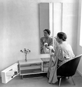
The last Text I wrote on the design blog was about the Iridium coated Oakley glasses with a colorful reflective surface. The object I want to write about this time, Slaapkamer-ameublement, is very much related to the previous text. It is a bedroom mirror designed by Elmar Berkovich in 1930.
A mirror is a reflecting surface, historically made of obsidian , silver, bronze, or aluminum. Today, most mirrors are made of glass, with a silvery, metallic, or amalgam backing. They serve many purposes, ranging from personal grooming to exploring the universe and they are also a common theme in art and Philosophy.[x]

 
Berk106-01_1000px
Elmar Berkovich: slaapkamerameublement, 1930 [x]

 
At its simplest, the mirror reflects what is positioned before it. In viewing ourselves in a mirror, we see what we recognize as self although this reflection is an image reversal of what others see in looking at us.
Sometimes I have some weird experiences when I look into a mirror. You know that you are looking at yourself but sometimes it feels like it is not you that is looking at yourself but rather yourself observing another person. We recognize ourself but actually, we do not know how we really look like. We only know how other people see us with the help of a mirror.

Bildschirmfoto 2017-02-26 um 15.57.04

The philosopher  Jacques Lacan, based his ideas on the human infant’s response to its image in the mirror.
Lacan’s theory is not about the mirror as a reflection of self, but about the mirror as the constitutive element in the construction of the self and self-recognition. This theory is interesting in my opinion because it suggests that we define our selfs by what we see in the mirror and therefore what others see in us. We describe ourself for what we are, but we cannot describe ourselves from outside or in formal terms. It is not us, it is just a reflection.
 

Plaster My Emotions to the Surface (faux)


Sunday, February 26, 2017

I like to own a piece of design from Memphis group design studio.
A piece of design from Memphis group is a shoe.
A shoe is from Adidas.
A shoe is covered in a Memphis group surface. 

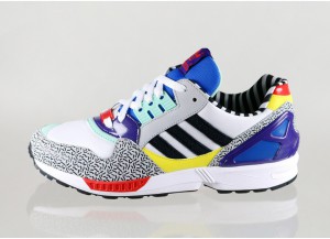
Adidas ZX9000 Memphis Group

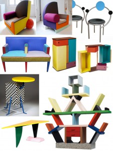
The many times I’ve been visiting the Stedelijk I always end up at the same part of the permanent exhibition. The Memphis group’s furniture and lamps. The reason for my interest is not the actual artwork but rather a particular colorway.

A couple of years ago I was in Berlin on the hunt for some new sneakers. I found myself caught in-between big names such as Adidas and Nike.

The question I would like to answer with this essay is, if Memphis group this day managed to tip the scales in favour for Adidas (ZX9000 Memphis Group) would it be just as a matter of style, or was it actually the essence of capitalism in the shape of a surface.

Is the shoe an imitation of an artwork or actually one by itself? If you plaster a stone with a Picasso painting is it then not still a Picasso painting?

This depends on your point of view, what did you lay your eyes on first? When I found interest in the shoe covered in the Memphis surface we have to keep two aspects in mind. First: I did not know that Memphis group was behind the design. Second: I did not know what Memphis group existed.  All I had in my mind was a wildly designed Adidas shoe that was like something I had never seen before. Does my perception of the shoe change now as I do know these influencial factors. Do my impressions of the shoe change under the influence of these two qualities, as the changing colors of the object in my previous text change under the influence of heat [x]

I brought my piece of Memphis covered Adidas mock-ups back home with me. I like to view them as a piece of art, hence I have not been wearing them until this day. They are still in the same shoe box I bought them in, resting in the archive of my parents basement to be looked at but never worn.


Memphis Group
Memphis Group furniture

I like to own a piece of design from Memphis group design studio.

A piece of design from Memphis group is a shoe
A shoe is a piece of art from Memphis group
I would not step on an artwork from Memphis group.

Future Lights


Wednesday, February 22, 2017

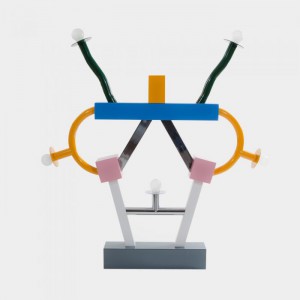
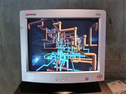
I wrote about the 3D pipes screen saver (Windows 95) and how that connected to surface . Now, I want to write about ‘Ashoka’ by Ettore Sottsass. I think I keep picking works that make me feel nostalgic in a way. This work reminds me of the furniture my grandmother had and the sports equipment we had in the gym at my old school.

Ashoka

  ''Ashoka'' - Ettore Sottsass

Ashoka is a lamp made in Italy and is connected to the Memphis art group. The name Ashoka, Comes from an ancient Indian emperor who ruled almost all of the Indian subcontinent from 268 to 232 BCE. After fighting an insanely destructive war, Ashoka (who’s name means ”painless or ”without sorrow”) converted himself to Buddhism. Connecting to the artwork, H.G Wells wrote in his book The outline of history fittingly: ”… the name of Ashoka shines, and shines, almost alone, a star.” Learn more about Ashoka here.

The work is made by Italian artist and designer Ettore Sottsass. In connection to surface I think this work shows a combination of surfaces that already existed to show a surface of the future. Sottsass was influenced by pop art and the fact that even poor people wore bright colours. When he came back from a trip to India, he was determined to make a new futuristic style of furniture which we now know of as Memphis Group or Ettore Sottsass

The lamp has a lot of movement in its design and looks cheerful and humoristic. This is mostly because of the colours that the Memphis group used. Critics once called it: ‘‘A shotgun-wedding between Fisher-Price and Bauhaus’’. Since the object is a lamp, the light from it is covering all the surrounding surfaces and makes its presence inescapable when it is turned on. The actual surface of the lamp is shiny and plastic looking. This is interesting, because the actual material is painted metal. The lights used in the lamp are E14 light bulbs and halogen up-lights. Interesting is to read about how Sottsass suggests the flow of electricity in it’s design . To quote from the text: ”Consider the Quisisana ceiling lamp, by Ettore Sottsass, from the Memphis collection. It also uses metaphor to suggest the flow of electricity and makes an ostentatious display of mechanics, but it engages users in a broarder argument that expands the idea of function in everyday life.”

Slim – ‘In which the future is superficial’

With its cheeky design and colours, speaking about futures that are made up from a colourful past, this object connects perfectly to the theme Slim. The future is superficial and completely seen in this object. No surprises or unexpected events will happen. The future is just a sum of all things past and this is the prime example of that. When turned on, all the surfaces near the lamp will be covered with the presence of the lights from the future. In my previous text, I wrote about a screensaver that also connects to the theme Slim. Both of these items have an exciting connection since they are so futuristic and they both want to break loose of their surroundings. Ashoka and the screen saver also both create a surface that is futuristic but not practical at all. The forms of both the subjects are here to excite and make for nice design, which shows a superficial, shallow future.

Designing the Surface Supplementary Show /New Institute


Monday, February 13, 2017

bieb_15029_mahoniehout-03_950

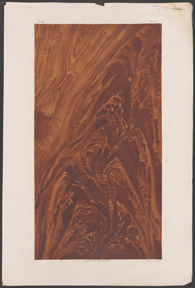
Gebr.A.R.& P.van der Burg /wood and marble painting examples in color 1876


Supplementary Surface Show Under Construction


20 students of the Rietveld Academy’s Basic Year visited the exhibition “Designing the Surface” organized at the New Institute Rotterdam (2017).
The intriguing aspect of surface, an issue that is generally avoided in a discussion about the context of content, raised our curiosity.
The exhibition and the accompanying publication was inspiring as were other additional exhibits like ‘Screen Savers’ or various shows in adjoining musea.

/FAUX /PATINA /LUSTRE /TEFLON /AGENCY /SLIM

Curious for our reflections on these subject?

Chose an image and click on it.

We assembled this small supplementary research show for you to enjoy.


PastedGraphic-4

FelineH VanilleOugen

SimonMarsiglia Screen shot 2017-02-13 at 12.05.50 PM CeliaNabonne

KaanKorkmaz JimKlok

Screen Shot 2017-02-12 at 11.43.35 PM

KimLang OfiaBaytocheva FelineHjermind

NadjaSchlenker JohannesZ

Parelstrik vantablack

blauw_400


Meeting with a shape explorer


Tuesday, December 6, 2016

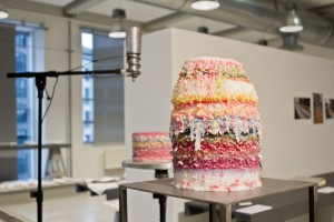
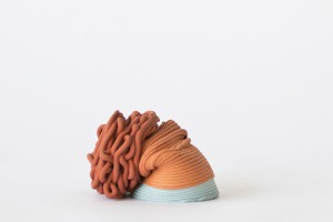
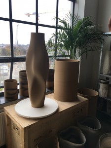
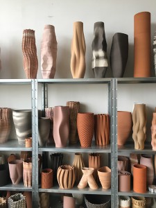
Olivier van Herpt is young Dutch designer from Eindhoven, he graduated in 2014 form the Eindhoven design academy. We discovered his work at the “Dream Out Loud” exhibition in the Stedelijk. Both of us were strongly attracted by the 3D world and process in the show. Therefor van Herpt’s work seemed like the most instructing of all regarding his process but also due to the final objects themselves. The other aspect that catches our eye was the combination of brand new technology and crafts, (3D printing/ceramics, weaving). Van Herpt’s work consists in making ceramic shapes (vase looking shapes) with 3d printing machine that he engineered for it. We were therefor even more fascinated not only by the shapes but even more by how he got there. We had the opportunity of meeting him in his studio and ask him more about his work and work process.

The conversation immediately focused on his work process.
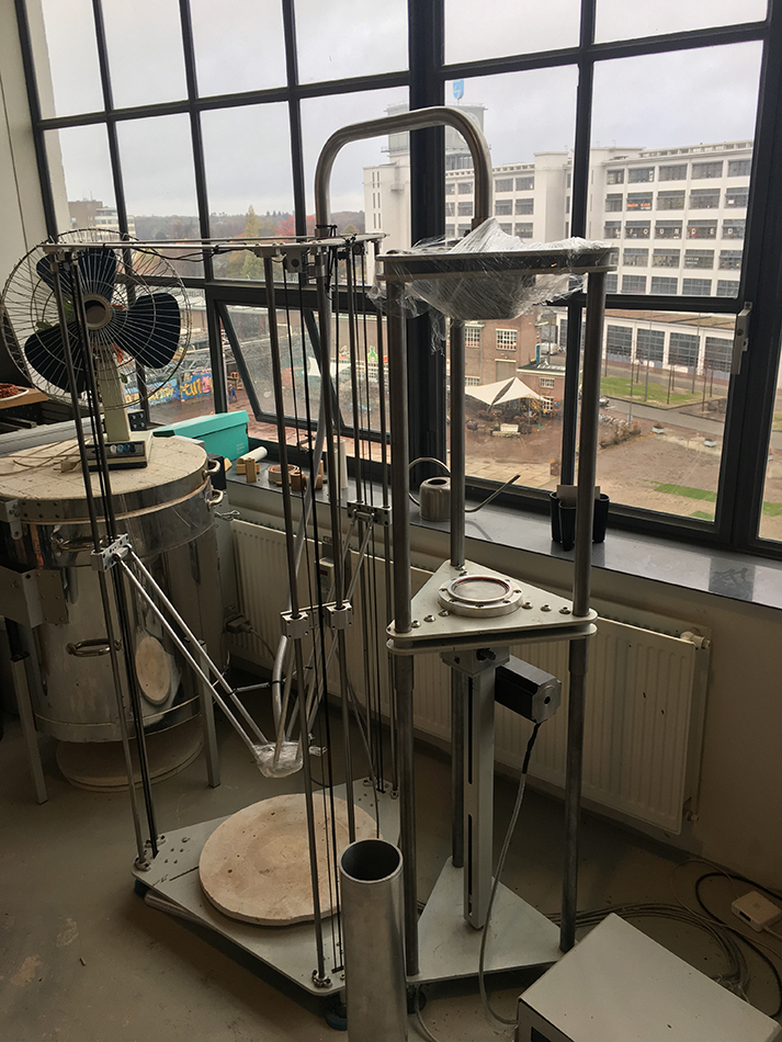
It all started when he was still a student at the academy, he was already interested in 3D printing and was taking ceramics as minor. He also mentioned that he had always been interested in the technical part. But was quickly limited by the technical possibilities of the machines at the academy, size wise, material wise and so on. This is when he started thinking about making his own. His approach was also mainly to combine different techniques. He therefor though about a machine that would combine man action and machine made. He wanted to have an interaction with the machine. That combination also takes place in the process of designing the object and making the object. Van Herpt had some help from student friends at the beginning but not from manufacturing industries. He started with a small machine and they got bigger with time. He designed and engineered the machines himself and learned the technical part while in the process of creating them. Also as a designer, unlike an engineer, he already had an idea about what the machine had to look like from the start. That give it a different approach but of course he had to adapt to technical issues and the machine had to adapt on what he wants to make. « It’s a parallel process between the object and the machine. »

3d-dripping

3d-printing-ceramics-1

After graduation he focused on experimenting with the machine with different techniques all about randomly approach « dripping » with different materials, such as wax, and bee wax. At the time he was experimenting with soft clay by softening it with water but had quickly explored all the possibilities with it so he then decided to focus on ceramics, dive deeper into it and use hard clay for which he had to build a new machine. Again we can see the close relation between the process of making the machine and the object, how one is to the other, and the constant need to develop a machine that is adapted to the material (hard clay).

IMG_8799

The second machine he made for the hard clay is basically like a pomp, he described it as an ‘extruder’, the innovative aspect to it is its openness and the possibility to interact with the machine that works with any kind of hard materials : « the machine is really like a tool » that he uses to make objects with. He explained that there were two ways of working with the machine. You can decided to interact with it or not. The most basic shapes are hand made. Some of the shapes are design then put into the computer and then when a machine prints it then it is machine made, or you can shape it yourself on to the machine because the machine is not closed.
This is it’s way of renewing an very old craft (ceramics). It is a human versus machine collaboration. The shapes of the products are all unique you cannot make one twice. Because of the use of clay it is also fast to make and always reusable until you cook it. It is then possible to make a lot of different try-outs and and shaped it until you are satisfied with it. Meaning that there are endless combination of shapes possible to explore. He also sees it only as the beginning and very much as an on going process of experimentation.
«It is only the beginning » as he said « it can be really random but also really controlled » which gives a bigger range of possibilities, also with the use of different colored clay, creating very different kind of shapes. He also told us that he recently started to experiment with new materials such as porcelain.

IMG_8795 IMG_8790

He is in process of creating a new machine, even bigger, to have the possibly of making bigger shapes and objects. Having the possibility now of collaborating with different fields, which was his idea in combining techniques, he is enthusiast in working not only with designers but also with artists, architects, interior designers and even industries. for example industries ordered his machines for other purposes.

This research project by Daria Nakov and Raphaelle Hugues is based on the "Dreaming Out Load" design exhibition curated by the Stedelijk Museum Amsterdam

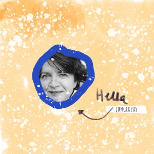
Hella Jongerius and the in-between-state of Design.


Sunday, November 27, 2016

Within a era where design industry has been mostly focusing on how-to-reach at quickest the largest market possible by basically allowing marketing and communication departments to take the lead and most companies are sales-increasing-oriented, there’s a figure I’ve been admiring a lot for a certain capability to break this kind of mechanisms. Dutch designer Hella Jongerius has been an attentive observer of the industrial production process and its weaknesses and I could think of her as a designer capable to give the design industry a remarkable, somehow playful response.

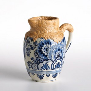
Chicle Project, material experiment for The Nature Conservancy, 2009


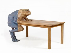
By having a broad look here and there to her work, I could figure out that the strength of her designs lies in their between-state for both caring about details and imperfections and still being able to fit into an industrial production rhythm. In her work I see some sort of generosity which looks up back to the past (not just to appropriate herself – as most designers nowadays would do – of principles such as authenticity and sustainability) by giving it a further value as a result of her never-ending research around life and ”afterlife” of objects. What strikes me about Jongerius’ design approach is that she pushes design to an almost imperceptible limit which oscillates towards an artistic process. Hers seems to me closer to an art-related way of processing research, brain storming, sketching ideas and projects themselves starting as sketches, always caring about some imperfection which can emerge through unexpectedly magic come outs. This is at least what it means dealing with handicrafts. Something that she has discovered already in the 90s when giving the design industry imperfection as an answer. Concerning to Jongerius, design should firstly be communicative. This is what design is about. Its function lies mainly in its communicative power which can be measured at different levels of meaning.  Even ugliness can be very a strong means of communication. Since handicrafts primarily deal with the impossibility to produce perfect finished products, she has considered it as her own vehicle to face the anonymous perfection that industry has been producing for more than a century. In most of her works, she is been playing with the imagination of the user, by creating fore ex. a ”frog table” which is basically a frog seating at the table itself and a question which comes along with that is: why do we need imagination for (a specific) utility? isn’t use already enough?


Frog Table [Natura Design Magistra] 2009

According to the Dutch designer, there is a persistent prejudice concerning the essential difference, drastic separation between designs that are made to be purely functional and expressive designs which are able to tell stories which go beyond themselves as objects.

Once again the function of design has assumed new meanings and contents. It cannot be formulated strictly depending on terms of use or comfort.
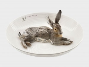
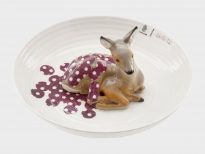
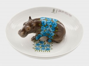
Sometimes the core signifier of design can actually be its paradoxical non-functionality > animal bowls < a project started in 2004 for which Jongerius is been selecting different pieces ouf of the Porcelain Manufacturer Collection of Nymphenburg – as a celebration of age-old crafts and treasures found within the Nymphenburg archive, in Germany.


Bowl with hare / Bowl with fawn / Bowl with hippopotamus

Some other aspects that I really appreciate about Hella Jongerius’ work are the experimentation with the more diverse materials and her deep passion for colours I feel somehow very close to.

In 2009 she’s been leading a project for The Nature Conservancy [x]. In this particular project Jongerius is been experimenting with the natural material of chicle, derived from the rain forests of Mexico. The project itself consisted of a group of internationally renowned designers who have been participating, initiated by the American Nature Conservancy, an organization which strives to protect sustainable materials for use in contemporary art, design and architecture. The results of the project were shown for the first time at the Cooper-Hewitt National Design Museum in New York.

Chicle project [x]


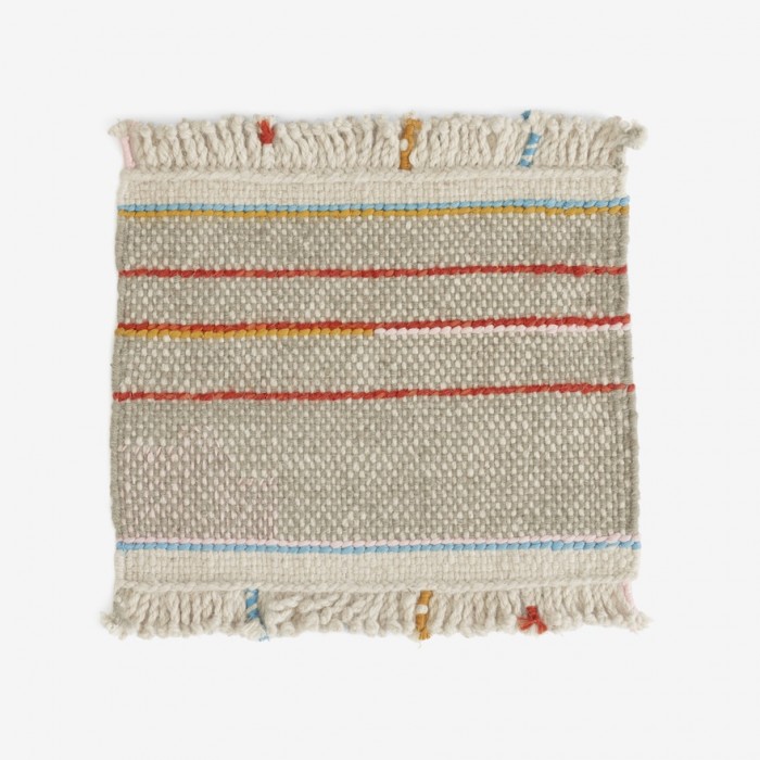
Argali Rugs, 2015

For this project Jongerius has created – within a palette of six colours typical of Nepalese yarns – Kilim rugs which have been hand woven from special Tibetan wool from Argali – a wild sheep breed that resides in the Himalayan mountains. The yarns themselves have been hand spun by local weavers, and their naturally faded colours and irregular character lend each rug a truly individual appeal. Each rug incorporates several design details, including a hand-embroidered area with silk yarn – a reference to an old tradition of repairing the rugs. The fringes are braided, a practice that also refers to an old custom in Nepal – this for its decorative appeal.


argalic0231©danskina

Argali for Danskina [x]


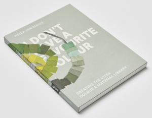
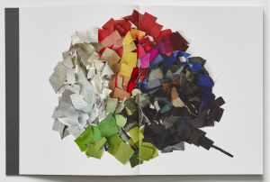
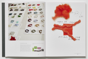
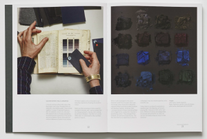
There are some many things which should be told about Hella Jongerius, that comes almost difficult to make a choice ouf of the huge amount of her research. Jongerius has been the Art Director for colours and materials at Vitra for many years, during which she has developed Vitra Colour & Material Library together with a quite recent book ‘I don’t have a favourite colour’ which basically refers to the establishment and +further development of an intelligent system of colours’, materials and textiles that make it easy to create inspiring environments in offices, homes and public spaces. It is definitely an interesting book since the Dutch designer has been illustrating her method of research and the application of its results to the Vitra product portfolio.


'I don't have a favourite colour' [x]


Jongerius way of dealing with the design experience is very fascinating for me since I’ve always felt quite far away from the design process, very related to super appealing – almost perfectly finished products.
Her installation/selection within the textile archive of KLM company for Dream Out Loud exhibition at the Stedelijk has been so inspiring for me. It confirmed me further my pre-existing love for textile matter. It immediately brought me to a sort of aesthetics that I personally feel pretty much related to. By reading part of her book Misfit and her .Manifesto. Beyond The New written together with Louise Schouwenberg so many exciting questions came up – concerning the contemporary era – where are we going to? design/art? this over exploited back to the roots feeling and the over flooded quantity of emerging designers. What can design add to the world of plenty? and What is functionality in the here and now?


Can high-end designs have any social significance?


Sunday, November 27, 2016

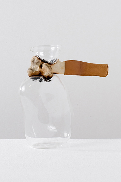
On first sight I loved Formafantasma’s designs, they held a certain elegance and beauty in their simplicity, the back to basics materials, gathered from the natural world juxtapose themselves, feeling both strong and delicate at the same time. It brought out my childhood fascination, I recalled scavenging for treasures on the British beaches of my childhood and taking them home to make new creations or to merely bring a glimpse of the natural world into my home in the dense, man-made city. These designers took this fascination, a primal human action of scavenging/collecting to an industrial level, contemplating the natural world by sampling, casting, weaving, reshaping their materials, making connections between unlikely materials to form a delicate balance between the rough and smooth, fragile and strong.

Formafantasma -Craftica
Bone Jug, 2012 (Cowbone, leather, mouth blown glass) from Craftica series

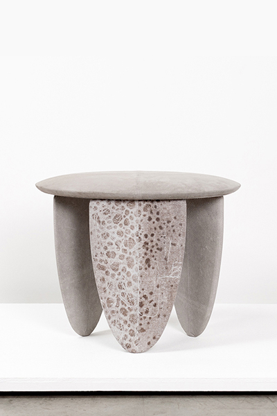
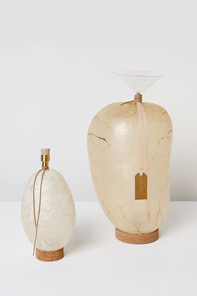
Their work is fascinating also because of the delicacy with which they deal with their subject matter, not only with the physical properties of the materials but the symbolic and historical meaning. Their project Craftica for instance is an investigation into leather, highlighting our ancient roots of hunting for food, tools and body protection. They channel prehistoric tools, durable tools for survival made of bone and stone, combining the simplicity of these ancient tools into a modern aesthetic.

Tools of bone were originally a practical use of materials but are now becoming a design statement, a hark back to our ancestral heritage, a sign of simpler times within a society too lazy to source sustainable, durable materials, instead opting for the cheap, easy version –mass produced materials with processes which are quickly damaging our environment.

formafantasma_craftica_6 formafantasma_craftica_14
Wolffish stool, 2012 (Wood, vegetal tanned wolffish leather)
Bladders water containers, 2012 (Pig and cow bladders, brass, mouth blown glass, cork)
from Craftica series

It is designers such as Formafantasma who are questioning this use of cheap, destructive materials, replacing them with more sustainable/unique alternatives. With each piece you can see where the materials came from and you question the story behind each material; the fish skin leather –a by-product of the fish food industry, in Alaska alone there are 2 billion pounds of fish by-products every year including fish skins which are often dumped into landfill or back into the ocean, left to pollute the water and kill off species’ (x article on an Alaskan start-up using salmon skin leather), or the cork leather –by harvesting the species of oak tree, Quercus Suber of their bark to form cork every 9 years rather than harming the trees it helps them live longer. Therefore, these designs are refreshing in a society where we don’t know where so many of our products come from.

However all of this comes at a price, an unlabelled price, a sale inquiry at a high-end gallery. Does this step into the elite then diminish the beauty or sustainability of these objects? These products, inspired by those that were once precious items necessary for survival then become an expensive showpiece. The matters of sustainability aren’t so important, it then becomes about the recognition and the money. Is it enough that they are potentially inspiring a next generation of designers, or inspiring the people that visit the Stedelijk museum to think more about where their everyday products come from? This engagement with the issue of the way we deal with our resources engages the viewer but it doesn’t solve the problem, instead it benefits the designer, giving them the recognition of being a sustainable designer making unique products.

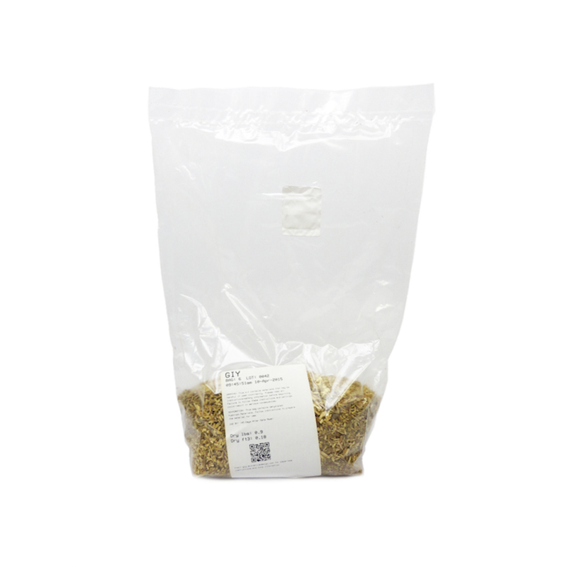
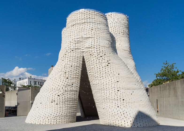
So, are there sustainable, affordable designers out there who are actually impacting the way we live? Of course there are many design companies trying to come up with solutions to these problems, a good example is material science company, Evocative who have developed Mushroom Materials, a sustainable building material made from agricultural byproducts and mushroom Mycelium; these provide a natural alternative to common synthetic packaging and the company have experimented with using this as both packaging and a material for product design, producing stools and tables, as well as offering an affordable DIY pack. This opens up a way of buying products that are good for our environment, in addition to encouraging people to make their own products. A number of different designers have experimented with Mushroom Materials, for example architectural studio The Living built an organic tower Hy-Fi for the annual MoMA temporary structure, a biodegradable material was therefore perfect for the temporary building. By creating this innovative material Evocative have opened a door to a new future material that could replace the depleting materials that are destroying our environment.

giy-bag_1024x1024Hy-Fi-by-The-Living_dezeen_784_0

Grow It Yourself, Mushroom Material from Evocative $10
Hy-Fi, 2014 The Living Pavilion made with Mushroom Material

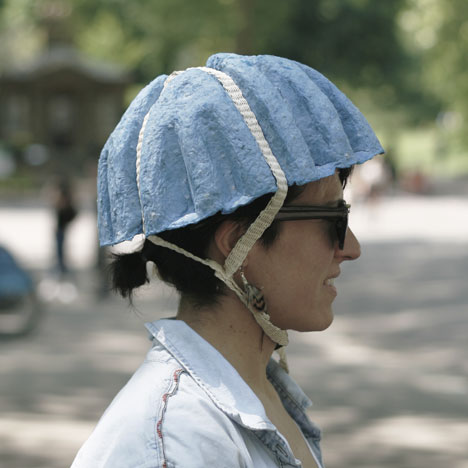
Another example of innovative sustainable design is the Paper Pulp Helmet designed by Tom Gottelier, Bobby Petersen and Ed Thomas, who made use of the many discarded newspapers around London’s transport system and recycled these to form helmets which would potentially cost £1, thus a low-cost environmentally-friendly solution to bike safety in the city. The design was just a prototype but the cheap and recyclable material/process is a perfect example of the future direction of design we need to take in order to preserve the planet.

dezeen_Paper-Pulp-Helmet-by-Tom-Gottelier-Bobby-Petersen-and-Ed-Thomas_1

Paper Pulp Helmet, 2013 Tom Gottelier, Bobby Petersen and Ed Thomas

In my research I found it very difficult to find these examples, searching for ‘sustainable product design’ offers a lot of high-end designers with very expensive products or similarly to Formafantasma prices aren’t shown and they are presented in galleries more as a work of art than a sustainable design, therefore they aren’t presenting an immediate solution.

Perhaps we need government schemes to encourage designers/bigger companies to use better materials and to sell these products at affordable prices so they can compete with the mass-produced products that are often badly made and harmful to the environment. In recent years we have seen many countries across the world introduce a charge for plastic bags in supermarkets. This due to the fact that around 8m tonnes of plastic makes its way into the world’s oceans each year, posing a serious threat to the marine environment. The charge was introduced by the government to try to influence consumer behavior and the result is massively affecting the amount of plastic waste, in England the number of single-use plastic bags was reduced by 85% over the first six months. If governments enforced similar rules on other products; introducing taxes to products with harmful materials then perhaps it could influence consumers to opt for better sourced products.

We, as consumers have brought about this problem, being so materialistic yet simultaneously too lazy to source sustainable products; we are struck by the aesthetic of a product and buy it without thinking where it came from or the ethical implication, just as I was struck by Formafantasma’s work in the Stedelijk, not considering the possible downsides of the designs. If there was a large scale enforcement of better quality, environmentally-friendly products then maybe consumers would think more before they buy.

Since books can’t fly, lets angle them instead


Saturday, April 16, 2016

Since books can’t fly, lets angle them instead

I’m usually a patient and thorough person. My apartment is always in an acceptable order, I iron my clothes, I bike at an average pace, I don’t lose my patience when I stand in the slowest line at the grocery store. If I start reading a book, I always finish it sooner or later.

But; whenever I visit a bookstore or a library, and I get confronted by thousands of books, I completely lose my patience.

I know that there is a very clever and simple system to find what you are searching for, and that someone carefully placed every book in alphabetic order, neatly lined up on the bookshelves. But when I stand before the books, I get the same anxious stomach ache as when someone asks me a simple mathematical question that I usually can answer in one second, but in the stressed situation I turn red and stutter that I don’t know.

So how could I avoid this brain-freeze related paralyzation in the context of books?

Solution:

So lets start with the order of the books. The order is usually determined by the alphabetic order of the authors name or the title, which makes sense since it’s both practical and logical, which I’m a big fan of.

Now imagine that you stand before the alphabetically organized bookshelf, turning the pages in Hendrikje Koersen’s poetry collection De witte boot. You are now amazed over the treasure you found, and start to eye the bookshelf after more poetry.

Here is the interesting part:

Imagine every book containing poetry, magically hoovering in front of the bookshelf, making it easy as a piece of cake for you to find.

Sounds good right? Unfortunately I’m not a wizard and therefore not in a position to change the laws of nature, but I can however physically highlight a category of books, by tilting the short-side of them, so they hang over the bookshelves end, pointing out in the room, without actually falling down.

To angle these books, you could use a very simple wooden tool as in the illustration below.
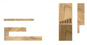
angler

Left picture: Angler, viewed from the side

Right picture: Angler, viewed from above

How:

I have chosen to call this tool an angler, since it is used to literally angle books. (Angler is also the word used to describe a person who is doing angling, a kind of sport fishing, which is fitting since you hold your fishing rod in a angle similar to my wooden tool.)
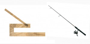
angler and fishingrod

Left picture: The Angler

Right picture: Fishing rod 

The angler-tool is made of a very simple construction of wood. It can both be used in singles or in groups, but in the context of bookshelves, I will describe the usage of multiple angler-tools.

To use it you first have to fasten it to a bookshelf, and then put it in the angle that is needed. You can choose from five different angles, each representing a different category.

I have chosen to represent poetry, architecture, design, photography and fine art in this scenario, since I study at an art school where these subjects are the most presented in the school-library. In theory, you could add even more angles to the tools design, but I believe that that would affect the clarity of the category’s in a negative way.
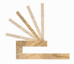
anglers angles

Picture: The five different angles that can be used

The tool has five angles, each representing on of the category’s above.

The angles are:

90

110

130

150

170

The angle 170 will be most far out from the bookshelf, and thus also highlight the book. I want to use it as a category for Poetry, because I believe that poetry it is an underrepresented subject that is read the least in art schools in comparison to other subjects. Having this subject highlighted could direct more attention to poetry and maybe influence someone to take a look in the book, even if this person usually does not read poetry.

Angle 90 would be used for books about Fine Art, since I believe that Fine Art is the subject with the highest quantity of books, which therefore makes it important for them to stay further back so they don’t block the view of the angled books, hanging out a bit from the bookshelf.

It is also a category of books that are often used for research in an art university, so it is important for their title to be visible to make them easy to find.

Angle 110 would be used for the Design-category, for the same reason as Fine Art.

The 130 angle would be used for Architecture, and angle 150 for Photography.
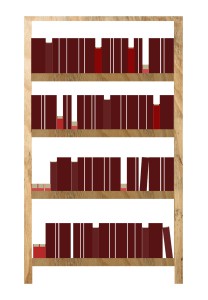
 

visualisation

Picture: Illustration of how a book-shelf using the angler could look.

Result:

By using this angler tool system a modified bookshelf will look like a relief due to the books protruding in different angles. If you are looking at the bookshelf from a distance, you should have an easy time recognizing the different categories by the angle of the books. Looking at the bookshelf from a closer distance, you would be able to find your book by using the alphabetic order.

By making the bookshelf look like a relief instead of a plain overview, it will invite the viewer for a more tactile experience of the books, because you are not only able to touch and see the spine of the book, but also the front and back side, the material of the cover and the colors of the pages.

The tool may only be a small object, but it would affect not only the angle of the books physically, but also the viewers visual perception of the bookshelf, both from  far and close distances.
 

Design Holland and Belgium


Wednesday, October 14, 2015

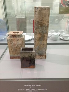
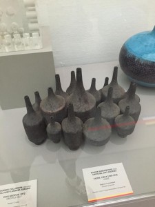
The composition of the ceramic vases Belgian artist Rogier Vandeweghe and vases Dutch artist Jan de Rooden.

subscription

Firstly, I’d love to explain why I’ve chosen ceramic vases for this essay. I imagine how the fingers are buried in soft brown slimy mass when I am thinking about creating a vase. I remember a few stories associated with clay from childhood. I grew up in a village. I loved poking around in the mud, but I had a special passion for the mud formed after rain on the roadway. Vehicles in the village – trucks, and the land under the wheels was pressed carefully because of heavy machine. As a soft mass, it was very pleasant to touch. Mud was becoming really strong as soon as it started to dry. I loved to do the round cakes of this manure. A day after i used to threw them on the floor and watch them breaking into pieces. This is the first thing I imagine when I’m thinking about ceramics. It seems to me very important to understand people, what events have affected them, how their personalities formed. An artwork produced by the artist containes all the information about his life, sensibility, condition. That’s why I’d love to highlight some events in the biography of Rogier Vanderwede and Jan de Rooden.
Born in 1923, he was the youngest son in the family. They moved a few years later to Beernem. From 17 to 23 years old, he studied at the Art Academy in Ghenthe. In the year of 1974 he was followed by a short internship at Joost Maréchal. In 1948 Rogier formed a business with his elder brother on the basis of fathers larger company. Their studio was named ‘Perignem (Latin for “through the fire”). In 1954 he married in the Church of St.Anne in Bruges on Maryanna Pyck (the collection vase that i chose called: Rogier Vandeweghe en Maryanna Pyck). Maryanna worked since 1952 as a ceramics painter at Perignem. As soon as regular production was established, Rogier decided to change direction towards a more modern product. The cautious, rather conservative attitude of Laurent and especially of Cecile Roets, which is in complete contrast with the radical and total renewal sought by Rogier, are the direct cause of the rupture between the two brothers in the summer of 1956. In 1957, Rogier Vandeweghe didn’t pay much attention to make his first ceramic production. In some cases, his wife Myranna Pyck painted the initials “RVDW”, eventually adding “Sint Andries”, with cold enamel after the firing. Soon however, Rogier adds this mark with glaze. In 1960, the workshop is named “AMPHORA».

Jan de Rooden Born in Nijmegen in 1931. When he was 5 years old his mother died. From 6 to 14 years old, he was admitted to Elementary School of the Heilig Landstichting. The landscape around us formed a beautiful country to grow up in. “In November 1944 I left home for the Passionist monastery in Mook September 1952 I became novice in the Passionist monastery in Pey, but after nine months I left the novitiate forever. Ultimately I could not reconcile myself with life in a monastery. I found that life too cut off, too safe and too well-provided for. ” As autodidact he started working in the studio of ceramist Lucie Q. Bakker in Amsterdam in 1956, and in 1958 started his own studio with Johnny Rolf with whom he later married.

Rogier was studying in artistic school and Jan at theological collage. But the story of the two artists is like when they meet their women and begin to follow their way.

I feel a similar sense when i am looking at the vase, I find something natural in that. Vases Jan de Rooden remind me about the forest, the surface of the vase is like a bark of a tree overgrown with moss and seabed, shells overgrown with silt. Vases Rogier Vandeweghe remind me of the mycelium, or forest spirits, or rocks. I like that he used black clay, I’ve got a association with caves and coal mining. From vases is completely different. Jan de Rooden used a simple sealed form. It gives a sense of confidence and stability, which in combination with glazing, creates the effect of natural stone. Rogier Vandeweghe several vases connects one composition and shape of these vases is like a bottle, but shorter, with a thin neck and a narrowing nizu.eta composition looks like a beehive. The Rogier Vandeweghe vase can be used rather only as an object, and the Jan vase may well accommodate some flowers.

In conclusion I would say that the facilities are beautiful.

BIG CHUNK, little purpose


Saturday, October 10, 2015

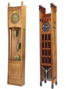
When I first heard about the task of choosing a pair of compared design objects in the Boymans van Beuningen exhibition “Design Derby” –where Dutch design is being compared to Belgium design– I thought it was going to be a long and painful process since I have never been interested in design. Especially not in furniture design which I know nothing about. It was a relief when I found out that the exhibition was well organized and the objects presented were described in an understandable manner. At first I had to take several strolls through the exhibition before I realized what my choice should be, and it was no other then the Grandfather clocks. Seeing them made the choice so easy that I even didn’t think about how hard it would be to compare them. That turned out to be difficult, since only later I realized I know nothing about the styles of design and even the point of owning one is completely unclear to me.

002_rb-image-1778000

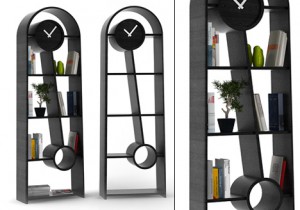
So these are the clocks that I ended up choosing, The one on the left is Designed by a Belgium artists Georges Hobe and architect Antoine Pompe in 1902 while the other clock at the right is designed by a Dutch designer Christiaan Wegerif also in 1902. You can see that both of the clocks are made at the same time, yet they are completely different. The Dutch designed clock is much more masculine and solid, also it has more detail and decor in general. The Belgium clock meanwhile is famine and is more about the function, It hasn’t been overly decorated and is just as complicated as it needs to be in order to serve its function. To have a general idea of what similar types of clocks look like and how they are the same or different you can visit this link that sells german grandfather clocks or this that sells grandfather clocks in general and has some background info as well.

So after the exhibition I thought to my self what the reason was of making this, (now seemingly) foolish choice that seemed so easy and clear at the moment I made it. Suddenly it clicked to me; my grandmother, she used to have several Grandfather clocks, and only now I started understanding how sad it is that I never paid attention to them. I never had the chance of asking her why does still keep them. My grand mother was very old and as I noticed, the clocks just became closer to her with time, after she got moved to an old people home, she took only few belongings with her, few pictures, bottle of cognac and one of the grandfather clocks. I guess there it served as a reminder of past and the overall importance of time.

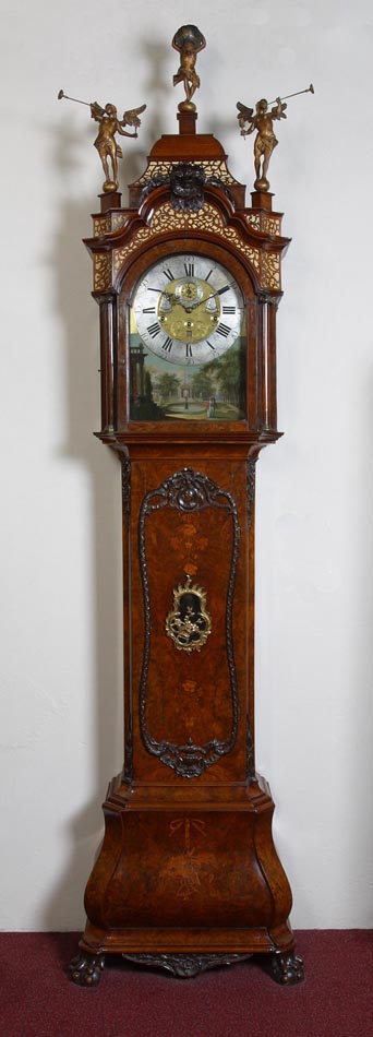
So due to the lack of information on the specific Grandfathers clock’s of my choice I decided to do a general research and the first thing that was unclear to me was the origin of the name “Grandfather clock” why not Grandmother clock or just Tall clock? Once again it all comes down to pop music, its named after a song “My Grandfather’s Clock” performed by an American songwriter named Henry Work [x], who wrote a song about a clock which stopped working the same minute of the day when the last surviving owner died and happened to be a grandfather, you might think that this is a made up myth but let me surprise you that the chances of this actually happening are pretty high since the less expensive clocks at that time needed to be wound every day or they just stopped working. The Grandfather clock is usually 1.8 – 2.4 meters tall and is a weight driven pendulum mechanism that is located in the tower or the waist of the body, this kind of clock was first developed in 1670 by an English clockwork William Clement.

Longcase_clock antique grandfather clock Friese staande klok

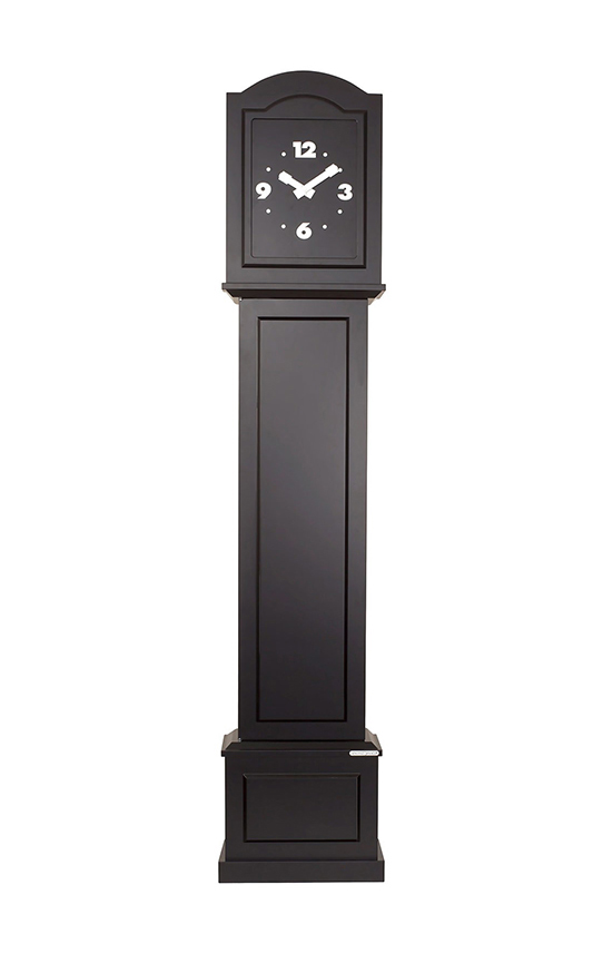
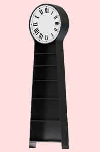
Until early 20th century these were the most accurate time keeping technologies so they were often kept by huge businesses and rich households. Now they only serve as decorative objects since it needs a lot more maintenance then a everyday wrist watch and most people now don’t have the TIME for that. Since I have a very limited interest and knowledge of history I decided to take a look at some modern day grandfather clocks, and I was rather sad to find out that with few exceptions they are not made by hand anymore and they have all become electronic. So I found very few companies that still make handcrafted clocks but only this Kauffman’s company offers to make a clock costum made just for you and how ever you want it so it has a much higher value and can relate to a specific family which in this case I think is very important. Though I must admit that the clocks made by hand then and now are not pleasing to my taste, and I find the modern ones more aesthetic and visually appealing for example this black and simple clock.

BLACK_CLOCK_1

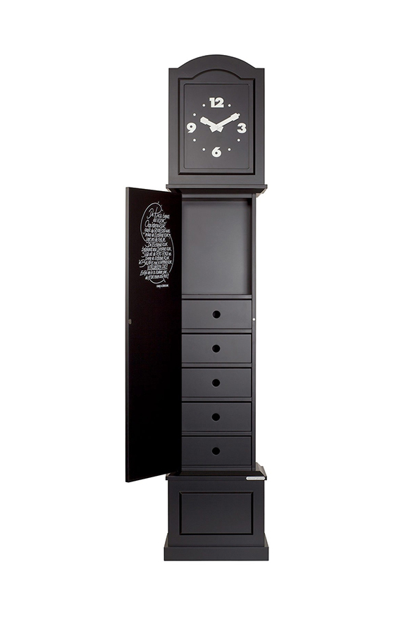
At the same time by loosing the need of a huge item that serves only the purpose of showing time they now serve new purposes that previously just couldn’t fit in the same casing with a pendulum mechanism. They can have built in drawers or be used as book shelves a and probably many other new purposes could be thought of. Here you can see the same clock as previously but opened and instead of the pendulums you have a set of drawers, that could be used perhaps for your dirty underwear that you wish to hide from the public eye.

BLACK_CLOCK_OPEN

Another great function but a rather ugly outcome.

CLOCK_BOOK

I think the shape of clocks should not be forgotten, they just need to be redesigned to serve more purposes then showing time or they can just as well turn in to art pieces since they have such a strong image and meaning as a thing on it’s own, for example artist Maarten Baas has done few works that relate to grandfather clock directly or to time in genera. Most related to this subject would be his work “Real time” where instead of the usual clock face there is an LCD screen within the clock that shows a human inside the clock drawing the time on the clock face. Read about three contemporary artists that explore the general concept of time.

I personally don’t like clocks at all since they just keep reminding me of the amounts of time I have wasted on useless activities. So I would need a grandfather clock that goes backward and is constantly fooling me or doesn’t show time at all. Something like this…
CLOCK_FOR_ME


PEOPLE NEXT DOOR


Monday, October 5, 2015

The design derby took place in the Boijmans museum. It is about the confrontation of Belgian and Dutch design objects from 1815 till today. The collection covered all kinds of design; from glass and ceramics, prints, furniture, fashion, even up to cars. The exhibition was ordered chronologically and all the items from each country were presented next to each other into two big lines.
Does this make sense and do you really find out more about Dutch and Belgian design by looking at it like that? This is an attempt to find out as much as possible through two chosen objects from the exhibition.


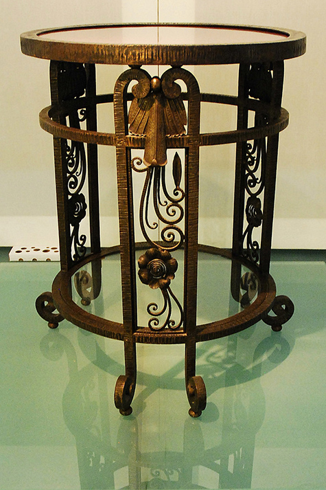
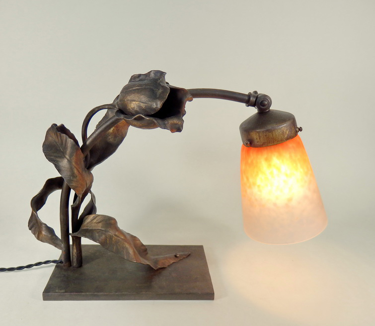
table carion OLYMPUS DIGITAL CAMERA

Francois Carion table [x] and lamp [x]

Firstly, a small round table by the Belgian designer François Carion. He built this table between 1925 and 1930, the materials he used for it are iron and pink glass. The wrought iron is one of the key symbols of his work and he used it for a lot of other designs as well.


ravesteyn chair ravesteyn

Ravensteyn chair presented at the "Exposition des Arts Décoratifs et Industriels Modernes in Paris 1925 [x]

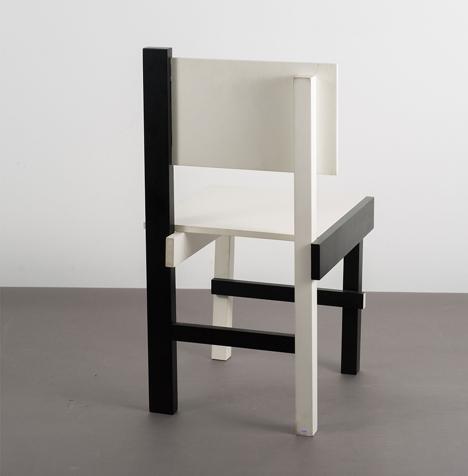
The second is this chair by the dutch designer Sybold van Ravesteyn, who was born in 1889 in Rotterdam. Van Ravesteyn is a nationally famous architect who designed some quite important projects in Holland, for example the central station in Rotterdam [x] (shutdown in 2007) and also various residences and furniture [x]. The presented chair was designed in 1925. It is made out of wood and painted in geometrical shapes in black and white, designed specially for mister Rademacher-Schoers bedroom with the matching nightstand for his house in Utrecht.

To find out more about the artists it is important to understand the circumstances of life and therefore their inspirations.
First of all, after the first World War progressive designers took advantage of the knowledge of material and techniques they had gained during war. That’s why for example it was also a big topic to design the first cantilever chair out of tubular steel which was used by famous designers like Mart Stam, Marcel Breuer and Mies van der Rohe.

Moreover some big art movements were going on in this time; from 1890 until around 1910 Art Nouveau was a big influence mainly inspired by natural forms and shapes and therefore you can find many dynamic flowing lines and mainly asymmetrical shapes. Art Nouveau was seen as a harmonization between nature and design, and also a way of life. In the same time the Arts and Crafts movement was going on, which was an big influence from Great Britain; the movement was mainly about the combination of work and art. From France came the important Art Deco movement. Art Deco was defined by stylized and two dimensional representation of floral and organic designs. The industrial production and lack of shadows and natural elements was the new sign for modernity and the overtake of Art Nouveau. The absolute climax of Art Deco was the Exposition Internationales des Arts Décoratifs et industriels modernes 1925 in Paris, which defined the movements name.

Another movement was De Stijl in Holland. Famous contributors included painter Piet Mondriaan and of course architect Gerrit Rietveld. Their work is mainly known as plastic art which is a pure abstraction in form and colour. It is about the reduction to the essentials by only using primary colors (among black and white) and the limitation to use almost only vertical and horizontal directions. The most famous example is the Red and Blue Chair by Rietveld in 1917 which can be also seen as a three dimensional painting of Mondrian.This chair was also invented for mass production which expresses the mood of time in Holland at that moment.

Also because in most middle class houses in Holland and with the higher class in Belgium it became common to use a gas stoves instead of a big oven in the kitchen,  people didn’t gathered only in their kitchens anymore as nice and cozy place to stay but in their whole houses. There were other heated rooms, even central heating, as well and furniture became much more important in general.

I choose these two items mainly because of their difference, despite being designed and produced at almost the same time. This shows how many different influences the countries and artist themselves had during the time, which makes the derby more interesting, it is nice that you can find several elements of the ongoing movements in these two pieces.
arts and crafts   william morris niebelungenlied

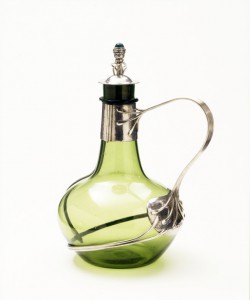
Art Deco Jug • Charles Robert Ashbee (1904) [x

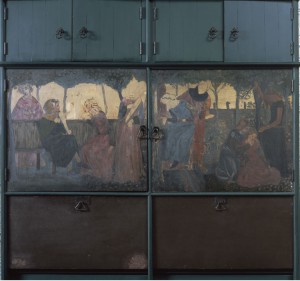
Art Deco Interior • William Morris Niebelungenlied (1860) [x]  

In Carions table for example I can find lots of flowing formed shapes and the motive of nature a characteristic of Art Nouveau and the Arts and Crafts movement which is coming mainly from Britain. I wanted to give another example for this movement because there are so many similarities to Carions work  in C.R. Ashbees work  (1863-1942) who was a British major designer for the arts and crafts movement. You can find simply the same elements and materials as Carion used in his works. In Interior Design wood was also a big thing  you can see that in the Red House from William Morris, who is actually seen as the founder of this movement and his friend Philip Wood. They designed this house in England together and until now it is a well known example for the Arts and Crafts movement.

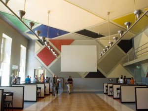
18_designparade_jt130711   Bar Aubette

Art Nouveau Interior • Sybold van Ravesteyn room of Villa Noailles [x]

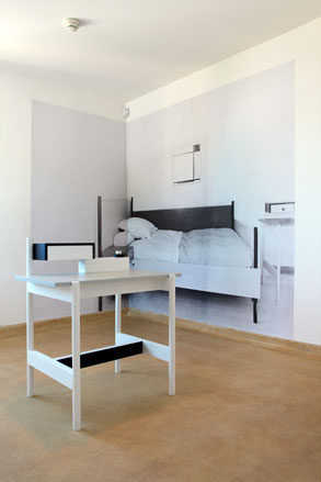
De Stijl Interieur • Theo van Doesburg Aubette (1928) [x]

Ravesteyn’s work which in this period consists of only geometrical shapes and very limited colours shows influences from the Dutch de Stijl movement, which is very much connected to Rietvelds work, who was also designing for private houses . But also artists such as Theo van Doesburg in whose Maison-Atelier de Theo van Doesburg de Meudon in Paris where he lived himself with his wife. It is quite obvious that both artists have similar inspirations and approaches in their work. In the picture you can see “Aubette” a collaboration between Hans Arp and van Doesburg for a cinema in Strasbourg which is very loyal to the de Stijl rules.
All in all from this exhibition as an example we can see the impact and influences countries get from other countries. As here seen in Holland which is more orientated on the East with Germany and the Bauhaus movement as there were also many refugees coming from there and they choose Holland as neutral country. In contrast to Belgium which was more focused on France and even Britain so therefore the south and west.
Moreover it is an interesting fact that people lived next to each other, but also very different, because there was a border between them. This has changed so much today where there is internet and it is so much easier to to cross borders to find inspiration online and not having to depend on the values and movements being part of the countries itself.

BEAUTY OF LACK IN A FORM


Monday, October 5, 2015

Museum Boijmans Van Beuningen in Rotterdam with it’s exhibition Design Derby, was a starting point in my research about design objects and empty space in their form. Exhibition in itself had a huge task to make, it was comparing two countries: Netherlands and Belgium in years 1815 – 2015 in their history of design, in their possible differences and similarities. You could easily dive in home furnishing, textiles, projects of interior decoration (even if it was on the pictures), posters (which by the way collected the whole dynamics of social and political situation at a time) and many more. Design Derby is one of those exhibitions or I would even say shows, during which you can spend hours on watching and contemplating, literally eating what you see.

As soon as I enter the museum I am vanishing for a few hours, as was the case exactly here. At first very carefully I studied the objects until, while passing from one half to the other half of the exhibition, I came across some chairs. Chairs from which I didn’t know yet who, when and why they were made. They were known to my eyes, popular through the times, translated into many other forms of furniture.

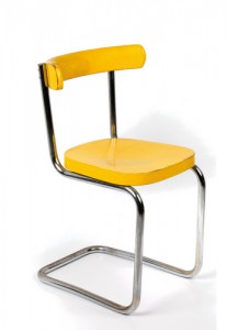
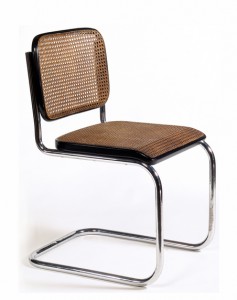
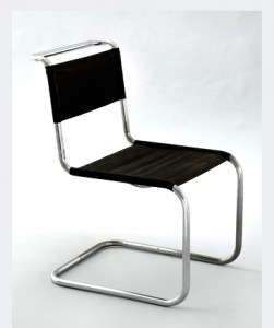
Like in a football match (as the situation compared in the interview with curator Mienke Simon Thomas http://arttube.nl/en/video/Boijmans/Design_Derby) Netherlands on the left with Mart Stam (Martinus Adrianus Stam) and his ‘cantilever tubular steel chair‘ (1927) and on the right side Belgian architect, furniture designer Gaston Eysselinck’s ‘office chair for typist‘ (1931).

 Mart Stam chair       Screen Shot 2015-10-04 at 22.24.24 copy

Both chairs are throwing in our eyes the amazing similarities. For Mart as well as for Gaston functionality was the most important thing. Form follows function and form is derived from function. For each destiny has to be a place. All this was dictated by the specificity of the times in which lived both creators. Shortly after World War I, damages especially in Belgium were enormous, economical situation was not the best for those who would like physically construct modern buildings. Despite the negative situation, technical progress is rising and with that faith in the future designers travel, meet, exchange ideas, communicate through new magazines (Werkbund G, ABC etc.). This gives freedom, freshness of development and creation, so needed after the hard, not so productive war times.

Mart’s chair, the icon of the modernist interior, looks in some way as a machine, it is smooth with its minimalist shape., with its slim figure and its perfectly bright, clean matching surfaces. In the same places will fit also good Gaston’s chair for typist, it will highlight even better its modest appearance.

My first meeting which described above chairs gave me a feeling of surprise, something attracted me in them, seduced but still not knowing what. It would be much easier to discover this riddle by sitting on them … but you know it was not possible to complete that at the museum. Then I got it! Such a simple answer. It was this empty space in the back part between the seat and a floor. This emptiness in the chair which gives you the possibility to hang in the air. These chairs were chairs for dreamers made by dreamers. Were explaining the spirit of the time in which its creators were living, their believe in future, freedom after the War, Utopian modernism.

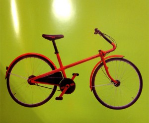
With that feeling I went into the research. Internet did not give to me any juicy information and in the library I did not find any solutions in language that I’m able to operate. Resigned, I started to look through the pages of an other books in the field of design. In every few pages, in front of my eyes were appearing objects with desirable “chairish” looks. Let’s take into consideration for example Bridgestone Cycle (1985) designed by Giorgio Giugiaro.

Blouson Brigetstone

Of course, the whole project of the bike is deeply thought out so as to satisfy in the best way its function. Surprisingly it is a family bicycle, although it looks more sporty (maybe because of the whole shape). The specific form of the frame, its uninterrupted line and shape of a steering wheel, brings convenience while driving, pedaling becomes easier, plenty space for the knees, even if you want you can attach seating for a child. The design of steering, its suspension seduces the eye like in an example of a chair.

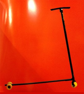
Funscate

I had very similar feeling with shown above, funscate (1985) design by Ravarini Castoldi. Although there is no significant steering suspension any way the designer uses it between the pipes for its function and captivating gentle curvature.

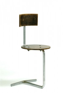
Coming back to the chairs with a special hanging feature, I would like to introduce you to few more dreamed examples. Heinz Rasch developed his own interpretation of Mart Stam’s ‘cantilever’ chair but more warm, soft shaped one (see below).

Heinz Rasch chair

An other designer, as well known as Mart Stam, Marcel Breuer (Hungarianborn modernist, architect and furniture designer) also developed and improved extensively described above chairs. Their constructions are more resilience, thereby, more comfort. Visual division between seat and the base disappears by using continuous supporting frame.


Marcel Breuer chair  Marcel Breuer chair

My beloved lack in a form is called ‘white space’ or negative space. Even if empty it says a lot. Having the same or an even more surprising message to tell than ‘filled space’. It is used not only in furniture design but also and maybe more in graphic design. Examples below:

trojkat  kulka

neg space

Some people have a huge fear of empty space, perceiving it as undeveloped. It looks for them like a mistake,. They are trying at all costs to fill it with whatever, ruining at the same time the appearance and first of all message. As for me, I am swimming in ‘amor vacui’, appreciating aesthetic minimalism, unfilled surfaces, limiting elements in art works or surrounding space.

Empty space in those objects bears its function which is always fulfilled. For me it is a negative space that it renames thanks to the positive role that satisfies, thanks to the transparency of form and seduction which is giving by interfering with the eye. Empty space described here can give us a feeling of comfort or discomfort, can attack us with its size or just only appearance, it may cheer us with clarity and translation. One is for sure, it will always say or do something to us not without reason.

Living on the edge of a chair


Monday, June 1, 2015

desingart

CHAIRZ

Lie van der WerfGaetano Pesce Green Street Chair 1984

Gaetano Pesce (1939) was an Italian architect and product designer who reconciled his interests in the fine arts with design in the 1960’s. Pesce, like many of his fellow contemporaries associated with Radical Design, sought design solutions that did not conform to the standardized forms associated with mass manufacture and mass consumption. His works challenge the commonly known concept of a chair, playing with the border of sculpture and objects of daily life that belong to the design world. Pesce continued to play a prominent role in progressive design circles over the following decades, placing greater emphasis on architecture in the 1990s. His multi- and interdisciplinary work known for experimenting with new materials and resin, which has become his signature material, was celebrated in an exhibition at the Centre Georges Pompidou in Paris in 1996.

gateano-pesce

Lie van der Werff (1962) graduated in 1992 at the Royal Academy of Arts in Rotterdam and in 1994 at the Rijksacademie in Amsterdam. She was part of a group of sculptors that brought back the figurative in art and started using natural materials again. Recognizable shapes from animals and humans were reintroduced. This went against the sculptures made at that time, when sculptures mostly consisted from abstract and geometric forms made from industrial materials. Van der Werff makes use of the fictive story behind textile and applies her findings to her imaginary animals. Next to textile she also uses wood and clay to translate her ideas into reality. Looking at her work on her website, her work seems highly theatrical. She is a bit as an Alice in Wonderland, who wears dresses that are too small and hangs out with fictive animals.

lievanderwerff


Form

How often do we stop and think about the hook we hang our coat on, or the knife we use to butter our bread? Our daily life is a succession of assumptions and presuppositions. We are not always aware of the multitude of shapes and objects we surround ourselves with day in and day out.

Form and function are seamlessly linked in our minds: trousers belong on our legs and a door hinges vertically, not horizontally. By contrast, when an artist or designer alters the form of such an easily recognizable everyday object, takes something away or changes the context in which it functions, the ingrained meaning of the object is subverted.

description in Setting a Scene at the Boijmans van Beuningen


An artificial connection

We started our research based on the connection made by the Boijmans van Beuningen Museum. In the exhibition of Setting the Scene the following questions were asked: What are the differences between design and the visual arts? And how far apart are they?

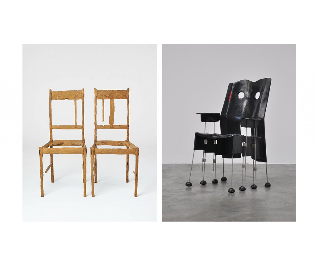
When we walked into the theme room assigned to us at the museum, we quite quickly chose our subject of interest. In the room we saw a chair that looked like a sculpture and two chairs that looked exactly like chairs but weren’t meant to sit on. We were immediately interested in this combination between the work of Gaetano Pesce (designer) and Lie van der Werff (artist).

There was something interesting about the chair from Pesce, because although we clearly saw that it was a chair, it looked very sculptural. Nevertheless you could see that the user was taken into consideration, there was no doubt where to sit. But material wise the designer was working on the boundaries of design. The eight thin legs under the seat of the chair almost made it look mechanical, almost like it could walk. The fine arts approach of the material (metal, glass fiber and polyester) lifts the chair from being ‚just another designed chair’. This Green Street chair is a result of Pesce’s research of the chair-ness within the chair.

In this exhibition under this theme, the chair makes perfect sense. Pesce’s chair raises the question of how far can you go with the idea of a chair? When is something still recognizable as a chair?

Looking at the chairs of Van der Werff that caught our attention, on the contrary, there are no undefined shapes involved. She used the archetype of a chair and without obeying the rules of design, she transformed it into a dysfunctional object. By processing the wood in her own way she made the chairs unable to sit on, changing them into sculptures. Through the processing she changes the design object into personal sculptures, changing their history, giving them a story and (probably) makes the viewer wonder what happened and to whom they belonged to. Van der Werff’s chairs raise the question of how long can you chop before the chair collapses? How long can you chop until the chair is not a chair anymore? When does it lose its original identity? How can another form arise through transforming an object?  But looking at her work in general, these chairs are the only possible work of her oeuvre that would fit this theme.

The work of Pesce and Van der Werff are as far apart as can be, not only looking at the chairs they made. They are not from the same time, not from the same country, not from the same discipline and never use the same materials or even use a concept that is alike. She is a lover of natural materials and colors, lives in her imaginary world and uses herself as part of her art. He, with a love for bright colors, is always looking how far he can go with materials and shapes to disten himself and his work from reality, while keeping it playful. We have to conclude that she only fits this Form theme with these chairs she made in 1992, whereas he would fit the theme with more chairs of his hand, whilst the theme of the room is also the research in his work.

So when the function is taken away, we can apply only the idea of the contemplative concept of an object. Where does design become fine arts? And where does fine arts become design? Should the distinction still be made?
To keep the answer as applied to the now as possible, we can talk from our own position as art students. We are from a generation of designers and fine artists that graduate at the Gerrit Rietveld Academy with a diploma that doesn’t make a distinction between the two practices. So the fact that it is changing inside the art schools means that the distinction will disappear more and more in the future. So, let’s mingle.


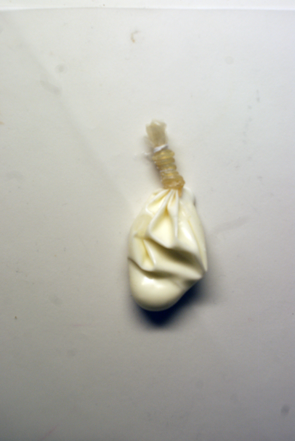
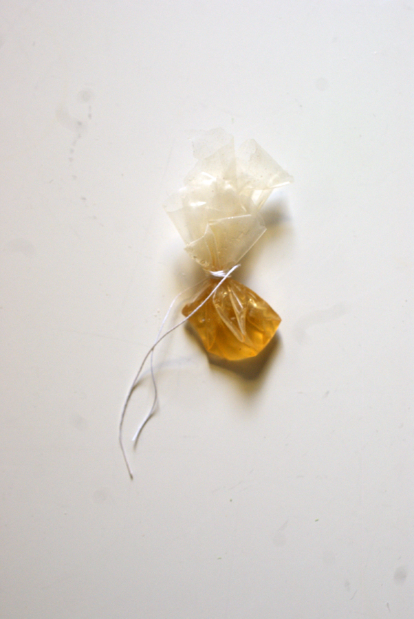
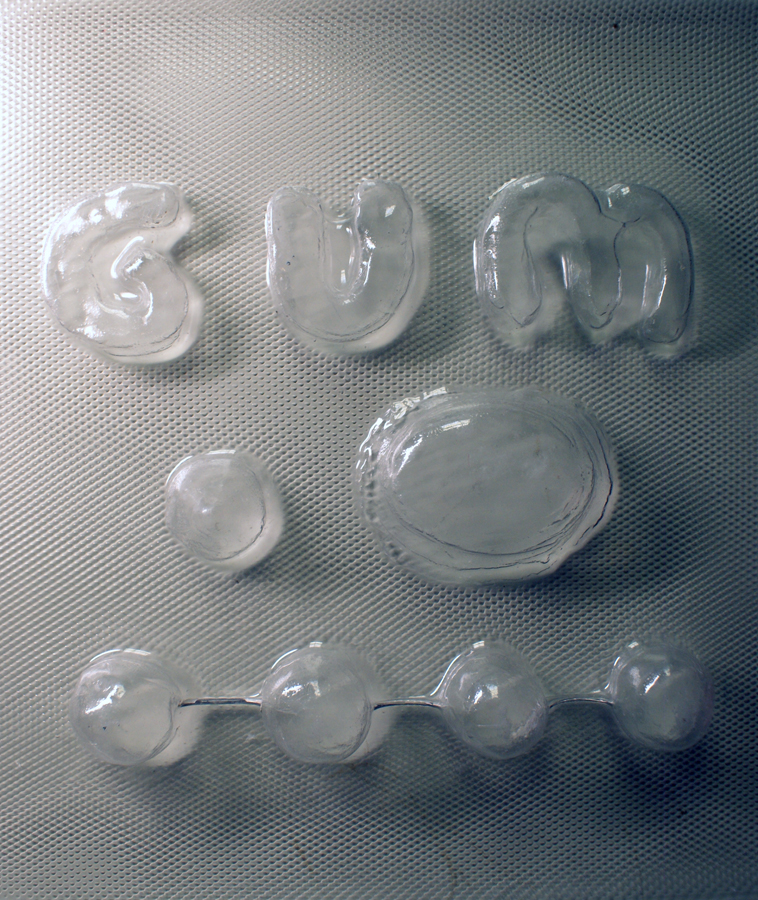
Through the stages of chewing gum.


Saturday, May 16, 2015


                                              oO.oO

                                       .oO.oO.oO.oO.oO

                                    .oO.oO.oO.oO.oO.oO

                                       .oO.oO.oO.oO.oO

                                             .oO.oO


.oO  STAGE 1 : Culinary World
[audio:https://designblog.rietveldacademie.nl/wp-content/uploads/2015/05/STAGE-1.mp3|titles=stage 1]

.oO  STAGE 2 : Roel Oostrom
[audio:https://designblog.rietveldacademie.nl/wp-content/uploads/2015/05/STAGE-2.mp3|titles=stage 2]

.oO  STAGE 3 : First Sketch 
[audio:https://designblog.rietveldacademie.nl/wp-content/uploads/2015/05/STAGE-3.mp3|titles=stage 3]

.oO  STAGE 4 : GUM!
[audio:https://designblog.rietveldacademie.nl/wp-content/uploads/2015/05/STAGE-4.mp3|titles=stage 4]

.oO  STAGE 5 : Maizena Experiments
[audio:https://designblog.rietveldacademie.nl/wp-content/uploads/2015/05/STAGE-5.mp3|titles=stage 5]

.oO  STAGE 6 : Chewing
[audio:https://designblog.rietveldacademie.nl/wp-content/uploads/2015/05/STAGE-6.mp3|titles=stage 6]

.oO  STAGE 7 : Hunting For Material
[audio:https://designblog.rietveldacademie.nl/wp-content/uploads/2015/05/STAGE-7.mp3|titles=stage 7]

.oO  STAGE 8 : Perfect Wrapping
[audio:https://designblog.rietveldacademie.nl/wp-content/uploads/2015/05/STAGE-8.mp3|titles=stage 8]

.oO  STAGE 9 : Experience Of Chewing
[audio:https://designblog.rietveldacademie.nl/wp-content/uploads/2015/05/STAGE-9.mp3|titles=stage 9]


.oO THE GUM                                              .oO THE DIP 

SONY DSC    SONY DSC

.oO THE PACKAGE

SONY DSC


dis play


Friday, May 15, 2015


who inspires you?

she asked

who?

I thought…

what?

I thought then…

meet this person and get inspired

make a work out of this experience

she said

and so I met a fashion designer

young man

very pretty

he said that fashion is like a colouring book

we have certain outlines and we have to fill the ´surface´

and then he said a lot of other thing, too

and made me pay for his coffee

and then, biking through Albert Cuypstraat, I was thinking of the colouring books

and about what it is, that we are filing the given shape with

finding:

Yamaha

Pepsi

24

N-power

Avis

I love sport

Fedex

Virgin

Bronx NYC crew

Alpinestar

nike just do it

WELLA PROFESSIONALS

keep calm and swag

avatar

dr.Oetker

clothing is a billboard

I understood

a display which is touching every single corner of our lives except the shower corner

and then I thought further what makes us want to proudly wear a company logo on our chests and how could we make a use of this display that we are constantly wearing

and then I did not know what to do for a while

and then I knew again

I made a plan to make a comfortable universal sweatshirt which will have a displaying function beside the warm keeping, protecting and covering one

what would I fill the surface with?

what surface?

I wondered

and so I bought a surface

blank, grey sweatshirt

I decided to make a use of the existing shape of the sweatshirt and challenge the idea of temporary and replaceable advertisement on it

but how?

I thought

Removable sleeves?

but how?

adding a zipper?

or a velcro?

zipper

and so I added a zipper on the sleeves and by doing so, I allowed the printed advertisement/ promotional element to be easily removed or replaced by another one

I made a list of small businesses that I really truly want to support and promote

I gathered the logos of all of them


2mala1 mala kopie


the print will come on the sleeves

I made another decision

but how?

screen print?

okay

the screen print studio works on the base of appointments

you must discuss your idea with the screen print assistant first

then an appointment is made

attention: it sometimes lasts over two weeks

you start printing with the assistant

hopefully you can work independent later

costs

yes costs…

no

I am not going to screen print my logos

what else can I do?

transfer print it

of course

I printed my logos onto a specially coated transfer paper

then they were applied onto textile under the heat press

and there it was

logos on my sleeves

I looked at the sweatshirt in my hands

I wanted to wear it immediately

and I did

and it felt good

but it did not feel good enough

so I took it off and looked again

and after some time I wrote down

70cm metal zipper standard + another sleeves + velcro pocket question mark

and then I went to Jan

and made another pair of sleeves

black

I put transparent, removable pockets on them

and I like them a lot

and then I looked again

they told me I have to look and reflect on my work during my process

so I did

I reflected

and I asked myself

what is it that I have now?

sweatshirt design?

yes

and what else?

and then I started my analysis

see here: video


33 16

1 21


The Mysterious Endless Chair


Thursday, April 30, 2015

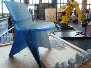
The  ‘Endless Chair’ by Dirk van der Kooij. My eye was caught by this chair when we went on a design trip with our class. We went to an exhibition with the most bizarre and special chair. There were a hundred chairs, old and new ones, crazy but also very simple ones. But the Endless Chair stood out for me. It stood in a corner, a beautiful light blue  object with a color that could not have been created by hand. When I came closer I saw that the chair looked very complicated but simple at the same time. It almost looked like it came from another planet, so clean and refreshing in its structure and design. Immediately it raised the question: ” What’s the material and how is it made?”

The Endless Chair is designed by Dirk Van Der Kooij, a dutch designed who graduated from the Design Academy Eindhoven in 2010. During his study he got fascinated by an old 3D printer for his final project. He turned an old robot arm from China into his own 3D printer. This was not just a normal 3D printer, van der Kooij is the creator of the first worldwide robot which can extrude furniture pieces from 100% recycled material. This machine wasn’t made for mass production because you can only produce one product at the time. One chair has a production time of approximately three hours.  Dirk van der Kooij is trying to produce products that have the qualities of a industrial produced object but without the strict rules of mass production.

endless

In this video you can see how the chair is made 

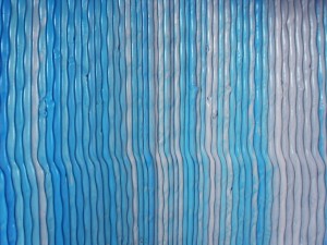
Van der Kooij wanted to change the bad image that plastic gained in the last decades, plastic is often seen als a cheap and breakable material, It is actually durable, beautiful and elastic. I can make objects, unknown as plastic ones”, he says. He and his robot create strong, powerful and creative objects. He doesn’t aim for the perfect outcome of 3D printing, he likes the little mistakes that the big robot arm makes. The 3D printer doesn’t make flawless designs like normal 3D printers would. Although the chair looks very clean and sharp when you look closely you see that the chair has little bumps and imperfections.

endless

A close up of the material and structure of the chair


Not only how the chair is made is very but also the material what it is made from is very special, all his chairs are made from old refrigerators. Small bits of recycled refrigerators are poured into the top of the robot arm and melted into the beautiful design. Dirk van der Kooij doesn’t really look at the process of recycling as a solution to be green and re-use our waste, he sees it as a new conceptual way of working. He likes the aesthetics that recycled material gives to an object: “Recycled material has a history that can be literary seen in the product. That gives particular beauty and layering.” 

The chair is build layer by layer. When you see chair being printed, it lays on its side, often van der Kooij makes beautiful gradients of color, which is easy to do with this way of production. The first time I saw this chair I saw in it a beautiful shade of light blue, it was one of his prototypes, I actually love this prototype, because in the beginning the robot arm was only able to make very angulair shapes. Later the robot arm could make rounder shapes. Not only I loved the angular shape of the prototype, I also really liked the color of the chair, it didn’t have a gradient, but it existed out of a light blue colored plastic that changed a bit all over the chair. Very simple but extremely beautiful. It reminded me of a cloud, very soft but also very strong.

Dirk van der Kooij is always looking for new ways to improve his designs, by always making new steps and trying out new things, his production process leads to him in a quite natural way to the production of new and more shapes. I would love to have these amazing and very special chairs in my kitchen, with their rich and interesting history.


Made Trough Material Research


Sunday, March 29, 2015

I was thinking, writing about a chair can be really interesting but for me it had to be more than only writing about a chair.

Waste, material, life, renovation, structure, experimenting, design.

A few of the words that were coming up in my mind when I saw and started to research this chair, so I thought this will be a perfect chair and designer to write about. To find out how deep this designer can go into material research, waste and renewable energy. Marjan Van Aubel is one of the designers who stimulates this.

table-17


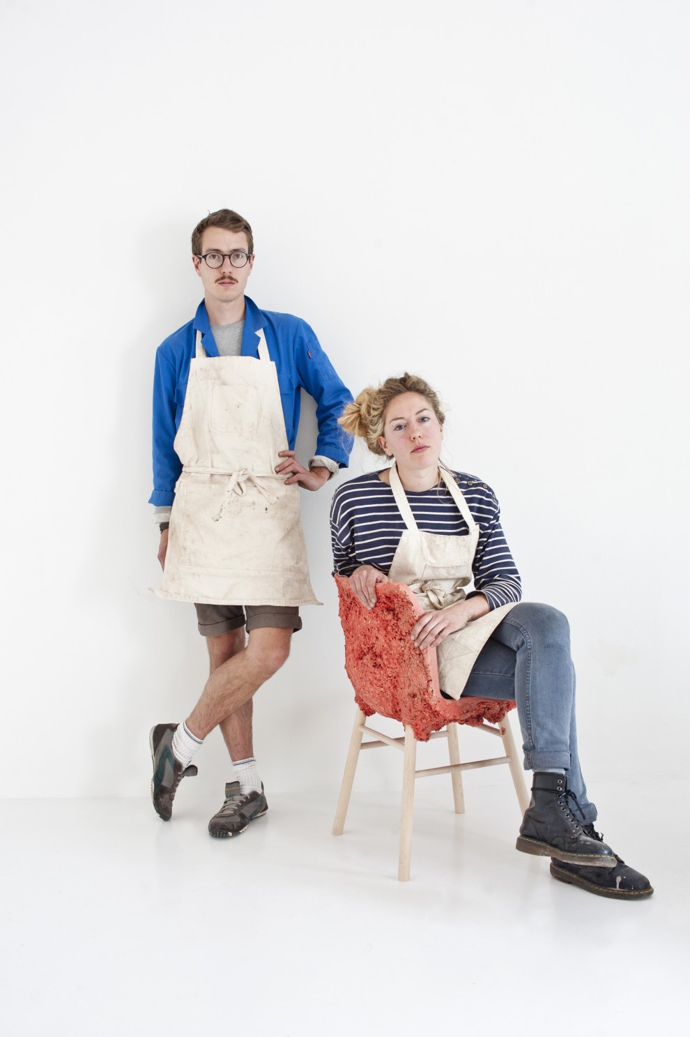
Marjan van Aubel is a designer that makes everyday objects in new innovative ways. She is trying to make people aware of the fact that renewable energy is everywhere. Normally there will be a waste of 50/80% during normal manufacture.  Van Aubel and James Shaw found a way how to use and incorporate that wastage during the manufacture.

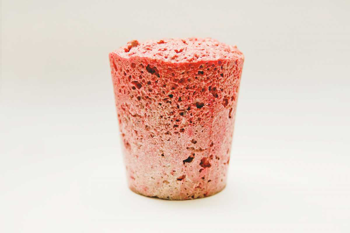
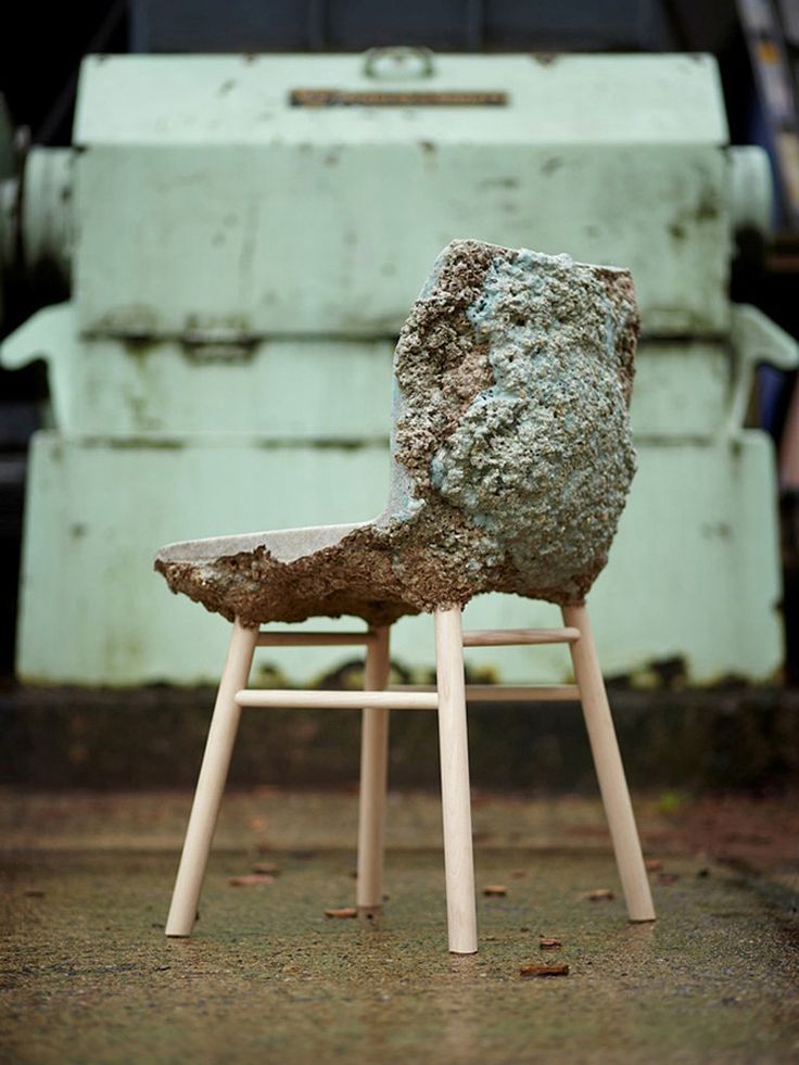
When I saw “the well-proven chair” for the first time it looked like a normal chair because of the simple legs of the chair but when you see the back it becomes a object. For me it was hard to understand the material. I didn’t know where the chair was made of. The nice structure camouflages the fact that it is actually made out of  shavings and sawdust.The sitting part is beautiful and smooth, making this chair nice to sit on and really nice to look at. It’s good that the legs are simple so the focus stays on the sit area. With her designs she try’s to combine design and technology. She strives for a more renewable life

Well-proven chairJamesShaw+MarjanvanAubel

For me this was a really interesting topic because i didn’t know a lot about this kind of experimenting with material. There are so designers working with this way of designing. They are busy with making new materials to make life more renewable. I think these new materials are needed because our resources are running out.

As an artist/designer Marjan van Aubel always was interested in how things are made, a reason why i feel related to her. I always want to figure out how ‘it’ is put together.

She was also intrigued by solar panels and why they are so ugly and why they can ruin the face of a building. Why are the panels not integrated in the tiles? I really agree with her. That is why she started at her collage time a research about energy. Now not only design was important also science. She graduated with “The Energy Collections” a set of solar glassware that discharges through a matching bookshelf, which serves as a rather large battery. This kind of thinking can make our life a lot more easy an conscious. Like I said we are running out of material so this kind of design thinking can improve this.

I have a lot of interest in nature.  For me that makes her work really interesting, because she interacts nature with design. I have a few works i made a few years a go which are also related to this.
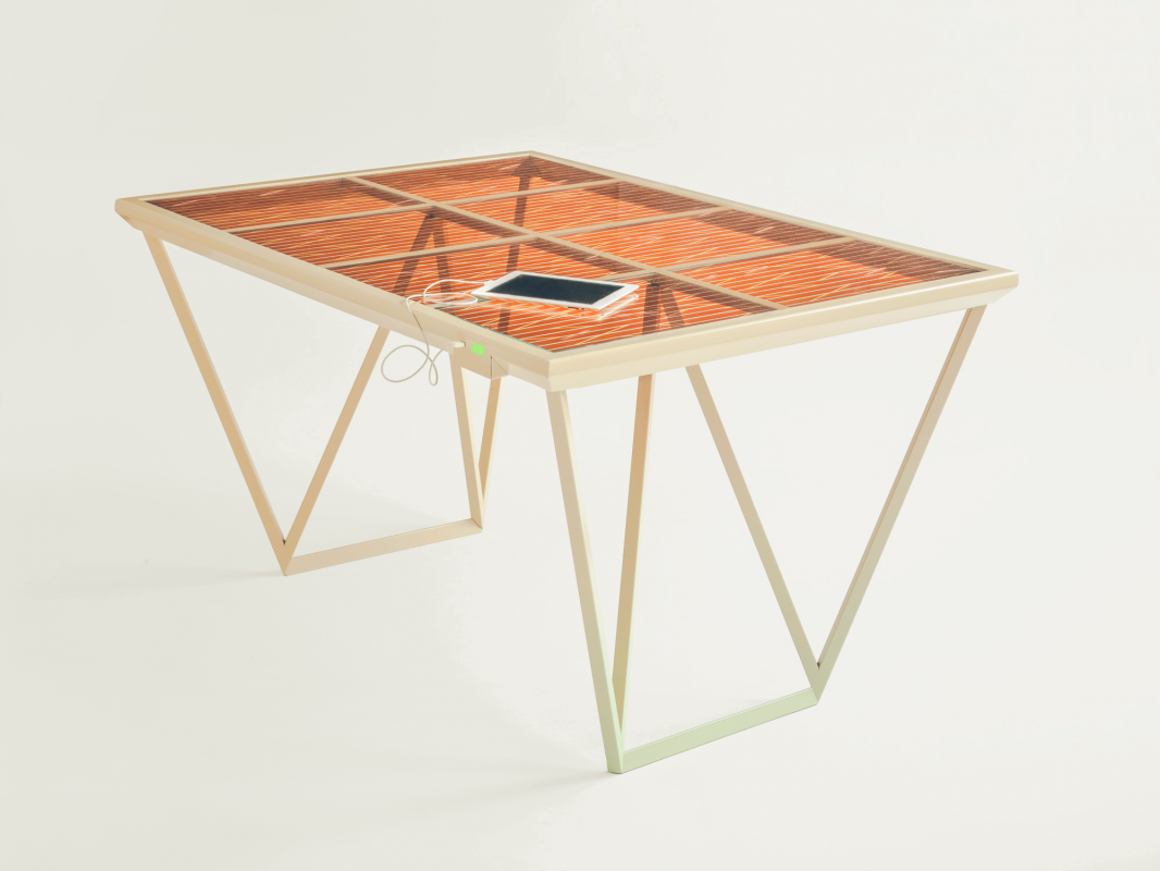
I investigated how nature and mathematics have a lot of comparisons. Like the golden ratio and Fibonacci. You can see it in a lot of plants, a lot of leaves  grow in a spiral around the branch to get enough sunlight and rain. It is also in our human body. For me structure in  nature is an important way for making a work. It is really nice that nature can help us to make products. I think it’s also good that new young designers/artists also use this opportunity to invent new products and make use of our nature. Like her latest project  “The Current Table‘ which was also able to generate energy. This project she made in response to “the energy collection”.


Current-Table

The market for these well made products is getting bigger and bigger.  People are more concerned with a healthy and a conscious way of life and designers will react on that.

This movie from 2012 shows how a lot of designers are busy with the meaning of material.

https://www.youtube.com/watch?v=9-GofyAQK6Y


It’s fascinates me a lot how this young designer are making al these new innovative products. I found a movie on this page and it shows how scientists are combining non-living chemicals to create materials with the properties of living organisms.

Now you can see how new materials, new invented but also already existing materials but used in an other way will blow your mind. For me their is still a lot to discover about al this material researches and the meaning of material. This research showed me a lot new ways of seeing waste and make new material with it. So we al can be more conscious and re-use waste to make something new.


Links:

http://www.marjanvanaubel.com/

http://wellprovenchair.com/

http://www.dezeen.com/

http://www.rennyramakers.com/


Log in
subscribe