Skip to Content Skip to Search Go to Top Navigation Go to Side Menu


Archive for April, 2019


Doing aerobics before painting?:


Sunday, April 21, 2019

When I first heard “Bauhaus,” my first impression of it was just “big movement important in the history of European art” Because I didn’t have much interest and think it was not really related to me but the Boijmans Museum’s exhibition of Bauhaus, where I went without any expectations, influenced me more than I expected.
The systematic learning of basic things, such as materials and colors, seemed boring at first glance, but turned out to be the most dynamic and interesting things. Exploring the properties of materials, understanding the various and contrary things, geometric shapes and colors are the most essential elements for art, but I had missed them.
Through the writings of Johannes Itten, founder of Bauhaus Vorkurs (preliminary course), I could understand exactly why Bauhaus put so much effort into these things.

Let’s take a look at the works that I saw at the exhibition and the writings of Johannes Itten together.

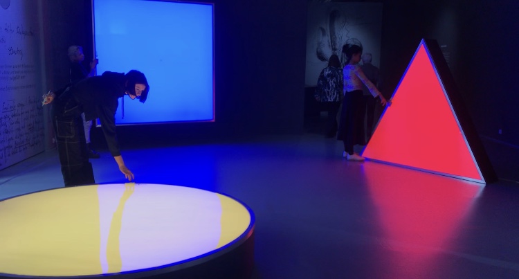
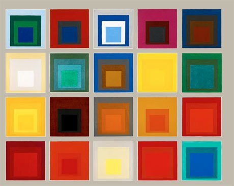
Two of the most distinct elements of Bauhaus: Geometric form and primitive colors

“The clear geometric form is the one most easily comprehended and its basic elements are the circle, the square and the triangle. Every possible form lies dormant in these formal elements. They are visible to him who sees, invisible to him who does not. Form is also colour. Without colour there is no form. Form and colour are one…Geometric forms and the colours of the spectrum are the simplest, most sensitive forms and colours and therefore the most precise means of expression in a work of art.” •1

It was like the playful work of children. It made me think differently about the concepts and the properties of materials that I had been knowing.

Forms and colours were discussed and presented in any number of polar contrasts. These contrasts can be presented as intellectual concepts…The students had to present these carious contrasts, separately and in combinations, in a manner that allowed our senses to perceive them convincingly.” “All artistic effects are based on the creation of contrasts. We not only studied their contrasts – smooth-rough, hard-soft, light-heavy—visually but also explored them with our fingertips…To deepen and control the experience, students had to contemplate, touch, and raw these textures until they knew them by heart and could reproduce them out of their inner perception, without the natural model.” •2

Among the many exhibited items, the drawings that caught my eyes turned out to be Vorkurs works.

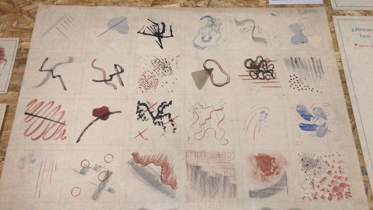
I was fascinated by these rhythmical lines and colors 

“ The teacher’s most difficult problem is the liberation and deepening of the inner spiritual sense of perception. To conduct exercises in that area one needs a very pliable, labile material which reacts immediately to the slightest motion of the hand. I used india ink brushes and soft charcoal” “The success of these studies wholly depends on the student’s ability to overcome his intellect and the function of his senses and give himself totally to spontaneous feeling. An inner automatism quite naturally gives a convincing outer form to his feelings.” 3

Johannes Itten’s ideals of education were very impressive and as a Gerrit Rietveld student, I related to that.
Itten found it difficult to judge students because they all have different talents and characters.
So the vorkurs was built, and students were able to have time to think fully about their interests and aptitudes as they went through this course. I think it is the same reason why Rietveld Academie persists in the basic year while many other schools have given it up already.
Students at Bauhaus had to explore and enlighten themselves without relying on the knowledge from the outside. Itten emphasized inner growth and self-examination, so he went back to the quest for more basic things and helped discover students’ interests and talents through them.

I felt lost when I came to the Rietveld Academie at first. I was used to the crammed Korean education, that was why it was difficult and awkward for me to think about myself and being on one’s own. Now I’m used to it and this new way of education has given me a chance to think deeply about myself.
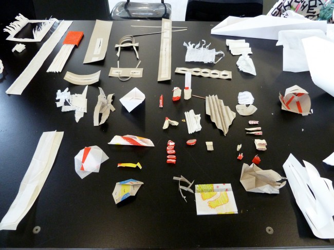
Drawing and painting, theory, design, mixed media and sculpture, learning these five subjects, and using various workshops, I could see what I liked and disliked, or what I didn’t do well. The fairly free atmosphere of discussion and feedback also helped me broaden my horizons.


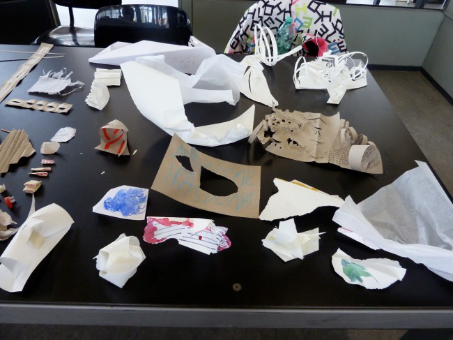
Pictures of Rietveld Academie basic year class


pictures of Bauhaus vorkurs

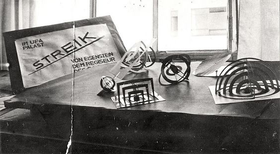
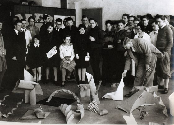
Interestingly, both educations seem to be exploring materials.

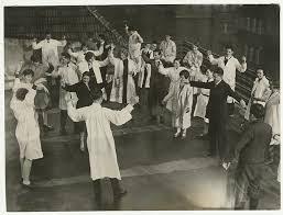
They have a lot in common, but the reason Bauhaus’ education seems more interesting to me is probably because of the physical exercise. Itten gave the class exercises in relation, breathing, and concentration to achieve a spiritual state and physical readiness during the instruction period.•4
He thought the training the body as an instrument of the spirit is essential to an artist’s creativity. That is why, before attempting class, the students were asked to limber up their bodies and minds by physical jerks, controlled breathing, and meditation.•5
I agree with his opinion as a yoga and meditation lover. I believe that the body and mind are connected and the brain also moves more actively when the body is ready and activated.

Imagine, wouldn’t it be more fun and energetic if we did yoga together at school or if we did weird exercises before we painted?

pictures of Bauhaus Vorkurs physical exercise

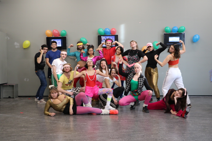
pictures of Rietveld Academie basic year class E’s aerobics performance

Maybe ‘Basicyear’ is the most important time as an artist. This is because it is an opportunity to experience many challenges and failures without constraint. So far, I have been busy just completing my assignments. After learning of Bauhaus’ educational philosophy, I began to reflect on my attitude and to think about how to deal with my work in the future. I will bear in mind the philosophy of Bauhaus, which is attentive to the sounds of body and mind, faithful to the basics and always exploring.

•1,5) Frank Whitford, Bauhaus, Thames and Hudson, 1984, London
•2,3,4) Gyorgy Kepes, Education of Vision, Studio Vista, 1965, New York


Colorconsequence.


Thursday, April 18, 2019

Color consequence.

As a student in the Basicyear at the Rietveld Academie I have started to discover the lack of teachings on the consequence of color. Many of the employees in the Academie I have discussed this matter with has answered (according to my perception of their given answer) that it is not an up-to-date topic. Yet I consider myself aiming at this from a painting perspective, the knowledge of color consequence is important, so it seems, also within the realm of what I define as Design. The Rietveld Academie has been described to me, during my time as a student, as it takes great pride in the use of what could be called ”The Bauhaus” model. Design and Fine arts share the same space with all of the crafts that you can fit into those two realms.  What I have started to investigate has begun to make me realize that there is color consequence to pretty much everything for someone whom has the ability to see, and is therefore of upmost importance as a subject in our education for every department in the Academy.

Johannes Itten mentions in his introduction of the book ”The Elements of Color” a simple example of how important color can be to space,

– ”The mausoleum of Galla Placidia, now at Ravenna, Italy, is dominated by a remarkable colored atmosphere of grey light. This effect is produced by bathing the blue mosaic walls of the interior in an orange light, filtered through narrow windows of orange-tinted alabaster. Orange and blue are complementary colors, the mixing of which yields gray” 1.

He goes on giving examples on how the element of color is used in other scientific professions,

– ”The physicist studies the nature of electromagnetic energy vibrations and particles involved in the phenomena of light, the several origins of color phenomena such as the prismatic dispersion of the white light and the problems of pigmentation. He investigates mixtures of chromatic light, spectra of the elements, frequencies and wave lengths of colored light rays. Measurements and classification of colors are also topics of the physical research.”

“The chemist studies the molecular structure of dyes and pigments, problems of color fastness, vehicles and preparation of synthetic dyes. Color chemistry today embraces an extraordinarily wide field of industrial research and production”.

“The physiologist investigates the various effects of light and colors on our visual apparatus-eye and brain – and their anatomical relationships and functions. Research on light -and dark- adapted vision occupies an important place. The phenomenon of afterimages is another physiological topic”.

“The psychologist is interested in problems of the influence of color radiation on our mind and spirit. Color symbolism, and the subjective perception and discrimination of colors, are important psychological problems. Expressive color effects, what Goethe called the ethic-aesthetic values of colors-likewise fall within the psychologists province.” 1.

It strikes me how color is such a essential part of our visual world that it is crucial to understand how it works, it is a very subjective matter among humans but also between species. If I look to nature I would like to state that the fundamental meaning of color is communication. Communication in the way of understanding what to avoid and not to survive.

After having some time digesting this research, having discussions with students, teachers and people whom are not professionally involved in fine arts and design, I’m starting to change my approach towards color and its consequence, also understand why color does not have the same essential role in our education as it had for the Bauhaus students. The other week my roommate had his father visiting. We were strolling around the center of Haarlem (NL) when we decided to enter The Frans Hals museum. An exhibition suggesting contemporary aspects of Frans Hals work was showing including art works by contemporary artists. One of the main focuses was the color of the walls in the museum rooms. Instead of the normally used white, changing hues of a green/yellow color represented each room. Even if I read this before entering I did not notice how the constant change of hue was effecting our approach towards the exhibition. I was very focused on analyzing the art itself, until my roommates father (my room mate had been in the same over analyzing state as me) suggested that the change of wall color had effected how we criticized the exhibition and it’s art pieces showing. It struck me that I’m so over focused on criticizing artworks that I lose perception of what else is happening around, which might suggest that my overthinking of how I use color based on the old color studies published is only an obstacle and not an asset. During painting classes after this I realized how I produce more balance with color by not thinking about the old color studies but by using my instinct. So after presenting my idea last time in class a short discussion with our design teacher ended up with him stating that our contemporary perception of color and its consequence is a common knowledge based on that the society we grow up and is now posses with a greater awareness, in difference from to what people during Itten’s time learned and experienced. Though Itten also said;

”For the artist, effects are decisive, rather than agents as studied by physics and chemistry. Color effects are in the eye of the beholder. Yet the deepest and truest secrets of color effect are, I know invisible even to the eye, and are beheld by the heart alone. The essential eludes conceptual formulation” 1.

We are observing the world and our reality from our perspective, the person next to you has another perception of reality. We tend to assume that the rest of the people have the same moral, same understanding and same ethics as oneself but when it comes to what is right or wrong, good or bad I would like to think that there are as many truths on this planet as there are humans. One reality for every human. All others, plants and creatures on the planet, experiencing the moment in ways not understandable to humans. This also would mean that there is one perception on color for every human, so in the end it is up to the artist to determine what purpose the colors used fits his or hers reality. Josef Albers writes in his book “Interaction of Color”,

In order to use color effectively it is necessary to recognize that color deceives continually” 2.

Color study from the book Interaction of Color by Josef Albers. 2.

For a more contemporary (digital) approach towards color please visit “The Color Library” made by Maximage.  Maximage is a Swiss collaborative studio established in 2008 who created a website they call ”The Color Library”. You can also visit the website where it is described how color is used in the Rijksmuseum.

If you have further interest in reading about color please visit some of the other color researches at the designblog, here is also one on surface.

Additionally here is a link to a lecture on Color Theory from YouTube.


  1. Johannes Itten, The Elements of Color, John Wiley and Sons Inc, Hoboken, 1970, page 9, 12 and 7.
  2. Josef Albers, Interaction of color 50th anniversary, Yale University Press, London, 2013, page 1.

Log in
subscribe