Skip to Content Skip to Search Go to Top Navigation Go to Side Menu


"art" Category


Don’t judge a book by its cover


Wednesday, October 29, 2014

Esther de Vries is a graphic designer specialized in book design. Among many projects, she made two books on her father, the sculptor Auke de Vries. The two books, dealing with the same artist, are yet very different, the first one, Auke de Vries Photo Archives, being much more intimate than the second one, Auke de Vries: Sculptures, drawing and work in public space, which is more meant as an chronological overview on the evolution of the artistic career  of Auke de Vries. But what is surprising is that both books are very different from the first impression the reader can get just by watching the cover.


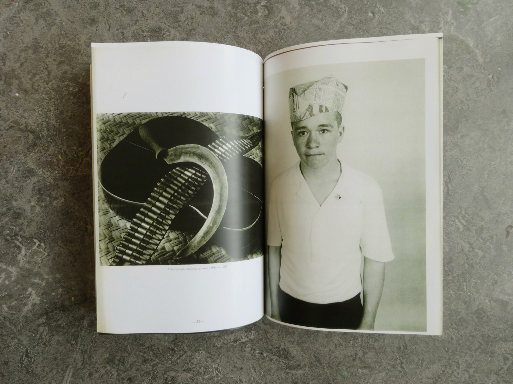
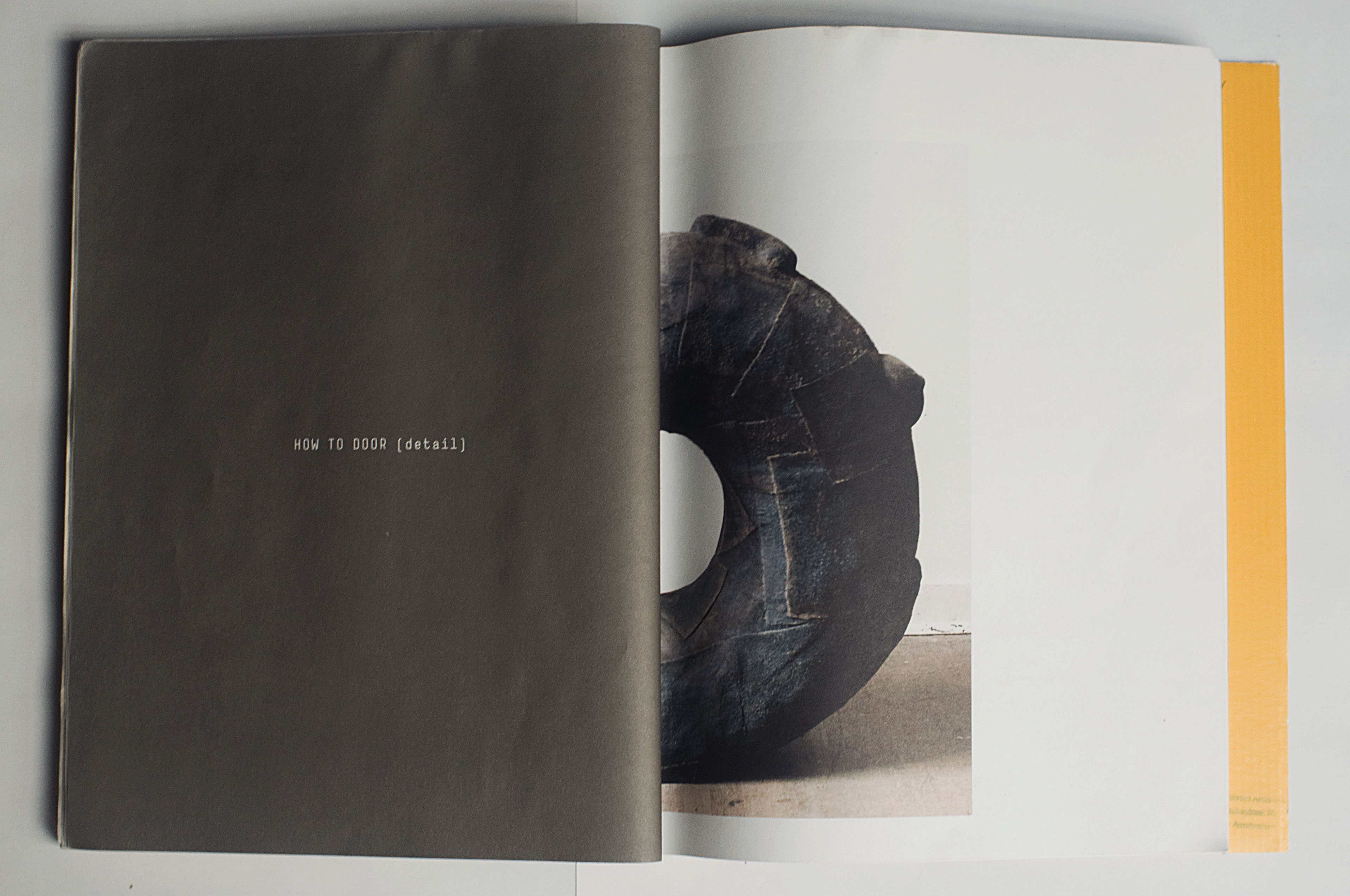
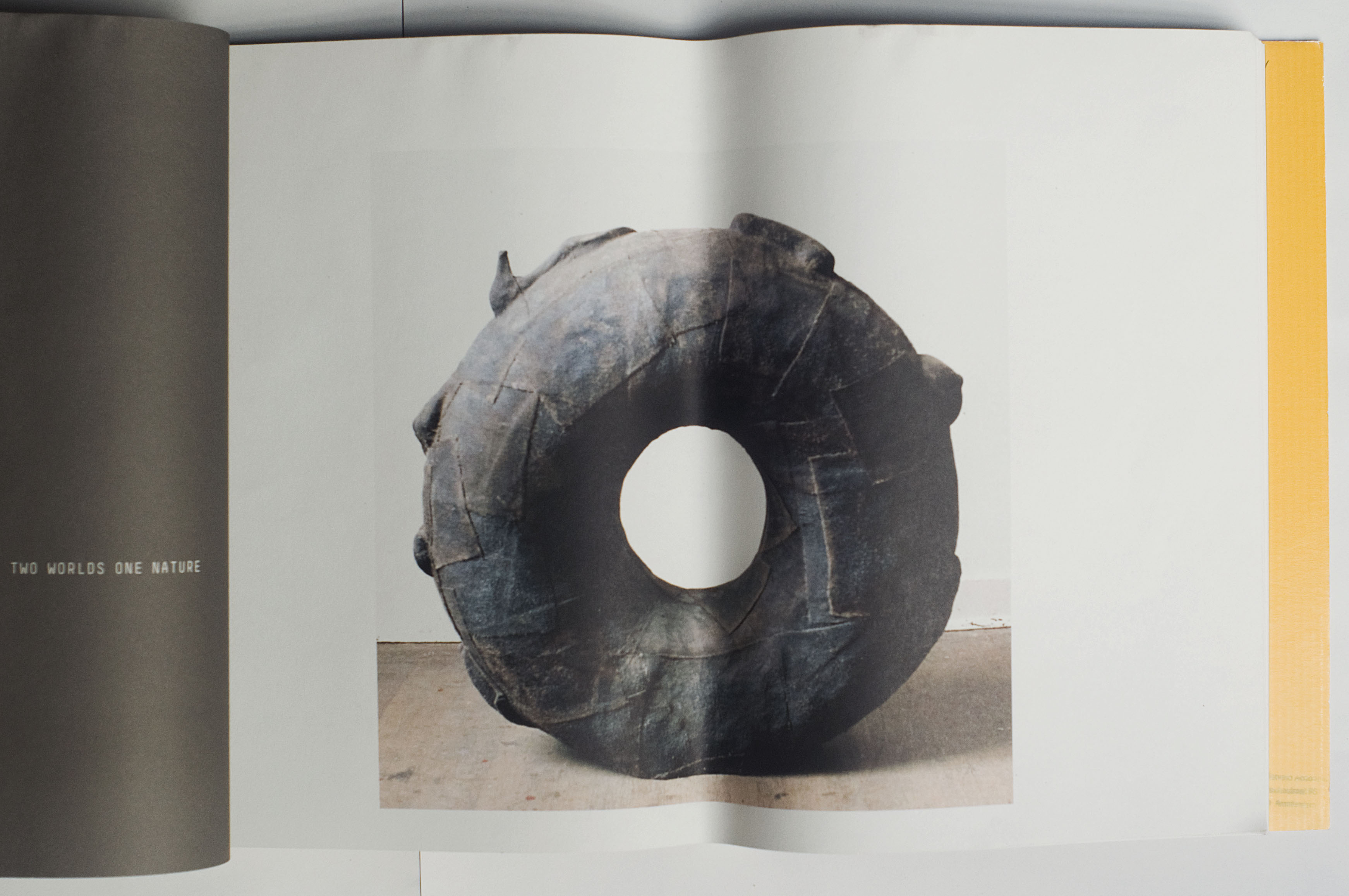
Indeed, at first sight and because of its very strong cover and size, the biggest book seems to be one of those very classical and sometimes deadly boring art books that present an exhaustive view of the work of an artist. But going into the design and the content of the volume you can experience it as an actual novel object. A lot of different materials are used in the book, making it exciting to go through, and a great importance is accorded to the process, thus gathering a collection of sketches, photographs and forms that helped or influenced the artist with his sculptures, and even pictures of the artist working in his studio. On all those pictures the text is set in an unquestionable playful way, sometimes even covering the images.


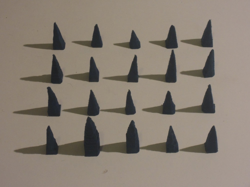
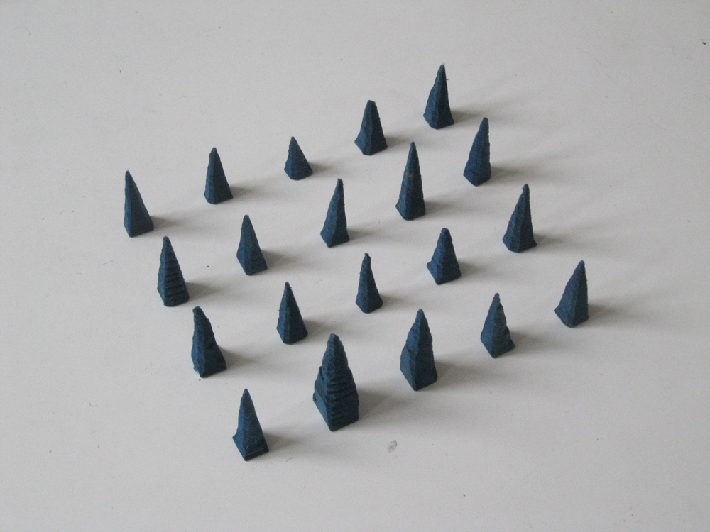
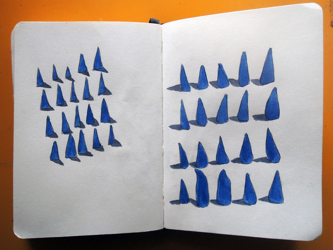
An other particularity that makes the book playful and thrilling is the use of very thin pages presenting a compilation of different forms, cut from a photograph of a work of the artist and magnified. Those pages refers to the collection of forms that the artist developed and used constantly in his work. Esther was keen to scatter that through the pages as, what she calls, an alphabet.


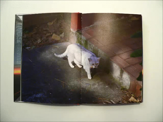
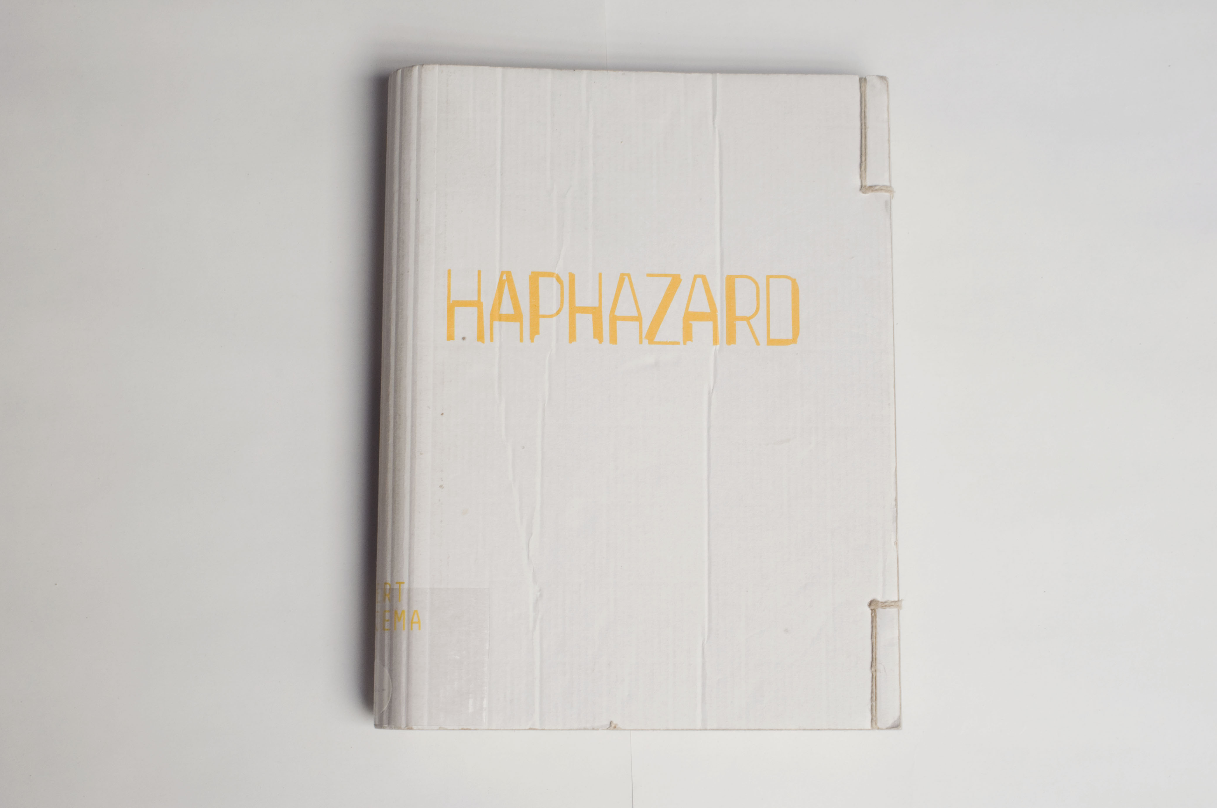
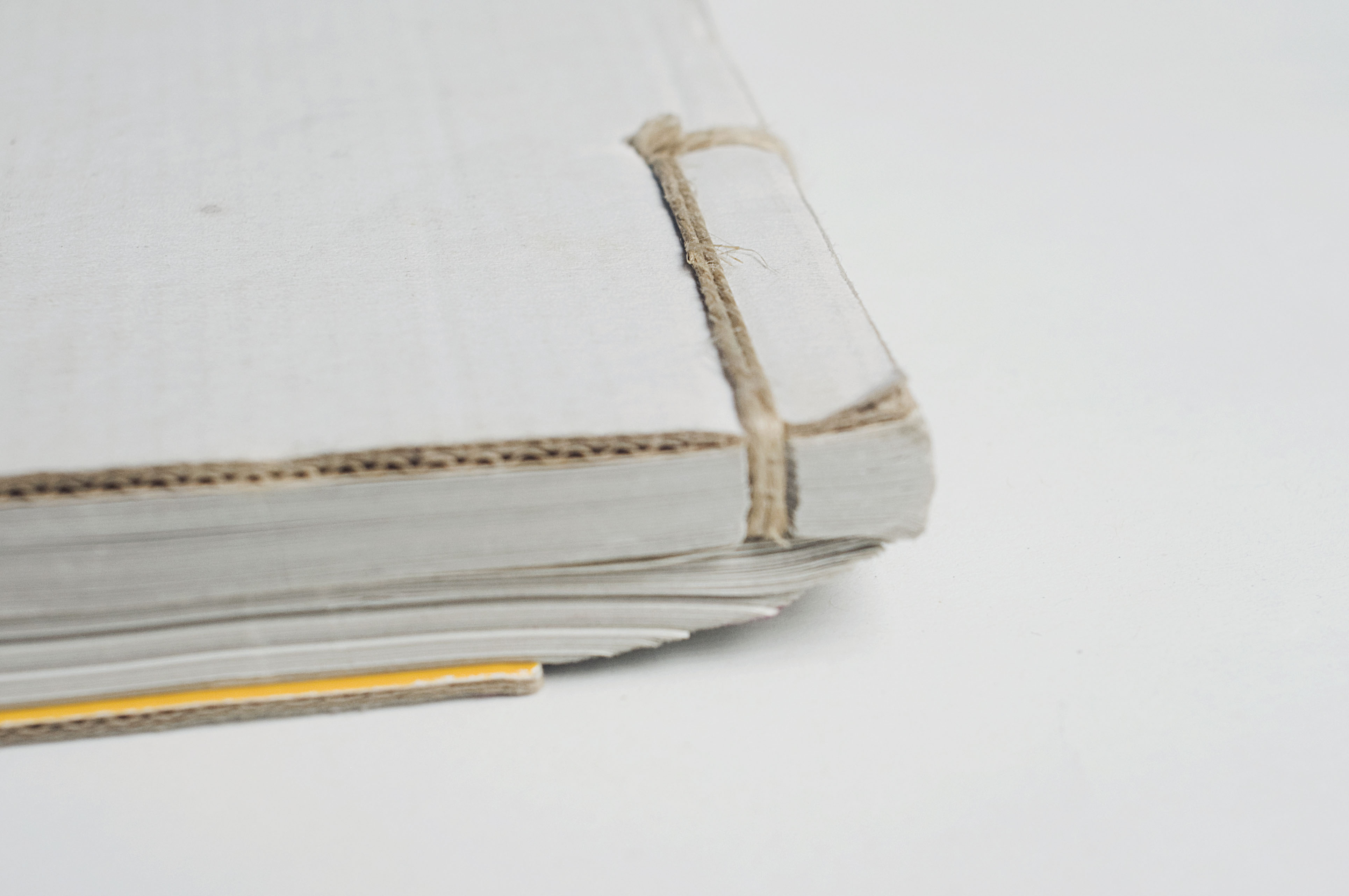
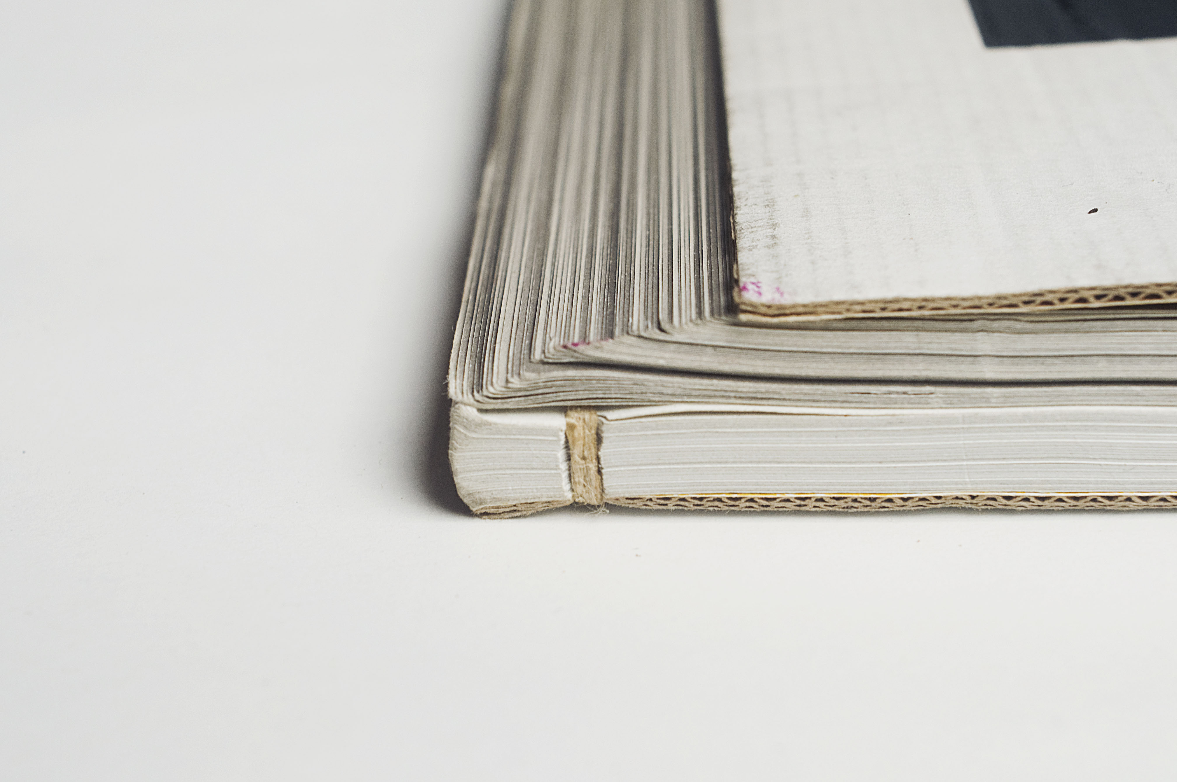
As for Photo Archives, the fabric and very simple cover makes it look at first glance as a secondary book, very small and discreet, soft, not meant to go through the years as the other one. But once more the design and content makes it very special, in a precious and sprightly way. While the other book is meant to present mainly the evolution of the artist’s works, this photography book shows through the collection of pictures the process that took place even before the artworks, as a wandering in the thoughts of the artist.


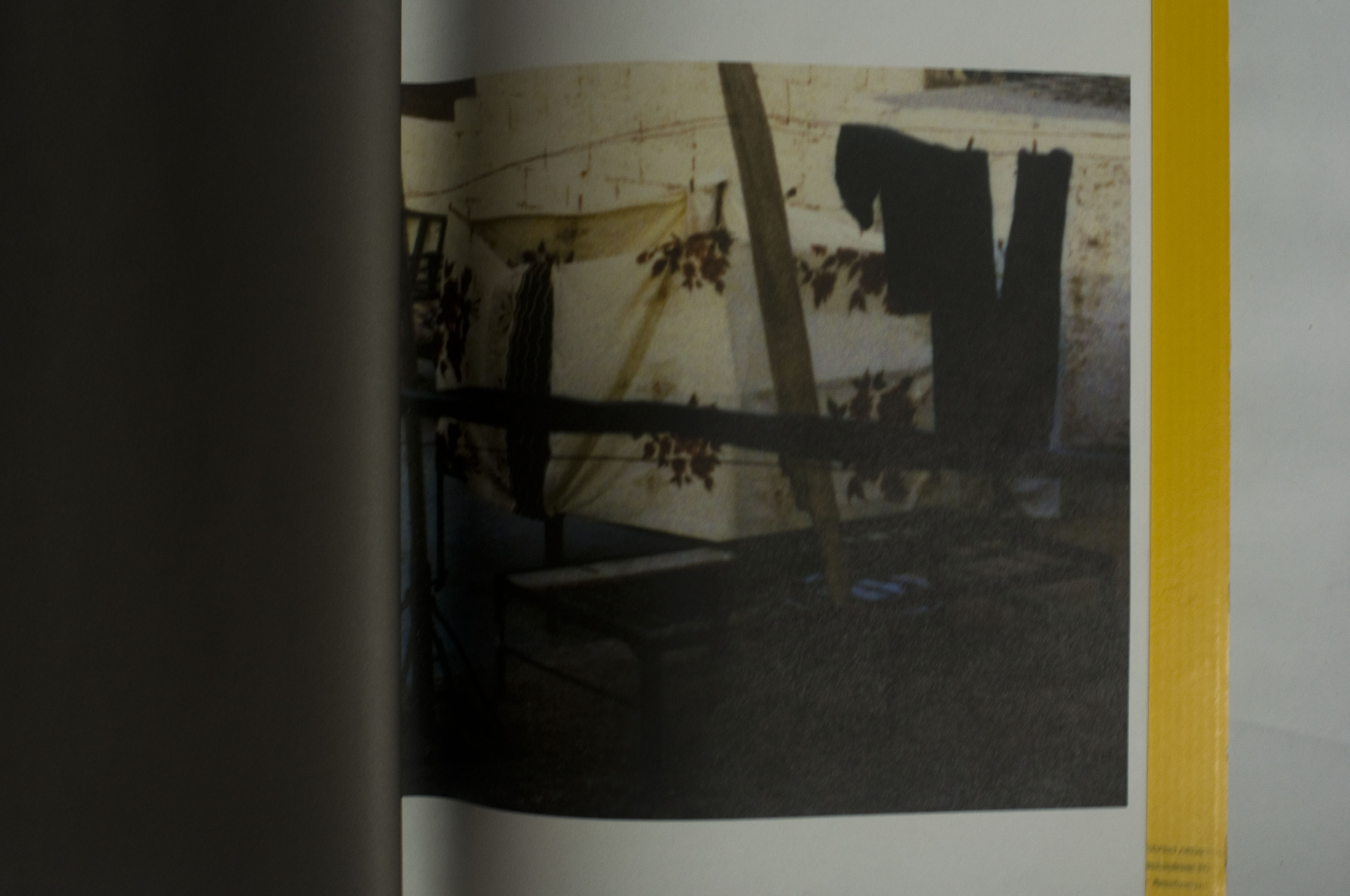
Here the relation to the reader is completely unusual, as there is no chronological order or reading direction. The reader, who is more a viewer since

there is no text, can open the book in the middle, at the end, or open the same page again and again, led to wander in the same way that the artist was wandering when he took those pictures.


archive_04


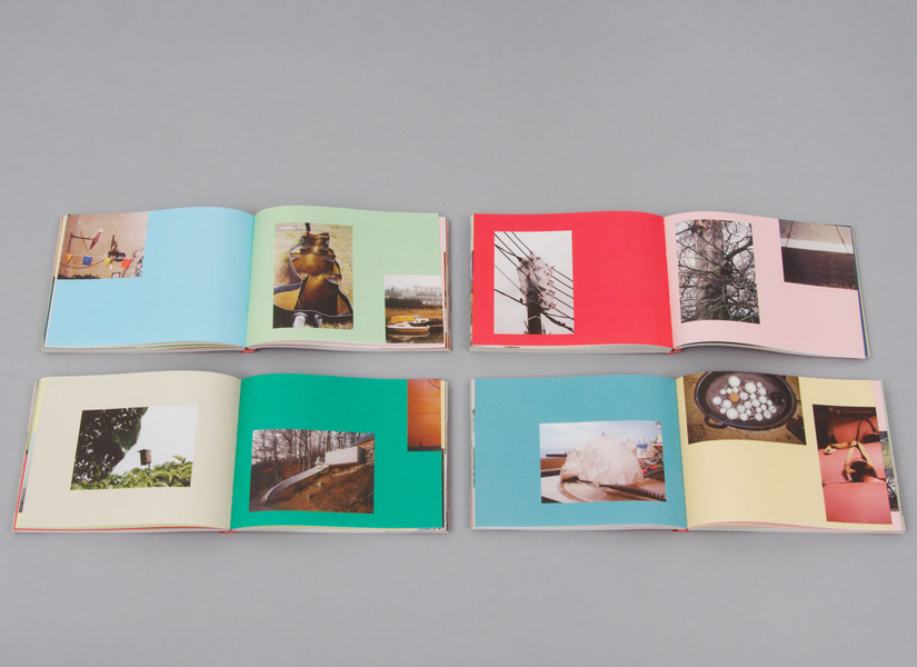
This is also a quite seducing book, designed between rule and coincidence with a set of colors and places for the pictures that are sometimes cut in two by the Japanese binding, leading the reader to focus on a particular shape that recalls Auke de Vries’ work. I noticed that the two books are very different from the first feeling you can get from them.


Yet, maybe Esther’s work, or at least these two books, deals a lot with feeling. That is to say the very strong feeling that the reader gets or is given in both cases of the close connection between the work of the artist and the design of the books. They pay homage to this work. It might has to do with the fact that both books where initiated by Esther herself, and not commisioned, hence the liberties in the design. This is also caused by the very long process that the designer went through while making those books, meticulously choosing each picture and composition, trying all the colors with each image again and again, changing direction until being fully satisfied, regardless of time.


All that makes both works very touching and the enthusiasm of the designer becomes very apparent, discovering a treasure made of all those pictures and willing to share it, making it as complete as possible to preserve the emotion aroused by the pictures themselves.

Rietveld library catalog no : Vrie 5 (

Rijksmuseum library catalog no : 832 E 13 (

The Indefinable Nature of Graphic Design


Wednesday, October 29, 2014

Book cover


In the following essay, an almost complete series of books will be discussed in comparison to each other, regarding the design, layout, and publishing choices that the respected artists/designers or publishers had to face. The books in question (both written and designed by) are: Talks About Money by John Barclay, I Heard They Ripped It Off by Robin Ekemark & Brita Lindvall, 37 Assignments by Indrek Sirkel, Can I Make Everybody Happy? by Dag Brandsæter & Noa Segal, and Our Daily Debates by Nina Støttrup Larsen.
The books in this series enquire into the different fields of graphic design, where the basic understanding of what graphic design actually is seems equivocal. They investigate this lack of definition in the different fields as a means to contribute to an otherwise arbitrary profession. The focus will be on Can I Make Everybody Happy?, which will be used as a base for comparison with the other books of the series.

All books share a similar front cover, namely a white background, with a black stripe of thick spray-paint horizontally across, that sometimes covers the title. If you place the whole series next to each other, you will see that the lines join up, and it looks like one fat line of spray-paint on a white, clean surface. The title is written in a specific font that is used throughout each book differently, including fonts such as Comic Sans for Talks About Money or Courier New for 37 Assignments also seen below. In I Heard They Ripped It Off, Robin Ekemark and Brita Lindvall created a new font for themselves in “an attempt to tell a story from the closest point of a source”.


talks-about-money-1


Can I Make Everybody Happy? designers Dag Brandsæter and Noa Segal had decided to compose the book of emails that had been sent back and forth between colleagues that mostly disagree on plans concerning the graphic design of specific, unknown projects. Ironically however, is that the blurb on the back describes how confrontations by e-mail are prone to make people aggressive and defensive, and that matters are best discussed face to face. This ironic addition to the production of the work coincides with the theme of the series, namely to investigate the miscommunication in the graphic design world.

In comparison to Can I Make Everybody Happy?, the layout in Talks about Money is a similar type of communication. Dialogue is displayed in speech-bubble format, discussing how much graphic designers can sell their work for. There are, like every other book in the series, chapters, which in this case are divided into a logical structure of explanation. Unlike Can I Make Everybody Happy?, the content is a constructive discussion, where graphic designers ask themselves how much they are worth, further accentuation the lack of definition within graphic design. Below is a picture to get an idea.

P1311_5220c3bf4f83a-580x387

In I Heard They Ripped It Off, the chapters are a lot less distinguishable. There are no chapters, as this is a retelling of a story about a specific project, the “Experimental Jetset”. There are divisions sometimes, to make the reader pause for effect, with a blank page. I heard They Ripped It Off seems like a personal encounter with the graphic design choices that have to take place during a project. The retelling of the story in the book feels more personal with this custom scribbled font. 37 Assignments focuses on the variety in 37/100 chosen graphic design assignments over the course of 2002 – 2007 at the Gerrit Rietveld Academy, to investigate potential patterns with the projects. To preserve the voice of the teachers, the texts are edited as little as possible: only specific dates are removed to make the assignments timeless and universal. All Assignments are presented anonymously, in an attempt to stress the entire approach of the department not simply the individual assignments. In a way, this book differs from all of the previously discussed, and dives into an almost scientific way of investigating graphic design.

Our Daily Debates is another new approach to investigating the indefinable nature of graphic design. The book is structured like a script, between Nina, Sirkel, and some other colleagues. They joined together to debate about graphic design, their future profession. In a way, this book is similar to I Hear They Ripped It Off, as the wall between reader and writer is once again broken down by the layout choices of the book.

IHEARDTHEYRIPPEDITOFF_853


IHEARDTHEYRIPPEDITOFF12_853-1

Subsequently, the series contains a variety of books that each contains their own specific design and content layout, sometimes seeming totally unrelated. However, the indefinable nature of graphic design is thoroughly reflected and investigated upon in these books, due to their contrast in content, difference in font choice, or disparity of the choices made to display the content. Therefore, the series works successfully together as a whole to provide a tangible examination of an indefinable, arbitrary, profession.


Can I make everybody happy?: Rietveld library catalog no : 750.1 bra1

I Heard They Ripped It Off: Rietveld library catalog no : 750.1 eke1

Our Daily Debates: Rietveld library catalog no : 750.1 stö 1

37 Assignments: Rietveld library catalog no : 750.1 sir 1

Talks about Money: Rietveld library catalog no : 750.1 bar 1

Can one have a conversation with an artist who is no longer living?


Tuesday, October 7, 2014


DIY DIY DIY DIY DIY DIY DIY DIY DIY

front page

 
HOW TO MAKE A CATALOG
 

Sterling Ruby [x] / Robert Mapplethorpe [x]

Designer Rutger Fuchs, living and working in Amsterdam [x] [x]


Prep time: 1-2 months
Cooking time: 2-3 months
Total time: approx. 3-5 months


copies : approx. 1000 [x]


Before you start you need to collect a few people to work with.
Besides that you will need:

–       Corporate identity for Xavier Hufkens [x]

  • Typeface: Swift* by Gerard Unger [x]

–       Pictures of art work/photography

–       Pictures from the exhibition [x]

–       Exhibition notes by Sterling Ruby

–       Essay by Ed Schad

–       Gold coated mirror board (spiegelkarton)

–       Red ink

–       Printing Press


When you have found just the right team you collect all the images and structure them. Arrange them as you would hang the exhibition. Make sure that the pictures correspond to eachother. It is crucial to recreate the dialogue between the works, as seen in the exhibition. (A tip: start out with the photography of Robert Mapplethorpe and make Ruby’s works react to that afterwards – it works for me, but play along until you established the dialogue within.)


Then you add a good portion of graphic skills and mix it all up. When that is done, go through the content once again. Does it give you a feeling of entering the actual exhibition? Does the pictures relate to each other? Is the answer yes, please continue to the following step. If not, please go one step back and rearrange until you are satisfied with the result.


Now comes the difficult part – time to press the cover. Here you will need to add a lot of patience and some overwork. First you start out by printing the red title on the front cover. Print it twice to keep the typeface in place. The material is very easy to damage, so be careful to avoid scratches when you uses the printing machine. When the title is printed on successfully and you are happy with the outcome you let it dry. Leave it to dry for a couple of days to make sure the ink is completely dry. (Tip: try to avoid touching the red ink while drying. It might ruin the cover and you will have to do it over again.)


After this you end up with the final result, which should measure approx. 21,4 cm. broad, 26,4 cm. long and 1 cm. thick. This size will make it more suitable for shipping to collectors, friends etc.


Hope you’re happy with your result – enjoy your catalog!


* Swift (1985) This typeface has proved its worth in corporate identities, magazines and newspapers and occasionally in books — it is a versatile type and can be used in a wide range of circumstances. It is a striking type, with large serifs, large counters and letters that produce a particularly strong horizontal impression. This means that words and lines in Swift are easily distinguished, even where there are large spaces between words, as can occur in newsprint. Swift’s large, robust counters were designed to improve legibility particularly in newspapers. It was designed in the early eighties, when papers were less well printed than they are today, and its special features help it survive on grey, rough paper printed on fast rotary presses. Today it is used more often outside newspapers than in. The current Swift (1995) is an improved version with technical and aesthetic enhancements, and has been expanded into a family of twenty-four variants.


///////////


BONUS INFO

A catalog representing an exhibition [x] of Sterling Ruby (American artist 1972) engaging with the photography of Robert Mapplethorpe (American photographer 1946 – 1989).

“Can one have a conversation with an artist who is no longer living? What is the nature of autobiography and biography? Why is psychoanalyzing Robert Mapplethorpe so compelling?”

These are some of the questions Ruby has been working with towards creating a whole new line of works.

all_rights_reserved_xavier_hufkens4MAPP-522-1980


“In a way, one can say that, while Mapplethorpe captured surface transgressions, Ruby’s response has been to take the inside outside and shove it in our faces.”  [x]


exhibitionSterlingRuby2


The catalog itself catches your eye right away with its reflecting golden cover and the red stained typography in the front. I wanted to figure out why especially this shiny cover caught my attention and found this phrase online:

“We have long been obsessed by shiny objects – from the latest glimmering gold iPhone to the sheen of a pair of high heels. … It is humbling to acknowledge that despite our sophistication and progress as a species, we are still drawn to things that serve our innate needs–in this case, the need for water.” [x]


Rietveld library catalog no : map 6

the orthogonal allegory of browsing


Tuesday, May 6, 2014


BrowseMap-sketchIMG_3148-2


This is a search that started as a response to the 'Orthogonal Allegory Thesis' I found at the the essays page of Designblog. It shows the dynamic of my browsing, dealing with the facts I bumped into, as well as the associative impulses that coincides with it. I tried to translate my sketched browse history into a text version, to make it more readable ! If you click it, an interactive pdf. version will create that experience for you.

mutating ideas


Monday, May 5, 2014

DSCN3714_redu

IMG_4158_redu

Blue drawing


I’m interested in taking forms and colours from the world around me and then making objects and drawings which share a similar form or colour. I was interested in the post “shades of blue” by George Kratochvil. A colour chart by Ignaz Schiffermüller, made in the 18th century, to ‘distinguishing between blue’s in the nature’, was the inspiration for a small sculptural work of blue abstract forms. Schiffermuller began by observing the shades of blue in the nature that he observed as a biologist and made an abstract representation of them in the making of his colour chart, which takes the shades of blue into the form of rectangles in a grid pattern. Kratochvil then observes the colour blue, the shapes in a grid pattern, and transforms it into his work. I now come and look through the design blog and am interested in the colour blue, I search for this keyword, open the post that has been made and comment on it. I also observe the shapes of Kratochvils sculpture and have created a drawing which uses them again with the colour blue. The use of past artworks as inspiration causes ideas to mutate in strange and interesting ways- thus is the use of this blog; to provide a library of ideas and images of which to take and re create things from. The drawing I have posted today is part of a dialogue that was started in the 18th century and now exists in a digital way on a blog where you are reading it and entering that dialogue.

chaos and order, architecture and linguistics


Monday, April 14, 2014

unnamed-2

order_redu

chaos_redu

I found the blog post “Chaos and Order” when I was looking at different tags on the design blog. I thought the tag and title “Chaos and order” seemed interesting and I started to read the blog-post.
The text is based on the Dutch architect and graphic designer Hendrik Wijdeveld’s exhibition ” To plan the impossible” [x].

Henk Wiljdeveld had a romantic viewpoint with a focus on nature and the universe in his utopian architecture. His project “Chaos and order” [x] was a proposal for an alternative expansion of Amsterdam. He wanted to protect Amsterdam from chaos from Randstad. In his plan Amsterdam as a perfect star shaped city with green surroundings from the city centre to the edge. He was searching for an universal model of urbanisation.

The blog-post “Chaos and order” starts with:

“Chaos and order in its most extreme form can be used as a formula for practically everything. From the beginning of time to the death of universe.”

” Chaos and Order” also refers to the Saussurean constructionist’s who believe that you cannot understand a word until you are aware of its opposite. To understand order you need a understanding of chaos. Saussure is the father of modern structural linguistics and he means that meaning is constructed by the use of the language. It is not fixed. Saussure divides the sign in the categories, the signifier and the signified. The signifier is the actual word or sign while the Signified is our idea of the concept.

A lot of focus in the blog-post is on the Universe and life/death in relation to order and chaos. To grasp this huge questions is not simple and I tried to relate the idea of chaos and order on myself.

If you see “order and chaos” from a personal perspective chaos and order are essential elements of daily life. It is impossible to have order everywhere. Chaos is somehow always present. It is as if you are just able to focus on order for some elements of your life at the same time. When you focus on one part and create an order other parts will be in a state of chaos. A very literal example is an article I read about that it exists two types of people the type who is spending a lot of time on cleaning and therefore can find everything fast and the type that is living in chaos but does spend a lot of time looking for things. Both types are spending the same amount of time but some are creating order and others do search in chaos.

Massa


Wednesday, April 2, 2014

The meaning of political issues in modern society is overwhelming, and the policy influences on Art as it has never done before. As far as we are able to refer our reality, that we have now, to the images of the past, we can clearly understand our society’s statement. De Stijl by 1.1928.8 “Wendingen Beeldstatistiek / Sociologische Grafiek” depicts a lot of political and sociological drawings mostly based on issues of the beginning of the 20th century. Supposedly, trying to fight everything old and well-established. The in that issue well-presented artists, show without hesitation a wide range of problems, by using sociology and statistics as a way of inspiration.

What i like the most about them is their honesty to themselves and the impudent way of story-telling. Also the graphics themselves are impressive a lot more than modern one’s as i think they creates their own value. Everything what i mentioned we can fully see in Franz Wilhelm Seiwert work “Massa” . Of course something will be still missing, and that’s why i like it the most, because being truly political, it stays neutral in a certain way. The word “massa” basically means “crowd” and what we see in the picture it is a crowd, but what is crowd seen as a political issue? 1922~Masse_(Franz_W_Seiwert) Massa becomes more than just a synonym, it gives it much deeper meaning, you don’t need leaders, bombs etc. to show the initial blind and violent power in the world, when people become pixels, being strong and weak at the same time. It is also amazing example how title can develop the whole idea.

I think everything that makes it so simple and scary strikes me the most, and of course in that case it works extremely well, but I also can not help but notice the value of the other pictures in that exact issue and most of them being drawn by different artists from different countries somehow relate to each other, and that is amazing as well. have a look…

Wendingen 11-9 1930 Rijksacademie Amsterdam

The CMYK Colour Model


Tuesday, February 4, 2014

the CMYK colour model is short for cyan-magenta-yellow-key (black) and refers to all colours as mixtures of these four process colours. so, within this model, a colour would be described through the quotient of cyan, magenta, yellow and black that can be found in the mixture.

the CMYK colour model is predominantly used in the printing process and is often referred to as four-colour printing (which corresponds to the four inks used). in order to fully understand it, it is vital that we examine another colour model named RGB (red, green, blue) that is used in display devices such as computer monitors. so, whatever you see on a screen is in RGB. however, these colours can only be viewed with the aid of natural or produced light – making it impossible for documents to be printed as exact copies of what can be seen on a screen. this is why these documents must have their colours translated into CMYK prior to sending it to the printer.

all the heavily paraphrased information above seems to make sense on a superficial level, but in fact i find it all extremely perplexing and difficult to grasp. unfortunately i never learned the complex language of science and since it is awfully strenuous to translate a language one doesn’t understand, here is the even-more-technical-side explained by someone who seems to know what they are talking about:

“When two RGB colors are mixed equally they produce the colors of the CMYK model, known as subtractive primaries. green and blue creates cyan (C), red and blue creates magenta (M), and red and green creates yellow (Y). black is added to the model because it cannot be created with the 3 subtractive primaries (when combined they create a dark brown). The K, or “key,” stands for black.” (taken from here)

subtractive-colour_redu

upon my investigation, i found that the aspect of the CYMK colour model that i found most compelling was the simple fact that a countless amount of colours are but a mixture of four: cyan, magenta, yellow and black. this thought was inevitably on my mind for days proceeding my research.


//

the idea for a translation of the CYMK model came to me when i was listening to Billie holiday’s  1941 version of “am i blue?” over a cup of coffee. it started me off on a long trail of thought which went a little like this:

blue? blue?! how has blue come to mean a sad & melancholic mood or person?

although the colour blue is used to describe a specific feeling, colour can also be used to illustrate mood or atmosphere – for instance – in less direct ways. this is apparent in art, music, poetry, prose… but why do we associate certain moods or meanings with certain colours? and more even-more-generally: why do we often have the urge to illustrate colourless things through colour?

i am extremely fond of the randomness of this occurrence  the randomness of the colour blue (with all its different tones) being chosen to represent something that is beyond blue literally, as a colour, a sensory experience…


//

i had the idea of translating the CYMK colour system in a way that i made each colour (cyan, yellow, magenta and black) represent something different. and so i did. i decided that i was going to translate this system into a system that determined the “colour” of one’s day. first, i made a list of things that tend to have an effect on my day. then i selected the four that i felt have the most influence on the “mood” of my day. i proceeded to make them into questions (which can be answered on a scale of 1 to 10):

– how happy/satisfied are you with yourself today? (C)
– how well rested do you feel? (M)
– how good does today’s weather make you feel? (Y)
– how similar is today to yesterday? (K)

each of these questions substitute C, M, Y, and K accordingly. and when answered as a numeral value (from 1 to 10), i have the percentages i need to make a colour with the aid of photoshop. the system i’ve created is therefore a colour-determining tool.

i decided that the colour i’d silkscreen would be the result of my answers to the questions the morning after i created the system. my answers were 5, 5, 3, 1 and made into percentages as shown below:


 …and “the colour of my day” beside my silk-screened circle version:

 circle_redu


//

i knew that to develop my project further i’d have to send this survey around and ask people to fill it out. therefore, i made an online survey using a survey-making-website (which can be accessed here):


this website organized the data which i later used to determine individual colours for each of the 40 people world-wide who answered my survey on the 12th of december, 2013. i mapped out all 40 colours to illustrate the colours of one day, according to the answers of 40 people:

colour-system_redu


a problem i encountered on two occasions was that if 10 (being absolutely) was the answer to the last question: how similar is today to yesterday? (K), then the colour would be entirely black. since the other quotients would be cancelled out, i didn’t want this to happen. so instead, i set the percentage as 95% rather than 100%. even though both appear to be black anyway, i like the idea that there are still undertones of colour. and although it did not stay completely ‘honest’ to my original system – at the time i thought it would be a good compromise.


//

after i was done with the poster shown above, i decided to design a survey of my own (which i would put online and use if i were any good at computing):

i think through this translated colour system, i managed to play on the randomness of colour representations, but also create a functional and fun system (which also has the potential of becoming interactive).

colour-system_total_redu


The Blind make the Blind See


Monday, December 9, 2013

When I walked along the bookshelves, trying to find the most interesting book in the entire library (which is quite a task I have to say), the first thing I noticed that I was not able to read the title on the spine of one of the books I was passing. Usually I would just pass by the book, like people pass by signs written in a language they do not understand, besides, I am not interested in books which are not worth adding the title on the spine of the book. It is almost like the designer tries to tell you already that it is not worth it.

Though the title was on the spine of this book and it was in English.

The reason why I could not read the title of the book is because the title is written in braille. Not in the way of feel-able braille but in big and small dots. The dots are printed in silver on purple, reflecting the light in the room which makes it even harder to ‘read’ or recognize the text.

So I decided half consciously, half unconsciously to take the book from the bookshelf to take a closer look at the cover. I reached out to the book and grabbed it from the shelf. Because I am right-handed the first thing of the book I see, when I pull it from between the other books, is the backside. (Provided that it was not placed upside-down or backwards on the bookshelf, which was not the case here.)

Help me, I am blind - cover[3] Help me, I am blind - cover[2] Help me, I am blind - cover


I now realize that it is a pity books are to be read from left to right. Since then the front of the book is on the left side of the cover. Because of this and the fact that the majority of the people is right-handed, you will always see the back of the book first when you get it off a bookshelf. Most books are designed with the thought that you will see the front of the book first and the back last. If you experience the book the other way around, you get answers before you even have questions, causing you not to be interested in looking any further.

So I grabbed the book from the bookshelf with my right hand. Unintentionally already reading the back of the book, which contained both the title, the writer and photographer of the book. So when I turned the book in my hands to the front it already was not a question anymore what this previously so intriguing text in dots on the front of the book meant. Though what I immediately noticed when turning the book in my hands was the nice manageability of it. It has the size of a small purse, a slightly bit smaller than A5 paper format, which makes it very hand-able.

I personally always appreciate this very much in a book. I do not like to read books which are so big you can barely hold them or so small you can not even hold the pages without covering at least a quarter of the page with your thumbs. In my opinion reading a book should be a pleasant and comfortable activity, independent of  the content being pleasant or not. Unless, of course, it was the artists specific intention for the book to be not comfortable or pleasant in its physical appearance.

Help me, I am blind - side.jpg


Another thing I noticed, when turning the book in my hands, was that the cover was filled with one big picture spread over both the front, spine and back, keeping the three connected as one. The picture slightly being out of focus suggests the view of a sunset with an object reminding me of a curtain partly covering the view. Also this raises questions, it being partly unclear about what you are seeing. You can quite clearly recognize the sunset though the object in front is raising questions as ‘what is this object?’ and ‘where are you when this object is in your view?’ The last thing I noticed before actually opening the book was that the sides of the papers were black, matching the dark design of the cover well. The black edges keeps the book together, prevent the book from splitting up in paper en cover.


two-dates

When I opened the book on the first page, I was confronted with two numbers divided by a short horizontal line. When taking a closer look I found out that those two numbers stand for the passing time in the book. The texts in the book start on 12/05/2009 and ends on 08/06/2009 covering 27 days of  the southern hemispheres autumn and the northern hemispheres spring and summer. Every single day in that month is represented in the book. First by one or more pictures than by a text. These pictures (by Heidi Specker) from Australia are given another meaning through the texts (by Theo Deutinger) from Rotterdam.

The Book is build up in such a way that you are first confronted with one or more pictures, allowing you to find your own connection with and between those pictures. All these photos cover a spread, only allowing you to take in one photo at a time. While looking through these photos there is never one clear answer to the question what connects them. Is it a subject? An abstract keyword? Or just the day those pictures were taken?

Take A Quick Look Inside

The groups of pictures are followed by the texts, which always start with the date and the title on top of each other divided by a short horizontal line. All the texts start on the right page, leaving an empty white page on the left. This empty page is very pleasant when going through the book since it allows you a deep breath after those very informative photos. The content of the text seems to be based on the photos without any further knowledge gained from the photographer. They start right from what you see and develop into a more personal description from the writers perspective.

The book ends with the photo from the cover (which turns out to be an airplane window) and the text:

‘For a moment I totally forgot why I am on this Lufthansa flight heading to Frankfurt. Or isn’t it me who is flying? Suddenly I have the feeling that I have never been to Australia at all.’ – 090608, Evidence

In this way Christoph Keller both brings back and abandons the distance between Heidi Specker, the photographer, who was there to experience Australia through making photos and Theo Deutinger, the writer, who experienced Australia through the photos and his texts.
For more information on the designer Christopher Keller have a look at this: [link]

Rietveld library catalog no: spe 1

ART, A LINK TO HISTORY


Monday, December 9, 2013


1979 was the year of victories, revolutions, delusions and cultural innovations; it was the year of the end of the Pol Pot regime in Cambodia, the year of the independence of Catalonia and Basque country, the year of Francis Ford Coppola’s „Apocalypse Now“ and the year of the invention of the IKEA Billy bookshelf.


But why do I all of a sudden care about this particular year? Was that year mentioned in the news lately? Or did something happen in that year that I have a connection to?


The year 1979 got my attention through the “Werker 2” Magazine I found in the “San Serriffe” Bookstore [x] in Amsterdam.


werker2_magazine


Werker 2 – A magazine edition designed by Marc Roig Blesa and Rogier Delfos for the exhibition „1979, A Monument to Radical Instants“ curated by Carles Guerra in 2011 in the Virrena Centre de la Imatge of Barcelona dealing with the issues of daily life in crisis of working class young men.[x]


With photographs and texts selected from secondhand publications – printed enlarged in blue-white – they show us the history of young men at work,  of unemployment and of protests. In the very special way they stage the pictures in the magazine, it becomes very obvious that photography was and is still a medium that communicates the essence of a situation.


Skimming through the pages of the magazine I get roped into the images and texts and I am interested to learn more about the historical context.


Why do these old photographs fascinate me so much that I want to know more about them? And would it be the same if I saw them in an ordinary news paper? What is the link between design / art and history?


A lot of artists or designers are dealing with these kind of questions. In our time, in which everything is well designed and life is getting faster with every new technical invention, our eyes are used to being attracted to things that look nice and are easy to get.


That is why it is getting more and more important that art and design connect with history and trigger people with unusual visual elements into getting interested in whats happening all over the world, about history and its connection to today, since a lot of people don’t even read the newspaper anymore. They don’t bother reading long articles anymore, especially if the layout is unattractive and uninviting.


Not only Marc Roig Blesa and Rogier Delfons are dealing with this issue. Other artists since the post-mordern movement, like Ai Wei Wei, El Anatsui and Allan Sekula who also appears in “Werker 2” magazine, are discussing political events with photographs and philosophical essays.


Such political photographs or artworks have there own language which is mostly stronger than just an article in a news paper, because the artists automatically point out their own view on happenings in a visual way. This brings the topics and concerns closer to the audience. It is often so, that we feel more connected to things as soon as we see that these things bring up emotions in other people to which we can relate.


werker2_magazine3


By zooming into old secondhand publications and combining text with images, the two designers Blesa and Delfos display the line between the different worker-movements during the 20th century. They take us on a journey through history in a very atmospheric manner. This intrigues me. The blue-white colours take away the old notion about the photographs and translate them into a modern design. With this simple „trick“ they show us that history from back then is still fundamental in today’s daily life.


To me, this issue of the “Werker” Magazine makes it very clear that design is very important – if you want to reach people, arouse their interest and trigger their emotions, the layout is very decisive. Don‘t just string together texts, add some pictures and that‘s it. Such a design is outdated in the present media world. But if you present your content in a form which is entertaining and at the same time visually attractive, you will not only attract attention, but also lay a bridge between a interesting topic and an interested audience. I think that Blesa and Delfos have mastered this challenge in their “Werker Magazine”[x] in a very succesful way.


werker2_magazine2

Rietveld library catalog no: magazine

NINETY-ONE BOOKS IN ONE


Monday, December 9, 2013

Books. They are there. Just there. As long as I can remember. Starting with Maan, Roos, Vis (Moon, Rose, Fish) and Wie heeft er op mijn hoofd gepoept? (Who shitted on my head?), learning the alphabet, learning how to read. But there is another way of looking at books. a total different kind of books. How does the book look like and why. Why is it done the way it is, why does it work this way and why did they do it.

Design.

When we were looking at the books in the library of the Gerrit Rietveld Academy, this was the book that got my attention. “Boy Politics”. It’s the color of the cover I saw at first, the grey, green color. Typical Rietveld I would say. Now when it’s lying next to me in the room, it’s almost like camouflage against the wall. Maybe this color is something we inherit from the Rietveld because the designers of the book, Anton Stuckhard and Andrea de Sergio both graduated last year at the Rietveld from the Graphic Design Department.

boypolitics 1 DSC_0407

Second thing you see: the way of binding. Screws. Good combination with the title I would say.

Boys. Strong. Screws. Politics. Connection.

On the cover there is only text, 5 narrow columns next to each other. The title is pretty clear in a simple fond. The cover is the index of the book but on the same time every number in the columns is related to another book. The front and the back cover page form the index together. Because it’s simple and clear you get immediately a lot of information. There are ninety-one numbers, relating to the other books and twelve different themes.

Science. Education. Work. Family. Hygiene. Sport. Media. Art. Sexuality. Murder. Music. Fight.

When you turn the book around there is in the right upper corner a small text.  It tells about the makers of the book, they didn’t design the book but they designed the presentation from which the book results. Marc Roig Blesa (2009, VAV, and Rogier Delfos. They work also together at the “Werker” Magazine. It’s a contextual publication about photography and labour that inquires into the possibility of formulating a contemporary representation of work [link].  While reading the small text you find out that the whole book is made out of ninety-one other books, the other books related to the numbers on the cover. The pages out of the books they choose are a visual essay analyzing the historical and still present instrumentation of the figure of the boy. All the books used are from Roig Blesa’s personal book collection, published between 1920’s and 1990’s. These books were presented at the Rietveld Library, organized in conjunction with the Marginal studies, a workshop by Marc Roig Blesa and Rogier Delfos at the Graphic Design Department. In the vitrines they presented the different books, opened on the page you see now in this one. So in a way, the design of the presentation was determent for the book. In between the different subjects there is again a thin paper with the index on it. All the books in the vitrines had a number, these numbers are the numbers related to their place in the index.

253324_584267184938477_1406346908_n

The pages are printed on a bit bigger than A3 format, but they are folded in the middle so the size of the book is kind of A4. The folding of the copied books and the folding of the A3 paper isn’t the same. It’s done that way that the left page of the first book becomes the right page of the new book, and so they form a new page with the second book. The difference between the images is very nice, they change from black-and-white into color and back again. Because it are all copies from the old books, they couldn’t choose them self which images would be color or black-and-white, but the rhythm in it is great. On the side of the pages you have a folding line and not a cut, you can open the page and see the copied book page in total. When you flip one page, you have two different books next to each other but that’s something you almost don’t recognize.

Boypolitics1Boypolitics2

The different size is what you see immediately but the subjects are the same. Also the switching between text and images makes it interesting to look at. On the top of the page there is on every page a small white line and on the bottom there is only black. Just to make sure that you see that it all are copied pages. Reading for me was a bit harder because the language of the books is various. German, English, Spanish, Dutch.

The image language in the book speaks strong, for me at least. The way the different books (Werker and this ‘catalog’) were putted together, forming a relation, made me curious how the rest looked like. Because the text that’s on the pages isn’t complete, you mainly focus on the images. As said before, a visual essay. While relating to the year the books are made and the photo’s it was for me a playful and inspiring way of trying to understand a bit of the boys history. The size, the weight, the coloring, the screws, the simple idea of only photocopies turned into a book, makes you want to hold it in your hands and really understand it.
In a way I think that the designers of the exposition were the main designers, they were the ones who provided the inside of the book and related the images. But without the strong outside it would have remained only a temporary presentation. The designers of the book found the perfect solution in translating it.

The ideas & steps behind making ‘Haphazard’.


Sunday, December 8, 2013

Analyze a book which is interesting because of its design.
So the book needs to be interesting, apart from the content. I discovered that it is almost impossible just to take a book because of adesign however interesting it may be. The content and design are often so closely connected to each other.

With this book it was different.

The first reason why I took it: the cover.

I had really no idea what the book was all about and I also didn't understand the title. No, I just took this book because of the cover. Between all these 'regular' books, there was this one book with a cover made of cardboard. Cardboard? That seems interesting to me.

René Put [x], the graphic designer of Haphazard, told me that you can not ignore the cover.

‘When you see a book, it starts with the cover.’

‘As a graphic designer, you have to deal with a lot of choices by designing a book. The content and form are in my opinion connected with each other. The content always plays a role. Which material is used by the artist? Which ideas the artist wants to tell with the book?’

cover Haphazard

The manner of binding confused me when I opened the book. The way it is bound, on the right side, gives you the idea that half of the book doesn't need to be seen. That it is a secret, hidden.

‘As a designer I’m always looking for inspiration. Once I had seen an Indian account book, this is a long flat book. The idea of having this pile of papers, folding it into a new object, fitted well with the work of Ellert. Ellert is always looking for the border between 2D and 3D objects.’

‘Someone in Den Haag bounded the book. He made four dummy’s for us. We were really content with the last one, the one as it is now.’

‘They call this a Japanese way of binding. But actually a Japanese binding is different because there are more whole in the cover. There are just two holes in this book cover. Afterwards the book is bound by hand in a system which keeps the pages all together.’

‘This is maybe a funny fact to know. The whole research for the book cover, took the most time but cost also the most money because bookbinding is a handicraft.’

binding Haphazard

I have the idea that there's a link between the paper which is chosen and the work of the artist. The artist, Ellert Haitjema, is working with natural materials and material he has found in the streets. This paper looks like recycled paper. Not glossy, it has a more natural look.

‘It’s always a search to find the right paper. Here we’ve chosen for uncoated paper. In this case it was necessary because not all the pictures were in a good quality. To compensate this problem, it’s always a good idea to use this paper because the effect of the bad quality is less. The pictures become also more an unity when they are from different sizes/qualities, all printed on the same soft paper.’

Haphardize_0034

‘This quality of this picture was not really well. That’s why I doubted to publish this one. In the end, we changed it a lot to get it how it is now. There were to many good arguments to place the photo.’


Isn't it a pity that some pictures on the middle of the page, are folded?

‘The pages are turned and that’s also why they get folded. In this example you can see why, on purpose, we’ve placed some photos in the middle of the page. By folding there will be another image then by seeing the photo on the whole page.’

Band 2 Haphazard band 1 Haphazard

‘The cover and the papers inside the book are folded. What we wanted to create when the book is lying on the table, is that the cardboard will end on the first page inside the book. By folding the book, the paper will move, by moving the paper you get a nice cutting edge.’

snede achterkant Haphazard

‘At the last moment I thought of adding something to the cutting edge, it needed to become an experience in itself for the book. We decided to add five colors of grey, so called PMS colors or Pantone colors. These five different colors are printed on the back of the papers inside the book. Now you can see a nice variation of colors in different grey tones which are an experience for the book in itself.’

grijs verloop achterkant Haphazard

‘This book needed to be an object in itself. Just as the objects which are shown within the book.’

‘The good thing about the picture on the back of the book cover is that it shows how the function of this book changed by using it to carry a plate of glass.’

‘The idea for a photo like this (on the back of the book) occurred while we were designing the book: the book needs to be shown as an object itself. This photo for the cover was a bright idea, thereby the whole book design was completed.’

achterkant Haphazard

What I wondered about, when I took this book out of all the other 'normal' books, was; how is someone making a book like this?

For instance, when you're a graphic designer, what kind of steps do you make during the process of designing such a special book. At first, I thought there was no direct link between the design and content of the book because from the design you couldn't get an idea of the content.

In the end, I know better. When you take a closer look, you see that there's a link, off course, but a subtile one. Graphic Designer René Put let me see what is all necessary by making a book. Which choices need to be taken and which ideas are behind all these steps.

‘In my opinion, you can always go back to the book when it is a good book.’


Rietveld library catalog no: hai 4

In & Out of Amsterdam


Sunday, December 8, 2013

This sparkling red cover with white arrows  caught my eye in the library.  There won`t be more colors in the book (except for photographs). I don’t mention it as a regretful. The retraint use of colours in the book emphasize both the cover and the inside.
cover

The cover is giving informations on the topic (conceptual art), the location (Amsterdam  and further links) and the period (1960-1976).As an object the book is pretty thick especially because of the choice of the paper. The cardboard of the cover is like wrapping the book which is bound separately with a black textile.
The book is dealing with conceptual art.
This field is generally using a lot of words to translates the works. In that case, graphic designer´s purpose is to communicate the ideas in the most efficient way. To reach this point they have to find a visual language to lead the reader in the way they consider as the most interesting. Here the structure is pretty clear. The book is comfortable as an object (as mentioned above) and comfortable to read.

This is first due to the black bold letters and central texts. Then the colors of the photos are softened and finally the white paper is not too bright.
Now we´re sure the reader is not confronted to practical difficulties the designers still have to focus on how to relay the information and find the balance between text and image.
Divided in chapters, the book first talk about the raise of the conceptual art especially linked with artist who have been working in Amsterdam. Then the book become more visual presenting artists through their works (mostly photos).  So when the book comes closer to the artists and conceptual artworks it becomes visual when you probably expect more text and informations.
The reader can easily spot the chapters because of the blank left page facing the title written in bigger letters on the right page. The first part of the book is about conceptual art and does not focus on artists so much. To illustrate the ideas developed in the texts and make them understandable images are included.

DSCN1661
The text placed in the middle leaves a lot of white space next to it. This is used to add  details that are not directly part of the text like information concerning a photo or references. There is only one single typeface used. The only difference is the size of the letters making the text more or less big according to its importance. So this book is really trying to explain the content in an organized and comprehensive way.

DSCN1658 copie


In the end of each chapter is an index and everything is gathered together in the end of the book in a bigger and complete index. This index also contains pictures to be in harmony with the rest of the books logic and design.


Index
Then we come to the second part of the book based on specific artists. Here the text gets smaller and is present on the first left page of each artist´s chapter only. This because after using a lot of text the reader should be able to have a sensitive and personal approach to the artworks. The presence of the text is only to provide informations that can not be translated through images (biography…). So that we can focus only on the works themselves.

At this point we only have pictures to understand. But still we are not facing the real artworks so the photographs and the graphic design can decide how to introduce them.
First because of the angles and the distance, then by the size of the printed picture in the book and the choice to select colors or not, finally by the order of the presentation and the links created between the chosen images due to their positions towards each other. That’s all the explanations the reader has.
With this system the graphic design leads to a certain way of looking at the artworks while they still give a lot of freedom to the reader.


Point of view

In my opinion the visual communication of this book makes its topic clear and understood but still asks a bit of interest and subjectivity from the reader who has to experience the book (exactly like in an empirical process)  to get  knowledge from it.

Rietveld library catalog no: 706.8 che 1

Khhhhhhh


Saturday, December 7, 2013

I was browsing through the list of books acquired this year at the Rietveld Library and I came across the title “Khhhhhhh” by Slavs and Tatars.

Interesting title that made no sense to me and therefore made me curios and furthermore choose the book for my exploration and design research.
Now I know that Slavs and Tatars (S&L) is an artist group and this book is a combination of research and study alongside giving a written lecture and investigation through the book which was published in connection with their exhibition on the topic which the book investigates [X].

Before starting the exploration of the book, to be clear about who S&L is, this gives a pretty good hint: “Slavs and Tatars is a faction of polemics and intimacies devoted to an area east of the former Berlin Wall and west of the Great Wall of China known as Eurasia. The collective’s work spans several media, disciplines, and a broad spectrum of cultural registers (high and low) focusing on an oft-forgotten sphere of influence between Slavs, Caucasians and Central Asians”.

Looking at the book the first thing one notice is of course the cover – afterwards turning the book around, feeling the weight in your hands and looking at the back.

Khhhhhhh, cover

The cover consists of the K and the H’s from “Khhhhhhh” scattered over a picture of a room that looks like a mosque. The letters are in a sort of bad computer game-like font with a thick white border and a filling of grey/silver’ish screen noise. Strange combination which immediately intrigued me and invited me to open the book and look at the inside.The way the letters are scattered is of course a choice which have been made, like everything else in the book, and the way these letters are scattered is no different. They move up and down in a rhythm that divides the cover into sections. Also the effect of the font adds to the feeling of them moving.

The book is slightly bigger than A4, half a centimeter on each side and has a thicker cover but still not hard, which gives it the feeling of a catalog more than a book-book.

The back of the book is a continuation of the mosque room with a big white print on it of an open mouth with the two sentences:”Mothers Tongues” and “Father Tongues” written under it.

Khhhhhhh, cover and back

By looking at the cover and the back you already get a feeling of what the book might be about. Something with letters and a strange pronunciation of /sound from this “Khhhhhhh” + the mosque, the strange print of the open mouth which almost goes “AAAAAAHHHHH” at you, the inside of the mouth with foreign alphabet symbols and finally the Mother Tongues and Father Tongues indicating, again, language and inheritance of tongues/pronunciation.

Opening the book there is no first page with information about the publisher, designer, year or anything, but on the opposite page there is the table of content written in Russian and English opposite of each other as if there was in a way some kind of comparison between the two languages. Maybe the book is about language? The paper is thicker (115 grams), a bit yellowish and has a really nice smell.

As you can see on the picture, the book has chapters and sub chapters.

Khhhhhhh, content


The following page is a Russian text in fat black lettering and two translations of the same text in English and I think Czech. The text says:” Genghis Khan, me you midnight plantation! Dark blue birch trees, sound in my ear! Zarathuse me, you twilight horizons! Mozarticulate me, dark blue sky!” – by Velimir Khlebnikov. I found it interesting that the two first letters in Velimirs second name are Kh. Also Genghis Khan was the leader of the Khan clan in Mongolia from 1175.
Before moving on to the rest of the book I would like to add a quote to give a shorter and probably more precise introduction to the book that might make more sense than what I’m able to explain: ” the book is;  A reconsideration of pedagogy, progress, and the sacred role of language via the perspective of a single pesky phoneme, [kh].Khhhhhhh explores the thorny issues of knowledge versus wisdom and the immediacy of the oral versus the remoteness of the written word thru a fireside chat around sacred hospitality, Velimir Khlebnikov, and numerology.”

After this starts a long investigation of the phenomenon Kh which I, before reading this book, had no idea was a phenomenon in language and how it undergoes different names and symbols in Semitic, Cyrillic, Turkic and Arabic alphabets. Because of the different languages each page consists of an English text, the translation in Russian, pictures from Slavs and Tatars exhibitions and beautiful drawings of the Kh in different languages and in which direction these symbols are to be drawn.

Khhhhhhh, alphabet Khhhhhhh, pages

The choices which S&T has made for this book helps to pass on the investigation/research feeling and works almost like having a wall with a lot of sticky notes and pictures on it. They make this work without being confusing, which very easily could happen, by dividing the pages into sections. As in the table of content, the pages inside the book are divided so the left, slim column is for the Russian translation, most of the rest of the page has the English text and then you have pictures, illustrations and alphabets/symbols scattered over the rest of the page, with descriptions of each picture under each picture + footnotes. Busy, busy pages! The graphic of the lettering becomes more like a picture on the page than a text. Still everything is framed and kept inside a border of approximately 1,5 cm.

Khhhhhhh, pages

There is a lot of information on each page and the drawings, the texts, the translations and images are placed differently on each page so when you turn the page you have no idea what will come at you. As mentioned before this could give a very confusing experience with the book, but instead of being confusing it just keeps you really interested and curious.

S&L them self says in an interview that with their publications they: “Attempt to resuscitate the sacred character of language, from the devotional act of reading to the ritual of the printed word”, – which might be why the book design is how it is,  jumping up and down and moving on the pages as if it was the spoken language with it’s rhythm, different heights and lows and not the printed word.
It is almost impossible to describe the book with words, especially written words, which funny enough makes so much sense considering what the book is about.

Khhhhhh pageshift

To indicate that the book moves into a different area in Appendix A, the pages changes completely and the background is a big photo.

Khhhhhhh, Appendix A

And the same goes for Appendix B, which is the last chapter.
I would really recommend you to have a look at this book and Hey! ….
It’s super easy because they even have a free pdf version uploaded online and on all their other publications www.slavsandtatars.com


Rietveld library catalog no: slav 1

Moving Forward


Monday, October 28, 2013

Daan Roosegaarde has been one of my favorite modern Dutch artists since I saw him once in the TV show De Wereld Draait Door, where he discussed his work Crystal, Marbles and Dune. This is because his way of thinking and working; he combines art with technology and tries to improve the world. Especially the first work, Crystal, caught my attention right away: thousand and one light rocks that interact with people: the lights functions as a ‘digital campfire’, each crystal contains an LED light charged via a power mat. People can move them, add them and even take them with them, once they are moved the basic breathing of the crystals changes. The lighting behavior of crystals moves from ‘excited’ to ‘bored’, keeping visitors curious. The lights become social and people can share their stories about the lights. He said himself: you can share or steal them and sharing is the new having. I think this is a good point because in light of the economic crisis and the earths resources running out we have to change the way we life now and make a new world and I think sharing is a good way to solve a lot of problems.

Crystal

His side-specific art installation Dune is also one of my favorites and is the work I have chosen from the Stedelijk Museum. A landscape of ‘Wuivend Koren/Waving Wheat’, which interact with human behavior; your motion and sounds. To watch, walk and interact. The work is made of large amounts of fibers with lights in it that brighten according to the sounds and motion of passing visitors. A new way of making a futuristic nature in relation with urban space. Nature and technology together. I saw this work on videos before I saw it in real life in the Stedelijk and that is a world of differences. By interacting yourself with the art work it makes you feel part of it and that gave me a really good feeling. The sight, the sounds, the lights, the change of it made it really special for me and is the reason why I really like it. The work was shown in museums in Amsterdam, Rotterdam, London, Tokyo and Hong Kong.
The specifications are: modular system of length 100 cm, width 50 cm, variable heights. Hundreds of fibers, LEDs, sensors, speakers, interactive software and electronics; variable up to 400 meters.

Dune

The last couple of years Daan Roosegaarde had a lot of publicity, his works has become more known, he was a regular guest on Dutch television on shows like De Wereld Draait Door, has won this year Danish Index award, which is regarded as the most important design price, for his work Smart Highway, he has his own studio called Studio Roosegaarde with establishments in the Netherlands and Shanghai. Last summer 2013 he was a guest of the Dutch talk show ‘Zomergasten‘ which was really nice. This episode of ‘Zomergasten is the reason I became a big fan of him and his work, because that was a good way to really get to know him and his ideas. ‘Zomergasten‘ is a Dutch television program broadcast every summer, in which about ten known people, writers, artist, politicians, scientist are invited. They are allowed to show videos or fragments of videos of things that are important for them, inspiration wise, learning wise or which they have found intriguing there whole life, and talk about with the host of the show.
After watching the episode I was really happy, because what he showed and talked about where things I am also interested in and it made me think and philosophize about. I have made some links of some of the things he showed because I though was really interesting:

(Mobiel Bellen 1999)
An interview of Frans Bomet about the use of mobile phones in 1999. It’s in Dutch and no subtitles. What funny is about this video that it shows how fast the world can change, almost 15 years ago not all people had a mobile phone and didn’t even want it and look at the current situation everybody has a phone and more important the way it’s used now, a lot of people can’t life without it.

(Solar Sinter)
A video of the work Solar Sinter by Markus Kayser. He made some kind of machine, a bit like a 3D printer, which absorbs the sun light which then goes through a magnifying-glass and then gets sprayed on sand which becomes hard because it crystalize. So you can make sculptures with only sun and sand, so imagine the possibilities, maybe in the future it can make houses in the desert.

(Ameisen, die heimliche Weltmacht)
This is maybe the most intriguing nature documentary I’ve ever seen: Ameisen, die heimliche Weltmacht (2004). In the Zomergasten episode they only showed fragments but this is worth to watch completely. I had already seen it on a BBC nature documentary and watch it again after the Zomergasten episode. For me this show how much we as humans still can learn from nature and other animals, the way the ants work together, it looks like their ‘city’ is built by one designer, one mind, but of course it’s made by a million ants.

I think the reason why I feel attracted to Daan Roosegaarde is because his way of thinking, most of the time his works are ideologies to change the way we, as people, are living now. He really tries to change the world. I think that that is very important in this time. There are so many problems and in many ways you can say we are destroying the world, and I think that art is a good platform to change the point of view of people, and make people aware of problems in the world. Daan Roosegaarde is one of those artists, he is an innovator.
Are we moving forward, are we evolving as people or have we stopped evolving and are we becoming more human or machine? We got to raise our angle of view, to learn, to grow and make the world a better place. Human and inventions have lived for years together and I think it becomes one (humans and technology), because if you look back in history, humans always have tried to improve themselves and improve life, like fire or the wheel; those are inventions, improvements of life. Technology is part of human’s evolution. We got to work together as one collective.

Grayson Perry


Monday, October 28, 2013

From the big design collection of the Stedelijk museum, I could point out a few pieces which I like a lot. Still, by having the limitation of choosing just one, I had no trouble remembering this one big pot I’d seen on my way. Not that I especially like ceramics, (nor shiny pots I would say) but for some reason this specific one got all of my attention in a completely positive way.

Strangely familiar was the name. From Grayson Perry. I thought: never heard of it, but in fact it looks strangely familiar to me. These drawings on it were telling a lot, making sense.

IMG_66581

After this first innocent impression, the investigation process started. First of all, as I cannot deny, I googled it – images. An amazing work collection appeared. I was happy already with my selection. I found out very quickly that apart from ceramics Grayson Perry also makes tapestries. Also it was easy to understand he likes dressing up as a woman.

Research went on for long, and still I know nothing of him. He has his name on a few book covers, is active on discussions about art, culture, education… Made a 3-episodes documentary for channel 4 in which he introduces 6 tapestries and discusses the idea of taste held by the different social classes in the United Kingdom. It was very successful, and won the turner prize in 2013. In 2002, Stedelijk made a solo exhibition with Perry´s work.

I went through one of his books: Grayson Perry, portrait of the artist as a young girl, a biography written by Wendy Jones. I found a lot of interest on his childhood, full of fantasy. He tells about his parents and sister, how they got married and divorced thanks to the affair of his mother with the milkman. His father left the family, which he takes as the event with biggest impact on him and his life; his stepfather violence or his teddy bear, which he sees a bit as a God.
Later on he studied in London, had lot’s of fun and lived in squats.

Grayson Perry has an alter ego, Claire. She is the kind of woman who eats ready-made meals and can barely sew a button. He likes to dress up like a girl since seven. Nothing ever made him stop. But Perry says that he is not pretending to be a woman; he is just a man in a dress. He is married and with a daughter born in 1992.

One of the reasons that made me identify this much with his work is that he likes to make things that he finds beautiful. Not with a big idea behind it, just in a spontaneous way. I think as well that sometimes is nice just to enjoy art, with no interpretation or understanding.
Grayson Perry thinks it is sad that in contemporary art the craft work is getting a bit lost. Like as if the concept is all. On this I agree with him, if it is all about concept, than why is it art and not philosophy? This way most philosophers are doing great works of art every time they use an object to explain their idea. I like to look at an art piece, and together with the concept to see something personal of the artist, that he actually did himself. Perry finds it very interesting about Duchamp and his urinal and all, but that is quite old now. It was new to point at a random object and to say it is art, but not anymore. Also that the question is not about what art is, because we’ve seen already everything can be art. This way the question becomes ‘’what is the good art?’’. For him a good concept is not enough. He compares it with a film that has this great subject but not good visuals and sounds. It might make it a good film, but not a good work of art.

In the end I think the reason why he is so famous is that he provokes other artists and people in general, somehow in a conservative way; but very cleverly, it is hard to criticize or contradict. Also he always speaks his personal opinion, but at the same time he justifies it very well, as if he is praying to people for some new art religion of esthetics and craft work, easy and accessible. He is going back to the old way of looking at art, the beauty of shapes and colours, and the feeling it gives to people. Instead of giving confusion which is after explained with the concept. I see it as the difference of drawing and illustrating. Before works of art were like a drawing, which tells the story by itself. Now it became like illustration, of a concept which should most of the times be told together so that you get the complete picture. Then again it is all a matter of what each identifies with or to find a good balance.

He will give lectures about the state of art on the 21st century on Reith Lectures from BBC radio 4, October or November 2013. I give everyone the advise of taking a look at his work and the things he wrote and says. Enjoy!

I am telling Grayson Perry’s opinion based on this interviews:


Scattered Matter


Sunday, October 27, 2013


ES Sandberg1


The picture shows a manuscript called ‘Lectura sub aqua’, part of the series ‘Experimenta Typographica’ from 1943 by Willem Sandberg.

Sandberg, a Dutch graphic designer, typographer and long term director of the Stedelijk Museum Amsterdam was forced to hide when the German occupation authorities discovered that he was involved in the resistance. While concealed on different farms, Sandberg produced graphic works out of the materials he found there – utilizing collected quotations – that correspond with his view of the world.

The chosen manuscripts states: ‘La propriété c’est le vol’ – property is theft. The slogan is a quote from the French anarchist Pierre-Joseph Proudon, taken from his book from 1840 ‘What is property?’. Proudon was a French politician, largely considered to be the ‘father of anarchism’.

I find Sandberg’s manuscript an interesting starting point to ponder the relation between content and form. The repetition and graphical variations that he applies on the inherently strong political statement seem to point out the link between the visual appearance of the statement and its content. Moreover, I find it an compelling artistic choice to break down the phrase into a simplistic formula, eliminating all parts of the syntax apart from ‘propriété’ and ‘vol’, making the phrase into an undiluted juxtaposition of two nouns. I feel that the two words not only strengthen each other, but also get the message on a high conceptual level.

Sandberg’s work reminds me of some of the text works of Lawrence Weiner. Weiner started this conceptual artistic practice in the 1960’s/70’s utilizing brief phrases, statements or words combined in formulas put up on walls. I see quite strong analogies between the ways that the two creators employ typography as their medium, in spite of coming from different eras and creative practices. In the 1960’s and 70’s, when Weiner evolved as a conceptual artist, his work was considered extremely avantgarde. Looking at Sandberg’s work from 1943 gives me a new perspective on Weiner’s wall pieces.

ES Lawrence Weiner

As many of his statements manifest, Weiner is an artist strongly rooted in the present. At the event of the opening of his current solo show ‘Written on the wind’ at the Stedelijk Museum in Amsterdam, Weiner stated: ‘Time is looking at the sky and realizing that it moves.’ I always enjoy making connections between art works from different eras or fields. Discovering references between Weiner and Sandberg was nice, because it points out once more that there is no inherent difference between ‘applied art’ and the so-called ‘fine art’ that Weiner would belong to, if you would obey those categories. I don’t know where that difference would lay. I find it intriguing that once one decides to devote time and attention to art, it becomes inevitable to realize that similar tendencies have been and are present throughout art history, also crossing between fine arts and applied arts. Artists and designers work on certain ideas and develop certain styles that keep influencing each other, while those ideas keep gaining visual, symbolic and historical meaning with every new era they enter.

One could say that Sandberg and Weiner share the way that they use language and – more specifically – typography as their medium. For some years, I have had a huge interest in the relation between the content and the form of an art work. To me, Walter Benjamin genuinely sums it up: ‘Beauty is not the object and not the shell, but the object in its shell.‘ The relation of the object and the shell is a very relevant question for myself and my own artistic works. If I was asked to chose one source of inspiration for the rest of my life, it would be this one.

The reason why I have chosen to compare the works from Sandberg and Weiner is my interest in the question how phrases change when their visual appearance is changed. What I like about conceptual art is its power lying in the mere thought. In 1968, Weiner manifested some view points on conceptual art in his ‘Declaration of Intent’: ‘The work need not be built.’ I can just agree with that. I can say that I find the relation between Sandberg and Weiner interesting with regard to the different fields they come from (applied art versus fine art), the different times and the different working methods. Both of the artists’ works inspire me to think about the relation of the content and the form. It furthers the understanding of Weiner’s work to hear him talk about it – e.g. the fact that he considers language sculptural. Weiner also states that his works are to be understood as gestures – which are immediately understandable, so they become language, too.

Weiner and Sandberg are interesting examples, because both of them chose for the immediacy of the language, while at the same time playing around with different colours and graphic variations. Also, by using language as a tool or medium, they put a concrete thought out there, which comes off as quite forcing compared to other media like painting or sculpture, while at the same time it leaves a large space for personal interpretations and associations. I like the directness of working with language, but also the openness.

Weiner always works with the same typeface – a very simple mono-space font designed by himself. As he states in this 2008 video: „I don’t like Helvetica, because (…) I find it a clumsy typeface. I don’t know if I find it clumsy because of its association or just aesthetically clumsy, but I try to avoid it.“ By creating his own font, Weiner avoids standardized visual appearances. His wall statements seem to get carried on to another level of visual meaning through the font they’re set in and to gain additional meaning by the way they are molded by their appearance. But even this typeface seems to be perishable, as the artist reveals: „It seems to be functioning for a while and I guess, one morning, I will wake up and it will have entered into the culture in such a way that I’ll try to find another typeface.


Log in
subscribe