Skip to Content Skip to Search Go to Top Navigation Go to Side Menu


"Projects" Category


Thinking small, shrinking (hu)man ::


Thursday, November 30, 2017


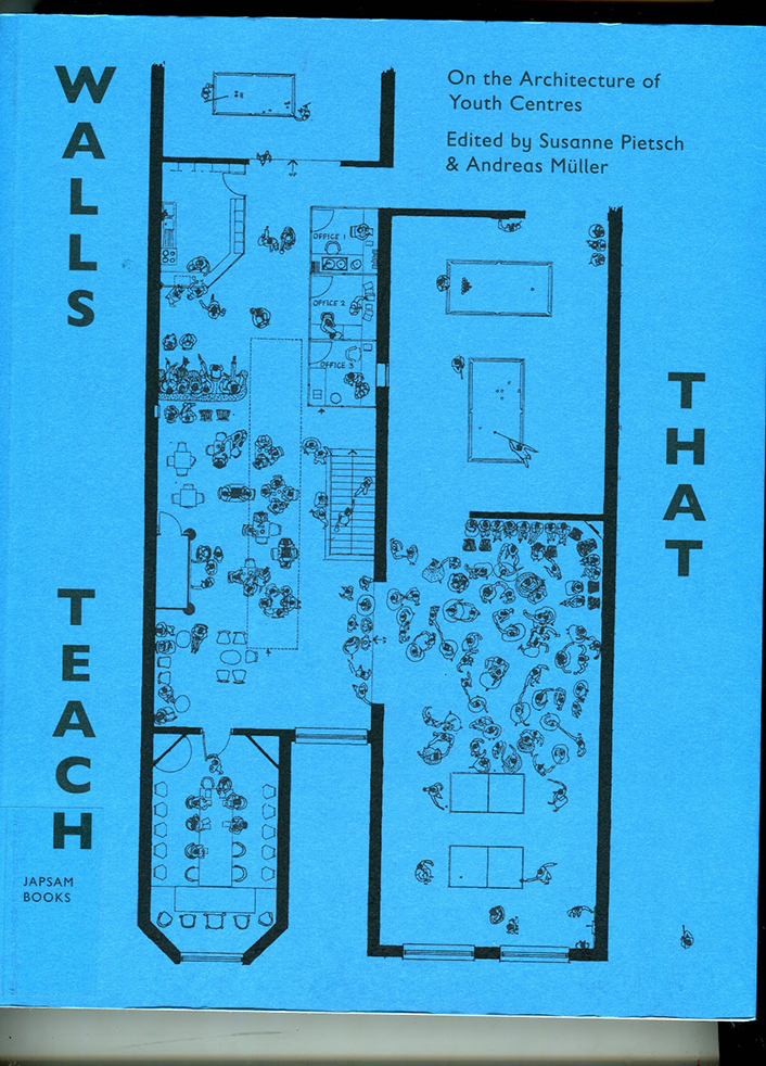
How good is your zoom? please device-zoom in order to simulate
the viewing experience of a shrunken person :
 

Short people

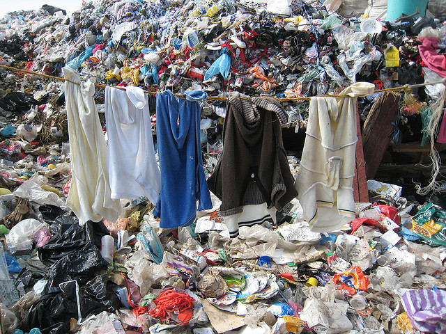
Humans have been evolving, growing ever larger with no popular trends in the reverse. This movement is fueled by vast amounts of resources that the human being demands as it grows – things like energy, space, dairy and popular consumer goods. In turn immense costs are inflicted on the environment and fellow human beings, to get such produce on the shelves. This inherited idea that being taller is generally better is widespread in many societies and consequentially those in power tends to also be taller than average..

This collective drive is being fueled by vast utilizations of oh so precious resources that the human species demands as it grows – things like energy, space, dairy and other consumer goods. In turn the immense costs are let out on the environment and fellow human beings, to get such produce on the shelves. This inherited idea that being taller is generally better is widespread in many societies.

But in our time  this aged-old trend be upheld?

The song short people was released by the artist Paul Newman to popular though not universal acclaim in the 1977 with a satirist lyric mocking short people in the favor of the tall. This was quite very ridiculous but also funny, with many short people taking a liking to it on their own. I therefore decided that the opposite of the song, (offered above) should be created to switch the social experience. It’s another sign of the discrimination against short people which does not seem to have receded to this day and beckons the tall as the gold standard.

Throughout vast plains of the internet some attention are being paid to this perceived difference of social values in terms of height. Popular mass media provider Buzzfeed made videos highlighting the many boons of being on the short side (or tall for that matter), and many other accounts add to this. All the more reason to not assume that taller = more prestigious.


Short

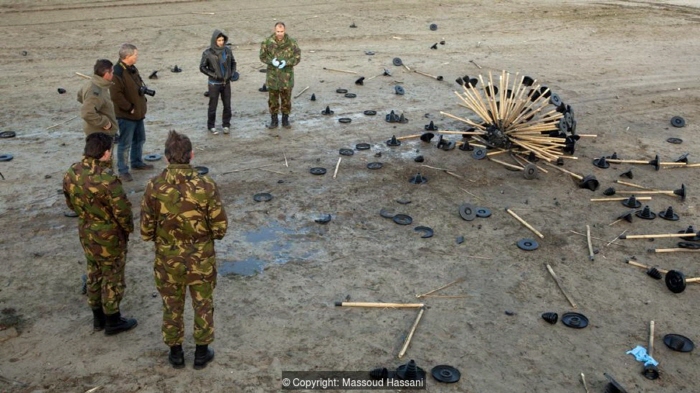
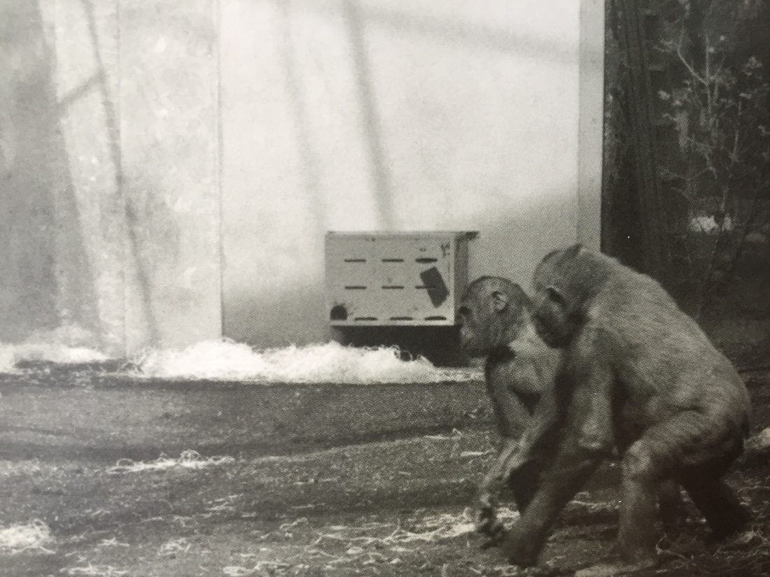
Going against this widely held belief in the preferability of more height, Dutch designer Arne Hendriks proposes a reverse trend – to shrink. Currently Arne teaches at NextNature of TU Eindhoven, the Design Academy Eindhoven and the Gerrit Rietveld Academie and apart from the Incredible Shrinking man is making on a Fatberg.

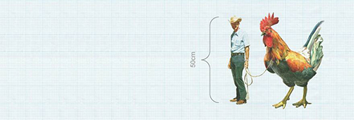
The Incredible Shrinking Man had, for the past eight years been proposing alternative possibilities diligently curated from all over the world and many specializations. The ultimate “theoretical” goal is to shrink the human average height to 50 centimeters, and greatly reduce the material demands that society consume. The endless litany of social observances and projects featured there offers wondrous though perhaps hard to implement promises to redesign human beings.

Man chicken


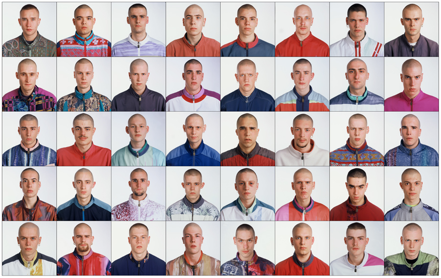
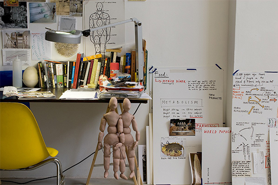
This is a good opportunity to examine the role of a change maker – if it is indeed possible, and if so how can anyone bring about such a leviathan and un-instinctive changes to the world. Perhaps someone have a brilliant idea, but how then should they show and communicate it to the rest of the world. With this project, Hendriks chose to continue contributing to the development and contribution of this project for the past eight years. Through this sustained timeline, examples have emerged across time, culture and region to show that this thought has perhaps been something lurking in the back of our mind. From this unique body of research Hendriks, often referred to as an artist establish short term, pop up studios in art establishments that keeps evolving with a bigger body of research every time – the latest being Museum Boijmans van Beuningen and ‘invite’ visitor to fish through the considerable body of research including a wall of postcards each illustrating a small info.


Studio of suspended disbelief

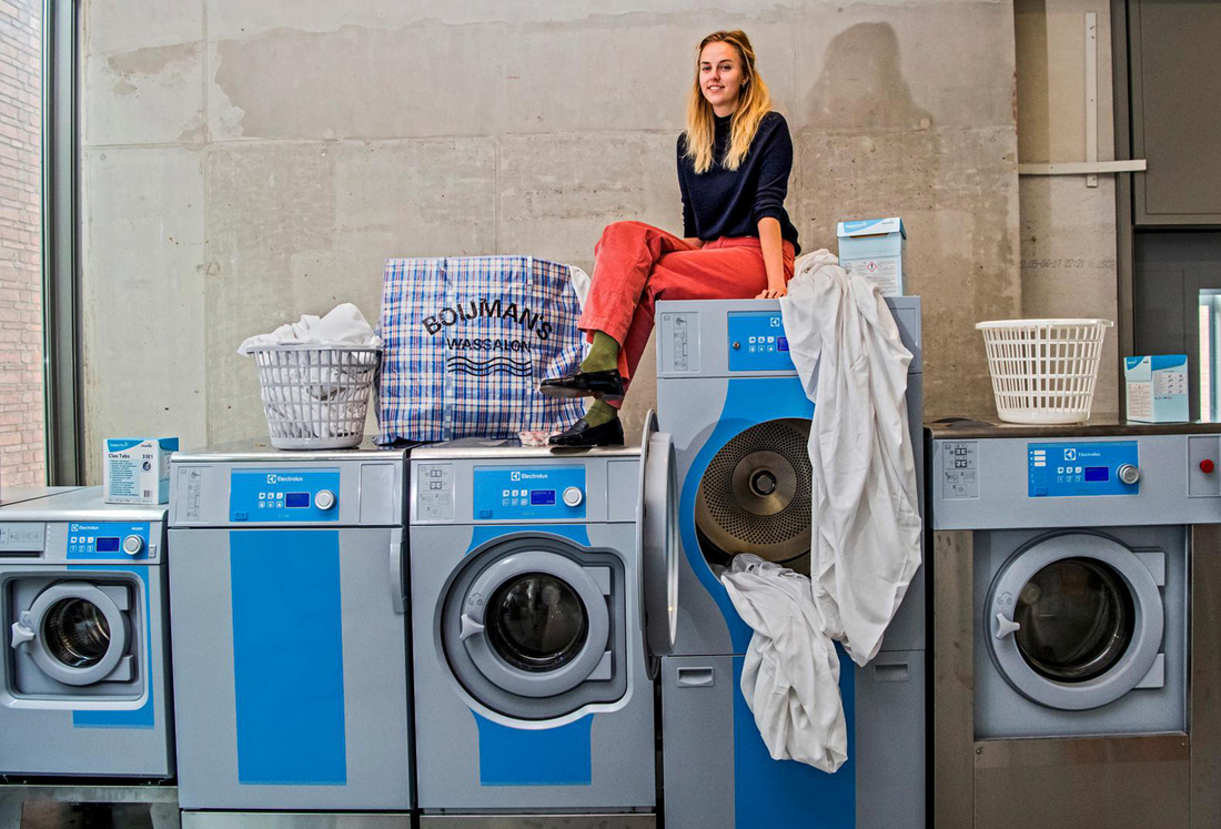
There seems to be no clear connection from the project’s base in such white cube spaces to major established institutions, namely the government and commercial entities so one wonders how far can this idea go? However upon a closer look in the project’s heaps of documents lead to references to the real world abounds, with a prominent example of the Thai government’s policy to encourage the consumption of milk through its multi-state collaboration, the The Thai Danish dairy company. The government’s policy aimed for project growth of its younglings of 6cm for male, and a rather lesser 2cm extra for females. Hendrik’s admirable research length is able to uncover other unseen details of our society through his dedication to the Incredible Shrinking man. And he is not the only one doing something about it.

shirinking-man12

Mass damon resized


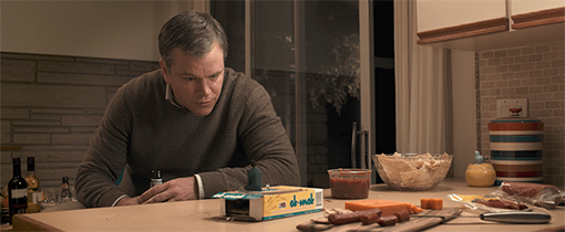
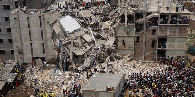
This idea has also recently taken off on the Hollywood mainstream albeit in the form of a badly reviewed film, ‘Downsizing’ in which the development of new technology allow the protagonist to choose to downsize his to body to a tiny size, smaller than even a hand. The concept of shrink here is thus illustrated to the extreme, although it is important to note that even though one of the reasons to downsize in this film is impeding human devastation on the environments, which perhaps mirror the situation in our real world, Paul the lead character has another main factor to downsize, namely the financial perks of being able to spend more. His assets of $152,000 becomes a gargantuan $12m when converted and perhaps enable him to splurge and consume even more in a large estate. It is not surprising too that the film’s title of Downsizing alludes to the unsavory act of corporate efforts to cut cost and relief its employees. The notion of going small gains a comical element in Downsizing but nevertheless highlights the need for alternative ways to reduce our hazardous impact on the environment, large part of which are being fueled by the footprints of gigantic big corporates – whom dystopian downsized world has to deal with. The film’s little community worryingly mirror the flawed outside one.

The world is a complex place and being more mindful about the hidden details, whether it be the gargantuan, empirical human footprints on the environs which this day few can deny acknowledging these hidden worlds as Arne Hendrik’s incredible shrinking man project discover are vast and fascinating. Somehow this idea of an ongoing research that involves you, and invites all to add on, is very attractive. 

And who knows maybe you will now see more traces of going small in your life!  

P.S. If you’re interested in Arne’s approach to shrink, take a look at this video where he presents his research and a closer look at the studio of suspended disbelief here, and thank you for your up close attention.


Design and Solution


Thursday, November 30, 2017

 s_massoud-hassani-3


Before visiting the exhibition, I already knew about  Mine Kafon(Kafon means “explode” in Dari [x]), designed by Massoud Hassani. I was glad to see his work again and that made me curious about the background of this work. There were three impressive things about his design. The design is so simple that even children can assemble pieces of the ball. It contributes to global issues and the starting point of this design is connected to the personal story. Inspired by the homemade wind-powered toys which he made during his childhood in Afghanistan, Massoud created the Mine Kafon, a wind-powered landmine detector for his 2011 graduation project. The project rapidly gained interest in the media and in 2012, Massoud and his brother Mahmud organized a Kickstarter campaign to raise funds for the development of the Mine Kafon as a prominent piece of landmine clearing technology. I’d like to start with the general information about the designer and his work and introduce how design can develop for applying in a real life.


“We are looking forward to a landmine-free world.”


s_p00s12nl

s_p00s12nv


The global statistics on landmines and their effects make sobering reading. According to the United Nations, up to 110 million mines have been laid across more than 70 countries since the 1960s and that between 15,000 and 20,000 people die each year because of them. Many of the victims are civilians – children, women and the elderly – not soldiers. Thousands more are maimed. Moreover, laying landmines is 50 times cheaper than removing them. And the removal is not without human cost either. The UN says that one mine clearance specialist is killed, and two injured, for every 5,000 mines cleared.


0_iiWlmoQu_BWwJNr2


As the only divided country in the world, South Korea also has landmines issues. The DMZ(the demilitarized zone) is the de facto barrier that divides the Korean Peninsula roughly in half. It was created by agreement between North Korea, China and the United Nations in 1953 and is 160 miles long and about 2.5 miles wide. Much of the border, one of the world’s most dangerous flashpoints, is strewn with landmines and laced with barbed wire. It’s reported more than 1,000,000 mines are scattered throughout the area. In 2015, there was a landmine blast in the DMZ. As a result, One South Korean soldier had both legs amputated after the blast, while another lost one leg.


 8-14_dmz_landmine_1

nintchdbpict000317845179


Unlike South Korea which has most of the landmines in the military zone, Afghanistan has a different aspect. It is one of the worst affected countries, with an estimated 10 million landmines contaminating more than 200 square miles of land. It is something that Massoud Hassani, who was born and grew up and lived in the northern part of Kabul for about 15 years of his life, knows all too well. “We lived out by the airport, and there’s a big desert out there where all different militaries trained. It was a real war zone. They left a lot of explosives, including landmines. But, it was our playground.“. After moving to Holland in 1998 in search of a better life, Hassani decided to pursue a creative education at the Design Academy Eindhoven. Hassani’s 2009 research project focused on air, fire, earth and biomimicry, the result of which he turned into Mine Kafon.
Hassani has designed and built, by hand, a wind-powered ball that is heavy enough to trip mines as it rolls across the ground. The idea is that it is light enough to be pushed by a wind but heavy enough to trip mines. Hassani thinks that humanitarian organizations could take Kafons with them into areas suspected of being mined, and then let the wind do the dangerous work.


a549050306c58b3a8006041f2e2be372_original


The Hassanis spent the next two years developing a tool they hope will have a real-world impact: Mine-hunting Drone. The autonomous copter performs a three-step process: It maps an area, detects mines, and then destroys them. The brothers claim Mine Kafon Drones will clear mines 20 times faster than existing technologies. Removing a single mine by hand can cost $300 to $1,000; one Kafon costs about $1,100 and can cover a full minefield. The Hassanis hope to deploy thousands, potentially ridding the world of landmines within 10 years. Fitted with a 3-D mapping system, the drone locates mines with a metal detector. Using a robotic arm, it places a small detonator on top of them before setting off the device remotely.
Following Massoud’s first successful Kickstarter campaign in 2013, the Mine Kafon Foundation was founded. The Mine Kafon Foundation is an R&D organization based in the Netherlands. In the past three years, Massoud and Mahmud have been raising awareness by giving lectures around the world and developing new approaches on how to fight landmines in different environments. In this way, they have crowdsourced many engineers and designers from all over the world and invited them to collaborate and volunteer on this humanitarian project. This way, his ultimate goal which is to remove every landmine over the world is still working on it step by step.


“Mine Kafon is not only an anti-landmine device;

it opens a discussion of global awareness”


There’s a hidden problem in the world. A landmine can be overlooked and forgotten because it’s out of sight. Although the developed world seems to have been mostly cleared of this problem, its deadly effects are constantly experienced by civilians in over 60 nations. With a collective and humanitarian effort, we can defuse this hazard, which will enable the land to become useful again. There are landmines where farms ought to be; there are landmines where sports fields and parks ought to be;


Int-Camp-Ban-Landmines_900


Before researching Massoud Hassani and his work, I didn’t realize the seriousness of landmines. Hassani’s design played a role as an entrance for paying attention to a forgotten global issue. Also, it was a good chance for me to learn the whole progress of his design. As he knows the pain of having landmines near home, he constantly improves his design, tries to apply his design in a real world to answers one question. Can design invent solutions to problems that we have put in place? The answer is yes.

Exactitudes


Thursday, November 30, 2017

I chose this project because I find really interesting how every human in the world even the most peculiar looking ones can be catalogued in a group. It always intrigued me how much you can express with clothing and where are the borders between being unique or just following fashion. The photographer Ari Verluis and the stylist Ellie Uyttenbroek have been working in the project Exactitudes for more than twenty years, the name of this project is a fusion of “exact” and “attitudes”.

01--Gabbers-Rotterdam-1994

Vetements which was also in the exhibition Change Makers used Ari and Elli’s work as an inspiration for the autumn/winter 2017 collection. This underscores the critique of the fashion world. After the collection was online big chains started copying it. This open really important questions about actual fashion.

The presentation of the photos they take are always the same, a grid of three by four, making it almost a catalogue of types of persons where you could find your urban tribe.

Exactitudes started in Rotterdam but actually they work all over the world. It analyses how depending on your surroundings your style will be different. They say sense of style is something you’re born with, using as an example the kids who use school uniform, the ones that even wearing the same exact thing make a little difference like wearing a chain or rolling up his sleeves.

This project is not that much about fashion but more about people and it really has an anthropological quality that it’s admirable because slowly it’s documenting the changes in society thru the years and how some factors like social media.


To understand better and interpret my subject I decided to recreate Exactitudes but with a twist: doing it on Tinder. Tinder is a dating app where you swipe left or right if you like the profile of the person or not.


cat owners dog filter

cat owners and dog filter


In the profile you create, you are able to post four photos where you have to sell yourself. You can also write about you, (but no one reads that). This dating app works visually. The pictures you post will make you have a match or a sad love life with no matches at all.

In the interview for the catalogue, Ari talks about the process of finding / collecting people and how they just sit in the street and wait for the right person to pass by. For me that process was more active, I first had to find which group I wanted to categorize. As soon as you start using the app, similitudes between the users pop up, and even though you can’t take photos of them with a white background and the same pose, when I arranged the screenshots in grids it was impressive to see how similar the photos were.


The research I made wasn’t that much about clothing, but there’s something in common with clothing and the images you post on Tinder to introduce yourself. They both are talking about you without words. You want to reflect your personality with them, it’s like a mute introduction of yourself.


soccer players

soccer players


Probably the people I put together in some of the grids won’t think they belong to the same urban tribe. I focused more on the attitudes they reflect on their profiles more than on what they wear. For example the soccer players, by making the choice of introducing themselves with a photo of them playing this sport place them in an idea of the kind of person they can be. The same exact thing would happen if someone shaved his head and wore a bomber, these decisions reflect a statement of who they are or how they want to be seen.


world saviors barbies

world saviors and barbies


World saviors is another example of how with a single image you can make a strong statement. They try to sell their person and reflect how merciful and helpful they are with the most needed ones. This could not be shown with clothing,


Now that Tinder and other social media platforms are opening opportunities for people to give the image they want to show of themselves is time for a new Exactitudes, but now in the virtual world.


Social Design and Relational Art


Thursday, November 30, 2017


“L’art est un état de rencontre” “Art is a meeting state” – Nicolas Bourriaud

When visiting the exhibition « Change the system » in the Booijmans, I wondered how art and design were differently defined when they both answer the one and only same question. At the very end of the show, I discovered the work of Manon van Hoeckel called ‘the laundry’. Manon is a designer, a social and critical one; she « designs context ». That was the very first time that I saw this term used , regarding a design work that had as a result a social cohabitation and that was human-centered in this way. Wasn’t it an art experience, such as Tino Seghal’s work or Marina Abramovitch’s one? How do design and art meet in social/relational situations to create a better understanding of our modern and future world?


images4.persgroep


In the last decades, through many art movements that raised, two specific ones in art and design have emerged. In art, the relational aesthetic defined by Nicolas Bourriaud as “a set of artistic practices which take as their theoretical and practical point of departure the whole of human relations and their social context, rather than an independent and private space. » In design, a social thinking approach has emerged in the same way, materializing into performances, contexts, tests, always in the finality to contribute to improve human well-being and livelihood. Although these two subjects do not have quite the same purposes, they coincide around the same problems and use the same tools with the purpose of better understanding/changing our world and human behavior.
In current art practices, it is not unusual to visit literally empty exhibitions which display works that turn away from the visual and the visible. Facing these constituent sensibilities, it is sometimes difficult to distinguish the invisible artwork from its exhibition. But let’s say it’s acceptable, because it is art. But what if this happens with design? What’s the result of it? Nothing specific, just an experience. How is it created? What happens? Let’s first have a look at Manon’s work.
As a social designer, Manon creates event, spaces for people to discuss, she creates interaction between humans. In her project for The Boijman’s Museum , Manon actually creates a space where people can come for other reasons than visiting a museum, and also a space to discuss the exhibition itself. As an answer to « change the system », she proposes discussion. But how is her work different from Tino Seghal’s, how is it different from relation aesthetic? Tino Seghal also bases his work on people’s experience of meeting and sharing, the interaction being the piece of art itself, working against the production of an object. Regarding what is relational art, let’s give an other relevant example. Rirkrit Tiravanija is perhaps the most iconic artist of this movement. He moved all the contents of an art gallery storeroom and office into the exhibition space and staged his work in the back rooms; the art consisted of cooking Thai cuisine for his audience. The viewers became active par­ticipants, first locating the backrooms, then consuming the food and engaging in con­versations with the artist and one another, instead of quietly looking at objects in an exhibition space.
So, what’s different from Manon Van Hoecken’s work ? We can nowadays suppose that there exists a correlation between what art and design produce in the way that now they are both no longer results driven, and either of them do not have a specific function/utility (to a certain extent). Regarding both disciplines, the term ‘relational’ offers a more complex understanding than the simple oppositional binary of both art and design – as either socially active or not.
How come design and art became so abstract, looking similar and tending to focus on the human matter so much?
If we had to make distinctions, we might say that regarding social design, as Manon Van Hoecken produces, it is an experience of sociology that enables the designer and the users themselves to better understand how does interaction and human contact work nowadays. Designers then became « expert citizens » and it is more about designing WITH, but not for users. This could be called « Human centered Design », and is definitely very close to relational art.
Regarding relational aesthetic, it is more about taking as its subject the entirety of life as it is lived, or the dynamic social environment (rather than attempting mimetic representation of object removed from daily life, as would be the case in a Dutch Baroque still life). Also, it is important to emphasize that the main purpose of relational aesthetics is not simply to produce social relationships and interactions but also reflect upon society and critique it through the approach of disruption by creating non-produced exhibition and art. Also, participatory and relational art raise important questions about the meaning and purpose of art in society, about the role of the artist and the experience of the audience as participants.
If we look at it from a historical point of view, relational aesthetic are older than social design. Relational art, as we said before, is a term that was created by Nicolas Bourriaud in 1995 in his book « Relational Aesthetic », from his experiences of his artist colleagues in the 90’s. Social design and human centered design are younger, they appear a bit later in time and have become a real subject of interest nowadays. Is then art what inspired design to go into the more performative experience of customers? How does art influence design? This supposition brings us to an other problematic, but from what we’ve seen so far we can confirm two things:
If social design and relational art have the similarity of experience, design tends more to derive analysis and create problematics from it, otherwise art offers another way to experience and create, in contradiction to what is known and defined. Very similar in their forms, nowadays it can be seen how design and art can be closely related. Social design such as human centered design also gives a much more open minded idea of what design is and can be, far from any industrial or concrete problematics.


momo5_800

In a project I made myself where I created a fake statue with the words “If you ever wanted to talk to someone, do it here whitestranger@outlook.fr” and waited for people to react by sending me/or not mails.
This project can be seen either as an art piece, bringing strangers and public spectators to help create the work itself. A design, social experiment, about loneliness but also about uses of internet communication.
White Stranger (click here to see the project)


The Aesthetic Green


Wednesday, November 29, 2017

Facing the future access to resources and the wish to preserve today’s climate, changes need to be made.
Looking at the world of design there has always been a tendency to broaden the horizon of consumers, buyers and users. Designers found ways to deal with daily life difficulties, which weren’t considered as a problem until there was a solution, as well as they made groundbreaking discoveries. Some designers are pioneers in developing and processing innovative materials into aesthetic products and others find solutions for social and psychological conflicts by approaching them from unusual angles.
In the last years the concept of sustainable design raised and increased, showing it’s today’s presence in plenty of remarkable projects with approaches diffusing across various disciplines as fashion, architecture, product design and even fiction.

grün3 grün4 grün5 grün7  

This is to be seen at exhibitions such as ‘Change The System’ in the Museum Boijmans Van Beuningen, where many projects were dedicated to sustainability.
So Eric Klarenbeek, called the designer of the unusual, who developed a 3D printing material based on straw, water and Mycellium, the threadlike vegetative part of fungus. Printed into a thin layer of bio-plastic the material can gain stability through drying and – in Klarenbeek’s case – become a chair. He went even further and created possibilities to 3D print with only local materials as algae, potato etc.
Remarkable is the aesthetic presence of the final products. Cups, vases, bowls, which you simply want to hold in your hand but cannot as they are displayed in the showcases. This might be what makes a researcher become a designer: using the power of aesthetics to create a bridge leading from innovative development to the manifestation of the product in daily life.

Unfortunately many green designers are seen as criminals when it comes to aesthetics. Next to the pursuing of sustainability as something of moral value, aesthetics are sometimes seen as luxury and therefore a waist of energy.
People who are already familiar with sustainable values, seem to see the beauty in the ethics.
However, this understanding of beauty requires the motivation to consume with a small footprint. A motivation which wants to be spread.
Thus, the power of an object’s visual appearance shouldn’t be underestimated. It can communicate and celebrate ideals and make users value the object and what it stands for.
Experiments in interaction design even reveal that people consider objects they emotionally bond to, as more functional – and use them more likely.

In the end we conserve only what we love.”
Baba Dioum

Thus objects which don’t attract us on an emotional level, will simply not be used and kept.
If it’s not beautiful, it’s not sustainable. Aesthetic attraction is not a superficial concern – it’s an environmental imperative.” wrote Lance Horsey in his book The Shape of Green. He is the first to write and examine the relationship of sustainability and beauty. According to him “beauty could save the planet” as in the end people consume and use what they love. Horsey here uses the example of wolves and dogs to enhance his theory:

The fate of many things depends on whether they please people. Wolves might seem heartier than dogs, but there are 50 million dogs in the world and only ten thousand wolves. Which has adapted better? This view of nature may give you pause—should other species exist just to please us? But as a principle for design, it is essential. If you want something to last, make it as lovable as a Labrador.

grün7 grün4 grün5 grün3

We personalize things we use – and we use things which are personal.
Based on this theses, Jonathan Chapman helps to create an alternative consumer’s philosophy, than our present ‘throw away’ society has. He developed a new design strategy, called Emotionally Durable Design.
Through the conscious shaping and strengthening of the emotional bonding between consumer and object, one can endure the using period and thus reduce waste. According to him this can be achieved through the consideration of the following five elements:

How users share a unique personal history with the product: Narrative
How the product is perceived as autonomous and in possession of its own free will: Consciousness
Can a user be made to feel a strong emotional connection to a product? Attachment
The product inspires interactions and connections beyond just the physical relationship: Fiction
How the product ages and develops character through time and use: Surface

This results in products such as the Stain tea cup of Bethan Laura Wood – an object which gains character through being used. It builds up an individual pattern of tea stains, according to the personal ways of drinking tea.
To establish this design approach further, Lance Horsey asks the question:

What if we created a different approach to aesthetics, one based on intelligence and not intuition? Can we be as about how things look as we are about how they work?

Answers will lead to new aesthetics based on the complex connections of efficiency, sustainability, character, endurance, and the potential to develop with the users personal demand. An understanding of aesthetics which goes beyond an object’s physical presence.

Sand Is The New Oil


Wednesday, November 29, 2017

INTRODUCTION TO ATELIER NL

 
Atelier NL is run by two women Nadine Sterk and Lonny van Ryswyck. They are Design Academy Eindhoven graduates whose design studio is also based in an old church in Eindhoven. This year they were selected as the official Dutch Design week ambassadors, alongside architect Winy Maas of MVRDV and Dezeen founder Marcus Fairs.


IMG_6569

Since 2010, the women have been running their ground based practice of collecting samples of sand from dunes, beaches, rivers, mountains and quarries to melt it into glass. One of the aims of the project To See a World in a Grain of Sand is to “reveal the unique colors and textures of the world and share the origins and stories of both sand and people from all corners of the globe”. This is made possible by the submission contributed by the public in response to the open call for sand samples.

 
The project also draws attention to the massively underestimated resource sand and the fact that the worldwide stocks of white sand are running out. Personally I haven’t really given much thought to this issue before which is why I wanted to look further into it, even though Atelier NL’s work and research that takes a part in the exhibition Change the System in museum Boijmans in Rotterdam seems to be highlighting more of the social aspect as it perhaps makes it more approachable and appealing to a larger audience.

 
In the future local supplies of sand might become an important source for the industry that, unlike the small Dutch design studio, is not yet able to process this natural sand. Besides glass, sand is also vital for many other industries including the manufacturing of computer chips and construction of buildings.


SAND – A FINITE RESOURCE

 
To put it simply sand is one of the main ingredients of modern life. Besides water and air, sand is the most used natural resource. We need concrete and asphalt to build cities roads, and sand is used for both of them. Not to forget windows, glasses, plates, cellphone screens and filtration systems in water treatment facilities, septic systems and swimming pools.

 
So cities are basically made out of sand, and since 1950 the number of people living in the cities has grown from 746 million to almost 4 billion making the demand of sand so high that we are now starting to run out of this natural resource.


IMG_6757

 
Both legal and illegal trade have economic and ecological backlash. It is estimated that 70% of the world’s beaches are disappearing due to these practices. Mining sand in rivers, beaches or offshore will inexorably lead to the disappearance of our beaches.

 
In Indonesia around two dozen small islands have vanished since 2005 because of sand mining. The coral reefs in Kenya, hundreds of acres of forest in Vietnam, and the ecosystem of India’s rivers have suffered the damages of sand trade as well. People working in the industry are getting hurt too, and some of the activists and government official confronting the black market sand mining gangs end up killed.

 
Stronger regulations are able to prevent some of the damages. The downside of this is that sand is heavy and expensive to transport which could cause the price go up in many developed countries where the sand mining gets banned for environmental reasons. If the sand needs to be trucked from further away, the price will go up as well. This would eventually hit the economy hard and cause more pollution and extra truck traffic.

 
Despite the effort, the attempts to stop the illegal mining doesn’t always work. An example of this are the satellite images released in 2012 by an environmental organization called Global Witness that showed how Singapore had expanded its land area by 22% over the past 50 years. The sand used in the process came mostly from surrounding countries like Vietnam, Malaysia and Indonesia, and had in some cases been extracted illegally.

 
These countries then responded by banning sand mining. After the ban in other countries, Singapore’s demand for sand continued fueling the industry in Cambodia, even though the government official claim to even have ban the mining in some cases.

 
In a way sand could be called the new oil. There are not yet good alternatives as the desert sand, shaped more by wind rather than water, and the local supplies of sand are not suitable for the needs of the industry. To find a solution for the shortage of sand won’t be an easy task but in the meantime more focus should be put on how we are using the still remaining resources.

The unimaginable is what keeps me exploring


Wednesday, November 29, 2017

CHANGE THE SYSTEM: IRIS VAN HERPEN

The first time I saw 3D Prints I was fascinated by the complexity it allows to generate, where your imagination is the only limit to create any shape. I wondered what the future of the way we make things would look like and how would that affect our lives. What kind of products will we produce?

I was intrigued by the shapes of the dresses exhibited at “Change the System”, and found out that Iris made an entire collection  using mainly umbrellas sticks, and that  she uses a lot of 3D Prints and laser cut fabrics in her collections. She spends a lot of time experimenting and researching new materials before start making, combining craftsmanship with the use of new technologies. She also collaborates with many people from other disciplines and incorporates new inputs, which I think is essential to develop new ways of making.

I question to myself what are the possibilities of fashion in between the arise of new technology and old craftsmanship. Materiality is changing as we develop new tools and materials, and so is the way we produce. If we change the way we produce then we will change our relationship with our possessions.

FAST FASHION

Fast fashion allows people to buy fashionable outfits inspired by the latest trends in the runway  and get them for a very low price. Mainstream consumers are now able now to afford new things that will last for a very short time. Fast fashion is unsustainable (fast discard, waste of manufacture and after consumption), unethical and unoriginal.

Consumption has clearly a very deep influence in our society, and buying clothes now responds to a wish more than a need: we no longer buy because we really need it, but because we desire them. “(…) the consumption of symbolic meaning, particularly through the use of advertising as a cultural commodity, provides the individual with the opportunity to construct, maintain and communicate identity and social meanings” (Elliot, “Existential consumption and irrational desire”, 1997 [x]), and marketing plays a “key role in giving meaning to life through consumption” (van Raaij, 1993 [x]).

We are involved in a cycle where trends go faster than ever, and are hard to keep up: what matters is not the quality, but how fast it gets to the shop and how cheap it is.The process of  obsolescence of the garments is already planned from the beginning: it’s meant to replace the old season and attract new purchases. We throw away and buy a new one.

Fast fashion becomes the opposite of creative and original pieces. In a way is about copying what is analysed as trendy, producing it as fast as possible to replace the previous trend. We don’t have any attachments to our possessions, no story behind them: we discard them once they are out of trend.

One of the biggest problems of fast fashion is that produces enormous amount of waste we don’t know how to deal with, as well of an increasingly overconsumption of low quality products that are made to be thrown away soon.

watse landfill

SWEATSHOPS

Retailers sell products that are being manufactured in undeveloped countries, where the labour cost is very low. The globalization of the free trade world market enables “race to the bottom” situations and sweatshops are the best example .

The catastrophe in Bangladesh, 2013 is the most horrible example: an eighth floor garment factory building collapses killing massive amounts of people. It was the deadliest garment-factory incident in history. The conditions under which they were working were so immensely deplorable that it had to get to this catastrophic point to raise awareness.

The large retailers but they are competing for lower production costs, and implementing unethical measures to keep the low prices at store.

Telecom-640x320

SLOW FASHION ///

TECHNOLOGY AND SUSTAINABILITY

We are starting to become aware about what we are consuming. Where, how and by whom was produced is becoming more and more relevant. I strongly believe that is of mayor importance to ask  that question and try to understand the mechanism of the chain production and global economy dynamics. I see an urge to create new, sustainable and better quality products.

Slow fashion is a movement that stands for long lasting high quality products, where the production process is transparent. They make garments reducing waste as much as possible, socially and environmentally ethical. They make sure the fabrics are Eco-conscious, the garments are produced locally and with less waste possible.

Changing the way people make their own garments and making accessible and easy to do, will also change the way they relate to their clothing. There will be more appreciation and another type of value to our possessions. It will also allow us to express our own identity through original and valuable pieces. We won’t look for images to buy, it will come from our imagination and more honest desires. It is also about generating an emotional and personal value with our possessions.

I think 3D print and other technologies will disrupt the production chain in a positive way. This way the  consumer will be  more involved with the idea and the production process of the piece that what she/he wants to wear, maybe even print our own garments at home or small objects.

Iris has an urge to change fashion industry. Innovation is also who to collaborate with to create a groundbreaking garment, avoiding waste and incorporating new technologies.

What if we could bring technologies and slow fashion together? Which materials and tools can we bring into fashion that would change the way we produce and consume? What will technology allow us? It is interesting to think how the future of fashion will look like, but fundamental to bring resources to local communities and development of conscious business, local development of ideas and conscious entrepreneurs.


James Bridle – The Anicons


Wednesday, November 29, 2017

“as an artist and activist, James Bridle 1980 shows the impact of the techno-surveillance society we live in. He has converted data collected with a spy camera for his project The Right to Flight to create a kaleidoscopic animation. As a protest against this ruthless technology, he has made unusable images.” – Change Makers


Skærmbillede 2017-11-29 kl. 17.10.34

James bridle is not only an artist and an activist, he is also a writer and a publisher and has appeared in magazines and newspapers like Frieze, Wired, Domus, the Atlantic and many others. He has a master degree in computer science from University College of London and wrote his dissertation on creative applications of Artificial Intelligence. Bridle also lectures regularly at conferences, universities and other events.

The Right to Flight was a four month installation, event series and ongoing research programme investigating technical infrastructures, surveillance, ballooning, and utopias. Ballooning has taken a dark turn since the zeppelin raids of the first world war to the use of surveillance-balloons in Iraq and Afghanistan and on the US/Mexico boarders.

James Bridle is in a specific case talking about a stolen car which is found trow Automatic Number Plate Recognition (ANPR) in northeast England in this text he is describing how a system like this is making every car a potential suspect, and how the surveillance-community suddenly becomes visible, and take a physical shape.


I have always been really interested in how our community has become an  surveillance-community, the way we store images, knowledge and numbers in our cloud, for instance. How you can find an answer to nearly anything in the “cloud”. How our focus has moved from the physical to the not physical – metaphysical. How Apple would be able to place you at a crime scene if you are owner and user of an iPhone with finger and face recognition. The norm is to tolerate that without questioning.

I think James Bridles project is interesting because he’s making those data unusable, data that is highly important in the way we are interfering and meeting each other today. Data which is not physical any more but have a high value in its metaphysical form.

I did a project earlier this year about how we began in some contexts to weigh the aesthetics higher then the function, and in some cases the understanding as well. And I think what James Bridle is doing can be understated in a similar way.

When you see graphical displays of books, posters or clothes etc., you begin to see a rhythm of incomprehensible elements, repeatedly one sees that a particular artist or designer chooses to use aesthetic elements like the Russian, Greek and Arabic alphabet as bearer of language. Some choose to use bar-codes or Gothic letters, ornaments that are clearly from another time, then the context it is viewed – used in. It is now only a matter of creating an aesthetically beautiful product, the recipient is now 100% uncritical and chooses only on behalf of aesthetics.
If you see Comme des Garcons for instance, they made a collab with Russian designer Gosha Rubchinskiy. In this colab there were t-shirts, hoodies etc with a text in Russian. I see people wearing this without knowing anything about the meaning of the selection of letters, they are only wearing it for the aesthetics and the fact that it’s popular.


Skærmbillede 2017-12-10 kl. 20.14.07


The connection I see between these two is that people of today’s society, the post internet generation, have such easy access to awareness – information, facts, news etc, that we have to some extent, stopped caring about it. We are choosing, consciously or unconsciously, what to be aware of and what we want to care about.

Even though both Bridles footage and Comme des Garcons/Rubchinskiys design with the language/letters is filled with important and valuable information, the finished product in these projects is only an abstract form. Roughly said, we are ignoring the value in this information and only choosing to see the abstract result that gives us aesthetic pleasure.

How deep can we go? – The conflicts about problematic issues


Wednesday, November 29, 2017

Who are Studio Wieki Somers and Thomas Eyck? During this research I posted myself the question what the relationship is between them and why they want to make a project about the problematic issues of our world society. I also got inspired by the specific work called ‘Deepwater’ which is related to the oil problem in the world. This motivated me to question and think of how to solve this problematic issue much further.

Back in 2000, Wieki Somers (Dutch designer, born in Sprang-Capelle, 1976) graduated from the Design Academy Eindhoven. After her graduating she settled with Dylan van den Berg, with whom she studied in Eindhoven. Together they started Studio Wieki Somers in Rotterdam. Wieki Somers and Dylan van den Berg are focusing on providing an enlightened reading of the everyday movement. Focusing and making sensitivity of materials, technological ingenuity and fantasy. They make objects that you as out-stander at first have to guess what it is and what they are doing. That is the whole point of what they want, making an art piece with a functional state in it. ‘‘Basically our work is one big quest, one big process. We look at things around us, what they can be and the associations people have. We study customs everyday situations, unleashing our own imagination on them. We make the uncommon common.’’ thus Wieki Somers

‘’As a designer it’s not my attention to make the world a better place, but I’m pleased if people look at the world differently because of my products.’’

People get ideas and inspirations from the work of Wieki Somers and that’s also how Thomas Eyck got involved. Thomas Eyck is a publisher and collector and he divide characteristic and exclusive design products from this time. He stimulate designers to come up with new objects for the daily life. Together they research for different kinds of materials and making new products out of it. This is how the Deepwater work was made when Thomas Eyck asked Studio Wieki Somers to worked together.

The Deepwater work is created in collaboration between Studio Wieki Somers and Thomas Eyck in 2016. It immediately caught my attention while I was walking through the exhibition of “Change the System’’ in Museum Boijmans Van Beuningen. The work is simple, yet very impressive. It has a strong design in contrast to the other works presented in the same room. Deepwater represents a vase which is a collection of the design “Still Waters’’. Thomas Eyck commissioned Studio Wieki Somers to design a series of objects with the theme “water”. These series are five glass vases and each form a poetic interpretation of the water cycle. The vases represent a topical theme regarding the problematic relationship between humans and nature.


LTVs_WiekiSomers_05_Deepwater, Labadie


The Deepwater vase is made out of glass filled with oil floating on water. In the center of this vase a stem with leaves is represented. The oil refers to the disrupted human actions like the results of the eco-catastrophe “Deepwater Horizon’’, this was an industrial disaster that began on April 20, 2010 in the Gulf of Mexico. It was a big explosion of the drilling platform Deepwater Horizon. Studio Wieki Somers and Thomas Eyck wanted to show how conflicting the values are that ascribe our resources.


deepwaterhorizon


How can you stimulate more people when you think about this collection? And in my case about the oil problem. Because using oil is something we should take very seriously if we think about our precious world. Our nature is capable of breaking down oil itself, but this is going very slowly. The quantities of oil that enter the environment through human intervention are so great that nature has difficulties with it. Of course the place plays a role, normally it is safely stored under the ground but when it comes into the water or on land it is just a strange substance. Just what happened to the Deep Water Horizon catastrophe. How can we clean up this mess if we constantly spill so much oil?

Thankfully there are many ways to clean the oil out of the water. I found materials and information and tried these out:


REMOVE IT

oilimage

In this video I'll show you an impression about removing oil out of the water.
For this experiment I used a glass jar, water, oil, cotton balls and a sponge. First I used cotton balls to remove the oil.
The cotton ball soaks the oil out of the water each time you use one. Then I wanted to see if it also works by using a sponge.
The water will get more clear once you do this repeatedly and it works perfect.


Of course this is not enough for an entire ocean, but it’s clearly that we could discover more with materials just like Wieki Somer and Thomas Eyck are presenting. We have to dig deeper and come up with much bigger ideas to solve the oil problem. There are machines or boats with different kinds of techniques by getting out the oil out of the ocean, but still there will be leftovers and we discover that years later by accident. Of course we think of other different ways to solve this for the future, for example; using electricity. The using of oil are mostly for machines and vehicles and these will run in the future with electricity.

So yes, just like Wieki Somers I would feel the same way by not making attention to make the world a better place, but to encourage and to let people think about these kinds of topics. I think we discovered already so much about materials, technologies and objects to improve our environment. Who knows what further will be discovered in the future.


ATTEMPTS ON A RESEARCH ESSAY, COMPLETE SERIES


Tuesday, November 28, 2017


claesfrontcover


1:
The designer of this catalog is unstated and unfindable and probably dead.
But that’s no good, so lets start again.

2:
During this assignment we were asked to chose a recent edition in the library based purely on its design, in order to research it for the coming weeks and write a publication on it.

Narrowing down my choices to 2 books Henk advised me one was a classic (he owned 4 copies) and the other he knew nothing about. Which was which he wouldn’t tell, so I followed my instinct. I settled on “Skulpturer och tecknigar 17 Sept.- 30 Okt”: a catalogue of Claes Oldenburg’s work from Moderna Museet in 1966.

Safe to say Henk doesn’t have a copy at home.

3:
Emailing Moderna Museet led to nothing fruitful.

4:
The librarian at the Rietveld Library said he would help me research.

He told me:
“Many designers in the 60s weren’t credited at the time because being a designer was so applied. who cares about them? Its all about the artist”
“Claes’ partner was actually dutch… but that doesn’t help you. Fuck.”
“I bought a Claes Oldenburg book last week.”
He said some things about the Moderna Museet but, again, “It’s no use to you. I don’t know”
He wished me luck.

5:
The librarian at Rijksmuseum told me:
“What is your question? I don’t understand your question?”

6:
Last February I went to a seminar by Nasan Tur.
Sat among the group was a woman (about 50) who was neither introduced nor introduced herself. For the sake of the narrative, she will be called Cecille. Cecille was conflicted about many things and had earlier that day talked herself into great confusion about the significance of a plastic Marylin Monroe compared to that of a plastic Buddha. At some point it all spilled out: an architect for 27 years, fed up of not being able to practice creativity within her job; taking a year out; putting everything on hold; trying to start again.
In trying to solve this issue Tur referenced Oldenburg as an example of an artist using interior design and architectural ideas in an artistic form: suggesting Cecille might learn from this. It was insufficient, she said: “There is no space for art when you build a house”.

Then Tur, exhausted by this statement: “Of course there is, make tiny doors”, Cecille: “Then people will keep banging their heads and they will get sick. We cannot live among sculptures”.

front coverclaes back cover


They were talking in riddles. She said “Kitsch is the repression of death”, and he: “Kitsch is the sweetness of the soul”. Cecille here being the front of this catalog, and Tur the back.


b+w sinksoft sink

Imagine above your two images: on the left a large black and white photograph of a sink and on the right a deflated, dilapidated version sown out of what looks like bouncy castle material: but here I promise not to dwell too much on content but what this content gives to the form, for there are 20 other pages like this in the book.

Here the designer has chosen not to separate the book by sculpture, photograph, sketch but by more obvious subject. For example:“sink, sink.”
“house, house.”
“ironing board, ironing board.”
“light switch, light switch.”
and beneath this one we may see a statement such as “my room is filled with cigarettes the size of cannons”
It becomes almost farce: such poetic expressions beneath large representative works of art.

The layout provokes:
“how typical of ‘art’ to be so obscure, to lay things next to each other and leave the audience to draw parallels.”
One gets the feeling you can assign meaning to almost anything, a little like this publication so far- so now to look at something slightly more grounded.

7:

1pingpongtable_1100
“Skulpturer och tecknigar 17 Sept.- 30 Okt”

2banan_1100a


In fact why I chose the catalog- apart from vague memories it evoked- was because of its simple design: the paper is thin and dimly laminate; the font is understated and normal; the arrangement of the text is practical: it sits more or less where you expect it to. The catalog is thin, glue blinded and flops slightly when you open it. Small black borders outline some images but most are left just as they are. These images are often black and white and the coloured ones are stuck in. Initially I thought this was a design decision to emphasize certain works but I found out it was just to make the printing cheaper.

Pulling various other Oldenburg books and catalogues from the library might, I thought, give me some much needed context.


3curve_1100
“Claes Oldenburg: Large-scale projects, 1977-1980”above Barbara Rose’s 1969 study of Oldenburg, catalogue Museum Boymans van Beuningen Rotterdam 1983, below.

4red_1100


Comparing a catalogue from Museum Boymans-van Beuningen, Rotterdam 1983, Barbara Rose’s 1969 study of Oldenburg and a book from 1980 called “Claes Oldenburg: Large-scale projects, 1977-1980” to mine, I found them all to be remarkably similar, even down to the thin black borders on some images. Two of the books were published in New York so I checked to see if they had the same designer. They did not. However on reading Rose’s acknowledgements I noticed she directly thanked both Claes and his wife for all of their help and even “good meals” they shared during the time of her research.

Perhaps Oldenburg gave some hint as to the style he expected with his work, after all the candor of the design suits Oldenburg’s work so well: which is also presented nonchalantly despite its surreal actuality.

8:
The designer of “Skulpturer och Tecknigar 17 Sept.- 30 Okt. 1966” remains unstated and unfindable and probably dead.

In trying to research it seems I have confused myself and various librarians. The best I can do is to conjure up some lose image of a designer, in a dimly lit office in 1960’s Stockholm; disregarded because their career choice was too “applied”. It is purely assumption- but somehow a nice one- to imagine Oldenburg influenced the design in some way.

Anyway, I think I will send a copy to “Cecille” in the hope that she might make smaller doors.

The book of imaginary beings by Jorge Luis Borges.


Monday, November 27, 2017

imganiary-book_950


” I would say my design-style is pretty classic.

I try to make my designs inviting and appropriate

to the subject matter, whether fiction or non-fiction. ”

 – Francesca Belanger 


For thirteen years ago Francesca Belange designed the cover of  The book of imaginary beings written by Jorges Luis Borges. The only guidelines she got about how the design should be was the length of the book. The author passed away the 14th of June 1986 so communication was impossible, which maybe makes the design work different. Or easier? Because direct opinions do not really exist only the words through the editor. However the book turned out wonderful, with its old but new appearance. And there we have it, that is the reason I choose this book. I loved how it felt when I first held it, when I flipped through the pages and felt the uneven cut of the pages in the book. It reminded me of a really old storybook with a long and rich history. It felt like a book with strong words and that made me curious. I got the urge of wanting to know more about it. And the design, what was the feeling they wanted to accomplish?

20171127_003024
 The uneven pages

Belanger wanted to give the book a dreamy and exotic look. She used the Aldus text font with the Locarno light display to try to achieve it, and I must say that she has. The book look really like a dreamy and of course it is a fantasy novel, but the feeling that this book contains another world strongly appears. It’s interesting to know which font she used, believe it or not but the font says a lot about the book, its feeling, its own language and everything between that.

belanger 343belanger 22

The book also has many beautiful illustrations of the imaginary beings. They are fantastic as well as the design, I asked Francesa if she had contact with the illustrator Peter Sis, and she had. She says he was lovely but can not recall exactly what they talked about. It’s visible in the work they did together on the book that they had some kind of connection I would say, I think that is important in all work, whatever there is, that there is some kind of affection between the people. Even if they hate each other or do not speak that much to each other. It just has to be there, even if it is just a few words.
Belanger divided the layout of the book based on the placement of the illustrations, and that the imaginary beings needed to start on a new page to give the book style a flow and organization. But also because sometimes the imaginary beings is on a page itself, some times on the same page as the text and sometimes w
ithout the border that appears on the full page art, all these decisions were made in relation with the space. Belagner says that this must have been something she asked Peter Sis about. She says that she would never alter art without the acceptance of the artist.

belanger 34belanger 33
It all comes together to a strong, wonderful book with a strong expression and layout. When I hold the book I get that – I really really want to read this book – feeling. Witch book design are all about.


I like to say that a book jacket or cover has to grab a

reader’s attention, and my job is to invite her in”

– Francesca Belanger


The book of Imaginary Beings, designer: Francesca Belanger, Rietveld Library Cat. no: 855.6 bor 1

So you like patterns?


Sunday, November 26, 2017

The book I choose to research is called ‘Biogea’ and was written by Michael Serres, and designed by Jason Wagner. Published in 2012 by Univocal Publishing, which Jason Wagner co-created with Drew Burk.
From the design of this book and from other books that Jason Wagner has designed I can see hints of his personality if not that then definitely his direction of interest. The way all the patterns are so precise and clean cut gives me the impression that he has a methodological nature and an obvious love of patterns both simple and complicated, while enjoying a subtle use of colour. As seen in another book designed by Jason Wagner ‘Variations on the Body’, which is also written by Michel Serres.

Variations -Cover

The fact that Jason Wagner is a part of the Univocal means that a critical look at the company can give an insight on the designer and ultimately the design itself.

Univocal Publishing was founded in 2011 as an independent publishing house specializing in small-scale editions and translations of texts spanning the areas of cultural theory, continental philosophy, aesthetics, anthropology and more. Univocal’s books including Biogea combine traditional printmaking techniques with the create evolutions of the digital age and feature letterpress covers designed by Jason Wagner, who demonstrates the technique in a video.

https://youtu.be/qwQSNhor1EQhttp://

Using techniques similar to this the publishing company oversaw the printing and binding of books from 2012 to May 2017, in which it ceased operations and merged with another company. This could seem to fall down to Jason Wagner who is stated to be moving on to pursue other projects.

But why did I choose this book? I decided on this book for a variety of reasons. I enjoyed its’ simple yet complex design containing a neat revolving spiral-like pattern which is placed in the middle of the book and looks pleasing to the eye. The pattern it self drew my gaze as I found it really intriguing as it resonated with my own interest in complex and unique patterns which I like to create.

The plain colours and easygoing layout of the book for me made it feel more approachable. The design it self didn’t take anything away from the content, for sometimes I feel that the cover of a book can sometimes give you false expectations of what it contains. Being misled into buying something based on its looks. This book however balances this nicely I think by not taking anything away from the content but instead relating and highlighting the themes within.

Biogea

The Typography is placed on top of the design and relates to and supports it nicely. Accentuating its colours and giving the book a clean and natural feel. The pattern initially drew my attention to the book, but as I took a closer look I found that the texture around the design on the cover felt good to the hand and gave it a thicker and more solid feel. This impacted on my decision as the pattern and texture subtly blend their delicate qualities together to create a book that i found aesthetically pleasing. While the design since imprinted on a thicker material felt noticeably different making it stand out from other designs and books.

The almost scientific complexity of the simple and delicate design also relates well to the content of the book for it’s a mixture of poetry and science. While also presenting a philosophy that merges the humanities with all creation. This has made Michel Serres “one of the most intriguing thinkers of his age”, and I believe is a reason why Univocal publishing has design and printed most of his books. Because of the authors philosophical and poetic inquiry sings praise of earth and life, and what Michel Serres names singularly as ‘Biogea’. The design relates well to the content as it mixes light fresh colours with an intricate pattern, which gives a natural clean aesthetic relating to some of the topics within the book. Some of the obvious examples being the use of blue in the typography which links with text within. “ Today we have other neighbours, constituents of the Biogea; the sea, my lover; our mother, the Earth, becomes our daughter; this beautiful breeze which inspires the spirit, a spiritual mistress; our light friends, the fresh and flowing waters.

Even though the design itself is quite precise it has a sense of movement to it and gives the book a poetic feel to it, this also relates to the content, as it’s a mixture of poetic statements revolving around natural themes. “In these times when species are disappearing, when catastrophic events such as earthquakes and tsunamis impale the earth” the author wonders if anyone “worries about the death pangs of the rivers”.

The author asks the same question of philosophy “as the humanities increasingly find themselves in need of defenders. Today, all living organisms discover themselves part of the Biogea”. Knowing the content of the book also ends up shaping my view on the design of the cover as the series of lines almost create a shield like swirl or sea creature, protected by the bold strong title Biogea.
 

Biogea, designer: Jason Wagner, Rietveld Library Cat. no: 157.3 ser 3

The spoken History of the young worker


Saturday, November 25, 2017

The magazine was on the shelf and the first thing that i picked up, I was immediately drawn to this magazine. The first thing that I noticed was the size – A3 -, demands your attention, gives importance. The cover is the picture of a young man, the eyes immediately captured my attention, eyes that tell a story. They make want to know what he has to tell.

Front

The dialogue in the magazine is mostly told in black and white photographs, what relates to the titel ‘’The spoken history of the young worker’’. The pictures are strong, dynamic, a lot of energy. There are also pages out of newspapers or other magazines from all over the world relating to the young worker. I think they this to connect the workers from all over the world as one unity.

What really spoke to me about the young worker is how relatable they are. Boy’s my age working, revolting, search for freedom. A peak into a different age but we still want the same at the core.  The story of the everyday people that is not what I typically think of when I think of design.

The Worker Photographers from the ’20s were the first amateur photographers to use the camera politically. They were pioneer in what we could call a ‘civil and collective use’ of photography. Far from having a rhetorical approach to Worker Photography, they are interested in their radical practice of photography based on self-representation, self-publishing and image critique

On page 3 you immediately get to know the spirit of the workers, what they have to say.

They are all different

temper

ambition

adaptability

team spirit

On the first page you have a collage for the youth photography programme and on the 4 and on page 4 an NEGATIV-ENTWICKLUNG. So on the first 3 pages you have the spirit of the worker and an mannual how to tell the story of the people. A manual to carry on the revolution.

Page 45/46 touched me the most, the plumber woman that dreams of going to college and the trainees that riot after the suicide of one their colleagues. Both heavy in the themes, and emphasizes by the word SCUM how we treat these human beings.

What i loved about the magazine is the IMAGE ACT, you can take it out of the magazine and made out of green paper. Image Act takes inspiration from the speech act, a concept in linguistics that explains how words can have qualities that go beyond the information they convey and materially affect our existence. These sound files are archived and accessible online at werkermagazine.org/imageact . The speeches are given in their own languages.

Werker correspondent aims to develop an autonomous and economically self-sustainable community of reporters and subscribers. the intention of this network is to function as a direct unmediated information source, communicating the everyday realities in different parts of the world.

Rogier Delfos is based in Amsterdam, The Netherlands. He studied a BA Graphic Design at the Gerrit Rietveld Academie, an MA Critical Studies at the Sandberg Institute and is currently teaching at the Gerrit Rietveld Academie. In his artistic practice he works with publishing as a communication technology that creates a multitude of social behavior. He experiments with an array of techniques of publishing to express his desires and micropolitics and spread alternative views on labour, gender, education and queer sexualities. His definition of ‘publishing’ has a wide and foremost artistic understanding; he is using various forms of printed matter, film, online platforms, installations, workshops and—as a more recent involvement—by way of writing and performative lectures.

Because this magazine is all about telling the story of the daily worker, how do tell a story. I decided to show the world of the the daily worker at the Albert Cuyp market. Young boys that work there but also men that work there for over 20 years. The pictures are taken in the night when they breaking of the market, that is when the workers have the most interactions with each other. Chatting with your neighbour from 3 stalls down, breaking off to rebuilt it all tomorrow.

welkom op de cup24085224_550761031927714_584990146_o24085217_550761231927694_427242328_o24085187_550760125261138_1554252217_o24085185_550760968594387_1853148593_o24085172_550760105261140_2083366229_o24085122_550760958594388_107620977_o24085051_550760605261090_301756406_o24008306_550761158594368_354181755_o24008292_550761201927697_199083987_o24008236_550760155261135_1797684679_o24008173_550760571927760_1725135145_o24008113_550761368594347_788304569_o24116674_550761065261044_1138337676_o24116657_550760685261082_1756487607_o24116653_550761171927700_179825527_o24116552_550761188594365_145621779_o24116532_550760598594424_1605619576_o24116488_550760578594426_1007634969_o24116415_550760648594419_1631676107_o24116355_550760208594463_436619670_o24115540_550760631927754_1712362897_o24115462_550760971927720_951828826_o24115421_550761255261025_1818772717_o24115348_550761145261036_1379700961_o24115341_550760148594469_2008611135_o24115303_550760218594462_590994169_o24115297_550760608594423_827372340_o24115289_550761238594360_511110490_o24115267_550760085261142_1629170884_o24115254_550760998594384_89609813_o24115232_550761041927713_2040479749_o24093885_550760231927794_254548344_o24093861_550761178594366_165234530_o24093831_550760595261091_395663118_o24093733_550760995261051_1647616141_o24093703_550761391927678_2092155428_o24093556_550760705261080_640813926_o
Werker Magazine #1, designer: Marc Riog Blesa & Rogier Delfos, Rietveld Library Cat. no: werk 2a/b

Gorillas inside a box


Saturday, November 25, 2017

The first indication given to us about this assignment was to select a book based solely on its design. As soon as this information was delivered the first thing that popped into my mind was to find one that would present the most extravagant, out of the box features, so that whatever the next steps to follow would be, the subject matter could not be accused of being boring.

Ironically enough, I chose a book that is inside a box. Which actually was the main reason it outshone its shelf mates, that suddenly looked very serious with their glue bind cover.

A07748_l

Puzzle box by Ines Lechleitner is an artist book released in 2009. I was momentarily skeptical at the functionality of its green gapped cardboard cover —not that it mattered to my eyes, since the pick was based on unconventionality—, or to put it in a way that fits better the central reasoning that led to my choice, maybe the fact that it would present an additional layer to access its content, or remind the feeling of opening a present, would make it more interesting. Soon, the content justified the packaging: it is composed by two books one being the artist’s work where you can find pictures of a group of gorillas in a German zoo and drawings that explain the movements made by the camera. The second one being a response of different authors to the work carried out. Then, two videos were also included — found as a CD in the book— that focus on the gorillas entering and leaving the frame, and finally, a map of the relations between the gorillas’ habitat, the photographs and videos. The box now seemed like a handy support to carry the CD and the map.

You can find the true reasoning behind the design in the author’s website: «Puzzle Box is modeled after ‘Beschäftigungskästen’, which were designed specifically for apes as an interactive occupation and recreation tool. The apes are expected to learn how to manipulate grains inside the box by pushing them from one level to the next in order to gain access to the food.»

This box was inside the gorilla’s location and is recurrently found throughout the images of the book

IMG_07554w

IMG_0757 (1)3256

As I mentioned earlier the book contains a response of different authors to the work. It was captured as a conversation between the artist and the authors. When I finished reading it, I imagined myself participating in that conversation. To get more insight on what the artist had experienced over the period of 5 years in which she developed this project I decided to go to the Amsterdam zoo to elaborate my response.

I quickly began to make associations. The humans standing there encircling the gorillas’ cage while expressing their reactions could be similar to the way the gorillas manipulate the Beschäftigungskästen, both actions are driven by the effect, even if in the first case it might be entertainment and in the latter obtaining some food. It is interesting to consider the sizes of those involved in this equation and the movement of this idea which goes inwards in distance.  Us humans look at the cage and touch the glass with our fingers while inside, the gorillas look at the box touching it to get some food. And even taking it further, while manipulating the box the gorillas fell into it, furthering the confinement, satisfying the humans need for entertainment and consumerism now possible through the Puzzle Box in which they lie. Definitely, I noticed how much my perception of the zoo as a place had shifted since I was a child.

eaf<

There are five polar notions that get emphasized in the book

we/them

open/closed

active/passive

space/movement

In the frame (onscreen)/ out of the frame (offscreen)

The pictures in black and white somehow make stronger the sensation of two different entities separated by distance. The framing delimits the space in a way that makes you wonder what is around, almost as if each picture wasn’t complete or was a piece of a puzzle. It also happens with the video where you would need a 360º panorama to understand the full set. The pace in which the gorillas are depicted is calm, almost uninterested.

In the zoo, once I spent enough time with the gorillas and my brain ended up getting used to the extreme, overwhelming aroma, I was able to truly concentrate on their movements, realizing how much more aware I was becoming of my own. I felt there was a strong relation between this feeling and the fact that the whole work of the artist (the map, the video, the pictures and the drawings) was to know very precisely, almost memorizing, each step and movement of the gorillas knowing what movement it was, which place were they occupying in space, when they did it, all of it systematically. This is also linked to the book’s design that appears to be calculated, calm and neat, using the same typewriter font throughout the book, and clean ‘one-line’ drawings.

Remembering that humans possess in a 98% the same DNA than gorillas I suddenly felt funny imagining my movements being dissected in a book.


Puzzle Book, designer: Ines Lechleitner, Rietveld Library Cat. no: lec 1

Reference work of the subconscious


Saturday, November 25, 2017

_MG_1108_1

Parallel Encyclopedia #2: welcome in Batia Suter’s head and my interpretation of what that might be. She searched, she found and she took, and now she is giving it back. The book turned into an object that spikes my curiosity, and not only because of her collection of curiosities.
The green cover spoke to me. I picked it up and it spoke even louder. I decided to dig further and at one point it made me want to dress in rubber boots, a jacket with too many pockets and a bucket hat and go off to explore the world. And bring a camera.

2014-01-03 12.11.22

After Parallel Encyclopedia – an almost black-and-white compilation of her personal archive of seemingly random pictures – Batia Suter made a second volume. An artist’s book poured into an encyclopedia-shaped cast. Where Parallel Encyclopedia number 1 contained strictly black and white imagery, number two also allows specks of colours to seep through the pages.

2014-01-03 12.09.10

One might wonder, in a book like this: what did the designer do? It’s Batia Suter’s collection, and her intuition that ordered the pictures. Where did the designer – Roger Willems – drop in? Where did the designer left his mark. Did he had a say and what did he say? Where and if to use colour in this otherwise black and white universe? To use Biotop paper in 90 grams, to give it all a functional feel? To add two red bookmark ribbons?

On might wonder – hidden inside this volume is a parallel world of a parallel world of a parallel world.
One might wander – an encyclopedia of no practical information but visual information, a dreamy answer to an 2000-year old tradition of encyclopedia-making. Another possible answer to this tradition is Wikipedia. Wikipedia suffocates most encyclopedia, but not this one, not Parallel Encyclopedia. This one tells us what Wikipedia can never tell and thank God doesn’t and probably doesn’t even want to. This one is a reference work of the subconscious. Batia Suter’s thematic categories are her own: giving us the suggestion of a story, or not at all – we all make up our stories anyway. She leads us into a great grey and black and white world, different worlds within different worlds, from curiosity to curiosity, from dreams to wonder. She let’s us jump from trees to mountains to griendhout to wolzakverwering and the wall of Hadrianus; Britannia. From fields to Kirchner to winter to bacteria and giving us a neat visual experience whilst doing it.

2014-01-03 12.13.24

Flip.

Page 105.

Workman sprays carbolic powder on a 35-yd long rubbish pile during strike of garbage collectors in London in September 1969. A picture of stacked boats, a woman shopping on the Amsterdam flowermarket. No clue how this works together, but somehow, it works.

Flip.

Page 177.

Verschillende dwarsdoorsnedes van kringsporig hout (es), verspreidporig hout (esdoorn), halfkringsporig hout (kers), mergstralen (eik), mergstralen (tulpenboom), and so on.

Flip.

Page 236.

The moon.

Page 237.

Several spherical objects, mirroring the moon.

Flip.

Page 440.

The entire page is filled with a picture of flowers that remind me of orchids, but apparently are called Odontonia.

Page 441.

The entire page is filled with a picture of geisha girls of the early 1900s. Their kimonos and the plants in the pictures depict flowers that mirror the Odontonia.

Flip.

Page 438.

Several pictures of butterflies, and hands being spread open, resembling butterfly wings.

It’s design is imbedded in it’s content, made to serve this visual feast. Made to serve the hidden narrative. Or the none-existent narrative. It’s not organised in a seemingly logical way, but for Batia Suter, it probably is. She is pretty convincing.

One might wonder – the strays and wanderers, all nicely wrapped in shiny green.

What’s the hand of the artist and what’s the hand of the designer?
They probably used both.
 

Parallel Encyclopedia 2, designer: Batia Suter / Roger Willems, Rietveld Library Cat.no: sute 5

Judge a book by its cover


Saturday, November 25, 2017

Book Cover     Illustration 2

Sound file: ‘Front Cover’

[audio:https://designblog.rietveldacademie.nl/wp-content/uploads/2017/11/Front-Cover-Audio.mp3|titles=Front Cover Audio]
The blue colour of the spine was the first thing that attracted me to the book ‘Walls That Teach’. I reached up to grab the book and upon closer inspection I discovered a beautiful cover with an interesting layout of text and attractive illustrations. The layout of text on the back of the cover for example runs horizontally, forcing you to turn the book to the side to read the text – something that reoccurs occasionally within the book. Despite the title of the book and the topic – architecture of youth centres – being an unknown topic to me, the design of the cover intrigued me enough to give the book a chance and look within it.

Typo 'w'

I opened the book and ran my fingers through the pages to feel the paper. The book felt light and the paper felt thin. The colours of the paper were the next thing that I noticed – they vary between green, white, and black paper. The main texts appear on the green and black paper. The illustrations and images appear on the white paper. The white pages are laid out horizontally requiring the reader to turn the book to its side in order to look at it.

Sound file: ‘Chronological’

[audio:https://designblog.rietveldacademie.nl/wp-content/uploads/2017/11/Chronological-order-paper-choice-and-consequences.mp3|titles=Chronological]

Young Pioneer Palace 3

The way the font (Gil Sans, Gill Sans Infant) is used and the strokes of the letters, the layout of the paragraphs, the letter spacing, word spacing and line spacing give a feeling of space on the pages without giving the impression that the page feels empty. The letters, words and lines are spaced quite far apart. The Paragraphs are centred on the middle of the pages, leaving a space of about an inch on either side. The strokes of the letters are also light (there are specks of white on the text that is black). All of these factors contribute to the appearance of the pages not looking cluttered.

Sound file: ‘Playful Typography’

[audio:https://designblog.rietveldacademie.nl/wp-content/uploads/2017/11/Playful-Typography.mp3|titles=Playful Typography]

Illustration 4

The illustrations throughout the book are very imaginative. The first illustration is on the front cover. it is an architectural drawing of a youth centre with illustrations of people demonstrating how the space would be used – people are dancing in a disco, some people are playing table tennis, some people are sitting around and some people are working.

Sound file: ‘Illustrations’

[audio:https://designblog.rietveldacademie.nl/wp-content/uploads/2017/11/Illustrations.mp3|titles=Illustrations]
However, these illustrations change inside the book. The people depicted in the illustration on the front cover are no longer contained within the walls of the ‘youth centre’, but are left to roam freely over the pages. Sometimes at the bottom of the page you will find a couple walking hand in hand. On another page there are people playing table tennis. On another page beside a paragraph about the planning of a youth centre there are a group of people meeting around a table discussing something.

Illustration 5

The contrast between these illustrations and the more practical architectural drawings within the book is really amusing. For someone like myself who doesn’t know much about the topic of architecture, small details such as the people wandering through the pages really capture my attention and encourage me to read. The different photographs of the youth centres under construction, how they were used and exterior shots of the buildings punctuated throughout the book also adds another dimension. The combination of how the text is put together, the illustrations, drawings and photographs really brings the book to life for me.

Sound file: ‘Images’

[audio:https://designblog.rietveldacademie.nl/wp-content/uploads/2017/11/Images.mp3|titles=Images]

Book Images 2 Book Images 3

My first impression of the book was that it appeared to be playfully made. This struck me as being funny because the topic of the book is about youth centre architecture, but the topic of the book suggested that it could be heavy to read. Upon opening the book and reading it, I was pleasantly surprised to find that the playfulness of the cover continued throughout. All the different elements brought together really encouraged me to read. I think that the intention of the design element of the book is to inspire the audience to interact with the book and create discussion. All in all a very well designed book.


Walls that Teach, designer: David Bennewith & Sandra Kassenaar, Rietveld Library Cat. no: 718.5 pie 1.8 met 1

Orange


Saturday, November 25, 2017


Orange to catch the eye and then black and white.

Creating pleasure, stimulating sight.

Images contrasting, dark and light.

Clashing shadows tend to fight.

Hundreds of books, a sea of bindings.

Holding stories, facts and findings.

A linen cover caught my attention.

A decision made with no suspension.


The book AR-artistic research was conceived through a one-year collaboration between Massachusetts Institute of Technology (MIT)and the German company Siemens-Stiftung. Multiple artists contributed essays to the book about their work and how they combine art and technology. The book is designed by Novamondo (Berlin) and no individual names of designers are given which may mean that a number of people were involved in the design of the book.

AR-artistic research has 131 pages bound in a hard cover. The image on the cover, designed by Jae Rhim Lee, has an interesting circle structure in fluorescent orange. Later in the book you come across the same image and realize the circles are mushrooms. The fluorescent colour really caught my eye. The orange/red colour fills almost the whole front of the cover. The image is screen-printed onto cream coloured, linen-like material that is very pleasant to hold. The hardback cover has the quality of a painter’s canvas.


ar-artistic-research-45


Looking through the book I immediately realized this fluorescent orange plays an important role in the design of the book. The colour returns on almost every page, usually emphasizing significant images or important parts of the text. The rest of the book is printed in black and white. The futuristic fluorescent orange in combination with traditional black and white create a fascinating relationship with many surprises.

AR-artistic research has four chapters that have no images. These chapters, which are full of text, were surprisingly one of the first things to catch my eye when I first looked through the book. In these chapters the designers play with the three colours (orange, black and white). I think limiting yourself to these three colours is an interesting decision. To experience this limitation myself I decided to experiment with the colours.


boekslides3


I combined black with the fluorescent orange and afterwards I did the same thing using white. Throughout my experiment I used the same orange tone, yet the colour seemed to change. This effect is called the contrast effect. It is an effect that you see everywhere though I had never properly taken it in. Using the contrast effect within design, you can create a structure of importance in size, shape and colour. The designers of AR-artistic research make great use of this effect. The fluorescent, eye-catching orange is a good contrast to the more inconspicuous black and white. The designers also create a lot of contrast in image and font size. This gives the reader the impression some images or sentences are more important than others. It also creates interesting layouts and some very fine prints.

There are five images in the book that cover two complete pages. The images are mainly photos and in every image the light and dark juxtapose each other. My favourite image is of white mushroom roots on a black background (see GIF below). The simplicity of the image and the differences in light and dark are very impressive. I think it was a good decision of the designers to dedicate two pages for this image. If the image was smaller the reader might not give it as much attention because of its simplicity.


boekafbeeldingen2


This is the first time I have focused on the design of a book instead of content, which was an interesting experience. Not only have I learned a lot about the book’s design but I have also learned a new way of looking. I hope now not just to read the content of a book but also to read the design. I have also fallen in love with this particular colour of orange.
AR–Artistic Research, designer: unknown, Rietveld Library Cat. no: 700.8 met 1


Log in
subscribe