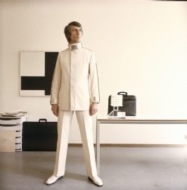
The first thing you see when entering the exhibition about Wim Crouwel is a huge photograph by Paul Huf from 1969 of Wim Crouwel himself.
Crouwel, dressed in a futuristic white costume, is standing proudly in the middle of his modern office. Chest to the front, legs spread, head held arrogantly high and looking proudly to the right.
At first a really nice picture and a good image of Crouwel’s minimalistic, functional and modern style. But after seeing the exhibition it also gives a conflicting image.
After walking around I got an image of Crouwel as a humble person. He has always had a modest approach to graphic design, the content should be more important than the design. The design was always serving the content. So what does Crouwel, who always pushed graphic design to the background, think of a 3 by 3 meter photo of himself at the entrance? Does he hate it? Or isn’t he a modest person at all?

