Skip to Content Skip to Search Go to Top Navigation Go to Side Menu


"product design" Category


Thread 53’’41’’43’’


Sunday, March 29, 2015

Like with a thread, it’s hard to find its top, it was hard to discover the beginning of this story.

A thread unravels itself on the ground
Its top is hard to find
Persistently strings are being pulled
Hooked on a state of mind
Fingers move on a virtuous trance
And yet no end is found


The thread starts to move around virtual spaces
Auctions and images
Prices and selling strategies
Long, thin and flexible form of material
Draws a series of messages
And sequence of connections


Flashes of images across my mind
From Hitchcock’s Rope dinner masterpiece
To Ernesto Neto’s suspended organisms
And Bjork’s Unravel portrait of decease
Besides, Garth Knight and Andrea Davies bondage motif


All these threads hold our existence together
Link memories to one another
Sprout canons of aesthetics
Create a language of composition
A fine line around the subject
Threads,
Filaments,
Fiber,
String,
Ropes
………..


Words like
Height 53’’
Width 41’’
Depth 43’’
Seat height 15.75’’
Starts to seem familiar


Slowly the string unravels into a ball of yarn
A triangular shape collects its pieces
Like a home for sailors ropes
A bow of Vikings boats
A tribute to a freezing place
And heroic seaman’s stories


Scandinavian blood runs through its veins
From 1935 to 2005
Award winning and acclaimed
Under the enchanting songs of the mermaids
Changed its powerful Viking name
To a meticulous fragile Harp sound


Depicted countless times
Spread out on different hands
Has long lost its original traces
Varies from site to site
Bleach, oak, ash, maple or walnut
As colours come and go
As the costumer pleases


Preserved under the sacred power of museums
Or kept among the noble houses
Once a piece of art
Now a  prototype


Yet far from being familiar
To a southern soul
Where wild oceans and fishing ropes
Scatter along the coast


Hammock nets, swing along the breeze
Fill the air with pine-wood trees
With Hollywood glamour mixed along
A slightly pear shaped frame is born


Taking the name of the place on the globe
Anonymously design,
Acapulco becomes
With its recycled PVC woven cords
Tropical colours and metal structures
Gain its place has percussionist
The southern orchestra member of the Northern Harp


Memories of gardens and beach
Come along……
White smooth sand, teaching you
How to sit in first hand


Or at the times you had
that white, blue, red, hand painted flowers
in the back of a tiny little chair
The size of half adult leg


With its straws and braided seat
Filled with the popular themes
Of a country of craftsman and traditions
Where you learn how to play hide and seek
At that moment you realize you can sit
Without anyone holding your seat
Unless you’re in a room filled with valuable chairs
And cameras everywhere


The Harp chants
Hypnotize my senses
That Viking treasure
That lays now among other chairs
In such a confined pointless room


I wonder how does it feel to sit on that chair
That same one that JØRGEN HØVELSKOV
Designed


Perhaps its transparency blends in
With my pale skinned shoulders
Perhaps my body will
Submerge into those strings
And stripes will be carved along my skin


Like that first chair
marked my silk buttocks
and drawn moving patterns
when I was a restless two years old child


I imagine how my back will melt
Into a flexible wave of relaxation
Like if I was made of clay
And my body shapes would assume the negative forms of that chair


Then those legs, spread out on the floor
like spiders using their glands to shape their web
Would invite me to cross my long legs
And play its imaginable pedals


The chair becomes wood
The ropes become thread
The thread becomes ………………………………………………………….
……………………………………………………………………………..unraveled


Harp Chair by JØRGEN HØVELSKOV
[x]


it looks great


Saturday, March 28, 2015


i say glasgow


Untitled-1

not the airport.

not the bin lorry crash.

not the coma scale.

not the distillery.

not the east midlands.

not the fishing mega-store.

not the grin (interesting, though).

not the herald.

not the irn-bru.

not the jigsaw puzzle.

not the kiss (again, interesting).

not the library.

not the mortality.

not the nino.

not the outcome scale.

not the prestwick.

not the qmu.

not the rangers FC.

not the smile.

not the tragedia 2014.

not the university.

not the vikings.

not the whisky.

not the zip.


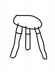
it is a chair – a stool – a taburett.

glasgow


and it is not any famous one.


one of these pieces of furniture that catch your eye and (if you are a good listener of your inner instincts) you hear them scream get me, get me. you do not get it immediately, but time-to-time you stop by the store, to look at it, to walk around it, touch it and in this case – to sit on it – or not – rather be like – it looks great on this shelf. it looks great.

in the end you decide to get this perfect bargain for amazing 34,99 only, which could be easily the price for the materials you would use for making your own (and maybe even better).


open the box 

unwrap it

Untitled-2

to be honest, the very first sit was kind of problematic due to its construction – the three legs which you firstly have to screw in – oh what a mechanism i could really make it myself – do not really support the whole weight of a normal adult human being.


it looks great, though.


questioning


when getting such piece of design in a big and ordinary furniture store you should be less naive than when shopping at the other places. you should expect the lower price which goes hand-in-hand with the lower quality. but do you ever think of the company or the person who actually designed it? do you think of the people who manufactured it? do you think of the person who cut the wood for it? (not the case here, not the wood, lies) and do you ever think of the driver who delivered your piece to the store?


i tried to think about it. i tried. and I tried to search. and I got to the dead point at the very beginning – who actually created this chair?


no names

no dates

no places


it seems like this chair just appeared to be. and it looks great.


some blunt information about the material and the size, more color options and the list of the other places where to get it. but that is it.


another way around or a holy piece


the original is made by the American furniture design company called UM Project, founded in 2004 by Francois Chambard, who seems to be french living in the united states.

(the names of his wife and children in his bio)

UM stands for users and makers.

F.Ch. says –  interested in getting his hands dirty, but also by the recognition that the market was craving more personal, tangible products and experiences beyond the conceptual promise of brands.


their name for the chair is holy stoolwhy – and is not very different from my version – only the material is not the some pieces of wood&shit&stuff&glue but pure maple. dipped into the paint (or at least that is how i imagine it) from the bottom up – while my chair is the other way around.


the other potential users experience is same instability as i do with my cheaper version of this stool, while the studio claims that the legs are far apart, which makes the stool stable and perfect for everyday use in homes or offices.

they said – users and makers. 


i am not sure how to feel anymore.

it looks great

saturday morning, mess around me, me in bed.

it looks great

glasgow close to me.

it looks great


confession – i never sit on it. 


piles of clothes dirty clean tidy laptop pills projector bags and purses boyfriend book jacket not me but it looks great


consumer society? are we greedy? or do we just get stuff because it looks great?

it looks great, though.


another confession – i will probably never sit on it. 


however, this has been the first chair that i have ever bought. the first piece of furniture that i have bought for myself only not because i need it but because i wanted it. 


and another confession – yes, we are greedy. 


i need to think about it all over again. 


‘The Mosquito’


Friday, March 27, 2015

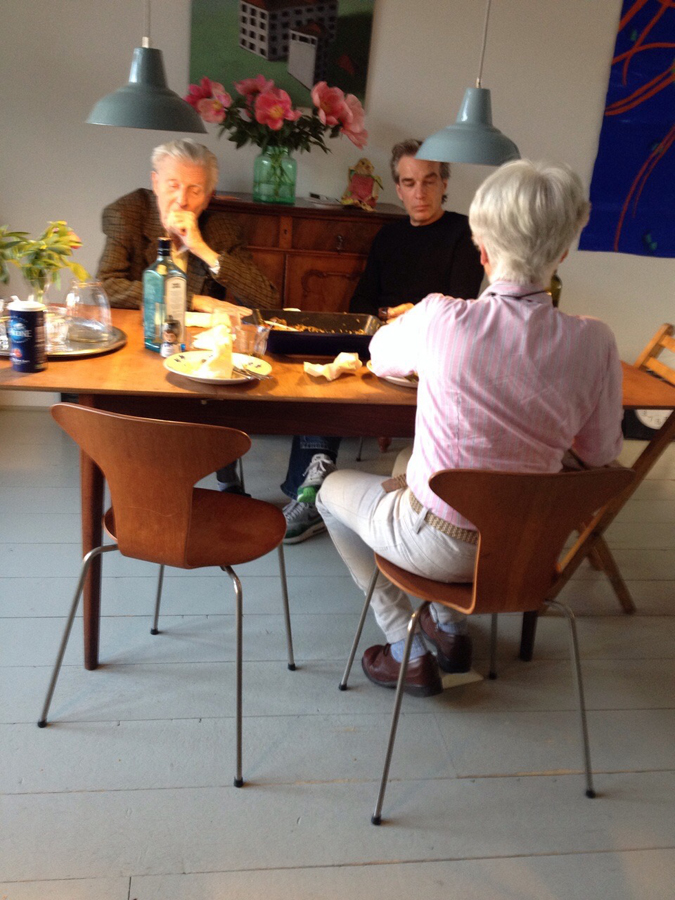
I am sitting behind a table, in my parents house, on a familiar, comfortable chair. I am used to this seat and it has been around for as long as I can remember. My grandmother got a set of four teak wooden chairs with a matching table as a wedding gift in the late fifties.  I have seen them in two different states throughout my life. My mother was given the set when she was about twenty years old. Feeling that the natural teak wood colour was outdated and ugly she decided to paint the chairs red. The table was not present until recently.

About a year ago my mom started to regret her decision to paint the chairs, and had them brought back to their original state. After my parents moved to a new house the chairs and table were placed in their newly furnished home, where they stand in full glory. Ever since then I keep admiring them more


family-around-Jacobsen_900

two generations sitting at the dinner table


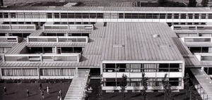
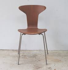
The Danish designer/architect Arne Jacobsen (1902-1971) introduced the munkegaard chair – also known as the mosquito – in 1955, in the Munkegaard school located in Gentofte, north of Copenhagen. The school is considered one of his most important architectural works, within which he designed everything from the light fixtures to the sinks [x]. The chair that belonged to it became an absolute classic. Because of the setting that the chairs were made for, the design is highly functional. They are very easy to stack, which is perfect in places where you have to deal with limited space. They are extremely durable and comfortable at the same time. The part on which your back rests follows the natural shape of your spine. The seat of the chair is made out of pressure moulded sliced veneer. The bases are made of chrome steel tubes. The thin wood is strong but flexible. If you lean backwards, the wood moves slightly with you. The chairs are more than just convenient though. The elegant objects have an inviting look. They are unique in their simplicity with an understated aesthetic quality, which makes them so brilliant. They will complement any decor or surrounding, and bring an edge to any interior. Having only been produced from 1955 until the late sixties (and for a short amount of time in the nineties), they are now back in production again. When you pay attention they appear everywhere. When I was on a holiday in Denmark, I noticed that the chair was used in many different places, from office spaces, to cafeterias, and from the fancy to the less fancy places. Everyone seems to appreciate them. See here a website made especially for the chair.


Munkegaard schoolThe mosquito chair

Munkegaard School                             The Mosquito Chair, Teakwood


Jacobsen plays an enormous part in the image we have of danish design, and maybe even design in general. Traces of his work are found worldwide, even now still, thirty years after his death. Jacobsen was a man of extraordinary vision, strong ideals and in his time was considered true avant-garde. He is not considered intellectual or analytical in a traditional sense. Jacobsen was a producer; even when he was not working he worked nonetheless. Relaxation for him meant a shift in the creative realm. His output therefore was enormous. As a designer he strongly believed in the ‘form follows function’ motto. Jacobsen was inspired by the works of Le Corbusier, Mies van der Rohe, and Walter Gropius, which is explicitly visible in his own early works. He was also inspired by the furniture of Ray and Charles Eames who worked a lot with bent plywood. Even though Jacobsen is most famous as a designer he never called himself as such, and it is said he had a strong dislike towards the word. A lot of his designs were created in the context of the architectural buildings that they would be placed in.

I see Jacobsen as a visionary, as he played a huge part in designing the environment we live our daily lives in. From architectural masterpieces to simple things we use everyday, Jacobsen surrounds us. He makes things exactly the way I like them. His designs are the perfect formula of functionality, durability, and aesthetics. They are modern simplicity: all that it needs to be and nothing more. His mosquito chair will remain a timeless object that people will appreciate for ever. As for the chairs in my parents house, they are probably not originals, since the design is one of the most copied in the world. Nonetheless I am happy that I have grown up acquainted with such a beautiful piece of design.

ARE WE STILL FUTURISTS?


Friday, March 27, 2015


h2_1987.98.1a-d

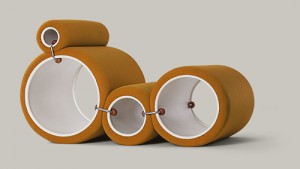
                                        Joe Colombo, Tube Chair, 1969-1970


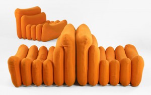
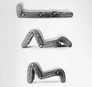
This is my chair. The Tube chair designed by Joe Colombo in 1969-1970. First I will introduce the intentions of this designer as a representative architect of that period and shed some light on the ideals behind designs from this time. Colombo was mainly focused on the creation of living systems (Combi- Centre of 1963) that were made to become micro-living-worlds with dynamic, multifunctional living spaces. He was very interested in furniture systems (Additional Living System), as an example the Tube Chair that could be set up in several different ways depending on the users wish!


first impression

One of the things that caught my attention when looking at this chair is the shape. To me it is quite unusual and therefore appealing to think that a construction could be shaped by only using round cylinders. I also found quite interesting the fact that these shapes could be organized according to the position you want at the moment, which to me is fascinating. Also the color of this particular model is very present and strong, adding to the shiny material it is made from. All of these elements create a quiet eye-catching construction.

Intrigued, I decided to research more about the aesthetics of the sixties and early seventies and learn the meaning behind this particular aesthetic and philosophy behind this kind of design.


for whoever want to know Joe Colombo

shiny tubes

shiny

shiny shiny shiny shiny shiny shiny shiny shiny shiny shiny

perfect colliding cells of bodies, body parts inside parts of parts of bodies inside shiny parts of bodies, is this a body, is my body this, parts of colliding shiny cells colliding bodies?

or cold neglected manufactures of machines? Machinery taped forcefully by robotic aggression or casually naturally beloved shapes holding, sustaining, lovingly enclosing tender body parts?

this is my question when sitting in the tube-chair.

both.none.both and none at the same time

because time is the reaction after this action.

orange tube chair.

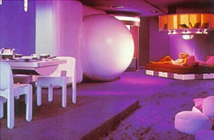
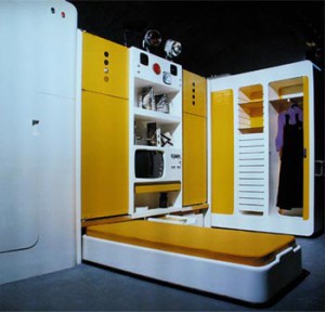
I saw lots of similarities between the interior design that is visible in furniture design, decoration and the architectural use of space used by  Joe Colombo during the late sixties/early seventies. here are some pictures to show some representative interiors designed by him in this period!


Manu 6

Manu 5

MANU 3


Joe Colombo, Visiona-Livingroom of the future, 1969, Total Furnishing Unit, 1972, Spring Lamp’s prototype, table lamp version, 1968,‘Plywood Chair’, 1963, Carrello Boby, 1970, Spiral chair, 1932, B-Line Colombo Modern Multi Chair, 1969


some history lessons:

The 70s represented a reaction against the sleek minimalism and simplicity of modernism and instead sought a  “playful embellishment and radical experimentation with form.” So this meant that functionality had a high importance yet still creating an exciting and almost utopian space. These spaces had unusual colors, shapes and functions as to move towards a successful future of living.Self-expression and individuality were defining for the time. Technology started gaining importance and spaces were used as organisms that were part of their surroundings.

The architecture of the time was also very innovative when it comes to light and space. In many ways, the 70s started the concept of “open plan living”. Many designers reacted to changes of how families were starting to be structured (women started working outside of the house thanks to  technological advances and overall economical growth f.e.) with double-height spaces, open planned living and grand entrances. Many homes had giant windows, spiral or “floating” staircases, interior and second-floor balconies. The kitchens were made to accommodate more cabinets and high spaces. Many kitchens had islands or breakfast spaces, bringing the family into a room that was once reserved only for women or staff. This was a symbol for the slight change in position women were starting to have during this period, that was to be seen in the way the living space was designed by the architects of the time.

During the seventies there was an enormous use of bright colors. Houses became very inviting and there was a lot of eclecticism when it came to the furniture designs and nearly every object had a bright color such as toilets, walls, furniture and decorations which came in several colors .

The 70s was a time of many advances in the design of chairs and office furniture. Designers began experimenting with ergonomic designs for the workplace and home offices. Many Italian Designers were at the forefront of radical and experimental furniture design, using high tech materials, tubular steel, bright colors, and polyurethane plastics.

1970s stuff

• Sleek plastics and high-tech materials
• Avocado green and gold
• Bold patterns and prints
• Stacked stone fireplace and stone walls
• Timbered ceiling beams
• Exposed brick walls
• Metal (chrome, polished steel)
• Geometric shapes and lines
• Thick and chunky masculine furniture
• Fiber optic lights
• Wood paneling
• Skylights
• Atriums
• Indoor gardens
• Fireplaces with elevated hearths
• Big windows and lots of glass
• Wall-to-wall carpeting
• Sunken living rooms
• Wicker furniture
• Shag rugs
• Earth tones
• Brightly colored furniture
• Orange

MANU2MANU


Joe Colombo, Additional System chair,

1967-1968, demonstration of positions


parallels to today:

IKEA

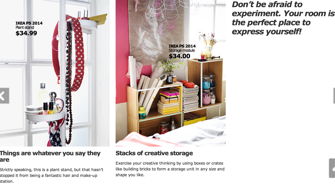
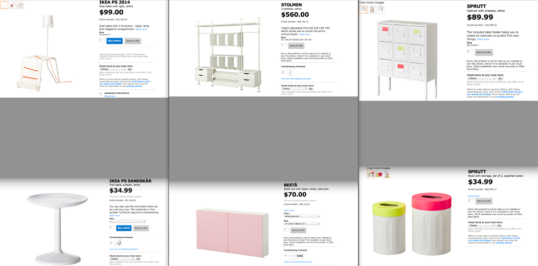
Reading about the sixties/seventies really got me thinking about how much of the ideals and aesthetics I recognize in our contemporary culture today. Some of the things such as experimentation with form, eclectic interiors, technological advances (that are employed within living spaces) and individualistic approach to the design and embellishment of a living space are elements I strongly recognize in our culture today. The first place that came to my mind was Ikea because of the presence it has amongst nearly all of us, as well as its attracting quality it has to people today. Here are some pictures that I thought were representative for the similarities!


Ikea_catalog1 copy
Ikea_catalog2 copy

Here from ago


Friday, March 27, 2015

03/03/2015, 10:00 AM

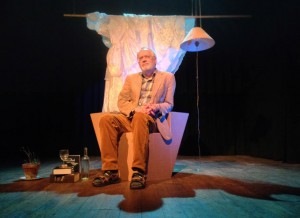
Fresh morning, makes me want to fill it with coffee and smoke and a nice story. And so we begin this day in a spacious room which is separated from the rest of the studio by this black wall which looks as if it fell from somewhere above and its destination happened to be this studio. It is interesting but Ok, nevermind. Let us sip our coffee from tiny soup bowls and burn it with some smoky inhales of rolled tobacco, as we further dicuss about this centrally positioned chair which put us together in this time and space.

10153205_10152017634480998_129506274_n
Chris Junge in the monodrama ‘ons ons’.

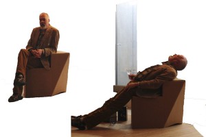
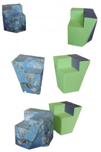
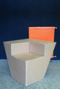
I have first encountered this chair on 3rd of July 2014, during an exhibition and a theater play by Melle Hammer, who at the same time is the designer of this chair. Its cheap and grandiose look caught my attention and kept my eyes staring at it, although I never really bothered to further investigate or question its existence. It seemed cheap in terms of the material it was made of (corrugated cardboard), and grandiose for its physical characteristics and attitude.

10885450_10152527566920998_4811577043378295905_n

As I sit a few steps across from it now, this switch from past to present keeps bouncing back and forth, making me want to finalize my opinion about this chair.  But then again, I know almost nothing about it. Although it is now standing upside down, it seems as if it hasn’t changed much, if at all. Cardboard still has the same brown color, its weight still looks cheap. Only this time, there’s more to see from what its interior structure offers, which is interior support consisting of two more cardboards connecting to form a plus-shaped structure.

And it’s Melle showtime, baby, feed me with words. It’s time for some real storytelling. He starts by describing the very first click he had for this chair, which was a theater play written by him. A monologue, or a dialogue should I say, between the writer and himself and so on which doesn’t really matter, but you get the idea. Anyway, the main point is that the he was trying to design a chair for this stage set which would give enough richness to the play, as if holding the whole scene on its legs.

We have a click. Good. And we have a direction/some kind of a plan. Good. What is the the hint, an inspiration, research, anything to grasp and begin with? A CHESTERFIELD CHAIR [x]. Just some background information. Ok, now we are complete: a click, a direction and a sort of inspiration.

Let us continue with some starting points, you know, that time when you get your hands dirty and make some mess. Before Melle starts telling me how the chair came to existence, he wants to make sure I understand the term „problem-solving“ before anything else about this chair, which has its occurence before design and which was his method of designing this chair. As an example, he puts a fork and a lemon squeezer on the table explaining that both of them can be used towards the same goal, which is getting the juice, despite the fact that their functions differ. Lemon squeezer speaks for itself, while the function of a fork, in this situation, would be „problem-solving“. I couldn’t make a direct connection to the chair, but I could sense my subtle excitement for what the following information is about. And so he introduces me to the problem he encountered in the beginning of the process, that being the money. He could not afford buying one of them chesties only for a one night show, so how one dealt with the problem and tried to find a solution resulted in the making of this chair. Corrugated, brown board costs only 6 euros per sheet (inc.taxes). It’s nice, yes, sharp, but its lasting is not long. Let’s say one year long, which is still enough as it was meant to be used for a few hours. Inside, the board consists of fluted sheets which will eventually deform or collapse through longer usage. During this play, the point of the chair where most power is used is armrest. At the same time, that’s where a lot of the chair’s strength comes from and it is double-layered. This armrest gives the chair a possibility to be used as a chair. However, real power comes from the interior of the chair which consists of two centrally crossing cardboards in order to support the weight. At this point of the story, I felt the pieces of the puzzle falling into their place, but Melle concludes it by saying that it is not a design, but a matter of problem-solving.


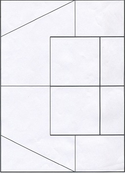
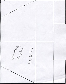
So far the obstacles encountered in the process were solved. Theater stage had its chair, it survived the show, and it met the budget conditions. Everyone is happy. The story goes on, however. It continues with Melle’s decision to take his problem-solving design further, from which breaking and overcoming more barriers followed. The goal is different now, that being to keep the model design of the chair which is strong enough to hold its ground without the interior support. And to last longer. Pure design. What is the key? Stronger material, which is Falcon board. It consists of standing up hextagons and doesn’t need to be double-layered in order to be stronger. It costs 9-11 euros per sheet(inc.taxes). Of course, it comes with disadvantages. Falcon board cannot be cut with machine pressing and immeddiately cutting down because of its high strength, but it would be possible with a plutter which travels slowly and precisely through the board. That said, it needs time and the production costs. However, this production would allow the possibility to print on the board, which further allows customized prints. This makes it into a more industrial product; it gives a furniture-feel and you can have it made with print preferences.

Melle_kill-your-darlings Melle_kill-your-darlings-1

Scale model(corrugated board chair) • Scale model(falcon board chair)


Example of customized print

I go back to that summer evening when I first saw the chair. I try to recall my thoughts, but it seems like I hadn’t put any effort to study the chair. All I can remember is that it did trigger my amazement for it for the reasons of its cheapness and steadiness. And I wonder, if I were to gain this knowledge about the chair before seeing it on stage, would the amazement still be there, or at all? Would it change my focus on the play? At the end of the play, who would my applaud be forwarded to? I was never exposed to much information about the chairs and their existence but the information keeps being present all the time, either verbally or visually. It took two events to broaden my perspective and make me question what lies beneath their designs.

Through Melle’s story; the whole process of deciding about the material, way of production, and constant problem-solving, I have come to realize that designing chairs is one of the hardest tasks for its creator.

11103936_10152743092000998_1510648936_n

Proving Prouvé


Friday, March 27, 2015

Starting our research trip through the endless material of chairs and endless amount of possibilities to wright a research about, we traveled to remote cities to attend group chair exhibitions. During this whole complicated ritual of coming up with a specific chair, I was always thinking of the simplest one. One that I could really describe because it would be just basic. And what is about basic that fascinates me is that anyone can imagine themselves on it. It might not be the most comfortable chair but for sure it will be one to spend some study hour on.
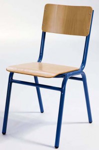
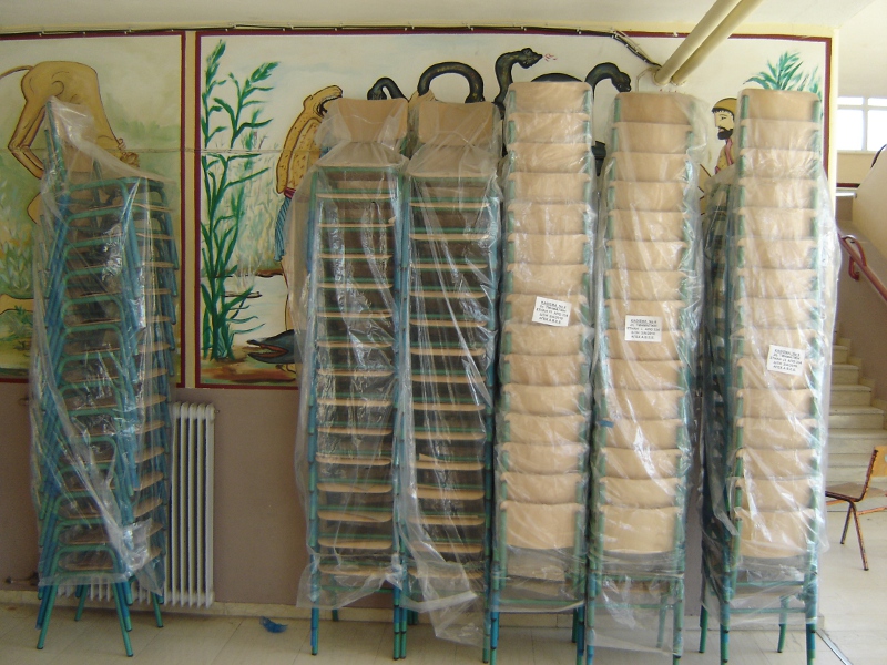
During these basic thoughts on basic chairs, my mind would travel to the chairs that I had been sitting on for 12 continuous years in my life, from the moment that I started primary school and finished high school.

13.thrania_metalika_gl

It is probably be the chair I have been sitting on the most. I have spend endless amounts of time getting bored on this chair, getting back pain on this chair and always trying to switch between positions as to find the right place for my feet. This would be in school, when I would bend my knees, place my legs under my butt so that I have a pillow on the basis of the chair with my feet coming out of the empty space, right under the piece of plywood supporting my back. Teachers would not allow non upright positions.
I remember I was then complaining to them on why they were using a comfortable chair with foam pillows for their desks in class, while us, a mass production of  students in a mass production education were sitting on mass production chairs.
This would be just four steel legs and two molded pieces of wood. Thin plywood.
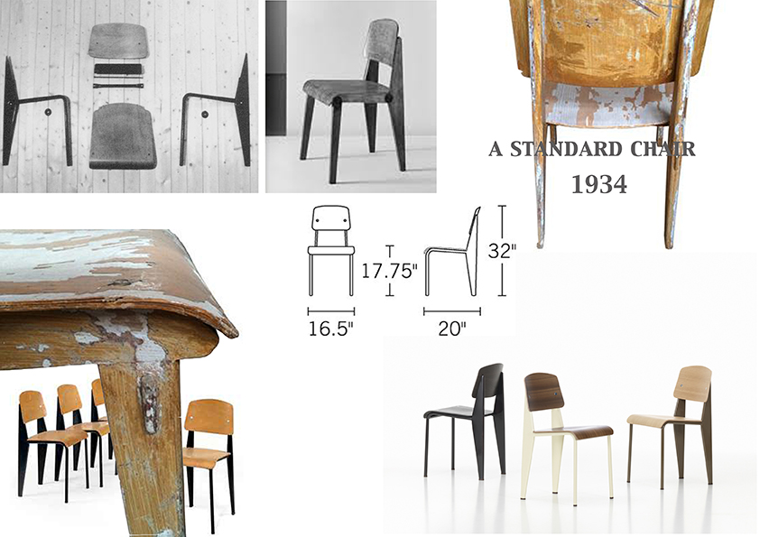
On the group chair exhibition I found myself identifying with Jean Prouvé’s Standard Chair produced during the 1930’s-1950’s since it looked very similar to the school chair I was recalling at the moment.

jean prouve

Going through the background of Jean Prouvé and his architectural achievements I got informed about his fascination with mass production of machine-made furniture and his constant adaptation to the problems of his times through working in a collective union with fellow architects such as Le Corbusier, Eileen Gray and Sonia Delaunay. In 1930, Jean Prouvé  joined the French Union of Modern Artists(UAM), a groundbreaking movement who’s artists proclaimed ‘We must rise up against everything that looks rich, against whatever is well made, and against anything inherited from grandmother…”.  Apparently, through this collective way of working, simple and basic furniture for collective use were produced. Educational furniture was some of them.
This is when I realized that my visual connection of his chair to my school chair was not random.  The name of it gives it away: “Standard Chair”.
Unfortunately I never got to sit on one of the Standard Chairs but I am convinced that it feels more or less the same.

Both chairs I am comparing take the stress on the back legs where they bear the weight of the user’s upper body. Prouvé incorporated this simple insight in his design for the Standard Chair: while steel tubing suffices for the front legs, since they are subject to less stress, the back legs are made of voluminous hollow sections that transfer the primary weight to the floor.

Feels like it is a chair to keep you aware and well-postured. I remember sitting on ugly yellow cubular (rectangular) steel legs when new, clean and polished chairs arrived having tubular(round) steel legs. A small detail I remember since somehow I prefer the first ones. I can also recall the high pitch sound of these steel legs when you would boringly move the chair in the classroom by scrubbing it on the floor. It sounded like it is going to collapse, like all the rust-proof elements would finally get un-proofed. But they didn’t.
They survived through many years, through many students sitting awkwardly on them, vandalizing them, chipping off the layers of the plywood one by one on your front classmates’ chair, writing nonsense with blanco pen in the back of it or making graffiti on it.
There was also this plastic black cap used to block the empty space of the tubular steel at the edge of it. This cap that you could patiently remove during the boredom of the class, revealing the empty space, where you could dispose your chewing gum if the teacher would see you, where you could loose your pen or hide a cheating note.

I am mostly fascinated with Prouvé’s chair because it somehow summarizes all these memories in an official and prototype way. All these years of experiencing the school chair were brought to the foreground at my first encounter with this chair, proving to me that I was sitting on it without even realizing it. That it was Him behind it.
It seems like his industrialized Standard Chair was indeed used in schools at that time and that it did inspire even Chinese companies to copy it and send them to schools all over Europe by stacking them on each other just like a good mass production product would do.

A-001


Complexity is Free


Monday, January 12, 2015

«Innovation can’t be found in the drawing of an object but in the use that is made of technology, materials, techniques. Technology has no interest for its image, but it is interesting for the service it offers. Its image must disappear, melt into the object. Technology is at the service of the result : price, lightness, comfort…» Patrick Jouin


OneShot.MGX_01

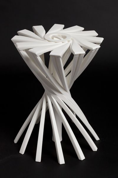
OneShot.MGX by Patrick Jouin

OneShot.MGX is a 3D-printed stool designed by the french designer Partick Jouin in 2004.This stool was manufactured using the 3D printing technique. Born in the mid 1980s, 3D printing, more formally known as additive manufacturing, was used at this time for visual prototyping. But some companies soon realized that the technology had the potential to do more than just producing prototypes. In 2003, .MGX by Materialise was founded and they invited world-class designers to experiment with this new technique and come up with novel products that were only possible with this new technology. Patrick Jouin was one of them and created on this occasion two chairs, a table and this stool.

I consider this item as one of the the most relevant among the Stedelijk’s design collection. Innovative, surprising, light, handy, delicate, subtile… it satisfies all the expectations that we have from a stool. You can take it anywhere easily, store it in a cupboard, in a car, in a bag. This object is in harmony with Patrick Jouin’s philosophy if we believe his words : «The objects we draw today are more discrete. They are more «affectuous». Discrete friends. They don’t tell less, they simply do it more slowly. It’s like homeopathy. They diffuse rather than they speak.»  I discovered Patrick at the same time as his product during the exhibition and I think he has a clear mind about what is going on in design nowadays. He created his own agency in 1998 after some years at Philippe Strack’s agency. His style is often qualified as discrete.

Patrick Jouin is really interested in experimenting new technologies. In an interview about rapid prototyping, P.J. said «The distance in between the creation, the drawing, and the final object was very short. It was like a sketch which is coming alive and taking shape in 3D. I know that every time in the history of design, when there is a new technology, there is always a new aesthetic.»

Patrick Jouin talking about 3D Printing

«Industrial production requires a radical conversion : we must start from the function of the object and possibilities of the machine. The limited performance of the craft production allowed sometimes the realization of original or richly decorated forms. Production by the machine, in series, needs a simplification of manufacturing’s forms and processes.» Willem Sandberg wrote these words around 1970 in a catalogue about the german designer Wilhelm Wagenfeld. Should we consider this way of thinking as still relevant nowadays ? New technologies such as 3D printing make these ideas a bit old-fashioned. I am not saying that this aesthetic is over, but 3D printing doesn’t undergo the same rules as the more industrial technique. Patrick Jouin said : «There are so many aspects, undiscovered yet, it is a new way to think how an object can be made.»

In his book Fabricated : The New World of 3D Printing, Cornell University researcher Hod Lipson describes ten of the underlying principles fundamental to 3D printing. The first principle he notes is that «manufacturing complexity is free». Unlike traditional manufacturing processes, where extra complexity requires a more expensive mold with more parts, there is no penalty with 3D printing when an object is made more complex. On the contrary, in some cases there may even be a benefit. With 3D printing, designers and artists can explore new kinds of highly complex and intricate forms that would have been impossible to realize with traditional techniques, and these come at no extra cost. It is a proverbial candy store of new formal possibilities, resulting in a new design language that is baroque and often eclectic.

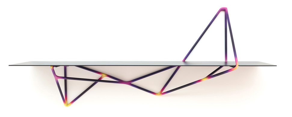
Kram/Weisshaar, Multithread

Multithread #06 Console Shelf[x]

«Just because you can, doesn’t mean you have to». It is true that there is a risk of overuse, a risk that it becomes too much. What should designers do now that complexity is not a problem anymore. Designers are still in the early stages of the search for aesthetic in 3D printing. Many of the experiment we see today may appear outdated in ten years, but they are playing an important role in paving the way. With an increasing number of designers, artists, and makers gaining access to 3D printing, a mature formal language will develop over time, uniting and exploiting the full potential of the technology’s aesthetic powers.

«…people often proclaims grand ideas, things that are just after all, the qualities expected about an object. What an object owes us.» Patrick Jouin

Many studios and companies are working on developing this technique. In Amsterdam, we have the 3D Print Canal House, the first 3D-printed house. It also acts as an exhibition and interactive research center for 3D-printed architecture and related areas, such as material recycling, policy making, and smart electricity grids. The 3D Print Canal House has been printed on-site with the KamerMaker, a shipping container that has been converted into a giant 3D printer.

An aspect of 3D printing that I find particularly interesting is the way you share a product. The designer creates a file that could basically be printed anywhere by any 3D printer (if the printer is able to do so), but then a question appears, how is he going to sell it ? In a shop as a finished object or on internet/in a shop as a file still ?

What will make him choose a certain option ? If you decide to sell for example your 3D printed vases in a shop, you will propose to the public a definite object, with definite colors, materials and price. These choices will be of course part of your research and of course as a designer you know better than anyone the nice colors, but you don’t give to the buyer many possibilities. Eventually you could print ten times the same vase with each time different materials and/or colors, but then you take the risk that some of them might not be successful. You might have eventually planned everything with a marketing analyze or something else, but I am sure that 3D printing could be exploited in a much better way. In this way, the 3D print is not highlighted.

Imagine that you sell the product on your website. The vase that you created has a definite shape, but no colors for the moment, it is still a neutral file, just a shape. Then you put it online and decide the price of it. You could also suggests some colors or materials, without saying that one is better than another. The customer will be free now to  print the vase as he wants. There is no risk of overproduction in this case and there is also an attractive aspect for the customer. He might feel involved in the project and enjoy the fact of being part of the creative process. I talked about the price previously and I think this aspect is also interesting to discuss. How would you fix a price ? If the customer want to print it at home, you would sell a file only, so the customer will print and pay the material by himself. What is the value of it ? Is it in terms of technical innovation or complexity ? Or in terms of originality ? 3D printing could also lead to personal (home) creations and lead to the disappearance of designers. Of course, there will always be designers, but they could be at stake. For sure, this solution is possible only if a great number a person would have 3D printer at home, and it is still not the case, but it may happen soon. We can already see this kind of website where you have the possibility to create your own product.

I am also wondering about reproduction, re-appropriation and protection. How can you protect a product from reproduction or re-appropriation ? How could you recognize an original from the copie ? You could not.

The last possibility that I find personally the most interesting nowadays is to have your own 3D design/print shop. Imagine that you have your design studio that is at the same time a production place. You keep into the studio a selection of the products, accompanied by suggestions of colors and materials. Customers would come into the shop and ask for the vase 3D printed in red and blue plastic with maybe some adjustements. The nice thing is that you have then a real contact with the buyer, you can advice them, keep them informed and help them. You can imagine many things with 3D printing. It could provide a solution to over-production and consumption.

For example, companies could provide 3D files that allows you to print the piece of your machine that is broken instead of ordering it and get it from the other side of the world. You would just have to print it. For sure, the materials that you use to print will not come alone, but I think it could help. There are many other subjects to discuss, so if you are interested in 3D printing, you should have a look at this conference  about the environmental impact of 3D printing that was given on December 13th 2013.

A lot of people are active in 3D printing research. This is the case of Dr. Behrokh Khoshnevis of the University of Southern California which has been developing since 1998 a layered manufacturing process called Contour Crafting, in which cement or concrete is pumped through a nozzle connected to a computer-controlled crane or gantry. This draws the contours of the largescale structure to be built layer by layer.


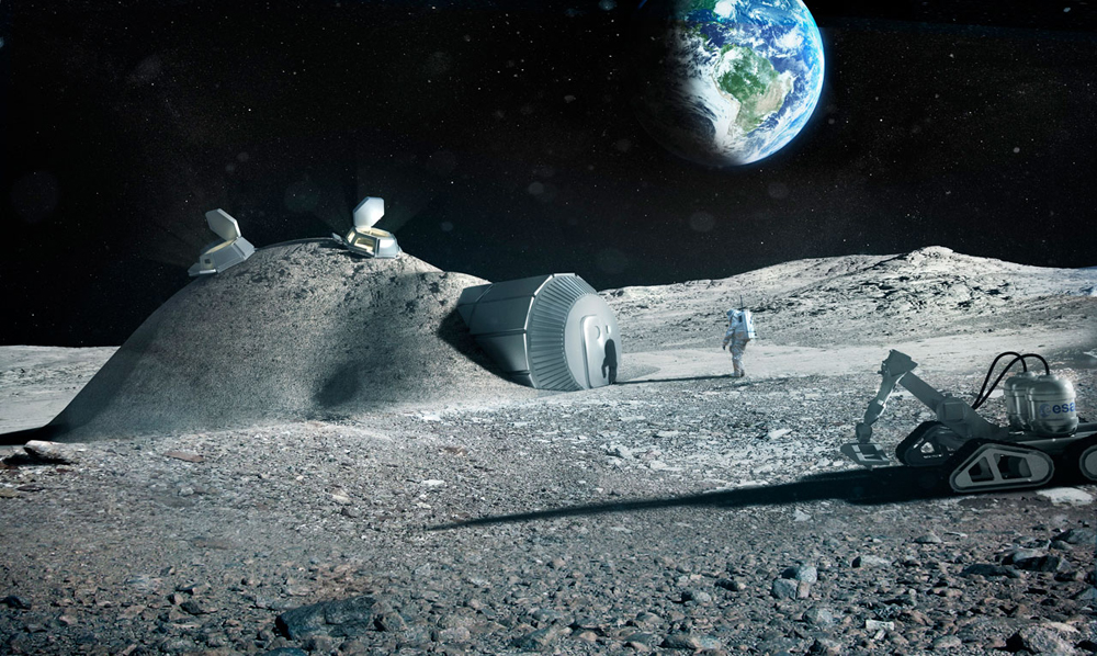
Foster+Partners, Lunar Base

3D printing with Lunar soil by Foster + Partners[x]

Enrico Dini also, a passionate Italian inventor, has teamed up with the European Space Agency and the architects Foster+Partners to test the feasibility of a 3D-printed permanent moon bases built out of moondust. Contour Crafting is also aiming for the moon in a partnership the NASA. Give the significant challenges of scaling up 3D printing machinery to encompass an entire building, many concluded that, for the time being, the most pragmatic approach is to fabricate constructions in sections and then to stack these sections on-site.

Finally, if you are interested, I link you to some studios who realized some really nice project with 3D printing technique. I hope you enjoyed this article.

3D printing is definitely the technology of tomorrow.

Who is Gherpe? About Superarchitecture and corruption by conventions


Saturday, January 10, 2015

Gherpe – a lamp designed by Superstudio
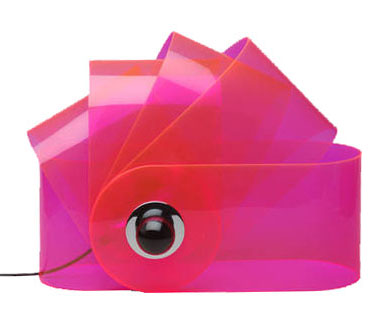
Gherpe
 (via:http://www.nova68.com/gherpelamp.html)

I think the Gherpe lamp is a relevant design because of several reasons. First of all, the lamp itself is made of materials that are still considered modern, even though it was designed more then forty years ago. That alone already shows how we still hang on to, or maybe are condemned to these materials nowadays. Next to that is the design, which references to the mathematics that appear in Nautilus shells. Then again the way this shape is interpreted is more like a cartoon of it, leaving the classical Nautilus image behind. This way of designing, letting interests and research – the designer was into marine biology – influence the work is something I think many designers work like, or would like to work like. Last reason why I think this is a relevant piece is because I think the whole of Superstudio, their designs and mainly their architecture is, because of their new views and extensive researches, relevant. They were part of a critical wave, commenting on Florence and it’s ancient heritage, on the years of full trust in technology and on architects before them. They wanted designers to be responsible for their creations when they design to make a better world. Their criticality on how design and architecture influences the life of other people and self-reflectiveness is what made them different from many before them. This idealism in theories, but with playfulness towards the designing process itself is to my opinion something important to keep relevant in art and design.
gherpe_01


(via:http://photografieundmehr.com/pics/2012-11/gherpe_01.jpg)
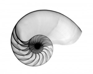
Nautilus-OS

Nautilus shell

(via: http://www.hungrywalrus.com/wp-content/uploads/2011/08/Nautilus-POS.jpg)

To test it’s relevance I’ m trying to get to know what Gherpe is, what it is not and what it could be, what it means to Superstudio and what it means to me.

At a time where popular culture is stealing all the science and logic that Modernism employed to make this world better, with youngsters starting to call themselves Mod.’s, Pop Art commenting on this Modernist reality and society by reproducing imagery from that popular culture, Gherpe is born. It’s designed by Cristiano Toraldo di Francia, and adopted by Superstudio, the Italian architecture group where Toraldo is the most important member of, together with Adolfo Natalini, who is a Pop Art painter when they found the group in 1966.
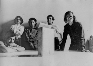
 

big_374062_2176_giulia_superstudio3

Alessandro Magris, Cristiano Toraldo di Francia, Piero Frassinelli, Roberto Magris, Adolfo Natalini
(via:http://www.domusweb.it/content/dam/domusweb/en/from-the-archive/2012/02/11/superstudio-projects-and-thoughts/big_374062_2176_giulia_superstudio3.jpg)


Where Modernism, in its affirmation of the human power to improve their environment the aid of practical experimentation and science, goes for logic, Gherpe pretty much mocks Modernism, by taking it’s science and it’s new materials to make something that is not in any way useful other than it’s aesthetical purpose. Gherpe is not practical, and it’s not helpful. But Gherpe’s cartoon like ambiguity looks fun, you want to have it, it looks smart even though it isn’t, and that’s exactly in line with popular culture of that day. Gherpes connection with nature is meaningless, but very important for it’s attractiveness. You could say it’s a beauty trick. The interest of Superstudio in nature combined with construction is to be traced back to one of their guides in the Academy of Architecture in Florence, which most members of Superstudio were attending. His name was Leonardo Savioli. As Adolfo Natalini says about Savioli: “Even when the drawings looked like traces of insects or explosions, galaxies, spiderwebs or wounds, they were always able to resemble parts of constructions or something constructable”.
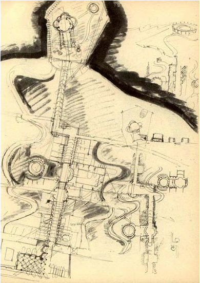
 

Savioli_plateXVIII

Plate XVIII, a drawing by Savioli

(via:www.etsavega.net/dibex/Savioli_citta-e.htm)


The fact that Gherpe’s reference to nature doesn’t have any symbolism or engagement in it, already shows what things it really has to do with, things like freedom. Gherpe is free from the morals that come with modernism: Superstudio didn’t think architecture could change the world for the better. Gherpe is the joyous realization that the burden of creating something that will add to create paradise on earth is not possible.

Gherpe was in the Superarchitettura show. This was a show combining two groups. The Superstudio and Archizoom, both from Florence and mainly from the same architecture school. The show took place right after a flood had swallowed a chunk of Florence’s renaissance beauty, at a time where others mourned renaissance architectures birthplace the Superstudio show was a psychedelic experience work that purposely lacked engagement and put consumerism on a pedestal. Their ideal: morals were irrelevant to architecture, and so you should not aim to change the world with it either. So there is a different approach: “Superarchittettura accepts the logic of production and consumption, it utilizes it in an attempt at demystification” and  “Superarchitecture is the architecture of superproduction, of superconsumption, of superinduction of superconsumption, of the supermarket, of the superman, of the super gasoline”.
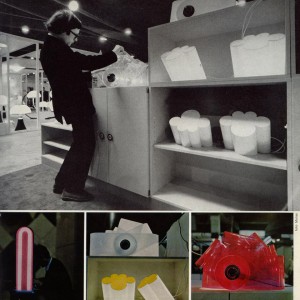
gherpe-archivio2

Toraldo and Gherpe, and Passiflora
(via:http://www.centrostudipoltronova.it/wp/wp-content/uploads/2014/07/gherpe-archivio2.jpg)

Seeing Gherpe from the eye of the Superarchitecture that it is, means not that Gherpe was meant for a world better than ours, but for the world as it was in 1967, where consumption and production were exploding. You could say, Gherpe is super itself. A lamp fitting for all these phenomena that felt relevant for the younger generation at this time. Instead of denying these phenomena, or wanting to change them, Superstudio designed something that fit in. It might even accelerate superconsumption, be meant for that purpose. In this perspective Gherpe is in a way a neo-futuristic piece, a monument for the speed and mass of its time. You could also see Gherpe as an, perhaps slightly melancholic, attempt at creating something, something touchable and real out of all the superlatives that together form the ungraspable frightening dystopia that was (and is) everyday life. And maybe that this is the reason we enjoy it, because Gherpe is then our comfort, a sign that from superproduction and superconsumption something appreciable can materialize.
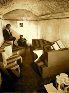
superarchitettura-3

Image of Superarchittettura show
(via:http://www.stylepark.com/en/news/a-landscape-of-mountains-and-valleys-the-design-parade-03-in-hyeres/283330)

Gherpe shows Superstudio’s double nature: it’s serious, socially critical but can also be ironic.  When Superstudio presents an utopian, or dystopian design we can never accept it at face value. When they design a utopia, they explore every possibility into the extreme, and so exploration of the architecture itself is it’s aim. Instead of presenting the possible solutions it tells the stories of the decisions of mankind, the ones it made and might make. A very serious and melancholic subject, reflecting their serious opinions (Adolfo Natalini: “the race of consumerism is definitely wrong”) but enabling playful and smart experimentations.

As Gherpe is an early Superstudio piece, Gherpe is also an early exploration which, as we can see in the Stedelijk, ended in a lamp. As Superstudio kept exploring their ideas became more and more critical of architecture and design, which made their projects end up way less often in actual designs and realizable architecture. Instead they expressed their ideas in movies, models and collages.

According to Superstudio architecture was corrupted to such an extent that even the avant-garde architect was guilty of suppressing human development, since he made use of existing conventions in architecture. An interesting idea, which suggests human development can come from no other place than out of the blue. Where one can ask the question what human development actually is, but let’s get back to Superstudio. They saw reason as the only quality that’s uncorrupted by these conventions. This makes it’s easy to see why they step farther away from architecture and design, as they are easily seen as complete and valid evidence of manifestos or ideas, rather than generally questioning and alienating. That doesn’t mean Superstudio didn’t make anything at all anymore, as you might expect.

Instead they found ways to visualize what architecture could be, without designing from conventions. Something that wasn’t really architecture. For the exhibition “ Italy: The New Domestic Landscape”  in the MOMA Superstudio made an 8 x 8 black square on the floor, and made it repeat itself in an endless grid by placing mirrors at the walls. They put a box with wires on each corner, making the plugs recur regularly in this “landscape” [x]. It wasn’t the first time they worked with this black grid [x], but it was the first time architecture and design was so completely dismissed that it was actually left out at all. Even though this seems like the ultimate conclusion, there’s more to the ever expanding black grid. In the Continuous Monument, a glass grid-like structure that spans all over the world, visualized in absurd collages [x] where it embraces Manhattan or faces the Taj Mahal, the irony, social critic and dystopia remains: a homogenous unrealizable blank space, but also a space where we can project our own ideas on of what it really is. Our ideas, full of conventions and corruption.
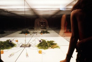
521d003de8e44effd40000a8_environments-and-counter-environments-italy-the-new-domestic-landscape-moma-1972-exhibition_5-528x362

Grid in the Moma: View of Supersurface: An Alternate Model of Life on Earth, by Superstudio, in Italy: The New Domestic Landscape, MoMA, 1972. Photo: Copyright Cristiano Toraldo di Francia.

(via: http://www.archdaily.com/421040/environments-and-counter-environments-italy-the-new-domestic-landscape-moma-1972-exhibition/)

As you understand now, Gherpe too is a piece of corruption. A mash up of conventions and brainwashing, which will, as you look at it, only corrupt and brainwash you more. Which is very true in the sense that, the more you know, the more you are stuck in the things that already are. Whether that really suppresses the development of humanity is questionable. I personally am less negative about the influences of the past and the conventions we get taught. But the fact that Superstudio deals so productively with their frustrations over a system is something everyone, defenitely every art student, can be inspired by.

Over thinking and commenting on how design works is something I find fundamentally important, as I think this self reflection is what can bring us to new insights. Insights that can be reflected on again later, a continuous process I’d say would be human development rather than corruption. But, if you are reading this, and you do happen to find yourself having been corrupted by looking at Gherpe and reading about it, then at least we can be sure about it’s relevance for the (design) world today.
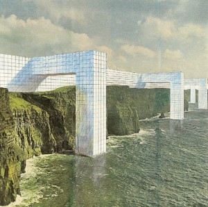
 

2701091233096716superstudio_monument_1_kl

The Continuous Monument, one of the many collages.

(via: http://www.spaceinvading.com/bookmarklet/Images/2701091233096716superstudio_monument_1_kl.jpg)

To sit like a swan


Monday, December 1, 2014

unfolded

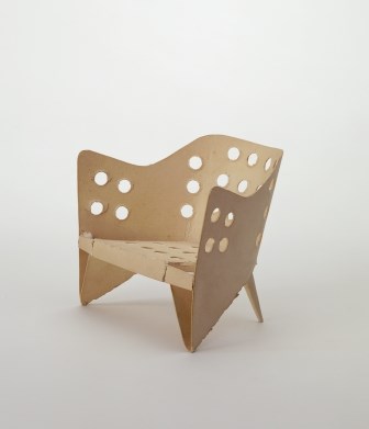
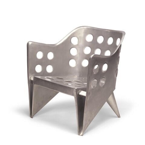
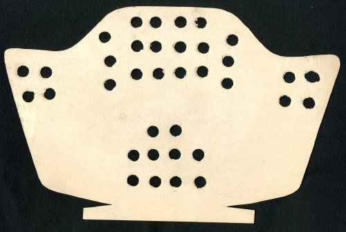
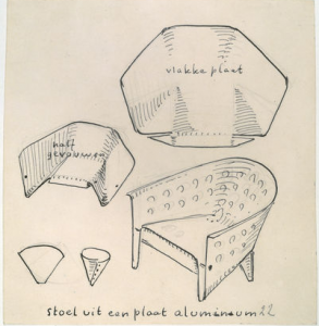
The object in this picture is a model of ‘aluminiumstoel’ by Gerrit Rietveld. It is simply a piece of paper cut in a way that when you fold it, it turns into a miniature model of the aluminum chair. The simplicity of this design is admirable, even though the final result in steel does not really give the same feeling of organic harmony. However, this model could not represent the creator’s idea better.


folded<a

Aluminium stoel model[x]

href=”https://designblog.rietveldacademie.nl/wp-content/uploads/2014/11/aluminum.jpeg”>aluminum

Aluminium stoel[x]


Rietveld made this chair in his attempt to create a furniture using one piece of material, or more specifically, one sheet of it. In this case, he used a sheet of metal for the chair we see in the picture and it is easy to understand how he handled the material to display the result in this, since we have at our disposal inside information of the designer’s process of thought, namely; this beautifully cut and pierced piece of paper. Rietveld also experimented with plywood to achieve an immediate connection of an idea with the act of making. When only one piece of material is needed to make an idea come to life, and when that material is so flexible that handling it seems as easy as drawing on a paper with a pen, then there’s a new type of harmony introduced to the design process; that of an immediate, fast action resulting in a beautiful and easy product.


Screen Shot 2015-04-17 at 12.58.59 PM

Sketch of Aluminiumstoel; notice how the designer uses method of folding as a starting point for his research[x]


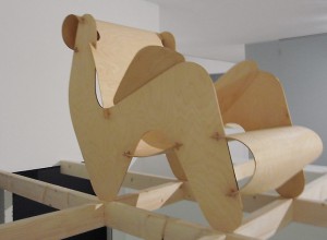
Rietveld and his contemporaries believed in a new world order, supported through their designs. In that world, one of the essential and necessary virtues would be the one of the minimum dwelling (das existenzminimum). For that to be achieved, all heavy labour would be replaced by machines, giving that way the man the freedom to use his leisure time in whatever way he thinks is best. In that world beauty and simplicity are the main gears of development. This is why in many Rietveld designs, in the model of the aluminiumstoel as well, we see a coexistance in harmony of these two and a lack of complexity which implies that the process of making of that object won’t result in valuing more than the object itself. For me, this is a reason why most of his chairs seem really uncomfortable; he wouldn’t want the owner of the chair to dwell in it for hours. There are examples of designs that embody perfectly Rietveld’s ideology, but were sadly never realised by him, like this chair of assembled plywood, designed in 1927.


plywood rietveld

Plywood prototype, 1958[x]


What I first thought when I saw the paper model – and what everyone probably thinks – is the old Japanese art of origami, the art of folding paper. The idea of folding a piece of paper in a certain way so that it creates a clear shape of something seemed really appealing when applied to interior design. More importantly, it seemed perfect for what Rietveld was aiming for; an oblect made of one sheet of material and whose existance would be a clear statement for an easy, free living of minimum dwelling.
Origami art has influenced many design-based branches, such as architecture, fashion and interior design. Its basic principles have even recently been proved to be beneficial for science when it comes to manufacturing. Assembled Additive Manufacturing is a new process of fabricating developed by researchers, which has origami principles as its base, as it treats 3D objects as multiple layers of 2D sheets.
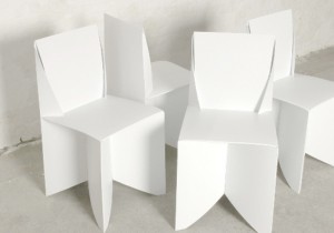
I was surprised, however, to see that most origami-influenced designs were really static and superficial; meaning that none of them took the idea one step further, none handled the art of origami as a general principle that could be the base of something bigger, or even as a statement. Designer Stefan Schöning came up with a design for a ‘folder chair’, where all that’s needed for its creation is a sheet of polypropelene.


folded chair

Origami folding chairs[x]

This example is really similar to what Rietveld was aspiring to do. Many similar designs have been realised, however it seems to me that they mainly aim at impressing the viewer, at making them admit that “that’s a witty design”, without committing a vision in it, nor giving the viewer and the world a tool for a better living, which will, in its turn, become a reason for contemplation.


WHAT HAPPENS WHEN TABLES BECOME CHAIRS


Monday, December 1, 2014

tafel-stoel


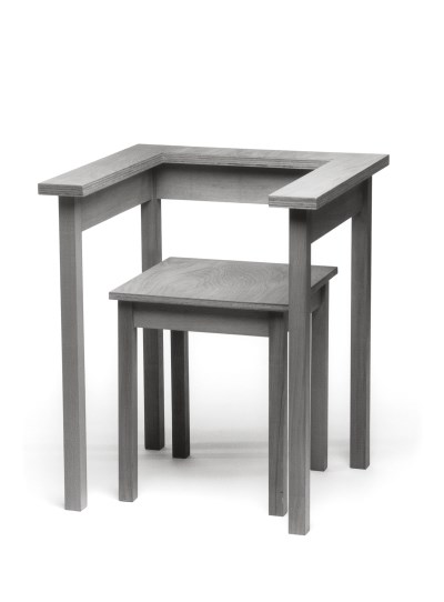
Wandering around in the Stedelijk museum my sight was caught by this ‘Tafel-stoel’ (table chair) by Richard Hutten (1990). It is part of the furniture collection. This collection will always have significance because furniture is part of the basics we use in life.
I was initially looking for an interesting chair, but this design didn’t look like a real chair. But then, what is a ‘real’ chair? To answer that question we’ll have to make up a definition of the chair in general. I would say that a chair is a design made for sitting with a backrest (otherwise it would be a stool). In this case there is a backrest present, but it doesn’t really function as such. I could imagine that leaning against it would make it fall. Therefore I would say that this chair is a case on the border of being a chair or a stool. Meanwhile it is also a table. Or actually it was. It looks like the former tabletop was cut out to become the sitting of the chair. Pondering about the traits of the chair I figured that this design item still has relevance for us in life and work nowadays. The question about the definition of the chair will always remain present and this chair is an example of it. Sometimes we can’t categorize items and that’s what makes these objects interesting to look at. They make us wonder and evaluate our attitudes towards the things we use in our daily life. And as Wittgenstein noted in his ‘Tractatus’ ; “we have to know about the connections between the objects we use to understand the world“.

They are always placed in a certain context. A table is not just a bare object, there are chairs around it, it is situated in a room, etc. With this philosophy in mind we might understand a little better why this chair is not easily understood. The connections are not clear.


The relevance of this chair will become more clear when we look at the reason why the Stedelijk came up with this collection to exhibit. The collection is considered on the basis of five themes, addressing aspects such as furniture in the collection which enjoys the status of international design icon and evolutions in particular kinds of furniture design (The furniture collection Stedelijk Museum Amsterdam – Dosi Delfini, L. A. [x]). The ‘Table Chair’ is an example of a conceptual design. Conceptual designs can’t be missed in an overview of furniture from (roughly) the last century, since that become a big focus in the world of art. Art can’t get more abstract than a white canvas. But ideas can go as far as you can imagine and beyond. And that’s where the conceptual art comes in. It’s about ideas, not about beauty and functionality alone. In Hutten’s work we can see the extreme clarity of form, which still leaves an unexpected amount of freedom in interpretation. “The austerity of his designs is the rare kind that makes you feel cheerful” (Richard Hutten – Ed van Hinte). As with the Table chair: it can be used in various ways, even in a way the designer could never have foreseen.


You could place the back- and armrest in another way then you would regularly expect. For example the other way around, so it becomes more like a table to lean on.


It is exactly what would give joy to Hutten and to me. I also like conceptual art a lot. But it can be a trap in which objects become too direct. Hutten knew about this pitfall and made sure that there was always enough space left for imagination in his designs. He said: ‘Traditionally design is about solving a problem. I don’t solve problems; I create possibilities’ (Richard Hutten: works in use – Brigitte Fitoussi). I share this opinion with him, because problem solving is one thing. Creating new things is something different. It is like grabbing something out of the air (which is quite hard). And it is like making a chair out of a table, which becomes a creature, challenging your common sense.


Form follows fact


Monday, December 1, 2014

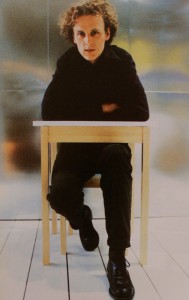
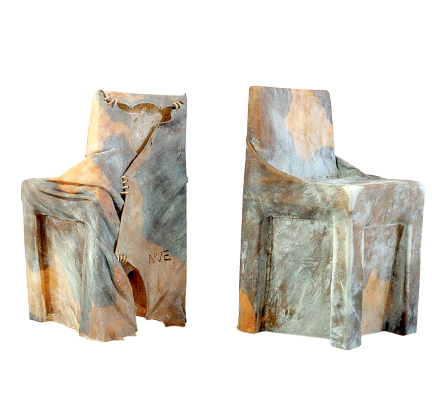
Cow chair was made in 1997 as a graduation project by the dutch designer Niels van Eijk. It is made from a single untreated cowhide which is stretched while soaking wet around a pre-consisting chair. It is left on the chair for a week until it has dried into a solid form. The idea was born when the designer looked down at his shoes and noticed how perfectly they were shaped around his feet. If this was possible, cowhide must have the quality to take on other forms, he thought, such as the shape of a chair. Van Eijk claims he is not a man of many words, he focuses on material and methods, which is clear in the case of the Cow chair. Despite that I think this chair is filled with relevant messages and comments on how we make and consume the objects surrounding us. It redefines the conventional use of familiar materials, It has strong relation to the discussion of using local recourses and it puts our attitude towards using animal products in context.

cow_chair_newmain

cow chair by Niels van Eijk 

The Cow chair does not try to conceal the single material used in its making. It almost looks like a newly skinned hide, having been laid on a chair at the tannery, waiting for further processing. Even the name of it has a very direct purpose, you are supposed to know that this chair was made of cowhide.
Normally, leather products have undergone such an intense working process that they do not remind us of they’re origin as much as the Cow chair does. As people of modern society, specially in the western world, have managed to distance ourselves from the source of the products we use that when we are exposed to the real thing a feeling of surprise or even repulsion arises. Sitting in a Chesterfield eating a fillet somehow feels more comfortable to most people than snacking on pigs ears and feeling the familiar texture of a cow behind your back.
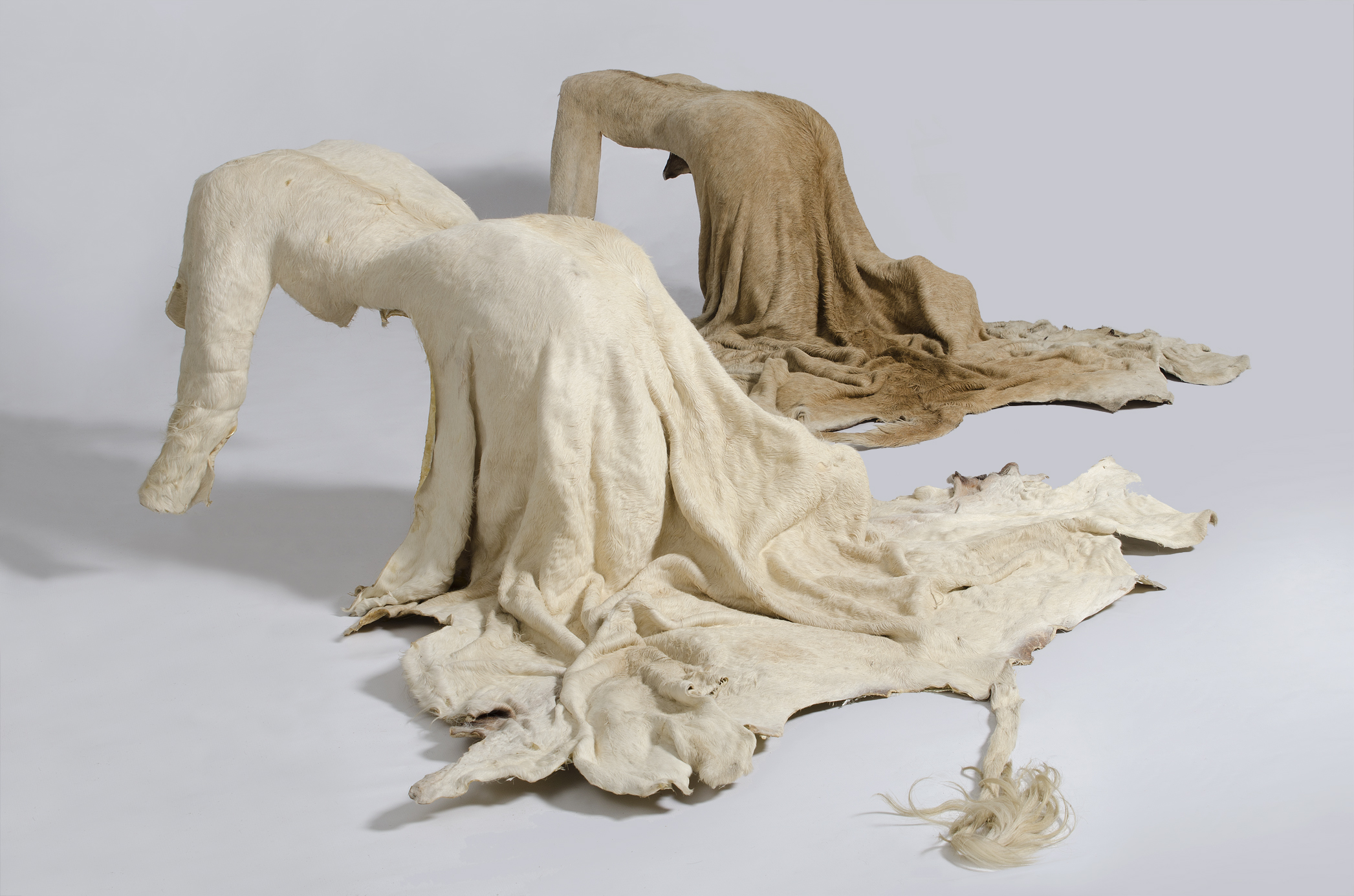
Since 1997 several designers have experimented with the use of untreated leather or familiar animal body parts and taken the familiarity of they’re origin even further than Van Eijk. The artist Nandipha Mntambo uses the same method of stretching leather to form hides around her body as sculpture material. By leaving the hides unshaven she achieves feminine, yet animal like objects. She wants to address the things we demand of the female body, and how we want to change it, shape it, shave it bare.

1-Mirror-image cut-final-websize1
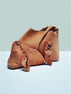
mirror image by Nandipha Mntambo • precious skin by Viktoria Ledig

Viktoria Ledig, a Swedish designer, used the tail, head and ears among other parts of the cow that otherwise would have been thrown away to make a line of products called precious skin. She tanned the body parts with a method that kept all the characteristics of the skin, so the final products had obvious wrinkles and blemishes along with a pale yellowish colour not so different from a humans skin. When describing the reason behind the project she asserts the following:
Leather is dead animal skin. This is perhaps the raw reason behind the human fascination with it. It is beautiful, precious and grotesque at the same time. We sometimes forget that touching leather is to handle a former living being’s hide.

The project and other similar ones for example Rachel Freire´s nipple dresses have caused a strong negative reaction, a louder outrage than is heard every time a designer puts out a more conventional product made from animal products.
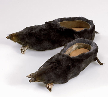
When Jan van Eijk later formed a studio with his wife and co-designer Van der Lubbe, they designed a product with a more deliberate intention of discussing use of animal products. They used mole rats that had been killed on golf courses in order to make the experience of golf playing more comfortable. The product was a pair of loafers made from the whole body of the rat, hair, tail, nose and feet still attached. I think this work is a great example of putting our claim on nature into context. Although the making of these loafers used material that otherwise would have gone to waste, wearing them is an uncanny reminder of the animals fate. In the same way removal of an unwelcome animal only for increasing human leisure seems unnecessary or even cruel but it can easily be hushed or forgotten.


mole-4

moleshoesloka

leather football shoes by Adias • mole shoes by Van Eijk and van der Lubbe

The method Van Eijk used to mould the leather is very inspiring. The finished object is not soft and smooth but hard solid enough to stand on its own as well as supporting  a human being. I think it invites us to discover endless ways of using hide to construct objects. It isn´t too different from the way many nations made their first books, or the way old drums and other instruments are constructed.

By stretching the hide with water there is no need to use toxic chemicals to preserve the material and prevent it from rotting. This is on the other hand unavoidable when tanning leather, even if it is done in the most eco-friendly way. So in fact using the hide as done with the Cow chair and the other things mentioned above makes far much more sense than using it to make soft articles such as shoes and clothing.


Screen Shot 2015-04-17 at 13.42.11

Screen Shot 2015-04-17 at 13.42.36

Making of prototype 1 by Garðar Eyjólfsson

Garðar Eyjólfsson uses a similar method of shaping leather while making lamps by pouring hot water over it. Instead of selling the lamp around the world he shares the way of shaping the lamp shade with a video. By using such a simple method and sharing it on the web he makes it possible for people everywhere to make use of it. He transports an idea, not a material, and therefor makes it possible to produce the lamp in different places with local materials. I see that same quality in the Cow chair as well.

In the times where our consumption of material is unsustainable and our sources do not renew themselves fast enough it becomes a part of the designers job to go out of his way to source new solutions. Contemporary experiments with bioplastics, biomimicry and new ways of recycling are a important part of this process. But I think it is equally important to reinvestigate our old materials, our old methods, just as Jan van Eijk did while designing the Cow chair. How can we use them or parts of them to create things in a better way than we are doing now?

cyber and (un)aware


Monday, December 1, 2014


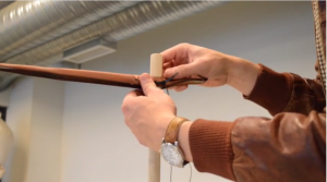
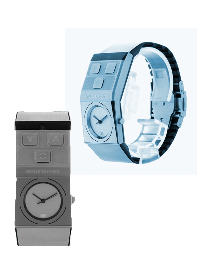
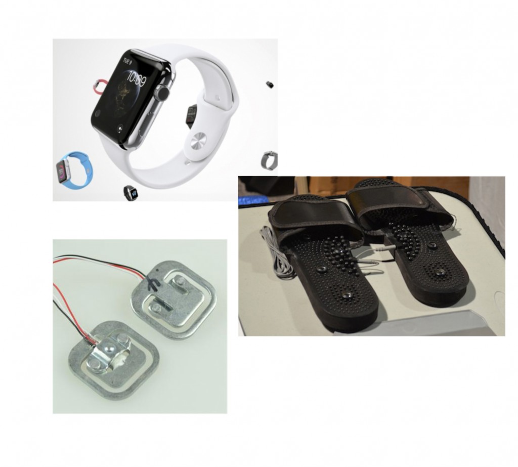
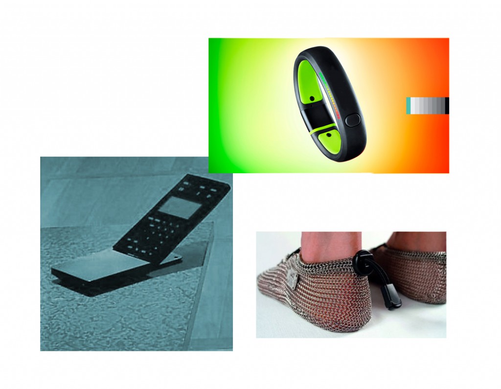
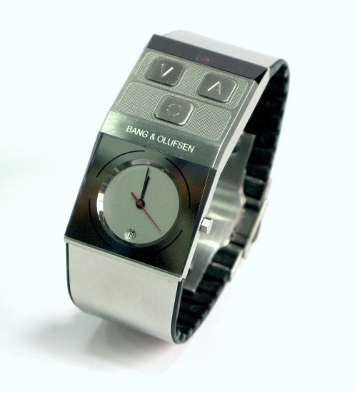
Jacob Jensen’s 1997 waterproof Beowatch (produced by bang & olufsen) was designed as a personal, unisex timepiece that makes telling time convenient and accessible. additionally, it also functioned as a remote control that controlled the volume of later bang & olufsen music centers. this design prompted me to question its present-day relevance in the design exhibition at the stedelijk museum, Amsterdam. over the last two decades the technology industry has undoubtedly grown and so has the way in which people engage with methods of measuring time. it is noticeable that less people wear wrist-watches everyday and the norm has adapted to using smartphones or other multifunctional devices to keep track of time.

this research will further discuss the design of the Beowatch in relation to the myriad of social questions it raises such as today’s security in wearable, intelligent technology and the aesthetics of unisex design.

b&o-image1

few wearable objects are designed to be unisex, particularly jewellery (if we classify a wristwatch as jewellery). i am drawn to the statement this wristwatch is indirectly raising about society’s perceived aesthetics of gender. the design is created as ‘neutral’, an object that is seen through its own entity- regardless of preconceived ideas of masculine and feminine beauty. throughout history, wearable objects or fashion, has had a very divisive characteristic – creating standards and room for assumptions. this design forgoes these notions and is created as its own autonomous form.

balancing aesthetic and (multi)functionality reiterates how the Beowatch was very modern for its time;.Jensen’s approach to design drew my attention as he states “…we expand our concept of…what a watch should look like. the sight of an object does not necessarily have to show its function…” (1994, Jacob Jensen design [paperback], Paul Schäfer). this relationship between functionality and aesthetic is a core issue that designers are faced with.

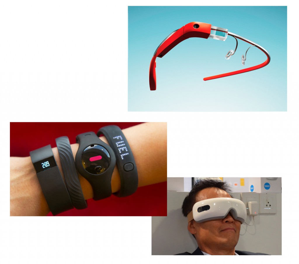
however, it is a challenge nowadays between technology and its external design. technology is becoming increasingly intelligent with wristbands/watches that gather data to measure heart rates, count steps, give directions, forecast weather, play music, interact with other devices, predict the position of the moon etc  and the visual appeal of wearing this technology. for example with the recent design release of Apple’s iwatch and Google’s glasses there is already considerable criticism on this ‘cyber-human’ image and artificial intelligence we are sometimes reluctantly and often unavoidably accepting.

b&o-image2

Jensen redesigned the concept of a remote control in the Beowatch by making it multifunctional (acting as a remote control and timepiece). similarly, designers today are changing conventional objects into ergonomic designs that fabricate, sync or react together with the human body. there is an evident focus from the technology industry to attach these gadgets and lumped plastic to people especially by getting them onto wrists. of course there are many benefits of having such tools; they are accessible, readily available and can make tasks faster. however, the fact that these devices become so quickly absorbed into the culture of everyday society is blurring the boundaries of our true basic needs.

they are also perhaps just purely adding insult to injury- for example do people need to know how little sleep they are getting? or if they have eaten too much on one day compared to the next? or if they have skipped a day of exercise? this data collection that these devices provide may give us information but it is still not enough, what is more important is the reasoning- why we slept/ate bad and missed exercise, for example. simply knowing these facts without reasoning is the added ‘insult’ to the injury/damage that has already been created. for instance if your watch tells you that you haven’t exercised enough, things that you probably know already, would you change your routine just because your watch is telling you? in most cases, not. there are versatile calculations everywhere, but the problem is what to do with this information and how to interpret it.

it is irrefutable that the pace of technological advancement is remarkable; but this also affords the risk that people will develop a better reading of their technology/ wristbands and lose their sensitivity and awareness in reading their own bodies.

b&o-image3

since the Beowatch, wrist technology has advanced further than the individual, as over the past decade debates have risen over personal security and privacy. it is unknown to the individual how much is known about them through their digital dossier. we are uncertain about where our information is stored or if it is being used for analysis; examples we have witnessed recently include the NSA files, cyber-hacks with phone applications and celebrities, Facebook scandals, Wiki-leaks and much more. these personal items have the potential act as a sensor or tracker, they constantly collect data which are ‘invisibly’ fed to different networks. though this subject may seem far fetched from the design of the Beowatch, the design is relevant as it marks part of the evolution of our technological reliance and dependence. it is uncertain where this line is between the personal object and a device that is actually just a form of data to a bigger establishment.

b&o-image4

the Beowatch nowadays represents a certain phase in design (1993-1996) as well as the literal time. it represents the start of multifunctional, human-fitted technology. though now the object is more about its face than its function, being presented in a showcase at the Stedelijk Museum, it is still highly relevant and raises many direct and indirect issues. As the son of Jacob Jensen said in an interview: “a product which survives the test of time, even when it has been out distanced by technology, contains a concise idea carried out at the right time, and with an aim of thorough reworking” (Timothy Jensen in Jacob Jensen design, 1994, Paul Schäfer). though technology has definitely distanced since 1997, the design of the Beowatch has survived by providing a mark for its time as well as offering insight into how we should speculate the future of cyber-human technology.


Stedelijk Design Show 2015 /Relevant Highlights


Monday, December 1, 2014


16 Rietveld Basic Year students visited the Amsterdam Stedelijk Museum to examine the items in the permanent survey of the design collection.

Does the Stedelijk exhibit all these design items simply because they are in their depot.

Do the collection criteria still have any significance today.

Do these design items have any relevance for us, our life or work,now? Is it possible to make a clear statement about that.

If you click on the image a caption will appear –just as a in a real museum– presenting information and a personal reflection on why that item is considered relevant. You can review the whole exhibition in pop-up mode.


click on images to visit the exhibit

Gijs_Bakker_Waterman_2_Cropped

modelWieke_stool_SM

PatrickJouinWelcome-To-The-StoreBeowatch_SM2

tafel-stoelunfolded

DSC_0321 Schuitema_300

superstudio_gherpe_flippedVaclavCigler_headband

cow-chair_flipped Paulina_glass


The London Supplementary Design Show


Friday, November 1, 2013


< LONDON DESIGN >


< CAREFULLY SELECTED FOR YOU >


17 Rietveld Foundation Year students visited London in the first week of October 2013 where they composed their own London collection of design highlights.

Items were selected from the collections of many renown institutes like the British museum, Victoria & Albert, The Design museum, Off-site ICA or galleries (The White Chapel, Ravenrow etc…..). What is interesting for us? What do we like and why.

Previous to this trip we did visit the permanent design presentation in the Amsterdam Stedelijkmuseum. Compared to the items we selected and researched there [project: Design in the Stedelijk-3], this show presents a personal comparison between that and those of the London institutes.

If you click on them a caption will appear –just as a in a real museum– presenting information and a personal reflection on why that item was selected.
Researching contemporary design we present this “The London Supplementary Design Show” as a mirror of our own selection motives, an imaginary online exhibition space with items carefully selected for you.

click on images to visit the exhibit


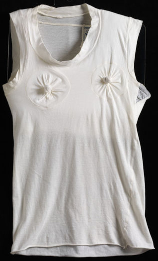
Spira-Ribb Westwood_T-shirt

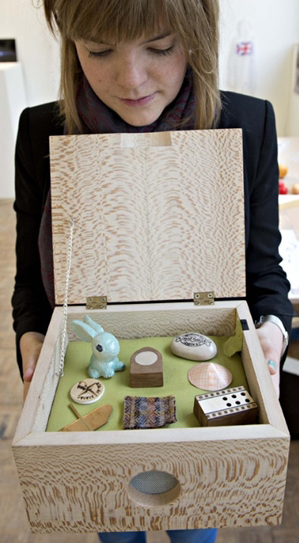
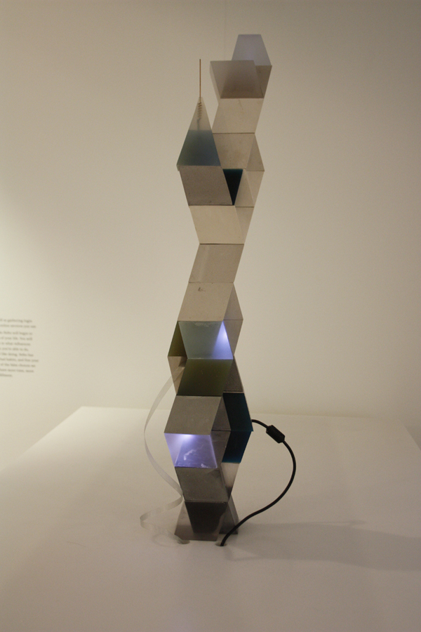
no_angle_no_poise_tiagodafonseca_2 ChloeMeineck_music-memory-box GatewayRouter_redu

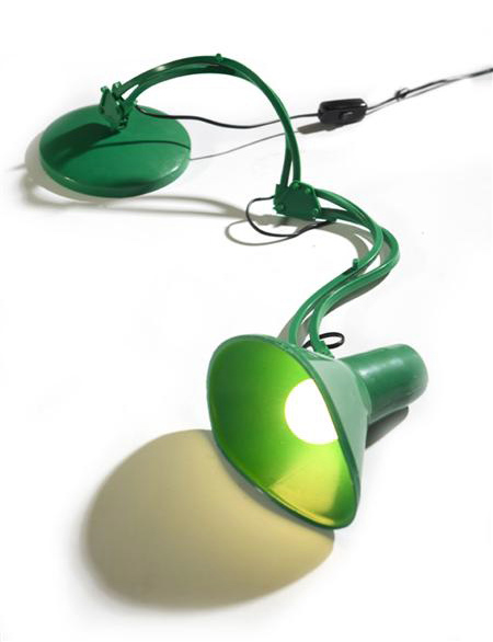
8_snow_white_wrist_redubrave-new-world-lamp_1helmet_cropped

Samoerai-armor Sottsas_London_Item_LeftSottsas_London_Item_Right RavenRow_poster_tadanori-yokoo

MarjorieSchick material 3d printer

selected by Wiebe Bouwsema WillyBrown_redu TrojanColumn_VAA G_Force_Cyclonic_James_Dyson


Lamp Science


Saturday, September 28, 2013


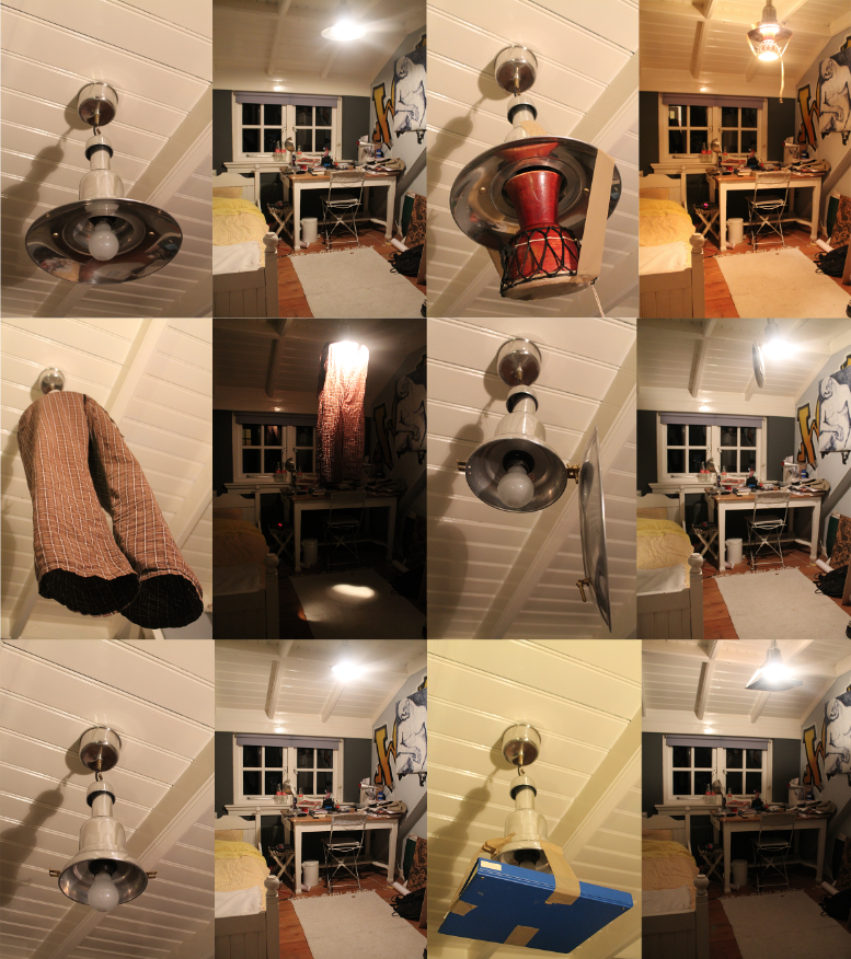
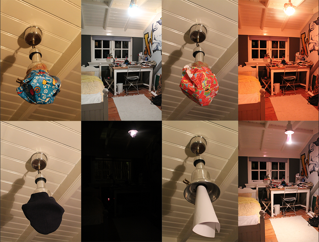
Gispen’s Giso lamp (model 24)

A lamp, a simple product. A lamp only needs to give light, you have to turn on the light and after that you don’t have to touch it anymore. So a product designer is not really limited to the function of it, except the fact that it must give light. Or is this not true? Despite of all the possibilities to create a decorative lamp, Willem Hendrik Gispen made a really minimalistic lamp, the ‘Giso Lamp’ []. Only a white opal glass shade and a frosted glass above it, but that simplicity, I think, is the power of it. Willem Hendrik Gispen (1890-1981) was a dutch designer. In 1916 he began his own forge, called ‘W.H. Gispen & Co’, where he created crafted products. But in the twenties Gispen  became increasingly influenced by the design ideas of De Stijl and he switched from traditional to mechanized production. In 1926 he designed and produced the Giso lamps, it became a big success. The Giso lamp (Nr. 24) is a pendant lamp and  has a shade made of white opal glass that is 25 cm and a frosted glass disk that is 43 cm, the stem is made of nickeled metal. The opal glass ensures that the light is not really intense, but soft. The disk ensures that the light is not going up but only going down, the reason why most of all the lamps have a hood is interesting. Maybe a lamp is not only to give light, but also to give it a direction. There are a lot of Giso lamps [], but I think Nr.24 is one of the nicest, because of that disk above the shade.

This lamp is an interesting starting point to look at the vision of Gispen about de art of light. Gispen says that in the theatre the only place is where they control the light so good, that it became a real lighting art. This is because they focus on the most essential element: the light, and they are constantly occupied with the goal: lighting. If you want to make a lamp, you should be aware of the technique and also the goal: the right light on the right place. The requirements that must be set by a good lamp are  of different kind: physically, technical, economic, psychic. There are two groups that create lamps, but not with all the suspects. Architects and artist only focus on the psychic suspect, but then rarely on the main points of this suspect: colour and mood of the light. They only focus on the carrier of the light source, the lamp or ornament. The meaning of a lamp and the way to show it be interchanged. He thinks of all possibilities, an interesting way of hang up, or he creates lamps in the form of a square, instead of round, or a lamp out of wood. He thinks about everything except the fact that a lamp must be an object that light the space as good as possible. The other group is the group that only focus on the technical and economic suspect of a lamp, they want to create the best formula: the most light for the lowest costs. A lot of calculations and math, but a moderate result.

Gispen_Model24_redu

 
I will explain the different requirements.

The physic requirements: the light must be calm and not flicker, that is harmful to the eye. Also the light must not be too strong, that is also harmful for the eye. So you have to cover the light source. You can see how it is done in the Giso lamp. The shade is made of Giso-glass, the best kind of crystal glass, in minimal achievable thickness, (1mM.) covered with a layer of white glass, to a thickness of only 1/5 mM. They make the light pleasant and soft and only lose 10-15% of the light. Also the light must not be too weak. If the light is too weak it requires too much effort from the eye.

The technical requirements: the light out of a lamp can be controlled, by the use of reflectors, diffusers and light-breakers. The light can be absorbed and reflected, the way it absorbed and reflects depends on the material that is used for the reflectors, diffusers or light breakers. So you need to know about materials if you want to create a good lamp. There are also three different ways of lighting: – direct lighting. The reflector is so made that the light goes straight to one place, and is very concentrated. Examples are outdoor lighting or lights in a storefront.

-Indirect lighting: you get this light to let the light first been shined on to the ceiling. But the shadow it creates is so small that you get a surrealistic feeling, and also it is really expensive because the efficiency is only 35%.
-Half-indirect lighting: the best for general lighting. You’ll get this light if you put the lamp in a diffuser of a particular form. The light will shine in all directions . The Giso lamps are made to create this half-indirect lighting. But what you can see, the Giso lamp Nr. 24 has also a reflector above the diffuser, so the light won’t go up to the ceiling.

Economic requirements: maximum efficiency at minimum power consumption. Giso glass is perfect for this efficiency. It has a huge perseverance.

Psychic requirements: the place where a lamp hangs is of course important for how it looks like, a lamp in a living room must be different than a lamp in a party room or a storefront. As you have read there are many different requirements that a lamp must meet. They already decide what a lamp should look like, but you still can design a lamp as good as possible. For example Gispen uses soft gold bronze instead of dark bronze, so there is less contrast between the white shaves and the metal. The Giso lamp (Nr. 24) does not hang on a clumsy chain, but on a fine metal tube.

So maybe it was not true that a lamp is just a simple product. You have to be aware of all kind of different suspects if you want create a lamp, as Gispen did. But if you think it doesn’t matter at all, you can make whatever you want, without looking at all the requirements. (in my experiment I look don’t really look at the requirement, only at the atmosphere.)


Light experiment

Experiment

So now we know what Gispen thoughts were about light. I wanted to do my own light experiment. I changed my lamp into different forms, to look what will happen with the lamp and my room when I make small changes. I used my lamp in my bedroom that has a reflector above the lamp, so the light is more concentrated on the floor and less on the ceiling (like the Giso lamp number 24). I put all kind of different things under the lamp or covered it. The changes are huge, you can see it in the pictures, but it was even more in reality. If we look at the physic requirements I think Gispen would say that I made really bad lamps, because they are often too weak. Personally I like weak light, I liked the one with the white paper around the lamp, and the light concentrated on one point of my room and the rest of the room was less light. Economically it were also not really good lamps, a lot of light gets absorbed so it was not really: maximum efficiency at minimum power consumption. But my experiment was not about creating a good lamp. But about what little changes to a lamp do with the atmosphere of the room. I found out that it changes a lot to a room, but also really your mood. When found out that when the light changed, so my view at my room changed, so my mood changed. The best example was maybe the one with the color, the blue was cold and the red warm. Also the weakness of the light matters to my mood, the darker, the more I get into a mysterious almost melancholic mood. So I discovered through this whole research the impact of a lamp in a room. And that is bigger than I first thought.


Light experiment


i see, i see what you don’t see


Thursday, September 26, 2013

Walking into an environment filled up with design items is interesting and tough at the same time. It is interesting to see how the items communicate with their surroundings especially because they were never meant to stand next to each other. Of the many design pieces i liked there was only one which both attracted my attention as well as my imagination.

A piece that is part of the cubic structure collection from 1964 by Jan Slothouber and William Graatsma.

Jan Slothouber and William Graatsma - cubic structure (1964)

Because the plastic material is transparent, the colours are being mixed on the white textile. For a moment i could not recognize if the textile was dyed or not. It was a sort of visual illusion and in the meantime i asked my self why is this soft and kind material locked into a hard plastic box? Is it design or is it art?

jan slothouber

William Graatsma together with Jan Slothouber began to work for the Dutch State Mines (DSM) in the beginning of the 1950’s. Their job was to create and develop packaging, product applications, advertisements and exhibitions, thereby establishing DSM’s corporate image.

cubic constructions p139_515pxcubic constructions p205_515pxcubic constructions p203_515px

They experimented with cubic constructions, developing them for applications in exhibition design such as the 1958 World Exhibition in Brussels. They limited themselves and decided to use almost only the cube as form or starting point, thus they tried to determine the principle of cubic constructions.

cubic constructions p158-159_1000px

Jan Slothouber was opposed to individualistic movements such as the painters of Cobra, and preferred a more ‘democratic’ artistic form, whereby the cube was the universal shape that everybody could understand and use. In fact he was an architect, he believed and practiced what Louis Sullivan [x] said in an article in 1896; “form ever follows function“.

Slothouber and Graatsma went on to found the Centre for Cubic Constructions (CCC). In 1966, CCC won the Sikkens Prize (jointly with Peter Struycken [x] and Johannes Itten [x]), for their innovative contributions to art and design. Their approach to commercial exhibition design earned for Slothouber and Graatsma an exhibition in the Stedelijk Museum in 1967. Design, dimensions and experiments in colour and lettering, all in relation to the cube, were being displayed under the title ‘Four Sides: Size, Shape, Colour, Letter’ (Vierkanten: maat, vorm, kleur, letter). Three years later, they represented the Netherlands with their Cubic Constructions at the Venice Biennale in 1970 (GRA Library).

cubic constructions p408_515pxcubic constructions p409_515pxcubic constructions p407_515px

After all this success, they were known by the public as artists instead of architects or designers. This became very visible when they were asked to design the post stamps for the former PTT in 1970. The profit from selling the stamps went to a charity for children. During that time, the PTT had a lot of critique for choosing such an “avant-garde artists”. The charity was afraid that the designs were to abstract for the bigger public and the stamps would not have been sold.

ccc_postzegels_515px

After his carreer at the DSM, in 1970, Eindhoven’s Technische Hogeschool invited Jan Slothouber to set up a Faculty of Form Theory in the new architectural engineering department. Together with his students, he developed ‘new cubic constructions’ (nieuwe kubiese konstrukties).

As professor of the new faculty he gave several lectures on a regular base. In 1971 one of his public lectures was “The form of our surroundings“, where he explains that our surrounding is built up by creatures, objects and happenings, and they are visible because of their shape. Our surrounding exist, because we see, experience, think or execute it, but everybody experiences it differently, because everybody’s awareness of the surrounding is different.

Therefor we are unable to talk about it as something common, it is only an apparent similarity because we perceive these shapes the same way, but it doesn’t mean we experience them on the same way. Sensory observations like sight is measurable, but our personal emotions change the result. Our feeling can influence our perception of the surrounding and that is why our surrounding can occur differently for everybody. The emotional perception is highly underestimated in architectural design, only invisible form aspects can be experienced. But for pleasure both (visible and invisible) form aspects are important.

Furthermore he explains the importance of the usefulness in our surrounding, whereby he mentions that the architect has to distance himself from artistic ambitions. These ambitions make the livability dissimilar for every levels of society. The best thing to do is to create an understandable form language, a base for our communication with the constructed surrounding. Human perception should be the priority of design. To achieve this, we need to cooperate with science, technology and art.

The object i have chosen was a result of a series packaging whereby he experimented with different materials inside the cube. The relation between the materials and the transparent, sometimes colored, plastic cube. His research has been shown in the Stedelijk Museum and the Venice Biennale, so what is this object? Art or design? Is it important?

Slothouber has done a lot of different things in the past so it is difficult to say where this object could be categorized. His design research has been shown on art exhibitions and his designs has been criticized as too ‘avant-garde’ art. He is erasing boundaries between design, architecture and art. The object I have chosen, the object where my all research started, is not just design, architecture or an artwork. it all comes together in that piece.

Jan Slothouber was an admired teacher, although it wasn’t always clear for his students if he was totally crazy or a genius. One of his students was John Körmeling. In his work the influence of Slothouber is highly visible. They both share the similarity of outlook on the erasure of boundaries between design, architecture and art.

video of the rotating house in Tilburg by John Kormeling


everything is relative,
even cubic regularity.
many things are true
and few are certain.
form is only a means,
just like cubic construction.
important is the aim
that finds expression by it.
an idea can be made visible
by the shape of a construction.
reconstruction of the idea however
is often a difficult task.
we beg your pardon
for our cloudiness.
we hope you will discover yet
the aim of cubic constructions.

– a cubic construction compendium, 1970


Stedelijk Design Show 2013 /Proposed Highlights


Monday, April 8, 2013

19 Rietveld Foundation Year students visited the "Stedelijk Collection Highlights /Design". Marveling at the many masterpieces, commenting on the applied or autonomous character of pieces in this highlight presentation, they arrived at the last part of this "depot salon", wondering what contemporary design would have in store for them and how it would look like. To their regret the presented selection faded out without any opinion on the latest developments in design; social engagement or neo crafts
Researching contemporary design we propose this "2013 Supplementary" as a possible continuation, an imaginary online next exhibition space.

click on images to visit the exhibit


selected designers are: Mark van der Gronden /site • Daan Roosegaarde /site • Tauba Auerbach /site • James Dyson /site • Ferruccio Laviani /site • Mediamatic /site • Leonid Tishkov /site • Jonathan Ive /site • Liliana Ovalle /site • People People /site • Nucleo /site • Faltazi Lab /site • Michelle Weinberg /site


Log in
subscribe