Skip to Content Skip to Search Go to Top Navigation Go to Side Menu


"Colour-Systems" Project


RedGreenBlue


Monday, February 26, 2018

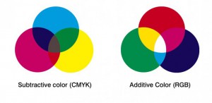
RGB is an additive colour model, meaning that lights are added together in different frequencies to create colours. For example, when red and green lights are added together they create a yellow colour. This is different to a subtractive colour model where colours are created by mixing dyes, pigment paints etc. which then absorb parts of the full spectrum of colour frequencies available in white light and reflect other frequencies which then give the surface it’s colour.

additive-vs-subractive1x

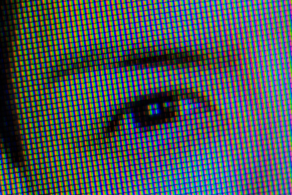
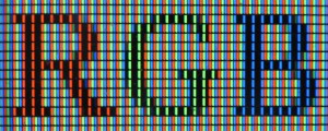
  RGB is used in digital colour sensors and digital colour displays and projectors. Each pixel on a screen has three tiny light sources, red, green and blue in colour. These emit different brightnesses which in the combined effect create the specified colour of the pixel. The sum of all the pixels on the screen will create an image.

LCD_RGB

  These three colours, Red, Green and Blue, are chosen because they correspond to the way the human eye sees colour. We have photo-receptor cells in our eyes called rods and there are three types of rods. One which detects long-wave frequencies of light, another for middle-wave and another for short-wave. Specifically, these correspond to the frequencies of blue, green and red.

eye


The first experiments with RGB were with colour photography in the 19th century. The same photo would be taken with a red, green and blue filter on black and white film and then composited together in printing. Here is an example of the Russian photographer, Sergey Prokudin-Gorsky who used this technique in the early 20th century:
 

Sergey-Prokudin-Gorsky-Composite


CMN Colour System


Sunday, February 25, 2018


01cmn


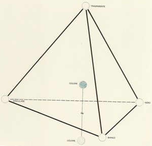
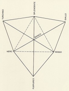
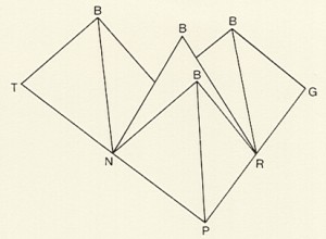
The CMN system was first introduced in Venice, 1986. Colours transform; they get brighter and darker until they eventually become white or black, as well as altering the quality of transparency and reflectiveness. The system shows why and how colours appear, change and disappear. Eat point of the tetrahedral structure marks the different qualities in reflectiveness, transparency, brightness and darkness the colour can posses. This single tetrahedron can be combined with others and create a complete range of spacial models required to find the origins of the colour as well as reflect the intentions of the observer. Despite transparency and reflection stemming from an object which is illuminated, the colours appearing will be the result of the contribution made by the observer. The effect these two qualities have on colours is at the forefront of this colour system, as it is the first to consider transparency and reflection in a colouring ordering system.

The tetrahedron construction was a form first seen in Plato’s geometrical idea of colour. The radiance must appear along side the colours and have equal value, only white being allowed dominance. The tetrahedron is taken as a basis, three can be assembled with their tip representing white interlocking acting as the central point and remains colourless. This forms a second triangular plane with a colour appointed to eat corner. The white centre being empty allows colours to be mixed. This idea given by Plato is not a formally constructed colour system, rather the personal view is intended to aid understanding the colour mixtures he describes.

pyt02    pyt03

Herman von Helmholtz colour theory


Saturday, February 24, 2018

Hermann von Helmholtz was a German physician and physicist. He was born in 1821 in Potsdam, Germany and died in 1894. Hermann von Helmholtz was a pioneer in several scientitv fields, and made significant contributions. In the field of physiology and psychology he is specially known for his studies of the mathematics of the eye, ideas on visual perception of space and colour vision research. In 1851, Helmholtz became world famous, after his invention of the ophthalmoscope – an instrument that could examine the inside of the human eye. Together with Thomas Young, an English physician, he developed a theory of trichromatic colour vision. The theory assumed that the eyes retina consist of three different kinds of light receptors for red, green and blue. The trichromatic theory was quickly accepted, so Hermann von Helmholtz continued to study colour.

The colour diagram appeared for the first time between 1856 and 18867 in his famous manual of psychological optics. here, Helmholtz introduces three variables; hue, saturation and brightness, all which we are still using to characterize colour. These variables were chosen to correspond to the three parameters of sound, amplification, pitch and timbre. Helmholtz discovered that the only difference between sound and the perception of colour is that the eye cannot differentiate between the components of a mixed colour, while the ear can easily identify separate elements of sound.

Helmholtz was the first to demonstrate that the colours which Newton has seen in his spectrum are different from colours applied to a white base using pigments. He discovered how spectral colours shine more intensely and possess greater saturation(1). In the manual he also submits that James Clerk

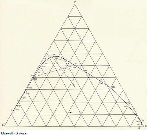
Maxwell’s triangle Screen Shot 2018-02-05 at 09.56.41 is too small to accommodate the saturated spectral colours, and that Newton’s colour spectrum neither did explicitly refer to trichromatic theory. In the colour diagram, the spectral

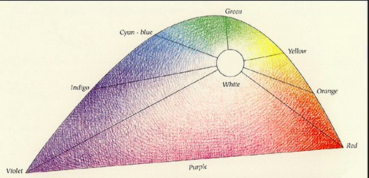
colours is arranged on a curved line Screen Shot 2018-02-05 at 09.43.54, to achieve a better understanding of their mixtures. In order to attain white, Helmholtz discovered that it did not require equal quantities of violet-blue and yellow for example. The diagram is instead arranged so that the complementary colours that required a bigger amount to obtain white, were given a greater authority. Helmholtz then did a modified version of Maxwell’s construction of the triangle, and arranges the colour diagram inside the triangle, with the spectral colours having varying distances to white, which lies in the center of the triangle.


Michel Albert-Vanel’s Planetary Colour-System


Thursday, February 22, 2018

In 1983, the Planetary Colour-System, was introduced by frenchman Michel Albert-Vanel, with the intention to organise colour perception multidimensionally.

Albert-Vanel created a so-called Plantetaric Room, in which the colours move like planets in a solar system. The floating planets represent four primary colours, which refer to the psychological primary-colours of Ewald Hering. Albert-Vanel incorporated Herings’ psychological primary colours (Yellow, Red, Green, Blue) into his planetary room. The secondary colours – that connect the primary-colours – are moons and thus orbit the planets.

01van

We almost never see colours isolated but in combination with others, which puts them directly into a context. The planetary system tries with the introduction of new parameters to describe this context in which a colour exists. In order to point out an individual colour, contrast and material are added to the usual parameters of hue, brightness and saturation.

02van

The contrast-parameter unites three new scales (again hue, brightness and saturation) describing a group of colours (the context), to later point out the individual isolated colour.

The scales of the material-parameter describe first if a colour is active (light) or passive (pigment), second if it is transparent or opaque and thirdly: matte or gloss.

With the incorporation of this context a colour is put in, the planetary system involves the natural effects of our colour perception. It considers, that we see colours differently depending on the surrounding it is put in.


Log in
subscribe