Skip to Content Skip to Search Go to Top Navigation Go to Side Menu


"book design" Category


k-r-k > eflux > art essay > web journal > printed reader > automated design


Wednesday, October 29, 2014

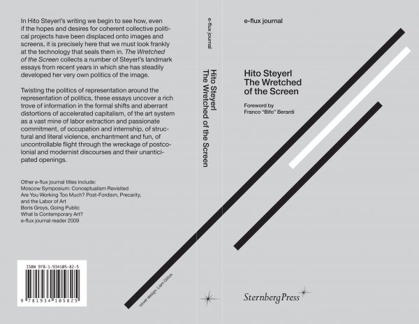
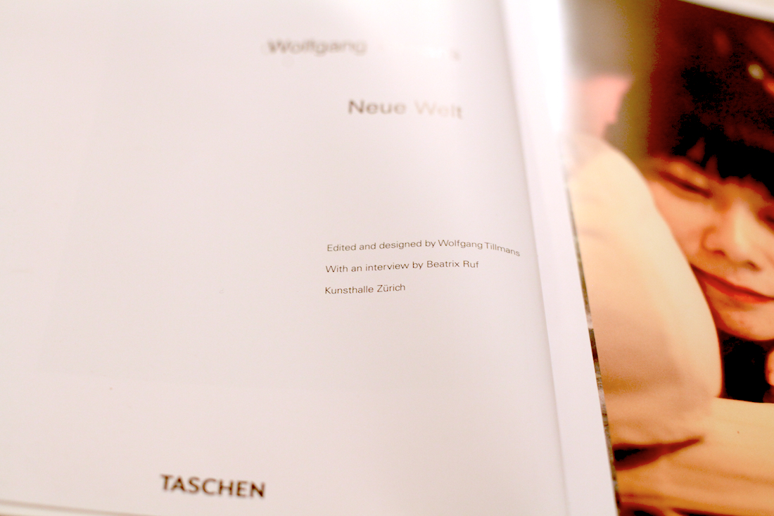
Publication: e-flux journal, Hito Steyerl – The Wretched of the Screen

Publisher: Sternberg Press

Designer: Kloepfer-Ramsey-Kwon


th_b6013a5beacabcb919d3a6564ae91b58_eflux_hitosteyerl_cover_497


e-flux sprung out as an autonomous platform for art critique and comissioned art theoretical essays in 1998, eventually launching a monthly online publication consisting of a text heavy PDF in near A4 format, in 2008.

Jeff Ramsey (of design studio Kloepfer-Ramsey-Kwon) studied graphic design at Werkplaats Typografie in the Netherlands around the same time as e-flux was drafting their online publication. Through a local contact he was given the design assignment, containing few artistic restrictions. Working with a programmer he developed a tool that would operate according to a number of pre-determined rules (i.e. pictures should stand alone on pages, be placed as close as possible to their point of reference in the text, be sized according to importance; which in turn are factors assigned by the writer or editor, not the designer, when feeding the text into the template).

The first 5 issues of e-flux journal were supervised by the designer but have since been laid out solely by the editors of e-flux. The template tool is thus a wysiwyg-layout software custom made for this particular purpose.

As the number of web based journals grew e-flux aspired to publish a physical, printed paper reader; grouping new and previous essays by theme. Some of thus far 9 published readers are named/themed:

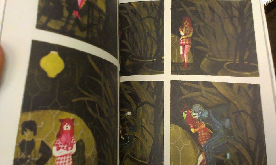
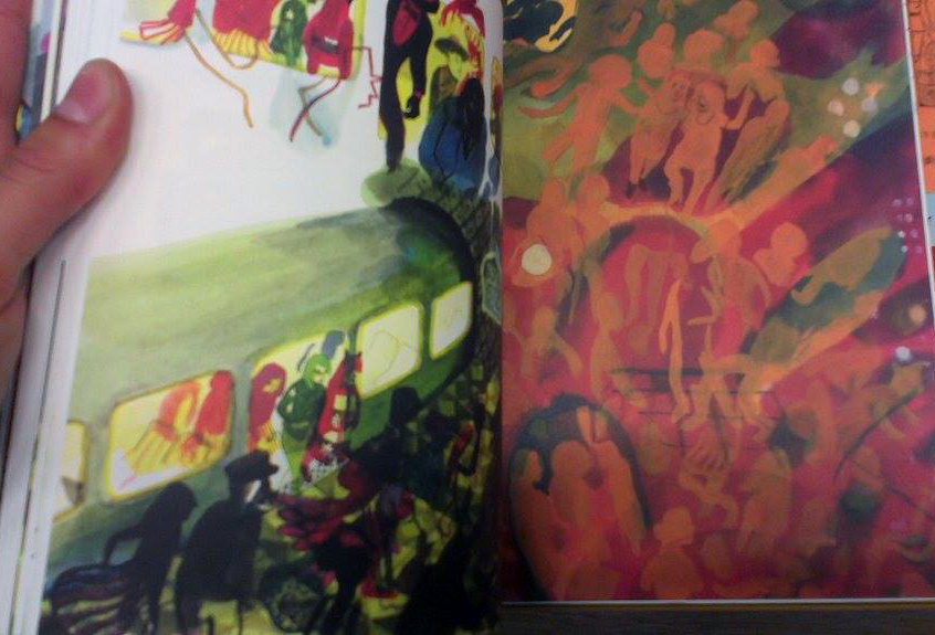
What Is Contemporary Art? / Are You Working Too Much? Post-Fordism, Precarity, and the Labor of Art / Moscow Syposium: Conceptualism Revisited / The Wretched of the Screen / Culture Class / Going Public

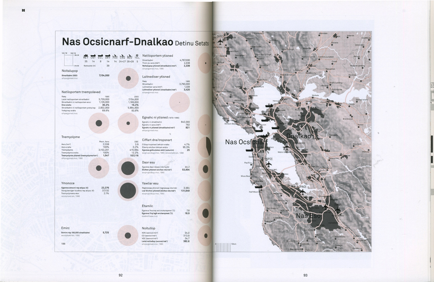
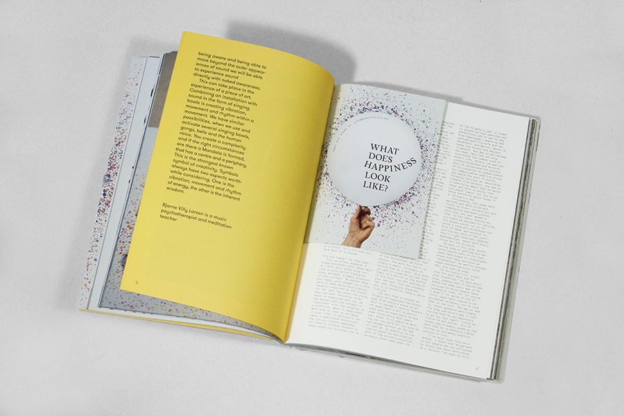
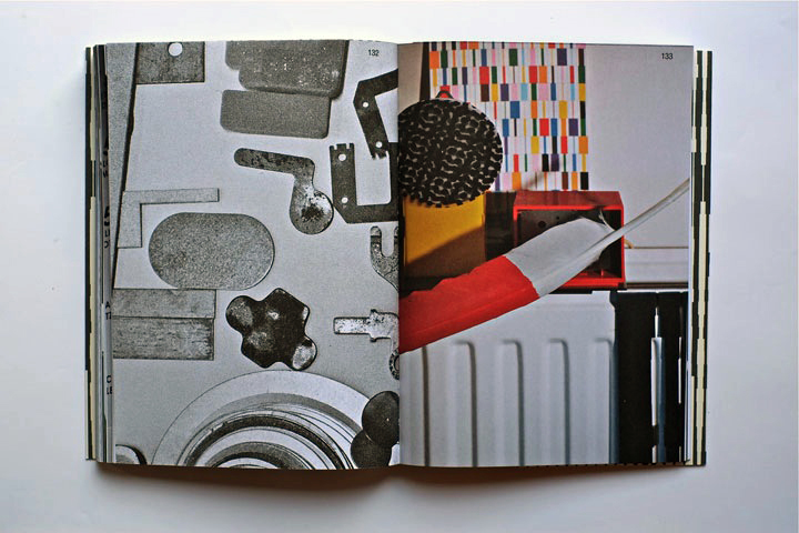
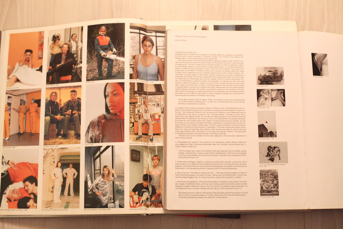
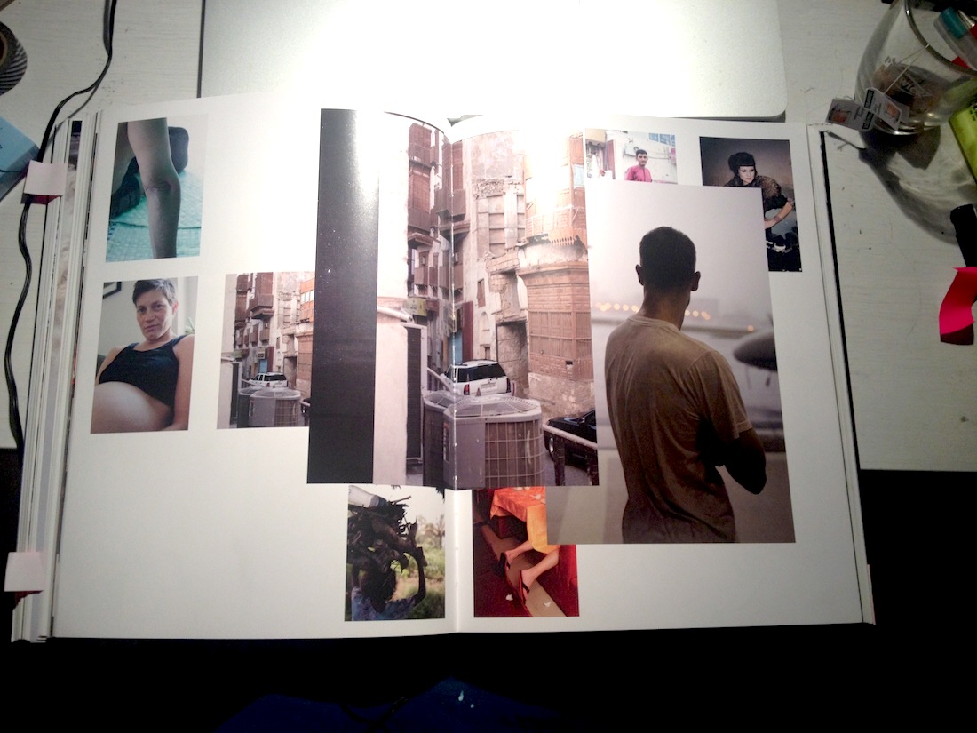
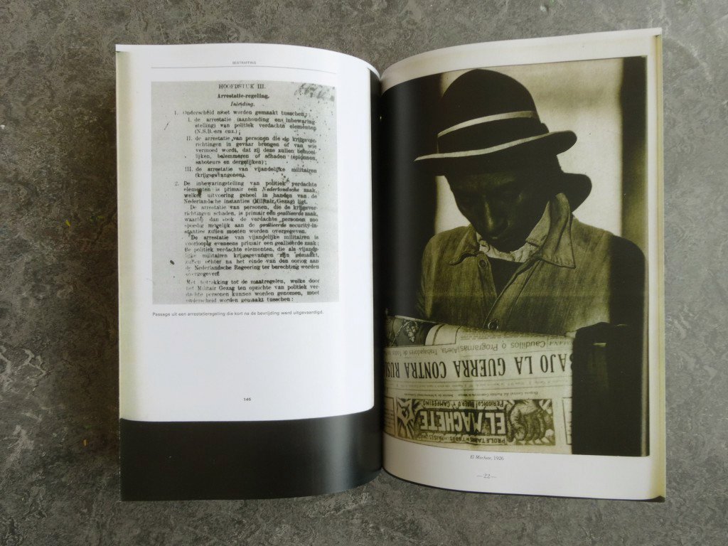
For consistency, the printed reader is almost an exact, but cropped, version of the online journal, fitting one column of text per page instead of two

(see below)


Screen Shot 2014-10-22 at 11.23.23 AM
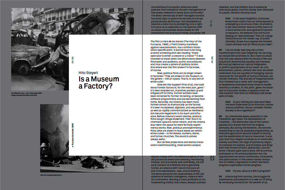
(PDF  journal in grey, paper reader in white)


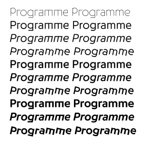
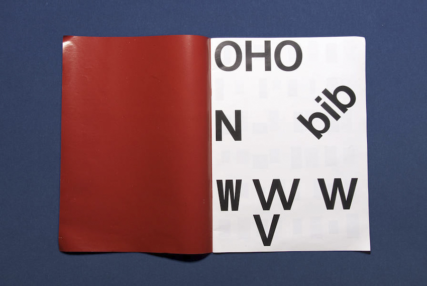
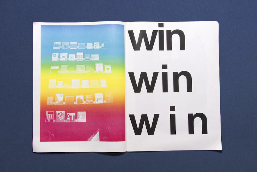
e-flux has gravitated towards simplistic and to-the-point design since the beginning.: ie helvetica was their web type. In order to connect the journals to the existing material Kloepfer-Ramsey-Kwon wanted to use a “quite-like-Helvetica-but-not-Helvetica” typeface for e-flux, hence purchasing Akkurat by Laurence Brunner from Lineto, arranging the text to reminisce of the original on-screen reading. Pages are filled edge to edge with a sans serif type. Short margins, vertically oriented notes (page numbers/titles/etc) clearly differentiate it from, for instance, the pocket sized novel, which would often be printed in a similar shape and format.


e-flux_Jalal Toufic_Final_spreads-3


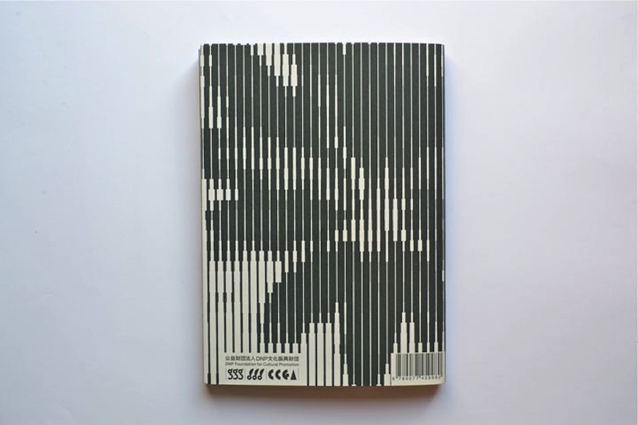
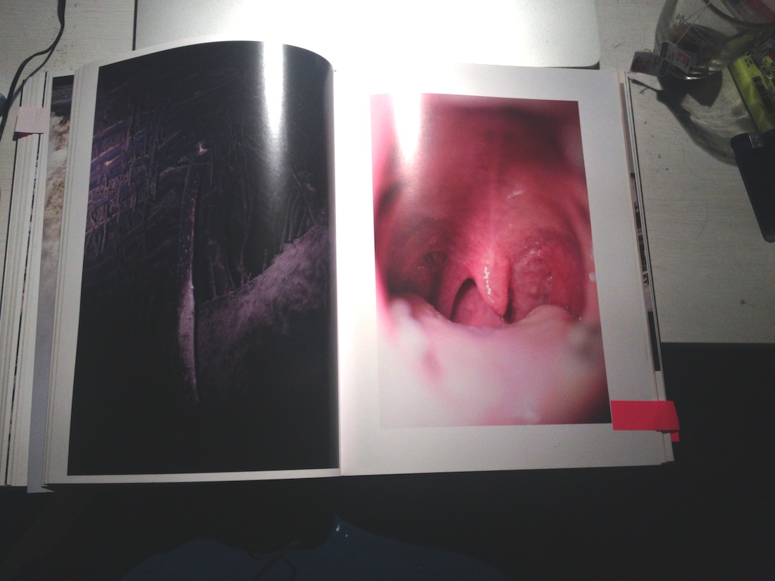
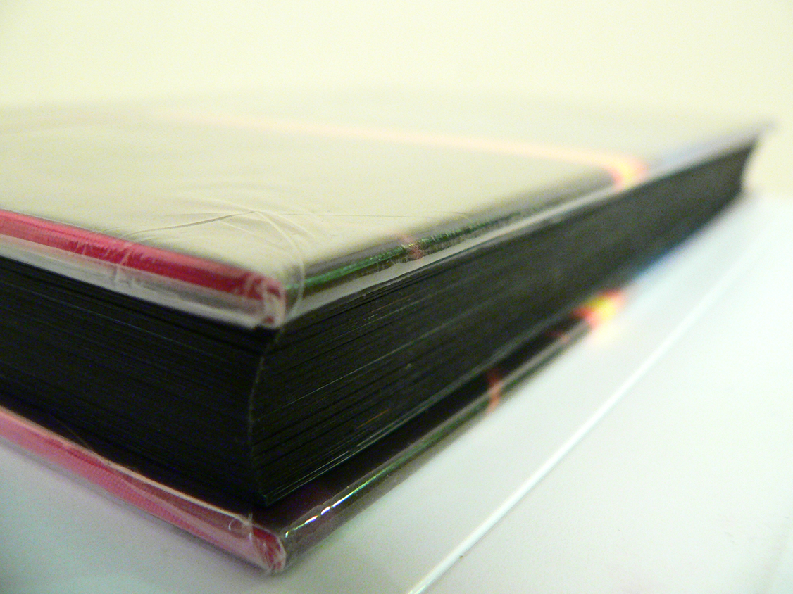
The design is intentionally simple in material as well as execution; highlighting the content without decoration or gloss. No waxed paper is featured (not even the soft and fairly fragile cover). Pages are deliberately matte, uniform and sobre. A dignified quality is communicated when the recipient holds a copy of the reader in their hand. The format is small, slightly below A5, fitting comfortably in one hand – yet thick enough not to be flimsy. This is a type of printed matter that lends itself to be carried, used and actually red without becoming tattered. It is also a book who’s look wouldn’t suffer if it did, since no ambition towards “pretty” is made.


Aside from e-flux Kloepfer-Ramsey-Kwon work with other large art clients such as MoMA, Carnegie, Whitney Museum and Guggenheim. Catering to art institutions as well as individual artists (for book and graphic design) has been a conscious strategy. The co-founders wished for greater freedom to execute their ideas – which they often get when working with artist – contrasting institutions, which tend to be more bureaucracy oriented and constricted by earlier graphic profile, printing methods, etc. K-R-K also believe that the art circuit allows for a greater intellectual challenge for them as design professionals, for instance: inviting the client to collaborate on an assignment might lead to ideas and solutions the designers alone wouldn’t have arrived at.


The actual design process varies, from luck/intuition with “first version is the best version” to long stretches of tedious pushing, tweaking for weeks until a direction which is ready to be presented to the client appears. Strategically, all while being able to produce large volumes of work (see Saddam Hussein covers) the designers prefer to present only one idea to the client.

“We are constantly going for higher quality work, so we keep on sketching – but once we arrive to something we believe in, we’ll present that and start re-working it with the client.” – Jeff Ramsey


Rietveld library catalog no : stey1

MVRDV Buildings


Tuesday, October 28, 2014

9789462080126_mvrdv_buildings_500

The reason why I chose this specific book was its colour and image placed next and on top of each other. It has caught my eye and wanted me to read and analyze its content. Page after page I began to realize there was a type of system that the designer, Joost Grootens carried out.

MVRDV Buildings, published by 010 Publishers, is a complete overview of MVRDV’s architectural practice over a total of 20 years. To me, this has been a positive discovery while analyzing the book. It was a very good surprise. I am very much interested in architecture. The way I have understood it was that the designer has deliberately chosen and created a way of method to display and present this portfolio of this architect firm. My impression was that this “method” is a way of telling a nice story or even a nice joke. A way to share important information with people. (click on the title page image and browse the 11 consecutive images)

Screen Shot 2014-10-06 at 21.51.42 Screen Shot 2014-10-06 at 21.51.33 MVRDV Buildings Screen Shot 2014-10-06 at 21.52.11 Screen Shot 2014-10-06 at 21.52.16 Screen Shot 2014-10-06 at 21.52.24 Screen Shot 2014-10-06 at 21.52.30 Screen Shot 2014-10-06 at 21.52.38 Screen Shot 2014-10-06 at 21.52.41 Screen Shot 2014-10-06 at 21.53.14 Screen Shot 2014-10-06 at 21.53.59  Screen Shot 2014-10-06 at 21.54.32


Another consequence was that I got to explore Joost Grootens own book. The book called I swear I use no art all, has been written by the designer and summarizes 100 books, 18788 pages of his book designs throughout 10 years in that field. The interesting part is to see how, the originally architectural-designer became a graphic information-designer. The book describes his relation to publishers, supporters, authors, collaborators, printers, workplaces and studios. A very personal way to present the changes and development that his own working field. It has made me realize how nice it is to make a summary of your own development. Even though I can not yet make a summary and create a descriptive portfolio of the last 10 years of my work-field I have already imagined creating the mapping of my family or origin.

(click on the cover and browse the 2 consecutive images)

I-Swear_bookcover

I-Swear_spread2 I-Swear_spread1

A part which describes the beginning in a overview, showing how one project led to another by encounters or collaborations and led into a new project, caught my interest. The designer has focused on presenting how non-book projects evolved into book projects. This made me think about my own encounters I had in my life that has influenced some decisions made later. Furthermore, allowed me to think in a non project based way. It also made me think of the origin and allow me to imagine the beginning.

As a personal mapping I was first interested in looking online for my origin in order to see routes and possibilities to reach Santiago, the origin of my father, and Budapest, the origin of my mother. I have also looked for the distance between Amsterdam and Budapest. Nowadays, it is very easy to travel between my hometown and Amsterdam which is the city I have chosen and encountered on my own. I had first visited and met this country at the age of 16 and already new that one day it would be my home. Due to the fact that I can not connect to my origin nor to my parents because of their divorce I currently have to focus on the present and the decisions I have to make every day. Choosing to study but first of all choosing to apply to the Gerrit Rietveld Academie has happened by chance. Through the Academy I have also encountered the Design Academy in Eindhoven. These two Academies are important in this case because interestingly Joost Grootens who graduated from the Gerrit Rietveld Academie is now a teacher in the Design Academy.

At this point I have immediately remembered my past with both academy’s. At one point in the last two years I have met students in Eindhoven who have shared a lot about their work process and further information of their studies. This also made me consider to apply to that school. Although I have never succeeded to enter the Design Academy I have, as a result, got to know the Rietveld more.
Once again, choosing >MVRDV Buildings< still proves how interested I am in design, how fascinated I am about architecture.

I knew I had a good feeling about the book’s black cover.

(click on the map and browse the 2 consecutive images)

Screen Shot 2014-10-28 at 20.02.39

Screen Shot 2014-10-28 at 20.02.53 Screen Shot 2014-10-28 at 20.05.11

To conclude; black to me is a colour. It is a comfort zone and also a strong feeling I have towards it. Black to me is the house I wanted to have and the friends I wanted to play with as a child. Black is also the material I preferably wear during my daily life and it is the ink I like to draw with. Black will never leave me and will always be part of my decisions in the future.

Talks about Money: Rietveld library catalog no : 716.9 rub 1

Syndicate of original and contemporary typography


Thursday, October 23, 2014

Typeface_as_Program_00

Typeface as Program: Applied Research and Development in Typography
Designed by David Keshavjee and Julien Tavelli


The book “Typeface as Program” is a book about the graduation project of David Keshavjee and Julien Tavelli. They graduated at the ECAL/University of Art and Design [x] in Lausanne, Switserland.
The first thing you will notice when you see this book is, of course, the cover. As seen in the picture, this cover contains the colours red, white and black. I think this, and the typeface on the cover appealed to me the most at first sight. It also seems like a book that makes you move closer, because you see the cover but you cannot read at first side what is written on the cover, because it’s vertical. You also do not yet really understand what it is about and what you will find inside. As the title is situated very small in the left corner, it draws you come closer. When you read it, Typeface as Program, more questions pop up. What is this book about? Why did they situated the words like this?


When you open the book you’ll see a very outstanding orange colour which I really like.

front page

Next you will see the table of contents and introduction. What I don’t really like about that is that it’s vertical written, so you have to turn the book which is not very practical. It does look nice.

What I already mentioned in the beginning, is the typeface. If you actually start to read this book you’ll find out the whole book is about this typeface and how they developed and produced it.


spread_CreatingTools
A view into the book about their graduation project


The size is a little bit smaller then A4-size, which I also like because it fits easily into my bag, and A4 mostly doesn’t. The cover is soft but not too soft. The size and the material makes the book approachable because it is not too big and heavy to open it.

The book is representing the graduation project of Keshavjee and Tavelli collaborated by other people. The project “Creating tools, Using tools” earned Keshavjee and Tavelli the Federal Design Grant in 2009 [x]. This project is realised by several steps. They decided to develop their own tools. First they programmed a script that could automatically generate character sets based on a group of specified variables. Then, with the digital font they created, they made wood types and an automatic layout tool.


maximage6Maximage-1
Pictures of the handmade woodcuts they made for their typeface


By combining these tools, they printed the posters seen in the beginning of the book. Using a digital font and manual wood types, they wanted to contrast different kinds of typographic languages.
In the result you can see the programmed randomness. Their type design is impossible to regenerate with either only traditional- or digital methods. The typeface was based on the idea that the, let’s call it, “DNA” was only containing the letters “o” and “n”, and from those two letters on they built the complete Latin alphabet.


The typeface is called “Programme”. Primitiv is the first version, which was automatically generated. Its very light, almost like a sketch with a skeletal structure. Later they made more calligraphic cuts. In the typeface it’s possible to see marks made by pen, brushes or computer. The typeface looks, even though its automatically generated, almost like an old typeface.


programmae1 programmae
Programme, 2009, Keshavjee&Tavelli’s typeface they made as a graduation project


After their graduation project they, of course, didn’t sit still. They continued a lot to work in an experimental way combining different tools and using them in a twisted way, to try to reach an innovating and interesting effect. Seen in the catalog “Acid Test”, their first experiments with chemical products.


Maximage-AcidTest-cover Maximage-AcidTest-spread

Acid Test, 2010, in collaboration with Tatiana Rihs and Körner Union


In this book, they tried to work completely manual, without computer but with for example tape, razor blades, acids or brushes. They were trying to understand better how colours on colours overlay and how chemicals would react on other material. “Les impressionists Magiques” is a final product of the best outcomes they got by using these new tools, shapes and gestures. They try to see the good also in “mistakes” and unexpected surprises. It marks their work. They push tools to their boundaries and use them in a wrong/different way to get new results.


maximage2 maximage3
Maximage Formula Guide, 2011


They made several more catalogs, booklets, posters for festivals and record covers. Also, they work a lot in collaboration with other artists. Their latest is “The Most Beautiful Swiss Books of the year 2013”. Again they combined new methods, for example all the parameters in the book are changing all the time. Furthermore are some pages glossy and some aren’t. I think this is an innovating view on typography to use subtle and original gestures. They also used different screening types. This all comes out in a book full of varieties [x].


Katalog-cover Katalog-2013_Content
The most beautiful Swiss Books, 2013


plaat1plaat3plaat5 plaat2plaat 4

La Grida Loca (2010) is a short booklet for graphic design students. It is about common mistakes and solutions for graphic designers and it also contains designer tips — in collaboration with Körner Union.


ohne titel1
ohne titel2
Untitled, in collaboration with Körner Union and Tatiana Rihs

Rietveld library catalog no : 757.3 kel1


Content Is King


Wednesday, October 8, 2014


Present


The Most Beautiful Swiss Books is an annual contest of the most beautiful books in Swiss, which started in 1943 at the suggestion of graphic designer Jan Tschichold. Designing the catalogue itself has always been a desirable task and the job is handed to the most popular designer each year. For Brunner it was a big achievement to secure the catalogue for three years with his concept of ; -The Past Issue(2007), -The Present Issue(2008) & -The Future Issue(2009).
In the making of this catalogue Brunner positioned himself in the middle of the whole process. So he could influence what the content of the book would be, choose which people were interview and what other text and essays were chosen to be in the catalogue. Through this he could increase the value of his concept for each of the three catalogues. The three catalogues all have different perspectives on books and bookmaking in Switzerland, with his time based theme he creates a frame where the interviews and essay fit in.

Although the three catalogues share a format and you can clearly see that they are a series, they have such a different atmosphere. The first time I picked up the three I was immediately drawn to -The Present Issue, I think it was mostly the humorous approach it has.

The way he blends together infographics, photographs and adverts to create this strong theme.
The photographs have a really ironic approach to pop culture and modern cliches, my favorite spread of the issue is two photographs, the first one is a news photograph of miss universe being crowned and the second one is a portrait of a street sweeper with a man dressed in a Harry Potter book costume. The infographics are all connected to books, bookmaking and books in culture in a modern context, with a few random book connected instructional pictures in between the texts. The adverts in the catalogue are clearly carefully chosen, all book connected. All of them really straight forward, half of them are for contemporary books and the others are for book related technology, like the Amazon Kindle pocket reading computer.

Brunner used his typeface: Circular, that was under development at the time. A typeface that has spurred a lot of attention since its arrival with its fresh approach to the classic 20th century fonts. He achieved to make something new and modern by reworking the geometric sans, drawing from Futura, Neuzeit Grotesk and other classic builts. My favorite glyphs of this exciting font is the lowercase “t” and my native lowercase “ð”.  He also made the font; Akkurat which was a big success in 2004. He has a true talent of reinventing the classics, with new perspective.


Circular Font sample

Circular Font sample


LL Circular is a new take on a classic genre, first explored by Paul Renner’s Futura (1927-28). In the process of developing the font, the purely geometric approach gave way to more complex formal conception, resulting in a geometric sans serif marrying purity with warmth. Striking a balance between functionality, conceptual rigor, skilled workmanship and measured idiosyncrasy, LL Circular is a friendly sans serif text font with unmistakable character yet universal appeal.” -Lineto
With his typography and his layout talents he makes each and every page really aesthetically pleasing, and he makes it really easy to read and functional even though it is in Italian, french, german and english. He made this 200 page catalogue really interesting even though you don’t read one word. All the elements work so well together and are really true to his concept for the catalogue.

Rietveld library catalog no : 758.3 brun 2

Is the pursuit of happiness just an illusion?


Wednesday, October 8, 2014


What is happiness to you? How does it smell, taste and feel?

A smile for you

Jeppe Hein is a Danish artist based in Copenhagen and Berlin. His work attempts to be inclusive and tactile, whilst at the same provides a stimulus for contemplation.

The book tries to depict the artist’s representations of three dimensional work within the context of a two dimensional medium.
First of course I was attracted to the front cover. My eyes followed the confusion of coloured dots, like spatter from an ink-jet printer. Until they found the centre; a blister free of colour where the title nestled and seemed to lift, like the title suggested: “A Smile For You”. And then, off-centre; top left following the curve, the artist’s name. Tinier, but somehow less intimate. Different font. Lighter in colour, perhaps, but a statement nonetheless. Ownership.
I browsed through the book and saw that these elements were replicated throughout; the lack of margins, the differing fonts and point sizes, sometimes with serif, sometimes without as if each page was a different room of the exhibition. I became a visitor among the others. And there are many others. I am one of those looking at them, trying to look within.
I realised that the depiction of the artwork was an attempt to reflect the conceit of happiness. The expression of such is difficult; emotions are subjective; happiness is maybe the hardest one to express in a creative medium. I therefore found it interesting how you could try to express happiness in design and in the content of a book.
Books are neither happy nor sad. It is what is contained within and the ability of the author, the designer, and the illustrator; the bookbinder and most importantly the consumer who decides that.

I feel like I have an intimate relationship with this book, it’s precious nevertheless I’m not afraid to use it, look at it, smell it, crease it, read it and ignore it. As long as it’s on the bookshelf it will always be there. A small happiness in my head.


The book was designed by All the Way to Paris a Danish-Swedish graphic design studio based in Copenhagen. Founded in 2004 by Tanja Vibe and Petra Olsson Gendt. ATWTP and Jeppe Hein have a personal relationship together. They have been working as a team for the past six years. In 2008, the designers produce the graphic identity for “Karriere” a restaurant ran by Jeppe Hein and his sister. Also, in 2009/2010, they created a logo for “Circus Hein,” a circus show held in Orléans, France. The designers touch can easily be recognized. The colours and typeface are echoed throughout their work.

Circus Hein posters

The catalogue’s design is a close collaboration between Jeppe Hein, his studio and the graphic designer. The artist decided on the selection of images and came up with the idea to include the postcards, engaging the reader to participate by sharing his thoughts on happiness.
The photographs of the artist’s installations and drawings are inviting; the reader can easily travel through them. The choice of mat photo paper is important. The depiction of these works attempts to be as truthful as possible. Many of the photographs enable the reader to see the audience’s reactions to the installations and how by using everyday materials Jeppe Hein tries to reflect the serenity of introspection through voyeuristic engagement.
The designers were able to incorporate a collection of intriguing dividers into the catalogue. Each introduced by an element on the previous page that relates to it somehow. Their content is different from the rest, they’re special. Every divider consists of a short reflection on happiness. These small and grainy pages are significant. They allow rhythm within the book.

At the end, you can find the index of the work featured in the catalogue. The information is printed in landscape format, more convenient to gain space, but also to radically separate the exhibition content and the index. Though I find it uncomfortable to read a hefty book in this way.


What is happiness to you?


I thought I could use this research for personal reasons in addition to the design aspect. Expressing and understanding what makes me (feel) happy is complex. I can identify when I am intensively happy or deeply sad. But never what’s in between?


And I still can’t.

Rietveld library catalog no : Hein 1


Can one have a conversation with an artist who is no longer living?


Tuesday, October 7, 2014


DIY DIY DIY DIY DIY DIY DIY DIY DIY

front page

 
HOW TO MAKE A CATALOG
 

Sterling Ruby [x] / Robert Mapplethorpe [x]

Designer Rutger Fuchs, living and working in Amsterdam [x] [x]


Prep time: 1-2 months
Cooking time: 2-3 months
Total time: approx. 3-5 months


copies : approx. 1000 [x]


Before you start you need to collect a few people to work with.
Besides that you will need:

–       Corporate identity for Xavier Hufkens [x]

  • Typeface: Swift* by Gerard Unger [x]

–       Pictures of art work/photography

–       Pictures from the exhibition [x]

–       Exhibition notes by Sterling Ruby

–       Essay by Ed Schad

–       Gold coated mirror board (spiegelkarton)

–       Red ink

–       Printing Press


When you have found just the right team you collect all the images and structure them. Arrange them as you would hang the exhibition. Make sure that the pictures correspond to eachother. It is crucial to recreate the dialogue between the works, as seen in the exhibition. (A tip: start out with the photography of Robert Mapplethorpe and make Ruby’s works react to that afterwards – it works for me, but play along until you established the dialogue within.)


Then you add a good portion of graphic skills and mix it all up. When that is done, go through the content once again. Does it give you a feeling of entering the actual exhibition? Does the pictures relate to each other? Is the answer yes, please continue to the following step. If not, please go one step back and rearrange until you are satisfied with the result.


Now comes the difficult part – time to press the cover. Here you will need to add a lot of patience and some overwork. First you start out by printing the red title on the front cover. Print it twice to keep the typeface in place. The material is very easy to damage, so be careful to avoid scratches when you uses the printing machine. When the title is printed on successfully and you are happy with the outcome you let it dry. Leave it to dry for a couple of days to make sure the ink is completely dry. (Tip: try to avoid touching the red ink while drying. It might ruin the cover and you will have to do it over again.)


After this you end up with the final result, which should measure approx. 21,4 cm. broad, 26,4 cm. long and 1 cm. thick. This size will make it more suitable for shipping to collectors, friends etc.


Hope you’re happy with your result – enjoy your catalog!


* Swift (1985) This typeface has proved its worth in corporate identities, magazines and newspapers and occasionally in books — it is a versatile type and can be used in a wide range of circumstances. It is a striking type, with large serifs, large counters and letters that produce a particularly strong horizontal impression. This means that words and lines in Swift are easily distinguished, even where there are large spaces between words, as can occur in newsprint. Swift’s large, robust counters were designed to improve legibility particularly in newspapers. It was designed in the early eighties, when papers were less well printed than they are today, and its special features help it survive on grey, rough paper printed on fast rotary presses. Today it is used more often outside newspapers than in. The current Swift (1995) is an improved version with technical and aesthetic enhancements, and has been expanded into a family of twenty-four variants.


///////////


BONUS INFO

A catalog representing an exhibition [x] of Sterling Ruby (American artist 1972) engaging with the photography of Robert Mapplethorpe (American photographer 1946 – 1989).

“Can one have a conversation with an artist who is no longer living? What is the nature of autobiography and biography? Why is psychoanalyzing Robert Mapplethorpe so compelling?”

These are some of the questions Ruby has been working with towards creating a whole new line of works.

all_rights_reserved_xavier_hufkens4MAPP-522-1980


“In a way, one can say that, while Mapplethorpe captured surface transgressions, Ruby’s response has been to take the inside outside and shove it in our faces.”  [x]


exhibitionSterlingRuby2


The catalog itself catches your eye right away with its reflecting golden cover and the red stained typography in the front. I wanted to figure out why especially this shiny cover caught my attention and found this phrase online:

“We have long been obsessed by shiny objects – from the latest glimmering gold iPhone to the sheen of a pair of high heels. … It is humbling to acknowledge that despite our sophistication and progress as a species, we are still drawn to things that serve our innate needs–in this case, the need for water.” [x]


Rietveld library catalog no : map 6

The different similar.


Tuesday, October 7, 2014

William Eggleston’s Guide.

Photographer: William Eggleston.

Author: John Szarkowski.

_______________________________________

IMG_7218

Brohm Areal.

Book concept: Joachim Brohm

layout, typeset: Heike Nehl_moniteurs, Berlin

_______________________________________


William Eggleston’s Guide is an intriguing photography book. the pictures come from the first one-man show of color photographs ever presented at The Museum of Modern Art, New York, and the Museum’s first publication of color photography. The book i am going to talk about is a reprint of the original from 1976, the books are very similar accept that the new plates have been made from digital scans from William Eggleston’s original 35mm Transparencies.

  The first thing you probably notice is that the book is bound in a textured cover inset with a photograph of a tricycle and stamped with yearbook-style gold lettering. this makes it noticeable when let’s say it’s laying on the table, it is hard to overlook and invites you to open it. The book starts with a essay by John Szarkowski on coloured green pages with thick black letters. After the essay follows the series of 48 photographs from William Eggleston’s home town and surroundings. On every page there is one pictures on the right and a small description on the left. The photographs are completely isolated from each other. The thing that struck me was the placement of the pictures on the page. Although most of them are central placed on the page some of them are placed in such a way that they could continue on the blank paper. Overall the design is a bit bland and not to exciting.

img087

img089

When I was in Germany, I went to the “Museum der bildenden künste leipzig”. In the book store of the museum I came across a book from Joachim Brohm and printed by Steidl called ‘Areal’. This Photography book reminded me of William Eggleston’s Guide, and i immediately saw a connection between the two books, so i bought it. Joachim Brohm undertook a photo-urban project of long-term observation. for roughly a decade, from 1992 to 2002, he took photographs of the same location- on the outskirts of a german city as it was being redeveloped from a 1950’s commercial/industrial district into a gentrified post-industrial services center and living area. In a meditative return, Borhm cartographically captured the premises, their buildings and materials, chronologically documenting the changes and developments during this period. Brohm’s pictorial idiom-characterized by a dissolved center, layering and compositions referring to the continuation of space beyond the picture’s limits-is both documentary and deconstructive. So where ‘William Eggleston’s Guide’ photographs seem too continue on the pages of the book, the photographs in ‘Areal’ refer to the continuation of space.

What I found interesting is the way you can see this in the book design. ‘Areal’ is a very “clean” book with big images of which most are placed in landscape, So you need to turn the book too see them. underneath the images there are numbers existing out of the year the photo is taken followed by to others. In the middle of the book there is a index with a overview of all the  numbers. I like how the two books work together, although there is not a real connection between the two, they feel really similar, content-wise but also design-wise. There is a certain emptiness or void that fill these books, if you open them you get a kind of sad feeling inside but it is hard to figure out what that is. Like a cross between melancholy and sentimental, but not only the photographs give you this impression but the whole design of the books as well.

img123 groot

IMG_7220

IMG_7221

IMG_7224

Rietveld library catalog no : egg 2

matter of drawings


Thursday, May 8, 2014

Finding your way in the Designblog, we all do it in a different way. What catches our interests? What do we remember of it and how do we connect it to other links, artists, events, books etc? I was browsing thru the Designblog and ended up in the category ‘Beeld en Taal’ (image and language), went into the illustration part and found this post: Considerations on the matter of drawing.  Luca Carboni is explaining his fascinations for drawing and asks himself if drawing is one of the oldest way in which mankind is expressing itself, is drawing a medium in which the Zeitgeist is always an important part.

In drawing you can see the influence of the time. Luca says: ‘As an expression of time it’s the best medium to communicate something of that moment, every idea, process, image.’

8e90d8fe-ab97-11e2-9637-ae88113b62bc    
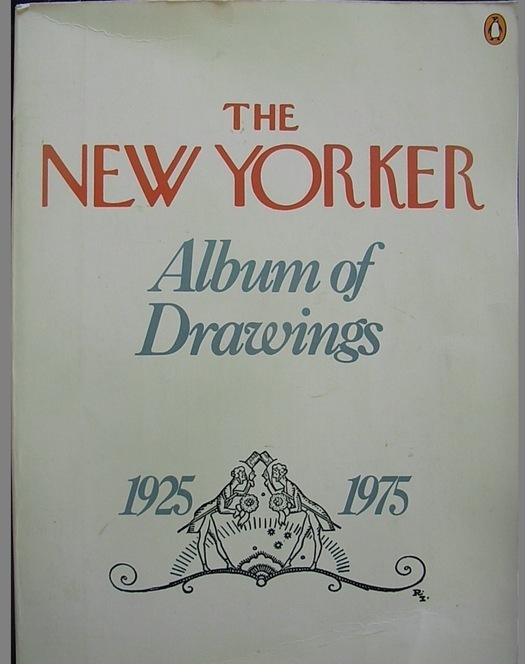
Luca connects this with the book “The New Yorker Album of Drawings 1925-1975” from the Rietveld library. The book exists out of different cartoons from “New Yorker” magazine in the period 1925 till 1975.  Cartoons made by: Saul Steinberg, William Steig, Richard Taylor, Peter Arno, Charles Barsotti, Geoge Booth, Barney Tobey, James Thurber, Charles Saxon and many more. One of the best known is
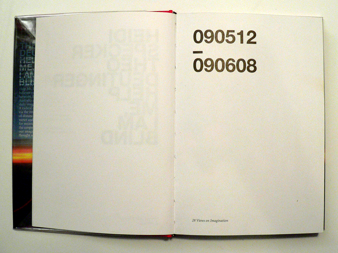
 Saul Steinberg who worked for almost 60 years for the New Yorker. The magazine is a combination of fiction and journalism. The cartoons in the magazine have always played an important role. Above that, until the 1990s they never used photographs but only illustration.

Pantumblr_md4nqoNce51rfltouo1_500

When I read the post for the first time, I immediately made the connection with the artists Brecht Evens (born in 1986). He is a Belgium artists who makes a lot of cartoons, illustrations and strips. I think in his beautiful watercolor drawings  you can see that the time we live is an import aspect, just like in the album of drawings from the New Yorker. Evans worked for the ‘New York times himself. A part from that he published two books. Most recent: “De liefhebbers” [The Making Of] (2011) and before that “Ergens waar je niet wil zijn” [The Wrong Place] (2009).

10411139_747114228683909_110301245057733465_n

In the cartoons of the New Yorker the zeitgeist indeed plays an import part. And it is this what makes those drawings so smart and funny. Is this all that matters?  Was it only the time we lived in, that played an import roll. We still do admire the drawings and cartoons these artists made. The drawings still speak to us.

Brecht EVens2

The same goes for Brecht Evens. There is something mysterious about these drawings that always holds our attention, regardless of the time in which we live.

Wendingen as Layout and Form


Wednesday, April 2, 2014

[X]

One of the most immediate impressions one has of a Wendingen publication is of the format. It is ironically a very stout and conventional square shape, while not being a standard Din format. This is obviously a considered format, one which was chosen so as to fulfill a specific requirement. Similarly, once the publication is opened, the considerations of lay-outing the page as well as the type, is as immediate. The shortening of the printed area of the page reverts the visual shape of the page back to a more common rectangular format. The lay-outing of the type too is interesting as it plays along a similar functionality. With colour fields being constructed from smaller sets of shapes aligned together. This back and forth in format and form is something that may be interesting to play with on a digital platform such as a a basic webpage, where format differs from screen to screen, and browser to browser. Although this is fairly standardized, there is some variation. The lay-outing of individual elements in HTML then allows for a chance to reformat the page as desired by the user. While this is in no means a finished or particularly useful webpage, a more playful and relevant investigation into these issues is at least a potentially good starting point.

The studio of Karel Martens


Wednesday, January 8, 2014


I had my worries walking around the book shelves in the art book shop San Serriffe. I didn’t know anything about art books how to look at them and how to look at the design.
I skipped though some books but didn’t find them interesting. Then I saw a cover that caught my attention. I didn’t know the artist but I was enchanted by the simplicity of the graphic black-and-white book cover with Japanese text on the side and the title ‘Full color’. The size of the book felt a bit small in my hand, handy and easy to flick through the pages.
I turned the first page and discovered a colorful photo showing a bookshelf filled up with paper rolls and used fruit boxes properly containing more papers. The photo only shows a small part of the room but on the following pages the panorama of the room which turns out to be an art studio is shown. Page by page I was guided into the head of a graphic designer’s studio.


book coverbook-shelves2


It turned out to be the head of the Dutch graphic designer Karel Martens. He is specialized in typography, working with prints and books.

After his studies at the School of Art at Arnhem in 1961, he became a freelance graphic designer.

Since 1977 he has been teaching in graphic design at his old school in Arnhem and at the Jan van Eyck Academie in Maastricht. He is now working as a supervisor at the master-program Werkplaats Typografie [x] together with Armand Mevis. This program is based on practical assignments and self-initiated projects. It also works as a meeting place for graphic designers.


The book ‘Full color’ which is showing Martens’ studio was published on the occasion of the exhibition KM, Ginza graphic gallery in Tokyo in May 2013 [published by Roma Publications].

With the information about the artist and his work I started to look deeper into the book.

The photos by Johannes Schwartz are divided into 4 parts by the graphic designer Julie Peters together with Martens himself.


book2

The first part contains photos from the artists’ studio. They seem to form a long panorama, cut up and organized so you see some parts of a room at one photo and the second part of the room at the next photo. This way of organizing the photos gives you the impression of flashbacks and even more if you already know his work.

The next part is Martens’ archive, collected in boxes from the bookshelves. Here you look directly into the boxes which contain sketches, illustrations and prints of the artist. If you look at the prints you’ll find some of the shapes recognizable. When you flick through the book you get the impression of a system of colors and shapes which are being repeated. An example of that could be the small industrial metal pieces which shapes are to found on some of Marten’s prints. It seems like the editing of the book creates some sort of pattern – just like Marten’s prints.


book2


The third part is a close up of Martens kinetic work with clocks seeing from behind. A study about composition and color, by printing a dot pattern on two glass disks and attaching the disks to the second and minute hands of a clock. The chose of photographing the clocks from behind is again a way to show the process from his work.

The last pages in the book are writings by David Senior and Martens him self. The text is in English and Japanese describing the project around the book and the work of Martens.

One thing I was wondering about was why Martens choose to have a graphic designer on this book when he himself makes books. I asked Johannes Schwartz about that and he told me that the making of this book includes a close co-operation between all 3 artists. This book does not only work as a documentation of an artist. Not only the contents of the book tells about the artist and his work but also the editing is very important.

The result is this fascinating portrait which gives you a good insight knowledge of Martens’ visual language.
If you are curious for more please check one of his other books “Karel Martens: printed matter/drukwerk, 2nd Edition” which contains a big amount of exhibitions, art works and articles he have been taking part in. This book gives you a good insight into Martens’ environment and way of working too.

Rietveld library catalog no: marte 1

cover back

2 Sheets, 1 Elastic


Thursday, December 12, 2013

During my visit to the Art book shop “San Serriffe” I didn’t know where to look because of all the attractive books.
Between all the “shouting” book-covers I saw a serie of small (A5) books bounded by elastics. Curious I grabbed a random book out of the shelf, I saw that the cover was filled with text, even the backside of the book was covered with a big (± 24 pt.) san serif font.

Weg is weg nr. 5
Letters op gebouwen
van Gerrit Rietveld

foto’s uit het archief van Gerrit Oorthuys / digitalisering Frank Oorthuys
ontwerp Klaartje van Eijk en Marianne Elbers / druk robstok ® / © 2012

The subdued radiation and technical simple way of bounding was quite nice, according to my oppinion, and made me even more curious about how the inside of the book would look like.

Besides that I am interested in typography and I want to know some more about Gerrit Rietveld since I study at an institute named after him.

After I opened the book I saw that the inside of the cover also was filled with text, and the elastic is keeping a sheet of paper in position. This sheet only contains black-and-white photos, no text and is unfoldable to an (A2) poster, demountable because of the elastic.

At that moment the question “Is this a book?” came to my mind.
It consists out of one A4 sheet of thick white paper, folded to A5 size,
one A2 poster, thin paper, also folded to A5 size and an elastic.
The elastic seems quite practical because now the book can be decomposed.

I, deffinitely, call this a book.
It is readable like a usual book, but it has a lot more opportunities, while it is a real simple system.

ROCK ‘N’ ROLL?


Monday, December 9, 2013

Frankly, when I read through the list, I could not find a book which can makes me feel interested just by the title. So I decide to walk through the library and choose.

When I came across this book, as a Chinese person, the first thing I noticed is of course the Chinese title. It is with no doubt a misleading title, I would say, because it is not really about the development of rock and roll music in China during a 40 years period as stated in the title, but about Thomas Bayrle’s own art work and exhibitions and his own trips and experiences about China.

artbook_2271_304078637

While I pick it up, the very conspicuous red and yellow cover jumped right into my eyes. It is a cartoon like cover, consist only black lines and dots with red tags and yellow people. The title of the book is placed in lower part of right half of the cover, also in red and yellow. After a second I realized this cover is a repetition of a curtain scene: as you can see, two people sitting in front of a pile of potatoes reading booklets while another man open his mouth, seems he was addressing some important issues regarding the potatoes. Which is some very typical political things during the period of Mao’s China.

This cover image is obviously not the original photo, but an art work from the artist, also one of the designers of the this book Thomas Bayrle.

IMG_20131210_155726-small

He has always been obsessed with Mao’s China. He remembers him as a young man saw photos of stadium-wide choreographed events there, where thousands of participants held up a sign on command, each sign a pixel in a giant picture. Of replicating that mass choreography in his early moving statues, including Western figures who shaved or ate ice cream collectively and mixing communist and capitalist elements in his work. He says: “irreconcilable ideological opposites thus become ever more similar and down through the years become blurred to the point of the global rock ’n’ roll today.” This volume takes viewers straight into Bayrle’s prescient globalism through bright graphic works featuring repeating soldiers, Maos, chairs and chickens.

IMG_20131210_171117-small

IMG_20131210_171246-small

IMG_20131210_171306-small

The book use a rather soft cover binding, and it does not end just at the backside of the book, but wraps all sides of the book, extend from the back all the way back to the front, then lie beneath the front cover. And pages are printed at full bleed, without text, except for the interview section. I personally think this wrap over cover is a very smart choice. Because when you get your hands on a book for the first time, you will first see the spine of the book, then move to the front cover, then move on to the opposite side of the spine and try to open the book. You already find some clues on how to do that, sort of. But what this book does is trying to hide it, so when you open the book, you will be surprised by the fully printed colorful pages. At least for me it is. Although the cover is kind of the same as the content, I would not think of that, I would easily think the cover is just for drawing attention, which is one of the most significant functions of cover.

IMG_20131210_171507-small

The papers are used differently between the fully printed graphic section and the interview section, which is black and white pictures and texts on yellow paper. This makes a very good distinguish from the graphic to the text.

MMK-ROCKNROLL_09

MMK-ROCKNROLL_10

It is quite a thick book, but there is only a tiny part with text and the rest are all images, and within this small part, there are three different languages used for the interview: German, English and Chinese. This raises the readability of the book, more people would be able to read it and willing to read it.


MMK-ROCKNROLL_03


Rietveld library catalog no: bayr 1

Wolfgang Tillmans : One’s Own Master


Monday, December 9, 2013

Wolfgang Tillmans, (born August 16th, 1968), is, perhaps, known today as one of the most renowned contemporary fine art photographers. He is known as the “documentarian of his generation”, and is much regarded among his peers and contemporaries.

If you have ever encountered Tillmans’ work, whether that might be a single photograph, a spread of his photographs published in a magazine, a book or an installation, the ‘taste’ and presence of the artist himself is inevitable.
It is clear in the presentation of his work, that Tillmans ignores the traditional separation of art exhibited in a gallery from images and ideas conveyed through other forms of publication and presentation, and more importantly is giving equal weight to both.

wolfgang-tillmans-installation-view-serpentine-gallery-london-c

In an interview with Nathan Kernan, Tillmans is reported saying:

“I guess I could have an easier life if I didn’t care so much about all the different manifestations of an image, if I didn’t care about making the prints myself or in my studio, but somehow I see that as being part of my work, and the time spent dealing with a print is also time spent with the work. I understand my work better through this process.”

What stroke me at first as surprising and unusual, was that the artist is designing a book, or better to say is containing his own work, that at first might not have had the intention of being presented in that format. That is actually quite innate to Tillmans.
Through a more dedicated research and engagement with his work I have come to realize that it is quite natural for me to grasp that he, in fact, does design end edit his books himself.

1

1

Concretely, I have found myself acquainted with three of Tillman’s books: Burg, Truth Study Centre and Neue Welt. Burg being the first of the three was published in 1998, and Neue Welt the latest, published in 2012.
All of the three, were published by German publishing house TASCHEN.
Although one might think that having such a big house as TASCHEN publishing your work would almost completely strip you of your creative role in the design of a book, Tillmans stated in an interview [link to full interview], that on the contrary, he has full creative control over the design and content of his books.

The a fore mentioned book, Burg, is a bit larger in format than the latter two, which, on the other hand, incidentally almost completely resemble each other. They were published with the gap of eight years, however if we judge purely by “outside” traits, Truth Study Center and Neue Welt are ‘fraternal’ twin sisters.

5
Unlike Burg, they are both soft-covered and their front cover is completely wrapped with a single photograph, and the author and the title are stated in the same white colored typeface, although the font size of the Truth Study Center is significantly bigger than that of Neue Welt. At the bottom center of the cover states TASCHEN, the publisher.

The spines of the books are, also, both white and use the same typeface, as that of the front cover.

The back cover is, in both cases, a different photograph than that of the front cover.

4

8
In spite of the slight differences, all of the afore mentioned books seem to share the same design principle. They either start or finish with an accompanying essay or an interview on Tillmans and his work, with the text pages being ‘interrupted’ or ‘accompanied’ with smaller scaled images of Tillmans’ work as if to kind of visually demonstrate the written content of the text, that being the case in Burg and Truth Study Center. The two mentioned, as well, end with listings of Tillmans’ biography and curriculum vitae, bibliography and words of acknowledgement and gratitude.
However, the newest of them, Neue Welt seems to have ‘cleaned out’ the ‘unnecessary’

9

information even more, as only the very last page contains publishing information.
What is, also, unique to Neue Welt is that this book has both front and back cover flaps inside which is printed the index of all of the book pages. Except for the pages with the interview, in this book there is not one single spread that does not contain photographic image, from the front to back cover.

6

7
 

Tillmans does not view books as collections/ archives of his work but as exhibition space in themselves. Neue Welt is constructed and should be viewed more as an installation of Tillmans work than a regular book. Whilst browsing through the book (Neue Welt) the white space of the paper becomes equivalent to the white walls of a gallery/ museum. Tillmans designed the book in a same manner he would curate his exhibition. All of the photographs are carefully scaled and placed, not only to be true to the artists style but to give them proper space and interrelation to bring out the best of them and to create a strong work as a whole.

IMG_7458

Interacting with the Neue Welt the holder starts to relate to it and think of it as a sort of portable exhibition.

The way it is designed, the viewer is not only challenged to engage with each singular picture or a narrative that is usually expected in photo-books, but with the connections Tillmans creates between the photographs. Having that in mind, holding his book in your hands feels almost like a privilege. The same kind of privilege one feels when one sees an exhibition of an artist’s work.

IMG_7460

Engaging with these books, for me it was very interesting to see how they become a work of art in itself, through process of design. Although, as a viewer you have the liberty to observe every single image in depth, it is in a way impossible to ignore the whole structure and rhythm of a book as a whole. The artist’s language and modus operandi is inevitable. I ascribe this to the fact that it was the artist himself who designed his books.

IMG_7462

During my studies at the Rietveld Academie, I have myself had the chance to be a designer of my own books, and it was whilst working with the photographic content of my own that I learned how differently does this content work in the medium of a book. The format and structure of a book give the content a new meaning and experience than observing it as single, or even series of photographs printed and pasted on a wall.

I am of the opinion, that it is the artist personal involvement and connection to the content, while designing it that creates this special flavor of the book and it would be interesting to see the direction in which book design would go if more and more artists were designing books on their work themselves.

More on Wolfgang Tillmans and Neue Welt:

http://tillmans.co.uk/

http://www.americansuburbx.com/2013/01/review-wolfgang-tillmans-neue-welt-new-world-2012.html


Rietveld library catalog no: til 3 and til 1

Neue Welt has unfortunately not yet been acquired by the Rietveld Library, but is author's own.

The Blind make the Blind See


Monday, December 9, 2013

When I walked along the bookshelves, trying to find the most interesting book in the entire library (which is quite a task I have to say), the first thing I noticed that I was not able to read the title on the spine of one of the books I was passing. Usually I would just pass by the book, like people pass by signs written in a language they do not understand, besides, I am not interested in books which are not worth adding the title on the spine of the book. It is almost like the designer tries to tell you already that it is not worth it.

Though the title was on the spine of this book and it was in English.

The reason why I could not read the title of the book is because the title is written in braille. Not in the way of feel-able braille but in big and small dots. The dots are printed in silver on purple, reflecting the light in the room which makes it even harder to ‘read’ or recognize the text.

So I decided half consciously, half unconsciously to take the book from the bookshelf to take a closer look at the cover. I reached out to the book and grabbed it from the shelf. Because I am right-handed the first thing of the book I see, when I pull it from between the other books, is the backside. (Provided that it was not placed upside-down or backwards on the bookshelf, which was not the case here.)

Help me, I am blind - cover[3] Help me, I am blind - cover[2] Help me, I am blind - cover


I now realize that it is a pity books are to be read from left to right. Since then the front of the book is on the left side of the cover. Because of this and the fact that the majority of the people is right-handed, you will always see the back of the book first when you get it off a bookshelf. Most books are designed with the thought that you will see the front of the book first and the back last. If you experience the book the other way around, you get answers before you even have questions, causing you not to be interested in looking any further.

So I grabbed the book from the bookshelf with my right hand. Unintentionally already reading the back of the book, which contained both the title, the writer and photographer of the book. So when I turned the book in my hands to the front it already was not a question anymore what this previously so intriguing text in dots on the front of the book meant. Though what I immediately noticed when turning the book in my hands was the nice manageability of it. It has the size of a small purse, a slightly bit smaller than A5 paper format, which makes it very hand-able.

I personally always appreciate this very much in a book. I do not like to read books which are so big you can barely hold them or so small you can not even hold the pages without covering at least a quarter of the page with your thumbs. In my opinion reading a book should be a pleasant and comfortable activity, independent of  the content being pleasant or not. Unless, of course, it was the artists specific intention for the book to be not comfortable or pleasant in its physical appearance.

Help me, I am blind - side.jpg


Another thing I noticed, when turning the book in my hands, was that the cover was filled with one big picture spread over both the front, spine and back, keeping the three connected as one. The picture slightly being out of focus suggests the view of a sunset with an object reminding me of a curtain partly covering the view. Also this raises questions, it being partly unclear about what you are seeing. You can quite clearly recognize the sunset though the object in front is raising questions as ‘what is this object?’ and ‘where are you when this object is in your view?’ The last thing I noticed before actually opening the book was that the sides of the papers were black, matching the dark design of the cover well. The black edges keeps the book together, prevent the book from splitting up in paper en cover.


two-dates

When I opened the book on the first page, I was confronted with two numbers divided by a short horizontal line. When taking a closer look I found out that those two numbers stand for the passing time in the book. The texts in the book start on 12/05/2009 and ends on 08/06/2009 covering 27 days of  the southern hemispheres autumn and the northern hemispheres spring and summer. Every single day in that month is represented in the book. First by one or more pictures than by a text. These pictures (by Heidi Specker) from Australia are given another meaning through the texts (by Theo Deutinger) from Rotterdam.

The Book is build up in such a way that you are first confronted with one or more pictures, allowing you to find your own connection with and between those pictures. All these photos cover a spread, only allowing you to take in one photo at a time. While looking through these photos there is never one clear answer to the question what connects them. Is it a subject? An abstract keyword? Or just the day those pictures were taken?

Take A Quick Look Inside

The groups of pictures are followed by the texts, which always start with the date and the title on top of each other divided by a short horizontal line. All the texts start on the right page, leaving an empty white page on the left. This empty page is very pleasant when going through the book since it allows you a deep breath after those very informative photos. The content of the text seems to be based on the photos without any further knowledge gained from the photographer. They start right from what you see and develop into a more personal description from the writers perspective.

The book ends with the photo from the cover (which turns out to be an airplane window) and the text:

‘For a moment I totally forgot why I am on this Lufthansa flight heading to Frankfurt. Or isn’t it me who is flying? Suddenly I have the feeling that I have never been to Australia at all.’ – 090608, Evidence

In this way Christoph Keller both brings back and abandons the distance between Heidi Specker, the photographer, who was there to experience Australia through making photos and Theo Deutinger, the writer, who experienced Australia through the photos and his texts.
For more information on the designer Christopher Keller have a look at this: [link]

Rietveld library catalog no: spe 1

ART, A LINK TO HISTORY


Monday, December 9, 2013


1979 was the year of victories, revolutions, delusions and cultural innovations; it was the year of the end of the Pol Pot regime in Cambodia, the year of the independence of Catalonia and Basque country, the year of Francis Ford Coppola’s „Apocalypse Now“ and the year of the invention of the IKEA Billy bookshelf.


But why do I all of a sudden care about this particular year? Was that year mentioned in the news lately? Or did something happen in that year that I have a connection to?


The year 1979 got my attention through the “Werker 2” Magazine I found in the “San Serriffe” Bookstore [x] in Amsterdam.


werker2_magazine


Werker 2 – A magazine edition designed by Marc Roig Blesa and Rogier Delfos for the exhibition „1979, A Monument to Radical Instants“ curated by Carles Guerra in 2011 in the Virrena Centre de la Imatge of Barcelona dealing with the issues of daily life in crisis of working class young men.[x]


With photographs and texts selected from secondhand publications – printed enlarged in blue-white – they show us the history of young men at work,  of unemployment and of protests. In the very special way they stage the pictures in the magazine, it becomes very obvious that photography was and is still a medium that communicates the essence of a situation.


Skimming through the pages of the magazine I get roped into the images and texts and I am interested to learn more about the historical context.


Why do these old photographs fascinate me so much that I want to know more about them? And would it be the same if I saw them in an ordinary news paper? What is the link between design / art and history?


A lot of artists or designers are dealing with these kind of questions. In our time, in which everything is well designed and life is getting faster with every new technical invention, our eyes are used to being attracted to things that look nice and are easy to get.


That is why it is getting more and more important that art and design connect with history and trigger people with unusual visual elements into getting interested in whats happening all over the world, about history and its connection to today, since a lot of people don’t even read the newspaper anymore. They don’t bother reading long articles anymore, especially if the layout is unattractive and uninviting.


Not only Marc Roig Blesa and Rogier Delfons are dealing with this issue. Other artists since the post-mordern movement, like Ai Wei Wei, El Anatsui and Allan Sekula who also appears in “Werker 2” magazine, are discussing political events with photographs and philosophical essays.


Such political photographs or artworks have there own language which is mostly stronger than just an article in a news paper, because the artists automatically point out their own view on happenings in a visual way. This brings the topics and concerns closer to the audience. It is often so, that we feel more connected to things as soon as we see that these things bring up emotions in other people to which we can relate.


werker2_magazine3


By zooming into old secondhand publications and combining text with images, the two designers Blesa and Delfos display the line between the different worker-movements during the 20th century. They take us on a journey through history in a very atmospheric manner. This intrigues me. The blue-white colours take away the old notion about the photographs and translate them into a modern design. With this simple „trick“ they show us that history from back then is still fundamental in today’s daily life.


To me, this issue of the “Werker” Magazine makes it very clear that design is very important – if you want to reach people, arouse their interest and trigger their emotions, the layout is very decisive. Don‘t just string together texts, add some pictures and that‘s it. Such a design is outdated in the present media world. But if you present your content in a form which is entertaining and at the same time visually attractive, you will not only attract attention, but also lay a bridge between a interesting topic and an interested audience. I think that Blesa and Delfos have mastered this challenge in their “Werker Magazine”[x] in a very succesful way.


werker2_magazine2

Rietveld library catalog no: magazine

NINETY-ONE BOOKS IN ONE


Monday, December 9, 2013

Books. They are there. Just there. As long as I can remember. Starting with Maan, Roos, Vis (Moon, Rose, Fish) and Wie heeft er op mijn hoofd gepoept? (Who shitted on my head?), learning the alphabet, learning how to read. But there is another way of looking at books. a total different kind of books. How does the book look like and why. Why is it done the way it is, why does it work this way and why did they do it.

Design.

When we were looking at the books in the library of the Gerrit Rietveld Academy, this was the book that got my attention. “Boy Politics”. It’s the color of the cover I saw at first, the grey, green color. Typical Rietveld I would say. Now when it’s lying next to me in the room, it’s almost like camouflage against the wall. Maybe this color is something we inherit from the Rietveld because the designers of the book, Anton Stuckhard and Andrea de Sergio both graduated last year at the Rietveld from the Graphic Design Department.

boypolitics 1 DSC_0407

Second thing you see: the way of binding. Screws. Good combination with the title I would say.

Boys. Strong. Screws. Politics. Connection.

On the cover there is only text, 5 narrow columns next to each other. The title is pretty clear in a simple fond. The cover is the index of the book but on the same time every number in the columns is related to another book. The front and the back cover page form the index together. Because it’s simple and clear you get immediately a lot of information. There are ninety-one numbers, relating to the other books and twelve different themes.

Science. Education. Work. Family. Hygiene. Sport. Media. Art. Sexuality. Murder. Music. Fight.

When you turn the book around there is in the right upper corner a small text.  It tells about the makers of the book, they didn’t design the book but they designed the presentation from which the book results. Marc Roig Blesa (2009, VAV, and Rogier Delfos. They work also together at the “Werker” Magazine. It’s a contextual publication about photography and labour that inquires into the possibility of formulating a contemporary representation of work [link].  While reading the small text you find out that the whole book is made out of ninety-one other books, the other books related to the numbers on the cover. The pages out of the books they choose are a visual essay analyzing the historical and still present instrumentation of the figure of the boy. All the books used are from Roig Blesa’s personal book collection, published between 1920’s and 1990’s. These books were presented at the Rietveld Library, organized in conjunction with the Marginal studies, a workshop by Marc Roig Blesa and Rogier Delfos at the Graphic Design Department. In the vitrines they presented the different books, opened on the page you see now in this one. So in a way, the design of the presentation was determent for the book. In between the different subjects there is again a thin paper with the index on it. All the books in the vitrines had a number, these numbers are the numbers related to their place in the index.

253324_584267184938477_1406346908_n

The pages are printed on a bit bigger than A3 format, but they are folded in the middle so the size of the book is kind of A4. The folding of the copied books and the folding of the A3 paper isn’t the same. It’s done that way that the left page of the first book becomes the right page of the new book, and so they form a new page with the second book. The difference between the images is very nice, they change from black-and-white into color and back again. Because it are all copies from the old books, they couldn’t choose them self which images would be color or black-and-white, but the rhythm in it is great. On the side of the pages you have a folding line and not a cut, you can open the page and see the copied book page in total. When you flip one page, you have two different books next to each other but that’s something you almost don’t recognize.

Boypolitics1Boypolitics2

The different size is what you see immediately but the subjects are the same. Also the switching between text and images makes it interesting to look at. On the top of the page there is on every page a small white line and on the bottom there is only black. Just to make sure that you see that it all are copied pages. Reading for me was a bit harder because the language of the books is various. German, English, Spanish, Dutch.

The image language in the book speaks strong, for me at least. The way the different books (Werker and this ‘catalog’) were putted together, forming a relation, made me curious how the rest looked like. Because the text that’s on the pages isn’t complete, you mainly focus on the images. As said before, a visual essay. While relating to the year the books are made and the photo’s it was for me a playful and inspiring way of trying to understand a bit of the boys history. The size, the weight, the coloring, the screws, the simple idea of only photocopies turned into a book, makes you want to hold it in your hands and really understand it.
In a way I think that the designers of the exposition were the main designers, they were the ones who provided the inside of the book and related the images. But without the strong outside it would have remained only a temporary presentation. The designers of the book found the perfect solution in translating it.

A shallow look into Intentional Stance


Sunday, December 8, 2013

Intentional Stance presents works by ten young artists who conclude their two-year working period at De Ateliers.
Intentional Stance,
published by Stichting Ateliers 63

‘De Ateliers, established 1963, is an independent postgraduate artists’ institute led by artists. New talent from the Netherlands and abroad is given the opportunity to work in a spacious studio, with the support of a grant and the critical feedback of prominent artists and critics who make studio visits weekly. A working period lasts two years.’

‘Intentional Stance’ presents works by ten young artists [Eric Bell & Kristoffer Frick, Fritz Bornstück, Mitchel Breed, François Lancien Guilberteau, Fiona Mackay, Saskia Noor van Imhoff, Emma van der Put, Laurens Stok and Amanda Wasielewski] who conclude their two-year working period at this internationally acclaimed postgraduate artists’ institute (De Ateliers 63) at the summer 2012 exhibited between 23.05. – 03.06.2012 in the exhibition curated by Bojan Šarcevic.

The publication is very much like an exhibition. The cover itself lists the names of the artists featured inside, the name of the publication, dates of the actual exhibition, the above mentioned institution and its location. All this would come across as rather informative, in my opinion, if the cover wasn’t done in only one color. Nearly the whole publication is printed on a dark blue heavy-weight paper.

When you open the book, a leaflet falls out.On the inside the publication is explained much like I just did here. There is also a floor map of the exhibition that took place in 23.05. – 03.06.2012 and short descriptions of each participating artist.

Each artist is given a spread to ‘exhibit’ his or her work. Each spread is the same dark blue as the cover with nothing printed on it except for the number and name of the artist. Instead of print on the pages themselves, each spread comes with a two-sided print the size of a poster showing the artist’s work. Needless to say these prints are another work by the artists.

The publication has a sturdy binding which, after a brief research, might be called the over sewn binding. The size of the book is roughly 34.9 cm by 27.3 cm, with these measurements it falls in between formats Quarto and Folio. It gets close to the paper size B4, as well.

What attracts me is that the publication was done in collaboration with the artists. It creates a tight relation between the content and the publication. It is not only a publication but also a piece of art. What I find interesting are the posters in between, one gets closer to the work when it is possible to hold and even replace in another context. The design creates a space of its own.

Other aspects that attracted me with this publication were the dark blue color, the size and the heavy-weight paper. All of which are personal weak spots of mine when browsing books.

The book was designed by Merel van den Berg and the artists. As far as I got with my research about van den Berg, it seems she has worked with combining posters and publications. Based on this, rather direct parallels can be drawn.

Little do I know about designing books, but to me it seems that this publication is a typical art book and, I would say, trendy with its simplicity and very careful, ‘designy’ look.

The publication is accompanied by a website, which is more or less just another version of it.


Who made the publication?

Entries: Dominic van den Boogerd in collaboration with the artists, Marlene Dumas and Simeon Cieslinski
Photography: the artists
Design: Merel van den Berg, the artists
Print: Drukkerij Raaddraaier
Website: Joel Galvez
Website photography: Gert Jan van Rooij, the artists


Rietveld library catalog no: 705.9 ate 5


Log in
subscribe