Skip to Content Skip to Search Go to Top Navigation Go to Side Menu


Archive for September, 2010


Thinking over the Thinkbook


Tuesday, September 7, 2010

When going inside the exhibition of Irma Boom I decided to look for the one book that made me want to grab it, huddle in a big fluffy chair and disappear behind it.

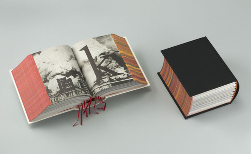
The SHV Thinkbook attracted me because it is plain black on the outside, like in the past many books were. Some of these ancient books also being on display (part of the private collection), I can see where she might have got her inspiration from.

Books to me are objects I love being around. They often bring back sentimental memories of a snug warm house and evenings spent divulging my favourite books again and again. And so does this book designed by Irma Boom.

I always thought there is something fascinating about books that are plain on the outside. They hardly reveal any of its mysteries at first glance and thus makes me curious about its contents. When you open it a whole world opens up before you. I wasn’t disappointed now. When you open the SHV Thinkbook you find colourful page after beautiful colourful cotton page, 2.136 pages of them! Within the letters of the title are hidden. Also, on the edge of the pages you can read a poem by Gerrit Achterberg.

Irma Boom wanted the book to be a voyage. For me the voyage already starts with goggling at its cover. Alas, that is as far as I am going to get, since it wasn’t allowed to touch any of the books.

All I can say is: it is a mighty shame I wasn’t allowed to take it home with me and discover its many secrets.

Irma Boom Book


Tuesday, September 7, 2010

I have chosen the book called SHV Thinkbook designed by Irma Boom.

This one caught the most my attention, although it is one of the most simple: black, thick, without any title, it is kind of brutal.  It looks like a simple dictionary. But we can discover the originality of the designer, because this book really doesn´t looks like another one. Because, it doesn´t has any title, only black without any symbol and when you look at the profile we can see the colorful side of the pages which contrast with the deep black of the front. It has something mysterious and unusual.

It has been designed in a way that you can´t guess what is inside (only maybe a strange geometric form white and red can symbolize

something). The cover of this book really makes me wondering  about  the content .

There is a details in this book that I found really beautiful, there are some few deep red bookmarks which go out between the pages. I like this three main colors (red, white and black).

Moreover , the story that Henk told us about this book makes it even more mysterious.

For the same reasons I found the book called Dutch Stampbook well designed. The same black, anything on the front page shows us the content, only a white peeler is appearing used as a kind of image of design (subject of the book).


Log in
subscribe