Skip to Content Skip to Search Go to Top Navigation Go to Side Menu


Archive for May, 2018


Space in the Metro universe


Sunday, May 20, 2018

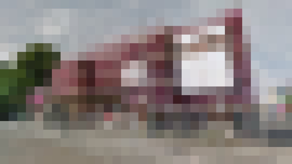
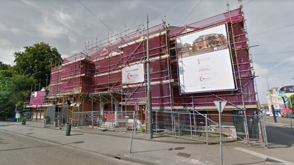
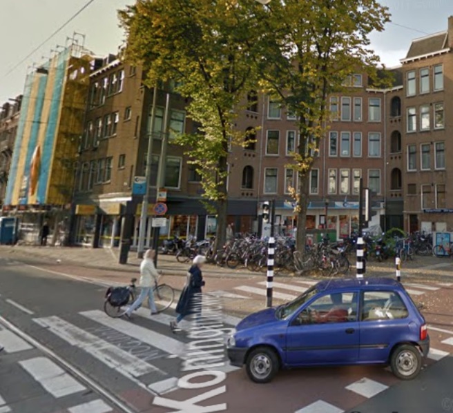
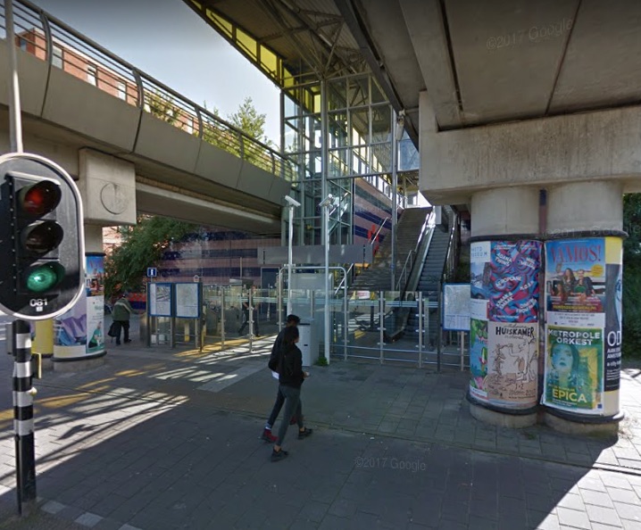
How do we recognize a map? That is the main question rising when we stand in front of the new decorations that appeared in differed Metro stations in Amsterdam. Together with design bureau Fabrique, Group A architects was responsible for the design [x] and renovation of stations along the Oostlijn Metro in Amsterdam.  Group A has created a design that is not only a return to the basis of the original design’ but also reflects ‘a vision of the future’. In an interview for Grafik.net website, Rene Knip, the main designer of the project, said: I’m taking the walls of stations and starting to tell things, I’m leaving it open — stories that are not understandable but everybody wants to read. I give type the opportunity to mean something, I give the people visual material to build meaning, a visual story that is free to dive in – the way they do it is their story.”

 
metro 1
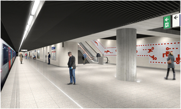
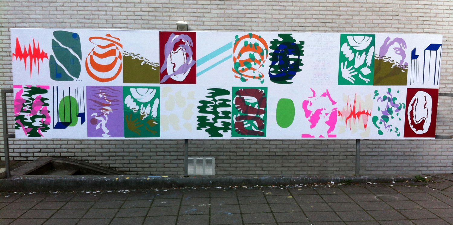
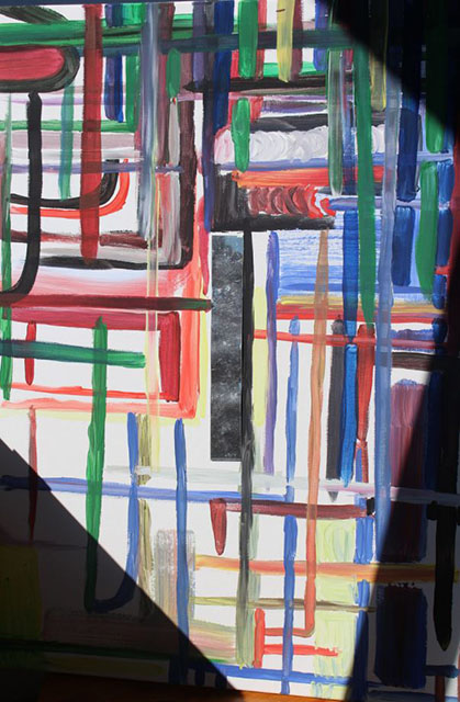
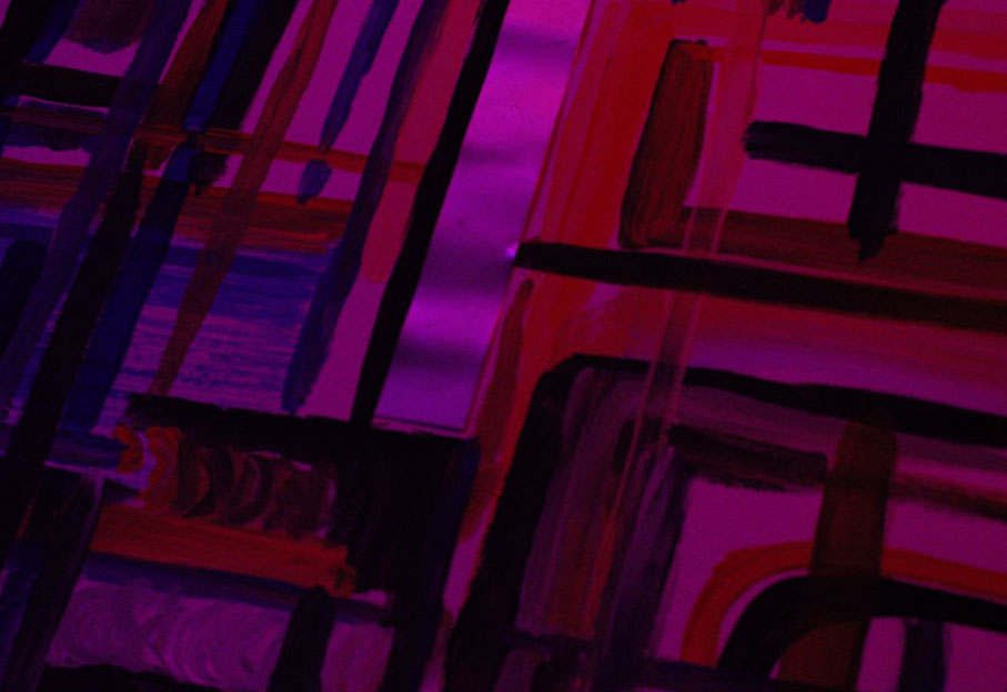
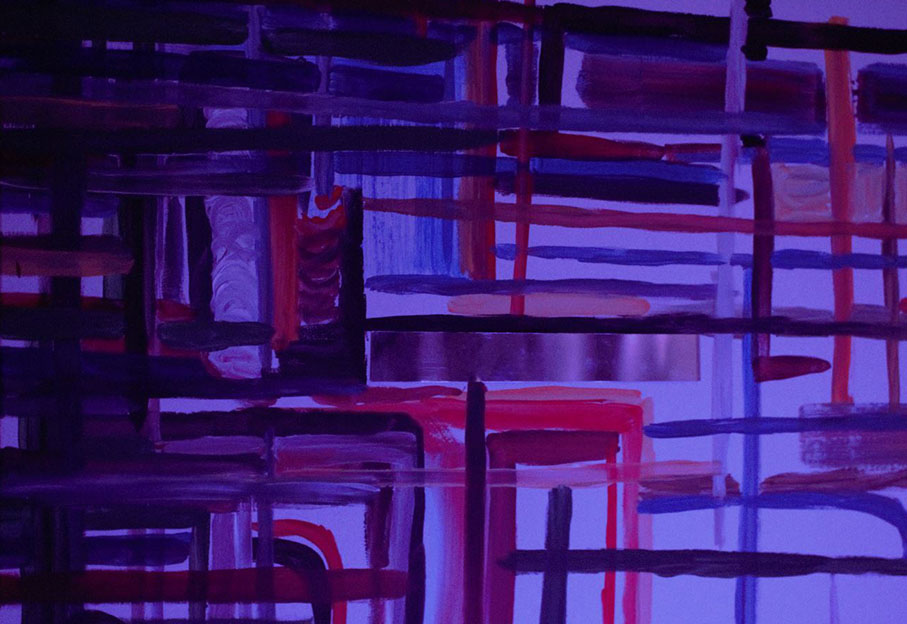
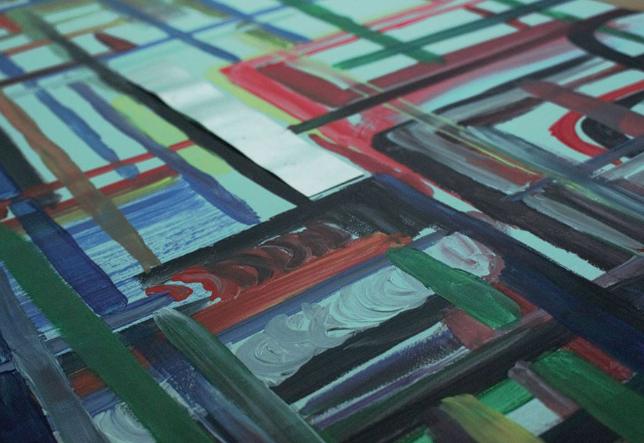
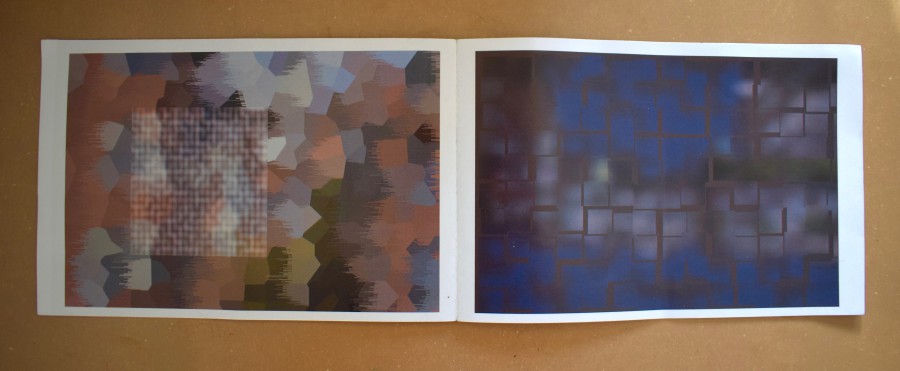
Photoshop sketches for visual language tableaus for the renovation of the Oostlijn metro in Amsterdam, 2013

 
When looking at these decorations, they immediately receive the shape of mystery maps revealing unknown places. They become a visualization of a secret landscape or an imaginary place. The reason that we see those unknown images and connect them to maps might be the language that was used in the design of the decorations. The use of red broken lines and empty dots, above a white background, connect us to the visual language of the Metro maps, but also to childhood treasure maps that uncover precious secrets. Knip described that the Metro designs were inspired by childhood experiences.

The Metro stations can perform as a universe on their own. When we look at a Metro map, we find out it is very much composed by straight lines, even though the path in fact is not straight. The maps are not designed in a way that allows you to find your location in the world, but instead they give a relative information of where is your station in the order of the Metro station system. Your location is relative to the route you are on.

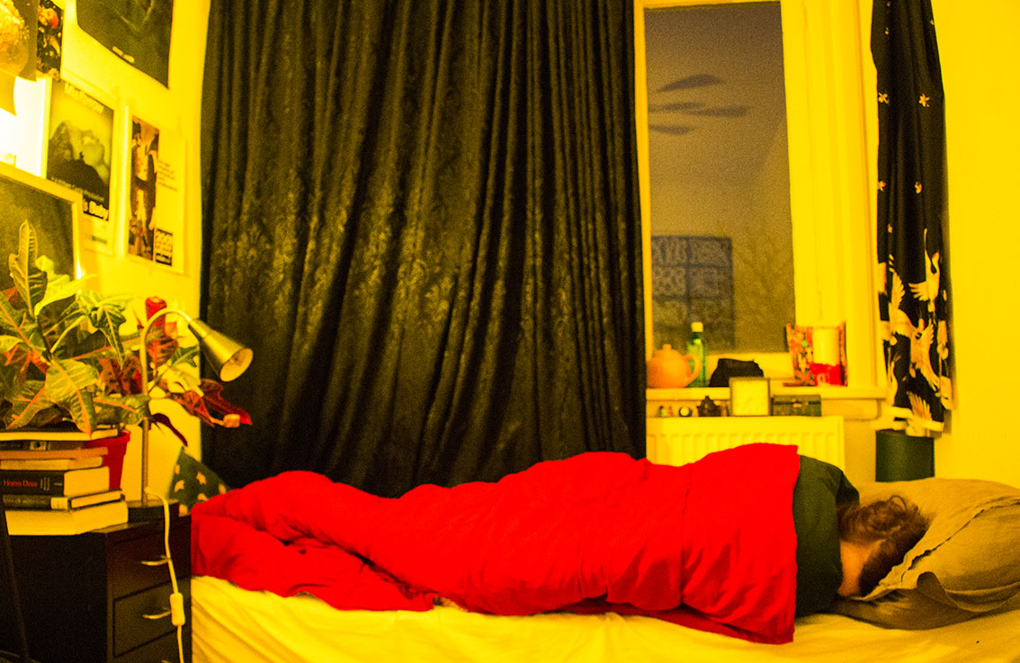
In this universe there is an order of actions that you have to perform in order to get to your destination starting with passing your ticket to enter. Once you arrive, you pass your ticket again and go back to the outside world. The Metro maps are the maps of a parallel world, that is connected to the locations outside, but also has existence of its own. You can travel under the city in a parallel universe that its whole reason of existence is to allow you to pass between places. In New York, abandoned Subway stations are becoming a strange space in which things are changing and transforming according to time.

 
metro 2
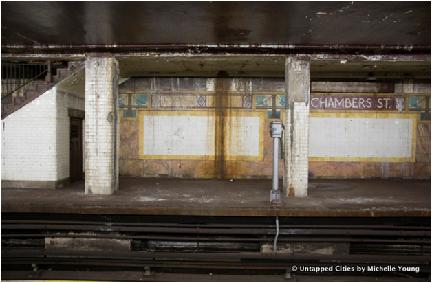
The tiling on a platform at Chambers Street has become significantly damaged

 
When we step out of the metro, and in our way out we see the decorations on the wall, it’s clear for us that they don’t try to illustrate the outside world. Why do we still relate ourselves to those maps? We know what it is but we don’t understand it, we recognize it as a metro map but we cannot read it. Maybe the motive of fantasy that they hold, the fact that they are almost something familiar, but not completely, is what gives it its power.


metro 3

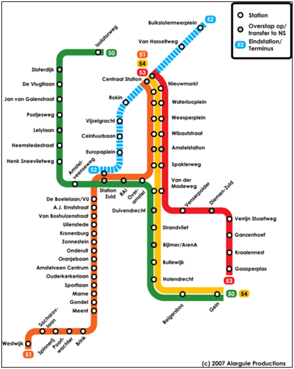
Amsterdam’s Metro map

 
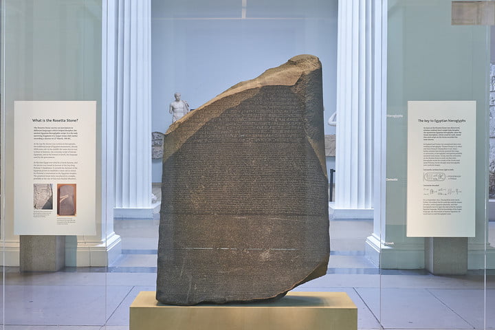
Is it possible that the way the decorations communicates might change with time? when we look back at something in time, we might not understand the meaning of it, but this appearance of something that it constructed by rules might give us the feeling that there is a meaning hiding behind the unknown language. An example for this can be the hieroglyphs found inside the pyramids in Egypt. No one had used the hieroglyphs for more than 1,500 years, but since discovered, people knew that the hieroglyphs are not only decorations on the Egyptian kings’ grave tombs. Even though people believed that the hieroglyphs has a meaning, they were decoded only after hundreds of years, with the discovery of the rosette stone that was found in 1799. The stone is inscribed with three versions of a decree issued at Memphis, Egypt in 196 BC during the Ptolemaic dynasty on behalf of King Ptolemy V. The top and middle texts are in Ancient Egyptian using hieroglyphic script and Demotic script, while the bottom is in Ancient Greek. As the decree has only minor differences between the three versions, the Rosetta Stone [x] proved to be the key to deciphering Egyptian hieroglyphs.

 
Maybe in hundreds of years, the cultures following ours will come across those Metro decorations that has the quality of a secret map or a secret language, and will try to find the meaning lying behind those vague maps. Maybe when that happens, they would be able to find their own Rosetta stone [x}, and give new life to our symbols, that will receive a new form and meaning.

tumblr_o6swairt5L1r54c4oo1_1280
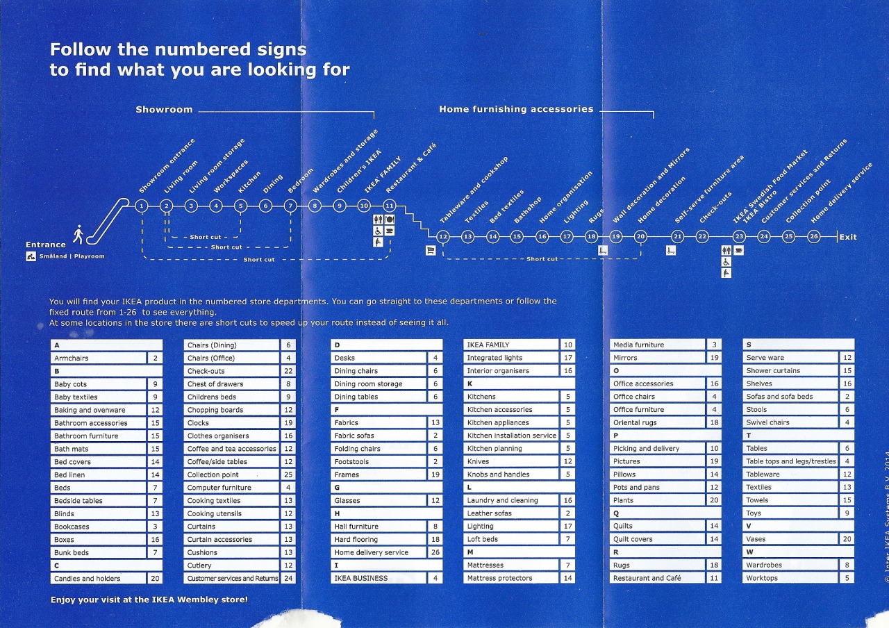
Linear IKEA Store “Transit” Strip Map
 

emojis


Sunday, May 13, 2018

So what it basically iS?

.                                    Symbols, that help to describe/show things/emotions.

Did it all start from the primitive period, when people drew animals on the walls of the caves, using images and signs in order to describe?

2017-01-092_1300


Or from the first ‘:)’ in the poem from 17th century?


emojis


Anyways, it became popular in the 90s when in SMS people started using emoticons. Emoticons are punctuation marks, letters, and numbers used to create pictorial icons that generally display an emotion or sentiment.
Actually, it officially started in 1982, when in Carnegie Mellon University the joke in online message board went wrong and made a huge misunderstanding. Dr. Scott E. Fahlman came with a proposal to use emoticons in order to define jokes and non-jokes.  : – )

Kao(face)moji(character)s are Japanese emoticons ¯\_(?)_/¯ .

e(picture)moji(character)
the first emoji was made by Shigetaka Kurita in 1999 for the first Japanese mobile internet platform i-mode.
(the 176 original emojis are now part of the permanent New York MOMA collection)

In 2011 Apple (of course) made them famous by adding them in iOS 5, but only for the Japanese version.                                  (2 years later Android joined 🙂
After noticing the growing popularity of emojis around the world they added them to every keyboard.
Now every user can switch from English or German to emojis’ keyboard.

With the help of Unicode Consortium    (- a non-profit group that maintain text standards across computers) (and Google’s petition to get emojis recognized  )             emojis are (almost) everywhere.                                                                                                                                                                                                    O-:

in 2010 Unicode accepted 625 new emojis proposed by Apple.

in 2013 the US Congress Library added the ‘Moby Dick’ written in emojis languages

in 2014 the gender and skin-color issues raised

in 2018 157 emojis were added.


You can propose your emoji and explain why it is necessary to add it                                                                                                 http://unicode.org/emoji/selection.html

2 times a week the Unicode meets up to discuss wether the pasta should be on a plate or in the bowl

wether it is important to add a sugar cube to emojis’ list

wether the girl’s haircut should be till shoulders or longer

You can go to https://emojipedia.org/                if you are not sure in the meaning of the emoji and do not want the misunderstanding to happen

You can go to                                                             if you want to analyze the emojis you are using

http://emojinalysis.tumblr.com/                                                                            (sometimes they can tell more than your daily horoscope from Cosmopolitan)


http://emojitracker.com/                       if you want to know what is in trend on Twitter


We are now way more reachable for any person in the world

We are now able to understand people without words


                           are emojis the new Esperanto?

                                                                                                                                                                How are they effecting us socially?

In Japan, where the emoji was born, there are declining birth rates due to people loosing interest in romantic relationships.

 Hikikimori – a group of young men who dont leave the house and only communicate through technology.

                             We are loosing the power to communicate face to face.

However, Match.com released data proving that the more emojis a singleton uses on their dating site seems to result in more dates, therefore more sex.

      Our phones have become priority.               In general, if someones phone pings they stop their real life conversation for their phone.

Emojis are  proven to help dyslexic people – they help us to sense emotions in bland messages.

                                                                                                             what is the future of emojis and our language?

Colour System Project


Wednesday, May 9, 2018

January 30th

Hi all,

Sunny morning, the colours are back!  pilz

Colour systems are created from very different starting points and urgencies, often related to a specific application and context. Some are based on observations, others on textual theories or visions. They can be technical, poetical, philosophical, tactical or speculative, they can be developed “for home use” or for a large audience or group of users. They are both political and personal, and almost always related to ideology.

Here’s the story about a fake art movement SPECTRA. Also all the other bulletins in that section (from ‘Umberto Eco: THE COLORS WE SEE’ till ‘James Langdon: NOW IN COLOUR’) are on colour-related  topics.

The  question is to develop a new colour system. A colour system that comes from your own, subjective starting point. Medium, scale, application, etc. is up to you. It would be interesting too if you all develop a colour and  a visual, graph-like representation as part of your colour system,

This was how the project started and ended with the publication of all process documentations which you can read if you scroll down.


April 4th

But before you do,


Look at all the colours we created, silkscreened with Kees Maas as part of this project and glued on the Rietveld Billboard. The next day it was a sunny day..


Builboard_Colours2


– All Color Names–
–Night Sky Violence, Walking on Light Tears, Sancho Panza, Lost-Diving-Mask-Green, Sickatoum, Sea Bird Blue Goes Dancing, Retired Rosy Brown, Flu Blue, Lost in Some Wax That Game Out Of Shrek’s Ear Green, Uta Grass, Hope Empty, Lizzard Wizzard, Capitalistic Pink, Maria Markan, I’ve Got Leaves In My Eyes, Tolerant White, Dragon’s Egg, Daniel’s Jeans, Adolescent Moss, Glass White / Glaswit, Don’t Be Blue Boo –


WORK IN PROGRESS

 
(more…)

A Letter of Rejoice


Monday, May 7, 2018

During the research of Isaac Newtons colour-wheel I had the image of colour being spread into flakes, much like flakes in the paint of cars. Another thing is also the separation of the colours within the prism that is projected by Newton. These to points gave life to the idea of the book: A letter of rejoice.

 
Screen Shot 2018-04-03 at 14.49.44

 
The colours of cars come in every shape and form just like the rainbow. With the paint from cars as a starting point I went out in public trying to gather as many photos of car colours. With no system in what pictures of cars I took I quickly gathered +70 pictures of different car colours. Looking through the pictures on a laptop one thing was clear. The reflection of the sun changes the colour of the car. A black metallic will turn into a less black and a bit more dark blue.

 
Screen Shot 2018-04-03 at 14.51.33 Screen Shot 2018-04-03 at 14.51.53

 
The reason for the dramatic change in this case is because of the blue sky reflecting in the paint. This was the case with some of the colours. Some will stay true to their original colour while some change significantly. In order to create a system I had to select the images of cars that were relative to each other and remove them from the collection. Reason being to create a book that isn’t boring to look through. Reading a book where at least 50% of the images are difficult to distinguish from each other can be, quite frankly, boring. Another reason for some of the images being removed is because of the main inspiration which was a catalogue from 1982 by Porsche (911 G (1982) – COLOUR CHARTS AND PAINT COLOURS).

 
Screen Shot 2018-04-03 at 14.52.14Screen Shot 2018-04-03 at 14.52.29

 
In the catalogue the colours are far from similar. This is to make it easier for the buyer to choose a colour for the car they want to order.
Using the Porsche catalogue as a template for the project I sculpted my own “German” catalogue. For this I used Adobe Illustrator. Anyone can set up an illustrator page like the catalogue from Porsche. Its just like copy paste. However the real obstacle was to name every colour in the book. In order for the text to become alive and for the reader wanting to read on wards the text needed to be related to what I felt when I see the specific colour. The text attached to each picture but in total it creates a story and that’s what I wanted to create. A story with no end nor beginning. If the pictures were to be switched around the story would still be the same because of the nonlinear course of the text. One restrain that I wanted to keep from the Porsche catalogue was that the text shouldn’t be any longer than a few sentences. A lot can be said with just a few words. A lot can be felt with just a few words. A lot can be misunderstood with just a few words.

Screen Shot 2018-04-03 at 14.52.54 Screen Shot 2018-04-03 at 14.53.09

design theory process compressed (1)

Layout became like so:
flakes of colour pdf compressed

The draft for the catalogue looked like so:

flakes of colour sample flakse of colour sample 2

This draft is very close to what I would imagine the catalogue looking like back in 1982. Or at least my interpretation of what it could look like. However it is also very plain and it doesn’t have any flare to it. When making a book the outside has to reflect whats on the inside. It was therefore back to the drawing board.

Screen-Shot-2018_1400
Using Adobe Illustrator CS6 to set up the pages

A few problems were to be considered when I was changing the catalogue into a book. What page size, matte or shiny paper, the printing setup etc. All these problems are something that can be difficult to choose from but once you narrow it down to what you want it look like it is fairly simple. I went for A3 paper, so I could fold the A3 and have two A4 pages on one A3 page, and a different setup with the order. The reason being that the pages with images now could be on shiny paper while the text pages could be on matte paper.
The experience of going through a book like this is a lot more enjoyable.
Rather than having to flip the pages upwards its now the normal way. It also changes the characteristics of the book it self. Before it was leaning more towards the original catalogue from Porsche where as now its something on its own. The departure from the catalogue is a great improvement.


letter of rejoice 1 letter of rejoice 2

letter of rejoice 3 letter of rejoice 4


Orders can be done on my instagram account @carlottolinde


chasing after something unclear


Sunday, May 6, 2018

good

At first I thought of two spheres, one based on pigment, and one based on light. The spheres would hold all colours, but on the outside, the pigment-based sphere would be black and the light-based sphere would be white. It was kind of an immediate response to the three-dimensional colours system shapes I saw during our presentation on already existing colour systems. A lot of artists and taxonomists from this presentation had decided on a certain shape either two or three dimensional, which would hold all, or at least all (for them) relevant colours. These two spheres I had in mind were maybe an ode to the two things I believe decide colour; the pigment an object contains from itself, and the light that makes it possible to receive the colour by the eye. The pigment-sphere is black, with a white center (all other colours exist somewhere in between the white and the black), because this creates a bigger arera of black in opposition to white, just like the more pigment something contains, the darker the colour gets. The same goes for the white sphere, as more light will eventually create white, and no light at all will create complete darkness (black).

But far before I started working with this idea, even before I completely thought it through, I started to doubt. Because, if light and pigment completely depend on each other, than what reason is there to “pin down” colours, in a system? Of course I could create a scale model, animated version or a couple of drawings of these spheres to show what the colours inside are like and how they work, but what would be the use of that if anyone seeing it in a different room, with different light would receive it completely different?

I wasn’t sure how to continue now, as the word “system” felt like I had to make something clear, or at least something that can make sense and be repeated in multiple situations, which I thought wasn’t really possible with something and changeble as colour. It took me a while to realize that I should just start working with colour, and not worry too much about it making perfect sense. But as soon as I realized, I got sick and didn’t do much more than lay in bed. This, in combination with the feeling that colours mostly depend on how our eyes perceive them, made me want to approach the assignment in an unconcious way. A couple of nights I slept with a different colour light in my room. Afterwards I tried to capture what my dream was that night, and if there was any noticeable difference from the night before. Though I remembered the dreams well, it was surprisingly difficult to pin them down. I wanted to show the general feeling of the dream, and no specific details or story lines. I wanted to capture them in a simple way, in which the sense and atmosphere of the dream is immediately there and clear to anyone.

I noticed that sleeping a shorter amount of time had a different influence on the dream than sleeping the entire night. If i only slept an hour or two with the coloured light on, I could clearly remember the first random associations mix up with the usual memories and thoughts I have when I’m awake. To put it differently: I felt myself fall asleep, and I felt myself sleep, and then I felt myself dream and then I felt how an alarm clock woke me up and brought me back to the logical world. Within those few hours, there was not enough time to form coherent, “full” dreams. I dreamed in feelings and associations, not about stories or places or people. I think the lights had some effect, in the short term.


yellow light  Yellow light, 8 hours, no clear difference from my usual dreams, except that everything was darker, This corresponds to an old dream I have each time the morning sun shines into my eyes: That my eyes don’t work and there is a black spot in the middle of my eyesight.

geel 5


green light Green light, three hours. Some images I had with this one were of dark wood furniture and music instruments.

groen


light blue light Light blue light, 1 hour (maybe shorter). This one had very clear images, as I was still half-awake. I woke up pretty soon too, so that I remembered them very well.

lichtblauw


red light Red light, 8 hours.

rood 2


purple light Pink/purple light. 2 hours. I dreamed about textures and places, no clear story lines involved.

roze


dark blue light Dark blue. I don’t remember how long I slept. I dreamed about people crossing a busy highway in the dark, so there were a lot of orange headlights.

blauw


I really liked the coloured light and the many effects it had on the colours I was used to, so I wanted to do a little more on it and show what a power the light has. I had two coloured lamps change constantly while painting, so that the way I choose the colours wasn’t like usual. Thinking about it, maybe it were better if I had painted something realistic, so that the choices I made had more of a purpose. The painting then would also “make sense” in one light, but not in the other.


blue light painting green light painting

orange light paintingpink light painting

purple light paintingwhite light painting


In the end, I still feel quite confused about what I did in this assignment.
By focusing on the things that go around unconsciously in my head, I can never be sure if I have “catched” what I was chasing after.


Camouflage


Sunday, May 6, 2018

We started this project by choosing a color and trying to find a match in our surroundings. And instead of searching for the solid color objects have, I started to look at the colors that were reflected in certain objects and how the colors change in the shadow. So when we were asked to make a color system I started thinking about working with reflecting colors. But after researching the CIE-1931-system and reading about all the other really mathematical systems I got a little bit confused.

8.-Liz-West-Our-Colour-Reflection-2016.-Image-Credit-Hannah-Devereux-660x400

A color system was now in my head something that was very structured, had a mathematical origin, even and could be presented in graphs. So when I was working with the reflection of color I soon got stuck on trying to systematize this. First, I did some visual research on the different ways materials reflect color. I did this so I could maybe make my own objects which would reflect the color. But I didn’t see how to make this into a system. I thought maybe using different gradients and different materials to get various color reflections, but I didn’t really think this was a real system.

static1.squarespace So I moved on…

This is the moment when I got really stuck. First, I just tried to research a lot of different color systems and came up with a few ideas, but never really worked them out. So when I was talking with a classmate about his color system I mentioned the idea of using google maps to get an overview and then I thought why don’t I use google maps for my color system, because for the first time I had the feeling I could approach this in a systematic way. There was already a lot given in Google Maps, almost everything is already visualized and there’s also already some sort of system, countries are divided by regions and cities by neighborhoods and so on. So I could make a color system out of this. Maybe measuring the green in different capitals, by taking screensavers of google maps and pixelate the capitals in color graphs and look at the graduation of the green. So I opened google maps, and Photoshop and started to take some screensavers and pixelating them.

1616 kopie7 kopie 3715 kopie153 kopie3

But when I was working with this, it felt so easy to just make a graph of the green in capitals and only making a screen shot and pixelating it. So now when I made screenshots in google maps and edited them in Photoshop I slowly started to let go of the idea that it had to be confined in this systematic approach.

9-kopie-29

This was I think the first time there was some freedom for me in the assignment. So I just played around with the pictures, editing them in Photoshop.Although I still felt that what came out didn’t really made sense, I tried to ignore this feeling for a while and just see what happened. What came out of editing these photo’s more freely were all kinds of camouflages of the city. For the first time in the project I gave myself the space to explore what will happen in the making and this at least created something to react to. Now I had these pictures, I had to find a way to bring them together in a next step. The most obvious way to do this is to make a booklet and this is what I did.

Screen Shot 2018-05-18 at 17.22.51

DSC_0431

But I knew this wasn’t the best way to present it. Not only because it was a badly published booklet, but the pictures also needed something extra to make them work. Now they’re just plain pictures in a book without getting a clear notion of what they represent. I had a talk with Matthias and we both agreed that maybe the best format for this is to bring it back into the city, to give the pictures a context. So what I’m now going to do is making posters and put them up in the city and photograph them.

In the end, I think I learned that I should have given myself the freedom to let go of this rigid idea of a system and to try out things earlier. Because when I did this it became more fun to do and there was also more room for other possibilities.

DSC_0419

The Pursuit Of Completeness


Sunday, May 6, 2018


ColourCard-4


Once in a time, lived a young hero who found himself on a quest: the pursuit of completeness. He traveled across the lands, west and east, observing cultures and reading the ancient texts. He discovered so much on his journey, and came across many wise sages who offered him mysterious advice. And yet, the hero found that the more knowledge he gained, the more distant his goal seemed to become. At certain moments the target would completely disappear and he would be left raw and dizzy, lost. In these moments he would cling even more desperately to the words of the wise-men, reading, researching, searching obsessively until his vision would once again appear in the distance. But it was hopeless, it hovered like a mirage on the horizon, never any closer no matter how fast he ran towards it.
On a particular night, exhausted and alone, stuck but stubbornly holding onto hope, the hero fell into an unexpectedly peaceful sleep. It was as if his body was floating gently on a warm sea, and, in the eye of his dreaming mind, an image appeared: A full rainbow across a grey landscape. It was so dazzlingly crisp and clear, so bright and vivid. The air was still and perfectly silent and in that moment the hero knew that he had received the sign that he had so desperately been needing. He woke up with the new day, crying tears of joy and gratitude. His quest was far from being over, in fact he was certain that the hardest challenges were yet to come but, finally, he had clarity and direction. He would leave his texts behind, all his pointless, distracting knowledge and set out on his own path.

The next night, as the hero was sleeping, he dreamed of the devil and of fear. The dream was bathed in a red glow and the devil knocked on his door. Terrified, the hero resisted but then a calmness came to him. He opened the door and invited the devil in and together they sat down for a meal.

The following night, the hero dreamed of a woman of the night in an orange dress and a fight against yellow men, a dream of guilt and shame but also of an incredible strength and willpower.

The night after that, he dreamed a beautiful dream of the woman he loved. Lost together in the night, in an empty world, they mourned the loss of all those they had once loved but, gazing into each others eyes, saw the eyes of their parents and friends and past lovers and they smiled in their hearts.


ColourCard-1     ColourCard-2     ColourCard-3


The hero could feel it in his body. Finally it had come! Life was guiding him. So strange and peculiar these dreams, so profound the significance of these colours! The full spectrum of life, in the full spectrum of the rainbow. Now he understood red, orange, yellow and green with an understanding beyond words. Oh silly, silly words he laughed. It was all in the colours, it was all in life always. The hero fell asleep that night full of anticipation, but the blue dream did not come. Nor did it come the next night, or any of the nights that week. No blue, indigo or violet dreams. He started to worry, he had made such incredible progress. He was almost there but now he could feel himself slipping away again. Weeks went by and the hero had no dreams. The colours which had once seemed so vivid now seemed dull and meaningless. Life seemed dull and meaningless and the hero mourned the loss of those clear, bright eyes he had once looked through. Weak and confused, he reached again for his books. He was desperate to understand and so desparate to feel that beautiful way once again. But, remembering how certain he had been of their futility, he put them away again.

Gathering up strength, the hero resolved to set himself out into the world to search for the answer. If the colours would not come to him, he would go and pull them out of whatever situations he found himself in! He would do whatever it took. He started with painting the dreams he had had. And then he painted paintings with all the colours of the rainbow, trying to understand what they had meant to him and how they were in relation to each other. He came to some interesting, intuitive understandings. It seemed that the first four colours existed on the foreground plane and the blues and purple in the background plane. The further he explored this, the more obvious it became to him that there was a divide. There was the realm of human emotional experience, of textured and colorful personality, all belonging more to the material world and then there was the realm of the spiritual, the land of the soul which belonged to a mystical, divine world. Yet how to split this mystical world up into blue, indigo and violet, he could not yet work out. He needed some kind of way to access them.
Remembering his earlier dreams, the hero went in search of the devil. Let me find the adventure that will take me through the full spectrum, he thought. He kept his ears and eyes open and wandered the land. After weeks of following symbols and signs he found himself, one dark night, approaching a huge and abandoned church. He heard a terrible, hypnotic chanting inside. He quietly pushed open the door and looked inside. There was a huge crowd of all terrifying, evil beings; men with knives and guns, gangsters and crooks, giants and witches and demons. They did not notice him as he crept inside. He was scared but calm in his determination. He looked to the front of the church and saw, standing by the altar, a man leading the chant. The hero’s ears singled out the man’s voice and he was gripped by an incredible torment. The voice was so

big, powerful and so direct. It felt like it was calling him directly. He was filled with fear and immediately regretted his ever having come here. He wanted to turn and leave but the voice was so beautiful and hypnotic that he could not. He was trapped in indecision but then the calm voice of his red dream came back to him, ‘open the door and let him in, offer him something to eat and drink’. He watched himself as he pushed his way to the front of the crowd to stand in front of the devil. The devil slowly turned his fiery eyes upon the hero and as he did this the hero felt his body fill up and he stood taller and he felt amazing and powerful and he lifted up off the floor and reached out his arms and roared. The crowd of people roared back and he flew up higher and higher spreading himself out more and more until, all of a sudden, he came crashing down to the ground. He felt a sharp sensation in his face, it took him a second to realize what had happened and then he got up and started laughing at himself. Walking back through the crowd, his nose bleeding, he laughed because it seemed so funny how seriously he had been taking it all.


ColourCard-5 Tarot7-1


Beccio


Thursday, May 3, 2018

After studying and researching on William Benson cube colour system, based on a geometrical approach to the harmonious use of design colours, we had the announcement of creating our own colour system.

I looked to my predecessors and so, I decided to create a colour system based on a personal approach and a personal use. As a starting point I tried to figure out elements and interests of my life that could be and not be related to a colour system.

The thing that interested me the most between all the ideas I had sketched down was wind. I was really intrigued how to combine such a powerful element as wind to a colour system. The similarities between this two element is the representation of both of them.
The diagram of the wind (Wind Rose) is used in order to know which directions the 8 major winds (and sometimes 8 half winds and 16 quarter winds) blew within the planet. In fact there’s no difference between cardinal directions and the winds which blew from the same points. Wind roses use 16 cardinal directions, such as north (N), NNE, NE, etc., although they may be subdivided into as many as 32 directions, so that creates a distinction between the degrees of each cardinal point ( North corresponds to 0°/360°, East to 90° exc.)

circle rosa dei venti R

At the beginning I tried to give more of a strict or scientific approach to the work and to create something actually handy. In fact many airport, such as Amsterdam have records of how the wind had blew during the years. The diagram below demonstrate how the wind rose for Amsterdam shows how many hours per year the wind blows from the indicated direction. Example SW: Wind is blowing from South-West (SW) to North-East (NE).

My idea was to create a system based on how the wind blows in the city of Amsterdam, during a period of time, I wanted to actually use the records from the airport so to relate each cardinal point to a colour.

amsterdam rose wind

After reflecting on my idea for a while I realize that I was unsatisfied and things such as the difficulty of reaching the records and a big lack of interest and real personal approach on the theme were influencing my working process.
I started to reflect again on the idea that I have of wind and how I feel about it and after a while I found the perfect way to combine my interests to the work.
Wind is really almighty element that influence our existence, something that never stop blowing and will never stop. So I had to put this power in to my work and include it in to it.

I decided to work with coloured smoke emitter, and to bring my colour system where it belongs.
My initial idea started when I went to the beach and under the “eyes” of the camera I positioned 4 coloured smoke emitter on the sand. One for each cardinal point and then turned them on.
Since the regulation of the Netherlands doesn’t allowed smoke emitters with an high percentage of gunpowder, as expected due to the power of the wind, the emitters in my possession barely worked (result in the picture below).

Screen Shot 2018-05-06 at 17.18.43


The attempting of creating a land art piece, worked quite bad, consequently to solve the problem the solution was to work with the idea of the wind as an untouchable and floating element.
I decided then to create a performance in the spray-painting room of the main Rietveld Academie building, a really loud place caused by the ventilation of the room that reminds me a lot of the sound of the wind or how loud the wind can be.
click here for the performance.


Log in
subscribe