Skip to Content Skip to Search Go to Top Navigation Go to Side Menu


Archive for November, 2018


Softness of the alphabet


Thursday, November 22, 2018


In the library, I was first overwhelmed by the fact that I had to make a choice.

Because of my mood, I was drawn to all the books which seemed to hold a certain amount of history – in other words, old and mysterious.
I was lingering at a big blue book with no inscriptions, when I first saw it:

SCHRIFTKUNDE, SCHREIBÛBUNGEN UND SKIZZIEREN
Ein kleines Lehrbuch der Schrift für Setzer und Graphiker
– Von Jan Tschichold
Almost too thin to be of any importance. A5, 77 pages, and rather uneven around the edges. The color is a light slightly yellow brown, the main title in black capital letters and the further inscription in dark toned orange cursive.

Maybe I felt a bit of myself reflected in the design, or maybe I was drawn by the nostalgia and romance I often ascribe to objects which are a bit ‘old-fashioned’.  A weakness of mine.

Immediately I felt the need to give this book a certain personification.
To claim that this book has a character, and with it a history hidden in its scruffy pages.  It is almost stoic, with its simple design.
Moderate, German = serious, important.

The plastic cover for protection is exhausted, and has been repaired, giving the book an even dodgier look. The plastic reflects the light and makes me think of grease shining on the forehead of old sweaty men.

Although my German is a bit rusty, I try to decipher the title; SCHRIFTKUNDEN – ‘the art of writing’.
The text on the back is a bit more confusing, but overall I get some words: Typographic, graphic art, learning and maybe something about photography too.

The backside only confirms my notion of this book and its author.
Jan Tschichold makes his own introduction of the book, mentioning its precise size (148 x 210 mm), number of edition (112), publisher, something about the paper and the prize of the book (5 Franken), which I find amusing.

Typography – the artwork of creating letters and numbers.

The beauty of an alphabet has always fascinated me.
I remember making up my own alphabets as a child:
Aa, Bb, Cc, Dd, Ee, Ff, Gg, Hh, Ii, Jj, Kk, Ll, Mm, Nn, Oo, Pp, Qq, Rr, Ss, Tt, Uu, Vv, Xx, Ww, Yy, Zz, Ææ, Øø, Åå. I would write them over and over again.
Different sizes, lengths of the lines, curves, dips and turns,
Words as drawings, numbers as symbols. Somehow it was important for me to claim the letters. Taking over, making it into my personal alphabet, in a sense conquering the language.

After this notion I felt softness. A sense of safety mixed with the slight sadness of nostalgia. I remembered other things. Smells, touches., sounds.
And I felt grateful.

Book number, 757.4-tsch-5
 

“I HEARD THEY RIPPED IT OFF”


Wednesday, November 21, 2018

The first thing that caught my eye was the title together with the typo; “I HEARD THEY RIPPED IT OFF”. The typo looked like the way I write by hand; With bold letters and a melancholic undertone. The book gave me a homemade impression, and right now I really want to make a book based on what I write and draw in my journal, like one of those books that more look like a public notebook( Had bookbinding workshop for the first time the same morning). The aesthetics of the book worked as inspiration for me, which was one of the reasons I chose it. Generally I like books that look like weird notebooks you have stumbled across somehow. When I go thrift shopping I always look for old journals, like peeking into lives of strangers I probably never will meet.

The title had my kind of humor, for me humor is key; Seeing something which applies to your own sense of humour is kind of like seeing something written in your own language when you are traveling. Furthermore the title intrigued me and I wanted to know more about the title and the person who came up with that quote. I don’t like when things are too obvious, I want to feel as if I have stumbled across something  secret.

The cover was very minimalist with only a stripe of black “spray paint, a bit mysterious in a way, and very graphic ( Black and white). I like when things are a bit mysterious yet graphic at the same time, I suppose you can see that in the artworks i make. The book was small and simple and the pages “raw” in a way, again working as an inspiration for my eventual future book. I always prefer books that are small and simple, too big and too fancy books takes up too much space and attention. Also that day I had a small bag which might have affected my choice of a small book in order to fit.  When I peered through the pages there where different small texts written in straggly handwriting together with a few drawings, which gave me the impression of looking into someone’s journal. Exactly the inspiration I’m currently looking for. I wanted to know more of the content, it felt very personal and humorist yet serious in a way.

rope


Wednesday, November 21, 2018

I picked out my book because of the colours and the way the book is bounded together. I had bookbinding class today so i was more focus on the way the books are made. The most spines are the same. But not this one! It is made with a lot of attention and care. The rope makes it a bit raw, and the pages makes the book soft. They look more like fabric. They look sweet and in balance. The colours of the pages remind me of today. A beautiful autumn day with a lot of sun in the perfect time of the season where the leafs are having all this beautiful colour. They make me smile and think that every season has his own character.

Its looks so modest on the last shelf of the bookcase. and I felt a bit the same. More focussed on myself then the outside world, specially when I am looking for a book. I felt immediately that this was my book. When I took it from the case I saw that it had the same colour of my shirt. But it was not a boring flat colour. The front was more a life. It was made with different paper. It looked recycled. You could almost see the parts of the other papers where it was made from. There was no text but it didn’t need it. Also the back was amity.  Except from the two yellow round stickers. I think the Rietveld placed them there for the order in the library. It fits my book. The yellow rounds where placed at the right place. I didn’t get the inside of the book. In the front there where more pages pointing in different directions. They are cute and necessary. It looks fragile hanging on this few ropes but also strong enough to hold itself. Anyways the pages looks together didn’t fit but that made it interesting to look at. I saw some black and white pictures, I love black and whit pictures. I just developed some myself last week.

758.3rieb4

The Tribal World


Wednesday, November 21, 2018

Thursday, November 22, 2018
The book „Tribal Tattoo Design“ is a little yellow book with silver printed shiny letters on the cover that spell the tittle. It is a square small soft covered book around 15cm x 15cm. The color is very vibrant and stands out. Not necessarily a kind of yellow I very much like but neither I mind. A lemon little toxic looking yellow. Next to the tittle is a sketch in outlines only, showing a human body from behind with tribal looking tattoos on the arms, pine and legs.

The first time I saw this book it attracted my attention in the hands of a classmate of mine. The book was open so the images inside attracted me in the first place. Simple outlines only sketched body with traditional tribal tattoo art from different regions in the world. I immediately wanted to look through the book because I’m very interested in diverse tribal history, body art and tattoo art for a longer time now.

The book looks vey simple. If I would have seen it just on the shelf the cover would not attract me at all and blend into the surroundings. On the inside of the book the most oft it are pictures so it attracts to look through. Around the images is a lot of space it attracts the eye with a lot of space and just tattoo and human body doodles. It is easy and fun to look through. The book gives you an eutectic feeling and brings some inspiration as information that you can simply absorb with your eyes. A nice little handy book for some illustrative inspiration for people who are interested in tribal culture and a look on beauty outside of the western world. A nice looking book on the inside and not spectacularly designed from the outside. A very simple little like-able book.

Book number 908.9 din 1

Ideograms’ first fascination


Wednesday, November 21, 2018

Thursday, November 22, 2018

I was first attracted by the back of the book : placed among hundred of others, this thin pale blue back on which we could read – or rather just see in my case, as i can’t understand Japanese- the fine title.
At first sight, this book also looked a bit like a notebook -due to the black cover and the worn out aspect of it-  maybe this is another thing that appealed my attention as I have a special affection for notebooks/sketchbooks, everything randomly sketched and unfinished.

I wouldn’t have picked up this book if there wasn’t those yellow pages in some parts of the book (p.73-88 and p.93-108 and p.121 to the end). They have a different quality of paper : less soft and shiny than the other pages wich mostly depict photographs of masks (the book’s subject I guess). We could also notice more clearly in those parts, how the contour was shining in gold , as if the book was made out of cult paper.

There is also this recurrent fascination for Asian ideograms, that implies a complete inability to understand the meaning of what the book is about , consequently bringing  a focus on the the form and how beautiful compositions the writings create. Ideograms and the all language and culture brought with it become drawings and pure contemplation for me, more than a clear explanation and precise knowledge.
My reaction is a typical European person’s reaction who become quickly fascinated by all this « exotic » aesthetics , anchored in a culture, a language, cods and signs & symbols she can’t totally understand. However, I found this naive reaction, from the moment it becomes conscious, also beautiful. This feeling can be brought closer to the feeling we get in front of an artwork , or in our everyday life, when at a sudden moment, a sort of spark -made out of several elements brought together by coincidence at this precise instant- brings beauty to the present situation.

772.5 CAT 3

Searching for books


Wednesday, November 21, 2018

Thursday, November 22, 2018
I was asked to choose a book that attracted me the most. So I was walking in the library, checking books in different sections. Everything was ordered in categories. It took me around 15 minutes before I found something that attracted me. When I was looking at one of the many shelves that was in front of me, I saw the word “colors” on one of the books and i didn’t even notice in which category it was. It attracted me because I love colors in general, they make me feel happy. I held the book in my hands it was “heavy”. I looked at it! On the cover was written “stop” in Arabic. It felt like it was a sign from the universe telling me to stop searching and take that book. I opened the book and it was full of pictures which attracted me more to it. Because I am that person who can’t concentrate for a long time and read big texts. I rather watch pictures, documentaries or films instead of reading. In the same time i found it pity that i don’t learn or get knowledge from books and therefore i try to learn and get knowledge from experiences in life like ( meeting people with different backgrounds, traveling to other countries, listening to people stories and listening to my own stories ). As i also think that each one of us individually is a book with their own stories and knowledge that we should try to share in the library of life.   It’s funny! that a few months ago i was in the park next to where i stay and there was a big round sign (big circle) with a walking woman/man on it (as you can see in the picture that i attached to the text). I took it with a friend of mine by using a screwdriver home, and kept it home. I like the circle shape it has and i use that a lot in the art i make. Unconsciously i might have picked the book because of that sign i have at home now and it might inspire me for my art.

Naked Dog


Wednesday, November 21, 2018

Thursday, November 22, 2018
Last week we had to look for a book for our design project. I had to look for a book related to design, but here was the catch. I was not allowed to look at the information in the book just its exterior, i had to find a book that attracted ore displeased me only on subjective grounds.

While I was walking through the brand-new library of the Rietveld academy I was primarily buzzy with looking at the library itself. The nice plants they put to the sides and how well put and nice the place looked. In my head a school library is supposed to look old fashioned and dusty not a nice looking clean place like this. Then again, I did not have that much experience with library’s. This was not because I do not enjoy reading. On the contrary I enjoy it to much, so much so that every book I end up liking I want to have as my one. This is why you will not find me in a library but more in a bookstore.

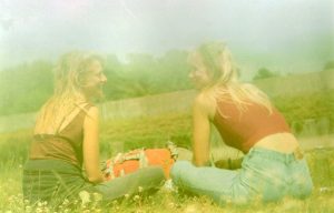
While my head was wandering about like that my eyes fell upon a rather shabby looking book in compere’s ant to all the other rather fancy looking books in the shelfs, the book did not have a title and instead had a cover of what seemed a group of friends siting tighter naked with a dog. The picture did not shook me or anything instead it made me instantly curios what it could be about. For me (someone who is very new to the concept of design) this seemed like a very odd picture to put on the front of a design book. But then again, my idea of design is much more of that of a very clean and tight looking piece than what I was holding. Halve confused and curios I went to the man behind the desk who was the head of the library and asked if this book was also part of the design departed ant and to my surprise it was. This book that seemed to be hand bind with the group of naked friends on the cover of witch in my eyes it looked more like a fine arts project was an actual design book, well…. That made it clear I had made a decision
book 779 -won- 1

Donald Judd, Chair


Thursday, November 15, 2018

Donald Judd, Chair

By Mara-Luna & Sharan

Stedelijk Museum Amsterdam

While walking around De Stedelijk Museum in Amsterdam we got the assignment to select one design object out of the Base Collection of the Stedelijk Museum. This object would become our subject for a research about the different approach on information of different media such as the Internet, magazines, books and others.

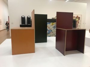
The selection procedure was not an easy assignment. In some occasions we misinterpreted an artwork for a design work and visa versa. After a search of a few hours we both selected, by coincident, the same object, which was the “Chairs/Ameublement” by Donald Judd. The simple square shapes and the miner variations of the three chairs exhibited caught our attention.

Donald Judd is an American artist and designer most famously known for his minimalist works. Judd is, from origin, an artist and started designing furniture after he moved from Soho, New York to Marfa in 1973, Judd was unsatisfied with the furniture available at the local stores and so he started to build his own furniture such as the beds for his children and tables and chairs for his new home.

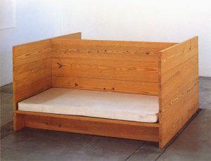
Children’s bed

His beautifully and most off all simplistic designed chairs, mostly made out of wood, are easily recognizable due to their primary colours and simple ‘practical’ squared shapes just as other works/furniture he made.

At the very beginning of our research, we started comparing articles of the internet.The first thing we noticed was the difference in the writing style.

In the articles we found on the internet most of the writers played around loosely with their chosen words and used a somewhat simple vocabulary in talking about the work. In the books there was a ‘deeper’ approach to the work of Donald Judd. The books, such as A good chair is a good chair give different insights to his works. There are more comparisons made and different people like curators review his work. This could in the end be seen as a broader perspective on his work.

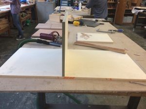
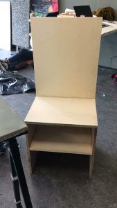
During our research we stumbled across a great blog at the Rietveld Design Blog.  In this blog the writer explains how to make one of Judd’s chairs from scratch and shows the process step by step. It was interesting to have this absolutely different approach in the research. It gave us an opportunity to dive into Judd’s practicality in the making process of the chairs.

Donald Judd himself mostly describes his furniture in his essays just simply in how they were made and why; the why as in choice of material, shape and space. Not much words are spend on the ‘idea behind’ the chair.

While on the internet – and also in books written about him- his chairs are way more described following the concept of his work and the philosophy of Judd in general.

I think Donald Judd very much wanted to make clear in his specific objects/furniture and in his choice of ‘explaining’ them that the chairs exist as themselves and nothing more than that.

In that sense it was interesting to find this different attitudes in the media we encountered during the research. We found that in everything there is written about, or by Judd himself, there is a certain tension of ‘what can be said and what not’ considering his chairs are, as he says ‘just chairs’.

This also brings us to an interesting other subject within Judd’s approach to his work; the fact that Judd used all his furniture in his own home. He uses his chairs (could we call it his art?) as the chairs that we also use in our home. Just like all the other furniture.

Before we started this research I (Sharan) had planned a trip to New York for during our autumn brake. I did not want to let this great chance go by to also pay a visit the Donald Judd foundation in SoHo New York. Luckily enough there was still one spot available to visit this beautiful and interesting building.

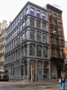
Judd Foundation


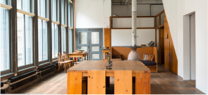
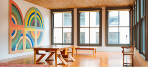
The building that Judd and his family called home for many years used to be on old sewing factory. Its huge open plan floors, massive windows and high ceiling’s are heaven for any artist to think, create, live and of course host friends and fellow artists.


Up on arrival a friendly lady who was our guide for today greeted me. At the ground floor a few paintings by Judd and Manifest Destiny by Carl Andre were exhibited.  We were kindly asked to take a seat on one of Judd’s iconic chairs.

After a small introduction we were guided around the building. The foundation was a very interesting place to visit but I have to say it did really feel like a museum and didn’t fulfill my curiosity. Overall the tour was very sterile and it seemed like the building had lost its living soul and had become purely an exhibition space.

So we can see his work everywhere, even touch it in his own home.  We can all read and talk about it, and have an opinion. The internet gives you words and pictures, the books give you insight and a place in art / design history. We have seen it in the Stedelijk Museum for the first time; no words, no touching, no history.  Just three chairs, in a museum.

The chairs Judd designed are still for sale at the Donald Judd Foundation for the casual sum of almost $3000,-  https://judd.furniture/#chairs-stools

As Little Design as Possible


Thursday, November 15, 2018

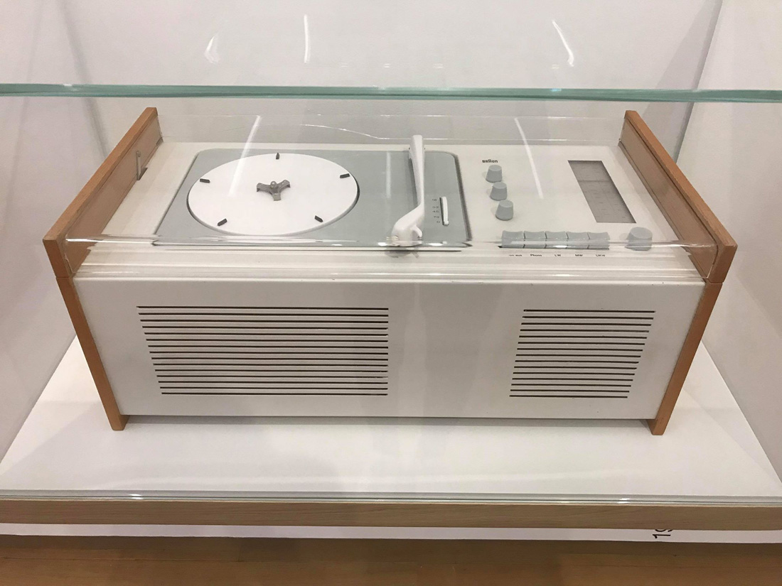
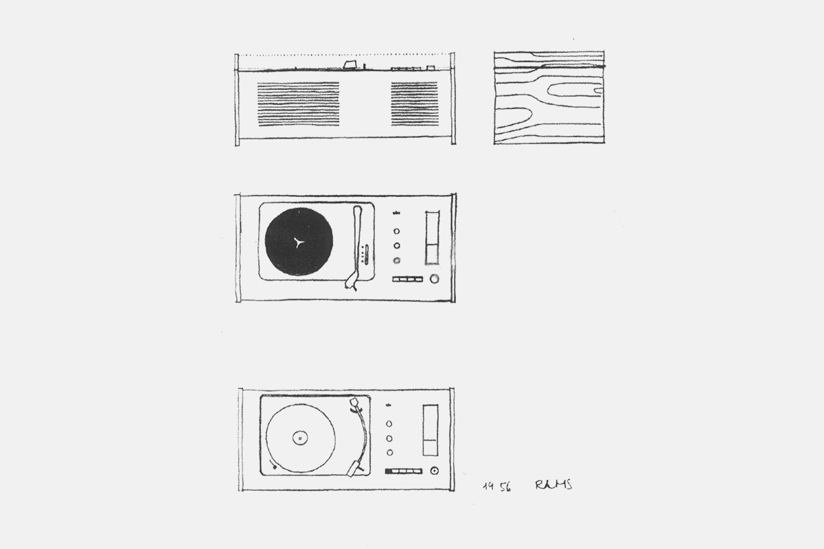
I was startled by the fresh, sleek but subtle apparence of the SK 4 as I walked by it in the basement of the Stedelijk museum. I stopped and bent over to get a closer look. This audio system combines a turntable and a radio with two speakers in a single white metal box ornamented solely by two wooden boards on each side and an acrylic glass lid. The rest is all functional: a few plastic control knobs and an analog display for radio frequencies.

« Hans Gugelot, Dieter Rams » stated the label on the right.

Those two designers (Hans Gugelot and Dieter Rams) worked for electrical appliance company Braun which released the Phonosuper SK 4 in 1956 as one of the first products to incarnate their new design. They wanted to get rid of the superficial and fashionable to make room for efficiency, simplicity and the beauty that comes with it.

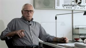
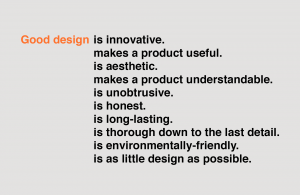
I started searching the internet for some historical context and information about the relevancy of the object today. A few scrolls were enough to realize how influential the SK 4 design is. I first stumbled on countless ads selling the product from one to three thousand euros. Then I found many blogs paying tribute to it by sharing images and information about the design philosophy of the brand. I noticed that Dieter Rams was a lot more mentioned and appreciated than his co-worker Hans Gugelot, probably because the former was involved with Braun for many years (and still is) and has worked on many other notorious products. In fact, Rams is a legend of product design, referenced by many younger designers, such as Apple’s Jony Ive, as a major influence. This is very apparent when looking at today’s electronic products like smartphones, computers, bluetooth speakers but also furnitures and architectural edifices. I found a short documentary on Vimeo yielding the floor to Mr Rams himself at the initiative of the V&A Museum in London. According to him, his willingness to bring a new world of modern design to post-war Germany began when he met the Braun brothers. The success of their new creative approach proved the importance of a well though and original design. He also developed the 10 commandments for good design (which undoubtedly still hold up) in order to teach the students and the media, as well as keep together the behavior of the brand.

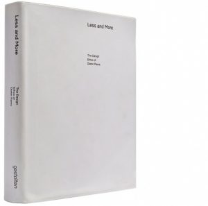
I searched the library of the Rietveld Academie as well as the library of the Stedelijk museum for documents published in the 60’s when the SK 4 was commercialized but I was not able to find any. All I could find were recent books paying tributes to the design philosophy of Braun and Dieter Rams, compiling images and information on their broad collection of products. I did not learn anything new about the SK 4 except for a few drawings I found in the book ‘Less and More, the Design Ethos of Dieter Rams’ by Klaus Klemp. They were made by Rams during the conception of the audio system, which I was quite excited about. The drawings are very simple, almost innocent, and denote of the « new beginning » state of mind of their author. It only made me thirsty for more archive documents of this type, so I kept on researching the internet. I found an image from an original Braun catalog including the SK 4, as well as a diagram of the SK 4 electric circuits naming the object « schneewittchensarg » (« snow white coffin »). This nickname shows how groundbreaking the design of the SK 4 was.

Overall, I found the internet much more efficient for my researches: it brought me more information in a shorter amount of time then books did. Nonetheless, the search for material publications is much more thrilling. It leads to discovering new places (like the archives of the Stedelijk museum) and offers a tactile, more intimate experience. The books I found did not really offer more information but displayed in a more interesting, compelling and memorable way. This leads me to thinking that printed publications will continue to play a very important role along the exponential growth of virtual data. Our senses have not changed and the book is a design object which offers a cleaner and purer visual and tactile experience than computers.


Log in
subscribe