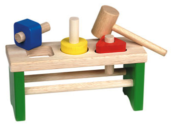
Geometry appeals to us. When I was very young, I remember playing with wooden squares, circles and triangles, trying to find the right hole for them. Apparently, we learn to recognize geometry’s basic shapes from an early age. Not only is it one of the oldest mathematical sciences, it provides practical knowledge to interpret size, volume and relative position of figures in all kinds of situations. Through the axioms of geometry, measurements can be reduced to a simple set of lines, making our world a very synoptic place and providing us with a feeling of – why not – security and intelligent understanding.
For artists, geometry served as a convenient tool for translating the natural world onto a two dimensional canvas. Applying the arithmetic of geometry, perspective drawing could be precisely accomplished and also the golden mean is defined by a geometrical relationship of figures, clearly demonstrated in Fibonacci’s spiral.


However, in the beginning of the 20th century, the straightforward, non-objective character of geometric shapes started to play a main role in art. Its abstraction became a welcome medium to rebel against more romantic, illusionist, even decorative practices in the past.
A modern age was commencing which had a great influence on this, similarly titled, modernist movement. Slowly, the standards of craftsmanship were declining and instead, mass consumption, mechanization and technology started to shape the world. The link between art and industrial production and an increasing knack for rationalisation encouraged the movement toward stripping art, architecture and design even further from any kind of decoration. What remained were the pure, elementary lines of geometric shapes.

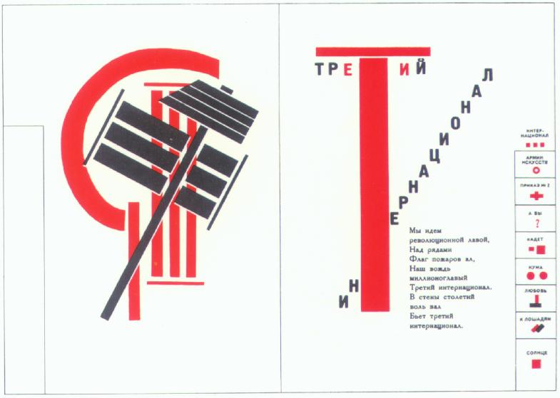
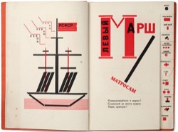
Russian Constructivists were very radical in redefining the role of the modern artist in their attempt to construct a new communist state. Their credo “art for arts sake” underlined the modernist spirit of utilitarian simplicity and abstraction. The social motives stimulated artists like Alexander Rodchenko and Lazar El Lissitzky to take their work to the streets, connecting art to everyday life. With bold lettering announcements were made for all to read. This Constructivist typography with its reliance on sans serif faces not only gave the Bolshevik revolution a promising identity, but initiated a revolution in type design as well.
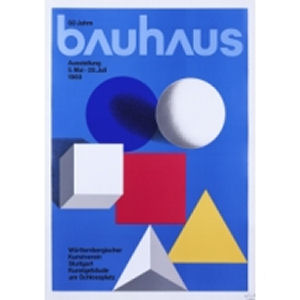
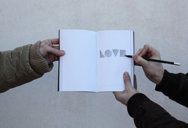
De Stijl, Bauhaus, Theo van Doesburg and Bart van der Leck, all were greatly inspired by the typography that derived from the Constructivist movement. In De Stijls manifesto art and design was invoked to be “elementar”, “nicht philosophiert”, but instead constructed “aus den ihr allein gegebenen Elementen”. Thus, letters were constructed with elemental, geometric shapes, sometimes transforming them into forms so simple and abstract that they virtually become new geometric shapes themselves. Even words and text blocks were composed according to geometric logic, resulting in a revolutionary asymmetric but ever-so-constructed manner of graphic design.
P22 Foundry digitized many of these typefaces
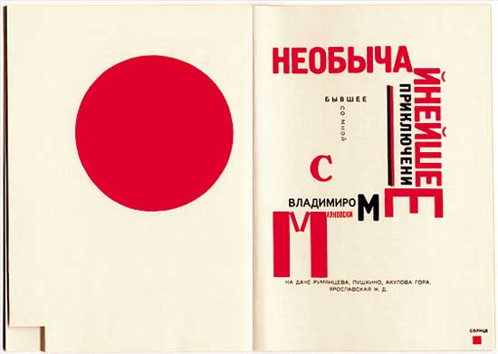
In El Lissitzky’s design for poet Vladimir Mayakovsky’s Dlya golosa (For the Voice), the geometric elements even have a symbolic meaning. Curator Peter Hellyer explains it as follows: “The visual economy of the design not only allows quick absorption of information but also gives rise to numerous word associations and puns. (…) The letters of the Russian Cyrillic alphabet are more block like and geometrical than other Western alphabets so that when they are enlarged or reduced as in this cover they can form part of an abstract image which can be read as picture sound, symbol or word.”
In broader sense constructed type design became a symbol for everything modern technology brought about: simplicity and efficiency, purposefulness and clarity. According to graphic designer Jan Tschichold the formality of its sans serif shape was even fully liberated from any historical, individualistic and national connotations. Shortly after this statement, Tschicholds boss Paul Renner would design the geometric sans serif typeface Futura, constructed solely from (near-) perfect circles, triangles and squares.

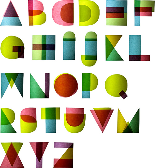
Even before, artist and designer Josef Albers experimented with grids and geometry, to create and efficient, easy to learn and cheap producible typography. His Architype Albers consists of only ten basic shapes that merge elements of the square, triangle and circle and can form any letter or number according to it’s different combination’s.
In more recent history, the formal, functional, elemental aims of constructed type are still important for many designers. In spite of the advancement of the computer, making possible all kinds of complexities in type design, geometrical beauty and its simplicity is still appreciated. The manual construction of production and form of letters has not yet lost its charm. For example, Wim Crouwels New Alphabet can be seen as an extreme attempt to unify (electronic) production and concrete letter form once more. In New Alphabet, digital lines provide a new geometry for the type design.
And still even newer constructed type is designed. Take Christian Küster’s Wendingen, solely made up from various sized rectangles, letters and white space alike (and a nostalgic eponymous to the famous magazine of the Amsterdamse School), and Gerard Ungers Decoder, which uses a set of shapes resembling parts of letters as the elements to construct a new type (and by doing so refers to the patterns of runes). Both typefaces date from the 90’s. Although the latter may only scarcely remind us of the standard geometrical shapes we know, its constructed character is obvious and it reveals that in the end constructed type all boils down to making a lot possible with only little means. Liberated from solely geometric building blocks, the variations of what may be called constructed type are thereby suddenly endless, as long as the constructive logic remains the same.
Yes, geometry appeals to us. The bold geometric letters in Russian propaganda obviously proved its persuasive power. The elemental typefaces used by De Stijl and Bauhaus heralded our modern age. And although no one ever experienced Crouwels New Alphabet as easy reading, the formal placements of the lines convince and seduce us anyway. We understand it because we can deconstruct it to a mathematical fundament, because we are permeated with this geometrical awareness. And that is why we can do nothing but appreciate geometry’s forms and proceed in reconstructing it again and again in our own art and design.
Who knew that playing with those wooden squares, circles and triangles so many years ago, might actually have initiated this collective soft spot for constructed type?
For more geometric porn check the #7 issue of Slanted Magazin.

