For the children a design by Rik Meijers
After some introductions of new ways of looking and dealing with books, I tried to focus in how the connection between artist and designer work together in the best way. When I say ” in the best way ” I’m always being subjective, understand a book in the way the artist wants is not always possible.
During my first research I didn’t get amazed by any book , Every time I founded a special design for my eyes I couldn’t understand the connection between the content and the choices the designer has done, because there could be thousands of possibilities to represent that content in an understandable way, at this point I got confused but I had to keep with the research.
but this time, I just only wanted to focus in my first visual attraction and then go deep in how that specific design works with the content.
During this process, walking at the Rietveld library I found one book that was shocking for my eyes ,this book is called For the children and is designed by Rik Meijers .
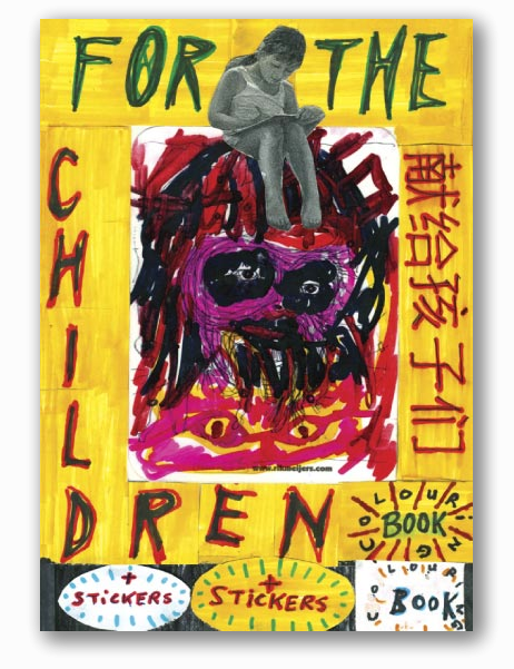
As an starting point I can talk about the cover wich consist of a painting collage .
The titled >‘For the Children'< and some of the other words as >+stickers or coloring book< belong to the painting.
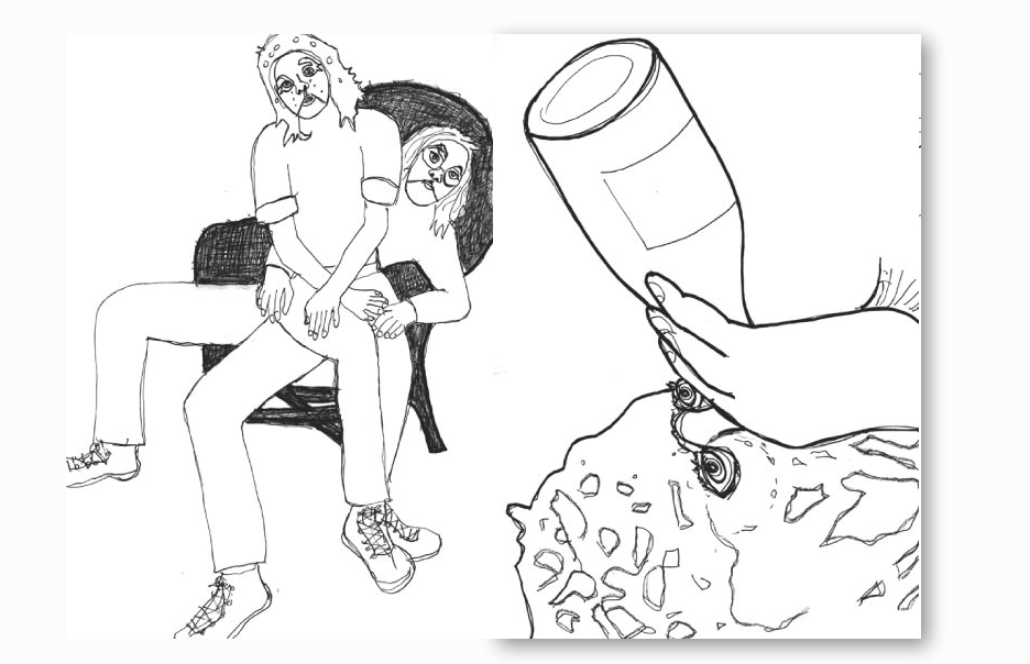
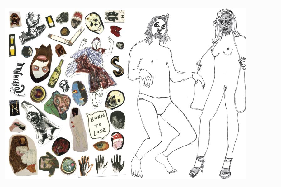
‘For the Children’ is printed in A4 and all the drawings inside are scaled to this size
The paper used for the cover is shining and inside Rik Meijers used white cardboard paper.
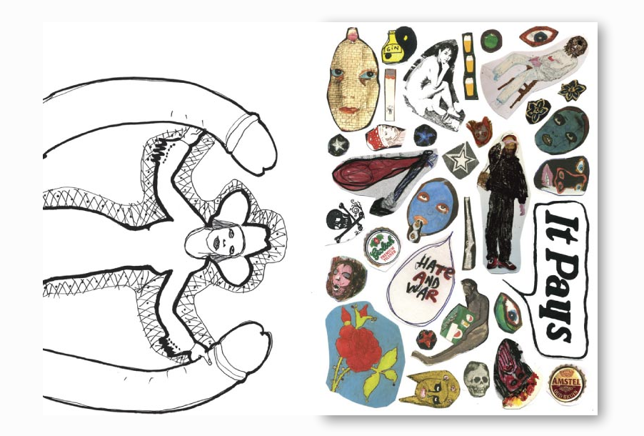
Inside the book you can find 16 illustrations, drawings in black and white and 2 pages full of stickers, all scaled to A4, this combination gives the feeling of those children coloring books, which is mentioned at the cover (coloring books)
The design of this book is quite simple it gives all the importance to the drawings, which I guess is the purpose of the artist.
This simple design make you wonder how to deal with the book, if making new creations in top, I mean, using the book as a real coloring book or enjoy and observe this book as a finish book and finish work, I think Rik Meijers wants to present the book in this ironic way which in my opinion could be logical by the fact that the drawings are not representing scenes for children.
As a conclusion I thought this design was connecting perfectly to the concept the artist wanted, but then I realized that the artist was also the designer of the book , Rijk Meijers made me think about the artist being his own designer, which in my opinion sometimes could be really good because they know exactly how to present their work clearly, but sometimes could be totally the opposite and the artist needs a designer that understands the best way to show their work in a clear way .

Rietveld library catalog no: Meij 2