
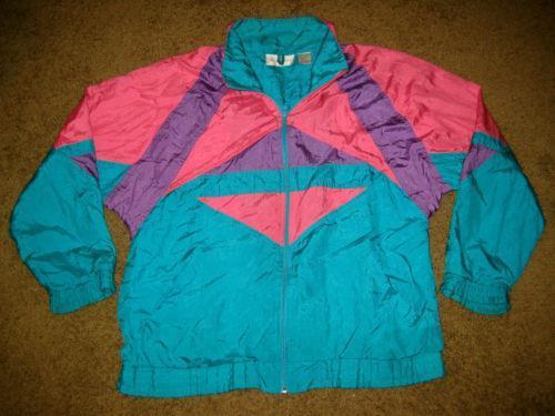
Very intuitively I picked up this book. The bright, contrasting colours were screaming for my attention. The colours reminded me of those beautiful 80’s ski jackets.
nice
Next came the tactility. The moment you take it in your hands it feels like a good, quality book. The cover is a tough silkscreened fabric sheet which looks and feels substantial. The silkscreening is neat and professional. However when opening the book you see that the cover isn’t even attached to the rest of the book properly. It’s just folded around the pages. The book also slides around quite a lot within the cover, making it very susceptible for damage around the corners.
On further examination I found that the design of this book is actually full of contradictions. The paper on which text is printed is not the same as the paper on which the images are printed. Very high quality images are placed right next to very low quality images. There are two different fonts used. The text is printed in seven different colours. And Part I and Part II are in the same book, except you have to flip the book around if you want to read them both. All of these little disagreements within the design of this book are what made this publication so exciting for me.
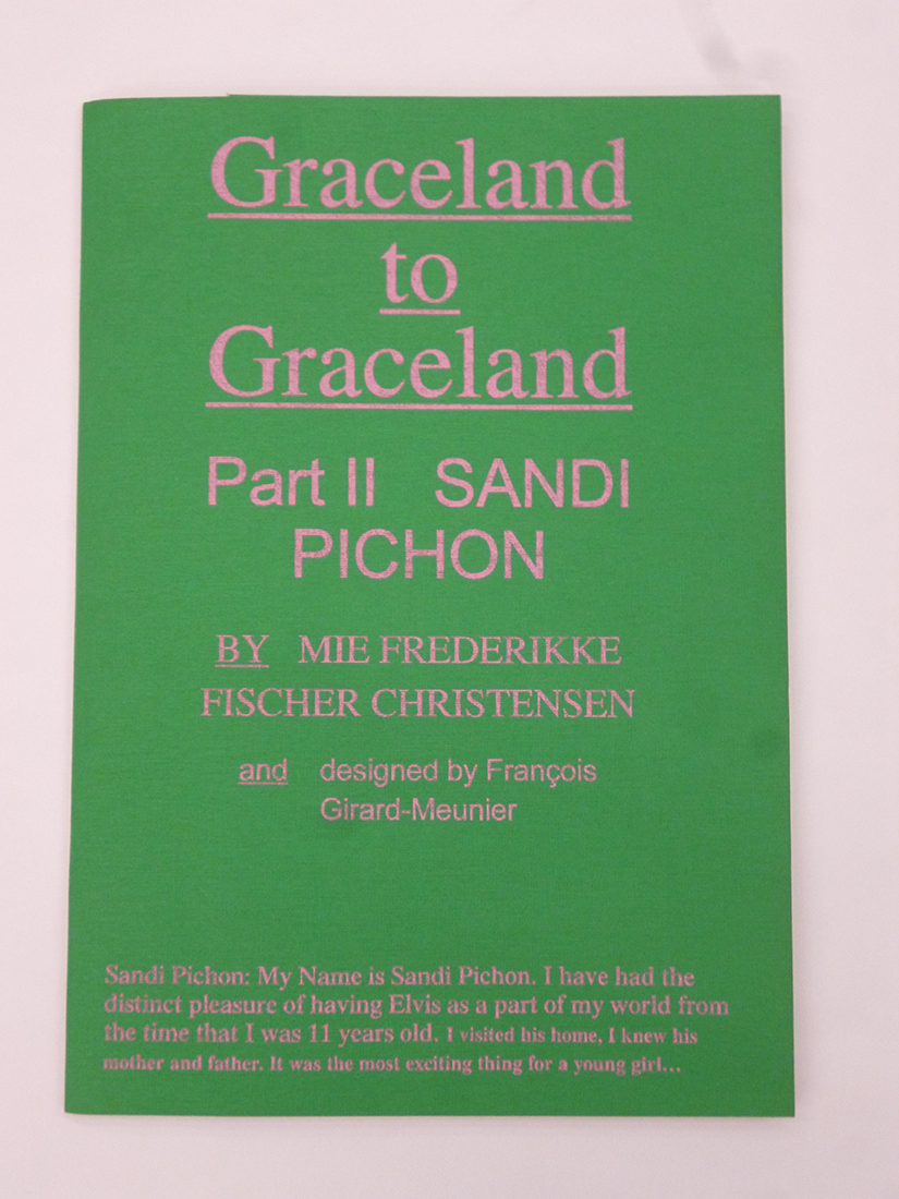
François Girard-Meunier is the designer of the book; Graceland to Graceland. Graduated from the Rietveld Academie just last summer 2015, so he is a fairly new player in the Amsterdam design world. Nonetheless, his design for Mie Frederikke Fischer Christensen’s (a fellow graduate student) book “Graceland to Graceland” is more than noteworthy.
There’s just something childishly interesting about bright colors, which draws one’s eye to this book. The use of these bright and very contrasting colours reminded me of those amateur-built websites from around 2000. Which would tie in very well with the content of the book, elvis being quite a cult-figure with a fairly large amount of fans. The colours emit a certain immaturity, as if someone very unaware of conventional graphic design really wanted to make this book look as ‘beautiful’ as possible. And by doing so, that individual crammed in as much visual stimuli as possible. However, when reading the appendix (written by the designer himself) it became clear that all of these elements are actually a ‘leftover’ of the text editing proces. “As multiple annotations came and disappeared within the editing proces, we [François Girard-Meunier and Mie Frederikke Fischer Christensen] somehow found [it] meaningful to keep a form that suggested this process.”

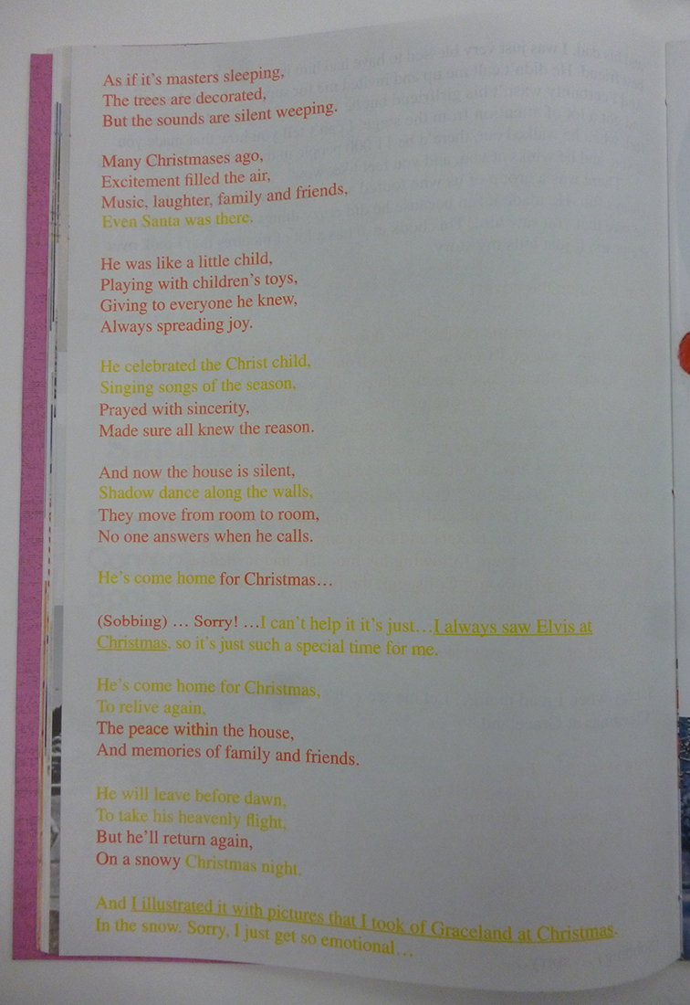

Moreover, not only the colours are striking about the text, the fact that François also used two different fonts to distinguish the interviewer from the interviewee is also very interesting. A certain distance is created between the two characters by letting the interviewer ‘speak’ in Arial and the interviewee in Times LT. When taking into account that the Arial typeface has mostly taken the position that the Times typeface had before, one could argue that this symbolizes the younger interviewer versus the older interviewees. In a sense that the interviewer is now more relevant than the Elvis fans. In this publication the focus lies more on the reasons for these fans to be fans than on Elvis himself.
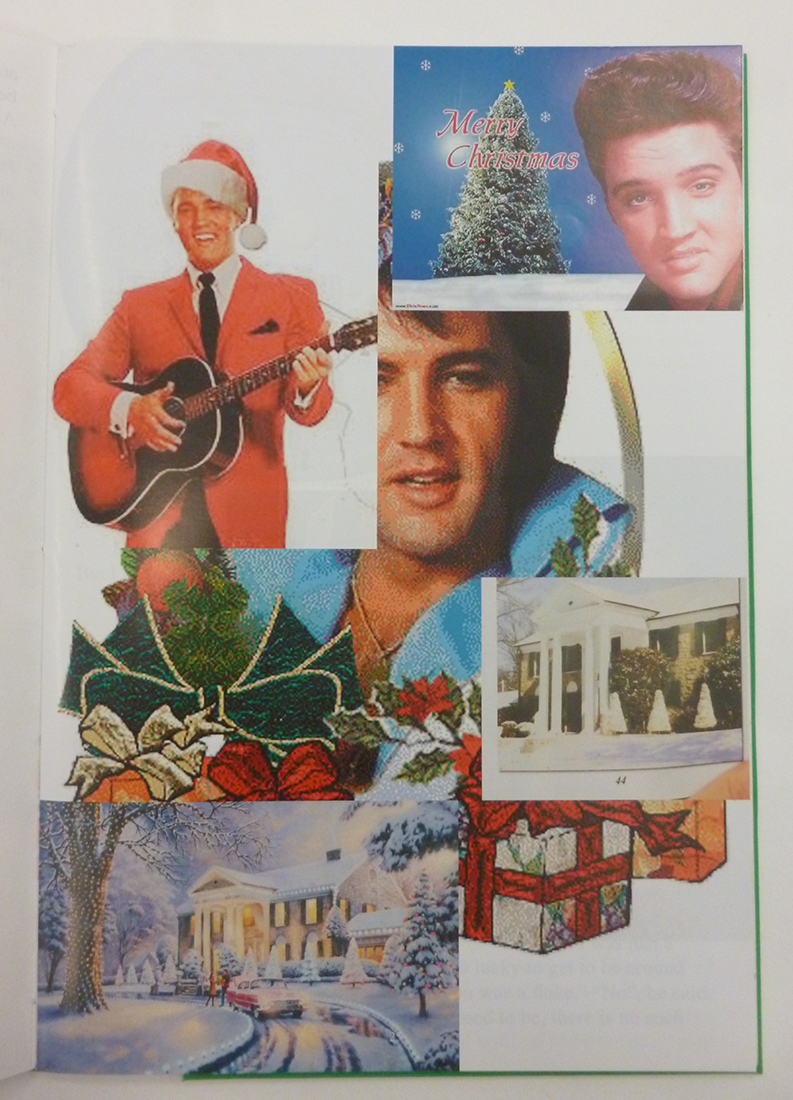
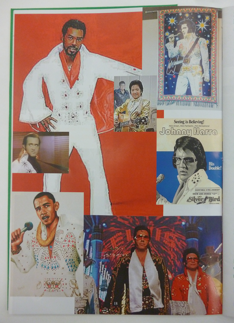
Furthermore, a plethora of images is showcased. Seemingly randomly stacked on top of each other and in different levels of quality. the pictures seem to be taken from all over the internet. Not only good resolution pictures are used but also quite bad quality stuff, watermarks included. The one thing they have in common though is their relation to, or, representation of; Elvis. This aesthetic is reminiscent of the ones found on fan-made websites, created to lift their idol to a higher level by posting as much images of him as possible. No matter the quality or the context, the only thing that matters is Elvis.
This is also what drew me to this book. These details supposedly try to reenact the feeling of a very DIY website. It takes a good eye to spot these kind of fan-made characteristics and even better eyes to imitate them. Then again, when reading, and hearing François talk about these things, these kind of decisions seem to have a more layered argumentation: “the massive amount of material that, even though not ‘clean’ are great forms of representation that show how diverse and polysemic a character such as Elvis Presley can become after being transformed into a mythology.”
He turns the tables. Instead of all these image just being an illustration of the interviews, they are actually a representation of what the ‘myth’, Elvis, can mean.
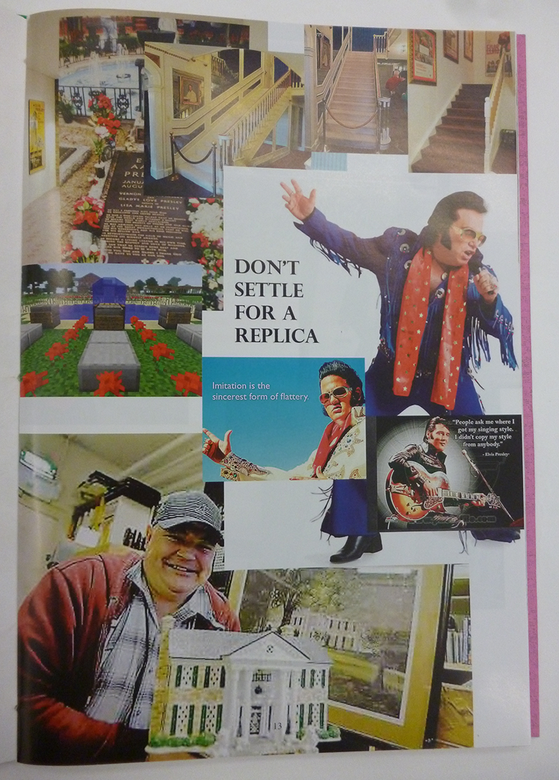
The inside of the book also features two types of paper. One a bit more glossy that the other. The images being printed on the glossier one. This division also suggests a certain budget, as if there wasn’t enough money to make the entire book out of glossy paper. Which again, ties in with the aesthetics of these amateur fan-pages. When listening to François however, this was exactly the point. All individual materials used in order to make the book are of quite high quality, there is just a lack of coherence (literally and by figure of speech) between the materials.
All of these clashes in the design and in my way of thinking about the book and the original intentions of the designer make me realize that this book is actually so much more than what I had anticipated it to be.
Rietveld library catalog no : graduation publication 2015

