For me it was always easy to come to the quick conclusion THAT if it was about something interesting, it would effect the design on the book automatically. Maybe because it’s true, and therefore I only reached out to books that looked appealing to me, indirectly confirming a satisfaction about the content.
But having to choose a book on it’s look as an assignment put my mind in a different light. Books suddenly looked different to me, and it backfliped reversed on me, and I found myself standing with a book, that I ironically chose only from it’s contents.
Try again.
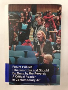
I went to the library alone this time, isolated in my own mind I tried a different approach towards the books. Found it. A book that had a picture I found interesting for a cover. A women screaming at some boring conference. Something real is on her mind. the outside cover is a real photograph, continuing onto the back of the book reveling more boring conference room and people reacting to the woman in a social intelligent environment. This I found appealing, to see a book simply being wrapped in a powerful picture. For me this confirms the insignificance of all styling or additional details added, when it comes to the matter of the content of a book. This brings seriousness and action to the mind, which again is reflected on the motive of the picture.
So what WAS happening in the picture? What could possibly be so wrong or mind boggling that you would have to stand up in a crowd and make a fool of yourself to such length that words or arguments is pushed aside leaving the raw fight of shouting, only for the sake of proving something wrong?
This got my attention and I wanted to search more about this exact situation. How hopeless was this situation?
digging a bit inside of the book led me to the photographer providing this picture. Berlin photographer florian Braun took it, but not under the circumstances i had originally thought.
the picture shows part of a performance by Aernout Mik from september 2013 at haus der kulturen der welt, Berlin. A staged photo using actors in a fake scenario.
Florian took the picture for he was his set photographer during that performance.
This founding immediately made me happy, and I was hit by a feeling of being deceived by a cover, and let my thoughts go towards, not believing in everything that looks real. It might as well just be a picture from an artist who specializes in making “conference gone wrong” sceneries.
Which is exactly what this book is about.
Brilliant.
Design
Besides the raw message of the photo covering this book there are other features that triggered my design sense. The long title that is almost a little poem in itself, made me want to read it with care, and left me a bit confused, which matches the content pretty well. The text is put in a blue semi transparent box, associating that color to the concept of adding a comment onto an existing happening. This color is the only color applied to the pages, and can be some sort of guidance or forever rightful manifestation of research. Even the side of the book has that blue colored text, underlined, as a well known web link to “get further”. Opening the book reveals a whole page of just that deep blue color. Pure treat.
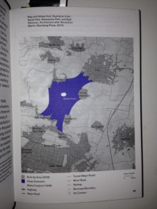
Shown in the picture below is the color. Not used as text but to fill out an area on a picture in the book. The only place in the book where the color is used in a picture or illustration. A nice unexpected mix with the content.
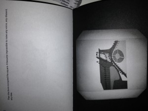
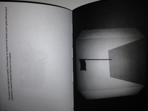
What I also liked was the size of the book. About the size of a hand, and an inch thick. For me, this gives an intimate feel of holding the book tightly, and it made me want to treat it as a handy everyday object. I gives associations to a classic on-the-go bible. But without the shiny cover with a divine picture of jesus himself. useful, not styled or fancy. speaking of non fancy things, inside the book is an incorporated story, shown in simple and fun overhead projector dias show inventing a graphic page consisting on mostly black background. Also you have to flip the book too see it right, but that seems easy thanks to the size and hands on feeling the book is providing.
I found it interesting that some chapters in the book is pages that has been scanned. These pages have comments and corrections, leaving a raw and hectic reading material. This is a historic previous example of what this book is centered about. Being critic and direct about a serious matter if it means something to you. Letting the reader decide what to read into and what to just swallow as written.. Shown though design and symbolic features this book really enhances new curiosity of reading presented material, and take a physic hands on part by turning and twisting your way though.


