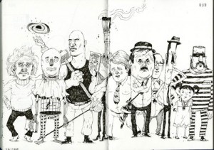
Image instead of font, relaxed instead of compulsive, everything except cats: these are the tags of the book I picked. No relation is a relation as well, and thus is this lack of relation the perfect link between the first and the second book. I found an objective way to link this post to my earlier post. This book pulled my attention in the same way it is linked to the other book: the big differences. Was the first book white, about fonts and having a sort of mysterious neurotic repeating cleanness, the second book is colorful, filled with images, hundreds of subjects and a bit of chaos. Browsing through the pages you see countless interesting illustrations, which make you want to take a closer look but also make you want to look further; are there more images like these, are there better images then these, could it become better then this? It makes you want to draw or make such images too: images from which you can see there was a lot of work in it or absolutely not much work. The amount of work is of no importance, the works are intriguing.
Rietveld Library code: ?
