Wednesday, November 21, 2018
The first thing that caught my eye was the title together with the typo; “I HEARD THEY RIPPED IT OFF”. The typo looked like the way I write by hand; With bold letters and a melancholic undertone. The book gave me a homemade impression, and right now I really want to make a book based on what I write and draw in my journal, like one of those books that more look like a public notebook( Had bookbinding workshop for the first time the same morning). The aesthetics of the book worked as inspiration for me, which was one of the reasons I chose it. Generally I like books that look like weird notebooks you have stumbled across somehow. When I go thrift shopping I always look for old journals, like peeking into lives of strangers I probably never will meet.
The title had my kind of humor, for me humor is key; Seeing something which applies to your own sense of humour is kind of like seeing something written in your own language when you are traveling. Furthermore the title intrigued me and I wanted to know more about the title and the person who came up with that quote. I don’t like when things are too obvious, I want to feel as if I have stumbled across something secret.
The cover was very minimalist with only a stripe of black “spray paint, a bit mysterious in a way, and very graphic ( Black and white). I like when things are a bit mysterious yet graphic at the same time, I suppose you can see that in the artworks i make. The book was small and simple and the pages “raw” in a way, again working as an inspiration for my eventual future book. I always prefer books that are small and simple, too big and too fancy books takes up too much space and attention. Also that day I had a small bag which might have affected my choice of a small book in order to fit. When I peered through the pages there where different small texts written in straggly handwriting together with a few drawings, which gave me the impression of looking into someone’s journal. Exactly the inspiration I’m currently looking for. I wanted to know more of the content, it felt very personal and humorist yet serious in a way.
Wednesday, November 21, 2018
I picked out my book because of the colours and the way the book is bounded together. I had bookbinding class today so i was more focus on the way the books are made. The most spines are the same. But not this one! It is made with a lot of attention and care. The rope makes it a bit raw, and the pages makes the book soft. They look more like fabric. They look sweet and in balance. The colours of the pages remind me of today. A beautiful autumn day with a lot of sun in the perfect time of the season where the leafs are having all this beautiful colour. They make me smile and think that every season has his own character.
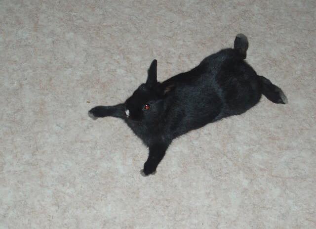
Its looks so modest on the last shelf of the bookcase. and I felt a bit the same. More focussed on myself then the outside world, specially when I am looking for a book. I felt immediately that this was my book. When I took it from the case I saw that it had the same colour of my shirt. But it was not a boring flat colour. The front was more a life. It was made with different paper. It looked recycled. You could almost see the parts of the other papers where it was made from. There was no text but it didn’t need it. Also the back was amity. Except from the two yellow round stickers. I think the Rietveld placed them there for the order in the library. It fits my book. The yellow rounds where placed at the right place. I didn’t get the inside of the book. In the front there where more pages pointing in different directions. They are cute and necessary. It looks fragile hanging on this few ropes but also strong enough to hold itself. Anyways the pages looks together didn’t fit but that made it interesting to look at. I saw some black and white pictures, I love black and whit pictures. I just developed some myself last week.
758.3rieb4
Wednesday, November 21, 2018
Thursday, November 22, 2018
The book „Tribal Tattoo Design“ is a little yellow book with silver printed shiny letters on the cover that spell the tittle. It is a square small soft covered book around 15cm x 15cm. The color is very vibrant and stands out. Not necessarily a kind of yellow I very much like but neither I mind. A lemon little toxic looking yellow. Next to the tittle is a sketch in outlines only, showing a human body from behind with tribal looking tattoos on the arms, pine and legs.
The first time I saw this book it attracted my attention in the hands of a classmate of mine. The book was open so the images inside attracted me in the first place. Simple outlines only sketched body with traditional tribal tattoo art from different regions in the world. I immediately wanted to look through the book because I’m very interested in diverse tribal history, body art and tattoo art for a longer time now.
The book looks vey simple. If I would have seen it just on the shelf the cover would not attract me at all and blend into the surroundings. On the inside of the book the most oft it are pictures so it attracts to look through. Around the images is a lot of space it attracts the eye with a lot of space and just tattoo and human body doodles. It is easy and fun to look through. The book gives you an eutectic feeling and brings some inspiration as information that you can simply absorb with your eyes. A nice little handy book for some illustrative inspiration for people who are interested in tribal culture and a look on beauty outside of the western world. A nice looking book on the inside and not spectacularly designed from the outside. A very simple little like-able book.
Book number 908.9 din 1
Wednesday, November 21, 2018
Thursday, November 22, 2018
I was first attracted by the back of the book : placed among hundred of others, this thin pale blue back on which we could read – or rather just see in my case, as i can’t understand Japanese- the fine title.
At first sight, this book also looked a bit like a notebook -due to the black cover and the worn out aspect of it- maybe this is another thing that appealed my attention as I have a special affection for notebooks/sketchbooks, everything randomly sketched and unfinished.
I wouldn’t have picked up this book if there wasn’t those yellow pages in some parts of the book (p.73-88 and p.93-108 and p.121 to the end). They have a different quality of paper : less soft and shiny than the other pages wich mostly depict photographs of masks (the book’s subject I guess). We could also notice more clearly in those parts, how the contour was shining in gold , as if the book was made out of cult paper.
There is also this recurrent fascination for Asian ideograms, that implies a complete inability to understand the meaning of what the book is about , consequently bringing a focus on the the form and how beautiful compositions the writings create. Ideograms and the all language and culture brought with it become drawings and pure contemplation for me, more than a clear explanation and precise knowledge.
My reaction is a typical European person’s reaction who become quickly fascinated by all this « exotic » aesthetics , anchored in a culture, a language, cods and signs & symbols she can’t totally understand. However, I found this naive reaction, from the moment it becomes conscious, also beautiful. This feeling can be brought closer to the feeling we get in front of an artwork , or in our everyday life, when at a sudden moment, a sort of spark -made out of several elements brought together by coincidence at this precise instant- brings beauty to the present situation.
772.5 CAT 3
Wednesday, November 21, 2018
Thursday, November 22, 2018
I was asked to choose a book that attracted me the most. So I was walking in the library, checking books in different sections. Everything was ordered in categories. It took me around 15 minutes before I found something that attracted me. When I was looking at one of the many shelves that was in front of me, I saw the word “colors” on one of the books and i didn’t even notice in which category it was. It attracted me because I love colors in general, they make me feel happy. I held the book in my hands it was “heavy”. I looked at it! On the cover was written “stop” in Arabic. It felt like it was a sign from the universe telling me to stop searching and take that book. I opened the book and it was full of pictures which attracted me more to it. Because I am that person who can’t concentrate for a long time and read big texts. I rather watch pictures, documentaries or films instead of reading. In the same time i found it pity that i don’t learn or get knowledge from books and therefore i try to learn and get knowledge from experiences in life like ( meeting people with different backgrounds, traveling to other countries, listening to people stories and listening to my own stories ). As i also think that each one of us individually is a book with their own stories and knowledge that we should try to share in the library of life. It’s funny! that a few months ago i was in the park next to where i stay and there was a big round sign (big circle) with a walking woman/man on it (as you can see in the picture that i attached to the text). I took it with a friend of mine by using a screwdriver home, and kept it home. I like the circle shape it has and i use that a lot in the art i make. Unconsciously i might have picked the book because of that sign i have at home now and it might inspire me for my art.
Wednesday, November 21, 2018
Thursday, November 22, 2018
Last week we had to look for a book for our design project. I had to look for a book related to design, but here was the catch. I was not allowed to look at the information in the book just its exterior, i had to find a book that attracted ore displeased me only on subjective grounds.
While I was walking through the brand-new library of the Rietveld academy I was primarily buzzy with looking at the library itself. The nice plants they put to the sides and how well put and nice the place looked. In my head a school library is supposed to look old fashioned and dusty not a nice looking clean place like this. Then again, I did not have that much experience with library’s. This was not because I do not enjoy reading. On the contrary I enjoy it to much, so much so that every book I end up liking I want to have as my one. This is why you will not find me in a library but more in a bookstore.
While my head was wandering about like that my eyes fell upon a rather shabby looking book in compere’s ant to all the other rather fancy looking books in the shelfs, the book did not have a title and instead had a cover of what seemed a group of friends siting tighter naked with a dog. The picture did not shook me or anything instead it made me instantly curios what it could be about. For me (someone who is very new to the concept of design) this seemed like a very odd picture to put on the front of a design book. But then again, my idea of design is much more of that of a very clean and tight looking piece than what I was holding. Halve confused and curios I went to the man behind the desk who was the head of the library and asked if this book was also part of the design departed ant and to my surprise it was. This book that seemed to be hand bind with the group of naked friends on the cover of witch in my eyes it looked more like a fine arts project was an actual design book, well…. That made it clear I had made a decision
book 779 -won- 1