Skip to Content Skip to Search Go to Top Navigation Go to Side Menu


"Uncategorized" Category


Calcite Stalactite


Wednesday, April 2, 2014

In the Wendingen issue, Kristallen Wondervormen der Natuur from 1924 i found this picture of a calcite stalactite. I choose the picture because I did not remember to have ever seen anything like it and that made me curious.  After a bit of research I learned that a stalactite is a type of formation that hangs from the ceiling of caves, hot springs or manmade structures such as brigdes and mines. Limestone caves, where most stalactites are found, are mainly composed of calcite, a rather common mineral found in sedimentary rocks. Stones and crystals have been a huge passion of mine, for as long as I can remember. The interest started in an early age, as my parents took me, my brother and sister for long walks up and down the coast-line in Denmark. We were looking for fossils, amber, seashells and stones. We never really knew why we were doing it, but it soon got competitive. Who would found the most exquisite one? The biggest? The funniest? And we would carry large heavy amounts back to our house and place them carefully, in an order, on shelves or window sills. My mother keeps collecting and my parents house have turned into what could be called an exhibition of stones and stuff. My father sometimes forces her to get rid of some of the stones, because he says “it doesn’t make sense”, but my mother took me to the farthest place of their backyard; a wilderness of weeds and showed me where she get’s rid of the stones. The pile is enormous. When asked why stones are so fantastic, my mother says: because they are ordinary and exquisite and they look beautiful in the rain. Later I started making animations where I would scan some of my favorite stones and give them simple movements. Maybe they would turn around, or switch back and forth between a crystal and a flintstone. I too like the normality of stones and I embrace that my love for them doesn’t make any sense at all.

m

Wendingen 6-11 1924 Rijksacademie Amsterdam

It’s All About The Spine


Thursday, May 9, 2013

Looking through the aisle of books in the library and trying to find that one book out of hundreds that I could be interested in was a difficult task. So instead of picking out every book and inspecting it in detail, I chose to find a book that I found interesting purely from the spine. This meant I was looking for a unique bind, or a unique choice of material. Both these criteria are too often ignored in my opinion, for example if your book is in amongst thousands of books in a library, with only the spine visible, I think it is essential to give your publication that little bit extra to set it above the rest.

So I came across a small book crammed in at the end of an aisle called ‘Mechanisme’ and it stood out for three reasons. A) It was bound with a traditional Japanese binding. B) It was so much smaller than all the other books around it. C) It was made from a very textural recycled card. It’s no bigger than a CD case, yet it has more character than the majority of the books in the design section. There is something personal about it, as it is almost definitely handmade, so it has a delicate quality to it. So delicate in fact that it is falling apart slightly. To be honest I was slightly disappointed when I decided to check out the contents of the book, although it was made using very nice materials it’s design was far too bland and the actual purpose of the book wasn’t clear, as far as I could tell it was a book explaining the contents of different materials. The cover and general outer appearance gets 10/10, the content however 5/10. But at least it was interesting enough to stand out from the rest.

Rietveld Library cat.nr:

Research of Kaba ornaments


Wednesday, October 31, 2012

Research of Kaba ornaments 


Misinterpreted


Sunday, November 13, 2011

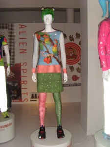
This article is about my research into the alien spirits collection by Walter van Beirendonck.
First of all, it isn’t designed as a collection, the outfits are picked from various collections from 1994 up to 2011 for his exhibition in the fashion museum in Antwerp. He picked outfits with a common theme; “Alien Spirits”.

And that theme can be described as a theme with alien and indigenous influences. As Walter describes it:

“‘Alien Spirits’ references my interest for all things alien but also the spiritual like shamanism.”
-Walter van Beirendonck

But to describe it like that would be too easy, there is more to it than that. To me it is more about interpreting certain traditions and habits and using them in new outfits.
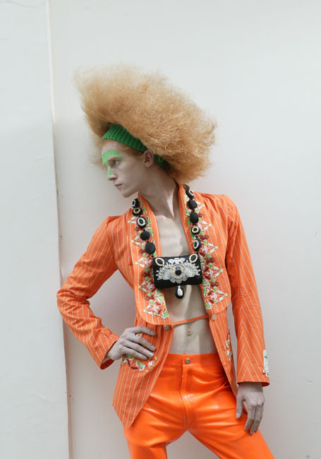
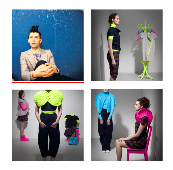
But Walter isn’t a scientist, he just looks at clothing and traditions of certain indigenous tribes (Like the Maori, the Masaï, the Hopi Indians, the Pende people etc.) and uses some of their accessories and clothing in new outfits. But he isn’t looking at what the purposes of the accessories are, so he uses them in a very wrong way.

And I think he does that on purpose, he likes to radically change the way the indigenous pieces are used. For instance, he uses the spiral eyes of masks used in traditional burial ceremonies of the Tolai tribe in Papua New Guinea in several of his outfits.

And just as he likes to deliberately misinterpret indigenous traditions he also likes to misinterpret our traditions. For that misinterpretation you need somebody who doesn’t belong in a culture to look at their habits with a fresh and unknowing eye.
And just like Walter uses himself as an outsider of indigenous cultures, he uses Aliens as outsiders of our western culture.
In 1999 he made a movie about two aliens coming to earth and scan the world. But he lets them misinterpret certain of our habits. For example, in “relics from the future, 2006” he uses jewelry which is still attached to the small black cushions on which they are presented in the stores. And in “Welcome Little Strangers, 1997” instead of a small flower behind the ears of the models they have wigs made of grass.


The misinterpretation of our traditions is a theme that is used in more things. A lot of big Hollywood movies and television shows use the same idea:

In “the gods must be crazy” (Jamie Uys, 1981) a cola bottle is tossed from a plane in the Kalahari dessert and believed to be a sign from the gods by bushmen.

video fragment The Gods Must Be Crazy

In Mars Attacks! (Tim Burton, 1996) Aliens come to earth and think a white pidgeon that is released as a sign of peace, is a threat and begin shooting people.

video fragment Mars Attacks!

In the TV-Show 3rd Rock from the Sun the misinterpretations happen a lot. It is a show about Aliens living on earth disguised as normal humans. They cannot figure out human basic emotions, they believe gelatin pudding is an evil creature and so on.

These are just a few example, movies like, for example, Men in Black, coming to America and almost any other Hollywood science fiction movie use the same idea of misinterpretation.

Whereas the big Hollywood movies and shows use that idea more for a comical purpose, Walter uses it for a different reason. To me his works are more about trying to have us look at our clothing and traditions in a new way and questioning them.
Why do women wear dresses and skirts and men don’t? And so on. He really wants us to look at our clothing again, because how crazy and extravagant his designs are, they are still intended for sale and to be worn in the street.

“Clothing is to me something to sell and to wear – that is its function. Of course you can tell stories and communicate with fashion, and that is something I definitely try to do in my collections. But essentially it’s a consumer product.”
-Walter van Beirendonck

So after my research the definition of the Alien Spirits ‘collection’ is:
“The deliberate misinterpretation of traditions in other cultures” with the goal of having us look at our clothes with a fresh eye.

Pastry


Wednesday, September 21, 2011

design by Philippe Apoloig

When I saw this poster from far, I thought it looked like a well-made textile (like a table cover) or graphic poster, made through usage of computer programming. Therefore, Its not a hand made textile.

Then Seeing it in detail, I found that there is small text in the big text, I can see the shade of letters. Black, red and white colors are being used. It also seems that a lot of layers have been used, even in small parts. Like a pastry.

It also looks like an exotic letter. These layers have each a repetitive form, different for each part. It seems like a  letter or piece of textile, such a in mixed layer. Its an intentional item, but really unaffected. I think Its like an artwork, not a design poster.

artwork by Hyo Seop Kim

I thought about gravity during the drawing.

A book’s weight is about 500g. But books include different photos, with according happening take each date. I think it’s a huge mass, if it is in the size of the book. So I completed the painting, through finding of picture in the book that inspired to me. Perhaps, This poster is similar in the way how it is using layers to create its form, I Think its interesting.

A0 by A4


Sunday, September 18, 2011

This is a work created by experimental jetset. I chose to write about this work because I find it very genious to make something like this. It really is a new way to make a print on an A0 size. It fits in the corporate identity they made for the Stedelijk Museum. They had to make this corporate identity in just a few months within an extremely tight budget. They had to be ingineous with the prints, beceause they didn’t have enough money to print lots of posters on A0. At the same time, this way to show large print works, is so easy you could do it yourself at home. They also used thin coloured paper to print some of the folders on, and found a way to fold the letters they send so you don’t need an enveloppe anymore. It all worked out very nice, and fitted in the budget. This A4 solution is cheaper, easier and economic, friendlier because it doesn’t need huge printers and big rolls of paper to achieve the same result.

Boijmans


Wednesday, April 20, 2011

Het meest interessante deel van de tentoonstelling ‘Schoonheid in de wetenschap’ was het allereerste filmpje van de tentoonstelling, omdat er veel gebeurt maar weinig bij wordt verteld, zodat je je eigen verbeelding de loop kunt laten; in plaats van iets op microscopisch niveau leek het mij een natuurramp of oorlog gezien vanuit de lucht.

De rest van de tentoonstelling was voor mij geen openbaring in de mogelijk van schoonheid vinden in wetenschap; die kende ik al. Voor een tentoonstelling in een museum vond ik de afbeeldingen ‘leeg’  waardoor ik de stelling

” Scientific imagery is not exactly a “true copy”of reality but a result of a complex process of mediation; both using complex equipment to obtain them, and having to learn how to see them, how to interpret them. “

frappant vond; hoe ver kun je ze interpreteren dan? Het is toch vrij duidelijk? Dit is daar een cel van en die is zo klein dat we hem niet met het blote ook kunnen zien, wat verwondering oproept als we dat uitvergroot wel voor ons krijgen.

De onderdelen ‘de foetus’ en ‘het heelal’ vond ik ten opzichte van al die close ups een fijne tegenstelling; hier word ons eigen kleinheid onderstreept; we denken dat we het hoofdpersonage in ons eigen drama zijn maar we zijn allemaal een stipje op het stipje aarde, en als we de beelden op de foetus-film zien worden we even geconfronteerd met hoe fragiel we beginnen met leven. En de mogelijkheid tot deze associaties vind ik boeiender dan de afbeeldingen die als enige functie hebben dat ze mooi zijn.

art equals science


Tuesday, April 19, 2011

About the exhibition Science in Beauty is said that ‘science is a quest for new knowledge about the real world. Art creates its own reality and therefore summons up emotions and often a sense of beauty in the viewer’.
I think that you can switch the words science and art in this sentence and it will also make sense: ‘art is a quest for new knowledge about the real world. Science creates its own reality and therefore summons up emotions and often a sense of beauty in the viewer’.
Art and science, in my opinion, are both used to investigate our reality.
You can read the ‘statements’ about science from Part1 as if it is about art too:
– art as offering the possibility to view in a variety of ways:
zoom in the micro-visuality of things, to literally see the invisible, but also enabling us to view from above, the larger picture (of the globe for example)
– art is not exactly a “true copy”of reality but a result of a complex process of mediation; both using complex equipment to obtain them, and having to learn how to see them, how to interpret them
– for the uneducated eye, if we don’t know what are these images, they have a strange beauty, vivid color, and complex form, they open a possibility for a “second” aesthetic look at nature (the first being simply the appreciation of a landscape), but as an appreciation of an image
– but science as well as art had to invent those images, in the sense that it invented the procedures and the equipment of gaining access to them – which brings the crucial question of the making of the image
So if it’s easy like this to swop the terms art and science around, then what is the difference?

Sorcery and Design


Wednesday, September 8, 2010

Starting point:
Irma Boom: Biography in Books
Location: Bijzondere Collecties (UvA)
Place: Amsterdam aka Mokum

And then:
‘Choose one book.’
Okay.
I choose two.

.

SHV

Af first glance, this book seemed boring to me. I saw a conventional book, formally shaped and made for a non-romantic Holdings NV. Boring.

Sheila Hicks: Weaving as Metaphor

At first glance, this book seemed appealing to me. I saw a perfect assimilation between form and content, but maybe a bit too slick – and for me that means: less interesting.

Brainwise next to each other, they activated my grey cells:

.

RECONSTRUCTION
What happened?!

.

1. Context. SHV, which I thought to be boring

formal/conventional – heavy – ribbon – not frisky // though: form/content-contrast! with the inside: playful – colourish

seemed to be the result of a five-year period of carte blanchesse, full of difficulties within the production process. Veiled complexity.

[funny: carte blanche results in a book that i found has striking resemblances with the archetypical old(est) european book: the bible]

2. … I linked to the Sheila Hicks-book.

form/content become one: appearance of textile, subject textile

So, instead of contrast: form/content-assimilation.

3. But maybe the contrast of the first book is actually a form/content-paradox: the conventional, formal element of a company comes together with an artistic book – artistic whether you look at the arty inside of it, or at the aesthetic base of the production process.

As a result: form and content come together also in thís book.

.

.

.

IN BRIEF

Although I thought to deal with two contrastive books, that I could put next to each other to illustrate a difference (conventional/aesthetic), it turned out that there wasn’t that much difference between the books after all.

…  for me, these kind of little surprises create heart jumps, retina stars, frolic impulses.

*s*o*r*c*e*r*y

Ants at Mars


Thursday, May 27, 2010

Ant robotics

During our first talk of a guest teacher, in the last design-period, I got interested in the way one could reach something really complicated by following some simple rules. We made tree-kind of forms according to a few rules, and however these rules where really simple we created quite complicated structures. I was questioning myself if this way of reaching complicated goals was also being used by non-artists, scientists, researchers, architects and maybe in nature as well. This is how I started my investigation and got to a website of a scientist named Chris Melhuish. He has got a lab at the university of Oxford, where he’s investigating ants ad robot’s together with ant-researcher Ana Sendova-Franks.


From a distance an anthill seems to be a lot of chaos. All the ants are just running around without a clear common goal and without noticing each other. If one would look more closely, his opinion won’t change that much. One ant is carrying some food or a larva to a nice looking place and another ant will just as easy bring it back to the beginning point. They just care about finishing there own tasks, and don’t care about what the other ants are doing.
An Ant has no sense of a higher purpose, and doesn’t know for what reason he is actually working. Therefore the organization of an ant colony is far too complicated. Nobody has got the survey and there is no unified management. Even the queen hasn’t. Some scientists are looking at ant colonies as being one organism, which exists out of a lot of smaller animals.

And so does Chris Melhuish, however some ants aren’t working that effective, as a whole, an ant colony seems who work quite well. After all they are living on planet earth for millions of years now. This antsystem has a lot of advantages for robots as well. Using a lot of small stupid robots solves for example lots of miscommunication if all the robots are just deciding themselves what they are doing, because mistaken tasks of a higher power won’t exist anymore. They are also more vulnerable when a higher power is deciding everything. If this higher power would pass away or something, they won’t know what to do any longer. Another big advantage of using a lot of small stupid robots is that it won’t cost lots of money to build them.

U-bot, one of the ant robots of Melhuish

Scientists are now thinking about the use of these robots at another planet or for the use of nanobots. In the case of nanobots, which are really small robots, it would be very useful to use simple robots that don’t need complicated soft- or hardware, because you just don’t have the space for it. You could for example use these nanobots in paint for bridges or buildings to discover small cracks in the paint or even to find weak spots in the iron. When using Robots on the moon or another planet it would be a really big benefit to use a big amount of cheap and simple robots. It won’t matter if one or two robots wouldn’t work or would get destroyed by landing at this planet.

Besides the technological use of these robots I think there are also great possibilities to use them in art. For example interactive art, because you can easily instruct these robots to complete certain tasks, while they will never complete this task in the same way. There will always be a certain randomness in the way they will complete their task. A second benefit to use these robots in interactive art is that it doesn’t matter in which kind of environment you will place them, they can work in any kind of environment because they react on the things that are happening around them.

The beauty of this system for me is that you don’t have to be effective to create an effective system while a lot of futuristic city-systems like Aurovile, discussed earlier at this blog, are based on pure effectiveness. One ant can carry some food or a larva to a nice looking place and another ant can just as easy bring it back to the beginning point, however at the end they will reach there final goal. Actually it’s a kind of anarchy, there is no higher power to check or instruct them, they have got all the information they need since their creation.

van pen naar trein


Monday, March 15, 2010

The final Choice


Tuesday, December 8, 2009

In my quest of finding books to write about I finally choose a book that I really want to read. In the former postings where I wonder why and trying to answer that question I now finally finish this path. I finish it by picking a book by M.C Escher. As a child this Dutch Graphic Designer fascinated me. His so-called impossible structures blew my mind away. You can look for hours to his drawings where he plays with perspective and impossible spaces. When I look at his work I don’t know what reality or fantasy is. And maybe that is what attracts me so much. The mathematical influence in his work is really important and that also raises questions again. Is his work art, math or graphic design? And is Design Art?

Esch. 6

Comfortable


Tuesday, December 8, 2009

The third and the last time I was walking in to these walls of books.

I am starting to feel at home, it feels like I am in my own house.

It feels like I am part of the design blog were I write my posts on.

I feel home and I am part of something.

I enjoy my state of being. I am in comfort.

In comfort with this book, I can’t link it to a person, I don’t think he is part of something I know, i don’t see the link, so that makes him very interesting.

I want to read him and find the link.

Book number: 15199


Hello Frend of a Frend


Tuesday, December 8, 2009

I walked in to these walls of books again.

I saw this book, and while I was observing him, it remembers me of this person I saw in my last book.

In my last book it was an imaginary person, but the cover from this new book I have found is showing me the truth.

The real person who is part of this book, you can say that this book is his house.

He lives in this book and without this book people wood forget him, that’s why I have picked this book so this person will not be ignored.

number of the book. 12651

ornament


Sunday, November 15, 2009

The appearance of Muhammad in Arabia in the year 610 had no effect whatever on art in Arabia and no common single homogenious Islamic style is to be found from India to the Straits of Gibraltar. All kinds of influences, in accordance whit local conditions, are evident such as for example, Antique, Early Christian, Byzantine, Phoenician, Hebraic, Babylonian, Assyrian, Persian, Egyptian, and even Indian influences. These together whit what remained of Arabian art, combined whit their own original contributions, were all formed into one whole one single new style.
As the pictorial reproduction of men and animals was forbidden by the Islam religion, Islam art was obliged to confine itself to geometric and vegetable Ornament. This command however appear to have been promulgated in the later periods of Islamism and to have originated in the fanatism of the Mohammedan priesthood, for animal ornaments have been found which date from more ancient times. There is a general absence of plastic work in Islam art, the moslims appear to have had no understanding for this class of work.
For information about this subject link for a large two part documentary to google video ….

The Fashion Student


Wednesday, October 14, 2009

Joshua Enker

This research started with a very different subject; Lucas Ossendrijver, a Dutch fashion designer who’s currently working for the French high fashion brand Lanvin. What fascinated me was the big difference between his appearance and the clothing he designed! Which raised the question; why does this differ?

To be able to have an answer I started looking somewhere else; the fashion students on the Gerrit Rietveld Academy. I made a list of question I though would get the students to explore what they though would be the main difference in their own work; and I also collected photographs of the specific students and their work. This way creating a sort of almanak or small book about the fashion student and his or her clothing.

It is an ongoing project; which means that I will ask more and more students to answer these questions and collect their pictures. (I will add these to an updated version of the PDF at the bottom of this post) Like this I will create a more complete, more whole view and a more accurate answer to my question;

What’s the link between what the clothing designer wears and makes?

pdf

Who sets the standard in Hong Kong?


Monday, May 25, 2009

While visiting Hong Kong last week, I noticed the huge difference in standard between their graphic design and our graphic design. If you only look to their graphic design you will think that they are all insane lunatics. They give faces to everything, use the color pink to sell men products and combine business posters with pigs. I used this as my starting point for my research. What is the difference in standard telling us about the culture of Hong Kong? You can all read it in my weblog.


Log in
subscribe