Skip to Content Skip to Search Go to Top Navigation Go to Side Menu


"science" Category


Harp of Pythagoras


Saturday, May 30, 2015

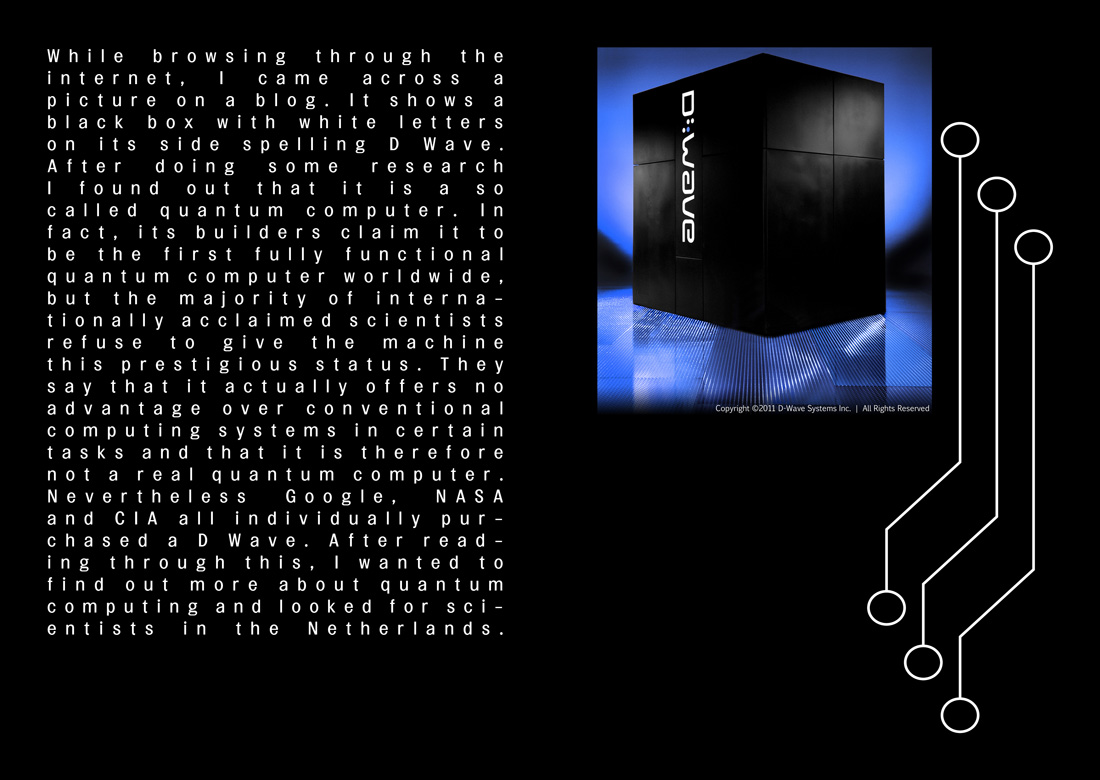
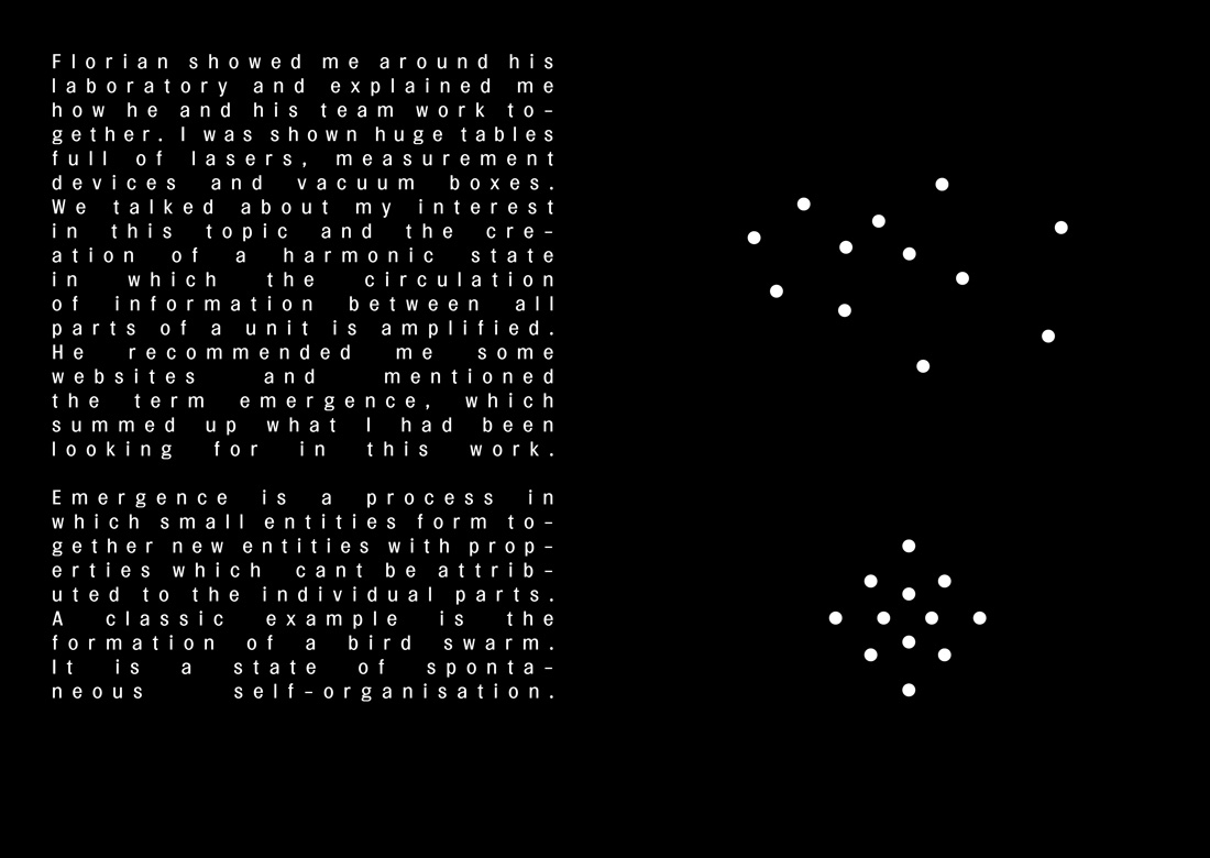
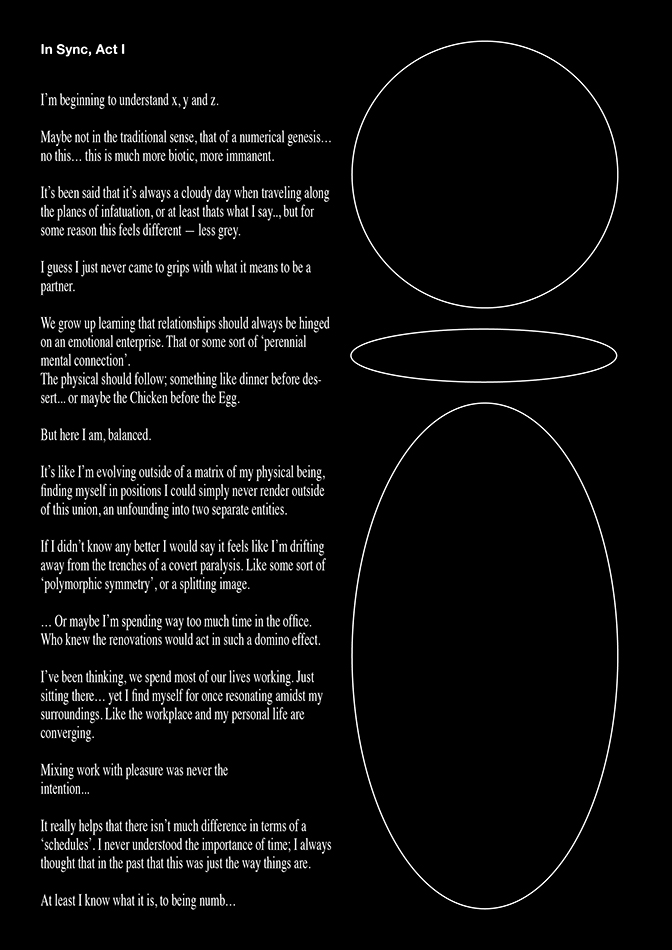
Why are things the way they are? That is a question I can never stop asking. Every day I find myself completely fascinated by things that other people seem to take for granted. I just cannot get used to the simple fact of existence.

One of my most recent questions: “Why do we always tune our instruments the same way?”  This is the question that sparked a whole design research of which the outcome was to be a mathematical music instrument.

At the start of my research, I decided to visit my old piano teacher. I asked if he had some time to think with me on the subject of musical tuning. When I met up with him though, it was quite evident that he was not a music theoretician. He did encourage me to find out by myself, so I headed his advice and did a lot of research.

The science behind the instrument: Pythagorean music theory

0501_gaffurio_pythagoras

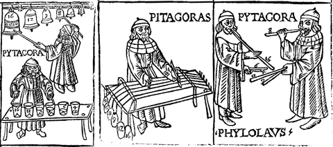
When starting this project, I did not expect to develop such a great fascination for a man who has been dead for over 2500 years and would probably cringe at the mere thought of modern music. Pythagoras had some very interesting theories about harmony. He believed people could be healed spiritually by listening to harmonious tones. He developed a tuning system based on exact mathematical ratios to create perfect harmony. He used the most harmonious interval (3:2) the perfect fifth as his foundation.

Sound file: perfect fifth

[audio:https://designblog.rietveldacademie.nl/wp-content/uploads/2015/05/perfect-fifth.mp3|titles=perfect fifth]

By stacking fifths upon fifths he developed a 12 tone system. The framework of our modern 12 tone system called “equal temperament”.

mtp01

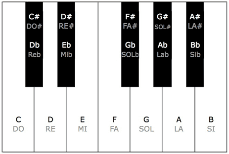
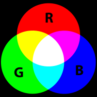
The 12 different tones in an octave as shown on a piano keyboard.


Mathematically Pythagorean tuning is perfect. It describes the almost exponential nature of sound exactly. This way he could play the musical equivalent of the golden spiral. Pythagoras saw truth in these harmonies. It was his way of communicating with the heavens.

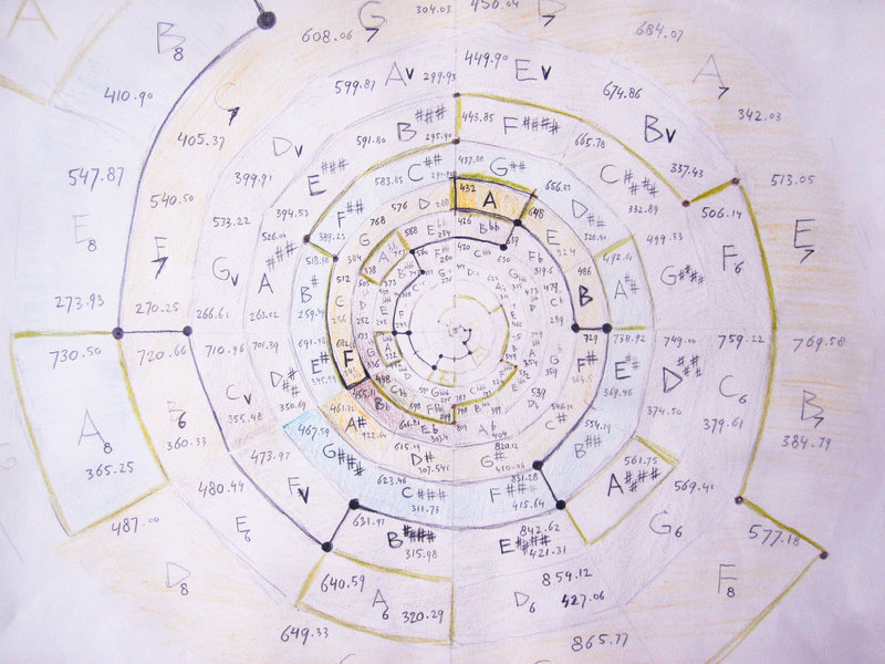
The most fundamental difference between Pythagorean temperament and equal temperament is the difference between a circle and a spiral.

 41-43spiral

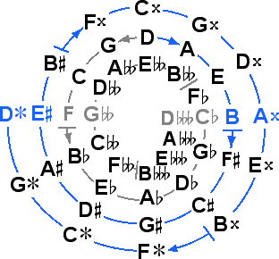
Pythagorean tuning shows the golden spiral of fifths. Because the spiral of fifths is a spiral shaped system based on stacked fifths, the fifth intervals are in perfect unison, but the octaves are in dissonance.

Sound file: wolftone

[audio:https://designblog.rietveldacademie.nl/wp-content/uploads/2015/05/wolftone.mp3|titles=wolftone]

This dissonance is also called a “wolf tone” because it resembles the howl of a wolf.

The wolf tone, is by no means the result of a faulty calculation. It does however create a problem for music playing. This problem is referred to as the Pythagorean comma. A quite ironic name seeing as Pythagoras did not believe in decimal numbers. The Pythagorean comma actually prevents you from playing more notes than the range of an octave because the 13th note will be slightly out of tune (though you could play perfect fifths into infinity). Pythagoras had a solution. He just did away with note 13 and upwards!

circle

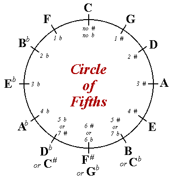
Equal temperament avoided the problem caused by the Pythagoras comma, by converting the spiral into a circle. The comma is still there, only spread out between all the notes. Everything sounds kind of okay, because everything is out of tune in the exact same way except for the perfect octaves (which you can play into infinity). Now we can play music in every key, but there is little harmony left.

Can the comma be solved? No. It cannot be solved because it is a fact of nature. Perfect octaves and perfect fifths cannot co-exist. No power of 3:2 can ever be a power of 2:1. Pythagorean tuning sought to find truth and equal temperament standardised it for the sake of convenience.

I found this very interesting, I wanted to hear the perfect fifths, so I gave myself the task to design an instrument based entirely on Pythagorean tuning. Not only would it have to be tuned in the right way, I also wanted the design to reflect the tuning, so I could understand it better.

Creating the instrument

First I had to calculate the notes Pythagoras did not care about (note 13 and upwards), so I could make an instrument with more than 12 notes. That way I would be able to hear the perfect natural disharmony Pythagoras shied away from.

Luckily someone I know had already done the dirty work for me:

rsz_img_3861

Here is the chart I used to come up with the absolute frequencies of my instrument.

And here is the list of absolute frequencies:

rsz_scn_0006

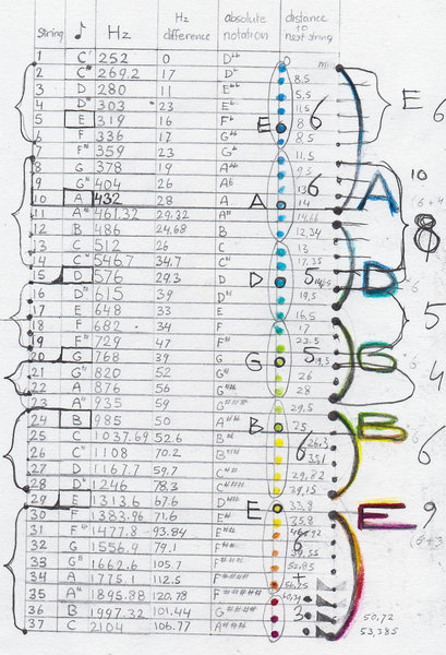
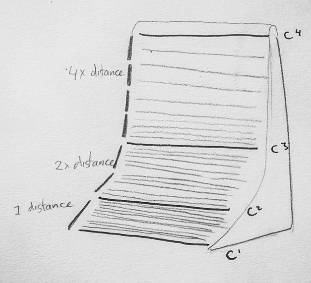
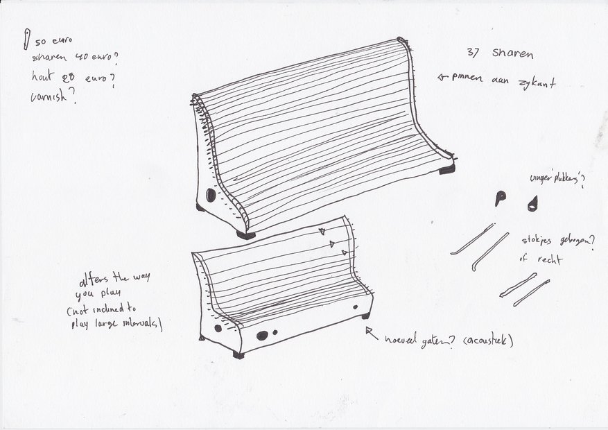
It has 37 strings from C1 to C4 where A2= 432 Hz.

Sound file: Pythagorean tuning of my instrument and equal temperament

[audio:https://designblog.rietveldacademie.nl/wp-content/uploads/2015/05/Pythagorean-tuining-and-equal-temperament.mp3|titles=Pythagorean tuining and equal temperament]

Sound file: dissonance between Pythagorean tuning equal temperament

[audio:https://designblog.rietveldacademie.nl/wp-content/uploads/2015/05/Dissonance-between-Pythagorean-tuining-and-equal-temperament.mp3|titles=Dissonance between Pythagorean tuining and equal temperament]

I was struggling to think of a meaningful design for the instrument. Out of nowhere it hit me

 rsz_1rsz_1scn_0003rsz_1rsz_scn_0005

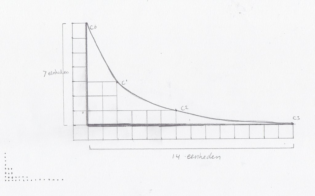
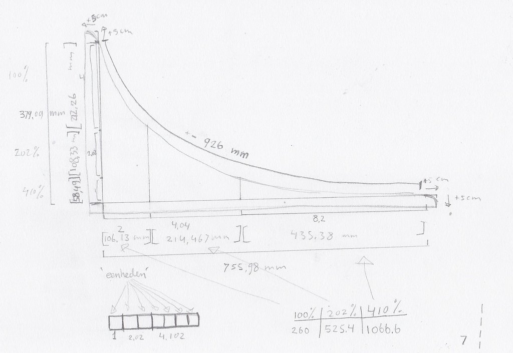
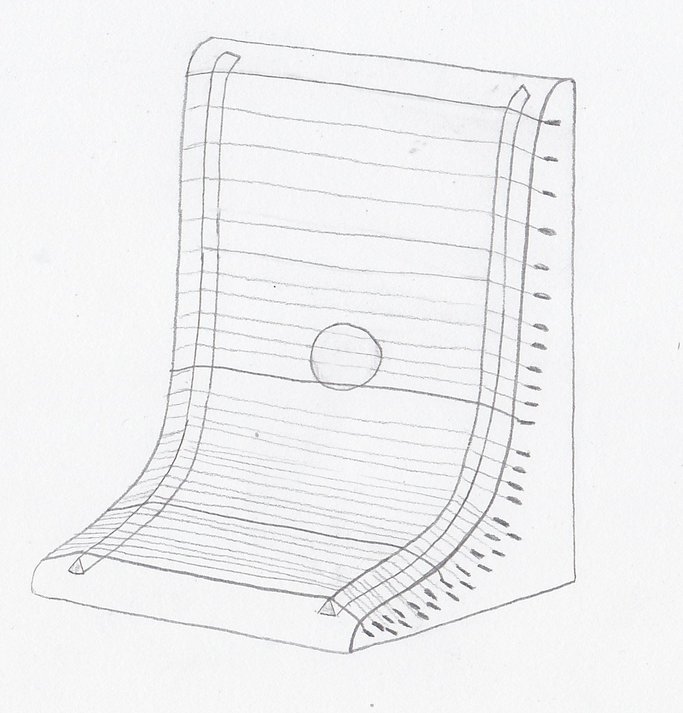
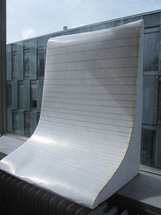
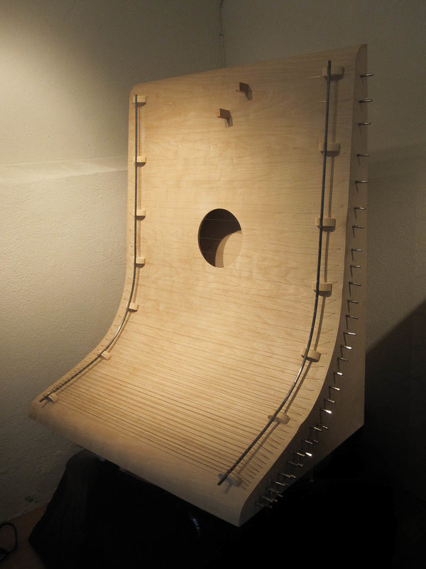
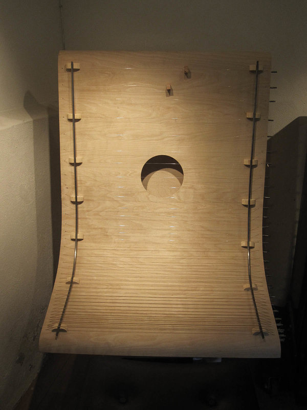
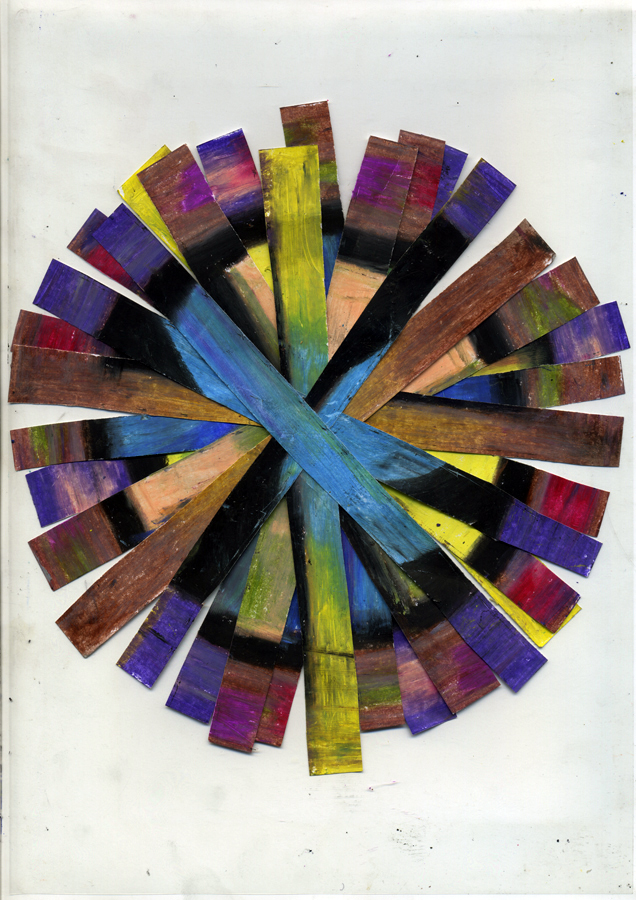
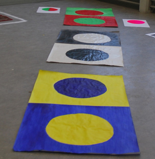
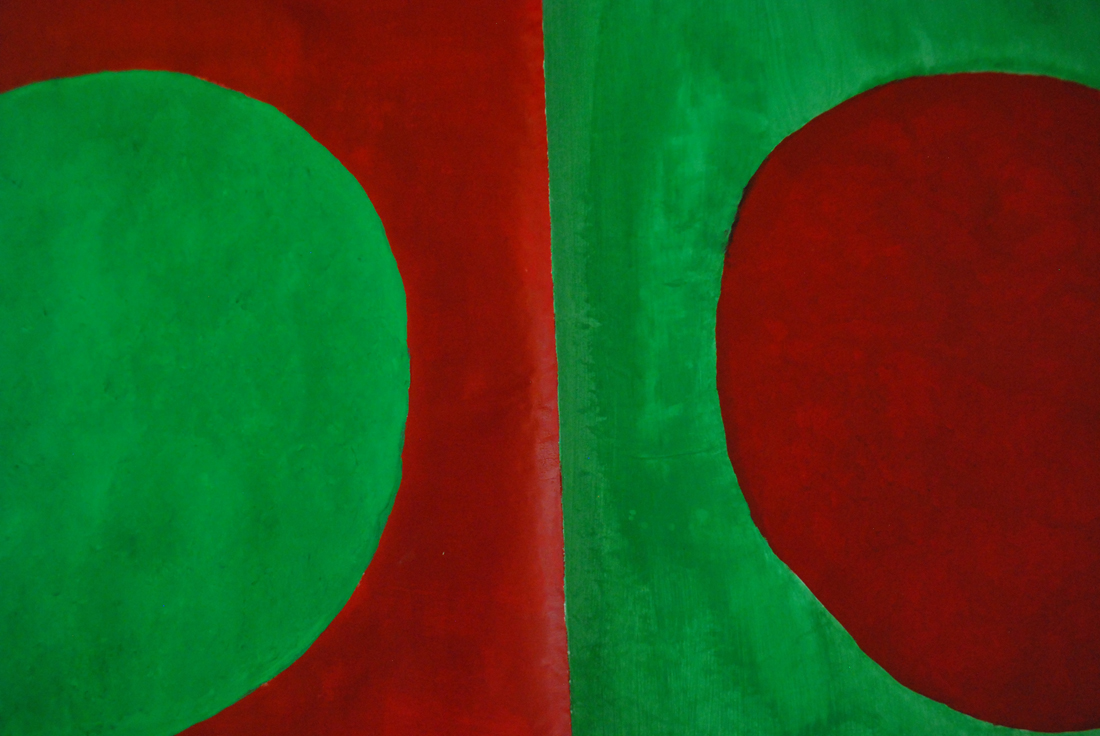
I drew the distribution of the frequencies of my instrument in these graphs and I realized the shape of the graph would be the perfect shape. It visualizes the exact near exponential nature of the tuning system. I even decided to place the strings at their corresponding spatial position on the instrument. From down to up, the strings grow increasingly farther apart from each other.

 rsz_img_3864 rsz_rsz_scn_0004-1 rsz_scn_0002


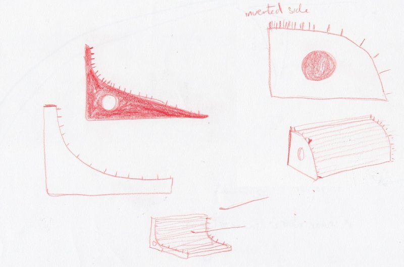
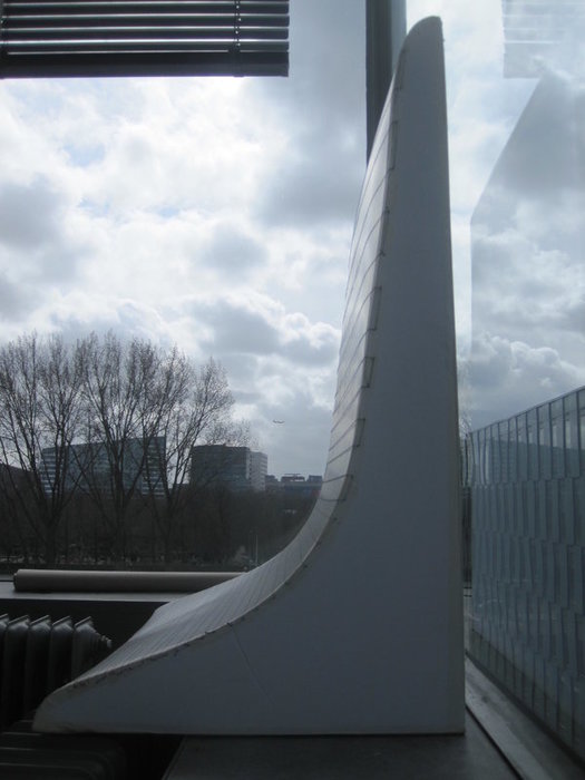
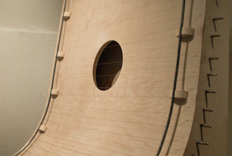
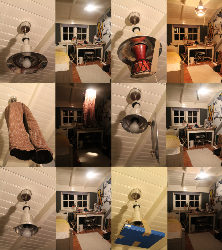
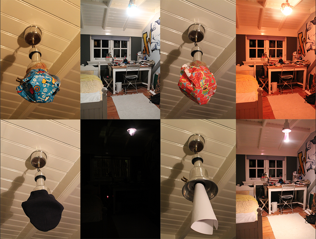
Final design and model

rsz_scn_0001 rsz_rsz_img_3410 rsz_1rsz_img_3409


Stages of building

rsz_img_3852 rsz_img_3854-2-1

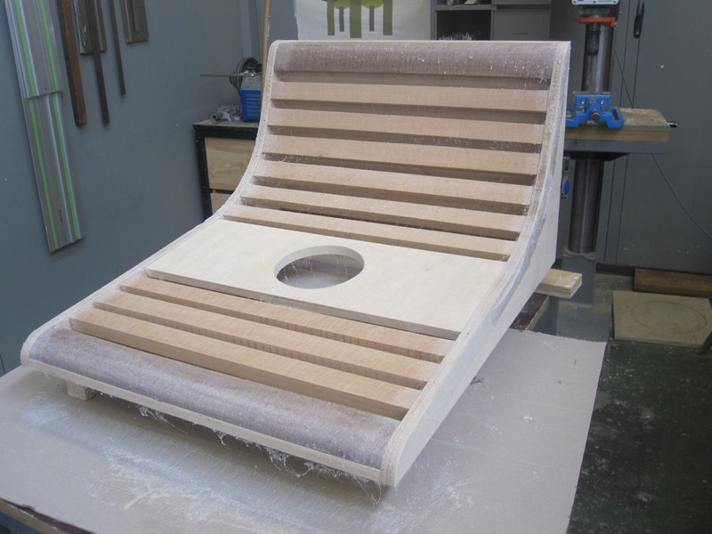
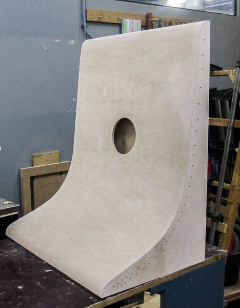
The instrument is made from birch plywood. The inside is reinforced with massive wood to resist the tension of the strings.

Final outcome

rsz_img_4414

                                                                                                         rsz_img_4412 rsz_ca2_0060


Sound file: some sounds of the instrument (not tuned to pythagoras)

[audio:https://designblog.rietveldacademie.nl/wp-content/uploads/2015/08/HARP-.mp3|titles= some sounds of the instrument]

Math is nothing other than stating things as they are. I only realised this during my research. It is the very foundation whereon math is based. It is the thing whereon my instrument is based. It shows tuning systems as they are. It does not hide the perceived disharmony. Creating this instrument has truly showed me how bad our attempts are at grasping the nature of reality. We are trying to create harmony with notes that actually form dissonance. It’s complexly ridiculous.

As an art student I say I made an interesting discovery. As a musician I say I have created an incredibly ridiculous instrument and I am very happy with that.


I & O


Sunday, May 17, 2015

q1

q2

q3

q4

q5

q6

pic1

pic2

pic3

pic6

Made Trough Material Research


Sunday, March 29, 2015

I was thinking, writing about a chair can be really interesting but for me it had to be more than only writing about a chair.

Waste, material, life, renovation, structure, experimenting, design.

A few of the words that were coming up in my mind when I saw and started to research this chair, so I thought this will be a perfect chair and designer to write about. To find out how deep this designer can go into material research, waste and renewable energy. Marjan Van Aubel is one of the designers who stimulates this.

table-17


Marjan van Aubel is a designer that makes everyday objects in new innovative ways. She is trying to make people aware of the fact that renewable energy is everywhere. Normally there will be a waste of 50/80% during normal manufacture.  Van Aubel and James Shaw found a way how to use and incorporate that wastage during the manufacture.

When I saw “the well-proven chair” for the first time it looked like a normal chair because of the simple legs of the chair but when you see the back it becomes a object. For me it was hard to understand the material. I didn’t know where the chair was made of. The nice structure camouflages the fact that it is actually made out of  shavings and sawdust.The sitting part is beautiful and smooth, making this chair nice to sit on and really nice to look at. It’s good that the legs are simple so the focus stays on the sit area. With her designs she try’s to combine design and technology. She strives for a more renewable life

Well-proven chairJamesShaw+MarjanvanAubel

For me this was a really interesting topic because i didn’t know a lot about this kind of experimenting with material. There are so designers working with this way of designing. They are busy with making new materials to make life more renewable. I think these new materials are needed because our resources are running out.

As an artist/designer Marjan van Aubel always was interested in how things are made, a reason why i feel related to her. I always want to figure out how ‘it’ is put together.

She was also intrigued by solar panels and why they are so ugly and why they can ruin the face of a building. Why are the panels not integrated in the tiles? I really agree with her. That is why she started at her collage time a research about energy. Now not only design was important also science. She graduated with “The Energy Collections” a set of solar glassware that discharges through a matching bookshelf, which serves as a rather large battery. This kind of thinking can make our life a lot more easy an conscious. Like I said we are running out of material so this kind of design thinking can improve this.

I have a lot of interest in nature.  For me that makes her work really interesting, because she interacts nature with design. I have a few works i made a few years a go which are also related to this.
I investigated how nature and mathematics have a lot of comparisons. Like the golden ratio and Fibonacci. You can see it in a lot of plants, a lot of leaves  grow in a spiral around the branch to get enough sunlight and rain. It is also in our human body. For me structure in  nature is an important way for making a work. It is really nice that nature can help us to make products. I think it’s also good that new young designers/artists also use this opportunity to invent new products and make use of our nature. Like her latest project  “The Current Table‘ which was also able to generate energy. This project she made in response to “the energy collection”.


Current-Table

The market for these well made products is getting bigger and bigger.  People are more concerned with a healthy and a conscious way of life and designers will react on that.

This movie from 2012 shows how a lot of designers are busy with the meaning of material.

https://www.youtube.com/watch?v=9-GofyAQK6Y


It’s fascinates me a lot how this young designer are making al these new innovative products. I found a movie on this page and it shows how scientists are combining non-living chemicals to create materials with the properties of living organisms.

Now you can see how new materials, new invented but also already existing materials but used in an other way will blow your mind. For me their is still a lot to discover about al this material researches and the meaning of material. This research showed me a lot new ways of seeing waste and make new material with it. So we al can be more conscious and re-use waste to make something new.


Links:

http://www.marjanvanaubel.com/

http://wellprovenchair.com/

http://www.dezeen.com/

http://www.rennyramakers.com/


In Sync, Act I


Saturday, March 28, 2015

hap_capisco

hap_capisco2


Complexity is Free


Monday, January 12, 2015

«Innovation can’t be found in the drawing of an object but in the use that is made of technology, materials, techniques. Technology has no interest for its image, but it is interesting for the service it offers. Its image must disappear, melt into the object. Technology is at the service of the result : price, lightness, comfort…» Patrick Jouin


OneShot.MGX_01

OneShot.MGX by Patrick Jouin

OneShot.MGX is a 3D-printed stool designed by the french designer Partick Jouin in 2004.This stool was manufactured using the 3D printing technique. Born in the mid 1980s, 3D printing, more formally known as additive manufacturing, was used at this time for visual prototyping. But some companies soon realized that the technology had the potential to do more than just producing prototypes. In 2003, .MGX by Materialise was founded and they invited world-class designers to experiment with this new technique and come up with novel products that were only possible with this new technology. Patrick Jouin was one of them and created on this occasion two chairs, a table and this stool.

I consider this item as one of the the most relevant among the Stedelijk’s design collection. Innovative, surprising, light, handy, delicate, subtile… it satisfies all the expectations that we have from a stool. You can take it anywhere easily, store it in a cupboard, in a car, in a bag. This object is in harmony with Patrick Jouin’s philosophy if we believe his words : «The objects we draw today are more discrete. They are more «affectuous». Discrete friends. They don’t tell less, they simply do it more slowly. It’s like homeopathy. They diffuse rather than they speak.»  I discovered Patrick at the same time as his product during the exhibition and I think he has a clear mind about what is going on in design nowadays. He created his own agency in 1998 after some years at Philippe Strack’s agency. His style is often qualified as discrete.

Patrick Jouin is really interested in experimenting new technologies. In an interview about rapid prototyping, P.J. said «The distance in between the creation, the drawing, and the final object was very short. It was like a sketch which is coming alive and taking shape in 3D. I know that every time in the history of design, when there is a new technology, there is always a new aesthetic.»

Patrick Jouin talking about 3D Printing

«Industrial production requires a radical conversion : we must start from the function of the object and possibilities of the machine. The limited performance of the craft production allowed sometimes the realization of original or richly decorated forms. Production by the machine, in series, needs a simplification of manufacturing’s forms and processes.» Willem Sandberg wrote these words around 1970 in a catalogue about the german designer Wilhelm Wagenfeld. Should we consider this way of thinking as still relevant nowadays ? New technologies such as 3D printing make these ideas a bit old-fashioned. I am not saying that this aesthetic is over, but 3D printing doesn’t undergo the same rules as the more industrial technique. Patrick Jouin said : «There are so many aspects, undiscovered yet, it is a new way to think how an object can be made.»

In his book Fabricated : The New World of 3D Printing, Cornell University researcher Hod Lipson describes ten of the underlying principles fundamental to 3D printing. The first principle he notes is that «manufacturing complexity is free». Unlike traditional manufacturing processes, where extra complexity requires a more expensive mold with more parts, there is no penalty with 3D printing when an object is made more complex. On the contrary, in some cases there may even be a benefit. With 3D printing, designers and artists can explore new kinds of highly complex and intricate forms that would have been impossible to realize with traditional techniques, and these come at no extra cost. It is a proverbial candy store of new formal possibilities, resulting in a new design language that is baroque and often eclectic.

Kram/Weisshaar, Multithread

Multithread #06 Console Shelf[x]

«Just because you can, doesn’t mean you have to». It is true that there is a risk of overuse, a risk that it becomes too much. What should designers do now that complexity is not a problem anymore. Designers are still in the early stages of the search for aesthetic in 3D printing. Many of the experiment we see today may appear outdated in ten years, but they are playing an important role in paving the way. With an increasing number of designers, artists, and makers gaining access to 3D printing, a mature formal language will develop over time, uniting and exploiting the full potential of the technology’s aesthetic powers.

«…people often proclaims grand ideas, things that are just after all, the qualities expected about an object. What an object owes us.» Patrick Jouin

Many studios and companies are working on developing this technique. In Amsterdam, we have the 3D Print Canal House, the first 3D-printed house. It also acts as an exhibition and interactive research center for 3D-printed architecture and related areas, such as material recycling, policy making, and smart electricity grids. The 3D Print Canal House has been printed on-site with the KamerMaker, a shipping container that has been converted into a giant 3D printer.

An aspect of 3D printing that I find particularly interesting is the way you share a product. The designer creates a file that could basically be printed anywhere by any 3D printer (if the printer is able to do so), but then a question appears, how is he going to sell it ? In a shop as a finished object or on internet/in a shop as a file still ?

What will make him choose a certain option ? If you decide to sell for example your 3D printed vases in a shop, you will propose to the public a definite object, with definite colors, materials and price. These choices will be of course part of your research and of course as a designer you know better than anyone the nice colors, but you don’t give to the buyer many possibilities. Eventually you could print ten times the same vase with each time different materials and/or colors, but then you take the risk that some of them might not be successful. You might have eventually planned everything with a marketing analyze or something else, but I am sure that 3D printing could be exploited in a much better way. In this way, the 3D print is not highlighted.

Imagine that you sell the product on your website. The vase that you created has a definite shape, but no colors for the moment, it is still a neutral file, just a shape. Then you put it online and decide the price of it. You could also suggests some colors or materials, without saying that one is better than another. The customer will be free now to  print the vase as he wants. There is no risk of overproduction in this case and there is also an attractive aspect for the customer. He might feel involved in the project and enjoy the fact of being part of the creative process. I talked about the price previously and I think this aspect is also interesting to discuss. How would you fix a price ? If the customer want to print it at home, you would sell a file only, so the customer will print and pay the material by himself. What is the value of it ? Is it in terms of technical innovation or complexity ? Or in terms of originality ? 3D printing could also lead to personal (home) creations and lead to the disappearance of designers. Of course, there will always be designers, but they could be at stake. For sure, this solution is possible only if a great number a person would have 3D printer at home, and it is still not the case, but it may happen soon. We can already see this kind of website where you have the possibility to create your own product.

I am also wondering about reproduction, re-appropriation and protection. How can you protect a product from reproduction or re-appropriation ? How could you recognize an original from the copie ? You could not.

The last possibility that I find personally the most interesting nowadays is to have your own 3D design/print shop. Imagine that you have your design studio that is at the same time a production place. You keep into the studio a selection of the products, accompanied by suggestions of colors and materials. Customers would come into the shop and ask for the vase 3D printed in red and blue plastic with maybe some adjustements. The nice thing is that you have then a real contact with the buyer, you can advice them, keep them informed and help them. You can imagine many things with 3D printing. It could provide a solution to over-production and consumption.

For example, companies could provide 3D files that allows you to print the piece of your machine that is broken instead of ordering it and get it from the other side of the world. You would just have to print it. For sure, the materials that you use to print will not come alone, but I think it could help. There are many other subjects to discuss, so if you are interested in 3D printing, you should have a look at this conference  about the environmental impact of 3D printing that was given on December 13th 2013.

A lot of people are active in 3D printing research. This is the case of Dr. Behrokh Khoshnevis of the University of Southern California which has been developing since 1998 a layered manufacturing process called Contour Crafting, in which cement or concrete is pumped through a nozzle connected to a computer-controlled crane or gantry. This draws the contours of the largescale structure to be built layer by layer.


Foster+Partners, Lunar Base

3D printing with Lunar soil by Foster + Partners[x]

Enrico Dini also, a passionate Italian inventor, has teamed up with the European Space Agency and the architects Foster+Partners to test the feasibility of a 3D-printed permanent moon bases built out of moondust. Contour Crafting is also aiming for the moon in a partnership the NASA. Give the significant challenges of scaling up 3D printing machinery to encompass an entire building, many concluded that, for the time being, the most pragmatic approach is to fabricate constructions in sections and then to stack these sections on-site.

Finally, if you are interested, I link you to some studios who realized some really nice project with 3D printing technique. I hope you enjoyed this article.

3D printing is definitely the technology of tomorrow.

“ants”


Thursday, April 3, 2014

Simply start scrolling from “A” until I find something that “pops”. Suddenly I come to this post, which makes me stay and actually read everything. I like when the science and academic world comes in together with design and art. Makes it interesting, and you learn new things and get a new insight. When you refer to natural things it is something everyone can relate to, and it makes you realize how present nature always is.


Screen shot 2014-04-03 at 3.49.56 PM


Ants are fascinating creatures, which are used in design and art too. The way the post is written is good and easy read, you get introduced in the subject immediately. These kind of posts that refer to other “worlds” and facts makes me interested in researching new subjects and other media. When a text makes you think and reflect, it is a good text and it reminds you too keep your eyes open to different subjects and how they can relate. Personal opinions together with facts is a good combination.

If you search for words regarding science and nature in art context, some things and facts might surprise you, as did post gave me new insights. Even if it’s nice to read and discover new artists through the blog, there is something very interesting about posts that concern other things that are a bit far from what you usually come across.

 
steamengine
 

Therefore I suggest you not to just check the topics, but actually choose something a bit more random, or something that is far from your interest, as it could invoke something new in you. This blog offers many interesting topics, which are all worth to be explored. This post offers me a new perspective and curiosity to read further about the topic.

If you do as I did and don’t search for too specific subjects or are too picky and actually continue reading, you might get surprised of how many new insights one single post might give you.
 

The CMYK Colour Model


Tuesday, February 4, 2014

the CMYK colour model is short for cyan-magenta-yellow-key (black) and refers to all colours as mixtures of these four process colours. so, within this model, a colour would be described through the quotient of cyan, magenta, yellow and black that can be found in the mixture.

the CMYK colour model is predominantly used in the printing process and is often referred to as four-colour printing (which corresponds to the four inks used). in order to fully understand it, it is vital that we examine another colour model named RGB (red, green, blue) that is used in display devices such as computer monitors. so, whatever you see on a screen is in RGB. however, these colours can only be viewed with the aid of natural or produced light – making it impossible for documents to be printed as exact copies of what can be seen on a screen. this is why these documents must have their colours translated into CMYK prior to sending it to the printer.

all the heavily paraphrased information above seems to make sense on a superficial level, but in fact i find it all extremely perplexing and difficult to grasp. unfortunately i never learned the complex language of science and since it is awfully strenuous to translate a language one doesn’t understand, here is the even-more-technical-side explained by someone who seems to know what they are talking about:

“When two RGB colors are mixed equally they produce the colors of the CMYK model, known as subtractive primaries. green and blue creates cyan (C), red and blue creates magenta (M), and red and green creates yellow (Y). black is added to the model because it cannot be created with the 3 subtractive primaries (when combined they create a dark brown). The K, or “key,” stands for black.” (taken from here)

subtractive-colour_redu

upon my investigation, i found that the aspect of the CYMK colour model that i found most compelling was the simple fact that a countless amount of colours are but a mixture of four: cyan, magenta, yellow and black. this thought was inevitably on my mind for days proceeding my research.


//

the idea for a translation of the CYMK model came to me when i was listening to Billie holiday’s  1941 version of “am i blue?” over a cup of coffee. it started me off on a long trail of thought which went a little like this:

blue? blue?! how has blue come to mean a sad & melancholic mood or person?

although the colour blue is used to describe a specific feeling, colour can also be used to illustrate mood or atmosphere – for instance – in less direct ways. this is apparent in art, music, poetry, prose… but why do we associate certain moods or meanings with certain colours? and more even-more-generally: why do we often have the urge to illustrate colourless things through colour?

i am extremely fond of the randomness of this occurrence  the randomness of the colour blue (with all its different tones) being chosen to represent something that is beyond blue literally, as a colour, a sensory experience…


//

i had the idea of translating the CYMK colour system in a way that i made each colour (cyan, yellow, magenta and black) represent something different. and so i did. i decided that i was going to translate this system into a system that determined the “colour” of one’s day. first, i made a list of things that tend to have an effect on my day. then i selected the four that i felt have the most influence on the “mood” of my day. i proceeded to make them into questions (which can be answered on a scale of 1 to 10):

– how happy/satisfied are you with yourself today? (C)
– how well rested do you feel? (M)
– how good does today’s weather make you feel? (Y)
– how similar is today to yesterday? (K)

each of these questions substitute C, M, Y, and K accordingly. and when answered as a numeral value (from 1 to 10), i have the percentages i need to make a colour with the aid of photoshop. the system i’ve created is therefore a colour-determining tool.

i decided that the colour i’d silkscreen would be the result of my answers to the questions the morning after i created the system. my answers were 5, 5, 3, 1 and made into percentages as shown below:


 …and “the colour of my day” beside my silk-screened circle version:

 circle_redu


//

i knew that to develop my project further i’d have to send this survey around and ask people to fill it out. therefore, i made an online survey using a survey-making-website (which can be accessed here):


this website organized the data which i later used to determine individual colours for each of the 40 people world-wide who answered my survey on the 12th of december, 2013. i mapped out all 40 colours to illustrate the colours of one day, according to the answers of 40 people:

colour-system_redu


a problem i encountered on two occasions was that if 10 (being absolutely) was the answer to the last question: how similar is today to yesterday? (K), then the colour would be entirely black. since the other quotients would be cancelled out, i didn’t want this to happen. so instead, i set the percentage as 95% rather than 100%. even though both appear to be black anyway, i like the idea that there are still undertones of colour. and although it did not stay completely ‘honest’ to my original system – at the time i thought it would be a good compromise.


//

after i was done with the poster shown above, i decided to design a survey of my own (which i would put online and use if i were any good at computing):

i think through this translated colour system, i managed to play on the randomness of colour representations, but also create a functional and fun system (which also has the potential of becoming interactive).

colour-system_total_redu


A “light” summary of color


Tuesday, February 4, 2014

When we think of light and colors the first thing we think of is the RGB color model.
The RGB color model is an additive model based on red, green and blue colored lights. When added together in various ways, they can produce a wide range of colors. The name of this system comes from the initials of red, green and blue.

HueSystemRGB The RGB color system’s main purpose is to display images in electronic systems, such as televisions and computers, although it’s also been used in conventional photography.

This system is based off of the Young-Helmholtz theory of trichromatic color vision. This is a theory developed by Thomas Young and Herman Helmholtz in the early to mid 19th century.

Trichromacy is a condition in which one has 3 channels to convey color information. Humans are trichromats. Each channel has a different absorption spectra, thus showing the viewer a different color. Young came up with this theory in 1802. Herman von Helmholtz brought the theory further in 1850 by classifying each wave length under the colors blue, green and red.

James Clerk Maxwell elaborated on this by creating a color triangle in 1860. He is the founder of color photography. He proposed in 1855 to take 3 black and white photographs and run them through red, green and blue filters. Each filter was projected on a different projector, and when superimposed, the human eye percieved a colored reproduction of the scene.

2474164072_d421085ba2_z The RGB system is also used for display screens, such as televisions or computers. Each pixel on the screen is built by driving three small and very close but still seperated RGB light sources. From a normal viewing distance the seperate colors are indistinguishable tricking the eye into seeing a solid color.

Here is a silkscreen print colour-wheel_White of a single colored circle made to represent the RGB color model. I chose to print the circle white because i felt that it would be the most accurate way to represent the entire system. The reason being, as you can see on the RGB color wheel, the combination of red, green and blue lights create a white light.

An other project I did was to create a projected piece based of the RGB system. I felt it would be interesting to base myself off the color wheel to create a less scientific but more abstract version of it.

These are the initial sketches I came up with: Screen Shot 2013-12-13 at 10.51.42 AM


I ended up choosing this one sketch for my final piece. Because this is a theory purely based off light, it does not work if only on paper. I needed to find a way to implicate this color wheel to something involving light. Therefor, I decided to scan and project this color wheel to a wall. By using a projector, the piece based of light and thus appropriate for this system.

How ever, i felt this was not enough. So with Photoshop, I divided the piece into three by separating it into channels: Red, Green and Blue. This way, i could go back to the origins of this model which is based on the addition of those three colors.

Screen Shot 2013-12-13 at 10.51.20 AM Screen Shot 2013-12-13 at 10.51.57 AM Screen Shot 2013-12-13 at 10.52.09 AM

After transferring these images into jpeg’s, I placed them into the iMovie software and created a short one second film. When running this film using a Quicktime loop, I created a gif.
Finally, this gif is then projected on a wall, completing the piece :


Get the Flash Player to see this content.


Freaking contrast


Monday, February 3, 2014

Some time ago I heart about color theories. My focus was mostly on the color theory of Ewald Hering. He was a psychologist. As a psychologist, he was busy with the perception of color by people. He made a theory based on another theory. The theory of Helmholtz and Young. Young and Helmholtz said that there are three primary colors (red, green and blue) these are the basis for every color. But Ewald Hering made his own improved version of this theory of Young and Helmholtz.

               Ewald_Hering2   hering1

Ewalds color theory is about how color is perceived in the eye. The perception of color is (re)made in the brain. In the eye there is a layer which is sensitive for color, it is called the retina.

You have little cones in this layer of your eye. Every cone has its own function in relation to color. Each cone is sensitive to two colors. The cone has two colors that are opponents of each other. Red and green are together in a cone. As well as blue and yellow and as black and white. When a cone is being activated by for example red, green also reacts to that cone. In the cone there are nerves which pick up the signals of the colors and transport that to the brain.

eye


The introduction of the color yellow into the theory was very important. Hering said yellow was a primary color. We see yellow as a primary color in painting but in light it was new to use yellow as a primary color in color theory. Like in the theory of Helmholtz and Young, there yellow was said to be a mix of green en red.

The color is what makes Herings theory innovative for the time. He changed from three primary colors to four primary colors.

 Yellow

With his fourth primary color, the way the colors responded to each other had to be different. He made a theory for that which deals with opponent colors. Because the sensation of green and red together cannot be seen together in one color. (Reddish-green doesn’t exist). But his theory claims that they do have to interact with each other.

Get the Flash Player to see this content.

I thought it was fascinating that someone could create a theory by thinking in a logical way. Because Ewald could not proof that Helmholtz and Young were wrong with their theory. He based his whole theory on the fact that he experienced that people could not see yellow as a mix of green and red.

colors

What I then tried was combining red and green light through 3D glasses. I thought I saw yellow but when I looked again, I just saw black. That might also have been caused by the method of using filters. When you put a red filter and then nothing else red goes through, if you then put a green filter it will go black.

I find Herings way of making a color theory a beautiful way of finding new things.

”Farbenkugel ”


Monday, February 3, 2014

Schermata 2014-02-06 a 22.57.12

Colors //

Philipp Otto Runge, born the 23 july 1777, died the 2 December 1810, he was a German Romantic Painter, friend of Goethe (that wrote a ”brick” book about colors; ”Theory of Colours”) in short, they shared the same interests. Runge dedicate his life on accurate, almost ”scientific”, drawings, painting and he dedicate him self on the studies of colours and creating a colours system.

For him there are three colors (blue, yellow and red) what he wanted to do is create the complete kind of colors resulting from the mixing of them, among them self and black and white. The result is a  sphere illustration similar to planet earth with two poles of black and white and colors are mixing each others in all direction and depth. The easy way to visualize his idea I think is to imagine it as a three-dimensional sphere that you can as well dissect (like an apple) and inside discover colors mixing among each other.

527px-Runge_Farbenkugel

What I appreciate on the ”Farbenkugel” is his ambition on creating a complete illustration of the relation between colors, and the obvious benefit that you can have from it.

With the fact that he is a painter you can see that his colour studies influenced the way he is handling colours (x;x) in his paintings that make me interested on choosing some of his paintings, simplify them and select some colours with the use of pastels, than be playful and let the process lead me to create something.

illustrazione-copy Philipp_Otto_Runge_005


The process//

First of all I selected some of his paintings and then I made some abstractions based on the similar color that you can see in his works, then I cut out parts, square and lines of the abstractions. Build forms and experiment and play around with them.

An interesting point of the “Farbenkugel”, if I´m not wrong, is that in the center of the sphere, or rather the core, all the colors are mixed and give black, I decide to pick a gray because of adding some white from the upper pole of the color sphere:

1903285_10151905931406314_1697678139_n

Actually, the more I was experimenting and trying out, the more I was getting insecure and confused.
Finally I decided to focus on the square selection and zoom/ abstraction of his painting.

Prova2-15_redu A2pastel

Prova2-9_reduprovaA2_redu

So I selected some of the more or less 5 x 6 cm cut outs, scanned them and printed them in A3. But then I still didn’t know what to do with them.

I questioned myself what should I do? So i pick up the camera and start filming but….

I was getting more lost and far from the original idea.

Whit this color system I must say that I learned to not underestimate or doubt the first idea, but go for it and finish it.
So this is a video clip showing the concept of extraction of colors on the first idea that I had, and if I followed correctly maybe I had some more image exemples…

Get the Flash Player to see this content.

Lamp Science


Saturday, September 28, 2013


Gispen’s Giso lamp (model 24)

A lamp, a simple product. A lamp only needs to give light, you have to turn on the light and after that you don’t have to touch it anymore. So a product designer is not really limited to the function of it, except the fact that it must give light. Or is this not true? Despite of all the possibilities to create a decorative lamp, Willem Hendrik Gispen made a really minimalistic lamp, the ‘Giso Lamp’ []. Only a white opal glass shade and a frosted glass above it, but that simplicity, I think, is the power of it. Willem Hendrik Gispen (1890-1981) was a dutch designer. In 1916 he began his own forge, called ‘W.H. Gispen & Co’, where he created crafted products. But in the twenties Gispen  became increasingly influenced by the design ideas of De Stijl and he switched from traditional to mechanized production. In 1926 he designed and produced the Giso lamps, it became a big success. The Giso lamp (Nr. 24) is a pendant lamp and  has a shade made of white opal glass that is 25 cm and a frosted glass disk that is 43 cm, the stem is made of nickeled metal. The opal glass ensures that the light is not really intense, but soft. The disk ensures that the light is not going up but only going down, the reason why most of all the lamps have a hood is interesting. Maybe a lamp is not only to give light, but also to give it a direction. There are a lot of Giso lamps [], but I think Nr.24 is one of the nicest, because of that disk above the shade.

This lamp is an interesting starting point to look at the vision of Gispen about de art of light. Gispen says that in the theatre the only place is where they control the light so good, that it became a real lighting art. This is because they focus on the most essential element: the light, and they are constantly occupied with the goal: lighting. If you want to make a lamp, you should be aware of the technique and also the goal: the right light on the right place. The requirements that must be set by a good lamp are  of different kind: physically, technical, economic, psychic. There are two groups that create lamps, but not with all the suspects. Architects and artist only focus on the psychic suspect, but then rarely on the main points of this suspect: colour and mood of the light. They only focus on the carrier of the light source, the lamp or ornament. The meaning of a lamp and the way to show it be interchanged. He thinks of all possibilities, an interesting way of hang up, or he creates lamps in the form of a square, instead of round, or a lamp out of wood. He thinks about everything except the fact that a lamp must be an object that light the space as good as possible. The other group is the group that only focus on the technical and economic suspect of a lamp, they want to create the best formula: the most light for the lowest costs. A lot of calculations and math, but a moderate result.

Gispen_Model24_redu

 
I will explain the different requirements.

The physic requirements: the light must be calm and not flicker, that is harmful to the eye. Also the light must not be too strong, that is also harmful for the eye. So you have to cover the light source. You can see how it is done in the Giso lamp. The shade is made of Giso-glass, the best kind of crystal glass, in minimal achievable thickness, (1mM.) covered with a layer of white glass, to a thickness of only 1/5 mM. They make the light pleasant and soft and only lose 10-15% of the light. Also the light must not be too weak. If the light is too weak it requires too much effort from the eye.

The technical requirements: the light out of a lamp can be controlled, by the use of reflectors, diffusers and light-breakers. The light can be absorbed and reflected, the way it absorbed and reflects depends on the material that is used for the reflectors, diffusers or light breakers. So you need to know about materials if you want to create a good lamp. There are also three different ways of lighting: – direct lighting. The reflector is so made that the light goes straight to one place, and is very concentrated. Examples are outdoor lighting or lights in a storefront.

-Indirect lighting: you get this light to let the light first been shined on to the ceiling. But the shadow it creates is so small that you get a surrealistic feeling, and also it is really expensive because the efficiency is only 35%.
-Half-indirect lighting: the best for general lighting. You’ll get this light if you put the lamp in a diffuser of a particular form. The light will shine in all directions . The Giso lamps are made to create this half-indirect lighting. But what you can see, the Giso lamp Nr. 24 has also a reflector above the diffuser, so the light won’t go up to the ceiling.

Economic requirements: maximum efficiency at minimum power consumption. Giso glass is perfect for this efficiency. It has a huge perseverance.

Psychic requirements: the place where a lamp hangs is of course important for how it looks like, a lamp in a living room must be different than a lamp in a party room or a storefront. As you have read there are many different requirements that a lamp must meet. They already decide what a lamp should look like, but you still can design a lamp as good as possible. For example Gispen uses soft gold bronze instead of dark bronze, so there is less contrast between the white shaves and the metal. The Giso lamp (Nr. 24) does not hang on a clumsy chain, but on a fine metal tube.

So maybe it was not true that a lamp is just a simple product. You have to be aware of all kind of different suspects if you want create a lamp, as Gispen did. But if you think it doesn’t matter at all, you can make whatever you want, without looking at all the requirements. (in my experiment I look don’t really look at the requirement, only at the atmosphere.)


Light experiment

Experiment

So now we know what Gispen thoughts were about light. I wanted to do my own light experiment. I changed my lamp into different forms, to look what will happen with the lamp and my room when I make small changes. I used my lamp in my bedroom that has a reflector above the lamp, so the light is more concentrated on the floor and less on the ceiling (like the Giso lamp number 24). I put all kind of different things under the lamp or covered it. The changes are huge, you can see it in the pictures, but it was even more in reality. If we look at the physic requirements I think Gispen would say that I made really bad lamps, because they are often too weak. Personally I like weak light, I liked the one with the white paper around the lamp, and the light concentrated on one point of my room and the rest of the room was less light. Economically it were also not really good lamps, a lot of light gets absorbed so it was not really: maximum efficiency at minimum power consumption. But my experiment was not about creating a good lamp. But about what little changes to a lamp do with the atmosphere of the room. I found out that it changes a lot to a room, but also really your mood. When found out that when the light changed, so my view at my room changed, so my mood changed. The best example was maybe the one with the color, the blue was cold and the red warm. Also the weakness of the light matters to my mood, the darker, the more I get into a mysterious almost melancholic mood. So I discovered through this whole research the impact of a lamp in a room. And that is bigger than I first thought.


Light experiment


Color Opposition


Thursday, January 24, 2013


What I understand about Ewald Hering is not a vast amount, it’s pretty narrow. I’m no Physiologist as he was but I will try to elaborate on his theory of Color Opponency, which is the idea that the receptors in our eye that make seeing colors possible are capable of taking in two colors at a time and that to each color there is a reaction. When looking at the two colors at the same time, or next to each other, it has contradictory experiences. This creates a kind of optical illusion where the colors seem to glow. Just like when you look at a black dot on a white background then look away you keep seeing the glow of the dot you stared at. This is that same glow. There are many optical illusions that use this formula.

The opposing colors he was talking about were Blue to Yellow (and vice versa), Green to Red and Black to White.
Anytime these colors are put up next to each other, without any intervening colors, it becomes difficult to look precisely at the border between them.

I understood why this combination of two opposing colors creates this illusion.
So my plan was to combine the colors and create an illusion that had its effect within the colors.
First I started with little prototypes with examples of existing optical illusions, but with the opposing colors, since I had discovered that Hering himself had created an optical illusion, namely the Hering Illusion.

Goodness gracious, is there anything Mr. Hering didn't do?

I found two other optical illusions that were of almost the same design as that of Hering’s and combined the colors with the design of the illusions.

It was too distracting, the optical illusions, so I removed these and tried a simple design; a red square within a green background and the opposite of that; a red background with a green square in the middle.
It felt more honest to the colors, rather than taking something that was already meant as an optical illusion and decorating it, so to say.

I liked the prototypes but they were, after all, prototypes.
So I set off to make three big paintings with a color combination of two each just like the ones I had made before.
The optical illusion worked, halfway through the second one, blue and yellow, I had to wear my sunglasses because I started to get a massive headache.

It was funny how the color scheme, blue & yellow, green & blue and white & black are usually set up together. I finally understood why; it was this subliminal optic effect which makes you either love it or hate it.

Not only that, this might be the very reason some people hate Christmas. Eureka!

I had to pat myself on the back for that one.

What I’m interested in researching further after this project is to see which secondary colors have this same effect with each other.
However I don’t want to limit my research to painting, I want to check if the same rule applies with objects in backgrounds with opposing colors.
I’ll try this with myself wearing a red t-shirt and standing in front of a green wall. The opposite as well, green shirt to a red wall. This I’ll do with all the color combinations and if my calculations are correct I should be able to blind you when you see me.

I started noticing that this same optical illusion not only works with these colors, but that it happens with other ones as well. Colors like purple in combination to green, for example, has a similar effect. However I don’t have the specific formulas to the secondary colors, so I won’t elaborate.

As an ending to the Ewald Hering project we silk screened one color each in reflection to our color theory. I chose the brightest neon pink I could find

(Thank God for Magenta, am I right?)


Colour Made of Light


Thursday, November 29, 2012


Research – RGB system

The RGB system [X] is a colour system generated by light. It is based on the light primaries of red, green and blue.When combined, red and green light rays produce yellow, blue and green produce cyan, red and blue produce magenta. Red, green and blue mix to create white (light).[X]

The RGB colour model is additive in the sense that the three light beams are added together, and their light spectra add, wavelength for wavelength, to make the final colour’s spectrum.

The choice of primary colours is related to the physiology of the human eye; good primaries are stimuli that maximize the difference between the responses of the cone cells of the human retina to light of different wavelengths, and that thereby make a large colour triangle.

The RGB system was developed in conjunction with television technology. The surface of the screen is covered by tiny points, each with a diameter of approximately 0.2 mm, containing phosphorescent materials (molecules). Normally, three types are selected to transmit red, green or blue light after excitement by beams of electrons (after they have absorbed energy).

Colours on the television screen are created by a special form of additive light mixture known as a partitive mixture. The partitive light mixture is created because the human eye is incapable of perceiving the many hundreds of thousands of points — the triads of red, green and blue patches into which they are organised — individually, and can only register the mixing effect of all RGB-triads together, with brightness being regulated by the intensity of the electron stream which triggers the phosphorescence.

The cube construction has been verified as the most suitable system for this particular range of colours, with each of its edges being divided into 16 equal parts numbered 1 to 15. These numbers are sufficient to specify the trichromatic composition of each colour.

The eight corner-points of the cube are occupied by red , green and blue, the subtractive primary colours magenta, yellow and Cyan, and the achromatic colours white  and black.

All colours in the RGB system can be concentrated into two subgroups, one centred on white and the other on black. The chromatic form extends from black (0, 0, 0) along the edges of the colours to reach the white tip (15, 15, 15) — the maximum intensity — after passing two corner points.
The RGB colour model itself does not define what is meant by red, green, and blue colormetrically, and so the results of mixing them are not specified as absolute, but relative to the primary colours. When the exact chromaticities of the red, green, and blue primaries are defined, the colour model then becomes an absolute colour space, such as sRGB or Adobe RGB.


PROJECT

& silk-screening


The colour I silkscreened during the progress of my project was connected to the red I used as a starting point for the RGB project. They were not the same red, but still *red“.  The red I used as a starting point for this project (RGB) was on my mind somehow, I’d been with this red for a while so maybe that’s why I still had it in my head, I don’t usually consciously spend this much time with one specific colour.

I was thinking about this RED, so that was the colour I was most curious about to silkscreen. I liked seeing the red in that process. It became tomatosoup red, not like the red in the project, which reminded me more of blood at the time. But maybe it’s also dependent on your mood, how you see red.

The project began with my research on the RGB system, colour made of light. How you see what you see on a monitor. Your eyes are fooled. What they don’t see, is that what is actually on the screen are millions of tiny dots, molecules that change colour when stimulated by electrons, into red, green or blue. Where they overlap we see yellow, cyan or magenta. And all of the hues that can be formed out of these components (read this research for more). So all of the fantastic images you can see on a screen are just tiny dots changing into three different colours and overlapping. Layers of light form the image. White light illuminates or dims the colour.

This was my starting point and this is what I went into throughout my research on colour. Seeing how colour is or can be composed, by  looking at it like a monitor screen. On which you see an image, but you know it’s actually only dots, and you want to see the dots, but if you do that you have to go up to the screen really close, and then you loose the big picture. Is it possible to see the tiny dots as well as the big picture? For humans, on the monitor this is generally not possible, so I tried to explore this „seeing up close, far away“, on a different medium, than a monitor.

My first experiment, I did on a white paper surface was my „white light“.

On it I applied a shade of red I mixed out of different reds. I used a small soft roll you would usually use for painting walls, which has a sponge effect, it absorbs and release. With this I felt I had more room to  deal with the white paper as a 3D Object not just as a surface. With this sponge roll I could press colour into the sheet of paper as well as absorb it  depending on how wet/dry the paper and/or roll was.


If I used a lot of water for example, I could  „wash“ the colour out. I would say it was like trying to tear the colour apart, going through all of its layers, and seeing what sort of image this creates.

To this stretching the colour/revealing it’s layers, I added another colour and tryed a more soft approach, using more soft movements to try and get the colours to overlap as they wanted to .


Basically what I did in the next experiments was working with layers. Concentrating on the single colours and how they change, according to the different tiny particles or pieces they are made up of.


At some point I worked with black as well as white, to see how colours react when you add light or dark, above or underneath it or both. Sometimes I would let one part dry longer so the different layers of colour wouldn’t mix to see if it made a difference.


I also tried creating different patterns/structures, to see how a pattern or a structure, for example one made up of dark and light particles underneath the colour, takes an effect when you look at the big picture.

For this I also tried using my lower lip to create a colour pattern to find out if a colour looks different when it is applied in a lower lip pattern.


The last experiment I did, was cutting material things into small parts so I could mix them and when you see it from far away maybe you see a new colour. I made for example, an orange colour out of khaki fruit skin, and an orange velvet textile, both of which I cut into very small pieces and then mixed. After about two weeks it started to rot, and green mold was added to the colour scheme.


With other experiments I got lost in the big picture and it became a more pictorial. Still I was working up close, concentrating on small sections at a time, looking for effects this can have on a colour when you take one (or many) steps back.


Philipp Otto Runge’s colour sphere & the three-dimensionality of colour


Thursday, November 29, 2012

Philipp Otto Runge (1777 -1810) was a romantic painter. He’s considered to be one of the best of his time. His interest in colour was the natural result of his profession as a painter. He invented a colour theory which he eventually published, encouraged by his friends, in 1808 in the form of a manuscript. He was pen pals with Goethe and they exchanged their ideas on colour. Goethe also featured him in one of his books.  Sadly he died young and his efforts where soon overshadowed by others.

His goal was to establish the complete world of colours resulting from mixtures of the three, among themselves, and together with white and black. He presented this in the form of a colour sphere, shown below.

Featured are the primary colours red, yellow and blue. They have the same distance to each other. The secondary colours orange, purple and green also have the same distance. The upper part of the sphere is white; the colours become lighter. The lowest part of the sphere is black; The colours become darker.  Red, blue yellow, black and white have the same distance from each other.

The colours shown on the outer layer of the sphere are the most pure. You could, for instance, also cut the sphere. In the middle of the sphere you could see a muddy colour (grey/brown). It’s every colour together so it doesn’t have any characteristics.

—————————————————————–

For my own project I took the idea of three-dimensional color. It’s already there in the original drawings from Runge, as shown above. This idea of three-dimensional color and the way Runge has dealt with showing this already offers some nice problems which I used as a starting point.

For instance:

-You can’t (to a certain extent) show three-dimensional colour in a two-dimensional way, in other words you can’t show the three-dimensionality of the color sphere by making a drawing of it.

– The only thing that works like the colour sphere is the colour sphere itself. For example; if you take the fruit ”mango” you will see random spots of red and green on the outside and yellow on the inside, there’s no order, like with the sphere. There are no logical transitions and grades. From red to yellow is logical. From red to green not.

-The colour sphere cannot be a colour triangle or colour square. It only works as a globe.

I started investigating these thoughts; The problem of three-dimensionality, the problem of the colour itself and the problem of shape.


With this in mind I started investigating different ways of showing color. On different surfaces; paper, textile. With different materials, paint etc. I started looking for objects, things and even animals which I thought could be interesting colour-wise. Taking them apart to see the colour inside. Decomposing and analyzing.

In the end I took an onion. The advantage is it’s simple shape, round, and the way it’s already layered. It has different layers of colour, ready to be peeled off.

Philip Otto Runge was of course a painter. To stay close to those roots I used actual paint to get the right colours of the onion. I painted on the onion itself to see if the colours where alike and for me it was a big part of the project; it’s quite hard to get the exact colors. As Runge used his colour sphere to discover and examine the colour of paint, and how to effectively use it, it was a nice experience to work with this material myself in such a way.


Now I had the colours ready; I could start thinking about the shape, or the application of these colours. I thought about applying the colour to various things, for instance; architecture. In the illustration I made below one can see how this could be done. There are seven rooms that fit into each other. I took them apart and spread them out in the illustration in different layers. The last ”room” is actually a pillar. You can’t go any further.


I silkscreened this colour. It reminded me of the light of the sun at the beginning & end of the day, when it only touches the top part of houses, trees, clouds. A gold, deep and warm yellow with a little bit of mustard. One of Runge’s works, ”morning”, inspired me to choose this colour.


/In progress/

Moses Harris, The Natural System of Colors


Thursday, November 29, 2012


Moses Harris [entemologist engraver 1730 – 1788] examined the work of Isaac Newton, and tried to discover all the variety of colours that can be determined from principal colours : red, blue and yellow
Harris presumed that these colours, when are mixed with each other can form all the colours and tints (660) in the nature.

Nature was his guide and assistant , as the arrangement of the principal colours is systematized according to those reflected by the prism, where we find the orange colour lays between the red and yellow, green between yellow and blue and purple between blue and red.
These colours coming in continues succession gave him the first idea that they should be placed in a circle. He thought that this order agreed with what seems to be demanded by nature.

The nature of the thing divided the the whole into two parts: prismatic and compound


He noticed that
PRIMITIVES – red yellow and blue are most common especially in wild nature
MEDIATES – orange green and purple are the colours that mother nature decorated most of the flowers

To show all the variety of colours Moses Harris created segmented circle and its identification system.
He applied water colours in layers what allowed the subtle transition between colours and shades.
According to Harris explanation, the primitive prismatic colours each use the use three parts of a single color (red, yellow, or blue) while the mediate prismatic colors are two-to-one combinations of the primaries, determined by their position on the circle.reference. From this information, we can assume that each compartment received at least three washes or layers of color and perhaps as many as twenty, the number of shades or tones Harris designates within his circle. It is unlikely that Harris used as many as twenty color layers to create the deeper tones in these plates, however: It simply was not necessary. The narrowing size of each arc gives the perception of color darkening, and Harris may have taken advantage of that effect, just as he relied on the white paper surface to aid representation of the lighter shades. It is likely that Harris used some smaller number of color washes—three or six, perhaps—for each of the eighteen colors in each of the two circles.

He linked colours with some pigment, fruit or flower

PRIMITIVES:
Red – Vermilion – Wild poppy
Yellow – Kings Yellow – Butter flower
Blue – Ultramarine – Corn flower

MEDIATES:
Orange – Red orpiment – garden Marigold
Green – Sap green – Leaves of the lime-Tree
Purple – Hairy sheep scabius – flower if the common Judas tree

COLOURS CIRCLES

PRISMATIC:
Red, orange-red, red-orange, yellow-orange, orange-yellow, yellow, green-yellow , yellow-green green, blue-green, blue-green-blue, purple-blue, blue-purple-purple, red-purple, purple-red

COMPOUND
Orange, olave-orange, orange-olave-olave,gren-olave, olave-green-green, slate-green, green-slate-slate, purple-slate, slate-purple-purple, brown-purple, purple-brown-Brown, orange-brown,brown-orange

equal amounts of red + blue + yellow = black
equal amounts of purple + green + orange = black

white is seen as the lack of colour

Contrasting colours lay on the opposite sides of the circle
According to Harris his colour system has both practical and philosophical uses. He mentioned an experiment in which blue arises from the orange of the candle flame. These are the contrasting colours that lay in the circle opposite to each other

There is nothing known of the contemporary use of these color circles.


MY research OF THE MOSES HARRIS COLOUR SYSTEM

Moses Harris presumed that these colours, when are mixed with each other, can form all the 660 colours and tints  in the nature.
The ones that he himself actually found in the nature were just 6 of them (red yellow blue green orange purple).

Where this small amount of examples comes from? Moses Harris lived in the XVIII century, when there were not many ways of transport and traveling was not easy and common. He was most probably, just looking around in his surrounding.

Nowadays, we live in the globalized world and traveling is an everyday thing. We have planes,  cheap flights and we can reach any place of the world.
Moreover we can also travel in the cyber-space through the internet. Internet is an enormous source, all the world is there. Its a very big source of information. Most of the people use it daily, to search for different kind of info, to  check our email and also for the social networks among which the most popular is Facebook.

Facebook is a huge personal (but not only) information area. Members post

photos from their journeys.  Next to the photos of people and architecture one of the most popular are photos of nature.

I find this modern world and digital media a very interesting topic, that is why I decided to search in the photos of nature taken by my Facebook friends posted during their whole existence on Facebook

I found many photos of nature  in a bunch of different tints, but still many are missing.

I was thinking what would be a great way to present them and decided to make collages  that  take a way a bit the realistic look of plants. make them more abstract ( each 10 tints ) .


blue- purple   / purple-red  /  orange-yellow  /  yellow    / yellow-green

I am still in the process of creation. At the moment there are many parts of the Moses Harris circle to be filled in. It leaves the open space for other people. If any of you is interested to search for the nature photos of their friends, please do that and send it to me : a.d.radzimirska@gmail.com
I am pretty sure that together we can fill in every segment of the whole circle of Moses Harris.


Herman Ebbinghaus, Deconstructing the Phenomenon


Thursday, November 29, 2012

Introduction

Herman Ebbinghaus (1850-1909) was a German psychologist, who pioneered the experimental study of memory, was the first one to talk about the learning cube and is known for his discovery of the forgetting curve and spacing effect. He has also discovered a color system, based on a double pyramid colored Red Blue Green and Red after Leonardo da Vinci’s idea. The idea was that due to the variation of brightness, those four colors can be separately distinguished. He strongly believed that being aware of the physiologists discovery,  in the eyes retina there are only three photo-sensitive substances who are responsible for the phenomenon of colored vision and its anomalies. He published in 1893 in the Journal of Psychology in Germany, a “Theory of Colour Vision” – in which he mentioned that humans perceive colors through higher mental processes. He had then discovered that if one of the combinations of pyramids, red and green or yellow and blue have a common base in a three dimensional space and that base spins (as seen in the image), two white hues are produced and the brightness is linked to the speed of the spin. It is a purely phenomenologically oriented portrayal of colors in which the complementary pair does not find a place opposite one another. The double-pyramid has then came to be a stronghold of phenomenology, an era in which colors were simple came to a close. After Ebbinghaus discoveries physics could never be certain again about the nature of light and it’s wave and particles properties that have also been discovered at the same time by Albert Einstein.    

The Machine

It really got me by surprise me that i couldn’t find any other source or any other image besides one website. All about this color system is theoretical, it hasn’t been applied into action. So i was curious to see this phenomenon happening. My first attempt was to create a physical machine with two rotated round edge squares, one would fit into the other and with the help of two air blowers, it would turn.The machine didn’t have much success as i realized immediately, it was an interesting shape but the squares didn’t turn fast enough therefore the phenomenon couldn’t appear. After creating the machine i wondered whether a digital form could be more efficient.

  (more…)

James Clerck Maxwell’s additive color


Thursday, November 29, 2012

James Clerck Maxwell, physicist, created the first color photograph, theorized, and experimented with kinetic theory of gases, electromagnetism, and additive color. Maxwell’s theories and research into these several fields commenced other scientists to define the physical description of the human color perception and to further delve into this subject. He created various equations, which explain how light waves travel and the first triangle color system, which plays a large role in many color systems such as CIE and Hermann von Helmholtz’s Curve of Spectral Colors. Maxwell demonstrated in his experiments that when he mixed red, green, and blue together they create white.

Each color in his triangle is the result of the combination of two or more of the primary colors. Within the triangle, Maxwell hypothesized any two color combinations will lie opposite of each other. In Maxwell’s triangle, he translated the geometrical shapes and space between colors defined in Newton’s color circle to measurements of the colors physical stimulation and resulting mental states and sensations. Digital screens all use the additive color system, which emits certain colored lights to create the image on a screen. These controlled light waves still cannot be completely measured in computers or televisions, which cannot distinguish different colors. The additive color and electromagnetic waves experiments done by Maxwell all contribute to the visual aspect of computers and television, as well as radio.


Log in
subscribe