Skip to Content Skip to Search Go to Top Navigation Go to Side Menu


"Projects" Category


Designing A Country


Monday, October 5, 2015


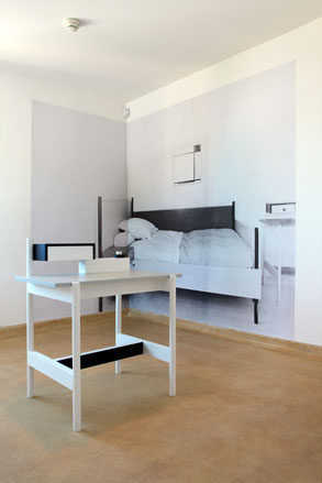
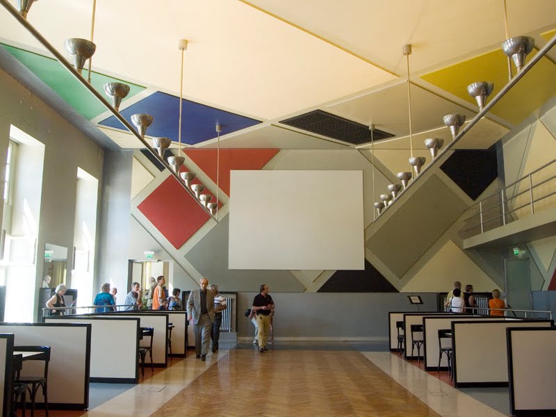
Why is it interesting to examine the differences between Dutch and Belgian design? The exhibition that was supposed to make me understand what was interesting about comparing the two countries design-wise, made me even more confused. As I strolled down the beautifully curated paths of the Design Derby, I saw Dutch and Belgian design objects cleverly placed next to each other to make the viewer see the clear differences between these two very closely related countries. The problem was that every time I had concluded something drastic about one of the two being more art nouveau, constructivistic or a clear example of de Stijl movement than the other, I would see two new objects and be surprised that my conclusions were far fetched.

What I should have done instead of just casually taking a glimpse at the beautiful objects, was reading what was written on the walls next to them. This I found out by googling the relationship between Belgium and Holland, and figuring out that they have a closely related history, but developing different socio-economic statuses during the 20th century.

Hereby I found the answer to why this exhibition is interesting and relevant, not only to people familiar with the history of the two countries, but in general for people who want to understand how a design object can express a whole time period or the mindset of a country just in the way it’s shaped.

Here, for example, the two logo’s of respectively the Dutch railway system, and The Belgian Metro. Similar in their form, you think by first eye sight, but if you look closer you see significant differences.

NS-Logo_200logo-metro-brussels_200

Dutch >•< Belgium

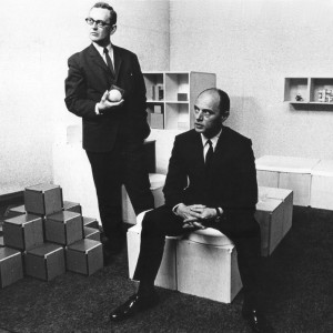
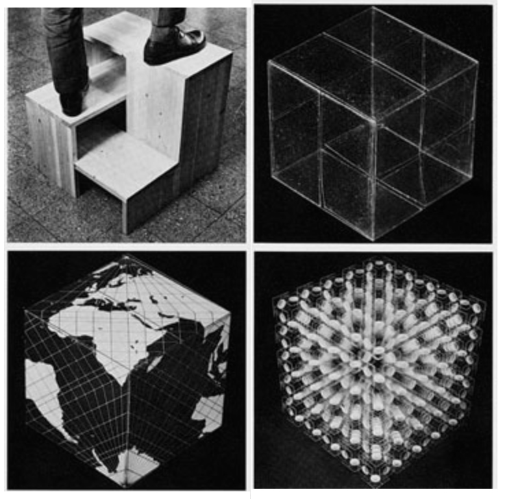
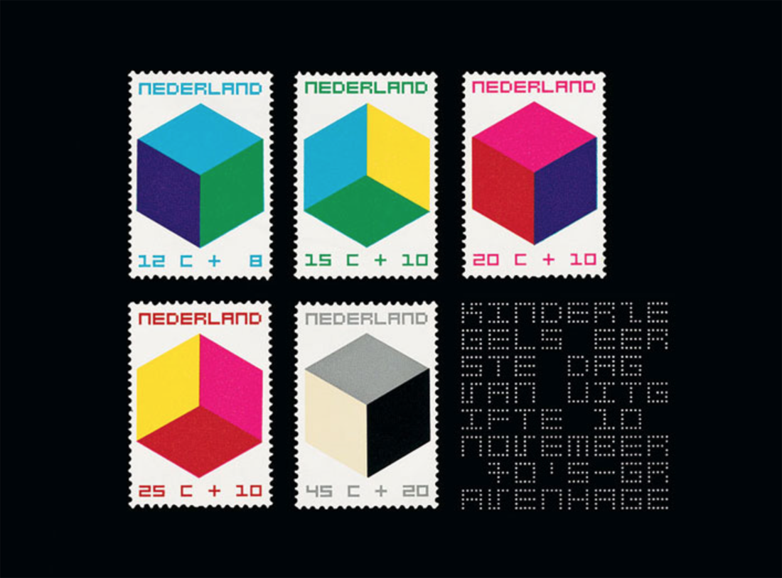
The Dutch logo was made in the 1960's, a golden age for corporate design in Europe, with Holland and Switzerland as two of the main providers. This logo was made by the still existing Graphic Design company, Studio Dumbar, who created a whole Identity for the Dutch railways; way finding signs, tickets, the look of the outside of the trains etc. The logo is a symbol, no letters are needed, because this symbol is supposed to be strong enough to remind every Dutch person that 'here you can take the train', and maybe it even contains more than just that simple fact. The railway system of Holland is a public institution, it's a representative of the Dutch culture, signaling to both the people of the country itself and the outside. Maybe this is why the same company was chosen to design the identity of various other public institutions: to give the whole country a graphic identity. This shows a very visually conscious country, knowing the importance of a graphic identity.

Here an example from neighboring country, Germany  and Swiss, with  their big company's representing the country, the airline Lufthansa and Swiss-Rail. Other examples showing the strong, straight lined, European corporate design of the 1960's.

lufthansa-book-cover Swiss-Railways

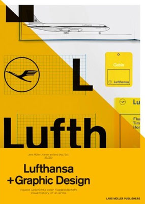
Logo design by Otl Aicher 1963 and Joseph Müller-Brockmann 1982

The Belgian logo is a bit different in it's look. Less sharp, less serious with a lighter blue colour and a rounded and assymetrical shape. What is the most significant difference when you look up the history of this logo, is that it was made, not by a big company that knows about Graphic Design, but by a small and vagely well known Sculpturer, who never, before nor after, had anything to do with Graphic Design in a traditional sense.

Also interesting is, that if you google Brussels Metro Graphic Design, the images that turn up are far less clear than what turns up when you do the same to the Dutch Railways. This being said, it is also important to have in mind that the Belgian logo was designed in the 1980's, a slightly different style period in the history op graphic design. Less clear, more post modern, pointing in different directions. This shows in the logo being both sharp and soft, geometrical and asymmetrical, as if  it was shaped in the hands of a, yes, sculptor.
 
Skærmbillede 2015-10-05 kl. 23.06.18 Skærmbillede 2015-10-05 kl. 23.06.34

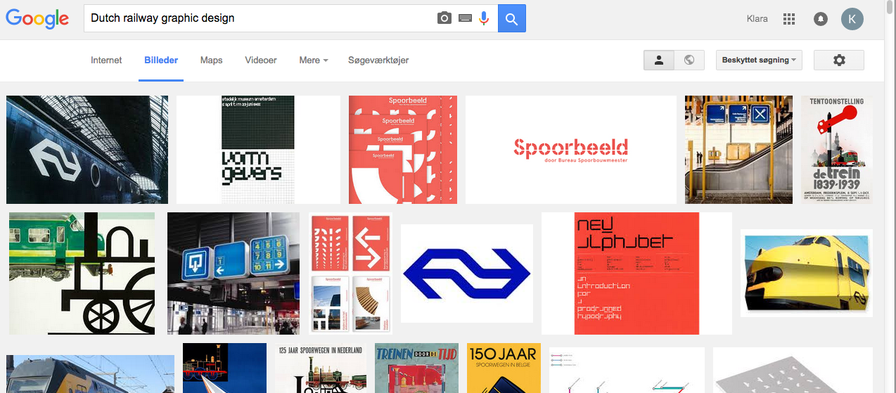
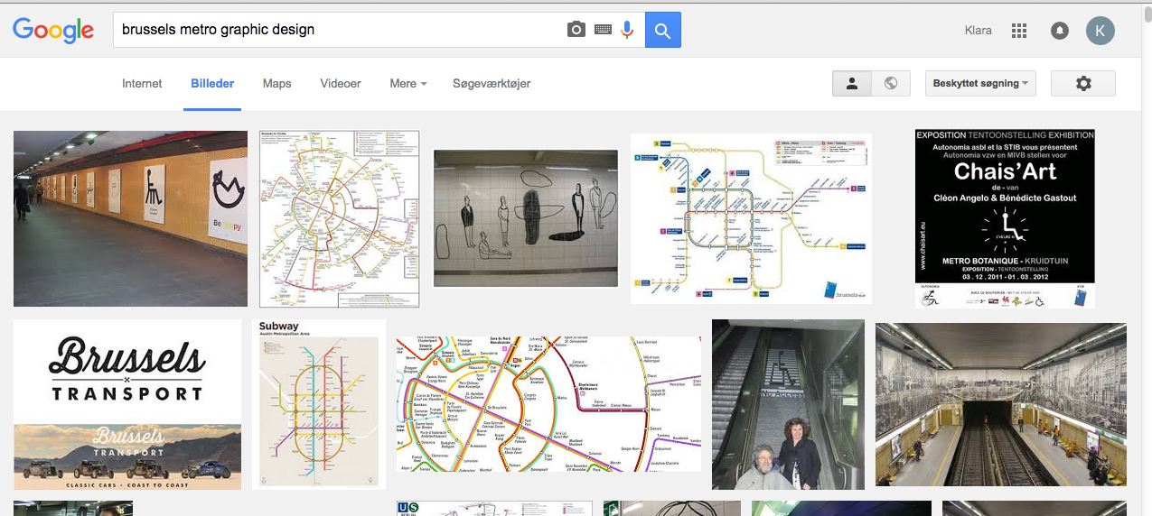
Google Search images for Dutch Railways and Brussels Metro


What is the difference between a waiter and a piano player?


Monday, October 5, 2015

The world opened a new window in 1844, when the public entered “French Industrial Exposition” in Paris. Quickly afterwards, various large public exhibitions were held in different parts of Europe. In 1851, the first-considered International Exposition was held in London called “Great Exhibition of the Works of Industry of All Nations”. A new platform was born, where art, science and technology from different countries were brought together.

In the process of the development of the platform, the pavilions became a tool to improve the image of each country from 1988. A study called “Expo 2000 Hanover in Numbers” by Tjaco Walvis showed that 73% of the countries at Expo 2000 were primarily interested in improving their national image. The world fairs had evolved into big vehicles for national branding.

 “In the desert of life the wise person travels by caravan, while the fool prefers to travel alone”, (African proverb)

As the importance of the pavilions’ look grew, the budget grew with it.

world's fair

At Expo 2000 Hanover, the average investment pr. pavilion was €12 million: A budget that made governments doubt their participation since the benefits were often assumed to outweigh the costs.

In a world today, where branding is a key asset: Is it possible for the artwork to stay as strong and sensuous to the audience? Does the creation of a salable layer (that has to be considered and assessed) leave the message behind? When a world fair tries to destroy the line between exhibition and exposition, is it possible to make both’ part equal?
Creating a community inside of the world fairs figurative walls is interesting. But at the same time, I’m constantly aware of the galleries’ need to sell. Does art lose its artistic value if it has to be salable? And does the price affect the experience of art?

CHART ART FAIR had its debut in Copenhagen 3 years ago. A Danish offer of how a world fair could look like. The CHART director Simon Friese wants to establish an international art platform for the Nordic region: “The ambition to do CHART in the first place was actually to make a platform that had the curatorial level to be able to attract an international audience coming here (…)”

CHART ART FAIR

But in the crowd, I feel like the gallery presentations convey get lost. The event has been located the same place all three years: Kunsthal Charlottenborg. In the 17th century surroundings, the location won’t disappoint you, but in the big spaces I feel an enormous distance between the art pieces and me as a viewer.
Before you are invited indoor, you can see advertising on display in different shops around town. Large video installations were put in shops as a warm-up before the fair this August. But every shop they have chosen had a specific status and price range. The locations were obviously chosen to attract an audience with a high income: because the buying of a ticket is only a small part of the money that’s exchanged inside the fair’s walls. If you’re interested in ownership, you can take the matter up with the gallery owner you can find next to every stand. Gallery owners you also can meet in the lounge section solely for specific members of the art world. (Some transported in limousines).
But why do I care? Do I want to play a role in the social club of the arts? Even though CHART is a new-born, the number of viewers has increased with 50% the past two year. Apparently, there are a lot of people, on national and international ground, who are interested in a Nordic art platform. Simon Friese and Denmark’s most famous gallery owners are those men who rule the roost, since they decide the selection of the approx. 28 galleries which are participating.

World’s Fairs are great scenarios to enlighten upcoming art and new ideas. The first telephone by Alexander Graham Bell was shown at Centennial Exposition in 1876. And the infrared touch panels were finally presented to the public at the 1982 World’s Fair in Knoxville, Tennessee, after 40 years of research. A lot of people, including myself, imagine the World’s Fairs to be like in the 1950’s, but the medium has changed.

Bell's  telephoneFirst touchpad 1982

In the old days, the rich would cross the sea to see the wonders firsthand, but the internet put an end to that. “I don’t know today how a World’s Fair can be viable, because everybody has a camera in their pocket,” says Louise Weinberg, World’s Fair Archive Manager at the Queens Museum. With everybody having art from each corner of the world in their pocket, you don’t need to go to foreign countries. With the internet, the outcome of World’s Fairs has been a massive slump.
Is CHART trying to transform art into a trade again? At Kunsthal Charlottenborg, the artwork or art “actions” seem like entertainment you can quickly pass without being further included. Is that the intention of the yearly event? And then I cannot not think about; are artists meant to serve the rich?

pearl and sophia bible


Monday, October 5, 2015

This article aims to compare two bibles, Sophia bible from Holland and  The Mother of Pearl bible from Belgium, both found at the Design Derby Exhibition at the Boijmans van Beuningen museum in Rotterdam.

b8eef0808b9ba6c571c9db492c59d6f9-256x300

The ‘Sophia bible’ was made by Dutch publishers ‘Uitgeverij van Goor’, a family run business who specialized in Children’s literature.                                           It was made for Queen Sophia and the Dutch King Willem III in 1855.  It was called the Sophia bible, after King Willem’s wife Sophia of Württemberg. It was for public sale, but two very ornamental copies were reserved for the Royalty.

2d22868db9545eb3f67b7743278292b7

The bible is bound with calf’s skin and velvet,  decorated with wooden graphics and golden clasps. Sophia bible is illustrated, suggesting that it’s function was more ornamental than informative.

(Taking it’s style from Art Nouveau, )

The 19th century was a time of civil unrest in the Netherlands, as there was much conflict between the Protestant and Catholic churches. In 1853, King Willem gave permission for the Roman Catholic bishop hood to be restored. Although the Royalty remained favorable to the Protestant Church, this elaborately decorated bible could have been an attempt for the King to neutralize the differences between the two sides, as it’s ornamental design refers far more to Roman Catholicism, than to the more humble, Protestant style.

173d5793d5c188ad286e461e737ffc09

The Mother of Pearl bible, published by the Belgian publishers ‘Brepols‘ in 1882 is a small, silver bible made from Mother of Pearl, gold leaf and copper. It’s Art Deco Style owes to the geometrical triangles, it has a small clasp and is made to be kept close at hand. This may be because the popularity of Christianity was declining in the late 19th century, meaning people wanted to protect and prove their faith. A pocket sized bible would mean people could read from it on the streets, either preaching from it, or using it to prove a Christian identity. In 1882, Belgium was Roman Catholic, so the pearl bible was too. The Belgian publisher ‘Brepols’ was a family run business, who coincidentally also specialized in children’s literature.

The two bibles are vastly different, firstly and most notably, in size, sophia bible is very big compare to the pearl bible .They came from two different ideas of how to practice Christianity. The Sophia bible is purely ornamental, the desire to look inside is great, but the idea of using it as book for Christian practice seems less so. The Belgian Pearl bible is used for reading every day and following faith. It’s hard exterior prevents it from damage, so it is designed to be portable.

Secondly, the design styles. The Belgian bible follows Art Deco, somewhat unlike the rest of Belgian design in the 19th century. It’s symmetrical triangles, it’s ornamental pearl cover and the small copper clasp  make the bible elaborately shiny, but also visually very simple. The Dutch Sophia bible was made in the Style of Art Nouveau. It’s design follows Neo-Classicism and Baroque revival design which was popular in Holland in the 1800’s. It’s ornate wooden floral patterns, it’s huge golden clasp and it’s royal red binding make the bible decorative, fitting well with the rest of Dutch design from that period.

Lastly, there is a difference in the Status of the bibles. The Sophia bible was made for Royalty, already this calls for intricate and decorative design. Before the second half of the twentieth century, there seemed to be an unspoken rule that design for Royalty must be elaborate and ornate and just because of this, it creates a huge bias in the design of this bible. The pearl bible is vastly different as it was made for upper middle class Roman Catholics. It was designed far more simply, you would not recognize it as a bible unless you looked inside, whereas the Sophia bible gives it away with the ornate effigy of Christ on its cover.


In conclusion, these bibles are vastly different. Although both using expensive, decorative materials, one is over-designed looking at it from a 21st century eye, whereas the other is far more simplistic. The pearl bible’s Art Deco design is more modern than the Sophia bible, which screams Art Nouveau. They were used for different purposes, I imagine the pearl bible more actively so than the Sophia bible, owing to it’s sheer size and weight. The Sophia bible is probably more fragile than the pearl one, as it has many thin, decorative wooden features which may not survive a fall from table height. The bibles are 30 years apart which was enough time for design styles to change quickly, especially in the second half of the 19th century.

Written Colaboratively with Freja Björnberg

PEOPLE NEXT DOOR


Monday, October 5, 2015

The design derby took place in the Boijmans museum. It is about the confrontation of Belgian and Dutch design objects from 1815 till today. The collection covered all kinds of design; from glass and ceramics, prints, furniture, fashion, even up to cars. The exhibition was ordered chronologically and all the items from each country were presented next to each other into two big lines.

Does this make sense and do you really find out more about Dutch and Belgian design by looking at it like that? This is an attempt to find out as much as possible through two chosen objects from the exhibition.


table carion OLYMPUS DIGITAL CAMERA

Francois Carion table [x] and lamp [x]

Firstly, a small round table by the Belgian designer François Carion. He built this table between 1925 and 1930, the materials he used for it are iron and pink glass. The wrought iron is one of the key symbols of his work and he used it for a lot of other designs as well.


ravesteyn chair ravesteyn

Ravensteyn chair presented at the "Exposition des Arts Décoratifs et Industriels Modernes in Paris 1925 [x]

The second is this chair by the dutch designer Sybold van Ravesteyn, who was born in 1889 in Rotterdam. Van Ravesteyn is a nationally famous architect who designed some quite important projects in Holland, for example the central station in Rotterdam [x] (shutdown in 2007) and also various residences and furniture [x]. The presented chair was designed in 1925. It is made out of wood and painted in geometrical shapes in black and white, designed specially for mister Rademacher-Schoers bedroom with the matching nightstand for his house in Utrecht.

To find out more about the artists it is important to understand the circumstances of life and therefore their inspirations.
First of all, after the first World War progressive designers took advantage of the knowledge of material and techniques they had gained during war. That’s why for example it was also a big topic to design the first cantilever chair out of tubular steel which was used by famous designers like Mart Stam, Marcel Breuer and Mies van der Rohe.

Moreover some big art movements were going on in this time; from 1890 until around 1910 Art Nouveau was a big influence mainly inspired by natural forms and shapes and therefore you can find many dynamic flowing lines and mainly asymmetrical shapes. Art Nouveau was seen as a harmonization between nature and design, and also a way of life. In the same time the Arts and Crafts movement was going on, which was an big influence from Great Britain; the movement was mainly about the combination of work and art. From France came the important Art Deco movement. Art Deco was defined by stylized and two dimensional representation of floral and organic designs. The industrial production and lack of shadows and natural elements was the new sign for modernity and the overtake of Art Nouveau. The absolute climax of Art Deco was the Exposition Internationales des Arts Décoratifs et industriels modernes 1925 in Paris, which defined the movements name.

Another movement was De Stijl in Holland. Famous contributors included painter Piet Mondriaan and of course architect Gerrit Rietveld. Their work is mainly known as plastic art which is a pure abstraction in form and colour. It is about the reduction to the essentials by only using primary colors (among black and white) and the limitation to use almost only vertical and horizontal directions. The most famous example is the Red and Blue Chair by Rietveld in 1917 which can be also seen as a three dimensional painting of Mondrian.This chair was also invented for mass production which expresses the mood of time in Holland at that moment.

Also because in most middle class houses in Holland and with the higher class in Belgium it became common to use a gas stoves instead of a big oven in the kitchen,  people didn’t gathered only in their kitchens anymore as nice and cozy place to stay but in their whole houses. There were other heated rooms, even central heating, as well and furniture became much more important in general.

I choose these two items mainly because of their difference, despite being designed and produced at almost the same time. This shows how many different influences the countries and artist themselves had during the time, which makes the derby more interesting, it is nice that you can find several elements of the ongoing movements in these two pieces.

arts and crafts   william morris niebelungenlied

Art Deco Jug • Charles Robert Ashbee (1904) [x

Art Deco Interior • William Morris Niebelungenlied (1860) [x]  

In Carions table for example I can find lots of flowing formed shapes and the motive of nature a characteristic of Art Nouveau and the Arts and Crafts movement which is coming mainly from Britain. I wanted to give another example for this movement because there are so many similarities to Carions work  in C.R. Ashbees work  (1863-1942) who was a British major designer for the arts and crafts movement. You can find simply the same elements and materials as Carion used in his works. In Interior Design wood was also a big thing  you can see that in the Red House from William Morris, who is actually seen as the founder of this movement and his friend Philip Wood. They designed this house in England together and until now it is a well known example for the Arts and Crafts movement.

18_designparade_jt130711   Bar Aubette

Art Nouveau Interior • Sybold van Ravesteyn room of Villa Noailles [x]

De Stijl Interieur • Theo van Doesburg Aubette (1928) [x]

Ravesteyn’s work which in this period consists of only geometrical shapes and very limited colours shows influences from the Dutch de Stijl movement, which is very much connected to Rietvelds work, who was also designing for private houses . But also artists such as Theo van Doesburg in whose Maison-Atelier de Theo van Doesburg de Meudon in Paris where he lived himself with his wife. It is quite obvious that both artists have similar inspirations and approaches in their work. In the picture you can see “Aubette” a collaboration between Hans Arp and van Doesburg for a cinema in Strasbourg which is very loyal to the de Stijl rules.

All in all from this exhibition as an example we can see the impact and influences countries get from other countries. As here seen in Holland which is more orientated on the East with Germany and the Bauhaus movement as there were also many refugees coming from there and they choose Holland as neutral country. In contrast to Belgium which was more focused on France and even Britain so therefore the south and west.

Moreover it is an interesting fact that people lived next to each other, but also very different, because there was a border between them. This has changed so much today where there is internet and it is so much easier to to cross borders to find inspiration online and not having to depend on the values and movements being part of the countries itself.

Mart Stam and Gaston Eysselinck ‘s chairs


Monday, October 5, 2015


chairs mart stamjpg

What first stroke me about those two chairs is how similar they look.

I thought they were made by the same designer. It’s funny because at first I was attracted by the colour of Mart Stam’s chair. Yellow is for me the colour, of happiness and brightness. I also thought that it was very modern and appealing in it’s shape and colour. I then saw that they were made in the 1930’s which surprised me because I believe they haven’t done anything so modern ever since.

Obviously throughout the last century we have discovered a lot of what arts have to offer and gone deeper and deeper in to the meaning of it. Just as Gaston Eysselinck’s did with his chair, pushing simplicity and minimalism to it’s most extreme point and aspect. I believe this is why Gaston’s chair is much more depressing sad even then the one of Mart Stam, because he has pushed the concept just a little bit too far.

eysselinck_10

The other aspect is that, they did it one year a part from each other but seemed to have had no kind of link what so ever, it means that in a way they had the same intention and were inspired more or less by the same idea. Both countries were at the verge of something new because of economical, social and political changes.

Gaston Esseyelinck Typist chair is way more simplistic and sad in a way, and maybe more to me I guess this is because of its wooden colour which brought me back to my teen years when I was send to an all girl catholic boarding school, where we had wooden bench as chair’s in our classes. Gaston Eysselinck’s rigid design reminds me of that a lot. They are not a very cheerful memory, so I might not be objective about it but as a involved spectator I can’t really be objective because of all these emotions that are brought in me be the design piece and this what it is meant to do. In that point of view Gaston Eysselinck’s chair worked on me by bringing back emotions even if they weren’t cheerful ones.

I believe the difference, is also the approach to the product of design it self. Mart Stam’s chair was meant to be sold for the mass so the idea of quantity enclosed in the design was appealing to that mass. Gaston Eysselinck, only

mart stam ellow chair

managed to make this one and didn’t manage to commercialize it. I believe he pushed his idea a little bit to far in the simplistic way, in wanting it to be to much avant-garde maybe to functional in the construction and lost himself in the process, or maybe just by being raised in Belgium in a Protestant society which obvious influenced him.

The exhibition itself didn’t interest me so much probably because it was so organized and most of the objects were not well presented in my point of view but when I saw those two chairs, even if Gaston’s one didn’t cut my breath, they were standing out in the crowd. Until a few days ago I could not say why but it’s because they aren’t just chair they are like architectures which makes sense as both designers were architects. The forms and shapes are very simplistic but very researched well thought.

Beautifully, according to me they are simply beautiful; “less is more” is a concept I completely agree with. And which applies here in its entire complexity, it is because those chairs are so simple, that they are so modern, triggering in me those emotions.

Mart Stam manage to create a chair that is still today a reference to any designer or architect that wants to create a chair.

He didn’t just create a chair. He developed an idea that brought out a lot of the new ideas at that time, but in 1930 proving that it could be simple and beautiful, was an achievement and innovative.

If you go to Ikea or any department store today you will find many chairs that will be in a way coping those chairs. This is why it is such an invention because we are still using it as a reference without even realizing it.

BEAUTY OF LACK IN A FORM


Monday, October 5, 2015

Museum Boijmans Van Beuningen in Rotterdam with it’s exhibition Design Derby, was a starting point in my research about design objects and empty space in their form. Exhibition in itself had a huge task to make, it was comparing two countries: Netherlands and Belgium in years 1815 – 2015 in their history of design, in their possible differences and similarities. You could easily dive in home furnishing, textiles, projects of interior decoration (even if it was on the pictures), posters (which by the way collected the whole dynamics of social and political situation at a time) and many more. Design Derby is one of those exhibitions or I would even say shows, during which you can spend hours on watching and contemplating, literally eating what you see.

As soon as I enter the museum I am vanishing for a few hours, as was the case exactly here. At first very carefully I studied the objects until, while passing from one half to the other half of the exhibition, I came across some chairs. Chairs from which I didn’t know yet who, when and why they were made. They were known to my eyes, popular through the times, translated into many other forms of furniture.

Like in a football match (as the situation compared in the interview with curator Mienke Simon Thomas http://arttube.nl/en/video/Boijmans/Design_Derby) Netherlands on the left with Mart Stam (Martinus Adrianus Stam) and his ‘cantilever tubular steel chair‘ (1927) and on the right side Belgian architect, furniture designer Gaston Eysselinck’s ‘office chair for typist‘ (1931).

 Mart Stam chair       Screen Shot 2015-10-04 at 22.24.24 copy

Both chairs are throwing in our eyes the amazing similarities. For Mart as well as for Gaston functionality was the most important thing. Form follows function and form is derived from function. For each destiny has to be a place. All this was dictated by the specificity of the times in which lived both creators. Shortly after World War I, damages especially in Belgium were enormous, economical situation was not the best for those who would like physically construct modern buildings. Despite the negative situation, technical progress is rising and with that faith in the future designers travel, meet, exchange ideas, communicate through new magazines (Werkbund G, ABC etc.). This gives freedom, freshness of development and creation, so needed after the hard, not so productive war times.

Mart’s chair, the icon of the modernist interior, looks in some way as a machine, it is smooth with its minimalist shape., with its slim figure and its perfectly bright, clean matching surfaces. In the same places will fit also good Gaston’s chair for typist, it will highlight even better its modest appearance.

My first meeting which described above chairs gave me a feeling of surprise, something attracted me in them, seduced but still not knowing what. It would be much easier to discover this riddle by sitting on them … but you know it was not possible to complete that at the museum. Then I got it! Such a simple answer. It was this empty space in the back part between the seat and a floor. This emptiness in the chair which gives you the possibility to hang in the air. These chairs were chairs for dreamers made by dreamers. Were explaining the spirit of the time in which its creators were living, their believe in future, freedom after the War, Utopian modernism.

With that feeling I went into the research. Internet did not give to me any juicy information and in the library I did not find any solutions in language that I’m able to operate. Resigned, I started to look through the pages of an other books in the field of design. In every few pages, in front of my eyes were appearing objects with desirable “chairish” looks. Let’s take into consideration for example Bridgestone Cycle (1985) designed by Giorgio Giugiaro.

Blouson Brigetstone

Of course, the whole project of the bike is deeply thought out so as to satisfy in the best way its function. Surprisingly it is a family bicycle, although it looks more sporty (maybe because of the whole shape). The specific form of the frame, its uninterrupted line and shape of a steering wheel, brings convenience while driving, pedaling becomes easier, plenty space for the knees, even if you want you can attach seating for a child. The design of steering, its suspension seduces the eye like in an example of a chair.

Funscate

I had very similar feeling with shown above, funscate (1985) design by Ravarini Castoldi. Although there is no significant steering suspension any way the designer uses it between the pipes for its function and captivating gentle curvature.

Coming back to the chairs with a special hanging feature, I would like to introduce you to few more dreamed examples. Heinz Rasch developed his own interpretation of Mart Stam’s ‘cantilever’ chair but more warm, soft shaped one (see below).

Heinz Rasch chair

An other designer, as well known as Mart Stam, Marcel Breuer (Hungarianborn modernist, architect and furniture designer) also developed and improved extensively described above chairs. Their constructions are more resilience, thereby, more comfort. Visual division between seat and the base disappears by using continuous supporting frame.


Marcel Breuer chair  Marcel Breuer chair

My beloved lack in a form is called ‘white space’ or negative space. Even if empty it says a lot. Having the same or an even more surprising message to tell than ‘filled space’. It is used not only in furniture design but also and maybe more in graphic design. Examples below:

trojkat  kulka

neg space

Some people have a huge fear of empty space, perceiving it as undeveloped. It looks for them like a mistake,. They are trying at all costs to fill it with whatever, ruining at the same time the appearance and first of all message. As for me, I am swimming in ‘amor vacui’, appreciating aesthetic minimalism, unfilled surfaces, limiting elements in art works or surrounding space.

Empty space in those objects bears its function which is always fulfilled. For me it is a negative space that it renames thanks to the positive role that satisfies, thanks to the transparency of form and seduction which is giving by interfering with the eye. Empty space described here can give us a feeling of comfort or discomfort, can attack us with its size or just only appearance, it may cheer us with clarity and translation. One is for sure, it will always say or do something to us not without reason.

Playing with the System


Thursday, June 4, 2015


In the Booijmans exhibition ‘Setting the Scene’ both a work of Joep van Lieshout and Bas Jan Ader are shown next to each other in the theme room System. Does it make sense to combine these artists and to place them in this category? We try to answer this question by looking at the oeuvre of both artists.

JOEP VAN LIESHOUT

The work of van Lieshout  that is shown in the exhibition is 12 crates, 12 stones. By ‘accident’ van Lieshout found out that they exactly fit together. But this is not all that random, because almost everything around us is build according to a system of standard measurements.

But 12 crates, 12 stones is not really representative for the work of Van Lieshout, aesthetically it looks like an outsider. He does however frequently use the notion of System in his work, but rather in the sense of human systems.

Joep van Lieshout, 12 stones - 12 crates, 1987

A good example is his work slave city (2005-2008). In the concept for this city, van Lieshout  developed a system to re-use human bodies. The inhabitants that are not suitable for work can be recycled.

Van Lieshout, Zero Foot Print, 2008

Next to  this conceptual approach van Lieshout makes a lot of visual work showing the human system. In his organ sculpture series he took parts of this inner system outside of the body in a big and stylised form.

Van Lieshout, Organs - Penis XL, 2003

He also took the shape of organs into design and architecture. A great example is the CasAnus, a giant sculptural enlargement of the digestion system. The inside contains everything that a comfortable hotel room has, and for 120 euros you can spend the night in it.

Van Lieshout, CasAnus, 2007

If I reflect his work, I would say that Van Lieshout uses the human body system in two major ways. Both provocative (showing the inside, using body as flesh, focus on genitals) and functional (recycling, using shapes for design).


BAS JAN ADER

Bas  Jan  Ader’s  work  Primary  time  is  also  shown  in  the  the  room  System  as  wel. The   connection  to  this  video  with  the  theme  is just as  Van  Lieshouts’s  12  crates  12   stones-­  totally  obvious:  a  bouqetue  of  flowers  are  variously  arranged  by  variating   colour.

Bas Jan Ader, Primary Time, 1974

But  is  Bas  jan  Aders  further  ouvre  related  to  this  theme  as  wel  or  is  it  just  this   specific  work  that  fits  in?   On  fitst  hand  I tought  the last  example  was  trough.  But  when  I  made  a  small   investigation  on  his  work  I  saw  it  was  very  accurate  to  place  him  in the  room   “system”.   When  you  look  at  the  whole  ouvre  of  Bas  Jan  Ader  you  can  recognise  a  certain   struggle  with  the  system.  For example  in the  “fall”  serie”.  He  falls  from  a  roof,  from  a   bike,  from  a  brach,  etc.  He  puts  himself  in  situations  where  the  fall  is ineveteble,  the   gravity  wil  win  overpower  anyway.  In  this  work  he  is  dealing  with  the  rules  of   gravity:  a  deadlocked  system.  He reveals in  a metaphorical  way  how  this  system  is   overpowering  us.

Bas Jan Ader, Fall II, Amsterdam, 1970

The  work  “PietNiet”  shows  Mondriaan-­alike  paintings  with  no  horizontal  &  vertical   lines  but  only  diagonal  lines,  with  letters  in  them forming  the  statement  “piet  niet”   (what  means  “no  piet”).  Also  in  this  work  you  can  recognise  this  urge  to  uncover  a   system,  in  this case  more  related  to  the  artworld.

In  his  famous  and  fatal  last  work  “in  search  of  the  miraculous”  he  tried  to  cross  the   ocean  in  a  little  boat.  This  failed  and  he  died somewhere  on  the  the  atlantic  sea.  It’s   very  clear  that  he  challenging  mortality  here;  the  ultimate  system  that  we  all  obey.   Bas  Jan Ader  as  a  filibuster  who  used  poetic  metaphors  who  that  the  attempt  to   bring  down  every  system,  even  if  its  doomed  to  fail,  and maybe even,  especially   because  its  doomed  to  fail.


CONCLUSION

Bas  Jan  Ader  and  Joep  van  Lieshout  both  deal  with  systems  in  their  work.    At   van  Lieshout  work  this  is  more  a  fascination; he isolates  and  enlarges  certain   systems  in  a  -often  humoristic-­  visual  language.  To  play  around  and  to  investigate   them.  Bas  Jan Ader  is more  challenging  the  system,  he  tries  to  break  them  down,   what  gives  a  more  philosophical  note  to  his  work.  And  maybe, because  all his   attemps  fail,  you  can  even  call  it  romantic.

On  the  other  hand  is  there  also  a  big  thing   these  artist  might  have  in common;  an  awareness  of  how  many  systems  are  dictating   us. Bas  Jan  Ader  plays  around  with  the  systems  of  life  itself,  Joep  van Lieshout  is   finding  this  challange  maybe  more  in  the  artworld.  He breaks  the  distuigishment   between  art  en  design  and  he  makes  it inpossible  for  the  vieuwer  to  put  a  stamp  on   his  work.  Maybe  smart from  van  Lieshout  to  find  this  chalange  in  the  art  world  and  not in the real world, because – as Bas Jan Ader showed – playing around with the systems of real life can be fatal.


The Grey Area between Art and Design


Thursday, June 4, 2015

We got the assignment to pick one artist and one designer at the Boijmans van Beuningen Museum, and that’s what we thought we’ve done. However, after researching Lars Englund and Niek Kemps we realized that they both are considered artists.  This mistake manifests the confusion of the grey aria of what an artist and designer can be.


Lars Nittve, director of the Moderna Museet in Stockholm, stated that Lars Englund, Swedish sculptor, could not be put into a drawer: “Not abstraction. Not concretism. Not minimalism. Not even post-minimalism.” For the last 50 years he has been a leading figure in the Swedish art scene, beginning as a painter, but finding himself in sculptures.

What he took from painting is the line – some of his sculptures seem to be drawings in space. And this is what his work actually is about: space. Space and volume, density and lightness, surface and emptiness. About inner and outer space.

Built from thin metal or thick black rubber, solid concrete and see-through plastic, he invites the visitor to “enter my works – but only with your mind”.

The intensity between something and nothing builds up tension, questions about empty space open doors to philosophical conversations. His often very simple means leave room for the viewer.

Over the last 50 years Lars Englund didn’t only make 40 public sculptures in Sweden, he also presented the country at the Venice Biennale in 1978.

Unknownlars2

Niek Kemps is a Dutch artist born in 1952, working mainly in Holland and Belgium. He has done several noticeable monuments all over Holland. Since 1979 he has done over 50 exhibitions and are a part of the collections of Stedelijk Van Abbemuseum in Eindhoven, Stedelijk Museum in Amsterdam and Museum Boijmans Van Beuningen in Rotterdam to mention a few.

Monos II presented in the room titled mass at the Boijmans van Beuningen Museum is one half of an oval egg shape hanging on the wall, reminds one of the shape of a belly. The surface is covered with beige polyester and plaid. The work almost creates an optical illusion of infinity. When the oval space that he created is dividing the light, it generates this “never-ending” impression. In his other works one can see a re-appearance of negative and positive space. As well the creation of space to divide and manipulate light. An example is Memory Watch from 2004. In this work he divided/created space with huge half moon shaped screens with a texture similar to human skin. In this installation, one can view the same themes returning again.

Bildschirmfoto 2015-05-21 um 12.33.19 Bildschirmfoto 2015-05-21 um 12.33.25

In the exhibition „Setting the Scene“ in the Boijmans van Beuningen Museum Rotterdam work of Lars Englund and Niek Kemps was put next to each other in the category Mass. Now it wasn’t as easy to tell who of them was an artist and who a designer, due to the shape and the setting of the works. Englund’s piece “Volume” could easily have been a design piece. Also our background knowledge about the artists and the spare guidance by the museum led to confusion and made it impossible to tell the difference.

While diving deeper into the works of Kemps and Englund, we found several similarities between the two: the architectural aspects in their work, the usage of space and non-space, the in- and excluding of space.We nearly got the impression, that they were the Dutch and the Swedish version of the same concept.  Both of Englund and Kemps work falls in to a group of artists that could be perceived as designer and architects due to the structural appearance of their work.

Also in the approach of the artists themselves towards their works you can see that they are artists, and not designers, since their objects have a lot more depth than mere functional objects. If you review the artworks from the exhibition in the context of the whole oeuvre of the artists the artistic essences of the works appear.

Why the works were put under the category “Mass”? We don’t know, since the works are more likely being labelled with words like volume, surface, space, density or lightness. The concept of comparing works from the fields of art and design was clear to us, however the categorization in the different rooms caused more confusion than clearness. We would have wished for a more open approach and a more clear  connections between the artists and designers.


The then contemporary pirate- The now lost artist


Thursday, June 4, 2015

The then contemporary pirate- The now lost artist


Once upon a time,
a baby was born.

Thirty three years later he disappeared.

It’s a fascinating story indeed as only a true captain with stone-strong beliefs and trustful instincts could proceed with such an ambition.
Aye! A captain he was. But in reality he was an artist. Or, thats what we like to call him nowadays. Or maybe what he really was is a contemporary pirate.I mean, he did have his own boat and he did start a journey that would last days and nights. And nights. And days. Until humanity never heard of him ever again.


BUT:

Before the ship had sailed/ Primary time

He was unconsciously building this plan into his -back then, clueless- mind, and he had to go through different processes. But he was too sad to tell anyone.
His interests varied from falling into the Amsterdam canals to falling from roofs and such.

A rebellious soul, a living concept I would call him.
Or a concept with legs. (And the rest.)

He failed the exams at the famous art school ‘Gerrit Rietveld Academy’.
But he got in the Otis Art Institute. and managed to not only graduate, but also win the heart of his Dulcinea, the daughter of the principal.
And now I have to apologise if this story is too cliche for your taste, but it’s not my fault, that’s the actual story.


The theme of that day: Arrangement 

I will need to make a small twist though.

So the other day I was passing by a flower shop. Quite a nice one I must say. Behind the vitrine, there was a vase with a beautiful bouquet of three colours: Red, blue and yellow. A person was standing behind the vitrine and behind the vase and he was arranging the bouquet; it seemed like he didn’t like the yellow or the blue flowers as the next time I passed by the vitrine(few hours later), the bouquet was consisting only by red ones. It was a funny coincidence, later that day I found myself arranging my markers from red to yellow, green, blue and purple. And after that I was doing the same with my clothes and even my food. Yes. Funny.

The disappearance 

Well as I can’t hear anyone laughing and I have no idea what this text is all about, I will now silently walk away.

Tabula Rasa


Wednesday, June 3, 2015

rei-kawakubo copyConstant_Nieuwenhuijs_(1974)


1. Rei Kawabuko


Rei Kawakubo is a Japanese fashion designer. She first studied fine arts and literature at Keio university but then later thaught herself how to design and started making clothes under the label Comme des Garcons. In 1973 she incorporated it as a company. Soon Comme des Garcons became a label preferred by the Avant-garde. Kawakubo designes clothes with a modus operandi more familiar to conceptual art than to fashion.


11261966_916720045016664_1635637135_o

Rei Kawakubo
and Yohji Yamamoto,
1983


During the 1980s, her garments were primarily in black, dark grey or white but later more colors were added. The materials were often draped around the body and featured frayed, unfinished edges along with holes and a general asymmetrical shapes. Comme des Garcons is often referred as anti-fashion with their austere, deconstructed garments and the focus is more on the three-dimensionality of shapes and not so much on the surface and finish. By all these means Kawakubos designs challenges the traditional notions of beauty in fashion.


11310958_916720195016649_1749574529_n 11287469_916720101683325_2021034115_o 11281749_916720151683320_342495459_n

Rei Kawabuko,
1997


In 1997 the spring/summer collection was an ironic commentary on female vanity and advertisements for cleavage enhancing bras and figure sculpting thights. These designs suggest that the mind no longer need to submit itself to the dictates of conventional notions of beauty, but it is free to find it where it will. Also that beauty may not reside in the places what our culture suggests but more in our own imagination.


What is beautiful doesn’t have to be pretty

Rei Kawakubo


Working together with other professionals like photographers and architects their approach in fashion is very collective. Kawakubo wants to be involved in all aspects of her business like photography, graphic design etc.


11354448_916720235016645_731800098_o

Ensemble
Rai Kawabuko
1997


Ensemble is a top and a skirt from collection Body Meets Dress, Dress Meets Body. It is made of cheesecloth stapled together in layers of pattern sections. The sculptural silhouette and the complex piling reflects Japanese ideas about the garment, which is seen as a construction in space. Here the garment is an autonomous sculptural object and it is no longer dependent on the shape of the human body.

This garment was part of a exhibition in Booijmans museum under a theme: Tabula Rasa. I think Kawakubos design fits quite well to the theme because she has been quite groundbreaking in her field by challenging the traditional idea of beauty in fashion.


2. Constant Nieuwenhuys


Constant Nieuwenhuys (1920 Amsterdam – 2005 Utrecht), also known as Constant is dutch. He is a painter but he touched other fields such as sculpture, music and, what interests us, theory and architecture.

His brother Jan Nieuwenhuys, who was born a year after him also became
an artist and their paths are closely related as they founded together with Corneille, Asger Jorn, Karel Appel and others the Experimentele Groep in Holland in 1948. It is important to mention that all those people then took part to the CoBrA movement which we all know and which was a period when Constant painted a lot and a lot of beautiful paintings.


Constant

Constant Nieuwenhuys
Maskierte Ungehorsamkeit
1948


Constant took part to the theorizing of CoBrA. In Wikipedia I found his theory resumed to six points, I translate it here.


– Realism is the negation of reality
– Who denies hapiness on Earth denies Art
– No good painting without great pleasure
– Civilization admits the beautiful to excuse the ugly
– The best painting is the one reason cannot admit
– Imagination is the way to know reality


After CoBrA, he briefly joined the revolutionary Art movement International Situationist (from 1958 to 1960), led by Guy Debord, between others. Asger Jorn was there as well. This part of his life is really important to understand his work New Babylone.

The International Situationists were influenced by Marxist thinking and wanted to end the class society and the merchandise dictatorship. Their thinking is well explained in the book Society of Spectacle Guy Debord wrote in 1967. Guy Debord is an important character to understand New Babylon because in 1956, he theorizes the Derive in his text La theorie de la derive.


One or several people experiencing the Derive are renouncing, for a laps of time more or less important, to the reasons to move and to act they generally know…

– Guy Debord, Theorie de la derive, 1956


societeduspectacle

Image used for the cover of one of
Society of Spectacle editions


New Babylone was supposed to be called Deriville. It is a utopian city in which the defaults of capitalism (and of society of spectacle) does not exist anymore. In this sens, it fits very well in the Tabula Rasa theme.


imageproxyboijmans

Constant NieuwenhuysNew Babylone
1966


3. Tabula Rasa


Even though the history and works of Constant and Kawakubo aren’t similar, they work in different fields, different puposes and connections are hard to find, we see that in those both particular works, some interesting aspects can be joined.


The first aspect is the use of architecture thinking for works that are not only architectural. Kawakubo, in Ensemble, thinks the garment as a construction in space, which means that she works with the object but also with the void it creates. Ensemble is a garment created using architecture.

Constant tries to build an utopian city, he has no choice but using architecture (he also made some beautiful models of New Baby- lone). The sketch we are talking about can also be seen as a piece of Art because the city was never built, it was only a big project that, I think, even Constant himself did not think he would see become real. New Babylon is a piece of Art using architecture.


The second aspect is related to the idea of Tabula Rasa. As we saw, Constant relation to it is quite obvious, he wants to built a new city for a new kind of human. In other words start everything again.

Kawakubo, in her garment, tries to challenge our traditionnal idea of beauty and to find new aesthetic values. We saw in Ensemble that the garment becomes autonomous from the body form an can be seen as a sculpture too.


To be an artist, to not be an artist


Wednesday, June 3, 2015

John Baldessari


John Baldessari is  known for his dot pictures, pictures in which a dot is used to shift the meaning of the appropriated (for example from a magazine or newspaper) material. This is how he works in general, appropriating existing forms, like pages from magazines, scenes from famous movies, pictures that people take at famous scenery, that mostly relate to mass media or mass culture, then using minimal gestures to change the meaning of this material. One could say his art is visceral since there is no space for hands on work but only of plan executed.

ribbon-cutting21 john-baldessari-dotprint

John Baldessari belongs to a stream of artists that would rise to fame in the seventies, forming the last somewhat coherent group of artist that could be called a movement. This movement is designated the Pictures Generation and group artists like Jack Goldstein, Sherrie Levine, Richard Prince, David Salle, Robert Longo, Louise Lawler, Barbara Kruger, Cindy Sherman. All of these group up in America in a time were tv and mass media were omnipresent, and there art praxis is a reflection of this. Baldessari formed an central figure in this group as was the teacher of a big part of the artists to would grow up and become representatives of this group. Also was he one of the first to gain attention with a type of art that could not find in the categories of former times: Minimal Art, Conceptual Art and Institutional Critique.

Here are some links to a few of his movies:

John Baldessari teaching alphabet to a plant

John Baldessari singing the conceptual art manifesto


Christophe Coppens


I have chosen to work with Christopher Coppens, who is an Belgian accessory designer originally trained as an Theater director now to be Artist.

What’s interesting regarding Christope in the exhibition is that he works in an area between fashion and art, as he puts it himself, though he recently completely stopped his fashion career to make art, though his fashion brand was very successful including clients as Rihanna, the queen of Belgium and so on.

unnamed 
For me it’s meaningless to place his work in any of the boxes, he sure does walk on the line  for instance his hats morphs into human faces, handbags that are shaped like animals, a swan and a lamb to mention a few. Which quickly makes you start thinking in the veins of an artwork.

When he chose to become an artist full time, he shut down his fashion firm and left it in bankruptcy, i think it was to be taken serious as an artist and not to be viewed ”just” as a multidisciplinary craftsman,
It seems to me that CC is a material based craftsman first of all, with a vision for different materials, accessory designer or artist, the title to me does not seem to matter much, maybe it was important in CC steps towards feeling comfortable with his creations.
He felt that the fashion world he surrounded himself with had an unfriendly sphere towards the more artsy, folks were ready to spend money buying from Christophe Coppens: The Mad Hatter’s designs but only the products, the stories and the processes behind each piece did not matter(im sure it did to some).

The first exhibition from Coppens transition from designer to artist.
For the show Coppens destructed by different means most of his belongings, suits, furniture, credit cards and business files, a kind of ritual, which he then turned into different sculptures.
The exhibition consisted of sculptures which Coppens refers to as Mountains, made from ceramics primarily. A ongoing tendency in these pieces is that it seems that the ceramic material is being eaten by fabric, swallowing the shapes. A visual reflection upon his feelings around a conflict he seems to be caught in.


 It is a collection of inanimate objects, s stuffed animals or toys, that are viewed through the windows of a small house. A shop beside the house sells miniature versions of the objects (a method deployed to great profit by artists including Takashi Murakami).


No reference was an installation by CC, in which he questioned the origin of his profession as a accesories designer, going back to point zero without any references, hence the title. The installation consisted of 33 haute couture accesories, that were presented as work in process and during the opening hours he would work on the pieces, invite people to join(if you were handy enough) and invited the public backstage of the ”hectic” fashion world.


Christophe and John

We now turn to the final question, does it make any sense to put Christophe and John together in one room, under the banner of the Abject. This question should be answered negatively, and for many reasons. First of all does John Baldessari’s work not fit to the theme of the abject because his work doesn’t concern the abject, and if his works, taken out of context seems to deal with the abject in a superficial manner it is solely because he deals with the abject how it is represented in mass media. Second of all does Christophe’s work not fit the abject because the term the abject refers to something quite deep, and following the theories from which his notion stems, quite fundamental. To deal with this topic in a design manner changes it so much that we cannot speak of the abject any more in its original sense, it becomes funny, witty and superficial, it is just used as a tactic of Christophe Coppens to give his work some extra artificial layering that makes it appear as “art”.

Lastly to combine the two in one exhibition is quite senseless, they have no relation whatsoever: different background, different views, different approaches, different topics. We can sum it up by saying that the noon of the artists relate to the abject, nor to each other.


                John Baldessari - Teeth (Tanden)  No References (2008)


Wednesday, June 3, 2015

SLOTHOUBER AND GRAATSMA

jan et willliam

Jan Slothouber is a Dutch architect and designer who often teamed up with his colleague William Graatsma who had the same background. We could also call them artists… Indeed, their status isn’t so clear. They both have been trained as architects working for the DSM (Dutch State Mines) in which they had the kind of privileged position to be very free in their buildings and creations. This way they could develop their interest : cubic constructions.
Considering the art movement of the time (i.e Cobra) as too elitist,they were much more interested to work with CUBE a simple, basic and humble shape, easy to reach for everybody. Also, working with such a basic and geometrical shape opens a lot of possibility and a much bigger diversity of work than an already complicated shape, usable only in a certain context.

According to this view on the Art Scene, they liked also to qualify themselves as « anonymous » and to work around social issues. But, they became famous when the Stedelijk Museum asked them to do an exhibition called Four Sides: Size, Shape, Colour, Letter (Vier Kanten: maat, vorm, kleur, letter). From this exhibition started a big enthusiasm around them, including lots of exhibitions and presentations, such as the Venice Biennial from 1970. [x]

Slothouber-Graatsma_vierkantenSlothouber-Graatsma_vierkanten2

Starting this period they built the Centre for Cubic Constructions (CCC) for which they are very famous. But a few years later, when they’ve been asked to design stamps in favor of children charity, and they used their now famous style to give those stamps value, a lot of people were very skeptic regarding this choice : Slothouber and Graatsma were indeed judged too « avant grade » not accessible enough for the average people. Which is exactly for what they were fighting against.


RICHARD ARTSCHWAGER

artschwager

Richard Artschwager is an American sculptor and painter. He Studied Science and Mathematics. After studying he worked as a cabinet-maker. He got to be pretty successful with his furniture untill his studio and all his contents was destroyed by a fire in 1958. After this he started to work more as an artist, this was in the time that abstract expressionism influenced the arts.[x]

After the 60’s his work is mostly pop- minimal- and conceptual art.
His work had a dichotomy between painting and sculpture, abstraction and representation, industrial manufacture and hand craftsmanship. The works are on one side sculptures and on the other hand pictures of objects. His craftsmanship for making furniture enabled him to make artworks with an identity and function that brings subject materiality, form and space into a balanced combination. Artschwager experimented with basic forms and materials, for example in his work Handle (1962), a handrail shaped in to a frame. The work is simultaneously pictorial and sculptural. Via an utilitarian and aesthetic approach he creates works that emphasize space.

In 1963 Artschwager starts to work with Formica, a new material, synthetic laminate, which was used a lot in furniture making because it was cheap and resilience. Artschwager: “It was Formica which touched it off. Formica, the great ugly material. the horror of the age, which i came to like suddenly because i was sick of looking at all this beautiful wood.” For Artschwager the Formica is a picture of a piece of wood. If you take that and make something out of it, than you have an object. But its a picture of something at the same time, its an object. By covering box-shaped plates with Formica in different colours and textures he creates a composition of domestic objects. In this way he pushes a painting in to three dimensions. mirror/mirror – table/table (1964) and later on triptych II (1967)

table 1964

mirror-mirror-table-table-1964_800 Table and Chair 1963-4 by Richard Artschwager 1923 - 2013


SCALE

This research is about the differences between art and design, we compare an artist and a design couple that both had their artworks in the exhibition ‘Setting the Scene’ at the Boijmans van Beuningen Museum. Both of our artists/designers shared the room themed by scale. To which extent is this the right theme to connect them to?

Scaling down is used in architecture to present large designs for building projects in a manageable format, as a floor plan or a scale model. Design and art also use scale models as way of crystallizing and communicating ideas and research. They can be used to experiment freely with form, scale, material, and details – after all a model does not always have to have a ratio of one to one in the real world.

Scaling up or down need not always be a practical solution; it may be and end in itself. A functional object can be made dysfunctional by enlarging it, reducing it or making it from unconventional material. Deviating from the human scale changes an object’s relationship with the human body. And if you enlarge a recognizable pattern far enough it transforms into an abstract structure of its own accord. The surrounding space is also a factor: you see things fundamentally differently when you see them from a distance or stand very close to the object. Scale changes one’s view of things.


CONNECTION WITH SCALE

We think that in Artschwagers work scale isn’t a central point. The alienating effect of modifying scale, is something that Arschwager achieves via material and playing with assumptions. The way he works is different but the result has similar aspects. The work in the exhibition, Counter III, is probably the only work that has a different proportion, but we think his works more relate to form and space. A form that is recognizable for his works is the cube, which is a central shape as well in the works of Slothouwer en Graatsma, our artists relate more in form than in scale. Indeed they’re using the cube for its simplicity and thus the diversity of composition it offers. Slothouber and Graatsma are then able to play endlessly with scale. The cube can be the piece in itself, as well as an essential element (like an atom) to build a bigger form not necessarily with a cube shape. The cube can be the final object or the substance of the object.
genicapart-inspirations-07

grid

SlothouberGraatsma

There is a clear difference shown between art and design that also matches the common view on this distinction, the works of the artist are not for use even though they look like in first sight, the works of the designer are based on shapes that are not immidiatly recognisble as domestic objects.


Living on the edge of a chair


Monday, June 1, 2015

desingart

CHAIRZ

Lie van der WerfGaetano Pesce Green Street Chair 1984

Gaetano Pesce (1939) was an Italian architect and product designer who reconciled his interests in the fine arts with design in the 1960’s. Pesce, like many of his fellow contemporaries associated with Radical Design, sought design solutions that did not conform to the standardized forms associated with mass manufacture and mass consumption. His works challenge the commonly known concept of a chair, playing with the border of sculpture and objects of daily life that belong to the design world. Pesce continued to play a prominent role in progressive design circles over the following decades, placing greater emphasis on architecture in the 1990s. His multi- and interdisciplinary work known for experimenting with new materials and resin, which has become his signature material, was celebrated in an exhibition at the Centre Georges Pompidou in Paris in 1996.

gateano-pesce

Lie van der Werff (1962) graduated in 1992 at the Royal Academy of Arts in Rotterdam and in 1994 at the Rijksacademie in Amsterdam. She was part of a group of sculptors that brought back the figurative in art and started using natural materials again. Recognizable shapes from animals and humans were reintroduced. This went against the sculptures made at that time, when sculptures mostly consisted from abstract and geometric forms made from industrial materials. Van der Werff makes use of the fictive story behind textile and applies her findings to her imaginary animals. Next to textile she also uses wood and clay to translate her ideas into reality. Looking at her work on her website, her work seems highly theatrical. She is a bit as an Alice in Wonderland, who wears dresses that are too small and hangs out with fictive animals.

lievanderwerff


Form

How often do we stop and think about the hook we hang our coat on, or the knife we use to butter our bread? Our daily life is a succession of assumptions and presuppositions. We are not always aware of the multitude of shapes and objects we surround ourselves with day in and day out.

Form and function are seamlessly linked in our minds: trousers belong on our legs and a door hinges vertically, not horizontally. By contrast, when an artist or designer alters the form of such an easily recognizable everyday object, takes something away or changes the context in which it functions, the ingrained meaning of the object is subverted.

description in Setting a Scene at the Boijmans van Beuningen


An artificial connection

We started our research based on the connection made by the Boijmans van Beuningen Museum. In the exhibition of Setting the Scene the following questions were asked: What are the differences between design and the visual arts? And how far apart are they?

When we walked into the theme room assigned to us at the museum, we quite quickly chose our subject of interest. In the room we saw a chair that looked like a sculpture and two chairs that looked exactly like chairs but weren’t meant to sit on. We were immediately interested in this combination between the work of Gaetano Pesce (designer) and Lie van der Werff (artist).

There was something interesting about the chair from Pesce, because although we clearly saw that it was a chair, it looked very sculptural. Nevertheless you could see that the user was taken into consideration, there was no doubt where to sit. But material wise the designer was working on the boundaries of design. The eight thin legs under the seat of the chair almost made it look mechanical, almost like it could walk. The fine arts approach of the material (metal, glass fiber and polyester) lifts the chair from being ‚just another designed chair’. This Green Street chair is a result of Pesce’s research of the chair-ness within the chair.

In this exhibition under this theme, the chair makes perfect sense. Pesce’s chair raises the question of how far can you go with the idea of a chair? When is something still recognizable as a chair?

Looking at the chairs of Van der Werff that caught our attention, on the contrary, there are no undefined shapes involved. She used the archetype of a chair and without obeying the rules of design, she transformed it into a dysfunctional object. By processing the wood in her own way she made the chairs unable to sit on, changing them into sculptures. Through the processing she changes the design object into personal sculptures, changing their history, giving them a story and (probably) makes the viewer wonder what happened and to whom they belonged to. Van der Werff’s chairs raise the question of how long can you chop before the chair collapses? How long can you chop until the chair is not a chair anymore? When does it lose its original identity? How can another form arise through transforming an object?  But looking at her work in general, these chairs are the only possible work of her oeuvre that would fit this theme.

The work of Pesce and Van der Werff are as far apart as can be, not only looking at the chairs they made. They are not from the same time, not from the same country, not from the same discipline and never use the same materials or even use a concept that is alike. She is a lover of natural materials and colors, lives in her imaginary world and uses herself as part of her art. He, with a love for bright colors, is always looking how far he can go with materials and shapes to disten himself and his work from reality, while keeping it playful. We have to conclude that she only fits this Form theme with these chairs she made in 1992, whereas he would fit the theme with more chairs of his hand, whilst the theme of the room is also the research in his work.

So when the function is taken away, we can apply only the idea of the contemplative concept of an object. Where does design become fine arts? And where does fine arts become design? Should the distinction still be made?
To keep the answer as applied to the now as possible, we can talk from our own position as art students. We are from a generation of designers and fine artists that graduate at the Gerrit Rietveld Academy with a diploma that doesn’t make a distinction between the two practices. So the fact that it is changing inside the art schools means that the distinction will disappear more and more in the future. So, let’s mingle.


Harp of Pythagoras


Saturday, May 30, 2015

Why are things the way they are? That is a question I can never stop asking. Every day I find myself completely fascinated by things that other people seem to take for granted. I just cannot get used to the simple fact of existence.

One of my most recent questions: “Why do we always tune our instruments the same way?”  This is the question that sparked a whole design research of which the outcome was to be a mathematical music instrument.

At the start of my research, I decided to visit my old piano teacher. I asked if he had some time to think with me on the subject of musical tuning. When I met up with him though, it was quite evident that he was not a music theoretician. He did encourage me to find out by myself, so I headed his advice and did a lot of research.

The science behind the instrument: Pythagorean music theory

0501_gaffurio_pythagoras

When starting this project, I did not expect to develop such a great fascination for a man who has been dead for over 2500 years and would probably cringe at the mere thought of modern music. Pythagoras had some very interesting theories about harmony. He believed people could be healed spiritually by listening to harmonious tones. He developed a tuning system based on exact mathematical ratios to create perfect harmony. He used the most harmonious interval (3:2) the perfect fifth as his foundation.

Sound file: perfect fifth

[audio:https://designblog.rietveldacademie.nl/wp-content/uploads/2015/05/perfect-fifth.mp3|titles=perfect fifth]

By stacking fifths upon fifths he developed a 12 tone system. The framework of our modern 12 tone system called “equal temperament”.

mtp01

The 12 different tones in an octave as shown on a piano keyboard.


Mathematically Pythagorean tuning is perfect. It describes the almost exponential nature of sound exactly. This way he could play the musical equivalent of the golden spiral. Pythagoras saw truth in these harmonies. It was his way of communicating with the heavens.

The most fundamental difference between Pythagorean temperament and equal temperament is the difference between a circle and a spiral.

 41-43spiral

Pythagorean tuning shows the golden spiral of fifths. Because the spiral of fifths is a spiral shaped system based on stacked fifths, the fifth intervals are in perfect unison, but the octaves are in dissonance.

Sound file: wolftone

[audio:https://designblog.rietveldacademie.nl/wp-content/uploads/2015/05/wolftone.mp3|titles=wolftone]

This dissonance is also called a “wolf tone” because it resembles the howl of a wolf.

The wolf tone, is by no means the result of a faulty calculation. It does however create a problem for music playing. This problem is referred to as the Pythagorean comma. A quite ironic name seeing as Pythagoras did not believe in decimal numbers. The Pythagorean comma actually prevents you from playing more notes than the range of an octave because the 13th note will be slightly out of tune (though you could play perfect fifths into infinity). Pythagoras had a solution. He just did away with note 13 and upwards!

circle

Equal temperament avoided the problem caused by the Pythagoras comma, by converting the spiral into a circle. The comma is still there, only spread out between all the notes. Everything sounds kind of okay, because everything is out of tune in the exact same way except for the perfect octaves (which you can play into infinity). Now we can play music in every key, but there is little harmony left.

Can the comma be solved? No. It cannot be solved because it is a fact of nature. Perfect octaves and perfect fifths cannot co-exist. No power of 3:2 can ever be a power of 2:1. Pythagorean tuning sought to find truth and equal temperament standardised it for the sake of convenience.

I found this very interesting, I wanted to hear the perfect fifths, so I gave myself the task to design an instrument based entirely on Pythagorean tuning. Not only would it have to be tuned in the right way, I also wanted the design to reflect the tuning, so I could understand it better.

Creating the instrument

First I had to calculate the notes Pythagoras did not care about (note 13 and upwards), so I could make an instrument with more than 12 notes. That way I would be able to hear the perfect natural disharmony Pythagoras shied away from.

Luckily someone I know had already done the dirty work for me:

rsz_img_3861

Here is the chart I used to come up with the absolute frequencies of my instrument.

And here is the list of absolute frequencies:

rsz_scn_0006

It has 37 strings from C1 to C4 where A2= 432 Hz.

Sound file: Pythagorean tuning of my instrument and equal temperament

[audio:https://designblog.rietveldacademie.nl/wp-content/uploads/2015/05/Pythagorean-tuining-and-equal-temperament.mp3|titles=Pythagorean tuining and equal temperament]

Sound file: dissonance between Pythagorean tuning equal temperament

[audio:https://designblog.rietveldacademie.nl/wp-content/uploads/2015/05/Dissonance-between-Pythagorean-tuining-and-equal-temperament.mp3|titles=Dissonance between Pythagorean tuining and equal temperament]

I was struggling to think of a meaningful design for the instrument. Out of nowhere it hit me

 rsz_1rsz_1scn_0003rsz_1rsz_scn_0005

I drew the distribution of the frequencies of my instrument in these graphs and I realized the shape of the graph would be the perfect shape. It visualizes the exact near exponential nature of the tuning system. I even decided to place the strings at their corresponding spatial position on the instrument. From down to up, the strings grow increasingly farther apart from each other.

 rsz_img_3864 rsz_rsz_scn_0004-1 rsz_scn_0002


Final design and model

rsz_scn_0001 rsz_rsz_img_3410 rsz_1rsz_img_3409


Stages of building

rsz_img_3852 rsz_img_3854-2-1

The instrument is made from birch plywood. The inside is reinforced with massive wood to resist the tension of the strings.

Final outcome

rsz_img_4414

                                                                                                         rsz_img_4412 rsz_ca2_0060


Sound file: some sounds of the instrument (not tuned to pythagoras)

[audio:https://designblog.rietveldacademie.nl/wp-content/uploads/2015/08/HARP-.mp3|titles= some sounds of the instrument]

Math is nothing other than stating things as they are. I only realised this during my research. It is the very foundation whereon math is based. It is the thing whereon my instrument is based. It shows tuning systems as they are. It does not hide the perceived disharmony. Creating this instrument has truly showed me how bad our attempts are at grasping the nature of reality. We are trying to create harmony with notes that actually form dissonance. It’s complexly ridiculous.

As an art student I say I made an interesting discovery. As a musician I say I have created an incredibly ridiculous instrument and I am very happy with that.


Package for Jewelry


Thursday, May 28, 2015

For the collaboration project I met Nadine Kieft, a young jewelry designer based in Amsterdam. I got in contact with her via her website. Her work looked fresh and trendy, not so traditional and a style that people would love to buy in these days. This was important for me because I was curious how she is working. How she is getting in contact with people and how she is organizing the sales of her work. Because her work looked so nice, I thought that she was a popular designer. I sent her an email and we made an appointment to meet for one hour or a little more. She told me that she was busy but that she could make a little free time for me.


mad3  mad2

In the beginning of my process I experimented with candle wax and plaster to make molds. It ended up as jewelry which is captured in materials, almost like fossils.


I met her on a Thursday in January. I visited her in her atelier in the East of Amsterdam. She had a really nice working space. Not super big but enough space for the small works she makes.

I got a nice cup of tea and from that moment we talked about her work and her life as a jewelry designer. She told me a lot about how she started and about her study. She studied at a Jewelry Crafts School in Amsterdam. She learned the craft there but later in her life she discovered that she did not got the appreciation for her work she deserved. It is super hard for her to get an exhibition space in a gallery for her jewelry simply because she did not study at an art academy. Because of that she is forced to sell her work via organized jewelry markets. These markets are quite expensive to join. To rent one stand on the market she had to pay around 1500 euro’s, what is quite a lot if you are just started with your own business.
Nadine told me about the rest of the organization she has to do for her business. It became clear for me that the part of organization, promotion, talks with customers, and website issues, is bigger than the part of designing and making jewelry. It is the bitter sweet truth about being an artist. It made me think. It made me think about the jewelry she makes, that the outside, the part that has the shiny stones and gold is not only the work but that there is much more inside one jewelry piece, namely all the organization around the piece.
I got an image in my head of a ball containing three layers. The ball is a symbol for the jewelry. The core of the ball is the concept, the personal part of the work. The layer around the core is the materialized work, for example the jewelry piece with gems and gold. The outside layer is the organization of the work. The promotion, the connections with people, all the things that are invisible to see but what is almost the most important part of the jewelry piece. The outside layer is invisible and visible in the same time. It leads the eye to the work. Without this layer it will be hard for the artist to sell the work and to make a living out of it.


mad6 mad1

The second step I made was working with layers and experimenting with different materials. I was inspired by the look of a traditional pearl necklace, using clay to make the beads by myself. The fossil slightly changed in a roughly made package. Still the material was not speaking to me as if it was a real package. 


My thinking process went on. How to make an “organization” for a jewelry piece? What is “organization” exactly and how to materialize it. These questions where constantly in my head. As always, I got stuck with all these problems, I tried things out containing the “organization” idea but most of the hick ups didn’t work. It took me a while to find the right word for the “organization” to give it a more materialized meaning. I came up with “package”. Organization is the packaging of the jewelry piece. This helped me by developing an idea and when I am writing this I am in the middle of the making process.


mad5 mad7

I made a material change to plastics. Namely because plastics immediately speaks to me as a material mostly used for packaging. I used two different kinds of plastic, a transparent one and a semitransparent one. I sewed the layers together and captured the necklace inside. The thread of the first necklace broke inside the package, though it is possible to wear this jewelry piece.

The second try out is a little more advanced. I used a different kind of thread, but the middle part of the plastic is still there what directly means that this piece is not wearable yet. The aim is that the middle part is part of the package but easy to take out if you want to wear it as a necklace. I like the plastic material but still it is not package-like enough. An advantage of this material is that it is flexible, what makes it nice to wear.

At this moment I am still in the process of making the ‘organization’ for a necklace. The package and the necklace has to work together as a symbioses. Step by step I come closer to the end result of my jewelry piece.

Experimenting with different materials is something what I really like to do and what I can do a lot in this project. Now I am focussing on finding a way to use plastics to capture the jewelry piece. Finding the right plastic is harder than I first expected. For the last experiment I made, I used the vacuum machine. Unfortunatley the plastic I can use for this machine is too thick and hard to bend. It will not form around the human body, which I find important for jewelry. I have to find another solution for this and will try to stick with the vacuum machine because it gives the perfect look of something what is packaged. Soon I will visit a cheese shop where I can vacuum one of my necklaces with there soft, thin, package material for cheese.


mad4

Necklace, captured in a not bendable plastic.


How an object becomes a part of us.


Monday, May 18, 2015

So

I don’t know why  I have this anxiety about smartphones.

Maybe, it’s about dependence, it’s about feeling like something is missing when you don’t have it with you, like an actual part of you is missing.

Do we need smartphones, to avoid loneliness ? The relation we have with our phones are so intimate, we hold them in our hands, they connect to our bodies and become an extension of it.

My research became really visual as I found images that spoke stronger for themselves than what I was writing. Here is a selection :


existenz_controller Images from the Cronenberg’s movie ExistenZ came back to my mind. In the movie, the design of this object really intrigued me, this “game pod” [x] that could have been electronic but that is made in a really organic way. They plug it in their spinal column to be able to connect to it and play. Human and the machine are then one.


glove-one-the-wearable-phone-is-real-2 Brian Cera is a designer that did this phone/glove called Glove One [x]. He says: “It presents a futile and fragile technology with which to augment ourselves. A cell phone which, in order to use, one must sacrifice their hand. It is both the literalization of Sherry Turkle’s notion of technology as a “phantom limb”, in how we augment ourselves through an ambivalent reliance on it, as well as a celebration of the freedom we seek in our devices.”

 Another picture that was significative in my research

Capture d’écran 2015-03-24 à 18.45.45


Of one of my first steps, I made this picture to visualize what I wanted to do

 cellphonealien1


Quite fast I started to make some objects with clay as I wanted to work with touch and the feelings of materials in my hands. I wanted to make an object that you could use instead of your phone. An object that would be made with organic shapes and give a  conforting feeling. After using clay I wanted to try softer materials, more fleshy, I started with silicone and end with latex. Here is the evolution.

_MG_8411 - copie1 _MG_8383 - copie

_MG_8384 - copie _MG_8385 - copie

_MG_8396 - copie _MG_8401 - copie1

_MG_8403 - copie1 _MG_8404 - copie1

_MG_8410 - copie _MG_8415 - copie1

_MG_8426 - copie1 _MG_8429 - copie1

_MG_8435 - copie1

_MG_8436 - copie1

_MG_8452 - copie1

This is my final object, made out of latex.


I & O


Sunday, May 17, 2015

q1

q2

q3

q4

q5

q6

pic1

pic2

pic3

pic6


Log in
subscribe