Skip to Content Skip to Search Go to Top Navigation Go to Side Menu


"Projects" Category


Sound Sock


Saturday, May 16, 2015


Startingpoint

The startingpoint to my design project  was my interest in costumemaking and theatre. I arranged a meeting with the costumedepartment of the Nationale Opera & Ballet in Amsterdam. During my visit I gained insight into the process of costume making and was struck by the amount of detail, creativity and knowledge that goes into every piece.

What inspired me most was the fact that the goal is to create the perfect illusion, to make something look like the real thing in order to make a play, character or story believable.

First Tryouts

To kick off my research I applied the idea of creating the perfect illusion onto the example of a sock. The questions I asked myself were:


How is a sock constructed?

-What happens when commonly used materials are replaced?

-When is a sock a sock?


tryout2


When taking a closer look at my try-outs it was clear that replacing common materials with new ones not only affected my object’s appearance but could potentially change its function. All of a sudden that sock had turned into something more. I decided to investigate this aspect more closely by moving away from the idea of simply creating a visually authentic object, like it is mainly the case with costume making. Instead I tried to find a new or added function that would derive out of the use of a different material.

All the materials I had used so far in my research had/made very distinctive sounds. In the following steps I therefore narrowed my focus on 3 basic movements, 3 distinctive sounds and 3 different materials with the goal of making a sock that makes sound.


 Sound

When making music, people like to tap their feet. When I play the guitar myself the rhythms in my right foot can be reduced to these three movements:

kdungtaptick


*kdung*

*tap*

*tick*


After having limited and simplified the movements I chose three different materials that would fit each of them and represent them with a suitable sound, looking for a high pitch for the area below the big toe, a short tap for the footpad and a dull, low sound for the heel.

Metal (big toe), plastic (footpad), plaster (heel); shaped to match my own footprint as it taps the floor:

3materials


Final Object

To combine these three sound-elements into one wearable and therefore flexible and fitted object, I needed a third component. For that part of my final object a material research I had made earlier on during the process, a combination of jersey fabric and metallic isolation material, seemed to have all the needed qualities and even came with an additional effect: a rustling, swooshing sound as the foot is being bent, the final sound.


final


Playing the Sock

Trying to play with the sound-sock I noticed that it takes a quite some practice. Even though the number of different sounds is limited to three they can be used with a lot of diversity, combined, separated, fast and slow. The following video gives a brief idea of how the sock sounds and can be used:
 

Get the Flash Player to see this content.


architectural rendering: about


Saturday, May 16, 2015


Screen Shot 2015-05-16 at 2.34.29 AM

Screen Shot 2015-05-16 at 2.35.28 AM

Screen Shot 2015-05-16 at 2.36.35 AM

read it all on ISSUU

Through the stages of chewing gum.


Saturday, May 16, 2015


                                              oO.oO

                                       .oO.oO.oO.oO.oO

                                    .oO.oO.oO.oO.oO.oO

                                       .oO.oO.oO.oO.oO

                                             .oO.oO


.oO  STAGE 1 : Culinary World
[audio:https://designblog.rietveldacademie.nl/wp-content/uploads/2015/05/STAGE-1.mp3|titles=stage 1]

.oO  STAGE 2 : Roel Oostrom
[audio:https://designblog.rietveldacademie.nl/wp-content/uploads/2015/05/STAGE-2.mp3|titles=stage 2]

.oO  STAGE 3 : First Sketch 
[audio:https://designblog.rietveldacademie.nl/wp-content/uploads/2015/05/STAGE-3.mp3|titles=stage 3]

.oO  STAGE 4 : GUM!
[audio:https://designblog.rietveldacademie.nl/wp-content/uploads/2015/05/STAGE-4.mp3|titles=stage 4]

.oO  STAGE 5 : Maizena Experiments
[audio:https://designblog.rietveldacademie.nl/wp-content/uploads/2015/05/STAGE-5.mp3|titles=stage 5]

.oO  STAGE 6 : Chewing
[audio:https://designblog.rietveldacademie.nl/wp-content/uploads/2015/05/STAGE-6.mp3|titles=stage 6]

.oO  STAGE 7 : Hunting For Material
[audio:https://designblog.rietveldacademie.nl/wp-content/uploads/2015/05/STAGE-7.mp3|titles=stage 7]

.oO  STAGE 8 : Perfect Wrapping
[audio:https://designblog.rietveldacademie.nl/wp-content/uploads/2015/05/STAGE-8.mp3|titles=stage 8]

.oO  STAGE 9 : Experience Of Chewing
[audio:https://designblog.rietveldacademie.nl/wp-content/uploads/2015/05/STAGE-9.mp3|titles=stage 9]


.oO THE GUM                                              .oO THE DIP 

SONY DSC    SONY DSC

.oO THE PACKAGE

SONY DSC


dis play


Friday, May 15, 2015


who inspires you?

she asked

who?

I thought…

what?

I thought then…

meet this person and get inspired

make a work out of this experience

she said

and so I met a fashion designer

young man

very pretty

he said that fashion is like a colouring book

we have certain outlines and we have to fill the ´surface´

and then he said a lot of other thing, too

and made me pay for his coffee

and then, biking through Albert Cuypstraat, I was thinking of the colouring books

and about what it is, that we are filing the given shape with

finding:

Yamaha

Pepsi

24

N-power

Avis

I love sport

Fedex

Virgin

Bronx NYC crew

Alpinestar

nike just do it

WELLA PROFESSIONALS

keep calm and swag

avatar

dr.Oetker

clothing is a billboard

I understood

a display which is touching every single corner of our lives except the shower corner

and then I thought further what makes us want to proudly wear a company logo on our chests and how could we make a use of this display that we are constantly wearing

and then I did not know what to do for a while

and then I knew again

I made a plan to make a comfortable universal sweatshirt which will have a displaying function beside the warm keeping, protecting and covering one

what would I fill the surface with?

what surface?

I wondered

and so I bought a surface

blank, grey sweatshirt

I decided to make a use of the existing shape of the sweatshirt and challenge the idea of temporary and replaceable advertisement on it

but how?

I thought

Removable sleeves?

but how?

adding a zipper?

or a velcro?

zipper

and so I added a zipper on the sleeves and by doing so, I allowed the printed advertisement/ promotional element to be easily removed or replaced by another one

I made a list of small businesses that I really truly want to support and promote

I gathered the logos of all of them


2mala1 mala kopie


the print will come on the sleeves

I made another decision

but how?

screen print?

okay

the screen print studio works on the base of appointments

you must discuss your idea with the screen print assistant first

then an appointment is made

attention: it sometimes lasts over two weeks

you start printing with the assistant

hopefully you can work independent later

costs

yes costs…

no

I am not going to screen print my logos

what else can I do?

transfer print it

of course

I printed my logos onto a specially coated transfer paper

then they were applied onto textile under the heat press

and there it was

logos on my sleeves

I looked at the sweatshirt in my hands

I wanted to wear it immediately

and I did

and it felt good

but it did not feel good enough

so I took it off and looked again

and after some time I wrote down

70cm metal zipper standard + another sleeves + velcro pocket question mark

and then I went to Jan

and made another pair of sleeves

black

I put transparent, removable pockets on them

and I like them a lot

and then I looked again

they told me I have to look and reflect on my work during my process

so I did

I reflected

and I asked myself

what is it that I have now?

sweatshirt design?

yes

and what else?

and then I started my analysis

see here: video


33 16

1 21


center expansion


Friday, May 15, 2015

i was interested in the term “meta-modernism” that i had been reading about, so when we got this assignment i decided that i wanted to focus on that topic.
i found an artist named Jonas Staal that works in a meta-modernistic way.
before my meeting with Jonas i made some research about his work, and when we met we went straight into discussing his works.
he had one work about a new prison model, a thesis by the leader of the Freedom Party MP, Fleur Agema.
(book is called Art, Property of Politics III: Closed Architecture if you want to read more. you can download the publication with this : link)

this publication became a starting point for me, as i was inspired to change/improve/alternative solution of an existing structure.
i decided that i wanted to “minimize” the gap between the suburbs and the city center, a topic that have been very discussed in Swedish media lately.
to enter this topic, I felt that starting with something I already know would be a good starting point. to this took me back to Sweden, mainly in Gothenburg.
i tried to find out what have been done/tried to be done, to “solve” it.
there were a lot of different approaches.
i am going to mention some of them briefly:

–       back in 1985ties if you were a Swedish citizen and moved to the suburbs, you got 15% of your rent.
–       some apartment buildings had rules, that X apartment is only for Swedish citizens, in apartment Y you can only live if you are a non-Swedish citizen, and in apartment Z you can only live if you are over 50.
–       a large number of high schools have been built outside the city center, to send people outside of the center.
–       building large shopping-malls with a number of exclusive stores that can not be found anywhere else in Gothenburg.
–       building villa-neighborhoods and schools for kids age 6-12.

with this knowledge in my mind, I started sketching up a city plan, as you can see below.
citylayout


hus5


my idea behind this plan is based on what have been tried before. but how come those plans did not work?
why do I go out of the city center?
with these questions in my mind, i decided to make a construction plan where student housing/cheap housing, is built around a galleria with some exclusive stores.
when i leave the center it is because i am going to visit someone or if i need to go to a specific place to buy something.
the area i decided was a place where it was possible to make fast collective traffic and effective bike lanes into the center and out to the neighborhood.
instead of creating a new area, how can i expand the already existing center?
here are some try-outs where i try to add to already existing buildings:


hustry12345SvampHus


designhusgrej


HusRiktigtExampel_1100


with the try outs above, i tried to use the space that would not take up space on the ground but still expand the construction of the building.
in the last picture, i was trying to work with two buildings and a piece to connect them, that made made me think of Tetris, and my work took another direction.
into something you can always keep adding as long as you have the right pieces.


tetris3   tetris5


tetris4


TetrisIRL TetrisIRL3


Note cup for composers


Friday, May 15, 2015

I met my professional, Niek, a music student, for this cooperation design assignment. Since he is a composer, I am more interested in way how rhythm is made than the way how sound is made, which means that my direction is related to composing rather than instruments.
Niek told me how he usually makes music: when he has an idea he normally writes them (music notes) down on his notebook and then deals with it when he goes home. However sometimes he has no inspiration, especially when he wants to make something new. Then I found that I can make a tool that helps composers make new ideas in an extreme helpless environment. I went directly to the language of composers: staff (stave). Simply speaking, staff is the thing that tells musicians on which moment which tone should (or will) come out, the position of notes tells how high or low the tone is and different shapes of notes tells the length of the sound.
pianonotesdiagramsmaller

images_muzieksleutel

My idea was to create new pieces of staff as a starting point for composers. Once there is one good part of rhythm they can finish the rest. Since Niek and I made the conversation during drinking coffee, I found that a cup can be a good form for the tool — small and functional. The point was to produce new pieces of staff completely random and potential of unlimited results.
1st step:
Thinking to make a tea set with a transparent cup and a plate with five circles or arcs which represents the staff. When the composer spin the cup on the plate, from above he can see the handle of cup point out different notes. I studied a lot of round patterns but finally found out that it can’t work at all. The handle always points the same note or a same piece of music. Then I realized that the circle staff isn’t necessary.

Cirkles_1st-period2

2nd step:
I researched how notes can move at the bottom of the glass.

s1


3rd step:

I turned to make a transparent cup cover with traditional blank staff (five straight lines) and put five to seven flowing dots as note at the bottom of the cup.

s2s2-2


4th step:

Decided to let the cup itself carry all functions, which means that there’re no additional part for it, also simplify the shape of the cup. The black notes work better than white ones since they can be seen through tea or colored soft drinks.

s3-1_500s3-2_500s3

adjust

(this is a .gif, click to see the whole)

It is a pity that people from glass workshop told me that it is not so possible to make this cup precisely with glass because the whole process will be in a hot environment, the liquid and my hot glue notes won’t survive.  Despite that, I’m quite happy about the result, and the experiment is telling me that this cup really works.
Check it and you can ask me for that piece of ringtone ~

Get the Flash Player to see this content.


Object of Curiosity


Thursday, May 14, 2015

When we got an assignment to contact a person that influences and fascinates us I got lost for a moment. There are simply too many people whom I would be curious to meet and ask about their work and inspirations! After a couple of failed email conversations with hard-to-reach professionals I decided to try another way. My inspiration came spontaneous as a follow up of my daily curiosities. I personally find it very stimulating for my own working process to make a step aside from the main route and see what is it there behind the corner because you never know! Following this simple idea I went to a butchery I have been to recently. I already had a short encounter there with a butcher Mike and a video of him slicing slaughtered pig. Therefor we met again and I had a great opportunity to spend some time at the butchery with the best butcher-guide! During that meeting I discovered the world of modern dutch butcher and afterwords continued on searching for the best object i could make to tell the story of this meeting. In the text below you can find all the process steps that led to the creation of the final piece- OBJECT of CURIOSITY.

First Reaction: Right after the meeting I decided to quickly summarize what had happened and what material I have now. I had a sticker with all of the information about the pig Mike was slicing and loads of videos documenting almost the whole meeting. I decided to make a list of tags which would describe that meeting.

Sticker from a piece of meat  2tags-about-the-meeting-copy

First tryout: My first idea was to make a fan with sharp knifes used as blades. I thought it would be a funny metaphor for the meeting. Chilling plus being dangerous.

First idea fan of knifes


Second tryout: Understanding that the fan idea is too flat I decided to try to make something what the butcher could use. Here is a sketch of some kind of logo/identity proposal.

second idea logo


Third tryout: After talking to my teacher and classmates I decided to go away from my direct design solutions and think more about what was my experience like, what made this meeting so special? The experience was unexpected, though the location of the meeting suggested some narratives, and the main conclusion I made was that my own curiosity led my towards this happening. I started sketching to figure out what object can look common but yet carry something surprising in it and trigger peoples curiosity at the same time.

2third-idea-taste-the-curiosity-copy


Final idea: To go further I decided to ask my friends in what situations they feel the most curious? Receiving their opinions I understood that all of them were naming the situations where the communication with other people involved. At this point it became obvious for me! That now I want to make something that I can give to others, something that will become something else when used by people. And here came the idea to make some kind of lottery ticket called OBJECT of CURIOSITY. It will help people to create their own Object of Curiosity and at the same time will be object that contains the curiosity in itself. Here is the first version of it.

Final idea- object of curiosity tryout Final idea- object of curiosity tryout 2


Final design: To make it look more like a lottery ticket I made a design for the object and used special techniques by applying scratchable lines on it.

objectof curiosity final version


Final move: To finish my project I asked two of my friends to test OBJECT of CURIOSITY and sketch their own Objects of Curiosity. Here below is what came outcome.

object of curiosity used by ValdemarValdemars object of curiosity


object of curiosity used by RubyCURIOSITY-ruby_900


OBJECT of CURIOSITY is a lottery ticket to the greatest trip of your imagination! In this object I tried to combine suspense with excitement, make it open and closed at the same time and, above all, interactive. This is a metaphor for the process of my work and a useful tool for others.


!BE CURIOUS!

#STICKY #SWEET_SMELL #MUSELS #VACUUM #MAFIA #BLOOD #SLAYERS #DELIVERY #FRESHLY_SLICED #HASH #FREEZER_ROOM #SALTED #DRIED #EX-ANIMATOR #GANGS #JEW_BUTCHER_FROM_30s #AIR_CONDITIONER_IN_A_WARDROBE #WINNER_OF_2013 #CLEAN_EVERY_WALL_EVERYDAY #BUBBLES #SHARP_KNIFE-THE_MAIN_RULE #STAB_YOURSELF #CHILL #FAMILY_BUSINESS #CUSTOMERS #BACTERIAS #SALAMI #HOOKS #HAIR_STYLING #VAN_PERSIE #FOOTBALL #DRUNK- AGRESSIVE WOMEN HARASSMENT CHILLED MEAT TO TASTE BETTER #YOUNG_MEAT- NO_TASTE #TEENAGE_MEAT #CUT_CLOSE_TO_THE_BONES

STARSTRUCK


Wednesday, May 13, 2015

01_animation_EX_book

Hello Experimental jetset

My name is Claes and I’m a student at the rietveld academic, and my design teacher has given us an unusual assignment to contact people that influence our work and see if we can spend a short period of time with them. I had the chance to talk with one of you at the San Serriffe bookstore a while back and it was a really nice conversation. Your group is a huge inspiration to me and contacting you was the first thought i had! I hope that we could work something out at your convenience.

I look forward to hearing from you!

Best regards,

Claes

This is the first mail I sent to EJ and the starting point for a really nice project which resulted in a book that you can see as the gif above.

The research publication can be found in the attached PDF at the bottom. The research publication is about the work before and after the meeting with EJ. This meeting lead me to the conclusion that “less is more”. Enjoy.


IMG_0730_2_500px

“The tattoo I got is the worst and best…. But I would never show it to them, they would think I’m a freak”

research publication


BREAD


Wednesday, May 13, 2015

I spent approximately 3 months doing intermittent research and experiments related to bread making. I looked a lot at the process of making bread, the associations and relationship that we have with bread and tried to think about bread making in a different way from what has become such a stable and set way of working with and interpreting bread. This all sounds a bit silly, and in a lot of ways it was – one of the conclusions I came to was that because bread has been such a common practice for such a long time that the way that it is done has been refined so much that it does not need a design student to come along and ‘re-invent’ it. When I came to this realization in many ways it opened me up to experiment more and in different ways without worrying about the experiments having any particular meaning or significance.

Punch

I started my project by getting up at 4 in the morning and spending a few hours watching a professional baker work and talking with him about bread and baking. I was amazed at how he seemed to always know exactly what needed doing next, he almost never paused to think about what the next thing to do was. A good moment was when I had just arrived, he was pouring out some walnuts from a large bag into a bowl and one dropped on the floor; thinking to be helpful I picked it up and after a pause of not knowing where to put it I set it down on the corner of the metal work surface. Issa instantly picked it up and put it in a small bowl lower down and gave me a bit of a smiley but ‘what an idiot’ look which was fair, I hadn’t considered the hygiene level in a professional food environment!

P1110728

One thing that I particularly liked about watching the baker work was the scoring of the bread before it goes into the oven. I originally thought it was just an aesthetic thing but it is an important element as it allows the bread to rise properly and cook more evenly, by scoring in a controlled way it also means the bread does not just split in random places. As a result of these thoughts I decided to do a small workshop with 4 of my class mates where I provided them with a piece of dough each and a razor blade and encouraged them to form their dough in whatever way they wanted and to try avoid the conventional way that bread looks. It was a fun experiment and brought a diverse range of results which I think pose an interesting question to how we all have a very set way of what we expect bread to look like and how it can be altered.

P1110754 P1110761 P1110784

As a continuation from that workshop I thought again about the lack of experience and in particular tactile experience that we have with bread even though most of us are so familiar with it as the finished product. For my next experiment I decided to teach a friend of mine who has very little interest in cooking/baking and virtually no experience in bread making but eats bread almost every day how to make bread.

Having watched a professional at work and been inspired to go and experiment with baking myself I wanted to pass on the experience that I had had onto someone who was unlikely to have experienced it before. I guided my friend through the simplest bread making and talked to him about his connection, or lack of it, with bread. As I am just learning myself it was enjoyable to guide him though it in an amateur way and work certain things out together at points and the discussion was entertaining. I was not looking to inspire him to become a regular baker but just to share the experience of making bread and hope that it would change his relationship with the thing he eats so often.

I also enjoyed the extreme amateur situation that we were doing it in, we did it in my tiny student accommodation kitchen and improvised a lot of parts where we didn’t have the space/equipment that a professional would use. This extension of the amateur level that we were baking at was something I enjoyed particularly because it shows just how simple bread making can be.

These are just a few examples of experiments that i tried out during my process, the project is ongoing and now I bake my own sourdough bread once a week and continue to experiment with the shape and ways that we look at and use bread.

Scan 23-cropNeckSandwich

Scan 25

Personal Mass


Tuesday, May 12, 2015

I decided to visit a glass factory, I met Just who controls the machines that generates 200.000 beer bottles per 8 hours. I wanted to see the mass production of daily glass objects, wine glass, beer bottles etc. The contrast between the two images that glass has: The cheap, functional mass product and the crafted, expensive, complicated, cultural acknowledged glass, was clearly visible in the factory visiting the production part and the craftsman department. Both in the same factory, two completely different stories.
I decided to learn to make my own hand crafted beer bottle to combine the cheap image of a beer bottle with the expensive one of crafted glass. This process was longer, intenser, more impossible and way more difficult then I ever thought. In the end this process, of searching for  methods getting to know the material (a little bit) and working together with all the elements that need to be just right in order for the glass to do what you want it to do, took over the functionality of the bottle.
You work in service of the glass, if not it will master you. I had to adept towards what the glass needed, the time, the pressure, temperature. I could wish for all that I wanted but there was only one way to go. The focused and calm research of the glass. It feels silly or a bit like a cliche, but the glass forced me to work in a way which I often try but where I also often fail, it made me really be in the process.


Measuring the bottle  Blow a bubble Take glass two times

Blow

Shape it Glass to thin at the bottom Broke when putting in cool down oven Blow a bubble

                                     Take glass two times

Blow

Bubble a bit small

IMG_1144

Shape it

When putting in the oven    Broke

Blow a bubble     Take glass two times   Really hot Blow   Bubble a bit small     Shape it     Put in oven  Heavy

Blow a bubble        Shape it         Really thin glass      Broke when putting in the oven


Get a piece of colored glass    Blow a bubble     Take glass two times


IMG_1149

Shape

                             Blow

                                                   Shape
Bottom to thin
Broke when putting in the oven

Get two pieces of colored glass  Mix them Blow a bubble   Take glass two times

Shape

Blow

Shape

IMG_1143

Open cold wind

Glass cools down

Falls off

Broke


Make shape in sand  Make sand wet Poor glass into shape  Sand to wet starts to boil  Making a glass volcano

IMG_1145

Making a mold from plaster  Get glass  Blow a bubble More glass                 Blow  More glass  Blow  More glass

                                                                                                 Blow

Turn a lot

Shape a bit Wait for perfect temperature Open mold Let the mass sink perfect timing closing the mold

Press mold as tight as possible

IMG_1330

Blow

Blow

Blow

Blow

Blow

Press

Open mold Take out the glass

Cool a bit

Make a cutting line Glass to cool for cutting line Broke

Fall down Transfer to cool down oven asap

IMG_1337

Blow Turn a lot  Shape a bit Wait for perfect temperature

Open mold Let the mass sink Perfect timing closing the mold

Press mold as tight as possible

Blow

Blow

Blow

Blow

Blow

PPPPPPPFFFFFFFFF

Press Open mold                 To little glass and to cool                     Take out the glass

Cool a bit and Transfer to cool down oven asap

Get colored glass Making a mold form plaster Blow a bubble

Get more glass Blow   More glass Blow   More glass  Blow    More glass

                                                                  Wait

IMG_0024

turn a lot Shape a bit Wait for perfect temperature Open mold Guide mass of glass bubble into mold Let the mass sink Way to hot and to much glass Drops quickly to the bottom Try to safe glass by pulling the pipe all the up                Pressing the mold

Blowing

Pressing

Blowing

pressing

Glass goes trough the sides of the mold Open mold Glass still soft

11231705_10152962643988931_110610957932174378_n

Rest glass on floor get gloves Pick up glass  Bring to cool oven


Didn’t I see this before?


Saturday, May 9, 2015

Didn’t I see this before?

dejavu-gif


Have you ever had this strange, but uncertain feeling that you have experienced something before? An overwhelming sense of familiarity? A moment you are not sure if something similar or the exact same thing already happened? Then you belong to the majority of people who have had a déjà vu. Scientists are still unsure how to explain this phenomenon. Some try to link it to memory functions, claiming that familiar events can trigger memories of forgotten information. Some say it’s a more like a “memory check” of our brain: a signal that there is a conflict between what we think we’ve experienced and what we actually did experience.

In a web app I created for iPads you can move along stories told by various images and collages of hands. Sometimes you end up at a point you think you have experienced before. But is it really the same, or does it just familiar? You might just have a déjà vu.

There are other interesting theories as well that try to explain a déjà vu:

Precognition: We have the power of foresight. A déjà vu is the evidence that we are actually able to predict the future.

Reincarnation: We have lived before. A déjà vu is the surfacing of a hidden memory, evidence of a previous existence.

Higher dimension: Our consciousness actually exists outside of our physical bodies in a higher dimension, and when a déjà vu occurs, it’s a brief moment when that separation becomes clear.

Parallel universes: There are other versions of ourselves, living in parallel universes. A déjà vu is a moment we share a memory with an alter ego of another universe.

When browsing through the internet, we often experience this feeling of familiarity. Links and tags create a confusing net of intertwined information, often taking you back to a page you have been before. But because of the information overload we are exposed to, we are often not sure. Maybe you experienced it while surfing through the Design Blog, using the various tags. And you asked yourself, didn’t I see this before?


The Mysterious Endless Chair


Thursday, April 30, 2015

The  ‘Endless Chair’ by Dirk van der Kooij. My eye was caught by this chair when we went on a design trip with our class. We went to an exhibition with the most bizarre and special chair. There were a hundred chairs, old and new ones, crazy but also very simple ones. But the Endless Chair stood out for me. It stood in a corner, a beautiful light blue  object with a color that could not have been created by hand. When I came closer I saw that the chair looked very complicated but simple at the same time. It almost looked like it came from another planet, so clean and refreshing in its structure and design. Immediately it raised the question: ” What’s the material and how is it made?”

The Endless Chair is designed by Dirk Van Der Kooij, a dutch designed who graduated from the Design Academy Eindhoven in 2010. During his study he got fascinated by an old 3D printer for his final project. He turned an old robot arm from China into his own 3D printer. This was not just a normal 3D printer, van der Kooij is the creator of the first worldwide robot which can extrude furniture pieces from 100% recycled material. This machine wasn’t made for mass production because you can only produce one product at the time. One chair has a production time of approximately three hours.  Dirk van der Kooij is trying to produce products that have the qualities of a industrial produced object but without the strict rules of mass production.

endless

In this video you can see how the chair is made 

Van der Kooij wanted to change the bad image that plastic gained in the last decades, plastic is often seen als a cheap and breakable material, It is actually durable, beautiful and elastic. I can make objects, unknown as plastic ones”, he says. He and his robot create strong, powerful and creative objects. He doesn’t aim for the perfect outcome of 3D printing, he likes the little mistakes that the big robot arm makes. The 3D printer doesn’t make flawless designs like normal 3D printers would. Although the chair looks very clean and sharp when you look closely you see that the chair has little bumps and imperfections.

endless

A close up of the material and structure of the chair


Not only how the chair is made is very but also the material what it is made from is very special, all his chairs are made from old refrigerators. Small bits of recycled refrigerators are poured into the top of the robot arm and melted into the beautiful design. Dirk van der Kooij doesn’t really look at the process of recycling as a solution to be green and re-use our waste, he sees it as a new conceptual way of working. He likes the aesthetics that recycled material gives to an object: “Recycled material has a history that can be literary seen in the product. That gives particular beauty and layering.” 

The chair is build layer by layer. When you see chair being printed, it lays on its side, often van der Kooij makes beautiful gradients of color, which is easy to do with this way of production. The first time I saw this chair I saw in it a beautiful shade of light blue, it was one of his prototypes, I actually love this prototype, because in the beginning the robot arm was only able to make very angulair shapes. Later the robot arm could make rounder shapes. Not only I loved the angular shape of the prototype, I also really liked the color of the chair, it didn’t have a gradient, but it existed out of a light blue colored plastic that changed a bit all over the chair. Very simple but extremely beautiful. It reminded me of a cloud, very soft but also very strong.

Dirk van der Kooij is always looking for new ways to improve his designs, by always making new steps and trying out new things, his production process leads to him in a quite natural way to the production of new and more shapes. I would love to have these amazing and very special chairs in my kitchen, with their rich and interesting history.


PERNILLA


Thursday, April 30, 2015

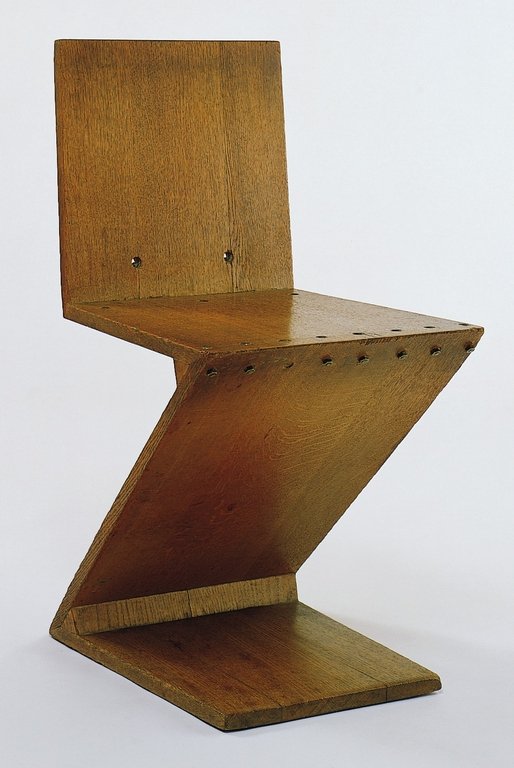
In February 2015 I visited, together with some fellow students from the Rieteveld Arts & Design Academy,  the exhibition Possessed by chairs at the Gocrums Museum. The intention of the exhibition was to celebrate the history of design through picking out around 90 iconic chairs from the 100 past years. 90 chairs exhibited, a rather broad selection concerning to a western perspective– all from Scandinavian classics like Eero Aarnios famous Balls Chair, Hans J Wegners Papa Bear arm chair , chairs by Alvar Alto to international classics such as the MR 20, And off course – a couple of chairs made by the Dutch famous architect and chair designer himself – Gerrit Rietveld.
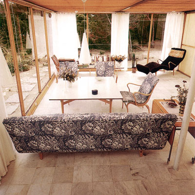
During my visit at this exhibition, experiencing all those chairs, some questions came to my mind. A collection of 90 chairs and every single one made by a male designer I made me wonder: if all this chairs were made by men, who were they then made for?  When observing the chairs I got a feeling that many of them where carrying an expression of power and that one had to have a bit of courage to actually sit in them. Maybe this is what happens when chairs get exhibited on a museum instead of being in use but still I got a feeling of them not welcoming me.

chair_3 chair_1 chair_2
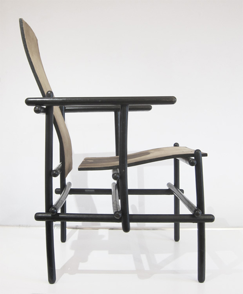
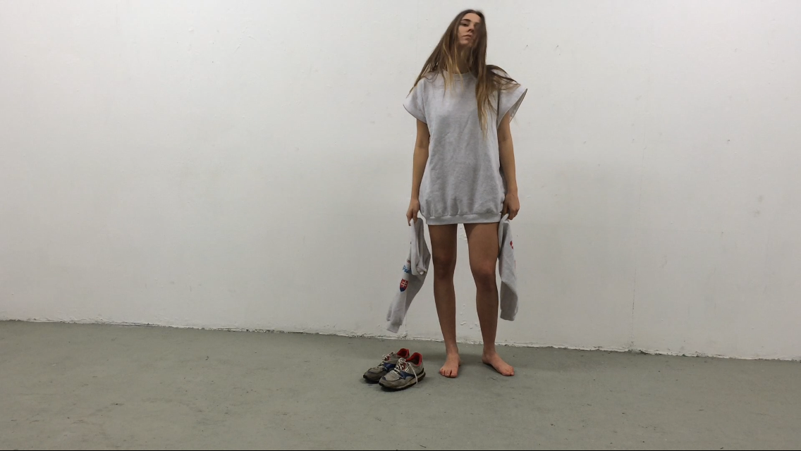
some unwelcome examples from Possessed By Chairs
 

Chairs often supplied with a high and straight back gave me more a feeling of how to position you than place for resting. How do we position our self by sitting and what is the difference between sitting and standing trough history according to gender, social class, culture background and so on. Who can sit and who don’t? Who sit today and who have been sitting the past 100 years? I think every chair have plenty to tell, not just from the technical aspect in how we been building our furniture’s and which material we been using; I think they as well have great stories to tell about our social history.
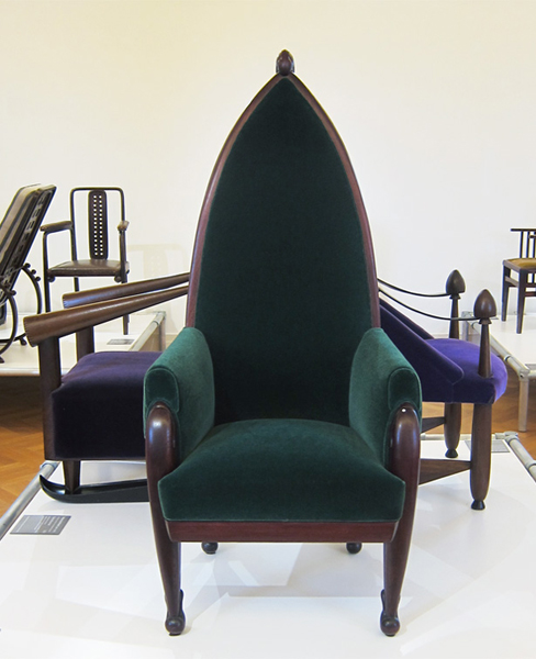
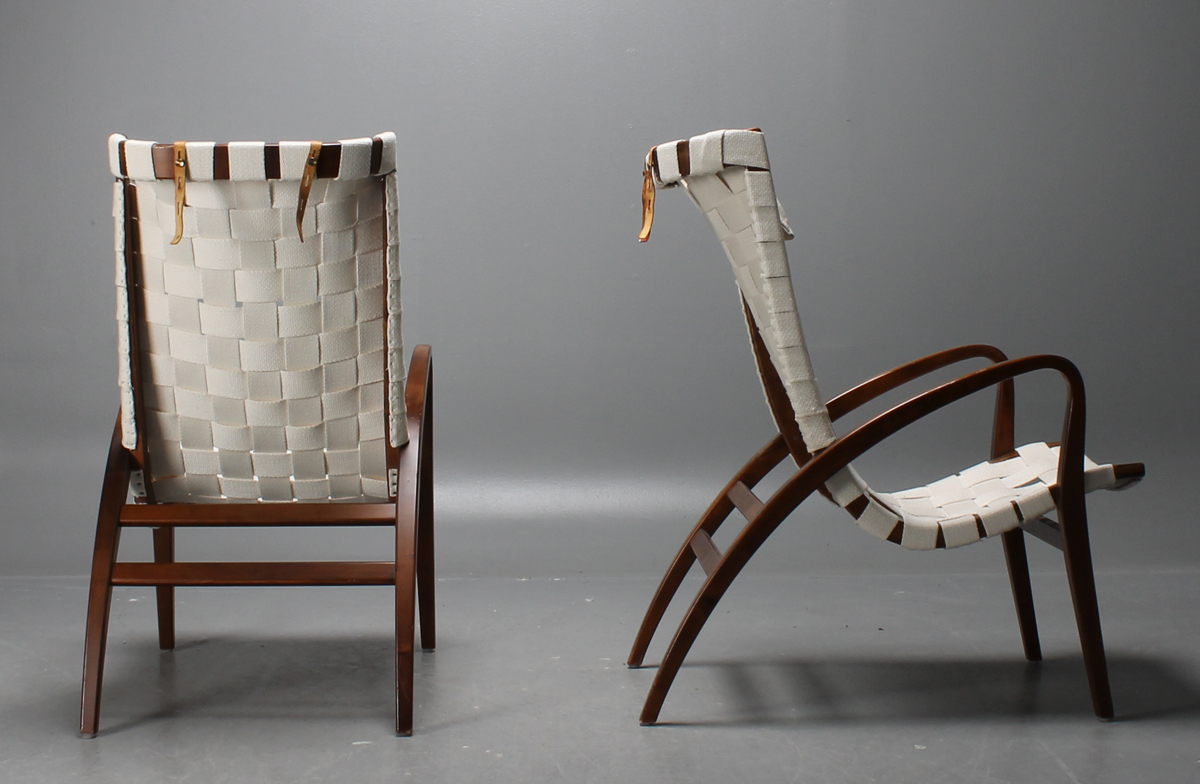
Anyhow, while walking thorough this selection of chairs there was one that caught my eyes and that I felt spoke with another tune. It was a leaned back chair that almost reminded me about a sun-lounger.

With a green cover in woven textile in a kind of plating technique this chair were for me manifesting everything else then hierarchy, rather a feeling of joy. I immediately got very touched by it. The color of the chair, which was a light green color, close to a light green Verona were expressing something very inviting and then along with the size of the chair, which felt more than enough to take one person gave a atmosphere of generosity.
 

Mathsson_Pernilla Mathsson_Pernilla_detail
 

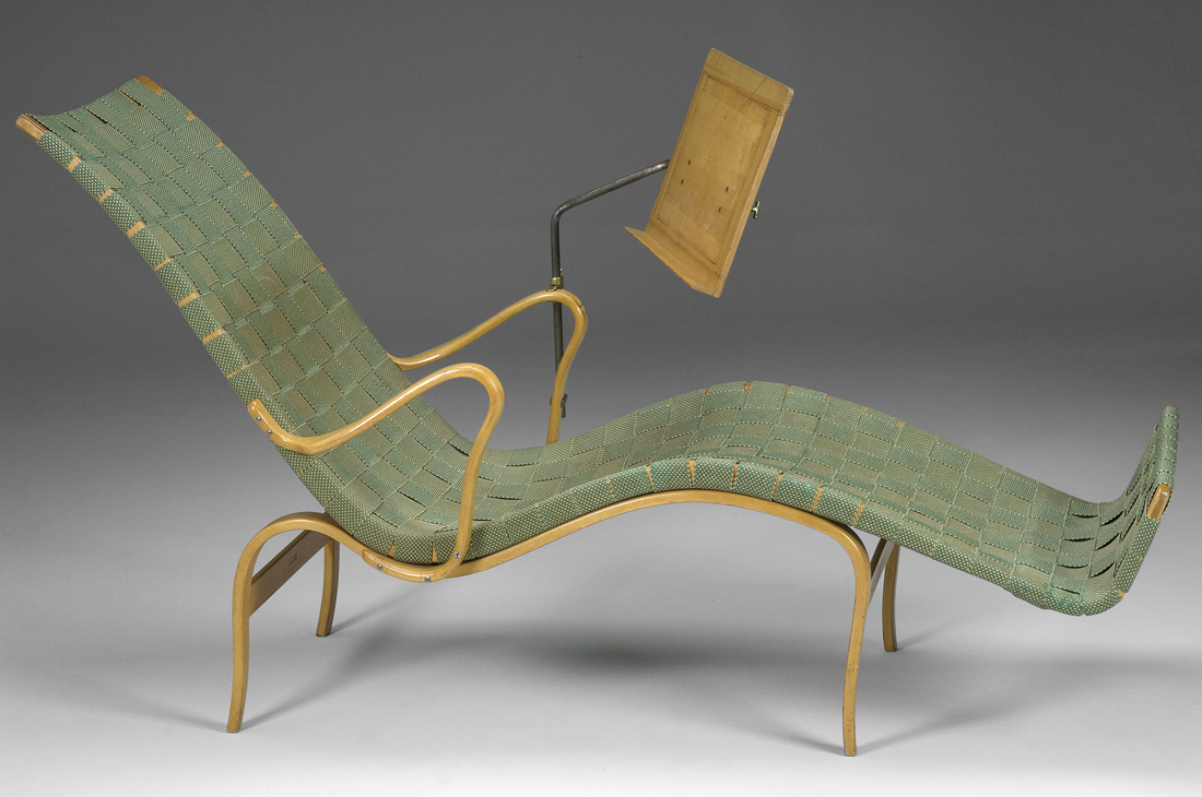
When the title of the chair later became clear to me it got even more exciting as the chair actually had a woman’s name – “Pernilla”. A chair made for a woman? To put a human name to a chair apparently works well though all of a sudden I felt a personal relation to the chair and I wanted to know more. To know more about her. Who was this Bruno Mathsson and who was Pernilla?


WHERE IT ALL BEGAN

Bruno Mathsson was born in a small city in the south of Sweden called Värnamo. Since Bruno was the fifth generation in a family of master cabinetmakers Bruno was learned early how to do carpeting by his father. To live in Värnamo which is a small and quite isolated city wasn’t something that stopped Bruno from having big visions. He early learned how to get input from his surrounding world and keep up with the contemporary arts and design. After a visit to the Roohska Art and Crafts Museum in Gothenburg in his early years, he got in contact with the manager of the museum and through him he started to borrow the literature of the museum – which they send back and fro with the trains between Värnamo and Gothenburg. The Rooshka Art and Crafts Museum, which is one of the biggest museums in Sweden specialists on art combined with craft, would later make strong connections with Bruno and his design and still today they every year support and exhibit work by one designer with a scholarship through the “Foundation of Bruno Mathsson

In 1930, at the age of 23 years the Bruno got the opportunity for the first time to put all his study and theories into real practice since he was commissioned to design a new chair for the Varnamo Hospital. Bruno took the chance to create something that he found less traditional and decided to make a chair without the old conventional and quite shabby sprung upholstery that the chairs in the hospitals of Sweden at that time used to have.

The quality and comfort combined with a new and fresh design finally brought Bruno to an unusual solution. He covered the frame with a sort of
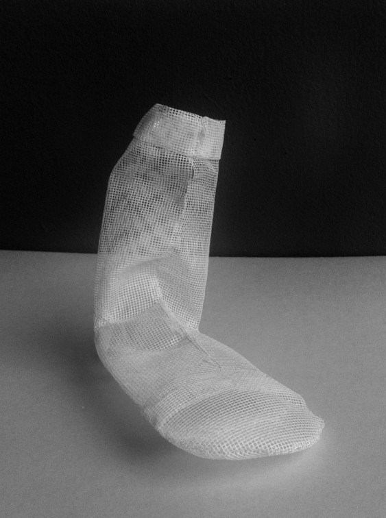
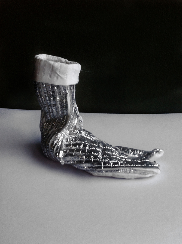
plaiting webbing technique plaiting-webbing.
The arms and legs were made in sold birch. Bruno liked to keep the light in his design and I think you can se this in his relation to the birch as material. The chair was not of a big success by the staff of the hospital though and they nicknamed the chair The Grasshopper”.

Mathsson_Grasshopper
 

The Grasshopper hasn’t been in use for long before it sadly had to move up the attic of the hospital. Even if the mission with the chair to the hospital didn’t led to an immediate prosperity Bruno continued his work and carefully studied the ”mechanics of sitting”. He wanted to find the perfect sitting line, or curve and this he approached in different ways. One way of finding it he got through sitting in snow and then study the imprint his body just made. Once again the comfort was one of his biggest aims. He further on kept on experimenting with techniques of bent laminating wood to gaining skills and found out compotes of great strength but still with a gracefully and restrain look. Bruno held his visual language minimalistic and did never use more elements than necessary.

In 1936 Bruno launched three new chairs in one series that he called “Working”, “Easy” and “Lounge chair” model 36. These chairs were all designed using one piece of frame covered with plated webbing supported by separate bent laminated legs. Different but same. Bruno was reaching for a concept of a chair that could work for different settings. As well as working is something we do we equally need a chair for resting. I find it funny that Bruno made the chair “Lounge chair” so much reminding about a sun-lounger though I somehow think it says a lot about the Swedish mentality. As the winters are long and heavy in this northern country people appreciate the summers and specially the sun almost in an absurd way and because of this Swedish people often make jokes about how we to the very extend try to catch every minute of sun.
br m 2
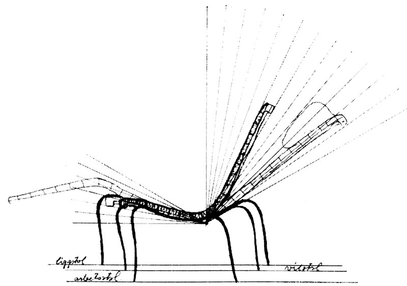
The sketch of the three chairs in one serie.

Liggstol = Lounge chair

Arbetsstol = Working Chair

Vilstol =Easy


THE BREAKTHROUGH

The three basic chairs can more or less be seen as a breakthrough in the career for Bruno. The same year Bruno got the opportunity to have an own exhibition in the Roohska Arts and Craft Museum where he now could show his work for a much bigger audience. Brunos chairs did apparently made a bigger accomplishment in the space of a museum than in the Swedish hospitals and soon Mathsson could be seen as one of the leaders in the design of Sweden. One year after the exhibition Bruno was asked to participate in his first international exhibition in Paris, “The Paris 1937 Expo”,

exposition-internationale-paris-1937Bruno_mathsson_bok_bocker_design

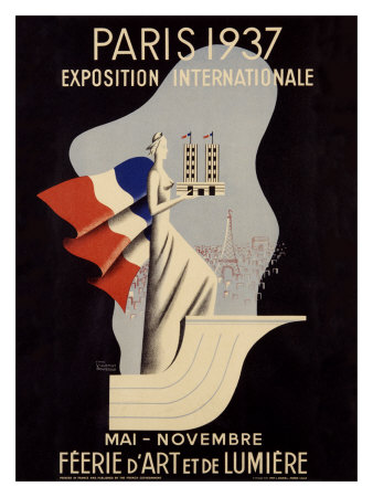
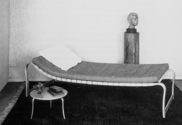
where he won the Grand Prix for his bed “Paris” that he showed. His furniture was received with a great appreciation and admiration and he got a lot of interested from all over the world. The same year his furniture also got represented at other exhibitions such as the world exhibition in New York and the Golden Gate-exhibition  San Fransisco.

Swedish Pavilion Golden Gate International Exposition 1939


WORKING IN AND OUTSIDE OF SWEDEN

Even if Bruno never gave up his small hometown Varnamo he made a lot of journeys abroad to stay update. In the 1940s Bruno made a visit to the US with his fiancé Karin that resulted in lots of new inspiration, which led to among others, an architectural work that would become very famous as built houses in glass. Houses you today can visit in Kosta, called the Mathsson Glasshouses.

The light was of great value for Bruno, which you already could notice in his furniture’s and I think you can see a link here to his way of using of the glass as a material. Bruno wanted to get as close to nature as possible and investigating in how close the design could get to nature, and this was something he was developing through his work with the glasshouses. Later during the winter times Bruno used to leave Sweden for some months for going abroad and spend some time in Portugal where he could work in one of his own glasshouses that was established there.

br m 4 glasshaus-interior
 

PERNILLA

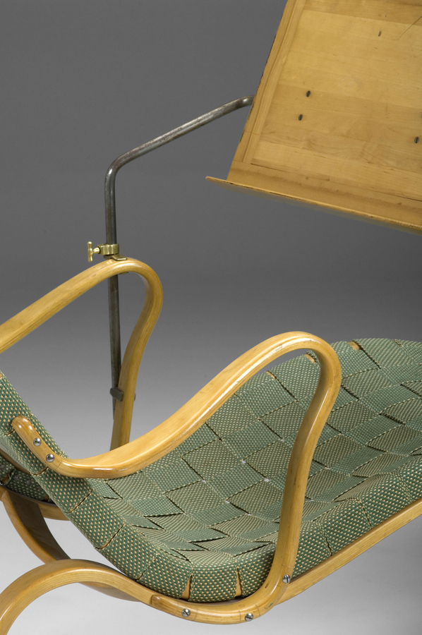
In the late 30s and beginning of the 40s Bruno’s international work somehow slowed down a bit, partly as a result of the The Second World War. By reason of this he however slowed down the tempo of the business and instead got more time to be able to develop his own design. In 1944 he launched the classic chair for resting “Pernilla 2” and then one year later the deck chair “Pernilla”. Pernilla was a chair in the already recognizable and typical style of Mathsson in which he used the technique of bending the laminating wood to get the curve he wanted and then used the plaiting technique for the cover. This time he let the whole chair be covered with the light natural green textile. The only part of the chair that wasn’t covered was the armrests. “Pernilla” was also resourced with something similar to a Canterbury, which could be used for reading without the need of using hands.

But why the name Pernilla? In further research I found out that in 1943 Bruno got interviewed by a journalist from the Swedish daily newspaper “Dagens Nyheter”  by a journalist called Pernilla.

Pernilla pernilla_tunberger
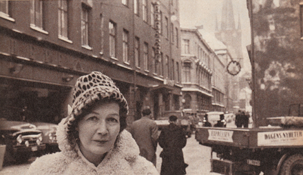
, or Pernilla Tunberger as her correct name were was a prosperous and important journalist that were beside writing about Bruno’s work an involved food columnist. She wrote critical about the food processing industry and she lifted questions around food and transport; something that was not that common in this days. She often created heads in the newspaper and somehow she must have made big impact also to Bruno as he after their meeting decided to dedicate the chair to her.

To give his chairs and furniture’s name were later to become significant for Bruno. And nearly all of them he gave female names. Eva, Mina and Miranda were besides “Pernilla” three of the most famous furniture he made and they were all named after women he met. Was he a man with mainly woman surrounding him or why did he want to give his furniture’s female names? In this I’m leaved to speculations.

As I said earlier the name of the chair worked as an intriguer to me and gave the chair a certain personality. I like to think of the furniture’s of our homes as nearly creatures and as objects that we care about. Furthermore I think it also contributes to a philosophy of the importance of quality. When our furniture’s get personal to us, we put more effort to take care of them and then we have them for longer. By this the quality will play a stronger role and quality together with functionality was together with the ergonomic quality and beauty the main things in Bruno’s concept of design.

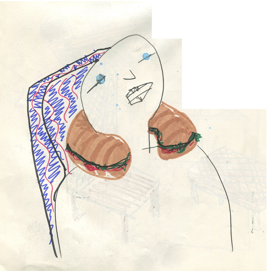
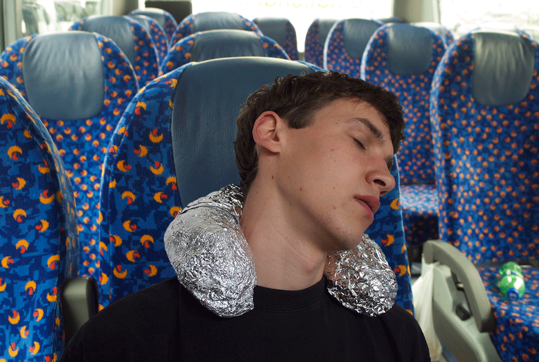
Bruno continued his work for many years and and the fact that he turned older was nothing that constrained his passion. In the 1970?s Bruno for example had a project going on way outside of Europe, where he were being part of a panel discussing design with a several hundred interior architects in Tokyo. In 1981, at seventy-four years of age, he designed a workstation for computer users that was equipped with a “wing” that supported the shoulders. The last piece of furniture Bruno Mathssons did he made at the age of 90, the easychair “Minister” in 1986.

Bruno Mathsson died in 1988 leaving behind a rich cultural heritage.

Birthday-Chair


Tuesday, March 31, 2015

Before my sister and I left the house of my parents there used to be a clear structure in chair-composition during the breakfasts and dinners.
A rectangular formed table surrounded by 6 chairs at the 2 long sides of the table. My parents sat in front of each other, and my sister in front of me in the middle of the table.


CHAIR HIERARCHY


Everyday this composition was the same (although we tried a few times to change), except of 4 days a year, the birthdays.


CHAIR COMPOSITION


The ritual of a birthday was that the lucky birthday person stayed in bed while the rest was preparing breakfast and the living room with as finishing touch the ‘birthday-chair’.
The ‘birthday-chair’ means that one of the chairs was covered in garlands and, very important, the chair was moved to the head of the table.
The chair, a simple and comfortable design by Gispen, inspired by the tube-construction of Marcel Breuer, used in a school, than sold to my parents for 5 guilders a piece, is quite hard to decorate because of the simplicity. 3 days a year it felt like my responsibility to decorate the chair in an artistic and surprising way.
The goal was of course to make the one who’s birthday it was feel important. It was his/her special day. By placing the chair at the head of the table he or she was the boss of the day. By making the chair look special I tried to make the person feel happy and loved.


BIRTHDAYCHAIR


What I realise now is that chairs can say a lot about hierarchy (throne). What I also think is very interesting is the contradiction between the super functional chair and the colourful (ugly) decoration what change the feeling of sitting totally. Can we consider this as a new ‘design’ chair?

Sitting in Red and Blue or Zigzag ?


Sunday, March 29, 2015

First time I encountered him, it was at theory class;

The second time I encountered him, was at a museum exhibition;

The last time I encounter him, was at a teacher house.


MoMa_RedBlue23

original Rietveld Red and Blue chair 1923 from MoMa collection • chair at seen at exhibition


Bright color surface, complex structuration. I was deeply attracted to him, the Red and Blue Chair, one of the most famous chair made by Gerrit Rietveld.


Red and Blue Chair is an important example of the three-dimensional works of De Stijl. One typically relates the chair to De Stijl, or concept of design in general, rather than to utility. The unstable outward appearance and the height of the chair raise questions about its comfort.


One can imagine the importance of comfort in the design of a chair. There are well-established criteria for the ergonomic evaluation of chairs to prevent user discomfort and injury. The main ergonomic considerations for chairs in the workplace are the following: comfort, safety, adaptability, practicality, durability, and suitability for the job. Luckily, I had a chance to sit in an original (1958 Groenekan) Red and Blue Chair at my teacher’s studio. Before I conclude the chair is actually comfortable, I would like to summarize a few points from my experience sitting in it.

1
at teachers home 

First of all, as an armchair, the sitting angle is relaxed. The chair has armrests at the appropriate height and of the suitable length. The most essential part of chair was the back. The back is long which gives support to the lumbar region and the shoulders. For people who aren’t too tall, they could relax their head against the back of the chair. What’s more? Since the production of materials is wood, cut boxy neither polished round. So sturdy texture reduces the comfort of the chair.  However, it creates a better sitting situation, combining the chair with cushion. The chair with its logical construction could easily be made much comfortable with the help of some cushions.


The most fundamental question is adaptability: the chair’s dimensions and control features cannot meet the ergonomic characteristics of at least 60% of the potential users, due to the low seat. In fact, present standards would not define it as a suitably ergonomic chair. However, it wasn’t Rietveld’s original intention to design a chair for people to sit on for hours on end. His famous words are sitting (in Dutch “zitten”) is a verb (verb in Dutch translates into “werkwoord” a combination of the words “werk”= work and “woord” = word), meaning ; “sitting is an active pastime“.
Compared to today’s concern about ergonomics, the culture of sitting has experienced a great change from the past, according to the Australian engineer and designer Albert Linschutz in 1928.


Chair comfort level and the user’s body position are inextricably linked. This network survey shows that most is known as a comfortable chair, the way the vast majority of the user’s apply are lying down, compared to sitting, lying down, of course is more comfortable.


chair-Ergonomics_1100


A Short Interview with André Klein.Foto-André1


Question:
What do you think of red & blue chair by Rietveld?
André:
" Hmmmm, it was never my favorites.
It seems uncomfortable but I must admitted when you sit, its not so bad. But after 20 minutes for me its maximum.
And I like Zig-Zag chair much more as a design."


The Zig-Zag Chair is another chair designed by Gerrit Rietveld from 1934. It is a minimalistic design without legs, made by four flat wooden tiles that are merged in a Z-shape using joints.
cassina-zig-zag-2822-5525_z1Rietveld_ZigZag

Zig-Zag chair by Cassiba • original copy 1934 from the MoMa collection

Besides the superior Z-shaped appearance, the flat seat and vertical backrest are joined by a system of dovetail joints. Coupled with the unique shape, the straight back of chair is perfectly matched with user’s back, which creates a better comfort situation. Sufficient height of the chair seat becomes much more practical and ergonomic for the user. One does not need to exert much energy or rely on an armrest to be able to stand easily, which is a feature the Red and Blue Chair cannot achieve due to its low seat.  What’s more? Since school still keeping the original zigzag chairs made by Rietveld, I also got chance to sit on it. For my own perspective, the specific design angle could correct user’s sitting position and it becomes much pleasant sitting experience due to the ergonomic principle.

zigzag

at school's student office


Zig-Zag Chair as a designer chair was one of Rietveld’s most economic designs. Cassina S.p.A, an Italian manufacturing company, is still producing the replicas of the Zig-Zag Chair up until this day.

The chair is in fact quite sturdy, yet comfortable. With or without the addition of cushions, the chairs have proved be very efficient and have served their owner over many years.


By comparing the two different styles of chairs made by Rietveld, the importance of user comfort within design is put into question. As design students, we must understand the concept of design within many parameters. For instance, when we design a chair, considering appearance and functionality, at the same time, we cannot avoid considering comfort. We take user’s sitting preference, or changing the material or shape as factors or direction to achieve the demanding of comfort. A good design will often require meeting several standards. I believe that this concept is applicable to all design.


Design is to change the life, so that people can enjoy and sustain life more.


Made Trough Material Research


Sunday, March 29, 2015

I was thinking, writing about a chair can be really interesting but for me it had to be more than only writing about a chair.

Waste, material, life, renovation, structure, experimenting, design.

A few of the words that were coming up in my mind when I saw and started to research this chair, so I thought this will be a perfect chair and designer to write about. To find out how deep this designer can go into material research, waste and renewable energy. Marjan Van Aubel is one of the designers who stimulates this.

table-17


Marjan van Aubel is a designer that makes everyday objects in new innovative ways. She is trying to make people aware of the fact that renewable energy is everywhere. Normally there will be a waste of 50/80% during normal manufacture.  Van Aubel and James Shaw found a way how to use and incorporate that wastage during the manufacture.

When I saw “the well-proven chair” for the first time it looked like a normal chair because of the simple legs of the chair but when you see the back it becomes a object. For me it was hard to understand the material. I didn’t know where the chair was made of. The nice structure camouflages the fact that it is actually made out of  shavings and sawdust.The sitting part is beautiful and smooth, making this chair nice to sit on and really nice to look at. It’s good that the legs are simple so the focus stays on the sit area. With her designs she try’s to combine design and technology. She strives for a more renewable life

Well-proven chairJamesShaw+MarjanvanAubel

For me this was a really interesting topic because i didn’t know a lot about this kind of experimenting with material. There are so designers working with this way of designing. They are busy with making new materials to make life more renewable. I think these new materials are needed because our resources are running out.

As an artist/designer Marjan van Aubel always was interested in how things are made, a reason why i feel related to her. I always want to figure out how ‘it’ is put together.

She was also intrigued by solar panels and why they are so ugly and why they can ruin the face of a building. Why are the panels not integrated in the tiles? I really agree with her. That is why she started at her collage time a research about energy. Now not only design was important also science. She graduated with “The Energy Collections” a set of solar glassware that discharges through a matching bookshelf, which serves as a rather large battery. This kind of thinking can make our life a lot more easy an conscious. Like I said we are running out of material so this kind of design thinking can improve this.

I have a lot of interest in nature.  For me that makes her work really interesting, because she interacts nature with design. I have a few works i made a few years a go which are also related to this.
I investigated how nature and mathematics have a lot of comparisons. Like the golden ratio and Fibonacci. You can see it in a lot of plants, a lot of leaves  grow in a spiral around the branch to get enough sunlight and rain. It is also in our human body. For me structure in  nature is an important way for making a work. It is really nice that nature can help us to make products. I think it’s also good that new young designers/artists also use this opportunity to invent new products and make use of our nature. Like her latest project  “The Current Table‘ which was also able to generate energy. This project she made in response to “the energy collection”.


Current-Table

The market for these well made products is getting bigger and bigger.  People are more concerned with a healthy and a conscious way of life and designers will react on that.

This movie from 2012 shows how a lot of designers are busy with the meaning of material.

https://www.youtube.com/watch?v=9-GofyAQK6Y


It’s fascinates me a lot how this young designer are making al these new innovative products. I found a movie on this page and it shows how scientists are combining non-living chemicals to create materials with the properties of living organisms.

Now you can see how new materials, new invented but also already existing materials but used in an other way will blow your mind. For me their is still a lot to discover about al this material researches and the meaning of material. This research showed me a lot new ways of seeing waste and make new material with it. So we al can be more conscious and re-use waste to make something new.


Links:

http://www.marjanvanaubel.com/

http://wellprovenchair.com/

http://www.dezeen.com/

http://www.rennyramakers.com/


Thread 53’’41’’43’’


Sunday, March 29, 2015

Like with a thread, it’s hard to find its top, it was hard to discover the beginning of this story.

A thread unravels itself on the ground
Its top is hard to find
Persistently strings are being pulled
Hooked on a state of mind
Fingers move on a virtuous trance
And yet no end is found


The thread starts to move around virtual spaces
Auctions and images
Prices and selling strategies
Long, thin and flexible form of material
Draws a series of messages
And sequence of connections


Flashes of images across my mind
From Hitchcock’s Rope dinner masterpiece
To Ernesto Neto’s suspended organisms
And Bjork’s Unravel portrait of decease
Besides, Garth Knight and Andrea Davies bondage motif


All these threads hold our existence together
Link memories to one another
Sprout canons of aesthetics
Create a language of composition
A fine line around the subject
Threads,
Filaments,
Fiber,
String,
Ropes
………..


Words like
Height 53’’
Width 41’’
Depth 43’’
Seat height 15.75’’
Starts to seem familiar


Slowly the string unravels into a ball of yarn
A triangular shape collects its pieces
Like a home for sailors ropes
A bow of Vikings boats
A tribute to a freezing place
And heroic seaman’s stories


Scandinavian blood runs through its veins
From 1935 to 2005
Award winning and acclaimed
Under the enchanting songs of the mermaids
Changed its powerful Viking name
To a meticulous fragile Harp sound


Depicted countless times
Spread out on different hands
Has long lost its original traces
Varies from site to site
Bleach, oak, ash, maple or walnut
As colours come and go
As the costumer pleases


Preserved under the sacred power of museums
Or kept among the noble houses
Once a piece of art
Now a  prototype


Yet far from being familiar
To a southern soul
Where wild oceans and fishing ropes
Scatter along the coast


Hammock nets, swing along the breeze
Fill the air with pine-wood trees
With Hollywood glamour mixed along
A slightly pear shaped frame is born


Taking the name of the place on the globe
Anonymously design,
Acapulco becomes
With its recycled PVC woven cords
Tropical colours and metal structures
Gain its place has percussionist
The southern orchestra member of the Northern Harp


Memories of gardens and beach
Come along……
White smooth sand, teaching you
How to sit in first hand


Or at the times you had
that white, blue, red, hand painted flowers
in the back of a tiny little chair
The size of half adult leg


With its straws and braided seat
Filled with the popular themes
Of a country of craftsman and traditions
Where you learn how to play hide and seek
At that moment you realize you can sit
Without anyone holding your seat
Unless you’re in a room filled with valuable chairs
And cameras everywhere


The Harp chants
Hypnotize my senses
That Viking treasure
That lays now among other chairs
In such a confined pointless room


I wonder how does it feel to sit on that chair
That same one that JØRGEN HØVELSKOV
Designed


Perhaps its transparency blends in
With my pale skinned shoulders
Perhaps my body will
Submerge into those strings
And stripes will be carved along my skin


Like that first chair
marked my silk buttocks
and drawn moving patterns
when I was a restless two years old child


I imagine how my back will melt
Into a flexible wave of relaxation
Like if I was made of clay
And my body shapes would assume the negative forms of that chair


Then those legs, spread out on the floor
like spiders using their glands to shape their web
Would invite me to cross my long legs
And play its imaginable pedals


The chair becomes wood
The ropes become thread
The thread becomes ………………………………………………………….
……………………………………………………………………………..unraveled


Harp Chair by JØRGEN HØVELSKOV
[x]


Log in
subscribe