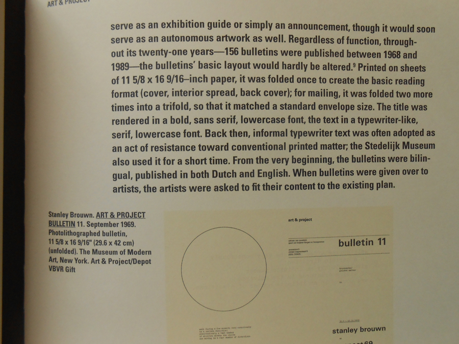
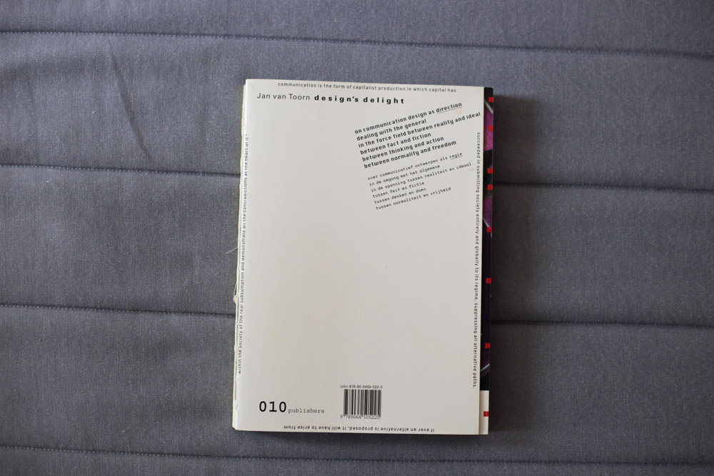
Skip to Content Skip to Search Go to Top Navigation Go to Side Menu


"Projects" Category


A shallow look into Intentional Stance


Sunday, December 8, 2013

Intentional Stance presents works by ten young artists who conclude their two-year working period at De Ateliers.
Intentional Stance,
published by Stichting Ateliers 63

‘De Ateliers, established 1963, is an independent postgraduate artists’ institute led by artists. New talent from the Netherlands and abroad is given the opportunity to work in a spacious studio, with the support of a grant and the critical feedback of prominent artists and critics who make studio visits weekly. A working period lasts two years.’

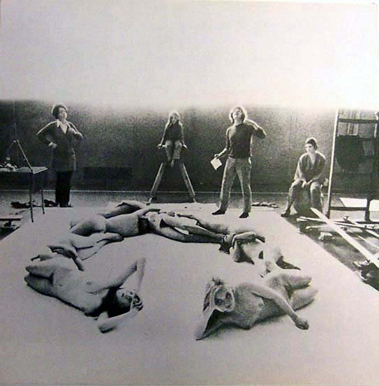
‘Intentional Stance’ presents works by ten young artists [Eric Bell & Kristoffer Frick, Fritz Bornstück, Mitchel Breed, François Lancien Guilberteau, Fiona Mackay, Saskia Noor van Imhoff, Emma van der Put, Laurens Stok and Amanda Wasielewski] who conclude their two-year working period at this internationally acclaimed postgraduate artists’ institute (De Ateliers 63) at the summer 2012 exhibited between 23.05. – 03.06.2012 in the exhibition curated by Bojan Šarcevic.

The publication is very much like an exhibition. The cover itself lists the names of the artists featured inside, the name of the publication, dates of the actual exhibition, the above mentioned institution and its location. All this would come across as rather informative, in my opinion, if the cover wasn’t done in only one color. Nearly the whole publication is printed on a dark blue heavy-weight paper.

When you open the book, a leaflet falls out.On the inside the publication is explained much like I just did here. There is also a floor map of the exhibition that took place in 23.05. – 03.06.2012 and short descriptions of each participating artist.

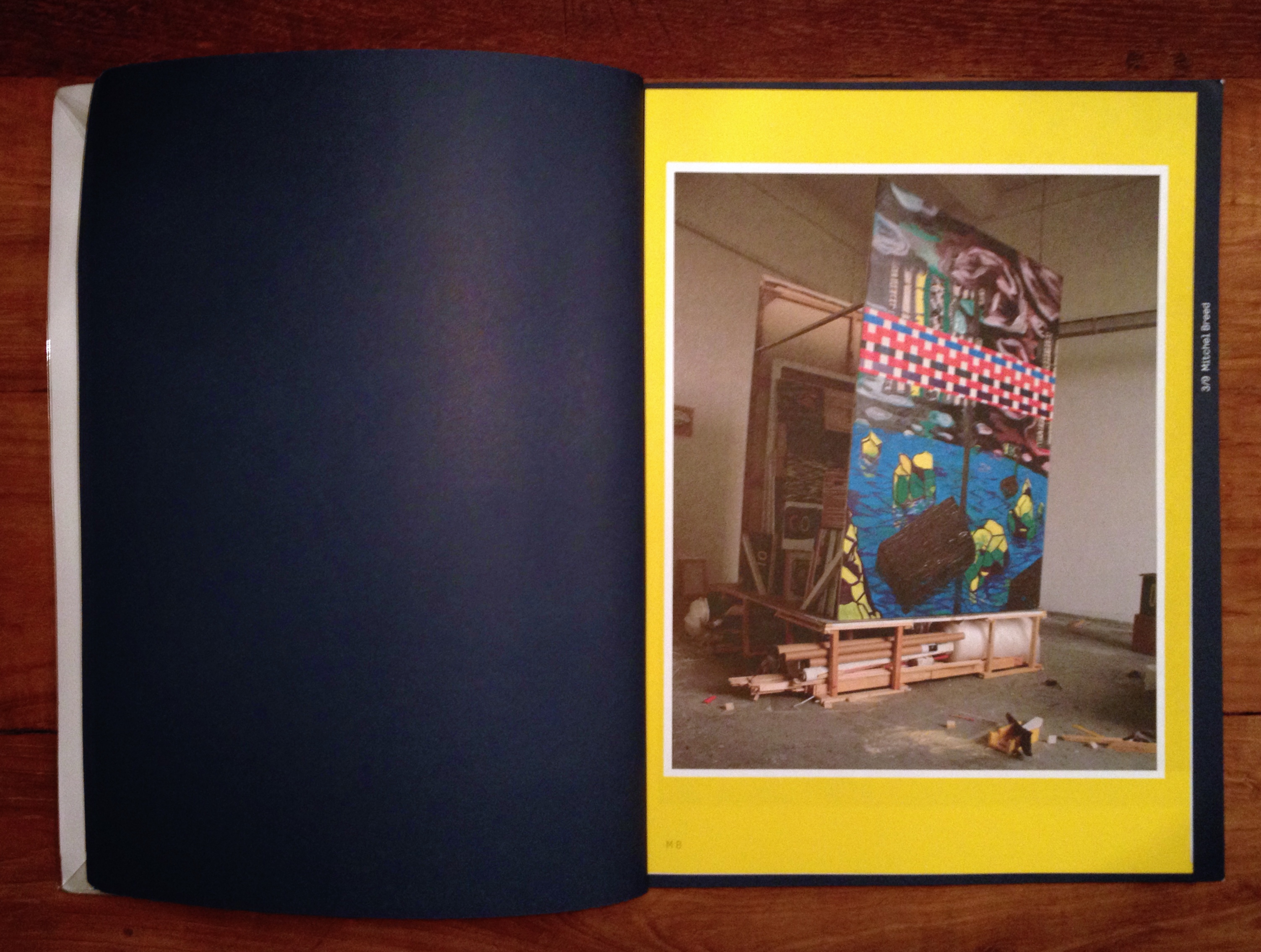
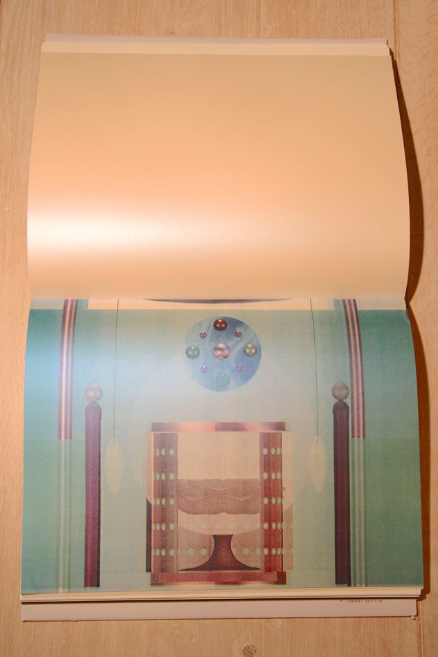
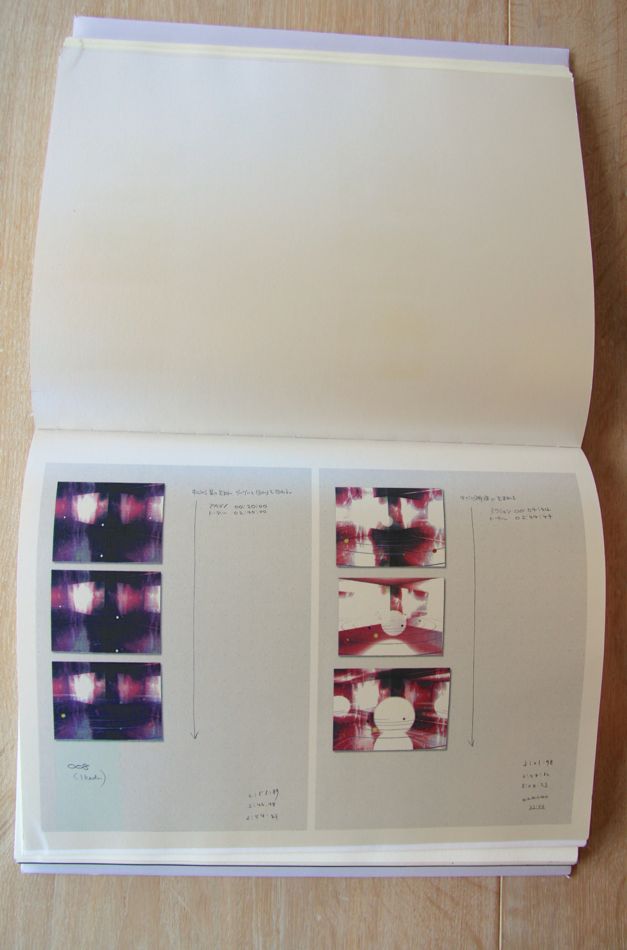
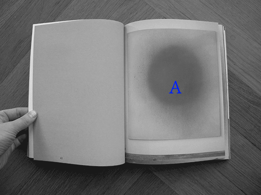
Each artist is given a spread to ‘exhibit’ his or her work. Each spread is the same dark blue as the cover with nothing printed on it except for the number and name of the artist. Instead of print on the pages themselves, each spread comes with a two-sided print the size of a poster showing the artist’s work. Needless to say these prints are another work by the artists.

The publication has a sturdy binding which, after a brief research, might be called the over sewn binding. The size of the book is roughly 34.9 cm by 27.3 cm, with these measurements it falls in between formats Quarto and Folio. It gets close to the paper size B4, as well.

What attracts me is that the publication was done in collaboration with the artists. It creates a tight relation between the content and the publication. It is not only a publication but also a piece of art. What I find interesting are the posters in between, one gets closer to the work when it is possible to hold and even replace in another context. The design creates a space of its own.

Other aspects that attracted me with this publication were the dark blue color, the size and the heavy-weight paper. All of which are personal weak spots of mine when browsing books.

The book was designed by Merel van den Berg and the artists. As far as I got with my research about van den Berg, it seems she has worked with combining posters and publications. Based on this, rather direct parallels can be drawn.

Little do I know about designing books, but to me it seems that this publication is a typical art book and, I would say, trendy with its simplicity and very careful, ‘designy’ look.

The publication is accompanied by a website, which is more or less just another version of it.


Who made the publication?

Entries: Dominic van den Boogerd in collaboration with the artists, Marlene Dumas and Simeon Cieslinski
Photography: the artists
Design: Merel van den Berg, the artists
Print: Drukkerij Raaddraaier
Website: Joel Galvez
Website photography: Gert Jan van Rooij, the artists


Rietveld library catalog no: 705.9 ate 5
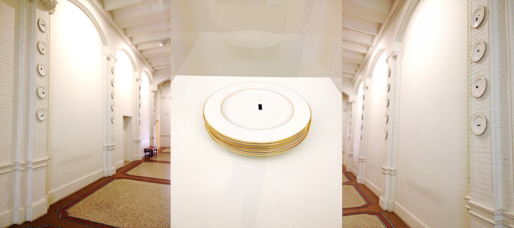
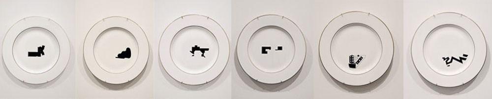
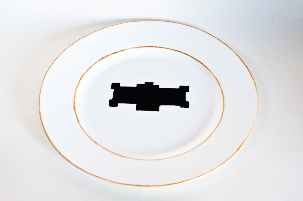
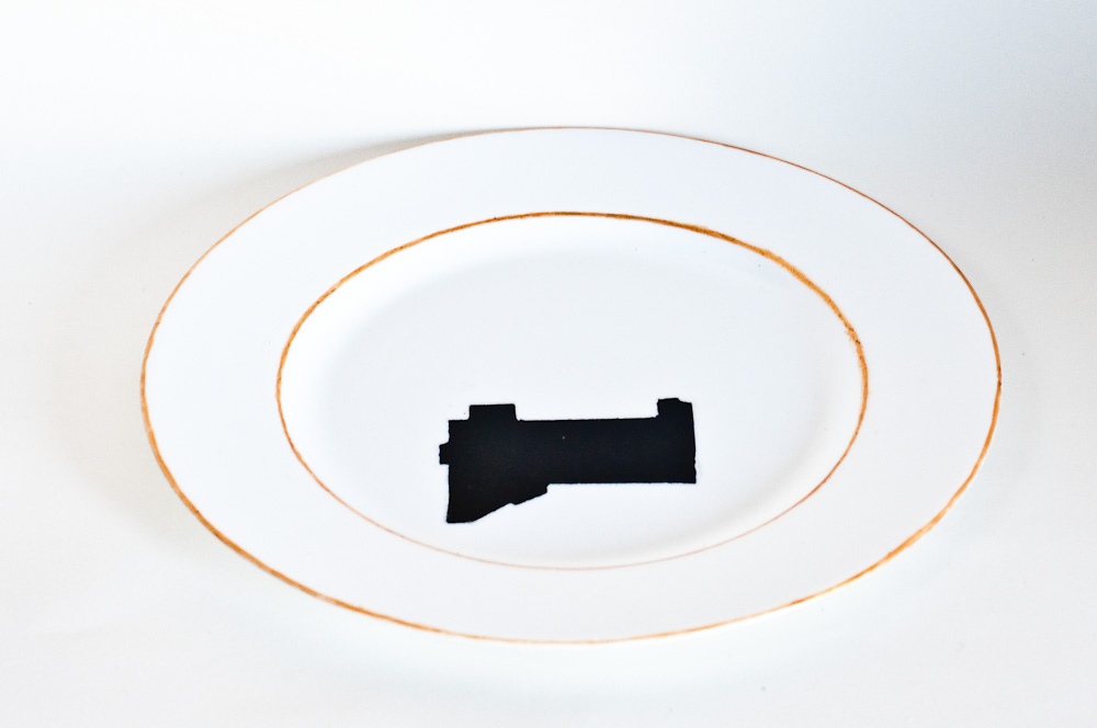
Italian Elegance


Sunday, December 8, 2013

For an artist, a book can be an interesting medium to show and explain work to the audience. Graduated as a young jewellery artist, I made this year my first book whereby I experienced the importance of a book design in relation to the concept of your work: it should connect together seamlessly.
In this essay I will explore the book design of Pierluigi Cerri and his team, in relation to the work of the Japanese artist Mariko Mori.

IMG_8040

“Dream Temple” is the title of the book and of the project made by the artist.  It is about the legend of the Japanese Dream Temple, a place for meditation and for studying Buddhist Sutras. Look at this video to get an impression of her work: Mariko Mori Dream Temple.
Mariko’s work is tying the knot between dream and technology, past and present, spirit and body.
Looking at the book the first thing that strike me, was the transparent vellum that is used for the cover and when you look trough it, the slightly blurred computer drawing of the dream temple is visible. To me this creates a nice dreamlike feeling, which is in line with the title of the work.
The title is printed in a purple/ pink color on the left corner of the cover and because of the font size it feels less important than the visual image of the temple.
Remarkable is also the way the book is printed. This rectangular book is bound at the long side, what means normally that you look in the longitudinal direction; but in this case you have to look in the width. This isn’t typically Japanese, but is more common there than in Europe.

IMG_8049

When I look at the structure of the book, I can already see from the outside that the book is split in different parts. It starts with a short introduction of the concept and finishes with an explanation of the inspiration, two interviews and a catalog. In between the book is organized in 6 parts, showing the working process of the artist, from the first drawings to the final artwork. Every part is printed on different paper, with transparent vellum in between as the clear changeover. The layout is plain structured as well, like a documentation, with all the time the first page blank or provided with a Japanese inscription and the second one with images and drawings.


IMG_8041

After the introduction the book starts with pencil and watercolor drawings, where the artist is visualizing her concept. The yellowish paper where the drawings are placed in full size, creates a sketchbook feeling, also by the way how the paper feels. Some pages next to the drawings contain text. Despite of the fact that I cannot read the Japanese characters, they are visually very interesting to see and they suggest to be an inscription of the drawings. The text is placed on different places across the paper in a playful way and mainly in a straight line from the top to bottom. In my opinion, this part is the most personal one of the book. You really get the feeling if you are looking into the sketchbook of Mariko Mori.


IMG_8062 IMG_8042

The second part is like a storyboard and is combining different ideas of the Dream Temple. The digital images in color are printed on a special type of paper with a pearl shine. This gives a mysterious feeling to the images and is verging on kitsch, what you can also say of Mori’s Dream Temple itself. This part starts with full paper size digital images and continues with pages separated in two, to display the pages of a notebook and hand written notes. Visually I miss something in the layout that makes it attractive to look at, probably that’s the reason for the special type of paper to give it some shine.

Architectural drawings, printed on a thinner paper with a ribbed texture, are the next step. This paper which is often used for hand drawings and paintings, gives the construction drawings a more informal look.
The fourth part consist of more watercolor drawings and they are placed on the same paper and in the same way as in the beginning of the book.

IMG_8043 IMG_8047

Then follows a more mysterious part, with black pages of video stills centered in the middle. She is showing her vision suggesting that a contemporary meditative space can be a mesmerizing journey into the micro and macro cosmic forces of creation.
The layout in this part of the book is representing this idea, were the round images are printed on paper with a kind of glitter effect, so they look like magic planets. They blend into the infinity of the black paper; like the universe.

IMG_8048

The last part represents the final pieces in full paper size. The pictures have a strong dark – light effect to give the work a more mysterious and extraterrestrial feeling and the final built Dream Temple look like something of the future. To give more attention to the slightly dark pictures, the opposite pages are blank and white.


IMG_8051

Looking at the typography, the book is clearly separated in two different parts. The introduction and documentation in the end consist of computer printed text and is left-alined. It creates a formal and aloof image.
Different is the main part of the book, which feels more personal linked to the Japanese nationality of the artist and the subject. The Japanese characters are handwritten in pencil and also traditionally calligraphed with black ink and they are lined from the top to bottom. This typographic contrast is in line with the artist who is dealing with the past and present at the same time.

IMG_8053

Pierluigi Cerri and his team designed the book in a modern sleek and clear way, what makes it a bit impersonal. But still there are some playful elements who breaks through the formality, like the transparant vellum and the use of shiny types of paper. Looking at their other designs I see this tasteful details as well.
Despite of the use of different paper and layout, it remains rather formal for an artist book. It could be nice if the book was more representing the meditation feeling of the the Dream Temple.
This book design reminds me allot of the art and design in Italy, where I stayed for a year.
Italians are searching for a way to deal with contemporary life and the remains of their glorious past. They do that by combining a formal more classical structure, with playful elements and high quality materials.
These elements also fit well with Mariko Mori’s approach. All in all the design of the this book reflects the high quality of her Dream Temple.

Rietveld library catalog no: mor 1

In & Out of Amsterdam


Sunday, December 8, 2013

This sparkling red cover with white arrows  caught my eye in the library.  There won`t be more colors in the book (except for photographs). I don’t mention it as a regretful. The retraint use of colours in the book emphasize both the cover and the inside.
cover

The cover is giving informations on the topic (conceptual art), the location (Amsterdam  and further links) and the period (1960-1976).As an object the book is pretty thick especially because of the choice of the paper. The cardboard of the cover is like wrapping the book which is bound separately with a black textile.
The book is dealing with conceptual art.
This field is generally using a lot of words to translates the works. In that case, graphic designer´s purpose is to communicate the ideas in the most efficient way. To reach this point they have to find a visual language to lead the reader in the way they consider as the most interesting. Here the structure is pretty clear. The book is comfortable as an object (as mentioned above) and comfortable to read.

This is first due to the black bold letters and central texts. Then the colors of the photos are softened and finally the white paper is not too bright.
Now we´re sure the reader is not confronted to practical difficulties the designers still have to focus on how to relay the information and find the balance between text and image.
Divided in chapters, the book first talk about the raise of the conceptual art especially linked with artist who have been working in Amsterdam. Then the book become more visual presenting artists through their works (mostly photos).  So when the book comes closer to the artists and conceptual artworks it becomes visual when you probably expect more text and informations.
The reader can easily spot the chapters because of the blank left page facing the title written in bigger letters on the right page. The first part of the book is about conceptual art and does not focus on artists so much. To illustrate the ideas developed in the texts and make them understandable images are included.

DSCN1661
The text placed in the middle leaves a lot of white space next to it. This is used to add  details that are not directly part of the text like information concerning a photo or references. There is only one single typeface used. The only difference is the size of the letters making the text more or less big according to its importance. So this book is really trying to explain the content in an organized and comprehensive way.

DSCN1658 copie


In the end of each chapter is an index and everything is gathered together in the end of the book in a bigger and complete index. This index also contains pictures to be in harmony with the rest of the books logic and design.


Index
Then we come to the second part of the book based on specific artists. Here the text gets smaller and is present on the first left page of each artist´s chapter only. This because after using a lot of text the reader should be able to have a sensitive and personal approach to the artworks. The presence of the text is only to provide informations that can not be translated through images (biography…). So that we can focus only on the works themselves.

At this point we only have pictures to understand. But still we are not facing the real artworks so the photographs and the graphic design can decide how to introduce them.
First because of the angles and the distance, then by the size of the printed picture in the book and the choice to select colors or not, finally by the order of the presentation and the links created between the chosen images due to their positions towards each other. That’s all the explanations the reader has.
With this system the graphic design leads to a certain way of looking at the artworks while they still give a lot of freedom to the reader.


Point of view

In my opinion the visual communication of this book makes its topic clear and understood but still asks a bit of interest and subjectivity from the reader who has to experience the book (exactly like in an empirical process)  to get  knowledge from it.

Rietveld library catalog no: 706.8 che 1

Design’s Delight by Jan van Toorn


Sunday, December 8, 2013

Design’s delight is a book of which as well the content as the design are by Jan van Toorn, a dutch graphic designer. The aim of his book is to question and to comment the way designers work now. You can tell this by both the content and the way it is designed.

cover

The cover of the book is rather simple, but shows already some of the characteristics of the graphic designs of Jan van Toorn. Various thicknesses of letters have been used, to make distinctions between different sorts of text, the text in the top right corner, for example, is shown as well in English as in Dutch, but to divide these two the English part has been set in bold type.

Another characteristic of Jan van Toorns design is making a text that should incite the reader to “active reading”. He does this by putting the text on a page in different directions, you can see this at the bottom of the cover, where the text has been put upside down, but also at the sides of the cover, where the text has been turned. This stimulates the reader to read the book in an active way, by having to turn it around to read everything it says.

idea ideea

The first pages of the book are used to offer an introduction to the further part of the book. Different pages has been used to write the sentence “design is a good idea desperately seeking images and other forms of truth”, which actually is the core idea behind the book. By spreading the sentence over a few pages, more attention of the reader is asked to figure out exactly which point is made. With every page, a new word is added. Again the text is shown in both English and Dutch, and these two are again divided by setting them in different thickness and types.

essay essaycollage

After the introducing pages the book continues with an essay on ‘thinking the visual’, placed on the page in a simple, clear way, again both in English and Dutch in different typefaces. Still, in the essay, van Toorn keeps adding sentences that have been turned around in the middle of the pages, and the pages after the essay are filled with little pieces of text that have been placed in an almost collage-like way, spread out and turned around over the pages, sometimes even combined with images, encouraging the reader to turn the book around and play with the book in order to read what it says.

afbeldingen

After this part, the biggest text part of the book, van Toorn starts working out the main idea of his book, showing it in a lot of pages filled with different images that have been taking from media like newspapers, television, magazines and various advertisements. Every single thing that is shown in these media has been given a form by a designer. The book is on the role of this designer, and the influence a designer has on the way information is given. In these pages, the most important part of the book, Jan van Toorn explores the opportunities of the role of a designer. He makes various juxtapositions of images from different media, and by doing this he adds a different meaning to them, encouraging the reader to think about these different meanings, and, indirectly, the role of the designer who puts these images together.

afbeeldignen

Most of the pages exist of one big image, shown as a spread, only leaving some white space at the bottom of the pages, where text is shown. Across most of the images other images have been places, but the design changes a lot, sometimes only 1 images are shown or images are placed next to each other in a row. The text below the images, again, has been placed upside down and turned around. Because the text is below the image you make, as a reader, a connection between the two, as if the text is a description of the image shown above. Which often is not the case, but the texts mostly illustrates the meaning of the juxtaposition of the images shown in the pages.

Also a number is shown in this white space, indicating the current chapter you are in, and the title of this chapter is always shown in the top left corner of the right page. At every first page of a new chapter the title of the chapter is also shown in handwritten letters, next to the number of the chapter. Because of this continuous showing of the chapter you are in, there is something that you can hold on to during the reading of the book, because of the chaos of the combination of all the different images, in which a lot happens and which contain a lot of colors, you would otherwise easily lose grip of what you’re reading.

eenalaatste

The next part of the book is again a small text part, on the method and means of dialogic practice. It is designed in a similar way as the essay at the beginning on the book, but now the English and Dutch part are not divided in two columns on the same page, but one page is filled with English and the other with Dutch. The same typefaces are used again to make the separation.

always failing

After this text part different pages are used to write one sentence, just as in the beginning of the book. The design is very similar, only the sentence and the images behind it are different, but as a reader you understand directly that it refers to the start of the book.

nawoord

The last part of the book is the afterword, which is designed the same as the preceding text part.

rug

The book has a glue binding, and because the book contains a lot of images the spine of the book has a blend of all different kinds of colors, which kind of reminds you of newspapers and magazines, and it might as well be a reference to these media, where the images in the book are coming from. You can unfold a part of the back of the cover, which at the inside shows a poster-like design of a text in different sizes. At the outside of this part, the part that is the last page of the book when it isn’t unfold, the colophon and the contents of the book are shown.

achterflapdicht achterflap

All in all, I think the design of the book serves it’s content very well. The combinations of the images and text are very well done, they complement each other on every page. The basic design is very continuous throughout the book, which works very well because the chaos of the images keeps changing. Design’s delight by Jan van Toorn was an intriguing book to research, because of both its content as its design.


private collection

For The Children


Sunday, December 8, 2013

For the children a design by Rik Meijers

After some introductions of new ways of looking and dealing with books, I tried to focus in how the connection between artist and designer work together in the best way. When I say ” in the best way ” I’m always being subjective, understand a book in the way the artist wants is not always possible.

During my first research I didn’t get amazed by any book , Every time I founded a special design for my eyes I couldn’t understand the connection between the content and the choices the designer has done, because there could be thousands of possibilities to represent that content in an understandable way, at this point I got confused but I had to keep with the research.
but this time, I just only wanted to focus in my first visual attraction and then go deep in how that specific design works with the content.

During this process, walking at the Rietveld library I found one book that was shocking for my eyes ,this book is called For the children and is designed by Rik Meijers .

As an starting point I can talk about the cover wich consist of a painting collage .
The titled >‘For the Children'< and some of the other words as >+stickers or coloring book< belong to the painting.

‘For the Children’ is printed in A4 and all the drawings inside are scaled to this size

The paper used for the cover is shining and inside Rik Meijers used white cardboard paper.

CONTENT2


Inside the book you can find 16 illustrations, drawings in black and white and 2 pages full of stickers, all scaled to A4, this combination gives the feeling of those children coloring books, which is mentioned at the cover (coloring books)

content3


The design of this book is quite simple it gives all the importance to the drawings, which I guess is the purpose of the artist.

This simple design make you wonder how to deal with the book, if making new creations in top, I mean, using the book as a real coloring book or enjoy and observe this book as a finish book and finish work, I think Rik Meijers wants to present the book  in this ironic way which in my opinion could be logical by the fact that the drawings are not representing scenes for children.

6


As a conclusion I thought this design was connecting perfectly to the concept the artist wanted, but then I realized that the artist was also the designer of the book , Rijk Meijers made me think about the artist being his own designer, which in my opinion sometimes could be really good because they know exactly how to present their work clearly, but sometimes could be totally the opposite and the artist needs a designer that understands the best way to show their work in a clear way .

content4
 

Rietveld library catalog no: Meij 2

New girls and boys by Anthon Beeke


Sunday, December 8, 2013

This post is dedicated to the design approach, names, some interesting facts of project “Body Type” by Anthon Beeke.
The book, which I want to consider was published in August 2011, but looking into it, it become clear that this box/book is the second time this project of this talented graphic designer is published. For me, it is important to say that these two publications are based on an idea of an alphabet made up of ‘Beautiful girls’ created originally in 1969. In past, this alphabet was based on naked female bodies, which posed (where constructed) like letters and punctuation marks. Beeke made this alphabet as ‘a tongue cheek’ response to Wim Crouwel’s famous New Alphabet published a year before in the same series “Kwadraat bladen/Quadrat Magazine”[x]

_1114605983

Project ‘Beautiful girls’  in process in a GYM of Gerrit Rietveld Academie

photographer: Ed van der Elsken


This alphabet as an experimentation was a sensation for late of 60’s, nobody has done something like that before.

Considering the second publication it is extremely essential that a lot of famous designers as Wim CrouwelRene Knip worked together and organised every aspect of the book.Well, I can say that this book is as a result of cooperation of several designers. That means that this project was mulled over  from different points of view and all design decisions were discussed in a professional surrounding and this fact automatically  increases its quality.

images


The ‘Body Type’ book was made as a box,which is a really attractive ,in my opinion, because of a size, image on a cover and, of course, colours. Despite on a fact, that book is based on a quite old idea, it looks contemporary and a cause of it is that Anthon Beeke decided to make it in colour. The whole publication saves a tendency of 3 main colours: redwhite and black. Thats is why it looks bright, new and interesting. A content of the box consists of 3 parts. In the first part you can find an introduction ,which was written by Wim Crouwel ,who also was a designer of the main font for a book.Text is provided in Dutch and in English, and following a purpose to create a fast visual difference between these two languages and to make it easier to read,separating one from another , Dutch text is in black colour, English in red.

wimcrouwel

The second part of a book is a ‘body alphabet’ itself.In this part Beeke also decided to add something new (compering with a previous publication), there are letters from not only women, but and from black men, what shows an expression of time ,which we live now. The third part consists of printed letters , so you can tear out and string up to bring this alphabet to life in words and texts that means that now a benefit from a book is not only to read it and enjoy its design ,but and use it for whatever you like.


This video shortly shows how photos for letters were made.Enjoy!

https://www.youtube.com/watch?v=FoSNFuVM3Tw
 

Rietveld library catalog no: 757.3 bee 1 (N.U.)

Khhhhhhh


Saturday, December 7, 2013

I was browsing through the list of books acquired this year at the Rietveld Library and I came across the title “Khhhhhhh” by Slavs and Tatars.

Interesting title that made no sense to me and therefore made me curios and furthermore choose the book for my exploration and design research.
Now I know that Slavs and Tatars (S&L) is an artist group and this book is a combination of research and study alongside giving a written lecture and investigation through the book which was published in connection with their exhibition on the topic which the book investigates [X].

Before starting the exploration of the book, to be clear about who S&L is, this gives a pretty good hint: “Slavs and Tatars is a faction of polemics and intimacies devoted to an area east of the former Berlin Wall and west of the Great Wall of China known as Eurasia. The collective’s work spans several media, disciplines, and a broad spectrum of cultural registers (high and low) focusing on an oft-forgotten sphere of influence between Slavs, Caucasians and Central Asians”.

Looking at the book the first thing one notice is of course the cover – afterwards turning the book around, feeling the weight in your hands and looking at the back.

Khhhhhhh, cover

The cover consists of the K and the H’s from “Khhhhhhh” scattered over a picture of a room that looks like a mosque. The letters are in a sort of bad computer game-like font with a thick white border and a filling of grey/silver’ish screen noise. Strange combination which immediately intrigued me and invited me to open the book and look at the inside.The way the letters are scattered is of course a choice which have been made, like everything else in the book, and the way these letters are scattered is no different. They move up and down in a rhythm that divides the cover into sections. Also the effect of the font adds to the feeling of them moving.

The book is slightly bigger than A4, half a centimeter on each side and has a thicker cover but still not hard, which gives it the feeling of a catalog more than a book-book.

The back of the book is a continuation of the mosque room with a big white print on it of an open mouth with the two sentences:”Mothers Tongues” and “Father Tongues” written under it.

Khhhhhhh, cover and back

By looking at the cover and the back you already get a feeling of what the book might be about. Something with letters and a strange pronunciation of /sound from this “Khhhhhhh” + the mosque, the strange print of the open mouth which almost goes “AAAAAAHHHHH” at you, the inside of the mouth with foreign alphabet symbols and finally the Mother Tongues and Father Tongues indicating, again, language and inheritance of tongues/pronunciation.

Opening the book there is no first page with information about the publisher, designer, year or anything, but on the opposite page there is the table of content written in Russian and English opposite of each other as if there was in a way some kind of comparison between the two languages. Maybe the book is about language? The paper is thicker (115 grams), a bit yellowish and has a really nice smell.

As you can see on the picture, the book has chapters and sub chapters.

Khhhhhhh, content


The following page is a Russian text in fat black lettering and two translations of the same text in English and I think Czech. The text says:” Genghis Khan, me you midnight plantation! Dark blue birch trees, sound in my ear! Zarathuse me, you twilight horizons! Mozarticulate me, dark blue sky!” – by Velimir Khlebnikov. I found it interesting that the two first letters in Velimirs second name are Kh. Also Genghis Khan was the leader of the Khan clan in Mongolia from 1175.
Before moving on to the rest of the book I would like to add a quote to give a shorter and probably more precise introduction to the book that might make more sense than what I’m able to explain: ” the book is;  A reconsideration of pedagogy, progress, and the sacred role of language via the perspective of a single pesky phoneme, [kh].Khhhhhhh explores the thorny issues of knowledge versus wisdom and the immediacy of the oral versus the remoteness of the written word thru a fireside chat around sacred hospitality, Velimir Khlebnikov, and numerology.”

After this starts a long investigation of the phenomenon Kh which I, before reading this book, had no idea was a phenomenon in language and how it undergoes different names and symbols in Semitic, Cyrillic, Turkic and Arabic alphabets. Because of the different languages each page consists of an English text, the translation in Russian, pictures from Slavs and Tatars exhibitions and beautiful drawings of the Kh in different languages and in which direction these symbols are to be drawn.

Khhhhhhh, alphabet Khhhhhhh, pages

The choices which S&T has made for this book helps to pass on the investigation/research feeling and works almost like having a wall with a lot of sticky notes and pictures on it. They make this work without being confusing, which very easily could happen, by dividing the pages into sections. As in the table of content, the pages inside the book are divided so the left, slim column is for the Russian translation, most of the rest of the page has the English text and then you have pictures, illustrations and alphabets/symbols scattered over the rest of the page, with descriptions of each picture under each picture + footnotes. Busy, busy pages! The graphic of the lettering becomes more like a picture on the page than a text. Still everything is framed and kept inside a border of approximately 1,5 cm.

Khhhhhhh, pages

There is a lot of information on each page and the drawings, the texts, the translations and images are placed differently on each page so when you turn the page you have no idea what will come at you. As mentioned before this could give a very confusing experience with the book, but instead of being confusing it just keeps you really interested and curious.

S&L them self says in an interview that with their publications they: “Attempt to resuscitate the sacred character of language, from the devotional act of reading to the ritual of the printed word”, – which might be why the book design is how it is,  jumping up and down and moving on the pages as if it was the spoken language with it’s rhythm, different heights and lows and not the printed word.
It is almost impossible to describe the book with words, especially written words, which funny enough makes so much sense considering what the book is about.

Khhhhhh pageshift

To indicate that the book moves into a different area in Appendix A, the pages changes completely and the background is a big photo.

Khhhhhhh, Appendix A

And the same goes for Appendix B, which is the last chapter.
I would really recommend you to have a look at this book and Hey! ….
It’s super easy because they even have a free pdf version uploaded online and on all their other publications www.slavsandtatars.com


Rietveld library catalog no: slav 1

A hidden paper archive


Thursday, December 5, 2013

A designer makes choices. When it comes to book design, he or she is likely to decide on typography, grid system, editing, binding, format, print technique, paper quality and so on. The sum of these choices create a unified expression that tells us something. It can be a parallel language to that of the content of the book and it can be more or less emphasized and thought-out. Some would say it could even be devious in its intentions.

This is an exploration of the book “Klaas Kloosterboer: Shivering Emotions + Feverish Feelings” from a design perspective. It was published by Artimo in connection to Klaas Kloosterboers exhibition BALLAST at the Badischer Kunstverein. It is designed by the design office Mevis & Van Deursen.
I interviewed Linda Van Deursen in connection to this essay to get further insights in the design choices and the conditions from which the book came to be.

shivering_emotions_cover

The cover consists of neon orange cardboard (around 300 gsm) with the title in what looks like Klaas Kloosterboers handwriting in pencil. The orange cover folds in to almost full width of the very first and last page. I learn from the designer that this is a technical solution to add steadiness to the book. It’s a signature bound soft cover, consisting of a broad selection of heavy stock paper which can result in a weakening of the soft spine unless it is reinforced. I’m thinking it could invite the reader to use the orange cardboard gate folds as an alternative page in any of the books 100 spreads.

shivering_emotions_paper_archive

There’s an intriguing colour spectrum around the edge of the book. This feature clearly communicates that it is a book mainly concerned with visual language or images. It resembles a visual preface or introduction to the book. Each signature consists of 16 pages made from one sheet of paper. Most of the paper types only occur in one single signature, this gives us a clue about the parallel function of the book:

I learn from Linda van Deursen that the book is a sort of material archive or assortment of papers of a specific kind. A rule that she set up for the book was that only two sided paper (meaning the paper has a different appearance on each side) of the type used in posters and envelopes (because they can’t be see through) were to be used. Not only does this create an intriguing visual and physical experience but it serves as a kind of metronome or conductor where the different surfaces of the paper are altered rhythmically but not predictably (you learn the rhythm and then it alters).

shivering_emotions_paper

Rietveld library catalog no: kloo 1


shivering_emotions_sequence

This feature creates a playful element to the structure of the book. For example in the sections that consist of photos of Kloosterboers work, the reading sequence is ACBD where A and C are overviews of two different artworks and B and D zoom in on the same two images. But because of the rule of the two-sided paper rythm, this seemingly logic and rigid set up completely changes. In addition to this, all rules seem to be broken at least a couple of times in the book which is a testimony to the sure instinct and playfulness of the designer.

shivering_emotions_sequence2

The text is set in EF Maxima. This sans serif is used in two contrasting ways throughout the body of copy. The left hand pages are in English and set in larger size (approximately 12 pt) and narrower leading which results in a more contemporary expression. The tracking is on the plus side of the spectrum, perhaps around 10.

shivering_emotions_eng

The right hand side has the same tracking but is smaller in size (approximately 10 pt) and more importantly its leading is much bigger which leads to a surprisingly conservative appearance. This is a demonstration of how drastically you can change the meaning of a typeface with small means. It also solves the problem of fitting the German language in the same amount of space as the shorter English text.

shivering_emotions_ger

There’s a lot of trends in typography and it is hard to define what a typeface communicates without looking at its context and treatment. Also, the way a typeface is repeatedly used will change how we read it. This could mean that a typeface that was originally designed with utilitarian intentions can end up being perceived as elitist or exclusive. EF Maxima was originally developed by Typoart as a substitute for Helvetica. Typoart was a government owned, east german type foundry that was privatised in 1989 in connection to the unification of Germany. If we ignore the complex political situation in that area at that time, and just see Maxima as a typeface created with similar intention as Helvetica but without the same exposure, then I think we could dare call it a humble and uncommercial font. This could be illustrative of the intention behind this design. Because it is clear that Van Deursen is not concerned with selling commodities or increasing value to art galleries through slick design. All the design choices are closely connected to the subject that is the artist. I think this explains why the book still seems so relevant in its form.


Rietveld library catalog no: kloo 1

The London Supplementary Design Show


Friday, November 1, 2013


< LONDON DESIGN >


< CAREFULLY SELECTED FOR YOU >


17 Rietveld Foundation Year students visited London in the first week of October 2013 where they composed their own London collection of design highlights.

Items were selected from the collections of many renown institutes like the British museum, Victoria & Albert, The Design museum, Off-site ICA or galleries (The White Chapel, Ravenrow etc…..). What is interesting for us? What do we like and why.

Previous to this trip we did visit the permanent design presentation in the Amsterdam Stedelijkmuseum. Compared to the items we selected and researched there [project: Design in the Stedelijk-3], this show presents a personal comparison between that and those of the London institutes.

If you click on them a caption will appear –just as a in a real museum– presenting information and a personal reflection on why that item was selected.
Researching contemporary design we present this “The London Supplementary Design Show” as a mirror of our own selection motives, an imaginary online exhibition space with items carefully selected for you.

click on images to visit the exhibit


Spira-Ribb Westwood_T-shirt

no_angle_no_poise_tiagodafonseca_2 ChloeMeineck_music-memory-box GatewayRouter_redu

8_snow_white_wrist_redubrave-new-world-lamp_1helmet_cropped

Samoerai-armor Sottsas_London_Item_LeftSottsas_London_Item_Right RavenRow_poster_tadanori-yokoo

MarjorieSchick material 3d printer

selected by Wiebe Bouwsema WillyBrown_redu TrojanColumn_VAA G_Force_Cyclonic_James_Dyson


the “ B A T H T U B ”


Tuesday, October 29, 2013

John Knight - Autotypes

Walking through the high white corridors in the Stedelijk Museum, you notice the colorful museum Posters on the left wall. On the opposite wall, there are four rows of five plates. Because of the white background, they do not pop out, but blend in to the surrounding. Next to a vitrine with a stack of five of the plates inside, a sign explains the artwork and the artist. The black graphical forms on the plates, with a gold-trim, are parts of blueprints. These blueprints are the recent additions to Modern and Contemporary Art Museums around the world.

The work, acquired in 2011, is titled Autotypes. The title stands for the desire to expand and to create, which fits the underlying criticism of the artist John Knight (LA, 1945) and his work. With the by mass-production created set of porcelain plates he creates an opening for a critical discussion of the changing role of the museum. Which includes serving a marketing tool for city branding within the ever-expanding spectacle of mass tourism. Because the plan of the original, historic structure are omitted, the blueprints of the additions are isolated, showing the uniformity of museum architecture.

John Knight Autotypes

The moment I looked up at the plates I was intrigued. The gold on the white ceramics looked sophisticated and slightly kitsch, but the black graphic made it modern. Which is just the way I like it, slightly kitsch with a modern touch. Before I read the text about the work, I thought about the forms. ‘What do these forms stand for? Do they tell a story? About a growth? Expansion? Are there any recognizable forms? Is there a specific order?’

So when I read in the information that they are parts of blue prints and that this is part of a debate on the additions to museums now a days, it made me think. I was standing in one of these museums that had expanded. Why did the Stedelijk change? And why did it take so long?

By asking myself these questions, I realized that John Knight had pulled me into the debate. A clever man, that John Knight.

Mysteryman

After seeing this question-raising artwork, I wanted answers. So, what is this debate John Knight is referring to really about, what role does the Stedelijk play in it and WHO is this man I have never heard of? I could not find any images of the man in question, so John Knight’s appearance remains a mystery. I do find out that he has been around in the art circuit for quite some time and that it is not easy to lay a finger on him.

He has been producing art since the late 1960s, early 70s, using existing forms and communication to reconsider the social structures and value systems that support the exchange of ideas and merchandise. He takes the art establishment as his subject of investigation. his practice unpacks conventions and codes that give art its value, using art as a platform to reflect upon larger political and economic systems. Working “in situ,” each project is based on analysis and intervention specific to the venue at hand; its aesthetic logic takes its cues from the structure of that of the gallery, museum, or other exhibition space.

Another stack of plates

I also discovered that Autotypes is a follow up work from Museotypes from 1983: sixty glazed ceramic plates with gold trim. Like he did with Autotypes, he did not represented the particular museum building by its familiar, literal image. Instead, he ironically chose the abstract configuration of the floor plan that on the plate serves as a ready-made code or symbol. In Museotypes John Knight fuses various visual but specifically non-art traditions in order to questions and revalidate contemporary art. He presents the plates as collectable items and reduces them to commercially available, limited-edition souvenirs. The museums are literally put on display, and as the artist explained, the work as a whole becomes “a representation of the museum and its role in culture”.

Bathing in art

In the last several years it has become necessary for museums to expand not simply to house their ever-growing collections, but also to stake their claim in a global tourist trade characterized by spectacle and speculation alike. But, why did the Stedelijk Museum change?

Old Stedelijk museum - Nickname Stedelijk museum - New building Stedelijk Museum

The original Stedelijk Museum was designed by A.W. Weissman in 1895 to house modern art and contemporary art. It was built in a Neo-Renaissance style
but in 2003 firemen made the museum shut down temporarily for a renovation. It lasted until September 2012 to re-open in its full glory. A new all white and glass part was added to the existing building by Benthem Crouwel Architekten. A few major changes were made with the renovation: it had created enough space to house the permanent collection in the main building and temporary exhibitions in the new part. Because of its remarkable appearance, it didn’t take long for the museum wing to get nicknamed the Bathtub. To get back to John Knight, the Stedelijk museum closed, not because of too little space for artwork, nor too little space for the public, but because of safety issues. However, in the end the expansion took care of both.


John Knight inspiredJohn Knight inspired

Put it on a plate

I wanted to do something with the information I had gathered. Firstly, the fact that Autotypes is a work that is visually as interesting as the idea behind it. Secondly, the fact that John Knight chose this medium, ceramics, to make a point. Thirdly, the fact that the work Autotypes is the extended version of Museotypes. And lastly, the fact that the Stedelijk did not really need to expand, but during the time it was closed slowly took part in Knights discussion. That is why I expanded John Knights work with three more plates. On one of the plates I drew the old floor plan of the Stedelijk museum. On another I drew the floor plan of the Stedelijk museums extension from 2012 and on one plate I did my own take: the nickname of the Stedelijk Museum. I think it is a very interesting subject, nicknames. I think in the case of John Knight, it doesn’t get deeper into the discussion. But, I do think it goes deeper in to the subject. Knights discussion talks art and tourists, but it doesn’t say anything on the people of the city where the museum expanded. A nickname would then be a symbolic gesture to the reaction and or emotions of the people living in the area.

But then again, maybe it is just me. I am an ‘Amsterdammer in heart and kidneys’ and when this huge white thing was added to the Museum square, near to where I went to school for six years, I had to process this. Apparently in this research, I started with trying to be a participant in an interesting discussion on museums and their expansions and ended up in ceramic therapy.

John Knight inspired


Moving Forward


Monday, October 28, 2013

Daan Roosegaarde has been one of my favorite modern Dutch artists since I saw him once in the TV show De Wereld Draait Door, where he discussed his work Crystal, Marbles and Dune. This is because his way of thinking and working; he combines art with technology and tries to improve the world. Especially the first work, Crystal, caught my attention right away: thousand and one light rocks that interact with people: the lights functions as a ‘digital campfire’, each crystal contains an LED light charged via a power mat. People can move them, add them and even take them with them, once they are moved the basic breathing of the crystals changes. The lighting behavior of crystals moves from ‘excited’ to ‘bored’, keeping visitors curious. The lights become social and people can share their stories about the lights. He said himself: you can share or steal them and sharing is the new having. I think this is a good point because in light of the economic crisis and the earths resources running out we have to change the way we life now and make a new world and I think sharing is a good way to solve a lot of problems.

Crystal

His side-specific art installation Dune is also one of my favorites and is the work I have chosen from the Stedelijk Museum. A landscape of ‘Wuivend Koren/Waving Wheat’, which interact with human behavior; your motion and sounds. To watch, walk and interact. The work is made of large amounts of fibers with lights in it that brighten according to the sounds and motion of passing visitors. A new way of making a futuristic nature in relation with urban space. Nature and technology together. I saw this work on videos before I saw it in real life in the Stedelijk and that is a world of differences. By interacting yourself with the art work it makes you feel part of it and that gave me a really good feeling. The sight, the sounds, the lights, the change of it made it really special for me and is the reason why I really like it. The work was shown in museums in Amsterdam, Rotterdam, London, Tokyo and Hong Kong.
The specifications are: modular system of length 100 cm, width 50 cm, variable heights. Hundreds of fibers, LEDs, sensors, speakers, interactive software and electronics; variable up to 400 meters.

Dune

The last couple of years Daan Roosegaarde had a lot of publicity, his works has become more known, he was a regular guest on Dutch television on shows like De Wereld Draait Door, has won this year Danish Index award, which is regarded as the most important design price, for his work Smart Highway, he has his own studio called Studio Roosegaarde with establishments in the Netherlands and Shanghai. Last summer 2013 he was a guest of the Dutch talk show ‘Zomergasten‘ which was really nice. This episode of ‘Zomergasten is the reason I became a big fan of him and his work, because that was a good way to really get to know him and his ideas. ‘Zomergasten‘ is a Dutch television program broadcast every summer, in which about ten known people, writers, artist, politicians, scientist are invited. They are allowed to show videos or fragments of videos of things that are important for them, inspiration wise, learning wise or which they have found intriguing there whole life, and talk about with the host of the show.
After watching the episode I was really happy, because what he showed and talked about where things I am also interested in and it made me think and philosophize about. I have made some links of some of the things he showed because I though was really interesting:

(Mobiel Bellen 1999)
An interview of Frans Bomet about the use of mobile phones in 1999. It’s in Dutch and no subtitles. What funny is about this video that it shows how fast the world can change, almost 15 years ago not all people had a mobile phone and didn’t even want it and look at the current situation everybody has a phone and more important the way it’s used now, a lot of people can’t life without it.

(Solar Sinter)
A video of the work Solar Sinter by Markus Kayser. He made some kind of machine, a bit like a 3D printer, which absorbs the sun light which then goes through a magnifying-glass and then gets sprayed on sand which becomes hard because it crystalize. So you can make sculptures with only sun and sand, so imagine the possibilities, maybe in the future it can make houses in the desert.

(Ameisen, die heimliche Weltmacht)
This is maybe the most intriguing nature documentary I’ve ever seen: Ameisen, die heimliche Weltmacht (2004). In the Zomergasten episode they only showed fragments but this is worth to watch completely. I had already seen it on a BBC nature documentary and watch it again after the Zomergasten episode. For me this show how much we as humans still can learn from nature and other animals, the way the ants work together, it looks like their ‘city’ is built by one designer, one mind, but of course it’s made by a million ants.

I think the reason why I feel attracted to Daan Roosegaarde is because his way of thinking, most of the time his works are ideologies to change the way we, as people, are living now. He really tries to change the world. I think that that is very important in this time. There are so many problems and in many ways you can say we are destroying the world, and I think that art is a good platform to change the point of view of people, and make people aware of problems in the world. Daan Roosegaarde is one of those artists, he is an innovator.
Are we moving forward, are we evolving as people or have we stopped evolving and are we becoming more human or machine? We got to raise our angle of view, to learn, to grow and make the world a better place. Human and inventions have lived for years together and I think it becomes one (humans and technology), because if you look back in history, humans always have tried to improve themselves and improve life, like fire or the wheel; those are inventions, improvements of life. Technology is part of human’s evolution. We got to work together as one collective.

Grayson Perry


Monday, October 28, 2013

From the big design collection of the Stedelijk museum, I could point out a few pieces which I like a lot. Still, by having the limitation of choosing just one, I had no trouble remembering this one big pot I’d seen on my way. Not that I especially like ceramics, (nor shiny pots I would say) but for some reason this specific one got all of my attention in a completely positive way.

Strangely familiar was the name. From Grayson Perry. I thought: never heard of it, but in fact it looks strangely familiar to me. These drawings on it were telling a lot, making sense.

IMG_66581

After this first innocent impression, the investigation process started. First of all, as I cannot deny, I googled it – images. An amazing work collection appeared. I was happy already with my selection. I found out very quickly that apart from ceramics Grayson Perry also makes tapestries. Also it was easy to understand he likes dressing up as a woman.

Research went on for long, and still I know nothing of him. He has his name on a few book covers, is active on discussions about art, culture, education… Made a 3-episodes documentary for channel 4 in which he introduces 6 tapestries and discusses the idea of taste held by the different social classes in the United Kingdom. It was very successful, and won the turner prize in 2013. In 2002, Stedelijk made a solo exhibition with Perry´s work.

I went through one of his books: Grayson Perry, portrait of the artist as a young girl, a biography written by Wendy Jones. I found a lot of interest on his childhood, full of fantasy. He tells about his parents and sister, how they got married and divorced thanks to the affair of his mother with the milkman. His father left the family, which he takes as the event with biggest impact on him and his life; his stepfather violence or his teddy bear, which he sees a bit as a God.
Later on he studied in London, had lot’s of fun and lived in squats.

Grayson Perry has an alter ego, Claire. She is the kind of woman who eats ready-made meals and can barely sew a button. He likes to dress up like a girl since seven. Nothing ever made him stop. But Perry says that he is not pretending to be a woman; he is just a man in a dress. He is married and with a daughter born in 1992.

One of the reasons that made me identify this much with his work is that he likes to make things that he finds beautiful. Not with a big idea behind it, just in a spontaneous way. I think as well that sometimes is nice just to enjoy art, with no interpretation or understanding.
Grayson Perry thinks it is sad that in contemporary art the craft work is getting a bit lost. Like as if the concept is all. On this I agree with him, if it is all about concept, than why is it art and not philosophy? This way most philosophers are doing great works of art every time they use an object to explain their idea. I like to look at an art piece, and together with the concept to see something personal of the artist, that he actually did himself. Perry finds it very interesting about Duchamp and his urinal and all, but that is quite old now. It was new to point at a random object and to say it is art, but not anymore. Also that the question is not about what art is, because we’ve seen already everything can be art. This way the question becomes ‘’what is the good art?’’. For him a good concept is not enough. He compares it with a film that has this great subject but not good visuals and sounds. It might make it a good film, but not a good work of art.

In the end I think the reason why he is so famous is that he provokes other artists and people in general, somehow in a conservative way; but very cleverly, it is hard to criticize or contradict. Also he always speaks his personal opinion, but at the same time he justifies it very well, as if he is praying to people for some new art religion of esthetics and craft work, easy and accessible. He is going back to the old way of looking at art, the beauty of shapes and colours, and the feeling it gives to people. Instead of giving confusion which is after explained with the concept. I see it as the difference of drawing and illustrating. Before works of art were like a drawing, which tells the story by itself. Now it became like illustration, of a concept which should most of the times be told together so that you get the complete picture. Then again it is all a matter of what each identifies with or to find a good balance.

He will give lectures about the state of art on the 21st century on Reith Lectures from BBC radio 4, October or November 2013. I give everyone the advise of taking a look at his work and the things he wrote and says. Enjoy!

I am telling Grayson Perry’s opinion based on this interviews:
http://www.youtube.com/watch?v=EKT0vvN3rNs


http://www.youtube.com/watch?v=DtehJ3O3vMk

Scattered Matter


Sunday, October 27, 2013


ES Sandberg1


The picture shows a manuscript called ‘Lectura sub aqua’, part of the series ‘Experimenta Typographica’ from 1943 by Willem Sandberg.

Sandberg, a Dutch graphic designer, typographer and long term director of the Stedelijk Museum Amsterdam was forced to hide when the German occupation authorities discovered that he was involved in the resistance. While concealed on different farms, Sandberg produced graphic works out of the materials he found there – utilizing collected quotations – that correspond with his view of the world.

The chosen manuscripts states: ‘La propriété c’est le vol’ – property is theft. The slogan is a quote from the French anarchist Pierre-Joseph Proudon, taken from his book from 1840 ‘What is property?’. Proudon was a French politician, largely considered to be the ‘father of anarchism’.

I find Sandberg’s manuscript an interesting starting point to ponder the relation between content and form. The repetition and graphical variations that he applies on the inherently strong political statement seem to point out the link between the visual appearance of the statement and its content. Moreover, I find it an compelling artistic choice to break down the phrase into a simplistic formula, eliminating all parts of the syntax apart from ‘propriété’ and ‘vol’, making the phrase into an undiluted juxtaposition of two nouns. I feel that the two words not only strengthen each other, but also get the message on a high conceptual level.

Sandberg’s work reminds me of some of the text works of Lawrence Weiner. Weiner started this conceptual artistic practice in the 1960’s/70’s utilizing brief phrases, statements or words combined in formulas put up on walls. I see quite strong analogies between the ways that the two creators employ typography as their medium, in spite of coming from different eras and creative practices. In the 1960’s and 70’s, when Weiner evolved as a conceptual artist, his work was considered extremely avantgarde. Looking at Sandberg’s work from 1943 gives me a new perspective on Weiner’s wall pieces.

ES Lawrence Weiner

As many of his statements manifest, Weiner is an artist strongly rooted in the present. At the event of the opening of his current solo show ‘Written on the wind’ at the Stedelijk Museum in Amsterdam, Weiner stated: ‘Time is looking at the sky and realizing that it moves.’ I always enjoy making connections between art works from different eras or fields. Discovering references between Weiner and Sandberg was nice, because it points out once more that there is no inherent difference between ‘applied art’ and the so-called ‘fine art’ that Weiner would belong to, if you would obey those categories. I don’t know where that difference would lay. I find it intriguing that once one decides to devote time and attention to art, it becomes inevitable to realize that similar tendencies have been and are present throughout art history, also crossing between fine arts and applied arts. Artists and designers work on certain ideas and develop certain styles that keep influencing each other, while those ideas keep gaining visual, symbolic and historical meaning with every new era they enter.

One could say that Sandberg and Weiner share the way that they use language and – more specifically – typography as their medium. For some years, I have had a huge interest in the relation between the content and the form of an art work. To me, Walter Benjamin genuinely sums it up: ‘Beauty is not the object and not the shell, but the object in its shell.‘ The relation of the object and the shell is a very relevant question for myself and my own artistic works. If I was asked to chose one source of inspiration for the rest of my life, it would be this one.

The reason why I have chosen to compare the works from Sandberg and Weiner is my interest in the question how phrases change when their visual appearance is changed. What I like about conceptual art is its power lying in the mere thought. In 1968, Weiner manifested some view points on conceptual art in his ‘Declaration of Intent’: ‘The work need not be built.’ I can just agree with that. I can say that I find the relation between Sandberg and Weiner interesting with regard to the different fields they come from (applied art versus fine art), the different times and the different working methods. Both of the artists’ works inspire me to think about the relation of the content and the form. It furthers the understanding of Weiner’s work to hear him talk about it – e.g. the fact that he considers language sculptural. Weiner also states that his works are to be understood as gestures – which are immediately understandable, so they become language, too.

Weiner and Sandberg are interesting examples, because both of them chose for the immediacy of the language, while at the same time playing around with different colours and graphic variations. Also, by using language as a tool or medium, they put a concrete thought out there, which comes off as quite forcing compared to other media like painting or sculpture, while at the same time it leaves a large space for personal interpretations and associations. I like the directness of working with language, but also the openness.

Weiner always works with the same typeface – a very simple mono-space font designed by himself. As he states in this 2008 video: „I don’t like Helvetica, because (…) I find it a clumsy typeface. I don’t know if I find it clumsy because of its association or just aesthetically clumsy, but I try to avoid it.“ By creating his own font, Weiner avoids standardized visual appearances. His wall statements seem to get carried on to another level of visual meaning through the font they’re set in and to gain additional meaning by the way they are molded by their appearance. But even this typeface seems to be perishable, as the artist reveals: „It seems to be functioning for a while and I guess, one morning, I will wake up and it will have entered into the culture in such a way that I’ll try to find another typeface.

Irony, puns, provocations


Saturday, October 26, 2013

ashoka Ettore Sottsass (1917-2007) was a vivid rebel, a child with grown mans needs. He was disrupted by rules and clear ways, why do we (have to) live by rules? He wanted to play so he started a game of his own: The Memphis Group. A group of designers from around the world to fight against traditional functionalism with a postmodern touch and only one rule, there is no rule.

They really did create something new, a new kind of playground and standards for being creative and getting rid off limits and good taste. Memphis was colours, forms, lot of different materials. It was an attitude. Easy but radical ways to get close and referred by Ettore Sottsass himself as a strong drug what you should never take too much.
They were active in the 1980s. The artists tought Memphis as a trend wich would die like in fashion.

The Ashoka table lamp(1981, Ettore Sottsass) has a major status in the Memphis Collection. For me it looks like an altarpiece, a sculpture full of life, light. It has five corners and it turns out by the symmetry as a statue.

It really wants the attention. An ad/hd kid who is only positive and wants to show you that there is a smile around us, it makes me smile.

Ashoka was an Indian emperor who was a peace ambassador, a leader who knew how to make a change and that the change is in need. A great example of positive change in history, kind of like Memphis itself.

He wasn’t trying to create a utopia or a better world but he wanted to get his voice up and make a comment for the whole industry. I think he saw the bitter and wanted to add some sweetness, a lot of sweetness in the world.

techniek die samensmelt met de omgeving


Saturday, October 26, 2013

http://roosegaarde.blogspot.nl/

Trophy Cups


Sunday, October 6, 2013

6916281473_cc98cbc543_z-1
Trophy Cups by Vika Mitrichenka

Vika Mitrichenka (1972), is originally from Minsk but she moved to Amsterdam on a tourist visa in 2000, because she was fascinated by the Golden Age painters from Holland, like Johannes Vermeer and Pieter Hoogh. This fascination with old things, is still visible in her works today.

She got accepted into the Gerrit Rietveld Academie, and after that she studied at the Rijksacademie.

This work is dedicated to her father and consists of five small trophies made of porcelain painted in blue, yellow and pink, with some golden details. On each trophy cup there is a small text, and a little sports person is posing on the lid. On the pink one, with a little swimmer kneeling at the top it says:

‘For trying to educate his mother-in-law in understanding art till her last days.’

I like the work, because I think what Mitrichenka is trying to do, is give some credit to the little everyday good deed, that means a lot but rarely gets rewarded. Usually trophies are a symbol of achieving something extraordinary, like running really fast, jumping very high or kicking a ball to the goal. Mitrichenkas trophies are small and detailed, not very flashy but very pretty and knickknacky. They look like something you could find on a shelf at your grandmothers house.

The trophies stand out from a lot of the other things at the exhibition, because they are so over-the-top and shiny. Designers like Rietveld, and Poul Henningsen, work with handy, functional, simple furniture with no decoration. In the exhibition you see a lot of wood, metal, plastic and other strong, long lasting materials. The colors are only black and white or blue, red and yellow.

The trophy cups are multicolored, decorated and detailed. They are made of porcelain, and they are difficult and expensive to produce. Still they are made to reward the normal simple person. 

In 2005, the Frozen Fountain, a design store in Amsterdam gave Mitrichenka an artistic assignment to make a tea service. When she had finished it one of them were immediately purchased by the Stedelijk museum.

I went to the Frozen Fountain to look at some more of Mitrichenkas’ work. One of the first thing I noticed when I got there was the tea set called “Victoria” that she made in 2005. It is a set of 15 pieces, made especially for the Frozen Fountain. 


Grandmothers treasures


At first, the tea set looks like it is made from old pieces of Chinese porcelain, that has been glued together in kind of a clumsy way. Different styles and colors gets mixed up, and sharp edges appear where the pieces has been put together. But when you look closer the set actually looks like it would be nice to use at a tea party. The sugar bowl is made from two different cups, one has a fish printed on it and one with little flowers. The lid is light blue with a colorful pattern, and with a head of an angry, pink gorilla on top of it.


tea cup and saucer with a perch and some parrots


What inspired Mitrichenka to make the tea set was her Russian grandmothers’ Chinese porcelain, which she would never throw away, not even if it was broken. The work is very nostalgic, and it reminds me of my own grandmother, who also used to collect different porcelain tea cups. I remember that I used to take them out of her cabinet and look at them all together. The nice thing about them was that they were all different, and had a little story of their own. One was bought on a holiday in Italy, one was inherited by my great grandmother and another one was from some small flea market in Birkerød where she lives. The porcelain cups would never have given me the same feeling if they all looked the same.

When I walked further into the shop I found some more trophy cups! I was happy! I didn’t know that she had made so many of them! And some of them I thought were even more cute and funny, than the ones in the Stedelijk. They were displayed in a showcase in the back of the store, and most of them looked a bit like try outs, but somehow they seemed more personal, than the ones I had seen before.


"For having said please forgive me if I ever hurt you"

For having said please forgive me if I ever hurt you


"For giving lectures on the history of art to his bedside neighbors in the hospital during his rehabilitation after a heart attack"

"For giving lectures on the history of art to his bedside neighbours in the hospital during his rehabilitation after a heart attack"

This day I already felt a little emotional, so the texts on the cups almost brought a little tear to my eye.

Not all of these trophy cups have a sportsman/woman posing on the lid, but instead a glazed, white roman sculpture. They are put together from a square bottom with the text on, something from a Chinese porcelain set and a little sculpture posing at the top. I like this kind of clumsy way that they are put together. It is not at all ‘tasteful’ or in a stylish design. The texts are not at all pretensions, but very honest and down to earth. One of them had the caption: “For looking in the distance and doing noting”. The theme of the cups is for me again about the intimate memories of home, about the stuff that happens in the everyday life, that is actually really important, but we never really take the time to think about.


THE THRILL OF CONFUSION/ POINTY BEAUTY


Monday, September 30, 2013

One piece of the permanent exhibition at the Stedelijk that stimulated some form of internal reaction was ‘Cow Chair’ designed by Niels van Eijk in 1997 for his graduation project at the academy in Eindhoven.

At first glance it appears to be a thick legged kiddie chair with a cow hide pinned onto it, which is nice enough – I remember thinking how well it would go with my new old cowboy boots – however, much to my astonishment, as I drag my feet past the seat to check off the next object to admire that it was obstructing I sneak a peek into the chairs insides, where to my amazement was in fact no such chair supporting the skin! I began to pace from one side to the other, pushing my face as close as I could to the void within without drawing the attention of the eagerly hovering security, reassuring myself that it was truly self-supporting.

Curious, the way that it looks so flexibly drawn around a form, with bunched creases contrasting with the tautness in the extremities yet still feels that if you were to sit on the cloth would fall beneath you like a loose rag. When considering the properties of a hide I had no reason to consider that it was it’s own shape, rather than taking the form of a structure beneath it; after all, isn’t that what skin does? My perception of the design changed completely; a hollow, anorexic skin made rigid by the last moistness of life being drained from it, locked together by savage stitches pulling at the skin as both leathers shrink in opposition.


Rather morbid, really.

As oppose to being a complex object that requires calculated thought to attempt to understand, such as an optical illusion or some form of puzzle, this intense feeling of pure confusion is induced when a seemingly mundane, daily object or situation is not how you automatically assume it to be; so automatically  that you don’t even think about it, that’s what really puts you out of whack. This sensation is one that has fascinated me (or haunted, in some cases) since I can remember. One chair related experience almost brought me to tears, it was such bedlam. On a morning no different to any other I took my usual seat at my dining room table with my tea and toast, but as I slid my chair under the table the top of my thighs brushed against the underside of the wooden table; this never happens! I was simply overwhelmed, I just didn’t know why it had happened. I called to my mother to seek an answer, ‘oh, well it must be because one of the chairs is slightly lower than the others, they must have been switched’; what a cruel trick to play so early in the morning. It was such a minute change that upon reflection such a reaction could easily seem somewhat overdramatic, but in the heat of the moment it truly felt like the world was crumbling around me and the chair.

The experience with the cow chair was less of a painful confusion and more of an intriguing, encapsulating.. confusion.  An object to eradicate all other drifts of thought.  To be noticed above all other things, even if the intention of the design is to be discreet . To create an object capable of such engrossment is surely the target of all designs? I find it so refreshingly satisfying to experience such a concentrated distraction, allowing you to grant all focus to the subject at hand, being lost in thought for something that is really real. After all, how can you think in an unclouded manner when you’re constantly mentally multitasking?

Niels and Miriam, hangin’ out.

Mr. Van Eijk and Miriam van der Lubbe have been partners in design (and in [x] their personal lives) since they graduated from the Sandburg institute, leading them to found their design studio in 1998, which lead to their own label: Usuals. Whilst managing not to come close to making the same thing twice, these two capture Dutch design by collaborating humour with vast imagination and experimental works, ranging from spacial projects to product and furniture design; this creative combination attracted numerous museums and other collaborative design companies such as Droog, and many others.

‘Poodle Chair’ 2002, another example of humorous chairs by VEVDL.

The design was of pure inspirational birth. According to ‘Subjects’, one evening whilst Niels was admiring his shoes he was captured by the way the leather formed so beautifully around the point of the toe he thought ‘if this is possible, it must be possible to make a whole chair this way’. This notion developed my opinion on the design even more so; I like a good lump of leather around my feet and can absolutely empathize with the new found pointy beauty that the chair possesses. Why, I just want to wrap myself up in a crispy point of leather.

Although I am a great enthusiast in the field of pointy-leather-beauty, I can’t help but feel a mild disappointment towards the  lack of confusion in the way the design was conceived; it all seems a little too cosy. Alas, perhaps only few are subjected to the level of intense confusion that taunts me so heavily.


Log in
subscribe