Skip to Content Skip to Search Go to Top Navigation Go to Side Menu


"Projects" Category


Synesthesia As a Reason For Subjective Choice


Saturday, May 18, 2013

There is a Synesthesia exist.

As for information from the Wiki difficulties have been recognized in finding an adequate definition of synesthesia, as many different phenomena have been covered by this term and in many cases the term synesthesia (“union of senses”) seems to be a misnomer. A more accurate term for the phenomenon may be ideasthesia.

According to Richard Cytowic, sound ? color synesthesia, or chromesthesia is “something like fireworks”: voice, music, and assorted environmental sounds such as clattering dishes or dog barks trigger color and firework shapes that arise, move around, and then fade when the sound ends.  For some, the stimulus type is limited (e.g., music only, or even just a specific musical key); for others, a wide variety of sounds triggers synesthesia. I’d like to have it. How is it to feel the sound with the color, or drawing with the sound?

Sound often changes the perceived hue, brightness, scintillation, and directional movement. Someone can see music on a “screen” in front of his face. Deni Simon, for whom music produces waving lines “like oscilloscope configurations – lines moving in color, often metallic with height, width and, most importantly, depth. My favorite music has lines that extend horizontally beyond the ‘screen’ area.”

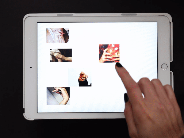
I pretended being an synesthet while I was touching hundreds of books on the library’s shelves. I would like to see in all of this pictures a sound. To feel that the title of the book I chose is not a trick, and design made by machines is truly loud and 3-dimensional. Is it?


Signs can be art to


Tuesday, May 14, 2013

The art section of the library, this is where we have to choose our third book. This week again we had to take the key words of the last book that we chose, and then choose a new book taking these key words as criteria.

So my question this week is what do we consider the art section of the library of the Gerrit Rietveld?

To start with its all ready a small library in which they already have a small selection of book, and I would say the selection they have there is a selection made on books that would be useful to art and design students. It would seem weird if they had mathematics and science books cause they wouldn’t really be the most used books there, although it would be nice and maybe useful if they had science books.

So saying that I would say that the whole library of the Gerrit Rietveld is already an art library, with books about art, design and of course philosophy.

So that already makes my task easier, now I just have to pick my last key words which were distinction, yellow and stencil, and take these to choose a new book in the whole library (except the philosophy section).

So this is what I did, I entered the library started walking through the shelves picking up every book with an yellow cover, none of them had something with stencil so this keyword wasn’t really useful. All the yellow covered books were quiet boring and not at all distinct so I kept on walking through the library until I got to this book titled 1000 colors (since yellow is a color I picked it up) it had a traffic sign on the cover and an yellow sign that said END at the back. I flipped through the pages and it was a book with let’s say about 500 pages all about signs, a few known signs but also made up ones. It turned out to be an interesting book that shows that you could make a sign up for practically everything and you can make an art out of it.

Rietveld Library cat.nr: 754.9

Here, here little foxie


Tuesday, May 14, 2013

I like this one.

Or maybe not. Because it’s orange. I hate orange.

Or do I.

Strong feelings, dragging both ways. It hurts. No, I like this one. But it’s orange.

Since I moved to Holland I think orange is the colour of annoyance. It represents drunk and ignorant people with no sense for fashion, running around in the streets, pissing in my staircase and littering the veins of Amsterdam.

But also, the colour of my hair. Gingerlicious. Makes me wonder, is it so, that also I am one of those?

Well I guess a little bit yes and a little bit no. As in all deep cases in life, it’s easy to get lost in this grey area of orange. To be or not to be – a deuce.

No, I like it. Because it doesn’t say anything about what the author has between his or her legs, even though it’s tagged with feminism. I like it because it represents a feministic artist and not a gender. A genderless-looking book full of questions about gender. Orange, square and just a book. Perfect to sneak in to any chauvinist nearby. And then the chauvinist finds it and picks it up and is like yeah cool orange book gonna look in it. And then is all oh yeah cool book no way cool stuff oh my god and comes out from the situation a bit less chauvinistic and a bit more enlightened. Never thought about that when you picked up an orange, easy book huh? Nice one.

Yes, I like it because it’s orange. And sneaky. And smart. Like a fox. Fox-book.

Rietveld Library cat.nr:

to be continued ………..[X]

The shortest search


Tuesday, May 14, 2013

This search for a book was the shortest search in my life. I’ve got six tags. One of them is ‘rules’. So, I’ve set up rules for myself. I am allowed to check books only from top shelves. The third tag is ‘coincidence’. I have had no idea what kind of book I was looking for, which means it was going to be a coincidence any way. One of the first book I picked from the first top shelf from the art section is a book with a naked lady on the cover. I went thought the book. The artist was mostly working around naked human body. My search was going really well!
Inside of the book I found oily finger stamps and prints of cup of tea. Apparently some one had breakfast in front of the book and left all this marks inside by coincidence.  First book I took from the book shelf exactly fitted all the tags I had! It confirmed the rules I made for myself. The power of coincidence convinced me how important to trust your own intuition and used a bit of imagination.

Rietveld Library cat.nr: BECK 3

OH LA LA I WANT YOU


Monday, May 13, 2013

this time i dont have time for pretty small talk my eyes are hurting i slept i dont know 2 hours been at school drawing and making stuff all day even though im still sick and should be in bed but i cant cause assessments are coming soon. besides i read my last text and even though it was also written over one night i still kind of got ashamed cause it felt so pretentious and i hated this side of me that always pops up (stomp on it!!). so i just wanna find something quick to get this shit done, so what do i write about fine ill write about japan, i like japan, japan is interesting japan is fine. but i forgot to borrow the book of course so i have to make some shit up i guess? or what do i do
or wait i can go into the library online from my laptop at home while laying in bed in my pyjamas eating icecream awesome.
japanjapanjapn what do i find i want something crazy something wild to prove that i’m not boring or pretentious or just to have fun and not think too much while writing i guess now i find this book about araki and i guess that could be something cause i really hate that guy. sexist disgusting fuck. i remember when me and sara did our art coup in gamleby and he was one of our main targets.
here’s what happened: we snuck out early in the morning, completely overexcited and got into the school before everyone else. then we put up the speakers with the music blasting loud, and all the pictures of the most disgusting slimy sexist art ever made rolling in the worst slideshow made in history, BAM on a big screen in the entrance hall. (not that it actually was the worst slideshow made in history, i think rather that it was one of the best slideshow ever produced by humankind. only the pictures were the sleaziest).
it was araki micke berg araki araki anders zorn all these sexist artists (araki) portraying naked passive women as muses, all rolling around in our awesome slideshow to the sound of the most sleaziest sexist singer of them all: ULF LUNDELL.

the song was OH LA LA JAG VILL HA DIG /
 
OH
LA
LA
I WANT YOU
[audio:https://designblog.rietveldacademie.nl/wp-content/uploads/2013/05/Ulf-Lundell-Oh-La-La-Jag-vill-ha-digmp3hamster.net_.mp3|titles=song]
YES THAT’S RIGHT
when the first students entered the school early in the morning they could hear the music and see the flashing lights from faraway. it was like a bomb

and we were invincible

anyway, araki. i still really hate that guy.

Rietveld Library cat.nr: arak 2


Muddy Love


Monday, May 13, 2013


Map.

I cheated a bit last time by picking a book that was not part of the design section. It could be, because it dealt with cartography, but it’s maps were torn apart and put back together in different ways to form new landscapes; or used as starting points for spatial installations; or written, painted and drawn on; folded, pierced and even torched to make up new worlds.

Water.

A lot on architecture. I drift off and think of how much I would like to go for a swim now. To take a dive in the cold fresh water. A bit muddy probably. The kind of mud that slithers through the space between your toes when you stand on it, before it gives way a few inches under the pressure of your body.

Memory.

Mixing up these keywords doesn’t lead to anything.

Computerwise. Librarylike.

Hitting “memory” does provide for some compelling outcomes. Like “Bodies Voices Memories”, a book that looks at the remembering, speaking and sensing body. Specifically on instances where these abilities are disrupted or displaced by traumatic or physical causes. The book is bursting with text. But I like looking in it. The text has fascinating accompanying pictures and every new chapter title is printed on the folded corner of the previous page.


I end up with “It Crossed My Mind”, a catalogue on an exhibiton of Marijke van Warmerdam at the Kunsthalle Nurnberg in 2000.

Funnily enough it has an abundance of water in it. From showers to bathtubs and lakes. The pages are split in two. A text, sometimes in white or black, but mostly transparent and glossy, moves over the featured photo’s of film stills, installations and sculptures. An empty attic room. A man in folkore with his mouth wide open, a woman doing a headstand in a dress. A red wall.

-NO WONDER IT SOUNDS LIKE LOVING-

,

Not laughing.

Loving.

It’s in fact a map. Of her mind.

Rietveld Library cat.nr: -WA- 1

The X-Factor: Interior Edition


Sunday, May 12, 2013

Even though the title of the book that I will discuss here sounds like a cheap television-show, I am forced to be objective today. Therefore I would like to mention that the title of the book is, in fact, both good and bad. I’m totally neutral about it, really.

Xtreme Interiors – Courtenay Smith + Annette Ferrara;
is what the cover screams (the ‘X’ in ‘Xtreme’ covers most of the cover, printed in pink).
You might wonder why I am discussing the book with this particular cover at all. Well, dearest reader, with the three old keywords from a previous article (the keywords being: Bauhaus, contemporary, decoration) I have written for this site, I had to choose a book from the Art section in the Rietveld Library. As you may expect, the Art section in the Rietveld Library covers more than just one shelf. I even am under the impression that the Rietveld Library is an art-minded library rather than a usual library. Anyway, the three keywords in combination with the Art section of the Rietveld Library brought me to this book; since it’s full with contemporary architecture that does use decorations a lot.

The cover turns out to be very straightforward about its content: it’s a simple book filled with pictures of extreme interiors. Unlike the previous book, this book does look a lot like an art book: every two-pager has at least one image; every image is supported by some text. The book supports a wide range of architectural interests: it shows images from renowned architects to companies like IKEA, it shows interiors from all over the world and from many different movements/years – although it does not show any interiors from before the 20th century.
I think this book is more a fun-to-have, a visual page-turner to inspire your architectural designs once you found out that your designs are just as boring as the ones of most modern architects.

Rietveld Library cat.nr: 14564

Where is the Tradition?


Thursday, May 9, 2013


Choosing a book using the three words from the previous post was a tricky task, whenever I thought I had found a suitable solution, it failed on one of the criteria. This time I had to take more care and consideration in looking at every book individually. But as one of my key words was ‘small’ I started looking only at small books, but with no luck, so I decided to jump to the other end of the spectrum and only look at the oversized books.

Then I came across a book on Japanese prints. Japanese art is something that I have always for interesting but I know very little about it. The traditions are so different to those of the western world that I find a lot of it very hard to access. This book fails in all the areas the last book succeeded, It is made from this horrible shiny card which is almost sticky to the touch. It is bound just like 99% of the other books, it all looks a bit cheap in the end. But the one area where it is successful, unlike the previous book, is the content. The collection of prints are really intriguing, mostly black and white. Also included in the book is a lot of Chinese calligraphy, which obviously is very unclear for me, but nonetheless it as a certain elegance that is unique to the Asian aesthetic. But I can’t help but think that this book would be so much more successful had it been bound with the Japanese traditions, it would just make sense.

Rietveld Library cat.nr: 1058

It’s All About The Spine


Thursday, May 9, 2013

Looking through the aisle of books in the library and trying to find that one book out of hundreds that I could be interested in was a difficult task. So instead of picking out every book and inspecting it in detail, I chose to find a book that I found interesting purely from the spine. This meant I was looking for a unique bind, or a unique choice of material. Both these criteria are too often ignored in my opinion, for example if your book is in amongst thousands of books in a library, with only the spine visible, I think it is essential to give your publication that little bit extra to set it above the rest.

So I came across a small book crammed in at the end of an aisle called ‘Mechanisme’ and it stood out for three reasons. A) It was bound with a traditional Japanese binding. B) It was so much smaller than all the other books around it. C) It was made from a very textural recycled card. It’s no bigger than a CD case, yet it has more character than the majority of the books in the design section. There is something personal about it, as it is almost definitely handmade, so it has a delicate quality to it. So delicate in fact that it is falling apart slightly. To be honest I was slightly disappointed when I decided to check out the contents of the book, although it was made using very nice materials it’s design was far too bland and the actual purpose of the book wasn’t clear, as far as I could tell it was a book explaining the contents of different materials. The cover and general outer appearance gets 10/10, the content however 5/10. But at least it was interesting enough to stand out from the rest.

Rietveld Library cat.nr:

Didn’t I see this before?


Thursday, May 9, 2013

Didn’t I see this before?

dejavu-gif


Have you ever had this strange, but uncertain feeling that you have experienced something before? An overwhelming sense of familiarity? A moment you are not sure if something similar or the exact same thing already happened? Then you belong to the majority of people who have had a déjà vu. Scientists are still unsure how to explain this phenomenon. Some try to link it to memory functions, claiming that familiar events can trigger memories of forgotten information. Some say it’s a more like a “memory check” of our brain: a signal that there is a conflict between what we think we’ve experienced and what we actually did experience.

In a web app I created for iPads you can move along stories told by various images and collages of hands. Sometimes you end up at a point you think you have experienced before. But is it really the same, or does it just familiar? You might just have a déjà vu.

When browsing through the internet, we often experience this feeling of familiarity. Links and tags create a confusing net of intertwined information, often taking you back to a page you have been before. But because of the information overload we are exposed to, we are often not sure. Maybe you experienced it while surfing through the Design Blog, using the various tags. And you asked yourself,


Didn’t I see this before?


the clouds of Andy


Tuesday, May 7, 2013

Moving towards the theoretic department, exiting! or boring? the book “studio and Cube” caught my attention because i am currently writing an essay about curating, and the title popped in to my eye “Hello there, im relevant to you, the book screamed” and i took it without any consideration. futher more, the curating subject is to me imediate future, the book looks boring, but I think the opposite. the subject is no where near childish, but my method of grabbing it and running out of the library without any hesitation kind of is.

What turned out to be funny, and not funny as in “funny, haha” but a perculiar coincsidence, was that i imediately opened the book (which is mostly text rather than images) to page 61 (this is a guess or estimation as the book is to fancy to have page numbers on all pages) wich features a work of Andy Warhol, Silver clouds 1966 – wich. hold your breath, in my mind imediatly linked to the previous book of my choice with the ambient work of Hanna Jung of a cloud like bed with a cloud of whool over it. In Andys case, the clouds are made of aluminium something, and are shiny pillows floating around in space. If I had’nt had my previous reference of cloudy rooms the clouds would have had no signifigance to me but now they imediatly pressent something poetic, as light, but in another time frame. Other times, other clouds.

Rietveld Library cat.nr:

Self-expression, constructed in mathematics


Friday, May 3, 2013

With three keywords in the back of my head, I had to search for another book in the Rietveldian Library.
I had chosen a book I new that I would hate – a book about modern architecture.

The keywords ‘Bauhaus’, ‘Contemporary’ and ‘Decoration’ had to give me a clue what to choose. Yet this time, I had to be objective. Ah well, when I saw the book entitled ‘Postmodern Urbanism (Revised Edition)’ it was easy to choose without judging. It was clearly the best book to choose for me, since Postmodern Urbanism is extremely contemporary, Bauhaus-influenced and therefore a-decorative (relating to ‘decoration’ as a keyword).

The first thing one could notice about the book, is that it feels a lot like a modern building itself. The book is solid, practical, safe, strong, linear in design, no decorations (except for the cover, however, the decoration is rather mathematical than baroque-like) and unpersonal. I estimate there are about 15 pictures in the book that counts almost 400 pages. This is definitely remarkable for a book about art, where the visual aspect is usually so important. It feels like a book written by a philosopher rather than an artist; rather focused on the inside visuals of one’s mind than the outside visuals of the physical world, in which all contemporary postmodern buildings are standing after all (if we forget about the people that say that what is in their brains is reality too, which of course is debatable).

Upon studying the book a little bit longer, one could notice it’s full of footnotes. The book really looks a lot like a scientific paper, it does not look like an art book at all. I feel the urge to complain about modern architecture again, how it is so different, so ancient, so non evolved compared to other forms of modern art, but let’s keep it objective here, hey!

Rietveld Library cat.nr: 14749

What does it mean?


Sunday, April 28, 2013

If you start a research without the desire to find anything does the result have any meaning? I think the purpose of this last research was to assemble all the pieces. Find a sense to this sometimes automatic, sometimes random, book hunting. When you are finally looking for the meaning behind your actions, I deeply think you actually limit yourself. Think about looking for the ultimate solution to all your trouble is probably one of the most stressing action. This time I walk around this books with actually no desire to find anything. Your eyes go around with this emotionless sensation toward the object you are looking at. Of course this is an assignment so I tried to respect the rules. Look for the words my other research led me too. I knew before entering this will be pointless.


Them let the meaning behind and let’s act past forward. The art section is now open to me. The first choice I ever did during this assignment is them accessible. And there is actually nothing that I can find today, which match more word in my head. This a book about Jacques-Henri Lartigues. This is a name I for long hear, but I could not related any image to it. And if during the past assignment the purpose was to describe our research, as a results it is here in the content that the sense appear. Why this book sounded interesting to me in the first place is quiet easy to understand. The name remind me of something. The tittle is french as well and probably could be link to some nostalgia i felt them. But if all the element are quiet random and actually boring the content offer an ultimate and unexpected resolution to the research.


Jacques-Henri Lartigues, have been an amateur photograph during all his life. From the age of 8 when his father offer the young boy, his first camera. The desire of taking image never left Lartigue. It is though only as a painter that he was well know during most of his life. The picture stayed a passion. An habits practice and repeat as an amateur. The meaning was kept by himself only.


The black and white image reveal a pure and simple beauty. Because at any moment this poet had no idea of the work he was making. It is as a “Flaneur” that he keep wonder around taking image after image out of the reality. There is nothing else to say from here, my choice might not been issue from the word it should have been, but the results couldn’t be more relevant.

But why to my eyes this is the case is not to explain. I discover trough a random research across words and envy, something I’m really glad to have in my hands. A piece of a life I never knew of. A unique expression of poetry as my eyes can read it.

Rietveld Library cat.nr: 761* lar 2

Purple Rain


Friday, April 26, 2013

Purple Rain

I had to look for another book based on the keywords of 40 years of Chinese rock’n’roll. First I tried all my chosen tags. But nothing came out of it, so I just typed in Rock and then I got the title The art of Rock. I found the book easily. But the first thing I noticed when I actually saw the book was the weight of it.
The colour purple remind me the most of royalty and Prince. Maybe the two things go together. Prince has something royal in his way of performing. On the book cover the colour white turns into deep deep purple. The hair exists out of flames. If you look long enough you can read: the art of rock posters from Presley to punk. I saw the cover maybe 15 times but never saw the text into the fire hair flames. That’s some nice graphic art work! My first thought was that the man on the cover is still smiling with his head over his shoulder, but his hair is fire? Also he looked pretty pleased with himself. Most people whose hair is on fire don’t smile that cool. So is it sacrifice for being cool or is he just being stupid?

Tina Turner also smiling over her shoulder but with some more sexiness and joy. Wearing clothes that you normally don’t wear to the supermarket.

But then Jimmy Hendrix his hair turned into snakes.

There are some similar connections between these 3 pictures. But there are also other images on the back of the cover. I have to mention the rolling stones with the two falling dices poster. Because I have to mention them.

Rietveld Library cat.nr: 754.1

Rush into poetry


Wednesday, April 24, 2013

No time to wonder around

Only number this time

Tapping them down

Moving backward

I arrived to a section of graphic design. A few are matching the right number. Two are too small for contain all the letters. Two 75 where I was looking for some 758.3. They are small and easy to grab.

Seven hundres fifty eight point three

Seven

Five

Eight

Three

Two books in my hand

One efficient research

Go.

I barely open them. They are for sure about poetry. Which kind I don’t know. But apparently they are in Dutch, but that something to fins out later. I have two book instead of one.

Now it could be simple. Red or black. Stick to the cover and avoid a contact to the content. Except I already encounter the book in the library. As I was taking them my eyes went inside, turn the pages. My look inside change the way I see them now so why not dig a bit more into them now.

Transparent paper

Poem in construction

White page

Simple drawings

The visual take over the text. I’m confronted to a lovely sensation in my hand. But even through the graphic construction of the lines I don’t manage to read this text. It stays mute. Impossibility to relate to the language, the text loose his meaning. Beauty stay cold and lines unclear.

A world of lines

Symbole of black and white

Visual poetry of square

There is some words

Some birds

Animal by themselves

One dog fucked by a men

Juni 1991

Gerrit Rietveld Academy

The rest is up to you. A new journey is now open across the book. I meet see you along in between a deserted landscape and the sunset over my head as I swim in this ocean of poetry. See you later.

Rietveld Library cat.nr: 758.3 wee 1a

Materialization of thoughts


Wednesday, April 24, 2013

According to one of the tags I decided that I am allowed to search for a book only on the top shelves which made it a little bit easier for me. I could give to my search a better structure and can check every book from that area.
I set up rules for myself that the second tag has to be a part of a title of the book and it has to be written on a cover or it has to have any semantic similarity. My second tag is ‘living book’. I was thinking about something contemporary or something new but happening at the current moment. Or it also could be something which has any quality of living or alive object. A part of the title of the book I picked is ‘themes and movement’. I thought about living moving books and also the subject of the book is quite new for me. I have never been into this topic before. It did not attract me before. Recently I come across this subject all the time. I’ve never divide art according to these categories before for myself. I found this topic quite interesting at the moment. This book caught my eye and it was a coincidence.
My third rule was ‘relay or trust coincidence’. I opened the book some where in a middle and I discovered a picture of a naked lady sitting in the dust surrounded by rubbish. I did not have any doubts about my choice.
My search took about 10 min. Was it accidental or do we always cross over things which we are really into or do those thing find us?

Rietveld Library cat.nr: 708.4 rec

“The space for nude feet and the space for a stone”


Tuesday, April 23, 2013

A boring childish future?
A futuristic boring childhood?
A childish futuristic boredom?
the book “7th Biennale Internationale de La Tapisserie somehow came closest to fulfilling these not easy criteria. Or maybe not. It mostly fits the childish criteria, the cover has a knitted foot on it, very naive and silly. but still quite pretty or intriguing. boring I would say as well, because i find nitting really really boring. Im sure it can be used as a good medium and bring out exiting results, and it sure does in the book, so delicate and structaral a material, photographed in black and white, but however, the procces of knitting is to me quite boring. so kntting is definitley not gonna be my future. A picture that captures me is a picture of th ework by a polish artist named Hanna Jung. the work is called “Two spaces –

The space for the nude and the space for a stone”. In a room you have a delicate fur like cloud of fuzzyness as a gigantic bed overflowing the room on the floor, and above a lamp like shape of the same fuzzyness. almost touching eachother, but not quite. he work comes out so fragile but still so space consuming and i want to touch it. but its not even possible to find a picture on the internet. And im sure, because im really good at internetting. Its really as shame with work like this i think, that they only are documened in a dusty black and white book hidden between to much bigger books in the design section of knitting and fabric where you would never imagine to be drawn in to a magical white cloud of dominating light fur.

Rietveld Library cat.nr:779.2


Log in
subscribe