Skip to Content Skip to Search Go to Top Navigation Go to Side Menu


"Highlight" Category


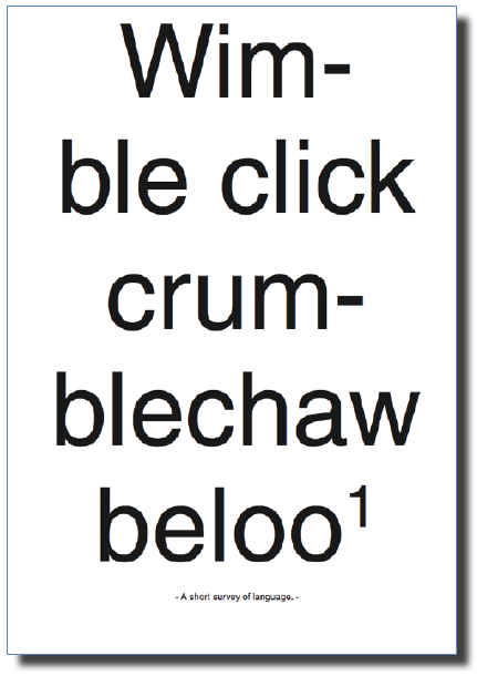
Wimble click crumblechaw beloo


Thursday, September 15, 2016

650-ANDREEA_PETERFI_ANNELAKEMAN

Umberto Eco in his Six Walks in The Fictional Woods is referring to the idea of an optical illusion, for explaining how we are perceiving the fictional novels. Throughout his essay we are being shown, several illustrations with which he is visualizing the concept behind his es- say. Although it is not a children’s book, he is adding the illustration for the means of having a common understanding on the topic he is referring to and the concepts he is presenting.
While in children’s books, unfortunately, the freedom of the child using his fantasy is taken away, by – and thus imposing the fantasy of – one or more grownups, directing them in what they must see and understand as to have a common memory. I will come back on this subject later.
In Eco’s book though it is necessary to have the same understanding of the concept he is proposing. He is pointing his finger, saying “this is what I mean and not other”. Being able to maintain a certain common understanding, while using words, either in speech or writing is very difficult, as De Certeau is pointing it out in The Practice of Everyday Life:

“The readable transforms itself into the memorable: Barthes reads Proust in Stendhal’s text; the viewer reads the landscape of his childhood in the evening news.”


650-ANDREEA_PETERFI_ANNELAKEMAN-2

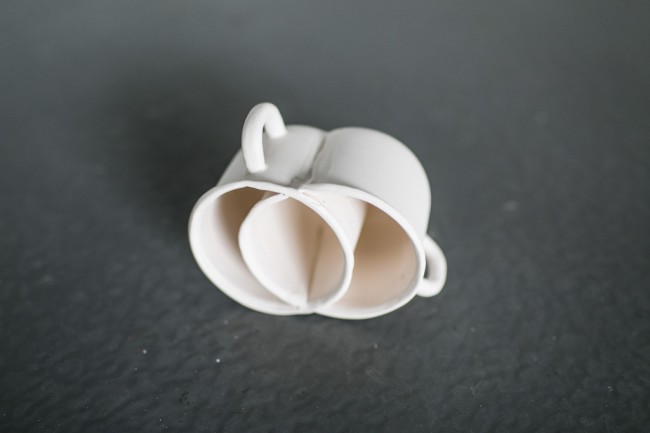
Simply because we have agreed that, say: cup is a cup it does not mean that we are talking about the same subject/object. Each of us are having a specific memory of the word, being related to either the time we have learned it first, space, surrounding, atmosphere, mate- rial, color, size or form, are additions to the experience we are relating the word to.
When we say the word cup we refer to all the cups from everyone’s memory, and to the only one cup we relate to personally, all the cups we have happened to see, and even the ones we do not yet know about.
Here I will make a short parenthesis for coming back to what I have said above, about the common memory of the children, whom have shared the same book in the past. Clearly there are a few objects in each generation (related to time) or cultures (related to place) we can think of, that are bringing a sudden nostalgia. Referring to one of these objects from our common memory, has the power to affirm and acknowledge the ground where one that stands facing the others. Thus sharing a specific memory of a specific object can be decisive for taking or not part of the group.

650-ANDREEA_PETERFI_ANNELAKEMAN-3

Once this idea is settled there is no need for other words to explain ourselves. We now can trust each others understanding on a number of other discussions, that we do have similar experiences.
Let’s take the 90’s generation as example. We might have experienced objects as Tamaqotchi, Nokia Querty, Pokemon and Dexter’s laboratory even though we come from all different countries and cultures. Recently I have participated in a some similar talks in a few different settings about Tamaqochi. It seems that somehow the memory of this object, keeps reoccurring. There are exactly a few specific answers to the question: “Oh! And do you remember Tamagotchi?!” that represent the object at it’s best and everyone understand their meaning.With or without the additional –
annoyed : “Oooh! Noooo, please….(it was such a stupid game, it would always die during the class)” .
and the enthusiastic : “Yes Yes! (I actually had a few)!”.
Whether one remembers more the annoyance or the pleasure, in the end both sides know exactly what it all meant or felt like. Thus trough sharing a common reference point they are becoming ‘a group’. They can now feel closer by the fact that they have shared a common/similar experience. Trough sharing a common experience the ‘other’ becomes ‘we’. While the ones that did not share the experience have a harder time to relate to the word and the meaning it carries with it.
This of course is a simplistic example and as such I am here not discussing the importance of sharing the idea of the Tamagotchi persé as an object/name, or as an experience, but replace it with something of a bigger importance – and that is where we, although having developed language to be able to transmit thoughts, can not get over the struggles of truthfully understanding their meaning and in some cases we overlook their importance by not being able to relate to other people’s experiences only trough words.


Cover_shaded download this thesis by Andreea Peterfi
all rights to this thesis are property of the author © 2016


Un Use You All


Thursday, September 15, 2016


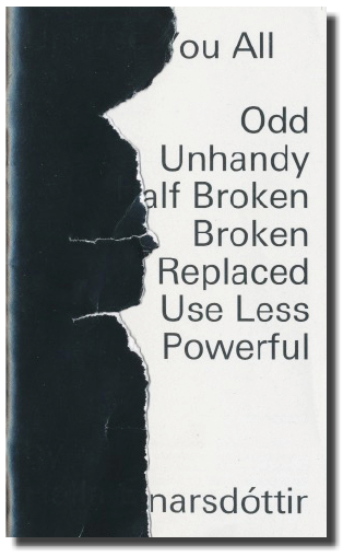
How much can a few oddly functioning objects tell us, about the written and unwritten rules and conventions revolving around the world of artifact? The on-the-verge-, in-between-, half-, unhandy-, surprisingly-, weirdly- or not-at-all-functioning objects – or is that even possible?

Through a series of 10 short-stories, the term Shift Spectrum is introduced. An objects journey from fully functioning (as its initial intention) to the broad field of “what else” during which the object behaves as a sort of “social agent”. Where the object speaks back to us and we listen creating a two way dialog which reflects, sometimes in confronting ways, the useful and personal values we imbue objects with. Whether in a dry product description or the object becoming a protagonist, an object narrative power is prominent in the text.
The examples given are both historical and contemporary, ranging from a tent peg, a kitchen chair, a warming pan and a Neapolitan coffee pot to a name a few.

Handing the thesis over to William Jacobson to design it was a way of taking a distance to the text and another dialog, this time between my text and his design was created. His choice of making the cover sealed, puts the reader immediately in a position of questioning the object, even before starting to read.


SAMSUNG CSC SAMSUNG CSC


This thesis became a theoretical foundation for my graduation work, Sauðfjarveikivarnagirðing. A story of a broken down fence in the highland of Iceland. It wasn’t until after writing the thesis that I was able to go back to the material I had gathered a year earlier about the fence and contextualize it.


Cover_shadow download this thesis by Halla Einarsdottír
all rights to this thesis are property of the author © 2016


One life in three years.


Tuesday, May 10, 2016


1933. 

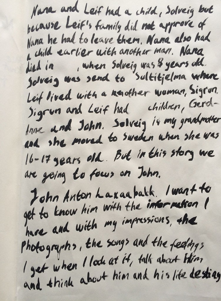
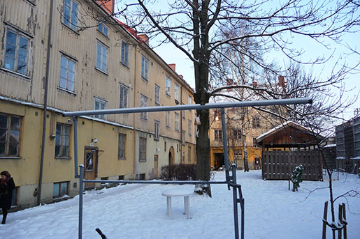
John Laxaabakk was born in Sultielma, a small mine village in the north of Norway

Sulitelma


2010.

My grandmother’s stepsister came from Holland to Gothenburg and told us (my family) that he (John Laxaabakk) had been living in our city in Sweden but now had passed. He had been laying in his apartment without anyone knowing it for almost a year.


story


2010.

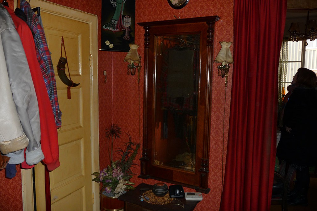
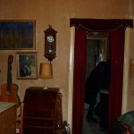
We went to the apartment. It was sad, beautiful and intense.
garda515
There were decorative things everywhere, carefully chosen places for everything, there was a presence of life even though no one was there. Red velvet curtains, golden frames, vitrine cabinets, books, records, video games, posters, cassette tapes, paintings, instruments.. It really felt like we were invading someone’s home. Someone’s own important and personal space.


gardamellan1John Laxaabakk was rejected by his mother and father (my great grandfather) because of his sexuality.


gardamellan44 gardamellan33
My grandmother moved to Sweden to work at a factory when she was 16-17 years old. I do not think they ever saw each other again, but I’m not sure of that, I never met her either.
 

2016.

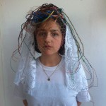
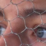
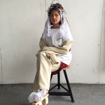
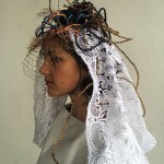
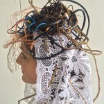
When we got the assignment to make a mask/headpiece inspired by someone else I immediately thought of John, I had been thinking about that I wanted to make a work inspired by and for him and with this project I saw that opportunity. The process have been quite complicated for me, both emotionally and aesthetic wise. I did not think of, at first, that when you bring something personal like this to school, or let’s say the public you have to be completely open. I learned that the information I have, my process and and final work is for everyone else to judge even though the subject is highly personal. In the end I saw my work as a homage for John rather then a mask of him

I started working with what I had, pictures we took when we visited his apartment, researching the village he came from, listened to cassettes he recorded where he sings and plays the guitar. I had some contact with his sister although she seemed a bit distant to wanting to talk to me about this. And I had to respect that. I decided along the way to focus more on what I saw and felt when I looked at what I had and thought about him and his life destiny.

gardamellan2

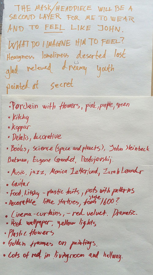
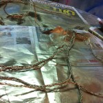
I remember I was touched by the theatrical interior John had. I’ve always wanted to have red velvet curtains as well. I imagine us sharing an interest for the dramatic. That is another reason why I chose to work with John in this assignment. It seems that he has been forced to act during his life. That social conventions and the time and environment he grew up in didn’t accept him for who he was or wanted to be. I extracted colours in his home, thought about music he listened to and what titles in his bookshelf I could see from the old pictures. I started experimenting.

ex1 ex2 ex3

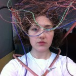
But realized it was way to “spacey” an I needed more decorative elements for it to be right. I listened to songs he recorded, here is one of them with a musician he admired, Nat King Cole with Nature Boy. Further down in the text there is a song from Monica Zetterlund, Swedish jazz singer.


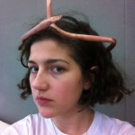
I made it more romantic.
ex4 ex5 ex6

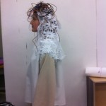
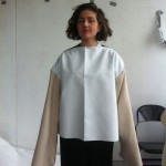
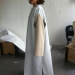
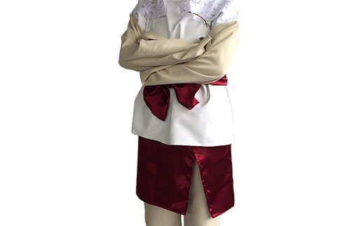
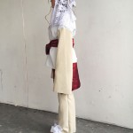
And started working on a costume as well. I felt I could not say it all with a headpiece. I got some dark red fabric and used interior fabric in beige and white to drape and improvise shapes and qualities.

ex9 ex8 ex7

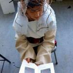
I made the arms long to show the feeling of being captured and I added more and more layers to the costume, the person who wears it is captured but beautifully so, like a Geisha.

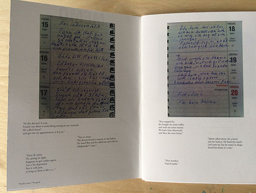
When I was almost done with the costume and mask I still wanted to add something more. This project was getting bigger than I had anticipated but I went with it because it felt like the right, and only, thing I could do. There was so much to say and somehow I started to get to know this person a bit, through me. My mum showed me a diary she had found the day we were in John’s home and I decided to make a small booklet out of it. He only wrote small notes a few times a month but it shows his delicate observations, his finding out that he got cancer and his quiet joy and ode to life.


2005/2016.


bok3
“At the doctor’s 9 a.m
Found out there is something wrong in my stomach
He called Axess.
And got me an appointment at 8 p.m”
“Taxi to Axess.
              The doctor found a tumor in the kidney.
               He faxed Ben, he called me and told me.
               Sahlgrenska next.”
“Grey & rainy.
No spring in site.
Suppose to get colder again.
Am a bit depressed.
But it will pass.
As long as there is life e.t.c.”


Results.

resultat1


To complete the costume I made a pair of platform shoes in wood before the presentation. I wanted to be taller and more restrained to really get into the feeling of being restrained. However I should have covered them because they took to much attention from my other work. For the next presentation I will have worked on them for a bit, to make them more low key.

result3 result2 result4


result7 result6 result5

Thank you, John. 

I am glad I did this, I hope you are too. And I hope you know that I would love to have gotten to know you. I would have love to talk with you about music, books and all the other things that are important in life. Even though you had a tough time sometimes I see your love to life through small windows  in your home, music, writings and photographs. Thank you again.  

img043

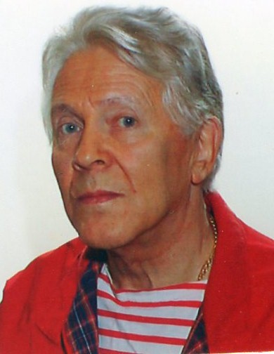
photo of Laxaabakk


[audio:https://designblog.rietveldacademie.nl/wp-content/uploads/2016/04/Monica-Zetterlund-Trubbel-live-1968.mp3|titles=Monica-Zetterlund-Trubbel-live-1968]
Sound file: Monica Zetterlund – Trubbel (live 1968)


the tragedy of the blue wolf


Tuesday, May 10, 2016

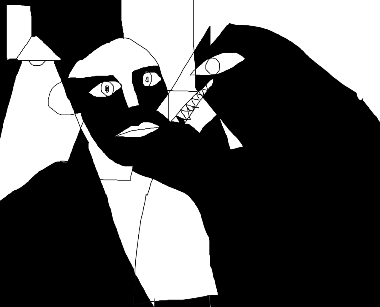
during this article i will probably forget the fact that there is also something about a wolf that makes it easy to use as the illustration of an illness, yet again i’m not sure; because however dark wolves may look they still hide a certain gentleness.
hello

when we were given the design topic of making a mask out of a person that fascinate us in anyway, i instantly thought i should use this space for the study of someone who would be in any way either strongly connected to me or that had a certain impact in my life, whether i know them or not.

the topic led to a very strange brainstorm that at first only resulted in ideas of persons that deeply touched me of course, but somehow did not bring me the satisfaction and excitement i thought i needed for this project. and i have to say that all of those whom i thought of, i knew perfectly well; and back then i think i needed someone i could « inspect » in instinctive ways, without ever really knowing if i am on the right track to understand them, or going straight the opposite direction.

i need to work on someone that touches me in any way. that i feel connected to.

but i need the thrill. i need to inspect. i need to depict, i need to look for (???), i need to know it’s not for sure, i need to know i’m probably wrong, i need to wonder.
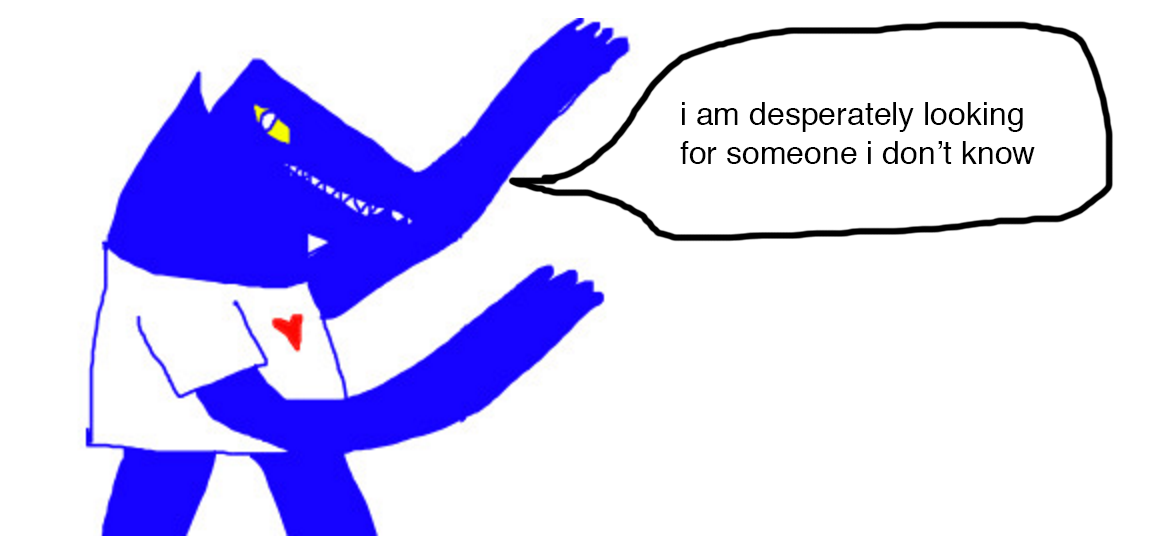
capture1design


once i met a guy. i hanged with him a lot, we never really talked. a kind of silent relationship built on a completely abstract understanding of each other.

misunderstanding?

we did manage to talk about two or three times and he had trouble finding his words, he always talked really slowly and silently, and often to say a few things about his life that were quite personal; almost as though he was suddenly talking because he desperately needed to get something out of his head. it’s ok because i needed something to get in.

he drew. he needed calm. he had no friends (and never had had) (first thing he told me)


first name:
surname:    
gender:     


meeting and learning to know someone in a context as destabilising as a hospital is quite tricky and implies many unusual factors. It is a context in which you instantly connect a stranger to a patient – not talking of any dehumanisation, but you know that you will go through certain situations with this person whether you like it or not; which eventually makes them special people who in the end you don’t know that much – although the things you know are certainly some of the most personal things you could know about them. If you add the fact that they will, in your mind and whether again you like it or not, always be connected to a medicalised and often painful period, things get even more mixed up, intertwined and weirdly complicated – but in the end that’s okay, and eventually you will sort things out on your own.
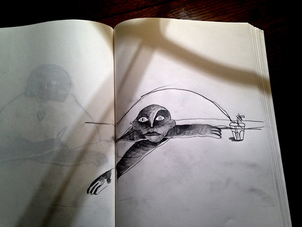


drink

thing i drew at a point where i got lost


some situations continuously appear in my mind from time to time; some of them everyday, even if it is only for five seconds. as time passes things get forgotten, or just don’t feel the need to pop through your mind anymore; some others just hang in there and become a sort of daydreaming, neither pleasant nor unpleasant, that i realise I almost don’t notice anymore. this guy, however a stranger he may be in comparison to some other patients i’m supposed to know much better, is a person i think of a lot since we lost track of each other. i met him again two years ago quite randomly when going to an appointment at the same hospital – i was hoping he would’ve been discharged, but then i saw him, and he happened to be one of the rare patients in the unit who found a way, within his distorted mental capacities (for illness and medication purposes), to remember my face and name, he came to see me and quietly said “i’m happy you’re out, i wish i was too” – which left me this image of someone stuck for months in a situation I didn’t have the capacities to change; and with a deep willingness to break the armoured doors and take him out, but of course it’s a fantasy…which still brought guilt, love, hate, frustration and a number of questions probably never to be answered.

did he get bullied

i’m sure he gets bullied

does he like mint&chocolate chip ice cream and does he laugh like a kid when he sees someone stumble on the street
does he still play ping pong even though i’m not facing the ball anymore,

did he see the last Woody Allen movie or

does he talk all the time now
did he ever get out of hospital? what does he look like now, did he cut his hair?

has he become a cartoon maker?

or maybe he’s just stuck home video gaming seven days a week

is he alive?
what do I think?

what could I do for him?


*if i could wish for


i guess sometimes you just take things the wrong way. dream. dream again. dream always.
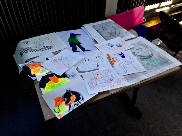
tumblr5

then i realised he made me think of a kind of hybrid mystical beast


costume2


i knew i needed something powerful, probably mystical also, but something beautiful, intriguing, perhaps funny in a way…something in which he could hide, something with which he wouldn’t care of walking besides a thousand complete strangers, something that would protect him and bring fascination and interest in the eyes of others.

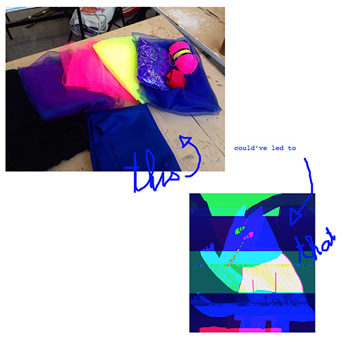
i chose the drawing of a blue wolf.
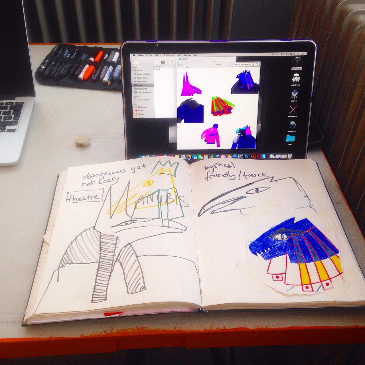
hello


and then this happened


process1

process2


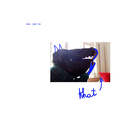
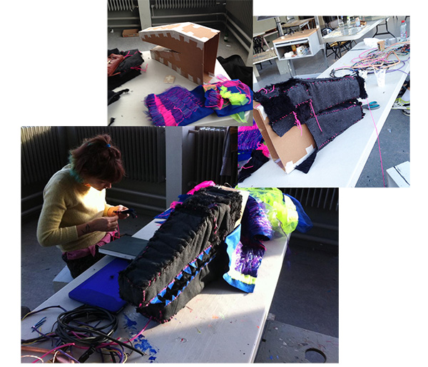
i often work without really knowing what I’m doing and if it sometimes lead to good it also makes me make a lot of mistakes, but that’s o.k. when I saw the result of the structure i was working on, i really wondered where the * my mind went. not that i thought it looked terrible or anything, but when i looked back at all the fabrics i’d bought i wondered why it lead to such a dark mask.

why

why

why??????
blogggggg 

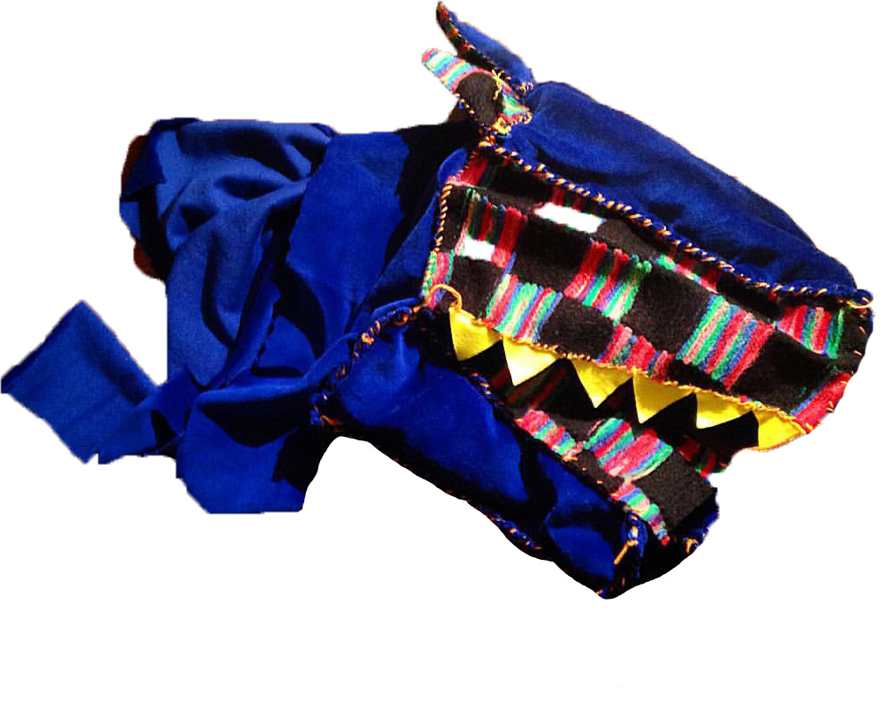
 it had to be altered; i don’t see the point of illustrating darkness with darkness when it can sometimes be expressed with means opposite to those you expect the most. moreover i do not see him as a glaucous human being, and i remember catching some glimpses of a certain colorful beauty in him that really touched me – once we played ping pong and he laughed like a kid during the whole game because i deeply suck at this game, it was maybe one of the rare moments during which i felt the emotions coming out of him were completely independent from any medical purposes. maybe that’s also the point where I felt he could also still be a kid despite all the hard stuff he was going through and i ended up with a structure that actually brought joy to me and that i found much more relevant than the former.

it’s also one of the most important things for me, in my process. if what i’m doing makes me feel bad about things, i let go of it. Things are usually relevant when i feel good while doing it, otherwise i barely even see the point of it.
 

process 3

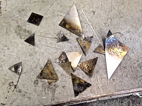
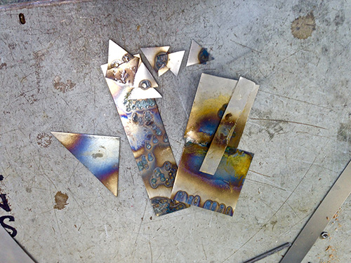
i also worked with metal for a while, studying the changing of colors that can happen with the different heating ways; using metal as jewels but also as a material that could break the use of textiles i had. only textiles seemed boring in the end, and i felt like i needed to add something maybe a little colder/stronger.
metal

metal2


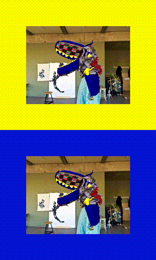
the last weeks were the most intense because it took me ten days approximately to dare adding layers to it; not that i didn’t want to, but i was scared of ruining everything and that the finality wouldn’t fit my expectations. but then i did, with yellow, grey fur, some more metal, orange and pink wool, ribbons etc that i placed instinctively (impulsively?) until i had the feeling it was done.

the sewing was long…but it was worth it, i was glad to see that my ideas had changed so much during the process, only to lead to a result that couldn’t have been more honest, and that’s exactly what i was looking for.
 

Sans-titre2

masque


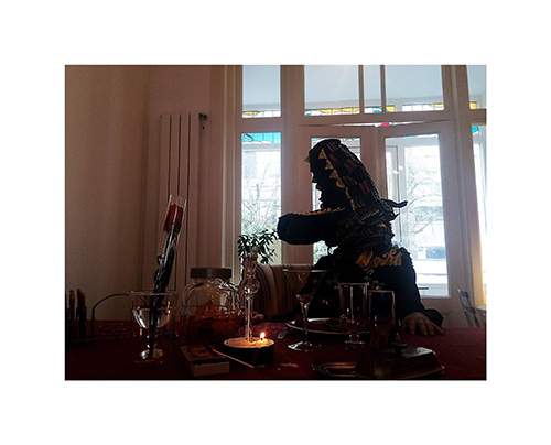
now I’ve made this mask i would like to create a whole scenery around it and maybe use it for audiovisual purposes. the only tryouts i have are poor quality iphone pictures; i thought of making photographs that could illustrate the life of this character, although i do not want to say that it will really be about the person i made the mask for anymore. not that i don’t want to but i wouldn’t really dare to do that; and in the way i made the tryouts i think it more as taking bits and bots of anything related whether to him, or to the kind of emotions he made me feel – and that englobes a lot of things. i see the character on the following picture more as a hybrid being containing deep human emotions than an explicit illustration of this guy. 

i think that the making of a mask for him was already huge in terms of tangibly illustrating who i see him as – what he makes me feel etc. creating sceneries around him personally disturbs me in a way, i don’t want him to be used for anything but i know that he plays a big role in these pictures. so i will continue my tryouts and maybe in the end i will find that without knowing it during the photographic process, the sceneries i will have created do still fit what i see him as…for this tryout, it doesn’t. lets say all the “naïve” parts the mask contains have been taken away by the pretty dark scenery. we’ll see!
12891032_10153330226311898_9059141670972767018_o


Touching the earth and the sky


Monday, April 18, 2016


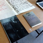
book-in-window2_1100book-in-window2_1100


I sat by the bookshelf for less than a few minutes when it caught my eye.


Touching the earth and the sky. A small, thin, white book, with only the title on the cover and spine, in simple black type. It was squeezed between two books, towering beside it like skyscrapers, like a small alleyway just off the main road.


Somehow this book was meant to be mine for a day. Its small size meant I could easily slip it in my bag, pocket, under my arm, on top of some other books. Its blankness meant it didn’t clash with any of the covers of my other books or objects. A book that could manage to slip in anywhere, unnoticed, and hide comfortably for a while. I placed it on a pile of books I had lying around at home, and it looked like it had been there for years. I put it on the table in the living room with my notebook, so as not to forget to bring it the next morning, and it seemed to curl up its spine and go to sleep. I placed it in my bag and it slipped right under the cover, as if it had done it a thousand times before.


What made this book so naturally acceptable to its environment? I thought it was probably that it looked a bit insignificant: the combination of its small, thin shape; the white cover; the simple type. But this insignificance intrigued me. It was almost as if the book worked as a counter-weight: a blank page in all this information that was already surrounding me. Where each book I looked at was pouring out its message to me, this book seemed to suck its message back into itself, hiding it even when opened, and remaining its aura of blissful ignorance. It didn’t matter if I understood the book, if I had read it or knew what it was about, because its attraction was this mystery where I could read all that I wanted into its story.


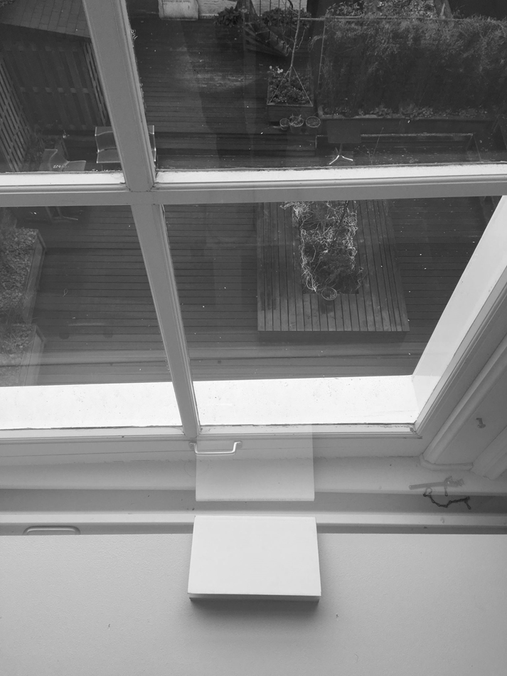
I took the book to a place, and was curious how it would fit into a place that neither I nor it had seen before. I left my bag in a locker so the book travelled with me in my hand, clasped behind my back or dangling from my fingers. It didn’t seem to mind. The cleanness of the space fitted it surprisingly well, and it wasn’t long before it had made it clear to me that it wanted to be put down, in one particular spot by the window. At first, it looked slightly lost and vulnerable on the floor, but the longer I looked away and looked again, the more it blended in and seemed to breathe into its place. It managed to hide from my eyes at times, its reflection suddenly disappearing as I took a step forward, backward, but would suddenly reassure me by popping back into focus. I was losing it to its environment, and at the same time I had never seen it so in its place.


The moment came to take it back. I was convinced it would resist my touch, being so perfectly in its place by the window, but no sooner had I picked it up or the book folded into its position in my hand. Just as it had curled up on the table in my living room, now it rested in my palm as we travelled back to the bookshelf where I had first spotted it.


The books that had towered by its side before I couldn’t find anymore, the shelves having been rearranged with all the people searching through the library. But I knew now that there was no trouble in finding a new spot for this little book. Placed beside a window, a tower, a roadside or hovering in the sky, it would always manage to reflect its environment and tell the reader exactly what you had always wanted to hear.


In my library, you move your way through the books one on one. Each book functions simultaneously as a lock and key. You don’t know the doors it might open when you pick it from its place on the shelf. Even when you’ve skimmed the spine, recognised the author, taken in the title and flicked through its pages, you’re still under a false impression of knowing where the book might lead you. It’s only once you’ve managed to extract it from its place in the library, folded your fingers around the covers, travelled with it for a couple of days, immersed yourself in the letters and forgotten it on the train, that you start to discover what this book holds in store for you. And once the rhythm of opening and closing the story has come to its natural end, the book will lead you back to the library to be found in its new place, closing its door as softly as it opened, and unlocking the way to a new book. Only a system which has no system can enable this experience of true discovery.


And then you can touch the earth and the sky.


book-in-window1_1100book-in-window1_1100


Tapestry of knowledge


Tuesday, April 12, 2016


Structure of library and structure of textile.

It’s all about information and network.

First of all what is a structure ?

  1. the way in which the parts of a system or object are arranged or organized, or a system arranged in this way
  2.  the arrangement of particles or parts in a substance or body  ex: “molecular structure”
  3. the relationship or organization of the component parts of a work of art or literature

I get interest in the structure of materials, and in especially structure of fabric. Then I looked for the definition of fabric.

  1.  structural plan or style of construction
  2.  the basic structure of something
  3. A distinctive, complex underlying pattern or structure:
    contexture, fiber, texture, warp and woof, web

I decided to assimilate information to threads which are connected to each other in an interweaving organization and which need each other to create a textile and here a complet knowledge.

Then, I considered the book not as an object which is part of a shelf but as a composant of it. As the equivalent of a thread in a piece of fabric. The library couldn’t exist without books as the textile without threads.

A book is already subject to an organisation and structuration : composed of letters making words, sentences, informations on a theme.

Paragraphs, pages, chapters, subjects. All the elements are accumulated and are mixed.

It’s the same in the library. All the books make links to other ones : by there subjects, the movements, the contexts they deal with, or the references they make.

An artist is part of a movement which combines several artists. Thus we already acquire new information to organize.  We also have to take in count that a movement is included in a period of time which makes echoes to events and context.

Thus, HOW TO ORGANISE BOOKS IN A LIBRARY ?

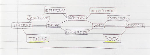
First, I decomposed the notion of book and the notion of textile in the form of a web in order to understand and make a link between Textile and Book. I realized this two approaches shared the notions of Web-work and Information. Then, it came the bas e of my concept.

IMAG1731


This structure made of links, interweaving of subjects, shared thematics is the base of the organisation I would like to try.

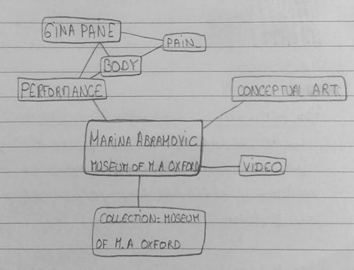
I took a book by chance in the library and decided to put it in the center of a « web » made of criteria and information.

It was a book about Marina Abramovic’s works and I made a list of the criteria which were related to this book.


Criteria

-Artist book : Marina Abramovic

-Categorie : Conceptual art

-Technique : Performance, video

-Subject : Body, pain

-Collection of the book : Museum of Modern Art Oxford


As we could expect, this book is already linked to many others in the library and we can look for books which the same criteria.

IMAG1738_1

This way of selection and organisation let us the possibility to associate information on a subject more efficiently. The research we make can be more detailed and in depth

Thus, this tidying of books is undertaken through a web, a kind of tapestry of knowledge.

But many criteria can be considered and we could even use tags for each books :


Marina ABRAMOVIC’s book :

#Marina Abramovic

#Artist book – Monograph

#Conceptual Art

#Performance

#Body


My first idea was to take one tag # for one thread. And thus, to consider that the tags are representing by the warp strings, and each book by one weft string.

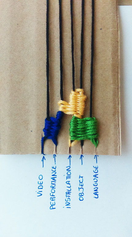
Now, let’s take the same book as above. We have this book about Marina Abramovicwhich which refers to five tags and thus, refers to 5 strings in the warp.

All these related words can complicate and confuse the organisation we try to make. But what is interesting, is the fact that each tag # is also linked to another one, so linked to another book in the library.


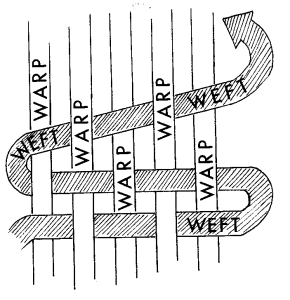
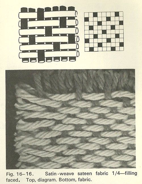
But before, I would like to introduce briefly the principe of warp and weft :

warp-and-weft

The warp threads are held in place by the loom while the weft thread travels over and under the warp threads.


Books are related to each other because of the subjects, themes and notions they deal with. I chose three books in the library,  that I’ve represented by colors weft threads in the weaving :

Colors of the threads in the photo below :

Marina Abramovic book

Marcel Duchamp book

Joseph Kosuth book

IMAG1752

Indeed, we remark that two of the books I’ve chosen share some notion. For instance Marina Abramovic and Marcel Duchamp’s books broach the notion of performance. Thus, in the weaving the weft threads which correspond to them will be weaved on the warp thread that correspond to “performance”.

With this way of thinking, the organization of books lets appear a pattern and create a weaving.


A tapestry which reflects how the books are organized.


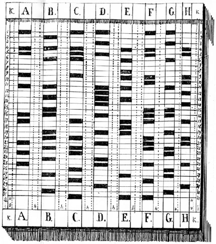
However, this research of layout and combination reminded me the Jacquard Loom and its mechanism.

Then, I get interest in the paper tapes constructed from Punched Card  made for controlling textile looms in the 19th century.


Korsakov_punch_card


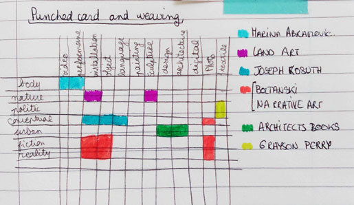
I choose to represent the thematic and subject tags by the horizontal threads (the weft strings) and the technics/medium used tags by the vertical threads which correspond to the warp strings.

Then appears a kind of pattern, created by the different locations of the book in the “weaving organisation”.

a5da1fc9334a79f7554c09ee325e3ae9

IMAG1733-copie

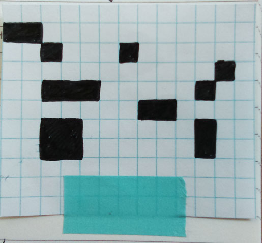
Each blocks of colors corresponding to a book, I transposed them is a uni-color pattern.


IMAG1734

Then, by combinations we can put the books in a “web”. And as the punched cards, each marks (here in black) contain information and their positioning in the structure correspond to the way their will be tidy.


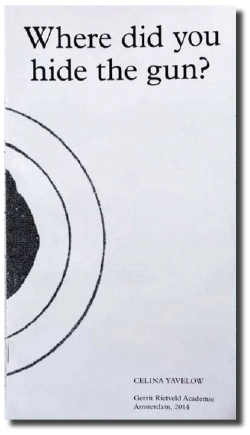
WHERE DID YOU HIDE THE GUN?


Wednesday, February 24, 2016

text by Celina Yavelow


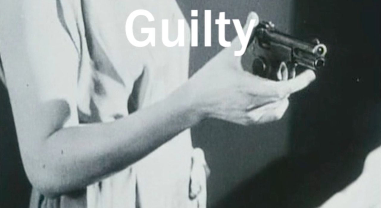
Guilty_Screen Shot

She changes this thing in the house to annoy the other, and the other is annoyed and changes it back, and she changes this other thing in the house to annoy the other, and the other is annoyed and changes it back, and then she tells all this the way it happens to some others and they think it is funny, but the other hears it and does not think it is funny, but can’t change it back.

The Other, by Lydia Davis


Loaded Language


The fact that language can change a state being is pretty much wow to me. Say the word and there’s a chance something will change: your insides start hurting (“Cunt”), you’re suddenly single again (“I’m breaking up with you”), or forced into a guilty state (“You’re under arrest”). The load in this kind of language is taken literally here, considering the body not only as the agent for speech, but also as physically subject to the force and effect of loaded language — realizing you can actually do things with words, and realizing also, that its authority can be both threatening and empowering.

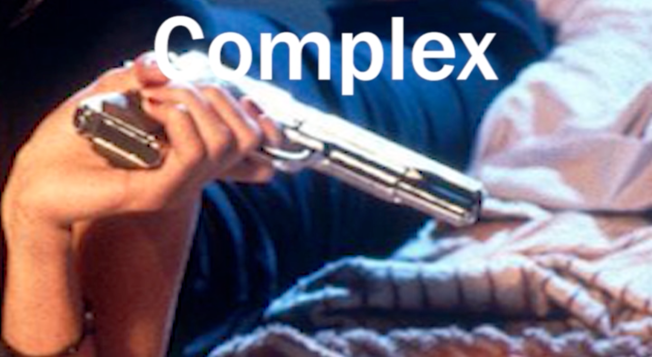
Complex_Screen Shot

This thesis is titled Where did you hide the gun? because it’s a famous example of a question deliberately loaded by its formulation. It does not ask if there is a gun, but ensues there is, and where did you hide it? According to the question you’re already guilty of the shot — regardless (“POW POW!”). I’ve connected this mechanism to a term in language philosophy and theater studies called performative speech utterance, which is quite a tough shoe to chew, so my theoretical framing is constantly interrupted by metaphoric associations and a fictional narrative, offering a melodramatic illustration of the concepts employed.

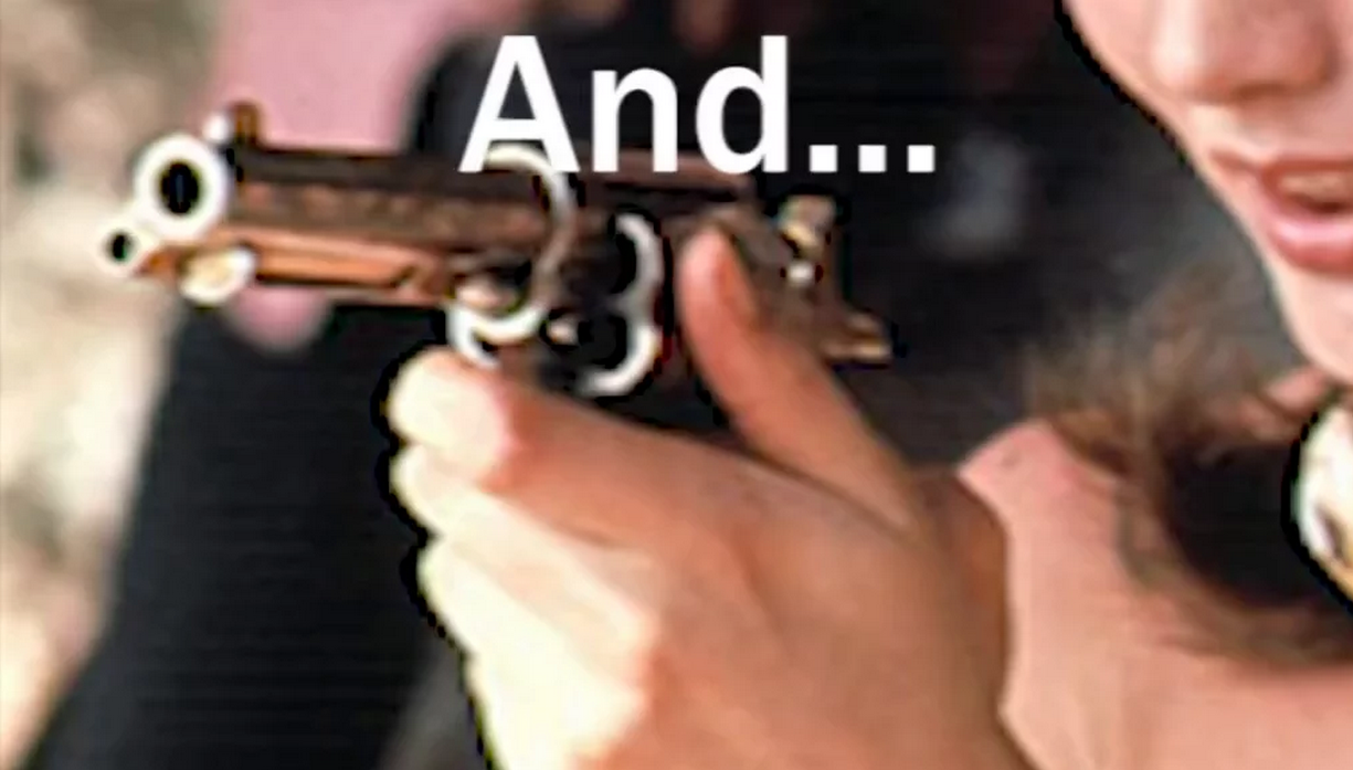
And_Screen Shot

Meanwhile, I became completely hooked to the thought that language can be so directive, that we are so easily affected, seduced or tricked by it. I continued my research in a sound piece called Hi, Mary, which was set out to be a subjective audio tour of a small part of the GRA graduation show of 2015, but was mostly exploring this reflex in our body to surrender to a voice and its language. Listen to it here!
Sound file: Hi-Mary

[audio:https://designblog.rietveldacademie.nl/wp-content/uploads/2016/01/Hi-Mary_Celina-Yavelow.mp3|titles=perfect fifth]

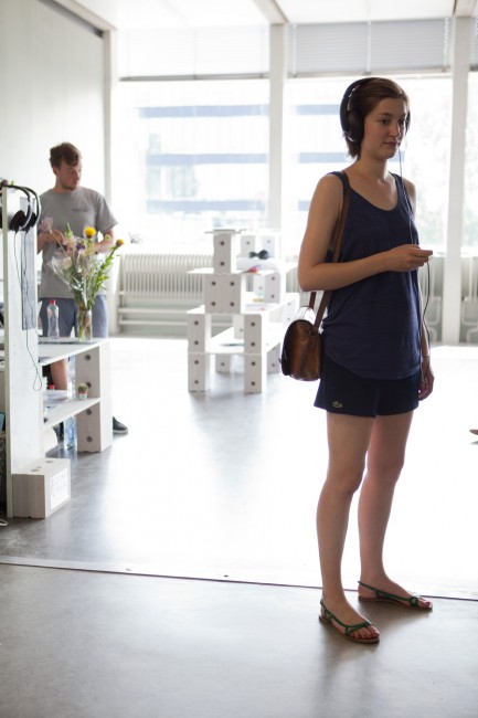
650-Celina_Yavelow_LS_05_low_res audiotour at Rietveld graduation show


the thesis
The subject –loaded language– is in itself interesting. But what makes the thesis original and engaging is the way in which she approaches the subject - a mix of various types of material (film, language philosophy, literature, current events, memories) and registers (short story, academic prose, interview, collaged/found text), all capably, impressively intertwined. Yavelow presents the reader with both basic and not-so-basic linguistic concepts, each of which she proceeds to explore through various perspectives.
The writing process is thus integral to the subject matter. The bluntness of certain images (for example guns) and juxtapositions (for example romance with guilt) is largely offset by the assured writing style. A range of literary devices are used to good effect: repetition, sentence fragments, double meanings, omission of conjunctions. An enjoyable, kaleidoscopic read.
[text by Louis Luthï]

Screen shot 2016-05-15 at 3.23.50 PM download this thesis by Celina Yavelow


For your (human) eyes only


Monday, February 22, 2016

Text in it’s digital form or as a product of a digital process prior to printing is what we mainly encounter today. However we don’t have to travel very far back in time to find a different reality.
Tracing the development of digitization of text the invention of text recognition software, also known as OCR (optical character recognition), might be said to have played a key role in the transition period to the above mentioned development.

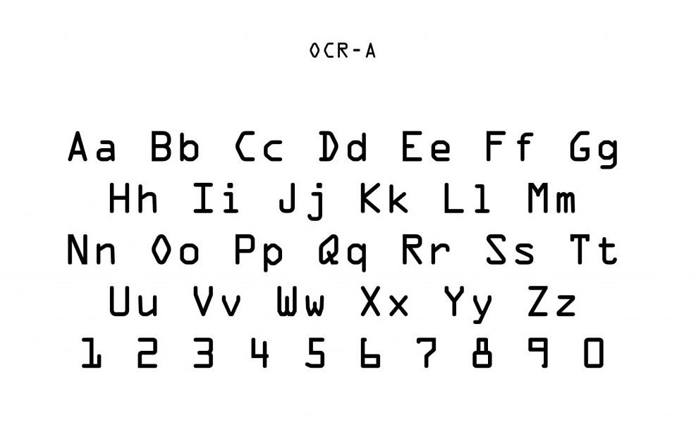
OCRA_Typeface-1-1024x860

Commissioned in 1968 by the American National Standards Institute the font OCR-A was released, as a international standard for a font easily read by humans and computer. Thus enabling printed matter to be translated into digital form without having to have a person manually type in the information once again.
Due to the in today’s view limited ability of text recognition by computers, the outcome was a quite peculiar looking typeface.
One could for example mention the very weird captital “o” among other odly shaped characters. But here the logic goes towards enabling the computer to fast and easy make the distinction between a capital “o” and a zero, without doing what we as humans of cause easily do – which understanding which is meant due to the context in which it’s presented.
The general effect of the font is one that is not very easy or pleasurable to read for longer text pieces, in fact making it a font that is more suited for the needs of the computer than that of easy human readability. This I believe is an important point which I will return to later in the connection with CAPTCHA’s (an acronym for “Completely Automated Public Turing test to tell Computers and Humans Apart”).


However taking a leap from 1968 to todays society, OCR-software are now able to recognize almost any text in no time, let alone the fact that a vast amount of information all ready exist in digital format and might very well never enter the physical world as printed matter.
Being a child of the 90’s myself, my generation have been brought up in a time were the development of the computer and the internet and the digitization and accessibility of information that it brought along has truly underwent extraordinary progress. Text and images crossing the globe in split second enables us to pass the physical boundaries of time and space.

But let’s stay grounded for a second. Cause as we surf around the internet so does computers. Bots with algorithms designed to sign up for free emails in the count of several thousands, to send out millions of so called “spam e-mails turned out to be one of the problems that the internet encountered. The number of spam e-mails is estimated to be around 200 billions a day.

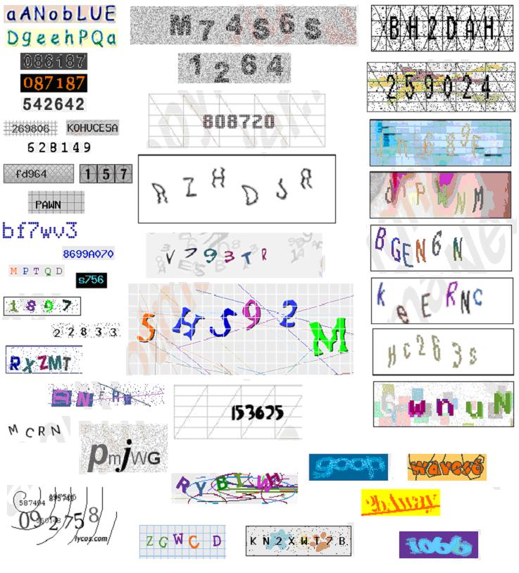
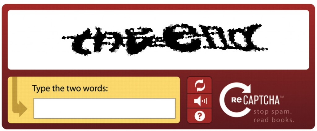
As a tool to avoid this the “CAPTCHA” was invented. A small box with hard to read text from which the user is supposed to decipher the letters in order to enter a certain webpage. The aim is to simply create a text which a person but not a computer could decipher, thus telling the two apart.


examplesoftextcaptchasdb0


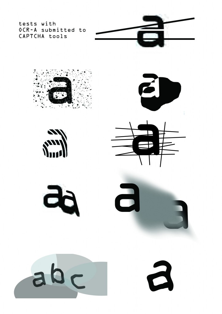
Going back to earlier mentioned OCR-A font I find it interesting to see how the CAPTCHA actually operates in the same intersection between human and computers, just here the goal seems to be the exact opposite in actually striving to avoid OCR-software to be applied. In my research i started looking into the various CAPTCHA’s and tried out whether one could mimic some of the visual tools applied by such software. Which got me thinking, if one could imagine a complete font mimicking the CAPTCHA?
This example would of course only be a mere visualization of such a font, because of the nature of CAPTCHA’s an actual font would be ever changing in order to avoid OCR being applied upon it.


anti ocr test2


Apart from my own visual affinity for this type of text, I also find there to be a sincere need for such a font or at least at a symbolic level of hindering information from being to easily accessed by computers.

What I mean by this is that how much the last 20 years off development of the internet has truly amazingly achieved, I also believe that it has been engaged with a certain sense of nativity, which we are only now starting to realize, it seems.
It was apparently perfectly natural for us to browse around the globe using free search engines or sign up for free e-mail services or to move through cities of the entire world in street level perspective. But what does these services cost if not money? The answer seems to be personal information. The reality being that our every move are potentially logged and can be utilized to profile us as consumers in order to sell advertisement space. But not only that, as relatively recent ‘leaks‘ by Edward Snowden showed us it’s not only corporate industry but also governmental agencies such as the NSA that are interested in our personal information.
So what’s left to do- cutting our LAN-cables and WiFi connection while putting on the the tin foil hat? Neither seems very tempting.

So what I’m advocating is not total paranoia but maybe once in a while remembering the saying: “there is no such thing as a free lunch”.
CAPTCHA as a typeface is indeed not very practically, but what I find potentially interesting is possible tools to provide us with a shelter for automated accessing of our personal information- also if only for a short while.


the end captcha


A wide variety of books and a bride with no groom


Sunday, February 21, 2016

notebooks  

– – – – – – – – – – – – –  – – – – – – – – – – – – – – – – – – – – – – – – – – – – – – – – – – – – – – – – – – – – – – – – – – – – – – – – – – – – – – – – – – – – – – – – – – – – –

A WIDE VARIETY OF BOOKS
AND A BRIDE WITH NO GROOM 

(Roughly about emojis)

 – – – – – – – – – – – – – – – – – – – – – – – – – – – – – – — – – – – – – – – – – – – – –– – – – – – – – – – – – – – – – – – – – – – – – – – – – – – – – – – – – – – – – – – –  – – 

Bride with no groom


The first time I saw Emojis  was 4 years ago, around 2011. I had done that big investment and changed my Blackberry for an Iphone. Coming from the Blackberry world it was very important for me to be able to chat for free so I downloaded Whatsapp, which was gaining popularity in my Ecuadorian chatting circle of life. But coming from the Blackberry world I was also missing to be able to send their super cute “Smileys” (how I called them before calling them “Emojis”, by the way my grandmother calls them “caritas” which means “little faces”).

Smileys, Emojis, or Emoticons where not included in Whatsapp and apparently they were not in my super new and slick Iphone neither. A friend recommended me to download an app called Emoji Emoticons, this applications was going to somehow make a Emoji Keyboard appear in my Iphone. So I did Sparkles on Apple iOS 9.3

remember finding very strange the fact that this Emojis will appear in my keyboard as another language. Between the options I had I could either write in Spanish or write Emoji. Technically I couldn’t do both in the same time. Emojis in Iphone interface at that time weren’t categorize as a complementary element to written words, as they appeared in my BlackBerry. Rather they appeared as a whole new language. The Emoji pack for the Iphone was also a lot wider than the Bb Smiley pack. Suddenly having so many options made me question my real need for them. They were all new so I was not used to them and they all seemed not suited to my usual way of communication and a bit arbitrary. Somehow because they where not the Emoji I was used too, they also felt “un-official”. I knew I could demand them to be official and that I couldn’t defend that the Bb smileys were official indeed, but I think it was an interesting instinctive (?) reaction.

I asked myself for example if I will ever need 4 Volumes of books (each one with their own color) and 3 types of notebooks.Where was the ecuadorian flag? And why was there a Bride and not a Groom? What happened with him? Is it the hat? This little and easy remarks (maybe a little bit too easy: Pseuo-Nationalist and Pseudo-FeministFace Throwing a Kiss on Apple iOS 9.3) catch my attention. With the time Emojis started to be used more and more and they started to feel like a some-how “official” thing. Despite this the arbitrary feeling to it was still there. They were being used for a lot of people but were they representing this people need of communication? (AND NOW OMG, MY QUESTION HAS BEING HEARD BY THE GOD OF ADVERTISING AND AlwaysG is also bitching about Feminist-Emoji-Rights…Face Without Mouth on Apple iOS 9.3: Always #LikeAGirl – Girl Emojis)

The ancestor of the Emoji is the “Smiling face”, even though earlier versions are known, Harvey Ball is recognized as the official designer of the smiley, he did it back in 1963. Emoji were born in the late 1990’s created Shigetaka Kurita, an employee at the Japanese telecom company NTT Cocomo. Kurita came up with the idea to add simplistic cartoon images to its messaging functions as a way to appeal to teens. He draw them using a pencil and a paper in a 12 by 12 pixel grid. This is how he came up with 176 crude symbols representing from faces to music notes. This emojis were a hit in the Japanese market, and other mobile providers adopted this feature. In 2007 when the Iphone appeared Apple and Google realized that they had to catch up and they added their own Emoji keyboard in the Iphones. This feature was hidden in the US Iphones, but we soon discovered that we could download an app to make them appear. By this moment the propositions given by provider were partially overlapping symbols and had its own way of coding. Emoji from a different provider often could not be displayed between them. Also emoji via email was a problem. 


National Park on Apple iOS 9.3
(This is a landscape painting hanging in the wall of this article for decoration and recreation purposes)


So Emoji added to the Unicode Consortium in 2009.Unicode which was founded in 1990 is a network of contribution members. This is the organization who punctuates, encodes, names and sketches Emoji to make sure that each platform (e-mail, iOs, Android, Google, etc) shows the same character. Then each platform can design their Emoji.  Since then the Unicode Consortium adds new Emoji features each year. This emoji features are held by employees from Apple and Google…Man in Business Suit Levitating on Apple iOS 9.3

In June 2015 there were 37 Emojis added, including an upside-down smiley, a nerd, a robot, a taco, a cheese, a hot dog, a mosque, a synagogue, etc. They also enabled, understandably, the option to change the skin tone of certain human-emoji to different hues on the FitzPatrick Scale, a “recognized standard for dermatology”

Looks quite hard to determine what Emojis are needed to represent all the Emoji-users needs for communication, it is clear that we are looking for solutions to be more expressive via text, but in the same time it also sounds too-easy easy to ask for emoji-representation of everyone. Tyler Schnoebelen lingüistic-related man has done some observations. As he says, “we’ve learned to talk, and we’ve learned to write, but we’re only now learning to write at the speed of talking (i.e., text), sending messages over vast expanses, absent any physical contextual clues. If you are talking to someone face-to-face, you don’t need an additional word or symbol to express “I’m smiling” because you would, presumably, be smiling.” But when we text between each other we loose all the non-verbal faculties like vocal intonation and body-language. Thinking about texting in this way makes very clear the necessity of a body-related language to emerge among chatters to leave intentions clear in a fast, casual way as easily as making a gesture.

But Emoji are not as limited as body-languageMouse Face on Apple iOS 9.3. Because among this very understandable body-expression conventions we also find other pictograms. Pictograms that seems to represent objects, actions or just words. And that have no defined meaning. This is the shady part of emoji. One of the reasons for which we cannot communicate solely with Emojis. With the times though there are some interpretations that have been stablished among certain people for example the girl with hands up in her head is in Japanese context a gesture for “OK”, but in other contexts is mostly interpreted differently. Each Emoji is still very much open for interpretation and I guess with time this language will be shaped to fit our needs for communication. We will add emojis we need and the existing emojis will be filled with the needed meanings. Until then I guess we will keep playing with this pictograms in this shady zone trying to scape from the limitations they offer and trying to use them our way. Hoping also that Emoji will find its way to make us all Smile and will not create any sort of discrimination feeling to start a war, or a second feminist revolution. 

senorita


Thats all I have to say. But I have also this emoji-related links to recommend: 
emojipedia.org
Tearsofjoy.nl
emoji.ink
emojiliteracy.com
emojitracker.com
emojinalysis.tumblr.com/
emojicate.com/

And things to read: 
nymag.com/daily/intelligencer/2014/11/emojis-rapid-evolution.html
time.com/2993508/emoji-rules-tweets/

the death of a letterform – towards a new identity


Friday, February 12, 2016

screedbot

stop imagining that a book must have one line, that wraps over and over again, in the same way that onE side of a record album has only one groove, And see a text like a symphony with many voices running continuously in any directIon.

every voice is a body on its own.

it moveS, It grows, it makes decisions. each letter is alive in its own world. enter this world and don’t be worried, like all good video games it teaches you how to play as it goes along, and gets more and more challenging as your skills within this world grow. the game stays one teasing half-step ahead of yoU but that’s why you play on.

ask yourself: what is possible to do with, within, and without language?
letters, words and other symbols are information we surround ourselves with every day. transferring messages from A to B, typography is an image we created, an image-language we are dependAnt on.
in print, type is fixed, stAtic and permanent. on-screen –though not permanent– type is largely inanimate. text remains an inactive tool of communication. our current understanding of type assumes it to be of static nature, limited to properties such as form and colour. Introducing temporal media (Video/animation) changing with time, type is growing A new property.

type behaves. type evolves. or as the artist eduardo kac put it in 1997:

”type becomes fluid”

considering the dynamic capabilities of conteMporary, digital media, our static definitions of type seem very outdated.
early feature films contained temporal typography, featuring largely static text, presented in sequences and subjected to cinematic transitions. it was not until the 1960s when alfred hitchcock’s north by northwest (1959) opening title sequence—created by saul bass— hit the screens, containing animated text, featuring credits that “flew” in from OFf-screen, and finally faded out into the film itself. a similar technique was also employed by bass in psycho (1960).
Since then, motion graphics, particularly the brand identities of film and television production companies, increasingly contain animated type. they hAve become trivial.

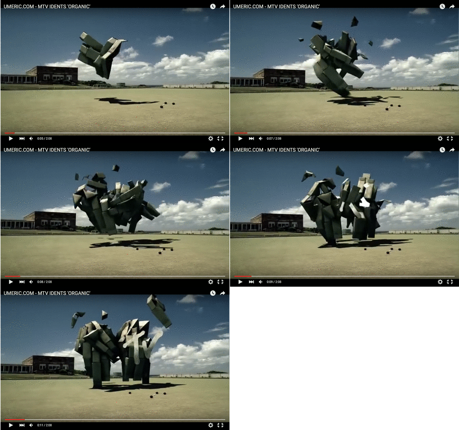
look at MTV’s idents from 2010:

www.GIFCreator.me_RbEVlP

MTV ident ‘organic’ (1/12)

several animated bricks fly around over a football yard, a yard possibly all american teenage kIddies can Identify with. an everyday life scenery in which each part of this ‘brick-matter’ seems to move independently, following an instinct i don’t understand. eventually, after a moment of non-control, Each brick is being drawn to one another to form the brand’s identity
– a moving ‘M’ connecting with a ‘TV’.

moving shapes, merging into one.
2010’s animation at its beSt – but this we know already.

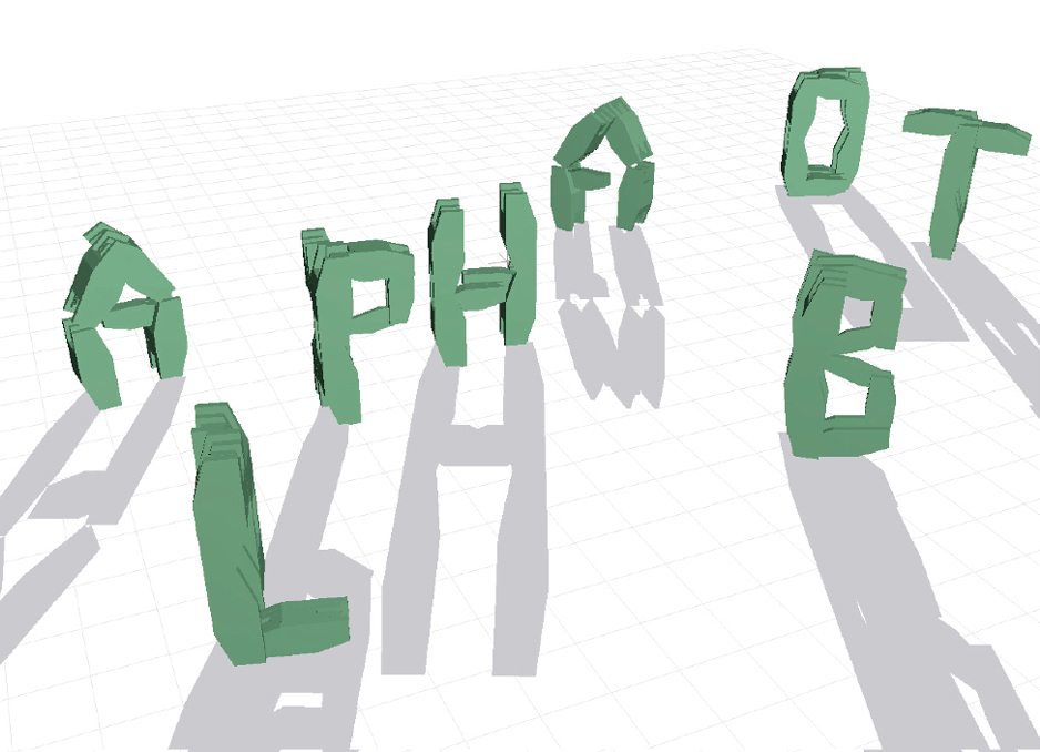
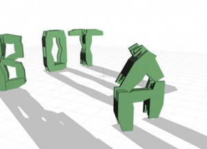
nikita pashenkov, creator of Alphabot (2001), a virtual robot that may transform to take the shape of any letter of the alphabet,  was one of the first programmers who gave life to a type being that consistently alters its form.
a single form may present multiple letters through processes of morphing, rotation or DEconstruction. multiple forms may present a single letter through processes of reorganization. the ‘alphabot’ transforms, firstly becoming the letter ‘A’, then ‘B’, and so on. without moving, It changes; it assumes a new identity. by this iNvention, type started to transform and mutate, to hide and interact. yet its new identity of behavior remains controlled by the human hand. the user types in a command – the robot translates – the letTer acts.

Nikita01-440x318

i ask

 you answer

A > B

the relationship remains uneven.

asking about the post-human condition, our role and relation with the machine or the digital world is a field I want to explore. human humanizing his surrounding. liking the letter’s motion to human gestures would therefore be a reasonable step to take when it comes to giving type a ‘life’. suddenly the letter has a leg, an arm, a finger pointing towards an information, i long to discover. he she it nods or shakes his her its body into a wild dance. he she it helps me by speaking my language. i feel connecteD, I am close to  ‘A’ – to ‘B’. but especially this way of personification is indicating the human’s urge to control his surrounding. i want To understand you, so you have to be like me.

let me suggest another relation.

what about a dynamic text in independent motion, a typography in complete metamorphosis? changing within space rather than moving across space (opening title sequences), merging from and into illegible visual elements?
a new self-sufficient algorithm, making own decisions for you to observe and thErefore creating a character with character, an identity expressing itself. a new ‘aliveness’ among us?

one body/many letters, many letters/one body

i am many.
a letter Is many.

in ‘beer’, a flash animation by komninos zervos (shown above), each letter undergoes a process of metamorphosis. two letters merge, becoming a single form, and thereby introducing a third letter. other Forms Move Independently, Adopting The Shape of one letter, then morphing into another. the forms, in flux, change between legible letters and abstract glyphs. their fluid deformation leads to new identities looking at the examples given, one can notIce that most of them come from a tIme between 5 and 15 years ago.

 where are the contemporary examples?

there is, at present, no substantial research into the properties and perception of fLuid typography. familiar methods for the analysis of typography have failed to keep pace with the development of digital technologies as they do not allow themselves to grow and allow additional dimensions such as fluid type’s capability to react and behave. there is an urge to re-evaluate our understanding of the nature of type just as to accept the notion that a single letterform may have various autonomous identiTIes.

nevertheless there do exist contemporary examples for other fluid forms of autonomous life within the worlds of the non-human or non-animal, namely the technological, alGorythmical.

take a look at ian cheng’s `emissary forks at perfection’

a Digital (a)live simulation and (foreveR) Ongoing story (2015- the very now) on screen in which cheng created different life forms through algorithms. beyond human control, an artificial intelligence called talus tWenty Nine manages the landscape, compulsively gambling on which character survives and which one may see the light of this randomly animated world for the first time. pushed together to occupy the same landscape, each form threatens to destabilize and mutate the other. “here, a story mAy escape its classical fixity and indefinitely procrastinate its conclusion.”

but back to typography.

giviNg type an autonomous life beyond control, you may ask yourself,

what’s in there for you?

if the game seems to only lead you towarDs lost battles and dead ends,

why should you keep on playing?

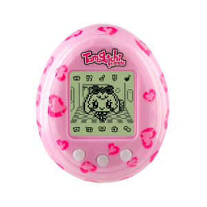
rethinking the human urge to find productivity in all that surrounds him Is a value to question. a certain un-readability arising from non-constant, fluid words, slogans and messages is indeed confusing but this situation of senselessness at first sight leADs to an encounter asking way more about the relation between human and a the letter itself. think of your probably long gone tamagotchi friends. you buIld a relationshIp by observIng them, listening to their needs, caring for them, so they care for you.

A = B

37485-Tamagotchi-Pink-Heart_R1

so why not entering this world of uncertAin messages hidden within the abstract structures of unreadable forms and images if there stilL Is the chance of reaching this certain point, as you’ve learned enough, to get into the neXT Level?

aS you know, the game stayS onE teasiNg halF-STep aheAd of you.

bUT that’S wHy yOU

pLAy ON

The Impossibility of Neutrality


Friday, February 5, 2016

Neutrality. Growing up in Sweden, the term has been a part of me since I was born, and a part of my country since before any of the world wars. It is defined by Merriam-Webster as “the quality or state of not supporting either side in an argument”. It is used throughout society in everything from neutral tasting yoghurt to neutral states in politics. But what does it mean? And is it even possible? I chose to explore and discuss a part of this which is dear to me as an art student, image making.

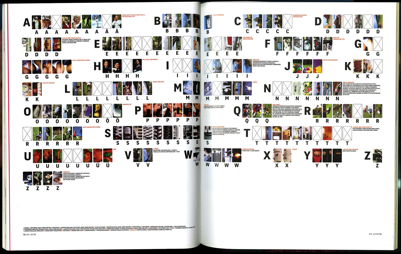
I started exploring neutrality through a work of Swiss designers Müller + Hess called The Impossibility of Neutrality, which is a commission by the English graphic design magazine Eye. It is an attempt to create an alphabet consisting of imagery instead of typography. Each letter in the alphabet has been replaced by multiple images. They chose multiple images because different people have different perceptions of what an image could represent. So to make this more precise, the viewer can look at multiple images to understand which letter the sender is trying to convey. The work deals with typography, text and photography, and how it is impossible to be neutral in imagery.

Impossibility-neutrality_1_1300

The Impossibility of Neutrality ©1999 by Müller + Hess, first published as Max Bruinsma's article Reduced to the Max in Eye-mag #32

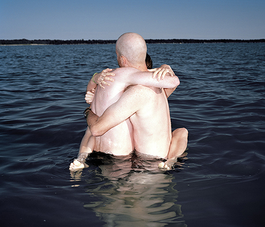
From this work I went onward to The Photographic Dictionary by Lindley Warren. The Photographic Dictionary is a website with photographs representing words. Each word in the dictionary is represented by a photograph. The word that is represented by the photograph below is the word embrace. What happens in this work, just as in Müller + Hess’s work, is that the impossibility of neutrality becomes very apparent. The representation of the word becomes very personal, and in every image there are many messages that the viewer can read into, and every image can be interpreted in many different ways. An image can not show something neutral, as text can. Or can it?

bgk 007

Embrace by Brendan George Ko through The Photographic Dictionary

Stock photography is often used as an image that can just be interpreted in one way. It is a photograph showing something in a very non-personal and mostly objective way. It is used widely by, for example businesses, who in this way can acquire quality imagery for their business at a lower cost. When using a stock photography service, the user searches for a word or a phrase, and the matching photograph appears. For this to work, the image has to be non-personal and work for a specific use within many different contexts. Does this mean that the image is neutral? And does it apply to all types of images? Images showing people can hardly be neutral I think. Most of them show an accepted norm for the human being which they send as a message. But let’s take something else as an example. Let’s take this image of U.S. dollar bills. I believe it is more or less neutral. It portrays the dollar bills as they are, no more and no less. I feel it is not carrying any messages more than the concept of U.S. dollar bills. But then again the concept of U.S. dollar bills holds a lot of messages in itself, within everything from geography to economy and politics. And also, the bills are stacked irregularly and have creases on them, which makes me think of money that is earned in illegal ways, passed on in duffel bags.

_3LITEN

Dollar bills by iStock

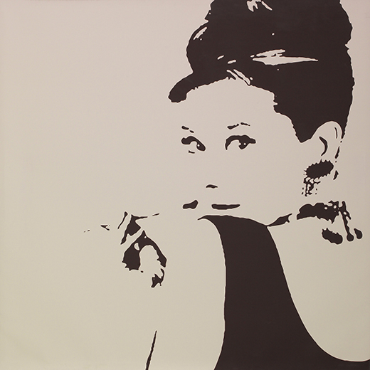
Another type of neutrality which I think is interesting is when an image or a message has been used so many times and in so many different contexts that it has lost its original meaning and doesn’t really say anything anymore. An example is the art sold at IKEA. It has been bought, sold and shown so many times in so many different contexts that the original context or message is completely lost, and it now doesn’t really represent much at all. Maybe this isn’t neutrality, but more some kind of visual confusion or loss of context. But just like the stock imagery, these images are often just used to replace one word, which in this case is decoration and/or art. This makes these images neutral in the way that most people don’t really experience or see anything when looking at these images, but instead just see a materialization of the word decoration or art.

Ikea_Art_Liten

Audrey Hepburn from Breakfast at Tiffany's by IKEA

Something that I think fits very well into this discussion is the word perception. Perception is defined by Merriam-Webster as “the way you think about or understand someone or something”. People will always have different ways of perceiving things, and when looking at an image, the image is always interpreted regarding to the perception of the viewer. Perception connects to what the viewer has seen, heard and experienced before. This is why the portrait of Audrey Hepburn from IKEA has lost it’s original context. Because it has been seen more often at IKEA or as a decorative art piece, than in its original context. This is also why we are able to find different messages and meanings in what at first glance appears to be a neutral image of dollar bills shown above. If the bills would have no marks and stacked in a perfect order, then the assumptions and the messages we are able to read into the image would still be there, just that they would be other messages and meanings. And because of perception, my conclusion in this essay is that it is impossible to be neutral. Whatever image is presented, the viewer or user will always be able to see one meaning or another in an image, and an image will always be able to be connected to something in the life of the viewer and therefore be interpreted through this experience.

On a side note I also believe it is a bit funny that Müller + Hess are Swiss, from the viewpoint that Switzerland is supposedly the oldest neutral country in the world. I wonder if any of their government officials read that issue of Eye Magazine.

On recordings (…)


Monday, February 1, 2016


henk2

listening to a 70’95’’ audiobook on a white cotton pillowcase

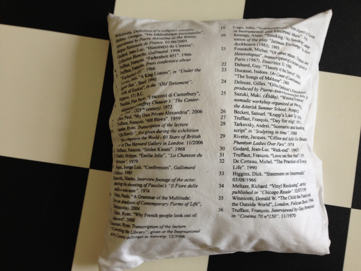
During the GRA Graduation Show 2015, the thesis “On recordings (…)” was displayed in the Graphic Design Department reading room as an audio piece. The different parts of the thesis have been recorded as separate mp3 files and reassembled together as a playlist. The text written by Émilie Ferrat is read by her, while her references are read by Ben Clark. The mp3 files were being played from an iPod, hidden in a white silkscreen pillow, displaying the title of the thesis and its references, which were printed at the back of it.
An extract of the first part, is available here.
Soundfile : “Memorizing litterature” (…)

[audio:https://designblog.rietveldacademie.nl/wp-content/uploads/2016/01/Hi-Mary_Celina-Yavelow.mp3|titles=perfect fifth] For any inquiries regarding the project, please contact: emilieferrat@gmail.com.
Pillow_backside-references

references on backside pillowcase


.Pdf-icon download this thesis “On recordings (…)”

Emilie Ferrat,
was also nominated for the GRA Awards 2015: Category Applied Arts in collaboration with François Girard-Meunier. To read more .... link


Ceramics with Émilie / Ceramics with François


Tuesday, January 26, 2016

650-Emilie_Ferrat_and_Francois_Girard-Meunier_RV_lowres_1 Rietveld Graduation Show

Émilie Ferrat [x] and François Girard-Meunier [x] graduated from the Department of Graphic Design. As part of their graduation show they presented a collaborated project ‘Ceramics with Émilie / Ceramics with François.’ This project was chosen by an independent jury to be nominated for the Design Award and was for that reason part of the exhibition ‘Selected Gerrit Rietveld Academyie Awards 2015’ organized in Castrum Peregrini [x].

Screen shot Peregrini-show

Castrum Peregrini Presentation


Ceramics with Émilie / Ceramics with François

‘The medium is the message.’ These words of Canadian philosopher Marshall McLuhan still offer room for artistic exploration. Because how exactly the message changes when the medium, or the material, is changed remains shrouded in mystery. In their collaborative project, graphic designers Émilie Ferrat and François Girard-Meunier use a classic yet surprising approach: dialogue.
 
Screenshot_Selected-images1
 
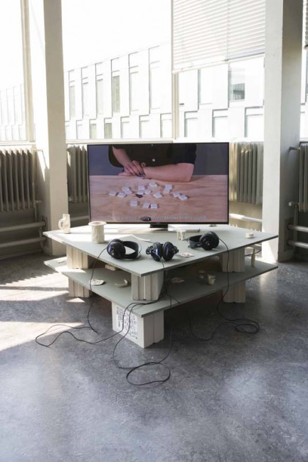
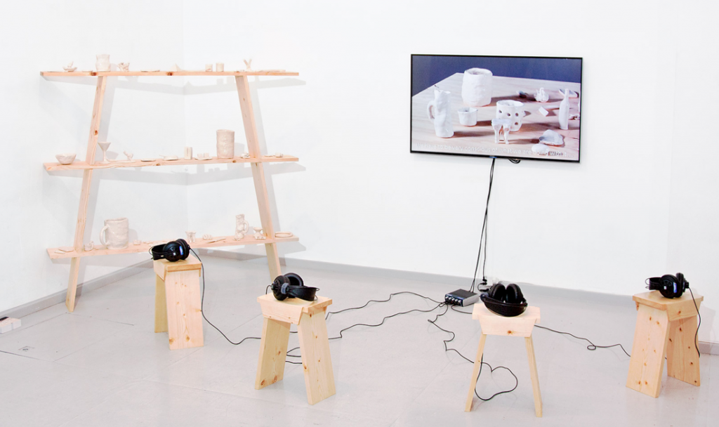
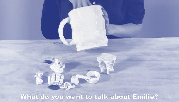
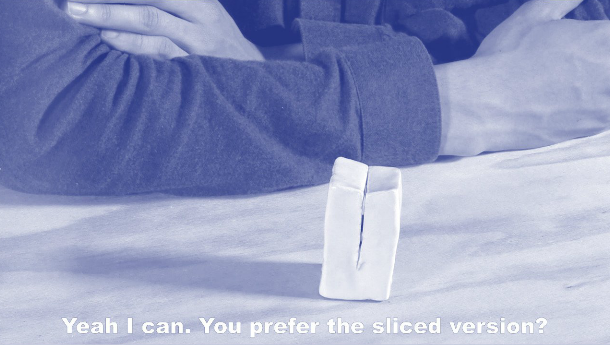
    The installation consists of a video of the two designers conversing and a number of glazed clay models –a mobile telephone, for example, and shot glasses, jigsaw pieces and some undefinable models– with which Ferrat and Girard-Meunier stretch the boundaries between form, material and meaning. A new plain field is established. The video shows their fresh and resolute debate on their progress in working with ceramics – a new material for both of them. The dialogue is explicitly overacted, which stresses the artificiality of the form (a recorded conversation about models they made earlier). The overacting harmonizes nicely with the glaze on the clay models: a shiny layer upon robust content. The spoken and material form are one.
 
Screenshot_Selected-images2
 
    ‘Do you think it’s the ceramics that is giving meaning to our talks,’ one of them asks, ‘or rather that our talks are giving meaning to the ceramics?’ The relationship between words and things is a complex one. It is a relationship that has puzzled many philosophers, artists and linguists. By deliberately speaking as amateurs, ferret and Girard-Meunier open up a new perspective on this relationship.
    The material prompts conversations that lead beyond just ceramics: design in a broader sense, a philosophical ‘brain in a vat’ argument, personal insecurities and the history of art, these are all subjects that lay hidden in the material. The ceramics function as a conversation starter: the medium turns out to contain many messages.

text by Thomas van Huut [x]


for full length video [19 minutes 54 seconds] contact François Girard-Meunier


Harp of Pythagoras


Saturday, May 30, 2015

Why are things the way they are? That is a question I can never stop asking. Every day I find myself completely fascinated by things that other people seem to take for granted. I just cannot get used to the simple fact of existence.

One of my most recent questions: “Why do we always tune our instruments the same way?”  This is the question that sparked a whole design research of which the outcome was to be a mathematical music instrument.

At the start of my research, I decided to visit my old piano teacher. I asked if he had some time to think with me on the subject of musical tuning. When I met up with him though, it was quite evident that he was not a music theoretician. He did encourage me to find out by myself, so I headed his advice and did a lot of research.

The science behind the instrument: Pythagorean music theory

0501_gaffurio_pythagoras

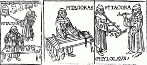
When starting this project, I did not expect to develop such a great fascination for a man who has been dead for over 2500 years and would probably cringe at the mere thought of modern music. Pythagoras had some very interesting theories about harmony. He believed people could be healed spiritually by listening to harmonious tones. He developed a tuning system based on exact mathematical ratios to create perfect harmony. He used the most harmonious interval (3:2) the perfect fifth as his foundation.

Sound file: perfect fifth

[audio:https://designblog.rietveldacademie.nl/wp-content/uploads/2015/05/perfect-fifth.mp3|titles=perfect fifth]

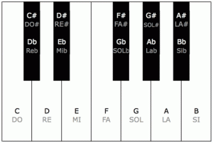
By stacking fifths upon fifths he developed a 12 tone system. The framework of our modern 12 tone system called “equal temperament”.

mtp01

The 12 different tones in an octave as shown on a piano keyboard.


Mathematically Pythagorean tuning is perfect. It describes the almost exponential nature of sound exactly. This way he could play the musical equivalent of the golden spiral. Pythagoras saw truth in these harmonies. It was his way of communicating with the heavens.

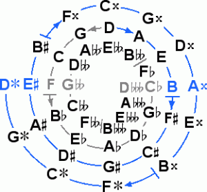
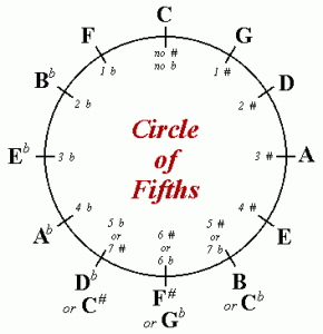
The most fundamental difference between Pythagorean temperament and equal temperament is the difference between a circle and a spiral.

 41-43spiral

Pythagorean tuning shows the golden spiral of fifths. Because the spiral of fifths is a spiral shaped system based on stacked fifths, the fifth intervals are in perfect unison, but the octaves are in dissonance.

Sound file: wolftone

[audio:https://designblog.rietveldacademie.nl/wp-content/uploads/2015/05/wolftone.mp3|titles=wolftone]

This dissonance is also called a “wolf tone” because it resembles the howl of a wolf.

The wolf tone, is by no means the result of a faulty calculation. It does however create a problem for music playing. This problem is referred to as the Pythagorean comma. A quite ironic name seeing as Pythagoras did not believe in decimal numbers. The Pythagorean comma actually prevents you from playing more notes than the range of an octave because the 13th note will be slightly out of tune (though you could play perfect fifths into infinity). Pythagoras had a solution. He just did away with note 13 and upwards!
circle

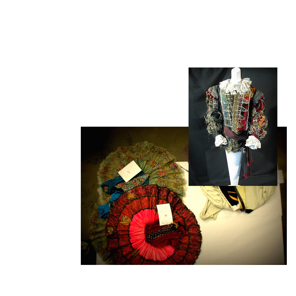
Equal temperament avoided the problem caused by the Pythagoras comma, by converting the spiral into a circle. The comma is still there, only spread out between all the notes. Everything sounds kind of okay, because everything is out of tune in the exact same way except for the perfect octaves (which you can play into infinity). Now we can play music in every key, but there is little harmony left.

Can the comma be solved? No. It cannot be solved because it is a fact of nature. Perfect octaves and perfect fifths cannot co-exist. No power of 3:2 can ever be a power of 2:1. Pythagorean tuning sought to find truth and equal temperament standardised it for the sake of convenience.

I found this very interesting, I wanted to hear the perfect fifths, so I gave myself the task to design an instrument based entirely on Pythagorean tuning. Not only would it have to be tuned in the right way, I also wanted the design to reflect the tuning, so I could understand it better.

Creating the instrument

First I had to calculate the notes Pythagoras did not care about (note 13 and upwards), so I could make an instrument with more than 12 notes. That way I would be able to hear the perfect natural disharmony Pythagoras shied away from.

Luckily someone I know had already done the dirty work for me:

rsz_img_3861

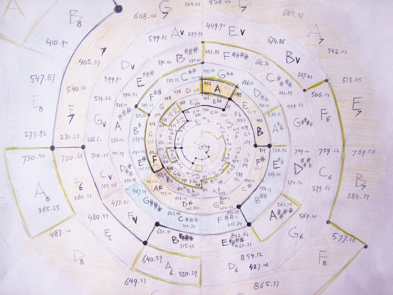
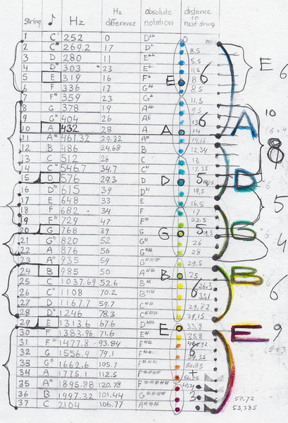
Here is the chart I used to come up with the absolute frequencies of my instrument.

And here is the list of absolute frequencies:

rsz_scn_0006

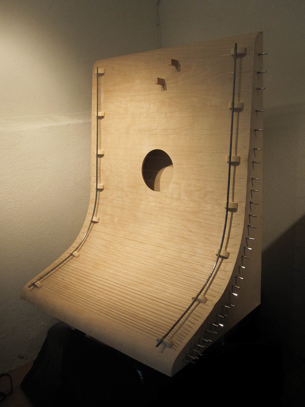
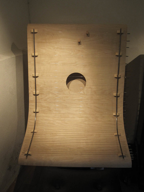
It has 37 strings from C1 to C4 where A2= 432 Hz.

Sound file: Pythagorean tuning of my instrument and equal temperament

[audio:https://designblog.rietveldacademie.nl/wp-content/uploads/2015/05/Pythagorean-tuining-and-equal-temperament.mp3|titles=Pythagorean tuining and equal temperament]

Sound file: dissonance between Pythagorean tuning equal temperament

[audio:https://designblog.rietveldacademie.nl/wp-content/uploads/2015/05/Dissonance-between-Pythagorean-tuining-and-equal-temperament.mp3|titles=Dissonance between Pythagorean tuining and equal temperament]

I was struggling to think of a meaningful design for the instrument. Out of nowhere it hit me

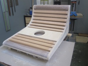
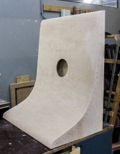
 rsz_1rsz_1scn_0003rsz_1rsz_scn_0005

I drew the distribution of the frequencies of my instrument in these graphs and I realized the shape of the graph would be the perfect shape. It visualizes the exact near exponential nature of the tuning system. I even decided to place the strings at their corresponding spatial position on the instrument. From down to up, the strings grow increasingly farther apart from each other.

 rsz_img_3864 rsz_rsz_scn_0004-1 rsz_scn_0002


Final design and model

rsz_scn_0001 rsz_rsz_img_3410 rsz_1rsz_img_3409


Stages of building

rsz_img_3852 rsz_img_3854-2-1

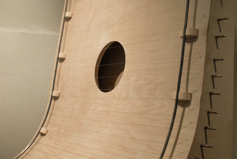
The instrument is made from birch plywood. The inside is reinforced with massive wood to resist the tension of the strings.

Final outcome

rsz_img_4414

                                                                                                         rsz_img_4412 rsz_ca2_0060


Sound file: some sounds of the instrument (not tuned to pythagoras)

[audio:https://designblog.rietveldacademie.nl/wp-content/uploads/2015/08/HARP-.mp3|titles= some sounds of the instrument]

Math is nothing other than stating things as they are. I only realised this during my research. It is the very foundation whereon math is based. It is the thing whereon my instrument is based. It shows tuning systems as they are. It does not hide the perceived disharmony. Creating this instrument has truly showed me how bad our attempts are at grasping the nature of reality. We are trying to create harmony with notes that actually form dissonance. It’s complexly ridiculous.

As an art student I say I made an interesting discovery. As a musician I say I have created an incredibly ridiculous instrument and I am very happy with that.


architectural rendering: about


Saturday, May 16, 2015


Screen Shot 2015-05-16 at 2.34.29 AM

Screen Shot 2015-05-16 at 2.35.28 AM

Screen Shot 2015-05-16 at 2.36.35 AM

read it all on ISSUU

PERNILLA


Thursday, April 30, 2015

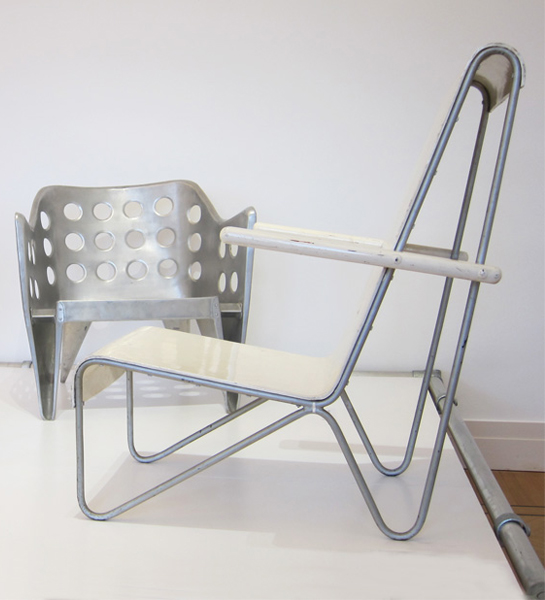
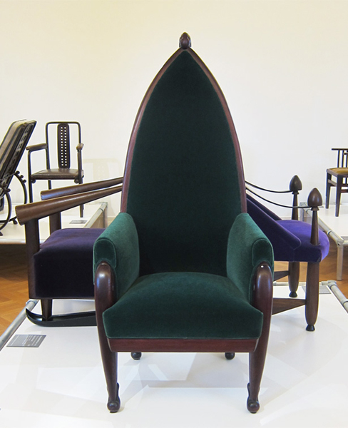
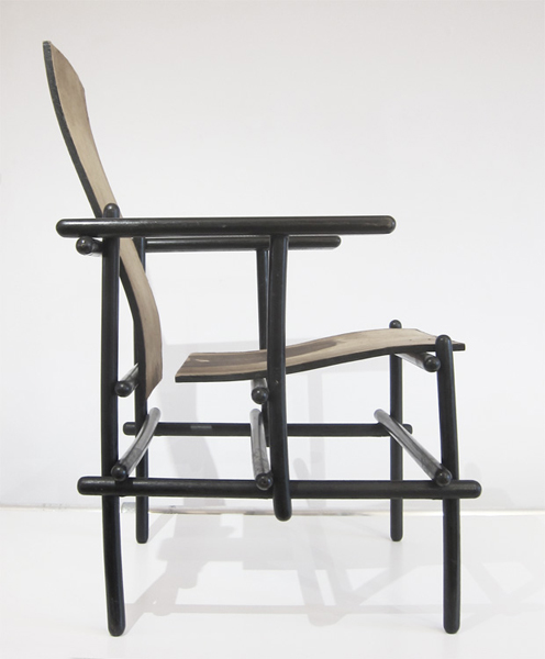
In February 2015 I visited, together with some fellow students from the Rieteveld Arts & Design Academy,  the exhibition Possessed by chairs at the Gocrums Museum. The intention of the exhibition was to celebrate the history of design through picking out around 90 iconic chairs from the 100 past years. 90 chairs exhibited, a rather broad selection concerning to a western perspective– all from Scandinavian classics like Eero Aarnios famous Balls Chair, Hans J Wegners Papa Bear arm chair , chairs by Alvar Alto to international classics such as the MR 20, And off course – a couple of chairs made by the Dutch famous architect and chair designer himself – Gerrit Rietveld.
During my visit at this exhibition, experiencing all those chairs, some questions came to my mind. A collection of 90 chairs and every single one made by a male designer I made me wonder: if all this chairs were made by men, who were they then made for?  When observing the chairs I got a feeling that many of them where carrying an expression of power and that one had to have a bit of courage to actually sit in them. Maybe this is what happens when chairs get exhibited on a museum instead of being in use but still I got a feeling of them not welcoming me.

chair_3 chair_1 chair_2
some unwelcome examples from Possessed By Chairs
 

Chairs often supplied with a high and straight back gave me more a feeling of how to position you than place for resting. How do we position our self by sitting and what is the difference between sitting and standing trough history according to gender, social class, culture background and so on. Who can sit and who don’t? Who sit today and who have been sitting the past 100 years? I think every chair have plenty to tell, not just from the technical aspect in how we been building our furniture’s and which material we been using; I think they as well have great stories to tell about our social history.
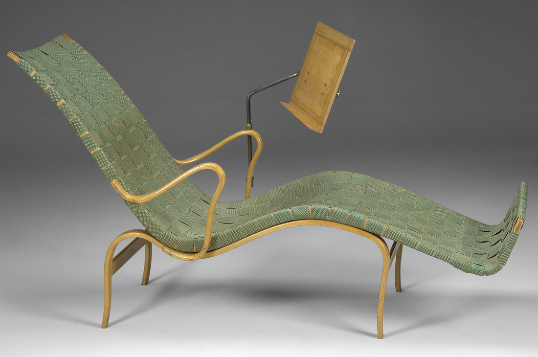
Anyhow, while walking thorough this selection of chairs there was one that caught my eyes and that I felt spoke with another tune. It was a leaned back chair that almost reminded me about a sun-lounger.

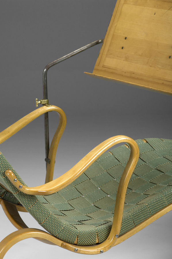
With a green cover in woven textile in a kind of plating technique this chair were for me manifesting everything else then hierarchy, rather a feeling of joy. I immediately got very touched by it. The color of the chair, which was a light green color, close to a light green Verona were expressing something very inviting and then along with the size of the chair, which felt more than enough to take one person gave a atmosphere of generosity.
 

Mathsson_Pernilla Mathsson_Pernilla_detail
 

When the title of the chair later became clear to me it got even more exciting as the chair actually had a woman’s name – “Pernilla”. A chair made for a woman? To put a human name to a chair apparently works well though all of a sudden I felt a personal relation to the chair and I wanted to know more. To know more about her. Who was this Bruno Mathsson and who was Pernilla?


WHERE IT ALL BEGAN

Bruno Mathsson was born in a small city in the south of Sweden called Värnamo. Since Bruno was the fifth generation in a family of master cabinetmakers Bruno was learned early how to do carpeting by his father. To live in Värnamo which is a small and quite isolated city wasn’t something that stopped Bruno from having big visions. He early learned how to get input from his surrounding world and keep up with the contemporary arts and design. After a visit to the Roohska Art and Crafts Museum in Gothenburg in his early years, he got in contact with the manager of the museum and through him he started to borrow the literature of the museum – which they send back and fro with the trains between Värnamo and Gothenburg. The Rooshka Art and Crafts Museum, which is one of the biggest museums in Sweden specialists on art combined with craft, would later make strong connections with Bruno and his design and still today they every year support and exhibit work by one designer with a scholarship through the “Foundation of Bruno Mathsson

In 1930, at the age of 23 years the Bruno got the opportunity for the first time to put all his study and theories into real practice since he was commissioned to design a new chair for the Varnamo Hospital. Bruno took the chance to create something that he found less traditional and decided to make a chair without the old conventional and quite shabby sprung upholstery that the chairs in the hospitals of Sweden at that time used to have.

The quality and comfort combined with a new and fresh design finally brought Bruno to an unusual solution. He covered the frame with a sort of

plaiting webbing technique plaiting-webbing.
The arms and legs were made in sold birch. Bruno liked to keep the light in his design and I think you can se this in his relation to the birch as material. The chair was not of a big success by the staff of the hospital though and they nicknamed the chair The Grasshopper”.

Mathsson_Grasshopper
 

The Grasshopper hasn’t been in use for long before it sadly had to move up the attic of the hospital. Even if the mission with the chair to the hospital didn’t led to an immediate prosperity Bruno continued his work and carefully studied the ”mechanics of sitting”. He wanted to find the perfect sitting line, or curve and this he approached in different ways. One way of finding it he got through sitting in snow and then study the imprint his body just made. Once again the comfort was one of his biggest aims. He further on kept on experimenting with techniques of bent laminating wood to gaining skills and found out compotes of great strength but still with a gracefully and restrain look. Bruno held his visual language minimalistic and did never use more elements than necessary.

In 1936 Bruno launched three new chairs in one series that he called “Working”, “Easy” and “Lounge chair” model 36. These chairs were all designed using one piece of frame covered with plated webbing supported by separate bent laminated legs. Different but same. Bruno was reaching for a concept of a chair that could work for different settings. As well as working is something we do we equally need a chair for resting. I find it funny that Bruno made the chair “Lounge chair” so much reminding about a sun-lounger though I somehow think it says a lot about the Swedish mentality. As the winters are long and heavy in this northern country people appreciate the summers and specially the sun almost in an absurd way and because of this Swedish people often make jokes about how we to the very extend try to catch every minute of sun.
br m 2
The sketch of the three chairs in one serie.

Liggstol = Lounge chair

Arbetsstol = Working Chair

Vilstol =Easy


THE BREAKTHROUGH

The three basic chairs can more or less be seen as a breakthrough in the career for Bruno. The same year Bruno got the opportunity to have an own exhibition in the Roohska Arts and Craft Museum where he now could show his work for a much bigger audience. Brunos chairs did apparently made a bigger accomplishment in the space of a museum than in the Swedish hospitals and soon Mathsson could be seen as one of the leaders in the design of Sweden. One year after the exhibition Bruno was asked to participate in his first international exhibition in Paris, “The Paris 1937 Expo”,

exposition-internationale-paris-1937Bruno_mathsson_bok_bocker_design

where he won the Grand Prix for his bed “Paris” that he showed. His furniture was received with a great appreciation and admiration and he got a lot of interested from all over the world. The same year his furniture also got represented at other exhibitions such as the world exhibition in New York and the Golden Gate-exhibition  San Fransisco.

Swedish Pavilion Golden Gate International Exposition 1939


WORKING IN AND OUTSIDE OF SWEDEN

Even if Bruno never gave up his small hometown Varnamo he made a lot of journeys abroad to stay update. In the 1940s Bruno made a visit to the US with his fiancé Karin that resulted in lots of new inspiration, which led to among others, an architectural work that would become very famous as built houses in glass. Houses you today can visit in Kosta, called the Mathsson Glasshouses.

The light was of great value for Bruno, which you already could notice in his furniture’s and I think you can see a link here to his way of using of the glass as a material. Bruno wanted to get as close to nature as possible and investigating in how close the design could get to nature, and this was something he was developing through his work with the glasshouses. Later during the winter times Bruno used to leave Sweden for some months for going abroad and spend some time in Portugal where he could work in one of his own glasshouses that was established there.

br m 4 glasshaus-interior
 

PERNILLA

In the late 30s and beginning of the 40s Bruno’s international work somehow slowed down a bit, partly as a result of the The Second World War. By reason of this he however slowed down the tempo of the business and instead got more time to be able to develop his own design. In 1944 he launched the classic chair for resting “Pernilla 2” and then one year later the deck chair “Pernilla”. Pernilla was a chair in the already recognizable and typical style of Mathsson in which he used the technique of bending the laminating wood to get the curve he wanted and then used the plaiting technique for the cover. This time he let the whole chair be covered with the light natural green textile. The only part of the chair that wasn’t covered was the armrests. “Pernilla” was also resourced with something similar to a Canterbury, which could be used for reading without the need of using hands.

But why the name Pernilla? In further research I found out that in 1943 Bruno got interviewed by a journalist from the Swedish daily newspaper “Dagens Nyheter”  by a journalist called Pernilla.

Pernilla pernilla_tunberger, or Pernilla Tunberger as her correct name were was a prosperous and important journalist that were beside writing about Bruno’s work an involved food columnist. She wrote critical about the food processing industry and she lifted questions around food and transport; something that was not that common in this days. She often created heads in the newspaper and somehow she must have made big impact also to Bruno as he after their meeting decided to dedicate the chair to her.

To give his chairs and furniture’s name were later to become significant for Bruno. And nearly all of them he gave female names. Eva, Mina and Miranda were besides “Pernilla” three of the most famous furniture he made and they were all named after women he met. Was he a man with mainly woman surrounding him or why did he want to give his furniture’s female names? In this I’m leaved to speculations.

As I said earlier the name of the chair worked as an intriguer to me and gave the chair a certain personality. I like to think of the furniture’s of our homes as nearly creatures and as objects that we care about. Furthermore I think it also contributes to a philosophy of the importance of quality. When our furniture’s get personal to us, we put more effort to take care of them and then we have them for longer. By this the quality will play a stronger role and quality together with functionality was together with the ergonomic quality and beauty the main things in Bruno’s concept of design.

Bruno continued his work for many years and and the fact that he turned older was nothing that constrained his passion. In the 1970?s Bruno for example had a project going on way outside of Europe, where he were being part of a panel discussing design with a several hundred interior architects in Tokyo. In 1981, at seventy-four years of age, he designed a workstation for computer users that was equipped with a “wing” that supported the shoulders. The last piece of furniture Bruno Mathssons did he made at the age of 90, the easychair “Minister” in 1986.

Bruno Mathsson died in 1988 leaving behind a rich cultural heritage.

Proving Prouvé


Friday, March 27, 2015

Starting our research trip through the endless material of chairs and endless amount of possibilities to wright a research about, we traveled to remote cities to attend group chair exhibitions. During this whole complicated ritual of coming up with a specific chair, I was always thinking of the simplest one. One that I could really describe because it would be just basic. And what is about basic that fascinates me is that anyone can imagine themselves on it. It might not be the most comfortable chair but for sure it will be one to spend some study hour on.
During these basic thoughts on basic chairs, my mind would travel to the chairs that I had been sitting on for 12 continuous years in my life, from the moment that I started primary school and finished high school.

13.thrania_metalika_gl

It is probably be the chair I have been sitting on the most. I have spend endless amounts of time getting bored on this chair, getting back pain on this chair and always trying to switch between positions as to find the right place for my feet. This would be in school, when I would bend my knees, place my legs under my butt so that I have a pillow on the basis of the chair with my feet coming out of the empty space, right under the piece of plywood supporting my back. Teachers would not allow non upright positions.
I remember I was then complaining to them on why they were using a comfortable chair with foam pillows for their desks in class, while us, a mass production of  students in a mass production education were sitting on mass production chairs.
This would be just four steel legs and two molded pieces of wood. Thin plywood.
On the group chair exhibition I found myself identifying with Jean Prouvé’s Standard Chair produced during the 1930’s-1950’s since it looked very similar to the school chair I was recalling at the moment.

jean prouve

Going through the background of Jean Prouvé and his architectural achievements I got informed about his fascination with mass production of machine-made furniture and his constant adaptation to the problems of his times through working in a collective union with fellow architects such as Le Corbusier, Eileen Gray and Sonia Delaunay. In 1930, Jean Prouvé  joined the French Union of Modern Artists(UAM), a groundbreaking movement who’s artists proclaimed ‘We must rise up against everything that looks rich, against whatever is well made, and against anything inherited from grandmother…”.  Apparently, through this collective way of working, simple and basic furniture for collective use were produced. Educational furniture was some of them.
This is when I realized that my visual connection of his chair to my school chair was not random.  The name of it gives it away: “Standard Chair”.
Unfortunately I never got to sit on one of the Standard Chairs but I am convinced that it feels more or less the same.

Both chairs I am comparing take the stress on the back legs where they bear the weight of the user’s upper body. Prouvé incorporated this simple insight in his design for the Standard Chair: while steel tubing suffices for the front legs, since they are subject to less stress, the back legs are made of voluminous hollow sections that transfer the primary weight to the floor.

Feels like it is a chair to keep you aware and well-postured. I remember sitting on ugly yellow cubular (rectangular) steel legs when new, clean and polished chairs arrived having tubular(round) steel legs. A small detail I remember since somehow I prefer the first ones. I can also recall the high pitch sound of these steel legs when you would boringly move the chair in the classroom by scrubbing it on the floor. It sounded like it is going to collapse, like all the rust-proof elements would finally get un-proofed. But they didn’t.
They survived through many years, through many students sitting awkwardly on them, vandalizing them, chipping off the layers of the plywood one by one on your front classmates’ chair, writing nonsense with blanco pen in the back of it or making graffiti on it.
There was also this plastic black cap used to block the empty space of the tubular steel at the edge of it. This cap that you could patiently remove during the boredom of the class, revealing the empty space, where you could dispose your chewing gum if the teacher would see you, where you could loose your pen or hide a cheating note.

I am mostly fascinated with Prouvé’s chair because it somehow summarizes all these memories in an official and prototype way. All these years of experiencing the school chair were brought to the foreground at my first encounter with this chair, proving to me that I was sitting on it without even realizing it. That it was Him behind it.
It seems like his industrialized Standard Chair was indeed used in schools at that time and that it did inspire even Chinese companies to copy it and send them to schools all over Europe by stacking them on each other just like a good mass production product would do.

A-001


Log in
subscribe