Skip to Content Skip to Search Go to Top Navigation Go to Side Menu


"Highlight" Category


MODEL SCULPTURE & DRAGONS


Sunday, January 11, 2015

A model is initially an object whose purpose is either to represent the real world or to be translated into the real world, in short the model can be a copy of reality or reality a copy of the model. The main difference is in terms of scale. Usually the model is a miniature of reality. But what more can it be? When we look at a toy car and a car, what do we see? Is the toy car just a replica of the car in a tiny scale? It is hard to analyze such a thing but I think that there is a huge difference triggered by (but not exclusively) the change of scale. When the toy car is made, it has no longer the same purpose as the car does. A child playing with it might as well imagine it just as real as the car and drive it around with his fingers, or see it in a whole new world, making it fly away, fist-fight and dance Rock n’ Roll. The new scale for things sometimes creates a new meaning for them above representation, a new reality even if they are seemingly the same object in different sizes.

model

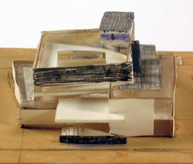
sketch model of van Gogh Museum, Amsterdam by Gerrit Rietveld [object: SM]

In 1963-1964, the furniture designer and architect Gerrit Rietveld (1888-1964) designs the Amsterdam Van Gogh Museum. In 1964 the architect dies before the project is finished. The building is completed by his partners  J. Van Dillen and J. Van Tricht, and the construction was concluded in 1973. The model exposed in the design collection of the Stedelijk was produced by Gerrit Rietveld in those first two years. It is a sketchy model made of wood, paper, cardboard and glass. The final building is close but does not respect this concept, with a unified color of brick and very little white (from front).
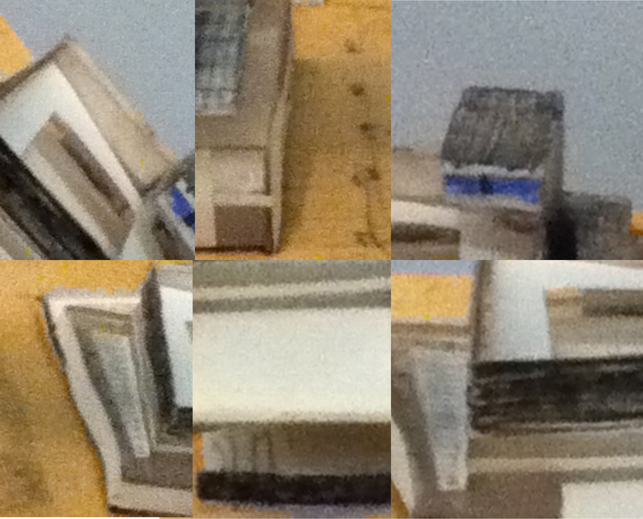
I present this piece for multiple reasons. First, because in my personal taste, I prefer this version from the finished one. Rich in contrast between black and white rectangles overlapping each other, the building has the balanced complexity of the Rietveld style although the shapes which compose it stay simple and limited (only colors: white, black and blue) which gives sobriety to the building. When we look at the final museum’s front view, the unity in brick color makes the building lose its striking composition at first sight, for the overlapping rectangles melt into each other. The second reason why I chose this model is because of the way it was made, without any connection to the building itself. I see in between the other models of the museum [x], well built, detailed and clean; something of a stain. On a dirty piece of wood on which we can see quick pencil sketches for the display, an irregular, clumsy, and worn little building is erected. The colors are simply indicated by a rapid and un-precise use of color pencils ( blue and black). The materials used are cheap, and if we try we might not even find one horizontal or vertical line. And yet it is beautiful, marrying complexity and simplicity in form and color, with a rich diversity of cheap materials. Its cheapness gives it a poetic and rough authentic aspect, we see that it was handmade.

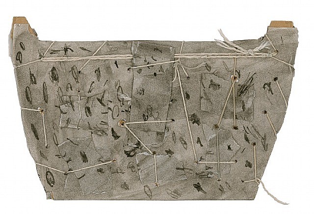
collage-model


James Castle

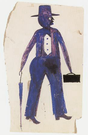
This may remind us of James Castle’s sown cardboard sculptures, which are made of scrap which gives them strength, or Bill Traylor’s choice (and no choice) of using cheap surfaces like cardboard for his paintings.

Bill Traylor blue man with suitcase                                                               James Castle


The model is in addition to this, very close to the final version. That sketchy but precise model shows the talent of Gerrit Rietveld as an architect, like the lines of a great draftsman. Its clumsiness along with the use of paper, lightly put together and slight curved, gives a feeling of fragility and tenderness which contrasts with the strongly built shapes of Rietveld’s buildings or the roughness of the materials.
I love this model because –to me– it is not a model anymore but a sculpture that contrasts with what we usually see, giving a new idea of his work and of what a model can be, even though it was not intended to become a piece of art. A model can be seen in ways that exceed its limits as a technical object.

A perfect embodiment of this idea is seen in the Tim Burton film Beetlejuice. The movie takes place in a small town and specifically in a house on top of a hill overlooking the town. In the opening scene (link here and here for the end with spider) a fake areal shot of the town is taken on a model of the town one of the main characters has built. We are tricked into believing that we are flying over a forest to finally overlook the whole town, then fly over and across it all the way to the house on top of the hill. Although it is possible to see that the scene is really shot on a model, the illusion is strong, and we are astonished to see a real spider (this time) which seems to be the size of a hippo, climb over the roof and be picked up by a real (gigantic) hand. What this illusion does is it gives life to the model, it gives it a new reality, and this is proved later on in the movie when we discover that the model has an “inhabitant”. When the protagonists are changed to the scale of the model, (in this scene) they come to its graveyard to dig up the main antagonist, Beetlejuice. In this case, the change of scale from real world to model is more than representation, the real world and the model are entangled, mingled into each other, whilst the two are different, the real world and the new world of the model. The model can open a whole new world for our imagination to create, a transcendental realm full of fire, wonder, and dragons.
Who is Gherpe? About Superarchitecture and corruption by conventions


Saturday, January 10, 2015

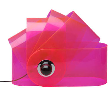
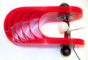
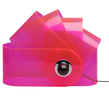
Gherpe – a lamp designed by Superstudio
Gherpe
 (via:http://www.nova68.com/gherpelamp.html)

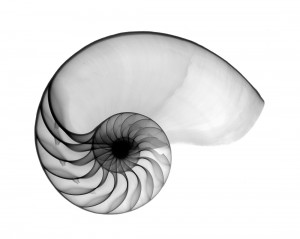
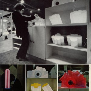
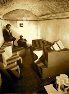
I think the Gherpe lamp is a relevant design because of several reasons. First of all, the lamp itself is made of materials that are still considered modern, even though it was designed more then forty years ago. That alone already shows how we still hang on to, or maybe are condemned to these materials nowadays. Next to that is the design, which references to the mathematics that appear in Nautilus shells. Then again the way this shape is interpreted is more like a cartoon of it, leaving the classical Nautilus image behind. This way of designing, letting interests and research – the designer was into marine biology – influence the work is something I think many designers work like, or would like to work like. Last reason why I think this is a relevant piece is because I think the whole of Superstudio, their designs and mainly their architecture is, because of their new views and extensive researches, relevant. They were part of a critical wave, commenting on Florence and it’s ancient heritage, on the years of full trust in technology and on architects before them. They wanted designers to be responsible for their creations when they design to make a better world. Their criticality on how design and architecture influences the life of other people and self-reflectiveness is what made them different from many before them. This idealism in theories, but with playfulness towards the designing process itself is to my opinion something important to keep relevant in art and design.

gherpe_01


(via:http://photografieundmehr.com/pics/2012-11/gherpe_01.jpg)

Nautilus-OS

Nautilus shell

(via: http://www.hungrywalrus.com/wp-content/uploads/2011/08/Nautilus-POS.jpg)

To test it’s relevance I’ m trying to get to know what Gherpe is, what it is not and what it could be, what it means to Superstudio and what it means to me.

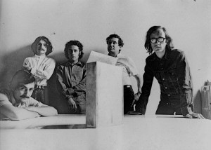
At a time where popular culture is stealing all the science and logic that Modernism employed to make this world better, with youngsters starting to call themselves Mod.’s, Pop Art commenting on this Modernist reality and society by reproducing imagery from that popular culture, Gherpe is born. It’s designed by Cristiano Toraldo di Francia, and adopted by Superstudio, the Italian architecture group where Toraldo is the most important member of, together with Adolfo Natalini, who is a Pop Art painter when they found the group in 1966.


big_374062_2176_giulia_superstudio3

Alessandro Magris, Cristiano Toraldo di Francia, Piero Frassinelli, Roberto Magris, Adolfo Natalini
(via:http://www.domusweb.it/content/dam/domusweb/en/from-the-archive/2012/02/11/superstudio-projects-and-thoughts/big_374062_2176_giulia_superstudio3.jpg)


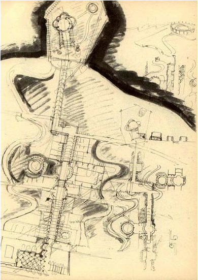
Where Modernism, in its affirmation of the human power to improve their environment the aid of practical experimentation and science, goes for logic, Gherpe pretty much mocks Modernism, by taking it’s science and it’s new materials to make something that is not in any way useful other than it’s aesthetical purpose. Gherpe is not practical, and it’s not helpful. But Gherpe’s cartoon like ambiguity looks fun, you want to have it, it looks smart even though it isn’t, and that’s exactly in line with popular culture of that day. Gherpes connection with nature is meaningless, but very important for it’s attractiveness. You could say it’s a beauty trick. The interest of Superstudio in nature combined with construction is to be traced back to one of their guides in the Academy of Architecture in Florence, which most members of Superstudio were attending. His name was Leonardo Savioli. As Adolfo Natalini says about Savioli: “Even when the drawings looked like traces of insects or explosions, galaxies, spiderwebs or wounds, they were always able to resemble parts of constructions or something constructable”.


Savioli_plateXVIII

Plate XVIII, a drawing by Savioli

(via:www.etsavega.net/dibex/Savioli_citta-e.htm)


The fact that Gherpe’s reference to nature doesn’t have any symbolism or engagement in it, already shows what things it really has to do with, things like freedom. Gherpe is free from the morals that come with modernism: Superstudio didn’t think architecture could change the world for the better. Gherpe is the joyous realization that the burden of creating something that will add to create paradise on earth is not possible.

Gherpe was in the Superarchitettura show. This was a show combining two groups. The Superstudio and Archizoom, both from Florence and mainly from the same architecture school. The show took place right after a flood had swallowed a chunk of Florence’s renaissance beauty, at a time where others mourned renaissance architectures birthplace the Superstudio show was a psychedelic experience work that purposely lacked engagement and put consumerism on a pedestal. Their ideal: morals were irrelevant to architecture, and so you should not aim to change the world with it either. So there is a different approach: “Superarchittettura accepts the logic of production and consumption, it utilizes it in an attempt at demystification” and  “Superarchitecture is the architecture of superproduction, of superconsumption, of superinduction of superconsumption, of the supermarket, of the superman, of the super gasoline”.

gherpe-archivio2

Toraldo and Gherpe, and Passiflora
(via:http://www.centrostudipoltronova.it/wp/wp-content/uploads/2014/07/gherpe-archivio2.jpg)

Seeing Gherpe from the eye of the Superarchitecture that it is, means not that Gherpe was meant for a world better than ours, but for the world as it was in 1967, where consumption and production were exploding. You could say, Gherpe is super itself. A lamp fitting for all these phenomena that felt relevant for the younger generation at this time. Instead of denying these phenomena, or wanting to change them, Superstudio designed something that fit in. It might even accelerate superconsumption, be meant for that purpose. In this perspective Gherpe is in a way a neo-futuristic piece, a monument for the speed and mass of its time. You could also see Gherpe as an, perhaps slightly melancholic, attempt at creating something, something touchable and real out of all the superlatives that together form the ungraspable frightening dystopia that was (and is) everyday life. And maybe that this is the reason we enjoy it, because Gherpe is then our comfort, a sign that from superproduction and superconsumption something appreciable can materialize.

superarchitettura-3

Image of Superarchittettura show
(via:http://www.stylepark.com/en/news/a-landscape-of-mountains-and-valleys-the-design-parade-03-in-hyeres/283330)

Gherpe shows Superstudio’s double nature: it’s serious, socially critical but can also be ironic.  When Superstudio presents an utopian, or dystopian design we can never accept it at face value. When they design a utopia, they explore every possibility into the extreme, and so exploration of the architecture itself is it’s aim. Instead of presenting the possible solutions it tells the stories of the decisions of mankind, the ones it made and might make. A very serious and melancholic subject, reflecting their serious opinions (Adolfo Natalini: “the race of consumerism is definitely wrong”) but enabling playful and smart experimentations.
As Gherpe is an early Superstudio piece, Gherpe is also an early exploration which, as we can see in the Stedelijk, ended in a lamp. As Superstudio kept exploring their ideas became more and more critical of architecture and design, which made their projects end up way less often in actual designs and realizable architecture. Instead they expressed their ideas in movies, models and collages.
According to Superstudio architecture was corrupted to such an extent that even the avant-garde architect was guilty of suppressing human development, since he made use of existing conventions in architecture. An interesting idea, which suggests human development can come from no other place than out of the blue. Where one can ask the question what human development actually is, but let’s get back to Superstudio. They saw reason as the only quality that’s uncorrupted by these conventions. This makes it’s easy to see why they step farther away from architecture and design, as they are easily seen as complete and valid evidence of manifestos or ideas, rather than generally questioning and alienating. That doesn’t mean Superstudio didn’t make anything at all anymore, as you might expect.
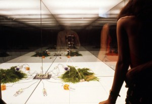
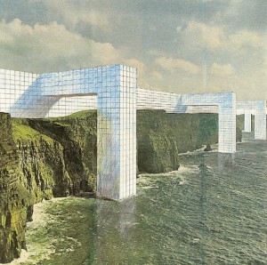
Instead they found ways to visualize what architecture could be, without designing from conventions. Something that wasn’t really architecture. For the exhibition “ Italy: The New Domestic Landscape”  in the MOMA Superstudio made an 8 x 8 black square on the floor, and made it repeat itself in an endless grid by placing mirrors at the walls. They put a box with wires on each corner, making the plugs recur regularly in this “landscape” [x]. It wasn’t the first time they worked with this black grid [x], but it was the first time architecture and design was so completely dismissed that it was actually left out at all. Even though this seems like the ultimate conclusion, there’s more to the ever expanding black grid. In the Continuous Monument, a glass grid-like structure that spans all over the world, visualized in absurd collages [x] where it embraces Manhattan or faces the Taj Mahal, the irony, social critic and dystopia remains: a homogenous unrealizable blank space, but also a space where we can project our own ideas on of what it really is. Our ideas, full of conventions and corruption.

521d003de8e44effd40000a8_environments-and-counter-environments-italy-the-new-domestic-landscape-moma-1972-exhibition_5-528x362

Grid in the Moma: View of Supersurface: An Alternate Model of Life on Earth, by Superstudio, in Italy: The New Domestic Landscape, MoMA, 1972. Photo: Copyright Cristiano Toraldo di Francia.

(via: http://www.archdaily.com/421040/environments-and-counter-environments-italy-the-new-domestic-landscape-moma-1972-exhibition/)

As you understand now, Gherpe too is a piece of corruption. A mash up of conventions and brainwashing, which will, as you look at it, only corrupt and brainwash you more. Which is very true in the sense that, the more you know, the more you are stuck in the things that already are. Whether that really suppresses the development of humanity is questionable. I personally am less negative about the influences of the past and the conventions we get taught. But the fact that Superstudio deals so productively with their frustrations over a system is something everyone, defenitely every art student, can be inspired by.

Over thinking and commenting on how design works is something I find fundamentally important, as I think this self reflection is what can bring us to new insights. Insights that can be reflected on again later, a continuous process I’d say would be human development rather than corruption. But, if you are reading this, and you do happen to find yourself having been corrupted by looking at Gherpe and reading about it, then at least we can be sure about it’s relevance for the (design) world today.


2701091233096716superstudio_monument_1_kl

The Continuous Monument, one of the many collages.

(via: http://www.spaceinvading.com/bookmarklet/Images/2701091233096716superstudio_monument_1_kl.jpg)

Stedelijk Design Show 2015 /Relevant Highlights


Monday, December 1, 2014


16 Rietveld Basic Year students visited the Amsterdam Stedelijk Museum to examine the items in the permanent survey of the design collection.

Does the Stedelijk exhibit all these design items simply because they are in their depot.

Do the collection criteria still have any significance today.

Do these design items have any relevance for us, our life or work,now? Is it possible to make a clear statement about that.

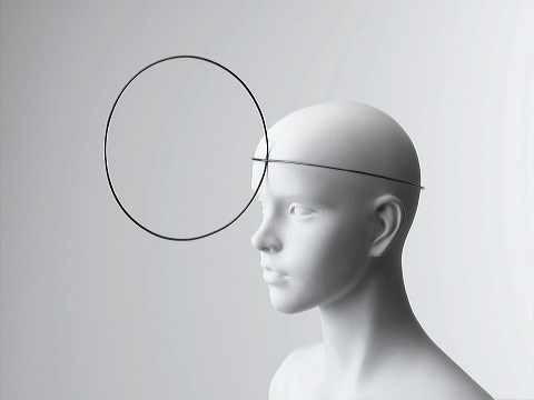
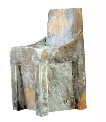
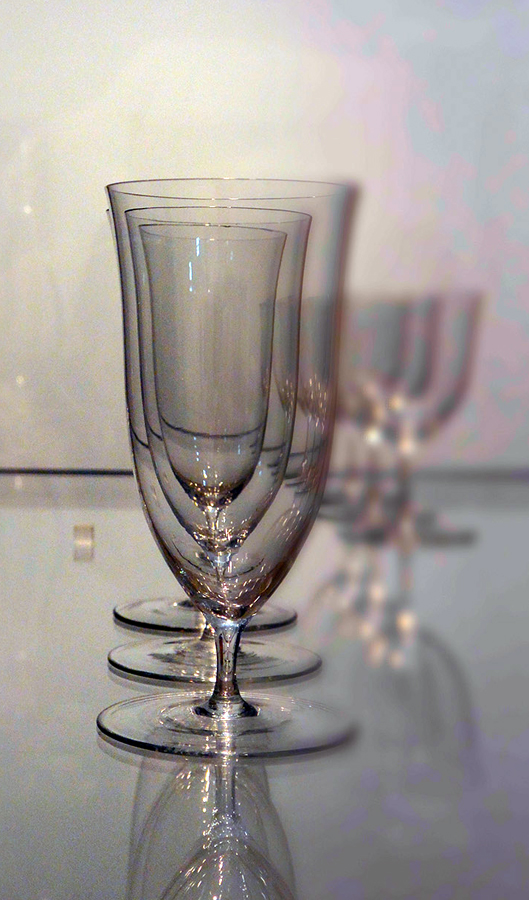
If you click on the image a caption will appear –just as a in a real museum– presenting information and a personal reflection on why that item is considered relevant. You can review the whole exhibition in pop-up mode.


click on images to visit the exhibit

Gijs_Bakker_Waterman_2_Cropped

modelWieke_stool_SM

PatrickJouinWelcome-To-The-StoreBeowatch_SM2

tafel-stoelunfolded

DSC_0321 Schuitema_300

superstudio_gherpe_flippedVaclavCigler_headband

cow-chair_flipped Paulina_glass


minding material


Monday, December 1, 2014

The exhibition The Future of Fashion Is Now [museum Boymans van Beuningen until January 2015] showed us an inspiring assortment of progressive designers with their newest techniques.

One of the many designers who participated in this exhibition was Iris van Herpen, who graduated at the Hogeschool voor de Kunsten Artez in Arnhem, the Netherlands. During her study she did an internship at Alexander McQueen in London and Claudy Jongstra in Amsterdam. Later, she began designing shoes for United Nude. An intriguing aspect is that she sees herself as a combination of a fashion designer and designer.
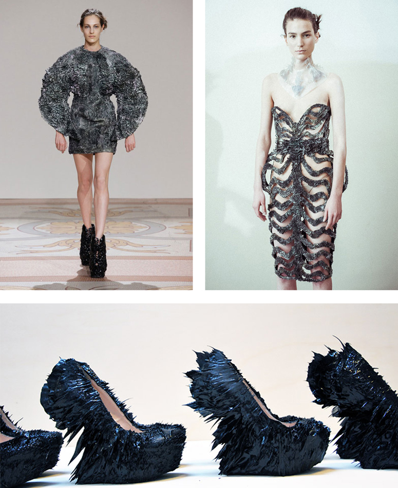
Iris van Herpen describes her own work as fashion where norms have no value and are being discarded. For her, fashion is a combination of craftsmanship and innovative techniques. It’s those techniques that really fascinate me in her work. Personally, I got really intrigued by the unique combination of materials and the technique with magnets she used to create the metal dress with, in collaboration with Jolan Van der Wiel.
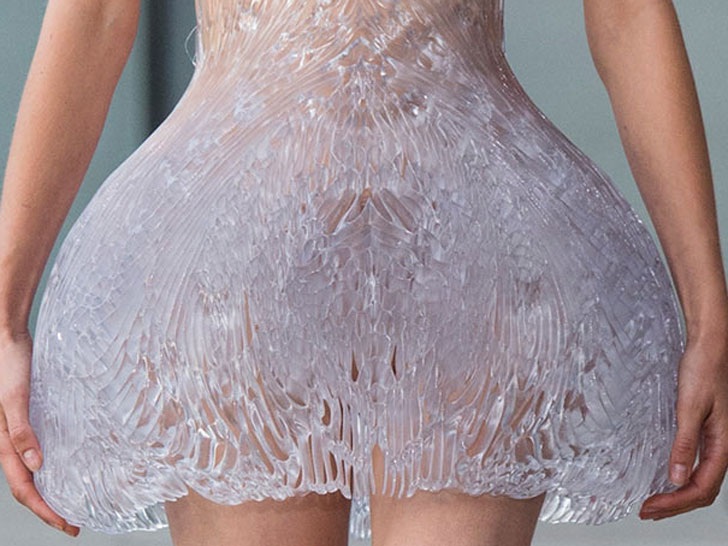
On the other hand, the idea of using unusual materials such as wood and synthetics for 3D printing and laser cutting which eventually can be transformed into –wearable or non wearable– fashion, was a true eye opener for me.


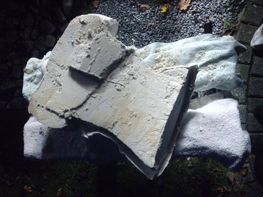
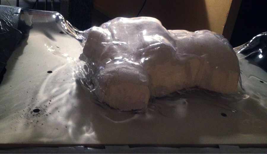
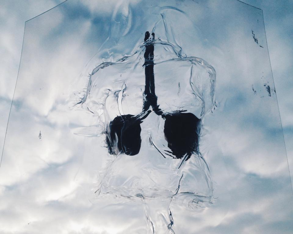
Inspired by this project, I have pictured my own body in a plastic vacuum. Since this wasn’t possible with the vacuum machine that is available in school because of its size, I did thorough research on the internet in order to be able to build my own vacuum machine with the help of my father. Firstly, I made a mold out of plaster so that I could ‘pull’ vacuum from a see-through body. The heat got spread by a heater. In this way, only a small surface could be heated and I had no control of how the pvc plate would react to this. The consequence was that the pvc was about to burst or left air bubbles behind.

vacuum_1_900 vacuum_2_900

10912953_10203785246617845_1268682439_n

In the beginning I was quite disappointed because it didn’t go the way I expected it to. On the other hand, these little imperfections in the body actually do give some added value to the work. Having control over  your material can be handy, but as soon as you lose this, interesting and unique things can happen. This reminded me of the magnets that have a will of their own in the project of Iris van Herpen en Jolan van der Wiel.


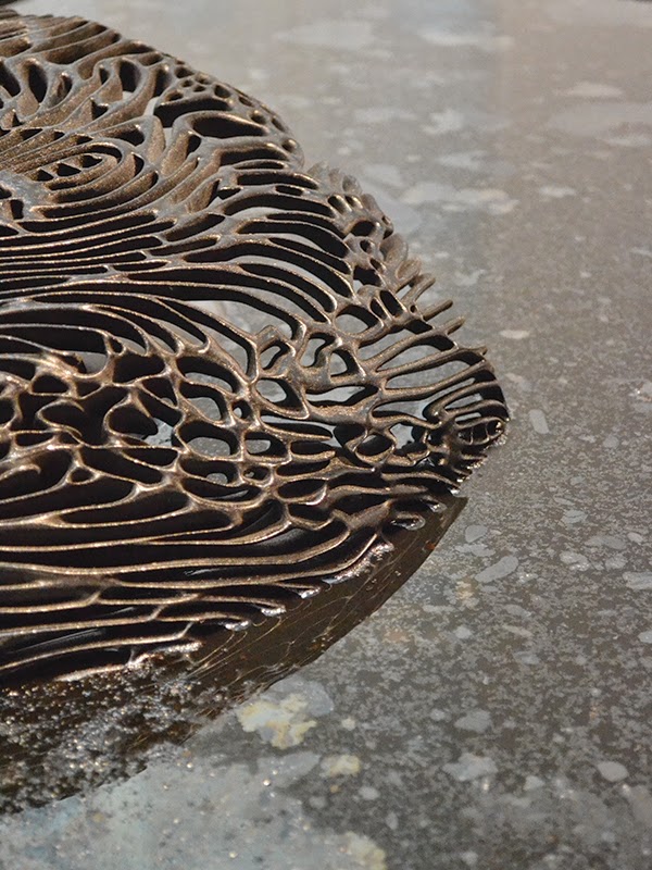
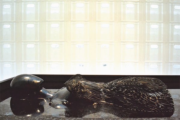
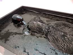
Her growing metal dress from immediately had an impact on me when I saw it from a small distance. The dress presented in the museum was one of her latest experiments. The 3D printed dress lay in a bath and grows with the help of fluoride liquid and magnets. To develop this dress she asked Jolan van der Wiel, a product designer, for help. Because of her urge to constantly apply new techniques, she frequently works together with other artists who specialize in the handling of these certain techniques. Jolan tries to forget the mundane things in his studio and to trust and make use of his imagination. Just like Iris van Herpen, he is fascinated by the working of different instruments that offer him a platform to his fantasy.

Iris van Herpen_ferroJurk Iris van herpen_FerroJurk 2

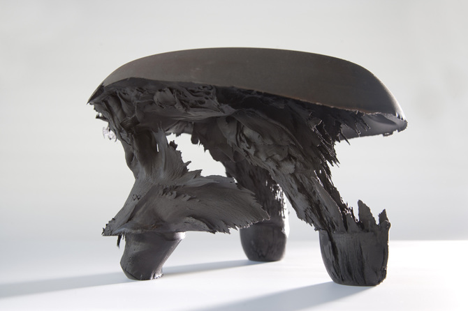
One of the instruments he uses are magnets. He creates a mixture of synthetic and metal that transforms by the help of magnets in order to create his own, unique chairs. The magnet grabbed Iris van Herpen’s attention, what resulted in a collaboration. Together, they developed a way to transform metal by using magnets so shoes and garments could be made from this. They used the same technique as Johan van der Wiel (graduated from Rietveld Academy’s

Designlab in 2011) did to design his chairs [x]. JvW_black-gravity-stool They made a basis mold, the form of the dress or shoe, and ornamented this with the synthetic magnet mixture. Subsequently, when the mold is solid, the magnets continue to do their job. They determine how the form eventually will look like. The attracted force designs the shape and after that the plastic hardens whereby the form stays permanent. In this way, thousands of divergent forms can originate and every product has a truly unique aspect.

magnetenjurk_950

They practiced this technique in real life situation in the Boijmans museum. Underneath the 3D printed dress, different magnets are hidden. Above the dress, the fluoride liquid drops down, falling on the dress. Through the magnets, the liquid sticks which makes the dress grow layer by layer. Therefore the name ‘growing dress’.

SONY DSC images-5

Furthermore, without the fluoride liquid, the dress is made out of synthetic that is 3D printed. This is a technique that we continually see coming back in her designs. A 3D printer is a device that creates arbitrary three-dimensional objects based on digital drawings. The material that is used builds up layer per layer, such as the Ferro fluid process. With this technique, Iris van Herpen is able to accomplish sculptures that are impossible to make by hand.


Next to the 3D printer she also makes use of a lasercut machine. This machine makes it possible to cut or engrave different patterns out of different materials. These patterns are being outlined on a computer program like Illustrator and Autocat. I recently used this technique as well. The only thing is that you need to have good knowledge of material. Is the material elastic, is it going to melt because of the heat?

iris-van-herpen-ice-dress-2

The laser cut literally cuts the pattern or the figures with a cropped laser. On the basis of the material you coordinate the data for the machine. How deep does the radius have to go? How fast? Is it supposed to go slower somewhere, for example in turns? I personally experienced this when doing material research for the making of my bodysuits. Some materials work a lot better than expected, others are being destroyed completely by the heat. Now I know that table foil is a perfect material to cut and ribbed cardboard is completely useless, while I expected the opposite.


bodysuits2_1100


Iris van Herpen and Rem D. Koolhaas, the face behind United Nude, both agree that the border between fashion and design is tremendously vague. Together, they try to make the impossible possible as not everything has to be easy. One of the first shoes they developed together is the ‘Iris van Herpen x United Nude 2.0’, a limited edition made out of patent leather. The big secret of the weirdly formed shoe is the balance between the heel that is curved to the front and the gravity. This shoe was a big challenge for the both of them, but also for the wearer. United Nude was founded with the idea of breaking the conventional rules of designing shoes. The rules don’t have to be broken, they just tried to simply ignore the rules. The higher the heel, the bigger the challenge.
Speaking of challenges, Iris doesn’t only pushes boundaries in the shoe world but also in the fashion world. Here, we also see that she applies techniques that are being used in the design world. She wants to experiment with material and shapes.
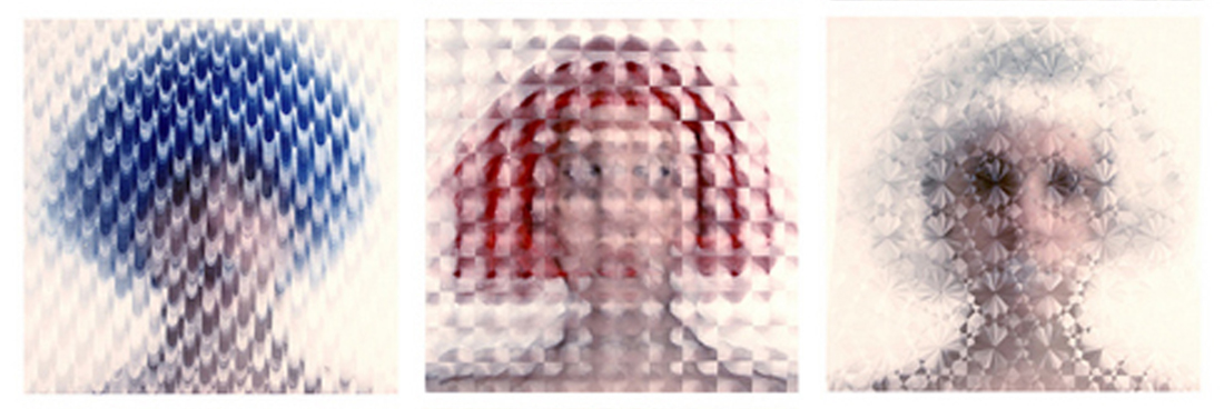
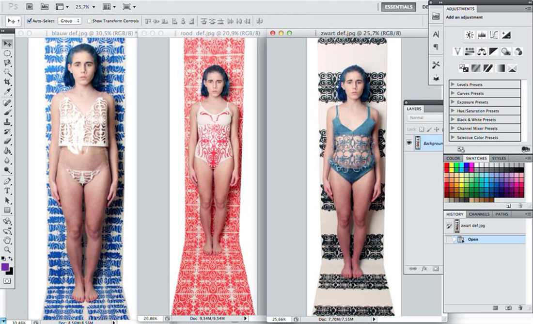
This is something I also try to do myself, processing unusual materials while keeping the pure visible. In photography, I try to apply as few Photoshop techniques as possible. In my opinion, Photoshop is only there to corrugate, like for example the contrast, a disrupting line or adapting a color. Thus, I made a triptych in which material is central. In front of the camera, someone held table foil, which actually did all the work for the photo. I could have Photoshopped a nice little effect, but for me it’s all about experimenting with different materials.

table-foil_1100

Iris van Herpen doesn’t like following the rules blindly and decently too, that’s why she doesn’t think wearability is important for fashion. Because of this reason, she is able to use materials like synthetic, metal and wood, that can be transformed and cut through the help of her favorite techniques, namely 3D printing and laser cutting.

/


Just like Iris, I like working with unusual materials, and that’s why her work has a definite impact on me. She inspired me to dare to use different materials and techniques and made me step out of my comfort zone. So the main difference between all the other shown designer pieces is that the Ferrofluiddress is not at all a static object but it is a growing piece of art. Iris isn’t only a traditional designer who only works in fashion, but an artist who converts her experimentation into wearable sculptures.


“I find beauty in the continual shaping of chaos, which clearly embodies the primordial power of nature’s performance”
–Iris van Herpen–


Red Carpet Culture


Tuesday, November 25, 2014

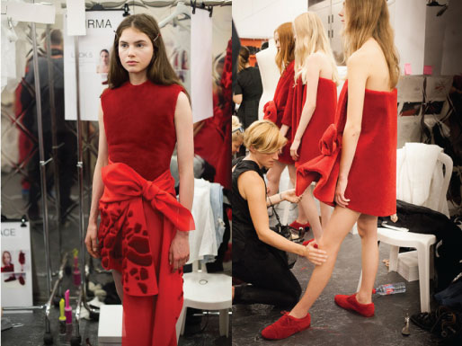
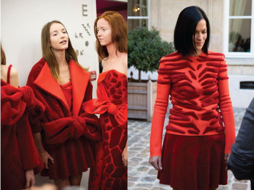
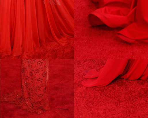
According to Oxford Dictionary, red carpet is ‘A long, narrow red carpet laid on the ground for a distinguished visitor to walk along when arriving.’ This dictionary also proposes one idiom related to the red carpet – red carpet treatment. This idiom is used ‘in reference to privileged treatment of a distinguished visitor.’ Viktor&Rolf’s Autumn/Winter 2014 collection meet that definition au pied de la lettre. This Amsterdam based duo literally made the dresses from the red carpet.


web_1


Viktor&Rolf took part in The Future of Fashion is Now exhibition at Museum Boijmans Van Beuningen in Rotterdam with two of their collections; Autumn/Winter 2013 aka Zen Garden collection [x] and Autumn/Winter 2014 aka collection executed entirely in red carpet. Although the Zen Garden one was broadly exhibited, the second collection made a bigger impression on me. Two white figurines with two dresses and two pair of shoes, all made from red carpet – that was it, quite decent display but perfectly contrasting to all glamorous world of red carpet. There was something magical about the material. Or maybe is it just something in human nature that we are subconsciously attracted by red carpet?


web_2


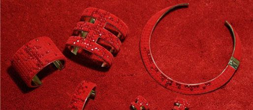
The designers found in a carpet manufacturer Desso a great partner for this collection. This Dutch company produced carpet without the usual rubber backing and also carpet with animal skin motifs, according to their words ‘shaved and laboriously hand-appliquéd carpet, which takes up to 300 hours per look to complete.’ The clothes were wrapped around body and a little bit resembled bath towels from afar. Dresses were accompanied by jewels and shoes made in the same style.


rc_9


Collection was initially presented in Paris, obviously on the red carpet, followed by a rhythmic clapping song [Video]. This presentation is worth watching. Viktor&Rolf themselves describe this collection as ‘a meditation on a current obsession.’ Are we actually a society obsessed by a red carpet? Are we a red carpet culture?

I have never realised that such thing as a red carpet can have a rich history. It was first mentioned in the play called Agamemnon, written by Aeschylus in 458 BC. In this play, the main character returns home from Troy and is greeted by his wife who offers him a red path to walk upon. However, Agamemnon, knowing that only gods walk on such luxury refuses and says: ‘I am a mortal, a man; I cannot trample upon these tinted splendors without fear thrown in my path.’

People are no more afraid of walking on the red carpet. First of all, there were popes and heads of states. Red carpet marked the route they were taking on ceremonials and special occasions. Red carpet is now mainly associated and broadly used by celebrities and all VIPs glamour world. For those who are interested, exhausting and detailed history of red carpet is here. Bearing in mind Agamemnon’s story and the fact that red carpet is only for gods, I realised that maybe the basis is still the same but we changed our faith.

We can also consider the red carpet as the first marketing tool in the history of fashion. In the early decades of the 20th century there were the celebrities (actors and actresses, singers, dancers as well as members of noble families) who carried fashion impulses. Nowadays designers like to dress celebrities for red carpet events because their photos literally see the whole world. In this context we can understand Viktor&Rolf’s collection as a revolt against this trend.

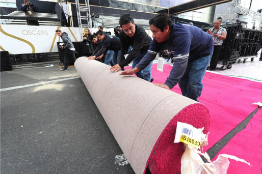
Nowadays, the actual event may seem overshadowed by the red carpet. Just look at this video of Oscar preparation – workers rolling out the red carpet and a huge amount of photographers and media in place to depict that very moment.


rc_3


It might be as well really stressful moment for celebrities in terms of perfectionism. All the world is watching every detail, manicure, hair, make-up, dresses, jewellery, manner of walking, everything. In the event of Emmy’s 2014, E magazine also prepared so called ‘clutch cam’ and ‘mani cam’ so the viewer could see every detail even closer. Walking the red carpet can actually be a nightmare. Celebrities might not eat for days or even weeks before the event. You can look at how many results you find when searching on google for ‘how to be red carpet ready’: tips on diets, workouts, pills and many many more.

We developed some kind of camouflage pattern for being invisible in the nature. Can we also be invisible on the red carpet? Viktor&Rolf dresses can represent one way of reaching invisibility but I searched for more examples where celebrities tried to disappear.


rc_10


I think that Viktor&Rolf caught really well this current obsession. Suzy Menkes, Vogue fashion journalist, expressed it in a good way: ‘two brilliant minds catching a sociological thread.’ [x] I can only agree with her words. Red carpet represents a new value of our lives. If we think about the idiom ‘red carpet treatment’ I have one suggestion for future. Maybe we will have real red carpet treatments. Covering our body with red carpet for certain amount of time will cure illness and give back lost self-confidence.


Your life on a thread


Tuesday, November 25, 2014

In the Boijmans Van Beuningen currently is an Exhibition called: The Future of Fashion is Now. One of the participates is Lara Torres.
Her work ‘an impossible wardrobe for the invisible’ takes part in the ‘New Values and New Stories’ part of the Exhibition.


About the part ‘New Values and New Stories’ the autor, Jose Teunissen, writes in the book of the exhibition: “Today’s designers are trying to recline and recalibrate the fashion system in a number of ways. The designers of the new generation are quick to criticise the fashion system, the compulsion to engage in overconsumption, and concepts such as brand identity a local identity, but they are also importing fashion with a new set of values. One important example is the Slow Fashion movement, whose goal is to render the fashion production system more transparent by using as many local materials as possible and by setting up a circular economy with direct lines running from producer to consumer. It is essential that the fashion product itself acquires a new, sustainable value so that its life extends beyond that of a single season.”

I underlined some words to make the connection to Torres reframing those words.
Overconsumption’ Her collection can only be worn once. What does that have to do with overconsumption? The waste can also be dissolved. And because of the dissolving there is a need for more clothes because you cannot wear the clothes again. Is ita good thing, to only wear clothes once?
Slow Fashion’. Her clothes dissolve slowly, but are gone forever. If it is connected to the ‘Slow Food’ movement, does it take long to make the clothes, are they worth the wait? Torres made such a fast disappearing collection, that the focus on a longer staying collection (not only one season) raises. And what about ‘Slow Design‘ movement in general. Is her work also an ongoing project? Comparing it to her previous work, maybe it is, maybe only for herself and not for her projects.
Transparent’. Her work is literally transparent when it is dissolved.
Direct lines’ She is using normal seams, so you could say that that’s literally, again, the direct lines of the producer to the consumer. You can see the way of using the seams by the producer.
Torres became interested in the relationship between clothing and memory. She wanted to approach fashion from a theoretical, artistic and investigative point of view.
She did research to make more transience, temporary clothing.

Screen Shot 2014-12-10 at 20.39.35

For example her Effacing Series, a project she did before she started with an invisible wardrobe. With this new project Torres made a wardrobe collection, from a material that dissolves in water. So the clothes could only be worn one time. There is nothing ‘touchable’ left from what was made, only the photos and the videos.

The dissolving part was the part that took my attention. For me it was intriguing to see how people became half naked when they came in contact with water. Fragile. The naked truth.

And when I read more and more about what her meanings were behind the material, it became more interesting. First I wanted to do similar research on dissolving material and maybe even find dissolving ways to connect them (for example a dissolving threat). But when I figured it took Torres years of material research, I thought maybe not. Nowhere she did write or say what she used as a fabric. It dissolves, that’s why it is nowhere to be found, except in Torres’ mind.

When I was reading about the material I also bumped into her concept, unavoidable. In the beginning I was maybe  a little too focused, or intrigued, into the material and I didn’t have a good look on her concept. But after a while it got stuck in my head.

As an explanation to her works, she is talking about the loss of the object and the documentation of this loss. The action of effacing the clothes leaves a trace (the seams) translating a strong relation with memory and forgetfulness.
But how can you memorize an object, or even the loss from it. Do you get attached to it? In this case you do, the clothes are getting very close to your skin and in the end it is not ‘hiding’ your body anymore. Is that what clothing does for me? Does it hide my body, or are they showing my body? I don’t know.
There is a very subtle line between hiding or showing although they are an opposite. In one way you hide what you want to show in private. Do you?
When we put on our clothes in the morning (or any time) we feel our clothes, but after a while, we are not aware anymore that we are wearing clothes. Habituation they call it in behavioral science. How can you remember clothes if you are forgetting that you are wearing them? You do remember the itchy Christmas hand-made sweater from your grandma. Do you remember the itchiness or the sweater, or that you thought it was itchy. In other words: Does your body remember it, the same way that your body remembers how to walk, or does your mind remembers it?

Lara3mood1.2

‘When the fabrics have dissolved, all that remains are the seams and the memories of the clothing.’  Did She write  in the Exhibition book about her work.
Can the seams be seen as a red thread of life? The continuing of life and the route it takes. Because when the water ‘attacks’ the clothes the seams are creating their ‘natural’ way to stay on the body. Is this how the water attacks us, human beings, because we don’t take enough care of the world. Does it have to do anything with the global warming? Our fight against water, which is also one of the main reasons we are alive?
Or can the remaining of the seams be seen as the memory of the edges of pain, or the edges of luck. Are the containing threads only there to give a suggestion of what was before, what happened? We remember only the outline of our memory. A friendship for example, we only remember the fights, the getting back together, but most of the things you did together you forget. Because they were ‘normal’ like having tea a hundred times, you will only remember at most five of the tea parties.
The seams are on the other hand also sticking how they were suppose to be, in other words, the seams are still holding the knots Torres used in designing her wardrobe. They are staying like they are supposed to stay. And then I am coming back to the literal interpretation of the ‘direct lines’ and the ‘transparency’. Because of the visual seams we can see the handwork of Torres. And with that she makes a very clear line between consumer and herself as a producer.

The invisible fashion


Tuesday, November 25, 2014

I am not really into fashion so I didn’t know what to expect during the exhibition and even by looking at the website of The Future of Fashion is Now I had no clue whether I am gonna appreciate this kind of art or not. My fondness for Adele Varcoe started when I visited the exhibition. It was divided into 3 parts and it was the last one which seemed to me totally unclear and thereby intriguing. Ironically it was precisely this part –New Values and New Stories– in which I found this  amazing artist who is taking fashion into a higher level, looking at it not only as an outfit but more as a factor indicating our behavior.

Adele Varcoe is an Australian artist. She is not strictly a fashion designer but her works are directly lined with fashion. She is creating experiences which are suppose to show the social effects on clothing. Adele is mostly constructing group performances in which she brings people together in order to explore the elusive nature of fashion. She wants to outline the sense of self which is heightened through the clothes.

Imagine Chanel

While making her performances she likes to mix the participants, working with artists, models but whats mostly important with the public. She is interested in revealing how fashion influences the interactions and relations between people. Adele often uses the quote “perception of dress” which in her opinion is the subconscious behavior of the society depending on what we wear and in what situation we are.

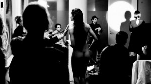
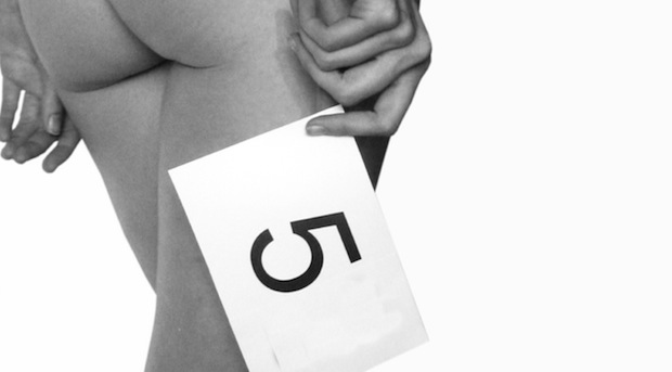
The performance which I saw in the Boijmans exhibit and which invited me to learn more about Adele Varcoe was the salon fashion show Imagine Chanel. It was in 2012 when she came up with the idea of presenting fashion experience through language. She used the descriptions of garments from 1920s till 1960s Chanel archive at the Victoria and Albert Museum and the Powerhouse Museum as material to reveal the role which our imagination plays in looking at fashion. The main goal of this performance was to highlight that fashion is not something that exists as dress only. The fashion show is led by a woman reading the descriptions of Chanel outfits while nude women circle between the audience acting as they were wearing all the precious, described cloths. This situation gives the audience a broad field where by using their imagination they can design their own clothes worn by the models.

03-Adele-Varcoe

Adele’s concept is based on the professional opinion of a sociologist Yaniya Kawamura [x] who claims that : “Fashion does provide extra added values to clothing, but the additional elements exist only in peoples imagination and beliefs. Fashion is not visual clothing but is the invisible elements included in clothing”.

Here comes the link between her work and the name of the third section of the exhibition: New Values and New Stories. I am really fascinated by her way of thinking. It looks like if she is taking a broad working space which is fashion and approaching it from a totally unconventional side. I think the point of conceptual art is to influence the audience and show them something which is not obvious. Working with subconscious behavior and reactions upon “invisible fashion”, Varcoe is putting new values to clothing which is actually our second skin changing our behavior and social interactions.

Each of her works is often closely connected to the broad area of fashion sociology. It is claimed that in fact, fashion is not about clothing but more about the basic process that propels modern life, and it is the outfit which structures the psycho-social development of a modern person.

A similar  concept was to be seen in Varcoe’s other exhibit in the Boijmans Museum called ” Feeling of undress”. This movie was even less about fashion itself but more about the social behaviour and human interactions.

Some other sociologist like Georg Simmel states; ..” that fashion refers to a general phenomenon, in which it becomes a type of social horizon point where the individual interest and taste comes across the collective”. He once wrote “Fashion represents nothing more than one of the many forms of life by the aid of which we seek to combine . . . the tendency toward social equality with the desire for individual differentiation and change”.

I think after experiencing her art or being part of it, we start to realize some behaviors and actions which are natural for us but we can never see them consciously. Varcole gives us an opportunity to set aside our subconscious actions and observe how the natural behavior is chaining depending on what situation we are in.

I think the most interesting part of being an artist is to use your creativity and open minded thinking to show the audience something new, in this case something totally normal but not realized in everyday live. I think its also interesting how she links the scientific knowledge in the area of sociology to play with the human mind and gives people the opportunity to experience and then realize the way of human behaviors by taking part in her art performances.

See through the whole


Wednesday, November 5, 2014

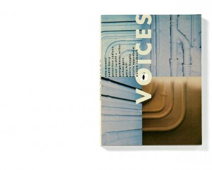
‘Voices’

Designed by former UNA-Designers (Hans Bockting + Mark Diaper)

As a start of my ‘guiding’ through my research I will write down a few sentences about the designers/design agency of the book. Just a few sentences because the designers doesn’t seem to have the need of sharing a lot of personal background information on the internet, I don’t feel the need of sharing their personal information as well.

Mark Diaper who was part of the UNA design agency at the time of creating the book, founded his own design agency “Eggers + Diaper” (1999, Berlin) together with Birgit Eggers.

The former UNA design agency existed from 1987 untill 2007, founded by Hans Bockting, Will de L’Ecluse and Henk Hoebé, who all went seperate ways by 2008.

quote; “Kenmerkend voor het werk van UNA is de grote aandacht voor het evenwicht tussen vorm en inhoud, oog voor het detail, respect voor traditie en een zekere vorm van speelsheid.(playfullness, !imporant! to translate!, as I found this interesting for my research, looking at the work of Hans Bockting) Eveneens tekenend voor het bureau is de lange relatie met zijn opdrachtgevers. Voor de stad Amsterdam is UNA een belangrijk bureau geweest omdat de meeste opdrachtgevers hier gesitueerd waren.”

“UNA-Designers” is now going on as “Bockting Ontwerpers” (from 2009) runed by Hans Bockting and his wife Sabine Bockting. Hans Bockting is also co-founder of “Traffic Design” and “Concepts”.


.

WDW_CT_vo98_02

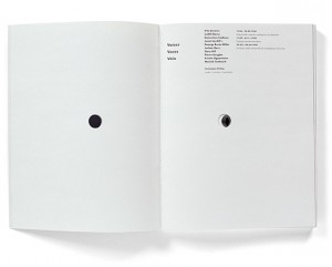
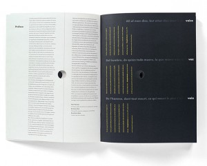
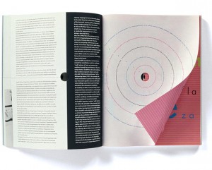
The book I chose for this project is titled “Voices”. It is a book named after an exhibition that once took place, which had the same name as the title.

“Voices is an exhibition that brings together works by nine contemporary artists of different origins and generations, discovering the domain of the visual and the material of sound contributed by the human voice”

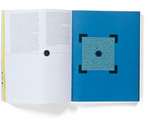
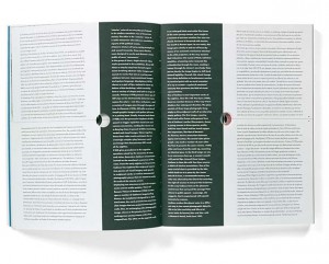
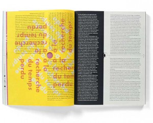
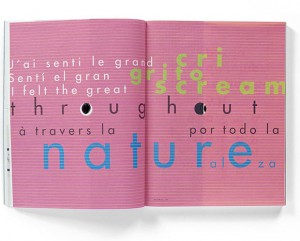
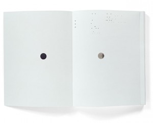
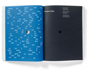
The choice I made for this book was quite selective. As I scanned through the given booklist, what caught my attention most were titles with the word ‘voice’ in it. Probably because of last years Studium Generale that took place with the subject of ‘voice’, but turns out a subject that I have an interest for. I noticed this strong attraction for this word and decided to find a book related to this subject. Immediately my eye fell on this book with on its front cover the word ‘voices’ with big letters centered between 4 images that are filling up/being part of the front cover. The backside is divided in 2 images. On the front cover there is a hole in the letter “O” of the word ‘voices’. You can not see through the hole because the following page is covering the hole with its white. But when you flip the second page you will see (through) the continuing hole till page 33.

WDW_CT_vo98_12

And there is more which caught my attention inside the design, the ‘dividing’. A thin black line through the center of the pages (horizontally/vertically) is attracting my eye. It’s seems like a strange element in the whole of the design. I want to know about this line. Why do I experience this line as unfitting, and why is it at some pages not reaching the opposite side it should do/ and does in other pages. 3 Languages who are divided by those attention-seekers of lines in many different ways, so many notations within the book, within the design, resulting to a bit of my frustration of not be able to ‘read’ this musical score.

WDW_CT_vo98_04WDW_CT_vo98_05
WDW_CT_vo98_07WDW_CT_vo98_11
WDW_CT_vo98_09WDW_CT_vo98_10
WDW_CT_vo98_03WDW_CT_vo98_06

While looking at other work of Hans Bockting, and getting introduced to a calendar from Hans Bockting (Traffic Design,1980), which I played with for a while, every month/page a different surprise in it’s full meaning, small attachments, opening/closing/lifting-up/changing material/sizes/colours, TACTILE SENSATION & FEEDING FOR THE EYE, again the sheet music work which I can hardly handle following from start until the end, but knowing it works perfectly as a whole. Let’s play it again.

After some plays I questioned myself why for godsake I am always attracted to such a full-filled mixture of information/ images/elements/things going on in, as now researched ,a book,design. Translated into my experience of observation “CHAOS”!

It is for my personal perspective exciting to see as much as possible, as many possible variations of information on a surface , in design, images etc. ! MASS !

I like to see mass and take time to discover every quality within that mass, but at the same time it is in general the case that I get stuck in the beginning of the discovery, losing track of what I am actually seeing while zooming in on a particular element/part, raising questions, no answers, no guide-through,raising frustration,loosing interest in zooming in on the following element, and taking it as a whole, but not really understanding.

Looking at my personal way of living, way of working, WORK, I consider myself as a possible face of the word ‘chaos’. I am attracted to chaos, but I would be happy if the chaos could be read in the way of the music sheets. In my personal way of working, I have taken steps back from mass into simple and clear, to understand the way of quality of less and the non-questionable/for itself-speaking element, in order to get to combining variables into a creation not-longer experienced as chaos as ‘?’,. My so called chaos who creates the heart/ the melody in the music sheets.

I decided to send a letter to Hans Bockting with the question, how Hans Bockting can permit himself the freedom to create such a playful diversity of work.

I did not get any response ……………………………………………………………………………………………………………………..

…………

…..

.

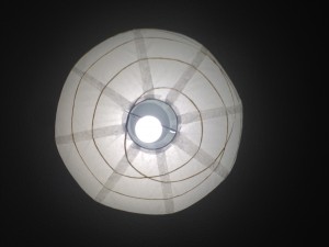
Then at one moment in thought, I looked up in my room, seeing my lamp.

IMG_0111

The circle. my escape out of the chaos.

IMG_0100IMG_0101
IMG_0102IMG_0103
IMG_0104IMG_0105

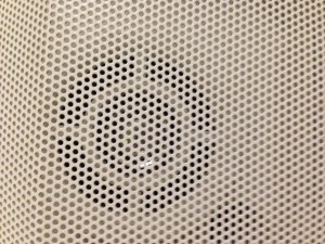
I had returned to the holes-element in my chosen book. My melody maker within my daily-life chaos. I saw dots in everything. The very clear round shaped element just made me understand.

WDW_CT_vo98_01

circles.

dots/points/holes.

the simplest element of visual design.

The defining characteristic of a dot is that it’s a point of focused attention. Dots settle themselves in space and provide a reference point relative to the other forms and space around it.

Dots are the focal points in our compositions. Dominance.

Dots create a relationship with the space around it. The two most important relationships formed are the proportion of the dot and the space around it and the position of the dot within that space.

As dots increase in size we start to see them as shapes, but they still retain their dot-like qualities and characteristics. A square placed in the white space of a page is still a dot. It still attracts visual attention to it, which again is the dot’s defining characteristic.

WDW_CT_vo98_17

Dots centrally placed within a composition create symmetry and are neutral and static, though they tend to dominate the space around them. Dots placed off center create asymmetry. They are dynamic and actively influence the space around them.

Serenity is my outcome of the research. I look through the holes of the book again, but now only focussing on what I see through the circle-out-cut on the following page. I will find the rhythm, I will find the voice.

Rietveld library catalog no : 708.5-cat-50


k-r-k > eflux > art essay > web journal > printed reader > automated design


Wednesday, October 29, 2014

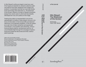
Publication: e-flux journal, Hito Steyerl – The Wretched of the Screen

Publisher: Sternberg Press

Designer: Kloepfer-Ramsey-Kwon


th_b6013a5beacabcb919d3a6564ae91b58_eflux_hitosteyerl_cover_497


e-flux sprung out as an autonomous platform for art critique and comissioned art theoretical essays in 1998, eventually launching a monthly online publication consisting of a text heavy PDF in near A4 format, in 2008.

Jeff Ramsey (of design studio Kloepfer-Ramsey-Kwon) studied graphic design at Werkplaats Typografie in the Netherlands around the same time as e-flux was drafting their online publication. Through a local contact he was given the design assignment, containing few artistic restrictions. Working with a programmer he developed a tool that would operate according to a number of pre-determined rules (i.e. pictures should stand alone on pages, be placed as close as possible to their point of reference in the text, be sized according to importance; which in turn are factors assigned by the writer or editor, not the designer, when feeding the text into the template).

The first 5 issues of e-flux journal were supervised by the designer but have since been laid out solely by the editors of e-flux. The template tool is thus a wysiwyg-layout software custom made for this particular purpose.

As the number of web based journals grew e-flux aspired to publish a physical, printed paper reader; grouping new and previous essays by theme. Some of thus far 9 published readers are named/themed:

What Is Contemporary Art? / Are You Working Too Much? Post-Fordism, Precarity, and the Labor of Art / Moscow Syposium: Conceptualism Revisited / The Wretched of the Screen / Culture Class / Going Public

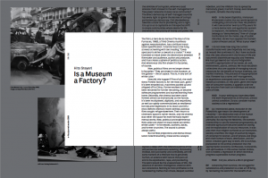
For consistency, the printed reader is almost an exact, but cropped, version of the online journal, fitting one column of text per page instead of two

(see below)


Screen Shot 2014-10-22 at 11.23.23 AM
(PDF  journal in grey, paper reader in white)


e-flux has gravitated towards simplistic and to-the-point design since the beginning.: ie helvetica was their web type. In order to connect the journals to the existing material Kloepfer-Ramsey-Kwon wanted to use a “quite-like-Helvetica-but-not-Helvetica” typeface for e-flux, hence purchasing Akkurat by Laurence Brunner from Lineto, arranging the text to reminisce of the original on-screen reading. Pages are filled edge to edge with a sans serif type. Short margins, vertically oriented notes (page numbers/titles/etc) clearly differentiate it from, for instance, the pocket sized novel, which would often be printed in a similar shape and format.


e-flux_Jalal Toufic_Final_spreads-3


The design is intentionally simple in material as well as execution; highlighting the content without decoration or gloss. No waxed paper is featured (not even the soft and fairly fragile cover). Pages are deliberately matte, uniform and sobre. A dignified quality is communicated when the recipient holds a copy of the reader in their hand. The format is small, slightly below A5, fitting comfortably in one hand – yet thick enough not to be flimsy. This is a type of printed matter that lends itself to be carried, used and actually red without becoming tattered. It is also a book who’s look wouldn’t suffer if it did, since no ambition towards “pretty” is made.


Aside from e-flux Kloepfer-Ramsey-Kwon work with other large art clients such as MoMA, Carnegie, Whitney Museum and Guggenheim. Catering to art institutions as well as individual artists (for book and graphic design) has been a conscious strategy. The co-founders wished for greater freedom to execute their ideas – which they often get when working with artist – contrasting institutions, which tend to be more bureaucracy oriented and constricted by earlier graphic profile, printing methods, etc. K-R-K also believe that the art circuit allows for a greater intellectual challenge for them as design professionals, for instance: inviting the client to collaborate on an assignment might lead to ideas and solutions the designers alone wouldn’t have arrived at.


The actual design process varies, from luck/intuition with “first version is the best version” to long stretches of tedious pushing, tweaking for weeks until a direction which is ready to be presented to the client appears. Strategically, all while being able to produce large volumes of work (see Saddam Hussein covers) the designers prefer to present only one idea to the client.

“We are constantly going for higher quality work, so we keep on sketching – but once we arrive to something we believe in, we’ll present that and start re-working it with the client.” – Jeff Ramsey


Rietveld library catalog no : stey1

A Photograph Revolution


Sunday, October 19, 2014


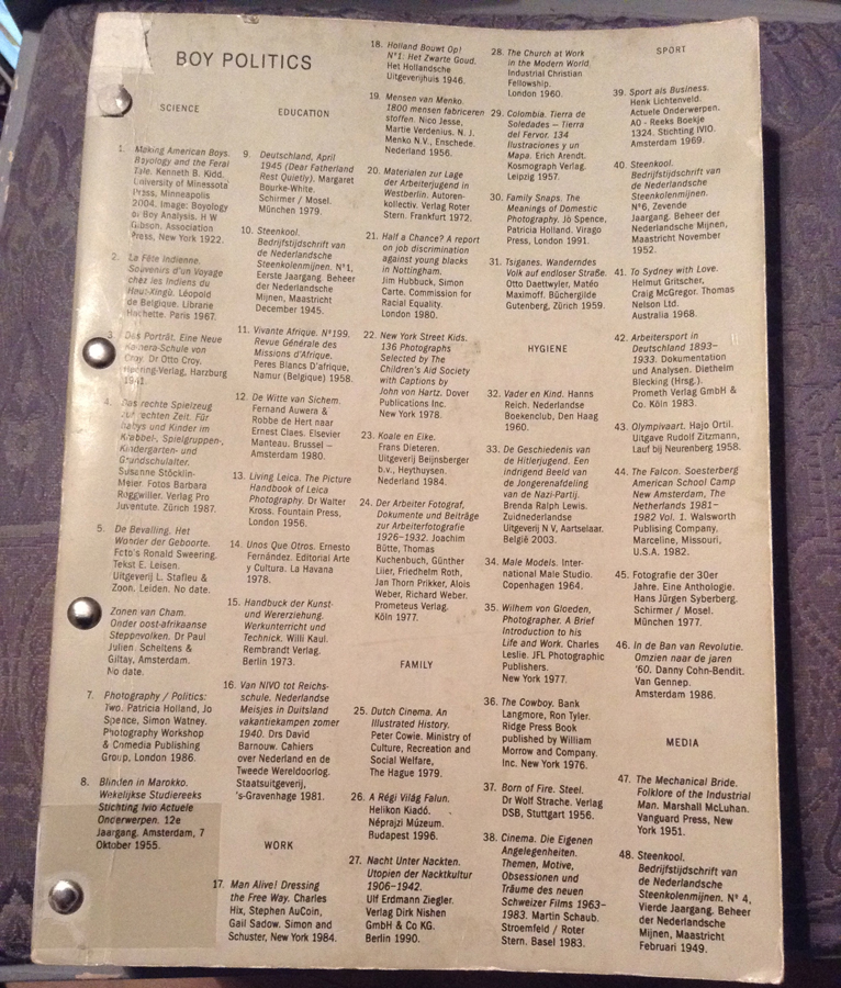
Among all of the recent books in the Rietveld Academie library, Boy Politics particularly appealed to me for its very peculiar aspect and design. It is a bit damaged and looks very breakable which gives it a feeling of preciousness, emphasized by the fact that it is a unique copy. At first I had decided to go see what it looked like because the title was very evocative to me and seemed like a topic I would want to read about. I am interested in the theme of gender and particularly male domination in different cultures and have often questioned it in my work last year in my art school in France. The boy figure, what is expected from a boy and how deeply these expectations and behaviors are attached to a culture and collective unconsciousness.

This book was my first glimpse of the tip of the iceberg that are Marc Roig Blesa and Rogier Delfos’ collaborative projects.


BoyPolitics_h900

Boy Politics, Marc Roig Blesa and Rogier Delfos


Marc Roig Blesa and Rogier Delfos are two former students of the Gerrit Rietveld Academie. Both graduated in 2009 ; Blesa from VAV and Delfos from graphic design. They have been working together ever since between Barcelona and Amsterdam. From 14/05/13 to 07/06/13 they held an exhibition at Rietveld library where they exposed a selection of Blesa’s secondhand books in a window display, opened at a certain page. It was a mute and powerful visual essay of the figure of the boy throughout images from the 1920’s to the 1990’s. Later on, two other former students of the Academie (Anton Stuckhard and Andrea Sergio) designed Boy Politics, a book that archives this exhibition in a very efficient manner that, to my opinion, is really coherent to the way Blesa and Delfos work. Without any fuss, they encapsulated the spirit of what was the starting point of a larger project that Blesa and Delfos have been working on ever since : « Werker ».


Boypolitics1


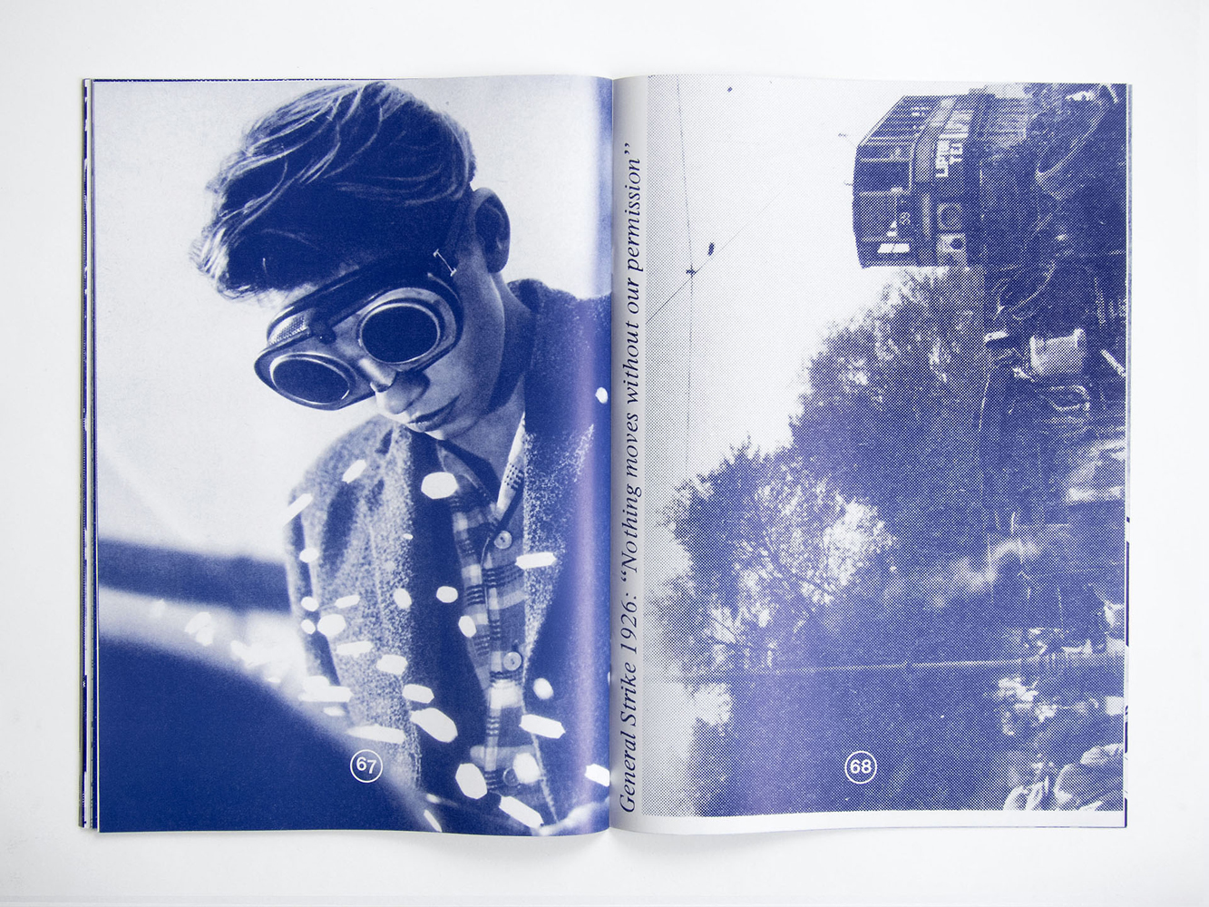
Werker magazine is a long term project and concept that asks many questions and got more and more complex over time. There are 8 different werker projects but usually more than one edition by project.

The artists define them as « contextual publications about photography and labor that inquire into the possibility of formulating a contemporary representation of work » They are all mute analysis of a situation that they try to depict in a most objective manner as possible. They are often the following or addition to an event (exhibition, lecture…) like for Boy Politics. Werker 2, for example, was realized for the exhibition « 1979, A Monument to Radical Instants » in the Virrena Centre de la Imatge of Barcelona (2011), dealing with the issues of daily life in crisis of working class young men. Knowing that photography is the medium that communicates best the essence of a situation, Blesa and Delfos have realized a very accurate observation of several situations.


werker2_h1000


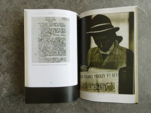
An example of that accuracy is the « Cinema Diary » edition of Werker 6 (that you can find in San Serriffe book store, along with other Werker issues. It is « a collection of photo diaries that reflect on the current working conditions of the youth through self-representation and amateur photography. » It is the summary of a young artist’s (Matthijs Diederiks) side job at a Pathé cinema. In this small book (x) from which the cover is handwritten by Diederiks, you can find an extract of his working contract and meaningfulness in the lost time of a very boring job.


Werker is the story of how graphic design and art meet through photography (amateur photography, secondhand books images, internet pictures…) aiming to deliver a message : Images have power and that power is into the wrong hands, the people must take it back. Blesa and Delfos are indeed strongly politically engaged with revolutionary ambitions.
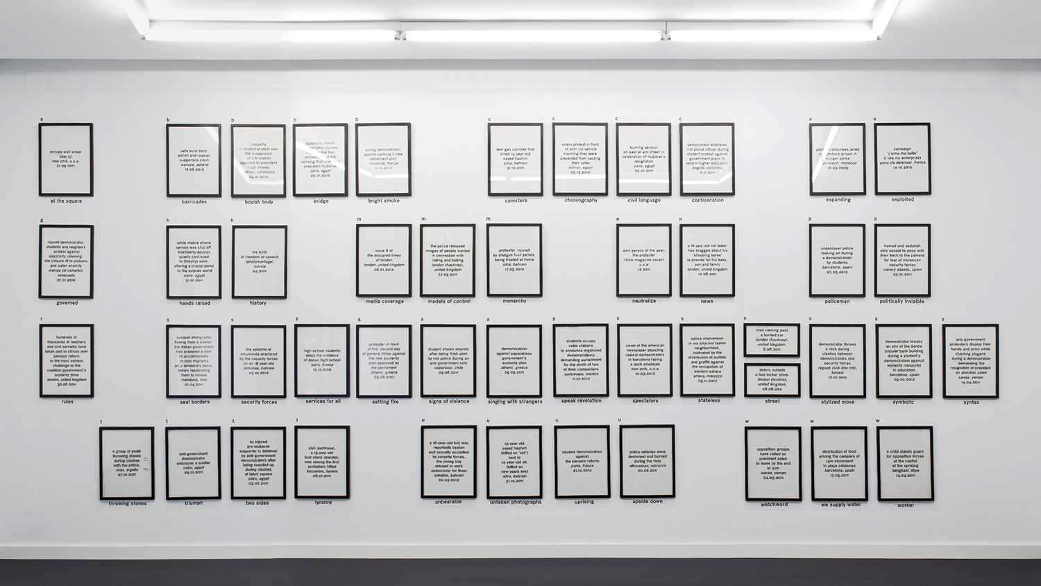
Let’s focus on « Werker 7 : the language of revolution ». This exhibition followed by an edition of newspaper (once with and once without image) was inspired by the words of Ariella Azoulay in a lecture she gave at the museu d’art contemporani de Barcelona in 2011 in which she did an analysis of Egypt’s revolution through images from the internet (you can find her lecture here : x). Werker 7 questions the revolutionary image, the revolutionary language, the role of mass-media in all this and the function carried out by photography in construction of a global revolutionary language. All the images chosen for that project were found on the internet.


Werker7_index_w1500

Werker7_index_zoom1_w1500


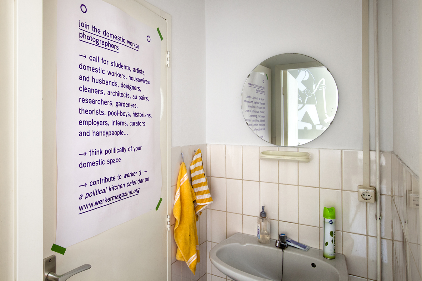
Werker takes its name from the « Worker Photography Movement » :  a group of amateur photographers that appeared in Germany in the 1920’s, following the steps of the first socialist photography experiences in the USSR which extended into the rest of Europe, the USA and Japan. The first group of amateur photographers to use the camera as a tool to fight class-struggle. When I found out about this origin, the work of Blesa and Delfos came clear to me to its full extent. Werker 3 is a « political kitchen calendar » developed within the « grand domestic revolution – user’s manual », a long term living research initiated by casco office for art, design and theory in Utrecht. it is a call for students, artists, domestic workers (and so on) to contribute to the collective gathering of materials. A call for amateur photography as an observation of domestic space. The assignment was « Think politically of your domestic space and contribute to Werker 3 ».


Werker-3_h900


Finally, I found in the « Cinema Diary » an extract from the book Der Arbeiter-Fotograf from Willi Münzenberg (1931) that I thought was very relevant to Delfos and Blesa’s approach, aims and tasks.

« Photography has become an indispensable and outstanding means of propaganda in the revolutionary class struggle. (…) For an illustrated book is easier to read (…) than the lead article of a political daily. Photography works on the human eye (…) the bourgeoisie caters for the mental laziness of the masses and also makes a lot of money. (…) Much more important is the political effect (…) a skillful editor can falsify every photograph into its opposite and can influence the politically naive reader. (…) The revolutionary workers of all countries have to realize these facts very clearly. They have to fight the class enemy with all means. Just as the workers of the Soviet Union have learned to make their own machine-tools (…) the proletarian amateur photographers have to learn to master the camera and to use it correctly in the international class struggle. »

Delfos and Blesa’s aim and ambition : an anti-propaganda revolution guided by photography.

Rietveld library catalog no : roi 1

A performance in n dimensions


Monday, June 16, 2014

In spring 2014 Designblog was invited by the 26th International Biennial of Graphic Design Brno (subtitled Education and Schools) to prepare a presentation for their Open OFF Program.
I decided to involve a group of BasicYear students in a research focussed on browsing the blog. The goal was to look for a personal objective and to visualize the browsing behavior it generated.
In an effort to regain more insight in the position of Designblog, we invited Klaas Kuitenbrouwer to lecture on the position of blogs as part of the wide interwoven internet space. A space that turned out to look much flatter than our imagination could have ascribed it.
The lecture later developed into this text supporting "WORDPLAY", our final presentation at the Biennial. No better place than to publish that text as part of the student research project "Browsing Designblog" on the Designblog itself.

Henk Groenendijk : moderator Designblog


While the screen of the device you are using shows that Designblog has a relevant two-dimensionality to it, this text will take you along perspectives on Designblog from single dimensions to two-and-a-half, three, four and even the ever flexible ndimensions in which Designblog simultaneously exists.


Address

http://designblog,rietveldacademie.nl
is an address, a pointer to a location. An address refers to a particular spot, a one-dimensional unit that is typically part of a thing with more dimensions.

An address like this has two kinds of capacities:  one is understood and used by machines, and the other is for humans. In its machinic capacity, designblog.rietveldacademie.nl points to a specific series of states of tiny logical gates, that are part of a memory disk in a server owned by some provider. That’s where Designblog resides in what you could call its latent, purely informational state. In this state Designblog is inaccessible for humans.

The human-facing capacity of the address points to a location on the WorldWideWeb. This address holds particular information on what it points to. In terms of content, it suggests its visitors to relate to what is behind the address as a time-stamped list of musings (a weblog) contextualized in the particular world of meanings known as design. But the address also ties the web location to a place on the physical globe, mobilizing some spatial –geographical- reference frame. It shows the blog is affiliated with an art academy: the Rietveld Academie in The Netherlands.

When a human calls upon that address – when it is clicked by you in this text, for instance – a command is sent to copy a section of that series of logical states from the server through fiber optic cables, through a couple of routers to the computer or phone where the click was performed. The browser on that computer (yours, that would be) than has the specific task and ability to allow that series or logical states to inform the screen of its computer to display what we have come to think of as the front page of Designblog.


Page

The ‘page’ is home turf for the graphically oriented. A two dimensional surface, that can passively hold various two-dimensional artifacts in a fixed relation to one another. The page was a helpful metaphor to be able to relate to the strangeness of networked information, as it was performed by snippets of code – a rewarding, but also frustrating metaphor for the graphically oriented: neither is there a real surface, nor is there a fixed two-dimensional relation between any artifact and any other. Still, although the page doesn’t exist anywhere but in your lazy perception, it doesn’t really hurt to think of Designblog as a collection of pages.
But there’s more…

The latent, machinic state is now activated. The address opened its front door, and revealed what performs not only as a page, but also like a place. An online, publicly accessible part of the Rietveld Academy, that indeed has some characteristics of a classroom.


Place

A place is an appropriated space. A location with layers of stories, traces of events. A place offers corners, furniture, a means to sit down and be there. A place ties to identity, to individual identities, or group identities. At places, relations become entangled. Anything can talk to who- or whatever also happens to be there. A place is somewhere you can be with your experience, somewhere to orient from. This possibility of being there, (which is different from ‘looking at’) this possible sensation of presence, subtly mobilizes a notion of partiality.

Over its years of existence Designblog has become a place with a deep accreted inside, a vast archive of contributions by Rietveld students: worded observations, found media-items, responses to assignments, to each others contributions, linked to each other, to other addresses on the web, clustered and flagged by tags.

Unlike a classroom, the inside of Designblog is at the same time its outside: the stuff inside is crawled and indexed by the bots of Google, that provide the endless amount of entry points for the querying audience. In this sense Designblog is like a Klein Bottle, an object with two-and-a-half dimensions, of which the outside and the inside are one unbroken surface.

Every corner of Designblog either links to some item in the vast non-dimensionality of the web, or is accessible from it. Things inside Designblog are not even closer to one another than to things accessible through other addresses. Everything  on the web exists at more or less the same distance from everything else. If this is a classroom, it is an extremely open classroom.


Space

Designblog has a lot of placeness, but clearly also still has endless space. To call it space pulls the attention to its not yet actualized potential. It brings to the front that whatever it is, it could house a great many future developments, without ever loosing that quality of potential. In the sense that any member of the blog can always open up a new empty page (a sub-address) to fill, Designblog performs as space. But this spaceness, because it is part of the web, has no particular kind of dimensionality to it.


Nest

Designblog is a collective, open archive, an accessible history of students’ online work. But to say (like you would say of an archive) that informational artifacts are ‘stored’ there would be misleading. The artifacts are not stored in its structure, they are its structure, as well as its decoration.

Like a birds nest is made of twigs, threads, leaves, wires, found things that are sufficiently twinable, Designblog is made of its twines. Also a nest is a place where one can land and fly off from. A nest is a place that holds up who dwell there, but that does not cover them. A nest offers place, but has no real inside. All that seems to hold for Designblog: as a groups’ nest it offers a place to land, to contribute informational twines to, and to fly off from.


Body language

When language deals with space and location, it stubbornly uses the body as implicit reference. The language of spatiality is about here or there, behind or in front, up or down and in or out. The web captured the human imagination through the metaphor of cyberspace. This spatial approach offered important and helpful familiarity, and has made the internet inhabitable, so to speak.

Spatial concepts have played and still play a crucial part in helping people to relate to networked computing. But insisting on spatial notions also fixes the relation between people and the online as a spatial one.


Time

And it is through the time-perspective – the fourth dimension– that other Designblog realities reveal themselves. Because the most essential aspects of Designblog are processes.

The emergence of Designblog, (as of all blogs) follows a time line, that would be one-dimensional if it didn’t fold in on itself, and looped to earlier contributions. Twining may be an apt practice by which to perceive the development of Designblog: both making and responding to what’s there, simultaneously creative and reactive.

Time is also the room in which learning takes place – the process of one thing informing another thing, the process of information, the raison d’être of a school.


Performing

All agents related to Designblog are engaged in some act of distinctly time-based performance. A performance of a for a particular audience – you.  Some of those acts come down to straightforward, unambiguous execution of tasks, others are more elaborate and creative.

Your computer or phone performs its web browser, for you. The web browser in turn performs the latent code of Designblog to make it active and accessible, again to you.

Designblog performs its fuzzily structured content, never showing more than a glimpse of its vastly twined labyrinthine body. It responds to your clicks by turning a differently dressed little facade, by offering a new shadowy inroad, or by suddenly pointing a spotlight in your eyes.

Members perform the mysterious part of author – transforming found things into new source material. They create independent, informative agents of text or (moving) image, that in their turn perform the act of information on your sense organs.

And the members add tags to their agents, to suggest similarities or difference between their agents to you. These tags perform as frames through which to move with your mind, frames that you put on to shape your perception. Every one of those tags performs like one of n dimensions along which the content of Designblog can be morphed, when you travel along it. Although it is not so much you who travels through Designblog, it is more that Designblog travels through your screen – you stay put, Designblog performs the moves.

But you are not undergoing this passively. You are the last performer, performing the score of Designblog, following the by-roads and sideways. By your clicking you act upon your pseudo-conscious choices about what material is allowed to inform your perception. Your clicks and non-clicks manifest your own perspective in the material of Designblog.


Klaas Kuitenbrouwer augustus – september 2014

(written for the occasion of "WORDPLAY", the presentation of the online artefact Designblog at the Graphic Design Biennial in Brno, Czech Republic.)


Memorization


Tuesday, May 6, 2014

How does the history of browsing stay in your memory?
How do we perceive the visual experience of websites which are opening up in new windows?
I question myself and try to observe my behavior when I am browsing around Internet webs. How do I chose the website and what makes me choose them? What determines if I like to stay on the page and look properly through it or if I click to the next page?
What is my choice based on? What visual experience do I get? What videos do I chose to click on? Is it exiting enough to look what is next? I think most of my internet browsing is based on visual experience, except particular situations when I am looking for certain subjects, where the context is more important than the visual experience.
Almost every morning, when I am starting my day, like a due during the breakfast I check my mailbox, read the news and brows around interesting blogs . Mostly they are about music, art, fashion,  news, or just whatever captures my eye.
“Capture my eyes” what are they capturing exactly? I think it is the matter of personal choice, what color, forms, shapes you are attracted to.
I find out that my choice of webpage is purely based on visual impression and it does not necessarily have anything to do with content. After I browse trough what stays in my memory and for how long?  What do I keep in my mind and what can easily be forgotten?


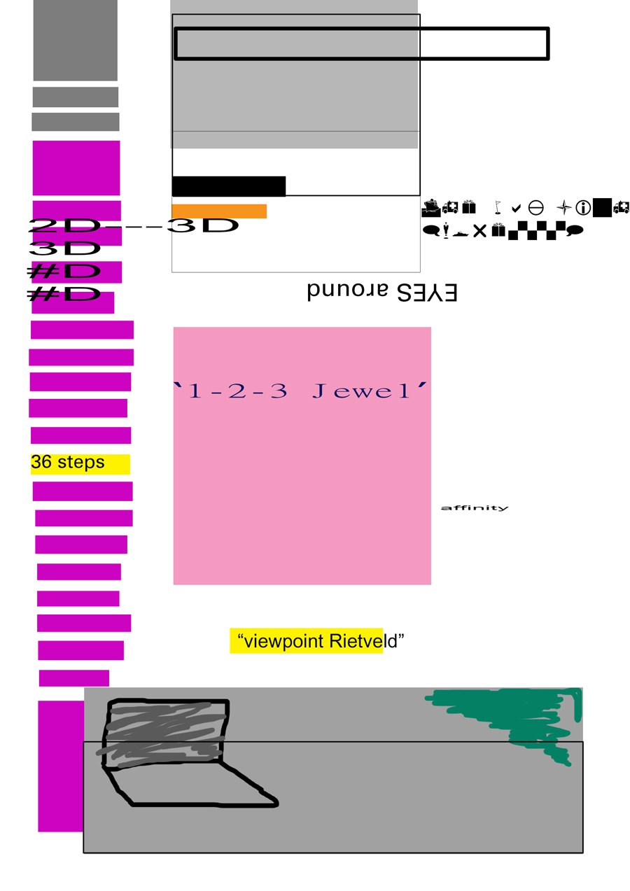
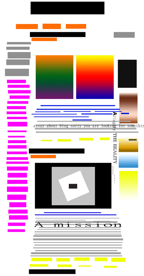
I choose to open Designblog for the first time, looked at the first page which comes out and then close it in 1 minute. I sketched my first impression immediately, what was there? Few geometrical shapes, and bright attractive colors this was the most catchy and noteworthy things.

browsing-history-1_redu


Next step, I simply let myself browse for half an hour, without forcing myself to memorize, reading most interesting things, watching concerning videos or look at images and illustrate my memories. As a result I had same expressive geometrical shapes and specifically recognizable colors, also some words or sentences from the context.
What was my experience? Well even if I illustrate and was attracted by colors, mostly I memorize the context of the posts and the idea what it was about.

30-min-browsing-reading-watching_redu


After this I browsed around in 1 page for fifteen minutes

browsing_15 min_3_redu


Finaly I watched a video, not paying attention to the surroundings

watching_video_4_redu

mutating ideas


Monday, May 5, 2014

DSCN3714_redu

IMG_4158_redu

Blue drawing


I’m interested in taking forms and colours from the world around me and then making objects and drawings which share a similar form or colour. I was interested in the post “shades of blue” by George Kratochvil. A colour chart by Ignaz Schiffermüller, made in the 18th century, to ‘distinguishing between blue’s in the nature’, was the inspiration for a small sculptural work of blue abstract forms. Schiffermuller began by observing the shades of blue in the nature that he observed as a biologist and made an abstract representation of them in the making of his colour chart, which takes the shades of blue into the form of rectangles in a grid pattern. Kratochvil then observes the colour blue, the shapes in a grid pattern, and transforms it into his work. I now come and look through the design blog and am interested in the colour blue, I search for this keyword, open the post that has been made and comment on it. I also observe the shapes of Kratochvils sculpture and have created a drawing which uses them again with the colour blue. The use of past artworks as inspiration causes ideas to mutate in strange and interesting ways- thus is the use of this blog; to provide a library of ideas and images of which to take and re create things from. The drawing I have posted today is part of a dialogue that was started in the 18th century and now exists in a digital way on a blog where you are reading it and entering that dialogue.

#wow


Sunday, April 6, 2014

#interesting #easytofollow #slowfashion #slowcouture #painted #fashioncollective #processing #newfashionideology #slower #sublimitedfashion #wellwritten #spendingtime #takingtime #doingnothing #importantnothing #reflecting #understandable #makingbyhand #inspiring #bulgarianneedlepoint #timeisgold #nomultitasking #notime #forgottentechniques #hybridfashion #meditation #japanisetradition #repairclothes #workshop #brokenclothes #makingnew #startingagain #somethingdifferent #notcategorizing #ontheedgeoffashion #nocatwalk #nocollections #notrends #work #constantchange #fragility #history #inprocess #manydesigners #garmentgrows #noplans #collaborativefashion #story #handmade #value #questioningmoney #timeinvestment #imformative #links #endwithmusic #personalexperience #balanced #explained #2013 #research

#rediscover

#fashionwithagoldtread


Calcite Stalactite


Wednesday, April 2, 2014

In the Wendingen issue, Kristallen Wondervormen der Natuur from 1924 i found this picture of a calcite stalactite. I choose the picture because I did not remember to have ever seen anything like it and that made me curious.  After a bit of research I learned that a stalactite is a type of formation that hangs from the ceiling of caves, hot springs or manmade structures such as brigdes and mines. Limestone caves, where most stalactites are found, are mainly composed of calcite, a rather common mineral found in sedimentary rocks. Stones and crystals have been a huge passion of mine, for as long as I can remember. The interest started in an early age, as my parents took me, my brother and sister for long walks up and down the coast-line in Denmark. We were looking for fossils, amber, seashells and stones. We never really knew why we were doing it, but it soon got competitive. Who would found the most exquisite one? The biggest? The funniest? And we would carry large heavy amounts back to our house and place them carefully, in an order, on shelves or window sills. My mother keeps collecting and my parents house have turned into what could be called an exhibition of stones and stuff. My father sometimes forces her to get rid of some of the stones, because he says “it doesn’t make sense”, but my mother took me to the farthest place of their backyard; a wilderness of weeds and showed me where she get’s rid of the stones. The pile is enormous. When asked why stones are so fantastic, my mother says: because they are ordinary and exquisite and they look beautiful in the rain. Later I started making animations where I would scan some of my favorite stones and give them simple movements. Maybe they would turn around, or switch back and forth between a crystal and a flintstone. I too like the normality of stones and I embrace that my love for them doesn’t make any sense at all.

m

Wendingen 6-11 1924 Rijksacademie Amsterdam

ON FUNCTIONALITY


Tuesday, April 1, 2014


Esther Frank* and Kjersti Alm Eriksen and NicolasChuard and Salomé Roodenburg* on functionality


Each project that students initiate, makes them into temporary experts on given topics. Art & Design schools then become knowledge hubs where different expertise cross fertilize. By looking at what types of research students engage in, Designresearch and UnBornLab organized a 'workshop' to investigate design matters from a students' perspective.

Through a series of short video's students from both the Foundation Year and the DesignLab department share ideas, focusing on the temporary expertise gained as part of their projects, rather than the outcome. The workshop was articulated around one of their given assignments. Students were asked to develop a specific object or context to help focus or explain content.

The format is clear: two persons, discussions, filmed from above.
the space is : two stools and a table.

* Foundation Year


ON THE BUBBLE


Wednesday, March 26, 2014


Salomé Roodenburg* and Nicolas Chuard talking together about the subject of working within the ‘Rietveld bubble’


Each project that students initiate, makes them into temporary experts on given topics. Art & Design schools then become knowledge hubs where different expertise cross fertilize. By looking at what types of research students engage in, Designresearch and UnBornLab organized a 'workshop' to investigate design matters from a students' perspective.

Through a series of short video's students from both the Foundation Year and the DesignLab department share ideas, focusing on the temporary expertise gained as part of their projects, rather than the outcome. The workshop was articulated around one of their given assignments. Students were asked to develop a specific object or context to help focus or explain content.

The format is clear: two persons, discussions, filmed from above.
the space is : two stools and a table.

* Foundation Year


Log in
subscribe