Tuesday, March 2, 2010
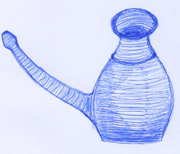 The object I brought has a function of a noserinser. For most people it strikes as a sexual object due to it’s shapes. I think this is interesting.
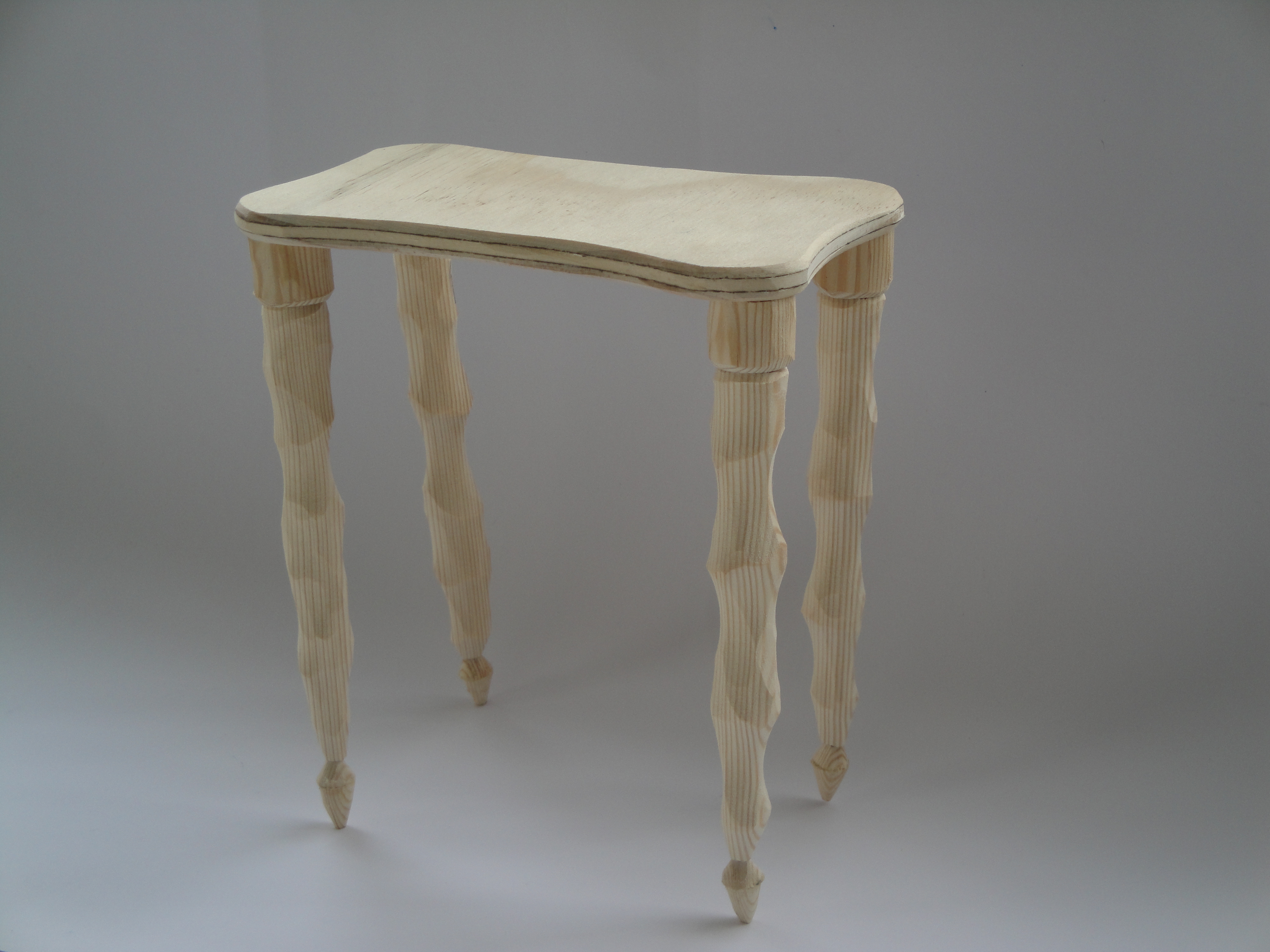
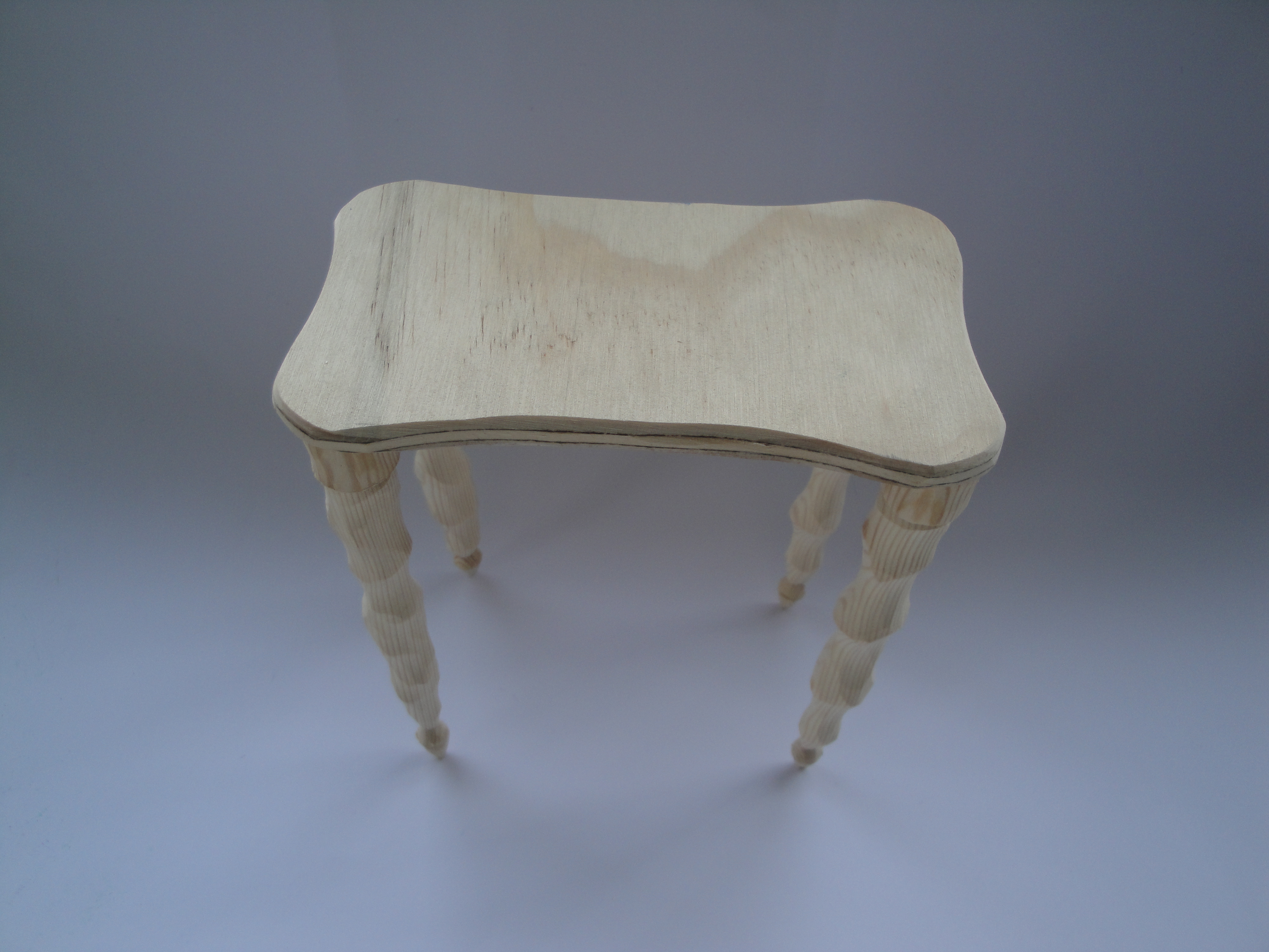
It is egg shaped and there is a fallic shape growing out of it. It’s made out of ceramics and has a nice glaze. The colour is white with some small imperfections in the glazing. Even though it’s hollow it has a certain weight to it. It looks simple, but it has some interesting details such as the rounded endings and the transition from one shape to another. Another practical detail is the measuring line up to where you fill it with water. It is just a seam but it’s not carved in, it must have been made directly on the throwing table.
The object attracts to touch, and looks easy to grab. I also think it refers to some kind of artifact, it could maybe be a water can, wine carafe, tea pot or something completely else. I find it interesting in it’s simplicity.
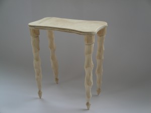
From the start there were a lot of ideas of what to make of the shapes. Finally I decided to make a table. The size of the original table would be 90cm x 90cm x 50cm, this would be a good size for a table in the hall. Preferably it would be made of ceramics.
I kept some of the shapes I liked or was interested in from the original noserinser, such as the endings and transitions from one shape to another. The measuring line was also an important element which I kept and presented at the top of the fallic shaped legs.
Wednesday, October 14, 2009

What is special about Tichelaar Makkum porcelain? What creates the fascination of it, and what can this tell us about the world of fashion and design?
These are the questions that I will seek to answer in my research on the Royal Tichelaar Makkum porcelain factory.
 Tichelaar_Makkum
Wednesday, October 14, 2009

At the beginning of the 20th century Josef Hoffmann, Kolo Moser and the industrialist Fritz Werndorfer founded the ‘Wiener Werkstätte’. In order to protect traditional handicraft from mass-production they designed exclusive handmade everyday objects and gave them the aura of art. At the same time they tried to find an alternative to old representative art forms favored by the rulers of Austria which shaped the picture of Vienna at this time. When they started to design architecture which they filled with their handmade furniture and their handmade objects their work became a concept that led to an idea of a different society based on pure aesthetics: they tried to create a ‘Gesamtkunstwerk’.
Under which circumstances could such a concept develop? The design of the ‘Wiener Werkstätte’ is still very modern and popular while the concept of the ‘Gesamtkunstwerk’ is not relevant anymore. But why? Do we need a similar utopia today? If one wants to get an idea ‘why’ one has to take a closer look at the development of the concept ‘Gesamtkunstwerk’ in relation to its historic background.
 Wiener_Werkstätte
Thursday, September 10, 2009
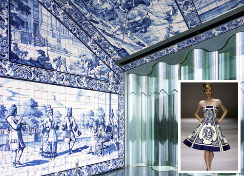
If there is one of the things I like in the country where I came from is the contrast between the white and the deep blue from the houses. It was in an instant that i made that connection to the well known Delft blue.
In the XV century the paintings in ceramics was brought to both, Portugal and Netherlands, by the Italians. From Islamic and Chinese origins, this ceramic technic started to be developed as a cultural tradition. Following different ways in that production, Portugal developed the technic of the big blue tile panel paintings with representations of historical and religious moments. Netherlands, in a slightly different way, got worldly famous with the Delft blue landscapes paintings in pottery such as plates and the well known tulip jars.
In Portugal, more then just folklore, this tile panel paintings are now revived in interior decoration from new modern buildings. Also used as an inspiration for fashion clothing and accessories, it pierced right through centuries from the old to the new age.
Wednesday, April 1, 2009

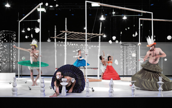
we are humans…
humans who are creating…
creation is an human action…
humans who are destructing…
destruction is an human action…
creation and destruction
thats human, thats us…
-twom- I
keyword: playground
Thursday, March 19, 2009
As I was walking in between the library’s narrow lines of bookshelves I quickly browsed through the titles on the shelves. A book caught my eye, I don’t know why, maybe a combination of the title and the layout and what notes of association they strike. The book that caught my attention was on the bottom shelf, in-between books about african ceramics and the art of pottery. The title Fragiles in black on a white background. I instantly felt a liking for the title “fragiles”, a poetic word that suggest vulnerable and delicate objects that has to be handled with care. As I picked up the book I noticed that it was a new book from one of my favorite publishers Gestalten Verlag.
Of course. I’ve got some of their books and always find them interesting, they cross over the borders between design, graphic design and contemporary art, in a playful and inspiring way. So sitting down and opening the book I found a collection of contemporary work in porcelain, glass and ceramics by both established and emerging design talents and artists. Gesltalten Verlag always seem to have an extraordinary eye for finding the most interesting subjects of right now. Ceramics is an area with history going back to the beginning of human kind but recently new technical developments allow designers a new approach. Collecting inspiration from the whole history of ceramics, these artist’s freely play with the language of old ceramics styles but by fully mastering that language and adopting it to new techniques they can create new unconventional objects that range from housewhare to artworks.
cat. nr:
keyword: fragile
Wednesday, February 4, 2009
Starting of a new academical year of design theory and research with an investigation theme like Unique versus Serial could not have been better. Chosing from a wide variety of design objects exhibited in “Limited/Unlimited, 100 years of Dutch design presented us with the unique opportunity to get an inside in the position of the designer during the last 100 years in the Netherlands. A characteristic of Dutch design is the coexistence of these unique objects alongside serial production, concept alongside industrial reproduction. “Goed in vorm“, 100 years of design in the Netherlands: by Mienke Simon Thomas (curator of decorative art and design at the Boymans Van Beuningen Rotterdam) was acquired by the library and provide us with a lot of interesting background insight.
The question was simple. Choose an object and find out what the position of the designer was in relation to our theme Unique versus Serial .


research: Samuel Schellink /vaas: Jan van der Vaart /research: Corné Gabriels
All those choices resulted in a colourful collection of investigations into the object’s background and the motives of their creators. Available in downloadedable pdf the students present: “Martin Visser, designer or collector“, “Starting with Anton Kurver’s Mailbox“, “Bruno Ninhaber, Stay Limited To Be Unlimited“, “Wim Gilles Dru Kettle“, “Wim Crouwel The Objective Functionalist“, “Adolf Le Comte, A Unique Mocca Set“, “Corné Gabriels, Not Your Average Fashion“, “Marcel Wanders, Knotted Design“, “Jacob Jongert, An Artistic Individualist“, “Limited-Unlimited, The Haque Plateel/Rozenburg“, “Jurgen Bey, A Narritive Structure“, “Jan van der Vaart, A Vase Is For Flowers“.
At the same time VIVID design galery presented a show of “Art Design“. A new phenomena that underlined the intriguing autonomous position of Dutch designers and design, making an on the spot discussion posible about art and design, commercial versus cultural or concept and functionalism. linked article Herald Tribune: Whatever ‘design-art’ is, it’s thriving ©2008
Thursday, May 22, 2008
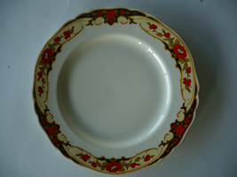 The Alfred Meakin plates I own, are like most of my belongings, second hand. I got these plates because the over organic and curly pattern looked beautiful and at the same time so fake and corny to me. I always enjoy this friction in things I own
These plates, like most Meakins are inspired, by nature not just in its patterns but also in the shape. They were not made anymore after 1937 and still, all modern Meakin plates, and also most porcelain, are in a nature theme. I find it interesting that throughout history one thing has not changed and that is the urge to recreate nature, even out of something as lifeless as porcelain, while at the same time bending real nature to our desires. Creating things that have a beauty like nature and that are at the same time cold and fake. This friction that works both ways is what really grabs me.
http://www.terhitolvanen.com/html/woodland12.html
http://nl.youtube.com/watch?v=XL1aCkKR0h4