Skip to Content Skip to Search Go to Top Navigation Go to Side Menu


"New Energy in Design" Project


E/MERGING PATTERNS – Khurtova / Bourlanges


Thursday, March 1, 2012

As part of the Foundation Years design-research project “New Energy in Design” based on the 2012 Boymans van Beuningen exhibit, Marie Ilse Bourlanges and Elena Khurtova were invited to present their work and research. As a sequel to an earlier presentation in the program 3 year ago [x], the development in their work over the years and the ambivalent state of design versus art presented the clear and inspiring ‘new energy’ in their work

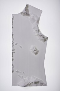
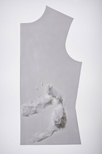
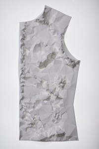
E/merging patterns, challenges the Normativity of systems: a care for order, from which one can’t withhold (social, cellular or temporal system), and provides an access to an aesthetic of cancer, ‘beyond well and ill’.

The artists study the grouping of cells that emerge as a new system within a normal ‘baseline’ system. By applying the behavior of cancer cells (uncontrolled growth and invasion) as design parameters, Khurtova and Bourlanges offer an experience of the body that begins where the usefulness of healthy bodies ends.

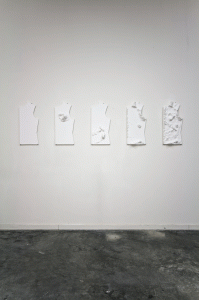
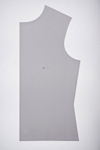
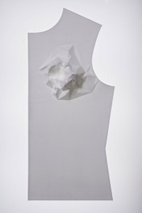
The work consists of a series of 5 bone china cast objects, and depicts a flat garment pattern, in order to give a dry representation of the body. The flat surfaces are distorted with extruded patterns, relating to different organs or inner body systems. Those patterns are generated from detailed 3D mapping of tumor growth, by the use of algorithmic software implementing uncontrolled growth parameters. The obtained structures are manufactured by CNC milling machine, in order to produce mother-molds for plaster molding and precise slip-casting.

Realized at the EKWC, this project merges the material sensitivity of ceramics and the precision of CAD/CAM technology.

5 pieces – 28 x 62 cm – Bone China (ceramics)

2011


Quality over Quantity?


Monday, February 27, 2012

In the fashion industry the topic of sustainability and eco-friendliness has not been on the top of the priority list one might say. Trends change every season, and to stay in style you are expected to renew your wardrobe at least twice per year. High-end designers are now launching even more than two collections a year, you have the so-called pre-fall and resort collections as well as the biannual summer and winter. Chain stores are introducing new collections as often as every six weeks. At the same time as this is happening, fashion is getting cheaper and cheaper.  The high-street brands keep pushing prices lower by producing their clothes in countries that are known for using child labor and having extremely poor working conditions. The materials used are usually of very bad quality, which is probably also produced in an unethical way. So with facts like these you don’t have to be the sharpest tool in the shed to see that this is not a very sustainable approach

(more…)

Bugged out


Sunday, February 12, 2012

“Good design should be innovative

Good design should be useful

Good design is aesthetic

Good design is understandable

Good design is honest

Good design is unobtrusive

Good design is long lived

Good design is consistent in every detail

Good design is environmentally friendly and as little design a possible.”

Dieter Rams


I used these premises to give structure to my research about “New Energy in Design” because I think it defines what the attempts are behind designing and what more or less designers are trying to achieve in actuality. It is becoming harder to pinpoint what is design and what is not. When I say “ contemporary design” I mean all which design is surprisingly turning out to be : from sketches to little tryouts, researches that can surprisingly redefine your idea about design.

When you design you are not only making an object that could function in a situational context. It’s about giving meaning and making an identity for the object and the situation it will serve. Nevertheless, functionality plays a big role because initially as a designer you are trying to come up with a solution. A solution for a problem should always be on top of the head of a designer. But besides solving a problem there’s also a big amount of values being transmitted from the designers character to the end result. You project all the perks and peculiarities that was found in the making. You add important characteristics that will come to identify you, and the connections you made through the research.
Being a designer is really about having a set of creative paradigms and externalizing a generated map of routes that will lead you to a product, or to a stable outcome (for the time being).

At least that is what I gathered after visiting the Boijmans Museum.


I  bumped into works that are surprisingly “Design” because they still whirl in between design and something less concrete: ”design-ish” if I shall put it that way. A very perfect example of what I mean is Debug, a work by a design firm in Eindhoven called EdHv.
Edhv retrieved the idea of mapping a route when they first started on a design project for a restaurant menu. Remco who is the founder of EdHv decided to create the restaurants identity based on the routes they take while they operate in the kitchen. Which is a clever solution if you ask me. Because what are we but pattern seeking creatures. The remarkable work I bumped in is just a small model of a chair and could be categorized as an architectural piece, product or even an identity for the project which is still ongoing.


Debug gives us a new way of approaching space, a new angle, a new perspective but on a whole different dimension, insect proportions. It kicked off when The EdHv crew started monitoring/tracking the movement of different insects on a model cast for a poster. A poster model generating 300 posters and counting. Every one of them is unique. Some posters are made by woodlice, some of them by house crickets. Tracking software and scripting, maps the walking patterns of these little creatures. The complexity of movement leads to stunning results.

click on image to see "Debug : Art by insects" a video made by edhv.nl

(more…)

SlowLab, thinking and creative activism


Sunday, January 29, 2012

To summarize the context I first must mention- with the freedom of a resident of here and today – the presence of pressure and calling out resent for (this interpretation of) passive living. With that, a near apocalyptic sort of set creation takes place. It receives emphatic caricatures, tragic responsibilities, gets greatly busy scenery’s to play on, and personally – I have a dislike for tricks in most cases. Not that I don’t care for the drama, it is the very reciprocal end, of paying respect to voices in letting them be exactly what they are.

In theory, slow design agrees with my thought. Carolyn F Strauss saw faults in the growing movements of green design, and overproduction of recycled/recyclable designs with wonky purposes – “We should be calling into question the need for the product in the first place.”. The economical success of key wording pollution, organic and related terminology grew and hasn’t reclined much since, the very idea of reducing production overproduced, and did so quickly.

What the slow movement suggested is a reduction with increased effort. The time needed for the process of manufacturing most things shortens exponentially to the cost – spiraling in recent event, time is money they say, slow designs agree differently. A pair of trousers whose material has circled the Earth several times even before being sewn together, has then been sent on a series of to a majority unknown routes before finally reaching y/our unimpressed hands – is replaced by a dazzling piece of phantom experience and craft, culture and tradition are now personal choices and flavors. As long as our story is near geographically, associatively or else, and beaded with time, it is what slow tells about in it’s forms.

In this sense, daily designs gain back their emotional and such weight in style and charm of a hand-made product, we make slow but noteworthy changes in ways of everyday consumption,  directing the trend rightfully. So I see visions of Strauss, who founded SlowLab in 2003, as a vent for ideas of applied activism, designs and debates on this slow framework within a worldwide web of selected individuals, based in New York, US. Through series of lectures and projects we get an insight to a philosophy with few examples of artists making (todays) drastic choices in technicalities of work methods and building new or bringing back old manufacturing principles, such as Judith van den Boom who’s taken the knowledgeable Chinese porcelain worker out of the factory into a small and personal area for working, learning and collaborative design. Focus frequently falls on ideas, and magnify a personalization – in form a sustainability factor – of objects, an illusion of a caring presence is cast to put the viewer into romanticized relationships with his toys. We wait for your mail accordingly through a programmed lens of another rational design, listen to amplified cooking sounds while reaping scents of it’s making, in a sort of disposable but pleasant and seedful event. Reflective research fruits a wearable face of inevitable and looked-over slow processes, not the first of SlowLab’s collaboration with former or present Rietveld students . It peeks a little outside the umbrella of the boldly tagged holistic promise, and resorts often to mid-flight concepts in elaborate captions, with it’s patterning accents on context and sacrificial imagery of more or less extreme discomfort as a crime against nature.

I have a hard time agreeing on sets of carved rules, and think one should be as careful and discrete with evoking guilt in other beings as can be. Moral justification does not make (good) artistic experience good,  neither does over politeness. But we can make a lot of solid exceptions for this in design, and the power of suggestion in a possible event differs from an artists dense sensation to be experienced attentively, also not to be overlooked is the responsibility of a designer of largely produced goods, and creator of appliances to be sent randomly into living and often outlive it’s maker. What I miss is a striking moment, like the gasp for air after having or witnessing a brilliant idea, otherwise I feel I might be convinced, perhaps this is the way of having framework. A sharp, clear thought, strong visual motor, an undirected balance that leads to somewhere like this. Maybe it is too ideological to expect of pieces a mapped idea with limited or no description, this sort of modulation seems crucial though, and a set of produces that need not much or any sugarcoating. I think the slow designers, and all artists concerned with environmental damage a cruelly run contemporary life allows, should take the green trend as a mean to challenge their own work, and distinct themselves in opportunist waters by finding strong subtleties for use in triggering thoughts rather than speaking them into a bore. We see the blueprint in our every day life already, respond to it most strongly when the message comes on it’s own, and we all have many factors afloat – a suggestive shooter like this is surrounded by comfy amounts of room for exploring abstraction and rock and roll, yet it stays easy. What I try to say is – we should be raising awareness by raising awareness levels, and sway to an old fashioned need to please and show (off) our very best, even if it means falling outside the fixed frame of your politically correct ideology – at least, we will be left with a loud work to discuss, debate, come back to and so forth.

Carolyn F Strauss with SlowLab sends out promising goals and messages, and should have space enough to branch and develop a captivating and elegant design, which sends us to a slow but sweet relationship with the inanimate, and gradually teaches importance of lively touch.

Just give us some variety and we’ll be happy


Sunday, January 29, 2012

The Idea of a Tree

I have a medium-large grocery list in one hand, and a shopping bag in the other. Moving through the kitchen accessories department of the Ikea store located in Utrecht, I am looking for a new, preferably cheap pizza cutter. My old one was lost in the crypt that is my room, and scissors can only do so much when it comes down to cutting my Albert Heijn pizzas.

Having found the shelf containing cheap plastic pizza cutters (they’re called Stäm), a question arises. What colour to choose? The olive green one, the scarlet version, the bright yellow edition or the rather unpleasing cyan variant? Remembering that I already happen to own a green spatula, I decide on the similarly coloured pizza cutter. While paying for my newly acquired Stäm pizza cutter, I am certain: the olive green colour will most definitely improve my quality of life to a larger degree than the cyan edition.
A seeming elementary choice. We make these rather dull choices all the time. Nonetheless, the other day I was investigating a friends kitchen supplies during a house party. In one of the drawers, I found the same green coloured Stäm pizza cutter. Soon, we were high fiving and felt closer related. After all, we have a mutual preference for a certain commodity. This anecdote can be generalised. In a nutshell: our social relations are based on the products (or, commodities) that we own. According to Karl Marx, that is. He calls this phenomenon commodity fetishism.
More relevant to this writing are the slight variations of a specific object. People like having a choice, as they have their own identity to maintain. All Ikea has to do to meet this need is presenting their Stäm pizza cutter in a variety of colours. This phenomenon has been conceptualised by the German philosopher Theodor W. Adorno. He coined the term pseudo-individualisation.
During the last two decennia, a new notion in consumption and production has emerged. Manufacturers increasingly think about sustainability when producing new designs. Artists are responding to this way of thinking as well: exhibitions about sustainability and slow design seem to have become common.
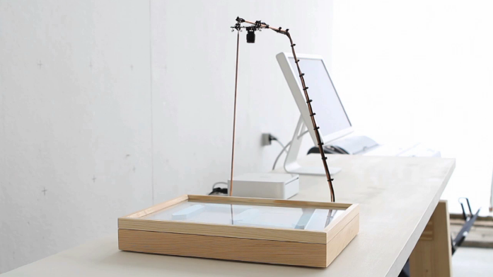
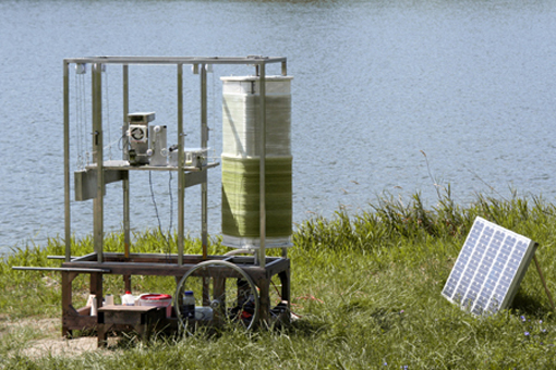
On the twenty-fourth of November I visited the “New Energy in Design and Art” exhibition at the Boymans van Beuningen in my city of birth, Rotterdam. A work that caught my eye was “The Idea of a Tree,” an award-winning project by Katherina Mischer and Tomas Traxler. Basically, it is about an autonomous machine (called “recorder one”) that produces objects using just thread, glue, paint and solar energy. Finished objects are not only functional, as they also reflect the weather conditions of the place and time where the machine has been working. Elaborates more extensively on the project.

The good thing about “The Idea of a Tree” is the fact that it actually works. Too often, sustainable projects by artists somehow feel stuck in the conceptual zone. As a person that classifies most of his own projects as “stuff that works”, I like seeing a relatively simple machine that tries to give a concise answer to the relatively complex question of sustainability.

Moreover, the project doesn’t just work in a mechanical sense. It also effectively combines concepts of consumer culture with ideas coming from the Slow Movement. Using the distinctiveness of local environment factors, objects are produced that are each unique and yet share a common theme. Examples of the objects produced can be found here.

The objects produced by “recorder one” are, as can be seen, aesthetically rather pleasing. They also come in a variety of forms, functions and colours. The seal, colours and even construction breathe the words “ecological design”. People buying these objects will probably identify themselves with some ecological responsible subculture. This is a typical trait of commodity fetishism, though this aspect doesn’t distinguish the “Idea of a Tree” project from most other slow design projects.

The unique appearance of every single object, however, does. Just like the Stäm pizza cutter mentioned in the introduction of this essay, there are concepts of pseudo-individualism to be found in the lovely stools and lamp shades produced in the “Idea of a Tree” project. The variety in thickness, length and intensity of colours found between these objects can be interpreted as the ecological responsible answer to the diverseness colours presented by the Stäm pizza cutter.
People like having to make these kind of choices. Thus, presenting the consumer with an assortment of small differences in the same product makes a great marketing tool. Take Apple, for example: ever since the dawn of the iMac, Apple has presented their products as a smorgasbord of colours and sizes. With the iPod, Apple took pseudo-individualisation to the next step: there are about five different iPods (iPod Nano, iPod Classic, and so on), each presented in a variety of colours. It made Apple one of the most successful companies in the world. The same counts for Ikea, offering rather superficial customisations to the customer. Over and over again, pseudo-individualisation has proven itself as a winning marketing tool.

Green marketing, however, has not. Despite the trend of sustainability becoming “hip”, telling people to buy a sustainably product because it’s sustainable doesn’t work. Just take a look at these links. In the end, people do not want ecological products for the greater good. People want good products that are marketed well. The “Idea of a Tree” project by Katherina Mischer and Tomas Traxler has this potential, especially if it were taken to a larger scale. The products show a clever balance between sustainability and the fulfillment of the rather superficial needs of the consumer. These superficial needs are met using local, environmental factors. It uses these factors to simulate the idea of the growth of a tree, which is – well – cool. Let it be an example for the many inspiring slow designs that are yet to come.

Reflecting Design Practise


Sunday, January 29, 2012

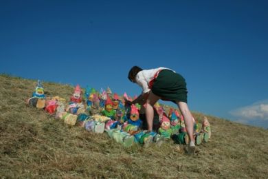
One of the first things I noticed when I saw the work of Sophie Krier for the first time is that there was definitely a lot more going on than just a simple design. She directly got my intention by a deep video about her grandfather @ Face value [x]. It was really based on reality, honesty, and with so many deep hidden emotions. I thought it was really interesting to see how she doesn’t directly throws it in your face. She is experiencing her work and daily life not only as a designer but also as a human, and a young women with a vision ‘designing is researching’.

Sophie Krier, video still from “Kabouter Revolutie”, 2009

(more…)

knitting machine


Saturday, January 28, 2012

 
[

http://www.youtube.com/watch?v=P4chUCehdbY&feature=related

]
 

Get the Flash Player to see this content.

 
[

http://www.youtube.com/watch?v=mQMtBBnMi_g

]

He flew too high, the wax melted, and Icarus fell down into the sea and drowned.


Saturday, January 28, 2012

Come to the edge, he said
They said: We are afraid
Come to the edge, he said
They came
He pushed them…and they flew.

by Guillaume Apollinaire

Design; while going in a more and more functional direction, slowly losing its identity or personality, we can see globalisation in comparison with every object, especially from minimalistic or functionalist movements, there are no more locations, no more things which are related to places . In this case designers; who’ve been born with brick in his stomach. In other words one who lives all their life in the same place and were inspired by local traditions are starting to feeling more tension nowadays.
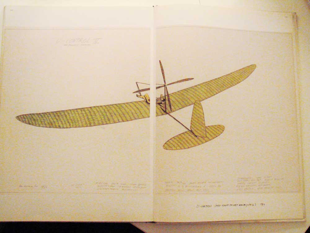
In the conception of slow design in the way how research has become a scientific experiment or philosophical theory the line between art and design become finer. On the exhibition which was dedicated to the theme New Energy / sustainability /Slow design one object was more related to the art then to the design , but the way of construction it is in the experience of the thing by itself that reflective ideal of positing thought has it’s basis. This statement is an almost perfect description of Panamarenkos notion of indention as creative method because for him inventive thinking must be invested in something, it must be realised in some way.
Thus when Panamarenko speaks of his machines as working, he is not simply talking about function -although this is enormous importance to him – but about the way in which a whole trajectory of new thought, aimed at an empty location of a certain kind? The journey into the unknown, the adventure, becomes embedded in or embodied by a thing. Even if this trajectory is never completed and flying machine, despite repeated attempts at improving the technology, fails to get off the ground, the concept together with the material engagement with the thing itself, will lend it an undeniable sense of purpose. It will make it intelligible, both as an object of technology and as an object of knowledge. Most important of all, it achieves an independent existence as what might best be described as a ‘radically styled’ work of art. It becomes inappropriate to categorize Panamarenko s works according to their appearance within some overarching notion of his development as an artist; we must look at them instead as a types and categories of things, aeroplanes or birds, insects or cars.
The impetus underlying Panamarenko s approach to work is a somewhat sceptical one, and his scepticism is directed at the institutions of both science and art. In this respect, it is part of an important and still current strand of scepticism in the complex weave which forms the history of ideas in the post-war period .
The most basic assumptions of science- it is institutionalised forms and routine methodologies- were being questioned by a generation intent upon pursuing their dreams rather than acquiescing in the face of a technology driven, steadily-intensifying cold war. In the field of art , this same spirit was manifested as a robot and to branch an attack upon the modernist conception of relationship based upon the idea that some profound sense art should demonstrate belief in a world, even a universe , that was potentially analysable, describable and measurable in its entirety.
His sceptical outlook extended to the nature of human existence .Rapid advances In the social sciences were leading individuals to question the biologically singular and rationalist construction of the human subject. For a brief historical moment it looked as though there were no certainties any more and seemed that everything was up for grabs .

As an example is an excerpt from an interview with an artist which reflects the position of Panamarenko about art and design:

If somebody asks me about my profession, I’m ashamed to have to reply: “I’m an artist.” For I consider most artists to be retarded. They always work in relation to the galleries and museums. This goes for all art, of course, art can only exist in relation to museums and galleries, but why should it depend completely on it? 50% should have a reason of its own as well. It should also have been made if the art world with all is crap wouldn’t exist. Most of the time one sees art which is 100% dependent. I absolutely dismiss all of it. My position is very neutral with regards to the general ideas about art. It’s easy. It relieves me of the question how to be anarchistic. It comes without saying, because otherwise I couldn’t make any good work. Without this dismissal my work wouldn’t be free and it wouldn’t contain any attempt of adventure. What a burden, all those stupid galleries and museums! One should analyse these people who have organized art shows for half of all the artists. One really wonders what artists are looking for in the neighbourhood of such jerks.

Make the bees work for you!


Saturday, January 28, 2012

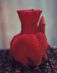
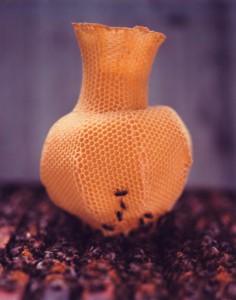
I have always been fascinated by different kinds of materials and combinations of them as there are thousands of different possibilities of the outcome. And especially in art or design works where you can feel that the material was completely ‘understood’ by it’s artist or designer. It was exactly that feeling that I got when I saw Tomas Gabdzil Libertiny’s Honeycomb Vessel #2 in the Boijmans van Beuningen Museum in Rotterdam.

The Paper Vase or the Honeycomb Vases demonstrate a new way and approach of working with materials. This means that natural processes have to be understood and investigated from all different kind of perspectives. I like this thought and I think it is a crucial one for ‘sustainable’ design. We should communicate with our environment and understand it. Therefore it is important to take advantages of the things that are already there. The Honeycomb Vases symbolize this crucial understanding. In collaboration with beekeepers he found a way to make the bees build a vase like shape. The vases are created by placing a basic beeswax mould printed with a honeycomb pattern into a beehive. The bees then start to work with that pattern. It took 40,000 honey bees that worked over a course of one week to create one vessel! Libertiny himself calls this process ‘slow prototyping’. Every vessel has a unique form and they also vary in color and smell depending on the flowers that are in season.

(more…)

A FIGHT FOR SUSTAINABLE LIGHT


Saturday, January 28, 2012


sustainable |s??st?n?b?l|
adjective
able to be maintained at a certain rate or level : sustainable fusion reactions.
• Ecology (esp. of development, exploitation, or agriculture) conserving an ecological balance by avoiding depletion of natural resources.
• able to be upheld or defended : sustainable definitions of good educational practice.

Sustainability has become an word used easily in the design world. It has become somewhat of a trend to be sustainable. However, to what extent are these designers, categorized as sustainable, truly part of that platform? Recently, there has been an exhibition in the Boijmans van Beuningen in Rotterdam on sustainability, slow design and new energy. There was a great collection of works that were chosen to be displayed in the museum by the curator. While I was walking through the collection I wondered how and why the curator had chosen to present these particular works. There is a link to sustainability in all of them, yet, is the relationship valid enough?
There were many products which used natural elements, but do they fulfill the criteria of being sustainable? As you can see above the definition is: ‘conserving an ecological balance by avoiding depletion of natural resources’. This is a very complex statement. If you are creating awareness of the natural resources and using it as a platform for design does that imply that you are being sustainable? It seems to be that designer takes this idea of sustainability a bit too easily. To investigate this concept I interviewed Mike Thompson and looked at his work.

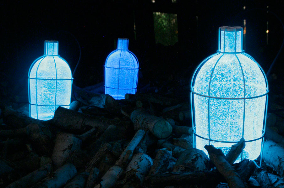
Mike Thompson sees himself as an instigator of design in the bio-technological world. Using unusual power sources, he has developed a myriad of ways to create light. One of these unusual design was shown in the Boijmans exhibit. The piece, named “the blood lamp“, contains a fluid, which reacts to blood to create an ambient lighting. Curious about it’s versatility, I asked Mike Thompson whether his light only reacts on blood or if other fluids could trigger a similar reaction. The answer was surprising, a yes for urine. Urine is as effective as blood as it is the ions that react to the fluid.
His objective behind the project was to create a ‘debate piece’. In his words: a piece that would ‘plant a seed of thought’ and ‘change our relationship towards energy’. The user of the lamp would have to think about the sacrifice (blood donation) that would have to be made in order to use energy. Blood, is a romantic to stimulate self-analysis. Do we use energy with that same consciousness, when we are in fact sacrificing the delicate balance of our natural surroundings.

Blood Lamp – Mike Thompson video

My choice to investigate Mike Thompson as the representing designer of the Booijmans van Beuningen, was based on the fact that he established a piece which by using beautiful symbolism, had created a clear message towards the public. However the question still remains whether or not we can call this ‘enlightening’ piece sustainable.

When I asked Mike Thompson how he interpreted the word sustainability; he directly admitted that his work and his way of working was not based on being sustainable. He merely wanted to create some consciousness and does not believe that his rather unsustainable process of creating pieces will distract from the message he is trying to bring across.

But is this the role of the designer? Designers, in this day and age are merely the instigators of something new and innovative. It is the role of the designer to create something tangible for the public. Mike Thompson is working on a biotechnological level surrounded by people whose main goal may only be sustainability. From which a product or solution may appear that do not relate to the world around us. The designer’s role can be seen as a mediating role, a role which Mike Thompson takes with pride. It is important to remember ‘that no one is shown the way to speculate’ and speculation is all we can do. A nice example of how the relationship between the design world and the biotechnological world works, is a new project that Mike Thompson is working on. He is in cooperation to create an ambient light that would trap light. The principle behind trapping light is that the lamp would catch light through which it would be able to reuse light and work for hours after the light has been trapped. In theory this project may work, but it does not yet. This initiation of creating the trapped light can cultivate a whole new stream of designs for recyclable light sources. Mike Thompson often works in theory, he has also designed a light called the algae light. The light would hypothetically work through photosynthesis. This however is not possible. But by designing these hypothetical pieces he has initiated a chain of thoughts: Are we able to use these natural processes for our own benefits? Or as he has written on his website: Are we able to use a flower as a light switch?. A question definitely worth further investigation.

In relation to many other works that where exposed I do believe that the work of Mike Thompson has an interesting approach to sustainability. I would however like to put him on a new platform, and make clear that he is not being sustainable with the blood lamp and is in no way ‘conserving natural resources’. The platform for designers that I would like to create and initiate would be called; ‘instigators of sustainability’. You can question whether this does not fall under slow design, but I am a great fan of clear labels, and words like sustainability are very easily manipulated to something that it is not. To prevent this from happening again we can merely add the verb ‘instigator’.


More on Mike Thompson: http://www.miket.co.uk/

John Körmeling


Saturday, January 28, 2012


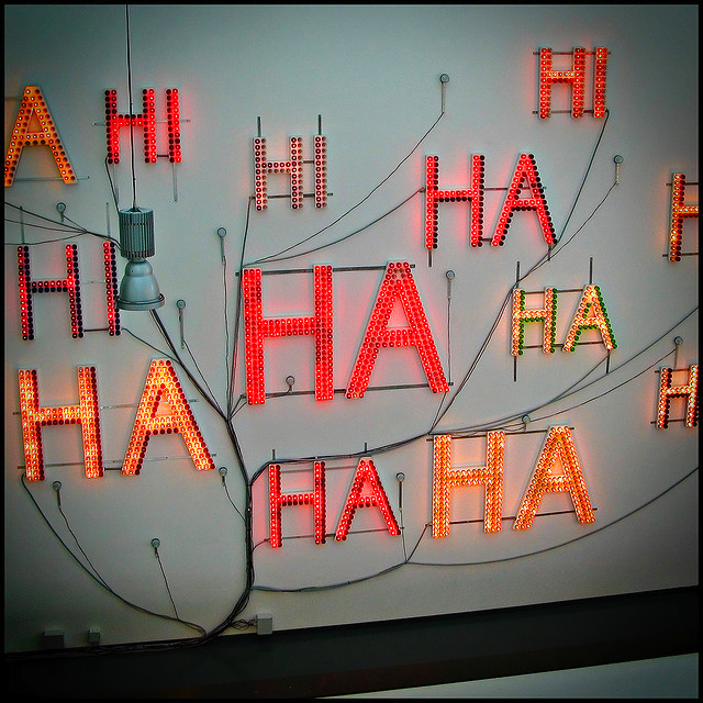
John Körmeling's "Hi Hi Ha Ha" (1992), Van Abbemuseum, Eindhoven, 2006.

(more…)

Technology in Nature


Saturday, January 28, 2012

These days there seem to be an ongoing battle; a destructive, and in many ways ignorant battle, between nature and technology.
Nature, as in our whole planet, with the various organisms living in it; the stars, the sky and so forth.Why does the technological world try to conquer what is, in fact, our source of life, and an ancient, mysterious and beautiful force of the unknown?
Maybe that is why –in today’s society– we don’t like to be left in the dark. We don’t like not to know, unexplainable things. There are, indeed factors to nature that we can neither explain nor understand at this moment.
I, myself, find that to be extremely comforting, and beautiful. I find myself constantly surprised by various factors in nature, and its mystical ways. To be assured of the fact that we actually don’t really know anything, do we?

There are these two designers in our midst today: Lonneke Gordijn and Ralph Nauta. Both graduated from the Design Academy of Eindhoven.
Lonneke Gordijn,   a passionate beliver in the strength of nature, found the love of her life, and business partner, in the technological Ralph Nauta  ; Together, they founded “Studio Drift”.

Studio Drift has a futuristic vision, which is truly beautiful, but nevertheless an ideal to strive for. This vision has peace and love written all over it, and is so idealistic that I felt like the world was all nice, and pink, and soft again after reading about it.
They believe in something most people have shoved under the carpet a long time ago, or haven’t even thought about at all.
They are curious about a future where the new technologies are constantly changing different aspects of our daily life, and also curiosity about how the evolutionary developments in nature and human culture will proceed.
Ralph Nauta and Lonneke Gordijn says that they are striving to find the perfect combination of knowledge and intuition, science fiction and nature, fantasy and interactivity. Their goal is to create a dialogue between the viewer and the objects created, embodied in tangible objects that refer to realities that are often impenetrable and difficult to understand.

Combining their two minds and fascinations, both their work and their minds ended up complementing each other, merging two good sides into an even greater unit. A great example of this is their design “Fragile Future” where you can question whether or not the nature is, in fact, THE technology?
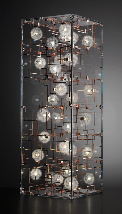
 "Fragile Future"

Creating with their vision ahead in the horizon somewhere, the vision of letting nature and technology complement each other instead of being in this restless, useless battle. Seeing how two people with quite opposite fascinations become a better one, than two separate poles gives me hope that they are in fact going to be able to open minds all over the globe; open eyes to see that war is not the answer to anything, no matter how innocent the war might seem.

My own opinion of the relations between nature and technology, is that these two are more closely linked than one might realize. If you look more closely, nature is in fact nothing more, and nothing less than highly advanced technology. All the organisms, the stars, the sky and so on, (as mentioned earlier,) are indeed a product of nature itself. For example, if you look at the snowflakes, fingerprints or the iris in the eye, you will find that these three creations of nature’s technology is an endless stream of astonishing, unique compositions far beyond what we have ever created with our technology!
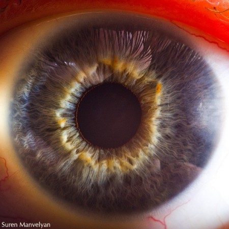
As the technology of nature has gone on for millions of years, and goes beyond the human ability to comprehend, a spiteful urge to compete appeared; human made technology appeared.

To some extent, we have “tamed” and defeated nature, to fulfill our own selfish needs for luxury
Although this development is increasingly polluting nature, we keep wanting more, craving even more of something unnatural. Human made.
Nature might seem to be in danger, and constantly being harmed by the footprints made by the human race, but this is only partly true!
Today we are so cocky and confident that we allow ourselves to think we have the ability to eventually destroy nature, which is a thought that scares us all, but is it true?  – I believe not!
Nature is, has been, and always will be a sustainable, reincarnating force that is too robust for us to destroy. We might be able to change the planets environment, but nature is still evolving in its own way, despite of the destructiveness forced upon it. It is truly highly adaptable, and might eventually show us that “survival of the fittest” will be, not only a saying, but also a fact. If we don’t take care, if we don’t stop the narrow mindedness, the selfishness and the urge to be God,
we might end up being the ones terminated by nature while trying to change the path into what we think is right.
An excellent author dealing with these thoughts and issues, Gert Nygårdshaug, has written a few books that are worth reading, like “Mengele Zoo”, and “The pool of Aphrodite”.

Why not take a step back, breathe, show a little humility to “the elders”[x]; our source of life?
The human kind is not essential for this planet, and certainly not our technology. At some point this has to be realized, and changes has to be made. Letting go of the great ego for something even greater. Life itself.

Now; I am not naive nor the biggest believer in the human mankind. Of course I don’t see us taking a break from developing new technology in order to stop and “smell the flowers”, but with designers like Ralph Nauta and Lonneke Gordijn I feel hope.
Hope that they might be able to spread a little more awareness amongst us, and start this thinking process in people that haven’t been thinking in this way before. Hope that more people will feel inspired to nurture the bond between the two [x], rather than the separation of them.
It’s amazing how far you can get, just by setting a simple seed in the ground; a simple thought in one’s mind. It might grow into a whole new forest.


Interested in more contributions on the subject of nature in technologie or vice versa check the project "Beauty in Science"
Saturday, January 28, 2012

Society as we know it today may seem at points really grey and monotonous at times, but in my opinion, in most cases, if you look at the small details, you will find out we are obsessed with colors, even in our every day life.

Imagine waking up, going to work, seeing your colleagues and breaking this conversation:?

-“hi how are you?”?

– “fine, and you?”?

– “good, thank you”?

And from there on work goes on, another day comes, and the same conversation all over again. Like an endless loop without any point or interest. Just being still like a sculpture.?

But not in reality, and this is where color comes in to the story, I believe our soul is built like a tray that carry things on it, it can be things that happened to you, opinions, philosophies and even believes. this is what makes life more complicated and interesting, the source for trouble and solutions at the same time.?

I feel like everyone trying to achieve some level of balance on the tray they carry, moving things around, adding good on bad and bad on good in order to find the balance between not too full or too empty, and between completely flipping the tray over. This balance that we seek for, as an individual forces us into all sorts of situations and feelings. And when you start to look for it in other people or in yourself, you may find people to almost look like they are brushed with a different color of paint anytime they try to balance the tray.?Happiness, sadness, hope, fear… is it all feelings? Or just colors that we can paint over? Dose every layer leaves a mark on us?

Is an argument presents a fight between different life perspectives or just shows two different colors trying to blend with each other?

As an artist, how do you decide what color to add to your work? Or even to your day, is it by what reality tells you should or is there. Or by what you feel needs to be there?

The emotive use of colors is something that interests me deeply; it is visible in various artists from Picasso to new age artists, how strong a color addition or lack of a color can be on a work?

All this questions started to rise up in me after seeing the work “Reuzen (Giants)” by the design group- 75b.

Reuzen (Giants) – 75B

Realizing how much color can effect and dose affect our everyday life, even in the deepest places, the core of our being. This work presents to me very well the feeling of change and process we all have in life.
Looking on the portfolio of 75B the versatile use of colors is visible. Creating or dividing spaces, adding a dimension to an existing reality, and evoking different feelings on the viewer. Also at other works the lack of color serves the same purpose. In different ways like dividing spaces, adding or taking away certain colors to evoke various emotions on the viewer.

Reuzen (Giants) – 75B

Know. the control is in your hands, in your own life you are the artist that holds the brush, and not obliged to be effected only by other colors being implied on you by others around you. So what happens tomorrow is completely up to your hands.

SHEILA HICKS


Saturday, January 28, 2012

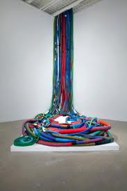
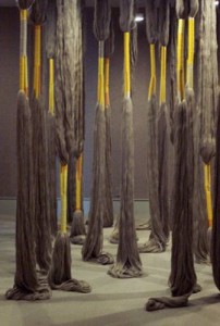
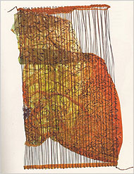
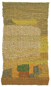
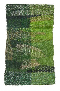
Sheila Hicks took the long way of learning weaving.

She studied painting under the Bauhaus professor Josef Albers, but when a pre-Columbian textile course captured her attention, he took her home to meet his wife, Anni, a noted weaver. At his suggestion, she applied for a Fulbright scholarship to South America, and spent the first few years of her weaving life journeying through Venezuela, Bolivia, Peru and Chile, and back north to Mexico. The old weaving traditions have so much more then just the methods and techniques, it is a mix between their history, spirituality and religion. It is mostly based on symbols.


Sheila’s work has a focus on the material and the space in it, and around it. In her pieces you can see how she also let go of the weaving and modeled it instead so it became an installation.


New energy is not just finding new sources of energy but also taking something old, such as weaving, and giving it life and a new meaning. Weaving is no longer a necessary activity or a way to show status, as it was back in pre-industrial times. Its social importance is less and less fainting in this world of new technology. When I was a child I grew up partly with a Tibetan woman who had history written on the walls in the disguise of tapestries. I remember the stories that I kept developing in my head with the inspiration from these woven paintings. And back then, I didn’t know that it had the same effect that I today get from a painted piece. I am glad that I got the opportunity to experience weaving and the lost handcrafts of this kind at such a young age, before people told me how to read a story properly, or what is “good” and “bad”.


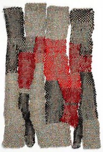
The first time i saw Sheila Hicks work was in Rotterdam’s “Museum Boijmans Van Beuningen”. She showed some of her smaller works, and the title of the show was called “Cent Minimes”- one hundred small works collected together


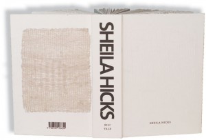
The works were presented like paintings in frames, but was still given the space of 3D objects. In her book “Weaving as a metaphor“, that she made in cooperation with Irma Boom, she shows a lot of her small pieces. Which also won the gold medal for “Most Beautiful Book in the World” prize at the Leipzig Book Fair. The book is very honest, with a focus on the physicality of touching and feeling the material. The book is one of the most popular art books of our time, I think it’s because of the special feeling of having a book that shows and “feels” this kind of art, which is meant to be both seen and felt. .


As she once said in a interview “I found my voice and my footing in my small work,” and that really shines through.

When I saw that show, I could immediately relate to Sheila Hicks in my own way of working and the satisfaction I get from painting. The way that she lets the fabric work for itself is amazing! She creates something, but she also gives the fabric and the different materials the space and life that they need in the frame. For me it was almost like seeing a sketch book, i think it is very honest to show “work in progress” might not be the truth behind it or the attention, but it had the affect on me. I myself have been struggling with the thin line of finishing a piece without over do it, so it was inspiring to see someone how could let go of the control and just show it!

Her experience really shows in her work, you can almost feel the wrinkles on her face, the laughter and tears that have been there.

She once said, “The act of creating is much more exciting for me than leaving a monument to myself,” explaining how she would deconstruct her fiber twists, spirals, ponytails and tapestries into piles of yarn. “It felt great. It meant that my imagination could run free.”

That really says something about her way of living, that she is not afraid of life.

HAHA! Oskar de Kiefte


Saturday, January 28, 2012

When we think about design we usually consider a fragile compromise between the practical qualities and aesthetic qualities of a product. The result will lead the viewer to consider a known concept or problem from a new perspective. Experiencing contemporary design is essentially re-adjusting our view of the future. In this essay I will attempt to outline Oskar de Kiefte’s work in the light of SLOW Design and sustainability. I will also consider the role of humor in his work.

In the work of Oskar de Kiefte we are not presented with a considerate balance of aesthetics versus practicality. Instead, Oskar chooses to show us a crude example of how technical simplicity can lead to new and interesting solutions. The Wind Turbine Car is a car without compromise, without consideration for elegance but rather the result of pure technical problem-solving. The wild, exciting and adventurous shape reminds me of deep sea exploration and space travel. The cause for such boyish associations is merely the technical nature of its design. From start to finish, every aspect of the car was designed to be for optimal performance. How do you turn wind resistance into wind stimulation? You build > this<

(more…)

“Time Writersz”


Saturday, January 28, 2012

Based on the idea of sustainability and especially the so called Slow Design I want to have a look at one of the works from  Eindhoven based design office EDHV, which were displayed in the Museum Boijman van Beuningen in Rotterdam. 

The work i want to talk about in this Essay is called „Time Writerz“, first exhibited at the Dutch Design Week 2010. It consists out of different plates of wood which have been hidden in the ground and sealed from air and erosion for more then six hundred years. By putting it back to the air the wood comes to life again. To show the ”growing” process there are pencils attached which are holding the wood and are „writing“, documenting  all the movement the wood is making.

EDHV is a creative office that was founded and based in Eindhoven in 2005 by Daan Melis who is a publisher and Remco van de Craats who take care of the design part. They are working in the field of product design, webdesign, motion design and architecture. As the title of the website already shows you „At EDHV, we don’t specialize in anything!“ and ” We can best be described as architects of identity. We work interdisciplinary so all aspects of identity can be fully integrated.“
One of many important things for EDHV is the sustainability of their work. Therefore the most important thing is to start every project with a proper research because this is important to create a sustainable concept or idea. To quote Remco van der Craats: 
”A shape without a foundation has no meaning“. Another key to a good result for him is trust and intensive collaboration between his office and the client.

Remco van de Craats on design


I choose the artwork „Time Writerz“ because it fascinated me for different reasons. For me this work from Edhv is a lot about making change through time visible and here I see the strong connection to a collaboration work I did myself for an exhibition in Munich in an temporary space in the summer of 2011. 

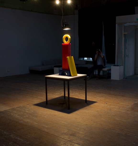
We decided to use very basic geometrical shapes and also keep the choice of colors really simple. It also should remind you of the wooden blocks you were playing with as a kid and also was a direct reference to a old mural that was painted  on the ceiling of the exhibition space. The mural shows silhouettes of houses painted out of the basic geometrical forms and colors. These basic forms were made out of colored wax. Over the sculpture we placed a lamp. The wax was slowly melting down during the time of the exhibition by the heat of the lamp hanging over it. Our goal was to work with the space and also showing the fact that the space, which we were using was temporary, by letting the artwork vanish during the show.
 

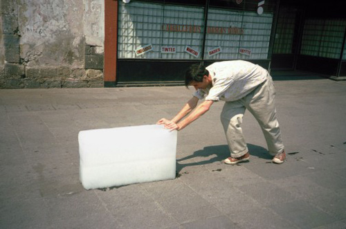
Another Artist that works with the same idea of making change visible is Belgian born artist Francis Alÿs. Educated as an architecture in Tournai and Venice, he move to Mexico City in 1986 and soon started to work as visual artist.


Melting wax sculpture

He mostly works with video and performance art. His performance „Paradox of Praxis 1 (Sometimes Making Something Leads to Nothing)done in 1996 in Mexico City is maybe the best example of how Alys worked with the topic of showing the change through time, by pushing a big squared formed ice block through the streets  of Mexico City.


Invisible Expression


Friday, January 27, 2012

Why do we build walls, roofs, doors? The same reason we build fires, run air conditioners, blow fans, humidifiers and de-humidifiers: to define and bend the atmosphere to our will. Once it is contained within walls, we change our atmosphere to the conditions we find to be the most pleasing, the most conducive to our continued growth & existence. In a cold place, the walls protect us from certain death at the hands of the wind & the freezing air. But what does the house do but capture the frozen air all around & tame it, domesticate it, as one would a wild animal, with constant care & attention? Human survival nearly everywhere on earth depends on this task.

Keeping air is like keeping the sea–it is all flow and energy, and everything we do to one part of it affects it all, creates a wave of reaction, for air resembles water in its motion: its currents and waves are wind, its warmth and chill move atom by atom up or down, each molecule making way for another as the others make way for it. How do we learn to use the qualities of this substance to our advantage, instead of treating it as something that happens to be there, an inconvenience, a battle to be fought with radiators and air conditioners? We know that this void is no void but a thin liquid in which we swim. Inside and outside, this air-thing called “climate” has finally found a place in the modern imagination, something that has its own identity, something that changes, that must be “saved”, and now that we recognize it, it is necessary to take it into consideration as we continue to build, as we continue to exist and grow.
 
Philippe Rahm is in some sense an activist for the interior climate, for finding an integrated way to use and not waste the nature of air and to revolutionize the way that we would constrain and encourage its flow with architecture. His focus is not the efficiency of the building for ‘the greater good’, however; he redefines how interior space is conceptualized in order to create a new language of architecture, one that can be equally bent to the need of function, efficiency and art.


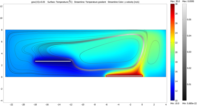
His “Digestible Gulf Stream”, a series of projects begun as an installation for the 2008 Venice Architecture Biennale, is a prime example of this language in use. As opposed to heating or cooling the different spaces in the structure to the optimal temperature for their use (warmer in the bathroom and living room, cooler in the stairways and bedroom), he uses the principles of thermodynamics to create a convection current that is perpetually cycling, aided by the structure of the space and two radiators that are set at a difference of 16 degrees Celsius. The function of the different areas of the house is thus prescribed by their place in this current as much as by their trappings.  This is not a new idea, of course, but what is new (at least to this writer) iis the sense that there is a continuity, instead of merely a radiating outward of heat, from cold to warm, or vice versa.

This cyclic flow of air and energy implies an efficiency that is currently being used in sustainable architecture (as well as many traditional types of architecture that are not reliant on central heating and cooling), but with the sun as the warming influence and the shaded area to the north of a building as the cooling influence. The Earthship design concept has been around since the 1970s, and other practices in sustainable architecture and living–using recycled and recyclable materials and determining the form of the building by how to best use the natural forces available in the area, among many others–have been being implemented for millennia. In the industrialized world, however, these considerations have mostly only used as guiding architectural forces by the “hippie” community, but in a very practical way they speak to the same concerns and techniques that Mr. Rahm uses to an expressive end. They both assert the necessity of involving the atmosphere that we capture in our houses in the architecture, involving the living with the rules and patterns of the natural world instead of attempting to deny or fight them.

The concept that nature is a force opposite to the interests of humankind is, to all modern sensibilities, a very dated idea. It is an idea brought on by the industrial revolution, colonialism, an us-vs.-them mentality, one that as the world progresses past fossil fuels, past the ‘civilized man civilizing the savage’, past the need to explore (read: conquer) the unknown and remake it in our own image, we find of less and less value. To see the world as irrevocably “other” is to assume that we are not connected to it, that it is in some sense infinite, & time and technology have taught us that the world is a much smaller place than we think. We must throw our lot in with the trees and the fishes & all the other peoples of the world, because we are all connected and it will be a delicate balance that we strike, if we can strike it at all.

This emphatic need is being recognized in modern architecture and design, characterized by the so-called “green” movements of Slow Design (in the image of Carlo Petrini’s Slow Food movement) and sustainable architecture. Again, though, much of this design is based on a desire to make something that works in the best way, the most efficiently or the most cleanly. Philippe Rahm, although first an architect, is among those who recognize this need as an opportunity to create a new and subtle artistic medium, the chance to bend the very air around us to the task of expressing the human experience.


Log in
subscribe