Skip to Content Skip to Search Go to Top Navigation Go to Side Menu


"graphic design" Category


The Indefinable Nature of Graphic Design


Wednesday, October 29, 2014

Book cover


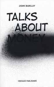
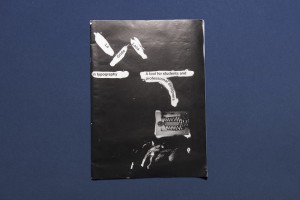
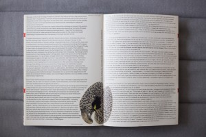
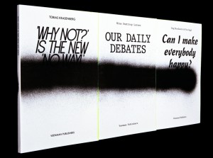
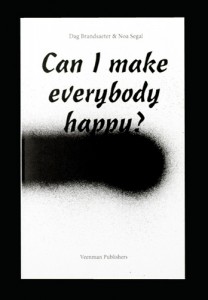
In the following essay, an almost complete series of books will be discussed in comparison to each other, regarding the design, layout, and publishing choices that the respected artists/designers or publishers had to face. The books in question (both written and designed by) are: Talks About Money by John Barclay, I Heard They Ripped It Off by Robin Ekemark & Brita Lindvall, 37 Assignments by Indrek Sirkel, Can I Make Everybody Happy? by Dag Brandsæter & Noa Segal, and Our Daily Debates by Nina Støttrup Larsen.
The books in this series enquire into the different fields of graphic design, where the basic understanding of what graphic design actually is seems equivocal. They investigate this lack of definition in the different fields as a means to contribute to an otherwise arbitrary profession. The focus will be on Can I Make Everybody Happy?, which will be used as a base for comparison with the other books of the series.

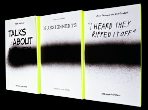
All books share a similar front cover, namely a white background, with a black stripe of thick spray-paint horizontally across, that sometimes covers the title. If you place the whole series next to each other, you will see that the lines join up, and it looks like one fat line of spray-paint on a white, clean surface. The title is written in a specific font that is used throughout each book differently, including fonts such as Comic Sans for Talks About Money or Courier New for 37 Assignments also seen below. In I Heard They Ripped It Off, Robin Ekemark and Brita Lindvall created a new font for themselves in “an attempt to tell a story from the closest point of a source”.


talks-about-money-1


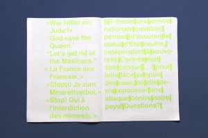
Can I Make Everybody Happy? designers Dag Brandsæter and Noa Segal had decided to compose the book of emails that had been sent back and forth between colleagues that mostly disagree on plans concerning the graphic design of specific, unknown projects. Ironically however, is that the blurb on the back describes how confrontations by e-mail are prone to make people aggressive and defensive, and that matters are best discussed face to face. This ironic addition to the production of the work coincides with the theme of the series, namely to investigate the miscommunication in the graphic design world.

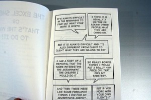
In comparison to Can I Make Everybody Happy?, the layout in Talks about Money is a similar type of communication. Dialogue is displayed in speech-bubble format, discussing how much graphic designers can sell their work for. There are, like every other book in the series, chapters, which in this case are divided into a logical structure of explanation. Unlike Can I Make Everybody Happy?, the content is a constructive discussion, where graphic designers ask themselves how much they are worth, further accentuation the lack of definition within graphic design. Below is a picture to get an idea.

P1311_5220c3bf4f83a-580x387

In I Heard They Ripped It Off, the chapters are a lot less distinguishable. There are no chapters, as this is a retelling of a story about a specific project, the “Experimental Jetset”. There are divisions sometimes, to make the reader pause for effect, with a blank page. I heard They Ripped It Off seems like a personal encounter with the graphic design choices that have to take place during a project. The retelling of the story in the book feels more personal with this custom scribbled font. 37 Assignments focuses on the variety in 37/100 chosen graphic design assignments over the course of 2002 – 2007 at the Gerrit Rietveld Academy, to investigate potential patterns with the projects. To preserve the voice of the teachers, the texts are edited as little as possible: only specific dates are removed to make the assignments timeless and universal. All Assignments are presented anonymously, in an attempt to stress the entire approach of the department not simply the individual assignments. In a way, this book differs from all of the previously discussed, and dives into an almost scientific way of investigating graphic design.

Our Daily Debates is another new approach to investigating the indefinable nature of graphic design. The book is structured like a script, between Nina, Sirkel, and some other colleagues. They joined together to debate about graphic design, their future profession. In a way, this book is similar to I Hear They Ripped It Off, as the wall between reader and writer is once again broken down by the layout choices of the book.
IHEARDTHEYRIPPEDITOFF_853


IHEARDTHEYRIPPEDITOFF12_853-1

Subsequently, the series contains a variety of books that each contains their own specific design and content layout, sometimes seeming totally unrelated. However, the indefinable nature of graphic design is thoroughly reflected and investigated upon in these books, due to their contrast in content, difference in font choice, or disparity of the choices made to display the content. Therefore, the series works successfully together as a whole to provide a tangible examination of an indefinable, arbitrary, profession.


Can I make everybody happy?: Rietveld library catalog no : 750.1 bra1

I Heard They Ripped It Off: Rietveld library catalog no : 750.1 eke1

Our Daily Debates: Rietveld library catalog no : 750.1 stö 1

37 Assignments: Rietveld library catalog no : 750.1 sir 1

Talks about Money: Rietveld library catalog no : 750.1 bar 1
Syndicate of original and contemporary typography


Thursday, October 23, 2014

Typeface_as_Program_00

Typeface as Program: Applied Research and Development in Typography
Designed by David Keshavjee and Julien Tavelli


The book “Typeface as Program” is a book about the graduation project of David Keshavjee and Julien Tavelli. They graduated at the ECAL/University of Art and Design [x] in Lausanne, Switserland.
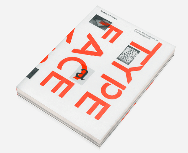
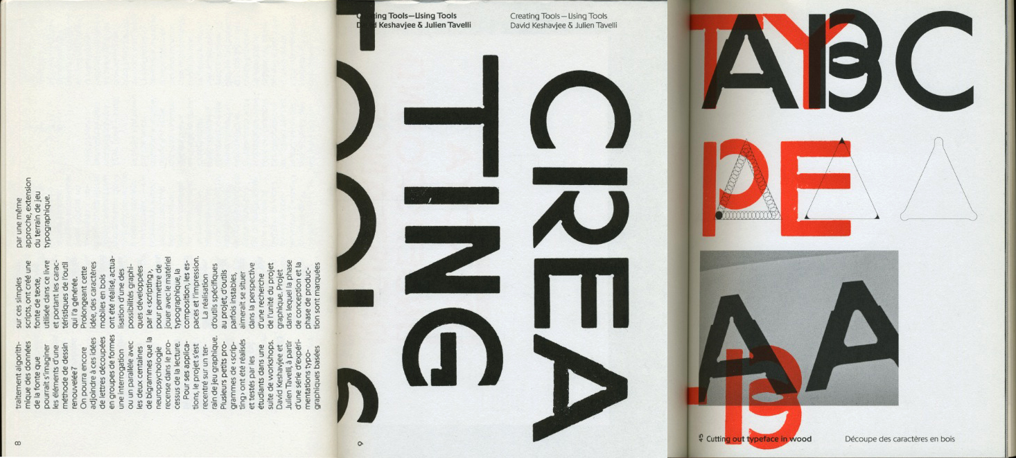
The first thing you will notice when you see this book is, of course, the cover. As seen in the picture, this cover contains the colours red, white and black. I think this, and the typeface on the cover appealed to me the most at first sight. It also seems like a book that makes you move closer, because you see the cover but you cannot read at first side what is written on the cover, because it’s vertical. You also do not yet really understand what it is about and what you will find inside. As the title is situated very small in the left corner, it draws you come closer. When you read it, Typeface as Program, more questions pop up. What is this book about? Why did they situated the words like this?


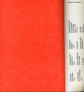
When you open the book you’ll see a very outstanding orange colour which I really like.

front page

Next you will see the table of contents and introduction. What I don’t really like about that is that it’s vertical written, so you have to turn the book which is not very practical. It does look nice.

What I already mentioned in the beginning, is the typeface. If you actually start to read this book you’ll find out the whole book is about this typeface and how they developed and produced it.


spread_CreatingTools
A view into the book about their graduation project


The size is a little bit smaller then A4-size, which I also like because it fits easily into my bag, and A4 mostly doesn’t. The cover is soft but not too soft. The size and the material makes the book approachable because it is not too big and heavy to open it.

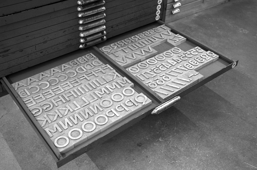
The book is representing the graduation project of Keshavjee and Tavelli collaborated by other people. The project “Creating tools, Using tools” earned Keshavjee and Tavelli the Federal Design Grant in 2009 [x]. This project is realised by several steps. They decided to develop their own tools. First they programmed a script that could automatically generate character sets based on a group of specified variables. Then, with the digital font they created, they made wood types and an automatic layout tool.


maximage6Maximage-1
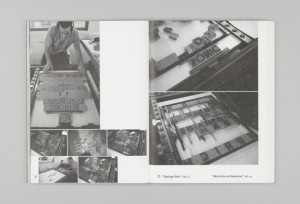
Pictures of the handmade woodcuts they made for their typeface


By combining these tools, they printed the posters seen in the beginning of the book. Using a digital font and manual wood types, they wanted to contrast different kinds of typographic languages.
In the result you can see the programmed randomness. Their type design is impossible to regenerate with either only traditional- or digital methods. The typeface was based on the idea that the, let’s call it, “DNA” was only containing the letters “o” and “n”, and from those two letters on they built the complete Latin alphabet.


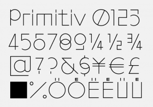
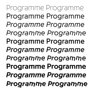
The typeface is called “Programme”. Primitiv is the first version, which was automatically generated. Its very light, almost like a sketch with a skeletal structure. Later they made more calligraphic cuts. In the typeface it’s possible to see marks made by pen, brushes or computer. The typeface looks, even though its automatically generated, almost like an old typeface.


programmae1 programmae
Programme, 2009, Keshavjee&Tavelli’s typeface they made as a graduation project


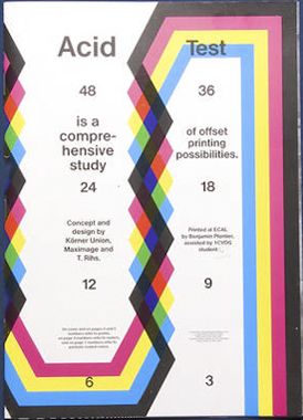
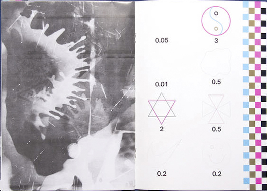
After their graduation project they, of course, didn’t sit still. They continued a lot to work in an experimental way combining different tools and using them in a twisted way, to try to reach an innovating and interesting effect. Seen in the catalog “Acid Test”, their first experiments with chemical products.


Maximage-AcidTest-cover Maximage-AcidTest-spread

Acid Test, 2010, in collaboration with Tatiana Rihs and Körner Union


In this book, they tried to work completely manual, without computer but with for example tape, razor blades, acids or brushes. They were trying to understand better how colours on colours overlay and how chemicals would react on other material. “Les impressionists Magiques” is a final product of the best outcomes they got by using these new tools, shapes and gestures. They try to see the good also in “mistakes” and unexpected surprises. It marks their work. They push tools to their boundaries and use them in a wrong/different way to get new results.


maximage2 maximage3
Maximage Formula Guide, 2011


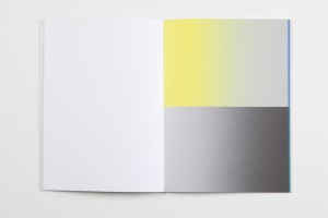
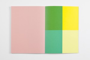
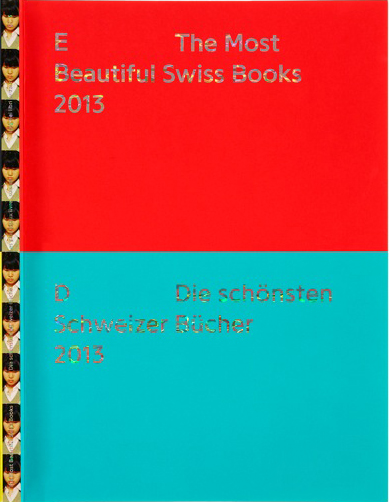
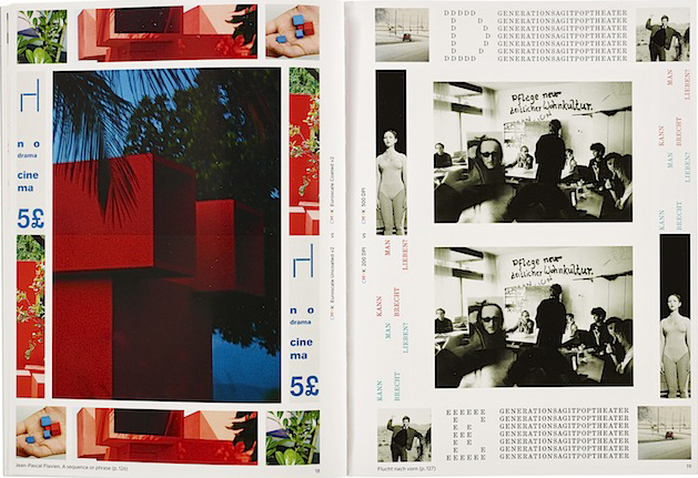
They made several more catalogs, booklets, posters for festivals and record covers. Also, they work a lot in collaboration with other artists. Their latest is “The Most Beautiful Swiss Books of the year 2013”. Again they combined new methods, for example all the parameters in the book are changing all the time. Furthermore are some pages glossy and some aren’t. I think this is an innovating view on typography to use subtle and original gestures. They also used different screening types. This all comes out in a book full of varieties [x].


Katalog-cover Katalog-2013_Content
The most beautiful Swiss Books, 2013


plaat1plaat3plaat5 plaat2plaat 4

La Grida Loca (2010) is a short booklet for graphic design students. It is about common mistakes and solutions for graphic designers and it also contains designer tips — in collaboration with Körner Union.


ohne titel1
ohne titel2
Untitled, in collaboration with Körner Union and Tatiana Rihs

Rietveld library catalog no : 757.3 kel1


Body types


Tuesday, May 6, 2014

When I was going through the blog, this tag got my attention. When I see the title I think of different bodies with different shapes, fat, thin, skinny… First I just went through the photos and didnt read the text. I wanted to see how my relation with the post will be just considering photos without the text. The post is actually different from what I thought it would be.

It’s interesting because there are many artists that use their body as an art work or use their bodies to develop their ideas. In this post, there are bodies that are formed to shape like alphabets and numbers. Also activists and protesters that write on their body or for example girls that get naked and go to Vatican to protest against religious laws against them.

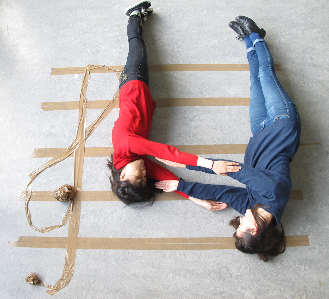
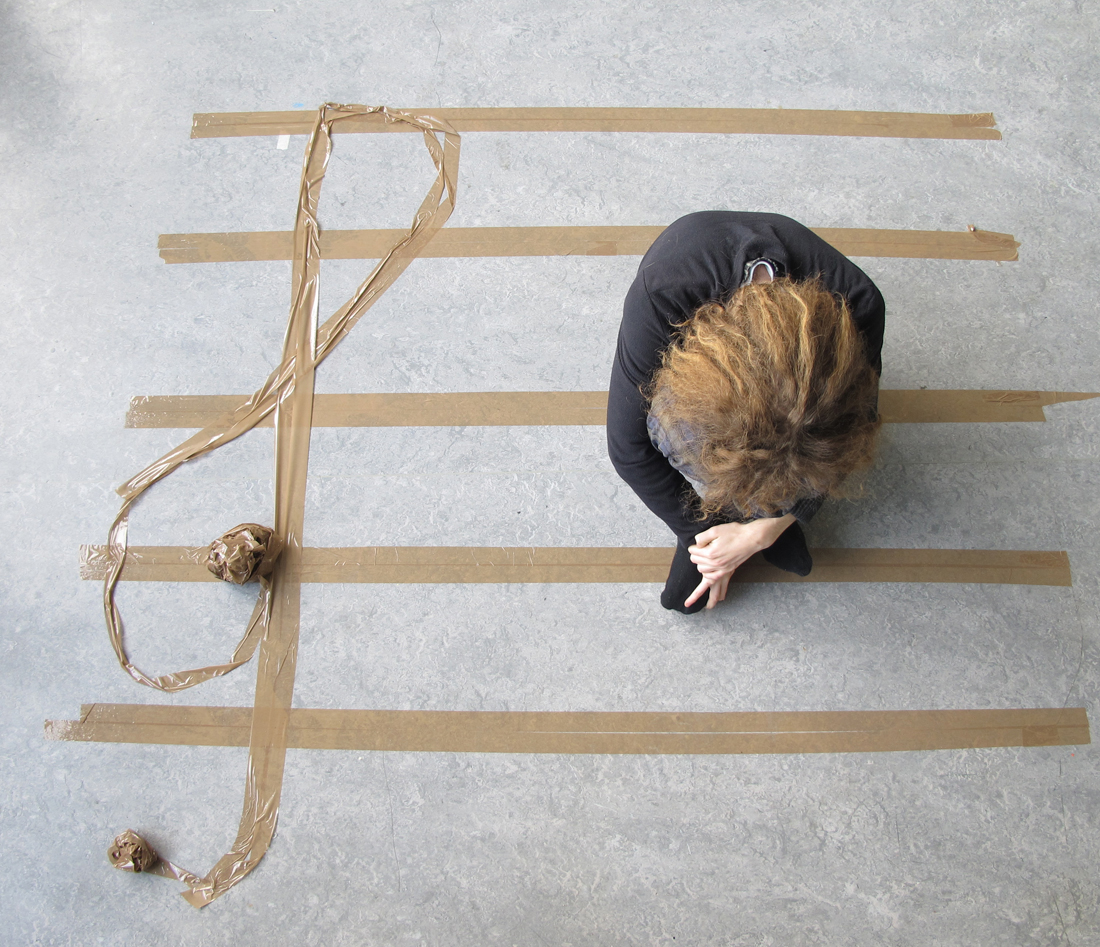
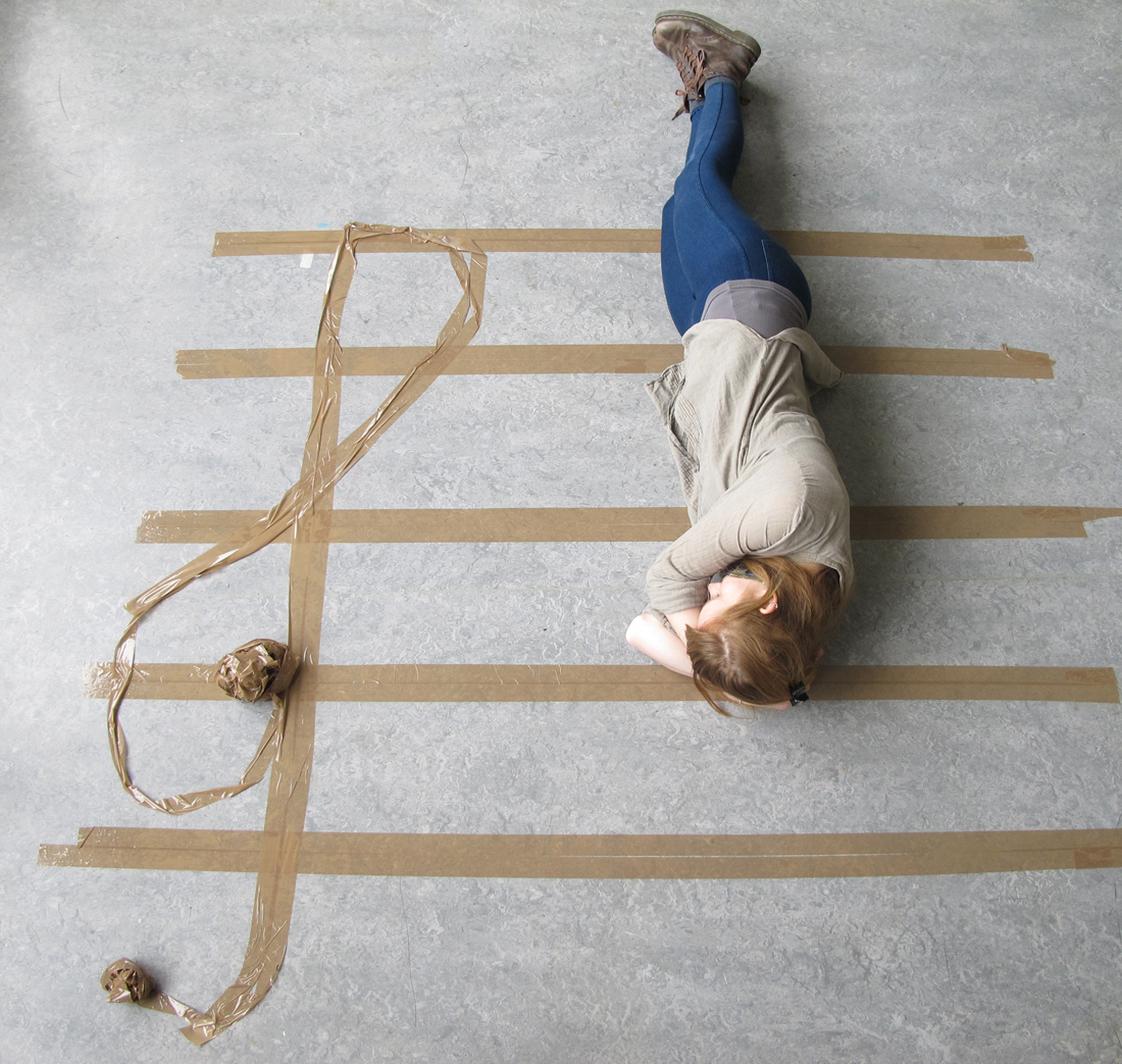
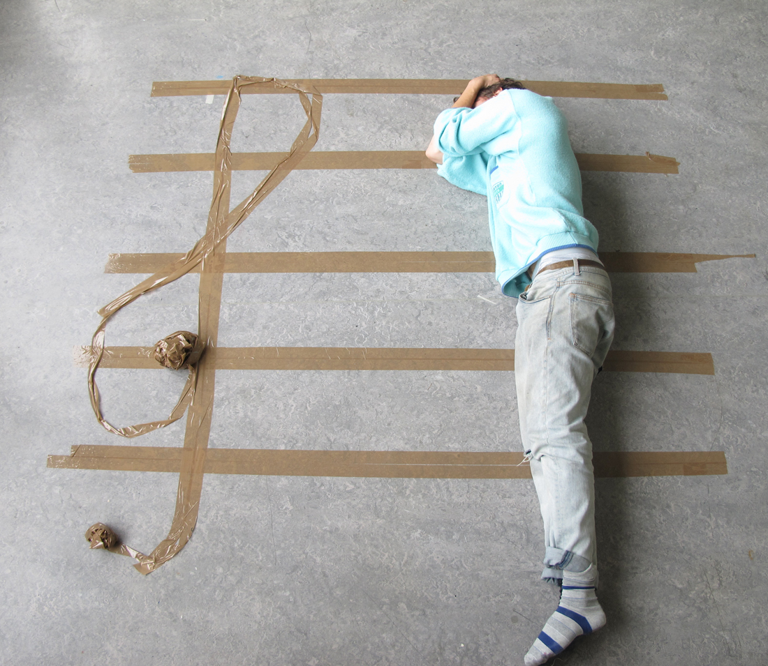
There are so many things that you can do with your body. I did a project on using human body to shape like music notes.


music_1 music_2

music_3 music_4
 

Wendingen as Layout and Form


Wednesday, April 2, 2014

[X]

One of the most immediate impressions one has of a Wendingen publication is of the format. It is ironically a very stout and conventional square shape, while not being a standard Din format. This is obviously a considered format, one which was chosen so as to fulfill a specific requirement. Similarly, once the publication is opened, the considerations of lay-outing the page as well as the type, is as immediate. The shortening of the printed area of the page reverts the visual shape of the page back to a more common rectangular format. The lay-outing of the type too is interesting as it plays along a similar functionality. With colour fields being constructed from smaller sets of shapes aligned together. This back and forth in format and form is something that may be interesting to play with on a digital platform such as a a basic webpage, where format differs from screen to screen, and browser to browser. Although this is fairly standardized, there is some variation. The lay-outing of individual elements in HTML then allows for a chance to reformat the page as desired by the user. While this is in no means a finished or particularly useful webpage, a more playful and relevant investigation into these issues is at least a potentially good starting point.

Similarity


Wednesday, April 2, 2014

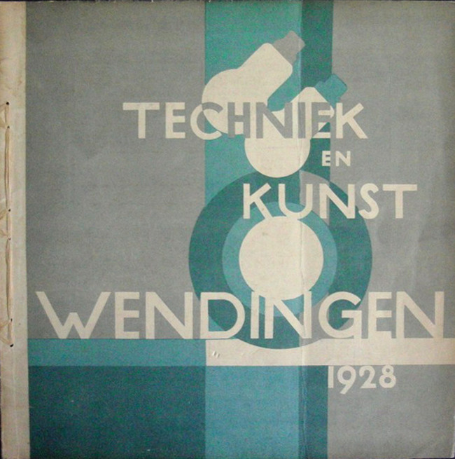
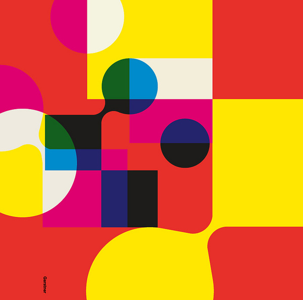
When i first went trough the pile of Wendingen magazines something struck me when I saw the cover of the “techniek en kunst” edition. At that point i didn’t really know what it was about that edition, but when thinking more thoroughly about it I had the feeling that I had seen it before. Going through my archive of pictures I found a poster designed by Karl Gerstner that had a lot of similarities. It left me thinking how amazing it was that something that was designed an odd thirty years later had a lot of the same qualities. The cover of the Wendingen magazine was designed by Wim Gispen, one of my favorite Dutch industrial designers. Before this discovery I only knew Gispen for his famous chairs, lamps and interior architecture in general. Unaware of the fact that graphic design at that time was not really labeled a profession, designers also did graphic design on the side. Though you can see that the cover designed by Gispen is an early design and not really modern any more it still has some modern qualities.

TechniekKunstWendingen karl-gerstner2

The use of shapes, circles, overprints and probably a grid in my opinion is quite modern. I think it fits in the same style of work as the early Swiss style of graphic desgin. That is why it reminded me of the work of Karl Gerstner a Swiss graphic designer that was part of the Swiss style. A movement that I am a big fan of because of their simple use of shape and subliminal use of color. Because Gispen is more linked to “de Stijl” movement I would have never expected that he designed the cover for the Wendingen Magazine but overall I am quite happy that I picked this copy because of the insight it gave me in early graphic design and the progression it went through over the years.

Wendingen 9-2 1928 Rijksacademie Amsterdam

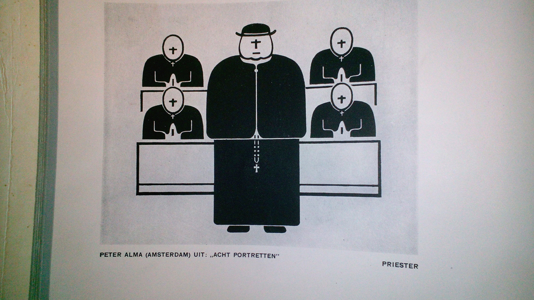
8 Portraits – Peter Alma


Wednesday, April 2, 2014

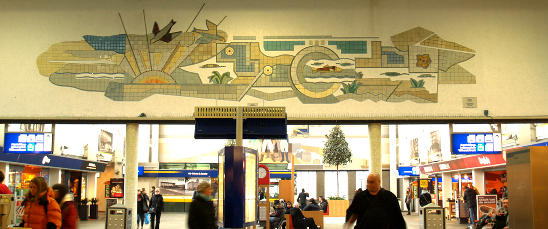
Peter Alma was a Dutch visual artist who studied in the Den Haag art academy and in Paris. He was very influenced in the communist movement and his art has been inspired by his believes. A lot of work have been done on public buildings in Amsterdam. The most famous among them was a mosaic on the old Marninxstraat swimming pool which was placed in the Amstel station after its destruction.

OLYMPUS DIGITAL CAMERA

His works represent a lot of industrial elements and workers. He works mostly with outlines and bold representations.

In the Wendingen magazine, he drew eight portraits of different social or religious communities. I choose the one where he represents the catholic church clergy. Although I saw his work in colors at the station and I didn’t like it, I was immediately attracted to his black and white portraits. I really liked the fact that he putted the cross instead of their face. To me, it looks like a critic of the consequence of a religious belief and especially with the catholic church. We can think that their religion make them blind and is the only thing you see on them. The face shows emotions and in this case, their face shows only this religious sign.

Arthur Guilleminot_redu

Wendingen 9-11 1930 Rijksacademie Amsterdam

The studio of Karel Martens


Wednesday, January 8, 2014


I had my worries walking around the book shelves in the art book shop San Serriffe. I didn’t know anything about art books how to look at them and how to look at the design.
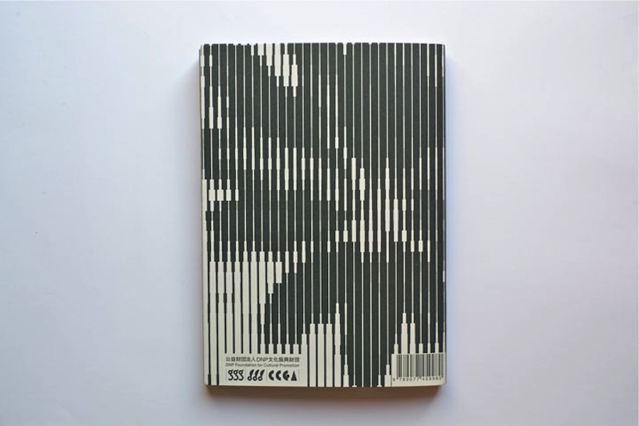
I skipped though some books but didn’t find them interesting. Then I saw a cover that caught my attention. I didn’t know the artist but I was enchanted by the simplicity of the graphic black-and-white book cover with Japanese text on the side and the title ‘Full color’. The size of the book felt a bit small in my hand, handy and easy to flick through the pages.
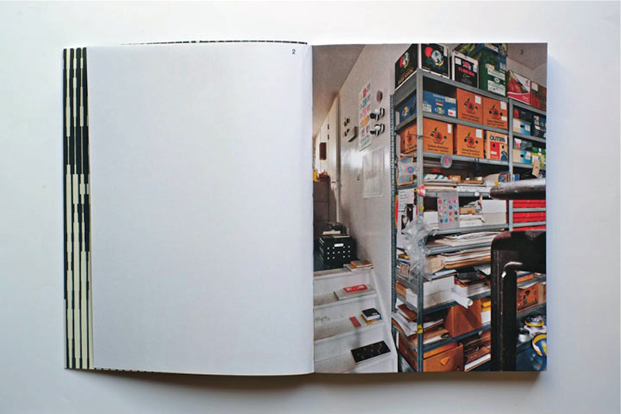
I turned the first page and discovered a colorful photo showing a bookshelf filled up with paper rolls and used fruit boxes properly containing more papers. The photo only shows a small part of the room but on the following pages the panorama of the room which turns out to be an art studio is shown. Page by page I was guided into the head of a graphic designer’s studio.


book coverbook-shelves2


It turned out to be the head of the Dutch graphic designer Karel Martens. He is specialized in typography, working with prints and books.

After his studies at the School of Art at Arnhem in 1961, he became a freelance graphic designer.

Since 1977 he has been teaching in graphic design at his old school in Arnhem and at the Jan van Eyck Academie in Maastricht. He is now working as a supervisor at the master-program Werkplaats Typografie [x] together with Armand Mevis. This program is based on practical assignments and self-initiated projects. It also works as a meeting place for graphic designers.


The book ‘Full color’ which is showing Martens’ studio was published on the occasion of the exhibition KM, Ginza graphic gallery in Tokyo in May 2013 [published by Roma Publications].

With the information about the artist and his work I started to look deeper into the book.

The photos by Johannes Schwartz are divided into 4 parts by the graphic designer Julie Peters together with Martens himself.


book2

The first part contains photos from the artists’ studio. They seem to form a long panorama, cut up and organized so you see some parts of a room at one photo and the second part of the room at the next photo. This way of organizing the photos gives you the impression of flashbacks and even more if you already know his work.

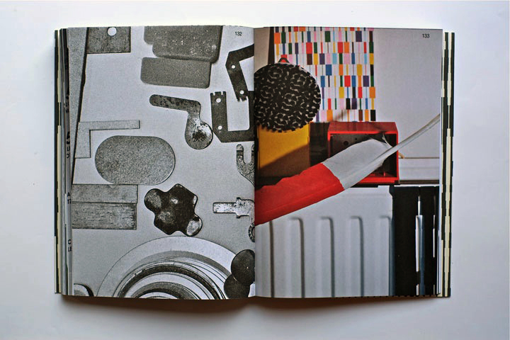
The next part is Martens’ archive, collected in boxes from the bookshelves. Here you look directly into the boxes which contain sketches, illustrations and prints of the artist. If you look at the prints you’ll find some of the shapes recognizable. When you flick through the book you get the impression of a system of colors and shapes which are being repeated. An example of that could be the small industrial metal pieces which shapes are to found on some of Marten’s prints. It seems like the editing of the book creates some sort of pattern – just like Marten’s prints.


book2


The third part is a close up of Martens kinetic work with clocks seeing from behind. A study about composition and color, by printing a dot pattern on two glass disks and attaching the disks to the second and minute hands of a clock. The chose of photographing the clocks from behind is again a way to show the process from his work.

The last pages in the book are writings by David Senior and Martens him self. The text is in English and Japanese describing the project around the book and the work of Martens.

One thing I was wondering about was why Martens choose to have a graphic designer on this book when he himself makes books. I asked Johannes Schwartz about that and he told me that the making of this book includes a close co-operation between all 3 artists. This book does not only work as a documentation of an artist. Not only the contents of the book tells about the artist and his work but also the editing is very important.

The result is this fascinating portrait which gives you a good insight knowledge of Martens’ visual language.
If you are curious for more please check one of his other books “Karel Martens: printed matter/drukwerk, 2nd Edition” which contains a big amount of exhibitions, art works and articles he have been taking part in. This book gives you a good insight into Martens’ environment and way of working too.

Rietveld library catalog no: marte 1

cover back

2 Sheets, 1 Elastic


Thursday, December 12, 2013

During my visit to the Art book shop “San Serriffe” I didn’t know where to look because of all the attractive books.
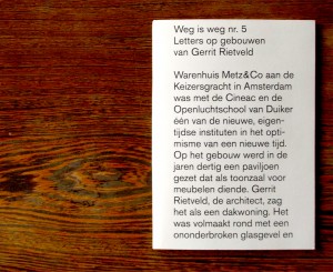
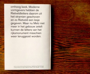
Between all the “shouting” book-covers I saw a serie of small (A5) books bounded by elastics. Curious I grabbed a random book out of the shelf, I saw that the cover was filled with text, even the backside of the book was covered with a big (± 24 pt.) san serif font.

Weg is weg nr. 5
Letters op gebouwen
van Gerrit Rietveld

foto’s uit het archief van Gerrit Oorthuys / digitalisering Frank Oorthuys
ontwerp Klaartje van Eijk en Marianne Elbers / druk robstok ® / © 2012

The subdued radiation and technical simple way of bounding was quite nice, according to my oppinion, and made me even more curious about how the inside of the book would look like.

Besides that I am interested in typography and I want to know some more about Gerrit Rietveld since I study at an institute named after him.

After I opened the book I saw that the inside of the cover also was filled with text, and the elastic is keeping a sheet of paper in position. This sheet only contains black-and-white photos, no text and is unfoldable to an (A2) poster, demountable because of the elastic.

At that moment the question “Is this a book?” came to my mind.
It consists out of one A4 sheet of thick white paper, folded to A5 size,
one A2 poster, thin paper, also folded to A5 size and an elastic.
The elastic seems quite practical because now the book can be decomposed.

I, deffinitely, call this a book.
It is readable like a usual book, but it has a lot more opportunities, while it is a real simple system.

Body Type


Monday, December 9, 2013

The subject I write about is a design, which is presented in the book of Anthon Beeke ”Body Type”, despite on this fact I would like to start with a small history part, following by highlighting key points of the book or would I rather say box

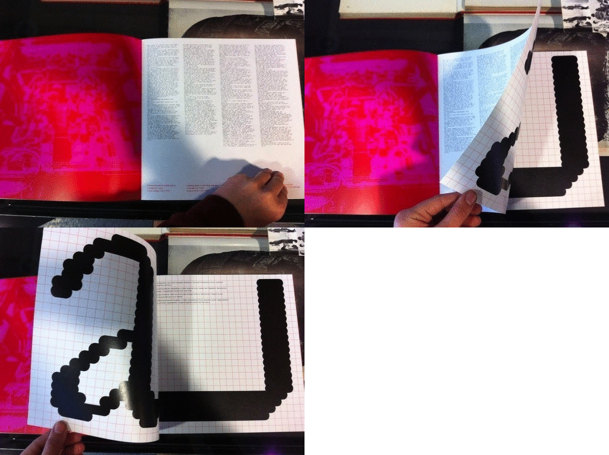
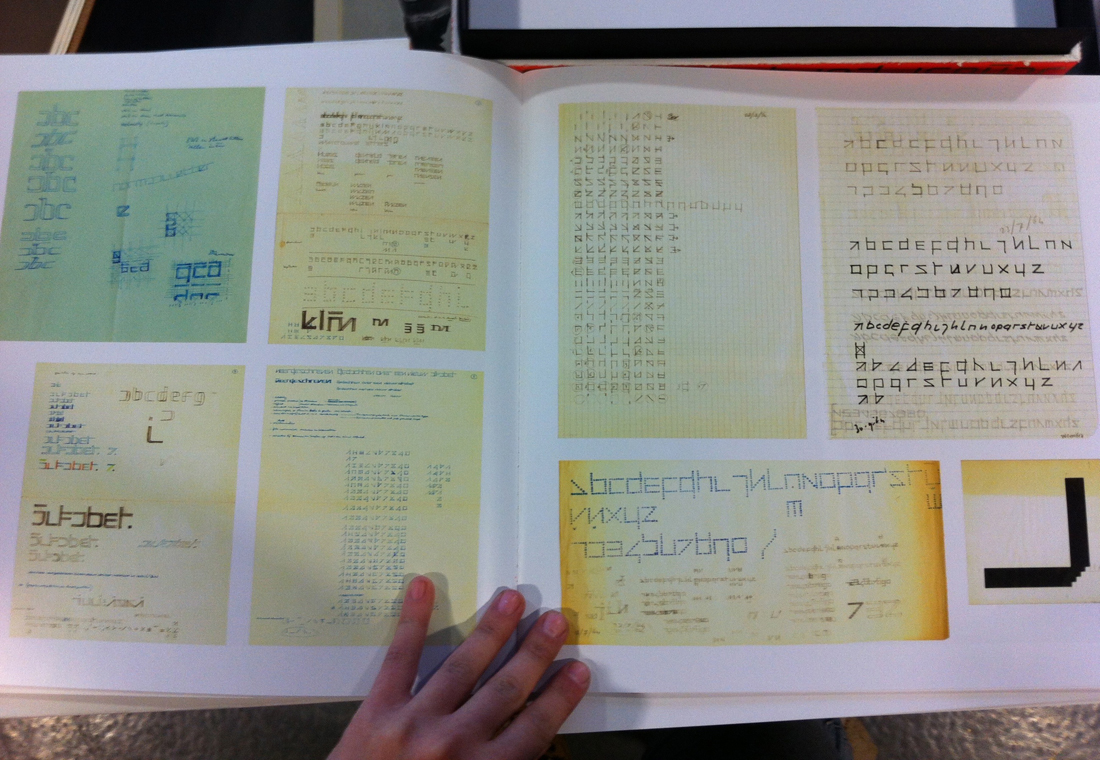
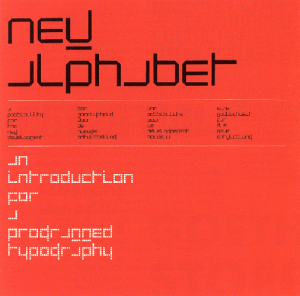
Let’s go back to the sixties.Wim Crouwel, who was born in 1928, is a graphic designer, who was influenced by digital developments of that time, saw an opportunity for an interesting experiment. Early computer screens rendered images in fairly large pixels, making traditional curvilinear letterforms difficult to reconstruct, and so Crouwel set out to redesign the alphabet using only horizontal lines. The ‘New Alphabet’ was published in 1967 in Kwadraat-Bladen: A series of graphic experiments (1955-1974).


Animation


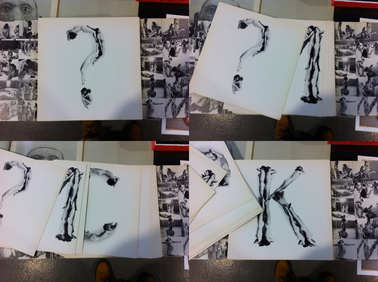
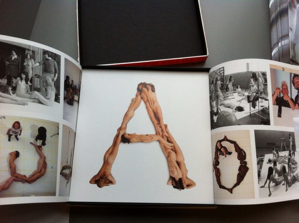
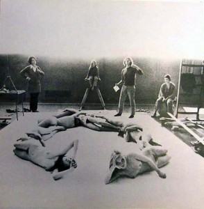
One other key figure of Dutch graphic design is Anthon Beeke (1940), who found his inspiration in the spirit of 60’s, a spirit of freedom which relates to politics and besides refers to the topic of feminism. In 1969 he created an othe Kwadraat -Blad ”Beautiful girls Alphabet”, in which you can also notice presence of ideas of feminism. This publication is based on type, which is spelled with the bodies of naked women. ”Beautiful girls” was published in 1969 (it’s two years later then ”New Alphabet”) in the same series as an answer to the one of Wim Crouwel


Animation-1


Considering these two famous and important publications, (because nobody did something similar before) you can see two opposite approaches in design modernist/functional by Wim Crouwel and content based by Anthon Beeke.

Now I can boldly return to the book.

Box-side_redu


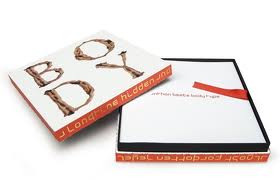
The ”Body Type” was published in August 2011 and despite that fact (in the past they have been opposites) for this publication they worked together. Two completely different, I can say loud events of Dutch graphic design, have merged into a single edition. Just like ”Beautiful girls” in the past this book is based on an alphabet with naked bodies but all text of the book is written in New Alphabet by Wim Crouwel. Also one more graphic designer Rene Knip (1963) is included in the work and designed the looks of the publication. With this I mean a book-box, which I will try to describe in details.

guukop

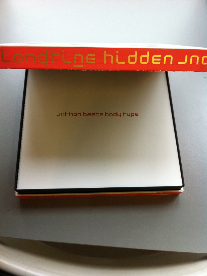
The box follows the tendency of square form (the tendency of Kwadraat-Bladen), front edges are white with a representation of the type ( B O D Y – T Y P E ) and lateral edges are in red with golden text in Crouwels New Alphabet. Inside this colorful box I found one more simple black interior box ,which separates a cover-box with a content of the book with the same color palette and, in my opinion, with the black line this construction attracts much more attention to itself. Besides, opening a box, I’ve noticed a red silk tape, which helps to remove the book from the box easily.

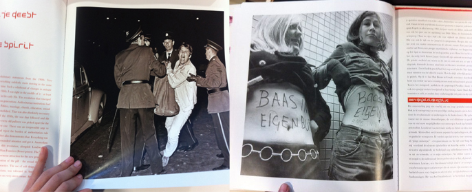
The content of the book is separated in three parts.In the first part you can find an introduction, which was written by Wim Crouwel and a text with images that is related to the publication, to the past and to the roots of the alphabets of both Crouwel and Beeke.

Baas in buik-

Crouwwel-sketches_redu

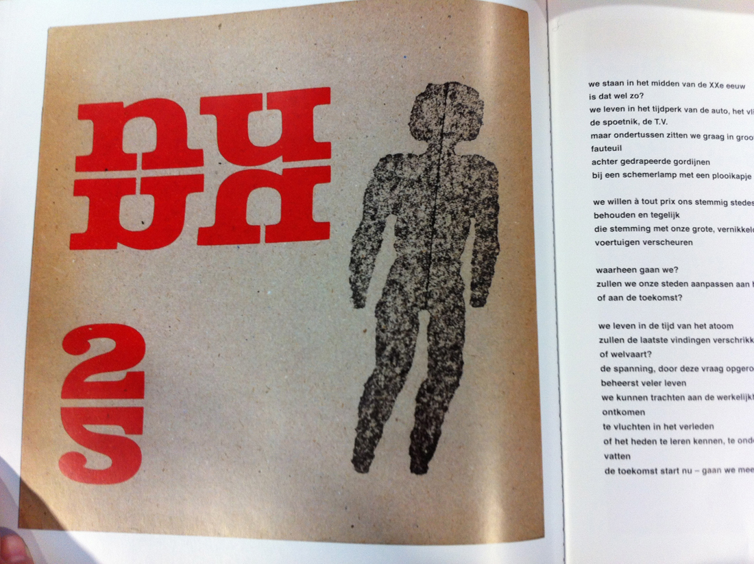
Flipping through the pages of the first part of a book you can find other examples of typography with images of another famous Dutch typographer and museum curator Sandberg (1897–1984)

Sandberg_Nu_redu


”Body Type” combined in itself works/ styles /approaches of 3 different famous Dutch graphic designers of 3 different generations,in other words this book contains an experience of key figures of graphic design. That is why this publication is not only a book but more like a monument.

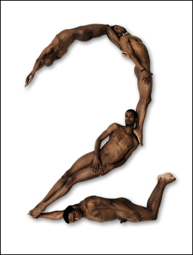
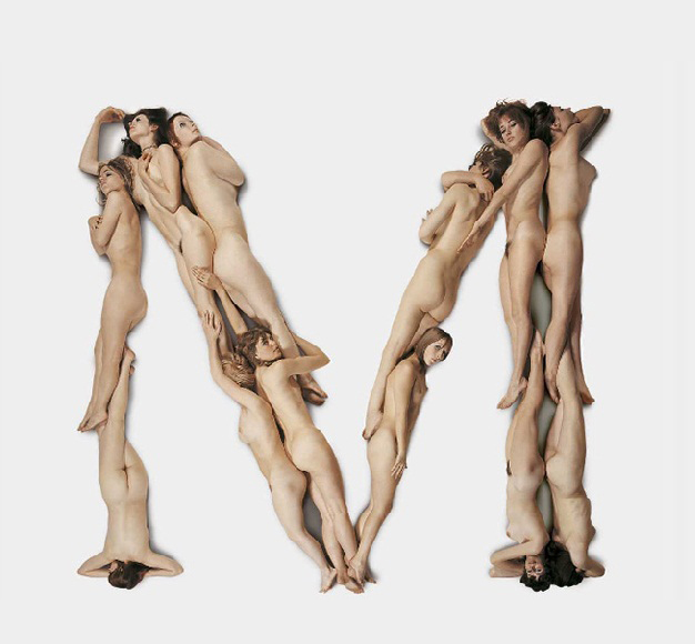
The second part of “Body Type” is the alphabet itself. All letters, number of the Latin alphabet are separated from each other. Every single letter placed on a single square paper sheet on a white background. Everything is printed on a quality and a bit glossy paper. In contrast to “Beautiful girls” letters of the alphabet are spelled from not only naked women but naked black black men as well adding a new controversy. By virtue of choice of color and paper this publication looks fresh, interesting and makes us curious to explore its content.

home_bodytype_L_04 Beeke-BodyType-M

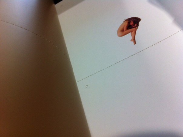
In the third part you can find a set of letters and punctuation marks, so you can tear them out and string them up to bring this alphabet to life in words and texts. There are four similar letters/punctuation marks placed on each page so you can cut it, one from another, using a dotted perforated line.

aqHZHwiuH3c


In the end I would like to add a couple of words about the name of the book.
To be honest, I was looking through a list in a library and the name “Body Type” was the first, which I paid attention too. I was trying to look for it more then 30 minutes, but I couldn’t find it. Then I tried to find another book but this name was in my mind and kept me interested. Finally the librarian of Rietveld Library told me that this book is special and it is located in a safe place and I remember that I though “I have made such a lucky choice”. I was thinking how to name the post and I have decided to save the original name.

The ideas & steps behind making ‘Haphazard’.


Sunday, December 8, 2013

Analyze a book which is interesting because of its design.
So the book needs to be interesting, apart from the content. I discovered that it is almost impossible just to take a book because of adesign however interesting it may be. The content and design are often so closely connected to each other.

With this book it was different.

The first reason why I took it: the cover.

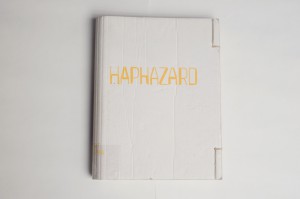
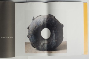
I had really no idea what the book was all about and I also didn't understand the title. No, I just took this book because of the cover. Between all these 'regular' books, there was this one book with a cover made of cardboard. Cardboard? That seems interesting to me.

René Put [x], the graphic designer of Haphazard, told me that you can not ignore the cover.

‘When you see a book, it starts with the cover.’

‘As a graphic designer, you have to deal with a lot of choices by designing a book. The content and form are in my opinion connected with each other. The content always plays a role. Which material is used by the artist? Which ideas the artist wants to tell with the book?’

cover Haphazard

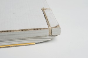
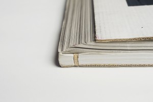
The manner of binding confused me when I opened the book. The way it is bound, on the right side, gives you the idea that half of the book doesn't need to be seen. That it is a secret, hidden.

‘As a designer I’m always looking for inspiration. Once I had seen an Indian account book, this is a long flat book. The idea of having this pile of papers, folding it into a new object, fitted well with the work of Ellert. Ellert is always looking for the border between 2D and 3D objects.’

‘Someone in Den Haag bounded the book. He made four dummy’s for us. We were really content with the last one, the one as it is now.’

‘They call this a Japanese way of binding. But actually a Japanese binding is different because there are more whole in the cover. There are just two holes in this book cover. Afterwards the book is bound by hand in a system which keeps the pages all together.’

‘This is maybe a funny fact to know. The whole research for the book cover, took the most time but cost also the most money because bookbinding is a handicraft.’

binding Haphazard

I have the idea that there's a link between the paper which is chosen and the work of the artist. The artist, Ellert Haitjema, is working with natural materials and material he has found in the streets. This paper looks like recycled paper. Not glossy, it has a more natural look.

‘It’s always a search to find the right paper. Here we’ve chosen for uncoated paper. In this case it was necessary because not all the pictures were in a good quality. To compensate this problem, it’s always a good idea to use this paper because the effect of the bad quality is less. The pictures become also more an unity when they are from different sizes/qualities, all printed on the same soft paper.’

Haphardize_0034

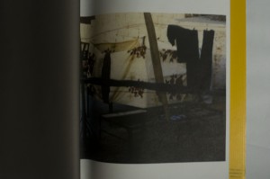
‘This quality of this picture was not really well. That’s why I doubted to publish this one. In the end, we changed it a lot to get it how it is now. There were to many good arguments to place the photo.’


Isn't it a pity that some pictures on the middle of the page, are folded?

‘The pages are turned and that’s also why they get folded. In this example you can see why, on purpose, we’ve placed some photos in the middle of the page. By folding there will be another image then by seeing the photo on the whole page.’

Band 2 Haphazard band 1 Haphazard

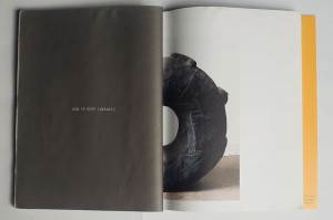
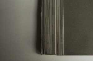
‘The cover and the papers inside the book are folded. What we wanted to create when the book is lying on the table, is that the cardboard will end on the first page inside the book. By folding the book, the paper will move, by moving the paper you get a nice cutting edge.’

snede achterkant Haphazard

‘At the last moment I thought of adding something to the cutting edge, it needed to become an experience in itself for the book. We decided to add five colors of grey, so called PMS colors or Pantone colors. These five different colors are printed on the back of the papers inside the book. Now you can see a nice variation of colors in different grey tones which are an experience for the book in itself.’

grijs verloop achterkant Haphazard

‘This book needed to be an object in itself. Just as the objects which are shown within the book.’

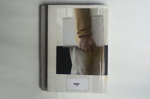
‘The good thing about the picture on the back of the book cover is that it shows how the function of this book changed by using it to carry a plate of glass.’

‘The idea for a photo like this (on the back of the book) occurred while we were designing the book: the book needs to be shown as an object itself. This photo for the cover was a bright idea, thereby the whole book design was completed.’

achterkant Haphazard

What I wondered about, when I took this book out of all the other 'normal' books, was; how is someone making a book like this?

For instance, when you're a graphic designer, what kind of steps do you make during the process of designing such a special book. At first, I thought there was no direct link between the design and content of the book because from the design you couldn't get an idea of the content.

In the end, I know better. When you take a closer look, you see that there's a link, off course, but a subtile one. Graphic Designer René Put let me see what is all necessary by making a book. Which choices need to be taken and which ideas are behind all these steps.

‘In my opinion, you can always go back to the book when it is a good book.’


Rietveld library catalog no: hai 4

Italian Elegance


Sunday, December 8, 2013

For an artist, a book can be an interesting medium to show and explain work to the audience. Graduated as a young jewellery artist, I made this year my first book whereby I experienced the importance of a book design in relation to the concept of your work: it should connect together seamlessly.
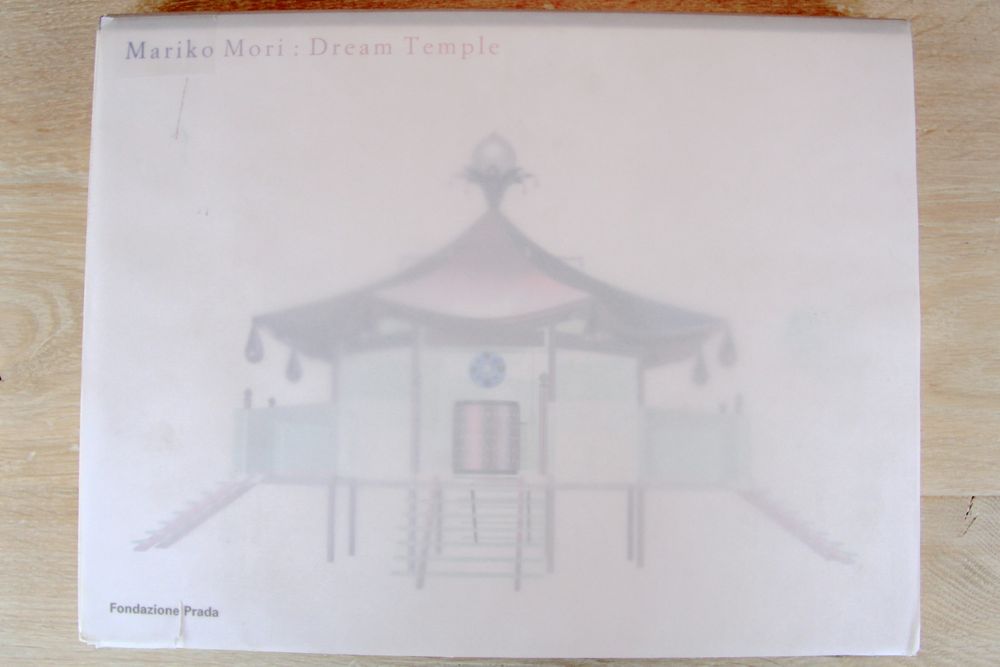
In this essay I will explore the book design of Pierluigi Cerri and his team, in relation to the work of the Japanese artist Mariko Mori.

IMG_8040

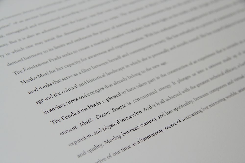
“Dream Temple” is the title of the book and of the project made by the artist.  It is about the legend of the Japanese Dream Temple, a place for meditation and for studying Buddhist Sutras. Look at this video to get an impression of her work: Mariko Mori Dream Temple.
Mariko’s work is tying the knot between dream and technology, past and present, spirit and body.
Looking at the book the first thing that strike me, was the transparent vellum that is used for the cover and when you look trough it, the slightly blurred computer drawing of the dream temple is visible. To me this creates a nice dreamlike feeling, which is in line with the title of the work.
The title is printed in a purple/ pink color on the left corner of the cover and because of the font size it feels less important than the visual image of the temple.
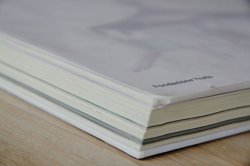
Remarkable is also the way the book is printed. This rectangular book is bound at the long side, what means normally that you look in the longitudinal direction; but in this case you have to look in the width. This isn’t typically Japanese, but is more common there than in Europe.

IMG_8049

When I look at the structure of the book, I can already see from the outside that the book is split in different parts. It starts with a short introduction of the concept and finishes with an explanation of the inspiration, two interviews and a catalog. In between the book is organized in 6 parts, showing the working process of the artist, from the first drawings to the final artwork. Every part is printed on different paper, with transparent vellum in between as the clear changeover. The layout is plain structured as well, like a documentation, with all the time the first page blank or provided with a Japanese inscription and the second one with images and drawings.


IMG_8041

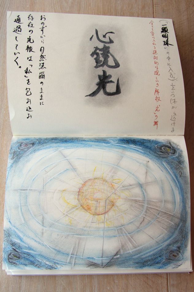
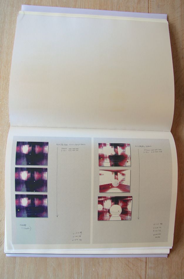
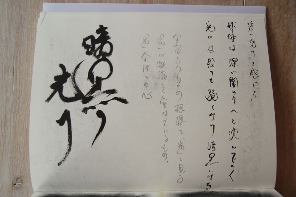
After the introduction the book starts with pencil and watercolor drawings, where the artist is visualizing her concept. The yellowish paper where the drawings are placed in full size, creates a sketchbook feeling, also by the way how the paper feels. Some pages next to the drawings contain text. Despite of the fact that I cannot read the Japanese characters, they are visually very interesting to see and they suggest to be an inscription of the drawings. The text is placed on different places across the paper in a playful way and mainly in a straight line from the top to bottom. In my opinion, this part is the most personal one of the book. You really get the feeling if you are looking into the sketchbook of Mariko Mori.


IMG_8062 IMG_8042

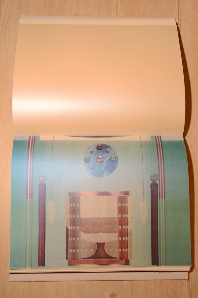
The second part is like a storyboard and is combining different ideas of the Dream Temple. The digital images in color are printed on a special type of paper with a pearl shine. This gives a mysterious feeling to the images and is verging on kitsch, what you can also say of Mori’s Dream Temple itself. This part starts with full paper size digital images and continues with pages separated in two, to display the pages of a notebook and hand written notes. Visually I miss something in the layout that makes it attractive to look at, probably that’s the reason for the special type of paper to give it some shine.

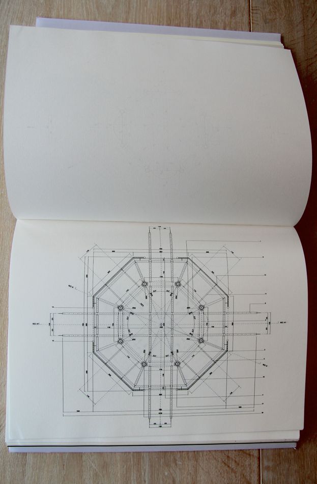
Architectural drawings, printed on a thinner paper with a ribbed texture, are the next step. This paper which is often used for hand drawings and paintings, gives the construction drawings a more informal look.
The fourth part consist of more watercolor drawings and they are placed on the same paper and in the same way as in the beginning of the book.

IMG_8043 IMG_8047

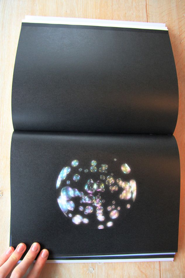
Then follows a more mysterious part, with black pages of video stills centered in the middle. She is showing her vision suggesting that a contemporary meditative space can be a mesmerizing journey into the micro and macro cosmic forces of creation.
The layout in this part of the book is representing this idea, were the round images are printed on paper with a kind of glitter effect, so they look like magic planets. They blend into the infinity of the black paper; like the universe.

IMG_8048

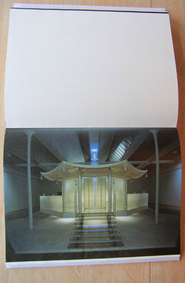
The last part represents the final pieces in full paper size. The pictures have a strong dark – light effect to give the work a more mysterious and extraterrestrial feeling and the final built Dream Temple look like something of the future. To give more attention to the slightly dark pictures, the opposite pages are blank and white.


IMG_8051

Looking at the typography, the book is clearly separated in two different parts. The introduction and documentation in the end consist of computer printed text and is left-alined. It creates a formal and aloof image.
Different is the main part of the book, which feels more personal linked to the Japanese nationality of the artist and the subject. The Japanese characters are handwritten in pencil and also traditionally calligraphed with black ink and they are lined from the top to bottom. This typographic contrast is in line with the artist who is dealing with the past and present at the same time.

IMG_8053

Pierluigi Cerri and his team designed the book in a modern sleek and clear way, what makes it a bit impersonal. But still there are some playful elements who breaks through the formality, like the transparant vellum and the use of shiny types of paper. Looking at their other designs I see this tasteful details as well.
Despite of the use of different paper and layout, it remains rather formal for an artist book. It could be nice if the book was more representing the meditation feeling of the the Dream Temple.
This book design reminds me allot of the art and design in Italy, where I stayed for a year.
Italians are searching for a way to deal with contemporary life and the remains of their glorious past. They do that by combining a formal more classical structure, with playful elements and high quality materials.
These elements also fit well with Mariko Mori’s approach. All in all the design of the this book reflects the high quality of her Dream Temple.

Rietveld library catalog no: mor 1
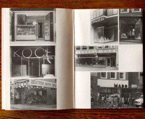
In & Out of Amsterdam


Sunday, December 8, 2013

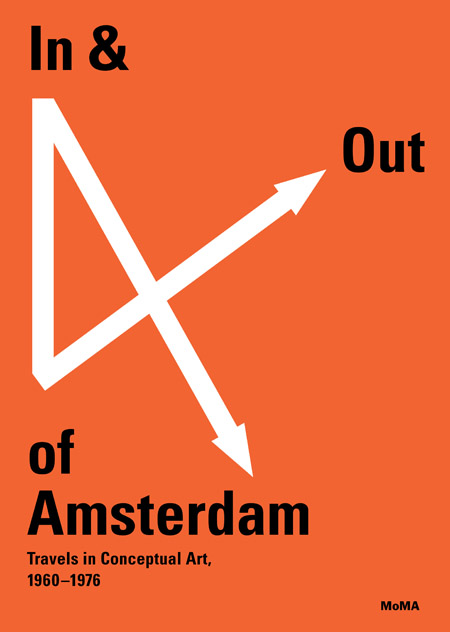
This sparkling red cover with white arrows  caught my eye in the library.  There won`t be more colors in the book (except for photographs). I don’t mention it as a regretful. The retraint use of colours in the book emphasize both the cover and the inside.
cover

The cover is giving informations on the topic (conceptual art), the location (Amsterdam  and further links) and the period (1960-1976).As an object the book is pretty thick especially because of the choice of the paper. The cardboard of the cover is like wrapping the book which is bound separately with a black textile.
The book is dealing with conceptual art.
This field is generally using a lot of words to translates the works. In that case, graphic designer´s purpose is to communicate the ideas in the most efficient way. To reach this point they have to find a visual language to lead the reader in the way they consider as the most interesting. Here the structure is pretty clear. The book is comfortable as an object (as mentioned above) and comfortable to read.

This is first due to the black bold letters and central texts. Then the colors of the photos are softened and finally the white paper is not too bright.
Now we´re sure the reader is not confronted to practical difficulties the designers still have to focus on how to relay the information and find the balance between text and image.
Divided in chapters, the book first talk about the raise of the conceptual art especially linked with artist who have been working in Amsterdam. Then the book become more visual presenting artists through their works (mostly photos).  So when the book comes closer to the artists and conceptual artworks it becomes visual when you probably expect more text and informations.
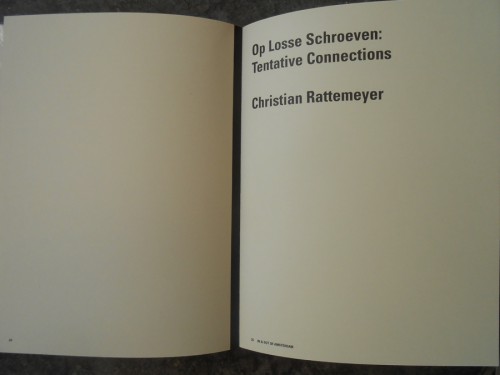
The reader can easily spot the chapters because of the blank left page facing the title written in bigger letters on the right page. The first part of the book is about conceptual art and does not focus on artists so much. To illustrate the ideas developed in the texts and make them understandable images are included.

DSCN1661
The text placed in the middle leaves a lot of white space next to it. This is used to add  details that are not directly part of the text like information concerning a photo or references. There is only one single typeface used. The only difference is the size of the letters making the text more or less big according to its importance. So this book is really trying to explain the content in an organized and comprehensive way.

DSCN1658 copie


In the end of each chapter is an index and everything is gathered together in the end of the book in a bigger and complete index. This index also contains pictures to be in harmony with the rest of the books logic and design.


Index
Then we come to the second part of the book based on specific artists. Here the text gets smaller and is present on the first left page of each artist´s chapter only. This because after using a lot of text the reader should be able to have a sensitive and personal approach to the artworks. The presence of the text is only to provide informations that can not be translated through images (biography…). So that we can focus only on the works themselves.

At this point we only have pictures to understand. But still we are not facing the real artworks so the photographs and the graphic design can decide how to introduce them.
First because of the angles and the distance, then by the size of the printed picture in the book and the choice to select colors or not, finally by the order of the presentation and the links created between the chosen images due to their positions towards each other. That’s all the explanations the reader has.
With this system the graphic design leads to a certain way of looking at the artworks while they still give a lot of freedom to the reader.


Point of view

In my opinion the visual communication of this book makes its topic clear and understood but still asks a bit of interest and subjectivity from the reader who has to experience the book (exactly like in an empirical process)  to get  knowledge from it.

Rietveld library catalog no: 706.8 che 1
Design’s Delight by Jan van Toorn


Sunday, December 8, 2013

Design’s delight is a book of which as well the content as the design are by Jan van Toorn, a dutch graphic designer. The aim of his book is to question and to comment the way designers work now. You can tell this by both the content and the way it is designed.

cover

The cover of the book is rather simple, but shows already some of the characteristics of the graphic designs of Jan van Toorn. Various thicknesses of letters have been used, to make distinctions between different sorts of text, the text in the top right corner, for example, is shown as well in English as in Dutch, but to divide these two the English part has been set in bold type.

Another characteristic of Jan van Toorns design is making a text that should incite the reader to “active reading”. He does this by putting the text on a page in different directions, you can see this at the bottom of the cover, where the text has been put upside down, but also at the sides of the cover, where the text has been turned. This stimulates the reader to read the book in an active way, by having to turn it around to read everything it says.

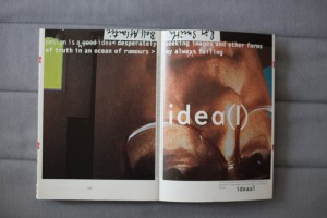
idea ideea

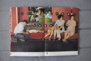
The first pages of the book are used to offer an introduction to the further part of the book. Different pages has been used to write the sentence “design is a good idea desperately seeking images and other forms of truth”, which actually is the core idea behind the book. By spreading the sentence over a few pages, more attention of the reader is asked to figure out exactly which point is made. With every page, a new word is added. Again the text is shown in both English and Dutch, and these two are again divided by setting them in different thickness and types.

essay essaycollage

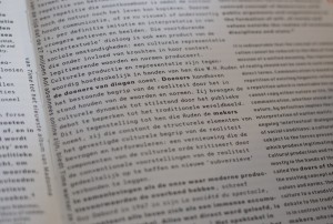
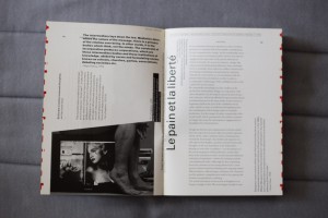
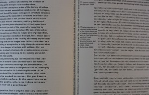
After the introducing pages the book continues with an essay on ‘thinking the visual’, placed on the page in a simple, clear way, again both in English and Dutch in different typefaces. Still, in the essay, van Toorn keeps adding sentences that have been turned around in the middle of the pages, and the pages after the essay are filled with little pieces of text that have been placed in an almost collage-like way, spread out and turned around over the pages, sometimes even combined with images, encouraging the reader to turn the book around and play with the book in order to read what it says.

afbeldingen

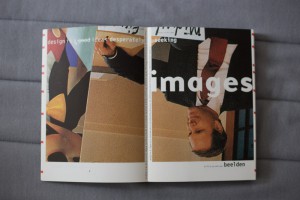
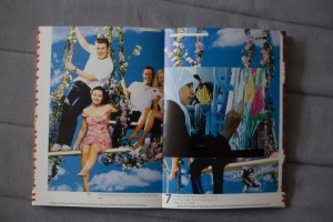
After this part, the biggest text part of the book, van Toorn starts working out the main idea of his book, showing it in a lot of pages filled with different images that have been taking from media like newspapers, television, magazines and various advertisements. Every single thing that is shown in these media has been given a form by a designer. The book is on the role of this designer, and the influence a designer has on the way information is given. In these pages, the most important part of the book, Jan van Toorn explores the opportunities of the role of a designer. He makes various juxtapositions of images from different media, and by doing this he adds a different meaning to them, encouraging the reader to think about these different meanings, and, indirectly, the role of the designer who puts these images together.

afbeeldignen

Most of the pages exist of one big image, shown as a spread, only leaving some white space at the bottom of the pages, where text is shown. Across most of the images other images have been places, but the design changes a lot, sometimes only 1 images are shown or images are placed next to each other in a row. The text below the images, again, has been placed upside down and turned around. Because the text is below the image you make, as a reader, a connection between the two, as if the text is a description of the image shown above. Which often is not the case, but the texts mostly illustrates the meaning of the juxtaposition of the images shown in the pages.
Also a number is shown in this white space, indicating the current chapter you are in, and the title of this chapter is always shown in the top left corner of the right page. At every first page of a new chapter the title of the chapter is also shown in handwritten letters, next to the number of the chapter. Because of this continuous showing of the chapter you are in, there is something that you can hold on to during the reading of the book, because of the chaos of the combination of all the different images, in which a lot happens and which contain a lot of colors, you would otherwise easily lose grip of what you’re reading.

eenalaatste

The next part of the book is again a small text part, on the method and means of dialogic practice. It is designed in a similar way as the essay at the beginning on the book, but now the English and Dutch part are not divided in two columns on the same page, but one page is filled with English and the other with Dutch. The same typefaces are used again to make the separation.

always failing

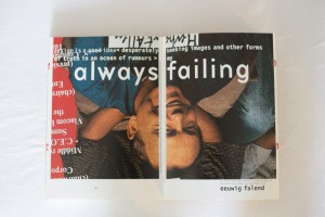
After this text part different pages are used to write one sentence, just as in the beginning of the book. The design is very similar, only the sentence and the images behind it are different, but as a reader you understand directly that it refers to the start of the book.

nawoord

The last part of the book is the afterword, which is designed the same as the preceding text part.

rug

The book has a glue binding, and because the book contains a lot of images the spine of the book has a blend of all different kinds of colors, which kind of reminds you of newspapers and magazines, and it might as well be a reference to these media, where the images in the book are coming from. You can unfold a part of the back of the cover, which at the inside shows a poster-like design of a text in different sizes. At the outside of this part, the part that is the last page of the book when it isn’t unfold, the colophon and the contents of the book are shown.

achterflapdicht achterflap

All in all, I think the design of the book serves it’s content very well. The combinations of the images and text are very well done, they complement each other on every page. The basic design is very continuous throughout the book, which works very well because the chaos of the images keeps changing. Design’s delight by Jan van Toorn was an intriguing book to research, because of both its content as its design.


private collection

New girls and boys by Anthon Beeke


Sunday, December 8, 2013

This post is dedicated to the design approach, names, some interesting facts of project “Body Type” by Anthon Beeke.
The book, which I want to consider was published in August 2011, but looking into it, it become clear that this box/book is the second time this project of this talented graphic designer is published. For me, it is important to say that these two publications are based on an idea of an alphabet made up of ‘Beautiful girls’ created originally in 1969. In past, this alphabet was based on naked female bodies, which posed (where constructed) like letters and punctuation marks. Beeke made this alphabet as ‘a tongue cheek’ response to Wim Crouwel’s famous New Alphabet published a year before in the same series “Kwadraat bladen/Quadrat Magazine”[x]

_1114605983

Project ‘Beautiful girls’  in process in a GYM of Gerrit Rietveld Academie

photographer: Ed van der Elsken


This alphabet as an experimentation was a sensation for late of 60’s, nobody has done something like that before.

Considering the second publication it is extremely essential that a lot of famous designers as Wim CrouwelRene Knip worked together and organised every aspect of the book.Well, I can say that this book is as a result of cooperation of several designers. That means that this project was mulled over  from different points of view and all design decisions were discussed in a professional surrounding and this fact automatically  increases its quality.

images


The ‘Body Type’ book was made as a box,which is a really attractive ,in my opinion, because of a size, image on a cover and, of course, colours. Despite on a fact, that book is based on a quite old idea, it looks contemporary and a cause of it is that Anthon Beeke decided to make it in colour. The whole publication saves a tendency of 3 main colours: redwhite and black. Thats is why it looks bright, new and interesting. A content of the box consists of 3 parts. In the first part you can find an introduction ,which was written by Wim Crouwel ,who also was a designer of the main font for a book.Text is provided in Dutch and in English, and following a purpose to create a fast visual difference between these two languages and to make it easier to read,separating one from another , Dutch text is in black colour, English in red.

wimcrouwel

The second part of a book is a ‘body alphabet’ itself.In this part Beeke also decided to add something new (compering with a previous publication), there are letters from not only women, but and from black men, what shows an expression of time ,which we live now. The third part consists of printed letters , so you can tear out and string up to bring this alphabet to life in words and texts that means that now a benefit from a book is not only to read it and enjoy its design ,but and use it for whatever you like.


This video shortly shows how photos for letters were made.Enjoy!


Rietveld library catalog no: 757.3 bee 1 (N.U.)
A hidden paper archive


Thursday, December 5, 2013

A designer makes choices. When it comes to book design, he or she is likely to decide on typography, grid system, editing, binding, format, print technique, paper quality and so on. The sum of these choices create a unified expression that tells us something. It can be a parallel language to that of the content of the book and it can be more or less emphasized and thought-out. Some would say it could even be devious in its intentions.

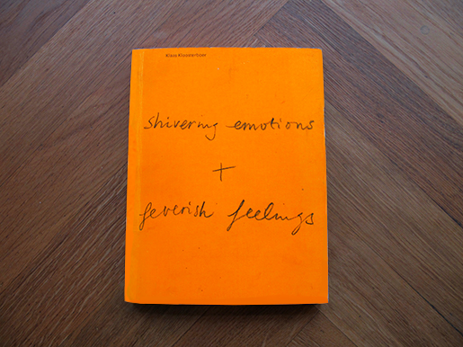
This is an exploration of the book “Klaas Kloosterboer: Shivering Emotions + Feverish Feelings” from a design perspective. It was published by Artimo in connection to Klaas Kloosterboers exhibition BALLAST at the Badischer Kunstverein. It is designed by the design office Mevis & Van Deursen.
I interviewed Linda Van Deursen in connection to this essay to get further insights in the design choices and the conditions from which the book came to be.

shivering_emotions_cover

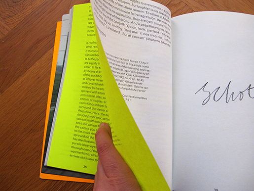
The cover consists of neon orange cardboard (around 300 gsm) with the title in what looks like Klaas Kloosterboers handwriting in pencil. The orange cover folds in to almost full width of the very first and last page. I learn from the designer that this is a technical solution to add steadiness to the book. It’s a signature bound soft cover, consisting of a broad selection of heavy stock paper which can result in a weakening of the soft spine unless it is reinforced. I’m thinking it could invite the reader to use the orange cardboard gate folds as an alternative page in any of the books 100 spreads.

shivering_emotions_paper_archive

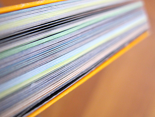
There’s an intriguing colour spectrum around the edge of the book. This feature clearly communicates that it is a book mainly concerned with visual language or images. It resembles a visual preface or introduction to the book. Each signature consists of 16 pages made from one sheet of paper. Most of the paper types only occur in one single signature, this gives us a clue about the parallel function of the book:

I learn from Linda van Deursen that the book is a sort of material archive or assortment of papers of a specific kind. A rule that she set up for the book was that only two sided paper (meaning the paper has a different appearance on each side) of the type used in posters and envelopes (because they can’t be see through) were to be used. Not only does this create an intriguing visual and physical experience but it serves as a kind of metronome or conductor where the different surfaces of the paper are altered rhythmically but not predictably (you learn the rhythm and then it alters).

shivering_emotions_paper

Rietveld library catalog no: kloo 1
 

shivering_emotions_sequence

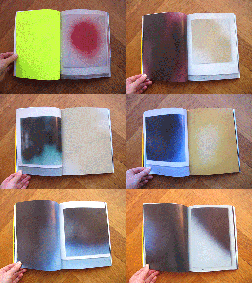
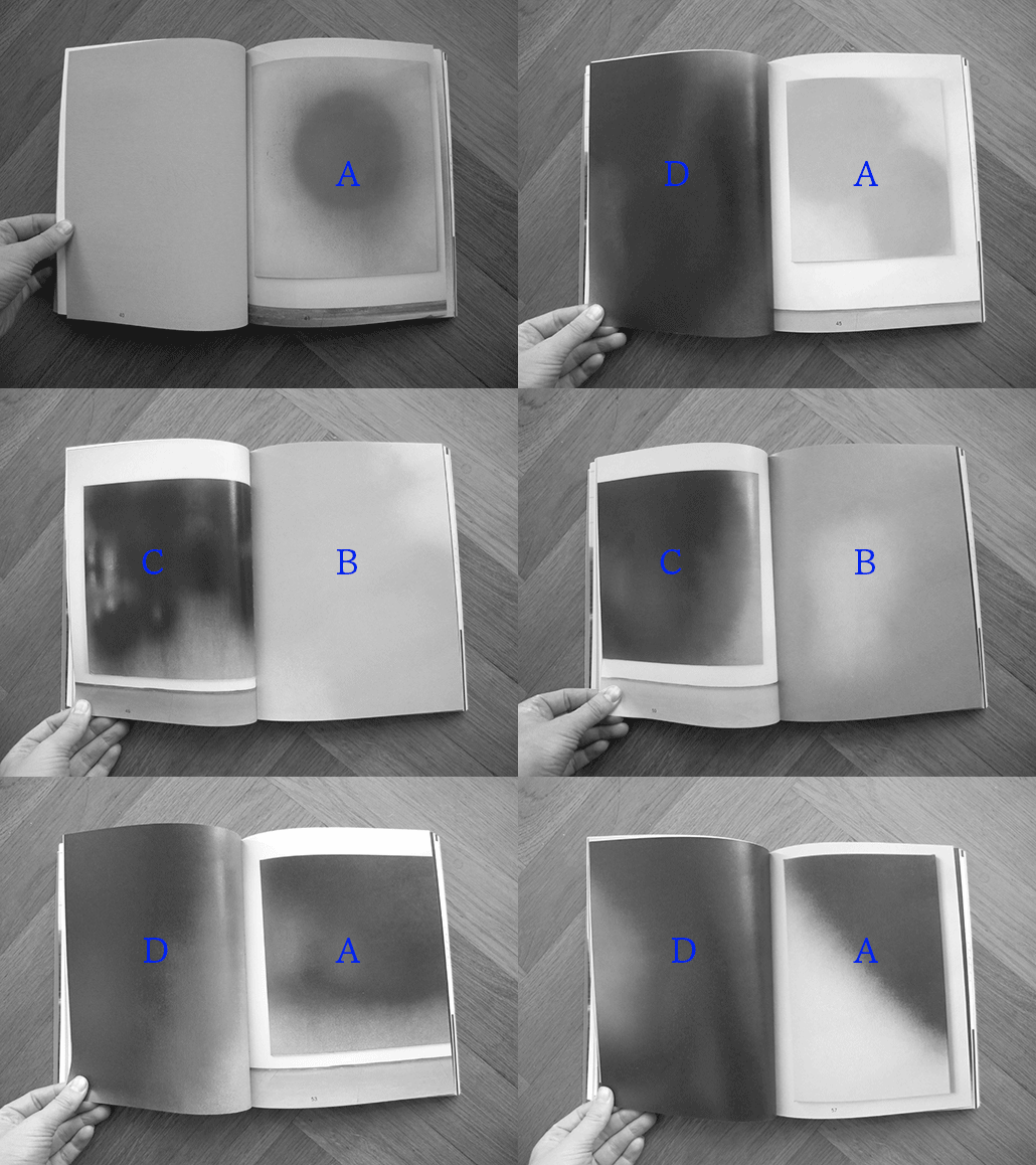
This feature creates a playful element to the structure of the book. For example in the sections that consist of photos of Kloosterboers work, the reading sequence is ACBD where A and C are overviews of two different artworks and B and D zoom in on the same two images. But because of the rule of the two-sided paper rythm, this seemingly logic and rigid set up completely changes. In addition to this, all rules seem to be broken at least a couple of times in the book which is a testimony to the sure instinct and playfulness of the designer.

shivering_emotions_sequence2

The text is set in EF Maxima. This sans serif is used in two contrasting ways throughout the body of copy. The left hand pages are in English and set in larger size (approximately 12 pt) and narrower leading which results in a more contemporary expression. The tracking is on the plus side of the spectrum, perhaps around 10.

shivering_emotions_eng

The right hand side has the same tracking but is smaller in size (approximately 10 pt) and more importantly its leading is much bigger which leads to a surprisingly conservative appearance. This is a demonstration of how drastically you can change the meaning of a typeface with small means. It also solves the problem of fitting the German language in the same amount of space as the shorter English text.

shivering_emotions_ger

There’s a lot of trends in typography and it is hard to define what a typeface communicates without looking at its context and treatment. Also, the way a typeface is repeatedly used will change how we read it. This could mean that a typeface that was originally designed with utilitarian intentions can end up being perceived as elitist or exclusive. EF Maxima was originally developed by Typoart as a substitute for Helvetica. Typoart was a government owned, east german type foundry that was privatised in 1989 in connection to the unification of Germany. If we ignore the complex political situation in that area at that time, and just see Maxima as a typeface created with similar intention as Helvetica but without the same exposure, then I think we could dare call it a humble and uncommercial font. This could be illustrative of the intention behind this design. Because it is clear that Van Deursen is not concerned with selling commodities or increasing value to art galleries through slick design. All the design choices are closely connected to the subject that is the artist. I think this explains why the book still seems so relevant in its form.


Rietveld library catalog no: kloo 1

Anthon Beeke plays


Thursday, September 26, 2013

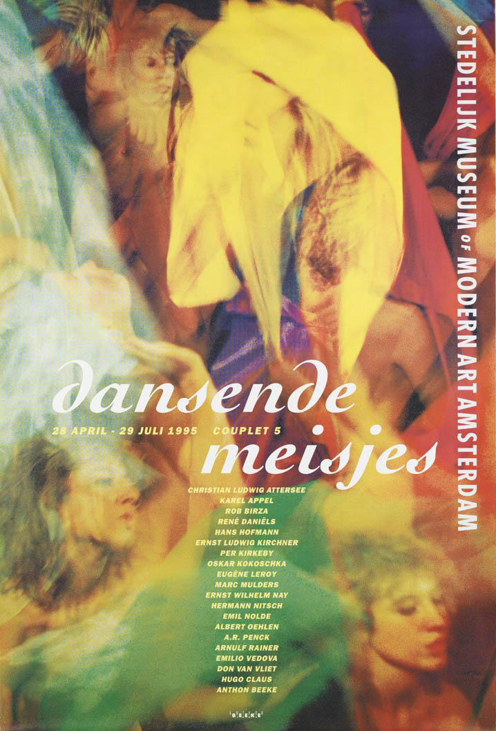
This is a poster for an exhibition in the Stedelijk museum by Anthon Beeke.

Anthon Beeke-dansendemeisjes-stedelijk

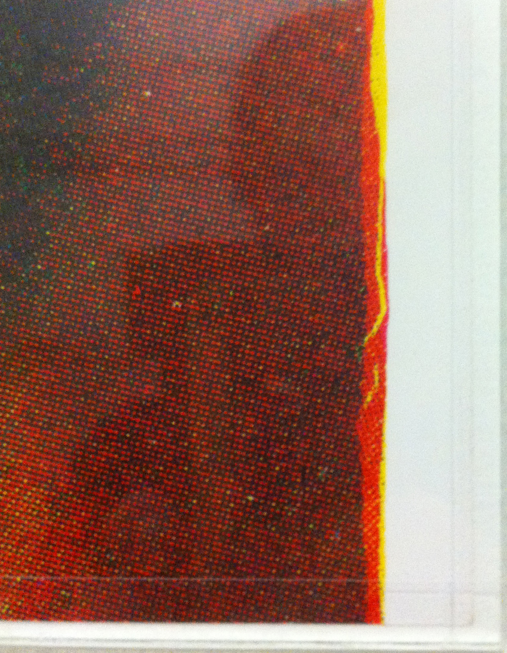
It has been printed in several different colored layers which show dancing figures. Anthon Beeke designed this poster in 1995. He sought to achieve independence from the rules of typography, and from popular trends.  This unconventional move has earned him a unique place in the Dutch graphic design history.

Before I came to Gerrit Rietveld Academie I graduated in graphic design on the Media College Amsterdam. After four years I disliked graphic design so much that it made me come to Rietveld. This graphic design school is very strict and technical without much freedom. Form follows function, as they say. You learn more to become a desk top publisher. I learned about Anthon Beeke but did not really notice because it was not allowed.

But not long ago I rediscovered his work and I really started to admire the pleasure he puts in his work, Form follows fun! And I totally agree with this concept. It makes possibilities limitless. One of the reasons why I came to Rietveld is to create without boundaries, because I really felt constricted. Since he was the first to step out of these rules I decided to chose this poster. It got my attention right away, in spite of the fact that the line of sight was partly blocked by some other objects at the entrance viewpoint.

I think it is not his best poster design but I chose this object more or less because of the artists. The whole poster looks like an accidental moved photo at a party with a lot of dancing. The font that he chose adds to the dancing, it is if the letters are dancers as well. I also like the fact that it is a layered print, nowadays this look is easily Photoshopped, but he experimented with the layers and colours.

Anthonbeeke-dansendemeisjes-closeup

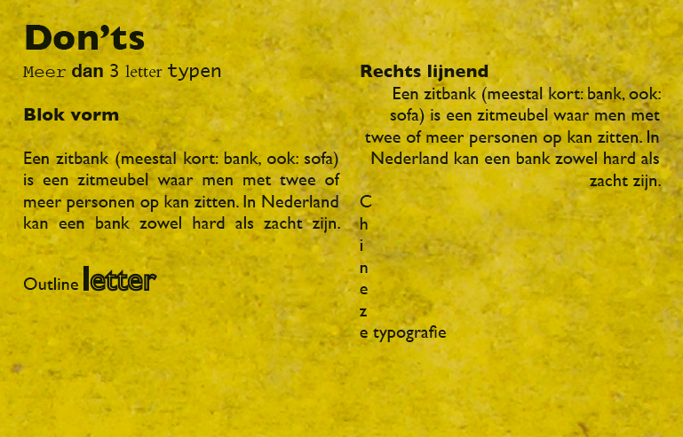
At the graphic design study I learned the Do’s and Dont’s which you have to obey. Of course it is good to obey these rules and if you don’t it easily becomes a bad design, but if you don’t obey and do it well it will become way more interesting then following the rules. It’s more exciting. I had to make a poster explaining typography rules this is a small part of the poster showing the Dont’s.

Don'ts typography

It’s in dutch, this is the translation:

Use more then 3 typefaces.

Align text in Block form.

Use outline on a font.

Right text alignment.

Chinese typography, line the text from top to bottom.

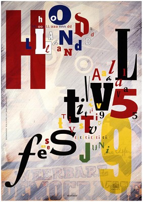
Obvious rules, but if you break them it could be so interesting, Anthon Beeke did this many times and he is one of the designers that could do that well.

Hollandfestival-Anthonbeeke

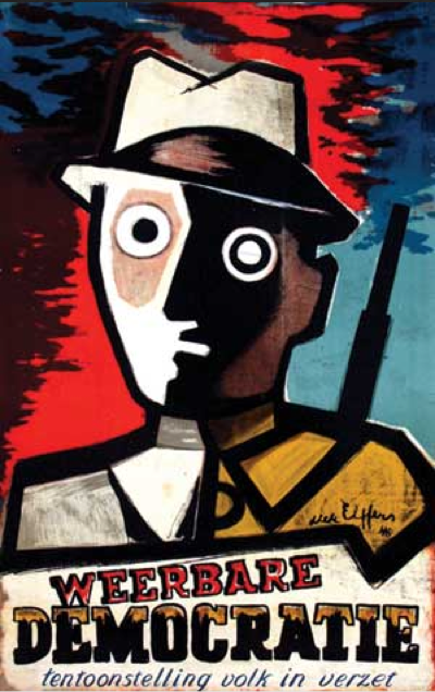
All the dont’s i learned are in this poster, but he did it so well that its interesting and exciting but also readable and understandable. There is a story behind this poster as well. The theme of Holland festival was avant-garde in the second world war. He used a poster of Dirk Elffers and painted it white.

Dirkelffers-weerbaredemocratie

And the Typography is copied form a letterproof of Piet Zwart. ”Pure stealing, a shame!” Anthon Beeke said. Every time he sees the poster he has to smile, because the poster says on the left side, Designgraphy: Dick Elffers, Piet Zwart, Anthon Beeke.

But what inspires me the most is that you can see in his design that he is having fun making design. In dutch graphic design it’s called grafisch vormgeven, vormgeven means form-giving, giving things form, sounds so much nicer then design. But that is really what he did, he has an assignment and looks at the possibilities (while playing) and starts giving it a form.

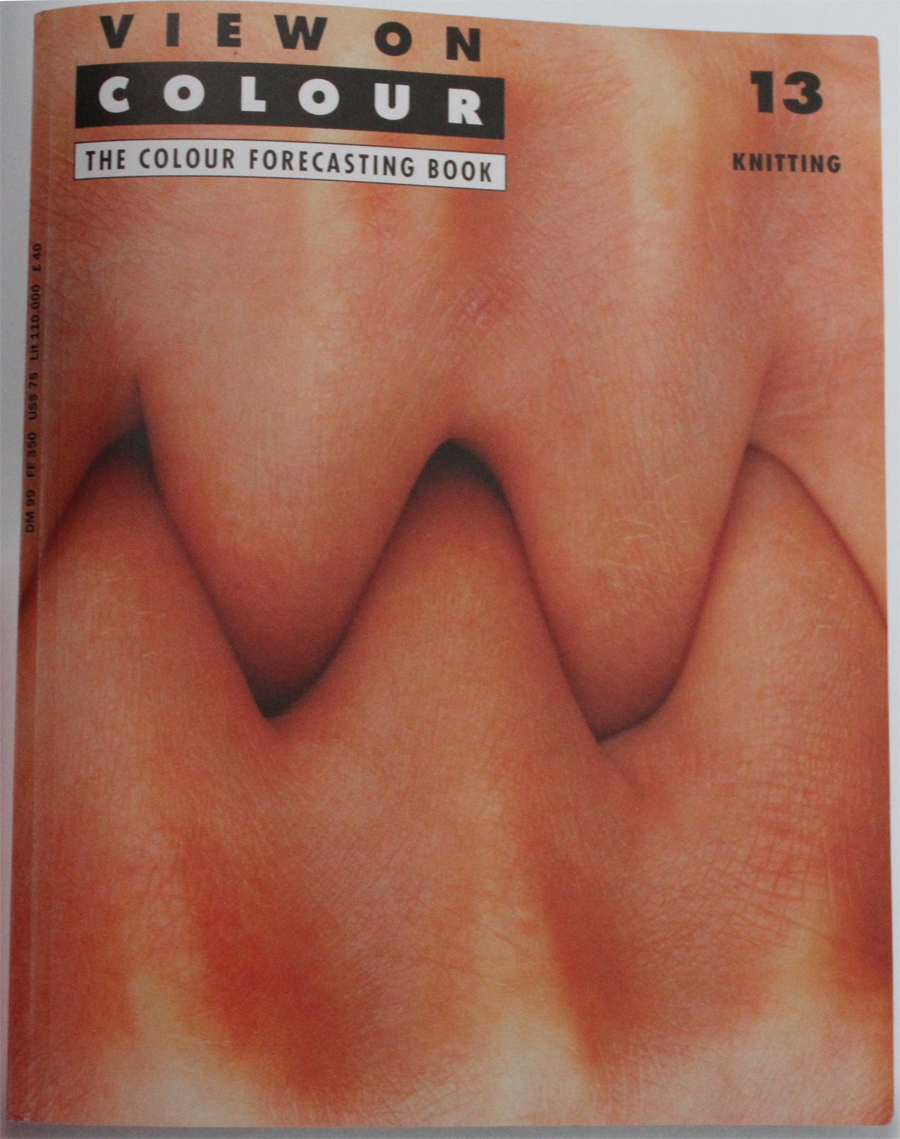
viewoncolour-AnthonBeeke-knitting-itsamiracle

This is for a magazine called ‘View on Colour’ which he published with his wife Lidewij Edelkoort. In this cover, about knitting, you can see something you can not think off from the start, you have to play and have fun to surprise yourself and have something to use.

James Victore says something very interesting is the book It’s a miracle about Anthon Beeke’s work.

”Anthon Beeke always kept playing. A lot of other graphic artist look more like accountants with posh watches and they don’t ask themselves what impact their design has. He plays for his own pleasure and to surprise himself. He doesn’t make work for clients, not for commissions, not for the money, its not even about the assignment or design it self – Its about him. And because its about him it’s about us. The more authentic and personal it becomes, the more impressive his designs becomes gives it more dept; it speaks to us, we can here him snigger of fun. He speaks to us because he gives himself to us. Anthon plays”(Translated from dutch version, not original quote)

I have nothing more to add or say because this quote says it all.

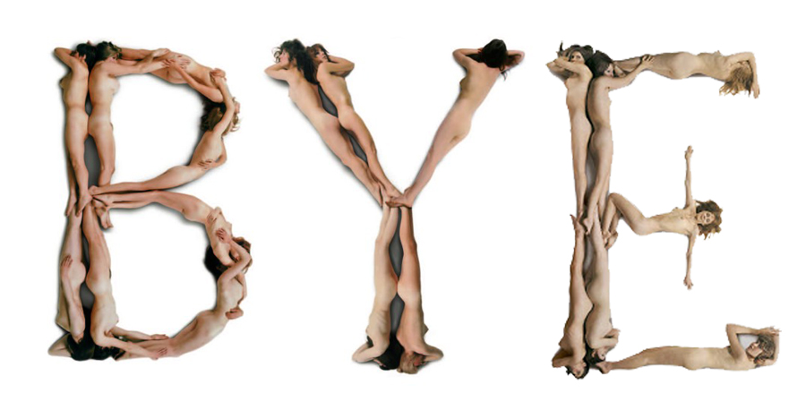
Bye-Anthonbeeke-nudeabc

Ecosophical Roadmap


Friday, August 30, 2013

intro

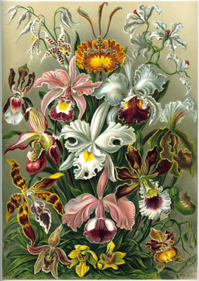
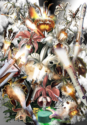
Haeckel_Orchidae

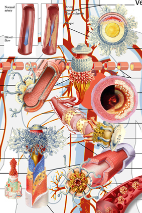
“The drawings in Kunstformen Der Natur express Haeckel’s fascination and devotion to the study of nature. Haeckel himself described his fascination for the world he was investigating, mostly referring to his main discovery, the Radiolarius [x], a single cell organism discovered in the depth of the ocean.
“It’s hard to believe that these creatures are single cells, some are like grids, broken nets or stems, others like tiny balls, helmets or bells when others appear to us like tender houses, windmills, fantastic towers.”

These words reflect on how much the artistic impulse of Haeckel seemed to have taken over his wish to be perfectly accurate and neutral as a scientist. His drawings are projections of real observations but they are as much projections of the inner interpretation of the artist’s vision of reality. Kunstformen der Natur was a way for him to unite these two projections in a single work. He by doing so “began to see not only the outer forms but also the inner content, the nature and the history of things”. He’s been trying to see nature as a “single unfolded work of art” by trying to understand the sequences allowing the Radiolarius to be present in such a multitude of forms. By doing so he achieved an astonishing body of work that can be seen as a suspended moment in time, a witness of this wish to leave space enough for observations and fantasy in a single picture. Following Goethe’s attempt to present nature in its diversity and trying to find unity in it at the same time, Ernst Haeckel created hybrid specimens that reflected on his subjective way to create the marvelous and the poetic in order to try to decode the genesis and the evolutionary systems of nature. That lead him to coin the word “ecology” itself.”

Excerpt from “The Curious, the Marvelous and the Particular”
(thesis by Rudy Guedj can be downloaded as pdf at the end of the article)


roadmap

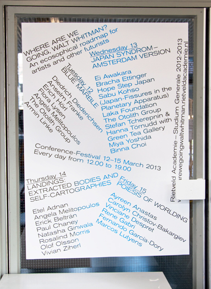
By exploring the potentialities of ecological worldviews, old and new, through theory and art, WHERE ARE WE GOING, WALT WHITMAN? seeked, to accelerate, accumulate, animate and activate our poetical and political understanding of the world. (Introduction of the Studium Generale 2012-2013 “Where are we going, Walt Whitman? An ecosophical roadmap for artists and other futurists”)

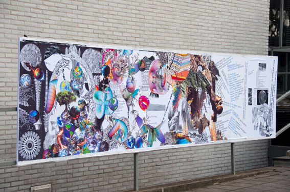
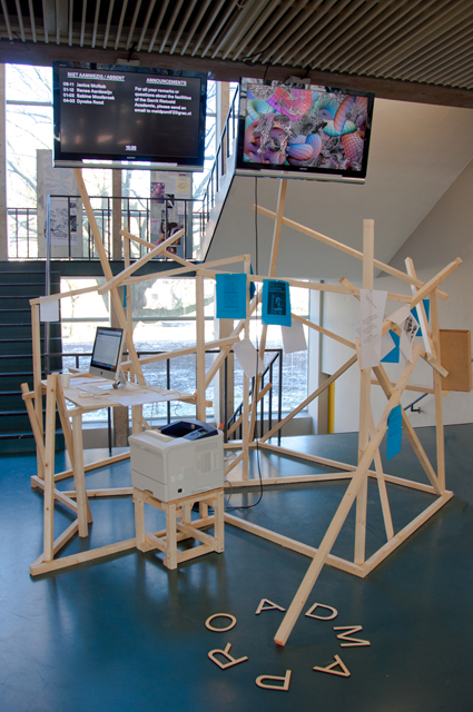
The visual campaign for the Studium Generale — designed in collaboration with Sophie Rogg, Olya Troitskaya and Martin Huger –all graduates from the Graphic Design department in 2013— revealed itself progressively. It was trying to both map knowledge acquired during the past lectures, and project on a fictional level thanks to a visual pollution which was growing exponentially on all the mediums we used.

billboard1

The first layer of the campaign, the map, was created before the Conference-Festival as a simple topology arranging references into a single spacial representation. Day after day, the basic map, as all the different supports we used to communicate with, was taken over by a visual infection.

DSC_0030

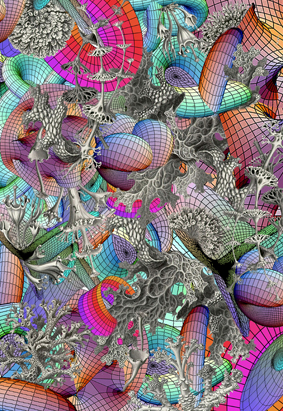
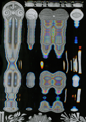
The creation of each of the collages has been realized as a reaction to the existing publication Kunstformen der Natur (Ernst Haeckel, 1899-1904). These bold interventions on top of the existing drawings shaped a fictional journey throughout the campaign and provided endless interpretations of the very broad topic of ecology today.

Collage_Orchidae calabi-yau-2 poster_3 Haeckel_Kunstformen_Page_065_2
< illustrations Rudy Guedj, Sophie Rogg, Olya Troitskaya and Martin Huger >

“A welcome pendant to the overload of terms and theory is the online Ecosophical Roadmap: an ongoing encyclopedic exercise accumulating (visual) footage that inspired the speakers. (Ecosophical Roadmap) I dare say this experiment is the only contribution to the Studium Generale that practices what it preaches: it actually embodies our way of interacting with the material world, mediated through technology and immaterial digits.”
From : Metropolis M (online reviews)

DSC_0110 DSC_0127
< Studium Generale poster, physical translation Roadmap >

The online roadmap was a way for us to respond to the immediate and ephemeral format of the lecture by gathering notes and other references mentioned during the discussions. It functions today as a remaining archive, an attempt to visualize the many connections that were progressively built up and to emphasize on the important role that plays serendipity in our daily use of technological medias.

text by Rudy Guedj [graduate student department of Graphic Design]

thesis


Pdf-icon Download my thesis: ”The Curious, the Marvelous and the Particular“


Log in
subscribe