"product design" Category
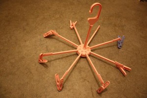
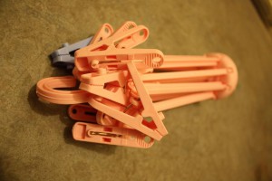
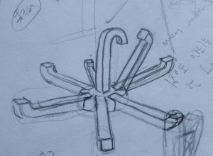
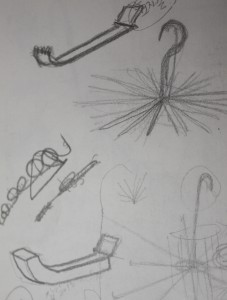
backscratcher
Thursday, March 4, 2010
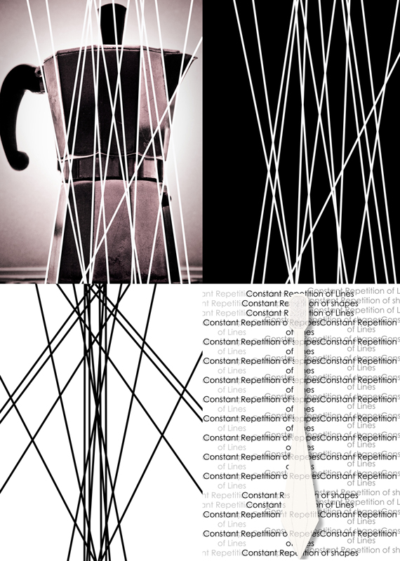
A constant repetition of form
Thursday, March 4, 2010
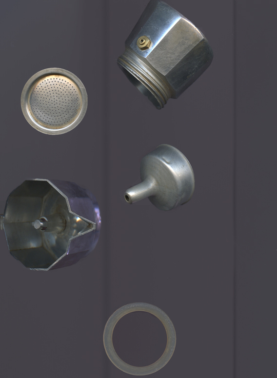
A task to dissect the aesthetics of my object.
A little machine with rumbling boilers and brass fittings.
A clumsy black rubber knob and sharp metallic lines.
A repetition of lines that make a symmetry of circles, hexagons and octagons.
A simplistic and minimal ripped off design for the shape.
A mass-produced iconic object within the field of industrial design.
A constant repetition of form.
Waking up, brushing our teeth, our morning cup of coffee.
It’s all part of a daily routine.
The constant repetition of the same shape in every element of this espresso machine fascinated me.
I took that concept and applied it to another object.
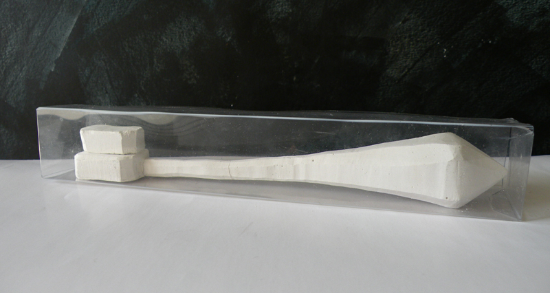
The design of the toothbrush is simplistic yet intriguing because of its peculiar hexagonal form.
A form that came into being by a constant repetition of a similar shape.
The infinite brain game
Thursday, March 4, 2010
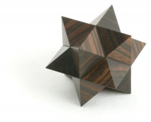
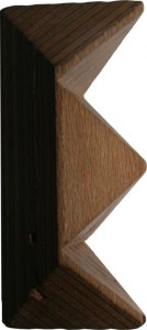
The Diagonal Star puzzle is a three-dimensional geometrical assemble made by six symmetrical wooden pieces.
Whether the interest for this object is practical or artistically, the solution is originated in mathematics, and there is only one way to interlock it. Fixing the six modules in to a pair of two mirror-image halves.
An interesting point of the visual part of this object is that if you look at the side of one module it resemblance a rectangle.
But when they are all assembled the form fits into a cube
.
Using the shape and measurements from the surface of the the Diagonal Star, a new sort of “game” can be created.
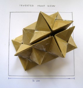
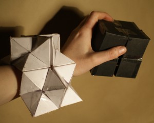
It is made out of eight interconnected paper cubes, that can be folded in what seems at infinitive ways.
It starts out as a black cube.
From this point you can fold it to a white cube.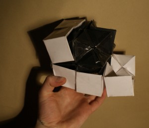
When you divide the cube, the new cubes can be transformed into two diagonal stars, with the exact same mesurements as the diagonal star puzzle. Therefore, either the black or white cube/star can contain the wooden puzzle.
The pleasure of the endless transformations in these new shapes can be a big inspiration for further research and design on product/interactive objects.
Sonny Boy
Wednesday, March 3, 2010
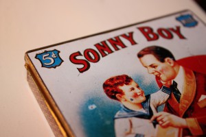
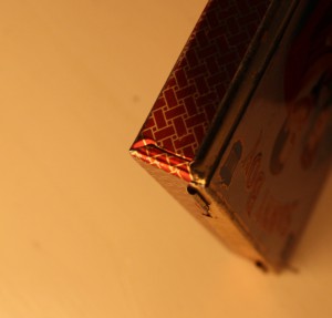
I like boxes. Small boxes, big boxes, secret boxes. The fact that I can put something inside, hide it, and get it out again is magical to me.
This particular box is my favourite. It is a small tin one made in 1980 to keep your cigarettes from crushing.
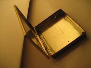
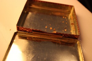
I like the worn out look, faded gold paint and the scratches. The old and nostalgic look and feel of the little box. The very simple shape, a flat container part and a lid, all made out of one material. The only part that is not made out of tin is the pin that connects the lid to the box.
That connection part is simply some bent tin and that little metal pin. And it works really well, for 30 years already. I also really like the curled edges of the lid, that make it seem fragile, but actually make the box more practical.
The way the tin is bent to get the square shape reminds me of the bending of an enveloppe, or a sheet of paper. I think it’s nice that such a solid and sustainable, decorative and unnecessary little object has such a humble and straightforward feel and look to it.
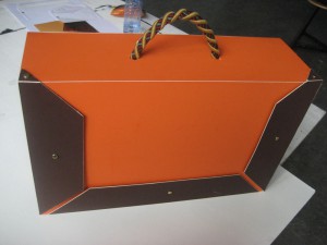
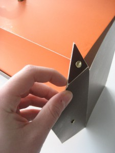
From these points of liking I decided to make a suitcase, with a similar simple feel to it – exists out of one part (except the handle) – deals with the way an enveloppe is bent or folded – is clearly a suitcase – and doesn’t look so very new
I designed a suitcase with the size and the handle of a traditional attaché case as we all know. To the opening and closing of the suitcase I applied the aspect of the bending of an enveloppe which I like about the Sonny Boy box.
Because of the bending-instead-of-lifting opening system the suitcase could be made out of one part, and in order to open the suitcase you unfold it.
spin spun spun
Wednesday, March 3, 2010
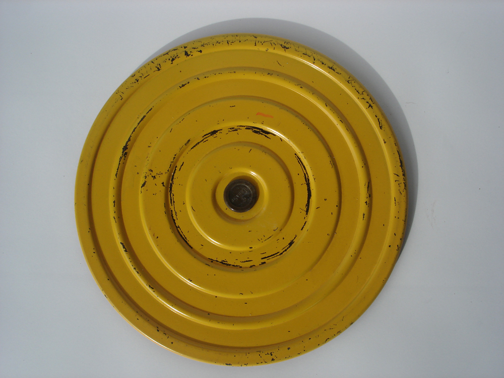
Form did not follow function.
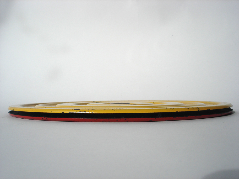
This exercise device that is designed to keep your waist in fantastic condition is visually something that could be an illustration or of decorative means in its most minimal way by being almost two-dimensional.
Its rounded corners on the edges and the repetitive voluminous circular lines add a wavy aspect to the object and give it air and continuity.
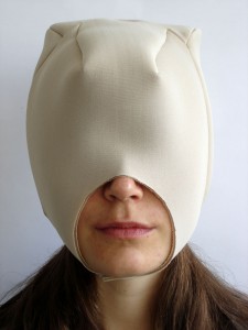
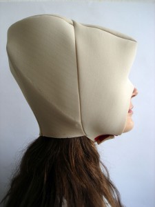
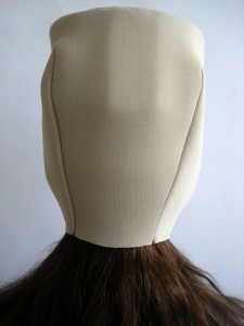
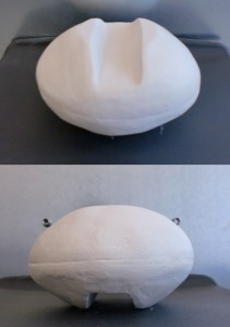
Taking the two above mentioned aspects and consequently use these principles as a departure point, designing headgear seemed utterly natural. The sort of headgear that would follow the shape and size of the head, but eventually alter its original state.
Shape beyond functionality
Wednesday, March 3, 2010
Shapes contain shapes.
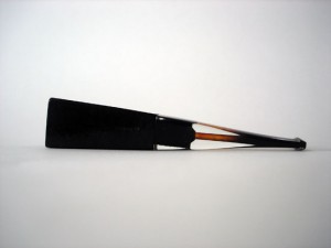
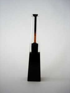
This pipe is a monument.
The company designed the pipe to be feminine. An infinite triangle, with an elitist and delicate exterior shape, but at the same time graphic and geometric. Frail but strong.
A woman.
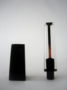
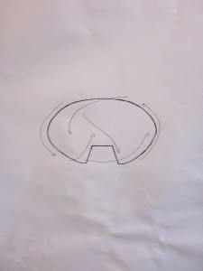
The pipe contains more shapes in the shape. Pipoo 8 has three shapes. The lower dark trapezium made of briar, the transparent upper part made of acrylic and a black plastic cylinder.
We can admire her. How two different materials become unified shapes that contain inside the black cylinder, making a unity of one strict object. There is no possibility to change it, I must accept how it is.
About 15 cm long, it can become part of your body but you can also compare it to a Bic, looking like something alien.
It’s gorgeous.
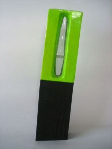
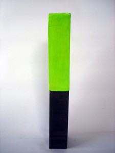
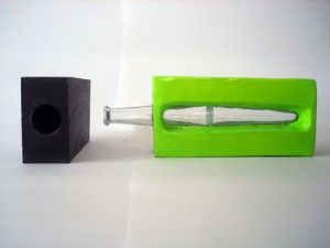
This is not a vase. It is Carnival.
The vase contains more shapes in a shape. It has three shapes. A wooden rectangular with sharp edges leaning 8 degrees towards the right. A fluorescent green rectangular with rounded corners made out of cardboard, whereas its centre has a phallic transparent glass.
Mike Kelley once said: “With my work I not only want to reach the most educated viewer, but the most lazy viewer as well”.
About 44 centimeters high. Screaming for attention. One cannot avoid the sight of this illuminating green situation.
It’s a glossy disaster.
made you look
Tuesday, March 2, 2010
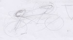
I chose a bike. A bike which colours I find hideous, leaving me no option but to rely on shape alone.
Trying to get something out of it I tried to draw the bike over and over again, varying sizes or distance between the individual elements that construct the whole. Then I did a gestural drawing of the bike.
My eyes constructed the shape in front of me, following the bike around it’s wheel, to the seat, which pointed ahead at the handlebars, which steered me, because of the slant of the bars, back to the wheel and the cycle continues. They don’t flow into one another; the elements point, circle and swing constantly towards each other.
The design literally becomes “eye-catching” not allowing me to escape; I have to analyse the object. Even an attempt at escape is useless as I would only slip back into the shape because of its properties.
An intriguing notion, an object that makes one look, if even for a second longer.
This principle I tried to follow, to arrive at a functional design, but before I completed it, something different happened.
I became intrigued by shape.
The object wasn’t eye-catching, it became different.
It showed so many possibilites, so many open doors that were immediately closed before a new one was opened.
I tried following the same idea, but in this case, I wasn’t intrigued by how the shapes were relating to one another. It offered something new; instead of the shape immediately telling me of an object, this one was like a puzzle. Or like kaleidoscope. Or even like a mirror.
I projected on it. It was telling me stories.
Shape As Language
Tuesday, March 2, 2010
Shape as language- If shape has its own language then what does it communicate?
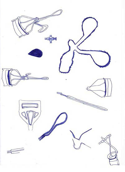
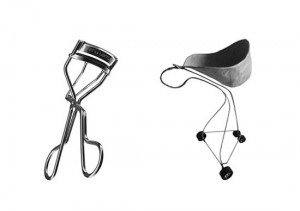
By zooming into the details of my Shu Uemura’s Eyelash Curler I discovered that the flow of the object is both practical as aesthetic. For example the flow of wire suggests that the least material was used making it a practical decision. However the screws with its specific smooth curved heads also reinforce the flow of the object making it not merely a practical choice.
Analyzing the flow of the object and sketching its shapes from different angles lead mine pen to the final shape of a shopping cart. I tried to apply the elegant design qualities of the eyelash curler into this new shopping cart by creating a flow with the least material.
It was interesting to use shape as a tool. In this manner the concept behind the shopping cart follows the shape and qualities of the eyelash curler. Furthermore by putting the object in its environment the concept behind it begins to speak for itself. In other words what you see is what you get.
At the end what does the shape of this shopping cart communicate? I would say consume less because the basket is twice as small as a regular supermarket shopping cart. Also the shape of the handle makes it not possible to lean on. Thus people will unlikely stroll in the supermarket and get less seduced by products that are not on their list. In this way consumers rather use the supermarket instead of the other way around!
Sound in simplicity.
Tuesday, March 2, 2010
Sound.
Heads turn.
What arrives?
What passes by?
Research.
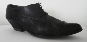
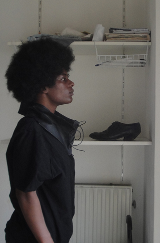
Male tango shoes.
Makes sense.
Quite feminine, though.
Androgynous.
Turkish shoemaker fixed them.
20 euro’s.
Cheap.
“Beautiful, around thirty years old.”
Leather, black, a hint of wood.
Ten little holes.
Thin black laces.
Simplicity.
Simplicity.
Starting point.
Sound transformed into visuals.
Black.
Second hand leather.
Ten small holes.
Covering skin.
New necklace.
New scarf.
Repetition creates silence
Tuesday, March 2, 2010
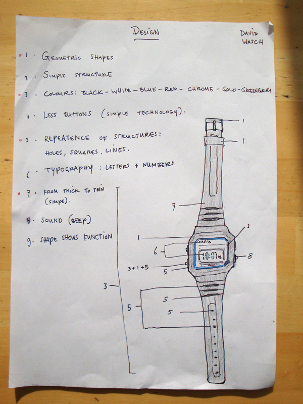
The Casio F-91w is a watch that intrigued me in the first place because of his simple structure. It’s not heavy, easy to wear and no unnecessary elements. The watch explains itself. With this I mean that the shape shows the function, which is something many designers don’t do anymore these days. Other aspects that I like are the geometric shapes, colours and the simplicity of the sound and buttons.
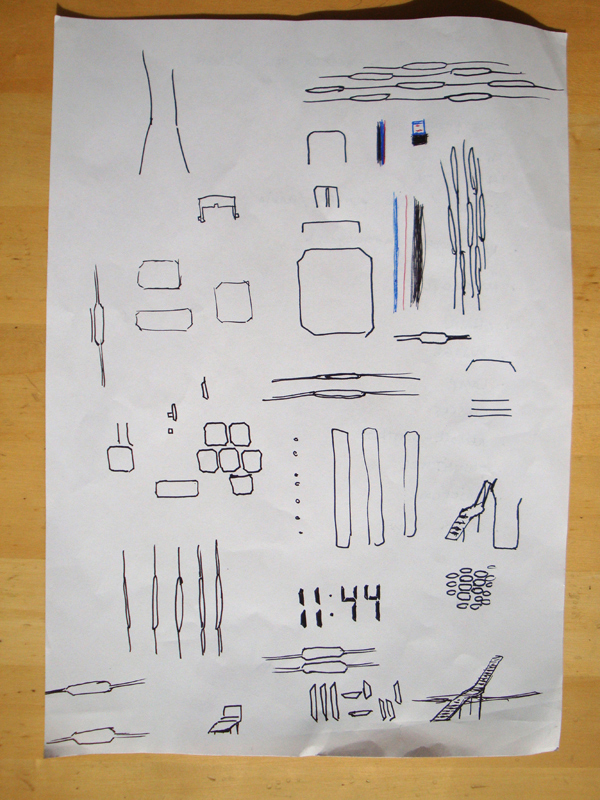
The longer you look at the watch, the more you will find out that the square with cut edges is repeated many times in different ways like a form stretched to the edges at the end of the watch. The designer did not only repeat this square, he also repeated other elements like lines and typography.
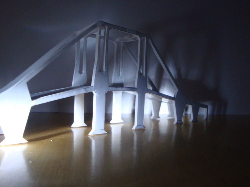
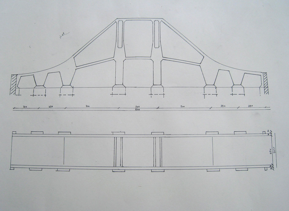
Since this watch turned out for me to be mainly about repetition. I chose to use this aspect in my next design, which turned out to be a bridge for bycicles.
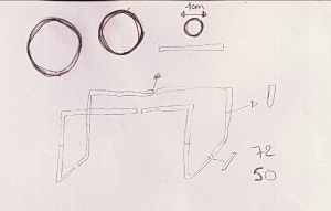
In the technical drawing you can see more clearly how I repeated the geometric forms as much as possible. For the bridge I also chose to use the form of the bracelet from thick to thin into the pilars of the upper-middle side of the bridge.
Blue pinocchio and his fairy go to Istanbul
Tuesday, December 8, 2009
I was looking in the art department of the library and found a book about folk art of Istanbul, in the time of the rising of the Ottoman Empire. When I looked through the pages I found that it was about getting a glimpse of the lives people (read, the sultan and rich people) lived in those days by showing the art, and the artifacts the people used. You can very well see the style of the period in the statues and the paintings and also in the cups, they drank out of, the rugs they walked on,the plates they ate from and the many other furniture and things they used. In short, for me this book shows the way the world looked in that period. In the same way that for us Pinocchio is a well known item now. He would look very strange and out of place in the world of Constantinople, especially if he was blue. To me this is a good link with design and art for both reflect the mentality of the times we live in.
703.6 -cat-1
Unique Book
Sunday, December 6, 2009
I entered the library with a goal to find a unique book, and I did.
But what is unique ? Isn’t it pretentious ?
A funny thing happened, I picked a unique book about one of the least unique subjects that I know. Shoe obsession, which is really almost every average woman’s obsession.
The book is a miniature with more than 500 pages of text and images with at least one image of some kind of shoe per page.
Pretty unique.
But what is unique ?
I came to a conclusion that :
Unique Is Not So Unique.
(Unique Shoe)
12178 / 908.3 o’kee 1
The New Anita
Tuesday, December 1, 2009
There I found myself once again, this time walking with a clear idea in mind.
In this case, more of an idea it was a name. I had began the quest of finding
“The new  Anita”. It is Interesting how this name has been taking over my life these past weeks. I even came across a Facebook
application which is called  “Anita has the answer of your future, click here!”. How did I manage to –somehow– give this name to the nameless images from forgotten archives.
So what do I know about 
 Anita,
and what is there to know about her anyway…? Personally the name has no connotations. I once had a friend called Anita when I lived in Mexico but how she is and where she is currently, is unknown. So I do not really know /where /why /how and /who.
As I am searching for faces I come across a few women, still no Anita.
Until, from the side binding of one of the books comes a portrait of a young lady: black and white image, what looks like red lips, tied yet loose hair, skinny bone structure, dark eyes, beautiful girl. Her shirt is loose, exposing her bare shoulders. Something about her strong persuasion turns her into Anita.
Once again I have picked up a book about portraits. This time the book holds a much older image archive from 1903-1917. So what is it that connects these two? Both archives of images contain a variety of portraits. Both seem to have a dominant female as their main attraction. There must be something about this women, something about this name that classifies, orders and places them in different categories.
 Anita has truly become a tag and I have become the tagger; I have acquired the power to pick and chose.
*12079*
From handcrafts till industrial production
Friday, November 27, 2009
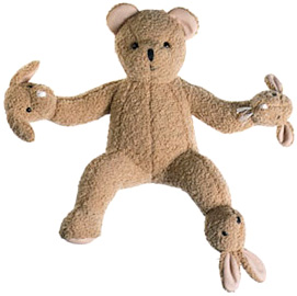

To find a book with the tags “mass production” and “hand works” wasn’t really easy to find, because these two term are really different. Almost the same, as positive and negative.
But “Design of the 20th century” become the book which has both words. Inside you can find mass production but also hand works.
Originally design come from the industrial revolution. Before that, products are made by hand. The design and realization from the objects were most of the time from the hands of an craftsman. Because of the new industrial production processes, and the works, design become different from production.
In this book you can find photographs from famous designers as J. Hoffman, P. Strack, C. Scarpa, etc.
It’s nice to enlarge your vision on design with this book.
13628
Eyecandy
Saturday, November 21, 2009
The book I chose is all about it’s size and content. It’s is a big white book, very light and very thin. On the cover there is a broche of a beautiful lady in gold. Her legs are squatted, her torso upright and she holds her arms wide open. Her arms are part of very lush and colourful butterfly wings. She has two curly antenna’s on her head and her hair flows around her face and arms. She appears to be flying. When I saw her I knéw that my pinnocchio has found his Blue Fairy. It’s a book about Nouveau Jewelry. Because of the sheer size of this book, the pictures of the jewellery inside are very big and very impressive. Every page is full of color and has a vibrancy that really captures the attention and imagination. It’s like a box of candy’s this book. EYEcandy!
777.4 ber 1
