Skip to Content Skip to Search Go to Top Navigation Go to Side Menu


"fashion" Category


Stedelijk Design Show 2012 /Future Highlights


Tuesday, November 27, 2012

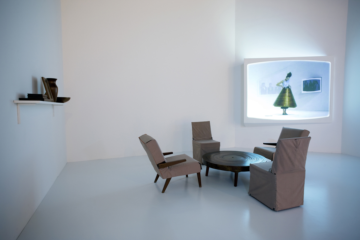
17 Rietveld's Foundation Year students visited the "Stedelijk Collection Higlights /Design" in the newly opened Stedelijk Museum. Marveling at some masterpieces of Interbellum design or surprised –a little further– by the Scandinavian design some of us know so well from our grandparents homes, we arrived at the last part of this "Depot Salon" wondering what a 2012 selection of Design could be.
Researching contemporary design we composed the "2012 Supplementary" which we present in this post. From the exhibit "Stedelijk Collection Higlights /Design" we all selected a personal best and made it the focus of the researches published as part of the project "Design-in-the-Stedelijk"


THE WAY OF A HANDWRITING


Sunday, October 28, 2012

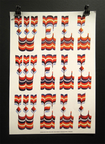
cover of the book Well Well Well containing his differents works, 2010


Letman. Behind this nickname hides a former student of the Rietveld Academy, Job Wouters.  He represents well a very illustrative part of graphic design and type design. This young artist is currently becoming quite famous, with some impressive institutions as clients like Monoprix, Heineken, Tommy Hilfiger, the New York Times Magazine, Playboy, or more recently a collaboration with dutch artist Dries Van Noten for a fashion show. In addition he has just published a book in collaboration with Gijs Frieling, and received the Dutch Design Award for his series of posters called Undercover.


Wouters first started to practice his drawing passion with friends and his brother, sharing their discoveries together. He still often collaborates with his brother Roel, or his childhood friend Yvo Sprey. He was quite intrigued by graffiti, practicing a lot and was particularly interested in street art lettering. This was his first step into the world of typography. In an interview, he said: when I was a youngster I was especially interested in graffiti-writers, who could write their names flawlessly in different styles. The communicative potential of type style was already of great interest to him. It is ironic to start looking at different styles that could communicate your personality through graffiti and finally do the same for corporate firms or advertisements. Later Job entered the KABK school of the Hague in the typography department and then carried his studies further at the Rietveld Academy in Amsterdam, where he graduated in 2004. His great passion for graffiti and handwriting was already very present during his studies. His graduation work was for example made out of 500 posters displaying each name of his classmates, they were handwritten thanks to a huge panel of graffiti styles. Job is definitely interested in underground handmade style of graphic design always keeping aesthetic problems, finalization and communication effects in mind. It is impressive to see a designer like Job who found his way so early, and then sticking to this fundamental base, staying true and evolving all the way.


(more…)

PUSHING THE LIMITS


Tuesday, April 10, 2012


We didn’t ask the school, we sent Linda (Linda Van Deursen, head of graphic design department, red.) a mail to say what we needed, but yeah after that I don’t think we had any contact with the school again.” Niels smiles.

I’m sitting in the studio of two of the leading fashion photographers in the world, that of Auschka Blommers and Niels Schumm, sipping a coffee that Anuschka made for me.

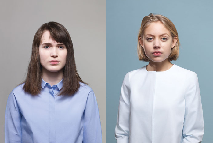
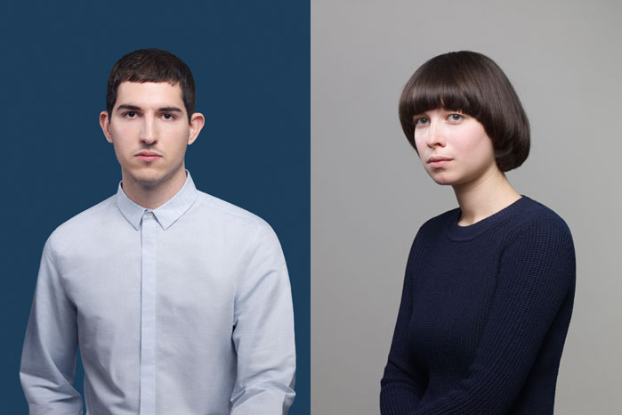
“Well, it was our idea to use Rietveld students”, Niels explains when I ask them who decided to make the reportage, “It was the Art Director who wanted a street casting and COS was very sceptical to it at first. But it’s always a bit tricky to go out on the streets to find models; they are always staying only for a few days in the country or can’t make it for some other reason. So it was easier for us to pick students from Rietveld. Besides it felt more like a real group, closer to us somehow. We all knew about each other, so that makes it easier to work together.”

What we are talking about is the latest collaboration Anuschka and Niels had with COS, a smaller brand originally an offspring from H&M, with their new lookbook for 2012.

So they started with a casting, asking and selecting fifteen people from the school, of which ten pictures were chosen to be viewed by COS, who then picked out seven of them to be in the magazine.

“But yeah, they see something else than we do” Anuschka explains, “where we see portraits, they see too much blonds. Or too pail skin. Or not enough guys, and so forth.”
 

I find it interesting that Anuschka and Niels, being former students and employees at the Rietveld, are doing a lookbook for a commercial fashion brand where they make use of Rietveld students without consulting the academy. In this way, Rietveld is portrayed almost as a product, rather than an art school.


But let’s go back a bit. It all started 1996, the year Anuschka Blommers had her end exam show at the Rietveld Academy (Niels graduated a year before). There she met Job van Bennekom, he saw her work and was immediately impressed and wanted her and Niels to come and make a photo series for a new magazine he was working on.

“YOUR work? He saw your work? Here we go again!” Says Niels laughing.

“Ok, our work then”, Anuschka replies smiling. She heard that joke before.

“We’re like a married couple, fighting over little things”, he explains, “not knowing who did what or said what anymore.”

Anuschka and Niels were working more and more together until one day they couldn’t tell who made which pictures anymore.

“It’s ridiculous really, we got to that point were I would help Anuschka set up the light in the studio, and she would hold the camera and take a shot. So which name should it be under the picture? Foto: Anuschka Blommers, Light: Niels Schumm? That didn’t work.”

“So we started to work together as a duo and eventually you forget who did what. You start to believe that you did a lot more than you actually did!” Anuschka fills in.

They are very used to each other, one picks up were the other one is finishing a sentence and they easily slipp into jokes and laughter.

“So anyway, it was Jop who one year later introduced us to Viktor & Rolf for an exhibition some 15 years ago”, Anuschka says.

And that’s where it all started for Anuschka and Niels, they took their first step into the fashion industry and haven’t stepped out of there since then.

“I mean, we were basically doing what we did at the Rietveld, taking pictures of our family and friends, but the only difference now is that they wear big brands like Comme Des Garcons.”

“Then why did you want to do fashion photography?”

“Well we didn’t!” they both respond.
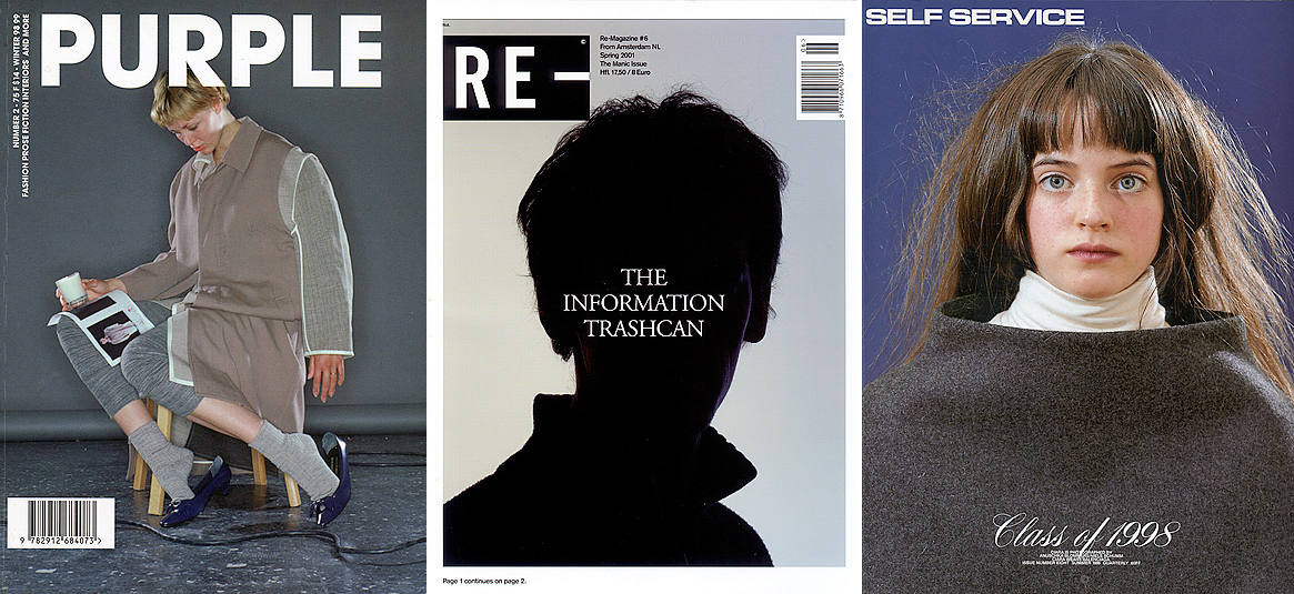


“We didn’t know anything about fashion or clothes or brands. We really had no clue! We just kept doing our thing, but we did it with the models wearing their fashion couture instead.” Niels says.

“We have some influence while taking the picture and printing it in a magazine, but what I find fascinating is that media then picks it up and it can go anywhere, it gets its own life. We don’t know what’s going to happen”, Anuschka explains.

“For instance last year at Queen’s Day, I actually met a woman who sold me one of my first pictures back to me, without knowing! She kept it for 15 years! That is amazing”, Niels says.

But Anuschka and Niels don’t just do portraits and fashion, they have also done work with still life photography, something that Niels was doing a lot in his Rietveld days, whereas Anuschka mostly did portraits back then. When asked what they prefer to do now they tell me that it’s the opposite: when they work separately on private projects Anuschka is the one trying out still life, whereas Niels is doing more portraits.
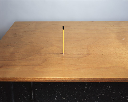
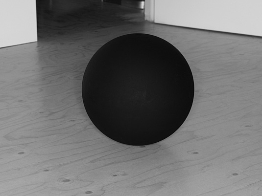


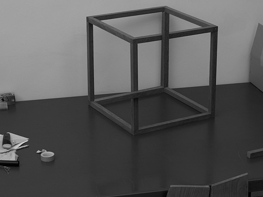
In their collaborate work they are trying to step away from Photoshop by taking surreal photos of objects floating, or tricking the eye, by only using lights and angles. For instants The Cube was one of the first photos that Niels wanted to make. He got a camera at the age of ten, and it fascinated him then how the perspective changes when you look through the viewfinder, so when you take the picture it never is quite the same as you saw it in reality. This notion he carried with him, he wanted to challenge this illusion by taking a picture with a professional camera, arranging this impossible cube.


“There was actually a young couple at our last exhibition at Foam, where the girl asked the boy; How do they do that?, and the boy answers; Photoshop, of course! We both were like Noooooo!”  Anuschka laughs.

It is fascinating to see how they try to make a real thing look like something that’s not real, like this impossible cube that looks like a cube from one angle and from another angle it’s just pieces of wood. So it’s very much about that, about this non-Photoshop. With little gestures they want to turn around the meaning of the image.


“You should always go back to yourself, and stay true to what you do”, Anuschka says in the end of the interview, smiling vaguely as if she’s possessing a secret that she knows already, and that we all have to discover for ourselves.
 

Radio Rietveld! DJ Zachary Airhorn interviews : Franciscus Van Der Meer


Tuesday, April 10, 2012

Radio Rietveld resident DJ Zachary Airhorn had a little chat with fashion designer Franciscus Van Der Meer about mislabeling, telling stories with garments, fashion jargon and living in London.

fashion -garments- are the most intimate and superficial layer that separates our minds and bodies from all around us. they cover our inner space. so what happens around us? what goes on in the outer space? wars, attacks on politicians, poverty, enough clean drinking water, hiv, riots in suburbia etc. the one word that connects all this is intolerance: angst & anxiety for the unknown and thus the threatening. so how do we deal with each other?
what do we show and what do we conceal? to what extend do you choose for yourself instead of those around you? what’s the relation between our own individuality and selflessness? what the confrontation like, when our inner space meets the outer space?

Franciscus van der Meer

The interview starts with Franciscus calling via Skype during a wonderful song by the Beach Boys, Heroes and Villains. We begin talking about his show at FOAM in Amsterdam, which took place in early 2012. Quickly the interview moves on to the issue of talkin fashion without visual aid, and thus the relation between his collections and this above text on his website from his collection …and I’ll show you mine :


We then speak about his work in London, his time with a label, and his work on his captual collection (a series of five outfits). Franciscus speaks in detail of his process, mentioning how the first outfits are generally more “confined”, while the later ones are calmer. He goes from “a place of aggravation to a place of peace.” The discussion then goes into the importance of atmosphere during a presentation, his annoyance with clichés relating to fashion, and his collaboration with friends documenting his work.


JOFF’s fashion designed ART


Tuesday, April 10, 2012


JOFF is the alter ego / the ‘brand’ of Joffrey Moolhuizen, created for his graduation collection in 2001 when he graduated from the Rietveld Academie in Amsterdam. In 2002 JOFF also graduated from the fashion institute in Arhnem. But instead of working in the conventional fashion designer way, making new collections every season, he wanted to establish his work through the art circuit. The designer who grew up in an extremely religious Jehovah’s Witness family, left for art school, where he “found himself” being forced to break with his family. His work originally began as a direct response to the restrictive culture he was raised in, with pieces hiding as much skin as possible (dramatically high collars and uncomfortable cuts are part of the appeal). His work can be seen as androgynous. The designer works on the fine line between femininity and masculinity. As he grew up as a designer, he became more self centered and focused his clothing designs on himself maybe even to the extreme. JOFF’s famous collection ofoffjoff is on the edge of narcissism. Every design is made precisely to his own measurements. So also the models should be approximately his size and build. In theory the work is meant for everybody (though you should be his size) and all the designs are totally unisex, but only avaible in one size, JOFFSIZE.
JOFF is a fashion designer who is multidisciplinary and tries to work in more than one approach to fashion by putting it in the art scene as performance, making books. He tries to combine more mediums to approach fashion, which I think is because of his Rietveld experience. About the Ofoffjoff collection JOFF made a book together with Julia Born (also studied at the Rietveld academie) who is a graphic designer. The book is called Ofoffjoff- one to one. Quoting mrs. Mo Veld who is a fashioncritic and fashion theory teacher at the Rietveld academie  “The  book is more than just the work of JOFF on paper, the classic medium to let fashion transcend beyond the original object of desire, like for instance a lookbook as it is called in fashion. OFOFFJOFF- one to one is a fashion object in itself giving the audience an alternative to discover in detail as well as relate to JOFF”S design, his style, his image, his size, one to one. JOFF and you. Much like early pop magazines featured life size “starschnitt” images of teenage icon. In this publication the designer again becomes the measure of all.”
The book earned two best designed books listings in 2007, by the best designed books foundation presented at the Stedelijk museum Amsterdam, as well as by the most beautiful Swiss books 2007

JOFF is also the artistic director/ curator of the Arhnem fashion biennale. Last year he tried to discuss the relationship between fashion and contemporary art in this city based exhibition. He didn’t want to make it in to a commercial fashion show because there are already to many of those. He sees fashion as the art that’s closest to the body, but tries to get more out of the biennale than only showing nice looking skirts, pants etc. he wants you to get the feeling of what fashion is in his eyes. His concept was a search to the identity and the phenomenon of fashion and also a declaration of love to fashion. He opened the biennale with a love letter to Amber which was also the title of the biennale (AMB first three characters of Amber stand for Arhnem Mode Biennale) which said:  “I’m addicted to your deception and temptation and will never be able to live without this on and off relation.”
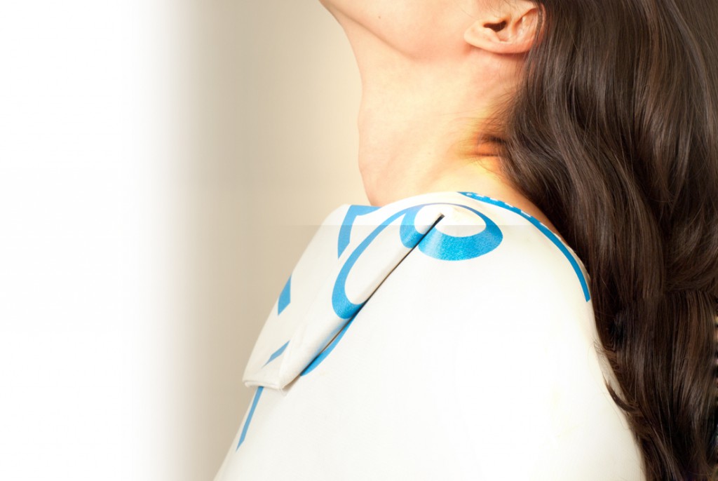
The goal of JOFF is to show fashion in all it’s manifestations, it goes beyond clothing. He also wants to show that your hairstyle and the car you choose is part of fashion, fashion is everywhere in daily life. Also photographs, objects, texts and what not will be shown with the goal to show the social-cultural function of clothing. But also outside of the exhibition space there was a lot to see not just the beautiful fashion stores but also the best bakery and the best views in town. This is how he wants to show that fashion is everywhere around us.
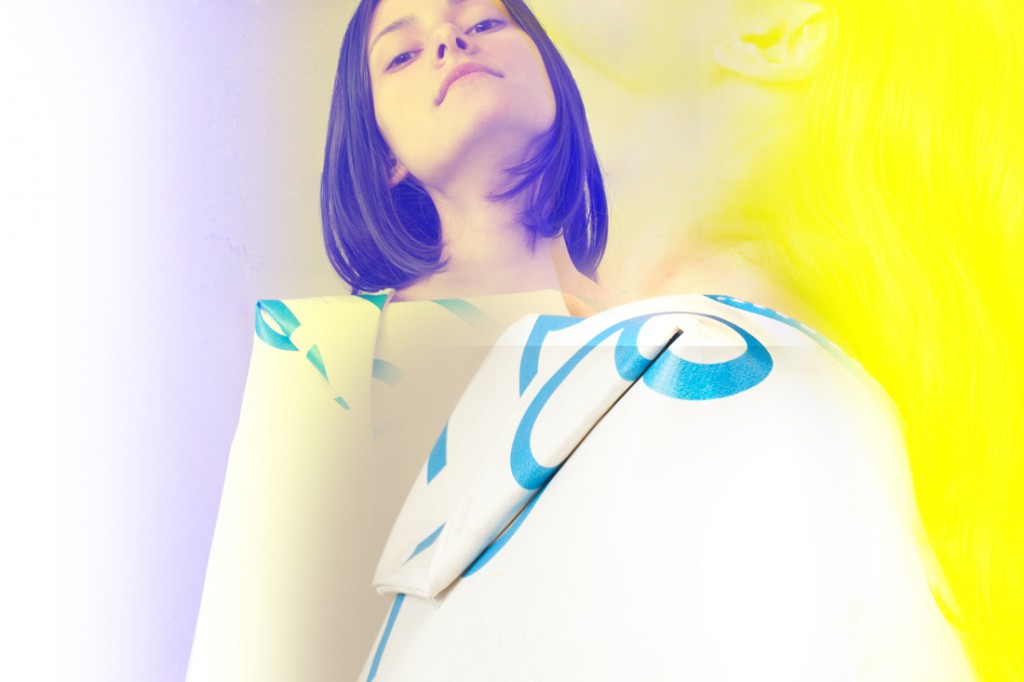
I think he has a really rich Rietveld background that is visible in his work and the way he directs the AMB. Already by not trying to fit in in the fashion world but trying to put his work in the art circuit feels really Rietveld to me. Also that he tries to combine elements out of other working fields, not just making dresses but his fashion serves a different higher goal. He uses his designs to do performances, installations and publications and by doing this he goes a step further than most fashion designers
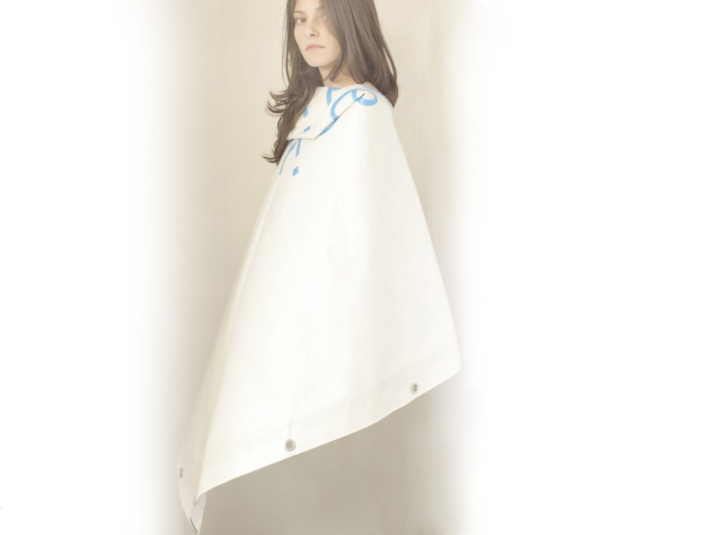
Also his work is maybe more conceptual than most fashion designers with his Ofoffjoff project and also using his religious  conservative background and not only to make beautiful looking clothes but clothes with a story

This conclusion is based on available facts. I tried to e-mail Mr JOFF but never got an answer.


http://www.moveld.com/?page_id=132

the modern man in nature


Tuesday, April 10, 2012

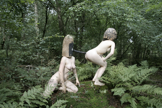
By wearing masks, I attempted to free myself from my ego and access a collective unconsciousness. It is a reaction to the Western urban human being, wallowing in a nostalgic concept of nature, convinced of being able to reach a certain pure natural state within the safe context of taking a course in “primal dancing” or “collaborating with dead ancestors.  quote by Emmeline de Mooij [x]

(more…)

Six Feet Under


Tuesday, April 10, 2012


&Foam
Foam lies in the city center of Amsterdam, in the museum on the Keizersgracht. That is where they program a wide range of expositions. From world famous photographers to young and -as of yet- unknown talent. Grand long-term expositions are followed by rapid successions of  smaller expositions.
&Foam are special editions seeking new collaborations with exceptional artist, with intersecting  the fields of photography and other forms of art.
The current &Foam exposition at display in the Vijzelstraat in Amsterdam is about Philippe Vogelenzang

‘Six feet Under’
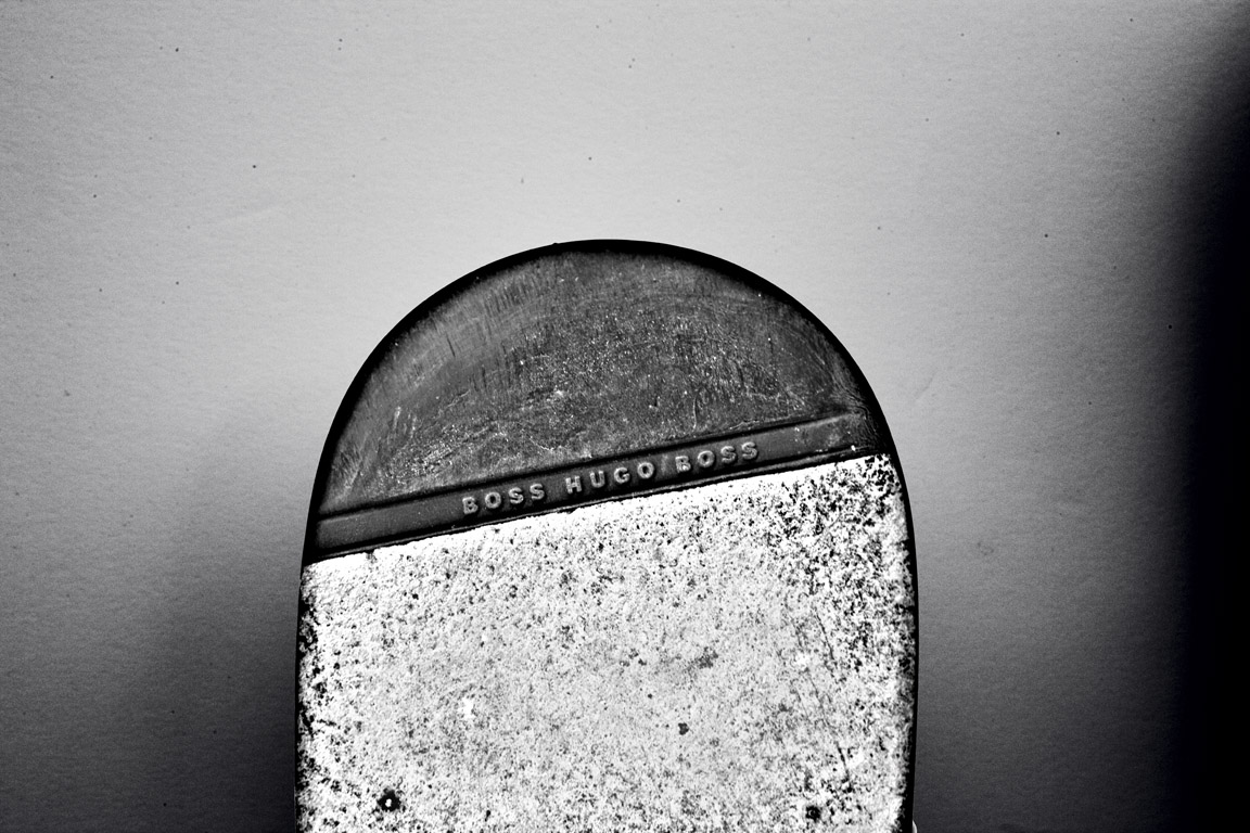
While visiting the ‘Fashion &Foam’ exposition one particular black and white photograph immediately caught the eye. A photograph depicting the bottom halves of seven soles. Shoe soles branded with the names of famous brands like Moshino, Prada, Hugo Boss, Lanvin, Emporio Armani en Vero Cuoio; designer shoes one and all.
After my tour of the rest of the exposition this piece again caught my eye, this time from a distance. The picture -while still recognizable as the same work- looks completely different from afar compared to what you see close up. These were not shoes, but gravestones!
The artist is playing tricks on his audience. He fools you into seeing the wrong thing, at least that is what it seems at first. The picture leaves a completely different impression from a distance and at second glance. It also made me curious as to the message of the piece. Then again the title is descriptive enough ; ‘Six feet Under’


‘Six Feet Under’


The young photographer (1982) lives in Amsterdam. He mostly works in fashion photography doing shoots for national and international fashion magazines. Digging deeper it soon became clear that he is a very active artist. The internet seems to be full of pictures by Philippe Vogelenzang. Many of the websites containing his pictures are about fashion photography. But not just any fashion photography. There always seems to be a story behind the pictures. A little something extra.


Interview with Philippe Vogelenzang

Does the academy still influence your work?
“No, the academy does not influence my work.
Before going to the academy I studied ‘Design en Styling’ after which I studied Art History for two years at the UVA (university of amsterdam) .”
After studying photography for a year at the ‘Koninklijke Academy for Fine Art’ in the Hague I decided to quit my studies and start to develop my own photographic aesthetics and intensity. The first year at the academy in the Hague did of course provide me with a solid base.”

How did you like the transition van studying at the academy to working in the field?
”I liked it a lot, I made many friends. And also made contact with a lot of photographers, they taught me a lot.”

Where do you get your inspiration?
“Inspiration comes from myself, the surroundings; everywhere basically.
I always work out my feelings and I make what I like and feel I want to make.
How it all eventually develops, as it is growing. Focused work is completely different of course.”

Do you like working with a theme?
“Yes, I like working with themes. I am especially drawn to start working on projects that tell a story and address important social issues.”

What is the relationship between your work at Fashion &Foam and you other work?
“In my photography i mainly focus on portraiture, fashion photography and art. Starting often with nostalgic of classical pieces. Aesthetics also play a big part in my works, that is where the fashion comes in. Fashion &Foam is a reflection of whom I am and what I strive for’’

In Fashion And Foam your work seems like conceptual photography, what do you think of this?
“My work is now with foam editions and is picked up that way and it seems that way more and more recognition for my work to occur, it is now as well as in foam in a more artistic angle. This is not something you can control it, but it is an honor if you work in this way is put down. “

What camera do you use?
” I was just sponsored a new camera, a Leica S System. Before that one I used a Canon 1Ds mark II”
One more interesting project in cooperation with Majid Karrouch is Project MODE MADE MAN – (for Amsterdam Museum

Vogelenzang in Foam see: http://www.foam.org/press/2012/en_foam


Discover Design


Tuesday, April 10, 2012


Fluid Fabrics


Tuesday, April 10, 2012


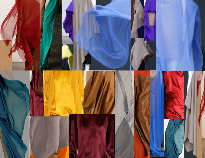
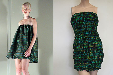
Probably the most fascinating part of the work of fashion designers Niels Klavers and Astrid van Engelen, is the special role given to the deliberate choice of material as the main ingredient of the design, which influences and shapes the garment (as they describe in the short video/interview Dutch Profile: Klavers Van Engelen). And what particularly fascinates me is the material referred to as the decisive factor of the final product and I will try to describe how the fabric becomes such a strong and inspirational object. The Designers` concept is based on this approach and it is evident that they want the fabric to get its own independent life when it is worn by the model. It moves and creates its peculiar visual  spectacle. That is why the designers Klavers and Engelen said that one cannot capture the whole of the design in a still picture as there is way more to see beyond the precise recorded instance of a shot. And there I can insist on the importance of those few minutes (ephemeral but also intensively documented) of the fashion show as the playground where the garments can perform. However, the shots are essential as they represent the source that the wide public can see. The selected audience that get the chance to attend the show, is thrilled by the wild appearance of the fabric while it is exposed in its most adventurous moment.

Coming from an art school, which apparently creates a different starting point compared to the background of other foreign fashion designers that studied at a regular fashion schools. These designers start working conceptually until the ideas develop naturally into an autonomous form. I recognize in this the “fingerprint” of the Gerrit Rietveld academy style that shapes the way of working and thinking, in the same way we, basic year students are educating our own visual language during these years of studying at the academy. What really surprised me is the manner in which the designers managed to implement all the practices that I see everyday in school, in such a rich and fulfilling way. Although their first garments were more constructivist and conceptual, they later developed into more wearable collections that keep the same tactility of the pure form and material.


Klavers Van Engelen


Seeing the work as if it is an enchanted talisman that is liberated as soon as it gets out of the stiff folding on the closet shelve, it also becomes a way of dealing with and approaching the material. I could add almost with respect not afraid to explore all its opportunities to the maximum. The moment that the fabric is released from the packaging, it suddenly becomes that creature that reflects light and communicates with the person that animates it. They treat the material as a living source that inspire their creations and give shape to the final products. Even though the designers try to keep the shape as simple as possible (sometimes just a rectangular piece of fabric with a cut), it still is very open for so many options and highly rich in its visuals, while the person can choose her/his own way of wearing it. That is why I may add that the delicate choice of the fabric as the raw material for the product, is indeed very beautiful in itself and carefully highlight every time when the garment is put into motion. The material speaks by itself determination the strictly sensory way of perceiving it at first glance when the audience is fascinated by that ”what it can do”.

“And it doesn’t move gently either, it becomes wild. The reaction we often hear is: have you seen how that moves! Wow, it`s amazing!” The choice of material is very important. The swishing and swirling of an animated garment is so very different then if it were captured in the photo”

The idea of the piece of clothing moving wildly and captivating the viewer is fascinating. I keep imagining a bond created between the designer and the fabric but also between the person wearing it and the clothing item.

What is this relationship based on? Is it exclusively sensory or more than that? From my own experience, when I visited The Fashion Foam and saw the first Klavers van Engelen design , I was captivated by that intense dark blue and the way the garment that they presented, more like a sculpture than a piece of clothing. It raised questions of what it may be and how it would look on a model or if I would have it in my hands. At first there is this very instinctive urge to touch it to see how it feels and then wondering and imagining how it would look like in another environment. Furthermore, what does it mean that it is presented in this way? I like the challenging way of exhibiting a fashion design that it almost detach from the wearable part but anyway, brings it back to its original meaning because of the context and space it is displayed in.

In conclusion, I would like to come back to my main reflective point which is the material choice in relation with Klavers van Engelen designs. The fabric is our starting point and the most recent collections have evolved from the horizontal.”  Their approach is quite simple and doesn’t involve pattern making or a lot of sketching but rather a hands-on way of working. What is important is the exploration of the material by researching all its opportunities and on top of all, the relation with the human body. Wrapping the fabric around the body and see what shape it gets is the easiest way of getting to know what they are looking for. The fabric has its own language that is translated visually as soon as it is wrapped around the model.

“You can tie a square around your hips and you have a skirt, that`s the simplest approach, but what other options are there for creating a form.”

Soepboer & Stooker


Tuesday, April 10, 2012

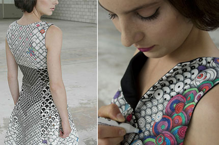
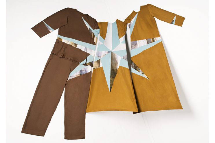
Soepboer & Stooker- A fashion brand, a collaboration between designer Berber Soepboer and Anne Stooker. It’s not only about fashion but also involves different media like installation, photography but mainly based on textile and clothing.

I went to the store for a little interview with Anne Stooker, she told me it was her dream to have her own concept store. She was born in 1984, she first did a foundation course in Fashion academy ARTENIS in Rotterdam, then she came to the Rietveld to continue her Bachelor programme of fashion. She met Berber Soepboer who was one grade higher than her during the study in the Rietveld . Here is some pieces from her in her graduation collection during 2006.

she describes, ‘in her designs, she gets concepts out of existing clothing to which she add subtle details by using a variety of fabrics with prints and her own designs.’

After graduation, as a freelance designer, she also participated styling for a Hip Hop band The Fringe and on September, 2009, she started the concept store with Berber Soepboer. What they are doing, she said, is a bit different than the other brands, they don’t design collections for every season, every piece they designed is connected to the rest of one big collection. It’s like if from one a trunk a lot of branches grow.

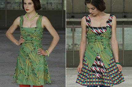
Berber Soepboer, finished her bachelor programme of fashion in 2007, she declares: “I design items of clothing that are characterized through the different ways in which they can be worn. The wearer can make choices in how he or she wants to wear the garment and is thus co-designer of the garment.  In this way I want to create a greater awareness of personal identity, sustainability is a recurring theme in this.” There’s some of her works which explains her concepts very well.

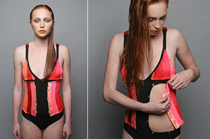
‘The dresses of the collection are extremely complex, with a series of wires that allow changing the shape of the dress.’

I remember this piece which hung on the wall in the store, one is not colored was put next to another one Which was colored, with pens next to it.


This few pieces below are some of the recent pieces in their big collection.

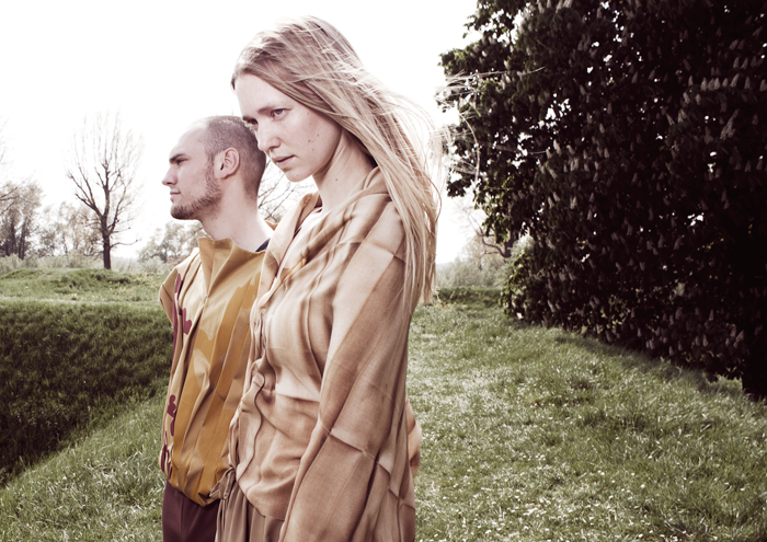
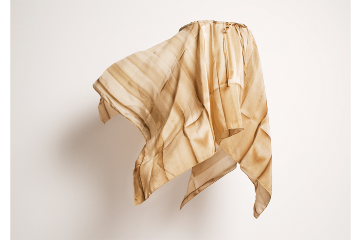
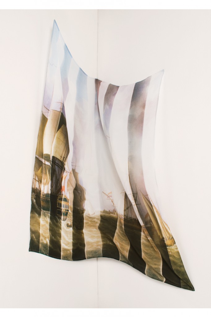
When I talked with Anne, she told me this piece is inspired by the city of Gorkum and the history behind. “Inspired by Countess Jacoba van Beieren a remarkable historical person from this region. Elements from her life such as traditional dress, Dutch ship trade and waterways are reflected in the designs. Present and Past + Identity and Perception were visualized in designs in which shapes and prints of the past get a new form and function in the present. This has resulted in garments which can be worn in different ways where there is an interaction between the individual pieces by means of encounters and connections.

The designs for the two silk scarves find their origin in folds; for storing clothes in cupboards and chests, it was necessary to fold in the old days. The folds are visible on the print but the actual scarf isn’t folded, also the VOC painting is folded and then printed.”  – Berber Soepboer


Collaborations with the Multidisciplinary


Monday, April 9, 2012

Emmeline de Mooij’s • Mixed Media

Emmeline de Mooij (Delft, 1978), currently lives and works in New York and Amsterdam and has a very detailed collection of works. She works a lot with settings in photography and from what we see she often centers herself like an actor in her own works. From 1997 to 2002 she studied Fashion Design at the Gerrit Rietveld Academy. If you see her work, you can see that she’s not your ordinary fashion alumni because her works are a combination of a lot of disciplines containing, but not limited to: sculptures, installations, photography, graphic design, video and performance art. I guess it’s safe to say her work is Mixed Media galore.

Where some alumni remain somewhat more linked to fashion, or at least to fashion within the ‘logical’ borders of fashion, I notice that there is an interesting thing that happens a lot during and after studying at the Rietveld. Something that I see less at other art schools seems to be more apparent there. The tendency to not-choose just one direction, but have a strong drive towards multi-disciplinary ways of creating their form of art. This is something that I not only see in the work of Emmeline de Mooij, but also in the work of other alumni like Felix & Mumford (Fashion, Installation, Graphic Design and more -),  Soepboer & Stooker (Fashion, Graphic Design and more -) and for example the way Thera Hillenaar doesn’t just make clothes for wearing, but also adds a focus on it’s interactive function.

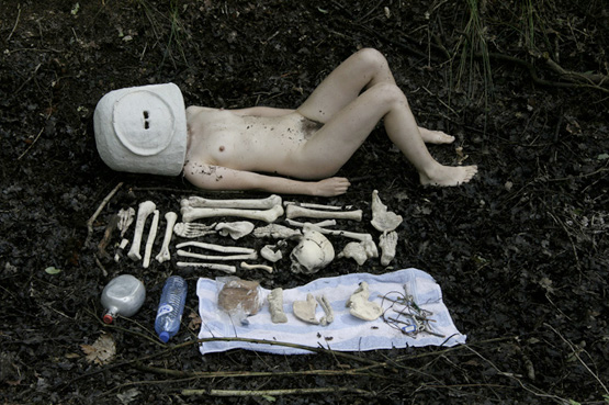
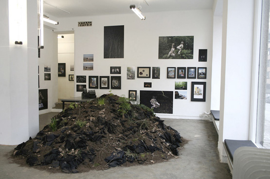
The following images are taken from the solo exhibition ‘Strip it down baby, give me those bare necessities’ at the Steinsland/Berliner gallery in Stockholm.
What I have mentioned in the above, becomes clearly visible in these photographic images.

‘Strip it down baby, give me those bare necessities’
image © Emmeline de Mooij

image © Emmeline de Mooij

image © Emmeline de Mooij
image copyright - Emmeline de Mooij

In the above work she spent weeks in European forests with her colleague Melanie Bonajo and together they researched and visualized how the modern man compares itself to the outdoors nature.

“By wearing masks, I attempted to free myself from my ego and access a collective unconsciousness. It is a reaction to the Western urban human being, wallowing in a nostalgic concept of nature, convinced of being able to reach a certain pure natural state within the safe context of taking a course in “primal dancing” or “collaborating” with dead ancestors.”

[welikeart.nl/]

I feel that from what I am learning now at the Rietveld, it is very important to try and focus on this collective unconsciousness, or somewhat try to approach and question the way you are thinking, and the way you approach a problem that you come across on your way to making a piece of art. This and the multidisciplinary approach to her works give me the feeling of a strong connection to the Rietveld.

(more…)

Not A Complete Story…..


Monday, April 9, 2012

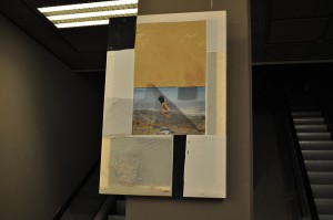
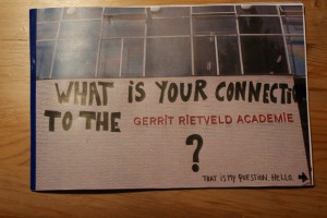
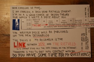
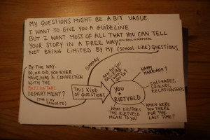
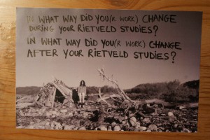
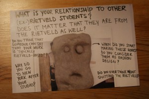
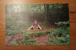
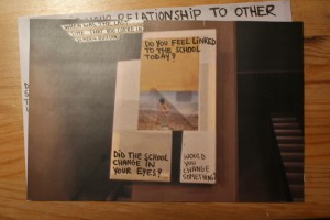
At the Fashion&FOAM exhibition in the Vijzelstraat, the work of Emmeline de Mooij was a real eye catcher. Not because of its colors, not because of its size, not because of its position, but because it was ‘different’. In an exhibition on fashion design, she chose not to show clothing or fashion photography, but to present a canvas with a picture of a jumping naked woman and collected sand, called ‘Gravity and Domestic Dust’. A very (strange?) personal approach to what fashion design is? How does she describe herself, and what –as an ex-Rietveld student- is her connection to the Rietveld after 10 years of graduation? As a reaction on her visual work, I chose a personal formal approach by sending her a letter full of loose questions, written on pictures of the Rietveld building and on photographs of her own work. What I got back was not a complete story, not a letter either, but a bunch of answers giving a slight insight in the relation between this versatile artist and ‘our’ Rietveld.

How do you describe what you do?
Emmeline de Mooij (born in Delft, The Netherlands, 1978) investigates in her installations, photo’s and performances, the human being looking for something to hold on, confronted with the sight of a dizzying big universe. Comfort and a therapeutic effect is often found in surrounding oneself with as much objects as possible.
In her work she creates artifacts and remnants of fictional societies and scenes from apocalyptic scenario’s, removing the contradictions between the everyday and the improbable. Materials such as clothing, utensils, plastic, clay and Styrofoam, she molds together into images referring to science-fiction, archeological finds and pseudo-scientific theories.
The complex, with objects surrounded modern life and the nostalgic desire for simplicity, she captures in an ironic way. Where concepts of freedom and panic are inextricably linked to each other.

You+Rietveld: Happy marriage?
Yeah, quite a happy marriage! Although I wouldn’t describe the Rietveld at that time as a top level institute. I thrived well in the general focus at the Rietveld at giving the students a lot of freedom and responsibility, but I also think that there were a lot of not really good teachers. Teaching on a bad level, not up to date with developments within the international art world, or just not dedicated enough (absent all the time, sick, burn-out etc). I had the feeling some of those teachers where teaching there since ages, having this contract, so they were save for the next 10 years, they were friendly to the director and that seemed enough to keep their job.

In what way did you(r work) change during your Rietveld studies?
I guess, due to the fact the Rietveld being quite an international community, the same counts for Amsterdam where I moved to for my studies, my horizon was broadened. And I felt I could finally fully express myself, surrounded by like minded people, quite different from the provincial town I grew up.

What is your relationship to other (ex-)Rietveld students?
I have some friends that went to the Rietveld as well, maybe 30% of my friends? But I’m not one of those that keep hanging out with only Rietveld people, there’s quite a big community in Amsterdam that is like that.

Does it matter that they are from the Rietveld as well?
See answer above.

Do you think that someone can say that your work is “typically Rietveld -based”?
To be honest, I hope not. I hope my work is not too strongly part of just one particular tradition.
Although sometimes I have the feeling, especially compared to artists with a background in American art education, people who studied at the Rietveld have quite an elaborate/intuitive way of working, which feels to me more natural. So I wouldn’t mind if people would connect me to the Rietveld in that sense.
I can’t ignore though that my work can be typical Dutch sometimes.
Especially in photography I think there is a certain approach that a lot of Dutch artists unites, “improvised” looking still lives for example, or snap shot like photo’s with strong flash light, the use of humor in the work. And many times I think Dutch art isn’t very political, again especially compared to artists with a background in American art education (for me this is a strong reference just because I recently lived/studied in the States for 1,5 years), artists here are not extremely engaged or making political statements.

Why did you go to NYC after your studies?
Because I got offered a scholarship for the Photo Global Residency Program

When did you start making these (canvas)works? Do you consider them as fashion design?
I started making them in New York in 2010. I wouldn’t consider them as fashion design.


Do you manage to draw the school-floorplan by memory?
No.

What did you learn most in school?
Working from my intuition.

Did the school change in your eyes?
Don’t know.

Would you change something?
If there are still these teachers that aren’t dedicated and not good at teaching, I would throw them out and really try to upscale the general level. There are enough great artists and theorists living in or close to Amsterdam who could teach at the Rietveld.

Did you ever think about quitting the Rietveld?
No.

When where you there for the last time?
I think 2008, for the graduation show.

Do you feel linked to the school today?
Not so much, although coincidentally two weeks ago or so I ended up at a lecture from the Italian thinker Bifo and I heard he was going to speak at the Rietveld Studium Generale the next day. So I checked the Rietveld website and some lectures looked interesting, but I had to finish some works for a show so I couldn’t go. But maybe definitely next time.

SUNSET


Monday, April 9, 2012


‘‘Today, you can expect it to be windy throughout the day, a few showers between 2 a.m. and 4 a.m. After that, it’s expected to be mostly cloudy. It’ll get a little warmer in the afternoon, around 10 degrees Celsius. The overall chance of rain is 45 percent. Tomorrow, showers in the morning and high temperatures around the 9 in the south up to 12 degrees in the north-east. The rest of….’

(more…)

KevinPower


Monday, April 9, 2012

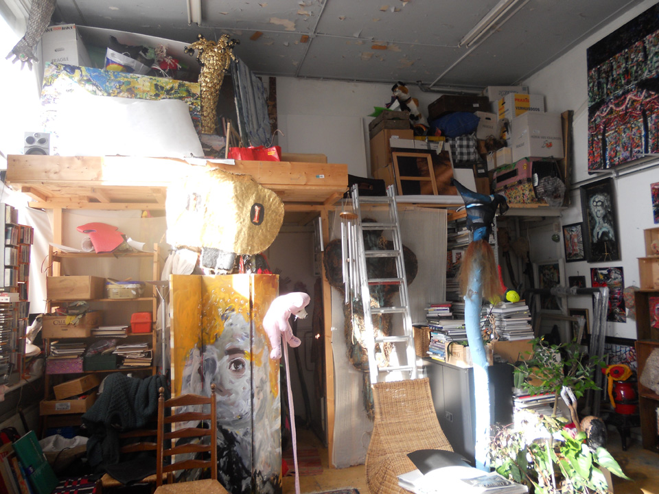
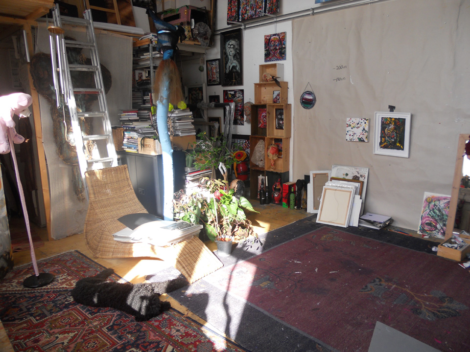
Kevin Power welcomed me in his studio, in a building that used to be a school. We sat down with a cup of coffee and I was soon to realize it was his birthday by a numerous of very nice birthday calls.

We talked about his career after he in 1999 graduated the fashion department at Rietveld, for example how difficult it can be to works as diverse as he does (paintings, collages, sculptures, illustrations, installations, costumes etc.) in a commercial context where they need a more clear style. That’s why he got two websites commercial oriented and one more diverse.

Kevin Power has worked as freelancer, made costumes and set designs for Klank Kleur Festival and from 2004-2010 he was hired by Tommy Hilfiger:” to inspire, everything from creating various interactive art projects to making props for stores and showrooms”.

The Atelier

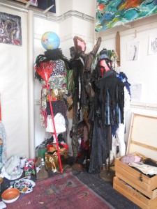
The work space is a storage for previous works that partly will become future works. After being cannibalized to bits and pieces they are recreated and reused containing both the history of its previous function and new dimensions for the present context.

Works are gathered and hidden in corners, paintings put in an untouchable distance and space is cleared to give a fresh start and room to begin a new project, new thoughts and challenges.

(more…)

Viviane Sassen: “I just love the black skin of people”.


Sunday, April 8, 2012

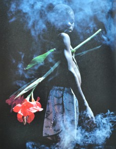
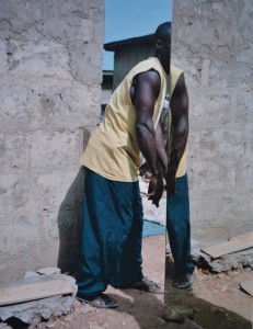
Viviane Sassen photographs people. But she doesn’t consider her photographs as portraits. Her models are more composition than persons. They are never photographed in close-up: it is always a total or semi total scene in which they figure. She almost uses her models as sculptures. Bodies always have a very sculptural aspect. She underlines that with very contrasted pictures. The faces of Sassen’s character’s are often no more than suggestions. They are surfaces and contours, black holes that contrast sharply with the bright, colorful surroundings. She uses a technique that could be called “the revered Clair-obscur”. While Rembrandt and Caravaggio used the light of a candle or their characters to emerge from dark decors, Sassen drapes a veil across the face. A tree, the edge of a roof, bystanders of whom only the legs are visible – they suggest eyes, mouth and nose with the echo of their presence.

Sassen makes 3 kinds of photographs: recumbent figures, lying with their head turned away from the viewer; intertwined bodies; and “Mystified portrait”: individuals who cannot be identified as such, who avert the camera’s gaze, who have a plant or a shadow of a plant where you expect a smile or a frown.

Between the age of 2 and 5 Sassen lived in a village in Kenya. It was a world of skinned goats’ head on market stalls, morning dew on the red earth, and sweet soft drinks in glass bottles and the smell of burnt charcoal. Her father worked in a hospital, and she herself played with the young patients from the polio clinic next door to their house. For a child of that age, who has not yet made the distinction between I and the other, the identification is complete.

She left Africa quite young and only came back there with a camera in 2001. During this in-between period, she flirted with the profession of fashion designer and became acquainted with photography. She sucked up the work of Araki, Nan Goldin, Thomas Ruff, Andres Serrano and Wolfgang Tillmans. Besides her autonomous work, she worked on assignment for progressive fashion labels like Miu Miu, Viktor & Rolf, Diesel, So, Adidas and Stella McCartney.

It is tempting to give an autobiographical interpretation to the images of her African’s work. But that would be too easy, opening the doors to accusations of navel-gazing and narcissism. “I’m attempting to recreate the images of my youth”, she says. But because of a lack of precisely determined locations these images have a universal charge, transcending personal ups and downs. And there’s a particular, political meaning behind them.


(more…)

all4114all (to niels klavers)


Thursday, March 22, 2012


“They seemed to fill with air, ALMOST like they were made out of paper.” Morta Griskeviciute


all4114all


121-58

Supplies the spark that

ignites the air/fuel mi

xture so that com

bustion can

occur.

The

spark

must

happen

at

just

the

right

moment

for the w

hole to work properly.


A hand tool consisting of a handle with a head of metal or other heavy rigid material that is attached at a right angle, used for striking or pounding.


40-62


Regulates, directs and

controls the flow of a

fluid by opening, closi

ng, or partially obstru

cting various passage

ways. The intake and

exhaust open at the pr

oper time to let in air

and fuel and to let out

exhaust. Both are clo

sed during compress

ion and combustion

so it is sealed.


A small open container, usually with a flat bottom and a handle, used for drinking.


33-93


Pushed by the

pressure of the

expanding

combustion

gases,

its

motion

converts

into

round

motion

within

4390

for the

purposes

of the

whole.


A thin toothed strip, as of plastic, used to smooth, arrange, or fasten the hair.


43-90


The space in which 33

-93 travels. Arranged

accordingly in a bank

typically cast from alu

minum or cast iron be

fore receiving precision

work. It may be sleeved

or sleeveless.


A printed or written literary work.


Conversation with niels –

Quality over Quantity?


Monday, February 27, 2012

In the fashion industry the topic of sustainability and eco-friendliness has not been on the top of the priority list one might say. Trends change every season, and to stay in style you are expected to renew your wardrobe at least twice per year. High-end designers are now launching even more than two collections a year, you have the so-called pre-fall and resort collections as well as the biannual summer and winter. Chain stores are introducing new collections as often as every six weeks. At the same time as this is happening, fashion is getting cheaper and cheaper.  The high-street brands keep pushing prices lower by producing their clothes in countries that are known for using child labor and having extremely poor working conditions. The materials used are usually of very bad quality, which is probably also produced in an unethical way. So with facts like these you don’t have to be the sharpest tool in the shed to see that this is not a very sustainable approach

(more…)


Log in
subscribe