Skip to Content Skip to Search Go to Top Navigation Go to Side Menu


"The Rietveld >< Bauhaus" Project


Another 21st Century Ballet


Friday, April 26, 2019

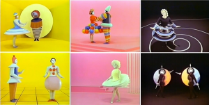
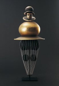
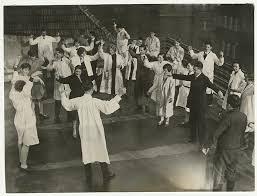
In Oscar Schlemmer’s ‘Triadic Ballet’ we are presented with a plethora of colours and shapes that touch the imagination as if being in another universe. The opening scene starts with two ‘living puppets’ standing in a yellow room. Their costumes resemble harnesses from some other age in another space with primary shapes that limits their movements incredulously. With a staccato walk they move around each other, surrendering to the costume that hides the true identity behind these puppets. As the performance proceeds, and yellow changes to pink and pink changes to black, the dancers appear in various costumes that share the same alien ‘harness’ look and all seem to be made to make movement impossible. With these minimalist movements, Schlemmer seems to be commenting on the position of the individual within the roaring Interbellum: the performers were reduced to puppets that were meant to blend into the colourful decorum.

The ‘Triadic Ballet’ is an important manifestation of the aim for interdisciplinarity that characterizes the legacy of the Bauhaus academy that was founded in 1919 in Weimar, Germany. Schlemmer, who was originally schooled as a painter, turned sculptor, turned decorist, turned choreographer, subsequently found himself at ease within several disciplines. And so did many of his colleagues: painters became designers and drawers became weavers. The true modernity of this Bauhausian aim for the integration of disciplines might have only become clear much later in the 20th century with the rise of Postmodernism. As to this day artists and scientists altogether seem to become increasingly convinced of the benefits that arise when two or more disciplines are being combined. [The appeal for interdisciplinary practice is also very apparent in the educational system of the Rietveld academy in the present day.] It is argued that, within the realm of an educational system it might be beneficial to learn through several disciplines in order to deepen the learning experience, to connect with your subject on many levels as opposed to just one. This also touches on the theory of constructivism, which suggests that people create their own understanding and knowledge of the world through experiences and reflection on those experiences. In other words: a plurality in narratives calls for a plurality in educational journeys (and results in a plurality of learning outcomes).

To me it seems that in my generation (y) a common awareness towards this plurality in narratives is manifested more clearly than ever as we have been exposed to so many through both mass media and personalised media. And yet again, just like in the Interbellum, the position of the individual within this digital era is being discussed. This made me wonder: what would a triadic ballet look like if it was recreated to-day?

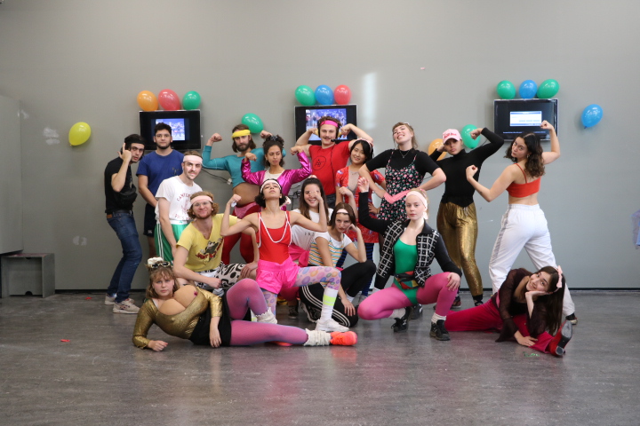
I therefore set out to research and create a choreography that would share a minimalist approach with Schlemmer’s ballet, but simultaneously touches on contemporary culture. Evidently enough there are many possible ways to represent the novelties of postmodern civilization within this historical context, so I made the choice to focus on the subjects of digitalisation and individuality. I discovered that these two themes are apparent in our lives not only through visual experiences, textual communication or metaphysical perception, but also through bodily adaptation. With this term I refer to the different adjustments modern humans allow their bodies to make in order to make use of digital devices and/or media. This bodily adaptation displays a process where an individual’s reality-identity somehow seems to have merged with their digital-identity. Inspired by Anne Teresa de Keersemaeker, who often attempts to create dance forms out of daily movements, I tried to work out different movements that I found to be exemplifying for these bodily adaptations: people crouching over their phones on trains, people shifting their view to and from their screen.


With these movements mimicking digitally-driven bodily adaptations I made a short movie showing a 21st century ballet in 21st century costume. Unlike in Schlemmer’s ballet music and sound has been left yet-to-compose in order to limit the scope of this research. A next step would definitely be to experiment with audio in order to create a complete experience. An important notion must be taken in the fact that this outcome is highly context specific (and therefore quite postmodern for that matter) as it is a result of my interpretation of what a 21st century ballet should look like carried out through my body.


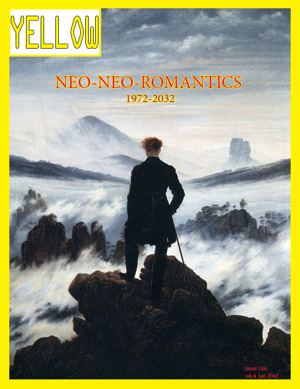
The Neo Neo Romantics


Friday, April 26, 2019


Triadisches Klassisches Ballett


Friday, April 26, 2019

The choreography, the costumes, the music and the decor that Schlemmer uses in his Triadisches Ballett were in my eyes the complete opposite of the classical ballet performances, for example The Swan Lake.

After further research, I actually came to the conclusion that it is difficult to compare, since his approach has had nothing to do with the telling of a story. Schlemmer’s ballet is based on three basic forms: square, circle and triangle and the various postures of the human body: standing, sitting, lying. These combined add up to an infinite number of variations and possibilities of interaction of the human body with space. In this approach, the choreography, the costumes, the music and the decor are all the same. The ballet is the result of the relationship and interaction of these four elements.

Even though Schlemmer’s choreography of the ballet was only a style element, equal to the costumes, the music and the decor, I consider it as the most crucial aspect of the ballet. Therefore, I asked myself: Can it be elevated to classical ballet if you omit the music, the costumes and the environment, and thus only focus on dance technique and choreography?

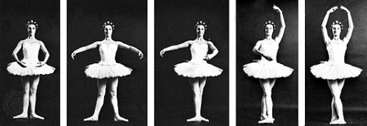
Ballet technique is the basic principle of exercise and form used in ballet. Within classical ballet there are some elements that distinguish it from other dance forms, such as the five basic positions, the turnout, balloon and the ‘pointe’ technique. The turnout is a rotation of the leg at the hips, causing the feet and knees to turn outwards, away from the front of the body. This rotation ensures a greater elongation of the leg, especially when tilting up and back. Balloon is an aesthetic in ballet and other dance genres, which makes it seem as if a dancer is effortlessly floating in the air, floating in the air and landing softly. The pointe technique is the part of the ballet technique that concerns pointe work, where a ballet dancer supports all body weight on the tops of fully extended feet and wears pointe shoes.

ballet pink

To answer my research question, I gave myself the task to learn ballet, to learn two dances. I did this to see if –when I do the dances without the costumes and surroundings in which the dance originally took place– it is rather seen as a classical ballet.

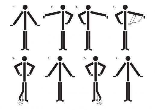
The start of this journey was a big failure, I started to reenact parts of the Triadisches Ballett. Almost immediately afterwards it dawned that it would be a lot harder than I had expected. A friend of my mom, who practices classical ballet, suggested that I sketch out every movement and position.

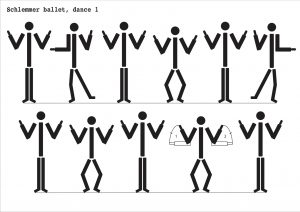
The first dance, yellow part, was way more easy to sketch out that the other one, the pink part had a lot of movement and positions switches really quickly, so I tried to make it as visible as possible.

While learning the Triadisches Ballett, I started researching classical ballet, so I also started to learn the five positions of classical ballet. I wanted to see if I could apply these five positions when learning the Triadisches Ballett.

Learning the movements and positions of my body progressed more and more, until the moment that I started to dance along with the original. I was very slow and took quite a long time to keep up with the rhythm. With the yellow part that went well quickly, even though my leg and arm coordination is not too good. The pink part lasted much longer, the combination of positions very quickly after each other and the twist with the leg going back and forth has been a long struggle and that includes most of the exercise.

While learning both the Triadisches Ballet, the classical positions and continuing to watch the ballet, I reached a conclusion. I have noticed that Schlemmer’s ballet has certainly included some positions of the classical ballet in his dance, not so much in the two that I have learned. In the very first dance section of yellow and pink, the woman dances with the pointe technique and combines it with the arm positions of all positions of classical ballet.

I have also noticed that throughout the Triadisches Ballet use is made of the ‘turnout’, not the feet entirely from the side, a milder version of the classic turnout. The ballet takes elements of classical ballet and applies these, but in addition to that Schlemmer does create many more elements in this dance that do deviate from the classical. For example, there are the more angular movements and the way of walking or running, which I would not call classical. They are a good reflection of the Bauhaus in ballet. The ballet takes classic elements and applies them,  yet there are more non-classical movements and positions than classical, hence my conclusion.

Bauhaus and me


Friday, April 26, 2019

I’ve always been very fond of the Bauhaus photography, or photography itself, so when we visited the Bauhaus exhibition in the Boijmans museum, all I really focused on was the photography. The way they use lightning (reflections) on different textures and materials, make the pictures look very beautiful and dreamy. The black and white effect and the high contrast in shade and light in the pictures also ad to the dreamlike feeling I get from the photographs.


So I immediately knew that I wanted to research the photography of Bauhaus. In this post I’m going to compare the Bauhaus Photographs with photographs of myself, as a Rietveld student, and see if there actually are any similarities between us.

First I researched how photography in the Bauhaus was. At the very beginning of Bauhaus they only used photography as a form of documentation for the architecture and art from Bauhaus, so it wasn’t actually seen as a form of art but only for practicality and publication. After that they were very experimental with the camera, they used new angles, new perspectives and new techniques. They got teatched to see with precision so they would be able to capture every detail of an object or texture. A big influence on this experimental phase was Laszlo Moholy-Nagy. He used unconventional and daring perspective, which defined a different relation between people and architecture. Moholy-Nagy inspired the Bauhaus students and teachers to a new way of experimentally exploring and making use of the camera’s potential. By this way, the students used photography as a means to discover themselves and their work. After the experimental phase they put more emphasis on product photography and got teaching in technical and aesthetic skills, which was a more school-like approach to photography.


For this part of the research I am going to search for photographs of my own, that are similar of that of the Bauhaus and compare the images.

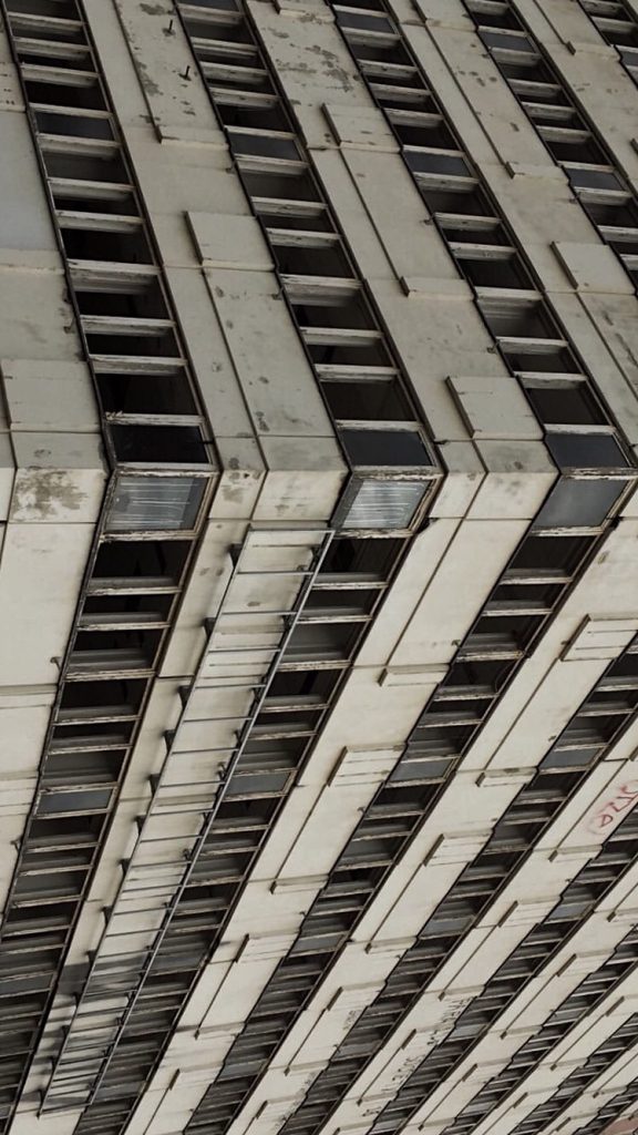
What I noticed when I was scrolling through the photographs that I have taken, I see quite a lot of architectural photographs. In the Bauhaus theres a big range of architectural pictures as well. But there are some differences in the architectural pictures in Bauhaus and my architectural pictures. For example in Bauhaus they mainly made photographs of architecture as a form of documentation, to publish in a magazine or a book. Of course there were some photographers who didn’t just take pictures of architecture for that purpose but also in an aesthetic or formal way. What I find interesting when taking architectural photographs is zooming in on its structure and details, taking it out of its context and creating a new kind of space or environment. Hereby I try to stimulate the viewer to create their own context and let their imagination on the lose. A photograph that can be compared to mine is ‘Steps in the water’ (1930) by Kurt Kranz. Similar in our pictures is the cancelling out of the space around it, and just focusing on one part of the architecture, creating a different space and feeling. Of course a difference in our photographs is the technique.  Now in 2019 we have many more (technical) options in photography than they had in 1919-1933. My picture is made with an iPhone and edited on the computer, so its digital. Moholy-Nagy’s photo is made with an analog camera and developed in a darkroom, unedited because that was not possible back than. This difference however is not even that visible to see.


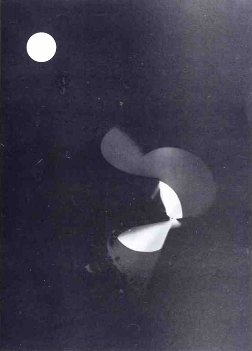
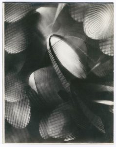
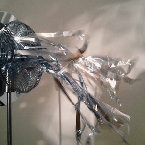
Another picture I want to compare is a picture I made at the Stedelijk museum a few years ago. The photograph is of a fan with thin aluminium strips that move with the wind of the fan. I find that a good comparison to this photograph is a photogram. Which is a technique Laszlo Moholy-Nagy used to experiment a lot with. With this technique you place an object or anything you want on a piece of photographic paper and exposing it to light. The result is a negative shadow image of the item placed on the paper. Why I compared this to my photograph, is because the experience of looking at the images is quite similar even though the technique is so drastically different. What I mean by a similar experience has a lot to do with the lightning and the movement in the pictures. With my photograph the light reflects very strongly on  the aluminium and on the wall, which creates a same kind of effect as the photogram. The differences in the strength of the light is a similarity between the photographs. In the picture of the fan its visible that the aluminium strips are moving, and in the photogram there is also a kind of movement in the picture.

Now how does the Bauhaus photography relate to me as a Rietveld student? Definitely experimenting plays a really big role in the Rietveld Academie, as well as in the Bauhaus. Stepping out of my comfort zone and discovering new ideas and new ways of using my resources. The way that you’re really doing this for yourself and your own development as an artist I also feel strongly related to. Next year I want to go to the Photography department and experiment with different techniques and discover new ways of taking photographs and using photography and discovering what I want to create and become.


Goed Maar Mooi?!


Thursday, April 25, 2019

In this quick visual essay I would like to discuss some personal observations I’ve made based upon visiting the Bauhaus exhibition and being involved in contemporary graphic design. Bauhaus has had a tremendous influence on typography and was the “standard” for at least 50 years in the 20th century. Interface design is still heavily influenced by the movement and school.
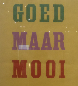
I ran into the following type-design when visiting the exhibition:

"Goed Maar Mooi"

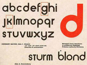
It says “Goed maar mooi” meaning something along the lines of “Good but pretty” which reminds me of similar phrases like “less is more”. I think this mantra encapsulates my observations quite nicely. Bauhaus seems to have a reputation of being mostly function-driven, however I think there was a lot of thought put into aesthetic qualities as well. Bauhaus is well known for the rounded typeface design by Herbert Bayer:

The Bauhaus Typeface

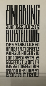
The rounded shapes are well-associated with Bauhaus and play a big part in their identity. Along with a modern-looking sans-serif look.  However I’ve also noticed a great focus on experimentation with grid-systems such as in the following examples:

Examples of grid-based design in the Bauhaus exhibition

I’d like to return to the previous “Good but pretty” mantra established before.
If we interpret “good” as “functional” or in this case: “legible”  I think these examples are less “good” than the previously mentioned rounded typeface Bauhaus is known for. The designer seems to painstakingly stick to an established grid, providing some kind of design-guideline. You lose legibility with this approach. This makes me wonder if these typefaces were design with a  specific function in mind, such as Wim Crouwel’s Neue Alphabet or the typeface used in trams in Amsterdam. The designs however do speak to the “pretty” part of the mantra: the grid system creates an interesting look still popular today.

I think recent design trends in large companies have shifted towards a Bauhaus mentality of being functional. Especially to be legible on a small phone-screen this goes for  typefaces, logo’s, icon’s etc. The minimal interface design popularised by Apple’s iPhone has seeped through a lot of modern-day interface design and identity design.

Jonathan Ive, chief design at Apple, has mentioned Dieter Rams as an influence in this text.
Dieter Rams has in-turn mentioned Bauhaus as an influence in an interview.
Rowan Moore also mentioned this in the article: Bauhaus at 100: its legacy in five key designs he wrote for The Guardian about Bauhaus’ 100 year anniversary. The article also mentioned objects such as signs in airports and Ikea chairs, it’s definitely worth a read.

The iPhone interface

I would relate the functional layout, rounded corners and minimal icons to the Bauhaus school. Both excel at bringing order to something very complex. A phone can basically do anything you want it to these days, the functionality exceeds past technology bij combining cameras, computers, maps and music players all in one device. It is a real challenge to make a user-friendly device with so many options. I think the unified grid-system, easy-to-read iconography and interface allow for this to be the case.
Apple has consistently been using sans-serif typefaces in recent years and even introduced it’s own “San Francisco” typeface for their iOS operating system.
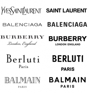
Traditional fashion houses have changed their “heritage” looking serif typefaces to modern looking. Companies such as Google, eBay and Instagram have opted to change their former intricate logo’s to more minimal “flat” interpretations of their previous logo’s.

Various Fashion logo's

I have observed younger contemporary designers rebel against this direction by coming up with wild and eclectic designs. I have heard arguments that people consider the sans-serif looking too safe and “same-y” do these fashion houses lose a piece of their identity when they’re all getting sans-serif redesigns by Peter Saville?
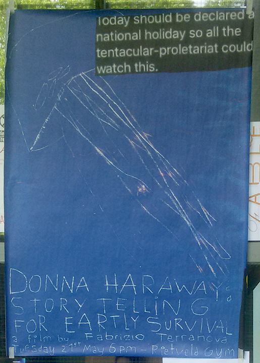
Another point I would like to rise that goes hand-in-hand with the rise of eclectic designs is the rise of analog (looking) designs. I personally like this

It’s an easy task to create a perfectly-uniform and perfectly-straight line in Photoshop. However it’s very difficult, or rather impossible, to create a realistic pencil-drawing or oil-painting. As people drift away from the “flat” design trends they end up with textures found in analog work.

I personally think it’s interesting smaller contemporary designers have been taking risks in this regard by creating an eclectic mix by juxtaposing Bauhaus aspects such as clean sans-serif typefaces with serif typefaces and interesting textures and imperfections.
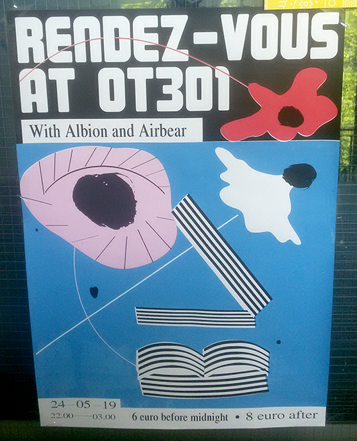
This recent development could be seen as “Modernism and Eclecticism”. The “Rendez-Vous at OT301” typeface is still reminiscent of the Bauhaus aesthetic. However, it is combined with Serif typefaces that have an imperfect look, like how the width of the type saying “6 euro before midnight” and “8 euro after” differs. The poster appears to be screen-printed but the red layer isn’t aligned perfectly. The black “eyes” also have a distinct textures look as if they’re hand-painted. This eclectic mix of elements makes the individual elements stronger in my opinion. The distinct characteristics of the “hand-painted” eyes are accentuated by placing them next to the perfectly clean “Rendez-Vous” header.

Imagining Bauhaus Poetry


Wednesday, April 24, 2019

Through the looking glass of Bauhaus principles, observing the elements of “poetry” and how that guides new possibilities in the making of a poem.

What inspires me to explore this idea is the incredible visuals of Bauhaus Theatre.


More spesifically HOW the concrete, minimalist and practical demeanors of Bauhaus (which in my mind have such an adult attitude!) created such extravagant, playful, toy-ish costumes that look like perhaps a child puked them out of their wild imagination! 

While “the Bauhaus element” in these costumes and general aesthetic* * * is undeniably present to me, there I observe something more, almost an added element… Having read that the thinking behind the designing of these costumes is in fact by observing the performers body with a calculating attention and following its relations to the space (the stage) through its motion*, I am tempted to think this “other element” I was looking for might just be the ballet itself.

Assumption…..         The designs of these costumes are just materialization of the visuals the dance draws in the viewers mind-eye. The dance is numerous invisible lines and shapes drawn in time with the tool of the body…       Perhaps!

Hypothesis:————————————————

Bauhaus building within an existing art form alters its outcome.

So It makes me Wonder. How would it apply to poetry? With letters and words as form and rhythm and sound as dance, the paper as the stage. I found myself wondering this more so than other mediums mainly because I haven’t seen it attempted.

Starting… Concrete, anew.

A concrete definition: Poetry is a form of literature that uses aesthetic and rhythmic qualities of language to evoke a concentrated imaginative awareness of experience or a specific emotional response.

Here is a new world, with its new forms and movements, sensations and images, to build a new Bauhaus in and of it. I will attempt to look at some elements of poetry and seek new possibilities in its design, looking at it through the 5 characteristics of the Bauhaus design.

1=Form Follows Function

It means that in design, a form should always be applied because of its function instead of its aesthetic appeal. “Utility came first and excessive ornamentation was avoided.” The thing is that this principle seems to shift slightly when applied to an already existing art form like dance, or poetry, as the means of actions in these are the adornments themselves. So, thinking of function for aesthetic, rhythm, imagination and emotion (and so on…) is altogether a different approach. Function in this case, I imagine, would be to ease and support the already existing or suggested communication of forms and elements -in the case of poetry, for example,——: All aspects must serve to communicate/highlight the emotion/mental picture/phonesthetic situation. 

Letters (uppercase, capital;size;font;color;bold-italic…so on.), Words, Gaps, Marks, etc. + the plane the poem will be viewed on should be used for this, courageously.

2=True Materials

According to the teachers at Bauhaus, materials should reflect the true nature of objects and buildings.

This to me, follows up to the previous case. What are the true materials of text, literature and what are their functions? These are not meant to be hidden, but even highlighted to show their functions thus exaggerating and complementing the existing literary pleasure.

In Bauhaus Theater we see the stage too, is designed in such a way that it holds hands with the costumes designed to exist with it, so the form and its space exist as one self-complimentary relation. I believe this relation is somewhat weak in the current poetry. There is perhaps much to do to enrich our poems by putting more thought on the plane (usually the regular white paper) we present it on. I would advise seeking new possibilities on this, trying to create a more powerful relation between the elements of the poem and the presentation of it.

3=Minimalist Style

Bauhaus artists favored linear and geometrical forms, while floral or curvilinear shapes were avoided. Only line, shape and colors mattered. Anything else was unnecessary and could therefore be reduced. Therefore we should give the reader the necessary amount of words (and preferably words that are not too difficult or esoteric) and not more, as it risks tiring the emotional and phonesthical landscape. This approach also gives the poem a fresh, modern look, which is desired. It becomes open and approachable artistic experience, instead of possibly exclusionary one.

4=Gesamtkunstwerk*

Translated from German as “total work of art”,”ideal work of art”,”universal artwork”*, “synthesis of the arts”, “comprehensive artwork”, “all-embracing art form” or “total artwork”) is a work of art that makes use of all or many forms of craft and design, or strives to do so. 

The poem can draw a picture as a visual form, can be sang as a song or acted as a play and so on… all this is desired and should be attempted.

*The concept of language makes this difficult as many languages used for poetry cannot be called Universal, but I believe it is still quite possible to challenge this with the help of growing alternative languages, which I will go more in depth in the following.

5=Uniting art and technology

In 1923, Bauhaus organized an exhibition that shifted the Bauhaus ideology. This exhibition was called ‘Art & Technology: A New Unity’. From then on, there was a new emphasis on technology. The artists embraced the new possibilities of modern technologies, for example at the time, mass-productivity was keep in mind whilst designing a product.

In Bauhaus ballet, geometric shapes and a mathematical understanding of the dance is very apparent in the costume designs and choreography –*.

New technologies today, give us new languages for poetry to play and build with, of which I don’t see enough use. A prime example of this are the Emojisa small digital image or icon used to express an idea or emotion. It is, by definition, quite similar to the words that we use but with an advantage of their own, being capable of much more of a universal communication than any word of any language. They are being used so often in our daily texting and us new age kids have learned to communicate so much with them so easily, and with the help of an ever growing selection of emojis available to anyone with a smartphone, I am surprised why they are not being used more creatively. I believe through emojis a new, different and straightforward literary landscape is possible and I would like to attempt it, here…

My (currently very incomplete) draft/attempt at Bauhaus Poetry::::::::::


Side-walk in the cold regular night,

I am sedated by 

the surrounding objects :

Moving amongst growth and shrinkage

To the pointed futurity which sits folded 

in Z00Ming horizon———. 

Moments pass themselves to remain 

over my shoulder, behind my last step 

to Reside as the Past. Behind the direction    of 

my opposing attention  

As we speak I am Approaching 

to : 

the ————. needle tip… 

Shapes emerge and grant me locality

The wind blows Regular 

and I start takinK 

The X Large stepsS 

of a clown. crawl

into an ever-descending point 

   the buzz of everything glimmers an easy happening  

   thingness of the smallest spot

                               WiNKs at me

Everywhere is filled with stars!

Except the calming darkness of the surrounding

Tree trunks 

descending...


The diversity of a stable object


Wednesday, April 24, 2019

     As a student of arts and design and, at the moment, about to reach the end of the first year – I found myself trying to understand my progress and development process as a student- considering all the different situations and stages I have been through this last year in relation to the school.

     Characterised by strong rhythm and diversity, the basic year forced me to be extremely versatile.

     Creativity and quick response led me to places where I had never been before and although I was very confused in the beginning, I can now understand the interconnection of all the proposals from the school and how my reaction to them should be constantly evaluated in order to keep developing as a student.

     As so, confrontation becomes incredibly important to get to know myself and, under pressure, the behavior of my body had many times to overcome the speed of thought, which means, that it was necessary to act without thinking innumerable times – which resulted in a completely different way of perception on my own work. This practice, of course, has greatly influenced my method of creation and helps when it comes to try to have an overall view on the last period of my life- which I will be doing meanwhile writing this essay.

    From this very small and summarised description of the last months as a student of an art academy I ask you to take some words that will help you to follow my thoughts throughout the essay:

  • Rhythm;
  • Diversity;
  • Versatile;
  • Creativity;
  • Interconnection;
  • Confrontation;
  • Development;
  • Behaviour of the body;
  • Method.

These words, for me, interrelate the three points I want to focus and connect: Art academies; me as a student and school furniture design. But lets start from the very beginning.

     Art as an educational practice emerged in the 16th century in Italy, and has since evolved in many directions. Artistic teaching has been constantly changing and responsible for the emergence and development of multiple movements and new artistic practices that grow from the urge of the artists and and the society. As so, methods used in art schools have been transformed side by side with the whole society and its needs. 

     Throughout all these years many academies have been important for the development of various names that have become part of world history. Thus, certainly, the school where each one of them studied, had a great impact in their own artistic practice. Aiming for the same to happen to me, when I decided to study arts, I promised myself that I would try to find a place that would truly satisfy my needs and where the thought that moves the school would meet my own way of thinking.

     The academies have become places where learning is fundamental but, over time, the way the disciplines are taught to the students is in constant transformation- what results in a huge variation of methods used in artistic teaching.

Therefore, my task of finding the place where I wanted to develop my practice as a potential artist had to be even more cautious and I had to get to know as much as I could about the schools to which I could apply without studying there.

     After much research, I ended up leaving my home country, Portugal, in search of something that seemed appropriate to me and I ended up enrolling in the Gerrit Rietveld Academie in search of a more adapted teaching to my ideas and to my way of producing.

     Surrounded by different ways of thinking and materializing ideas, I was immediately enthusiastic about the reality that surrounded me. The contemporaneity and versatility of the teaching of each one of the teachers has proven the ideas that I brought with me from Portugal. It is very important to have the school as a safe space where all ideas are respected; Where the concept is valued and experimentation has no limits. The unlimited access to the workshops gives creativity to the students and the consideration of the creation process by the teachers and colleagues makes me believe in several methodologies that open up a huge range of possibilities to each project that I develop.

     While considering all this I realized how similar the school I was studying was to one of the most important schools in the art and design history which I always had as a great example of education techniques: the Bauhaus.So there has grown an even greater interest for this fascinating school. Now, living even closer to where everything happened geographically, I have managed to get more and more acquainted with its history.

     After some research, I have come to understand that the way the Bauhaus developed and educated its students was more than a teaching method. It is perhaps a method of production and creation that is directly related to one’s own method of living.

     Honestly, I find it striking how schools like the one I attend and the Bauhaus consider the curriculum of the degrees, and as time goes on we have more and more evidences of the positive influence that this way of teaching has- somewhat minimal, where “less” is believed to enable a much interesting creation. I would like you to take into account the last sentence- “Less is believed to enable a very interesting creation”


     While researching about the schools of art education and my perception of them. I began to notice a very important element: school furniture. That both the Bauhaus and the Gerrit Rietveld Academie plays a very important role – maybe because of its relationship with design practices. Considering those academies as a space where an incredible relationship develops daily: between the building and its interior; the objects; and  the people that share this space of discovery and experimentation.

     The interaction turns out to be very relevant in the day-to-day of those who frequent this place. The distribution / organization of space among all those who occupy it is extremely relevant and certainly influences all activities that take place in the school environment, from pedagogical to playful.

     Historically, there are several objects that are part of the artistic school environment and that, thanks to its constant presence, a certain language between human being and object is developed. As I wandered through the corridors of my school, I realised that each student has its own body language, just like every person and that we all physically get involved with what surrounds us.
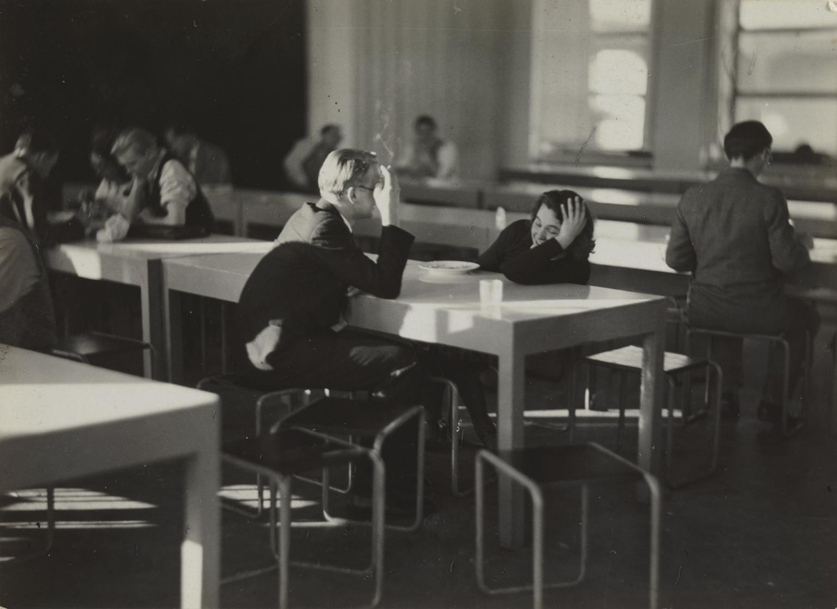

Cafeteria after lunch, Bauhaus, Dessau 1930-2, photo: Iwao Yamawaki, Tate UK

     The same happens in relation to pieces of furniture. Without realizing it, the chairs where we sit become part of our position while we are seated, or an easel can become part of our body while we paint – its triangular shape where the frame is supported, often serves as support for the painter. I myself have noticed that many times I paint I find moving in different angles thanks to the support given by the easel. And, together (me and the easel), support the fluid movements of my arm that moves the brush.

     Due to the introduction of this new theme – school furniture design. It is impossible not to go back to the Bauhaus, a school where numerous pieces of furniture were developed and included in the school itself. When I went to the exhibition “Netherlands Bauhaus – pioneers of a new world” at the Museum Boijmans Van Beuningen in Rotterdam, I found several photographs with many of the most famous pieces by Bauhaus students, such as Marcel Breuer’s stool but, and I realized how furniture captures my attention by the way it is designed and it interacts with the space. But, throughout the exhibition, there was one piece that captured my attention, the Ulm stool by Max Bill.

“Function means the relation of one thing to another. (…) When we speak about fulfilling a function, we are talking about producing something to fulfill a need. “;

“By function I therefore understand a relation, for example the relation between material and form.” – Said Max Bill.

     Having the designer’s words as a starting point I would like to take advantage of the functionality of his piece – which fascinates me – and directly compare it to my relationship with the school that I attend because, incredibly, while appreciating the stool in the museum Boijmans Van Beuningen I felt that, somehow, its structure was very close to mine, as a student of the Gerrit Rietveld Academie.

     Physical characteristics of the piece:

– The stool is made up of 4 pieces that when fitted create a volume of varied functionality. The joint of the different parts is extremely well design;

– The simplicity of the geometry allows the interconnection of all parts and a joint strong enough to handle a weight;

– The stool has 3 almost identical parts that form the seat and a tube that allows support and transport.
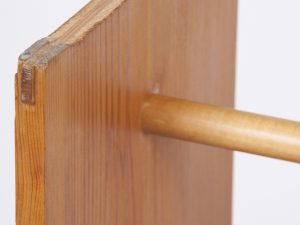
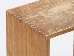
     In a metaphorical way, I associate this description with my goals as a student. Every day I try to find solutions for my assignments through maximum simplicity; I try to be as organised as possible so I do not get lost in my own thoughts and, to ensure that each of these thoughts results in something material. In order to develop my production process. In each of the projects that I do in school I seek the interconnection with the others projects- always trying to notice the small things where they might be similar and, therefore, I have discovered many personal characteristics – mainly in relation to the way I work and how I shape my thinking. By considering and evaluating my own works I manage to find myself a little bit more every day.


     Functionality of the piece:

  • One of the strongest features of the Ulm stool is its versatility in functionality.

The joining of four simple pieces results in a simple object that can be used as a bench, as a desk and as a shelf and can still be transported very easily.
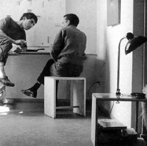
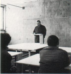
     In relation to my own experience this versatility can be found in a lot of aspects. The Gerrit Rietveld Academie is a place where its diversity promotes an open space where a lot is possible. Even if the departments work in separate ways there are links in between that make the school work as one and everyone is free to participate and to take the best out of everything that the school offers, from people to workshops.

From such freedom I experienced a lot of different results from each student, including myself.  It is this versatility that I try to find in my posture as a student because I believe that it will certainly result in a practicality and ability to solve any problem that I will increase my creativity and for sure be one of the most important lessons I will take with me from my years as an art student.


     At this point, where I can relate the characteristics of a design piece with my own performance as a student. I consider my research finished.

After all and by becoming better acquainted with the reality of art academies and their direct relationship with what is produced in them. I believe that writing this essay resulted in a very personal development – It led me to conclusions about how I interact with the space around me and how this influences my results and it also made me pay more attention to the results themselves so that, later, perhaps, I might be able to assume that I know myself.
 

Piet Zwart Dolls


Tuesday, April 23, 2019

The bauhaus might be quite interesting and new for some, but looking at the collection it only makes me realise how many works of theirs I see in daily life, without being aware of their background.

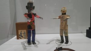
In the midst of it all there was one piece by Piet Zwart that caught my attention, the postal office dolls . The reason why his work interested me the most was not because of its material or colours but its size. Other works in the Bauhaus were on such a big scale, or photos of bigger works, that these small dolls made them even more noticeable for me.


Piet Zwart Postel Dolls


Afterwards I did some research at home on Piet Zwart and his other works by looking at a documentary on him called ‘Everything Must Change’, by Sherman De Jesus, 2012[x]. What I found out during my research was that, he wanted to design his own identity, he wanted to see what Piet Zwart looked like. Writing doctrines, manifestos, mantras and disciplines, of various forms of the avant-garde, and knowing them well, was his first step in breaking the conventions. Three of his biggest influences were Russian constructivism, Dada and the De Stijl movement [x].

He studied a diverse range of art related subjects including painting and architecture, and he was introduced to the principles of the English Arts and Crafts movement. From 1908 he started teaching at an industrial and domestic school for girls. In 1913 he returned to study, attending the University of technology in Delft for a year. From 1919 while continuing to work as an independent designer, he began teaching at the Rotterdam Academy of Visual Arts, now known as the Willem de Kooning Academy. He was dismissed in 1933 because of what were considered his radical ideas on education. His ideas were too similar to those of the Bauhaus art school in Germany, where he gave some guest lectures as well in 1929.

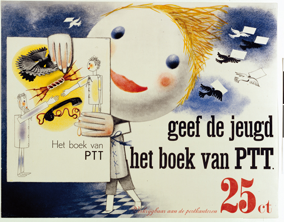
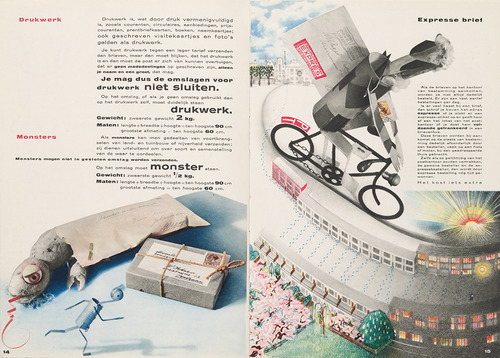
In 1930 he was asked to design ‘The Book of PTT’. This book was made to teach school children how to use the Dutch postal service. It was full of bright colors and it was meant to be exciting. He created two main characters for the book: ‘The Post’ and ‘J Self’ [See Dolls 1] They were paper doll cut-outs that he photographed and then touched up with chalk, ink, and color pencil. Additionally, he used many different fonts of varying sizes and thicknesses. He was assisted in illustrating the book by Dick Elffers. The book was finally published in 1938.


the 'Piet Zwart PTT book'


I studied him up to this point because it seemed to me like his later works would be irrelevant to how I relate to the dolls. So after the research of his earlier years and how he worked on The Book of PTT, I finally found a connection. As a child I used to make a lot of dolls out of a wide variety of materials for example; clay, paper, trash, etc. I made their clothes and homes, I created a separate world for them. And I would link those to a story in my head or on paper. The reason I felt connected with his dolls was because it gave me a nostalgic feeling of how I used to play and the way I produced the dolls and linked them to my stories felt similar to Piet Zwart’s dolls and The Book of PTT.

Even though I might find them very similar, at the same time, to me they are totally different. For example the way he executes his stories in his book he uses a very precise and fixed style that doesn’t change throughout the book whereas in my case I was still a child, I did not have a fixed style; my drawings were childishly disorganized.

Another difference is his typography, not only the way he writes but the way he uses words and letters. It seems like he’s playing with them, something I could’ve only dreamed of as a child. I wasn’t really the smooth talker, I often stuttered and could never get my words across.

As for his writing of course it can’t be compared to that of a child’s handwriting even if it is made for children. Even now writing is not really one of my strong suits, a reason why I came to the Rietveld, to improve my writing skills in order to get my stories across. That’s why my stories were told mostly by images instead of text.

I hope to have to opportunity of honing my writing skills at the Rietveld Academy so that I can explore and find my own new way of writing. That would clarify the meaning of the stories I have yet to tell.


Sources:

-Piet Zwart en Het boek van PTT, [x] Een commentaar, Paul Hefting, 1982
or have a look at the boek itself [x]

-Pioneers of Modern Typography, Herbert Spencer, London, 1983


Look How Far We’ve Come


Tuesday, April 23, 2019

The similarities between the Gerrit Rietveld Academie and the Bauhaus school are immediately apparent. In theory and course structure, one could declare them almost the same, even looking from far away at the way classes are taught, there is a striking resemblance, but looking in a little deeper, a lot of the practice has changed. A great amount of freedom has ensued in the last 100 years and that is highly visible in the hallways, classrooms, staircases and pretty much every corner of our academy. 

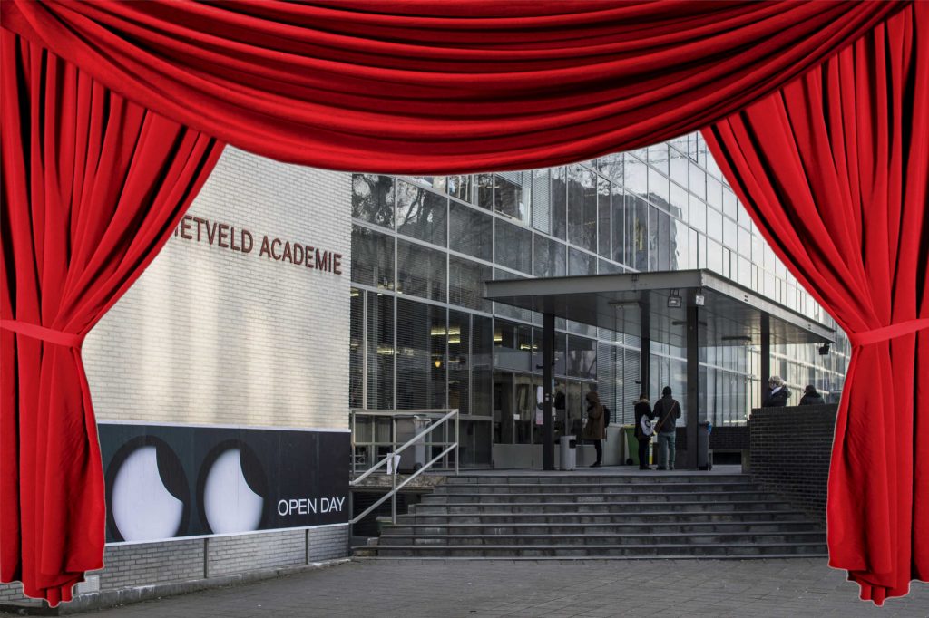
Looking strictly at the academy’s building, the Bauhaus influence, Gropius’ glass box designs’ influence on the Rietveld architecture is almost palpable. It is what Rietveld students have made of this glass box that demonstrates the progress. The beacon of modernist Bauhaus architecture is constantly littered and bombarded with student’s and teachers individual works and projects in the works; with posters promoting performances with roots in extremely diverse concepts, and the limitations of rationality imposed by the Bauhaus are thrown out the window.

Having spoken of posters, it would be ill advised not to look at the graphic design departments of the Bauhaus then and the Rietveld now. Having been put on paper by different designers, the ones coming from Bauhaus look like they might as well have been designed by the same person, and so do the ones coming from the second floor at the Rietveld today. Here is the difference: while the Bauhaus posters have a very neat, almost strict design based on straight lines and proportions, the results coming out of our graphic design department present relaxation and fluidity. The Bauhaus posters all promoted the same message through the same rhetoric: boring, modernist rationality. The Rietveld posters on the other hand merely promote each individual’s message through the same language.

But how have we arrived at this level of enabling relaxation?

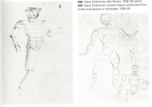
It could be the teachers. They kept the structure of the Bauhaus, even in teaching drawing, but the drawing subjects are now far more varied and exciting. In 1929 Oskar Schlemmer taught his students how to draw human proportions using spheres, tubes, cubes and other geometrical shapes. He did this in trying to question the nature of the human being, a lesson I cannot see disbarred from the socialist rhetoric of creating a new, logical type of human being, that the Bauhaus was so keen on.

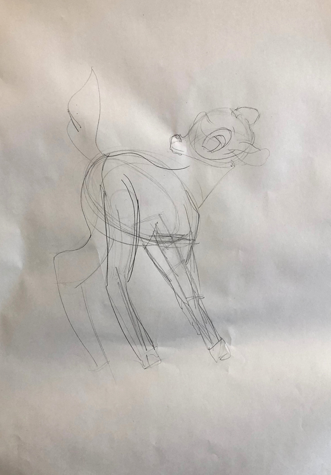
In 2019 Hewald Jongenelis (one of the drawing-painting teachers) taught his students, me included, how to draw fictional character Bambi through the same technique. He motivated this by saying: “If you can draw Bambi like this, you can literally draw anything”. Again adhering to teaching certain freedoms so necessary in the work of artists and designers these days.

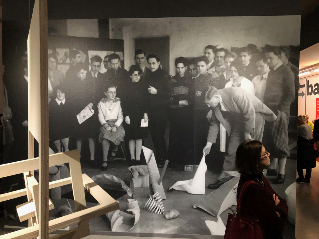
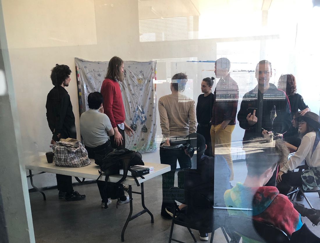
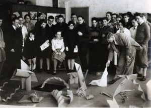
It could be a collaboration between teachers and students. Looking through a Bauhaus exhibition in Rotterdam, a certain picture that had been captured in a regular Bauhaus ‘Vorlehre’ (the Bauhaus equivalent of ‘Basicyear’) classroom decades ago caught my eye more than any designs exposed. A shared class structure in the Bauhaus school and Rietveld Academie is undoubtedly there. But something is off…

Where as in the Bauhaus school picture the entire class was immediately engaged in discussing one student’s work which was sitting in a pile of others like it, in a Rietveld basic year classroom some of the students’ attention is drifting away when things in class are becoming to repetitive, either towards their phone, towards the hallway or to anything slightly more stimulating than the class itself. Although this may seem like a bad habit, taking the bad with the good on might realise that this kind of habit allows for a constant flow of information with the outside of the classroom, broadening the field of subjects that students can study in their work or that they can ultimately bring into the classroom for their colleagues and teachers alike to digest.

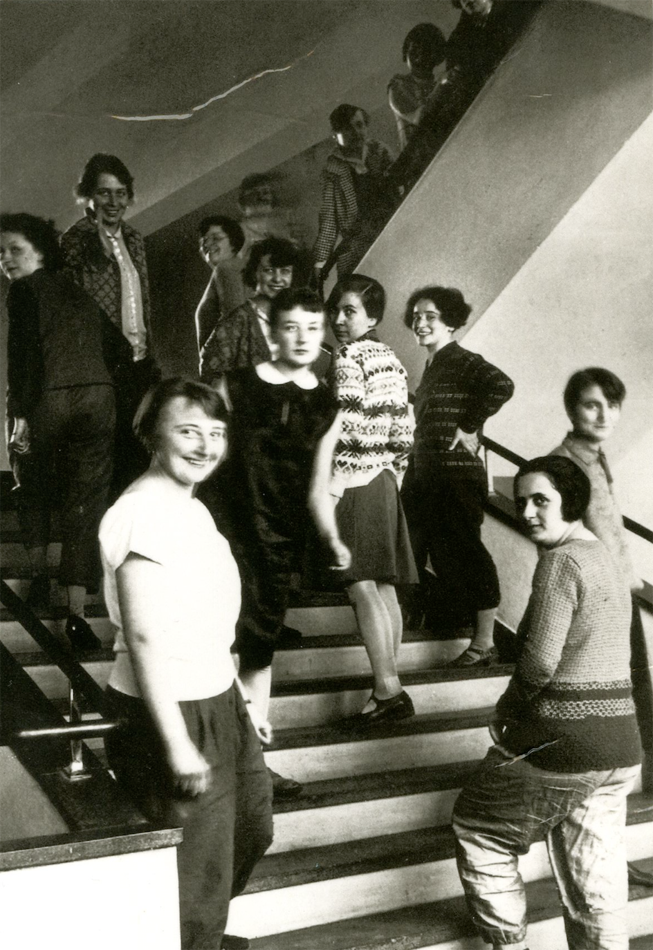
It could be only the students themselves. Its enough to look at their fashion, and how carelessly  they wear it within the school to understand the freedom that Rietveld students are experiencing today as opposed to 100 years ago in the Bauhaus. Even though much of the fashion on the Rietveld staircase is alike between itself, which was also very much the case in the Bauhaus, put it on the streets and it will be the only one standing out in Amsterdam a city which has come to look almost as if its streets are painted through one stencil.

A Spectacular Manifesto


Tuesday, April 23, 2019

The ultimate goal of all art is the spectacle! The ancient drama was once the main purpose of the visual arts, and it was institutionalized as an indispensable part of life. Today, it exists in complacent isolation, from which it can only be salvaged by the purposeful and cooperative endeavors of all artists. Architects, painters and sculptors, designers, writers and potters must learn a new way of seeing and understanding the composite character of the theater, both as a totality and in terms of its parts. Their work will then re-imbue itself with the spirit of the spectacle, which it lost being caged in a white cube.

The art schools of old were incapable of producing this unity—and how could they, for art may not be taught. They must return to the performative, to the spectacle, the theater. They must get back up on the stage. This world of mere conceptual products must at long last become a world of performers. When a young person who senses within them-self a love for creative endeavor begins their career, the context of the theater will give them unrestrained freedom to achieve excellence in their practice of art, as well on stage as behind the scenes.

Architects, sculptors, painters, photographers, weavers and dressmakers—we all must return to the collective spectacle! For there is no such thing as “art by profession”. There is no essential difference between an artist and an actor. The artist is an exalted performer. Merciful heaven, in rare moments of illumination beyond man’s will, may allow art to blossom from the work of his hand, but the foundations of proficiency are indispensable to every artist. This is the original source of creative design.
So let us therefore create a new ensemble of actors, free of the divisive class pretensions that endeavored to raise a prideful barrier between actors and artists! Let us strive for, conceive and create the new theater of the future that will unite every discipline, architecture and sculpture and painting, video and glassblowing and jewellery which will one day rise heavenwards from the million hands of artists as a clear symbol of a new spectacle to come.

If you know your Bauhaus well, you may recognize this text as it is a rewritten version of the Bauhaus Manifesto. When Walter Gropius wrote the original manifesto back in April 1919 he wanted to unify ”architects, painters and sculptors” by going back to the crafts and combine it with fine arts. When I’m rewriting it now, to the month exactly 100 years later, I’m also aiming to unify not only architects, painters and sculptors, but all artistic disciplines, through a revival of, and return to, the performative arts within the Gerrit Rietveld Academie.

We are always told to get out of our comfort zone, to aim for the impossible, the fantastic, to let us be carried away and explore our dreams. Where else better to do all that than in the context of the theater? It has room for, and it needs, everybody’s interests and practices! Apart from performers it needs just as many writers, sculptors, painters, musicians, designers, costume makers – you name it. Furthermore, there is nothing you can’t do on stage; if you want to fly, then you fly! This limitless space of imagination and exploration is something that should be available and encouraged for everyone, performer or not. With calling it ”theater” rather than ”performative arts” we can also emphasize on this collaboration and intertwining of knowledge and different practices which is absolutely essential.

”But you can already do this, you can do (almost) all you want at the academy!” some might say, and while that sure is true, the space and importance given to performative arts in this school is very limited compared to it’s precursor. Yes, there is a small group of teachers and students engaged with it within the academy (basically restricted to the Fine arts and VAV departments), and yes there used to be a theater department back in the days. But why isn’t it a natural part of the education for all of us, and not only for students in a certain department?

Reading Human – space – machine: stage experiments at the Bauhaus by Torsten Blume and Christian Hiller (Spector, Leipzig, 2014) it becomes clear that movement classes of different sorts were an important part of the Bauhaus’ Vorlehre – the equivalent of the Rietveld’s Basisjaar. During Johannes Itten’s years the focus was a “therapeutically motivated balance of body and soul” while later on, under Lászlo Moholy-Nagy’s and Josef Albers’ board, the physical exercise became more “businesslike and functional”. No matter the purpose, in both of the above mentioned cases the physical movement of the body was natural elements of the teaching that we are now missing but that could easily be brought back to life in the form of performative arts.

I say:

Let’s have theater class once a week in Basic Year!

Let’s build a proper stage with opportunities to experiment with light, sound, scenography and spatial design!

Let’s all and everyone, from our different practices and fields of interests, unite and collaborate in this machinery that is the Theater!

In the spirit of Oskar Schlemmer, I wish for us a rich and alive theater as the most central and unifying element of the Gerrit Rietveld Academie.

Let’s make a spectacle!

“Safeplace”?


Tuesday, April 23, 2019

“Any person of good repute, without regard to age or sex, whose previous education is deamed adequate by the council of masters will be admitted as far as space permit.”
Is the last statement of Walter Gropius in his Bauhaus Manifesto in 1919. It shows how open minded the school is in this early 20th century, opening the door of the art school to everyone.  At this time when women were not admitted in academies, the gender parity was respected at the Bahaus Schule, at its begining. Over the years, the number of admitted women will be considerably reduce.

Later on according to Gropius “Men thougth in three dimension while women can only handle two.” Relagated to the backgroung, females students had to figth male hostility to go beyond the textile workshop. Add to that how machiste the legacy of the Bahaus is and I can define females as a minoritie regarding this school. They had to figth to get into the education, then during their study to open doors of different workshop and achieve their goals more then others. Then 100 years later we have to figth for their memory to be inscribed in the Bauhaus heritage. In the Bauhaus book about great figures of the Bauhaus that I borrow in the library, their was nothing about Annie Albers or Marianne Brandts, while both had leadership position in the school.  Female work were not respected and is still not. During the power point presentation in class at the Rietveld, still nothing about women’s work or figures. Why do we keep forgetting about them even tho it was such a big change that their were admitted in such studies and they achieved so many great things such as their male co-wokers?

From 2016 to 2018 I did a bachelor in textile in ENSAAMA school in Paris. Some design teachers use to call our departement “napkin scetion”. Not ‘safeplace’ or open minded attitude. I still had to fight for my work to be respected and all the textile department was feeling like a minority in the school.

I felt like in Rietveld I haven’t experience that or even had to think about my “female position” compare to the outside world, or just in Amsterdam for exemple. Why is that? Is Rietveld a ‘safeplace’? For everyone?
During the academical Studium General I noticed that the relation between Rietveld and minorities was an significant subject for the school. But I couldn’t really understand how they related to this. What minorities exactly? Why some ones and not others? Is their a real issue or do they create the issue ? Or maybe their will always be an issue and the ‘safeplace’ is an ideal. Is it possible to achieve to be the perfect open minded art school or will it always reject someone? How long does it takes for a rejected minoritie to feel safe in an art school? And outside? What about the minorities inside the school? Quickly a thousand of questions came into my mind. I felt like if I was diving into an ocean of non resolving problematics. Then i asked to Mirjam the student councillor some of the questions below but she couldn’t help me cause she simply didn’t had the informations for answering my questions. She directed me to another person, Annelies van Eenennaam (Head of the Board). Now almost one month after, I still didn’t had any answer.

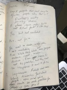
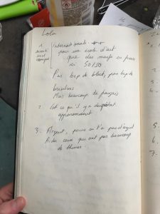
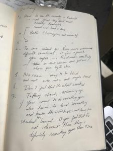
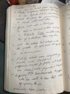
So I decided to ask the point of view of students to maybe see more clearly. I randomly choose the students around me at this moment. Here are the questions. The answer of four different persons follow in my notebook. Some are quoted following the questions:

1.How would you describe minorities in Rietveld? 

“Plenty, accepted. Rietveld is a Safeplace for everyone to be in touch with each others.”

Do you recognize yourself as a minority?

“Yeah but not in Rietveld. In terms of general public, but not in Rietveld. Queer, middle eastern is less a challenge here than everywhere else.”

Do you see it as a problem?

“There are good an bad sides”

“No idea. It’s easy to be blind, and not even notice that maybe, problems exist.”

Is being a minority in the school different from being it outside?

“To some extant yes. It’s a very secure environment, difficult sometimes. If you are a female you feel safer than in the city. Sometimes you also feel that being a female influence the comportment of some teachers toward you. As a light skin, I don’t feel as much pressure because of my colour as if I was in a small city.”

According to you, is the school involved in these subjects?

” I have the impression that Rietveld want more black diversity in the school. But it should be just about people. you create so much problem for yourself if you force it.”

Are there some significant changes that the school could implement to improve the ‘safeplace’ in an effort to reject minorities in art schools?

” Making school more adaptable for disabled and mental ill people with health care issues”

“Communicate to people who don’t want to hear that, instead of repeating it to us”

“Give a better support to people with financial issues, make it really accessible”

“Talking about, opening up. If you want to do something you also have to take the lead in something and take the initiative: not leave it to student in general. If you think that it is not relevant, then there is definitely something you don’t see.”


Art School or Art Factory?


Tuesday, April 23, 2019

protest poster of rietveld students

The students and teachers of the Gerrit Rietveld Academie are outraged. Protest have broken out the talks of a strike are becoming harder and harder to deny. After a leaked email from the heads of the Rietveld Academie strongly suggesting what many student already suspected, the school is using the students as unpaid workers. There have been talks between students and some teachers for a couple of months about this development which by many is described as criminal and not from this time, anno 2019. The school is under investigation as we speak to see if the way the school has been treating the students is really unethical and it could result in a high fee for the school, the heads of the school are facing jail time and there are even talks about a complete shutdown of the school.

The Gerrit Rietveld Academie is known to be pretty closed off for the public. They don’t have to adhere to certain rules that other higher education institutes have to, like the fact that they don’t have work with a point system. Also does the school not work with professional educators, but with artist, although this is with common other art schools as well. This is so they say, art schools, to stimulate the student in there education in the arts. Being around real artist will help them think and work in ways educator could not. All this makes the school a hard institute to keep an eye on. Many question arise now if this way of educating should be allowed after the news broke.

I saw many of your new pottery yesterday. They’re almost all single pieces and it would be wrong if we wouldn’t find a way to make the really good work that is in the pieces not accessible for a bigger audience.”

“We need to find a way to reproduce some of the works with machines.”

These are some quotes that caused the outrage among the students and some teachers. The students are being used by the school as unpaid designers, if you ask the students themselves. ‘We pay the school a higher tuition fee than other school in the Netherlands and then your own school uses you and your hard work, to sell themselves and our designs to the public. Where is all this money going to. Why am I even in school. I could apparently just start for myself,’ says Maria Sløthja a graduate student for the DesignLab department. Second year ceramics student, Frank Trebull adds;’It is like we are student athletes, but then like student designers.’ Teachers are also not pleased hearing this news, basic-year sculpture teacher Laurie Nagette has this to say;’ We cannot forget that we’re an education institute, that should be our main focus, educating the students. We shouldn’t try to make money off on them, that’s wrong.’

How the email was leaked is unclear, but there is a conjecture that one of the heads of the academy leaked it. The mail in question was send to all the heads of the school. But the remarks were made by Stijn van Kleinheest, Chairman of board of Directors. The authorities are investigating him closely, and the school has put him on inactive indefinitely.

The academy is also facing a complete shutdown, which comes with an even bigger outrage from the students. Especially among the graduate student the outrage of the shutdown was the biggest. They are in danger of not being able to graduate in that state. The academy is trying to figure a way out to prevent this from happening. They also have a problem with accepting new students for the coming year. They are considering not accepting any new students at all next year, but the admission has already started. And what to do with the rest of the students that already are studying in the academy. These are real problems the school has to face and find a solution for. For now they do not seem to have any. The teachers are also in fear of losing their jobs, for many this job is something they do next to being an artist, however for others it is there only source of income. Working at the academy is a steady pay, with is hard to find when you are in the world of arts.

I Tried To Make An Ashtray


Tuesday, April 23, 2019

I TRIED TO MAKE AN ASHTRAY
At the Bauhaus exhibition in the Boijmanns Museum many interesting objects and images were exhibited. I started taking pictures of all the things that  struck at first and thus interested me. After the exhibition I was still undecided what subject or object i wanted to lay my focus on. I was interested in many parts of the exhibition but didn’t really know how to connect it to myself or to my current situation at the Rietveld academy.

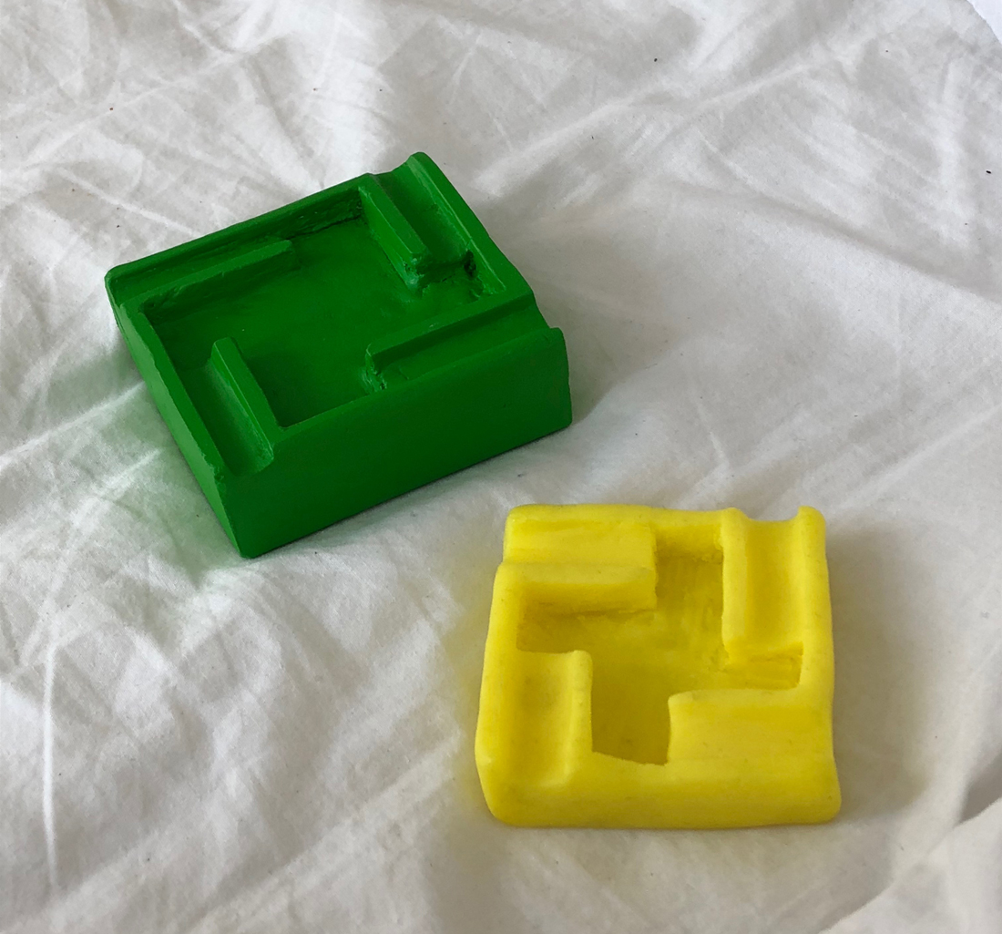
Every now and then I went back and looked through the pictures I took from the exhibition and  the catalog of the exhibition. I noticed that I had taken quite an amount of pictures mainly of the different ashtrays that where exhibited. I then asked myself where my “unconscious” focus on the ashtrays was coming from.

Some of the initial pictures of ashtrays that I took in the Boijmanns exhibition:

When I initially thought about trying out a new material and design I was instantly reminded about  me being in a similar situation back in highschool. We had a copper driving course. We were allowed to choose a simple form with which to start with. I choose a spherical piece of copper and it ended up becoming a round shaped ashtray. Through this previous experience I thought that I can relate myself more to a Bauhaus student by putting myself in the same position trough remaking the ashtray. Basically trying to comprehend the previous process trough the attempt of reproducing the same object.

In my opinion it makes sense to start with something small and not too complicated, that requires a small amount of skills and abilities, and that can be done trough, child like intuitive experimenting with material and form, for example a vase, a teacup or an ashtray.

I then tried to think about the students in the „Vorlehre“ of the Bauhaus school and imagined that they may also started out trying a new material by making simple objects like ashtrays. An ashtray is a decorative object that is often located in the middle of a room easy accessible  for everyone and at the same time functions as a design statement.

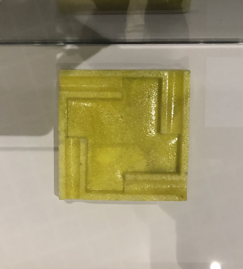
The ashtray depicted below is the one I choose from the exhibition

It was a design by Nicolaas Petrus de Koo, I choose this ashtray in particular because I felt like the time in which it was produced was really well represented in the design and color. It took the art and design language of that time ( clear forms, practicality ) and translated it into an every day object and at the same time it really represented the motive „form follows function“.

Form follows function was a principle associated with 20th-century modernist architecture and industrial design which meant that the shape of a building or object should primarily relate to its intended function or purpose. I think that is a really logical and sensual approach to not focus on all the „ornaments“ around but to rather set the focus on the pureness and the beauty of the function. I imagined to be part of the zeitgeist of that time to experience the process of reproducing an exact and polished design.

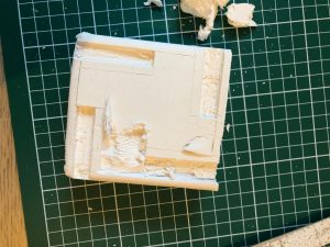
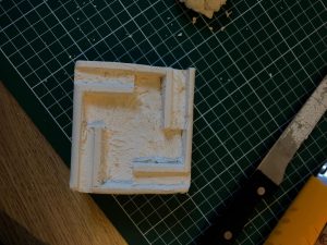
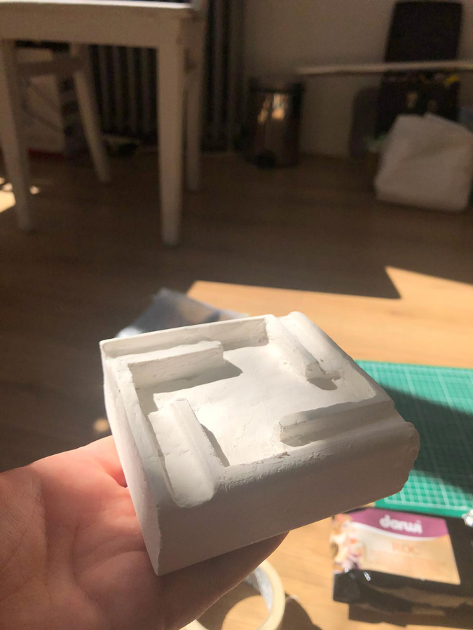
So I went and  bought some clay and started carving it and forming it. While doing that i noticed that it is going to be hard to make it look as precise as the original version.

I tried to imagine the process of an Bauhaus school student. Before they created an end product they must have made several steps and try outs to come to an end result that looked finished and not crafted.

First I stated meassuring and marking the form. For this propose I just used a ruler and a stanly knife. I made my own measurements because i didn’t have the original ones.

Then I started to ruffly carve the shape into the object, trying to build the middle part deeper and to ( kind of ) even the surface.

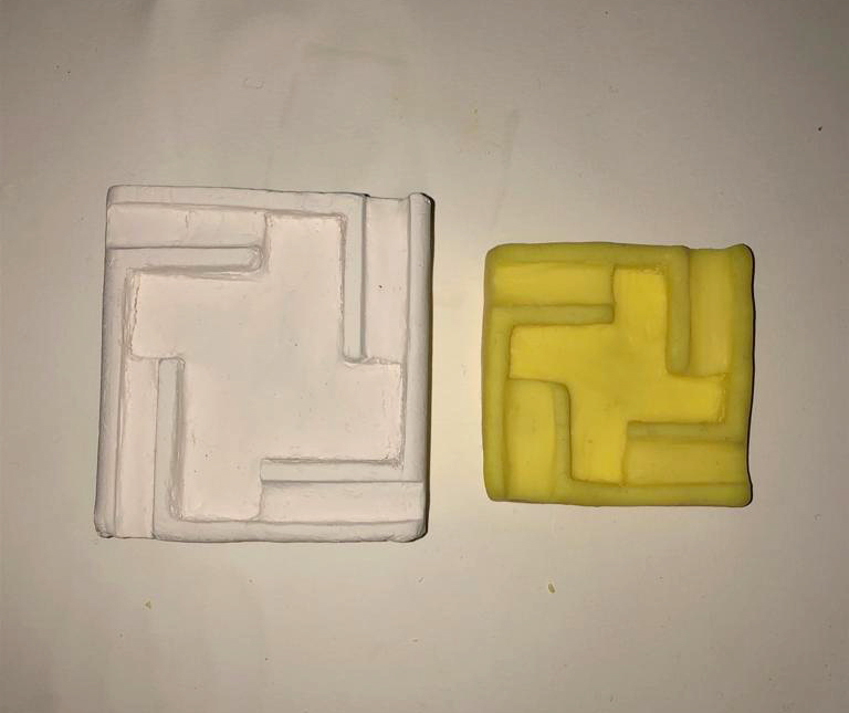
In the end I used a water rub on the survace to make it as even as possible even though it was still clearly visible that hands where involved in this process trough the numerous fingerprints.

Here are both finished versions (dried and baked) without paint on them. (Left : self hardening clay, right : Fimo)

I think that the Rietveld Academy education and the Bauhaus school education really differ from each other.

At the Bauhaus school one received a quite specific education that would provide you with skills to produce design objects and images. The education started with a different approach, where you first learn how to produce an object, carpet, form etc. and on the ground of these tools developing a design language.

At the Rietveld Academy on the other hand it seems the way to achieve your goals is more about thinking and reflecting and being aware of yourself and what is happening in the process. If you want to learn skills and abilities, go for it.

verbs in herbs


Monday, April 22, 2019

Rooibos tea.

About redness in tea.  green leafs that dries and take all ascorbic acid away with it, from rudeness that expanded into a settler colony, to a tea latte in a wine glass in jan evertsenstraat. an exploited small mountainous area in cape town , to the Boston tea party that made the biggest tea pot in the sea, I see myself enjoying the last sips of an endemic Fabaceae going to extinction by the time I graduate rietveld.


GROPIUS.

if clarity is a key tea peculiarity, if metal doesn’t dander in the friction of an almost boiling glass, if the pinky in the air connotes elitism in an anti Bourgeois sphere, if tea cups are in maximum efficiency and simplicity, if the ottomans didn’t invaded the world, if the word design is aware of its meaning, not meaning, and if the cup handle is not a cup handle but an artificial cup hand.

WHAT IF GROPIUS HAD THE ULTIMATE ROOIBOS TEA IN THAT TEA CUP?

Would he have died in his sleep? 


Cup.

Does a cup knows it’s a cup? does a cup like its particular shade? does it knows its position? is it aware of it? I asked a woman from the Boston tea party about this, she said: ”No taxation without representation!”.

I think I like transparency. 


Airplane.

I went on a small 2 days vacation, to come to realizes in the first 3o min on the airplane that I was dinning in west, they gave us cake as the whole dinner meal, and people were clapping when they were done, then the famous exotic pride came after as a rare gem to wash our throats with the over exploited capitalism’s favorite post colonial flavour ROOIBOS… 


What Is The Context?

Well well well, what is not? if potatoes not butter, if butter not cake, let them eat cake! or shell we find some blueberry and make ourselves ink to write on the bathrooms walls and call it vandalism, and stand next to all the isms and SCREAM”. IS IT BETRAYAL, OR ARE WE WRITING FUTURE HISTORY!”

Let them vandal aren’t we all vandalizers.


Taste.

Ummm what does it taste like?

it taste like you my love.

Do you think it tastes like the future?

oh wait, it taste like dancing in fields of yellow flowers on a midday, not so hot mid day.

Do you taste the anxiety?

it smells like their boots.

I am worried.  

Did the flavor change?


Stairs:

she get dizzy every time she go down the stairs, then she forget what she was thinking about. A law of intolerable acts maybe to prevent making a tea pot enough for everyone. Is for everyone? where did you get the tea from? they go or not go to Cape Town, bring or not bring the herb, the red herb!  Is it a flower or or another victimized commodity?


sound:

Manner to not sip laud, a loud sip is to care less. does it depends on the cup, or a glass cup, or cups as glass. Lauder it was as an aquarium bubbling around tiny depressed fishes in a capitalist reality. They knew, fishes signed the petition, the petition was signed for an idea that was stolen from beyond and beyond the idea that was stolen there was an idea of a stolen idea, stolen from an idea that though it will never be stolen, there was the thief that stole the stove, the stove that they made the rooibos tea on, the same tea that he might drank while making that famous teacup, that same transparent love story that was broken after making a tea that was so hot, so hot that never a human drank it ever.


Teaparty.

A card is thickened paper and a paper is a thinned  tree, how can we sustain if we can’t obtain alternation for consumption mania, fixating their future. Tea parties, tea breaks, smoke breaks, call them or not, They gather and discuss all what is so important and not, they assumed and forgot, we are the bitter, but what!


Kanteen.

It was early, early it was, coffee was wondering by herself on the table, on a sugary really sweet pink new paper publication sheet of paper. I poured, poured and poured In that sad paper not paper cup, and throw it in the bin, not so a bin, plastic bin, aren’t we plastic bins after all .


Spatial object


Sunday, April 21, 2019

At the Bauhaus exhibition

I found two very intriguing works. I don’t know why I was attracted to them, but I had to force myself to look at them carefully. Since there was something exciting to see in those work, I am going to explain it a little bit here.


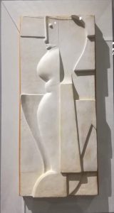
First one is [relief h] (1919) from Oskar Schlemmer.

The relief h is Oskar Schlemmer’s ideal form for developing human figure which he recognized as an all-encompassing reference system. He used to work on paintings before, but he expanded this work to 3D by using the relief. Although this example is made from plaster, he also worked with other material like bronze

Each part has a different way of creating shape, and the way light and shadow appear is very beautiful. Roundness in relief, or that only the face has a different texture than the rest, every parts has its own feature , and still it harmonizes well as a whole.


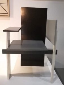
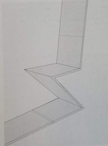
The other one is [the Berlin chair] (1923) made by Gerrit Rietveld.

This was his new furniture design with its asymmetry and flat panel construction,. It was specially designed for the exhibition he and Huzar had in Berlin in 1923, hence the name ‘Berlin chair’.

Simple yet daring, it makes me feel good to look at. It also tickles my fantasy and it is like a feeling of playing with the blocks somehow. Surprisingly the impression of the chair changes completely depending on the angleI liked looking at it, from the front and to the right of it, toward the front.


Now I will take a look at their background.

Oskar Schlemmer (1888-1943)

Oskar Schlemmer was a German stage-set designer, choreographer, and teacher. He was pursuing the relationship between figure and space. Actually he himself joined the [triadic ballet] (1922) as a dancer and deepened his understanding for interaction between figure and space. Specifically about this [relief h], it’s a development from his paintings on the relief. He reduced some factors such as colors and shapes, and used white plaster, resulted in 3 dimensional effect on 2D surface. His exploration had focus in simplicity, abstractness, and space. As he was working on this abstract shapes of the relief combined with the wall surface, he made a big step by haptically thematizing the link with architecture.


Gerrit Rietveld (1888-1964)

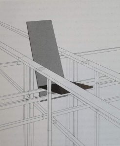
Gerrit Rietveld was a Dutch furniture designer and architect. He felt more freedom in the exploration of ideas when designing furniture. In some of his chair designs, he tried to deduct conventional chair factors and find the way to express the aesthetic with only simple structure and linear lines. In the apt language of Rietveld, “a chair should not be more complicated than a safety-pin.” Then dealing with the chair and space. 
As you can see from the picture below, the forms are considered to be continued to the surrounding space. “Instead of a solitary finished angle that ends and close everything, smoothing away the construction by some degree of ornament, Rietveld has the lines and planes pass each other at nodal points.”

Also with playing the role of color, both room and furniture has dissolved into form and color, and their hierarchical relation has been eliminated.


From these two works, what I find interesting is that the object doesn’t complete within itself but unite with surroundings. It is connected. It completes with the space. Their approach to space, or their stance for challenge, I feel, is related to what I am looking for as a Rietveld Academie student.

As a premise, I want to explain what it indicates when I use the word “space” from now on. “Space” for me is not only the physicality of space, but it includes people inside, culture, common sense, habits and all to be space. In other words, environment. I feel these all things are as one space, and it influences on my mindset a lot. As a Rietveld student, I believe that the environment is suitable for exploration of space like these two designers. I couldn’t go further beyond my limitation due to my personality and environment. I wanted to go beyond those border, but didn’t know how, which means I was making the same movements within the space.


Let me put this into an image.


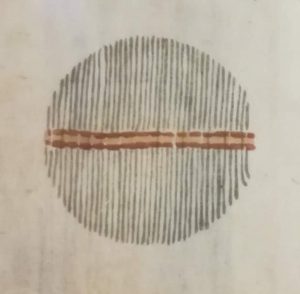
[left] image from the Japan folk crafts museum - [right] image of work from a foundation year student in Bauhaus

For the left one, the lines are organic texture and arranged in a way that the entire thing can be harmonized. It is hard to go out to the white empty space. On the other hand (in the one on the right), this line is drawn clearly and composed unsymmetrical. In addition, the end of line cannot be seen here and it continues outside the frame. It’s like intercepting the space boldly.


Suppose what is reflected on art works is how I see, think and understand things, then I see the possibility to explore my new way of living by breaking my convention through making art. The word “environment” is not enough to describe this concept. This physical part, tangible part of space seems to embody intangible parts. If it is connected, by pursuing things beyond my border in physical space, I can also explore the intangible part of feelings and reaction to society. Studying their attempts to interpret space will be the main motivation for my purpose in staying at the Rietveld Academie to search for my way of living.


Everything is One: Building


Sunday, April 21, 2019

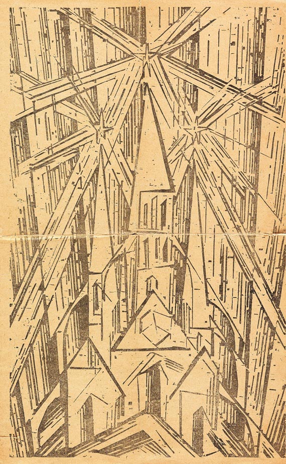
The Bauhaus manifesto published in 1919 outlines basic traits of the school. Headed with the Lyonel Feininger Cathedral (Kathedrale), the reader faces three stars shining above the turrets of the fictional basilica.

Lionel Feininger, Kathedrale, 1919, Cover of the Bauhaus Manifesto.
Programme of the Bauhaus. 

The three stars are said to represent the main three elements of painting, architecture and sculpture. All of which fall under the main concept of ‘building’. The Bauhaus was dreamt up upon a basis of creatives coming together, in alliance. To build work in an evolving space, a cathedral of mucky boldness, master among student, declaring craftsmanship and building as the basis of all learning.

Bauhaus itself is a blend of the word ‘to build’ and ‘house’. It takes semantic place as a ‘building house’. Now we can see the offspring of the school stretching from Berlin to Chicago, Pittsburgh and the Netherlands. Amsterdam is home to the Gerrit Rietveld Academie, which too was birthed from the wave of Bauhausian teachers and students left itching to scatter and inform after the original disbanded.

The school, mostly founded on modernist[1] design still has it’s reverberations. Is it just names that live on? Is the branding of Gerrit Rietveld, the only thing that links us to it’s educational model origins? Or is there still a cry of modernist education professing ‘building and making’ over all students?

It occurs that in the postmodern[2] world, the act of ‘building’ is seemingly scattered. Questioned theoretically. Few are painters, sculptors or architects now. Monogamous artists are perhaps becoming a thing of the past, steadily becoming toast along with craft in art. Perhaps we aren’t building physical practices anymore – emerging in the form of degree courses like ‘Autonomous Sculpture’ surfacing at the Rietveld, a subject so loose – almost transient. The focus here is on concept, as opposed to physicality.

The original Bauhaus manifesto is not something that presents a package of transience, but one of definitive action – “Architects, sculptors, painters—we must all turn to the crafts. … The artist is an exalted artisan.” The stress is on doing. Less on thinking.

The question I would like to pose is ‘what really happened during this rework?’ In the move from modernity to postmodernity, the focus has changed. Does this mean compromise? The change has happened in many forms, yet using the policy and attitudes towards ‘building’ in the two schools, we can evaluate them on a level playing field.

In my personal day to day experiences of the school, I have never been encouraged to ‘build something’. However, I have been encouraged to think reflectively, as if constructing something from thought. Within Itten’s original preliminary base course structure, the idea of elementarization[3] of basic artistic means plays a large part. I question wether this is still relevant with postmodernity. Elementarization was a method of finding the core of things. That could be related to shape, colour, and formal elements much better than thoughts, concept or theories. Deconstruction of colour, according to Itten’s book ‘The Elements of Colour’, allows you to provide “general rules and laws of colour, yet also relate it to subjective opinion”. Elementarization is a bid to find the root of something, the truth in which the experience lies. However, within a postmodern (Rietveld) structure, ‘truth’ itself is something shied away from. Instead of trying to find ‘the truth about colour (or making)’, we are left trying to find ‘the truth about thinking’, left ‘thinking about thinking’.

It is important to mention that even just through the existence of the Basic Year, and the formation of classes, teachers and subjects, it is apparent that the Rietveld does honour the idea of a ‘good education’, over a ‘bad one’. They have, after all  applied this structure to the course based on reason and pedagogy[4] study (or so I would assume). Thus, the structure must be based on certain means that deem it useful or good to us as students. This leads me to believe that there is indeed a right and a wrong way to educate young artists. In other words, there is a true art education to be obtained. In the Gropius manifesto of 1919, ‘What is Architecture’, this truth lies in “architecture, painting and sculpture”. But the world today demands a wider spectrum of conversation. I personally think that it is more than okay to dedicate oneself to finding a real trade, or becoming the master of something, as opposed to a jack of all trades.

I can see both sides of the story in so much that The Rietveld has to keep up to date with the process’ of the current art world, but coming from a somewhat dated model. When beginning this essay, I was under the impression that the school was undergoing some kind of identity crisis. Attempting to link themselves to their withering ancestral roots in Bauhaus. I would argue that the link is indeed withering. That can be seen in their policies on ‘making’. It is perhaps more of a historical connection now. In truth, if I wanted to become a master woodworker, I could. But it wouldn’t line up with the philosophy of the school. I have personally received criticism for dedicating myself towards attempting to become a kind of master in one material.

In conclusion, Gropius himself would suggest that the Rietveld needs a re-work if we are to base our education on a Bauhausian model. I think he would suggest that there are no ‘master craftspeople’ being raised up.

The Rietveld Academie has not explicitly chosen to follow the Bauhaus manifesto like some kind of Bible, so, from the perspective of a student studying here now, the school is allowed to deviate from the original blueprints due to societal changes. I personally think it’s great that we aren’t all sold into unpaid labour making zig-zag chairs. Yet, the school should probably analyse its withering links to the past. Just like inevitably a grandson will probably have different interests to his Grandfather. The Rietveld is not in an identity crisis, but slowly developing the ability to keep proud the family name, yet not live in the shadow of it’s ancestry. There will probably be a time, when the Rietveld’s education model will bear no similarity at all with that of the Bauhaus.


[1] Modernism(ism) – Modernism refers to a global movement in society and culture that from the early decades of the twentieth century sought a new alignment with the experience and values of modern industrial life. These were often utopian, and modernism was in general associated with ideal visions of human life and society and a belief in progress.

[2] Postmodern(ism) -Postmodernism was a reaction against modernism. While modernism was based on idealism and reason, postmodernism was born of scepticism and a suspicion of reason. It challenged the notion that there are universal certainties or truths.

[3] Elementarization – The reduction of artistic elements to their most basic or original form.

[4] Pedagogy – The method and practice of teaching, especially as an academic subject or theoretical concept.

  1. Johannes Itten, The Elements of Color, John Wiley and Sons Inc, Hoboken, 1970
  2. CityLab. (2019). Western Pennsylvania’s Bauhaus Town. [online] Available at: https://www.citylab.com/design/2019/03/bauhaus-pennsylvania-gropius-breuer-aluminum-city-terrace/584485/ [Accessed 20 May 2019].
  3. Moss, C. (2019). 100 years of Bauhaus: Berlin and beyond. [online] the Guardian. Available at: https://www.theguardian.com/travel/2019/mar/16/100-years-bauhaus-germany-berlin-weimar-dessau [Accessed 20 May 2019].
  4. The New Bauhaus. (2019). The New Bauhaus. [online] Available at: https://www.thenewbauhaus.com/ [Accessed 20 May 2019].
  5. Gropius, W. (1919). Walter Gropius, Bauhaus Manifesto (1919). [online] Adepratt.weebly.com. Available at: https://adepratt.weebly.com/uploads/3/7/7/1/37716215/bauhaus_-_manifesto__program_statement.pdf [Accessed 20 May 2019]
  6. Bauhaus-imaginista.org. (2019). The Bauhaus Manifesto – Articles – bauhaus imaginista. [online] Available at: http://www.bauhaus-imaginista.org/articles/1771/bauhaus-manifesto-re-cap [Accessed 21 Apr. 2019]
  7. Danchev, D., 2011. 100 Artists’ Manifestos: From the Futurists to the Stuckists. (s.n.). p159-p161 (M33 Walter Gropius – What is Architecture? 1919)
  8. Gerrit Rietveld Academie. (2019). Home. [online] Available at: https://rietveldacademie.nl/ [Accessed 20 May 2019]
Nicholas van Pelt

Doing aerobics before painting?:


Sunday, April 21, 2019

When I first heard “Bauhaus,” my first impression of it was just “big movement important in the history of European art” Because I didn’t have much interest and think it was not really related to me but the Boijmans Museum’s exhibition of Bauhaus, where I went without any expectations, influenced me more than I expected.
The systematic learning of basic things, such as materials and colors, seemed boring at first glance, but turned out to be the most dynamic and interesting things. Exploring the properties of materials, understanding the various and contrary things, geometric shapes and colors are the most essential elements for art, but I had missed them.
Through the writings of Johannes Itten, founder of Bauhaus Vorkurs (preliminary course), I could understand exactly why Bauhaus put so much effort into these things.

Let’s take a look at the works that I saw at the exhibition and the writings of Johannes Itten together.

Two of the most distinct elements of Bauhaus: Geometric form and primitive colors

“The clear geometric form is the one most easily comprehended and its basic elements are the circle, the square and the triangle. Every possible form lies dormant in these formal elements. They are visible to him who sees, invisible to him who does not. Form is also colour. Without colour there is no form. Form and colour are one…Geometric forms and the colours of the spectrum are the simplest, most sensitive forms and colours and therefore the most precise means of expression in a work of art.” •1

It was like the playful work of children. It made me think differently about the concepts and the properties of materials that I had been knowing.

Forms and colours were discussed and presented in any number of polar contrasts. These contrasts can be presented as intellectual concepts…The students had to present these carious contrasts, separately and in combinations, in a manner that allowed our senses to perceive them convincingly.” “All artistic effects are based on the creation of contrasts. We not only studied their contrasts – smooth-rough, hard-soft, light-heavy—visually but also explored them with our fingertips…To deepen and control the experience, students had to contemplate, touch, and raw these textures until they knew them by heart and could reproduce them out of their inner perception, without the natural model.” •2

Among the many exhibited items, the drawings that caught my eyes turned out to be Vorkurs works.

I was fascinated by these rhythmical lines and colors 

“ The teacher’s most difficult problem is the liberation and deepening of the inner spiritual sense of perception. To conduct exercises in that area one needs a very pliable, labile material which reacts immediately to the slightest motion of the hand. I used india ink brushes and soft charcoal” “The success of these studies wholly depends on the student’s ability to overcome his intellect and the function of his senses and give himself totally to spontaneous feeling. An inner automatism quite naturally gives a convincing outer form to his feelings.” 3

Johannes Itten’s ideals of education were very impressive and as a Gerrit Rietveld student, I related to that.
Itten found it difficult to judge students because they all have different talents and characters.
So the vorkurs was built, and students were able to have time to think fully about their interests and aptitudes as they went through this course. I think it is the same reason why Rietveld Academie persists in the basic year while many other schools have given it up already.
Students at Bauhaus had to explore and enlighten themselves without relying on the knowledge from the outside. Itten emphasized inner growth and self-examination, so he went back to the quest for more basic things and helped discover students’ interests and talents through them.

I felt lost when I came to the Rietveld Academie at first. I was used to the crammed Korean education, that was why it was difficult and awkward for me to think about myself and being on one’s own. Now I’m used to it and this new way of education has given me a chance to think deeply about myself.
Drawing and painting, theory, design, mixed media and sculpture, learning these five subjects, and using various workshops, I could see what I liked and disliked, or what I didn’t do well. The fairly free atmosphere of discussion and feedback also helped me broaden my horizons.
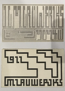
 

Pictures of Rietveld Academie basic year class


pictures of Bauhaus vorkurs

Interestingly, both educations seem to be exploring materials.

They have a lot in common, but the reason Bauhaus’ education seems more interesting to me is probably because of the physical exercise. Itten gave the class exercises in relation, breathing, and concentration to achieve a spiritual state and physical readiness during the instruction period.•4
He thought the training the body as an instrument of the spirit is essential to an artist’s creativity. That is why, before attempting class, the students were asked to limber up their bodies and minds by physical jerks, controlled breathing, and meditation.•5
I agree with his opinion as a yoga and meditation lover. I believe that the body and mind are connected and the brain also moves more actively when the body is ready and activated.

Imagine, wouldn’t it be more fun and energetic if we did yoga together at school or if we did weird exercises before we painted?

pictures of Bauhaus Vorkurs physical exercise

pictures of Rietveld Academie basic year class E’s aerobics performance

Maybe ‘Basicyear’ is the most important time as an artist. This is because it is an opportunity to experience many challenges and failures without constraint. So far, I have been busy just completing my assignments. After learning of Bauhaus’ educational philosophy, I began to reflect on my attitude and to think about how to deal with my work in the future. I will bear in mind the philosophy of Bauhaus, which is attentive to the sounds of body and mind, faithful to the basics and always exploring.

•1,5) Frank Whitford, Bauhaus, Thames and Hudson, 1984, London
•2,3,4) Gyorgy Kepes, Education of Vision, Studio Vista, 1965, New York


Log in
subscribe